JetWooBuilder
JetWooBuilder Shop Product Widgets
This block contains the detailed information about JetWooBuilder Shop Product widgets which can be used for creating WooCommerce Single Product page content.
Products Description
This widget allows to add the description to Shop Products and style them up according to your vision.
Style
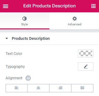
Text Color - here you can set the color of the text.
Typography — turn the option on to view the typography settings for the button text.
- Size — define the font size of the button label text.
- Family — here you can set the font family for the button label text.
- Weight — in this block you can select the suitable font weight.
- Transform — here you can choose from the dropdown menu, if you want the text to be shown in uppercase, lowercase, capitalize or normal way.
- Style — in this block you can choose from the dropdown menu the style of the font. It can be normal, italic (the characters look similar to handwriting) and oblique (the characters are slightly inclined to the right).
- Line Height — in this field you can set the height of the text line.
- Letter Spacing — here you can set the space between letters.
Alignment - here you can change the description alignment.
Products Loop
With this widget you are able to create a product loop.
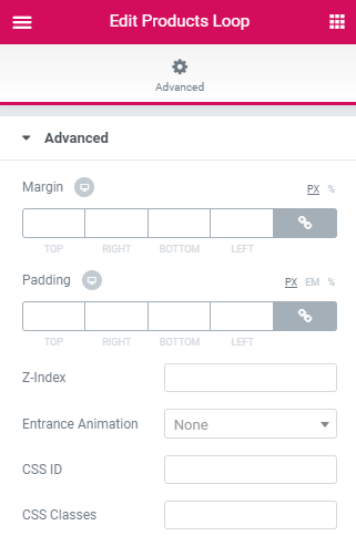
The widget has only Advanced settings the overview of which is available in the Advanced Settings. documentation block.
Products Navigation
This widget adds the navigation to the Shop Products.
Content
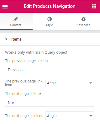
Items
Works only with main Query object.- The previous page link text - add text for your previous page link.
- The previous page link icon - select icon for your previous page link.
- The next page link text - add text for your next page link.
- The next page link icon - select icon for your next page link.
Style
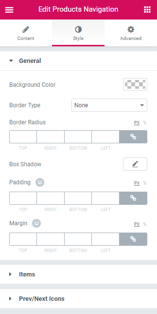
General
- Background Color - here you can set the needed color to use for the background of the products navigation.
- Border Type - here you can define the type of the border to apply for the item (or apply no border, according to your needs).
- Border Radius - here you can set the border radius values to make the angles more smooth and round.
- Box Shadow - here you can apply the shadow for the item. Click the Edit pencil option to open the additional shadow settings.
- Padding - here you can define the padding values for the item.
- Margin - here you can apply the specific margin values for the products navigation and make it responsive.
Items
- Alignment - here you can define the alignment type to apply for the item (top, center, bottom, stretch).
- Background Color - here you can set the background color to apply for the content.
- Text Color - here you can set the color of the button label text using the color picker.
- Typography - here you can edit the typography settings. They are the same as available for other JetWooBuilder widgets.
- Item Min Width - define minimum width of the item.
- Padding - here you can define the padding values for the item.
- Margin - here you can apply the specific margin values for the products navigation and make it responsive.
- Border Type - here you can define the type of the border to apply for the item (or apply no border, according to your needs).
- Border Radius - here you can set the border radius values to make the angles more smooth and round.
- Background Color - here you can define the alignment type to apply for the item (top, center, bottom, stretch).
- Text Color - here you can set the color of the button label text using the color picker.
- Icon Size - change the size of the products navigation icon.
- Icon Box Size - change the box size of the products navigation icon.
- Border Type - here you can define the type of the border to apply for the item (or apply no border, according to your needs).
- Border Radius - here you can set the border radius values to make the angles more smooth and round.
- Gap Between Text and Icon - change gap between text and icon.
Switch between Normal and Hover modes in order to change the style settings for the title in its normal state and when on hover.
Prev/Next Icons
Switch between Normal and Hover modes in order to change the style settings for the title in its normal state and when on hover.
Products Notices
This widget allows to add various notices to products.
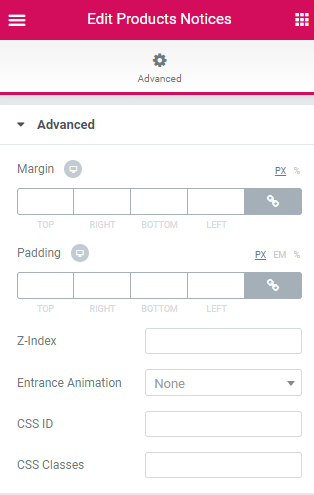
Advanced
The widget has only Advanced settings the overview of which is available in the Advanced Settings. documentation block.
Products Ordering
This widget is used to display the products sorted by various categories (popularity, average rating, newness, by price).
Style
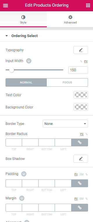
Ordering Select
Typography — turn the option on to view the typography settings for the products ordering text.
- Size — define the font size of the title text.
- Family — here you can set the font family for the title text.
- Weight — in this block you can select the suitable font weight.
- Transform — here you can choose from the dropdown menu, if you want the text to be shown in uppercase, lowercase, capitalize or normal way.
- Style — in this block you can choose from the dropdown menu the style of the font. It can be normal, italic (the characters look similar to handwriting) and oblique (the characters are slightly inclined to the right).
- Line Height — in this field you can set the height of the title text.
- Letter Spacing — here you can set the space between the title text characters.
Input Width - define the width of the input;
Text Color - here you can set the color of the button label text using the color picker.
Background Color - here you can set the background color to use for the item.
Border Type - here you can select one of the available border types to use for the button: none, solid, double, dotted, dashed or groove.
Border Radius - here you can set the border radius for the chosen border to make the border angles more round
Box Shadow - click on the pencil icon to access the shadow option and apply the shadow for the element. The shadow settings are similar for different elements of JetWooBuilder widgets.
Margin - here you can set the margins to use for the element.
Ordering Arrow
Show arrow in select - enable/disable showing arrow in select.
Ordering Arrow - select the ordering arror from the dropdown list.
Text Color - here you can set the color of the variations text.
Arrow Size - here you can change the arrow size.
Top Offset - here you can change the arrow top offset.
Right Offset - here you can change the arrow right offset.
Page Title
This widget is used to display the Shop page title.
Content
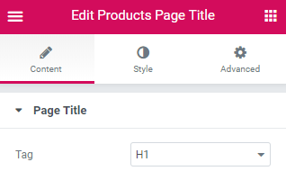
Page Title
Tag - select title size from the dropdown list.
Style
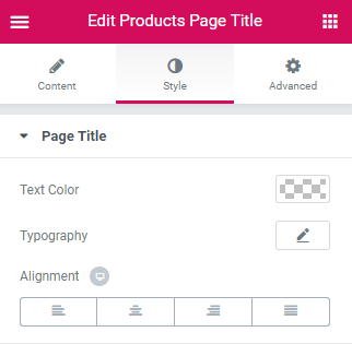
Page Title
Text Color - here you can set the color of the variations text.
Typography — turn the option on to view the typography settings for the variations title text.
- Size — define the font size of the variations title text.
- Family — here you can set the font family for the variations title text.
- Weight — in this block you can select the suitable font weight.
- Transform — here you can choose from the dropdown menu, if you want the text to be shown in uppercase, lowercase, capitalize or normal way.
- Style — in this block you can choose from the dropdown menu the style of the font. It can be normal, italic (the characters look similar to handwriting) and oblique (the characters are slightly inclined to the right).
- Line Height — in this field you can set the height of the variations title text.
- Letter Spacing — here you can set the space between the variations title text characters.
Alignment - here you can set the needed alignment (left, center or right).
Products Pagination
This widget adds the pagination to the Shop Products.
Content
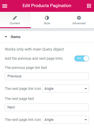
Items
Works only with main Query object.- Add the previous and next page links. - enable/disable adding previous and next page links.
- The previous page link text - add text for your prvious page link.
- The next page link icon - select icon for your next page link.
- The next page text - add text for your next page link.
- The next page link icon - select icon for your next page link.
Style
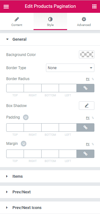
General
- Background Color - here you can set the needed color to use for the background of the products pagination.
- Border Type - here you can define the type of the border to apply for the item (or apply no border, according to your needs).
- Border Radius - here you can set the border radius values to make the angles more smooth and round.
- Box Shadow - here you can apply the shadow for the item. Click the Edit pencil option to open the additional shadow settings.
- Padding - here you can define the padding values for the item.
- Margin - here you can apply the specific margin values for the products pagination and make it responsive.
Items
- Alignment - here you can define the alignment type to apply for the item (top, center, bottom, stretch).
- Background Color - here you can set the background color to apply for the content.
- Text Color - here you can set the color of the button label text using the color picker.
- Typography - here you can edit the typography settings. They are the same as available for other JetWooBuilder widgets.
- Item Min Width - define minimum width of the item.
- Padding - here you can define the padding values for the item.
- Margin - here you can apply the specific margin values for the products pagination and make it responsive.
- Border Type - here you can define the type of the border to apply for the item (or apply no border, according to your needs).
- Border Radius - here you can set the border radius values to make the angles more smooth and round.
- Background Color - here you can define the alignment type to apply for the item (top, center, bottom, stretch).
- Text Color - here you can set the color of the button label text using the color picker.
- Icon Size - change the size of the products pagination icon.
- Icon Box Size - change the box size of the products pagination icon.
- Border Type - here you can define the type of the border to apply for the item (or apply no border, according to your needs).
- Border Radius - here you can set the border radius values to make the angles more smooth and round.
- Gap Between Text and Icon - change gap between text and icon.
Switch between Normal and Hover modes in order to change the style settings for the title in its normal state and when on hover.
Prev/Next
Switch between Normal and Hover modes in order to change the style settings for the title in its normal state and when on hover.
Prev/Next Icons
Switch between Normal and Hover modes in order to change the style settings for the title in its normal state and when on hover.
Products Result Count
This widget allows to showcase the number of all products with the ones being displayed at the moment.
Style
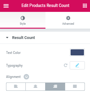
Text Color - here you can set the color of the variations text.
Typography — turn the option on to view the typography settings for the variations title text.
- Size — define the font size of the variations title text.
- Family — here you can set the font family for the variations title text.
- Weight — in this block you can select the suitable font weight.
- Transform — here you can choose from the dropdown menu, if you want the text to be shown in uppercase, lowercase, capitalize or normal way.
- Style — in this block you can choose from the dropdown menu the style of the font. It can be normal, italic (the characters look similar to handwriting) and oblique (the characters are slightly inclined to the right).
- Line Height — in this field you can set the height of the variations title text.
- Letter Spacing — here you can set the space between the variations title text characters.
Alignment - here you can set the needed alignment (left, center or right).