JetWooBuilder
JetWooBuilder Archive Product Widgets
This block contains the detailed information about JetWooBuilder Archive Product widgets which can be used for creating WooCommerce Single Product page content.
Add To Cart
This widget adds the Add to Cart button to the pages built with Elementor on WooCommerce-based websites.
Style
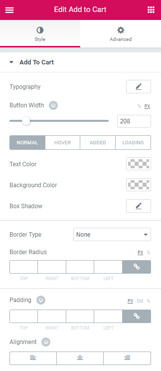
Add to Cart
Typography — turn the option on to view the typography settings for the button text.
- Size — define the font size of the button label text.
- Family — here you can set the font family for the button label text.
- Weight — in this block you can select the suitable font weight.
- Transform — here you can choose from the dropdown menu, if you want the text to be shown in uppercase, lowercase, capitalize or normal way.
- Style — in this block you can choose from the dropdown menu the style of the font. It can be normal, italic (the characters look similar to handwriting) and oblique (the characters are slightly inclined to the right).
- Line Height — in this field you can set the height of the text line.
- Letter Spacing — here you can set the space between letters.
Button Width — here you can define the width of the button.
Switch from Normal to Hover, Added or Loading modes to set the color scheme and box shadow for the button when in normal state, on mouse hover or when the purchase is disabled for the customers.
Text Color - here you can set the color of the button label text using the color picker.
Background Color - here you can set the background color to use for the button.
Box Shadow - click on the pencil icon to access the shadow option and apply the shadow for the button.
Shadow Settings:
- color — here you can set the color for the the shadow (use color picker tool to do it);
- blur — in this block you can define the blur settings for the shadow;
- spread — here you can set how large the shadow will be;
- horizontal — here you can move the shadow horizontally (from right to left);
- vertical — here you can move the shadow vertically (from top to bottom);
- position — here you can apply the shadow to the inside of the button or to the outside of it.
Border Type - here you can select one of the available border types to use for the button: none, solid, double, dotted, dashed or groove.
- Width - here you can define the width of the border in px.
- Color - here you can change the color of the borders.
- Border Radius - here you can set the border radius for the chosen border to make the border angles more round.
Padding - here you can set the padding values for the text placed inside the button.
Margin - here you can define the margins applied for the whole button contained in the column.
Categories
This widget displays categories applied to the Archive Product.
Style
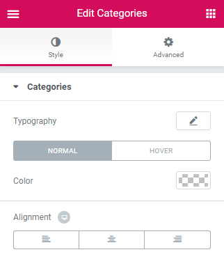
Categories
Typography - here you can edit the typography settings. They are the same as available for other JetWooBuilder widgets.
Switch between Normal and Hover modes in order to customize the appearance of both.
Background Type - here you can specify if you want to use the classic or gradient background and change the background style with the available options (they are similar for all JetWooBuilder widgets).
Color - here you can specify the color to apply for the categories.
Alignment - here you can specify the needed alignment for the categories (left, center, right).
Excerpt
This widget displays excerpt of WooCommerce archive products.
Content
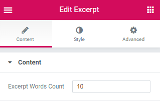
- Excerpt Words Count - here you can define the number of words you need to set as an excerpt.
Style
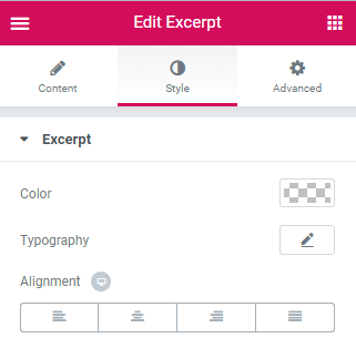
Excerpt
- Color - here you can specify the color of the excerpt.
- Typography - here you can edit the typography settings. They are the same as available for other JetWooBuilder widgets.
- Alignment - here you can change the excerpt alignment to the more preferable one.
Price
This widget makes it easy to embed the product price and sale price to the Archive Product page. One can also customize the prices along with the currency signs.
Style
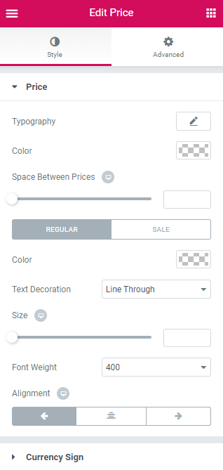
Price
Typography — turn the option on to view the typography settings for the product price.
- Size — define the font size of the product price.
- Family — here you can set the font family for the product price.
- Weight — in this block you can select the suitable font weight.
- Transform — here you can choose from the dropdown menu, if you want the text to be shown in uppercase, lowercase, capitalize or normal way.
- Style — in this block you can choose from the dropdown menu the style of the font. It can be normal, italic (the characters look similar to handwriting) and oblique (the characters are slightly inclined to the right).
- Line Height — in this field you can set the height of the product price.
- Letter Spacing — here you can set the space between the product price characters.
Color - here you can change the general color which is applied to the prices.
Space Between Prices - use the controls to set the space between the prices (regular and sale price) and make it responsive.
Switch between Regular and Sale modes in order to customize both product prices.
Color - here you can change the color to use it for the price.
Text Decoration - here you can add the text decorations for the prices (none, line through, e.g., when the regular price is no more active, and underline to make the price stand out.
Size - here you can set the needed size for the prices to make them responsive.
Font Weight - here you can specify the font weight to use for the prices.
Alignment - here you can change the price alignment to the more preferable one.
Surrency Sign
Color - here you can specify the color to use for the currency sign only.
Size - here you can set the size to use for the currency sign to make it responsive.
Vertical Alignment - here you can change the currency sign alignment to position it beside the price value.
Switch between Regular and Sale mode in order to customize both sale and regular prices.
Color - here you can change the color of the currency sign.
Size - use the controls in order to set the size of the currency sign and make it responsive.
Rating
This widget is invaluable when adding the product rating to the Archive Product page and styling it up according to one’s vision.
Style
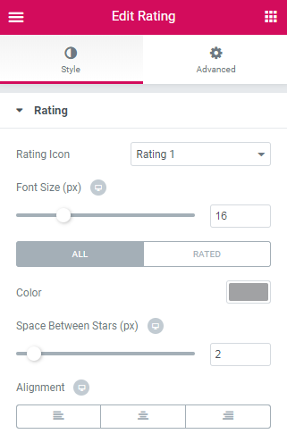
Rating
Rating Icon - here you can specify if you want the stars and review link to be shown in line or as a block.
Font Size - in this block you can change the size of the stars.
Color - here you can change the color of the stars in the rating.
Space Between Stars - here you can change the color of the stars in the rating.
Alignment - set the custom margins to apply for the stars.
Switch between All and Rated modes in order to customize the appearance of both.
Sale Badge
This widget makes it simple to add the Sale badge to the product’s page. Note, that one should set the Sale price in Products > Product Data Sale Price field to enable this functionality.
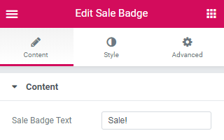
Content
Sale Badge Text - here you can change the color to use it for the Sale badge text.
Style
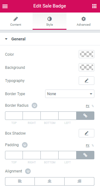
Color - here you can change the color to use it for the Sale badge text.
Background - here you can change the color of the Sale badge background.
Typography — turn the option on to view the typography settings for the Sale badge text.
- Size — define the font size of the Sale badge text.
- Family — here you can set the font family for the Sale badge text.
- Weight — in this block you can select the suitable font weight.
- Transform — here you can choose from the dropdown menu, if you want the text to be shown in uppercase, lowercase, capitalize or normal way.
- Style — in this block you can choose from the dropdown menu the style of the font. It can be normal, italic (the characters look similar to handwriting) and oblique (the characters are slightly inclined to the right).
- Line Height — in this field you can set the height of the Sale badge text.
- Letter Spacing — here you can set the space between the Sale badge text characters.
Border Type - here you can change the appearance of the Sale badge border by selecting one of the border types.
Border Radius - here you can change the border radius in order to make the angles more smooth and rounded.
Padding - here you can apply custom padding in order to use it for the element.
Alignment - here you can change the sale badge alignment to the more preferable one.
Stock Status
This widget allows to showcase the number of items in stock.
Style
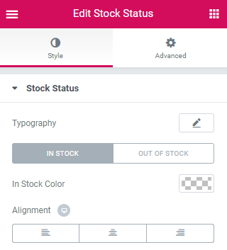
Stock Status
- Typography - here you can edit the typography settings. They are the same as available for other JetWooBuilder widgets.
- In Stock Color - select the color of number of items in stock.
- Alignment - here you can change the stock status alignment to the more preferable one.
Tags
This widget allows to display tags applied to the archive product.
Style
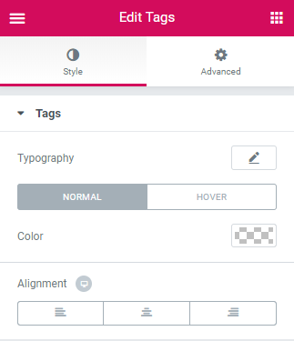
Tags
- Typography - here you can edit the typography settings. They are the same as available for other JetWooBuilder widgets.
- Color - here you can select the color for your tags.
- Alignment - here you can change the tags alignment to the more preferable one.
Thumbnail
This widget is used to add thumbnail image to the product on Archive Products page.
Content
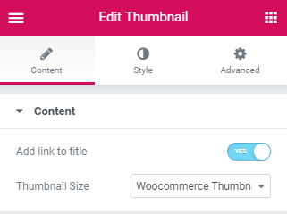
Add Link To Thumbnail - enable/disable adding link to the product tnumbnail.
Thumbnail Size - select the size of thumbnail from the drop-down list.
Style
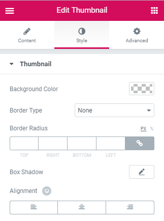
Thumbnail
Background Color - here you can change the color of the thumbnail imageusing the color picker tool.
Border Type - here you can change the margins to use them for the thumbnail image attributes.
Border Radius - input the padding values in order to use the custom paddings for the attributes thumbnail image.
Box Shadow - input the padding values in order to use the custom paddings for the attributes thumbnail image.
Alignment - here you can set the preferable (right, left, center) alignment for the thumbnail image.
Title
This widget allows adding the product title to the Archive Product page. It adds the title set on the Product page in the Title field and provides stylization settings for it.
Content
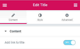
Add Link To Title - enable/disable adding link to the title.
Style
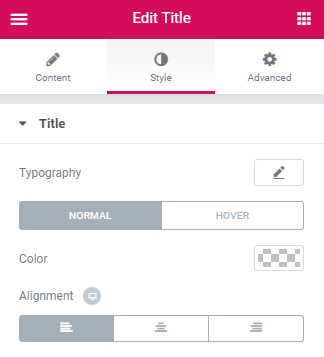
Title
Typography — turn the option on to view the typography settings for the title text.
- Size — define the font size of the title text.
- Family — here you can set the font family for the title text.
- Weight — in this block you can select the suitable font weight.
- Transform — here you can choose from the dropdown menu, if you want the text to be shown in uppercase, lowercase, capitalize or normal way.
- Style — in this block you can choose from the dropdown menu the style of the font. It can be normal, italic (the characters look similar to handwriting) and oblique (the characters are slightly inclined to the right).
- Line Height — in this field you can set the height of the title text.
- Letter Spacing — here you can set the space between the title text characters.
Color - here you can specify the color to use for the product title.
Alignment - here you can specify the alignment of the title (left, center, right).