JetPopup
JetPopup Settings
From this block, you can learn more about JetPopup plugin settings. The settings for it can be divided into General and Style block. Each of them is described below.
Settings Location
- To locate popup template settings you need to open the template for editing in Elementor and here click Settings option located in the bottom left corner.
- Here switch between Settings and Style block in order to make the template best fitted for your needs.
General Settings
General Settings
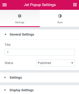
- Title – define the popup template’s title.
- Status – set the popup template’s status (draft, pending review, private, published).
JetPopup Settings
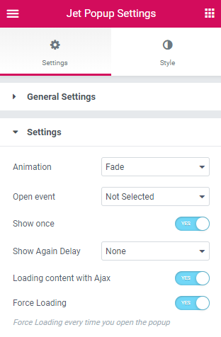
- Animation – here you can set how the popup will be animated on entrance.
- Open event – here you can adjust when the popup should be displayed (on page load, inactivity time after, page scrolled or try exit). To learn more about opening events, please, navigate here.
- Show once – enable this option to show the popup once.
- Show again delay - here you can specify the time when you want the popup will be showed again.
- Loading content with Ajax - enable this option if you want the content of the popup to load using AJAX method.
- Force loading - enable this option to load the popup content every time it will be opened.
JetPopup Display Settings
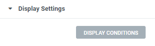
- Display conditions – click this option to open up the popup conditions settings.
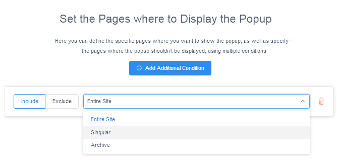
- Add Additional Condition – click this option to add a new condition, or use the one you’ve got in case there’s already one existing.
- Include - specify the pages on which the popup template you’ve created will be shown.
- Exclude - specify the pages on which the popup template you’ve created won't be shown.
- Entire Site - if you select this option, the popup will be shown on each page of your site.
- Singular - this option gives you an opportunity to apply the popup to particular posts or pages. You can set the popup for the post type, posts from category, front page, a child page of any other page, etc.
- Archive - choose this option to apply the popup to all of the archives, or only to the specific ones.
Style Settings
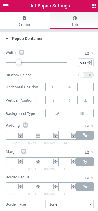
Popup Container
- Width – here you can define the width of the popup template.
- Custom Height – enable this option to set the popup container’s height.
- Horizontal Position – here you can position the template using the X axis (to the left, in the center or to the right).
- Vertical Position – here you can definite popup container’s position vertically (top, center or bottom.
- Background Type – here you can set the background of the popup container. You can choose either Classic or Gradient background type.
Classic Background Type
- Color — here you can set background color for the background using color picker tool.
- Image — here you can choose the image you want to use as a background. Select the image from the media library or upload it to define it as a background in this block. When the image is uploaded, you’ll be able to define its position, alignment, turn on repeat and set the necessary size.
Gradient Background Type
- Color — here you can set background color for the module using color picker tool.
- Location — here you can define the proportion for the first color in the gradient background.
- Second Color — here you can set the second color to use in the gradient background.
- Location — here you can define the proportion for the second color in the gradient background.
- Type — define, if you want to use linear or radial type of the gradient.
- Angle — in this block you can set the angle for the gradient (in degrees).
- Padding – type in the custom padding values to add a responsive padding for the block.
- Margin – fill in the custom margin values to add a responsive margin around the block.
- Border Radius – adjust the radius of the popup container’s borders to make the angles more round and smooth.
- Border Type – here you can define the needed border type for the block. It can be solid, double, dotted, dashed or groove.
- Box Shadow – enable this option if you want to access the shadow advanced settings for the block, and need to apply shadow to it.
Close Button
- Use Close Button - here you can enable the usage of the Close button to let the visitors close the popup manually.
- Icon – here you can select one of the icons, which will be displayed on close button.
- Icon Transform – here you can position the icon that should close the popup.
- Normal/ Hover – switch between the modes to change the Close button style in its normal state and when one hovers the button.
- Icon Styles – enable this option to style the icon.
- Font Color – here you can set the color of the icon.
- Background Type – here you can specify the color to apply for the icon background
- Icon Size – here you can choose the icon’s size.
- Box Size – here you can specify the icon box’s size.
- Border Type – here you can define the needed border type for the block. It can be solid, double, dotted or dashed.
- Width – here you can fill the width of the border.
- Color – here you can select the color of the border using Color picker tool.
- Border Radius – here you can set the border radius for the chosen border to make the border angles more round.
- Box Shadow – enable this option if you want to access the shadow advanced settings for the box, and need to apply shadow to it.
Popup Overlay
- Background Type – here you can choose the background for the popup’s template (classic or gradient) and set the advanced settings for each types.