JetPopup
Multi-Field MailChimp Form Integration
From this block you’ll be able to learn how to integrate the MailChimp form to JetPopup popup template using the JetPopup MailChimp widget.
Please, note, that in order to use multi-fields you should previously have the MailChimp account and at least one listing in it.
MailChimp API Settings
First of all, before using MailChimp widget provided by JetPopup, you need to have a registered MailChimp account.
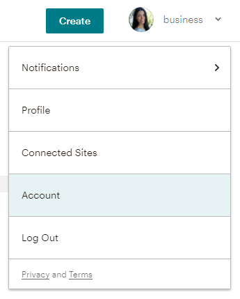
To connect MailChimp to JetPopup, you’ll have to log in to your MailChimp account and here click the dropdown where you can view the notifications, profile information, manage account settings, etc. Let’s navigate to Account block.
Here proceed to Extras > API Keys block and click Create a Key button to create a new API key.
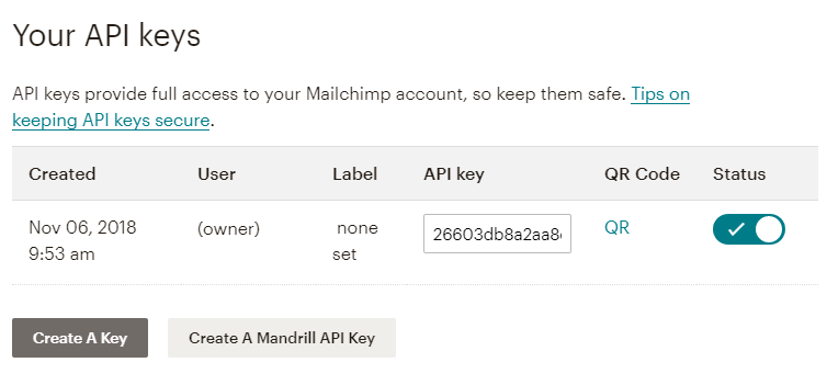
Copy the generated API key now available under API Key title.
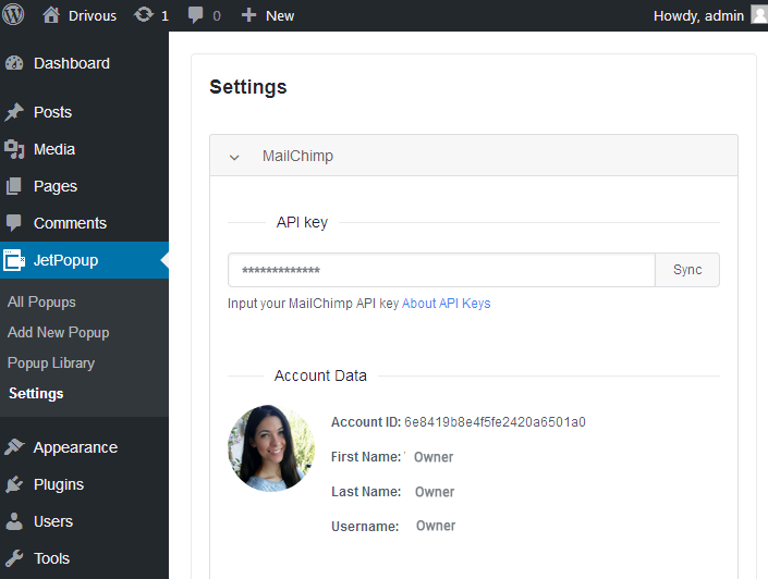
Now let’s log in to WordPress Dashboard of your site. Here open JetPopup > Settings block and paste the API key to the corresponding field. Click Sync option to synchronize the information about the lists connected to this MailChimp account and key.
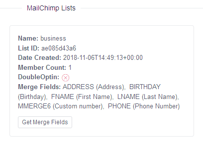
After that, in case you’ve already got a list at MailChimp, you’ll see it in the MailChimp Lists block. Each of the created lists will contain the following information:
- Name - the name of the list (you can have several of them, and you’ll be able to select one of the lists while working with JetPopup MailChimp widget and its functionality);
- List ID - the unique MailChimp list ID number;
- Date created - the information about the date when the current list was created;
- Double Opt-in - shows if the additional confirmation is needed for this list (this functionality is not supported at the moment);
- Merge Fields - these are the fields that can be set as additional in the MailChimp form added with the widget.
In case you don’t have the extra fields yet, follow the steps described below. If you already have all the needed extra Merge Fields, skip this information and proceed to MailChimp Widget documentation block.
Adding Extra Merge Fields
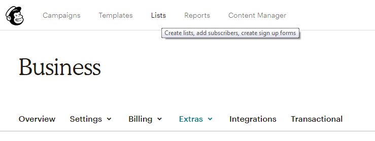
To add additional Merge Fields to the subscribe form log in to your MailChimp account and here click Lists option in the top panel.
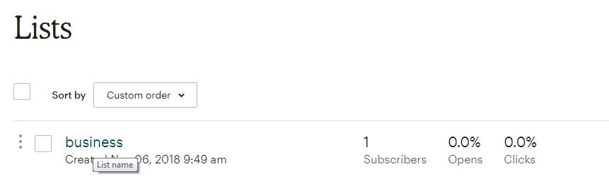
Click the title of the list you already have (even if it’s empty at the moment) to manage its content.
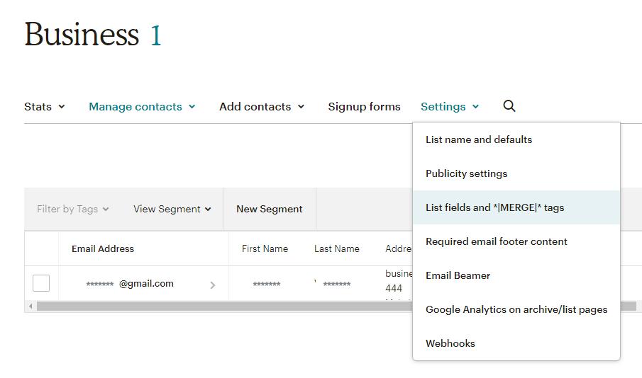
Click Settings dropdown and here open List fields and *|MERGE|* tags option. Now you can view the full list of the existing merge fields available for this list. Feel free to delete the ones you don’t need and create the ones you want to add.
Click Add a field button to add a new merge field to the list of the ones already available.
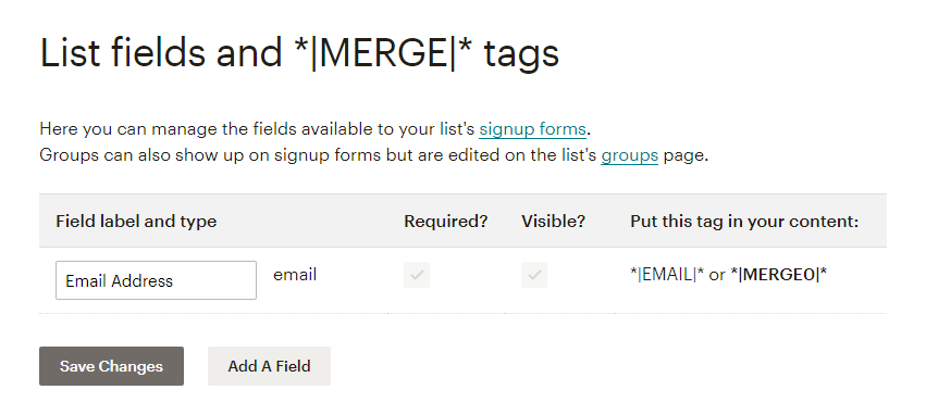
Select a field type to add from the list of field types available (e.g., text will do for adding a name field, etc.). Then click Save changes button.
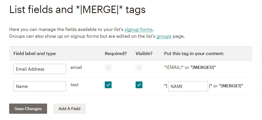
Replace the Untitled placeholder text with the actual Merge field title. Replace the default tag with the custom one. Then click Save changes.
Once again open WordPress Dashboard and here access JetPopup > Settings. Click Sync to sync the existing MailChimp lists.
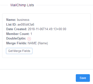
Proceed to MailChimp lists and here click Get Merge Fields button to pull all the merge fields that are newly added to the list. After that click Save button.
MailChimp Widget
From this block you can learn about using MailChimp JetPopup widget for Elementor.
The MailChimp widget can be found under the JetPopup widgets block along with the Popup Action Button widget. Drag and drop it to the popup template’s layout to add it to the template.
Content
Settings
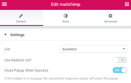
- List - here you need to specify the name of the MailChimp list pulled from your account, which has the needed fields.
- Use Redirect URL - enable this option to use the redirect.
- Close Popup when Success - enable this option to hide the popup automatically when the subscription was successful.
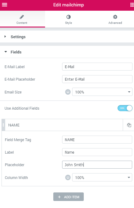
- E-mail label - here you can add the field label title to show above the field (this label should let the visitor know which information he has to input in the field).
- E-mail placeholder - here you can change the placeholder text to show the example of the information that should be placed in the field.
- E-mail size - here you can set the size of the field in percents (the 100% means that the full row will be occupied by the field, set 50% for several of fields to place both of them into one row, etc).
- Field merge tag - copy the merge field tag from the Merge Field you want to add (e.g., in case you’ve got *|MERGE|* tag, you need to input MERGE in this field).
- Label - here you can add the field label title to show above the field.
- Placeholder - here you can change the placeholder text to show the example of the information that should be placed in the field.
- Column width - here you can set the size of the field in percents (100% is the full row, 50% is half of the row, etc.).
- Submit text - here you can add the text to display for the Submit button.
- Button size - herer you can set the size of the button (100% is the full row, 50% is half of the row, etc.).
- Alignment - set the preferable alignment to use for the Submit button (left, center, right or justified).
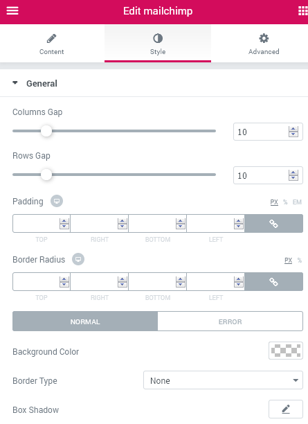
- Columns gap - here you can set the gap space to apply between the columns of the fields.
- Rows gap - here you can set the needed distance to apply between the rows.
- Padding - here you can apply the custom padding values and make them fully responsive.
- Border radius - here you can apply the border radius to make the angles more round.
- Background color - here you can select the color to use for the element.
- Border type - here you can define the needed border type for the element. It can be dotted, dashed, double or solid.
- Box shadow - enable this option if you want to access the shadow advanced settings for the element, and need to apply shadow for it.
- Typography - turn the option on to view the typography settings. They are similar to the typography settings of JetPopup Action Button widget.
- Label gap - here you can add a gap distance to apply between the label and the field.
- Padding - input your custom padding values to apply them to the element.
- Border radius - here you can define the values for the radius of the selected element to make its angles more smooth.
- Typography - turn the option on to view the typography settings. They are similar to the typography settings of JetPopup Action Button widget.
- Background color - here you can select the color to use for the element.
- Text color - here you can select the color of the input text.
- Border type - here you can define the needed border type for the element. It can be dotted, dashed, double or solid.
- Box shadow - enable this option if you want to access the shadow advanced settings for the element, and need to apply shadow for it.
- Add Icon - enable this option in order to add an icon to use for the Submit button.
- Icon - here you can select the icon to use with the icon picker.
- Icon size - here you can define the size to apply for the icon.
- Icon color - here you can set the specific color to apply for the icon.
- Icon margin - input your custom margin values to apply margins to the icon.
- Typography - turn the option on to view the typography settings. They are similar to the typography settings of JetPopup Action Button widget.
- Padding - input your custom padding values to apply them to the element.
- Margin - input your custom margin values to apply margins to the element.
- Border radius - here you can define the values for the radius of the selected border to make its angles more smooth.
- Background type - in this block you can choose, whether you want to use classic or gradient type for the element’s background. The customization options vary for each type. The settings are similar to the common background type settings for other JetPopup widgets.
- Background color - here you can select the color to use for the element.
- Text color - here you can select the color of the input text.
- Border type - here you can define the needed border type for the element. It can be dotted, dashed, double or solid.
- Box shadow - enable this option if you want to access the shadow advanced settings for the element, and need to apply shadow for it.
- Alignment - set the preferable alignment to use for the Submit button (left, center, right or justified).
- Typography - turn the option on to view the typography settings. They are similar to the typography settings of JetPopup Action Button widget.
- Padding - input your custom padding values to apply them to the element.
- Margin - input your custom margin values to apply margins to the element.
- Border radius - here you can define the values for the radius of the selected border to make its angles more smooth.
- Box shadow - enable this option if you want to access the shadow advanced settings for the element, and need to apply shadow for it.
- Background color - here you can select the color to use for the element. here you can select the color of the message text.
- Border type - here you can define the needed border type for the element. It can be dotted, dashed, double or solid.
Fields
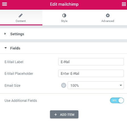
By default, there is only one field available (it’s the e-mail field). However, you can add more of them to create multi-fields in the subscribe popup. Enable Use Additional Fields option to add more fields to the subscription form. Then hit + Add item button to add a new field.
Submit Button
Style
General
Switch between Normal and Error moder to customize the appearance of both.
Fields
Label
Input
Switch between Normal, Focus and Hover modes to customize the appearance of each of them.
Submit button
Switch between Normal and Hover modes to customize the appearance of both.
Message
Switch between Success and Error modes to customize both.