JetPopup
Quick Start
This block explains the entire process of creating the new popup using the presets, popup templates available in the library, or from scratch.
Using Presets
From this block, you’ll learn how to apply presets to popups to use the specific popup layout when creating a new popup.
- JetPopup plugin provides the number of default presets that can help in creating popups with specific layouts. In order to select a preset, please, navigate to JetPopup > All Popups in WordPress Dashboard and here click Popup Layout button located at the top of the page.
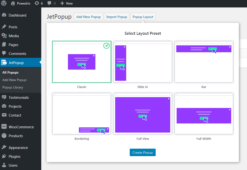
- You'll see Select Layout Preset block with the number of different preset variations. Choose one of the presets to use when creating a new popup.
- Click Create Popup button at the bottom of Presets block to proceed to creating a new popup template.
- After that, you'll see the selected preset opened in Elementor editing window. Here you can customize its appearance, fill it with other widgets available in Elementor, change its appearance and style, make changes in JetPopup Settings, etc.
Adding New Popups
From this block, you’ll learn how to create a new popup from scratch using JetPopup plugin and Elementor widgets.
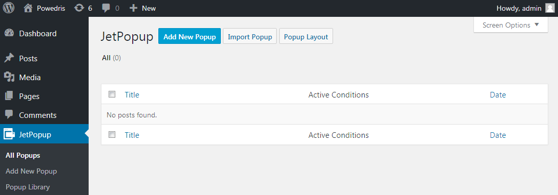
- Open WordPress Dashboard and locate JetPopup tab on the left. Click Add New Popup in order to create a new popup. You can also create a new popup from All Popups block, where you can view the list of existing popup templates. Here click Add New Popup button.
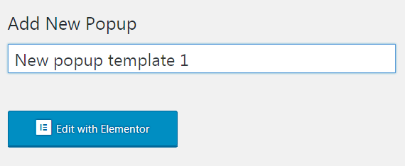
- On the Add New Popup page enter the title to use for the popup template. Then click Edit with Elementor button.
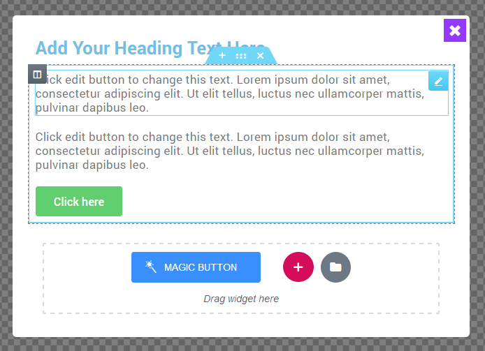
- After you're redirected to Elementor live page builder for customizing the new popup you'll see the default popup block where you can add a new section, or use one of the previously created templates. To add a new section click Add New Section button. Click Edit Section option in order to set the content width, section background style, paddings and margins, etc.
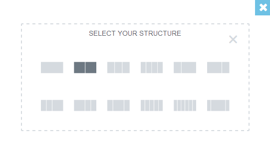
- Select the preferable columns structure for the section. You can also drag the column borders in order to set the custom columns width. Feel free to edit the columns width, set the content position, etc, by editing the column.
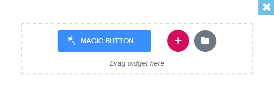
- Add any widgets to the layout you've created to make the popup template fit your needs.
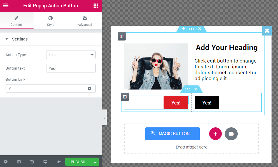
- In order to add Yes/No functionality you need to use Popup Action Button widget.
- After you've created the needed content, you can proceed to managing Popup Settings which are located in the bottom left corner of the editing page.
- After the page is built click Publish button to preserve the changes.
Popup Action Button
From this block, you can learn more about adding a Yes/No functionality to the popups using Popup Action Button.
Popup Action Button Overview
This widget is made for creating buttons that add Yes/No action to popup templates. It is easily customizable and provides one with all the needed means for adding different types of actions.
Content
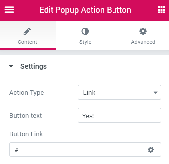
Settings
- Action Type – here you can select the type of popup: Link, Leave Page, Close Popup. It depends on what action you want to implement with this button (usually such buttons are added below the text blocks with questions, e.g., "Are you sure you want to leave this page?").
- Button text – add the appropriate label to use for the button title.
- Button link – here you can add the link.
- Open in new window – the link will be opened in a new window.
- Add nofollow – the link will not be followed to another resource.
Style
General
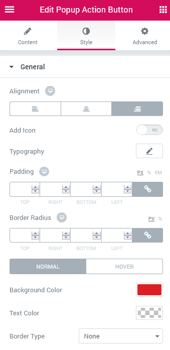
- Alignment – here you can set the Action Button alignment. It can be positioned to the left, in the center or to the right.
- Add Icon – this option allows to add an icon to the button.
- Icon – here you can choose one of the icons, which will be displayed on the popup.
- Icon Position – here you can place the icon before or after the text.
- Icon Margin – set the responsive space around the icon.
- Typography – here you can adjust popup’s typography settings.
- Family – select the needed popup’s typography style.
- Size – set the popup’s size.
- Weight – choose the popup’s weight. There are number designation and normal, bold types.
- Transform – here you can choose the text’s appearance. It can be uppercase, lowercase, capitalize and normal.
- Style – here you can choose the text’s style. There are normal, italic and oblique.
- Decoration – here it is available to decorate the poup’s text. The text can be underlined, overlined or with line through.
- Line-Height – set the popup’s height.
- Letter Spacing – set the space between the letters in the popup’s text.
- Padding – here you can set the popup’s padding.
- Border Radius – here you can set the radius of the popup’s borders.
- Normal – here you can adjust the normal popup’s settings.
- Background Color – choose the color of the normal popup’s background.
- Text Color – choose the color of the normal popup’s text.
- Border Type – select the type of the popup’s borders. There are solid, double, dotted, dashed and groove type.
- Width – set the width of the popup’s borders.
- Color – select the color of the popup’s borders.
- Box Shadow – Use the shadow settings (such as shadow color, horizontal, vertical, blur, spread, position) in order to make the normal popup stand out when it is shown above the content.
- Hover – here you can adjust the hover popup’s settings.
- Background Color – select the color of the hover popup’s background.
- Text Color – select the color of the hover popup’s text.
- Box Shadow – Use the shadow settings (such as shadow color, horizontal, vertical, blur, spread, position) in order to make the hover popup stand out when it is shown above the content.
Advanced
Element Style
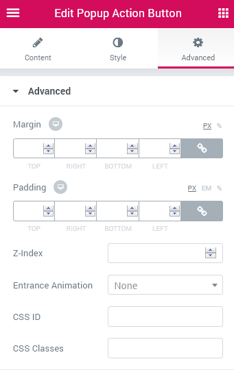
- Margin — in this block you can input the values (in pixels) to define the margins for the module you're customizing.
- Padding— here you can set the custom padding for the module. Fill in the values for the top, bottom, right and left padding in pixels to apply your custom padding.
- Z-index— input the value of the z-index to use it for the module.
- Entrance Animation- choose from the dropdown menu one of the styles for the module to appear on the page.
- Animation Duration — here you can define the time during which the module will appear on the page. It can be normal, slow or fast. Choose the one you need from the dropdown menu.
- Animation Delay (ms) — input the value (in ms) for the animation delay.
- CSS Classes — here you can define the CSS class for the module.
Background
Here you can switch from customizing Normal to Hover background style settings. Just click on the button Hover to proceed to customizing hover elements.
- Background Type — in this block you can choose, whether you want to use classic or gradient type for the module background. The customization options vary for each type.
Classic Background Type
- Color — here you can set a background color for the background using color picker tool.
- Image — here you can choose the image you want to use as a background. Select the image from the media library or upload it to define it as a background in this block. When the image is uploaded, you’ll be able to define its position, alignment, turn on repeat and set the necessary size.
Gradient Background Type
- Color — here you can set a background color for the module using color picker tool.
- Location — here you can define the proportion for the first color in the gradient background.
- Second Color — here you can set the second color to use in the gradient background.
- Location — here you can define the proportion for the second color in the gradient background.
- Type — define, if you want to use a linear or a radial type of the gradient.
- Angle — in this block you can set the angle for the gradient (in degrees).
Border
Here you can switch from customizing Normal to Hover border style settings. Just click on the button Hover to proceed to customizing hover elements.
- Border Type — here you can select the type of the border from the dropdown menu. Here is the list of available border types:
- none;
- solid;
- doubled;
- dotted;
- dashed.
- Border Radius — here you can select the radius for the applied border (in pixels).
- Box Shadow — enable this option if you want to access the shadow advanced settings for this module, and need to apply shadow for it.
Shadow Settings:
- color — here you can set the color for the shadow (use color picker tool to do it);
- blur — in this block you can define the blur settings for the shadow;
- spread — here you can set how large the shadow will be;
- horizontal — here you can move the shadow horizontally (from right to left);
- vertical — here you can move the shadow vertically (from top to bottom);
- position — here you need to choose, whether you want the shadow to outline the module, or to be inset.
Using Popup Library
From this block, you’ll learn more about utilizing pre-designed popups library.
- First, to use the pre-designed popups let's navigate to JetPopup > Popup Library in WordPress Dashboard. Here you'll see the pre-designed popups that can be used as presets when you create a new popup.
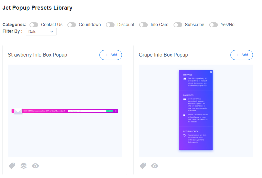
- To sort the popup presets you can use the categories (e.g., check Subscribe category to select the preset from the list of pre-designed presets available, that are related to the Subscribe topic.)
- Also, you can filter the popups by date, popularity, etc. Also, you can view the category of each popup preset and the times this popup was installed and used, under each of the presets.
- To apply one of the presets and start creating your new popup click +Create button.
- After you've clicked +Create button you'll see the popup window where you'll have to confirm your intention to use the preset for creating a new popup template. Click Yes to proceed to creating a new popup template based on the preset you've chosen.