JetMenu
JetMenu Settings
From this block you can learn more about JetMenu plugin settings, allowing you to change the general menu settings for the icons, badges, arrows, backgrounds, etc.
General Settings
First, navigate to JetMenu tab on the left of the Dashboard. Here you’ll see the window with several JetMenu settings tabs: General, Styles, Main Menu Item Styles, Sub Menu Item Styles, Mobile Menu and Advanced. Switch between them in order to access the specific settings you need to adjust.
Here you can manage Jetmenu plugin general settings.
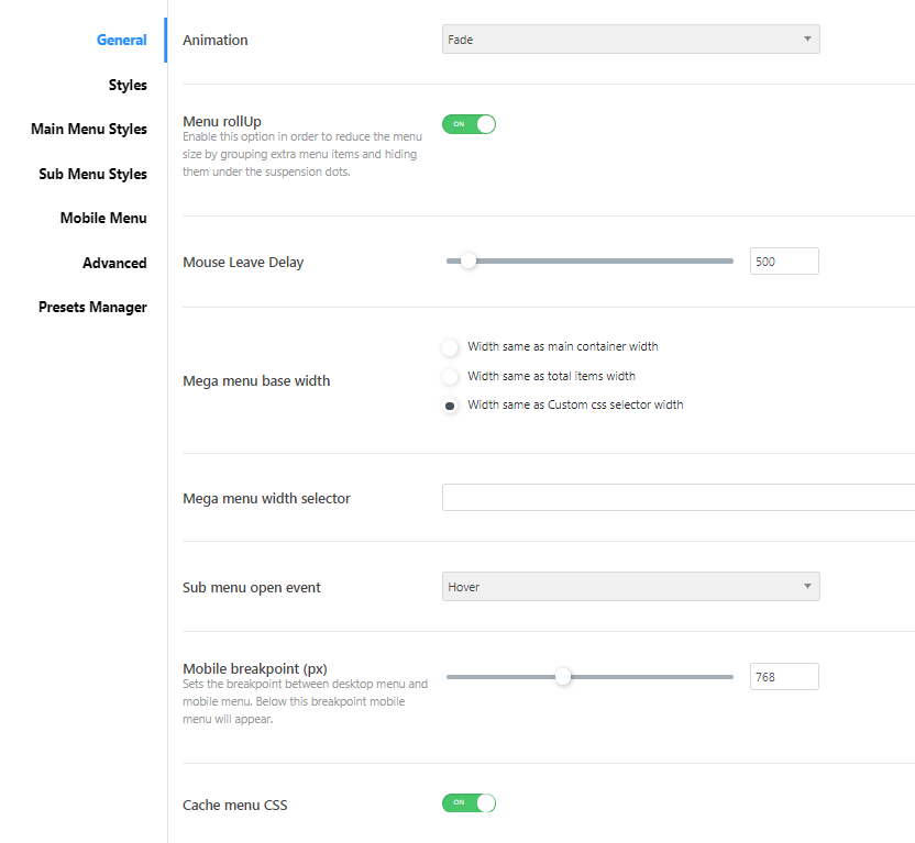
- Animation - choose the animation effect you want to use for the menu (fade, move up, move down).
- Menu rollUp - enable this option in order to reduce the menu size by grouping extra menu items and hiding them under the suspension dots. The items will show up on hover.
- Mouse Leave Delay - specify the delay time in ms.
- Mega menu base width - select the preferable base width to use it for the menu:
- Width same as main container width;
- Width same as total items width;
- Width same as Custom css selector width.
- Mega menu width selector - in the case you've selected Custom CSS selector width, here you need to specify the width selector.
- Disable default theme integration file - in the case you want to disable the theme integration files (e.g., if you're using PRO versions of the OceanWP, Astra, etc.).
- Sub menu open event - here you can set if the submenu opens on mouse click or on hover.
- Mobile breakpoint (px) - here you can change the breakpoint to specify the screen resolution when the menu switches from desktop to mobile mode and vice versa.
- Cache menu CSS - enable this option in order to cache menu CSS styles.
Styles
Proceed to Styles tab to access JetMenu styles settings.
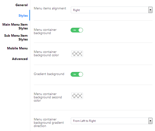
- Menu items alignment - here you can define the preferable alignment for the menu items (Left, Center, Right).
- Menu padding - here you can specify the values for the Mega menu padding in px.
- Menu container background - enable this option if you want to enable background color or image for the menu container.
- Menu container background color - click the color and set the one you need using color picker tool. You can also define the transparency for the container background color.
- Gradient background - enable this option if you want to create a gradient from two colors and use it as a container background.
- Menu container background second color - here you can pick the second color to use for the background gradient.
- Menu container background gradient direction - here you need to choose the direction for the gradient.
- Menu container background image - click Choose Image button to select the image from the media library or upload it from the hard drive. It will become the background for the container.
- Menu container background position - select the preferable container background position for the menu style (default, top left, top center, top right, etc.).
- Menu container background attachment - here you can specify the background attachment type (fixed or scroll).
- Menu container background repeat - set if you want to use the background repeat on the X, Y axes, or set Repeat to tile the background with the image.
- Menu container background size - select, if you want to use Auto size mode, Cover or Contain mode for the background image.
- Menu container border - enable this option to use the menu container border.
- Menu container border style - select, if you want to use a solid, a dotted, a double or the dashed border.
- Menu container border width - here you can define the width of the border in px.
- Menu container border color - set the preferable color for the border using color picker tool.
- Menu container box shadow - enable this option in order to use the shadow for the menu container.
- Menu container - position of the horizontal shadow - here you can use the controls to set the position of the horizontal shadow.
- Menu container - position of the vertical shadow - here you can use the controls to set the position of the vertical shadow.
- Menu container - shadow blur distance - use the controls to define the extent of shadow blur.
- Menu container - shadow size - here you can define the size of the dropped shadow.
- Menu container shadow color - define the color of the shadow using color picker tool.
- Menu container shadow inset - here you can enable the shadow inset for the menu container.
- Menu container border radius - in this block you can specify the value for the border radius.
- Inherit border radius for the first menu item from main container - enable this option in order to use the same border radius for the first menu item, as was used for the main container.
- Inherit border radius for the last menu item from main container - enable this option in order to use the same border radius for the last menu item, as was used for the main container.
- Menu container min width (px) - here you can specify the minimum width of the menu container in pixels using the control.
Main Menu Item Styles
Navigate to Main Menu Item Styles tab to access JetMenu styles settings for the Main Menu.
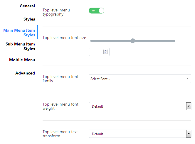
- Top level menu typography - enable this option in order to access the typography settings, such as font size, font family, etc.
- Top level menu font size - use controls to adjust the menu font size to your needs.
- Top level menu font family - select the font to use for the top level menu.
- Top level menu font weight - here you can specify the weight to apply to the font (from 1000 to 9000).
- Top level menu text transform - here you can make all of the menu items uppercase, lowercase, capitalize or normal.
- Top level menu font style - here you can select the style of the menu items font (normal, italic or oblique).
- Top level menu line height - use the controls to specify the height of the menu text lines.
- Top level menu letter spacing - use the controls to set the preferable letter spacing for the menu text.
- Top level menu subset - here you can define, which subset you want to use for the menu (latin, greek or cyrillic).
- Show item Description - enable this option in order to display the item decription in the cvase it is added for the menu item.
- Top level menu description typography - enable this option to change the Menu Description typography settings. The typography settings are similar to those of the the Top level menu typography block.
There are three different modes allowing you to customize Main Menu in its normal state, when on hover and when active: Default, Hover and Active. Switch between them to apply the separate style settings to Main Menu when on hover or active.
- Item text color - here you can specify the color to use it for the menu item text.
- Item description color - here you can specify the color to use it for the menu item description text.
- Item icon color - choose the item icon color using color picker tool.
- Item drop-down arrow color - here you can select the color for the arrow that opens drop-down menu.
- Item background - enable this option in order to access the item background settings. These are quite similar to the Mega Menu Container Background settings.
- Item border - enable this option to use the border for the menu item.
- Item border style - here you can select the style of the applied border (solid, double, dotted, dashed).
- Item border width - here you need to specify the border width in px.
- First item border - enable this option to add a border to the first menu item. You can as well change its border's width and color, as in the general border settings.
- Last item border - enable this option to add a border to the last menu item. You can as well change its border's width and color, as in the general border settings.
- Item border color - use color picker tool to set the preferable color for the applied border.
- Item box shadow - enable this option to use the shadow for the menu items. When enabled, the option will give you access to the shadow options, which are similar to Main Menu Container Shadow options.
- Item border radius - here you can apply the custom border radius for the menu items.
- Item padding - set the padding for the menu items in px.
- Item margin - here you can define the values to use for the margins in px.
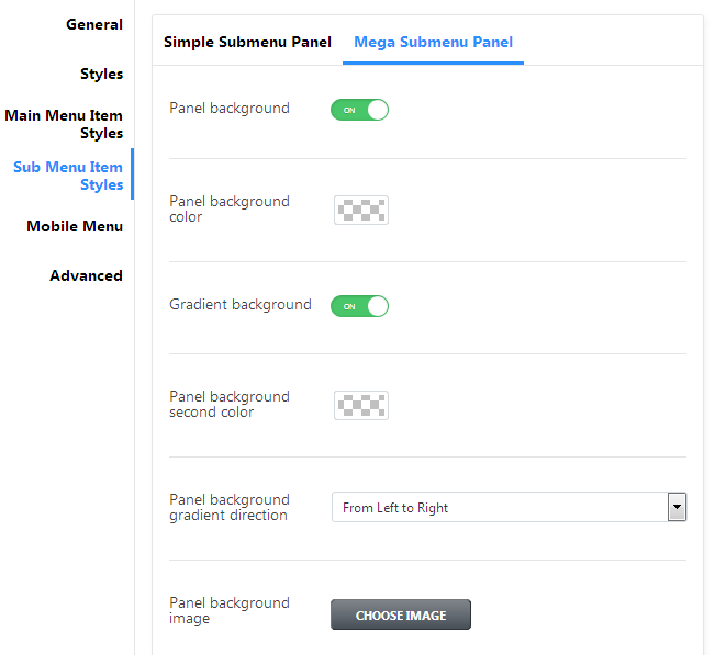
Sub Menu Item Styles
Switch from customizing Simple Sub Panel to Mega Sub Panel by clicking on the corresponding tabs.
Simple Submenu Panel
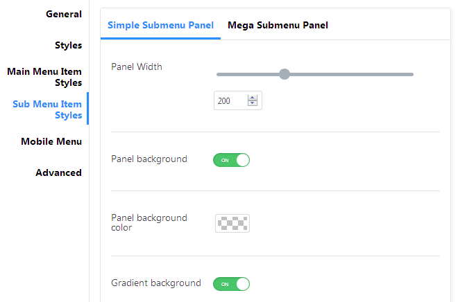
- Panel width - use the controls to define the preferable simple sub panel width.
- Panel background - enable this option to access the extended background options for this block. They are quite similar to the Mega Menu Container Background settings.
- Panel border - enable this option in order to use the border for the Menu Sub Panel.
- Panel border style - here you can select the style for the sub panel border (solid, double, dotted, dashed).
- Panel border width - here you can specify the values for the border width of the Menu Sub Panel.
- Panel border color - here you can define the color of the sub panel using color picker tool.
- Panel box shadow - enable this option in order to create the shadow around this element and access the shadow settings.
- Panel - position of the horizontal shadow - here you can use the controls to set the position of the horizontal shadow.
- Panel - position of the vertical shadow - here you can use the controls to set the position of the vertical shadow.
- Panel - shadow blur distance - use the controls to define the extent of shadow blur.
- Panel - shadow size - here you can define the size of the dropped shadow.
- Panel shadow color - define the color of the shadow using color picker tool.
- Panel shadow inset - here you can enable the shadow inset for the menu container.
- Panel border radius - in this block you can specify the value for the border radius.
- Panel padding - set the padding for the menu items in px.
- Panel margin - here you can define the values to use for the margins in px.
- Panel shadow color - here you can define the color of the panel shadow.
- Panel shadow inset - here you can enable the shadow inset by turning the option on.
- Submenu typography - enable this option to change the Submenu typography settings. The typography settings are similar to those of the the Top Level Menu Typography block.
- Show Submenu Item Description - here you can enable or disable item descriptions to hide them from being shown for submenu items.
- Submenu descriptions typography - enable this option to change the Submenu Descriptions typography settings. The typography settings are similar to those of the the Top Level Menu Typography block.
- Item text color - here you can set the color to use it for the sub items text.
- Item descriptions color - here you can set the color to use it for the sub item description text.
- Item icon color - specify the color to use for the item icons.
- Item drop-down arrow color - specify the color to use for the item drop-down arrow symbols.
- Submenu background - enable this option in order to access the background options for the sub menu. These are quite similar to the Mega Menu Container Background settings.
- Submenu border - enable this option in order to use the border for the submenu.
- Submenu border style - here you can select the style for the submenu border (solid, double, dotted, dashed).
- Submenu border width - here you can specify the values for the border width of the sub menu.
- Submenu border color - here you can define the color of the submenu using color picker tool.
- Submenu box shadow - enable this option in order to create the shadow around this element and access the shadow settings.
- Submenu - position of the horizontal shadow - here you can use the controls to set the position of the horizontal shadow.
- Submenu - position of the vertical shadow - here you can use the controls to set the position of the vertical shadow.
- Submenu - shadow blur distance - use the controls to define the extent of shadow blur.
- Submenu - shadow size - here you can define the size of the dropped shadow.
- Submenu shadow color - define the color of the shadow using color picker tool.
- Submenu shadow inset - here you can enable the shadow inset for the submenu.
- Item border radius - in this block you can specify the value for the border radius.
- Item padding - set the padding for the submenu items in px.
- Item margin - here you can define the values to use for the margins in px.
- Panel background - enable this option in order to access the menu sub panel background settings. These are quite similar to the Mega Menu Container Background settings.
- Panel border - enable this option in order to use the border for the menu sub panel.
- Panel border style - here you can select the style for the menu sub panel border (solid, double, dotted, dashed).
- Panel border width - here you can specify the values for the border width of the menu sub panel.
- Panel border color - here you can define the color of the menu sub panel using color picker tool.
- Panel box shadow - enable this option in order to create the shadow around this element and access the shadow settings.
- Panel - position of the horizontal shadow - here you can use the controls to set the position of the horizontal shadow.
- Panel - position of the vertical shadow - here you can use the controls to set the position of the vertical shadow.
- Panel - shadow blur distance - use the controls to define the extent of shadow blur.
- Panel - shadow size - here you can define the size of the dropped shadow.
- Panel shadow color - define the color of the shadow using color picker tool.
- Panel shadow inset - here you can enable the shadow inset for the menu sub panel.
- Panel border radius - in this block you can specify the value for the border radius.
- Panel padding - set the padding for the submenu items in px.
- Panel margin - here you can define the values to use for the margins in px.
- Submenu typography - enable this option to change the Submenu typography settings. The typography settings are similar to those of the the Top Level Menu Typography block.
- Submenu descriptions typography - enable this option to change the Submenu Descriptions typography settings. The typography settings are similar to those of the the Top Level Menu Typography block.
When customizing Simple Sub Menu styles you can switch from Default to Hover or Active mode to create several styles for the sub menu when on hover or active.
Mega Sub Panel
Mobile Menu Settings
From this block you can learn more about JetMenu Mobile Menu settings.
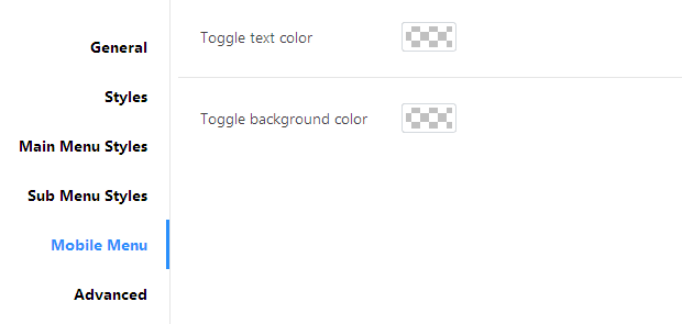
- Toggle text color - here you can set the preferable text color to use it for the toggle.
- Toggle background color - here you can specify the color to use for the toggle background.
- Container background color - here you can specify the color to use for the toggle container box.
- Cover background color - here you can specify the color to use for the cover overlay.
Advanced Settings
In this block you can switch from customizing Icon to Badge or Drop-down Arrow. Just click on the corresponding tab to open the element settings.
Icon
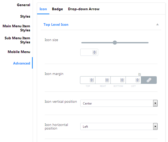
From here you can customize Top Level Icon and Sub Level Icon. To proceed to customizing Sub Level Icon click on the corresponding block to open the settings.
- Icon size - use the controls to set the preferable item icon size.
- Icon margin - here you can specify the values of the icon margins in px.
- Icon position - select the needed vertical position of the icon (center, top, bottom).
- Icon horizontal position - here you can specify the icon horizontal position (center, left, right).
- Icon order - use the controls to set the icon order.
Badge
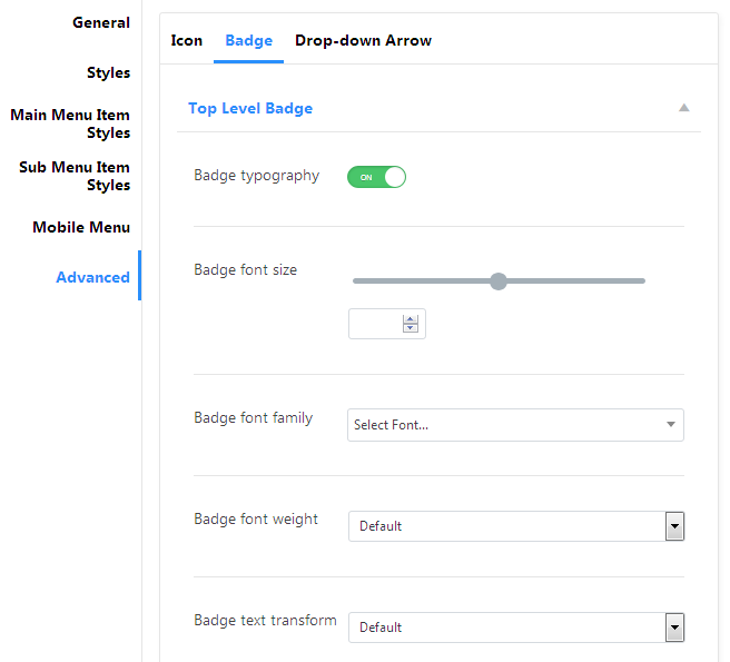
From here you can customize Top Level Badge and Sub Level Badge. To proceed to customizing Sub Level Badge click on the corresponding block to open the settings.
- Badge typography - enable this option to change the menu badge typography settings. The typography settings are similar to those of the the Top Level Menu Typography block.
- Badge text color - here you can specify the badge text color using color picker tool.
- Badge background - enable this option in order to access the badge background settings. These are quite similar to the Mega Menu Container Background settings.
- Badge border - enable this option to use the menu badge border.
- Badge border style - select, if you want to use a solid, a dotted, a double or the dashed border.
- Badge border width - here you can define the width of the border in px.
- Badge border color - set the preferable color for the border using color picker tool.
- Badge box shadow - enable this option in order to use the shadow for the menu badge.
- Badge - position of the horizontal shadow - here you can use the controls to set the position of the horizontal shadow.
- Badge - position of the vertical shadow - here you can use the controls to set the position of the vertical shadow.
- Badge - shadow blur distance - use the controls to define the extent of shadow blur.
- Badge - shadow size - here you can define the size of the dropped shadow.
- Badge shadow color - define the color of the shadow using color picker tool.
- Badge shadow inset - here you can enable the shadow inset for the menu badge.
- Badge border radius - in this block you can specify the value for the border radius.
- Badge padding - set the padding for the menu badge in px.
- Badge margin - here you can define the values to use for the margins in px.
- Badge vertical position (may be overridden with order) - here you need to specify the badge vertical position (top, center or bottom).
- Badge horizontal position - here you can define the badge horizontal position (left, center, right).
- Badge order - use controls to define the badge order.
- Hide badge on mobile - enable this option in order to hide the menu item badge on mobile devices.
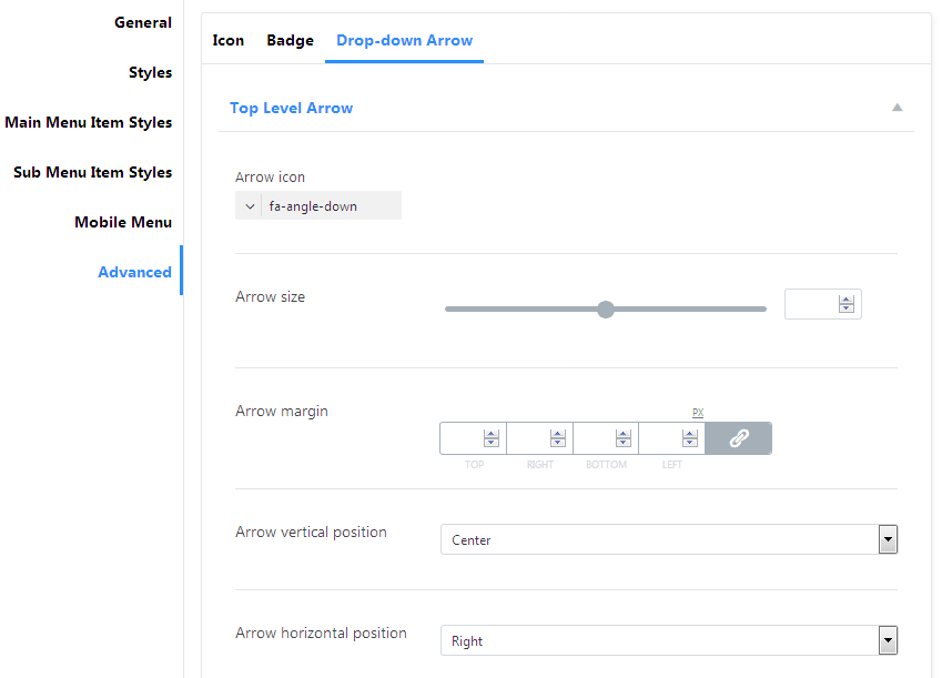
Drop-down Arrow
From here you can customize Top Level Drop-down Arrow and Sub Level Drop-down Arrow. To proceed to customizing Sub Level Drop-down Arrow click on the corresponding block to open the settings.
- Arrow icon - click on the drop-down menu to select the icon in order to use it as a drop-down arrow.
- Arrow size - use controls to set the suitable arrow icon size.
- Arrow margin - here you can set the margins value in px.
- Arrow vertical position - set the preferable arrow vertical position (top, center or bottom).
- Arrow horizontal position - here you need to set the arrow’s horizontal position (left, center, right).
- Arrow order - specify the arrow order using controls.