JetMenu
JetMenu Widgets
From this block you’ll learn how to use JetMenu widgets to create menus with JetMenu plugin using Elementor only.
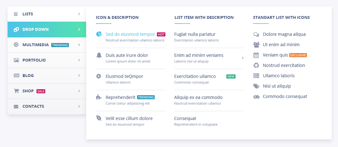
Vertical Mega Menu Widget
From this block you’ll learn how to add the menu to the website’s page using Vertical Mega Menu widget for Elementor. There are also multiple menu customization options for this content widget.
Adding and Customizing Vertical Mega Menu
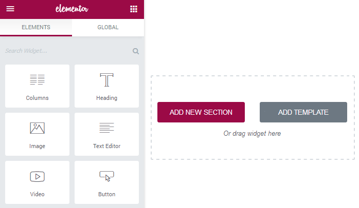
- First, you need to open the page for editing with Elemenor. Add a new section and define its structure in order to place a menu there.
- Locate Vertical Mega Menu content widget.
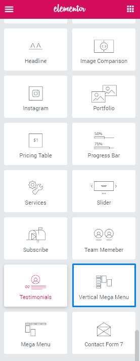
- Drag and drop it to the area where you want to add it. Right-click on it and select Edit Widget option.
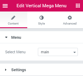
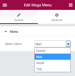
Content
Here you need to specify the menu you want to display with Vertical Mega Menu widget. Select the menu you want to add from the drop-down list of your existing menus.
Settings
- Sub menu position - here you can specify if you want the sub menu items to be displayed on the right or on the left from the vertical menu main items.
- Animation - here you can select the type of animation to use for the sub items or mega menu content appearance.
Style
Main Menu / Mega Menu / Sub menu
Main Menu, Mega Menu and Sub Menu blocks contain the same customization features, which are described below.
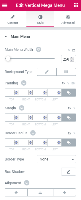
- Main Menu Width / Mega Menu Width / Sub Menu Width - here you can specify the width of the menu in px (use controls or set the preferable value in the corresponding block).
Background Type - in this block you can choose, whether you want to use classic or gradient type for the menu. The customization options vary for each type.
Classic Background Type
- Color — here you can set background color for the menu using color picker tool.
- Image — here you can choose the image you want to use as a background. Select the image from the media library or upload it to define it as a background in this block. When the image is uploaded, you’ll be able to define its position, alignment, turn on repeat and set the necessary size.
Gradient Background Type
- Color — here you can set background color for the menu using color picker tool.
- Location — here you can define the proportion for the first color in the gradient background.
- Second Color — here you can set the second color to use in the gradient background.
- Location — here you can define the proportion for the second color in the gradient background.
- Type — define, if you want to use linear or radial type of the gradient.
- Angle — in this block you can set the angle for the gradient (in degrees).
- Padding - here you can set the custom padding for the menu. Fill in the values for the top, bottom, right and left padding in pixels to apply your custom padding.
- Margin - here you can define the margins for the menu.
- Border Radius - here you can set the border radius for the menu.
- Border Type - here you can define the type of the border you need to use for the menu.
- Box Shadow - enable this option if you want to access the shadow advanced settings for this module, and need to apply shadow for it.
Main Menu Items / Sub Menu Items
Main Menu Items and Sub Menu Items blocks contain the same customization features, which are described below.
You can switch from customizing Normal to Hover style settings. Just click on the button Hover to proceed to customizing hover elements.
- Background Color - here you can set the color of the menu item background using color picker tool.
- Text Color - here you need to specify the color of the menu item text.
- Typography - turn the option on to view the typography settings.
- Size — define the font size of the text.
- Family — here you can set the font family for the item text.
- Weight — in this block you can select the suitable font weight.
- Transform — here you can choose from the dropdown menu, if you want the text to be shown in uppercase, lowercase, capitalize or normal way.
- Style — in this block you can choose from the dropdown menu the style for the font. It can be normal, italic (the characters look similar to handwriting) and oblique (the characters are slightly inclined to the right).
- Line Height — in this field you can set the height of the text line.
- Letter Spacing — here you can set the space between letters.
- Padding - here you can set the custom padding for the menu items. Fill in the values for the top, bottom, right and left padding in pixels to apply your custom padding.
- Margin - here you can define the margins for the menu items.
- Border Radius - here you can set the border radius for the menu items.
- Border Type - here you can define the type of the border you need to use for the menu items.
- Box Shadow - enable this option if you want to access the shadow advanced settings for this module, and need to apply shadow for it.
- First item custom styles - enable this option to access the first item border radius and border type settings.
- Last item custom styles - enable this option to access the last item border radius and border type settings.
Icon
- Icon Color - here you can set the menu icon color using color picker tool.
- Icon Font Size - use the controls to set the suitable icon size.
- Icon Box Size - here you can use the controls to set the icon box size without changing the size of the icon.
- Border Type - here you can define the type of the border you need to use for the menu icon.
- Border Radius - here you can set the border radius for the menu icon.
- Margin - here you can define the margins for the menu icon.
- Box Shadow - enable this option if you want to access the shadow advanced settings for this icon, and need to apply shadow for it.
- Alignment - select the suitable alignment for the icon (top, center, bottom).
Badge
- Color - here you can set the menu badge color using color picker tool.
- Background Type - in this block you can choose, whether you want to use classic or gradient type for the menu badge. The customization options vary for each type. The settings are quite similar to the Main menu background type ones.
- Typography - turn the option on to view the typography settings. The settings are quite similar to the Main Menu items typography settings.
- Border Type - here you can define the type of the border you need to use for the menu badge.
- Border Radius - here you can set the border radius for the menu badge.
- Padding - here you can set the custom padding for the menu badge. Fill in the values for the top, bottom, right and left padding in pixels to apply your custom padding.
- Margin - here you can define the margins for the menu badge.
- Alignment - select the suitable alignment for the badge (top, center, bottom).
Drop-down Icon
- Icon - click on this option to see the list of all the available icons and pick the one you want to use.
- Offset - here you can change the drop-down icon position.
- Icon Color - here you can set the menu drop-down icon color using color picker tool.
- Icon Background Color - here you need to specify the background color of the drop-down icon.
- Icon Font Size - change the size of the icon using controls or define it in px in the corresponding window.
- Icon Box Size - change the size of the icon box using controls or specify it in px.
- Border Type - here you can define the type of the border you need to use for the menu drop-down icon.
- Border Radius - here you can set the border radius for the menu drop-down icon.
- Box Shadow - enable this option if you want to access the shadow advanced settings for this drop-down icon, and need to apply shadow for it.
- Alignment - select the suitable alignment for the drop-down icon (top, center, bottom).
Mega Menu Widget
From this block you’ll learn how to create a horizontal mega menu using Elementor only.
Adding Mega Menu Widget
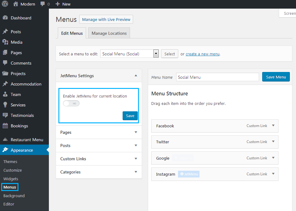
- First of all, please, navigate to Appearance > Menus tab on the left of the Dashboard and turn off Enable JetMenu for current location option. Then click Save button.
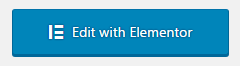
- After that navigate to Pages > Add new on the left of the Dashboard and click Edit with Elementor option under the page where you want to add a horizontal menu.
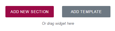
- Add a new section and select the preferable columns structure in order to drop there a horizontal menu.
- Select Mega Menu widget on the left and drop it to the content area.
- In the newly opened Content block choose a menu you want to embed to the page from Select Menu dropdown.
- Click Save button.
You can also add content to menu items. To do it navigate to Appearance > Menus tab on the left of the Dashboard, select the menu to which you want to add content with Elementor, and hover on the menu item. Click JetMenu and edit menu content the same way as described here.
Mega Menu Widget Style
Open Style block. Here you can access different style settings available for JetMenu Mega Menu widget stylization. The options are much needed for creating stylish appearance for menu built with Elementor right from Elementor editor page.
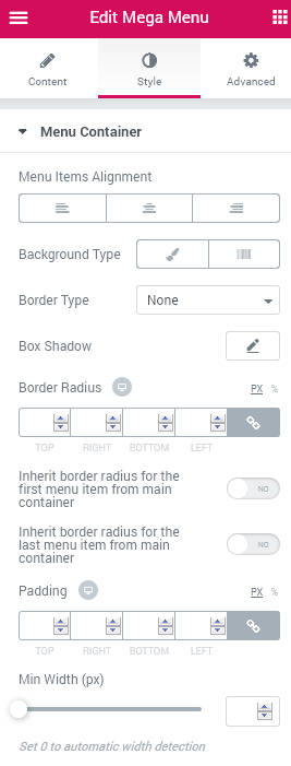
Menu Container
- Menu Items Alignment - here you can align the menu items to the start, center, end or stretch them.
- Background Type - select Classic or Gradient background in order to use it for menu container.
- Color — here you can set background color for the menu using color picker tool.
- Image — here you can choose the image you want to use as a background. Select the image from the media library or upload it to define it as a background in this block. When the image is uploaded, you’ll be able to define its position, alignment, turn on repeat and set the necessary size.
- Color — here you can set background color for the menu using color picker tool.
- Location — here you can define the proportion for the first color in the gradient background.
- Second Color — here you can set the second color to use in the gradient background.
- Location — here you can define the proportion for the second color in the gradient background.
- Type — define, if you want to use linear or radial type of the gradient.
- Angle — in this block you can set the angle for the gradient (in degrees).
Border Type - here you can define the type of the border you need to use for the menu.
Box Shadow - enable this option if you want to access the shadow advanced settings for this widget, and need to apply shadow for it.
Border Radius - here you can set the border radius for the menu.
Padding - here you can set the custom padding for the menu. Fill in the values for the top, bottom, right and left padding in pixels to apply your custom padding.
Width - here you can specify the width of the menu in px (use controls or set the preferable value in the corresponding block).
Classic Background Type
Gradient Background Type
Main Menu Items
Typography(Description Typography) - turn the option on to view the typography settings.
- Family — here you can set the font family for the item text.
- Size — define the font size of the text.
- Weight — in this block you can select the suitable font weight.
- Transform — here you can choose from the dropdown menu, if you want the text to be shown in uppercase, lowercase, capitalize or normal way.
- Style — in this block you can choose from the dropdown menu the style for the font. It can be normal, italic (the characters look similar to handwriting) and oblique (the characters are slightly inclined to the right).
- Line Height — in this field you can set the height of the text line.
- Letter Spacing — here you can set the space between letters.
Item max width(%) - here you can choose the spacing between items.
Text Color(Description color) - here you need to specify the color of the menu item text.
Icon Color - here you can set the menu icon color using color picker tool.
Drop-down arrow color - Here you can set the drop-down arrow color using picker tool.
Background Type - in this block you can choose, whether you want to use classic or gradient type for the menu. The customization options vary for each type.
Border Type - here you can define the type of the border you need to use for the menu.
First Item Border Type - here you can set the border type for the first item.
Last Item Border Type - here you can set the border type for the last item.
Box Shadow - enable this option if you want to access the shadow advanced settings for this module, and need to apply shadow for it.
Padding - here you can set the custom padding for the menu. Fill in the values for the top, bottom, right and left padding in pixels to apply your custom padding.
Margin - here you can define the margins for the menu.
Sub Menu
Simple Panel
Width(px) - here you can specify the width of the menu in px (use controls or set the preferable value in the corresponding block).
Background Type - in this block you can choose, whether you want to use classic or gradient type for the menu. The customization options vary for each type.
Border Type - here you can define the type of the border you need to use for the menu.
Border Radius - here you can set the border radius for the menu.
Padding - here you can set the custom padding for the menu. Fill in the values for the top, bottom, right and left padding in pixels to apply your custom padding.
Margin - here you can define the margins for the menu.
Sub Menu Items Style
Typography(Description Typography) - turn the option on to view the typography settings.
- Family — here you can set the font family for the item text.
- Size — define the font size of the text.
- Weight — in this block you can select the suitable font weight.
- Transform — here you can choose from the dropdown menu, if you want the text to be shown in uppercase, lowercase, capitalize or normal way.
- Style — in this block you can choose from the dropdown menu the style for the font. It can be normal, italic (the characters look similar to handwriting) and oblique (the characters are slightly inclined to the right).
- Line Height — in this field you can set the height of the text line.
- Letter Spacing — here you can set the space between letters.
Text Color(Description color) - here you need to specify the color of the menu item text.
Icon Color - here you can set the menu icon color using color picker tool.
Drop-down arrow color - Here you can set the drop-down arrow color using picker tool.
Background Type - in this block you can choose, whether you want to use classic or gradient type for the menu. The customization options vary for each type.
Border Type - here you can define the type of the border you need to use for the menu.
First Item Border Type - here you can set the border type for the first item.
Last Item Border Type - here you can set the border type for the last item.
Box Shadow - enable this option if you want to access the shadow advanced settings for this module, and need to apply shadow for it.
Padding - here you can set the custom padding for the menu. Fill in the values for the top, bottom, right and left padding in pixels to apply your custom padding.
Margin - here you can define the margins for the menu.
Mobile Menu
Toggle text color - here you can set color of toggle.
Toggle background color - here you can choose color for the toggle background.
Container background color - here you can set container background color.
Cover background color - here you can set cover background color.
Icon
Pick settings that you need between Top Level or Sub Level .
Icon Font Size - use the controls to set the suitable icon size.
Margin - here you can define the margins for the menu icon.
Horizontal position - you can horizontally align icon (left, center, right).
Vertical position - here you can set the suitable vertical position(top, center, bottom).
Order - choose the position of icon (left, right).
Badge
Pick settings that you need between Top Level or Sub Level.
Typography(Description Typography) - turn the option on to view the typography settings.
- Family — here you can set the font family for the item text.
- Size — define the font size of the text.
- Weight — in this block you can select the suitable font weight.
- Transform — here you can choose from the dropdown menu, if you want the text to be shown in uppercase, lowercase, capitalize or normal way.
- Style — in this block you can choose from the dropdown menu the style for the font. It can be normal, italic (the characters look similar to handwriting) and oblique (the characters are slightly inclined to the right).
- Line Height — in this field you can set the height of the text line.
- Letter Spacing — here you can set the space between letters.
Text Color(Description color) - here you need to specify the color of the menu item text.
Background Type - in this block you can choose, whether you want to use classic or gradient type for the menu. The customization options vary for each type.
Border Type - here you can define the type of the border you need to use for the menu.
Box Shadow - enable this option if you want to access the shadow advanced settings for this module, and need to apply shadow for it.
Padding - here you can set the custom padding for the menu. Fill in the values for the top, bottom, right and left padding in pixels to apply your custom padding.
Margin - here you can define the margins for the menu.
Horizontal position - you can horizontally align badge (left, center, right).
Vertical position - here you can set the suitable vertical position(top, center, bottom).
Order - choose the position of badge (left, right).
Hide on mobile - hide badge on mobile.
Pick settings that you need between Top Level or Sub Level.
Font size - change the font size.
Margin - here you can define the margins for the menu.
Horizontal position - you can horizontally align drop-down arrow (left, center, right).
Vertical position - here you can set the suitable vertical position(top, center, bottom).
Order - choose the position of drop-down arrow(left, right).