JetEngine
JetEngine Widgets
From this block you’ll get the detailed information on how to display dynamic content using the widgets from the Listing Elements block, that are needed for creating Posts and Taxonomies listings.
Dynamic Field
Dynamic Field widget is made for displaying the content from both meta fields and the post or term data, for posts and taxonomies listing templates. The widget pulls the data and displays it using the set style and content settings.
Content
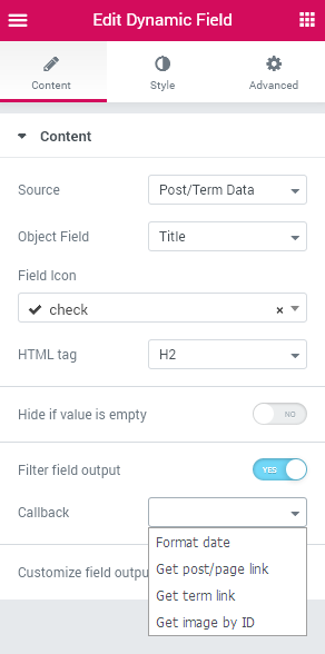
- Source - here you can set, if the content is to be pulled from post / term default data or the meta data. Use Meta Data to display content added in Meta fields and Post/Term data to display title, content, etc, added without the help of meta fields.
- Object Field - here you can select the field from which you need to pull information. In the case you’ve selected Meta Data source, you’ll see all the meta fields available for the post/taxonomy listed. You can also enter the ID of the meta field in Enter Meta Field Key block to display it.
- Field Icon - here you can apply an icon for the field.
- HTML Tag - select the needed HTML tag for the meta field (you can set the H1-H6 tags for the headings, DIV and SPAN tags for other content.
- Hide if value is empty - enable this option in the case you want to hide the field if it is not filled for the post/taxonomy. It will still be displayed in the case it is filled and contains any information.
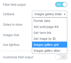
- Filter field output - use the filter to display the data that is pulled directly from the database. Sometimes the content can’t be displayed without any filters (e.g., to display date you’ll need Format Data callback, to display an image you’ll need to use Get Image by ID callback, etc).
Callback Types
- Format date - use this callback to show the date pulled from the database using Date ot Time meta fields.
- Get post/page link - here you can pull the link that's leading to the post or the page in case you've added the post/pagfe id in the Text meta field and then selected this callback.
- Get Term Link - here you can set the displaying for the term link in case you've added the term ID in the Text meta field.
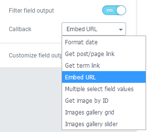
- Embed URL - with this callback you can embed the URL link (needed in case you want to embed a video from YouTube, etc., just add the link to the Text meta field and then display in using this callback.
- Multiple Select Field Values - use this callback to showcase several selected options when you're using Select meta field. When you use this callback, you'll be able to specify the delimiter to add for it in Delimiter field.
- Get Image by ID - here you can use this callback to display the image from the database instead of its number value when using Media meta field.
- Images Gallery Grid - use this callback to display gallery added using Gallery meta field.
- Images Gallery Slider - use this callback to display the images slider added using Gallery meta field. Note, that you should enable Grid and Slider gallery option in JetEngine > Modules Manager first.
- Customize field input - enable this option in order to add the text before and after the value that is pulled from the meta field (here %s stands for the value that is pulled, just add some content before and after it to add some text before and after the value.
Style
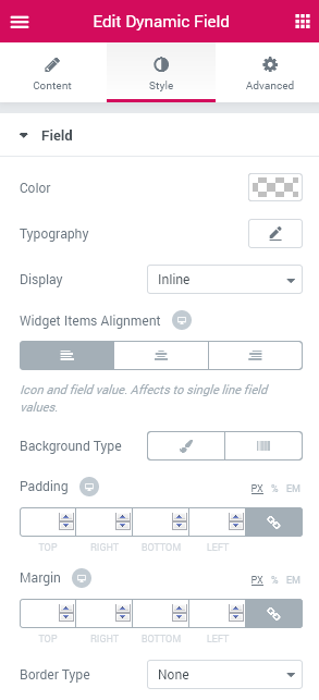
Field
- Color - here you can specify the color to apply for the data displayed with this field.
- Typography — turn the option on to view the typography settings that can be applied for the data shown in this field.
- Size — define the font size of the font characters.
- Family — here you can set the font family for the data.
- Weight — in this block you can select the suitable font weight.
- Transform — here you can choose from the dropdown menu, if you want the characters to be shown in uppercase, lowercase, capitalize or normal way.
- Style — in this block you can choose from the dropdown menu the style of the font. It can be normal, italic (the characters look similar to handwriting) and oblique (the characters are slightly inclined to the right).
- Line Height — in this field you can set the height of the text line.
- Letter Spacing — here you can set the space between letters.
- Widget Items Alignment - here you can select the alignment for the icon and field (affects the single line field values).
- Field Content Alignment - here you can specify the field content alignment to apply for the single line field values.
Icon
- Color - choose the color to use for the field icon using Color picker tool.
- Size - use the control to customize the size of the icon shown for this field.
- Gap - here you can change the gap distance between the icon and the content of the field.
Creating Gallery with Dynamic Field Widget
In case you've selected Gallery meta field content type and added several images to it, you'll be able to add a gallery to the listing using Dynamic Field widget.
- First, in order to do it drop the Dynamic Field widget to the template's structure. Then select Content tab and in Source specify Meta Data.
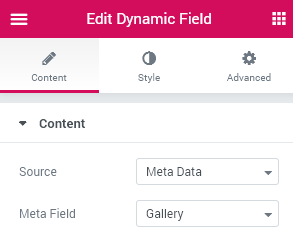
- Select Gallery ID in the Meta Field dropdown or enter it in the field below.
- Now you can view all the items that can be shown in the gallery, yet they are not rendered properly. In order to show them in the form of image you need to enable Filter field output option and specify the callback you want to use:
- Images Gallery Grid;
- Images Gallery Slider.
- The next step is to change the style of the selected grid or slider. The appearance settings are different for each of these callback types.
- Let's navigate to Style block. Here open Misc settings.
Misc
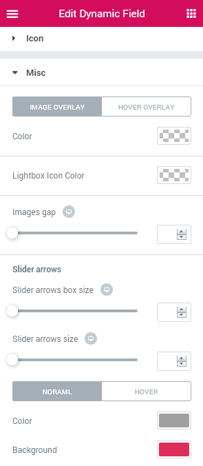
- Images Gap - here you can specify the gap distance to use between the images in the grid.
- Image Overlay/Hover Overlay - here you can switch between the normal and hover overlay styles for the images.
- Lightbox Icon Color - here you can set the specific color to use for the icon.
In case you're using Slider callback, you can customize the Slider Arrows in Misc block.
- Slider Arrows Box Size - here you can change the size of the boxes in which the navigation arrows are shown.
- Slider Arrows Size - here you need to set the size to apply for the arrows.
- Normal/Hover - here you can change the looks of the navigation arrow in normal state and on hover.
- Color - here you can change the color to use for the arrows.
- Background - here you can set the color to apply for the background of the arrows.
Dynamic Image
Dynamic Image widget provides opportunity to pull the thumbnail image or any other image added as the media in the meta field to showcase it on the pages built with Elementor. This is the dynamic widget that can be easily used for creating templates for custom post types and taxonomies.
Content
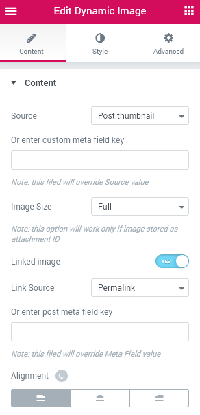
General
- Source - here you can set the source from which you need to pull the thumbnail image (e.g., Thumbnail, Post Thumbnail).
- Custom Meta Field Key - in order to display the image that is added to the meta field in the form of Media, input the ID of the meta field in this block.
- Image Size - here you can specify the size of the image to use for the set image (the list of sizes depends on the sizes available for the theme you’re using).
- Linked Image - enable this option to add a link to the image.
- Link Source - here you can select the link that will be applied for the image (e.g., permalink). In the case you can’t find the field to which you want to link the image, just input the ID of the meta field which you want to be linked to the image.
- Alignment - choose one of the alignments to apply for the image (center, left, right).
Style
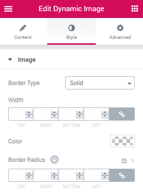
Image
- Border Type - here you can set the border for the image. Select one of the available border types to apply it.
- Width - type in the needed values to set the width of the border for different devices.
- Color - here you can specify the color to apply for the border.
- Border Radius - change the border radius values to make the border angles more round and smooth.
Dynamic Link
Dynamic Link widget helps in adding the links to the listings, that display the content from the predefined source.
Content
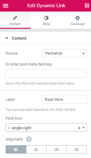
- Source - here you can define the source that will be used for this link (e.g., one of the meta fields).
- Post Meta Field Key - in the case you can’t find the meta field in the list above, input the meta field ID in this block.
- Label - here you can change the text label that will be displayed instead of the Read more default label.
- Field Icon - here you can set the icon to display it for this link.
- HTML Wrapper - here you can specify the needed HTML wrap markup to use for the link you've added (div, span,or heading type).
- Open in New Window - here you can specify if the link has to be opened in new window (add "target="_blank" property to it).
- Add "rel" attribute - here you can select one of the related attributes for the link (author, bookmark, external, license, nofollow, etc).
- Alignment - here you can specify the alignment to apply for this link (left, center, right, fullwidth).
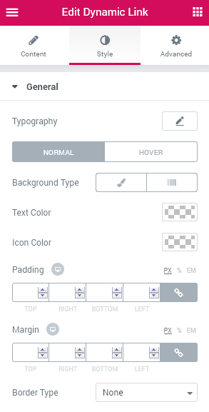
- Typography - here you can change the typography settings that will be applied for this link (they are the same as for other JetEngine widgets for Elementor).
- Background Type - select the type of the background you want to use for the link (especially in the case you want to create a button). The background can be Classic (in the case you want to apply a single solid color or an image) or a Gradient background.
Classic Background Type
- Color — here you can set background color for the background using color picker tool.
- Image — here you can choose the image you want to use as a background. Select the image from the media library or upload it to define it as a background in this block. When the image is uploaded, you’ll be able to define its position, alignment, turn on repeat and set the necessary size.
Gradient Background Type
- Color — here you can set background color for the widget using color picker tool.
- Location — here you can define the proportion for the first color in the gradient background.
- Second Color — here you can set the second color to use in the gradient background.
- Location — here you can define the proportion for the second color in the gradient background.
- Type — define, if you want to use linear or radial type of the gradient.
- Angle — in this block you can set the angle for the gradient (in degrees).
- Text Color - here you can specify the color to apply for the link label text.
- Icon Color - here you can set the different color to apply for the icon that is assigned for the link.
- Padding - here you can specify the custom padding values to apply for the link to make the paddings responsive.
- Margin - here you can set the margin values to apply the custom responsive margins for the link.
- Border Type - here you can select the type of the border to use for the dynamic link block.
- Width - here you can set the width of the border in px to make it responsive.
- Color - here you can specify the color of the border.
- Border Radius - set the border radius values to make the border angles more smooth and round.
- Icon Position - here you can set the preferable icon position (before link label, or after link label).
- Icon Size - use the control to change the icon size to the needed one. This value is also responsive.
Style
General
Switch between Normal and Hover modes to customize the appearance of the link on hover and in its normal state.
Dynamic Meta
Dynamic Meta widget allows displaying the default meta information (usually needed for the posts), such as the publishing date, author and information about comments.
Content
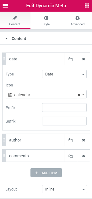
- Add Item - click Add Item to add a new item to the dynamic meta information block displayed with this widget (by default, there are already 3 meta data items: date, author and comments).
- Type - here you can select which meta content you want to display with this block: date, comments count or information about the author.
- Icon - here you need to select the icon to apply for the item.
- Prefix - here you can fill in the text that will show up before the meta data pulled from the post.
- Suffix - here you can fill in the text that will show up after the meta data pulled from the post.
- Layout - here you can select if you want to arrange the meta data items in line or as a vertical list.
Date Settings
- Format - type in the needed date format to apply for the date. You can check how to format date here.
- Link - here you can make the date linked to Archive, post or disable the link.
Author Settings
- Link - here you can set the link for the author block to lead the visitors to the author archives, to the posts, or you can disable the link at all.
Comments Settings
- Link - here you can specify the link that will lead the visitors from Comments count to the post itself.
- Zero Comments format - here you can set the format to apply in the case there are no comments for the post.
- One Comments Format - here you can set the format to apply in the case there is 1 comment for the post.
- More Comments Format - here you can set the format to apply in the case there is more than 1 comment for the post.
Style
General
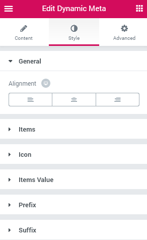
- Alignment - here you can specify the needed alignment (left, right or center) to apply for the meta data.
Items
- Typography - here you can change the typography settings to the ones suitable. These settings are the same as the ones available for other JetEngine widgets.
Switch between Normal and Hover modes in order to change the meta data appearance on hover and in the normal state.
- Background Color - here you can specify the color to use for the meta data background.
- Text Color - here you can specify the color to use for the meta data text using color picker tool.
- Padding - here you can apply your own responsive custom padding values.
- Margin - here you can apply the custom margin values to use for the meta data.
- Border Type - here you can select the type of the border to use for the meta data (solid, dotted, dashed, etc.)
- Color - here you can define the color of the border using color picker tool.
- Width - here you can set the needed responsive width for the border.
- Border Radius - apply your custom border radius values to make the border angles more round and smooth.
- Box Shadow- here you can set the shadow for the meta data block and set its settings, such as blur, spread, color, etc.
Icon
- Color - here you can set the desirable color to apply for the icon.
- Size - here you can set the preferable size to use for the icon.
- Gap - here you can set the custom gap width between the icon and the meta data text.
Items Value
Switch between Normal and Hover modes to change the values appearance on hover and in the normal state.
- Background Color - here you can set the background color to apply for the meta data values.
- Text Color - here you can specify the color to use for the meta data values text.
- Padding - here you can apply the custom padding values to apply a responsive padding for the item values.
- Margin - here you can specify the margin values to create a responsive margins around the meta data values.
- Border Type - here you can select the type of the border to apply for the meta data values (the border can be solid, dotted, dashed, etc).
- Color - here you can change the color to use for the border.
- Width - here you can set the custom width values to apply for the border.
- Border Radius - here you can set the border radius to make the border angles more smooth and rounded.
- Box Shadow - here you can specify if you want to enable the shadow and set its blur, spread and color.
Prefix
- Left Gap - here you can set the left gap distance to apply it before the prefix and the meta data.
- Right Gap - here you can set the distance to apply it between the prefix and the meta data.
Suffix
- Left Gap - here you can specify the distance to use it between the meta data and the suffix.
- Right gap - here you can specify the distance to use it between the suffix and the other content block on the right.
Dynamic Repeater
Dynamic Repeater widget is made for displaying repeating blocks set for the custom post types or taxonomies (this can be done in meta boxes or when you create a meta field and select the Repeater content type).
Please, note, that this widget can process only repeater meta fields created with JetEngine or ACF plugins.
Content
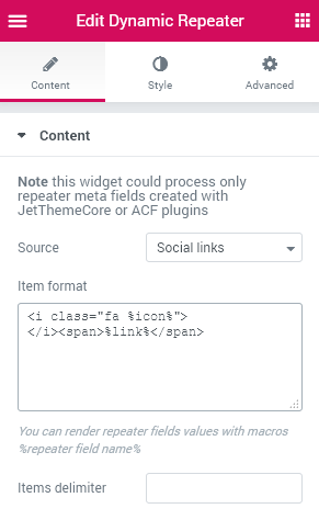
- Source - here you can select the repeater that you want to be displayed with this widget (here you can select repeaters only).
- Item Format - in this field you need to format the repeater content using macros blocks and HTML markup.
First, make sure you know the IDs input in the Meta Fields that are included in the repeater, e.g., ID “text” goes for Text block. To add this field as a macros type in “text” ID into %...% structure. This should look like:
- %text% - this is the macros that will help in displaying the content added in the Text meta field.
After that add the macros into the HTML markup (e.g., use < span >< /span> or < div>< /div> markup).
To add more complicated content, use the proper HTML markup (e.g., < i class="fa %icon%" > markup will fit for displaying icons where %icon% is a macros for the meta field with the iconpicker).
- Items Delimiter - to add spaces, special symbols or any other delimiters between the content type them in in this field.
Creating a Table with Repeater
You can also create tables using the dynamic repeater fields. Follow the detailed step-by-step tutorial below to create a table with the dynamic repeater.
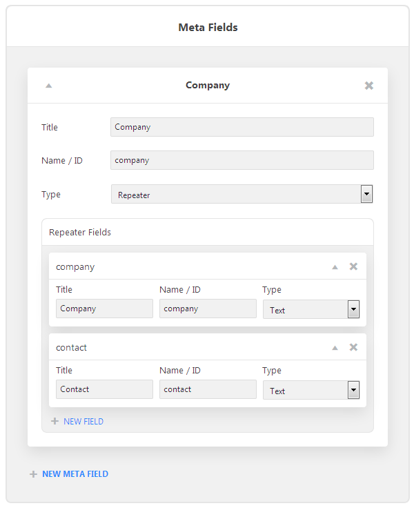
Create a new Repeater field type with several text text fields. E.g., one repeater field named Table (ID "table") with two sub fields for Company name (ID "company" and Contact (ID "contact).
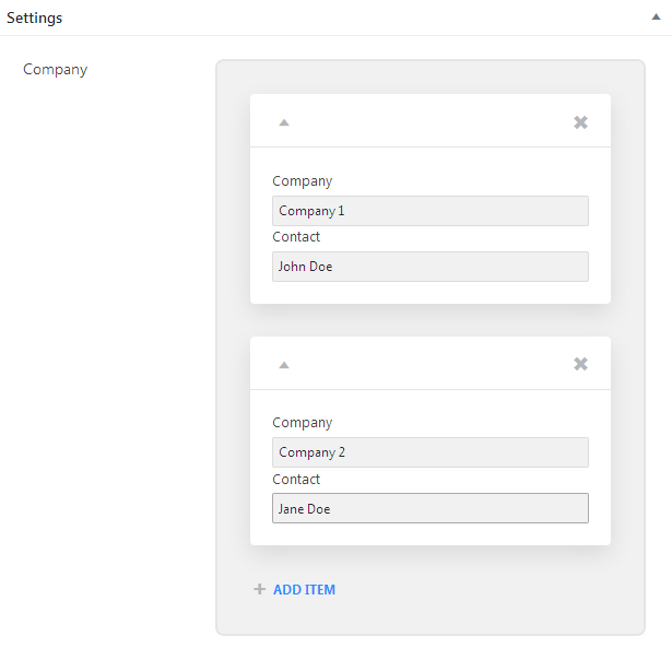
- Fill in the required information in the necessary fields while editing the posts you've created.
- Create a new listing and drop Dynamic Repeater widget to the page's structure. Select the needed reperate ID in the Source.
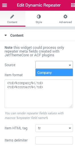
- Add the macros codes with the sub field IDs in the Item Format block. Add the HTML markup to create the table (e.g.,< td >< /td >).
- Select the necessary HTML tag (e.g., tr for the table).
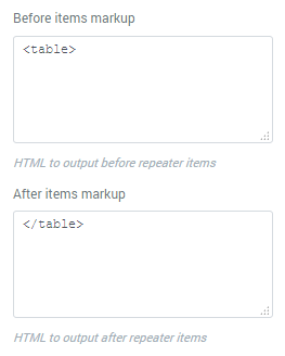
- Add the table opening and closing tags in the Before and After items markup.
- Customize the repeater styles and save the changes.
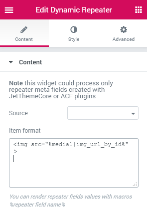
- In order to display the images with repeater you have to select the repeater which contains image sub fields on Source block.
- After that add the macroses for the image sub fields in the Item Format field (e.g., if you've used "media1" ID for the sub field that displays an image, add %media1% in the Item Format block.
- To make the image displayed properly add the filter to the end of the sub field ID. E.g., to display an image you should use |img_url_by_id filter. As a result, you'll be able to display the image URL link that will be pulled from the database. In Item Format block you'll have the following code: %media1|img_url_by_id%.
- The last step is to add the HTML markup for the image link to display the image (e.g.,< img src= "%media1|img_url_by_id%" > will display the image added in the repeater sub field with ID media1.
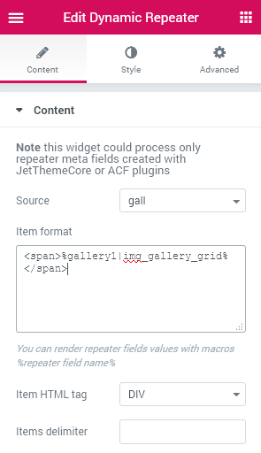
- To add the galleries in the repeater you need to use |img_gallery_grid filter. It allows displaying the gallery in the repeater sub field.
- In order to showcase the gallery that is added in one of the repeater sub fields, please, select the needed repeater in the Source block.
- After that, please, wrap its ID in the % in order to add it as a macros. The code should look like: %gallery1%.
- Add the filter behind the gallery sub field ID inside the macros. E.g., %gallery1|img_gallery_grid%.
Displaying Images, Posts and Galleries with Repeater
Images
Galleries
Post URL Links
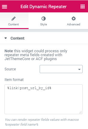
To add the Post URL that is added with ACF to the repeater sub field, use |post_url_by_id filter inside the macros. E.g., %link|post_url_by_id% .
Style
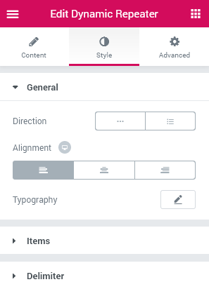
General
- Direction - here you can set the horizontal or vertical direction to apply for the repeater items that showcase the repeating content.
- Alignment - here you can set the needed alignment to apply for the repeater content.
- Typography - here you can set the preferable typography settings to use for the content displayed with the repeater. The typography settings are usually the same as for any other JetEngine widget.
Items
- Fixed Item Size - enable this option in order to access the item width and height settings that need to be set in order to make the repeater content responsive.
- Item Width - use the control to specify the width of the items added with the repeater.
- Item Height - use the control to set the height for the item added with the repeater.
Switch between Normal and Hover modes to customize the appearance of the content on hover and in its normal state.
- Color - specify the color of the item using color picker tool.
- Background Color - here you can customize the color to apply for the background.
- Border Type - here you can set the type of the border to apply for the item (e.g., solid, dashed, dotted type).
- Color - here you can choose the color to apply for the border.
- Width - here you can select the width to use for the border and make it responsive.
- Border Radius - here you can set the border radius values to make the border angles more smooth and round.
- Box Shadow - enable this option to access the shadow settings for the item, such as color, blur and spread).
- Margin - here you can specify the margins to use for the margins of the items in px.
Delimiter
- Color - here you can select the color to use for the delimiter with the color picker tool.
- Margin - here you can set the margin values to apply for the delimiters.
Dynamic Terms
Dynamic Terms widget provides opportunity to add the taxonomies to the custom post types. Use this widget to display the terms that are applied to the needed custom post listing.
Content
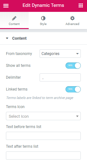
- From Taxonomy - here you can specify the taxonomy type from which you want to pull the terms.
- Show All Terms - enable this option to show all the terms in this taxonomy. In the case the option is deactivated, you’ll be able to specify the number of terms to show.
- Delimiter - here you can add a delimiter to separate the terms from one another.
- Linked terms - enable this option if you want the terms labels link to term archive page.
- Terms Icon - here you can select the icon to use for the terms.
- Text before terms list - here you can add the text before terms list.
- Text after terms list - here you can add the text after terms list.
Style
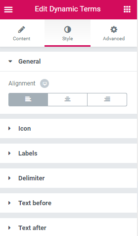
General
- Alignment - here you can specify the preferable alignment to use for the terms (left, right, center).
Icon
- Color - here you can set the color to use for the icon.
- Size - here you can select the size of the icon and make it responsive.
- Gap - here you can specify the gap distance to use between the icn and the terms.
Labels
- Typography - turn the option on to view the typography settings.They are similar to the typography settings of other JetEngine widgets.
- Background Type - here you can set type of the background to use for the labels.
- Color - here you can specify the color you want to apply to the background of the labels.
- Image - here you can add the image to the background of the labels.
- Text Color - here you need to set the color you want to apply to the labels text.
- Padding - here you can apply the custom padding values to apply a responsive padding for the labels.
- Margin - here you can specify the margin values to create a responsive margins around the labels.
- Border Type - here you can set the type of the border to apply for the item (e.g., solid, dashed, dotted, double, groove type).
- Width - here you can specify the width of the borders.
- Color - here you can choose the color of the borders.
- Border Radius - here you can set the border radius values to make the border angles more smooth and round.
- Box Shadow - enable this option to access the shadow settings for the item.
- Color — here you can set the background color for the labels using color picker tool.
- Location — here you can define the proportion for the first color in the gradient background.
- Second Color — here you can set the second color to use in the gradient background.
- Location — here you can define the proportion for the second color in the gradient background.
- Type — define, if you want to use the linear or radial type of the gradient.
- Angle — in this block you can set the angle for the gradient (in degrees).
- Text Color - there you can define the color of the text.
- Border Color - here you can define the color of the borders on hover.
- Padding - here you can apply the custom padding values to apply a responsive padding for the labels.
- Margin - here you can specify the margin values to create a responsive margins around the labels.
- Border Type - here you can select the type of the border to use for the total progress bar.
- Width - here you can specify the width of the borders.
- Color - here you can choose the color of the borders.
- Border Radius - here you can specify the radius values to make the border angles more smooth and round.
- Box Shadow - enable this option to access the shadow settings for the item.
- Typography - here you can apply the typography settings to the terms text. These settings are the same as the ones available for the other JetEngine widgets.
- Background Type - here you can set type of the background to use for the terms links.
- Text Color - here you need to set the color you want to apply to the terms links text.
- Padding - here you can apply the custom padding values to apply a responsive padding for the item links.
- Margin - here you can specify the margin values to create a responsive margins around the links.
- Border Type - here you can set the type of the border to apply for the item (e.g., solid, dashed, dotted type).
- Color - here you can choose the color to apply for the border.
- Width - here you can select the width to use for the border and make it responsive.
- Border Radius - here you can set the border radius values to make the border angles more smooth and round.
- Box Shadow - enable this option to access the shadow settings for the item, such as color, blur and spread.
- Color - here you need to set the color to apply for the delimiter separator.
- Size - here you need to specify the size to apply to the delimiter.
- Left Gap - here you have to set the gap distance to use between the term on the left and the delimiter.
- Right Gap - here you need to set the distance between the delimiter and the term on the right from it.
- Typography - turn the option on to view the typography settings.
- Color - here you can select the color to apply for the text before the terms list.
- Gap - here you have to set the gap distance to use between the text and the terms list.
- Typography - turn the option on to view the typography settings.
- Color - here you can select the color to apply for the text after the terms list.
- Gap - here you have to set the gap distance to use between the text and the terms list.
Switch between Normal and Hover modes to specify the looks of the labels on hover and in the normal state.
Classic Background Type
Gradient Background Type
Links
Switch between Normal and Hover modes to specify the looks of the terms links on hover and in the normal state.