JetEngine
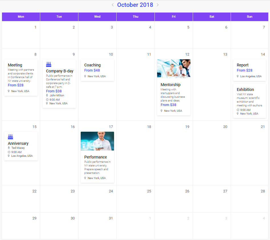
JetEngine Calendar Functionality
This block will guide you through the steps of creating a dynamic calendar using the JetEngine Calendar functionality.
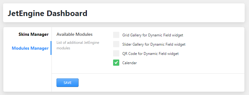
Before working with Calendar, please make sure to enable it in JetEngine Modules Manager.
Step 1. Creating Custom Post Type
From this block, you can learn how to prepare a custom post type to add events to the calendar.
Please, note, that in case you want to add the default posts to the calendar to showcase them using the publication date, you might skip this step and proceed to Creating a Listing Template with JetEngine to define the way how the event/post should be shown in the calendar.
- First, navigate to JetEngine > Post Types block. Here click Add New option to add a new custom post type to showcase events.
- Set the custom post type name (e.g., Event) and slug (e.g., “event”).
- Manage the Event post type settings (set the icon for the post type, define the fields this post type should support).
- Use Meta Fields to add the needed content you’d want to display when one would view it in the calendar:
- Icon;
- Event name;
- Date and time;
- Event thumbnail;
- Any other extra fields for your data type.
- Click Add Post Type button to add a new post type.
- After that, you should be able to see the new custom post type in your WordPress Dashboard. Add several custom posts you want to display in the calendar. Take care to fill in all the required fields, featuring the event specifics, time, date, name, etc.
- Save the changes.
Step 2. Creating a Listing Template
- It is necessary to create the custom post type listing template to be able to use it when adding events (or any other custom or default post types) to the calendar. In order to do it, please, navigate to JetEngine > Listings in WordPress Dashboard. Click Add New button to create a new listing you’d be using for the calendar to display posts or events.
- Navigate to Listing Item Settings > Listing Settings block and define the source of the content from which the data should be pulled for this particular listing. E.g., in case we have the “Events” custom post type, we should define Listing source: Posts and select Events in From post type dropdown.
- Use JetEngine Dynamic Content widgets to display the content that was previously added to the events using the custom fields and meta boxes. E.g., use Dynamic Field widget to pull the name of the event, its icon, date and time, the event description. You can also add the links for the events using Dynamic Link widget, or display any information (a link, a title, the location) in the form of QR code.
- After the listing template is created and styled according to your needs, save the changes.
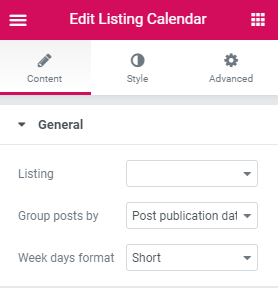
Step 3. Working with Calendar Widget
- Open the page or template where you want to add the dynamic calendar showcasing the posts, events, projects, schedules, etc.
- Drop the Listing Calendar widget to the section and column where you want to place it.
- In the Content > General block select the listing template you’ve created in the Step 2 using JetEngine Listing functionality.
- Select the way you want to group your posts in Group posts by dropdown. Currently there are 3 ways to group the posts:
- Post publication date - select this option in case you want to sort the posts and assign them to specific date cells using the post publication date as the marker to which date the post should be assigned;
- Post modification date - select this option in case you want to sort the posts and assign them to specific calendar date cells using the post modification date;
- Date from custom field - this option comes in handy when you want to display, e.g., the events, in the date cells when the events are to be held. In this case, you have to set the custom fields with the date content type for each of the events and fill in these fields with the dates when the events are to take place.
- After that, when working with the Calendar widget, specify Date from custom field option and input the Meta field name in the corresponding field.
General
- Listing - here you need to select listing from the dropdown list.
- Group Posts by - select either Post publication date, Post modification date, Date from custom field.
- Week days format - here you need to choose the format of displaying week days from the dropdown list.
Posts Query
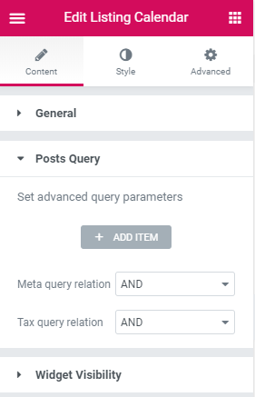
This block allows querying the posts or custom post types (e.g., events) using the complex query methods. E.g., in case you want the calendar to display only the events that have the specific location, category, or the events held in the specific time (you can accomplish this using the custom fields with the set time and by setting the meta query relation).
Widget Visibility
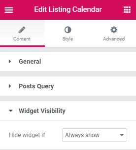
Here you can set if the Calendar widget is to be shown when there are no events, or if you need to hide it if there are no events to be shown.
There are two options to define the widget’s visibility:
- Always show;
- Query is empty.
Style
In this block, you can learn more about the stylization settings for the Listing Calendar widget.
Caption
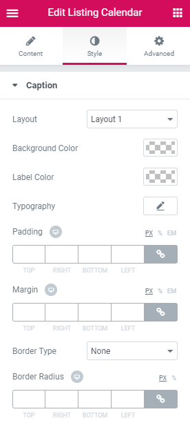
- Layout - here you can choose between the 4 existing layouts available for the calendar widget.
- Background color - here you can set the color to apply for the calendar widget caption block’s background.
- Label Color - here you can set the color to use for the label text (the text that specifies the month and year shown with the widget).
- Typography - enable this option to access the typography settings available for the label text:
Font family;
Font size;
Weight;
Transform (uppercase, lowercase, capitalize, normal);
Style (normal, italic, oblique);
Decoration (underline, overline, line through, none);
Line height;
Letter spacing.
- Padding - here you can define the responsive padding values to apply for the calendar caption.
- Margin - use the responsive margin values to create the margins around the caption of the calendar.
- Border Type - select the border type to use for the caption. After the border type is selected you can choose its width (top, right, bottom, left), and specify its color.
- Border Radius - fill in the border radius values to make the caption block angles more smooth.
Navigation Arrows
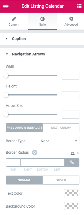
- Height - use the control to set the desired height you need to apply for the navigation arrows containers.
- Arrow Size - use the control to set the desired size you need to apply for the navigation arrows. Switch between the Previous Arrow and Next Arrow styles to use the different styles for the arrows that allow switching forth and back between the different months.
- Border type - here you can set the border type to use around the navigation arrows. In case you’ve set it, you’ll be able to choose its color and width.
- Border radius - in case you need the navigation arrows showcased in the circles instead of the square borders, set the border radius values to smoothen the angles. Switch between the Normal and Hover modes in order to apply the changes to the navigation arrows when you hover over them and in the normal state.
- Text color - define the color you want to use for the arrows.
- Background color - here you can set the color you want to apply for the navigation arrow background.
Week Days
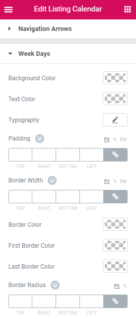
- Background color - here you can set the color to apply for the weekdays label blocks.
- Text color - here you can set the color to use for the weekday label text.
- Typography - enable this option to access the typography settings available for the weekday label text (the settings are similar to those for other text elements that allow managing typography).
- Padding - set the custom responsive padding values to set the distance between the weekday labels and the containers.
- Border width - apply the borders for the weekday blocks by defining its width in px or percents.
- Border color - choose the color to apply for the border.
- Border radius - smoothen the border angles using this value.
Days
- Background color - here you can set the color to use for the days shown in the month.
- Padding - use the responsive padding values to define the paddings around the events (or other listings created for the post types you want to display in the calendar).
- Min height - use the controls to define the minimum height for the days shown in the calendar.
- Gap between events - in case there are several events or posts shown per one date, you can select the gap to separate the events.
- Border width - here you can set the width of the border to use the border around the days.
- Border color - here you can set the color to apply for the border you’ve set.
- Border radius - to smoothen the border angles use the responsive border radius values.
Date label
- Text color - here you can define the color to use for the day date.
- Background color - add the background color for the day date to make the date more distinct.
- Typography - enable this option to access the typography settings available for the date text (the settings are similar to those for other text elements that allow managing typography).
- Date box alignment - align the date to the left, right, or center.
- Date text alignment - set the alignment you want to use for the date text.
- Width - here you can select the preferable width value.
- Height - here you can set the preferable height value.
- Border type - here you can set one of the several border types available for the element.
- Border radius - here you can make the angles more round.
- Margin - here you can define the preferable responsive margins for the element.
- Padding - here you can set the preferable responsive padding values.
Disabled days (not in the current month)
- Opacity - here you can set the custom opacity value to make the element sheerer.
- Day background color - here you can set the color to you for the day block background.
- Day label text color - here you can specify the color to use for the text label.
- Date label background color - here you can set the background color to use for the date label text.
- Day label border color - here you need to specify the color of the border shown around the label.
Mobile
- Mobile Trigger Color - here you can set the color to use for mobile trigger.
- Active Mobile Trigger Color - here you can set the color to use for active mobile trigger.
- Mobile Trigger Width - here you can set the width of mobile trigger.
- Mobile Trigger Height - here you can set the height of mobile trigger.
- Mobile Trigger Alignment - here you can set the alignment of mobile trigger.
- Mobile Trigger Border Radius - here you can set the border radius of mobile trigger.
- Mobile Trigger Margin - here you can change margins of mobile trigger.
- Mobile Event Margin - here you can change margins of mobile event trigger.