JetEngine
JetEngine Booking Forms Functionality
This block provides a detailed guide how to create booking forms using JetEngine Booking Forms functionality.
Step 1. Creating a Booking Form
From this block you can learn how to create a booking form with custom fields.
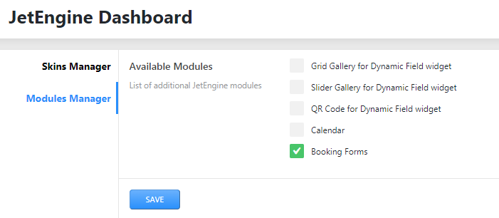
- First, navigate to JetEngine > Booking Forms block. Here click Add New option to add a new booking form.
- Define the custom booking form name.
- Manage the Fields Settings. Here you can add needed fields and submit buttons, which will be displayed in the booking form, and customize them. Also you can set the width of the fields. Click Add Field option to add a new field and Add Submit Button option to add a new submit button to the booking form. Click Apply Changes button every time, when you change the field settings.
- Type - here you can specify the type of the field:
- Text - you can choose this field type if you want to add a text field for Text, Email, URL, Tel to the booking form.
- Textarea - select this type for adding text area, where one can paste text line by line.
- Hidden - use this type if you want to hide the field on frontend, but you need its value for formulas calculation, for example.
- Select- this type allows adding a select field where the visitor will be able to select from the set values.
- Checkboxes - use this type in case you want to add field, where visitor need to tick the checkbox.
- Radio- this type allows one to select from the represented options in radio form.
- Number - choose this type if you want to add the field with quantity selection.
- Date - this type allows adding the date field.
- Time - you can select this type if you want to add time field.
- Calculated - this type allows displaying total value of the fields.
- Name - here you can define the name of the field.
- Label - here you can specify the label of the field.
- Description - here you can add the description to the field.
- Required - select this option if you want to make the field obligatory.
- Placeholder – here you can specify the placeholder of the field.
- Default - here you can define the default value of the field.
- Field Visibility - here you can specify who will be able to see the field.
- Field Type – here you can select an appropriate text field type. It can be Text, Email, URl and Tel.
- Field Value> – here you can choose the source of the field value. It can be Current Post ID, Current Post Title or Current Post Meta.
- Fill Options From – here specify either you want to fill the options via Manual Input or Meta Field.
- Options List – paste value and label of the option. Click Add option button to add one more option.
- Meta field to get value from – here you can determine the certain meta field, from which to get the value.
- Min Value - here you can specify the minimum number value available for the field.
- Max Value - here you can specify the maximum number value available for the field.
- Calculation Formula - here you can input the certain formula to calculate field value.
- Decimal Places Number - here you can specify the number of decimals after the separator.
- Calculated Value Prefix - here you can specify the value pferix of the calculated field.
- Calculated Value Suffix - here you can specify the value suffix of the calculated field.
- Label - here you can define the label of the submit button.
- Custom CSS class - here you can apply custom CSS styles.
- Notifications Settings - here you can adjust different notification settings.
- Type - here you can specify the type of notifications. There are 3 available types:
Send Email - this type allows notifying via email.
Insert Post - this type allows sending posts data.
Register New User - this type allows registering new users.
Call a Hook - this type allows creating custom hook and attaching php function to it in order that this php function will be called in a certain moment. Note: this option for developers.
Call a Webhook - here you can set automated task from Zapier to a server.
In case you select Send Email type, you need to set the following settings:
- Mail to - here you can define the email adress, where the notifications will be sent to.There are 3 available options: admin email, email from the submited form field and custom email.
- Reply to - here you can specify the email, which the user's reply will be sent to.
- Subject - here you can specify the subject of the email.
- From Field - here you need to specify the form field, where the email will be choosen from, if you chose Email from the submited form field option in Mail to setting.
- Email Adress - here you need to input the custom email address, if you chose Custom email option in Mail to setting.
- From Name - here you need to define the name, which appears in the name field of the email.
- From Adress - here you need to define the adress, which appears in the adress field of the email.
- Content - here you can paste needed macros for the email content.
- Post Type - here you need to select the post type, where the data will be taken from.
- Post Status - here you specify the status of the post.
- Fields Map - here you need to set meta fields names to save appropriate form fields into the selected post type.
- Fields Map - here you need to set form fields names, which to get the user data from. There are User Login, Email, Password, Confirm Password, First Name, Last Name fields. Note: User Login, Email and Password fields can't be empty.
- Log In User after Register - select this option if you want that users to be logged in after register.
- Add User ID to form data - select this option in order that registered user ID will be added to form data. If the form is filled by logged in used - current user ID will be added to form data.
- Hook Name - here you can specify the name of the hook.
- Webhook URL - here you need to embed the URL of the webhook.
In case you select Insert Post type, you need to set the following settings:
In case you select Register New User type, you need to set the following settings:
In case you select Call a Hook type, you need to set the following setting:
In case you select Call a Webhook type, you need to set the following setting:
- Type - here you can specify the type of notifications. There are 3 available types:
- Messages Settings - here you can define the text of messages, which can appear during one fills in the booking form.
- After you created the booking form, click Publish button.
- Open the page or template where you want to add the booking form.
- Drop the Booking Form widget to the section and column where you want to place it.
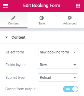
- In the Content block select the custom booking form you’ve created in the Step 1 using JetEngine Booking Forms functionality.
- Select either you want to display fields in column or row form in Fields layout dropdown.
- Also choose an appropriate submit type in Submit type option. There are 2 types available: to reload the page after submitting the booking form and using AJAX method without reloading a page.
- Cache form output option allows caching the output data of the booking form.
- Select form - here you need to select a booking form from the dropdown list.
- Fields layout - select the way to display the fields.
- Submit type - here you can choose the submit type for the booking form.
- Cache form output - enable this option if you want to cache the output data of the booking form.
- Divider between rows - enable this option if you want to add a divider between rows.
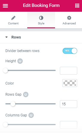
- Height - here you can set the height of the divider.
- Color - here you can set the color to apply for the divider.
- Rows Gap - here you can fix the appropriate gap between rows for different screen resolutions.
- Columns Gap - here you can fix the appropriate gap between columns for different screen resolutions.
- Typography - turn the option on to view the typography settings.
- Color - pick the color of the labels.
- Gap - here you can fix the gap larger or smaller around the labels.
- Width - here you can fix the appropriate width of the labels.
- Typography - turn the option on to view the typography settings.
- Color - pick the color of the descriptions.
- Gap - here you can fix the gap larger or smaller around the descriptions.
- Horizontal Alignment - define the horizontal alignment for the rows.
- Vertical Alignment - define the vertical alignment for the rows. They can be arranged on the top, on the bottom and in the center.
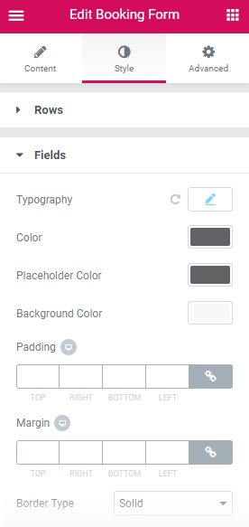
- Typography - enable this option to access the typography settings available for the fields:
Font family;
Font size;
Weight;
Transform (uppercase, lowercase, capitalize, normal);
Style (normal, italic, oblique);
Decoration (underline, overline, line through, none);
Line height;
Letter spacing.
- Color - here you can define the color of the fields.
- Placeholder Color - here you can select the placeholder color of the fields.
- Background Color - here you can choose the background color of the fields.
- Padding - here you can define the responsive padding values to apply for the fields.
- Margin - use the responsive margin values to create the margins around the fields.
- Border Type - here you can define the needed border type for the fields borders. It can be groove, dotted, dashed, double or solid.
- Width - type in the border width in order to set the width for the fields top, bottom, left and right borders.
- Color - here you can specify the color of the fields borders using Color picker tool.
- Border Radius - here you can set the border radius for the chosen border to make the border angles more round.
- Box Shadow - enable this option if you want to access the shadow advanced settings for the fields, and need to apply shadow to them.
- Textarea Height - here you can define the height of the text area.
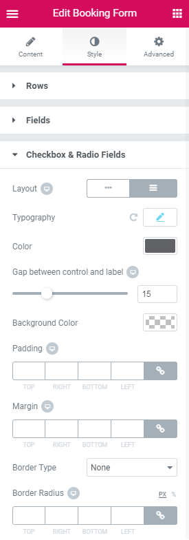
- Layout - here you can select the preferable layout of Checkbox & Radio fields (Horizontal or Vertical.)
- Typography - enable this option to access the typography settings available for the Checkbox & Radio fields.
- Color - define the color you want to use for Checkbox & Radio fields.
- Gap between control and label - here you can fix the appropriate gap between control and label in Checkbox & Radio fields for different screen resolutions.
- Background Color - here you can set the color you want to apply for the Checkbox & Radio fields background.
- Padding - here you can define the responsive padding values to apply for the Checkbox & Radio fields.
- Margin - use the responsive margin values to create the margins around the Checkbox & Radio fields.
- Border Type - here you can define the needed border type for the Checkbox & Radio fields borders. It can be groove, dotted, dashed, double or solid.
- Width - type in the border width in pixels in order to set the width for the Checkbox & Radio fields top, bottom, left and right borders.
- Color - here you can specify the color of the Checkbox & Radio fields borders using Color picker tool.
- Border Radius - here you can set the border radius for the chosen border to make the border angles more round.
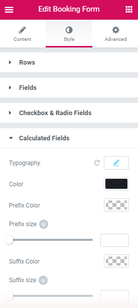
- Typography - enable this option to access the typography settings available for the Calculated fields.
- Color - here you can specify the color of the Calculated fields.
- Prefix Color - here you can define the color of the prefix.
- Prefix size - here you can set the size of the prefix for different screen resolutions.
- Suffix Color - here you can define the color of the suffix.
- Suffix size - here you can set the size of the suffix for different screen resolutions.
- Background color - here you can set the color to use for the backgorund of Calculated fields.
- Padding - use the responsive padding values to define the paddings around the Calculated fields.
- Margin - use the responsive margin values to create the margins around the Calculated fields.
- Border Type - here you can define the needed border type for the Calculated fields borders. It can be groove, dotted, dashed, double or solid.
- Width - type in the border width in pixels in order to set the width for the Calculated fields top, bottom, left and right borders.
- Color - here you can specify the color of the Calculated fields borders using Color picker tool.
- Border Radius - here you can set the border radius for the chosen border to make the border angles more round.
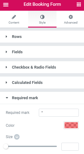
- Required mark - paste the mark using for obligatory fields.
- Color - here you can select the preferrable color for the required mark.
- Size - here you can set the size of the required mark for different screen resolutions.
- Background Color - here you can select the color to use for the button background using color picker tool.
- Text Color - here you can select the color of the button label text.
- Border Color - here you can specify the color of the button borders on hover.
- Typography - turn the option on to view the typography settings.
- Padding - input your custom padding values to apply them to the button.
- Margin - input your custom margin values to apply margins to the button.
- Border Type - here you can define the needed border type for the button borders. It can be dotted, dashed, double or solid.
- Width - type in the border width in order to set the width for the button top, bottom, left and right borders.
- Color - here you can specify the color of the button borders using Color picker tool.
- Border Radius - here you can set the border radius for the chosen border to make the border angles more round.
- Box Shadow - enable this option if you want to access the shadow advanced settings for the button, and need to apply shadow to it.
- Alignment - here you can define the preferable button alignment. It can be placed to the left, to the right, remain centered or fullwidth.
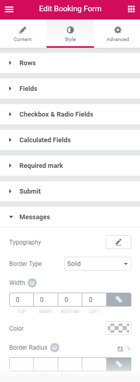
- Typography - turn the option on to view the typography settings.
- Border Type - here you can define the needed border type for the messages borders. It can be dotted, dashed, double or solid.
- Width - type in the border width in order to set the width for the messages top, bottom, left and right borders.
- Color - here you can specify the color of the messages borders using Color picker tool.
- Border Radius - here you can set the border radius for the chosen border to make the border angles more round.
- Background Color - here you can select the background color of the messages.
- Text Color - here you can specify the color of the text in the messages.
- Border Color - here you can specify the color of the borders.
- Box Shadow - enable this option if you want to access the shadow advanced settings for the messages, and need to apply shadow for it.
- Padding - input your custom padding values to apply them to the messages.
- Margin - input your custom margin values to apply margins to the messages.
- Alignment - here you can define the preferable messages alignment. They can be placed to the left, to the right or remain centered.
- Font Size - here you can select the size of the field messages.
- Color - add the color for the field messages.
- Margin - input your custom margin values to apply margins to the field messages.
- Alignment - ere you can define the preferable field messages alignment. It can be placed to the left, to the right or remain centered.
Field block provides such settings:
In case you select Text field type, there is an additional setting:
In case you select Hidden field type, there is an additional setting:
In case you choose Select, Checkboxes and Radio field types, there are additional settings:
In case you choose Number field type, there are additional settings:
In case you choose Calculated field type, there are additional settings:
Submit button block provides such settings:
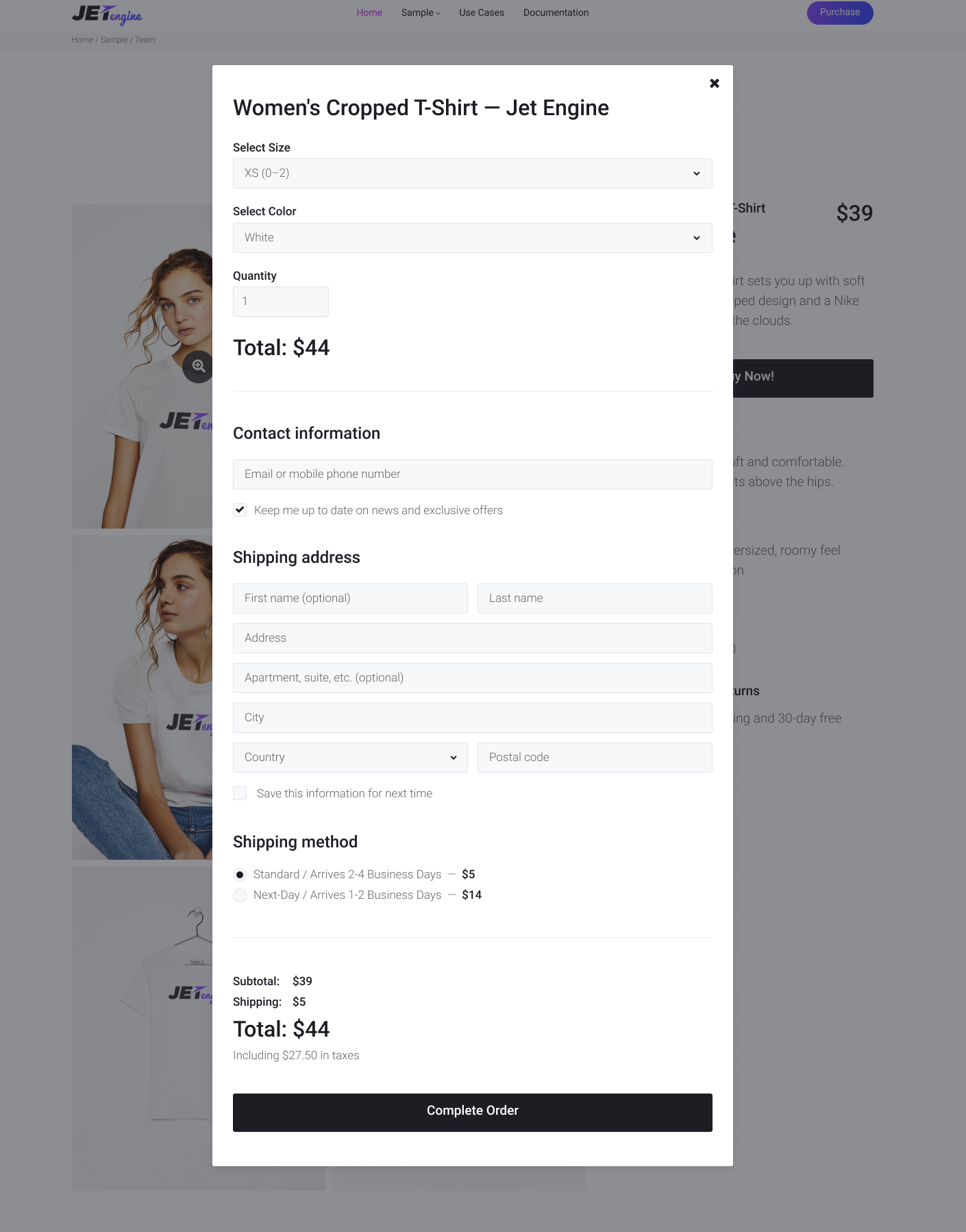
Step 2. Working with Booking Form Widget
Content
Style
In this block, you can learn more about the stylization settings for the Booking Form widget.
Rows
Labels
Descriptions
Fields
Checkbox & Radio Fields
Calculated Fields
Required mark
Submit
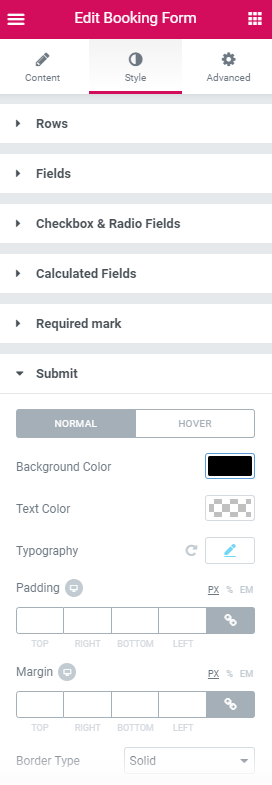
Here you can switch from customizing Normal to Hover Submit button style settings. Just click on the button Hover to proceed to customizing hover elements.
Messages
Here you can switch from customizing Success to Error Messages style settings. Just click on the button Error to proceed to customizing elements in error state.