JetElements
JetElements Widgets
In this section you can learn about JetElements widget settings. Here you can find information about widget options and discover tips about content and style customization.
Advanced Carousel
Advanced Carousel widget displays slides in an attractive way. You can display from 1 to 10 slides at one time using Advanced Carousel widget, set versatile animation options, create vivid backgrounds, enrich slides content with attractive typography. And you can create as many slides as you need to.
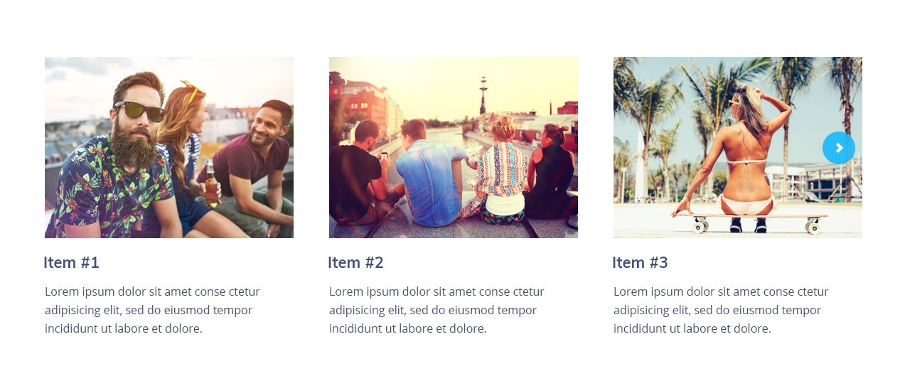
Advanced Carousel Widget Sample
On the picture below you can view Advanced Carousel widget sample.
Content
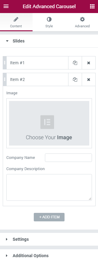
Slides
Slides are called Items in this block. Click on the Add item button to add new slides to the Advanced Carousel widget. You can add as many slides as you want, and customize each one of them. Click on the newly added item to customize it.
- Choose Your Image — click on the block to choose the image you want to use for this particular slide. You can choose it from the existing media library or upload it from your hard drive.
- Item Title — here you need to input the title for the slide. It will be displayed below the added picture.
- Item Description — in this block you have to add description for the slide. You can also use HTML markup to decorate the text.
- Item Link — here you can add URL address. The link will open when the visitor clicks on the slide.
Settings
In this block you can apply custom settings to Advanced Carousel, change slides animation, navigation settings, define the number of the slides to show, etc.
- Items Layout — here you need to define the the layout in which the slides will be shown. You can apply Simple layout or Banners layout to display slides and its content in different ways.
- Equal Columns Height — here you can enable or disable the equal columns height option to apply the same height for the columns.
- Animation Effect — here you can change animation effect for the slides. Choose one of the effects from the dropdown menu to change current animation effects.
- Slides to Show — define the number of slides to show at one time. You can show up to 10 slides at one time, or set “1” to use the widget as a simple slider.
- Slides to Scroll — here you can define how many slides you want to scroll.
- Show Arrows Navigation — in this block you can add navigation arrows to the sides of the slides to provide easy switching from slide to slide for the visitors.
- Prev Arrow Icon — here you can select the type of the arrow icon, that switches slider widget to previous slide.
- Next Arrow Icon — here you can select the type of the arrow icon, that switches slider widget to next slide.
- Show Dots Navigation — here you can enable pagination dots at the bottom of the Advanced Carousel to provide smoother navigation from slide to slide.
Additional Options
- Pause on Hover — enable this option to pause Advanced Carousel slider whenever the visitor puts the mouse to the slider area.
- Autoplay — here you can enable autoplay option for the Carousel slider. If enabled, the option turns on switching from slide to slide automatically.
- Autoplay Speed — here you can define the speed of switching from slide to slide (in ms).
- Infinite Loop — turn on the option if you want the slides to repeat.
- Animation Speed — in this field you need to define the speed of animation effect when switching from slide to slide.
Style
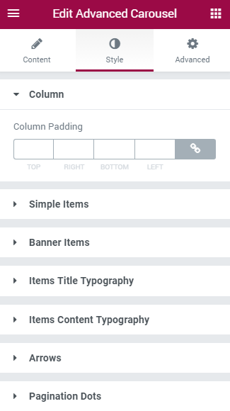
In this block you can change style and appearance settings for Advanced Carousel widget, define items padding, alignment, additional elements color, etc.
Column
- Column Padding — here you can set the preferable custom padding for the whole column where Advanced Carousel widget is displayed. Fill in the values for the top, bottom, right and left padding in pixels to apply your custom padding.
Simple Items
Here you can switch from customizing Normal to Hover Simple Items style settings. Just click on the button Hover to proceed to customizing hover elements.
- Background Type — in this block you can choose, whether you want to use classic or gradient type for the simple items. The customization options vary for each type.
Classic Background Type
- Color — here you can set background color for the simple items using color picker tool.
- Image — here you can choose the image you want to use as a background. Select the image from the media library or upload it to define it as a background in this block. When the image is uploaded, you’ll be able to define its position, alignment, turn on repeat and set the necessary size.
- Opacity — here you can define the value for the opacity of the background.
Gradient Background Type
- Color — here you can set background color for the simple items using color picker tool.
- Location — here you can define the proportion for the first color in the gradient background.
- Second Color — here you can set the second color to use in the gradient background.
- Location — here you can define the proportion for the second color in the gradient background.
- Type — define, if you want to use linear or radial type of the gradient.
- Angle — in this block you can set the angle for the gradient (in degrees).
- Opacity — here you can change background opacity, where 1 is 100% opacity, and 0 — is 0% opacity.
- color — here you can set the color for the the shadow (use color picker tool to do it);
- blur — in this block you can define the blur settings for the shadow;
- spread — here you can set how large the shadow will be;
- horizontal — here you can move the shadow horizontally (from right to left);
- vertical — here you can move the shadow vertically (from top to bottom).
- Items Padding — here you can set the custom padding for the slides. Fill in the values for the top, bottom, right and left padding in pixels to apply your custom padding.
- Items Alignment — set right, left or center alignment to use it for the slides content.
Banner Items
You can customize this block if you’ve chosen Banner layout in Items Layout settings block. Here you can switch from customizing Normal to Hover style settings. Just click on the button Hover to proceed to customizing hover elements.
- Background Type — in this block you can choose, whether you want to use classic or gradient type for the banner slides background. The customization options vary for each type. The options are similar to Simple Items Background type
Items Title Typography
- Items Title Color — here you can select the preferable color of the slides title using color picker.
- Typography — turn the option on to view the typography settings.
- Size — define the font size of the slide title.
- Family — here you can set the font family for the title.
- Weight — in this block you can select the suitable font weight.
- Transform — here you can choose from the dropdown menu, if you want the title to be shown in uppercase, lowercase, capitalize or normal way.
- Style — in this block you can choose from the dropdown menu the style of the font. It can be normal, italic (the characters look similar to handwriting) and oblique (the characters are slightly inclined to the right).
- Line Height — in this field you can set the height of the slide title line.
- Letter Spacing — here you can set the space between letters.
Items Content Typography
- Items Content Color — here you can select the preferable color of the slides textual content using color picker.
- Typography — turn the option on to view the typography settings.
- Size — define the font size of the slide content.
- Family — here you can set the font family for the content.
- Weight — in this block you can select the suitable font weight.
- Transform — here you can choose from the dropdown menu, if you want content to be shown in uppercase, lowercase, capitalize or normal way.
- Style — in this block you can choose from the dropdown menu the style of the font. It can be normal, italic (the characters look similar to handwriting) and oblique (the characters are slightly inclined to the right).
- Line Height — in this field you can set the height of the slide content lines.
- Letter Spacing — here you can set the space between letters.
Carousel Arrows
Here you can switch from customizing Normal to Hover Arrows style settings. Just click on the button Hover to proceed to customizing hover elements.
- Font Color — define the color of the arrow controls using color picker tool.
- Background Type — in this block you can choose, whether you want to use classic or gradient type for the simple items. The customization options vary for each type.
- Font Size — here you can select the size of the arrow font controls in pixels.
- Box Size — here you can select the size of the arrow controls box in pixels.
- Border Type — here you can define the type of the border you need to use for the element.
Pagination Dots
Here you can switch from customizing Normal to Hover Pagination Dots style settings. Just click on the button Hover to proceed to customizing hover elements.
Prev Arrow Position
- Vertical Position By — define the vertical position for the prev arrow. It can be positioned at the top or at the bottom.
- Top Indent — define the vertical position indent in pixels, or use controls to define the suitable position automatically.
- Horizontal Position By — define the horizontal position for the prev arrow. It can be positioned on the left or on the right.
- Left Indent — define the horizontal position indent in pixels, or use controls to define the suitable position automatically.
Next Arrow Position
- Vertical Position By — define the vertical position for the next arrow. It can be positioned at the top or at the bottom.
- Top Indent — define the vertical position indent in pixels, or use controls to define the suitable position automatically.
- Horizontal Position By — define the horizontal position for the next arrow. It can be positioned on the left or on the right.
- Right Indent — define the horizontal position indent in pixels, or use controls to define the suitable position automatically.
Carousel Dots
Here you can switch from customizing Normal to Hover and Active Pagination Dots style settings. Just click on the button Hover to proceed to customizing hover elements.
- Font Color — define the color of the pagination dots using color picker tool.
- Background Type — in this block you can choose, whether you want to use classic or gradient type for the simple items. The customization options vary for each type.
- Font Size — here you can select the size of the arrow font controls in pixels.
- Box Size — here you can select the size of the arrow controls box in pixels.
- Border Type — here you can define the type of the border you need to use for the Carousel Dots border.
- Box Shadow — enable this option if you want to access the shadow advanced settings for this widget, and need to apply shadow for it.
- Gap — here you can define the gap between pagination dots in pixels, or use controls to set it automatically.
- Dots Box Margin — here you can define the margins for the Dots box.
- Alignment — set right, left or center alignment to use it for the dots.
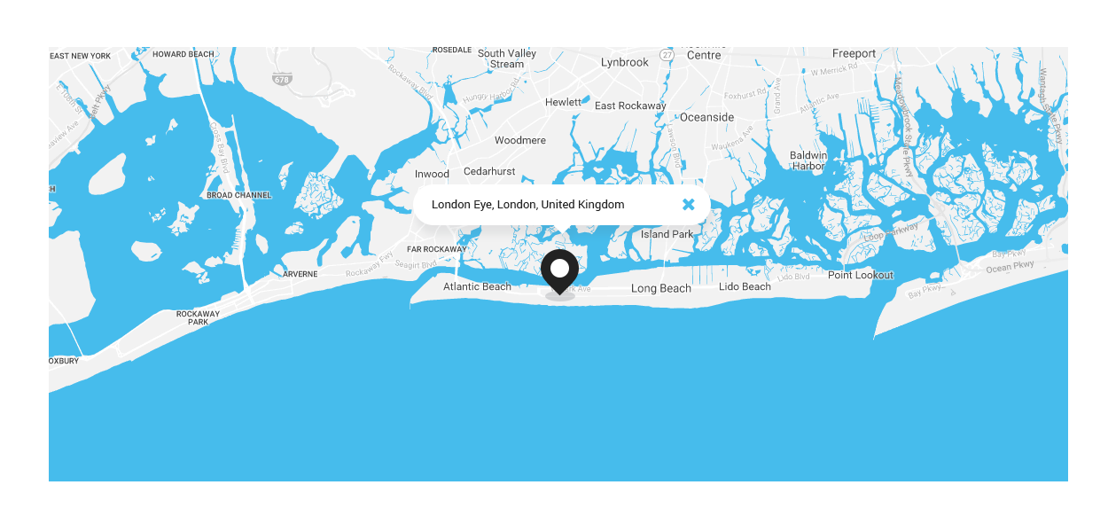
Advanced Map
Advanced Map widget is the perfect solution if you need to display a map on your website, and add pins to it to locate the places. You can add multiple pins, change map style, enable switching from satellite to map view. The widget is easily customizable and has clear user interface.
Advanced Map Widget Sample
On the picture below you can view Advanced Map widget sample.
Content
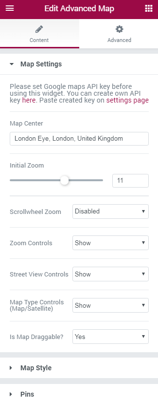
General
- Map Center — here you need to define the location, which will be used as the center of the map.
- Initial Zoom — here you can set the value for the initial zoom of the map.
- Scrollwheel Zoom — enable this option if you want the visitors to be able to zoom the map when scrolling with the mouse wheel.
- Zoom Controls — enable this option if you need to show zoom controls for the map.
- Street View Controls — here you can enable controls for the street view.
- Map Type Controls — here you can enable the switching between map and satellite map types.
- Is Map Draggable? — turn on the option if you want the map to be draggable.
Map Style
- Map Height — define the value of the map height in pixels.
- Map Style — here you can choose from the dropdown menu the style for the map appearance.
In case you select Custom map style, you can add custom style json file below in order to apply your own map style.
Pins
- Add Item — here you can add new pins to the map to be displayed on it.
- Pin Address — here you need to input the address to be shown on the map.
- Pin Description — in this field you have to fill in the description of the place you’ve selected to be pinned.
- Pin Icon — here you can select from the media library or upload your custom pin icon.
- Initial Size — here you can choose, if you want the initial size to be visible or hidden.
Adding API Key to Advanced Map Widget
- To add an API key please navigate to Elementor > Jet Elements Settings tab on the left of the Dashboard.
- Here you need to paste API key to the API Key field.
- Let's get API key for the map widget. Go to Google Developers page and select Maps Embed API.
- Here click on Create Key button and select the project to which you want to add a key. If you still don't have any projects, click on Create a New Project button.
- Name the project and click on Create and Enable API.
- Copy the key to the clipboard and paste to the API Key field in your Dashboard.
- Save the changes.
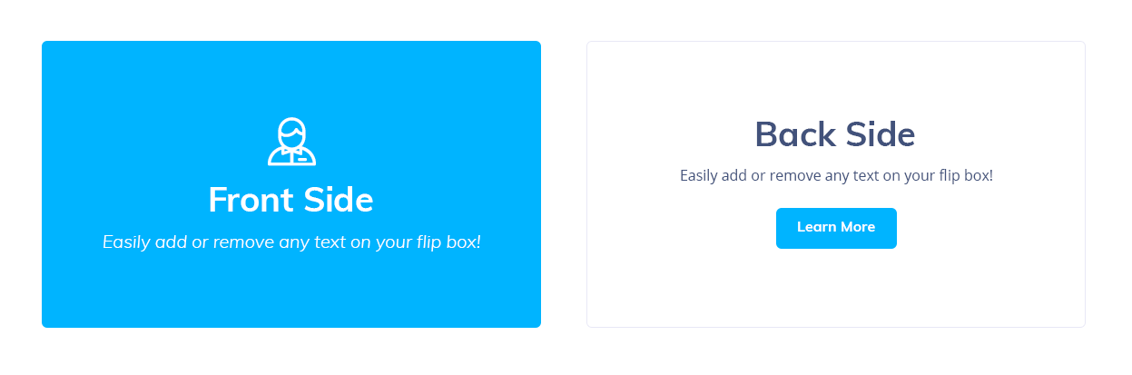
Animated Box
Animated Box widget creates an attractive info block on the website’s page, which consists of two sides, that switch from one to other. Here you can add icons, buttons, titles and content. Every element is easily customizable.
Animated Box widget Sample
On the picture below you can view Animated Box widget sample.
Content
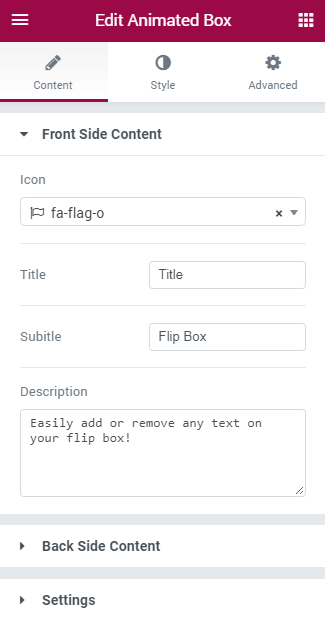
Front Side Content
In this block you can add content to the front side of the animated box.
Icon — here you can set the icon to be shown above the title of the animated box content. Select the icon you want to use from the dropdown list, or click on Delete button to remove the icon if you don’t want to use it.
- Title — here you need to input the title for the front side content of the animated box.
- Subtitle — here you need to enter the subtitle for the front side content.
- Description — in this block you can add the content to the front side of the animated box. Use HTML tags to separate lines and define quotes, etc.
Back Side Content
In this block you can add content to the back side of the animated box.
- Icon — here you can set the icon to be shown above the title of the animated box content. Select the icon you want to use from the dropdown list, or click on Delete button to remove the icon if you don’t want to use it.
- Title — here you need to input the title for the back side content of the animated box.
- Subtitle — here you need to enter the subtitle for the back side content.
- Description — in this block you can add the content to the back side of the animated box. Use HTML tags to separate lines and define quotes, etc.
- Button Text — here you need to input the text you want to use for the button.
- Button Link — in this field you need to paste the URL link for the button.
Settings
- Animation Effect — here you can choose one of the multiple effects from the dropdown list to use it for widget animation. The effect will define how the front side of the box will switch to the back side.
Style
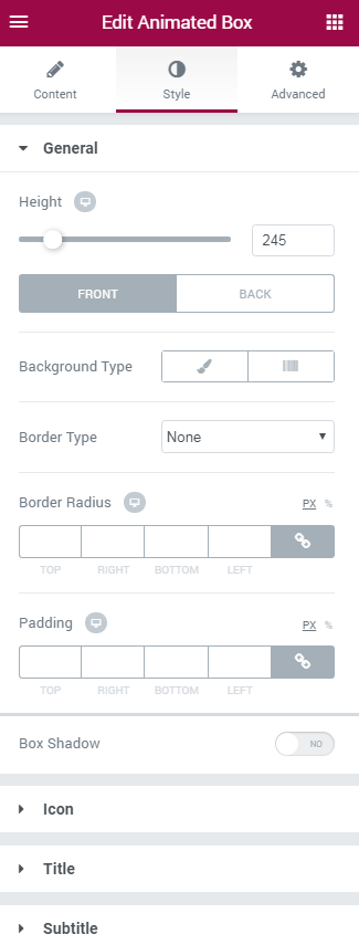
General
Here you can switch from customizing Front to Back Animated Box settings. Just click on the button Back to proceed to customizing the back side of the Animated Box widget elements.
- Height — here you can select the height value (in pixels) for the animated box widget. The height is the general parameter for the front and back sides of the Animated Box.
- Background Type — in this block you can choose, whether you want to use classic or gradient type for the animated box background. The customization options vary for each type.
Classic Background Type
- Color — here you can set background color for the animated box using color picker tool.
- Image — here you can choose the image you want to use as a background. Select the image from the media library or upload it to define it as a background in this block. When the image is uploaded, you’ll be able to define its position, alignment, turn on repeat and set the necessary size.
Gradient Background Type
- Color — here you can set background color for the widget using color picker tool.
- Location — here you can define the proportion for the first color in the gradient background.
- Second Color — here you can set the second color to use in the gradient background.
- Location — here you can define the proportion for the second color in the gradient background.
- Type — define, if you want to use linear or radial type of the gradient.
- Angle — in this block you can set the angle for the gradient (in degrees).
- Border Type — here you can define the type of the border you need to use for the animated box.
- Box Shadow — enable this option if you want to access the shadow advanced settings for this widget, and need to apply shadow for it.
- color — here you can set the color for the the shadow (use color picker tool to do it);
- blur — in this block you can define the blur settings for the shadow;
- spread — here you can set how large the shadow will be;
- horizontal — here you can move the shadow horizontally (from right to left);
- vertical — here you can move the shadow vertically (from top to bottom).
Icon
Here you can switch to customizing Front and Back Icon. To switch to customizing them you need to click on the corresponding button.
- Icon Color — here you can select the color to use it for the icon.
- Icon Background Color — in this block you can set the color to use it in the icon background.
- Icon Font Size — here you can define the value of icon size in pixels.
- Icon Box Size — in this block you can input the value for icon box size (in pixels).
- Border Type — here you can select the type of the border from the dropdown menu.
Here is the list of available border types:
- none;
- solid;
- doubled;
- dotted;
- dashed.
- Box Shadow — enable this option if you want to access the shadow advanced settings for this widget, and need to apply shadow for it.
- Alignment — here you can define the preferable icon alignment. The icon can be placed to the left, to the right, or remain centered.
Title
- Title Color — here you can define the suitable color for the animated box title. Use color picker tool to select the necessary color.
- Typography — turn the option on to view the typography settings.
- Size — define the font size of the animated box title.
- Family — here you can set the font family for the title.
- Weight — in this block you can select the suitable font weight.
- Transform — here you can choose from the dropdown menu, if you want the title to be shown in uppercase, lowercase, capitalize or normal way.
- Style — in this block you can choose from the dropdown menu the style for the font. It can be normal, italic (the characters look similar to handwriting) and oblique (the characters are slightly inclined to the right).
- Line Height — in this field you can set the height of the title line.
- Letter Spacing — here you can set the space between letters.
- Alignment — here you can define the preferable title alignment. The title can be placed to the left, to the right, or remain centered.
Subtitle
- Subtitle Color — here you can define the suitable color for the animated box subtitle. Use color picker tool to select the necessary color.
- Typography — turn the option on to view the typography settings.
- Size — define the font size of the animated box subtitle.
- Family — here you can set the font family for the subtitle.
- Weight — in this block you can select the suitable font weight.
- Transform — here you can choose from the dropdown menu, if you want the subtitle to be shown in uppercase, lowercase, capitalize or normal way.
- Style — in this block you can choose from the dropdown menu the style for the font. It can be normal, italic (the characters look similar to handwriting) and oblique (the characters are slightly inclined to the right).
- Line Height — in this field you can set the height of the subtitle line.
- Letter Spacing — here you can set the space between letters.
- Alignment — here you can define the preferable subtitle alignment. The title can be placed to the left, to the right, or remain centered.
Description
Here you can switch from customizing Front to setting uo Back Description. To do it click on the corresponding button.
- Description Color — here you can define the suitable color for the animated box content. Use color picker tool to select the necessary color.
- Typography — turn the option on to view the typography settings.
- Size — define the font size of the animated box content.
- Family — here you can set the font family for the content.
- Weight — in this block you can select the suitable font weight.
- Transform — here you can choose from the dropdown menu, if you want the content to be shown in uppercase, lowercase, capitalize or normal way.
- Style — in this block you can choose from the dropdown menu the style for the font. It can be normal, italic (the characters look similar to handwriting) and oblique (the characters are slightly inclined to the right).
- Line Height — in this field you can set the height of the content text lines.
- Letter Spacing — here you can set the space between letters.
- Alignment — here you can define the preferable content alignment. The title can be placed to the left, to the right, or remain centered.
Action Button
Here you can switch from customizing Front to setting uo Back of the Action Button. To do it click on the corresponding button.
- Background Color — here you can define the suitable color for the animated box button background. Use color picker tool to select the necessary color.
- Text Color — in this block you need to select the preferable color for the button text.
- Typography — turn the option on to view the typography settings. They are similar to Description Typography options.
- Border Type — here you can select the type of the border from the dropdown menu.
- Box Shadow — enable this option if you want to access the shadow advanced settings for this widget, and need to apply shadow for it.
Overlay
- Background Type — in this block you can choose, whether you want to use classic or gradient type for the animated box background. The customization options vary for each type.
- Color — here you can set background color for the animated box using color picker tool.
- Image — here you can choose the image you want to use as a background. Select the image from the media library or upload it to define it as a background in this block. When the image is uploaded, you’ll be able to define its position, alignment, turn on repeat and set the necessary size.
- Color — here you can set background color for the widget using color picker tool.
- Location — here you can define the proportion for the first color in the gradient background.
- Second Color — here you can set the second color to use in the gradient background.
- Location — here you can define the proportion for the second color in the gradient background.
- Type — define, if you want to use linear or radial type of the gradient.
- Angle — in this block you can set the angle for the gradient (in degrees).
- Opacity — in this block you can choose the opacity for the overlay.
Classic Background Type
Gradient Background Type
Order
In this block you can define the preferable order of elements displayed in the animated box. Input the order number for each of the elements in the required fields to create your custom elements order.
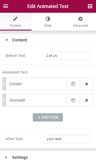
Animated Text
Animated Text widget was specially devised to deliver your ideas in the form of attractively animated text. With the help of ths widget you can add animated words and phrases to your website’s pages, customize them, and add plain text to complement animated text.
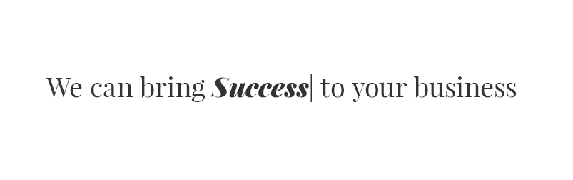
Animated Text Widget Sample
On the picture below you can view Animated Text widget sample.
Content
General
- Before Text — here you can add the text passage that will go before animated text. You can also leave the field empty if you want animated text to show up at the beginning of the line.
- Add Item — click on the button to add animated text. In the Text field type in the text you want to animate. You can as well add several items of animated text. In this case item 1 will be replaced with item 2 in loops.
- After Text — in this field you need to input the text passage, that goes after animated text. You can also leave the field empty if you don’t want to continue animated text with the plain text.
Settings
- Animation Effect — here you can select the preferable animation type from the dropdown menu.
- Animation Delay — define the value for the animation delay (the value sets the time for which the text will stay on the screen without animation). Input the time in ms (the minimum value is 500 ms).
- Split Type — here you can define, how the text will split when animated (in whole words, or in symbols).
Style
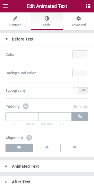
In this block you can define styles for these blocks:
- Before Text — the text that goes before the animated text passage;
- Animated Text — the text that has animation effects;
- After Text — the text that goes after animated text passage.
The style settings for these three blocks are similar.
Style Settings
- Color — here you can define the color of the text using color picker tool.
- Background Color — here you need to set the background color to increase text readability.
- Typography — turn the option on to view the typography settings.
- Size — define the font size of the animated box content.
- Family — here you can set the font family for the content.
- Weight — in this block you can select the suitable font weight.
- Transform — here you can choose from the dropdown menu, if you want the content to be shown in uppercase, lowercase, capitalize or normal way.
- Style — in this block you can choose from the dropdown menu the style for the font. It can be normal, italic (the characters look similar to handwriting) and oblique (the characters are slightly inclined to the right).
- Line Height — in this field you can set the height of the content text lines.
- Letter Spacing — here you can set the space between letters.
- Alignment — here you can define the preferable content alignment. The title can be placed to the left, to the right, or remain centered.
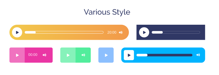
Audio
Audio widget provides you with the opportunity to add audio files on your website and visualize them. This widget is easy to use and pretty simple in customization.
In the picture below you can see the Audio widget sample.
Content
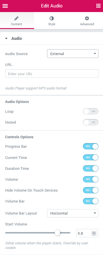
Audio
- Audio Source - here you can specify the source of your audio file. There are Self Hosted and External options, which means you can either upload an audio file from your hard drive or input the external link.
- URL - here you paste the external link or upload the file from your computer.
Audio Options
- Loop - enable this option in order for the audio to play without ending.
- Muted - this option allows you to put the song on mute.
Controls Options
- Progress Bar - as soon as you enable this option, the progress bar appears.
- Current Time - enable this option so that the listeners know how much time they’ve already spent listening to the song.
- Duration Time - enable this option to showcase the total duration of the song.
- Volume - with enabling this option you allow the listeners to select the preferable volume.
- Hide Volume On Touch Devices - enabling this option means, if you view this widget with a tablet or a mobile, the volume icon and bar will not be visible.
- Volume Bar - enable or disable this option to show or hide the volume bar, where one can define the comfortable volume.
- Volume Bar Layout - here you can pick either Horizontal or Vertical position of the volume bar.
- Start Volume - choose the volume the song will start with at the beginning.
Style
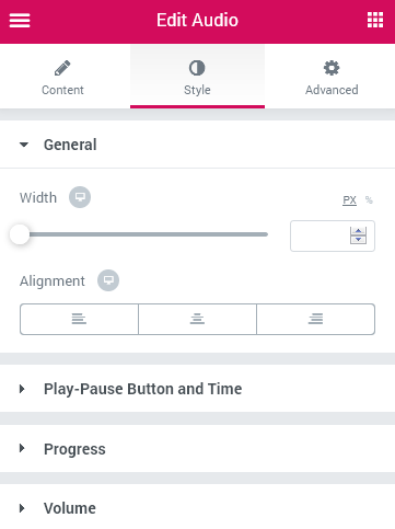
General
- Width - specify the preferable width of the widget in pixels.
- Alignment - set right, left or center alignment to use it for the widget.
Play-Pause Button and Time
Play-Pause Button
- Font size - here you can select the size of the “Play” button icon in pixels when Normal and on Hover.
- Color - here you are allowed to pick the color of the “Play” button icon when Normal and on Hover.
- Background color - here you can select the background color of the “Play” button.
- Padding - here you can set the preferable custom padding for the widget. Fill in the values for the top, bottom, right and left padding in pixels to apply your custom padding.
- Border Radius - here you can set the border radius to make the angles more smooth and round.
- Border Type - here you can define the type of the border you need to use for the element.
- Box Shadow - enable this option if you want to access the shadow advanced settings for the items, and need to apply shadow for them.
Time
- Typography - turn the option on to view the typography settings. They are similar to the typography settings of other JetElements widgets.
- Color - pick the preferable color of the time digits.
Progress
Total Progress Bar
- Height - here you can select the height value (in pixels) for the total progress bar.
- Background type - here you can set your custom Classic or Gradient background for the total progress bar.
Classic Background Type
- Color — here you can set the background color for the total progress bar using color picker tool.
- Image — here you can choose the image you want to use as a background. Select the image from the media library or upload it to define it as a background in this block. When the image is uploaded, you’ll be able to define its position, alignment, turn on repeat and set the necessary size.
Gradient Background Type
- Color — here you can set the background color for the total progress bar using color picker tool.
- Location — here you can define the proportion for the first color in the gradient background.
- Second Color — here you can set the second color to use in the gradient background.
- Location — here you can define the proportion for the second color in the gradient background.
- Type — define, if you want to use the linear or radial type of the gradient.
- Angle — in this block you can set the angle for the gradient (in degrees).
- Border Type - here you can select the type of the border to use for the total progress bar.
- Border Radius - here you can specify the radius values to make the border angles more smooth and round.
Current Progress Bar
- Background Type - here you can set your custom Classic or Gradient background for the current progress bar.
Classic Background Type
- Color — here you can set the background color for the current progress bar using color picker tool.
- Image — here you can choose the image you want to use as a background. Select the image from the media library or upload it to define it as a background in this block. When the image is uploaded, you’ll be able to define its position, alignment, turn on repeat and set the necessary size.
Gradient Background Type
- Color — here you can set the background color for the current progress bar using color picker tool.
- Location — here you can define the proportion for the first color in the gradient background.
- Second Color — here you can set the second color to use in the gradient background.
- Location — here you can define the proportion for the second color in the gradient background.
- Type — define, if you want to use the linear or radial type of the gradient.
- Angle — in this block you can set the angle for the gradient (in degrees).
- Border Radius - here you can specify the radius values to make the border angles more smooth and round.
Volume
Volume Button
- Font size — here you can set the background color for the current progress bar using color picker tool.
- Location — here you can set the background color for the current progress bar using color picker tool.
- Location — here you can set the background color for the current progress bar using color picker tool.
- Location - here you can select the size of the “Volume” icon in pixels.
- Color - here you are allowed to pick the color of the “Volume” icon when Normal and on Hover.
- Background color - here you are able to pick the background color of the “Volume” icon when Normal and on Hover.
- Padding - here you can set the preferable custom padding for the widget. Fill in the values for the top, bottom, right and left padding in pixels to apply your custom padding.
- Border Radius - here you can set the border radius to make the angles more smooth and round.
- Border Type - here you can define the type of the border you need to use for the element.
- Box Shadow - enable this option if you want to access the shadow advanced settings for the items, and need to apply shadow for them.
Total Volume Bar
- Width - specify the preferable width of the total volume bar.
- Height - fix the desirable height of the total volume bar.
- Background type - here you can set your custom Classic or Gradient background for the total volume bar.
Classic Background Type
- Color — here you can set the background color for the total volume bar using color picker tool.
- Image — here you can choose the image you want to use as a background. Select the image from the media library or upload it to define it as a background in this block. When the image is uploaded, you’ll be able to define its position, alignment, turn on repeat and set the necessary size.
Gradient Background Type
- Color — here you can set the background color for the total volume bar using color picker tool.
- Location — here you can define the proportion for the first color in the gradient background.
- Second Color — here you can set the second color to use in the gradient background.
- Location — here you can define the proportion for the second color in the gradient background.
- Type — define, if you want to use the linear or radial type of the gradient.
- Angle — in this block you can set the angle for the gradient (in degrees).
- Border Type - here you can select the type of the border to use for the total volume bar.
- Border Radius - here you can specify the radius values to make the border angles more smooth and round.
Current Volume Bar
- Background type - here you can set your custom Classic or Gradient background for the current volume bar.
Classic Background Type
- Color — here you can set the background color for the current volume bar using color picker tool.
- Image — here you can choose the image you want to use as a background. Select the image from the media library or upload it to define it as a background in this block. When the image is uploaded, you’ll be able to define its position, alignment, turn on repeat and set the necessary size.
Gradient Background Type
- Color — here you can set the background color for the current volume bar using color picker tool.
- Location — here you can define the proportion for the first color in the gradient background.
- Second Color — here you can set the second color to use in the gradient background.
- Location — here you can define the proportion for the second color in the gradient background.
- Type — define, if you want to use the linear or radial type of the gradient.
- Angle — in this block you can set the angle for the gradient (in degrees).
- Border Radius - here you can specify the radius values to make the border angles more smooth and round.
Banner
Banner widget allows you to add custom banners to your website’s content. The widget has multiple style settings, that include animation settings. It provides you with the means to customize banner background, title and content.
Banner Widget Sample
On the picture below you can view Banner widget sample.
Content
General
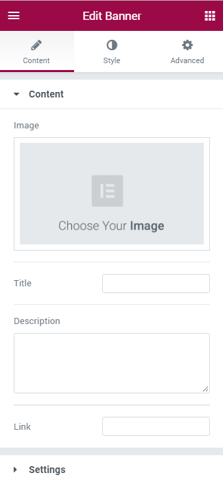
- Image — here you can upload or choose from the media library any image to use as a banner.
- Image Size — here you can set the preferable size for the banner widget.
- Title — in this block you need to input the title to use it for the banner.
- Description — here you have to add content to the banner. You can use HTML markup to separate text lines and quotes.
- Link — here you need to place the link, that will redirect the visitors to another webpage when they click on the banner area.
- Settings — here you can select the animation effect you want to use for the banner. Choose one of the effects from the dropdown list to view it on the page builder screen.
Style
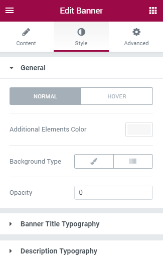
You can switch from customizing Normal to Hover style settings. Just click on the button Hover to proceed to customizing hover elements.
- Additional Elements Color — here you can define the color to use for additional elements of the banner. To apply a custom color select it using color picker.
- Background Type — in this block you can choose, whether you want to use classic or gradient type for the bannerbackground. The customization options vary for each type.
Classic Background Type
- Color — here you can set background color for the banner using color picker tool.
- Image — here you can choose the image you want to use as a background. Select the image from the media library or upload it to define it as a background in this block. When the image is uploaded, you’ll be able to define its position, alignment, turn on repeat and set the necessary size.
- Opacity — here you can define the value for the opacity of the background.
Gradient Background Type
- Color — here you can set background color for the banner using color picker tool.
- Location — here you can define the proportion for the first color in the gradient background.
- Second Color — here you can set the second color to use in the gradient background.
- Location — here you can define the proportion for the second color in the gradient background.
- Type — define, if you want to use linear or radial type of the gradient.
- Angle — in this block you can set the angle for the gradient (in degrees).
- Opacity — here you can change background opacity, where 1 is 100% opacity, and 0 — is 0% opacity.
Banner Title Typography
- Title Color — here you can define the color of the banner title using color picker tool.
- Typography — turn the option on to view the typography settings.
- Size — define the font size of the animated box title.
- Family — here you can set the font family for the title.
- Weight — in this block you can select the suitable font weight.
- Transform — here you can choose from the dropdown menu, if you want the title to be shown in uppercase, lowercase, capitalize or normal way.
- Style — in this block you can choose from the dropdown menu the style for the font. It can be normal, italic (the characters look similar to handwriting) and oblique (the characters are slightly inclined to the right).
- Line Height — in this field you can set the height of the title line.
- Letter Spacing — here you can set the space between letters.
- Description Color — here you can set the color for the banner content text.
- Typography — turn the option on to view the typography settings (they are similar to banner title typography settings).
Description Typography
Brands
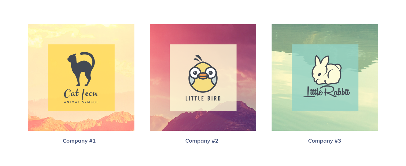
Brands widget helps you to showcase brands and companies on your website’s page. You can add brands, visualize them using brand logos, apply links to them and customize them in the matter of several clicks.
Brands widget Sample
On the picture below you can view Brands widget sample.
Content
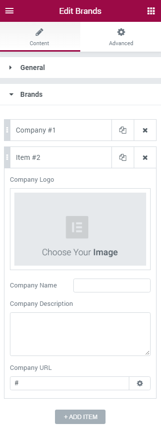
- Columns — here you can select from 1 to 6 columns to showcase brands.
- Add Item — click on the button to add new brand.
- Company Logo — here you can upload or choose from the media library your brand image to showcase in this block.
- Company Name — in this field you need to input the name of the company brand.
- Company Description — here you can input the short description of the brand to give the visitors impression about it.
- Company URL — fill in the brand URL link. When clicking on the brand the visitor will be redirected to the brand page.
Style
Company Logo
- Border Radius - here you can set the border radius for the company logo.
- Border Type — here you can define the type of the border you need to use for the company logo.
- Box Shadow — enable this option if you want to access the shadow advanced settings for this widget, and need to apply shadow for it.
- Alignment — here you can define the preferable logo alignment. The logo can be placed to the left, to the right, or remain centered.
Company Name
- Title Color — here you can define the suitable color for the brands title. Use color picker tool to select the necessary color.
- Typography — turn the option on to view the typography settings.
- Size — define the font size of the company name.
- Family — here you can set the font family for the company name.
- Weight — in this block you can select the suitable font weight.
- Transform — here you can choose from the dropdown menu, if you want the title to be shown in uppercase, lowercase, capitalize or normal way.
- Style — in this block you can choose from the dropdown menu the style for the font. It can be normal, italic (the characters look similar to handwriting) and oblique (the characters are slightly inclined to the right).
- Line Height — in this field you can set the height of the company name line.
- Letter Spacing — here you can set the space between letters.
- Alignment — here you can define the preferable title alignment. The title can be placed to the left, to the right, or remain centered.
Company Description
- Title Color — here you can define the suitable color for the brands description. Use color picker tool to select the necessary color.
- Typography — turn the option on to view the typography settings. The options ate similar to Company Name Typography.
- Alignment — here you can define the preferable description alignment. The text can be placed to the left, to the right, or remain centered.
Button
Button widget will assist you in creating buttons with your custom text and links, eye-catching icons and versatile hover effects! With this widget you can easily add a button whenever you need it and style it up according to your vision!
Button widget Sample
On the picture below you can view Button widget sample.
Content
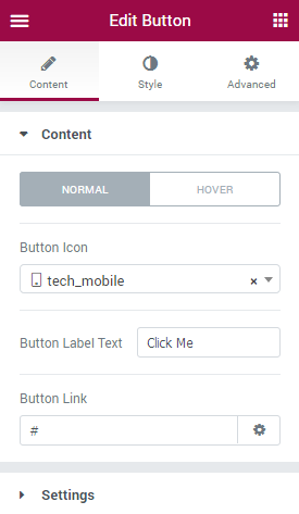
Here you can switch from customizing Normal to Hover content settings. Just click on the Hover button to proceed to customizing hover elements.
- Button icon - here you can select one of the available icons from the icons list to use it for the button.
- Button label text - type in your custom text to use it as a button text.
- Button link - here you can paste your custom link to apply it to the button.
Settings
- Hover effect - here you can pick one of the hover effects to use it for the button (none, fade, down slide, left slide, right slide, up scale, down scale, etc.).
- Use icon - enable this option if you want to display icon for the button.
- Icon position - here you can specify the icon button position (left, top, right, bottom).
Style
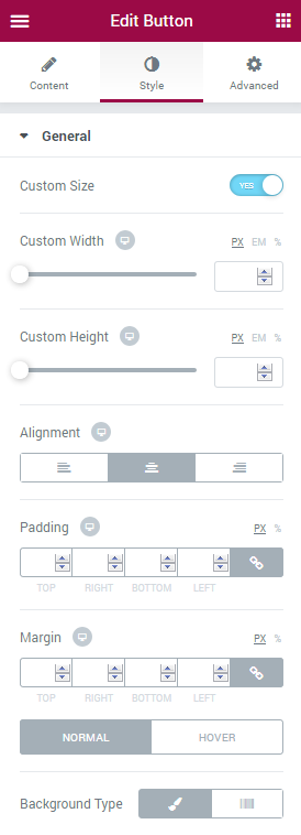
General
- Custom size - enable this option if you want to apply your custom height and width for the button.
- Custom width - here you can specify button width in px for different devices (desktop, tablet, mobile).
- Custom height - here you can specify button height in px for different devices (desktop, tablet, mobile).
- Alignment - here you need to choose the necessary button alignment (left, center, right).
- Padding - here you can set the preferable custom padding for the widget. Fill in the values for the top, bottom, right and left padding in pixels to apply your custom padding.
- Margin - here you can define the margins for the button.
Switch from Normal to Hover mode to use different style settings for the button background when on hover or in its normal state.
- Background type - in this block you can choose, whether you want to use classic or gradient type for the button background. The customization options vary for each type. The settings are similar to the common background type settings for other JetElements widget.
- Border type - here you can define the type of the border you need to use for the element.
- Border radius - here you can set the border radius to make the angles more smooth and round.
- Box shadow - enable this option if you want to access the shadow advanced settings for this widget, and need to apply shadow for it.
Plane
Switch between Normal and Hover modes to apply different custom styles for the button body.
- Background type - in this block you can choose, whether you want to use classic or gradient type for the button body background. The customization options vary for each type. The settings are similar to the common background type settings for other JetElements widget.
- Border type - here you can define the type of the border you need to use for the element.
- Border radius - here you can set the border radius to make the angles more smooth and round.
- Box shadow - enable this option if you want to access the shadow advanced settings for this widget, and need to apply shadow for it.
Icon
Switch between Normal and Hover modes to apply different custom styles for the button icon.
- Color - here you can apply your custom button icon color using color picker tool.
- Font size - use the controls or type in the icon font size value in px in the corresponding block.
- Icon box width - here you can specify the icon box width value using the controls. You can also type in the value in px in the corresponding block.
- Icon box height - here you can specify the icon box height value using the controls. You can also type in the value in px in the corresponding block.
- Icon box color - here you need to set the color to use it for the icon box.
- Border type - select the preferable border type to use it for the button.
- Border radius - here you can define the value of the border radius to make the angles more smooth and round.
- Margin - here you can define the margins for the button icon.
Label
Switch between Normal and Hover modes to apply different custom styles for the button label text.
- Color - here you can apply your custom button text color using color picker tool.
- Typography - turn the option on to view the typography settings. They are similar to the typography settings of other JetElements widget.
- Margin - here you can define the margins for the button text.
- Text Alignment - here you can define the preferable button text alignment. The text can be placed to the left, to the right, or remain centered.
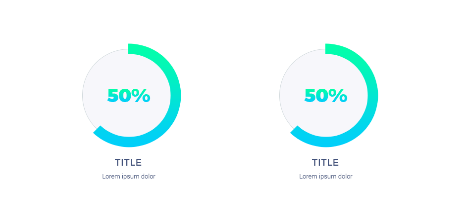
Circle Progress
Circle Progress widget allows you to display progress in the attractive form of circle progress bar. The widget has versatile style settings, such as content style, value type, etc.
Circle Progress widget Sample
On the picture below you can view Circle Progress widget sample.
Content
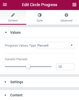
Values
In this block you can specify the values of the circle progress bar.
- Progress Values Type — here you can define the type of progress. It can be either absolute type (for common numbers) or percent type (for progress bar that uses percentage).
- Current Percent — here you can define the value to be displayed in the progress bar (in percents). The option is active when you’ve previously set percent progress values type.
- Current Value — here you can set the current value to be shown in the progress bar. The option is active when you’ve defined absolute progress values type.
- Max Value — the option defines the maximum value for the circle progress counter.
Settings
- Circle Size — here you can select the size for the circle progress bar. The minimal size is 100 px, the maximum size is 600 px.
- Value Stroke Width — here you need to select the width of the circle counter outline (stroke), which displays complete progress, in pixels.
- Background Stroke Width — here you need to select the width of the circle counter outline (stroke), which displays the remaining progress, in pixels.
- Animation Duration — here you need to select the speed of animation for the widget.
Content
- Value Number Prefix — here you need to set the positive or negative value number prefix.
- Value Number Suffix — here you need to define the positive or negative value number suffix.
- Show Thousand Separator in Value — here you can enable visual separating thousands in the counter.
- Counter Title — here you can fill in the title for the counter progress bar.
- Counter Subtitle — here you need to input the subtitle for the circle progress bar.
- Counter Content position — here you can select, if you want to position circle progress bar content inside of the circle, or outside of it.
Style
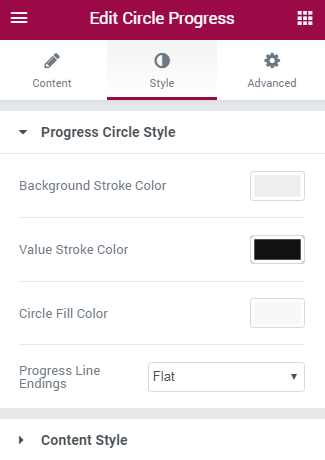
Progress Circle Style
- Background Stroke Type — here you can define the type of the stroke to use for the background outlines of the circle progress bar. It can be Classic or Gradient. Choose the one that is more suitable for you.
- Background Stroke Color — here you can define the color to use for the background outlines of the circle progress bar.
- Background Stroke Color A — here you can define the first color to use for the background outlines of the circle progress bar.
- Background Stroke Color B — here you can define the second color to use for the background outlines of the circle progress bar.
- Background Stroke Gradient Angle — here you can define the angle between first and second gradients.
- Value Stroke Color — here you need to specify the color for the outlines of the completed progress.
- Value Stroke Color A — here you can define the first color to use for the value outlines of the circle progress bar.
- Value Stroke Color B — here you can define the second color to use for the value outlines of the circle progress bar.
- Value Stroke Gradient Angle — here you can define the angle between first and second gradients.
- Circle Fill Color — here you need to specify the color that will be shown inside of the circle progress bar.
- Progress Line Endings — here you need to define, if you want the progress stroke line endings to be sharp or rounded, more smooth.
Classic Stroke Type
Gradient Stroke Type
Value Classic Stroke Color
Value Gradient Stroke Color
Content Style
In this block you can define style for these elements:
- number;
- title;
- subtitle.
Style settings for these three blocks are similar.
- Color — here you can define the suitable color for the Circle Progress widget elements. Use color picker tool to select the necessary color.
- Typography — turn the option on to view the typography settings.
- Size — define the font size of the Circle Progress widget element.
- Family — here you can set the font family for the Circle Progress widget element.
- Weight — in this block you can select the suitable font weight.
- Transform — here you can choose from the dropdown menu, if you want the Circle Progress widget element to be shown in uppercase, lowercase, capitalize or normal way.
- Style — in this block you can choose from the dropdown menu the style for the font. It can be normal, italic (the characters look similar to handwriting) and oblique (the characters are slightly inclined to the right).
- Line Height — in this field you can set the height of the Circle Progress widget element lines.
- Letter Spacing — here you can set the space between letters.
Countdown Timer
Countdown Timer widget is a helpful tool if you need to embed a timer with a countdown to your website’s page. The widget has multiple settings, such as digits color, font, and custom background for the timer.
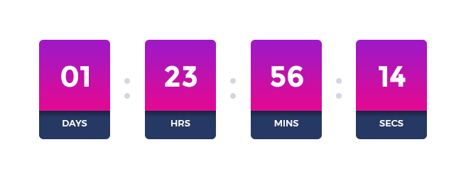
Countdown Timer widget Sample
On the picture below you can view Countdown Timer widget sample.
Content
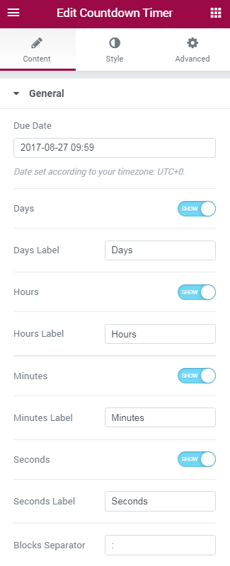
- Due Date — here you need to input the date to finish the countdown according to your time zone.
- Days — in this block you can enable or disable the days counter. When the option is disabled, the countdown will consist of hours, minutes and seconds only.
- Days Label — here you can change standard days label to your custom name.
- Hours — here you can enable or disable the hours counter. When the option is disabled, the countdown will consist of days, minutes and seconds only.
- Hours Label — here you can change standard hours label to your custom name.
- Minutes — here you can enable or disable minutes counter. When the option is disabled, the countdown will display days, hours and seconds only.
- Minutes Label — here you can change standard minutes label to your custom name.
- Seconds — here you can enable or disable seconds counter. When the option is disabled, the countdown will display days, hours and minutes only.
- Seconds Label — here you can change standard seconds label to your custom name.
- Blocks Separator — here you can input your custom separator to divide days, hours, minutes and seconds.
Style
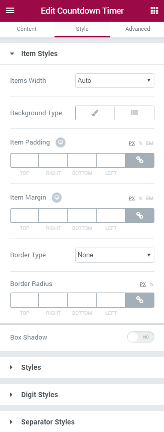
Item Styles
- Items Size — here you can select, if you want to use auto size, or you would rather use fixed size for the items. If you choose the fixed width for the items, you’ll be able to set the width and height in pixels in the blocks below.
- Width — here you can select the width of the items.
- Height — here you can select the height of the items.
- Background Type — in this block you can choose, whether you want to use classic or gradient type for the background. The customization options vary for each type.
Classic Background Type
- Color — here you can set background color using color picker tool.
- Image — here you can choose the image you want to use as a background. Select the image from the media library or upload it to define it as a background in this block. When the image is uploaded, you’ll be able to define its position, alignment, turn on repeat and set the necessary size.
- Opacity — here you can define the value for the opacity of the background.
Gradient Background Type
- Color — here you can set background color using color picker tool.
- Location — here you can define the proportion for the first color in the gradient background.
- Second Color — here you can set the second color to use in the gradient background.
- Location — here you can define the proportion for the second color in the gradient background.
- Type — define, if you want to use linear or radial type of the gradient.
- Angle — in this block you can set the angle for the gradient (in degrees).
- Opacity — here you can change background opacity, where 1 is 100% opacity, and 0 — is 0% opacity.
- Border Type — here you can define the type of the border you need to use for the animated box.
- Box Shadow — enable this option if you want to access the shadow advanced settings for this widget, and need to apply shadow for it.
Labels
- Color — here you can define the suitable color for the countdown timer. Use color picker tool to select the necessary color.
- Typography — turn the option on to view the typography settings.
- Size — define the font size of the countdown timer text.
- Family — here you can set the font family for the countdown timer text.
- Weight — in this block you can select the suitable font weight.
- Transform — here you can choose from the dropdown menu, if you want the countdown timer text to be shown in uppercase, lowercase, capitalize or normal way.
- Style — in this block you can choose from the dropdown menu the style for the font. It can be normal, italic (the characters look similar to handwriting) and oblique (the characters are slightly inclined to the right).
- Line Height — in this field you can set the height of the countdown timer text line.
- Letter Spacing — here you can set the space between letters.
- Box Shadow — enable this option if you want to access the shadow advanced settings for this widget, and need to apply shadow for it.
Digits
In this block you can set your custom styles for the countdown timer digits. The style options are similar to the general style options.
Separator Styles
- Color — here you can select the suitable color for the separator (usually it is a colon between the digits).
- Size — in this block you can select the size of the separator in pixels.
- Font — in this block you can define the font in which the separator will be shown.
Order
In this block you can set the custom order for the digits and labels.
Headline
Headline widget is the perfect tool for creating stunningly beautiful headlines in order to decorate the website’s pages with attractive textual titles. Its content is fully flexible, as well as its multiple style settings, devised to assist you in creating really beautiful headings within minutes!
Headline widget Sample
On the picture below you can view Headline widget sample.
Content
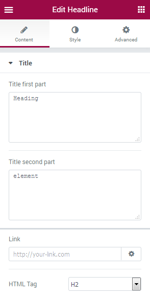
- Title first part - type in the first part of the headline in order to use it in the widget and apply different style setting to it.
- Title second part - fill in the second part of the headline to use it in the widget and apply different style settings, than were used for the first title part.
- Link - here you can define the headline link. Fill in the URL address to apply it for the headline. Click Settings icon in order to make the link open in the new window, or add nofollow to it.
- HTML Tag - here you can apply your custom HTML tag to the headline to define its importance (you can use both H1-H6 headings as well as paragraphs and divider tags).
Style
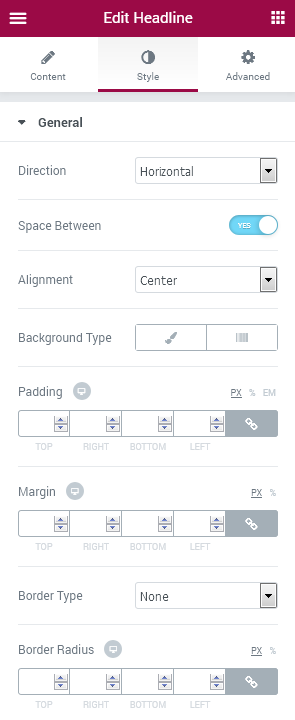
General
- Direction - here you can set the preferable headline direction. It can arrange text using horizontal or vertical alignment.
- Space between - when using horizontal alignment, you can choose whether it is necessary to add the space between the two parts of the heading.
- Alignment - here you can select the needed alignment for the headline text (left, center, right) on different screens.
- Background Type - in this block you can choose, whether you want to use classic or gradient type for the headline. The customization options vary for each type. The settings are similar to the common background type settings for other JetElements widget.
- Padding - here you can set the preferable custom padding for the headline. Fill in the values for the top, bottom, right and left padding in pixels to apply your custom padding.
- Margin - input the values for the headline margins in the required fields.
- Border Type - here you can define the needed border type for the headline block. It can be dotted, dashed, double or solid.
- Border radius - here you can set the border radius for the chosen border to make the border angles more round.
First part
- Text color - here you can change the first part of the headline text color using color picker.
- Typography - turn the option on to view the typography settings. They are similar to the typography settings of other JetElements widget.
- Background Type - in this block you can choose, whether you want to use classic or gradient type for the headline’s first part. The customization options vary for each type. The settings are similar to the common background type settings for other JetElements widget.
- Use Text Image - enable this option if you want to apply the image or gradient for the text of the headline’s first part.
- Text Image - here you can select the image for the text of the headline’s first part.
- Background Position - here you can define the position of the text image on the headline’s first part background.
- Background Repeat - here you can set the repetition of the text image on the headline’s first part background.
- Background Size - here you can determine the size of the text image on the headline’s first part background.
- Color - here you can set background color for the text of the headline’s first part using color picker tool.
- Location - here you can define the proportion for the first color in the gradient background.
- Second Color - here you can set the second color to use in the gradient background.
- Location - here you can define the location for the second color in the gradient background.
- Type - define, if you want to use linear or radial type of the gradient.
- Angle - in this block you can set the angle for the gradient (in degrees).
- Border Type - here you can define the type of the border you need to use for the element.
- Border Radius - here you can set the border radius for the chosen border to make the border angles more round.
- Padding - here you can set the preferable custom padding for the first part of the headline. Fill in the values for the top, bottom, right and left padding in pixels to apply your custom padding.
- Margin - here you can define the margins for the first part of the headline.
- Alignment - here you can define the preferable alignment for the first part of the text. It can be placed to the left, to the right, or remain centered.
- Text Color - here you can change the text color of the second part of the headline using color picker.
- Typography - turn the option on to view the typography settings. They are similar to the typography settings of other JetElements widget.
- Background Type - in this block you can choose, whether you want to use classic or gradient type for the headline’s second part. The customization options vary for each type. The settings are similar to the common background type settings for other JetElements widget.
- Border Radius - here you can set the border radius for the chosen border to make the border angles more round.
- Padding - here you can set the preferable custom padding for the second part of the headline. Fill in the values for the top, bottom, right and left padding in pixels to apply your custom padding.
- Margin - here you can define the margins for the second part of the headline.
- Alignment - here you can define the preferable alignment for the second part of the text. It can be placed to the left, to the right, or remain centered.
- Before Deco Type - here you can select the needed decoration type to place it before the headline element. It can be Icon element, Image element, or you can select None to use neither of these decorations.
- Before Icon - when you select Icon deco type, you can specify the icon in this field.
- Before Icon Color - here you can specify the color of the icon using color picker tool.
- Before Icon Size - use the controls to change the icon size or type in the size value in px in the corresponding field.
- Margin - here you can define the margins for the icon.
- Alignment - here you can define the preferable icon alignment. It can be placed to the left, to the right, or remain centered.
- Before Image - in the case you’ve chosen Image deco type, you’ll be able to upload or select from the media library an image to use it as a decoration of the headline.
- Before Image Size - here you can define the size of the selected image.
- After Deco Type - here you can select the needed decoration type to place it after the headline element. It can be Icon element, Image element, or you can select None to use neither of these decorations.
- After Icon Color - here you can specify the color of the icon using color picker tool.
- After icon Size - use the controls to change the icon size or type in the size value in px in the corresponding field.
- Margin - here you can define the margins for the icon.
- Alignment - here you can define the preferable icon alignment. It can be placed to the left, to the right, or remain centered.
- After Image - in the case you’ve chosen Image deco type, you’ll be able to upload or select from the media library an image to use it as a decoration of the headline.
- After Image Size - here you can define the size of the selected image.
Here you can switch from customizing Image to Gradient style settings.
Click on the button Image to proceed to customizing gradient elements.
Click on the button Gradient to proceed to customizing gradient elements.
Second part
Decorative Elements
Before Deco ElementHorizontal Timeline
Horizontal Timeline widget fits perfectly for demonstrating the project's milestones, upcoming events and roadmaps. Add stages of the project and events plan on the pages built in Elementor page builder using an attractive Horizontal Timeline widget!
Content
Cards
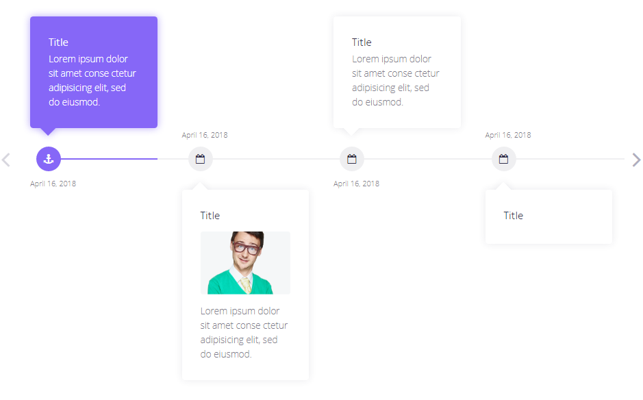
Click Add Item button in order to create a new event card in the Horizontal Timeline chain. After that, you'll be able to edit the event card, place content into it. You can add as many event cards as you need to make the event timelines longer or shorter.
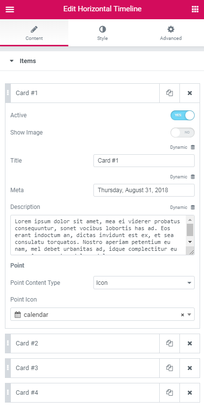
- Active - enable this option in order to show the current state of the event.
- Show Image - enable this option in order to add an image to be shown in the Event card.
- Image - here you can select the image from the media library or upload one from your hard drive to use it for an event card.
- Title - type in the preferable title to display for the event card.
- Meta - add the meta information for the event card to specify the date or timing of the event.
- Description - fill in the Description field to provide more information about the event.
- Point Content Type - select if you want to use the icon or the text event point type to place the icon or the textual event point (in the text field one can type in numbers or words that specify the currently edited event stage or step).
- Point Icon - here you can set the icon for the event or project stage using Icon Picker tool.
- Point Text - here you can fill in the number or the textual mark for the stage or the step on which this event will be held.
- Title HTML Tag - here you can select the HTML tag to apply for the cards titles.
- Show Cards Arrows - enable this option if you want to add arrows to the cards' bottom.
- Columns - here you can select the number of columns on the row will be displayed in the timeline.
- Layout - choose the appropriate position of the elements in the timeline. They can be located on the top, on the bottom or in chessboard order.
- Alignment - arrange the event cards horizontally using the left, center and right alignment types.
- Navigation Type - here you can adjust how you want to navigate among the cards in the timeline: by scrolling or with the help of arrows.
- Arrow Type - here you can select the arrow design from the drop-down list.
- Items Gap - here you can define the appropriate gap between the items.
- Border type - here you can define the needed border type for the card block. It can be groove, dotted, dashed, double or solid.
- Border Radius - here you can set the radius for the chosen border to make the border angles more round.
- Padding - type in the custom padding values to add the responsive padding for the block.
- Spacing - here you can define the spacing between cards and other items in the timeline.
- Background Color - here you can specify the color to apply for the card box background.
- Border Color - here you can select the color of the cards border.
- Box Shadow - enable this option if you want to access the shadow advanced settings for the box, and need to apply shadow to it.
- Size - here you can define the size of the cards arrows.
- Offset - here you can tune the cards arrows horizontal offset.
- Alignment - arrange the event cards content using the top, middle and bottom alignment types.
- Margin - fill in the custom margin values to add a responsive margin around the image.
- Border Radius - here you can set the radius for the image border to make the border angles more round.
- Stretch Image - enable this option if you want to stretch the image.
- Typography - turn the option on to view the typography settings. They are similar to the typography settings of other JetElements widget.
- Margin - fill in the custom margin values to add a responsive margin around the title.
- Color - here you can select the color of the title.
- Typography - turn the option on to view the typography settings. They are similar to the typography settings of other JetElements widget.
- Margin - fill in the custom margin values to add a responsive margin around the description.
- Color - here you can select the color of the description text.
- Image Order - here you can define the order of the image comparatively to title and description.
- Title Order - here you can define the order of the title comparatively to image and description.
- Description Order - here you can define the order of the title comparatively to title and description.
- Typography - turn the option on to view the typography settings. They are similar to the typography settings of other JetElements widget.
- Border type - here you can define the type of the border you need to use for the element.
- Border Radius - here you can set the radius for the meta border to make the border angles more round.
- Padding - type in the custom padding values to add the responsive padding for the block.
- Spacing - here you can define the spacing of meta data in the timeline.
- Color - use Color picker tool to specify the color of the meta text.
- Background Color - select the preferable color using Color Picker tool to apply if for the meta text background to make it more readable.
- Box Shadow - enable this option if you want to access the shadow advanced settings for the meta data, and need to apply shadow to it.
- Typography - turn the option on to view the typography settings. They are similar to the typography settings of other JetElements widget.
- Icon Size - here you can specify the size of the icon which indicates the event on the timeline.
- Point Size - here you can specify the size of the point that marks the event on the timeline.
- Offset - here you can customize the horizontal offset of the point.
- Border Type - here you can define the needed border type for the point block. It can be groove, dotted, dashed, double or solid.
- Width - type in the border width in pixels in order to set the width for the box top, bottom, left and right borders.
- Color - here you can specify the color of the border using Color picker tool.
- Border Radius - here you can set the radius for the point border to make the border angles more round.
- Color - here you can specify the color of the point using Color picker tool.
- Background Color - select the preferable color using Color Picker tool to apply if for the point background to make it more readable.
- Border Color - here you can select the color of the point border on hover and when in the active state.
- Line Color - here you can customize the color to apply for the line using Color picker tool.
- Progress Color - here you can set the preferable color to be shown when the progress moves on.
- Height - specify how high should be the timeline line.
- Scrollbar Color - here you can set the color to apply for the scrollbar using Color picker tool.
- Scrollbar Thumb Color - here you can set the preferable color of the scrollbar thumb.
- Scrollbar Height - specify how high should be the scrollbar.
- Scrollbar Offset - define the horizontal offset of the scrollbar.
- Border Radius - here you can set the radius for the scrollbar border to make the border angles more round.
Layout
Style
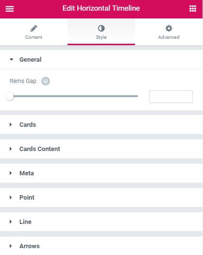
General
Cards
Here you can switch from customizing Normal, Hover or Active style settings of event cards. Just click on the button Hover or Active to proceed to customizing hover or active elements.
Arrow
Cards Content
Image
Title
Switch between Normal, Hover and Active editing modes in order to alter the appearance of the event card title on hover, when active and in the normal state.
Description
Switch between Normal, Hover and Active editing modes in order to alter the appearance of the event card description on hover, when active and in the normal state.
Orders
Meta
Switch between Normal, Hover and Active editing modes in order to alter the appearance of the meta information on hover, when active and in the normal state.
Point
Switch between Text and Icon modes in order to customize the appearance of the text point type or icon point type (depending on what type you've selected in Content block.
Switch between Normal, Hover and Active editing modes in order to alter the appearance of the event point on hover, when active and in the normal state.
Line
Scrollbar
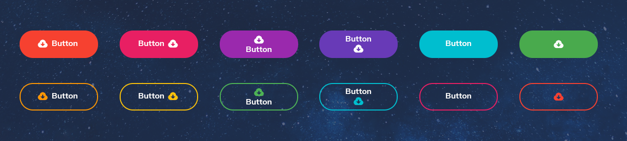
Download Button
Download Button widget will assist You in creating versatile buttons that will allow the visitors downloading files in one click! You won't need to install additional plugins to add this kind of functionality to the website! All You need is to use Download Button widget and have the file stored in the Media Library!
Download Button widget Sample
On the picture below you can view Download Button widget sample.
Content
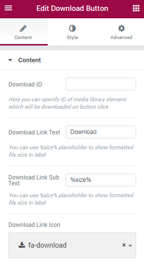
- Download ID — enter the ID number of the Media Library object to download it on button click.
- Download Link Text — here you can specify the text that will be displayed on the button. You can as well use %size% placeholder to display the formatted file size.
- Download Link Sub Text — in this field you can define the download link sub text. You can also use %size% placeholder.
- Download Link Icon — select the preferable icon to display with the Download link.
Style
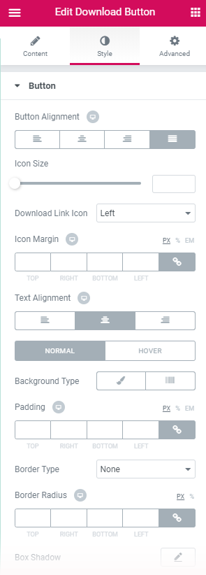
In this block, you can change style and appearance settings for Download Button widget, define item padding, alignment, additional elements color, etc.
Button
- Button Alignment — select the centered, left, right or justified alignment of the button.
- Icon Size — here you can set the necessary icon size to use it for the button.
- Download Link Icon — use the dropdown menu to specify the position of the download link.
- Icon Margin — here you can define the preferable margin values for the button icon.
- Text Alignment — select the centered, left or right alignment of the text.
- Background Type — in this block you can choose, whether you want to use classic or gradient type for the button. The customization options vary for each type.
- Padding — here you can set the preferable custom padding for the whole column where the widget is displayed. Fill in the values for the top, bottom, right and left padding in pixels to apply your custom padding.
- Border Type — here you can define the type of the border you need to use for the element.
- Border Radius - here you can set the border radius for the download button.
- Box Shadow - enable this option if you want to access the shadow advanced settings for this module, and need to apply shadow for it.
- Icon Color — use color picker tool to choose the needed icon color.
- Text Color — here you can select the preferable color of the button label text using color picker.
- Typography — turn the option on to view the typography settings.
- Size — define the font size of the button label.
- Family — here you can set the font family for the button label.
- Weight — in this block you can select the suitable font weight.
- Transform — here you can choose from the dropdown menu, if you want the text to be shown in uppercase, lowercase, capitalize or normal way.
- Style — in this block you can choose from the dropdown menu the style of the font. It can be normal, italic (the characters look similar to handwriting) and oblique (the characters are slightly inclined to the right).
- Line Height — in this field you can set the height of the text line.
- Letter Spacing — here you can set the space between letters.
- Text Color — here you can select the preferable color of the button sub label text using color picker.
- Typography — turn the option on to view the typography settings. They are similar to those in the Button Label block.
Button Icon
Button Label
Button Sub Label
Dropbar
Dropbar widget helps you to display additional information in compact form using Elementor templates or simple text.
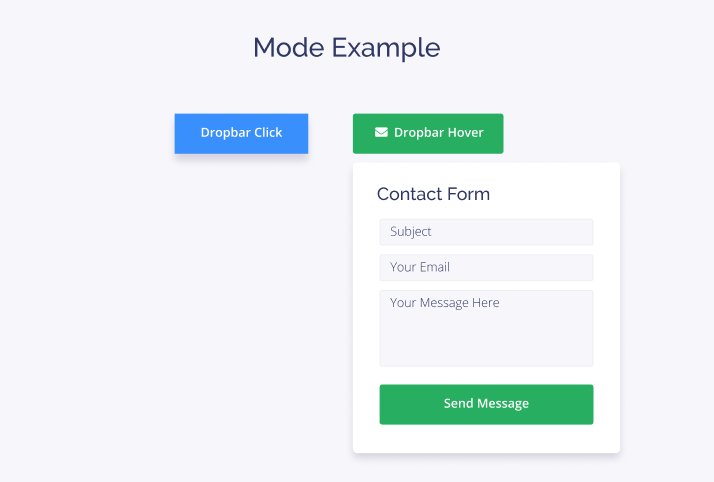
Content
Dropbar
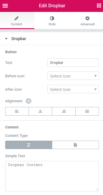
Button
- Text — in this field you can insert text, which will be displayed on the button.
- Before Icon — here you can select the icon from dropdown list, which will be showcased before the button.
- After Icon — here you can select the icon from dropdown list, which will be placed after the button.
- Alignment — define the appropriate button alignment. The button can be located to the left, on the centre, to the right or justified.
Content
- Content Type — here you can select one of the available options: Simple Text or Template. Simple Text allows filling the dropdown section with suitable text. Template allows choosing one of the templates in dropdown list, which will be displayed in dropdown section.
Settings
- Position — here you can adjust the dropbar's posiiton on the page on desktop, laptop and mobile phone.
- Mode — here you can define if the dropbar content opens on mouse hover or on mouse click.
- Hide Delay — it is available to define the time when the dropdown section will be hidden.
- Show Effect — here you can add one of the effects how the drowdown section will appear.
- Offset — here you can tune the dropdown content's offset down.
- Width — define the dropdown section's width .
- Fixed Layout — enable this option if you want to fix position of the dropbar on the page.
- Fixed Position — here you can determine the dropbar's position on the page.
- Gap — here you can fix the gap larger or smaller around the dropbar
- Z-Index — you can specify the dropbar's stack order relatively to other elements on the page.
Style
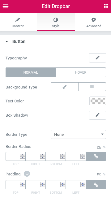
Button
- Typography — turn the option on to view the typography settings. They are similar to the typography settings of other JetElements widget.
- Icon Font Size — here you can adjust the icon's size.
- Icon Spacing — here it is available to define the space between the icon and the text on the button.
Here you can switch from customizing Normal to Hover Dropbar style settings. Just click on the button Hover to proceed to customizing hover elements.
- Background Type — in this block you can choose, whether you want to use classic or gradient type for the dropbar. The customization options vary for each type.
Classic Background Type
- Color — here you can pick the dropbar's colour using color picker tool.
- Image — here you can choose the image you want to use as a background. Select the image from the media library or upload it to define it as a background in this block. When the image is uploaded, you’ll be able to define its position, alignment, turn on repeat and set the necessary size.
- Text Color — here you can define the suitable color for dropbar's text using color picker tool.
- Icon Color — here you can define the icon's color using color picker tool.
- Box Shadow — enable this option if you want to access the shadow advanced settings for this widget, and need to apply shadow for it.
Gradient Background Type
- Color — here you can set background color for the dropbar using color picker tool.
- Location — here you can define the proportion for the first color in the gradient background.
- Second Color — here you can set the second color to use in the gradient background.
- Location — here you can define the proportion for the second color in the gradient background.
- Type — define, if you want to use linear or radial type of the gradient.
- Angle — in this block you can set the angle for the gradient (in degrees).
- Text Color — here you can define the suitable color for dropbar's text using color picker tool.
- Box Shadow — enable this option if you want to access the shadow advanced settings for this widget, and need to apply shadow for it.
- Hover Animation — this option is available in Hover Dropbar style settings block. here you can add animation effect to the dropbar on mouse hover.
- Background Type — in this block you can choose, whether you want to use classic or gradient type for the dropbar. The customization options vary for each type.
- Border Type — here you can define the type of the border you need to use for the element.
- Border Radius — here you can set the border radius for the dropbar.
- Padding — here you can set the preferable custom padding for the widget. Fill in the values for the top, bottom, right and left padding in pixels to apply your custom padding.
Content
- Typography — turn the option on to view the typography settings.
- Alignment — set the appropriate alignment of dropbar's content.
- Background Type — in this block you can choose, whether you want to use classic or gradient type for the dropbar's content. The customization options vary for each type.
- Color — here you can pick the colour for the dropbar's content using color picker tool.
- Image — here you can choose the image you want to use as a background in dropdown section. Select the image from the media library or upload it to define it as a background in this block. When the image is uploaded, you’ll be able to define its position, alignment, turn on repeat and set the necessary size.
- Text Color — here you can define the suitable color for text in the dropdown section using color picker tool.
- Border Type — here you can define the needed border type for the dropdown section. It can be dotted, dashed, double or solid.
- Width — define the width of the borders in the dropdown section.
- Color — define the color of the borders in the dropdown section.
- Border Radius — here you can set the radius of the borders in the dropdown section.
- Box Shadow — enable this option if you want to access the shadow advanced settings for this widget, and need to apply shadow for it.
- Padding — here you can set the preferable custom padding for the widget. Fill in the values for the top, bottom, right and left padding in pixels to apply your custom padding.
- Z-Index — you can specify the dropbar's content's stack order relatively to other elements on the page.
- Color — here you can set background color for the dropbar using color picker tool.
- Location — here you can define the proportion for the first color in the gradient background.
- Second Color — here you can set the second color to use in the gradient background.
- Location — here you can define the proportion for the second color in the gradient background.
- Type — define, if you want to use linear or radial type of the gradient.
- Angle — in this block you can set the angle for the gradient (in degrees).
- Text Color — here you can define the suitable color for text in the dropdown section using color picker tool.
- Border Type — here you can define the needed border type for the dropdown section. It can be dotted, dashed, double or solid.
- Width — define the width of the borders in the dropdown section.
- Color — define the color of the borders in the dropdown section.
- Border Radius — here you can set the radius of the borders in the dropdown section.
- Box Shadow — enable this option if you want to access the shadow advanced settings for this widget, and need to apply shadow for it.
- Padding — here you can set the preferable custom padding for the widget. Fill in the values for the top, bottom, right and left padding in pixels to apply your custom padding.
- Z-Index — you can specify the dropbar's content's stack order relatively to other elements on the page.
Classic Background Type
Gradient Background Type
Image Comparison
Image Comparison widget is the perfect tool that will assist you in creating slides with image comparisons (where two images are compared) in an attractive and stylish form.
Image Comparison widget Sample
On the picture below you can view Image Comparison widget sample.
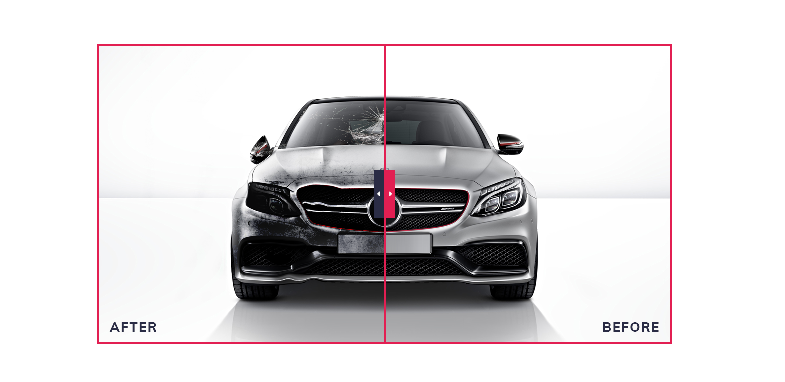
Content
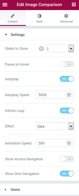
- Slides to show - define the number of slides to show at one time. You can show up to 10 slides at one time, or set “1” to use the widget as a simple slider.
- Slides to scroll - here you can define how many slides you want to scroll.
- Pause on hover - enable this option to pause Image Comparison slides whenever the visitor puts the mouse to the slider area.
- Autoplay - here you can enable autoplay option for the Image Comparison widget. If enabled, the option turns on switching from slide to slide automatically.
- Autoplay speed - here you can define the speed of switching from slide to slide (in ms).
- Infinite loop - turn on the option if you want the slides to repeat.
- Effect - here you can choose one of the multiple effects from the dropdown list to use it for widget animation.
- Animation speed - here you can set the speed of switching between slides in ms.
- Show arrows navigation - enable this option if you’re using Image Comparison slider. The navigation arrows will be added to right and left sides of the slider.
- Show dots navigation - enable this option if you’re using Image Comparison carousel.
Items
Click Add Item button in order to create a new slide for the widget.
- Before label - type in the title for the Before image.
- Before image - here you can select the Before image to use it in the Comparison widget.
- After label - type in the title for the After image.
- After image - here you can select the After image to use it in the Comparison widget.
Style
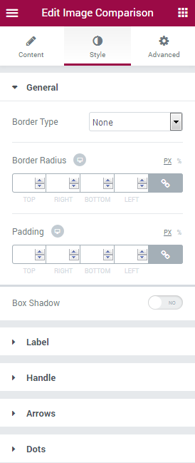
General
- Border type - here you can define the type of the border you need to use for the element.
- Border radius - here you can set the border radius to make the angles more smooth and round.
- Padding - here you can set the preferable custom padding for the whole column where the widget is displayed. Fill in the values for the top, bottom, right and left padding in pixels to apply your custom padding.
- Box shadow - enable this option if you want to access the shadow advanced settings for this widget, and need to apply shadow for it.
Label
Switch between Before and After blocks in order to customize styles for each of the text labels.
- Color - here you can set the text color for the image label.
- Typography - turn the option on to view the typography settings. They are similar to the typography settings of other JetElements widget.
- Background type - in this block you can choose, whether you want to use classic or gradient type for the label background. The customization options vary for each type. The settings are similar to the common background type settings for other JetElements widget.
- Margin - input the values for the alerts margins in the required fields.
- Padding - here you can set the preferable custom padding for the labels. Fill in the values for the top, bottom, right and left padding in pixels to apply your custom padding.
- Horizontal alignment - select central, left or right alignment for the label.
- Vertical alignment - select central, left or right alignment for the label.
Handle
In this block you can customize Image Comparison handle. It is an element that allows enlarging the image areas by dragging the borders between the two compared images.
- Control width - here you can specify the width of the handle in px for different devices (desktop, tablet, mobile).
- Weight - here you can apply your custom height for the handle elements.
Switch between Normal and Hover blocks in order to customize the style for the handle when on hover or in the normal mode.
- Background type - in this block you can choose, whether you want to use classic or gradient type for the handle background. The customization options vary for each type. The settings are similar to the common background type settings for other JetElements widget.
- Box shadow - enable this option if you want to access the shadow advanced settings for the handle, and need to apply shadow for it.
- Border radius - here you can set the border radius to make the angles more smooth and round.
Heading divider
- Divider width - here you can specify the divider width in px for different kinds of devices (desktop, tablet, mobile).
- Divider color - here you can select the color to apply to the divider using color picker tool.
Heading Arrow
- Prev arrow icon - here you can select the icon type to use for the Prev handle element. There are several icon types for you to choose (angle, chevron, angle double, arrow, caret, long arrow, arrow circle, chevron circle, caret square).
- Next arrow icon - here you can select the icon type to use for the Next handle element.
- Icon size - use the controls to define the needed icon size of fill in the size value in the corresponding field in px.
- Margin - here you can define the margins to use between the arrow icons.
Switch between Normal and Hover modes to use different icon colors when on hover.
- Icon color - here you can specify the color to use it for the handle icon.
Arrows
Switch between Normal and Hover modes to apply different style setting for the navigation arrows when on hover, or when in the normal state.
- Font color - here you can select the color to use for the navigation arrows using color picker tool.
- Background type - in this block you can choose, whether you want to use classic or gradient type for the harrows background. The customization options vary for each type. The settings are similar to the common background type settings for other JetElements widget.
- Font size - here you need to specify the size of the arrows.
- Box size - here you can set the size of the navigation arrow box.
- Border type - here you can define the type of the border you need to use for the element.
- Border radius - here you can set the border radius to make the angles more smooth and round.
- Box shadow - enable this option if you want to access the shadow advanced settings for the arrows, and need to apply shadow for them.
Prev arrow position
- Vertical position by - define the vertical position for the prev arrow. It can be positioned at the top or at the bottom.
- Top indent - define the vertical position indent in pixels, or use controls to define the suitable position automatically.
- Horizontal position by - define the horizontal position for the prev arrow. It can be positioned on the left or on the right.
- Left indent - define the horizontal position indent in pixels, or use controls to define the suitable position automatically.
Next arrow position
- Vertical position by - define the vertical position for the next arrow. It can be positioned at the top or at the bottom.
- Top indent - define the vertical position indent in pixels, or use controls to define the suitable position automatically.
- Horizontal position by - define the horizontal position for the next arrow. It can be positioned on the left or on the right.
- Right indent - define the horizontal position indent in pixels, or use controls to define the suitable position automatically.
Dots
Here you can switch between Hover, Active and Normal modes to style up them separately.
- Font color - define the color of the pagination dots using color picker tool.
- Background type - in this block you can choose, whether you want to use classic or gradient type for the simple items. The customization options vary for each type.
- Font size - here you can select the size of the dot pagination controls in pixels.
- Box size - here you can select the size of the dot controls in pixels.
- Border type - here you can define the type of the border you need to use for the dots border.
- Border radius - here you can set the border radius to make the angles more smooth and round.
- Box shadow - enable this option if you want to access the shadow advanced settings for dots, and need to apply shadow for it.
- Gap - here you can define the gap between pagination dots in pixels, or use controls to set it automatically.
- Dots box margin - here you can define the margins for the Dots box.
- Alignment - set right, left or center alignment to use it for the dots.
Instagram empowers you to showcase Instagram publications on your website's pages in an attractive way, with text captions, meta information (the number of likes and comments). You'll be able to style up this widget according to your vision in order to make it the truly outstanding part of your website!
Instagram Widget Sample
On the picture below you can view Instagram widget sample.
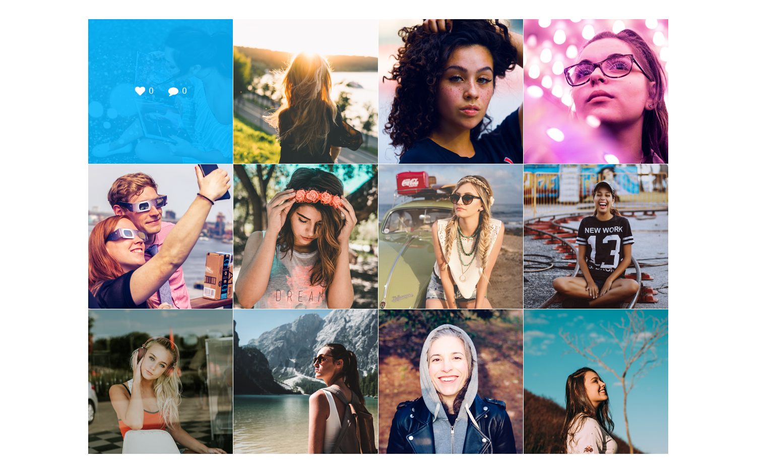
Please, note, that the way JetElements Instagram widget for Elementor works has changed along with the latest Instagram policy modifications.
You can demonstrate photos only from your own account, and it's not possible to showcase the photos from third-party account anymore.
To display the photos from your personal Instagran account you need an Access Token which you can easily generate here. After that, copy and paste it into the Access Token field in the Dashboard > Elementor > Jet Elements Settings > Instagram Options.
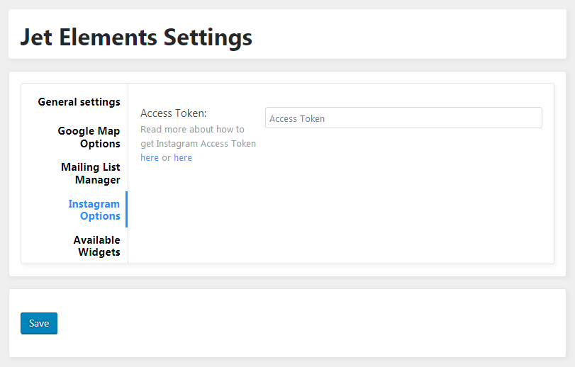
Read more about how to get Instagram Access Token here or here!
Content
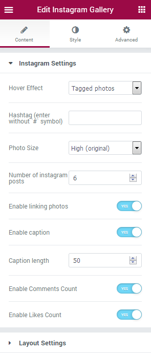
Instagram Settings
- What to show - here you can specify what you want to display in the widget (the photos with the specific hashtag, or the photos from your Instagram account.
First, let’s see what options are available when you set Tagged Photos.
- Hashtag - here you need to input the hashtag by which the photos will be displayed.
- Cache Timeout - in this block you can select the timeout of the Instagram photo cache (minute, hour, day, week, or none).
Now let’s see what options are available when you set My Photos in What to show.
- Username - type in your Instagram username to display the photos from your Instagram account.
The options mentioned below are the same for both My Photos and Tagged Photos options.
- Photo size - here you can set the desirable size to use it for the photos. Note, that in some cases the original photo size may vary for different photos, so you may need to set another size. Here you can see the available sizes to use for the photo publications:
- Standard (640x640px);
- Low (320x320px);
- Thumbnail (150x150px);
- Original.
- Number of Instagram posts - here you can set the needed number of instagram publications to display.
- Enable linking photos - enable this option in order to use linking.
- Enable caption - enable this option to show the caption of the Instagram publication (you can see it on hover).
- Caption length - here you can specify the needed length to use for the publication caption (the number of symbols to show in a caption).
- Enable comments count - enable this option in order to show the number of comments to Instagram publications on hover.
- Enable likes count - enable this option to see the number of likes for these Instagram publications on hover.
Layout settings
- Layout type - here you can specify the Instagram publications layout you want to apply (Masonry, Grid, List).
- Columns - here you can define how many columns you want to use for the Instagram publications (from 1 to 6). You can also change the number of columns for different devices to make the widget content responsive.
Style
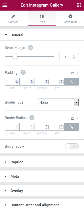
General
- Items margin - use the controls or type in the needed items margin value in px to use it.
- Padding - fill in the padding value for Top, Right, Left and Bottom of the widget in order to set the padding for the items.
- Border type - here you can define the needed border type for the items. It can be dotted, dashed, double or solid.
- Border radius - here you can set the border radius for the chosen border to make the border angles more round.
- Box shadow - enable this option if you want to access the shadow advanced settings for the items, and need to apply shadow for them.
Caption
- Color - here you can set the color of the caption text (shown on hover).
- Typography - turn the option on to view the typography settings. They are similar to the typography settings of other JetElements widgets.
- Padding - here you need to set the padding for the item caption.
- Margin - here you can specify the margins values to set them for the caption.
- Caption width - use the controls or input the caption width in px in the corresponding field in order to make it more narrow or wide.
- Alignment - here you can specify the preferable caption alignment (Right, Center, Left).
- Text alignment - here you can set the needed caption text alignment (Right, Center, Left).
Meta
- Comments icon - select the icon to show it before the comments count.
- Likes icon - here you can specify the icon to show it before the likes count.
- Icon color - here you can set the color to use it for the icons using color picker tool.
- Icon size - use the controls or type in the preferable value in px to set the needed icon size.
- Text color - here you can set the color to use it for the comments and likes count text.
- Typography - turn the option on to view the typography settings. They are similar to the typography settings of other JetElements widgets.
- Background type - in this block you can choose, whether you want to use classic or gradient type for the widget. The customization options vary for each type. The settings are similar to the common background type settings for other JetElements widgets. It is the background to use for the meta information only, such as likes and comments.
- Padding - here you need to set the padding for the meta information. <
- Margin - here you can specify the margins values to set them for the meta information.
- Border type - here you can define the needed border type for the meta information. It can be dotted, dashed, double or solid.
- Border radius - here you can set the border radius for the chosen border to make the border angles more round.
Overlay
- Show on hover - enable this option in order to show meta information, post caption and overlay on hover only. When set to No, the option will enable all the meta and caption info right on the Instagram publications in the normal state.
- Background type - in this block you can choose, whether you want to use classic or gradient type for the overlay. The customization options vary for each type. The settings are similar to the common background type settings for other JetElements widgets.
- Padding - here you need to set the padding for the overlay.
Content Order and Alignment
- Caption order - here you can select the order number for the caption of the publication text (e.g., 1 to make it show up first).
- Meta order - here you can select the order number for the meta information (e.g., 2 to make it show up second).
- Cover content vertical alignment - select the needed content alignment according to your needs (Center, Top, Bottom, Space between<).
Images Layout
Images Layout widget displays images using different eye-catching layout types, such as Masonry, Justify, Grid or List. Add images and customize layouts in several clicks to get the stunning results and adorn Your website pages with beautiful imagery!
Images Layout widget Sample
On the picture below you can view Images Layout widget sample.
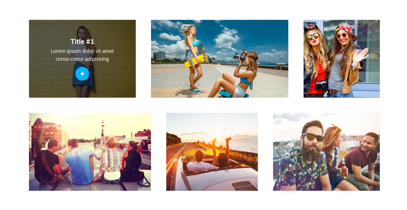
Content
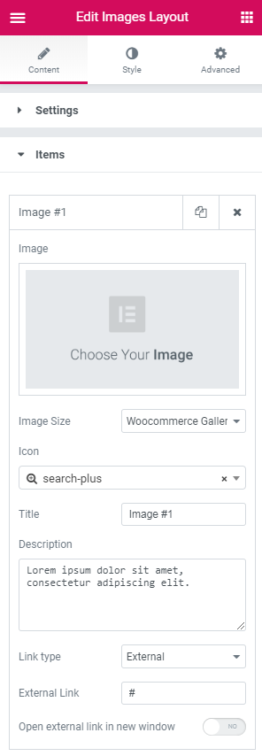
Settings
- Layout type — here you can select one of several image layouts available for this widget (Masonry, Grid, Justify, Grid, List).
- Columns — here you can select the number of columns to display the images in this widget.
- Image — click on the Image area to select the image from the Media Library or upload one from your hard drive.
- Image Size — here you can select the size of the images.
- Icon — here you can set the icon for the image.
- Title — here you can input the title of the image.
- Description — in this field you need to provide the image description.
- Link type — here you need to specify if you want the link to be external or lightboxed.
- External Link — here you can provide the URL address of the external link.
- Open external link in new window — enable this option if you want the link opens in a new window.
- Items Margin — drag the controller rightwards and leftwards to specify the preferable items margin.
- Border Type — here you can define the needed border type for the widget. It can be dotted, dashed, double or solid.
- Border Radius — here you can define the values for the radius of the selected border.
- Padding — here you can set the preferable custom padding for the widget is displayed. Fill in the values for the top, bottom, right and left padding in pixels to apply your custom padding.
- Box Shadow — enable this option if you want to access the shadow advanced settings for this widget, and need to apply shadow for it.
- Icon Color — here you can set the color of the widget icons using color picker tool.
- Icon Background Color — here you can set the background color for the icon using color picker tool.
- Font Size — here you can define the font size of the icon symbol.
- Box Size — define the box size of the widget icon.
- Border Type — here you can define the type of the border you need to use for the icon element.
- Border Radius — here you can define the values for the radius of the selected icon border.
- Box Shadow — enable this option if you want to access the shadow advanced settings for the icon, and need to apply shadow for it.
- Horizontal Alignment — select central, left or right alignment for the icon.
- Vertical Alignment — select central, left or right alignment for the icon.
- Color — here you can set the color of the widget titles using color picker tool.
- Typography — turn the option on to view the typography settings.
- Padding — here you can set the preferable custom padding for the titles. Fill in the values for the top, bottom, right and left padding in pixels to apply your custom padding.
- Alignment — set the centered, left or right alignment for the title.
- Color — here you can set the color of the widget descriptions using color picker tool.
- Typography — turn the option on to view the typography settings.
- Padding — here you can set the preferable custom padding for the descriptions. Fill in the values for the top, bottom, right and left padding in pixels to apply your custom padding.
- Alignment — set the centered, left or right alignment for the description.
- Background Type — in this block you can choose, whether you want to use classic or gradient type for the widget overlay. The customization options vary for each type.
- Color — here you can set the background color for the overlay using color picker tool.
- Image — here you can choose the image you want to use as a background. Select the image from the media library or upload it to define it as a background in this block. When the image is uploaded, you’ll be able to define its position, alignment, turn on repeat and set the necessary size.
- Opacity — here you can define the value for the opacity of the background.
- Color — here you can set the background color for the overlay using color picker tool.
- Location — here you can define the proportion for the first color in the gradient background.
- Second Color — here you can set the second color to use in the gradient background.
- Location — here you can define the proportion for the second color in the gradient background.
- Type — define, if you want to use linear or radial type of the gradient.
- Angle — in this block you can set the angle for the gradient (in degrees).
- Opacity — here you can change background opacity, where 1 is 100% opacity, and 0 — is 0% opacity.
- Padding — here you can set the preferable custom padding for the overlay. Fill in the values for the top, bottom, right and left padding in pixels to apply your custom padding.
- Title Order — here you can set the order number to display the title first or second.
- Content Order — here you can set the order number to display the content first or second.
- Content Vertical Alignment — here you can set the top, centered or bottom content alignment.
Items
Style
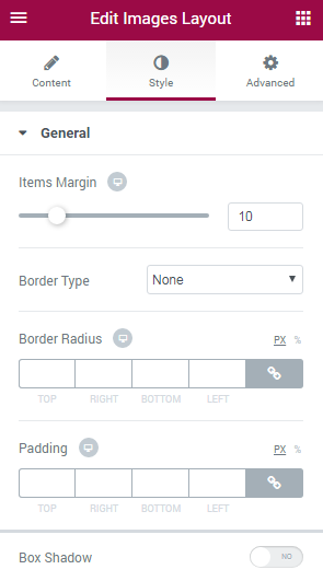
In this block, you can change style and appearance settings for Image Layout widget, define items padding, alignment, additional elements color, etc.
General
Icon
Title
Description
Overlay
Classic Background Type
Gradient Background Type
Content Order and Alignment
Inline SVG
Inline SVG widget is made for adding the imagery with scalable vector graphics format (SVG). SVG files can be scaled without loses in quality. To use them in webpage's design one has only to upload such a file into Media Library and choose if for displaying with Inline SVG widget.
Inline SVG
On the picture below you can view Inline SVG widget sample.
Content
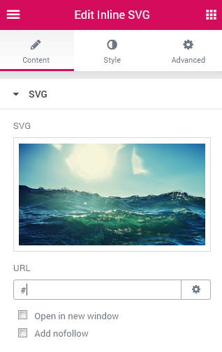
- SVG - here you can upload your desirable SVG file in order to use it on Elementor-built page.
- URL - here you can input the needed link in order to make the image clickable and redirect the visitors to the needed page on click. You can also change the link properties to "nofollow" and "target-blank".
Style
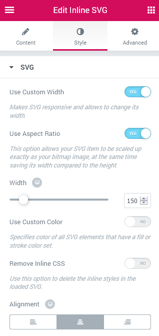
- Use Custom Width - makes SVG responsive and allows to change its width.
- Use Aspect Ratio - this option allows your SVG item to be scaled up exactly as your bitmap image, at the same time saving its width compared to the height.
- Use Custom Color - here you can specify color of all SVG elements that have a fill or stroke color set. When the option is active you'll get access to the Color and Hover Color settings.
- Remove Inline CSS - you can use this option to delete the inline styles in the loaded SVG.
- Alignment - here you can define the preferable button alignment. The SVG item can be placed to the left, to the right, or remain centered.
Pie Chart
Display varied statistical data in a form of circle diagrams divided into pieces using Pie Chart widget. You will be able to apply different style settings and customize Pie Chart widget according to your purposes.
Pie Chart Widget Sample
On the picture below you can view Pie Chart widget sample.
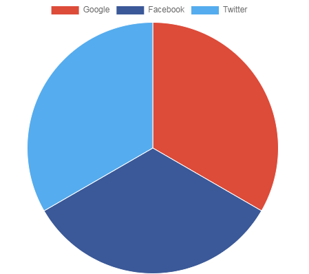
Content
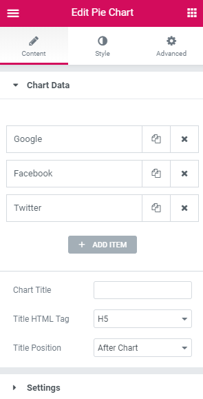
Chart Data
- Label — here you can specify the label of the chart item.
- Value — here you can define the value of the chart item.
- Color — here you can pick the color for the chart item.
- Chart Title - here you can add title of the chart.
- Title HTML Tag - here you can select the HTML tag to apply for the items titles.
- Title Position - here you can set the position of the title. It can be located before or after the chart.
Click on the Add item button to add new features to the chart. You can add as many features as you want, and customize each one of them. Click on the newly added item to customize it.
Settings
- Chart Height — here you can specify the height of the chart.
- Cutout Percentage — here you can set the percentage of the cutout in the middle of the chart.
Animations
- Duration — here you need to select the speed of animations for the widget.
- Easing — here you can change the type of animation easing.
- Animate Scale — enable this option if you want to animate scale of the chart from the center outward.
Legend
- Display — enable this option if you want to display legend on the chart.
- Position — here you can specify the position of the legend.
- Revers — enable this option if you want to show datasets in reverse order.
Tooltips
- Enabled — this option allows to add tooltips to the chart.
Style
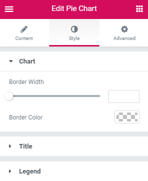
Chart
- Border Width — here you can specify the required border width for the chart.
- Border Color — here you can select the color of the borders of the chart.
Title
- Typography — turn the option on to view the typography settings.
- Color — specify the color of the title with color picker tool.
- Margin — here you can apply your custom margins in pixels or percentage to set them for the title.
- Padding — type in the custom padding values to add responsive padding for the block.
- Text Shadow — use the shadow settings (such as shadow color, blur, horizontal, vertical) if you want to make the title highlighted.
Legend
- Box Width — here you can specify the width of the boxes of the legend.
- Font Family — here you can set the font family for the legend.
- Font Size — define the font size of the legend.
- Font Weight — in this block you can select the suitable font weight.
- Font Style — in this block you can choose from the dropdown menu the style of the font. It can be normal, italic (the characters look similar to handwriting) and oblique (the characters are slightly inclined to the right).
- Font Color — here you can specify the color of the font.
Posts
Posts widget is a multipurpose tool, that can create attractive post grid layouts, sort posts by categories, IDs or the date of publishing. This widget is also helpful when creating post sliders and post carousels.
Changing Posts Layout With Posts widget
There are three ways to display posts using Posts widget. You can display posts in the form of Grid, in the form of Carousel and in the form of Post Slider. Let’s find out how to display posts in different ways.
Posts Grid Layout
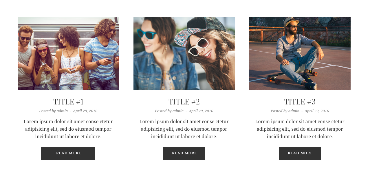
- To create Grid layout navigate to Content > Carousel settings and disable Enable Carousel option.
- Next, locate Content > General tab and type in in the Posts Number field the number of posts you want to display using this widget (for Grid layout it has to be more than 1 post).
- In the Columns field select the number of columns from the dropdown list. It has to be larger that 1 (select from 2 to 6 columns).
Posts Carousel Layout
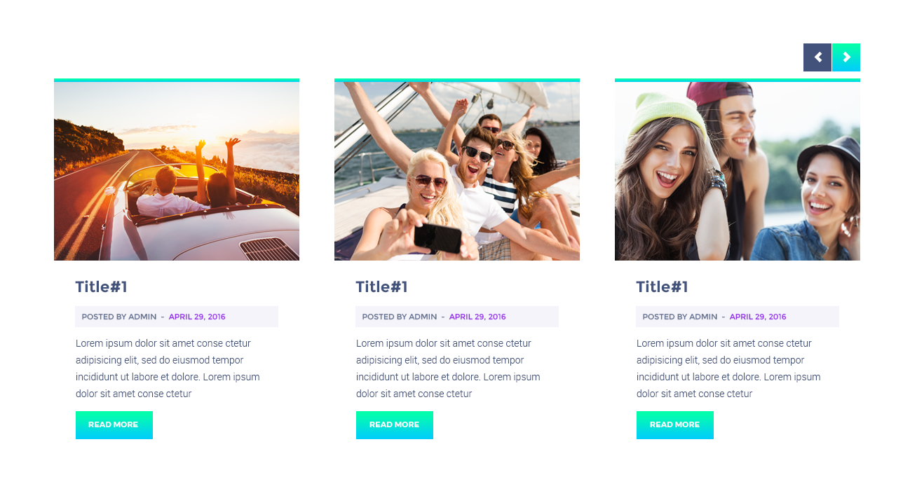
- To create Carousel layout go to Content > Carousel and switch on Enable Carousel option. In this block you can tune up such options, as the number of slides to show, enable or disable autoplay and different types of navigation (arrows and pagination dots).
- Now navigate to Content > General tab and define in the Posts Number field the number of posts you need to display. To create Carousel layout the number of posts has to be larger than the number of columns you use.
- In the Columns field select the number of columns. It has to be larger than 1—2 columns.
Posts Slider Layout
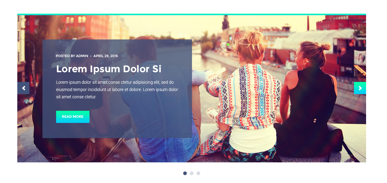
- To create a Post slider using Posts widget navigate to Content > General tab and select the number of columns in the Columns field. In order to create Post Slider you need to have only one column.
- In the Posts Number field fill in the number of posts you want to display. The number of posts must be larger than 1 (the more, the better).
- Now navigate to Content > Carousel tab and turn on Enable Carousel option.
Content
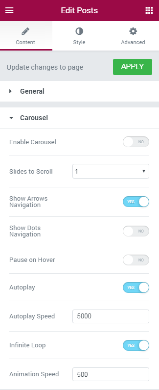
General
In this block you can customize Post General settings, such as posts sorting type; define information to show (meta, post excerpts, featured images, etc.).
- Posts Number — here you need to define how many posts you need to display with this widget.
- Columns — in this block you need to choose the number of columns to use from the dropdown menu. You can select from 1 to 6 columns to show per block.
- Equal Columns Height — in this block you can enable or disable the same height for all the widget columns.
- Query Posts By — here you can specify, if you want to filter and show posts by categories, or by IDs. You can also show only the latest posts.
- Show Posts Title — enable this option if you want to display post title in the widget.
- Show Posts Featured Image — enable this option to display featured images for the posts that are shown in the widget.
- Show Posts Featured Image As — here you can select, if you want to show the feratured image as a simple image, or the box background image.
- Featured Image Size — here you need to define the size of the featured image (usually it can be medium, large and thumbnail).
- Show Posts Excerpt — here you can enable displaying the excerpts for the posts shown in the widget.
- Excerpt Length — here you can specify the number of words from the post content you want to display as a post excerpt.
- Show Posts Meta — enable the option if you want to show such meta information, as post author, publish date.
- Show Posts Author — enable the option if you want to show the author of the post.
- Show Posts Date — enable the option if you want to show the date when the post was published.
- Show Posts Comments — enable the option if you want to show the number of comments to the posts.
- Show Read More Button — here you can enable Read More button to ensure comfortable navigation from post excerpt to the full version of the post.
- Read More Button Icon — here you can select the icon to use it for the Read More.
- Read More Button Text — in this field you need to fill in the text for the Read More button title.
You can also add gaps between columns and rows. To do it enable the corresponding option in the General block.
Carousel
In this block you can customize animation, enable carousel slider and post slider, etc.
- Enable Carousel — turn on this option to create post slider or carousel.
- Slides Minimal Height — here you can define the necessary height for the slides.
- Slides to Scroll — here you need to define how many slides you want to scroll when autoplay or using navigation arrows.
- Show Arrows Navigation — here you can enable or disable navigation arrows to provide easier navigation from slide to slide for the visitors.
- Prev Arrow Icon — here you can select the type of icon to use for the previous control arrow.
- Next Arrow Icon — here you can select the type of icon to use for the next control arrow.
- Show Dots Navigation — here you can enable or disable pagination dots at the bottom of the carousel slider to ensure easier navigation.
- Pause on Hover — enable this option if you want autoplay to pause when the visitor puts the mouse to the carousel area.
- Autoplay — enable this option if you want the slides to play automatically.
- Autoplay Speed — here you can set the speed of switching between slides in ms.
- Infinite Loop — enable this option if you want the slides to repeat continuously.
- Animation Speed — here you can define the speed of animation when the transition between slides takes place (in ms).
Style
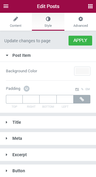
Column
- Column Padding - here you can define the custom padding values for the column (in pixels).
- Background Color — in this block you can set the color to use it in the post item background.
- Border Type — here you can select the type of the border from the dropdown menu.
- Box Shadow — enable this option if you want to access the shadow advanced settings for this widget, and need to apply shadow for it.
- Border Type — here you can select the type of the border from the dropdown menu.
- Box Shadow — enable this option if you want to access the shadow advanced settings for this widget, and need to apply shadow for it.
- Background Color — in this block you can set the color to use it in the post item content background.
- Background Color — in this block you can set the color to use it in the title background.
- Color — in this block you can select the color for the post title.
- Typography — turn the option on to view the typography settings. They are similar for Title, Meta, Excerpt and Button blocks.
- Size — define the font size of the animated box title.
- Family — here you can set the font family for the title.
- Weight — in this block you can select the suitable font weight.
- Transform — here you can choose from the dropdown menu, if you want the title to be shown in uppercase, lowercase, capitalize or normal way.
- Style — in this block you can choose from the dropdown menu the style for the font. It can be normal, italic (the characters look similar to handwriting) and oblique (the characters are slightly inclined to the right).
- Line Height — in this field you can set the height of the title line.
- Letter Spacing — here you can set the space between letters.
- Alignment — here you can define the preferable title alignment. The title can be placed to the left, to the right, or remain centered.
- Background Color — in this block you can set the color to use it in the meta information background.
- Text Color — in this block you can select the text color for the post meta information.
- Links Color — in this block you can select the links color for the post meta information.
- Links Hover Color — in this block you can select the links hover color for the post meta information, that will be displayed when the visitor puts the mouse to the link area.
- Typography — turn the option on to view the typography settings. They are similar for Title, Meta, Excerpt and Button blocks.
- Meta Divider — here you can input your custom divider to use it for the meta information block.
- Divider Gap — here you can define the gap for the divider.
- Alignment — here you can define the preferable meta alignment. The information can be placed to the left, to the right, or remain centered.
- Background Color — in this block you can select the color for the excerpt background.
- Color — in this block you can select the color for the post content excerpt.
- Typography — turn the option on to view the typography settings. They are similar for Title, Meta, Excerpt and Button blocks.
- Alignment — here you can define the preferable excerpt text alignment. The information can be placed to the left, to the right, or remain centered.
- Customize Icon — enable this option if you want ot apply custom appearance settings for the icon.
- Icon Position — here you can select the preferable icon position (it can be placed before text or after text).
- Icon Size — here you can define the suitable icon size.
- Icon Color — here you can select the icon color using color picker.
- Icon Margin — here you can define the margins for the icon.
- Background Type — in this block you can choose, whether you want to use classic or gradient type for the background. The customization options vary for each type.
- Color — here you can set background color for the element using color picker tool.
- Image — here you can choose the image you want to use as a background. Select the image from the media library or upload it to define it as a background in this block. When the image is uploaded, you’ll be able to define its position, alignment, turn on repeat and set the necessary size.
- Color — here you can set background color for the widget using color picker tool.
- Location — here you can define the proportion for the first color in the gradient background.
- Second Color — here you can set the second color to use in the gradient background.
- Location — here you can define the proportion for the second color in the gradient background.
- Type — define, if you want to use linear or radial type of the gradient.
- Angle — in this block you can set the angle for the gradient (in degrees).
- Border Type — here you can define the type of the border you need to use for the element.
- Box Shadow — enable this option if you want to access the shadow advanced settings for this widget, and need to apply shadow for it.
- Text Color — here you need to define the color of the text of the Read More button.
- Typography — turn the option on to view the typography settings. They are similar for Title, Meta, Excerpt and Button blocks.
- Box Shadow — enable this option if you want to access the shadow advanced settings for this widget, and need to apply shadow for it.
- Border Type — here you can define the type of the border you need to use for the button.
- Alignment — here you can define the preferable button alignment. The information can be placed to the left, to the right, or remain centered.
Post Item
Here you can customize the post item background color. Clock on the Background Color area and use color picker tool to select the suitable color.
Post Thumbnail (Image)
Post Item Content
Title
Here you can apply custom appearance settings for the post title.
Meta
Here you can apply custom appearance settings for the post meta information.
Excerpt
Here you can apply custom appearance settings for the post content excerpt.
Button
Here you can apply custom appearance settings for the Read More button.
Here you can switch from customizing Normal to Hover mode. To switch to customizing Hover you need to click on the corresponding button.
Classic Background Type
Gradient Background Type
Carousel Arrows
Here you can apply custom appearance settings for the Carousel Arrows.
Switch from customizing Normal to Hover mode whenever you need to switch to customizing Hover, or vice versa.
- Font Color — here you can set the font color for the element using color picker tool.
- Background Type — in this block you can choose, whether you want to use classic or gradient type for the background. The customization options vary for each type.
Classic Background Type
- Color — here you can set background color for the element using color picker tool.
- Image — here you can choose the image you want to use as a background. Select the image from the media library or upload it to define it as a background in this block. When the image is uploaded, you’ll be able to define its position, alignment, turn on repeat and set the necessary size.
Gradient Background Type
- Color — here you can set background color for the widget using color picker tool.
- Location — here you can define the proportion for the first color in the gradient background.
- Second Color — here you can set the second color to use in the gradient background.
- Location — here you can define the proportion for the second color in the gradient background.
- Type — define, if you want to use linear or radial type of the gradient.
- Angle — in this block you can set the angle for the gradient (in degrees).
- Font Size - here you can define the size for the font that you'd like to use for the Carousel Arrows.
- Box Size - here you can define the size for box that you'd like to use for the Carousel Arrows.
- Border Type — here you can define the type of the border you need to use for the animated box.
- Box Shadow — enable this option if you want to access the shadow advanced settings for this widget, and need to apply shadow for it.
Prev Arrow Position
- Vertical Position By — define the vertical position for the prev arrow. It can be positioned at the top or at the bottom.
- Top Indent — define the vertical position indent in pixels, or use controls to define the suitable position automatically.
- Horizontal Position By — define the horizontal position for the prev arrow. It can be positioned on the left or on the right.
- Left Indent — define the horizontal position indent in pixels, or use controls to define the suitable position automatically.
Next Arrow Position
- Vertical Position By — define the vertical position for the next arrow. It can be positioned at the top or at the bottom.
- Top Indent — define the vertical position indent in pixels, or use controls to define the suitable position automatically.
- Horizontal Position By — define the horizontal position for the next arrow. It can be positioned on the left or on the right.
- Right Indent — define the horizontal position indent in pixels, or use controls to define the suitable position automatically.
Carousel Dots
Here you can switch from customizing Normal to Hover and Active Pagination Dots style settings. Just click on the button Hover to proceed to customizing hover elements.
- Font Color — define the color of the pagination dots using color picker tool.
- Background Type — in this block you can choose, whether you want to use classic or gradient type for the simple items. The customization options vary for each type.
- Font Size — here you can select the size of the arrow font controls in pixels.
- Box Size — here you can select the size of the arrow controls box in pixels.
- Border Type — here you can define the type of the border you need to use for the Carousel Dots border.
- Box Shadow — enable this option if you want to access the shadow advanced settings for this widget, and need to apply shadow for it.
- Gap — here you can define the gap between pagination dots in pixels, or use controls to set it automatically.
- Dots Box Margin — here you can define the margins for the Dots box.
- Alignment — set right, left or center alignment to use it for the dots.
Portfolio
Portfolio widget allows displaying Portfolio in the form of eye-catching layouts using the pre-designed presets and layout types (masonry, grid, justify, list).
Portfolio widget Sample
On the picture below you can view Portfolio widget sample.
Content
- Layout Type - here you can select the needed layout type to use for the portfolio (masonry, grid, justify, list).
- Preset - here you can pick the preferable preset to use for the portfolio items.
- Columns - here you can set the preferable number of columns (from 1 to 6).
- 'All' Filter Label - here you can indicate the label for the all filters.
- View More Button - enable this option in order to add a View More button to the portfolio.
- View More Button Text - here you can change the text to be shown as the button label.
- Item Per Page - here you can change the number of portfolio items shown per pages.
Items
- Add Item - click this button to add a new item to the portfolio.
- Category - input the category in the corresponding field in order to allow the users view the portfolio items using the category markers.
- Image - select an image from the media library or use upload it from your hard drive in order to apply it to the portfolio item.
- Image Size - here you can select the certain size of the image.
- Title - input the title of the portfolio item you’re currently setting.
- Description - here you need to input the description for the portfolio item.
- Link Text - here you can add the link text to be shown for the item.
- Link URL - input the link URL in the corresponding field.
- Title HTML Tag - here you can select the HTML tag (div, or heading) to apply for the title.
Style
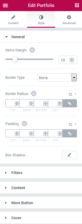
General
- Items Margin - here you can specify the responsive margins for the items.
- Border Type - here you can select one of the available border types to use: none, solid, double, dotted, dashed or groove.
- Width - here you can define the width of the border in px.
- Color - here you can change the color of the borders.
- Border Radius - here you can set the border radius for the chosen border to make the border angles more round.
- Padding - input the preferable responsive padding values in order to set the paddings for the portfolio.
- Box Shadow - click on the pencil icon to access the shadow option and apply the shadow for the element.
Filters
Filters Container Styles
- Background Type - in this block you can choose, whether you want to use classic or gradient type for the widget containers. The customization options vary for each type.
- Padding - input the preferable responsive padding values in order to set the paddings for the portfolio filters containers.
- Margin - here you can specify the responsive margins.
- Border Type - here you can select one of the available border types to use: none, solid, double, dotted, dashed or groove.
- Width - here you can define the width of the border in px.
- Color - here you can change the color of the borders.
- Border Radius - here you can set the border radius for the chosen border to make the border angles more round.
- Box Shadow - click on the pencil icon to access the shadow option and apply the shadow for the element.
Filter Items Styles
- Separator Icon - here you can specify the icon to use as a separator between the categories.
- Separator Size - here you can adjust the separator icon size to make it suitable and responsive.
- Alignment - change the alignment to the left, right or centered and make it responsive using the responsiveness modes.
- Color - here you can change the color of the categories using color picker tool.
- Typography - turn the option on to view the typography settings. They are similar to the Typography options for other elements.
- Background Type - in this block you can choose, whether you want to use classic or gradient type for the widget containers. The customization options vary for each type.
- Padding - input the preferable responsive padding values in order to set the paddings for the portfolio.
- Margin - here you can specify the responsive margins.
- Border Type - here you can select one of the available border types to use: none, solid, double, dotted, dashed or groove.
- Width - here you can define the width of the border in px.
- Color - here you can change the color of the borders.
- Border Radius - here you can set the border radius for the chosen border to make the border angles more round.
- Box Shadow - click on the pencil icon to access the shadow option and apply the shadow for the element.
Here you can switch from customizing the filter items in the Normal mode to styling them up in Hover mode and Active mode. To do it just switch between this three modes.
Content
Container
- Background Type - in this block you can choose, whether you want to use classic or gradient type for the widget containers. The customization options vary for each type.
- Padding - input the preferable responsive padding values in order to set the paddings for the portfolio.
- Margin - here you can specify the responsive margins.
- Border Type - here you can select one of the available border types to use: none, solid, double, dotted, dashed or groove.
- Width - here you can define the width of the border in px.
- Color - here you can change the color of the borders.
- Border Radius - here you can set the border radius for the chosen border to make the border angles more round.
- Box Shadow - click on the pencil icon to access the shadow option and apply the shadow for the element.
Image
- Box Shadow - click on the pencil icon to access the shadow option and apply the shadow for the element.
Title
- Color - here you can change the color to use it for the portfolio item title.
- Typography - turn the option on to view the typography settings. They are similar to the Typography options for other elements.
- Padding - input the preferable responsive padding values in order to set the paddings for the portfolio.
- Margin - here you can specify the responsive margins.
- Alignment - change the title alignment to left, right or centered according to your needs.
Category
- Show Category List - enable this option in order to show the categories not only as markers but also for each separate item.
- Color - here you can change the color of the category text.
- Typography - turn the option on to view the typography settings. They are similar to the Typography options for other elements.
- Padding - input the preferable responsive padding values in order to set the paddings for the portfolio.
- Margin - here you can specify the responsive margins.
- Alignment - here you can set the category alignment to right, left or centered according to your needs.
Description
- Color - here you can set the color to apply it for the description text.
- Typography - turn the option on to view the typography settings. They are similar to the Typography options for other elements.
- Padding - input the preferable responsive padding values in order to set the paddings for the portfolio.
- Margin - here you can specify the responsive margins.
- Alignment - set the description text alignment to the right, left, or make it centered according to your needs.
Button
Switch between Normal and Hover modes in order to make the button style on hover and in its normal state differ.
- Background Color - here you can set your custom button background color.
- Text Color - here you can set the color for the button text.
- Typography - turn the option on to view the typography settings. They are similar to the Typography options for other elements.
- Padding - input the preferable responsive padding values in order to set the paddings for the portfolio.
- Margin - here you can specify the responsive margins.
- Border Radius - here you can select one of the available border types to use: none, solid, double, dotted, dashed or groove.
- Width - here you can define the width of the border in px.
- Color - here you can change the color of the borders.
- Border Radius - here you can set the border radius for the chosen border to make the border angles more round.
- Box Shadow - click on the pencil icon to access the shadow option and apply the shadow for the element.
- Alignment - here you can change the button alignment to the one needed (left, right, centered).
Order
Here you can set the preferable order for such elements as title, category, description, button.
More Button
Switch between Normal and Hover modes in order to make the More button style change on mouse hover and when in normal state.
- Background Color - here you can change the More button background color using color picker tool.
- Text Color - here you can change the color of the button text to the one needed.
- Typography - turn the option on to view the typography settings. They are similar to the Typography options for other elements.
- Padding - input the preferable responsive padding values in order to set the paddings for the portfolio.
- Margin - here you can specify the responsive margins.
- Border Radius - here you can select one of the available border types to use: none, solid, double, dotted, dashed or groove.
- Width - here you can define the width of the border in px.
- Color - here you can change the color of the borders.
- Border Radius - here you can set the border radius for the chosen border to make the border angles more round.
- Box Shadow - click on the pencil icon to access the shadow option and apply the shadow for the element.
Cover
- Cover Icon - here you can define the icon for the cover from the list of available icons.
- Cover Icon Style - here you can set the style settings of the cover icon:
- background type;
- font color;
- font size;
- box size;
- border type;
- border radius;
- box shadow.
- Background Type - in this block you can choose, whether you want to use Classic or Gradient type for the widget containers. The customization options vary for each type.
Click on the Classic button to proceed to customizing classic type.
- Color - here you can set background color for the cover using color picker tool.
- Image - here you can define the background image for the cover.
- Position - here you can define the position of the background image.
- Attachment - here you can define the attachment of the background image.
- Repeat - here you can define the repetition of the background image.
- Size - here you can define the size of the background image.
- Color - here you can set background color for the cover using color picker tool.
- Image - here you can define the background image for the cover.
- Location - here you can define the proportion for the first color in the gradient background.
- Second Color - here you can set the second color to use in the gradient background.
- Type - define, if you want to use linear or radial type of the gradient.
- Angle - in this block you can set the angle for the gradient (in degrees).
- Location - here you can define the proportion for the second color in the gradient background.
- Border Radius - here you can set the border radius for the chosen border to make the border angles more round.
- Margin - here you can define the margins for the cover on the background.
Click on the Gradient button to proceed to customizing gradient type.
Progress Bar
Progress Bar widget is the best option for those who want to create the stylish progress bars to display the percentage in the attrractive and eye-catching form! Change the colors, typography, percents and title alignment, and enjoy the great results!
Progress Bar Widget Sample
On the picture below you can view Progress Bar widget sample.
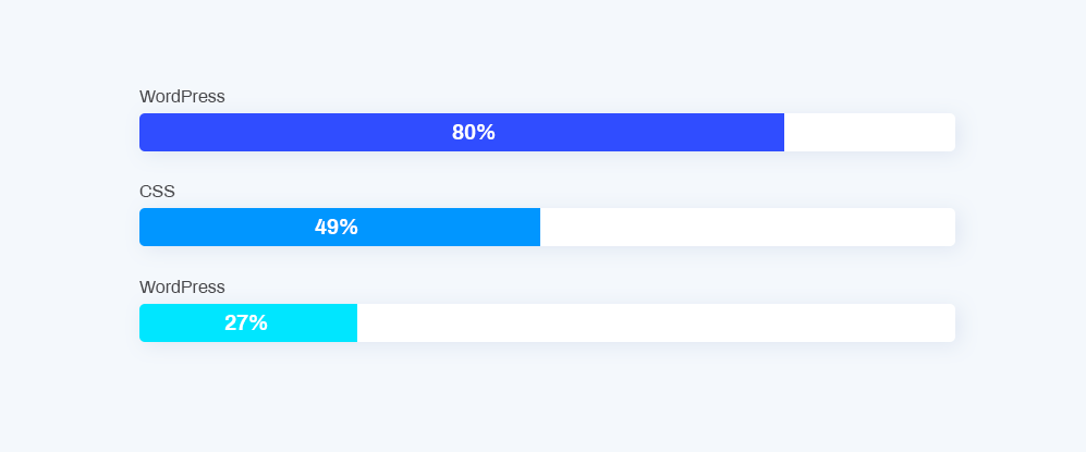
Content
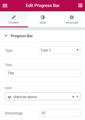
Progress Bar
- Type - here you can select the pre-styled type of the progress bar, with the different percents positions:
- inside the bar;
- above the bar;
- shown as tip;
- on the right;
- inside the empty bar;
- inside the bar with title;
- inside the vertical bar.
- Title - here you need to provide the title of the progress bar.
- Icon - here you need to specify the icon to show it besides the title.
- Percentage - here you need to set the percents value in order to apply them for the progress bar.
Style
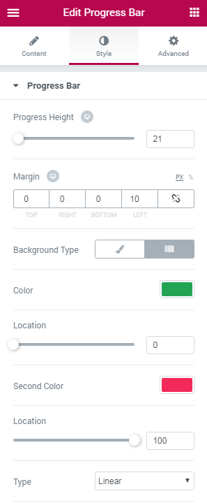
Progress Bar
- Progress Height - here you can specify the height of the progress bar for different devices.
- Margin - here you can set the margins on different sides of the progress bar.
- Background Type - here you can set your custom Classic or Gradient background for the progress bar.The customization options vary for each type.
Classic Background Type
- Color — here you can set the background color for the progress bar using color picker tool.
- Image — here you can choose the image you want to use as a background. Select the image from the media library or upload it to define it as a background in this block. When the image is uploaded, you’ll be able to define its position, alignment, turn on repeat and set the necessary size.
Gradient Background Type
- Color — here you can set the background color for the progress bar using color picker tool.
- Location — here you can define the proportion for the first color in the gradient background.
- Second Color — here you can set the second color to use in the gradient background.
- Location — here you can define the proportion for the second color in the gradient background.
- Type — define, if you want to use the linear or radial type of the gradient.
- Angle — in this block you can set the angle for the gradient (in degrees).
- Border Type - here you can select the type of the border to use for the progress bar.
- Width - here you can specify the width of the border around the bar.
- Color - set the color of the border using color picker.
- Border Radius - here you can specify the radius values to make the border angles more smooth and round.
Status Bar
- Background Type - here you can select the type of the status bar, which can be classic or gradient. The options for both types vary.
- Border Radius - here you can specify the border radius values in order to make the border angles more round and smooth.
Title
- Title Alignment - here you can select, if you want to set the title to the left, to the right, or center it.
- Background Type - here you can change the background type for the title of the progress bar. You can select Classic or Gradient background type. The options vary for each of them.
- Border Type - here you can select the type of the border to use for the title.
- Width - here you can specify the width of the border around the bar.
- Color - set the color of the border using color picker.
- Border Radius - here you can specify the radius values to make the border angles more smooth and round.
- Box Shadow - here you can define if you want to apply the shadow for the title.
- Padding - here you can specify the custom padding for the title to use it on different devices.
- Margin - here you can define the margin values to use them for the title.
Icon
- Position - here you can set the icon to the left or place it at the top of the title.
- Icon Color - here you can select the preferable icon color to use.
- Icon Size - here you can set the icon size to make it responsive for different devices.
Text
- Text Color - here you can set the color to use it for the title text.
- Typography - turn the option on to view the typography settings.
- Size — define the font size of the progress bar title.
- Family — here you can set the font family for the title.
- Weight — in this block you can select the suitable font weight.
- Transform — here you can choose from the dropdown menu, if you want the title to be shown in uppercase, lowercase, capitalize or normal way.
- Style — in this block you can choose from the dropdown menu the style of the font. It can be normal, italic (the characters look similar to handwriting) and oblique (the characters are slightly inclined to the right).
- Line Height — in this field you can set the height of the slide title line.
- Letter Spacing — here you can set the space between letters.
Percent
- Percent Width - here you can specify the width of the percents block to make it responsive and look good on different devices.
- Background Type - here you can set the Classic or Gradient background type to use it for the percents in the progress bar. The style settings for each type vary.
- Border Type - here you can set the border type you want to use for the percents.
- Width - in this block you can specify the border width in px.
- Color - here you can define the color of the border.
- Border Radius - here you can set the radius of the border to make its angles more smooth and round.
- Box Shadow - here you can set the shadow to apply it to the percents.
- Margin - here you can specify the margin to use it for the percents on different devices.
- Padding - here you can apply your custom padding values to the percents.
- Text Color - here you can change the color of the percents using the color picker.
- Typography - turn the option on to view the typography settings. They are similar to all of the Typography blocks.
- Prefix Font Size - here you can define the size of the % sign to make it responsive for all devices and screens.
- Percent Suffix Alignment - here you can change the suffix alignment to top, center or bottom.
Price List
Price List is the perfect tool for creating the lists of prices, that are invaluable when showcasing services. This widget provides opportunity to create stylish listings of the services and goods.
Price List Sample
On the picture below you can view Price List widget sample.
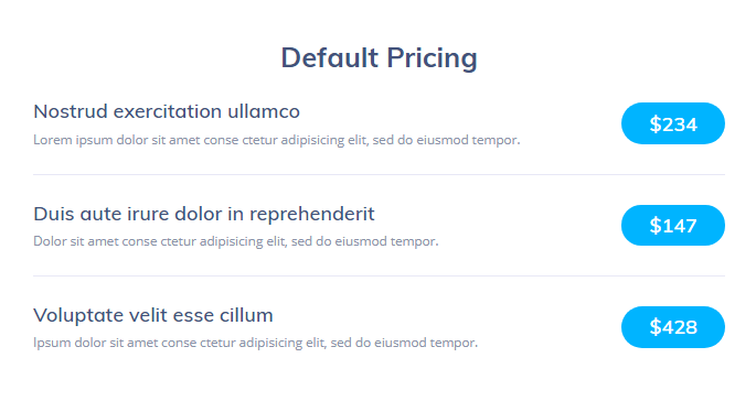
Content
General
In this block you can customize Price List general content settings.
To add the item, click Add Item button and then click Item #1 block to input the content: its title, price, description, select the suitable icon to use in the widget and add URl link.
- Title - here you need to input the desirable title to apply for this service or project / product.
- Price - here you can add the price to use for the item.
- Description - here you need to add more details about the item (service or project).
- Image - choose the image from the media library or upload one from your hard drive to add it for the service or product / project.
- URL - fill in the link to the service or product page in this field to apply it for the service or product.
Style
Item
Here you can customize the Pricing List style.
- Space Between Items (px) — here you can set the needed space between the items in px and make it responsive.
- Border Type — here you can define the type of the border you need to use for the element. It can be solid, double, dotted, dashed, groove.
- Color — set the color of the border.
- Width — set the width of the border in px.
- Border Radius — here you can define the radius of the border you use for the element.
- Box Shadow — enable this option if you want to access the shadow advanced settings for the item, and need to apply shadow for it.
- Padding — here you can define the padding of the border you need to use for the element.
- Content Vertical Alignment — here you can define the preferable content alignment. The content can be placed to the top, in the middle, or at the bottom.
Title
- Typography — turn the option on to view the typography settings.
- Family — here you can set the font family for the title.
- Size — define the font size of the title title.
- Weight — in this block you can select the suitable font weight.
- Transform — here you can choose from the dropdown menu, if you want the title to be shown in uppercase, lowercase, capitalize or normal way.
- Style — in this block you can choose from the dropdown menu the style for the font. It can be normal, italic (the characters look similar to handwriting) and oblique (the characters are slightly inclined to the right).
- Decoration — in this field you can set the decoration of the title. It can be underline, overline and lone through.
- Line Height — in this field you can set the height of the title line.
- Letter Spacing — here you can set the space between letters.
- Color — in this block you can define the color to use for the title.
- Alignment — here you can define the preferable text alignment. The text can be placed to the top, in the middle or in the bottom.
Price
- Price Minimal Width (px) — here you can set the minimal width for the price.
- Typography — turn the option on to view the typography settings.
- Color — in this block you can define the color to use for the price.
- Background Color — here you can select the color to use it for the price general background.
- Border Type — here you can define the type of the border you need to use for the element.
- Border Radius — here you can define the radius of the border you need to use for the element.
- Box Shadow — enable this option if you want to access the shadow advanced settings for the item, and need to apply shadow for it.
- Padding — here you can define the padding of the border you need to use for the element.
Description
In this block you can set the description settings.
- Typography — turn the option on to view the typography settings.
- Color — in this block you can define the color to use for the description.
- Margin — here you can define the margin of the border you need to use for the element.
- Alignment — here you can define the preferable description alignment. The description can be placed to the left, in the centre, to the right and justified.
Separator
Here you can customize separator settings.
- Separator Type — here you can choose whether you want to use solid, double, dotted, dashed or groove type for the separator.
- Separator Width — in this block you can define the width of separator.
- Color — here you can set the color to use it for the separator.
- Vertical Alignment — here you can define the preferable price alignment. The price can be placed to the top, to the middle, or in the bottom.
- Margin — here you can define the margin of the border you need to use for the element.
Image
- Image Offset (px) — here you can set the preferable offset between the image and title, price and description.
- Image Width — in this block you can define the width to use it for the image.
Pricing Table
Pricing Table widget is helpful when you need to showcase the prices and services your company provides in an attractive and clear way. The widget has multiple options, versatile customization settings and is easy to use.
Pricing Table widget Sample
On the picture below you can view Pricing Table widget sample.
Content
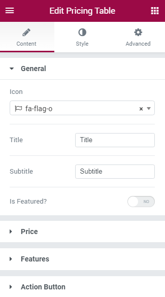
General
In this block you can customize Pricing Table general content settings.
- Icon — here you can select the suitable icon to use in the widget. Select one of the available icons from the dropdown list.
- Title — fill in the field with the Pricing Table widget title.
- Subtitle — here you should enter the subtitle for the pricing table.
- Is Featured? — turn on the option if you need to apply additional featured badge, use a custom position of the featured badge, etc.
Price
- Price Prefix — in this field you need to input the prefix for the price, usually it is a currency symbol (you can as well leave the field empty if you don’t want to use any currency prefixes).
- Price Value — in this field you need to define the price value to be shown.
- Price Suffix — here you have to define the suffix for the price (usually it indicates the frequency of payment, e.g., “per month”, “per year”, etc.).
Features
- Add Item — here you can add a new feature to be displayed in the pricing table.
- Text — type in the feature title in this block.
- Is Included? — enable the option if you want to show that the feature is included for the product, or disable it to show that the product or service doesn’t have this feature included.
Action Button
- Text Before Action Button — here you can specify the text you want to show before the Action Button.
- Button Text — here you can input your custom Action button text (e.g., “purchase now”, “buy”, etc.).
- Button URL — in this field you need to define the URL link that will redirect the customers to the purchase page or shopping cart.
- Text After Action Button — if you need to add the text below the Action button, just type in it into this field.
Style
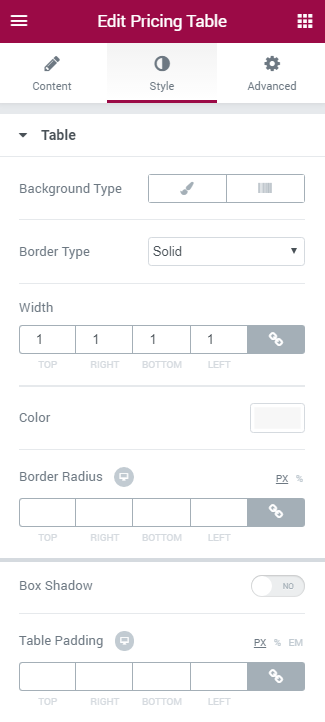
Table
Here you can customize the pricing table style.
- Background Type — in this block you can choose, whether you want to use classic or gradient type for the pricing table background. The customization options vary for each type.
Classic Background Type
- Color — here you can set background color for the animated box using color picker tool.
- Image — here you can choose the image you want to use as a background. Select the image from the media library or upload it to define it as a background in this block. When the image is uploaded, you’ll be able to define its position, alignment, turn on repeat and set the necessary size.
Gradient Background Type
- Color — here you can set background color for the widget using color picker tool.
- Location — here you can define the proportion for the first color in the gradient background.
- Second Color — here you can set the second color to use in the gradient background.
- Location — here you can define the proportion for the second color in the gradient background.
- Type — define, if you want to use linear or radial type of the gradient.
- Angle — in this block you can set the angle for the gradient (in degrees).
- Border Type — here you can define the type of the border you need to use for the element.
- Box Shadow — enable this option if you want to access the shadow advanced settings for this widget, and need to apply shadow for it.
Header
In this block you can apply custom colors and typography settings to the pricing table header.
- Background Color — here you can define the suitable color for the header background. Use color picker tool to select the necessary color.
- Title Color — here you can define the suitable color for the header title. Use color picker tool to select the necessary color.
- Subtitle Color — here you can define the suitable color for the header subtitle. Use color picker tool to select the necessary color.
- Typography — turn the option on to view the typography settings. The typography settings are similar for Title, Subtitle, Pricing, Features, Action Box and Action Button blocks.
- Size — define the font size of the animated box title.
- Family — here you can set the font family for the title.
- Weight — in this block you can select the suitable font weight.
- Transform — here you can choose from the dropdown menu, if you want the title to be shown in uppercase, lowercase, capitalize or normal way.
- Style — in this block you can choose from the dropdown menu the style for the font. It can be normal, italic (the characters look similar to handwriting) and oblique (the characters are slightly inclined to the right).
- Line Height — in this field you can set the height of the title line.
- Letter Spacing — here you can set the space between letters.
- Border Type — here you can define the type of the border you need to use for the element.
- Alignment — here you can define the preferable title alignment. The title can be placed to the left, to the right, or remain centered.
Icon
Here you can customize Icon color, font size, box size and icon background color.
- Font Color — here you can set icon font color for the widget using color picker tool.
- Background Type — in this block you can choose, whether you want to use classic or gradient type for the pricing table background. The customization options vary for each type.
Classic Background Type
- Color — here you can set background color for the animated box using color picker tool.
Gradient Background Type
- Color — here you can set background color for the widget using color picker tool.
- Location — here you can define the proportion for the first color in the gradient background.
- Second Color — here you can set the second color to use in the gradient background.
- Location — here you can define the proportion for the second color in the gradient background.
- Type — define, if you want to use linear or radial type of the gradient.
- Angle — in this block you can set the angle for the gradient (in degrees).
Pricing
In this block you can apply custom appearance settings to the pricing background, prefix, values and suffix typography and colors.
- Background Color — here you can select the color to use it for the pricing general background.
- Price Prefix Color — here you can select the preferable color for the price prefix.
- Price Suffix Color — here you need to specify the color of the price suffix.
- Price Color — in this block you can define the color to use for the price.
- Typography — turn the option on to view the typography settings. The typography settings are similar for Title, Subtitle, Pricing, Features, Action Box and Action Button blocks.
- Vertical Alignment — here you can define the specifics of the prefix vertical alignment.
- Prefix Display — here you can define, if you want the prefix to be displayed inline, or as a separate block.
- Suffix Display — here you can define, if you want the suffix to be displayed inline, or as a separate block.
- Border Type — here you can define the type of the border you need to use for the element.
- Alignment — here you can define the preferable alignment. The element can be placed to the left, to the right, or remain centered.
Features
In this block you can customize pricing table features, such as features background color and alignment.
- Background Color — here you can define the background color to use it in the features background.
- Alignment — here you can define the preferable features alignment. The features can be placed to the left, to the right, or remain centered.
- Typography — turn the option on to view the typography settings. The typography settings are similar for Title, Subtitle, Pricing, Features, Action Box and Action Button blocks.
- Included (Excluded) Feature Color — here you can specify the color for the excluded and included features.
- Included Bullet Icon — here you can define the icon to use for the included features.
- Excluded Bullet Icon — here you can select the icon you want to use for the excluded features.
- Text Decoration — for the excluded features you can enable such text decoration element, as line through.
- Bullet Color — here you can select the color you want to use for the included of excluded features icons.
- Icon Size — here you can define the size of the excluded of included features icons.
- Features Divider — enable the option if you want to separate features using a divider to make them stand out.
- Divider Style — here you can select the style to use for the divider. It can be solid, double, dotted or dashed.
You can also define the weight, the width and the gap for the divider using the corresponding controls.
Action Box
In this block you can customize the Action Box elements, such as action box background, typography, etc.
- Background Color — click on the option to define the suitable color for Action box background.
- Price Prefix Color — here you can set the color to use it for the price prefix in the Action Box.
- Typography — turn the option on to view the typography settings. The typography settings are similar for Title, Subtitle, Pricing, Features, Action Box and Action Button blocks.
- Border Type — here you can define the type of the border you need to use for the element.
- Alignment — here you can define the preferable action box alignment. The content of the Action Box can be placed to the left, to the right, or remain centered.
Action Button
In this block you can apply custom appearance settings for the button background, button text, change text typography, etc.
You can switch from customizing Normal to Hover style settings. Just click on the button Hover to proceed to customizing hover elements.
- Background Color — here you can select the suitable background for the Action button.
- Text Color — use color picker tool to set the preferable color for the button text.
- Typography — turn the option on to view the typography settings. The typography settings are similar for Title, Subtitle, Pricing, Features, Action Box and Action Button blocks.
- Border Type — here you can define the type of the border you need to use for the element.
- Box Shadow — enable this option if you want to access the shadow advanced settings for this widget, and need to apply shadow for it.
Scroll Navigation
Scroll Navigation widget has multiple style and content settings, allowing to set icons, use labels, define the elements position, background type, and there is so much more for you to customize to make the widget look its best!
Scroll Navigation widget Sample
On the picture below you can view Scroll Navigation widget sample.
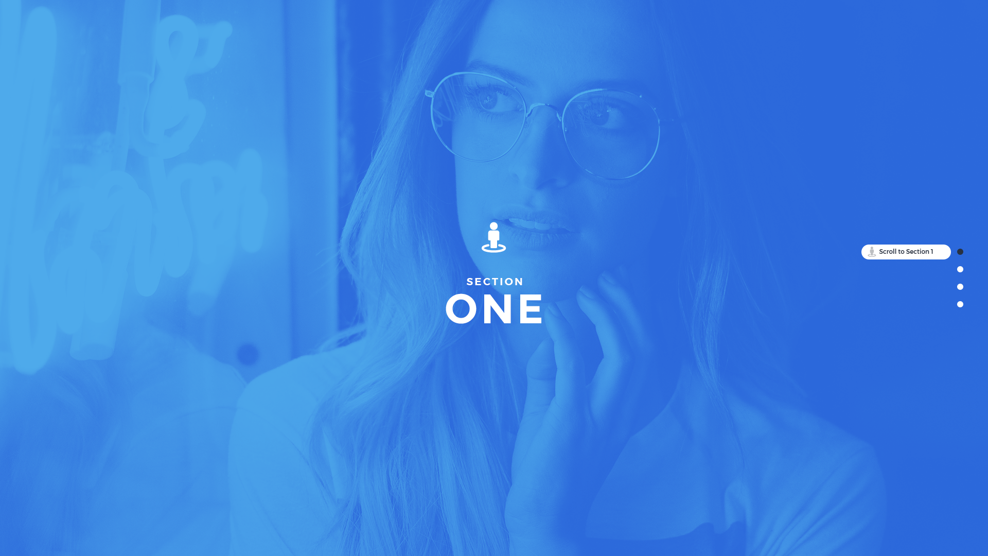
Content
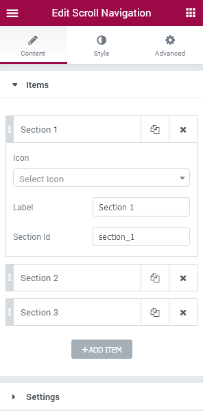
Items
- Add item - click this button in order to add a new Scroll Navigation item to the block.
- Icon (hint/dot) - here you need to specify the icons to use in this widget section from the list of the available icons.
- Label - specify the section label in the corresponding field.
- Section ID - here you can set the specific section ID (it can contain letters and numbers, be sure not to use spaces).
Settings
- Position - here you can change content position (left or right).
- Scroll speed - here you can set the necessary scrolling speed in ms.
- Full section switch - enable this option to switch between the whole sections when scrolling, or disable it to scroll slowly from section to section.
Style
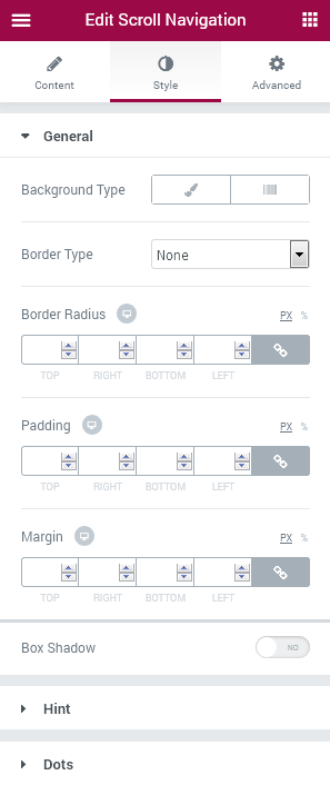
General
- Background type - in this block you can choose, whether you want to use classic or gradient type for the widget. The customization options vary for each type. The settings are similar to the common background type settings for other JetElements widget.
- Border type - here you can define the needed border type for the widget. It can be dotted, dashed, double or solid.
- Border radius - here you can set the border radius for the chosen border to make the border angles more round.
- Padding - here you can set the preferable custom padding for the widget. Fill in the values for the top, bottom, right and left padding in pixels to apply your custom padding.
- Margin - input the values for the margins in the required fields.
- Box shadow - enable this option if you want to access the shadow advanced settings for the widget, and need to apply shadow for it.
Hint
- Background type - in this block you can choose, whether you want to use classic or gradient type for the widget. The customization options vary for each type. The settings are similar to the common background type settings for other JetElements widget.
- Border type - here you can define the needed border type for the widget hint. It can be dotted, dashed, double or solid.
- Border radius - here you can set the border radius for the chosen border to make the border angles more round.
- Padding - here you can set the preferable custom padding for the hint. Fill in the values for the top, bottom, right and left padding in pixels to apply your custom padding.
- Box shadow - enable this option if you want to access the shadow advanced settings for the hint, and need to apply shadow for it.
Here you can set the style of the hint icon.
- Icon color - here you can specify the color of the icon using color picker tool.
- Icon size - use the controls to change the icon size or type in the size value in px in the corresponding field.
- Margin - input the values for the margins in the required fields.
Here you can specify the style to use it for the hint label.
- Text color - here you can change the first part of the label text color using color picker.
- Typography - turn the option on to view the typography settings. They are similar to the typography settings of other JetElements widget.
Dots
Switch between Normal, Hover and Active mode to customize Dots style according to your needs when the elements are active, or in the normal state.
- Font color - define the color of the dots using color picker tool.
- Background type - in this block you can choose, whether you want to use classic or gradient type for the dots. The customization options vary for each type.
- Font size - here you can select the size of the dot controls in pixels.
- Box size - here you can select the size of the dot controls box in pixels.
- Border type - here you can define the needed border type for the dots. It can be dotted, dashed, double or solid.
- Border radius - here you can set the border radius for the chosen border to make the border angles more round.
- Box shadow - enable this option if you want to access the shadow advanced settings for the dots, and need to apply shadow for them.
- Padding - here you can set the preferable custom padding for the dots. Fill in the values for the top, bottom, right and left padding in pixels to apply your custom padding.
- Dots margin - input the values for the dots margins in the required fields.
Linking Section IDs to Scroll Navigation Items
- In order to link the section ID to one of the Scroll Navigation items, please, create a section to place content there and hover on its upper border to view the options available for it.
- Click Edit Section option and navigate to Advanced section settings. Look for CSS ID field. Here you need to set the ID for the section.
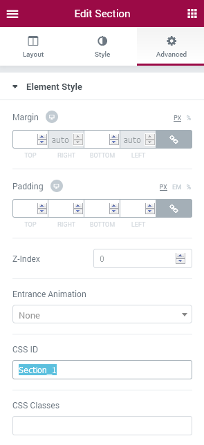
- After that go to JetElements widget and drop the Scroll Navigation widget to the first section.
- In Scroll Navigation Content settings block open each of the scroll items and input into Section ID field the name you’ve set in the CSS ID field for the section. You need to repeat the actions for each of the sections in order to link them to the Scroll Navigation widget items.
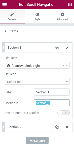
Services
Services widget is devised to add attractive services blocks to your website pages in a smooth and easy way! Use it to showcase the services provided by your company. With Services widget you can manage the service title, description, and there are still lots of style settings you can manage.
Services widget Sample
On the picture below you can view Services widget sample.
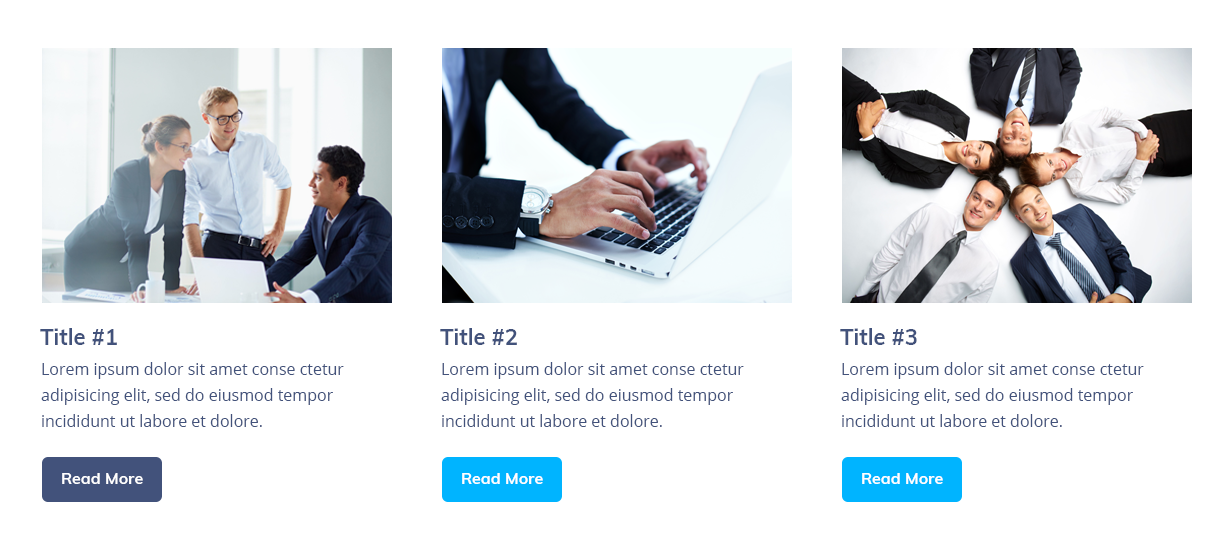
Content
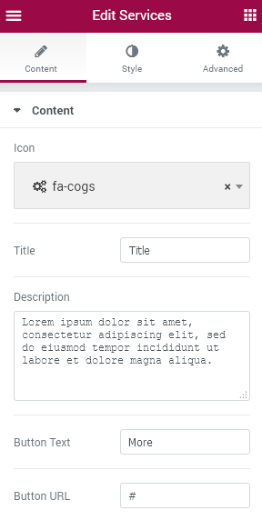
- Icon - click on the corresponding area and select the suitable icon for your service from the dropdown menu.
- Title - here you need to place your service title.
- Description - input the service description in this block to explain the service to your visitors.
- Button Text - here you can change the Button text to the text you want.
- Button URL - input the URL link which will lead to the Service page.
Style
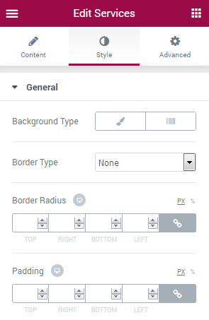
General
- Background Type - in this block you can choose, whether you want to use classic or gradient background type. The customization options vary for each type. The Background Type options are quite similar to the additional background type settings for Advanced Carousel.
- Border type - here you can define the type of the border you need to use for the element.
- Border Radius - here you can set the border radius for the chosen border to make the border angles more round.
- Padding - here you can set the preferable custom padding for the widget. Fill in the values for the top, bottom, right and left padding in pixels to apply your custom padding.
- Box Shadow - enable this option if you want to access the shadow advanced settings for this widget, and need to apply shadow for it.
Header
- Header Position - choose the preferable position for the Service header (Top, Right, Left).
- Width - here you can apply your custom width for the widget header using controls.
- Height - here you can apply your custom height for the widget header using controls.
- Background Type - in this block you can choose, whether you want to use classic or gradient background type. The customization options vary for each type. The Background Type options are quite similar to the additional background type settings for Advanced Carousel.
- Border Type - here you can define the type of the border you need to use for the element.
- Border Radius - here you can set the border radius for the chosen border to make the border angles more round.
- Margin - here you can define the margins for the widget header.
- Box Shadow - enable this option if you want to access the shadow advanced settings for this widget header, and need to apply shadow for it.
Icon
- Display in header - enable this option to display the service icon in widget header.
- Icon Color - here you can pick the color to use for the icon using color picker tool.
- Icon Background Color - here you can set the color to use for the icon background.
- Icon Font Size - use controls or type in the suitable icon font size value in the corresponding window.
- Icon Box Size - use controls to set the suitable size for the icon box.
- Border type - here you can define the type of the border you need to use for the element.
- Border Radius - here you can set the border radius for the chosen border to make the border angles more round.
- Margin - here you can define the margins for the widget icon.
- Box Shadow - enable this option if you want to access the shadow advanced settings for this icon, and need to apply shadow for it.
- Alignment - here you can define the preferable icon alignment. It can be placed to the left, to the right, or remain centered.
Title
- Display in header - enable this option to display the service title in widget header.
- Use title icon? - enable this option to use the title icon.
- Title Icon - here you can set the needed title icon.
- Color - here you can set the color to use it for the title icon.
- Icon Font Size - use controls to define the necessary icon font size, or type in the size value in the corresponding field.
- Icon Margin - here you can define the margins for the icon.
- Color - set the color to use it for the widget title.
- Typography - turn the option on to view the typography settings. They are similar to the typography settings of other JetElements widget.
- Padding - here you can set the preferable custom padding. Fill in the values for the top, bottom, right and left padding in pixels to apply your custom padding.
- Margin - here you can define the margins for the title.
- Alignment - here you can define the preferable title alignment. It can be placed to the left, to the right, or remain centered.
- Text Alignment - use this option to set the needed text alignment for the title.
Description
- Display in header - enable this option to display the service description in the header.
- Color - here you can apply your preferable color to the description text.
- Typography - turn the option on to view the typography settings. They are similar to the typography settings of other JetElements widget.
- Padding - here you can set the preferable custom padding. Fill in the values for the top, bottom, right and left padding in pixels to apply your custom padding.
- Margin - here you can define the margins for the description.
- Alignment - here you can define the preferable description alignment. It can be placed to the left, to the right, or remain centered.
- Text Alignment - use this option to set the needed text alignment for the description.
Action Button
- Display in header - enable this option to display the service action button in the header.
- Alignment - here you can define the preferable button alignment. It can be placed to the left, to the right, or remain centered.
- Add Icon - enable this option in order to add the icon to the button.
- Icon - here you can select one of the icons from the list to add it to the action button.
- Icon position - here you can define the suitable button icon position (after text, before text).
- Icon Size - here you can set the necessary size for the button icon using the controls of type in the needed value in px in the corresponding field.
- Icon Color - set the suitable color for the icon using color picker tool.
- Icon Margin - here you can define the needed margins for the button icon.
Here you can switch from customizing Normal to Hover mode to change the button style when on hover.
- Background Color - here you can change the button color.
- Text Color - here you can specify the color of the button text.
- Typography - turn the option on to view the typography settings. They are similar to the typography settings of other JetElements widget.
- Padding - here you can set the preferable custom padding for the button. Fill in the values for the top, bottom, right and left padding in pixels to apply your custom padding.
- Margin - here you can define the margins for the button.
- Border Radius - here you can set the border radius for the chosen border to make the border angles more round.
- Border Type - here you can define the type of the border you need to use for the element.
- Box Shadow - enable this option if you want to access the shadow advanced settings for this button, and need to apply shadow for it.
Overlay
- Show on Hover - the overlay will appear when on hover.
- Background Type - in this block you can choose, whether you want to use classic or gradient background type. The customization options vary for each type. The Background Type options are quite similar to the additional background type settings for Advanced Carousel.
- Padding - here you can set the preferable custom padding. Fill in the values for the top, bottom, right and left padding in pixels to apply your custom padding.
Content Order and Alignment
In this block you can specify the order of the Services widget elements (icon, title, description, button). Type in the order number in the corresponding field to set the necessary order for the elements.- Cover Content Vertical Alignment - here you can select the suitable alignment (top, center, bottom, space between).
Slider
Slider widget is invaluable if You need to liven up Your website page with a bright and attractive slider! This widget is easily customizable, has multiple navigation options. It provides profound content and style settings, which make working on slider as simple as it can be!
Slider widget Sample
On the picture below you can view Slider widget sample.
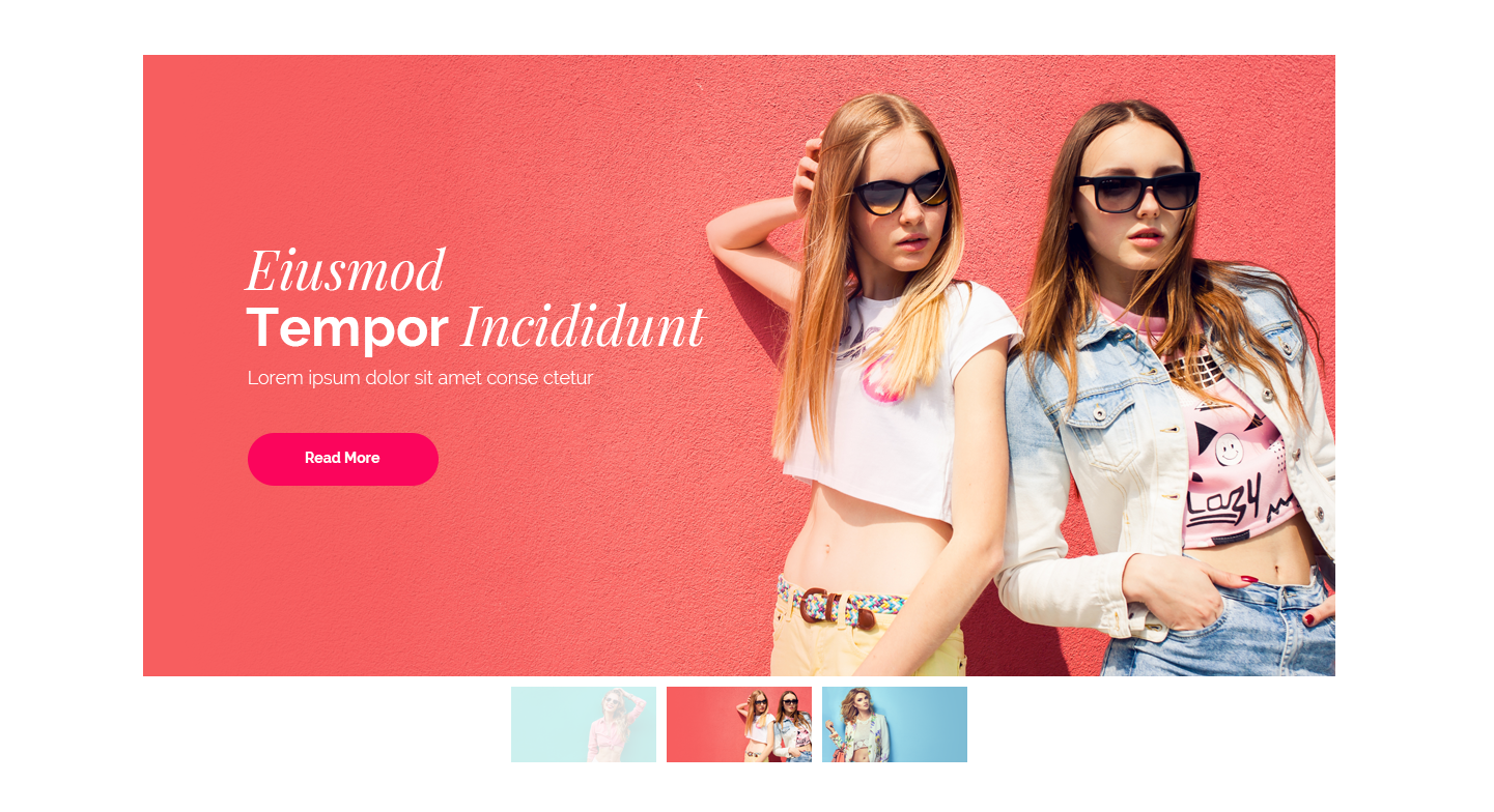
Content
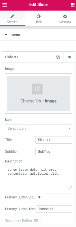
Items
- Image — click on the Image area to select the image from the Media Library or upload one from your hard drive.
- Icon — here you can set the icon for the image.
- Title — here you can input the title of the image.
- Subtitle — here you can specify the subtitle of the image.
- Description — in this field you need to provide the image description.
- Primary Button URL — here you can specify the URL link for the primary slider button.
- Primary Button Text — here you can define the primary button text for the link.
- Secondary Button URL — here you can specify the URL link for the secondary slider button.
- Secondary Button Text — here you can define the secondary button text for the link.
Please, pay attention, that by default there are 3 items. In the case You're using only 2 slides, please, consider disabling Indicates if the slides will be looped option, as the widget requires at least 3 slides to loop them.
Settings
- Image Size — here you can set the preferable image size for the slider widget.
- Use navigation? — enable the option in order to turn on navigation arrows for the slider.
- Arrows Fade on Hover — here you need to enable the option if you want the arrows to fade in on hover.
- Use pagination — enable this option if you want to add pagination dots to the slider.
- Use autoplay? — enable this option if you need the slides to switch from one to another automatically.
- Autoplay delay — here you can set the delay in autoplay in the ms.
- Autoplay on hover — here you can select autoplay mode on hover.
- Display fullscreen button? — here you can enable the fullscreen button.
- Slides shuffle — here you can enable shuffling the slides randomly.
- Indicates the slides will be looped — here you can enable repeating of the slides.
- Use fade effect? — enable this option if you want the slides to fade when switching.
- Between Slides Distance — define the distance to use between slides in this field.
- Slide Duration — here you can specify the duration of the slides in ms.
- Display thumbnails? — turn the option on to enable slides thumbnails.
- Thumbnail width — here you can specify the width of the slides thumbnails in px.
- Thumbnail height — here you can specify the height of the slides thumbnails in px.
Style
In this block, you can change style and appearance settings for Slider widget, define items padding, alignment, additional elements color, etc.
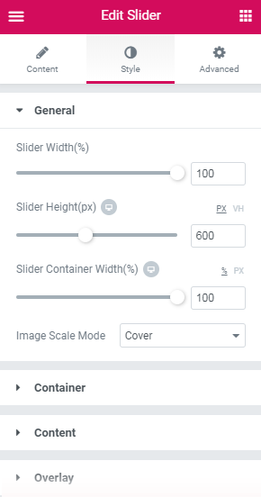
General
- Slider Width — here you can define the width of the slider in percents.
- Slider Height — here you can specify the height of the slider in percents.
- Slider Container Width — define the custom width of the slider container in percents.
- Image Scale Mode — here you can select if you want to use covered or contained image scale mode for the slider.
Container
- Padding — here you can set the preferable custom padding for the title. Fill in the values for the top, bottom, right and left padding in pixels to apply your custom padding.
- Margin — input the values for the container margins in the required fields.
- Border Type — here you can define the needed border type for the container. It can be groove, dotted, dashed, double or solid.
- Width — type in the border width in pixels in order to set the width for the container top, bottom, left and right borders.
- Color — here you can specify the color of the container borders using Color picker tool.
- Border Radius — here you can set the border radius for the chosen border to make the border angles more round.
- Box Shadow — enable this option if you want to access the shadow advanced settings for the container, and need to apply shadow to it.
Content
- Horizontal Alignment — define the horizontal alignment for the content block.
- Vertical Alignment — define the vertical alignment for the content block. It can be arranged on the top, on the bottom and in the center.
- Background Type — in this block you can choose, whether you want to use classic or gradient type for the content block. The customization options vary for each type.
- Color — here you can set background color for the content block using color picker tool.
- Image — here you can choose the image you want to use as a background. Select the image from the media library or upload it to define it as a background in this block. When the image is uploaded, you’ll be able to define its position, attachment, turn on repeat and set the necessary size.
- Color — here you can set background color for the content block using color picker tool.
- Location — here you can define the proportion for the first color in the gradient background.
- Second Color — here you can set the second color to use in the gradient background.
- Location — here you can define the proportion for the second color in the gradient background.
- Type — define, if you want to use linear or radial type of the gradient.
- Angle — in this block you can set the angle for the gradient (in degrees).
- Padding — here you can set the preferable custom padding for the content block. Fill in the values for the top, bottom, right and left padding in pixels to apply your custom padding.
- Margin — input the values for the content block margins in the required fields.
- Border Type — here you can define the needed border type for the content block. It can be groove, dotted, dashed, double or solid.
- Width — type in the border width in pixels in order to set the width for the content block top, bottom, left and right borders.
- Color — here you can specify the color of the container borders using Color picker tool.
- Border Radius — here you can set the border radius for the chosen border to make the border angles more round.
- Box Shadow — enable this option if you want to access the shadow advanced settings for the content block, and need to apply shadow to it.
Classic Background Type
Gradient Background Type
Overlay
- Background Type — in this block you can choose, whether you want to use classic or gradient type for the widget overlay. The customization options vary for each type.
Classic Background Type
- Color — here you can set the background color for the overlay using color picker tool.
- Image — here you can choose the image you want to use as a background. Select the image from the media library or upload it to define it as a background in this block. When the image is uploaded, you’ll be able to define its position, alignment, turn on repeat and set the necessary size.
- Opacity — here you can define the value for the opacity of the background.
Gradient Background Type
- Color — here you can set the background color for the overlay using color picker tool.
- Location — here you can define the proportion for the first color in the gradient background.
- Second Color — here you can set the second color to use in the gradient background.
- Location — here you can define the proportion for the second color in the gradient background.
- Type — define, if you want to use linear or radial type of the gradient.
- Angle — in this block you can set the angle for the gradient (in degrees).
- Opacity — here you can change background opacity, where 1 is 100% opacity, and 0 — is 0% opacity.
Navigation
- Arrow Icon — here you can set the specific arrow icon for the navigation controls.
- angle;
- chevron;
- angle double;
- arrow;
- caret;
- long arrow;
- arrow circle;
- chevron circle;
- caret square;
- Color — here you can set the color of the widget navigation elements using color picker tool.
- Background Color — here you can set the background color of the widget navigation elements using color picker tool.
- Font Size — in this block you can specify the font size of the navigation elements.
- Box Size — here you can define the preferable size of the navigation box.
- Border Type — here you can define the needed border type for the widget navigation elements. It can be dotted, dashed, double or solid.
- Border Radius — define the necessary border radius values in the required fields.
- Box Shadow — enable this option if you want to access the shadow advanced settings for this widget navigation elements, and need to apply shadow for them.
Pagination
You can customize the appearance of pagination elements in the Normal, Hover or Active mode. Just switch between the modes using the corresponding buttons.
- Font Color — here you can set the font color of the widget pagination using color picker tool.
- Background Type — in this block you can choose, whether you want to use classic or gradient type for the widget pagination. The customization options vary for each type. The settings are similar to the common background type settings for other JetElements widget.
- Font Size — in this block you can specify the font size of the widget pagination elements.
- Box Size — here you can define the preferable size of the pagination elements box.
- Border Type — here you can define the needed border type for the widget pagination elements. It can be dotted, dashed, double or solid.
- Border Radius — define the necessary border radius values in the required fields.
- Box Shadow — enable this option if you want to access the shadow advanced settings for this widget pagination elements, and need to apply shadow for them.
- Margin — input the values for the pagination elements margin in the required fields.
- Alignment — here you can set the pagination elements alignment (it can be centered, left or right).
- Pagination Container Offset — in this field you can define the preferable offset value for pagination elements using arrow controls.
Thumbnails
- Margin — input the values for the thumbnails margins in the required fields.
- Thumbnails Container Offset — in this field you can define the preferable offset value for thumbnails using arrow controls.
You can customize the appearance of Slider widget thumbnails in the Normal, Hover or Active mode. Just switch between the modes using the corresponding buttons.
- Background Type — in this block you can choose, whether you want to use classic or gradient type for the widget thumbnails. The customization options vary for each type. The settings are similar to the common background type settings for other JetElements widget.
- Border Type — here you can define the needed border type for the widget thumbnails. It can be dotted, dashed, double or solid.
- Width — set the necessary width values in the required fields (top, right, bottom and left).
- Color — here you can define the preferable color using color picker tool.
Fullscreen
- Icon — here you can set the icon for the fullscreen mode.
- Icon Color — in this block you can set the Fullscreen icon color using color picker tool.
- Icon Background Color — here you can define the background color to show under the fullscreen icon.
- Icon Font Size — paste the value for the fullscreen icon size.
- Icon Box Size — input the value for the fullscreen icon box size.
- Border Type — here you can define the needed border type for the fullscreen icon. It can be dotted, dashed, double or solid.
- Border Radius — here you can define the values for the radius of the selected border.
- Margin — input the values for the fullscreen icon margins in the required fields.
- Box Shadow — enable this option if you want to access the shadow advanced settings for this fullscreen icon, and need to apply shadow for it.
Icon
- Icon Color — in this block you can set the widget icon color using color picker tool.
- Icon Background Color — here you can define the background color to show under the icon.
- Icon Font Size — paste the value for the icon size.
- Icon Box Size — input the value for the icon box size.
- Border Type — here you can define the needed border type for the icon. It can be dotted, dashed, double or solid.
- Border Radius — here you can define the values for the radius of the selected border.
- Margin — input the values for the icon margins in the required fields.
- Box Shadow — enable this option if you want to access the shadow advanced settings for this icon, and need to apply shadow for it.
- Alignment — here you can set the icon alignment (it can be centered, left or right).
Title
- Title Color — in this block you can set the color of the widget title using color picker tool.
- Typography — turn the option on to view the typography settings. They are similar to the typography settings of other JetElements widget.
- Padding — here you can set the preferable custom padding for the title. Fill in the values for the top, bottom, right and left padding in pixels to apply your custom padding.
- Margin — input the values for the title margins in the required fields.
- Alignment — set the centered, left or right alignment for the title.
Subtitle
- Subtitle Color — in this block you can set the color of the widget subtitle using color picker tool.
- Typography — turn the option on to view the typography settings. They are similar to the typography settings of other JetElements widget.
- Padding — here you can set the preferable custom padding for the subtitle. Fill in the values for the top, bottom, right and left padding in pixels to apply your custom padding.
- Margin — input the values for the subtitle margins in the required fields.
- Alignment — set the centered, left or right alignment for the subtitle.
Description
- Description Color — in this block you can set the color of the widget description text using color picker tool.
- Typography — turn the option on to view the typography settings. They are similar to the typography settings of other JetElements widget.
- Padding — here you can set the preferable custom padding for the slider description. Fill in the values for the top, bottom, right and left padding in pixels to apply your custom padding.
- Margin — input the values for the description text margins in the required fields.
- Alignment — set the centered, left or right alignment for the description text.
- Max Width — here you can define the maximum width of the description text.
Action Button
In this block you can customize the appearance settings of the first and the second action buttons. To navigate to the second action button appearance settings scroll the customization options block down.
- Alignment — set the centered, left or right alignment for the widget action button.
You can customize the appearance of Slider widget thumbnails using Normal or Hover mode. Just switch between the modes using the corresponding buttons.
- Background Color — in this block you can set the background color of the widget action button using color picker tool.
- Text Color — in this block you can set the text color of the widget action button using color picker tool.
- Typography — turn the option on to view the typography settings. They are similar to the typography settings of other JetElements widget.
- Padding — here you can set the preferable custom padding for the slider action button. Fill in the values for the top, bottom, right and left padding in pixels to apply your custom padding.
- Margin — input the values for the action button margins in the required fields.
- Border Type — here you can define the needed border type for the action button. It can be dotted, dashed, double or solid.
- Border Radius — here you can define the values for the radius of the selected border.
- Box Shadow — enable this option if you want to access the shadow advanced settings for this action button, and need to apply shadow for it.
Subscribe Form
Subscribe Form widget will assist you in creating a Subscription form that will work with your MailChimp list. This widget is really easy to use, allowing to change the Subscription form layout, background color, width, add borders, shadows, and there are still many more exquisite options.
Subscribe Form widget Sample
On the picture below you can view Subscribe Form widget sample.
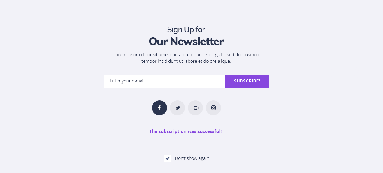
Connecting Subscribe Form to MailChimp
- First, let’s add the MailChimp List ID and API Key to JetElements to connect the Subscribe Form widget to it. Navigate to Elementor > JetElements Settings tab on the left of the Dashboard.
- Here switch to Mailing List Manager settings block.
- Add the MailChimp API key and the MailChimp List ID in the corresponding fields.
- If you don’t know where to get this information, please, feel free to read this tutorial.
- After that you need to navigate to the Elementor page editor and drop the Subscribe Form widget to the section where you need to add it.
- Let’s overview the Subscribe Form settings.
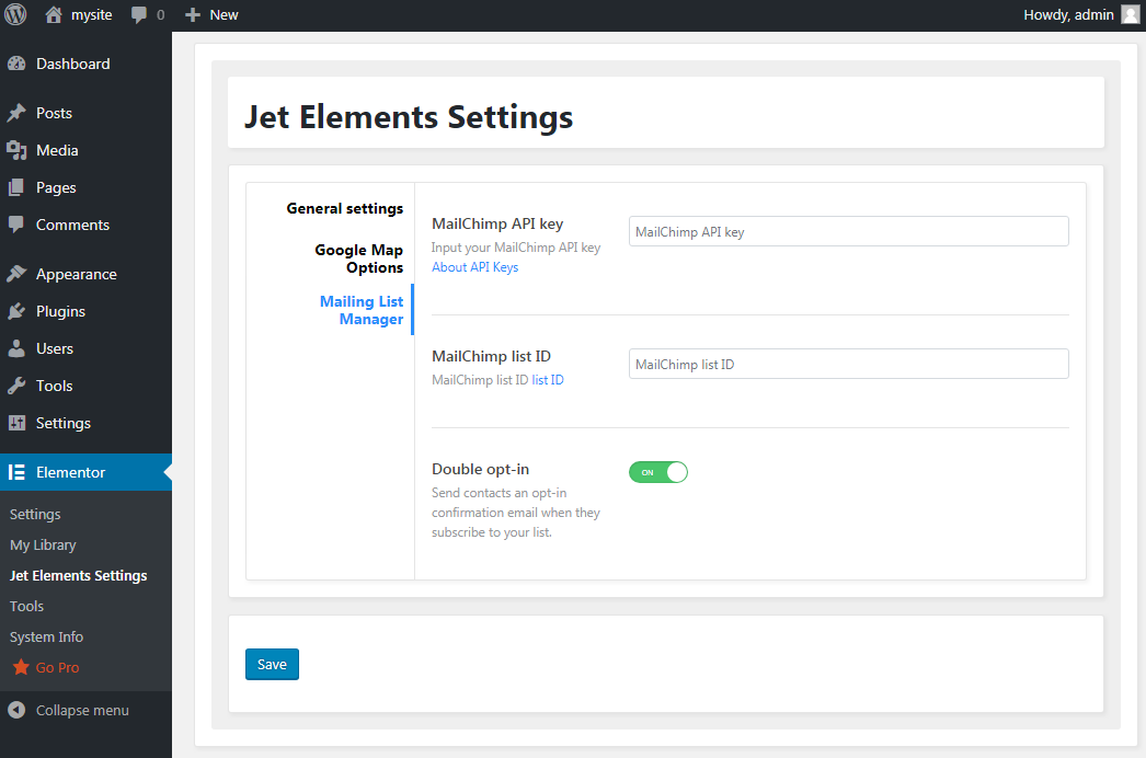
Content
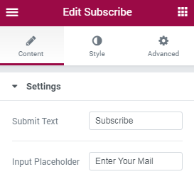
Settings
- Submit Text - in this field you need to type in the button label text you want to show up on Submit button.
- Input Placeholder - here you need to type in the text that will be shown as the placeholder in the field where the visitor has to enter his email address.
Style
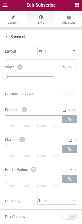
General
- Layout - here you can select the preferable Subscribe form layout (Inline or Block) from the dropdown list.
- Width - use the controls or type in the needed value in pixels to make the widget width responsive.
- Background Color - use this option to apply the custom background color for the whole widget using color picker tool.
- Padding - input your custom padding values in the corresponding fields to change the Subscribe form padding (the form text field).
- Margin - input your custom margin values in px in order to apply the margins for the widget.
- Border Radius - here you can define the values for the radius of the selected border to make its angles more smooth.
- Border Type - here you can define the needed border type for the controls. It can be dotted, dashed, double or solid.
- Box Shadow - enable this option if you want to access the shadow advanced settings for the widget, and need to apply shadow for it.
Input
- Width - here you can change the form field width to make its appearance responsive.
- Padding - input your custom padding values to apply them to the form field.
- Margin - input your custom margin values to apply margins for the form field.
- Border Radius - here you can define the values for the radius of the selected border to make its angles more smooth.
Switch from Normal to Error modes to customize the input form field appearance in its normal state of when the provided email address is incorrect.
- Background Color - here you can select the color to use for the form input field background using color picker tool.
- Text Color - here you can select the color of the text that will be placed in the input form field.
- Typography - turn the option on to view the typography settings. They are similar to the typography settings of other JetElements widget.
- Border Type - here you can define the needed border type for the element. It can be dotted, dashed, double or solid.
- Box Shadow - enable this option if you want to access the shadow advanced settings for the input form field, and need to apply shadow for it.
Submit Button
- Width - here you can change the Submit button width to make its appearance responsive.
Switch between Normal and Hover modes to change the button appearance in its normal state and when on hover.
- Background Color - here you can select the color to use for the button background using color picker tool.
- Text Color - here you can select the color of the button label text.
- Typography - turn the option on to view the typography settings. They are similar to the typography settings of other JetElements widget.
- Padding - input your custom padding values to apply them to the button.
- Margin - input your custom margin values to apply margins to the button.
- Border Radius - here you can define the values for the radius of the selected border to make its angles more smooth.
- Border Type - here you can define the needed border type for the button. It can be dotted, dashed, double or solid.
- Box Shadow - enable this option if you want to access the shadow advanced settings for the button, and need to apply shadow for it.
Message
Switch from Success to Error mode to change the message appearance for the successful subscription and for the errors.
- Background Color - here you can select the color to use for the message using color picker tool.
- Text Color - here you can select the color of the message text.
- Typography - turn the option on to view the typography settings. They are similar to the typography settings of other JetElements widget.
- Padding - input your custom padding values to apply them to the message.
- Margin - input your custom margin values to apply margins to the message.
- Border Radius - here you can define the values for the radius of the selected border to make its angles more smooth.
- Border Type - here you can define the needed border type for the message. It can be dotted, dashed, double or solid.
- Box Shadow - enable this option if you want to access the shadow advanced settings for the message, and need to apply shadow for it.
Vertical Timeline
Vertical Timeline widget is the best option for creating attractive timelines for upcoming and ongoing events, projects and roadmaps. Create the events chain and display it using Elementor page builder and loads of style settings!
Vertical Timeline Widget Sample
On the picture below you can view Vertical Timeline widget sample.
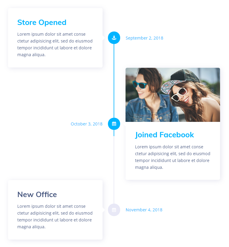
Content
Cards
Click Add Item button in order to create a new event card in the Vertical Timeline chain. After that you'll be able to edit the event card, place content into it. You can add as many event cards as you need to make the event timelines longer or shorter.
- Show Image - enable this option in order to add an image to be shown in the Event card.
- Image - here you can select the image from the media library or upload one from your hard drive to use it for an event card.
- Title - type in the preferable title to display for the event card.
- Meta - add the meta information for the event card to specify the date or timing of the event.
- Description - fill in the Description field to provide more information about the event.
- Point Content Type - select if you want to use the icon or the text event point type to place the icon or the textual event point (in the text field one can type in numbers or words that specify the currently edited event stage or step).
- Point Icon - here you can set the icon for the event or project stage using Icon Picker tool.
- Point Text - here you can fill in the number or the textual mark for the stage or the step on which this event will be held.
Layout
- Animate Cards - enable this option to apply an animation for the cards on entrance.
- Horizontal Alignment - here you can specify if the timeline will be aligned on the left, on the right or in the center.
- Vertical Alignment - arrange the event cards vertically using the top, middle and bottom alignment types.
- Horizontal Space - here you can set the space between the points and the cards for the events.
- Vertical Space - here you can specify the space to apply between the events vertically.
Style
Cards
- Border type - here you can define the needed border type for the card block. It can be dotted, dashed, double or solid.
- Width - type in the border width in pixels in order to set the width for the box top, bottom, left and right borders.
- Color - here you can specify the color of the border using Color picker tool.
- Border Radius - here you can set the border radius for the chosen border to make the border angles more round.
- Padding - type in the custom padding values to add the responsive padding for the block.
Switch between Normal, Hover and Active editing modes in order to alter the appearance of the event cards on hover, when active and in the normal state.
- Background Color - here you can specify the color to apply for the card box background.
- Box Shadow - enable this option if you want to access the shadow advanced settings for the box, and need to apply shadow to it.
Image
- Spacing - use the spacing control to add space between the content block and the image.
- Border Radius - here you can set the border radius for the chosen border to make the border angles more round.
Meta
- Typography - turn the option on to view the typography settings. They are similar to the typography settings of other JetElements widget.
- Border type - here you can define the type of the border you need to use for the element.
- Width - type in the border width in pixels in order to set the width for the box top, bottom, left and right borders.
- Color - here you can specify the color of the border using Color picker tool.
- Border Radius - here you can set the border radius for the chosen border to make the border angles more round.
- Padding - type in the custom padding values to add the responsive padding for the block.
- Margin - fill in the custom margin values to add a responsive margin around the meta block.
Switch between Normal, Hover and Active editing modes in order to alter the appearance of the meta information with the timing and date on hover, when active and in the normal state.
- Color - use Color picker tool to specify the color of the meta text.
- Background Color - select the preferable color using Color Picker tool to apply if for the meta text background to make it more readable.
- Box Shadow - enable this option if you want to access the shadow advanced settings for the meta data, and need to apply shadow to it.
Content
- Border type - here you can define the needed border type for the content block. It can be dotted, dashed, double or solid.
- Width - type in the border width in pixels in order to set the width for the box top, bottom, left and right borders.
- Color - here you can specify the color of the border using Color picker tool.
- Border Radius - here you can set the border radius for the chosen border to make the border angles more round.
- Padding - type in the custom padding values to add the responsive padding for the block.
Switch between Normal, Hover and Active editing modes in order to alter the appearance of the event card content on hover, when active and in the normal state.
- Background Color - select the preferable color using Color Picker tool to apply if for the content background to make it more readable.
- Box Shadow - enable this option if you want to access the shadow advanced settings for the content block, and need to apply shadow to it.
Title
- Typography - turn the option on to view the typography settings. They are similar to the typography settings of other JetElements widget.
- Margin - fill in the custom margin values to add a responsive margin around the meta block.
Switch between Normal, Hover and Active editing modes in order to alter the appearance of the event card title on hover, when active and in the normal state.
- Color - here you can specify the color of the title using Color picker tool.
Description
- Typography - turn the option on to view the typography settings. They are similar to the typography settings of other JetElements widget.
- Margin - fill in the custom margin values to add a responsive margin around the description block.
Switch between Normal, Hover and Active editing modes in order to alter the appearance of the event card description on hover, when active and in the normal state.
- Color - here you can specify the color of the description text using Color picker tool.
Point
Switch between Text and Icon modes in order to customize the appearance of the text point type or icon point type (depending on what type you've selected in Content block.
- Typography - turn the option on to view the typography settings. They are similar to the typography settings of other JetElements widget.
- Point Size - here you can specify the size of the point that marks the event on the timeline.
- Border type - here you can define the needed border type for the point block. It can be dotted, dashed, double or solid.
- Width - type in the border width in pixels in order to set the width for the box top, bottom, left and right borders.
- Color - here you can specify the color of the border using Color picker tool.
- Border Radius - here you can set the border radius for the chosen border to make the border angles more round.
Switch between Normal, Hover and Active editing modes in order to alter the appearance of the event point on hover, when active and in the normal state.
- Color - here you can specify the color of the border using Color picker tool.
- Background Color - select the preferable color using Color Picker tool to apply if for the point background to make it more readable.
Line
- Line Color - here oyu can customize the color to apply for the line using Color picker tool.
- Progress Color - here you can set the preferable color to be shown when the progress moves on.
- Thickness - specify how thick should be the timeline line.
- Border type - here you can define the needed border type for the line block. It can be dotted, dashed, double or solid.
- Width - type in the border width in pixels in order to set the width for the box top, bottom, left and right borders.
- Color - here you can specify the color of the border using Color picker tool.
- Border Radius - here you can set the border radius for the chosen border to make the border angles more round..
Team Member
Team Member widget is the perfect solution when it comes to displaying your team members, and if you need to introduce your team to your website visitors. There are multiple content and style settings, that can be changed at will!
Team Member widget Sample
On the picture below you can view Team Member widget sample.
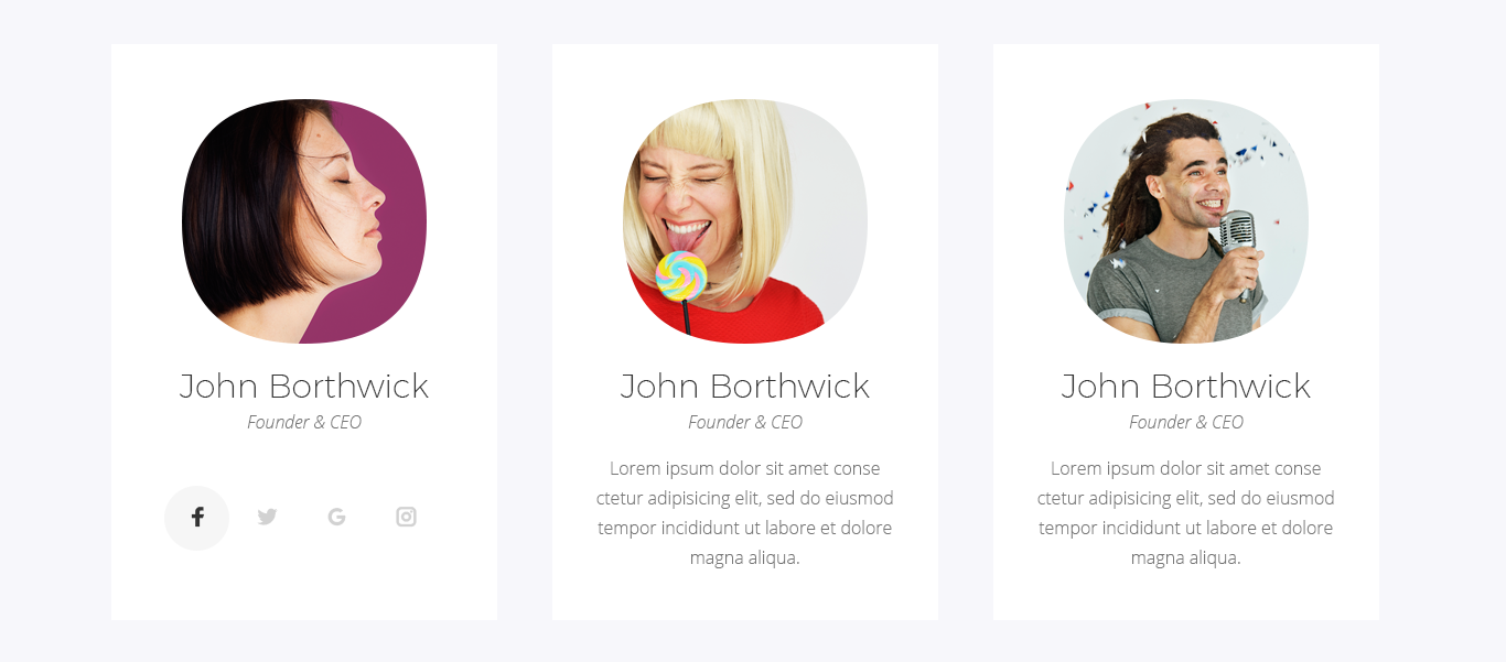
Content
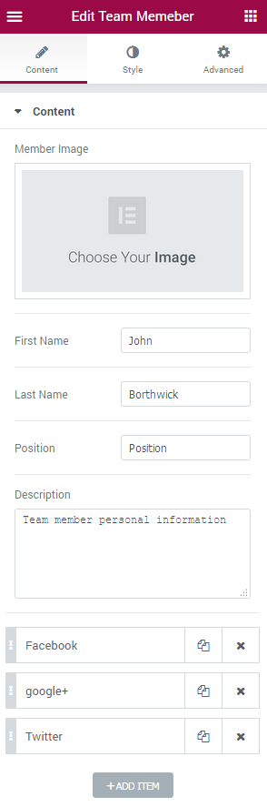
- Member Image - select the image for the team member from the media library or upload one from the hard drive.
- First Name - input the team member’s first name.
- Last name - type in the team member’s last name.
- Position - add the team member’s work responsibilities.
- Description - here you can add the description of the work your team member does, the details about him.
- Add Item - click the button to add a new social network link to the team member. You’ll need to select the social network icon, type in its label, add a link leading to the member’s profile and enable the label.
- Button Text - input the text for the button.
- Button URL - here you can add the URL link to the team member’s page on this site.
Style
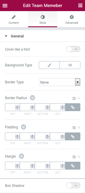
General
- Cover like a hint - enable this option if you want to show the content in the form of hint when on hover.
- Height - use controls or type in the preferable value in px in the corresponding block to define the widget height.
- Use hint corner - enable this option to add the arrow to the hint when it shows on hover.
- Color - here you can change the color of the hint corner.
- Background Type - in this block you can choose, whether you want to use classic or gradient background type. The customization options vary for each type. The Background Type options are quite similar to the additional background type settings for Advanced Carousel.
- Border Type - here you can define the type of the border you need to use for the element.
- Border Radius - here you can set the border radius for the chosen border to make the border angles more round.
- Padding - here you can set the preferable custom padding for the widget content. Fill in the values for the top, bottom, right and left padding in pixels to apply your custom padding.
- Margin - here you can define the margins for the button.
- Box Shadow - enable this option if you want to access the shadow advanced settings, and need to apply shadow for the widget.
Image
- Custom Size - enable the option to apply your custom sizes to the widget image.
- Width - use the controls or type in the width value in px to apply it for the widget image.
- Height - use the controls or type in the height value in px to apply it for the widget image.
- Border Type - here you can define the type of the border you need to use for the element.
- Border Radius - here you can set the border radius for the chosen border to make the border angles more round.
- Padding - here you can set the preferable custom padding for the widget image. Fill in the values for the top, bottom, right and left padding in pixels to apply your custom padding.
- Margin - here you can define the margins for the image.
- Box Shadow - enable this option if you want to access the shadow advanced settings, and need to apply shadow for the widget image.
Name
- Display in cover - enable this option to display the team member’s name in the form of hint or when on hover.
You can switch from customizing First name to changing style of the Last name. Just switch between the blocks to proceed to customization.
- Color - here you can change the color of the first/last name.
- Typography - turn the option on to view the typography settings. They are similar to the typography settings of other JetElements widget.
- Padding - here you can set the preferable custom padding for the name. Fill in the values for the top, bottom, right and left padding in pixels to apply your custom padding.
- Margin - here you can define the margins for the team member’s name.
- Text Alignment - use this option to set the needed text alignment for the team member’s name.
Position
- Display in cover - enable this option to display the team member’s name in the form of hint or when on hover.
- Color - here you can change the color of the Position text.
- Typography - turn the option on to view the typography settings. They are similar to the typography settings of other JetElements widget.
- Padding - here you can set the preferable custom padding for the position text. Fill in the values for the top, bottom, right and left padding in pixels to apply your custom padding.
- Margin - here you can define the margins for the team member’s position.
- Alignment - here you can define the preferable position alignment. It can be placed to the left, to the right, or remain centered.
- Text Alignment - use this option to set the needed text alignment for the team member’s position text.
Description
- Display in cover - enable this option to display the team member’s description in the form of hint or when on hover.
- Color - here you can change the color of the Description text.
- Typography - turn the option on to view the typography settings. They are similar to the typography settings of other JetElements widget.
- Padding - here you can set the preferable custom padding for the description text. Fill in the values for the top, bottom, right and left padding in pixels to apply your custom padding.
- Margin- here you can define the margins for the team member’s description.
- Alignment - here you can define the preferable description alignment. It can be placed to the left, to the right, or remain centered.
- Text Alignment - use this option to set the needed text alignment for the team member’s description text.
Social
- Display on cover - enable this option to display the team member’s social icons in the form of hint or when on hover.
- Alignment - here you can define the preferable social icons alignment. It can be placed to the left, to the right, or remain centered.
Switch from customizing social icons in the Normal mode to styling them up when on Hover. Just switch between these two modes when necessary.
- Icon Color - here you can change the color of the social icons.
- Icon Background Color - here you can set the suitable background color for the social icons.
- Icon Font Size - here you can specify the social icons size using controls.
- Icon Box Size - here you can set the size of the social icons boxes (the colored circles behind the social icons).
- Border Type - here you can define the type of the border you need to use for the element.
- Border Radius - here you can set the border radius for the chosen border to make the border angles more round.
- Margin - here you can define the margins for the team member’s social icons.
- Box Shadow - enable this option if you want to access the shadow advanced settings, and need to apply shadow for the widget social icons.
Action Button
- Display in cover - enable this option to display the team member’s action button in the form of hint or when on hover.
- Alignment - here you can define the preferable button alignment. It can be placed to the left, to the right, or remain centered.
Here you can switch from customizing button in the Normal mode to styling it up in Hover mode. To do it just switch between this two modes.
- Background Color - here you can set the button background color using color picker tool.
- Text Color - here you can change the button text color using color picker.
- Typography - turn the option on to view the typography settings. They are similar to the typography settings of other JetElements widget.
- Padding - here you can set the preferable custom padding for the button. Fill in the values for the top, bottom, right and left padding in pixels to apply your custom padding.
- Margin - here you can define the margins for the team member’s button.
- Border Radius - here you can set the border radius for the chosen border to make the border angles more round.
- Border Type - here you can define the type of the border you need to use for the element.
- Box Shadow - enable this option if you want to access the shadow advanced settings, and need to apply shadow for the widget button.
Overlay
- Background Type - in this block you can choose, whether you want to use classic or gradient background type. The customization options vary for each type. The Background Type options are quite similar to the additional background type settings for Advanced Carousel.
- Padding - here you can set the preferable custom padding. Fill in the values for the top, bottom, right and left padding in pixels to apply your custom padding.
Content Order and Alignment
In this block you can specify the order of the Team Member widget elements (Name, Position, Description, Social Icons, Button). Type in the order number in the corresponding field to set the necessary order for the elements.
- Cover Content Vertical Alignment - here you can select the suitable alignment (top, center, bottom, space between).
Table
Table widget allows adding stylish table blocks to the pages built with Elementor. This widget has vast stylization settings along with the set of content layout settings.
Table widget Sample
On the picture below you can view Table widget sample.
Content
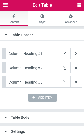
Table Header
Click Add item button in order to add a new table's column heading to the table structure.
Each of the columns hasa its own specific Content, Style and Advanced settings.
Content
- Text - here you can define the text label for the column’s heading.
- Add icon / image - here you can add an icon or an image to the column’s heading and adjust its settings.
Advanced
- Column Span - here you can set the span of the column’s heading.
- Column Width - here you can set the width of the column’s heading on different devices.
Style
- Color - here you can set the color for the column’s heading using color picker tool.
- Background Color - in this block you can choose the background color of the column’s heading using color picker tool.
Table Body
Click Add Item button to add a new table item (you can assign each new item as a start row or a new cell).
Please, note, that in order to add a new row with cells you should start with adding a new start row ,and then you'll be able to fill it with new cells. Depending on the number of cells, the table will have more or less columns.
- Action - here you can add a new row or cell in the table and customize it.
- Text - here you can define the text that is to be shown in the specific cell.
- Link - here you can add the link and adjust the link’s settings.
- Add icon/ image - here you can add an icon or an image to the column’s heading and adjust its settings (select an icon, change its position, customize image size and position, etc.
- Column Span - here you can define the column’s span.
- Row Span - here you can define the row’s span the cell occupies.
- This cell is Table Heading? - enable this option if you want to combine the cell and the table heading. For this cell are applied table heading cell styles.
- Color - here you can select the color of the text in the column using color picker tool.
- Background Color - here you can select the background color of the column using color picker tool.
- Sorting Table - enable this option if you want the table to be sorted.
- Responsive Table - enable this option if you want to set the table’s responsiveness for different devices.
- Responsive On - here you can define devices, where the table will be responsive (mobile, tablet, desktop).
Add New Row
Enable Add Custom Style option in order to access the row style settings, such as content text color and background color.
Add New Cell
Content
Advanced
Style
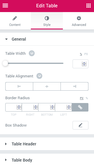
Settings
Style
General
- Table Width - set the table’s width in percents or pixels.
- Column Width - here you can choose auto or fixed (equal) width of the column.
- Table Alignment - here you can set the table’s alignment (on the left, in the center, on the right). This proiperty is responsive.
- Border Radius - here you can define the radius of the table’s border to make its angles more round.
- Box Shadow - enable this option if you want to access the shadow advanced settings for the table, and need to apply shadow to it.
Table Header
- Typography - turn the option on to view the typography settings. They are similar to the typography settings of other JetElements widget.
You can switch from customizing Normal to Hover style settings. Just click on the button Hover to proceed to customizing the style in hover mode.
- Color - select the header’s text color using color picker tool.
- Background Color - select the background color of the header using color picker tool.
- Padding - type in the custom padding values to add a responsive padding for the block.
- Border Type - here you can define the needed border type for the block. It can be solid, double, dotted, dashed or groove.
- Hidden border for header container - here you can hide the border of the header’s container.
- Alignment - here you can set the header’s test alignment (on the left, in the center, on the right).
- Vertical Alignment - here you can set the header’s alignment (on the top, in the center, to the bottom).
- Icon - here you can set the icon’s settings (font size, color and gap).
- Image - here you can adjust the image’s settings (width, gap and border radius).
- Sorting Icon - this option allows to style the sorting icon (font size and color).
Table Body
- Typography - turn the option on to view the typography settings. They are similar to the typography settings of other JetElements widget.
You can switch from customizing Normal to Hover style settings. Just click on the button Hover to proceed to customizing in hover mode.
- Color - select the heading’s color using color picker tool.
- Row Color - here you can select the row text color using color picker tool.
- Row Background Color - here you can define the color of the row’s background.
- Striped rows - enable this option to use the different style settings for the rows that are in even count (this way the rows going one under another will have different colors.
- Even Row Color - here you can specify the text color to use for the even row.
- Even Row Background Color - here you can specify the color to use for the even row background.
- Link color - here you can select the color to apply for the links.
- Padding - type in the custom padding values to add a responsive padding for the block.
- Border Type - here you can define the needed border type for the block. It can be solid, double, dotted, dashed or groove.
- Hidden border for body container - here you can add the hidden border of the body’s container.
- Alignment - here you can set the header’s alignment (on the left, in the center, on the right).
- Vertical Alignment - here you can set the vertical position of the header (on the top, in the middle or on the bottom).
- Icon - here you can set the icon’s settings (font size, color and gap).
- Image - here you can adjust the image’s settings (width, gap and border radius).
Testimonials
Testimonials widget is useful beyond compare when it comes to adding your clients’ positive feedbacks to your site. Feel free to style up the testimonials and add the beautiful testimonials carousel right to your web page in several clicks!
Testimonials widget Sample
On the picture below you can view Testimonials widget sample.
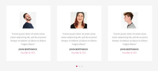
Content
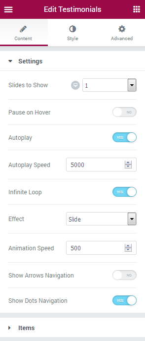
Settings
- Slides to show - here you can specify how many slides you want to show per section column (use 1 if you want to create a testimonials slider, or specify the number of testimonials to create a carousel).
- Slides to Scroll - here you can define how many slides are to scroll when scrolling.
- Pause on hover - the slider/carousel will be paused when on hover.
- Autoplay - enable this option in order to play the testimonials automatically.
- Autoplay Speed - here you can set the autoplay speed in ms.
- Infinite Loop - enable this option if you need the testimonials to play infinitely.
- Effect - when you use the testimonials slider, you can choose the animation effect (slide, fade).
- Animation Speed - here you can set the speed of animation in ms.
- Show Arrows Navigation - enable this option if you’re using testimonials slider. The navigation arrows will be added to right and left sides of the slider. You can also choose the arrow icons from the navigation icons list.
- Show Dots Navigation - enable this option if you’re using testimonials carousel.
Items
Click Add Item button to add a new testimonial to the widget.
- Image - here you can add the photo of the feedback author.
- Icon - here you can select the icon to use for the testimonial.
- Title - input the title of the testimonial.
- Comment - here you need to add the testimonial text.
- Name - here you should input the name of the testimonial author.
- Position - here you should add the testimonial author’s work responsibilities.
- Date - here you can add the date when the testimonial was published.
Style
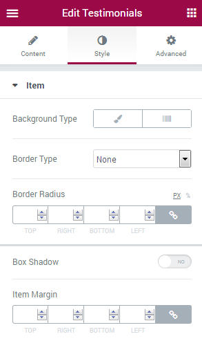
Item
- Background Type - in this block you can choose, whether you want to use classic or gradient background type. The customization options vary for each type. The Background Type options are quite similar to the additional background type settings for Advanced Carousel.
- Border Type - here you can define the type of the border you need to use for the element.
- Border Radius - here you can set the border radius for the chosen border to make the border angles more round.
- Box Shadow - enable this option if you want to access the shadow advanced settings, and need to apply shadow to the item.
- Item Margin - here you can define the margins for the Testimonials item.
Image
- Width - use controls to set the needed image width or type in the width value in px in the corresponding block.
- Height - use controls to set the needed image height or type in the height value in px in the corresponding block.
- Border Type - here you can define the type of the border you need to use for the image.
- Border Radius - here you can set the border radius for the chosen border to make the border angles more round.
- Margin - here you can define the margins for the Testimonials image item.
- Box Shadow - enable this option if you want to access the shadow advanced settings, and need to apply shadow to the image.
Arrows
Here you can switch from customizing arrows in the Normal mode to styling them up in Hover mode. To do it just switch between this two modes.
- Font Color - here you can change the color of the arrows using color picker.
- Background Type - in this block you can choose, whether you want to use classic or gradient background type. The customization options vary for each type. The Background Type options are quite similar to the additional background type settings for Advanced Carousel.
- Font Size - here you can change the size of the navigation arrows.
- Box Size - here you can change the size of the arrow boxes.
- Border Type - here you can select border type for the arrows boxes.
- Width - here you can define the width of the border in px.
- Color - here you can change the color of the arrow box borders.
- Border Radius - here you can set the border radius for the chosen border to make the border angles more round.
- Box Shadow - enable this option if you want to access the shadow advanced settings, and need to apply shadow to the navigation arrow boxes.
Prev Arrow Position
- Vertical Position by - select Top or Bottom position.
- Top Indent - here you can specify the top indent size of the Prev arrow.
- Horizontal Position by - select Left or Right position.
- Left indent - here you can set the left indent size of the Prev arrow.
Next Arrow Position
- Vertical Position by - select Top or Bottom position.
- Top Indent - here you can specify the top indent size of the Next arrow.
- Horizontal Position by - select Left or Right position.
- Right indent - here you can set the right indent size of the Next arrow.
Here you can switch from customizing arrows in the Normal mode to styling them up in Hover mode and Active mode. To do it just switch between this three modes.
- Background Type - in this block you can choose, whether you want to use classic or gradient background type. The customization options vary for each type. The Background Type options are quite similar to the additional background type settings for Advanced Carousel.
- Font Size - here you can set the size of the pagination dots font.
- Box Size - in this block you can specify the size of the dots boxes.
- Border Type - here you can select border type for the dots boxes.
- Width - here you can define the width of the border in px.
- Color - here you can change the color of the dot boxes borders.
- Border Radius - here you can set the border radius for the chosen border to make the border angles more round.
- Box Shadow - enable this option if you want to access the shadow advanced settings, and need to apply shadow to the navigation arrow boxes.
- Gap - use controls to minify or make larger the gap space between the dots.
- Dots Box Margin - here you can define the margins for the dots.
- Alignment - here you can define the preferable dots alignment. They can be placed to the left, to the right, or remain centered.
Icon
- Icon Color - here you can specify the color of the testimonials icons using color picker tool.
- Icon Background Color - here you can set the color to use it as the icon background.
- Icon Font Size - use the controls to change the icon size or type in the size value in px in the corresponding field.
- Icon Box Size - here you can change the icon box size using controls.
- Border Type - here you can select border type for the icon boxes.
- Width - here you can define the width of the border in px.
- Color - here you can change the color of the icon boxes borders.
- Border Radius - here you can set the border radius for the chosen border to make the border angles more round.
- Margin - here you can define the margins for the Testimonials icon.
- Box Shadow - enable this option if you want to access the shadow advanced settings, and need to apply shadow to the icon boxes.
- Alignment - here you can define the preferable icons alignment. They can be placed to the left, to the right, or remain centered.
Title
- Custom Width - enable this option to apply your custom width to the testimonials title.
- Width - here you can use the controls to set the necessary title width, or input the width value in px in the corresponding window.
- Color - here you can set the title color using color picker tool.
- Typography - turn the option on to view the typography settings. They are similar to the typography settings of other JetElements widget.
- Padding - here you can set the preferable custom padding for the title. Fill in the values for the top, bottom, right and left padding in pixels to apply your custom padding.
- Margin - here you can define the margins for the Testimonials title.
- Alignment - here you can define the preferable title alignment. It can be placed to the left, to the right, or remain centered.
- Text Alignment - use this option to set the needed text alignment for the testimonials title text.
Comment
- Color - here you can set the comment color using color picker tool.
- Typography - turn the option on to view the typography settings. They are similar to the typography settings of other JetElements widget.
- Width - here you can set the necessary comment width using controls or input the width value in px in the corresponding field.
- Use Comment Corner - enable this option to decorate the comment block with the arrows pointing at the comment authors.
- Color - here you can set the comment corner color using color picker tool.
- Corner position - here you can change the comment corner position (move the controls to the left or to the right to change the position).
- Corner Width - here you can set the comment corner width.
- Corner Height - here you can specify the comment corner height.
- Corner Skew - here you can set the angle of the comment corner skew.
- Background Type - in this block you can choose, whether you want to use classic or gradient background type. The customization options vary for each type. The Background Type options are quite similar to the additional background type settings for Advanced Carousel.
- Border Radius - here you can set the border radius for the chosen border to make the border angles more round.
- Box Shadow - enable this option if you want to access the shadow advanced settings, and need to apply shadow to the comment boxes.
- Padding - here you can set the preferable custom padding for the comment. Fill in the values for the top, bottom, right and left padding in pixels to apply your custom padding.
- Margin - here you can define the margins for the Testimonials comment.
- Alignment - here you can define the preferable comment alignment. It can be placed to the left, to the right, or remain centered.
Name
- Custom Width - enable this option to apply your custom width to the testimonials author’s name.
- Width - here you can use the controls to set the necessary name width, or input the width value in px in the corresponding window.
- Color - here you can set the name text color using color picker tool.
- Typography - turn the option on to view the typography settings. They are similar to the typography settings of other JetElements widget.
- Padding - here you can set the preferable custom padding for the author’s name. Fill in the values for the top, bottom, right and left padding in pixels to apply your custom padding.
- Margin - here you can define the margins for the Testimonials author’s name.
- Alignment - here you can define the preferable author’s name alignment. It can be placed to the left, to the right, or remain centered.
- Text Alignment - use this option to set the needed text alignment for the testimonials author’s name text.
The same style options can be customized in the Position and Date blocks.
Content Order and Alignment
In this block you can specify the order of the Testimonials widget elements (Image, Icon, Title, Description, Name, Position, Date). Type in the order number in the corresponding field to set the necessary order for the elements.
- Cover Content Vertical Alignment - here you can select the suitable alignment (top, center, bottom, space between).
Video
Video widget allows you to showcase a single video on your website. It can be a “Welcome” video for example! It has got all the necessary customization settings and it’s easy to use!
In the picture below you can see the Video widget sample.
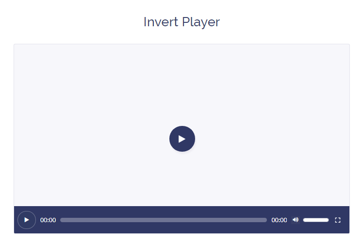
Content
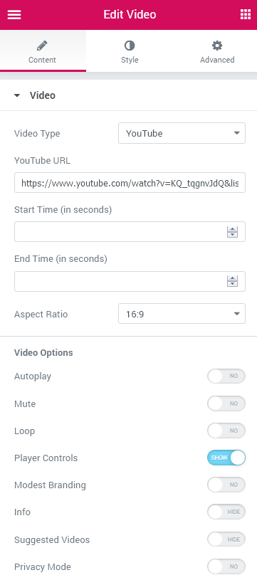
Video
- Video Type - here you can specify the video file type. It can be YouTube, Vimeo or Self Hosted type (in case you want to showcase the video that’s previously uploaded to your server).
- YouTube URL - input the YouTube video URL address in this field.
- Start Time (in seconds) - define the time you want the video to start at.
- End Time (in seconds) - define the specific time you want the video to finish at.
- Aspect Ratio - this option allows your video item to be scaled according to your needs.
- Vimeo URL - paste the Vimeo video URL address in this field.
- Start Time (in seconds) - define the time you want the video to start at.
- Aspect Ratio - this option allows your video item to be scaled according to your needs.
- Player - select the preferable video player among the Default HTML 5 and the MediaElement Player.
- Self Hosted URL - here you are able to upload the video from your hard drive to embed it to the page built with Elementor.
- Start Time (in seconds) - define the time you want the video to start at.
- End Time (in seconds) - define the specific time you want the video to finish at.
Video Options
- Autoplay - enable this option if you want the video to play automatically.
- Mute - this option allows you to put the video on mute.
- Loop - turn this option on if you don’t want the video to stop (the start and end time options will cease to affect the video).
- Player Controls - enable or disable this option in order to show or hide the player controls.
- Modest Branding - enable this option to display the Youtube logo.
- Info - enable this option to showcase the title of the video.
- Suggested Videos - enable or disable this option in order to reveal or hide the list of suggested videos.
- Privacy Mode - when you turn on privacy mode, YouTube won't store information about visitors on your website unless they play the video.
- Intro Title - enable this option in order to showcase the title of the video.
- Intro Portrait - enable this option in order to showcase the Vimeo profile picture of the person who owns this video.
- Intro Byline - enable this option in order to showcase the username of the video owner at Vimeo.
- Controls Color - pick the color of the video controls.
- Download Button - enable this option to reveal the “Download” button so that the viewers will be able to download the video.
- Controls Visibility - here you can specify which controls you want to be visible or hidden.
- Poster - upload the poster for the video from your computer to use it in case the video file can’t be played at the time (the poster will be shown instead of the video).
Thumbnail Overlay
- Show Custom Thumbnail - enable this option to display the thumbnail of the video. It will be shown before the video is played.
- Image Size - pick the preferable thumbnail size.
- Overlay Color - choose the overlay color with the color picker tool.
Play Button
- Show Play Button - enable this option to show the “play” button.
- Play Button Type - select the desirable button type, which can be either an icon or an image.
- Icon - pick the appropriate icon from the list of icons.
- Image - upload the image, which will be the “Play” button.
Style
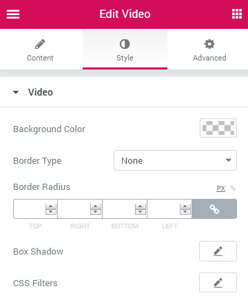
Video
- Background Color - here you can set the background color of the Video widget.
- Border Type - here you can define the type of the border you need to use for the video (the types are similar to the ones available for other JetElements widgets).
- Border Radius - here you can set the border radius to make the angles more smooth and round.
- Box Shadow - enable this option if you want to access the shadow advanced settings for this widget, and need to apply shadow for it.
- CSS Filters - in this block you are allowed to make some extra changes to the widget, such as use blur, make it more or less bright, etc.
Play Button
- Icon/Image Size - select the preferable “Play” button icon/image size.
- Color - define the “play” button color with the help of the color picker tool.
- Background Type - in this block you can choose, whether you want to use classic or gradient type for the “Play” button background. The customization options vary for each type. The settings are similar to the common background type settings for other JetElements widget.
- Box Shadow - enable this option if you want to access the shadow advanced settings for this widget, and need to apply shadow for it.
- Padding - here you can set the preferable custom padding for the widget. Fill in the values for the top, bottom, right and left padding in pixels to apply your custom padding.
- Border Type - here you can define the type of the border you need to use for the “Play” button.
- Border Radius - here you can set the border radius to make the angles more smooth and round.
Switch between the Normal and Hover modes to customize the appearance of the Play button in its normal state and when one hovers over it.
Player Controls Container
- Padding - here you can set the preferable custom padding for the widget. Fill in the values for the top, bottom, right and left padding in pixels to apply your custom padding.
- Background type - in this block you can choose, whether you want to use classic or gradient type for the “Play” button background. The customization options vary for each type. The settings are similar to the common background type settings for other JetElements widget.
- Border Type - here you can define the type of the border you need to use for the player controls container.
Player Play-Pause Button and Time
Play-Pause Button
- Font size - here you can select the size of the “Play-Pause” button icon in pixels.
- Color - here you are allowed to pick the color of the “Play-Pause” button icon when Normal and on Hover.
- Background Color - here you can select the background color of the “Play-Pause” button when Normal and on Hover.
- Padding - here you can set the preferable custom padding for the widget. Fill in the values for the top, bottom, right and left padding in pixels to apply your custom padding.
- Margin - input the values for the headline margins in the required fields.
- Border Radius - here you can set the border radius to make the angles more smooth and round.
- Border Type - here you can define the type of the border you need to use for the “Play-Pause” button.
- Box Shadow - enable this option if you want to access the shadow advanced settings for this widget, and need to apply shadow for it.
Time
- Typography - turn the option on to view the typography settings. They are similar to the typography settings of other JetElements widgets.
- Color - pick the preferable color of the time digits with the help of the color picker.
- Current Time Margin - input the values for the current time margins in the required fields.
- Duration Time Margin -input the values for the duration time margins in the required fields.
Player Progress
Total Progress Bar
- Height - here you can select the height value (in pixels) for the total progress bar.
- Background Type - in this block you can choose, whether you want to use classic or gradient type for the “Play” button background. The customization options vary for each type. The settings are similar to the common background type settings for other JetElements widget.
- Border Type - here you can define the type of the border you need to use for the total progress bar.
- Border Radius - here you can set the border radius to make the angles more smooth and round.
- Margin - input the values for the total progress bar margins in the required fields.
Current Progress Bar
- Background Type - in this block you can choose, whether you want to use classic or gradient type for the “Play” button background. The customization options vary for each type. The settings are similar to the common background type settings for other JetElements widget.
- Border Radius - here you can set the border radius to make the angles more smooth and round.
Player Volume
Volume Button
- Font size - here you can select the size of the “Volume” button icon in pixels.
- Color - here you are allowed to pick the color of the “Volume” button icon when Normal and on Hover.
- Background color - here you can select the background color of the “Volume” button when Normal and on Hover.
- Margin - input the values for the “Volume” button margins in the required fields.
- Border Radius - here you can set the border radius to make the angles more smooth and round.
- Border Type - here you can define the type of the border you need to use for the “Volume” button.
- Box Shadow - enable this option if you want to access the shadow advanced settings for this widget, and need to apply shadow for it.
Volume Slider
- Margin - input the values for the volume slider margins in the required fields.
Total Volume Bar
- Width - specify the preferable width of the total volume bar in pixels.
- Height - here you can select the height value (in pixels) for the total volume bar.
- Background Type - in this block you can choose, whether you want to use classic or gradient type for the “Play” button background. The customization options vary for each type. The settings are similar to the common background type settings for other JetElements widget.
- Border Type - here you can define the type of the border you need to use for the total volume bar.
- Border Radius - here you can set the border radius to make the angles more smooth and round.
Current Volume Bar
- Background Type - in this block you can choose, whether you want to use classic or gradient type for the “Play” button background. The customization options vary for each type. The settings are similar to the common background type settings for other JetElements widget.
- Border Radius - here you can set the border radius to make the angles more smooth and round.
Player Fullscreen Button
- Font size - here you can select the size of the “Fullscreen” button icon in pixels.
- Color - here you are allowed to pick the color of the “Fullscreen” button icon when Normal and on Hover.
- Margin - input the values for the “Fullscreen” button margins in the required fields to change the margin values.
Weather
Weather widget allows adding weather forecasts to the pages built with Elementor and styling up the design of the weather block.
Weather widget Sample
On the picture below you can view Weather widget sample.
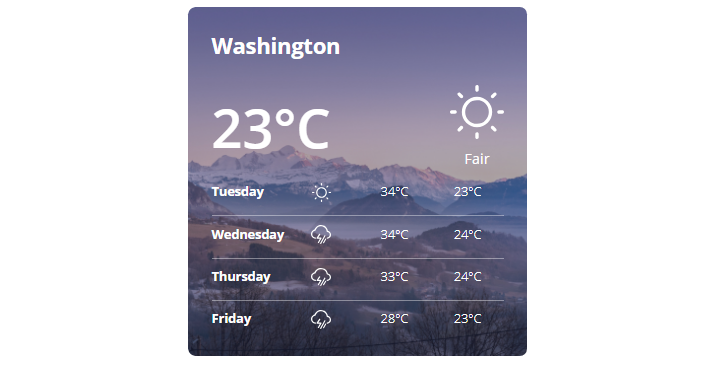
Content
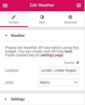
Weather
- Location - indicate the location which weather you want to display.
- Units – here you can define in what system to display the temperature (Metric – °C or Imperial – °F).
Settings
- Title HTML Tag – here you can select the HTML tag (div, or heading) to apply for the title.
- Show country name – this option allows showing the country’s name.
- Show current weather – here you can set if the current weather will be displayed or not.
- Show current weather details – this option makes it possible to showcase the details of current weather (the day, dawn/ sunset time, min/ max temperature, precipitation).
- Show forecast weather – enable this option if you want to display the weather forecast for some days and select the amount of days that will be showcased.
Style
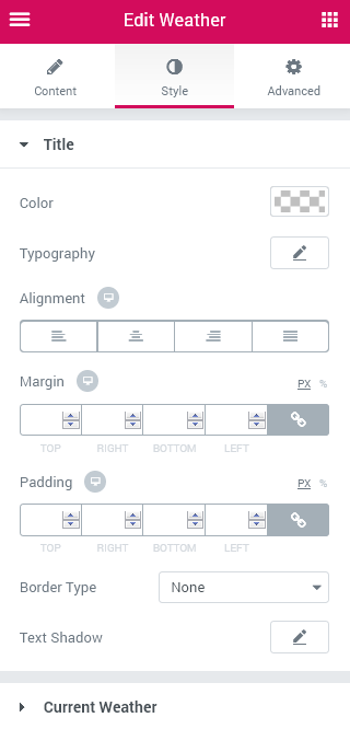
Title
- Color – specify the color of the title with color picker tool.
- Typography – turn the option on to view the typography settings. They are similar to the typography settings of other JetElements widget.
- Alignment – here you can set the weather region's alignment. It can be located on the left, in the center or on the right.
- Margin – fill in the custom margin values to add a responsive margin around the block.
- Padding – type in the custom padding values to add the responsive padding for the block.
- Border Type– select how borders of the title will be looked (solid, double, dotted, dashed and groove types).
- Text Shadow – use the shadow settings (such as shadow color, blur, horizontal, vertical) if you want to make the title’s text highlighted.
Current Weather / Forecast Weather / Details Weather
These blocks contain similar style settings. They are easily manageable and allow to apply different stylization for the current, forecasted and detailed weather.
Container
- Margin – fill in the custom margin values to add a responsive margin around the block.
- Padding – define in the custom padding values to add the responsive padding for the block.
- Border Type – select how the borders of block will be looked (solid, double, dotted, dashed and groove types).
- Width - here you can define the width of the container's border.
- Color - here select the color of the container's border using color picker tool.
Temperature
- Color – select the temperature’s color with color picker tool.
- Typography – turn the option on to view the typography settings. They are similar to the typography settings of other JetElements widget.
Icon
- Color – here you can specify the icon’s color using Color picker tool.
- Font Size – here you can set the icon’s size.
Description
- Color – here you can choose the description’s color using color picker tool.
- Typography – turn the option on to view the typography settings. They are similar to the typography settings of other JetElements widget.
- Gap – set the space between the description and the icon.
WooCommerce Recent Products
WooCommerce Recent Products widget helps you to showcase the products on your website’s page and sort them using custom order.
Content
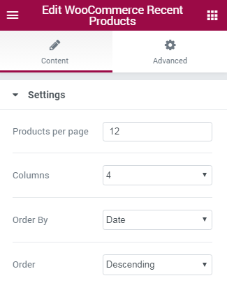
- Products per Page — here you can set how many products you want to display per one page using this widget. Set “0” value to display all the existing products.
- Columns — here you can define how many columns you want to display in the widget to organize products. You can set from 1 to 6 columns.
- Order By — here you can define the criterion by which the products will be sorted. You can sort products by date, ID, author, title, name, slug, comments count or menu order. You can as well apply random order.
- Order — here you can set ascending or descending order for the products.
WooCommerce Featured Products
WooCommerce Featured Products widget helps you to display featured products in an attractive way on your website’s page, and sort them using custom order.
Content
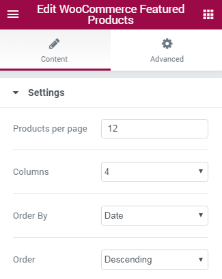
- Products per Page — in this block you can set how many products you want to display per one page using this widget. Set “0” value to display all the existing products.
- Columns — here you can define how many columns you want to display in the widget to organize products. You can set from 1 to 6 columns.
- Order By — here you can define the criterion by which the products will be sorted. You can sort products by date, ID, author, title, name, slug, comments count or menu order. You can as well apply random order.
- Order — here you can set ascending or descending order for the products.
WooCommerce Sale Products
WooCommerce Sale Products widget helps you to display sale products on your website’s page, and sort them using custom order.
Content
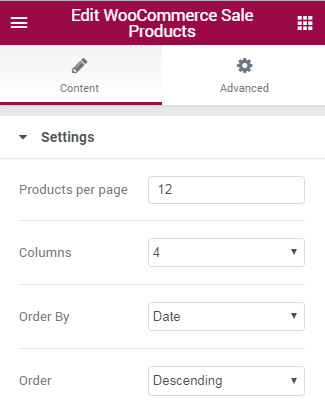
- Products per Page — in this block you can set how many products you want to display per one page using this widget. Set “0” value to display all the existing products.
- Columns — here you can define how many columns you want to display in the widget to organize products. You can set from 1 to 6 columns.
- Order By — here you can define the criterion by which the products will be sorted. You can sort products by date, ID, author, title, name, slug, comments count or menu order. You can as well apply random order.
- Order — here you can set ascending or descending order for the products.
WooCommerce Bestsellers
WooCommerce Bestsellers widget is extremely helpful if you need to show the most sold products on your website’s page, and arrange them in columns.
Content
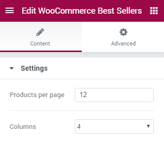
- Products per Page — here you can define how many products you want to display per one page using this widget. Set “0” value to display all the existing products.
- Columns — here you can define how many columns you want to display in the widget to organize products. You can set from 1 to 6 columns.
WooCommerce Top Rated Products
WooCommerce Top Rated Products widget can be used if you want to showcase the products that have the highest rating according to the customers reviews. With this widget you can set the number of products to show per page and the number of columns in which the products will be organized.
Content
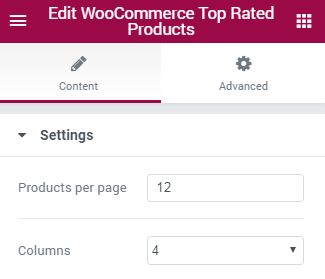
- Products per Page — here you can define how many products you want to display per one page using this widget. Set “0” value to display all the existing products.
- Columns — here you can define how many columns you want to display in the widget to organize products. You can set from 1 to 6 columns.
WooCommerce Product
WooCommerce Product widget can help you to display one custom product on your website page in a classy way.
Content
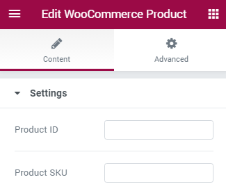
- Product ID — fill in the product ID number in this field to display it using this widget.
- Product SKU — input your product service identification code in this field to show the product using this widget.
Contact Form 7
Contact Form 7 widget helps you to display your existing contact forms on the website’s page.
Contact Form 7 widget Sample
On the picture below you can view Contact Form 7 widget sample.
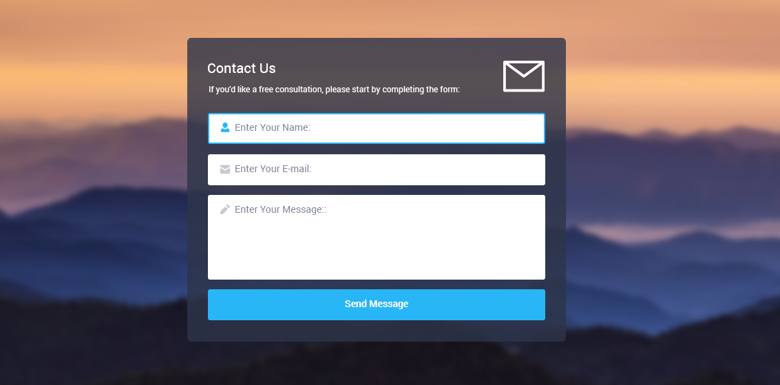
Content
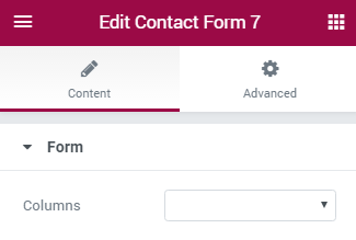
- Color — here you can set the color of the widget texts using color picker tool.
- Typography — turn the option on to view the typography settings. They are similar to the typography settings of other JetElements widget.
- Color — here you can set the color of the widget notices texts using color picker tool.
- Typography — turn the option on to view the typography settings. They are similar to the typography settings of other JetElements widget.
- Margin — input the values for the notices margins in the required fields.
- Alignment — set the centered, left or right alignment for the notices.
- Background Type — in this block you can choose, whether you want to use classic or gradient type for the controls. The customization options vary for each type. The settings are similar to the common background type settings for other JetElements widget.
- Color — in this block you can set the color of the widget controls using color picker tool.
- Placeholder Color — in this block you can set the color of the placeholder using color picker tool.
- Typography — turn the option on to view the typography settings. They are similar to the typography settings of other JetElements widget.
- Padding — here you can set the preferable custom padding for the controls. Fill in the values for the top, bottom, right and left padding in pixels to apply your custom padding.
- Margin — input the values for the controls margins in the required fields.
- Border Type — here you can define the needed border type for the controls. It can be dotted, dashed, double or solid.
- Border Radius — here you can define the values for the radius of the selected border.
- Box Shadow — enable this option if you want to access the shadow advanced settings for the controls, and need to apply shadow for them.
- Textarea Minimal Height — use the arrows to choose the suitable minimal height.
- Background Type — in this block you can choose, whether you want to use classic or gradient type for the button. The customization options vary for each type. The settings are similar to the common background type settings for other JetElements widget.
- Text Color — in this block you can set the color of the button text using color picker tool.
- Typography — turn the option on to view the typography settings. They are similar to the typography settings of other JetElements widget.
- Text Decoration — here you can apply the underlining for the text (e.g., on hover).
- Padding — here you can set the preferable custom padding for the button. Fill in the values for the top, bottom, right and left padding in pixels to apply your custom padding.
- Border Type — here you can define the needed border type for the button. It can be dotted, dashed, double or solid.
- Border Radius — here you can define the values for the radius of the selected border.
- Box Shadow — enable this option if you want to access the shadow advanced settings for the button, and need to apply shadow for it.
- Fullwidth Button — enable this option if you want to dispaly the fullwidth button.
- Typography — turn the option on to view the typography settings. They are similar to the typography settings of other JetElements widget.
- Padding — here you can set the preferable custom padding for the alerts. Fill in the values for the top, bottom, right and left padding in pixels to apply your custom padding.
- Margin — input the values for the alerts margins in the required fields.
- Border Radius — here you can define the values for the radius of the selected border.
- Alignment — set the centered, left or right alignment for the widget alert messages.
- Sent Success;
- Sent Error;
- Not Valid;
- Spam Blocked.
- Color — in this block you can set the color of the alert using color picker tool.
- Background Color — in this block you can set the background color of the alert using color picker tool.
- Border Type — here you can define the needed border type for the alert block. It can be dotted, dashed, double or solid.
- Box Shadow — enable this option if you want to access the shadow advanced settings for the alert block, and need to apply shadow for it.
- First, navigate to WordPress Dashboard and open Contact > Add New tab on the left.
- Here you need to name the contact form and create the form. Feel free to read How to Create Custom Layout for Contact Forms Using Contact Form 7 tutorial in order to learn how to change contact form layouts.
- When everything is ready click on Save button to save all the changes.
- Let’s navigate to Pages > Add New tab on the left of the Dashboard and type in the name for the page which will include the contact form. Then click on Edit with Elementor button.
- Click on Add New Section button to add the section where you want to place the contact form.
- Select Contact Form 7 widget from the Elements menu on the left and drop it to the section area.
- Select the form you’ve created from the dropdown list in the Content block.
- Now let’s switch to Style tab in order to style up the form to make it look like on live demo.
- Paste the #2f2f2f color HEX code in the Color field.
- Switch on Typography option to view the typography settings.
- In the Size field input 20 px value.
- Select Georgia font family in the Family section.
- The weight for the font should be 400.
- Leave Transform, Style fields, Line Height and Letter Spacing controls with the default values.
- The color for the not valid notices should be #f16334.
- Turn on Typography option to view the typography settings.
- The font size should be 14px.
- Leave the default values for all the other fields.
- Turn off the linking values together in the Margin block and define -21px for the top margin.
- Set the right alignment in the Alignment block.
- Use the Classic background type.
- In the Color area set #7a7a7a HEX color value.
- The placeholder color should be #9d9c9c.
- Turn on Typography options.
- The font size should be 16px.
- Use Georgia font family.
- All the other fields should be left with default values.
- Link the Padding values together and set 19px padding value for top, right, bottom and left.
- In the margin block set 19px top margin and 20px bottom margin.
- Select Solid for the border type from the dropdown menu.
- Link together the border radius values and set 5px for top, left, bottom and right border radius.
- Enable Box Shadow and specify 10 for the blur. Leave all the remaining controls with 0 value.
- Define Outline in the Position block.
- The Text area minimal height should be 171.
- Set #00bbd4 HEX value in the Color field.
- Turn on Typography and set 20px in the font size.
- Select Georgia in the Font Family block.
- The font weight should be 700.
- Select Normal in the Transform field.
- Leave the Default value for the style.
- The line height should be 1.7EM.
- Now proceed to editing padding and border radius values.
- Set the padding values as follows: top 12px, right 50px, bottom 12px, left 50px.
- The border radius should be 7px for the top, bottom, right and left.
- Choose Solid border type.
- Enable Fullwidth Button option.
- Now let’s customize alerts for this contact form.
- Enable Typography option.
- Select 16px font size.
- Use Default font family.
- The font weight should be 400.
- In the Border Radius block use 7px border radius for the top, bottom, right and left.
- Select centered alignment.
- Let’s specify the colors for the different kinds of alerts.
- In the Sent Success Background Color area specify #5bb966 HEX color code.
- Use #f16334 HEX color code for the main color of the Sent Error and Not Valid alerts.
- Now the contact form is ready!
- Navigate to the page where you need to place this contact form and click on Edit with Elementor button. Add a new section and drop the Contact Form 7 widget in the new section area.
- Select the name of the newly created form from your existing contact forms dropdown list.
- Switch to Style tab to proceed to styling up your new contact form’s appearance.
- Specify the #777777 HEX color code in the Color block.
- Turn on the Typography option to view all the available settings for the form texts typography.
- Set 14px font size.
- Select Raleway font family.
- Leave the default value in the Weight, Transform, Style, Line height and Letter spacing blocks.
- Select #f16334 HEX value for the notices color.
- Turn on Typography and set 12px font size. Leave the default font family.
- Define -25px value for the top and 7px value for the bottom margins.
- Choose left alignment.
- In this block you need to set your custom padding and margins.
- Select 25px top and bottom and 26px right and left padding values.
- Use 30px bottom margin.
- Select the Solid border type.
- Define 1 value for top, right, bottom and left width.
- The Textarea minimal height should be 160px.
- Select #f16334 HEX color for the button.
- Enable typography options and set 17px font size for the button text.
- Use Raleway font, its weight should be 800.
- In the Padding block set 20px top and bottom padding values and 78px right and left padding.
- Set 50px for top, right, bottom and left border radius.
- Select Solid border type from the dropdown list.
- Use the same alerts colors, as in the first contact form style.
- Go to the page to which you need to add the contact form.
- Click on Edit with Elementor button to open the page with Elementor drag-n-drop page builder.
- Add a new section and drop Contact Form 7 widget to it.
- Select the name of the newly created contact form in the Content block on the left.
- Switch to Style tab to start editing the contact form appearance.
- Specify #8488a0 HEX color code in the Color field.
- Enable typography options.
- Set 14px font size.
- Select Roboto font family.
- Specify 400 font weight.
- Set #c91765 HEX color code for the notices color.
- Enable typography settings.
- Specify 12px font size.
- In the margin block set -14px top margin.
- Use left alignment in the Alignment block.
- Let’s customize Normal mode for the contact form controls.
- Select #8488a0 HEX color for the Placeholder Color.
- The padding values should be as follows: 13px top, 20px right, 12px bottom, 20px left.
- Set 14px for the bottom margin.
- Set Solid border type.
- Define 2px border width for the top, right, bottom and left border values.
- In the Border Radius set 3px value for top, bottom, right and left borders.
- Enable Box Shadow option and set 10 value in the Blur block.
- Select Outline from the Position dropdown menu.
- Set 120px as the text area minimal height.
- Navigate to Focus mode for the controls and set the Solid border type.
- Specify 2px value for border width.
- The border color should be #28b6f6.
- Let’s customize the Normal appearance mode for the Submit button.
- Select the Classic background type and specify #28b6f6 HEX color code for it.
- The text color should be #fffffff.
- Enable typography options.
- Set 14px font size for the button text.
- Set Roboto font family.
- The font weight should be 700.
- Select Normal in the transform field.
- Let’s define the padding and border radius for the button.
- Set the padding values as follows: 12px top, 30px right, 12px bottom and 30px left.
- Set 3px for the border radius.
- The border type should be Solid.
- Now let’s customize the Hover mode of Submit button.
- Set Classic background type and select #c91765 HEX color code for the general button color.
- Enable Fullwidth button option to make the button fullwidth.
- Set #29bf3c color for the Sent Success alert, and #c91765 color for Sent Error and Not Valid alerts.
- Navigate to the page where you need to place the contact form and click on Edit with Elementor button.
- Add the new section and drop Contact Form 7 widget to its area.
- In the Content block on the left select the form name in order to select the form for embedding.
- Switch to Style tab on the left to start customizing contact form appearance.
- Set #222931 HEX color code to use it for the texts.
- Enable typography settings and set 16px font size.
- Select Hind font family.
- The font weight should be 800.
- Select Uppercase in the Transform menu.
- Set #f16334 HEX color code for the notices.
- Enable typography options and set 14px font size.
- Set the Default font family. The font weight should be 400.
- Select Normal from the Transform dropdown menu.
- Set -21px for the top margin.
- Choose right alignment in the Alignment block.
- Switch to Classic background type.
- Set #f5f6f6 HEX color code for the controls color.
- In the Color field below select #848a90 HEX color.
- The same color should be used for the placeholder color.
- Enble typography options and set 13px font size.
- Choose Open Sans font family.
- The font weight should be 400.
- Define 20px value for the bottom margin.
- Set the Solid border type in the Border Type section.
- The border width should be 1px.
- Set 212 value for the text area minimal height.
- Here we’ll customize the Normal and Hover modes for the button.
- First, let’s manage normal Submit button appearance.
- Select Classic background type.
- Set #27a69bcolor HEX code to use for the button.
- The text color should be #fffffff.
- Enable typography options to customize button typography.
- Select 14px value for the font size.
- Use Hind font family.
- The font weight should be 800.
- Set the following values for the button padding: 14px top, 30px right, 14px bottom and 30px left.
- Use the solid border type.
- Switch to customizing Hover mode and set Classic background type. Select #000000 HEX color code for the button background when you hover on it.
- Switch on typography options and set 14px font size value.
- Use default font family and specify 400 font weight.
- In the Transform field select Normal from the dropdown list.
- Set centered alignment in the Alignment block.
- Select rgba(39,166,155,0.8) color code as a background color for Sent Success alert, and use #f16334 HEX color code for Sent Error and Not Valid alerts.
- If you need to style up your contact form in order for it to look as the fifth form on JetElements Contact Form 7 live demo, please, feel free to accomplish the following steps allowing to customize contact form appearance.
- Navigate to the page where you need to place the contact form and click on Edit with Elementor button to open Elementor drag-n-drop page builder.
- Add a section where you want to place a new contact form and drop Contact Form 7 widget to it.
- In the Content block on the left select the contact form you want to embed by its name.
- Switch to Style tab in order to proceed to appearance customization.
- Set #ffffff HEX color code value in the Color field.
- Enable typography options.
- Set 16px value for the font size.
- Select Roboto font family.
- Define 300 value for the font weight.
- Select #ff8686 HEX color code for the notices.
- Enable typography settings and set the 12px value for the notices font size.
- Set -15 value for the top margin.
- Turn on left alignment in Alignment section.
- Here we need to customize Normal and Focus modes for the Contact Form 7 controls.
- First, let’s style up the controls in the Normal mode.
- Select Classic background type.
- Set rgba(35,164,85,0) color code in the Color block.
- Use #ffffff HEX color code for the placeholder color.
- Set the following values for the padding: 15px top, 20px right, 25px bottom and 20px left.
- The top margin should be 5px.
- Select Solid in the Border Type dropdown menu.
- Set 1 value for top, bottom, right and left border width.
- Use #ffffff as the border color.
- Link border radius values together and set the border radius 10px.
- The text area minimal height should be 192.
- Switch to Focus Controls mode and specify Solid border type.
- Set 1 for border width value.
- The color of the border should be #ffffff.
- Enable Box Shadow option.
- Select #ffffff HEX color code for the color.
- The shadow spread should be 2.
- Set Inset in the position field.
- Let’s style up Submit button. In this block you can also switch from Normal to Hover mode to set two separate styles for the button. We’ll use Classic background type for each of the modes.
- Specify #68dc9c color code for the button background color in the Normal mode.
- Enable typography settings and set 13px value for the font size.
- Specify Raleway font family.
- The font weight should be 800.
- Define the following padding values for the button padding: 20px for top and bottom padding and 30px for right and left padding.
- Specify 10px value for the border radius.
- Select Solid border type.
- Now let’s switch to Hover button mode.
- Here set #ffffff HEX color value for the button background.
- The text color should be #68dc9c.
- Enable typography settings to manage alerts typography.
- Set 14px font size.
- Define 7px border radius. Set centered alignment in the Alignment block.
- Specify #ffffff HEX color code for the Sent Success alert, and #58bf86 as its background color.
- Use #f16334 HEX color code for the Not Valid and Spam Blocked alerts.
- Select Form — here you can select one of the existiing forms to embed it to the website's page layout. You can create one using Contact Form 7 or create Your own if You have a basic knowledge in HTML.
Style
Form Texts
Not Valid Notices
Controls
You can customize the appearance of Contact Form controls using the Normal, Focus or Not Valid mode. Just switch between the modes using the corresponding buttons.
Submit Button
You can customize the appearance of Contact Form Sumbit Button using the Normal, Hover or Focus mode. Just switch between the modes using the corresponding buttons.
Alerts
There are 4 different types of the widget alert messages. They are:
You can customize each one of them using the following customization settings.
Contact Form 7 widget Styles
If you want your contact form to look like on JetElements live demo page, proceed to reading these short guides that will assist you in styling up contact forms.
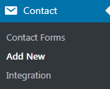
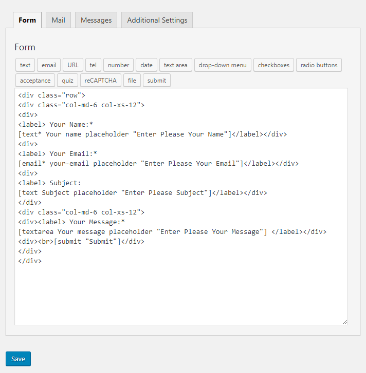
Style 1
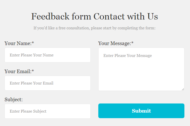
Form Texts
Not Valid Notices
Controls
Submit Button
Alerts
Style 2
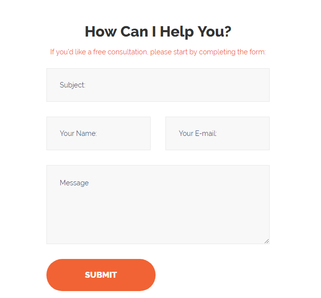
Form Texts
Not Valid Notices
Controls
Submit Button
Style 3
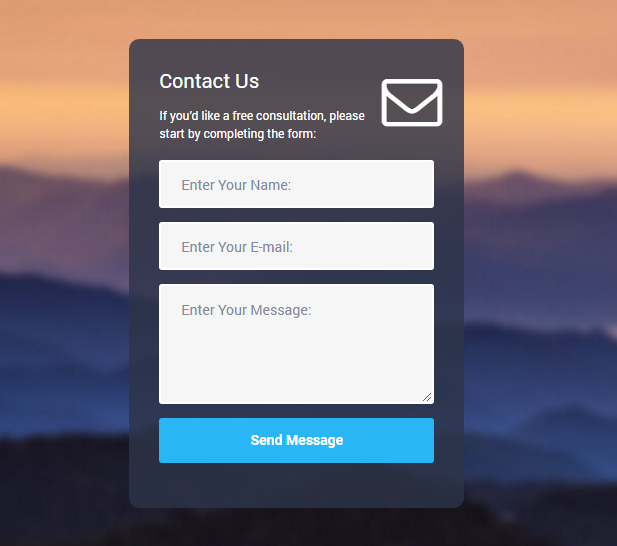
Form Texts
Not Valid Notices
Controls
Submit Button
Alerts
Style 4
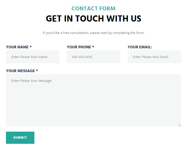
Form Texts
Not Valid Notices
Controls
Submit Button
Alerts
Style 5