
Vendy Pro
Sections All
Sections encompass both content and settings tailored for distinct segments within a Shopify store, whether it's the fundamental elements of a product page or a dynamic slideshow component.
With the introduction of Online Store 2.0, sections have evolved into the central means of structuring and managing all facets of your theme, ranging from entire pages to individual elements.
Shopify sections can enrich the store's potential greatly.
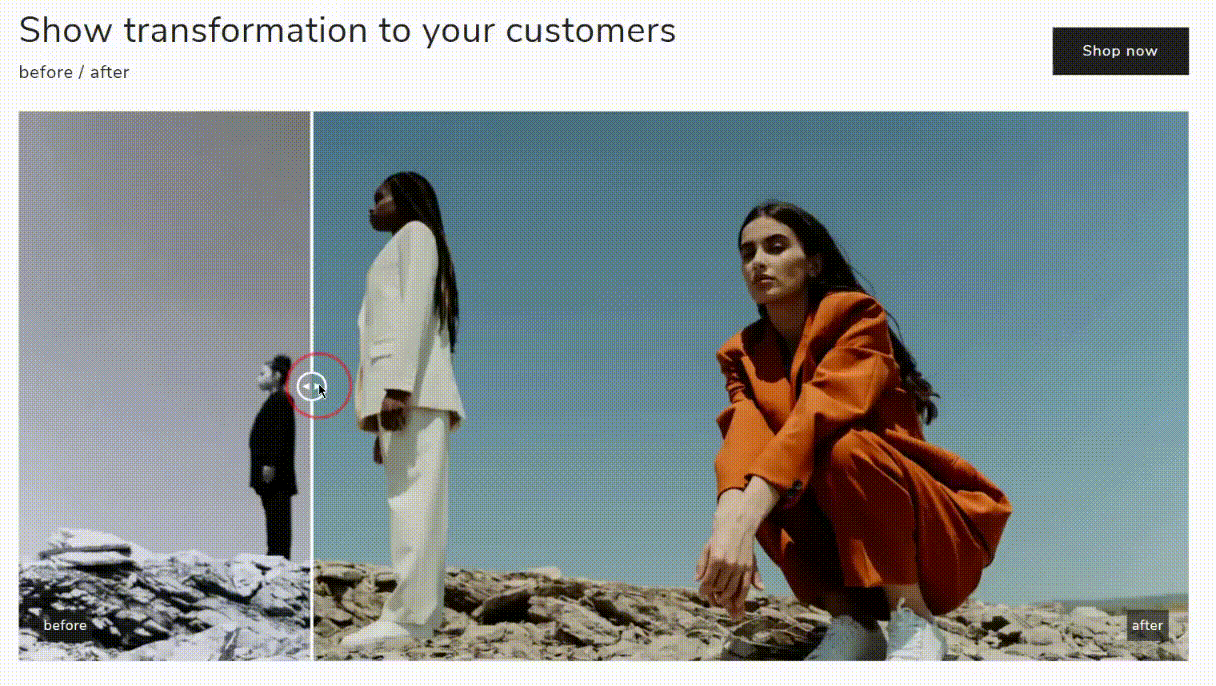
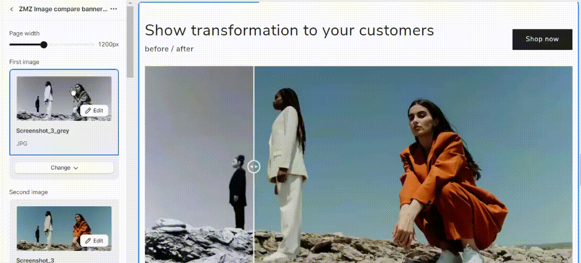
ZMZ Image Compare Banner (Before/After)
The "ZMZ Image Compare Banner (Before/After)" Shopify section is a customizable feature used to showcase visual comparisons between two images.
This section typically allows online store owners to display two images side by side, with a draggable slider or divider in the middle that lets users interactively compare the "before" and "after" states of a product, service, or transformation.
The following settings are available:
- Page width - set the page width for the section (max. 1200px).
- First image - set the prime image for the before/after section.
- Second image - set the secondary image for the before/after section.
- Start point area - set the slider from which the before/after switching begins.
- Show label beafore/adter - enable/disable the label.
Section heading
- Title - set the specific title for the section.
- Heading font size scale - set the font size.
- Subtitle - set a specific subtitle text if it's needed.
- Subtitle font size scale - set the subtitle font size.
- Description - set a specific description for the before/after section.
- Description font size scale - choose the description font size.
- First button label - set the title for the call-to-action button label.
- First button link - set the specific link for the button.
- Heading horizontal alignment - set the position of the heading text horizontally within a homepage (left, right, or center).
- Heading position - set the heading of the section (at the top or at the bottom).
- Desktop type heading - set the type of heading (row or colums).
- Color scheme - choose a specific color scheme.
Mobile layout
- Mobile content alignment - set the position of the heading text horizontally within a homepage on mobile ( choosing left, right, or center position).
Section padding
- Top padding - set the top space between the before/after section and the block above.
- Bottom padding - set the bottom space between the before/after section and the block below.
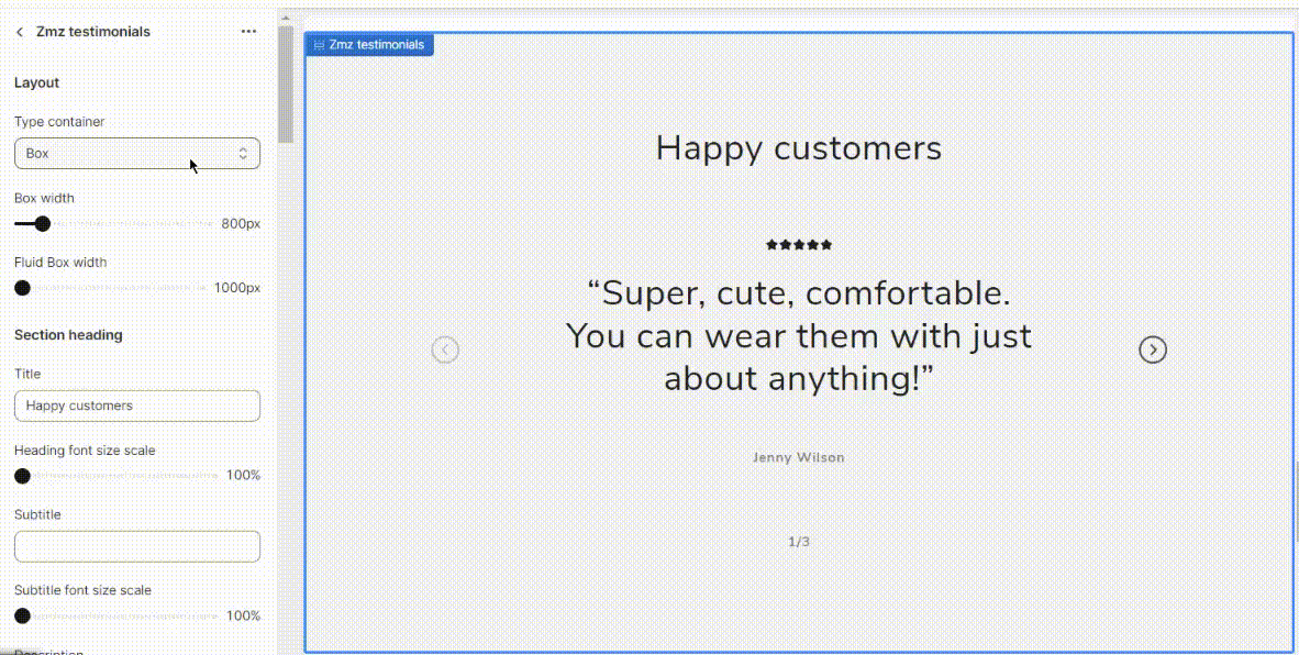
ZMZ Testimonials
A "Testimonials" section on a Shopify website is a dedicated area where you can showcase reviews, comments, or feedback from satisfied customers or clients.
This section is essential for building trust and credibility with potential customers.
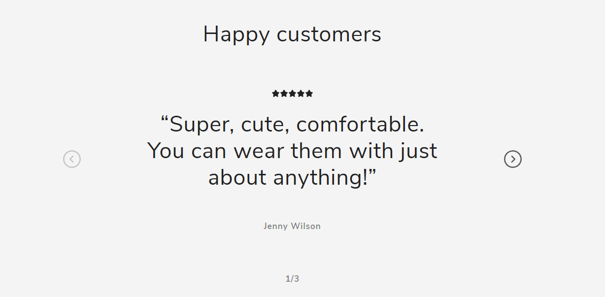
Such "ZMZ Testimonials" section settings are available:
Layout
- Type container - choose the type for the block (box, container fluid, container full width).
- Box width - set the width of the box (max 800px).
- Fluid Box width - set the fluid width of the box (max 1000px).
Second heading
- Title - set a specific text - title for the section.
- Heading font size scale - set the heading size.
- Subtitle - set the subtitle text.
- Subtitle font size scale set the subtitle size.
- Description - set the additional content for the section.
- Description font size scale - set the size of the text.
- Heading horizontal alignment - set the position of the heading text horizontally within a homepage (left, right, or center).
- Inverted text - enable a reverse text.
Image Settings
- Image width - set the image width (full width of column, one-third width of column, half width of column).
- Image ratio- set the proportional relationship between an image's width and height (adapt to image, portrait, square, circle).
Slider Settings
- Number of columns on desktop - set the number of columns.
- Horizontal block space - set the amount of empty or blank space that is left horizontally between blocks of content.
- Column alignment - organize the columns in a visually consistent and organized manner (Left, or center).
- Disable carousel counter - turn off or hide the counter that indicates how many items are in a carousel.
- Navigation style type - set the navigation style type from the available one.
- Enable carousel on desktop - enable/disable carousel display.
- Make caption full width - display the block so that it spans the entire width of the screen.
- Secondary background
Button
- Button label - add the button label if it the button is used.
- Button link - paste a link for the button.
Background section color scheme
- Section color scheme - choose the color for the section.
- Use custom section color - select or define a specific color for a section.
- Background custom color - set the specific color.
Mobile Layout
- Number of columns on mobile - set the number of columns on mobile.
- Enable swipe on mobile - enable/disable swipe option.
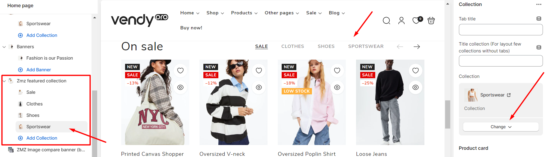
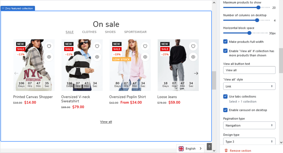
ZMZ Featured Collection
ZMZ Featured Collections is a feature of the Shopify platform that allows you to showcase items from selected collections on your storefront page or any other page. This feature is particularly useful for highlighting your best-selling or most popular products, as well as any new or featured items you want to promote.
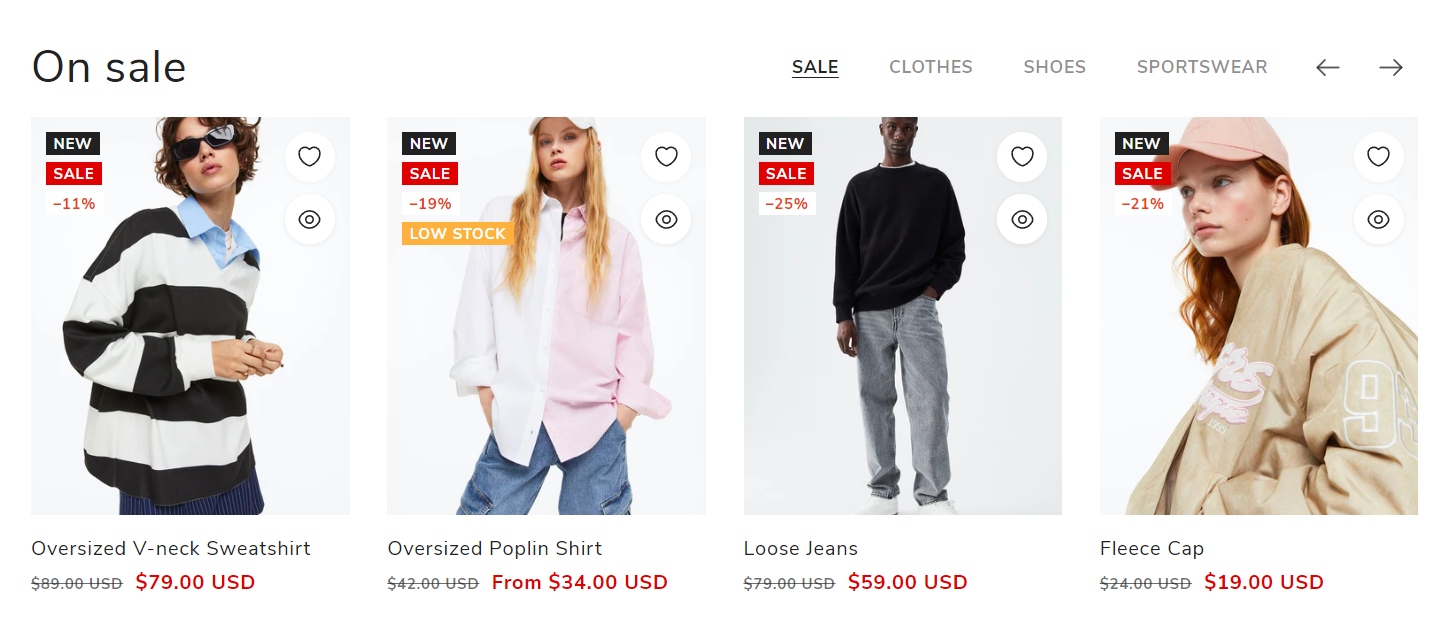
The ZMZ Featured Collection to display products from only one selected collection or from several different collections. When two and more collections are added, a tabs list will appear on the top of the section allowing you to switch between different collections. In order to add more collections to the section, just click the Add Collection link, set the tab title, select the needed collection, and make the required product card settings
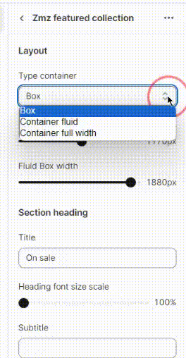
ZMZ Featured Collection’s general settings include:
- Container type and width;
- Section heading (content and style);
- Slider settings;
- Background Color Scheme;
- Mobile Layout and others.
Section Heading
In the Section Heading part of the settings a subtitle, description, or custom HTML can be added additionally and styled.
Slider Settings
In the Slider Settings part you can:
- set the maximum number of products to show (from 2 to 25);
- set the number of columns for the desktop view (from 1 to 5);
- adjust the horizontal block spacing (from 0 to 50px);
- make products fullwidth;
- enable/disable the View All button;
- choose a pagination type;
- enable/disable collections tabs;
- enable/disable carousel;
- choose a design type for the section.
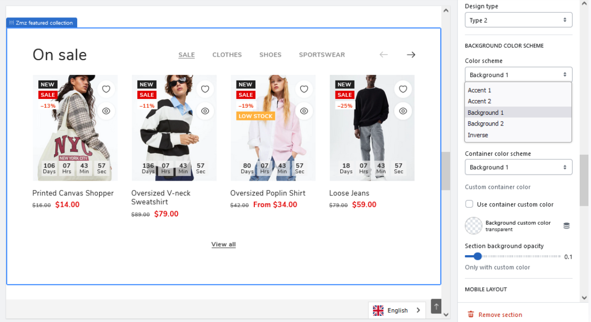
Also in the Background Color Scheme part of the settings, you can set/change the background colors of the section and the container. There is an option to choose from the pre-designed theme color schemes or to set custom background colors.
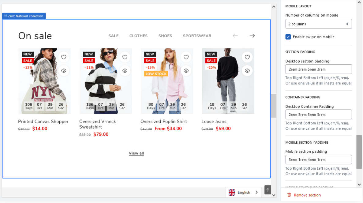
The rest of the settings include mobile layout, container, and section padding configuration.
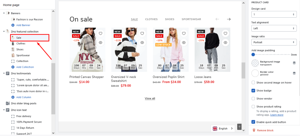
In the individual collection’s editing section, besides choosing a collection and setting a title for the tab, you can also make the needed style customizations.
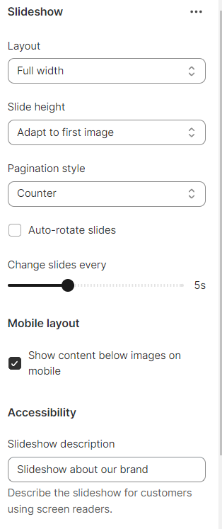
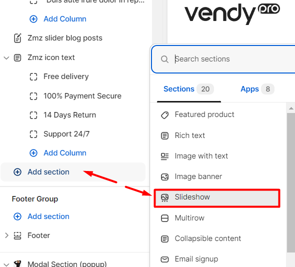
Slideshow
Using a slideshow is an excellent method for highlighting products or displaying images within your Shopify store. It can be employed to spotlight featured products or to visually present your products in real-life scenarios.
The following settings are available:
- Layout - choose the layout display (full width or grid).
- Slide height - set the height of the slide (small, medium, large, or adapt to the first image).
- Pagination style - choose the style of pagination (dots, counter, or numbers).
- Auto-rotate slides - enable/disable auto rotate option.
- Change slides every - set the time at which slides should change.
- Show content below images on mobile - enable/disable content below images on mobile.
- Slideshow description - set a specific content for the slideshow.