
Vendy Pro
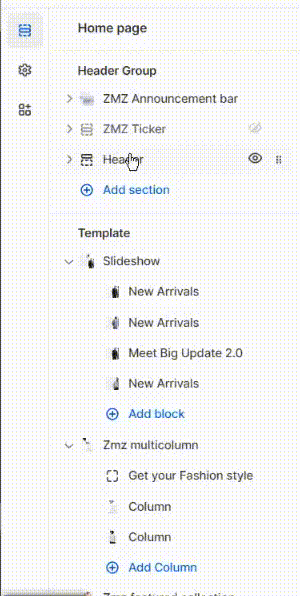
Header Group
Header area is a content block that you can see at the upper part of every page of an online store. Header typically consists of a name of a store, logo, main website navigation menu and shopping cart sign.
Header is customizable content. By changing the header options you will have different designs.
Megamenu
With the mega menu, you can make the navigation through your store smooth and organize your content properly. By creating a compound menu in the dropdown form, you will give visitors immediate access to any category on your site.
Mega Menu in Shopify
Mega menus allow you to display several menus across your store’s main navigation from one dropdown. The website allows customers to easily navigate through your store by displaying all of your products and collections.
Here is a great tutorial on how to build the basics of store navigation on Shopify. To get a grasp of the upcoming tutorials, please first visit their tutorial if you have no prior knowledge of website navigation.
Display Mega Menu
To showcase a Mega Menu on your Shopify store, you'll initially have to implement certain modifications within the Navigation section.
1. Go to Online Store -> Navigation and chose a menu to edit.
2. Add a new menu item or edit an existing one.
3. Add [is_mega] to the name field and hash sign (#) to the link field.
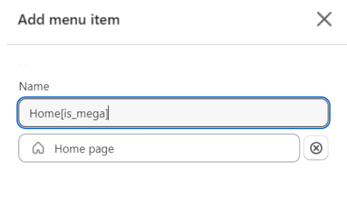
Note: Creating a Mega menu is possible only when you include a menu item labeled with [is_mega] within the Navigation.
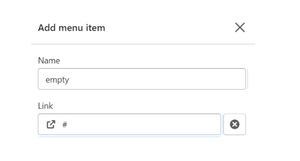
4. Add a new menu item, type “empty” in the name field, and hash sign (#) in the link field.
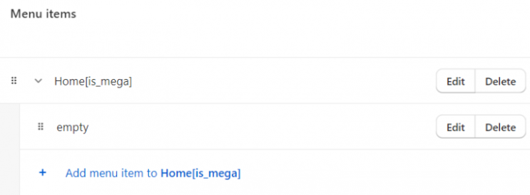
5. Drag the empty item to the right to make it a submenu item.
6. Go to Online Store -> Themes -> Customize.
7. Choose and add a new block to the header.
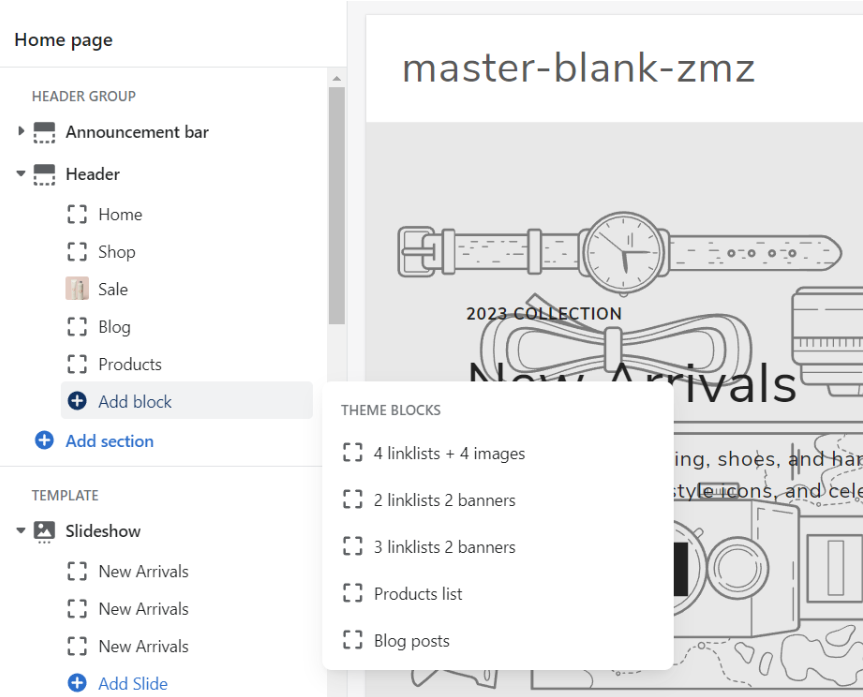
8. Go to edit the block you chose and type your menu title in the for item field.
Now, you can assign an item to any menu item in the navigation marked with [is_mega].
Display Simple Menu
To showcase a Simple Menu on your Shopify store, you'll initially have to implement certain modifications within the Navigation section.
Here's a step-by-step guide on how to do it:
- In the Shopify admin, go to "Online Store" in the left-hand sidebar and then click on "Navigation."
- Click the "Add menu" button to create a new menu. Give your menu a name, like "Main Menu" or "Header Menu."
- Click the "Add menu item" button. Enter the name of the menu item. This is what will be displayed on the menu. Enter the URL for the page you want the menu item to link to. This could be a collection page, product page, blog post, or any other page on your site.
- Organize Menu Items:
- You can create sub-menus (dropdown menus) to organize your menu items further. Click and drag a menu item slightly to the right under another menu item. This will make it a sub-item of the one above it.
- To rearrange menu items, simply click and drag them to the desired position within the menu.
- To edit a menu item, click on it in the menu editor.
- To delete a menu item, click "Delete" button.
- Before making your changes live, it's a good idea to preview them using the "Preview" button. If everything looks good, click the "Save" button again to publish your menu to your online store.
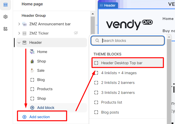
Header Desktop Top Bar
In Shopify, the "Header Desktop Top Bar" typically refers to the uppermost section of a website's header on its desktop version. It usually contains additional information such as social sharing icons, custom text, currency, and language selectors.
This top bar remains fixed at the top of the screen as users scroll down the page. This ensures that the important information and features present in the top bar are always accessible to users, even when they're exploring the rest of the page's content.
How to add a Header Desktop Top Bar
In the header settings click on Add block and choose "Header Desktop Top Bar" block.
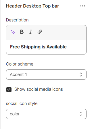
Here you can set the following settings:
- Description - display a brief message, announcement, or any other customized content that you want to prominently showcase to your visitors and ability to link it.
- Color scheme - choose the color scheme from the available ones.
Note: You can add/change the color scheme going to Theme settings -> Color.
- Show social media icons - enable/disable social sharing icons.
- Social icon style - set the social icon style: color, standard, circle, square.
Header Settings
In your Shopify admin panel go to Customize Theme > Header section. Here you can set the Header Layout Settings.
Header
- Page width or Apply full width - control how the content in the header area is displayed in terms of its width and alignment.
- Color scheme - choose the color scheme from the available ones.
Note: You can add/change the color scheme going to Theme settings -> Color.
Header transparent overlap
- Transparent header (only home) - create a visually appealing and modern aesthetic, allowing the content to flow smoothly underneath the header on the homepage.
- Enable inverse header color elements.
Logo
- Edit your logo in theme settings - set additional settings for logo.
- Desktop logo position - set the logo position from the available: top left, top left inverse part bottom, top center, top center/fullwidth menu, middle left, middle center, middle left/ center menu.
Menu
- Main menu - ability to change main menu or remove it.
- Desktop menu type - choose the type of the header menu from the available: dropdown menu + mega menu, or drawer menu.
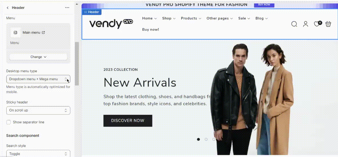
- Sticky header - the "sticky" behavior helps improve user navigation and provides easy access to important links and menu options, regardless of where the user is on the page. The following options for sticky header are available: none, on scroll up, always, always reduce logo size.
- Show separator line - a barely noticeable line that will separate the header section from the main page when scrolling.
Search component
- Search style - ability to display search as a toggle or a row.
Country/region selector
- To add a country/region, go to your market settings.
- Enable country/region selector - enable or disable country selector.
Configure currencies with shopify documentation Official documentation.
Language selector
- To add a language, go to your language settings.
- Enable language selector - enable/disable language selector.
- Move localization selectors to topbar block - the placement of language or region selection options in the top navigation bar of an online store.
Icons text on desktop
- Show account text - enable/disable the "Log in" text next to the account icon.
- Reverse account text - enable/disable the "Log in" text before the account icon (the Show account text option must be enabled).
- Show wishlist text - enable/disable the "Favorites" text next to the wishlist icon.
- Reverse wishlist text - enable/disable the "Favorites" text before the wishlist icon (the Show wishlist text option must be enabled).
- Show search text - enable/disable the "Search" text next to the search icon.
- Reverse search text - enable/disable the "Search" text before the search icon (the Show search text option must be enabled).
- Show cart text - enable/disable the "Shopping bag" text next to the cart icon.
- Reverse cart text - enable/disable the "Shopping bag" text before the cart icon (the Show cart text option must be enabled).
Mobile layout
Mobile logo position - you can optimize the logo position for mobile layout setting it in the center or on the left.
Spacing
Bottom margin - set the bottom margin spacing on mobile.
Social icon style - choose the style of the social icons: color, standard, circle, or square.
Section padding
Top padding - set the top padding spacing on mobile.
Bottom padding - set the bottom padding spacing on mobile.
ZMZ Announcement Bar
ZMZ Announcement Bar is a header section where you can display 3 types of blocks:
- Announcement Image Ad
- Announcement
- Announcement Coupon
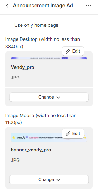
Announcement Image Ad
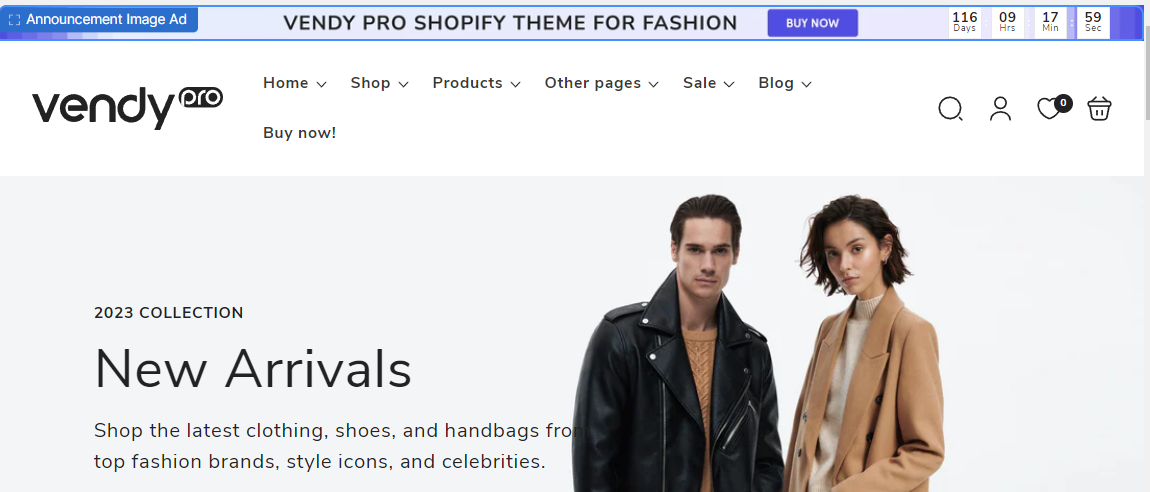
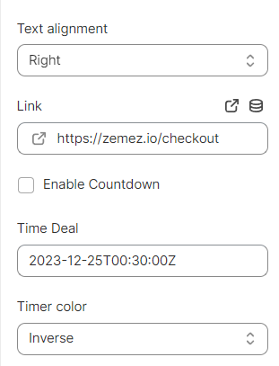
Announcement Image Ad – a block where you can add an image for desktop and mobile versions.
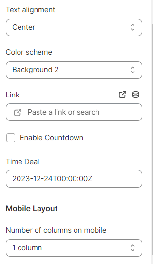
In the block settings, you can add a link, enable a countdown, and set the time for it.
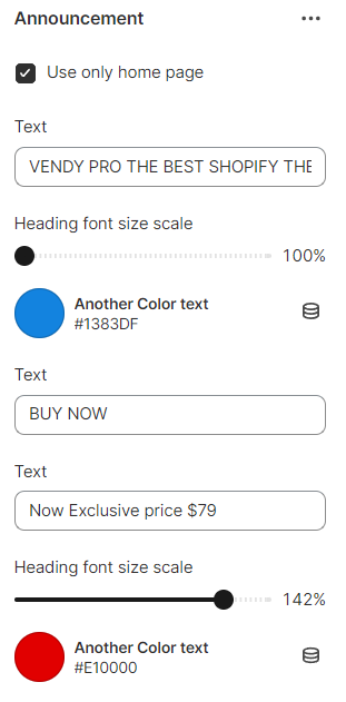
Announcement
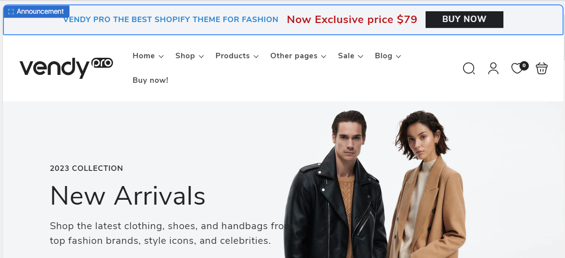
Announcement - a text block with a button and countdown.
Announcement Coupon
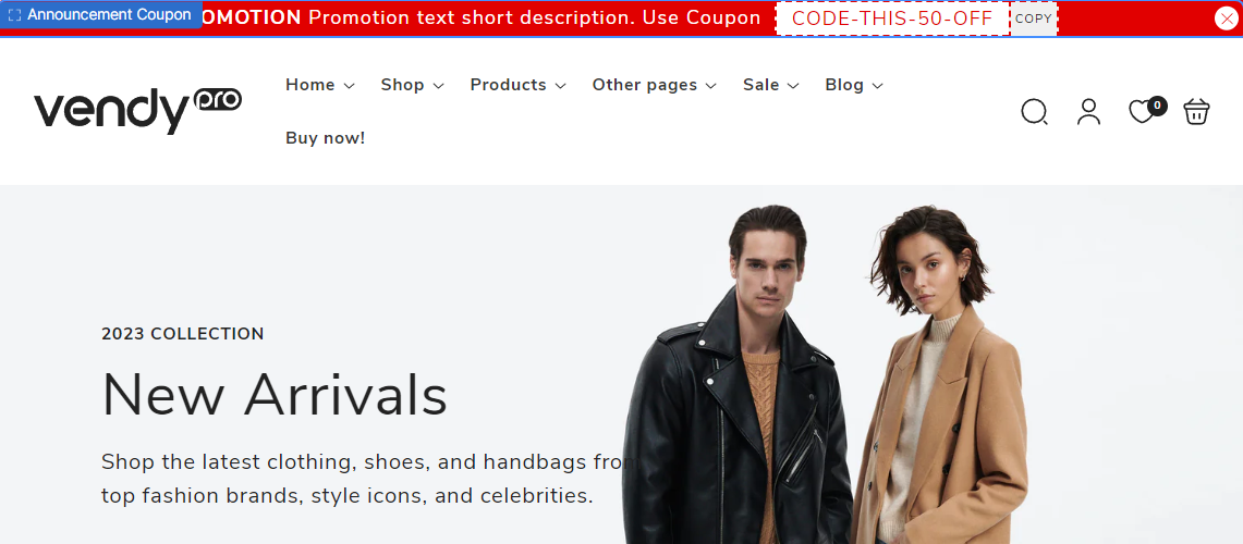
Announcement Coupon – a text block to display information about sale offers and coupon codes.