
Vendy Pro
Product Page Settings
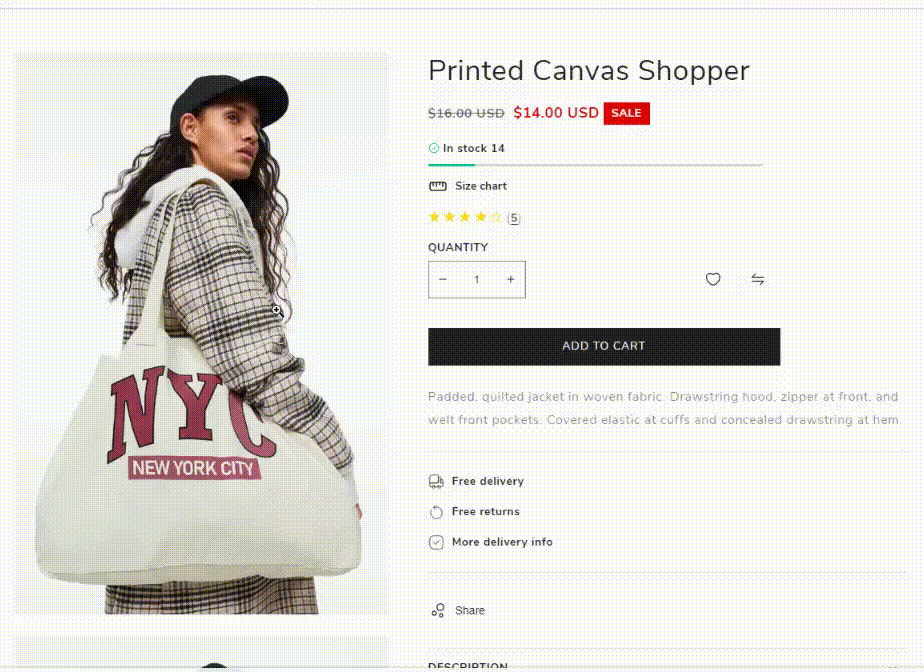
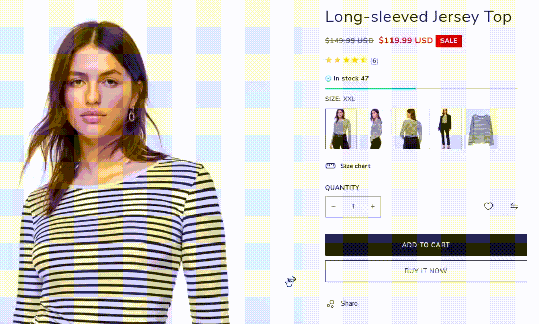
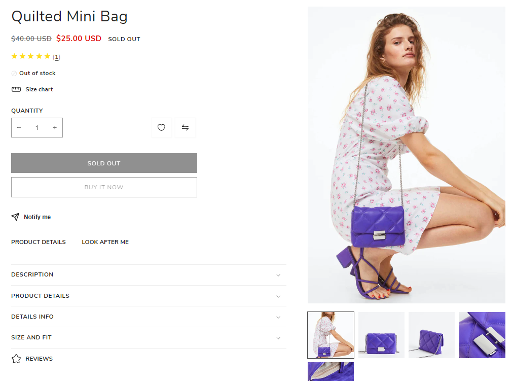
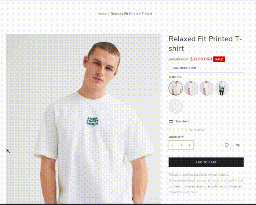
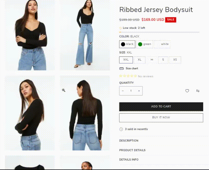
A Shopify product page is a page on your online store that lays out all the details of a given product.
It includes different features like price, sizes, specs, colour, manufacturer and more. It helps to answer questions, provide reviews, allow product comparison, and facilitate the buying process.
Create a Product Page
Before adding products to your Shopify store, check the information by the link Products - Official Documentation.
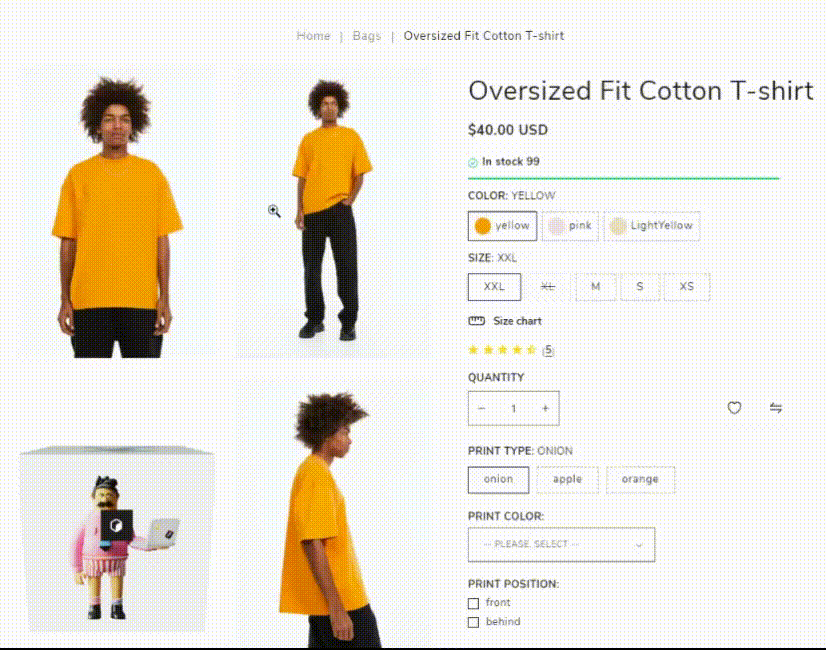
You can add such variants in the products as: size, color, material. This option will work with: product item, quick view, product page.
Check the information about Variants - Official Documentation.
Product Information
Shopify product information settings are the choices and details you can change for a particular product in a business or online store.
For the Product page you can manage the following dynamic blocks:
- Text
- Title
- Price
- Quantity selector
- Buy buttons
- Description
- Share
- Custom liquid
- Collapsible row
- Pop-up for all products
- Pop-up for products from collections
- Complementary products
- Notify button
- Drawer for products from collection
You have the flexibility to rearrange the position of all blocks within the Product Information by simply dragging and dropping them to your desired arrangement.
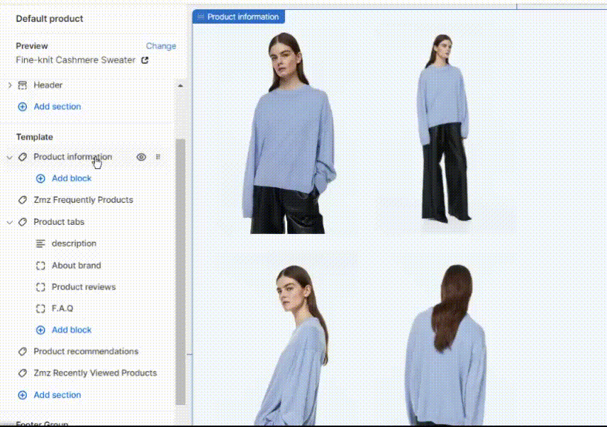
Product Gallery Settings
In Shopify, a "Product Gallery" refers to a feature or section on your online store where you can display multiple images and sometimes videos of a specific product. This gallery is typically found on a product page and serves the purpose of showcasing the product from various angles, providing close-up views, and allowing potential customers to get a better understanding of what the product looks like.
The goal of a product gallery is to give potential customers a comprehensive visual representation of the product, helping them make informed purchasing decisions. High-quality images and well-organized galleries can enhance the overall shopping experience on your Shopify store and contribute to higher conversion rates.
You can configure the product page within the Product Information settings.
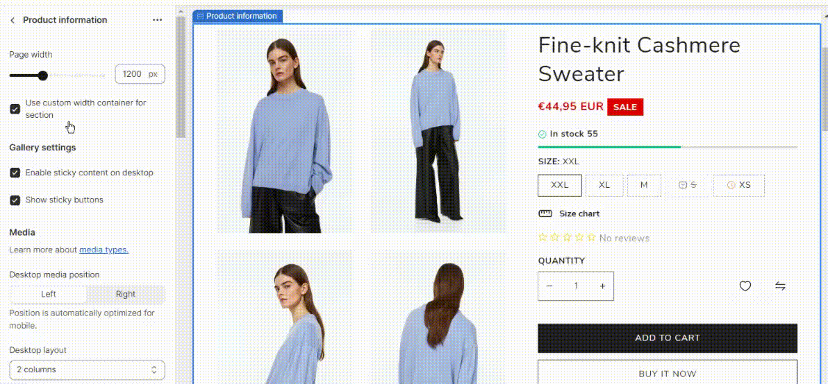
Page width - you can set the product page width max 1600px.
Use custom width container for section - you can enable/disable custom width container in your Shopify store.
Gallery settings
Enable sticky content on desktop - enables the creation of a sticky product information section while allowing the gallery media part to scroll down seamlessly.
Show sticky buttons - enable your customers to easily access the 'Add to Cart' button as they scroll through the page.
Media
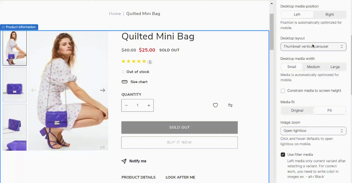
Desktop media position - select the preferred position (left or right) for showcasing product images.
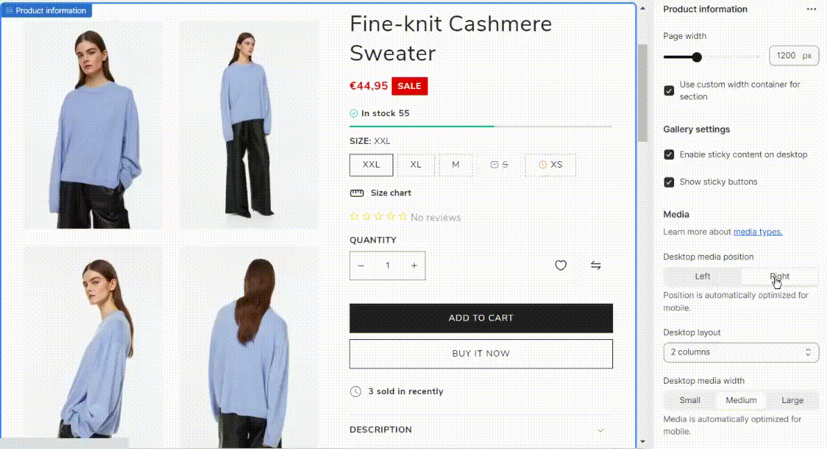
Desktop layout - choose the type of the media gallery layout. It can be: stacked, 2 columns, thumbnails, thumbnail carousel, thumbnail vertical carousel, or one column.
Desktop media width - adjust the width of product images to match the content information.
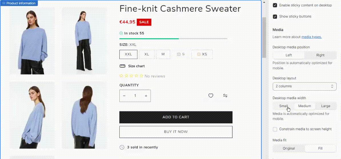
Constrain media to screen height - limit the media to the height of the screen.
Media fit - suitability for media. "Original" option allows you to preserve the original image size by height, even if they are different. The "Fit" option stretches all images equally if some of them differ in height and fully fills the allocated block.
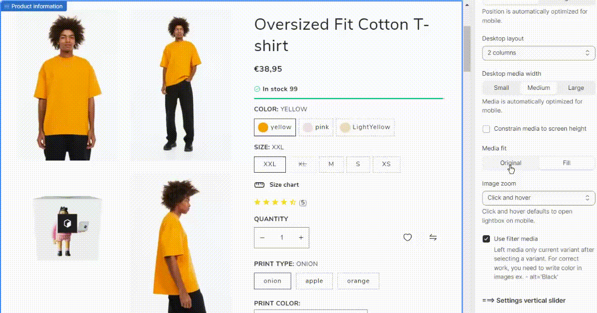
Image zoom - enlarge an image to get a closer view of its details. Available:
- Open lightbox
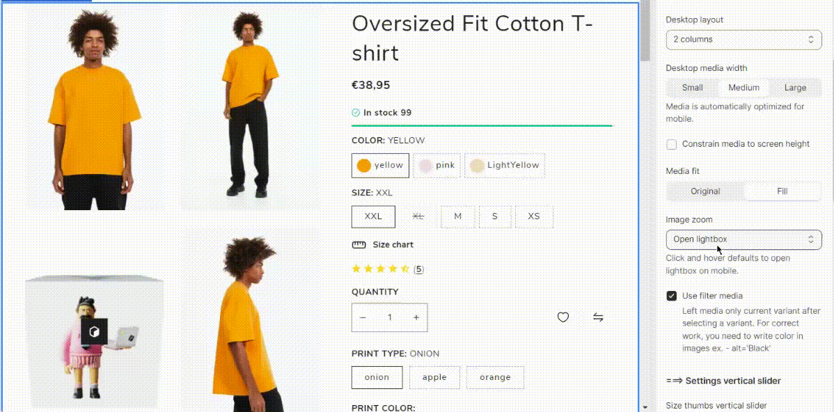
- Click and hover
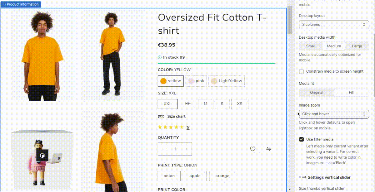
- No zoom
Use filter media - enable/disable the "filter media" option that allows filtering product media by color, or size.
You can check the following tutorial How to manage Filter Color Media using meta fields?
Settings vertical slider
Size thumbs vertical slider - set the size of thumbnails.
Thumbnails list to right - display thumbnail list on the right.
Show clickable pagination - enable clickable pagination.
Hide thumbnails vertical slider on desktop - hide thumbnails if the "Thumbnail vertical carousel" desktop layout type is chosen.
Product Media Gallery
Shopify Online Store 2.0 allows adding different media types to the product gallery: images, videos, and 3D models. The most common file type for the images is PNG, but Shopify also accepts images in JPEG, GIF, PNG, PSD, HEIC, and other formats. You can upload videos as files (.mp4 or .mov) or import them directly from YouTube or Vimeo. 3D models can be added as GLB or USDZ files.
1) Scroll down to the Media section on the product editing page:
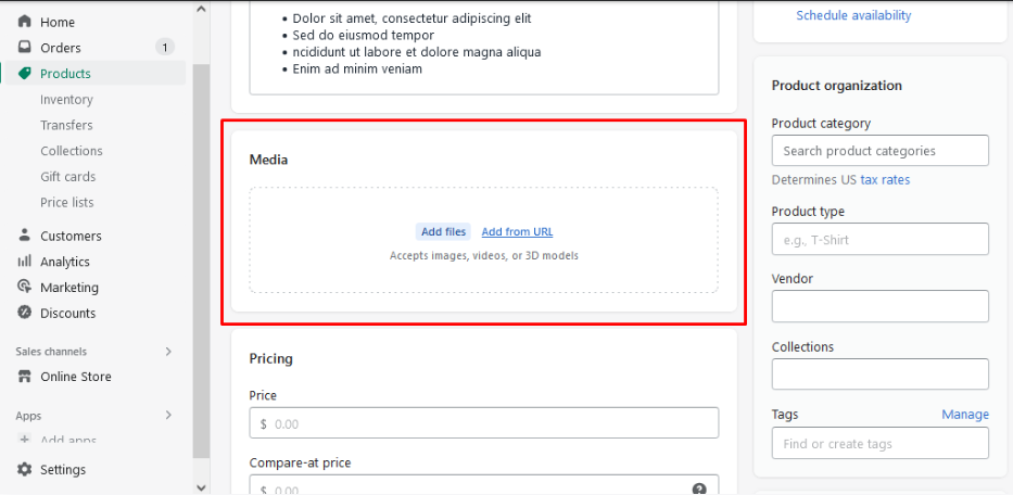
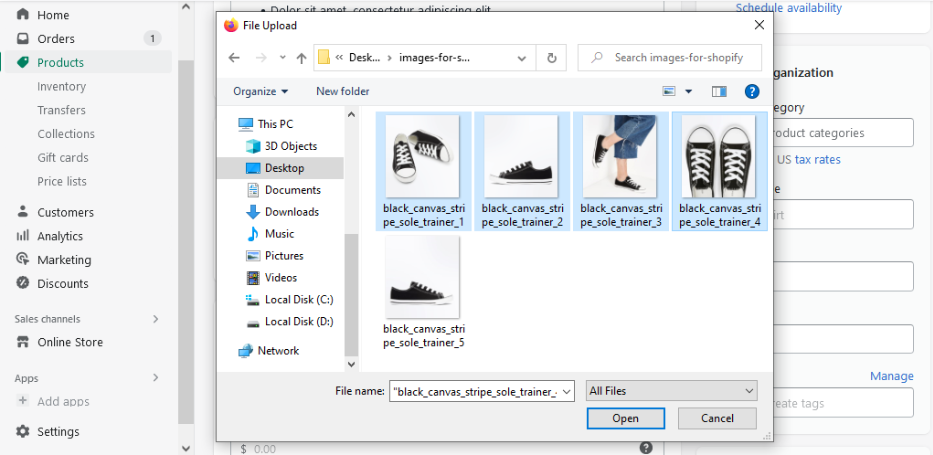
2) There are two ways of importing media for the product: uploading from your device or adding via a direct URL.
In order to upload an image, video, or 3D model, please, click the Add files button. Shopify allows selecting as many files for import at once as needed:
Pressing the Add from URL button opens a popup with an input field for an image URL, YouTube, or Vimeo link:
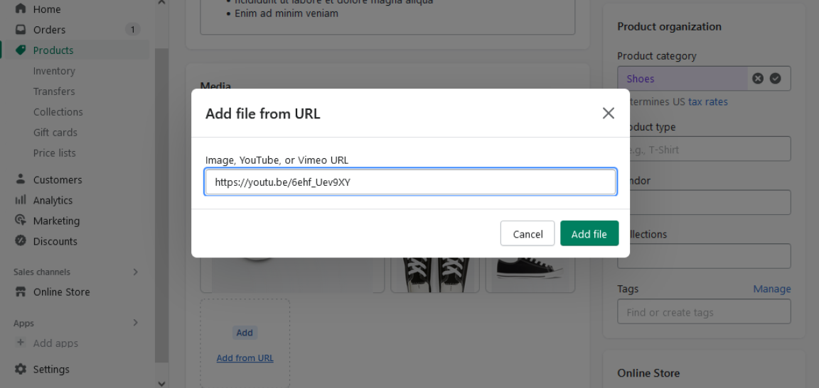
Note: the required image size is anything up to 4472 x 4472 px, 20 MB. The requirements for the uploaded videos are up to 1 GB in size and 10 minutes in length. For YouTube or Vimeo embedded videos, Shopify has no requirements.
3) The first file added to the Media section (it’s the biggest one in the gallery) is considered the main product media item.
Shopify allows rearranging the files manually after uploading. To change the order of the file, just drag and drop it to the required place:
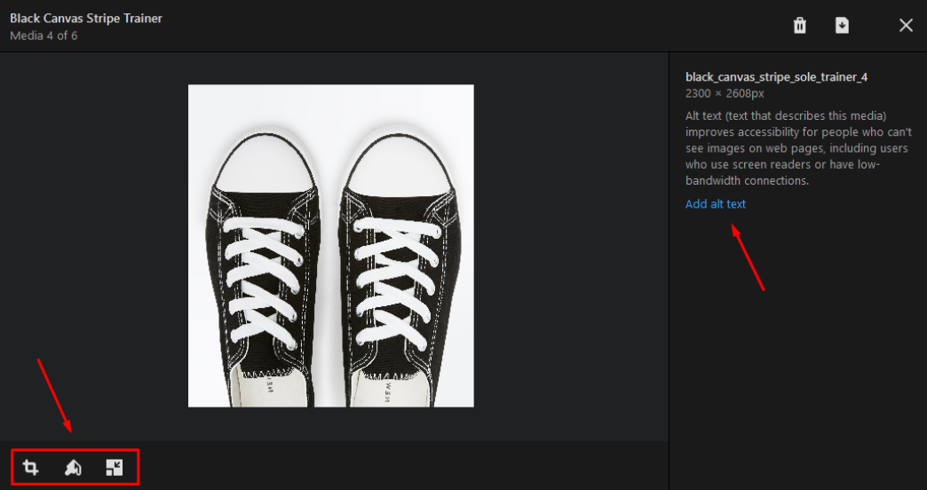
4) Shopify also has an inbuilt graphic editor, which allows resizing images, cropping or rotating them, and adding a drawing.
If you need, you can add alternative text in the same interface. You can open the editor by clicking on the image in the “Media” section:
5) If the product is newly added, do not forget to click the "Save" button after adding the product data, including the media.
In case the product was already saved earlier, the changes made in the media section are saved automatically.
Product Gallery Types
Gallery Horizontal Carousel
Display the product images in a horizontal carousel. Allow users scroll through images from left to right or vice versa
Gallery One Column
The product images are displayed in a single vertical column on your website, making it easy for customers to scroll through and view your offerings one at a time.
This type of gallery can be useful for showcasing products with a focus on individual details or for creating a clean and simple design on your website.
Gallery Vertical Carousel
Display the product images in a vertical carousel. Allow users scroll through images from top to bottom or vice versa
Gallery Grid Two Columns
"Two columns" indicates that the grid layout consists of two vertical columns. In this layout, product images would be arranged side by side in two parallel columns.
Gallery Vertical Right
"Vertical Right" suggests that the images in the gallery are arranged vertically, with the right side of the display being the primary focus or where the main content is placed.
Carousel without Thumbnail
Display multiple images of the product in a rotating manner but without the presence of thumbnail images that users can click on to navigate directly to a specific image.
Gallery Thumbnails
Gallery thumbnails are a visual tool to help visitors quickly identify and access products or categories of interest within an online store.
Stacked Gallery
In a Stacked Gallery layout, multiple images are placed on top of each other, typically in a vertical arrangement. Each image appears one below the other, creating a stacked or layered effect.
Sticky Gallery
Create a gallery of product images on your Shopify online store that remains "sticky" or fixed in a particular position on the webpage as the user scrolls down.
This can provide a better user experience by keeping important content or products visible to visitors as they explore your website.
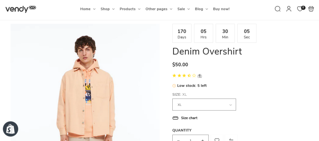
Countdown Timer
Using a countdown timer bar is an effective strategy for inspiring potential buyers to take action. Incorporating a countdown timer onto your product page serves as a powerful method to enhance sales. This timer instills a sense of FOMO (Fear of Missing Out) and urgency in potential buyers, compelling them to make a move.
Add a product countdown timer in Shopify
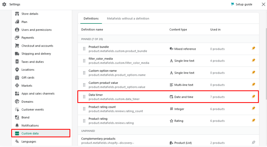
You can easily add a product timer to the Vendy Pro template. In doing so, you will use the functionality of meta fields. You can check the meta fields in the Settings -> User Data -> Products tab:
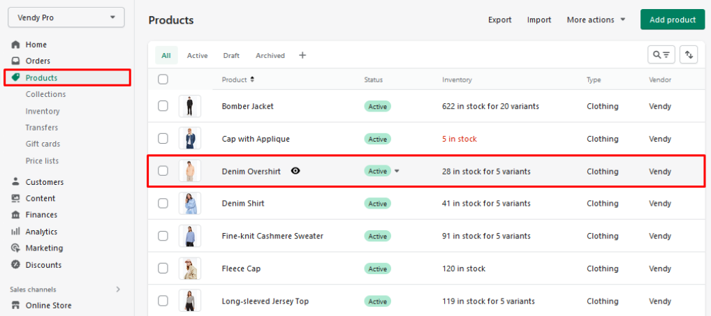
You can activate the timer for each product separately. In order to activate a timer for a product, please, navigate to the Products tab and open the required product for editing:
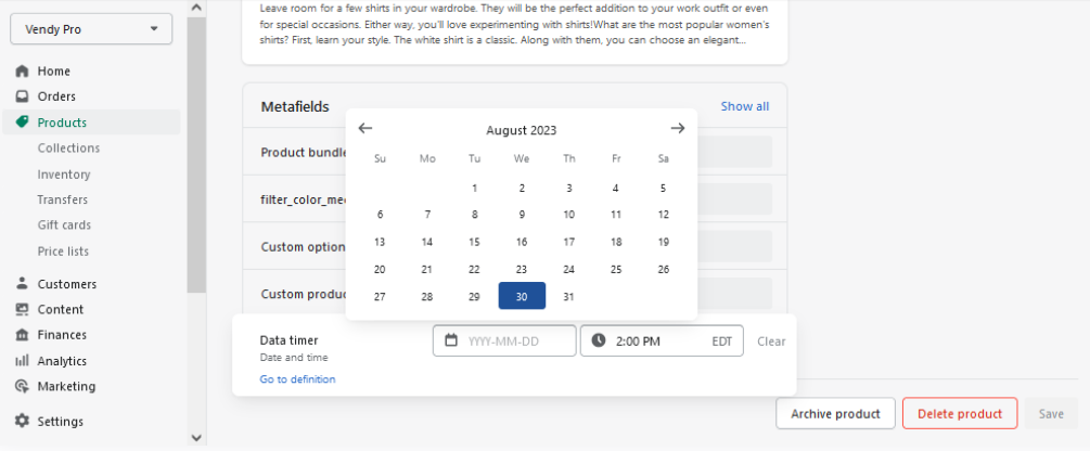
Scroll down to the bottom of the page and find the Data Timer field in the Metafields section.
Click on the Data timer field to open the editing interface. Choose the end date for the timer and set the exact time:
Press the Save button in the bottom right of the page to save the changes.
If the single product page template used in the template includes the timer block, the product timer will display on the respective product page right after the changes are saved. If the timer is not displayed, you should add it to the individual product page template.
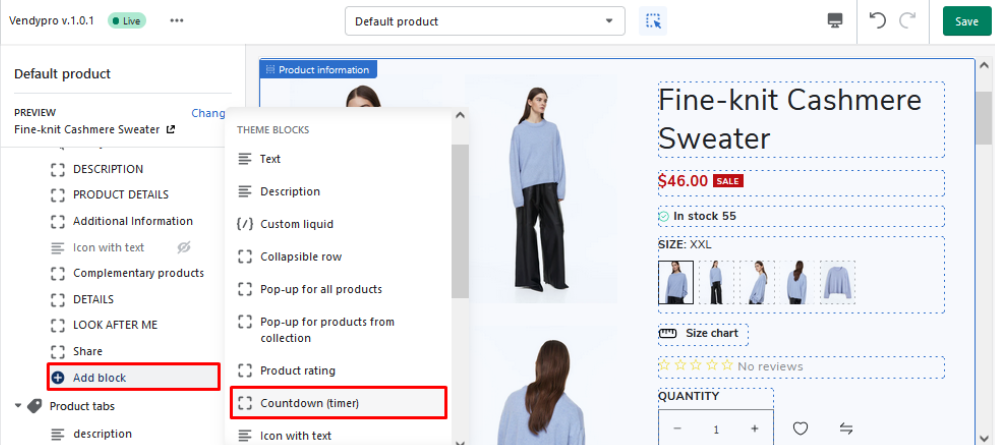
Please navigate to the Online Store -> Themes -> Customize tab and open the Single Product page template for editing:
You can add a timer to any section. But usually, it is in the Product Information section.
Click the Add Block button to open the dropdown with available blocks, and choose Countdown (timer) from the list:
After adding the timer, you can drag it to the desired location:
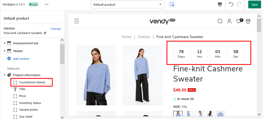
Do not forget to click the Save button and refresh the product page to see the changes:
Note: Although you added the countdown block to the single product page template, the timer will not automatically appear on all single product pages. The timer will only be displayed if you have enabled it in the settings of the respective product (Products tab).
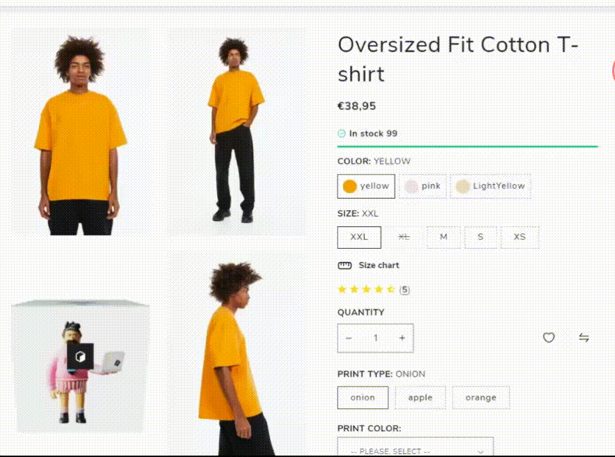
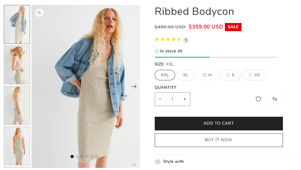
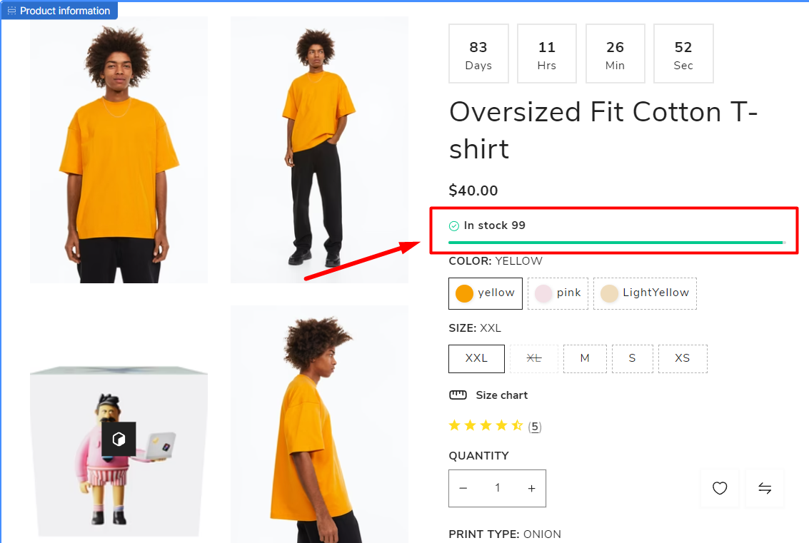
Variant Picker
The Variant Picker allows customizing and styling of the product variant selectors on the single product pages.
The first step is adding variants to the required product(s). These can be size, color, material, etc. variants.
1. Navigate to the Online Store > Themes > Customize tab and open your single product page template for editing:
2. Click on the Variant Picker block to open the settings interface. The first option in the settings determines whether the selected variant title will be shown or not:
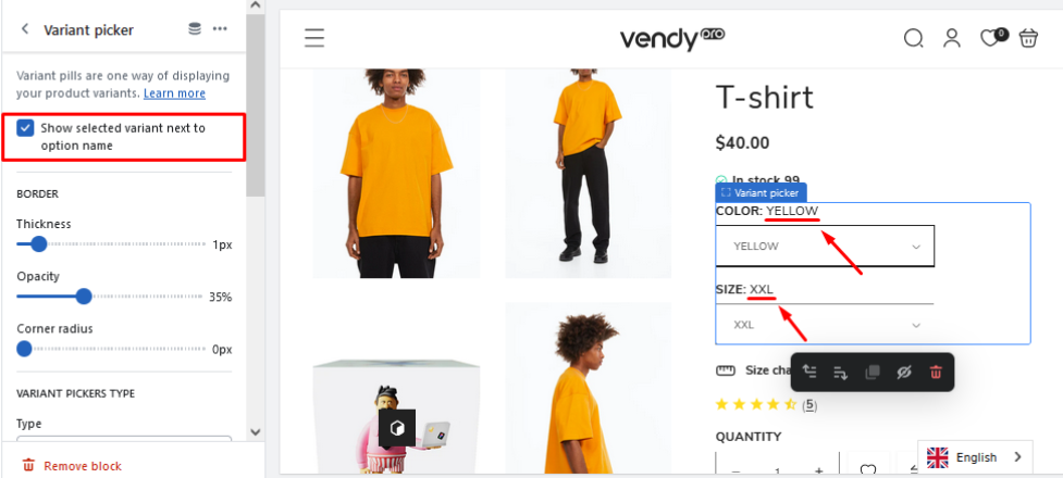
The Border section offers options for pickers’ border stylization.
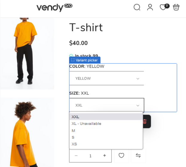
In the Variant Pickers Type section, you can choose the type for the pickers and customize their design. The three options for the variant picker types are dropdown, pills, and image & pills:
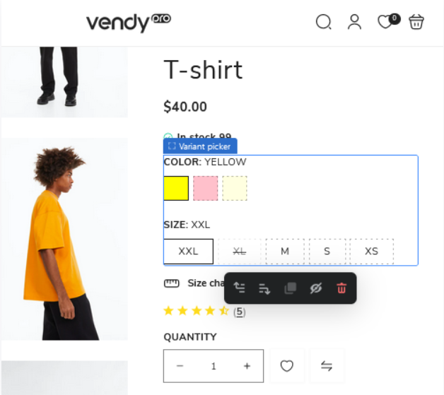
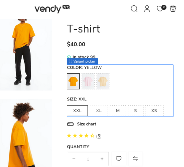
For the image & pills variant picker type you can choose an image ratio – portrait or square. For the color variants, you can select from several swatch types in the Swatch color type section:
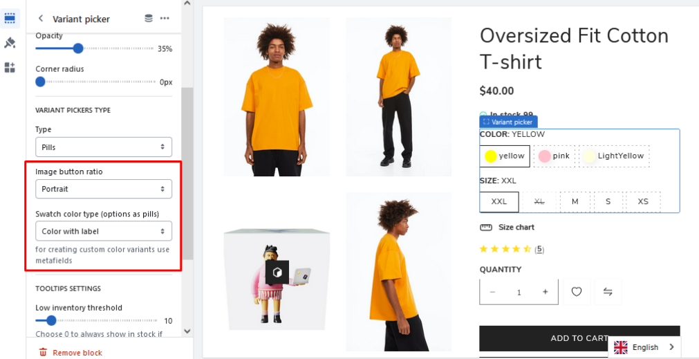
In the Tooltips Settings section you can set the low inventory threshold to show if the product variant is low in stock on hover:
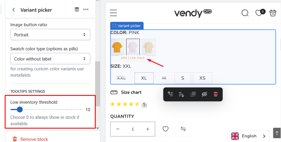
Note: the low inventory threshold for tooltip number must be the same as in the 'Low Inventory Threshold' setting in Inventory Status settings.
Custom colors by hex or image URL
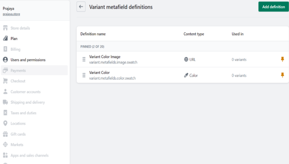
Create meta fields
1. In your admin panel go to Settings -> Custom Data. Choose Variants -> Add definition and create:
- variant.metafields.color.swatch
- variant.metafields.image.swatch
2. Now, go to the Product. Choose the needed Variant and click ‘Edit’.
Set color or link from “content -> files“.
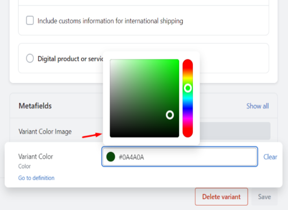
If you want to use color by image, upload the image to the server. Click ‘Copy link‘ and pass into Variant image URL”.

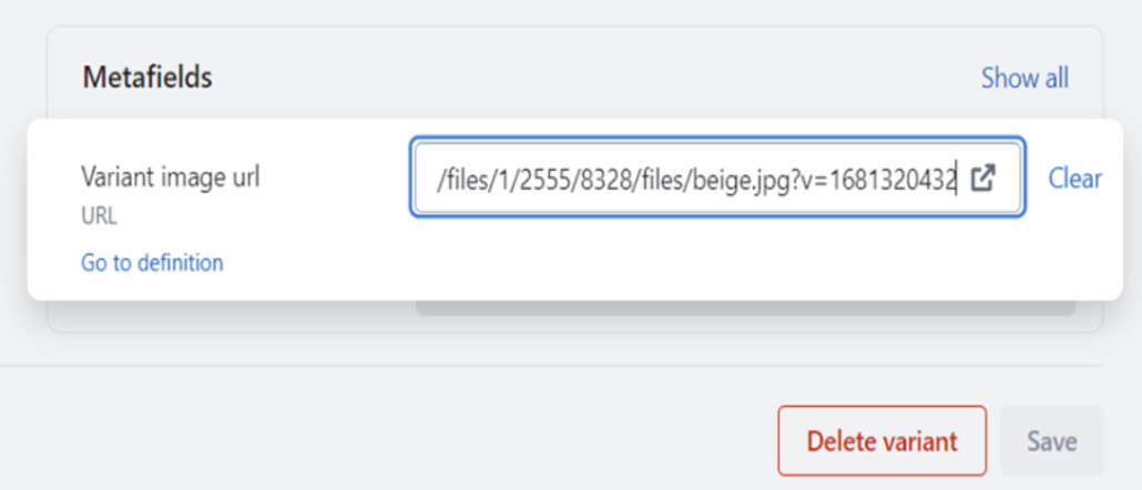
Save the changes.
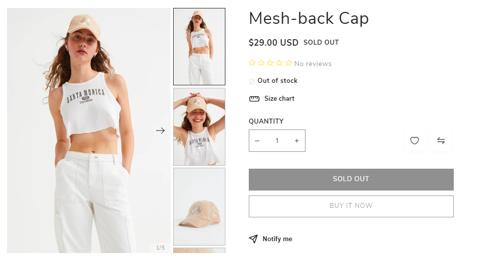
Inventory Status
By providing access to the inventory status, businesses can make informed decisions about purchasing, restocking, pricing, and sales strategies. This helps in maintaining optimal inventory levels, reducing carrying costs, preventing stockouts, and ultimately improving overall efficiency and customer satisfaction.
The following settings could be set:
- Text style - available Body, Subtitle, or Uppercase text styles.
- Low inventory threshold - refers to a specific point or quantity at which a business decides that its inventory level has fallen to an unacceptable or critically low level.
- Show inventory count - allows users to view the current inventory quantity or count of items.
- Show inventory bar - allows the user to display or hide a bar that provides information about the items' availability.
- Maximum count for inventory bar - shows the store occupancy levelю
How to Add Custom Product Options?
In Shopify, custom options are the ability to extend the functionality of your online store by adding your own custom scripts and logic. They allow you to create and execute your own code to manipulate the data and behavior of your store. Here you will learn how to add custom options in Shopify.
Custom options allow you to:
- Create custom scripts to interact with elements of your store such as buttons, forms, cart items, and more.
- Implement custom logic to handle events such as adding items to the cart, changing the price, displaying certain data, etc.
- Connect third-party APIs and services to extend the functionality of your store.
- Additionally, you can create custom variations and settings for your products.
- Use custom functions to control the look and feel of your store, such as changing styles, and adding animations and dynamic effects.
How to Add Custom Options in Shopify?
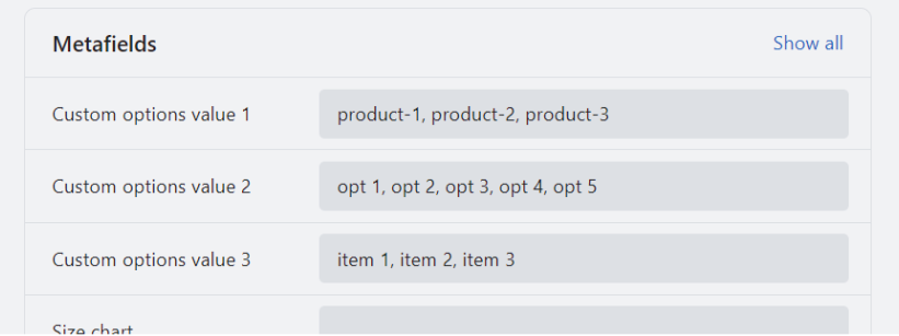
1. Firstly, create meta fields as in the pictures:
- product_options.value1 (for even the following option to add a number. For example product_options.value2, product_options.value3) set.
- type ‘Multi-line -text‘.
2. Add description meta fields on the product page:
3. Add a block to the product template in the customization panel:
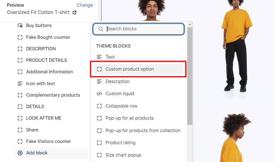
4. Add Option name and choose need values by dynamic source:
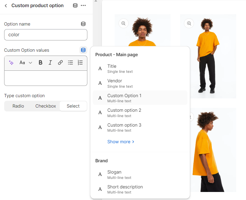
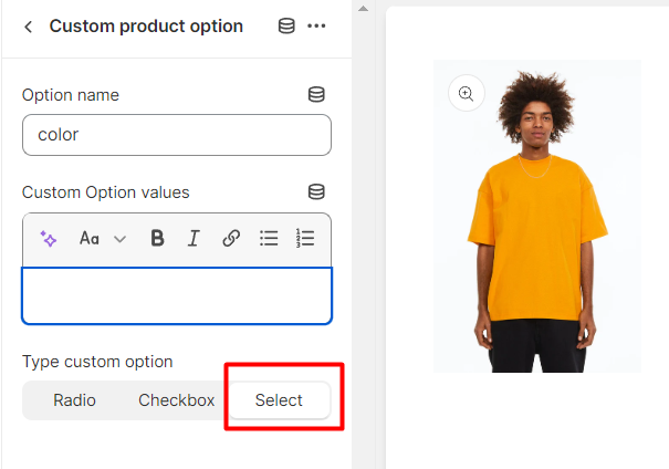
Choose the type. As a result, you’ll get this:
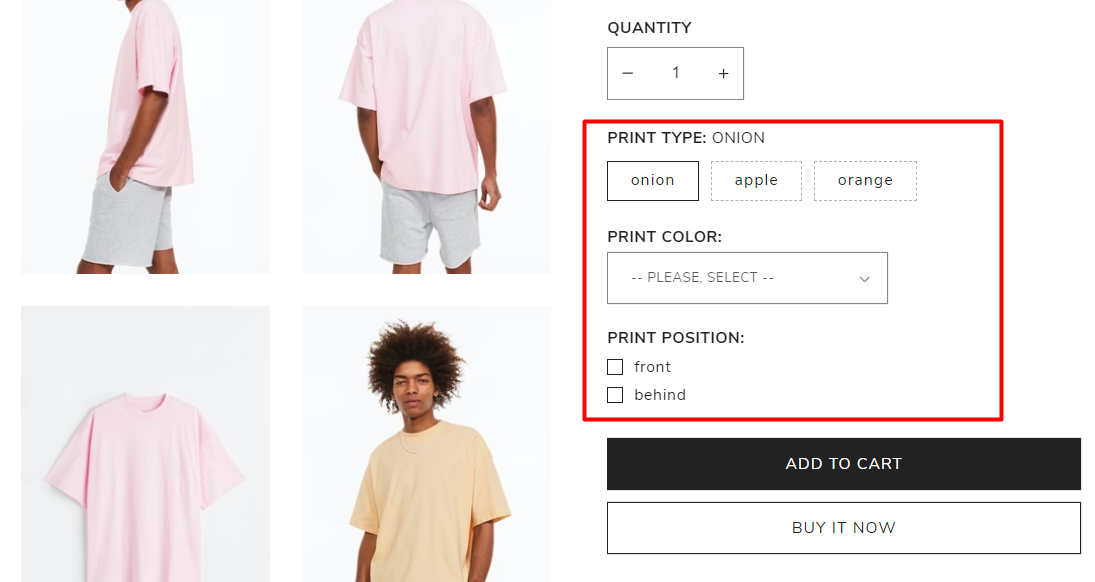
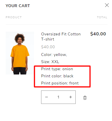
After choosing options and clicking to “Add to cart” get the following result:
For instance, when it comes to shopping carts, there are custom options available, including print-related choices such as:
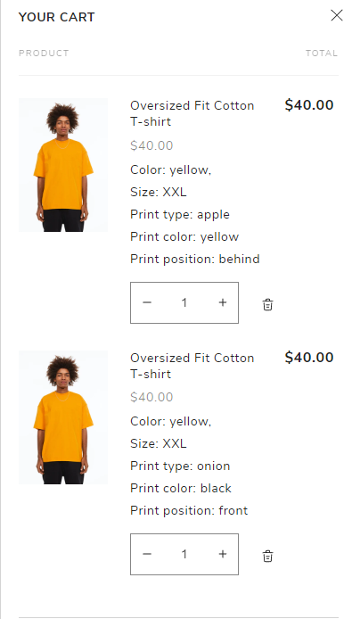
The Impact of Custom Options on Cart Interactions
ATTENTION: custom options interact with the cart as additional properties but not with the product’s price, this functionality can be useful for situations where the default variants of a product are insufficient, and the product price does not depend on these additional properties.
In such cases, the custom options serve to provide customers with additional choices or specifications that are not directly linked to the price. These options could include features, attributes, or preferences that enhance the product or tailor it to the customer’s specific needs. While these options may affect the overall user experience or functionality, they do not have an impact on the price of the product itself.
By allowing customers to customize these non-price-related properties, businesses can provide a more tailored and personalized shopping experience. This customization can lead to increased customer satisfaction, as individuals can select the exact specifications they desire without affecting the product’s price.
It’s important to note that although the custom options may not directly influence the price, they can still have an indirect impact on the overall value of the purchase. Customers may perceive a higher value in a product that meets their specific requirements, even if the price remains the same.
By incorporating such custom options, businesses can accommodate a wider range of customer preferences and potentially attract more customers who are seeking tailored solutions. This flexibility allows companies to differentiate themselves from competitors and provide unique offerings to their target audience.
Overall, the use of custom options that interact with the cart as additional properties but not with the product’s price allows businesses to offer more personalized choices to customers, enhancing their shopping experience and potentially increasing customer satisfaction and loyalty.
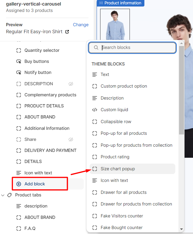
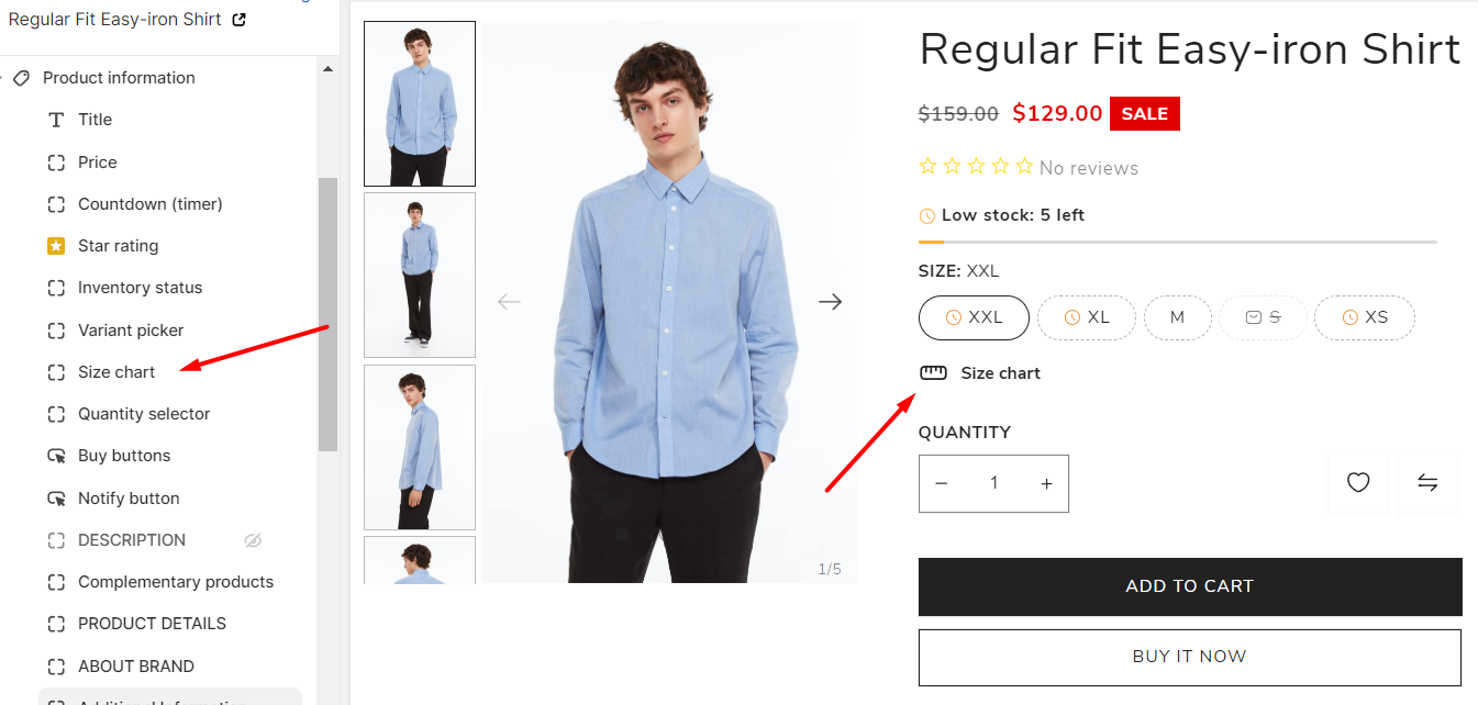
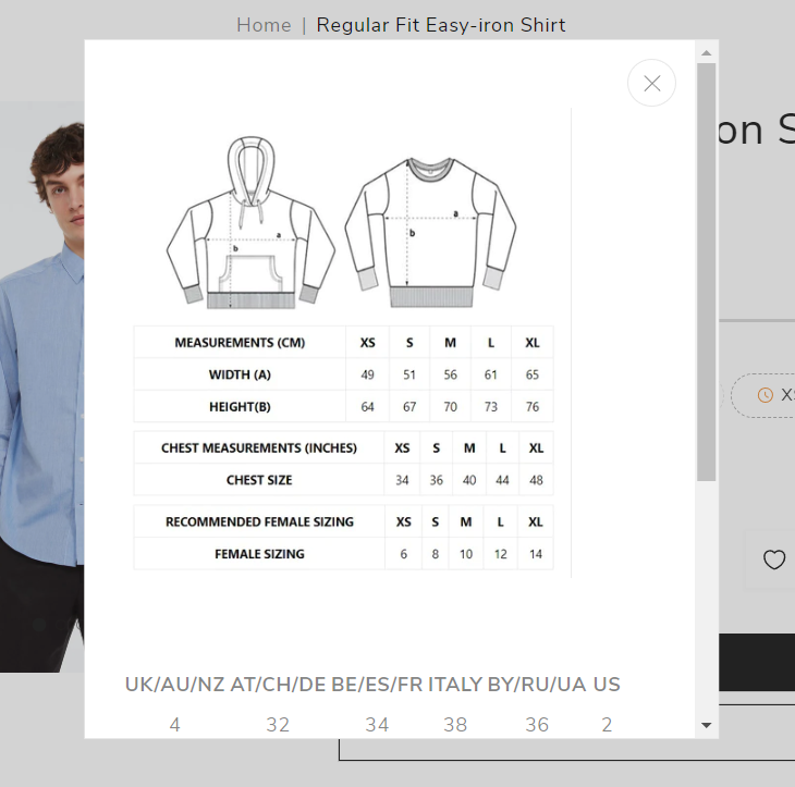
Size Chart
A different size chart popup for a product page in Shopify based on meta fields is a custom feature that allows you to display a different size chart on a product page in an online store powered by Shopify.
Meta fields are additional custom fields that can be created in Shopify for products, pages, and other objects. These fields allow you to add additional information and customize the functionality of the website.
One possible implementation of a chart popup of a different size would be to create a meta box for each product that specifies the size of the chart. Then, using Shopify development or third-party apps, you can add functionality that displays a chart with a specified size in a popup window when you click on a specific area or element on a product page.
Create a product Meta Field
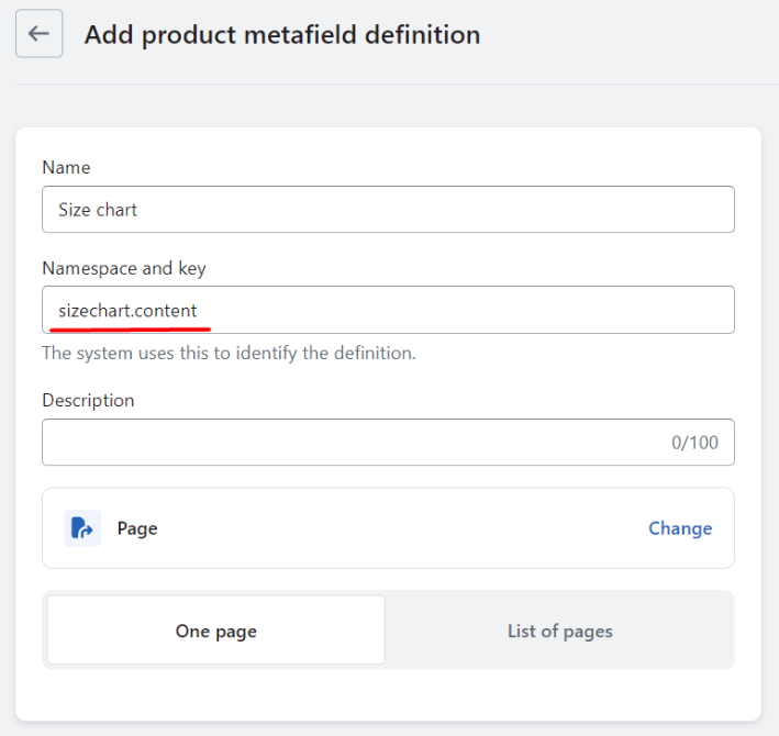
Namespace and key: sizechart.content
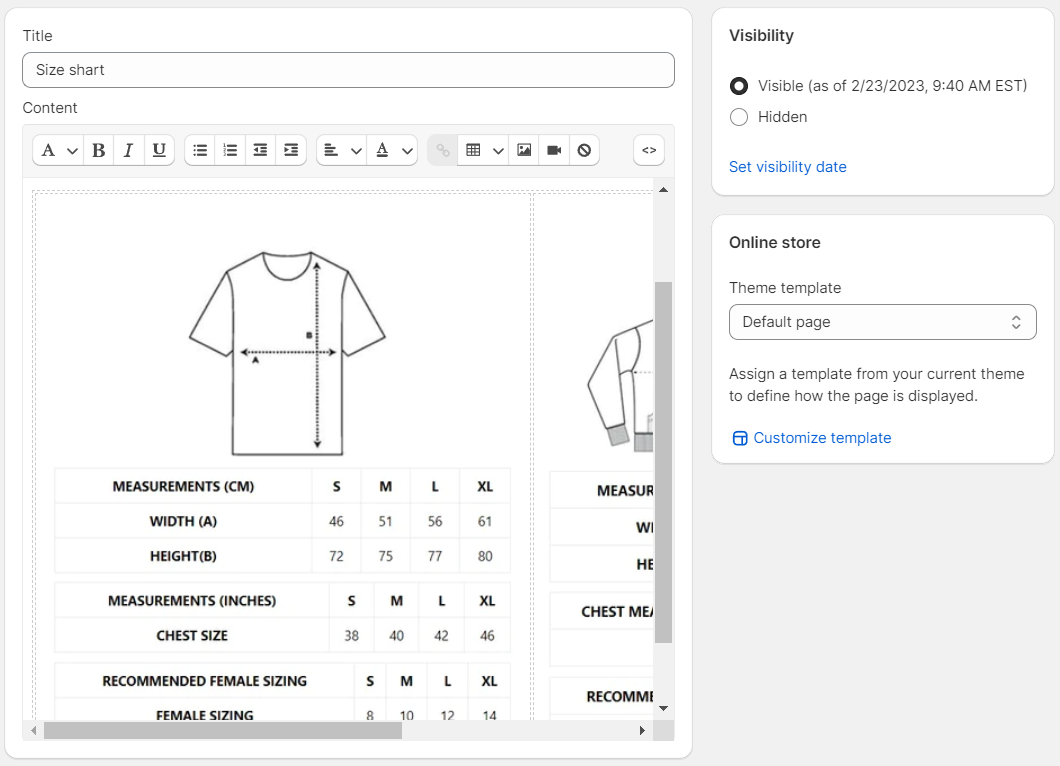
- Navigate to Page -> One Page section.
- Create a new page and paste content (images or tables with description size).
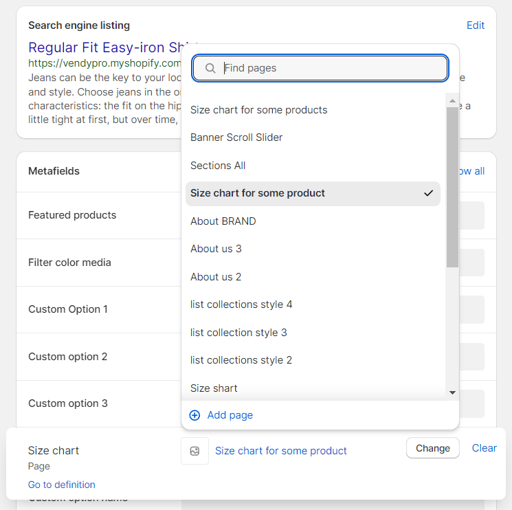
- Go to the product and choose the needed page.
- In the custom panel choose the needed product template and add the dynamic block "Size chart popup".
- This popup label will only appear for products that have a corresponding entry in the product meta field on the page.
- When we click on the label, we are redirected to the content page that we created earlier.
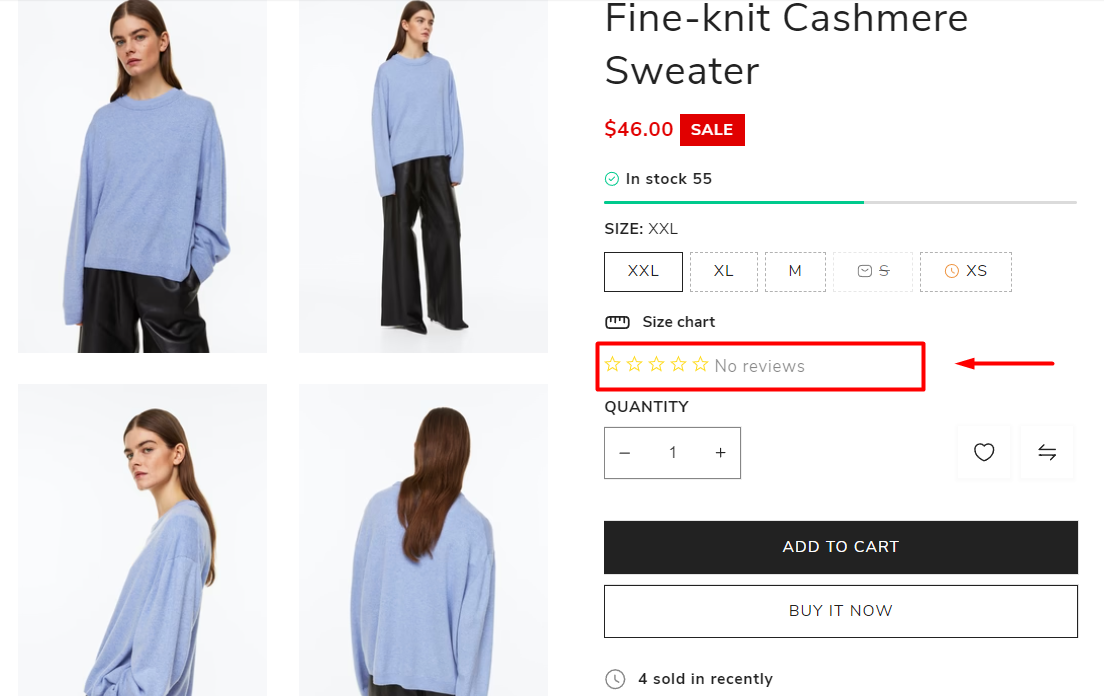
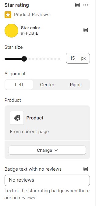
Star Rating
In order for it to function properly, it is necessary to utilize an application for rating.
Ratings and reviews are invaluable tools for aiding in product research and influencing purchasing decisions. They serve as powerful drivers, guiding a stream of highly qualified customers towards your product pages.
Star ratings, in particular, stand as a concise representation of the overall product quality, drawing from a diverse array of sources to create a comprehensive and informative rating.
The following options are available:
- Star color - set the color of the star rating.
- Star size - set the star rating size.
- Alignment - set the positioning of star ratings in a user interface (left, center, right).
- Product - choose the product to which you'd like to assign a star rating option.
- Badge text with no reviews - set the text of the star rating badge when there are no reviews.
Additional Information
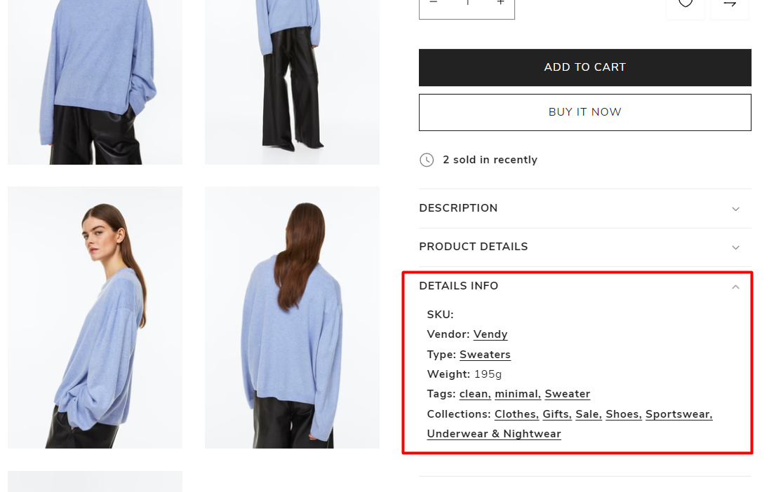
- Show as collapsible row - enable collapsible row display.
- Show SKU - display SKU “stock keeping unit” choice.
- Show vendor - display or reveal information about a vendor.
- Show product types - display product categories.
- Show weight - indicate the product weight.
- Show tags - display product tags.
- Show collections - display product collections.
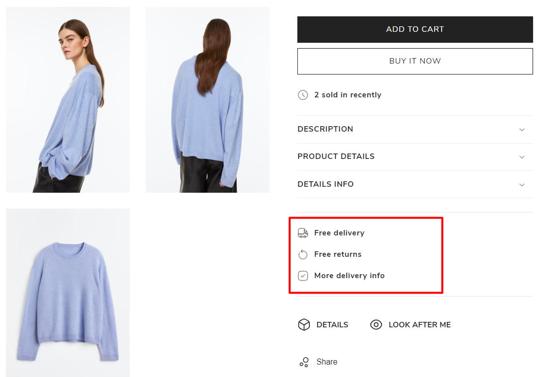
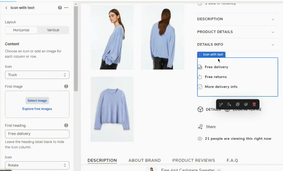
Icon with Text
The following options can be set:
- Layout - select the orientation for displaying the 'icon with text': horizontal or vertical.
- Icon - set a specific icon for each heading.
- First image - set a specific image for each heading.
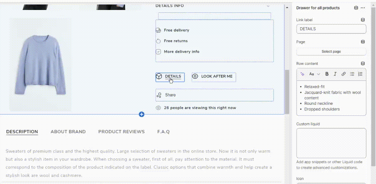
Drawer for all Products
Enrich your product page with more specific information.
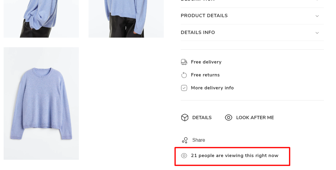
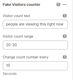
Fake Visitors Counter
Provide a counter or display indicating the number of visitors or users currently on a webpage. It is important to note that the term "fake" in this context refers to the idea that the visitor count may not accurately represent the actual number of real visitors or users on the website.
The following options are available:
- Visitor count text - set a specific text.
- Visitor count range - specify the range of potential page visitors.
- Change count number every...seconds - set the count number in seconds.
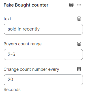
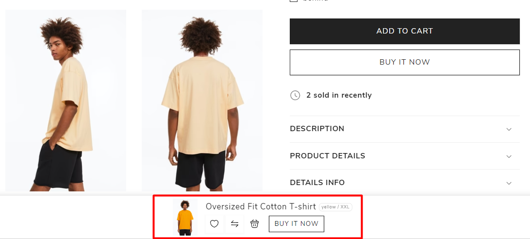
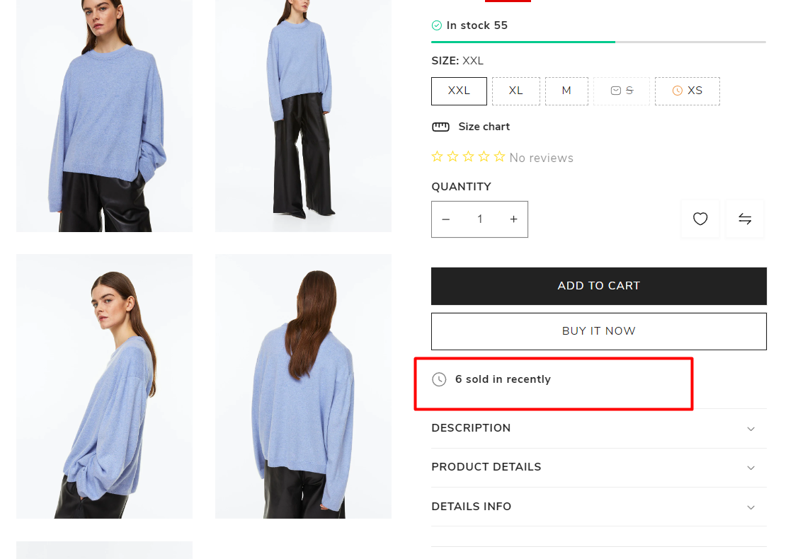
Fake Bought Counter
Offer a tally or visible indicator showing the quantity of product purchases to draw in a large clientele.
The following options are available:
- Text - set a specific text.
- Buyers count range - specify the range of potential buyers.
- Change count number every...seconds - set the count number in seconds.