
Vendy
Product Page Settings
A Shopify product page is a page on your online store that lays out all the details of a given product.
It includes different features like price, sizes, specs, colour, manufacturer and more. It helps to answer questions, provide reviews, allow product comparison, and facilitate the buying process.
Create a Product Page
Before adding products to your Shopify store, check the information by the link Products - Official Documentation.
You can add such variants in the products as: size, color, material. This option will work with: product item, quick view, product page.
Check the information about Variants - Official Documentation.
Product Template Main Settings
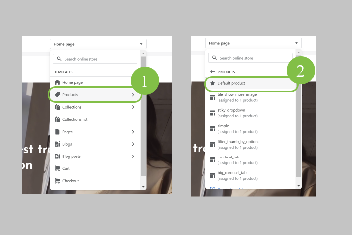
In order to manage the default Product Template settings, in your Shopify admin panel navigate to Themes -> Customize -> Products -> Default Product. Click on Product Template. Rightward, you'll see the main product template options.
Main Product Page Settings
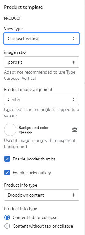
Here are the general Product page options to be set:
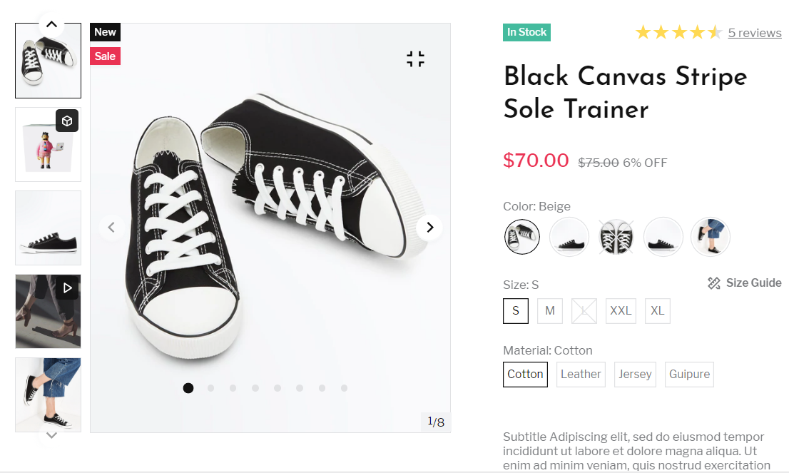
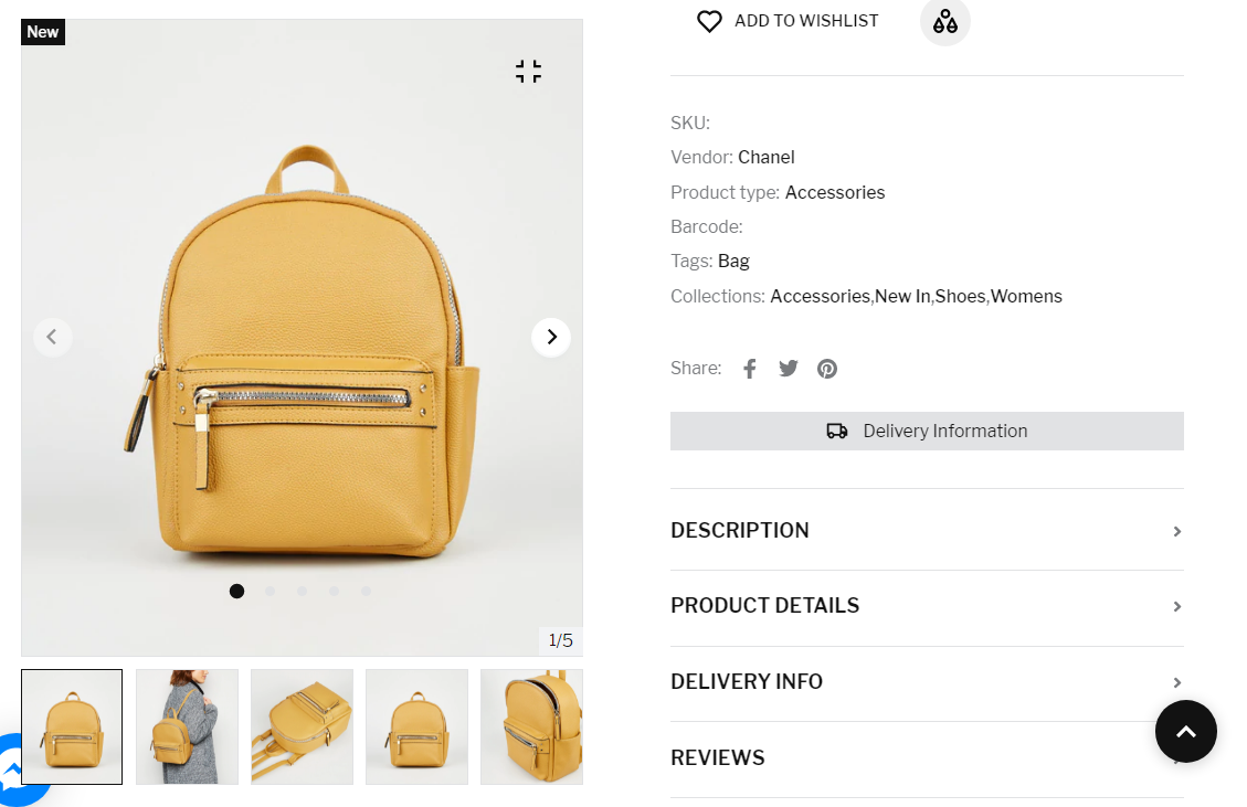
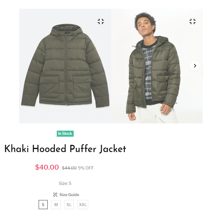
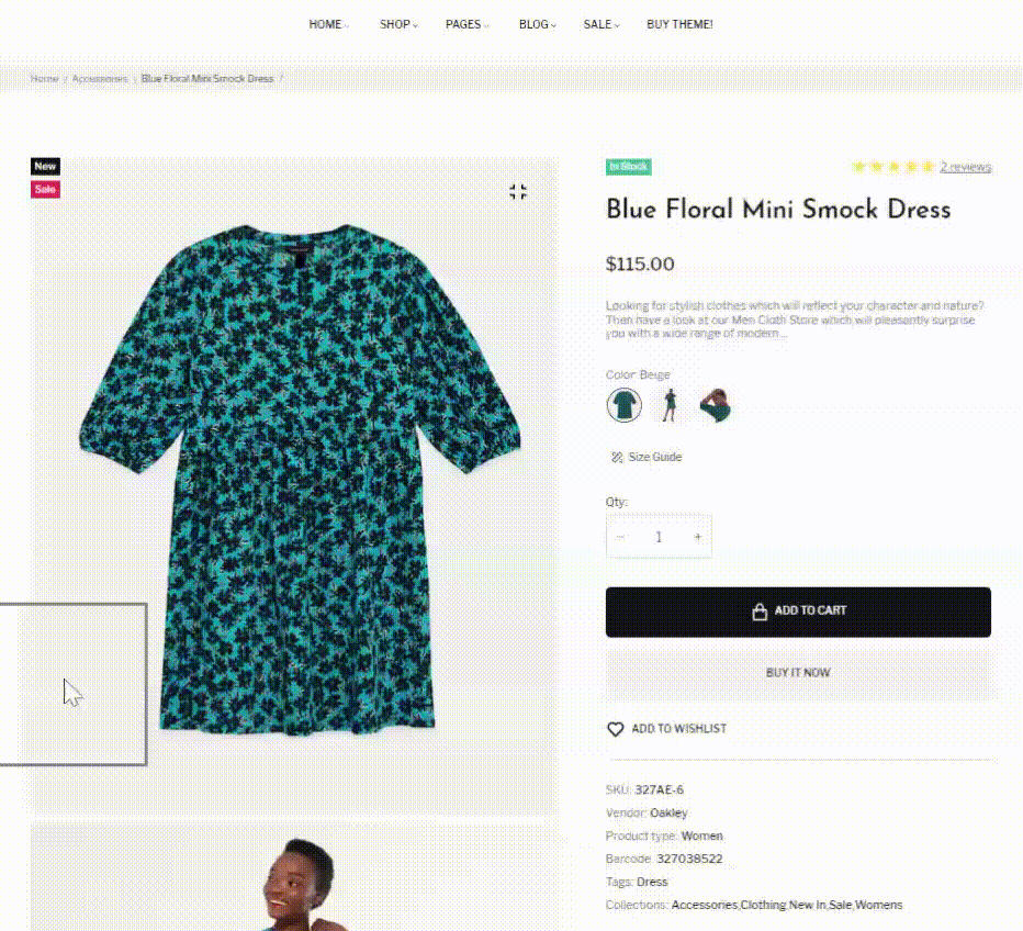
- View Type - there are 5 types of the product image display: Carousel Vertical, Carousel Horizontal, Sticky, Tile, Big Image Carousel.
- Image ratio - the image ratio of its width to its height available in: adapt, portrait, and square.
Note: Adapt image ratio is not recommended to use for Carousel Vertical Type.
- Product image aligment - overlay the images of the same scene under different conditions: left, center, right.
- Backgroud Color - the the image backgroud color.
- Enable border thumbs - enable/disable the border for image thumbnails.
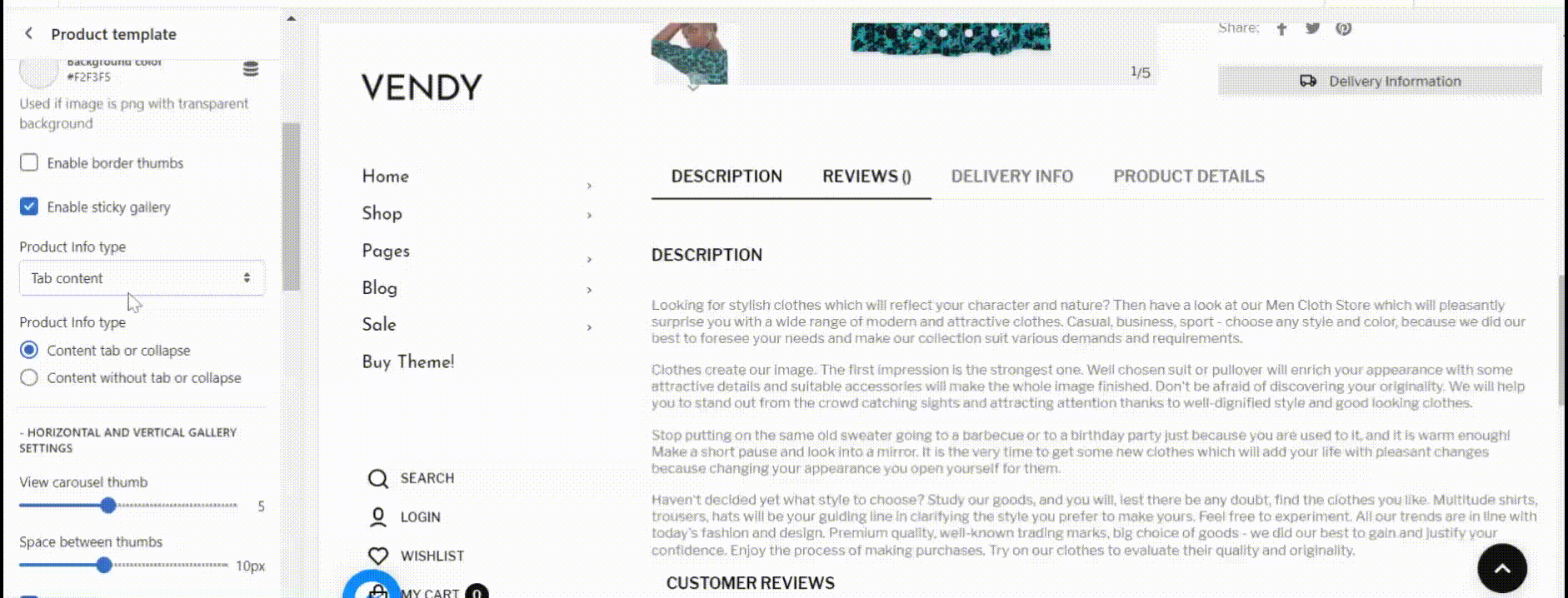
- Enable sticky gallery - enable/disable the image gallery 'sticky' on product pages. Make the image gallery scroll down alongside the short product description.
- Product Info type display the product information (Description, reviews, delivery info, product details) in form of:
- Tab Content;
- Dropdown Content;
- Content tab or collapse;
- Content without tab or collapse.
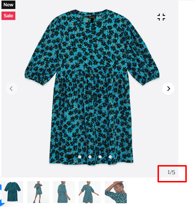
Horizontal and Vertical Gallery Settings
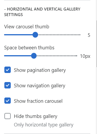
These product view types allow display product image gallery in horizontal and vertical positions.
Note: The best Shopify product image size is 2048 x 2048 px for square images. For Zemez themes we recommend no less than 1000px width.
For those view types you can set the following options:
- View carousel thumb - set the number of image thumbnails displayed in vertical or horizontal view positions (min. 3 thumbnails);
- Space between thumbs - set the space between the thumbnails (max. 25px);
- Show pagination gallery - show/hide the pagination gallery;
- Show navigation gallery - show/hide the navigation gallery;
- Show fraction carousel - show/hide the fraction carousel:
- Hide thumbs gallery - the option allows hide the thumbnail gallery for horizontal view type.
Carousel Vertical View Type
Carousel Horizontal View Type
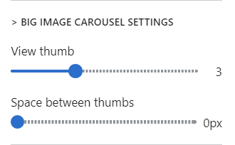
Big Image Carousel Settings
For this view type you can set the following options:
- View carousel thumb - set the number of image thumbnails displayed in vertical or horizontal view positions (min. 2 thumbnails);
- Space between thumbs - set the space between the thumbnails (max. 25px);
Tile Layout
There are two ways of displaying product tile layout type: with filter and "show more" button.
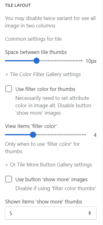
1. Tile Layout with filter.
For this view type you can set the following options:
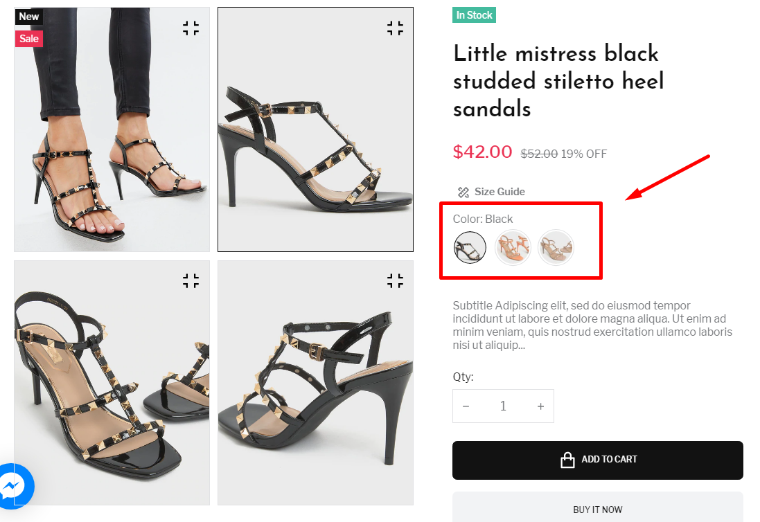
- Use filter color for thumbs - set the definite color for thumbnail images.
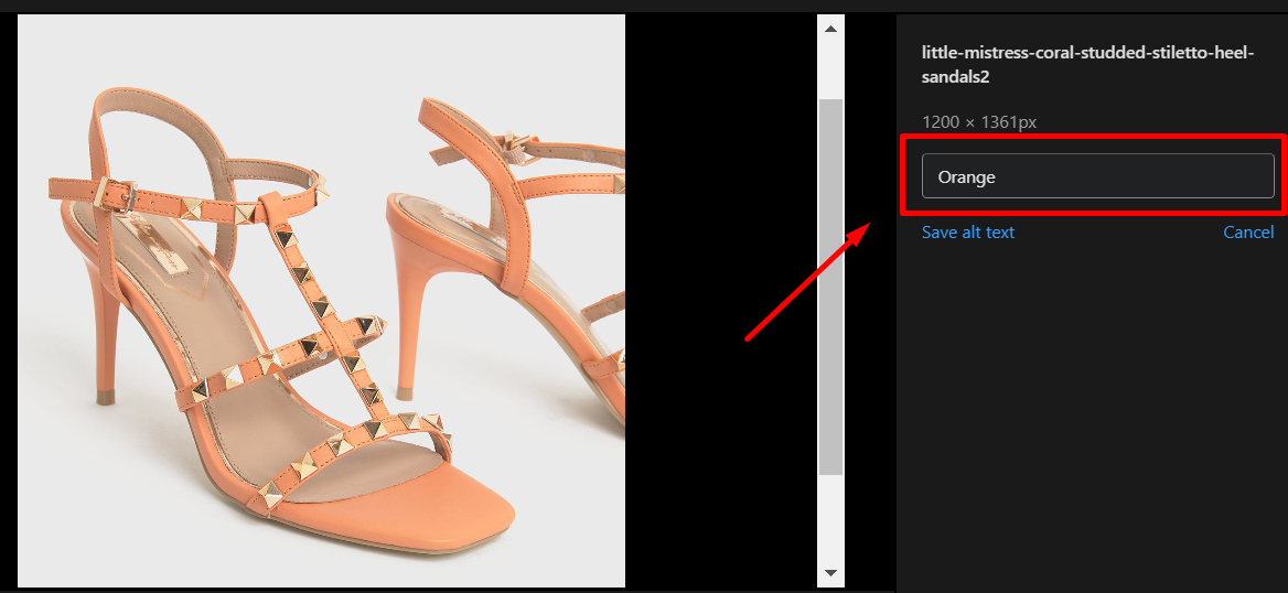
Note: It is necessary to set attribute color in image alt. Disable button "show more" images.
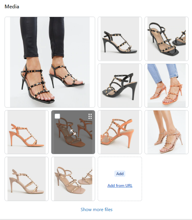
In order to set image alt for product, in your Shopify admin panel go to Products section. Click the needed product. Choose product image, and set the color alt fot it. Make the same procedure with the following product images.
- View items "filter color" - set the amount of "filter colors" to be displayed.
Note: Only when to use "filter color" for thumbs.
For instance, if you want to refer a definite image to the "orange" color filter, click this image, and set the alt text = "orange". You can set the same alt color for more than one image.
2. Tile Layout with "Show more" button.
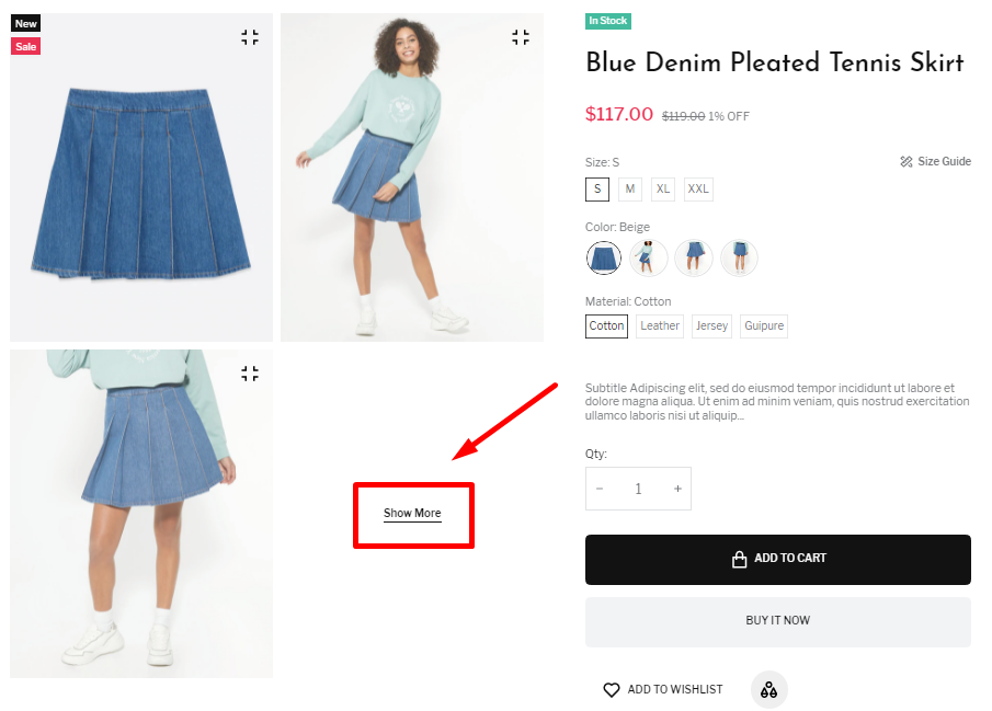
For this view type you can set the following options:
- Space between tile thumbs - set the space between the thumbnails (max. 25px);
- Use button "Show more" images - enable/disable the button "Show more".
Note: Disable if using 'filter color thumbs'.
- Shown items "show more" thumbs - set the amount of images to be displayed before "show more" button.
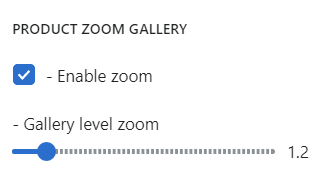
Product Zoom Gallery
This is a standard product image zoom on the single product page.
Here you can set the following options:
- Enable zoom - enable/disable the image zoom option;
- Gallery level zoom - the zoom level on the initial hover.
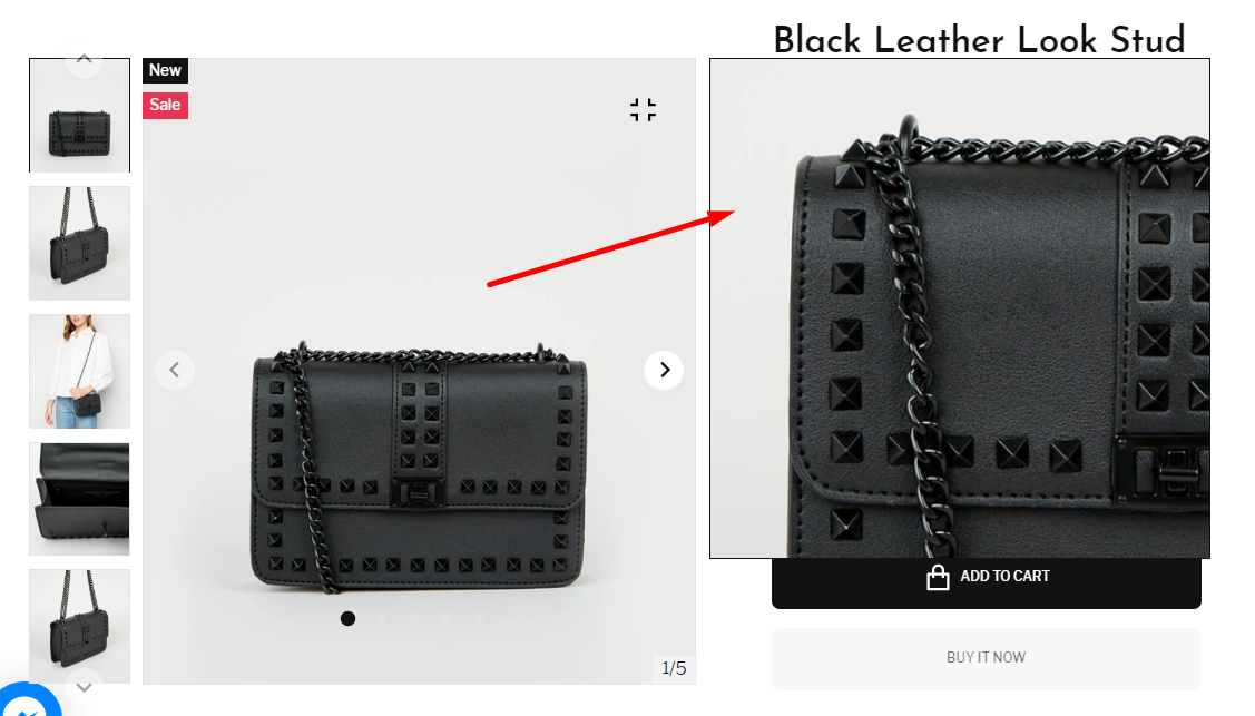
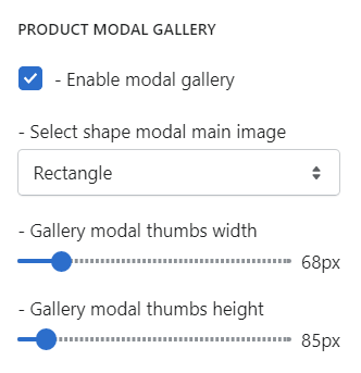
Product Modal Gallery
Product modal gallery option allows clicking on an product image on a web page that opens up a larger version of the image with navigation to view other photos.
Here you can set the following options:
- Enable modal gallery - enable/disable modal gallery option;
- Select shape modal main image - set the modal gallery shape for the main image (square or rectangle);
- Gallery modal thumbs width - set width parameter for the gallery modal thumbnails;
- Gallery modal thumbs height - set height parameter for the gallery modal thumbnails.
Product Page Dynamic Blocks
Creating unique and interesting online stores has been made easier with Shopify sections. These allow developers to design styled blocks that store admins can change. This allows shop owners a great deal of flexibility in keeping the content on their store current.
Dynamic sections are those that can be added to the homepage, and static sections are those that are added to other pages.
In order to manage the dynamic blocks on the product page, navigate to Themes -> Customize -> Products -> Default Product. Click on Product Template 'drop-down' arrow on the left. You can see the dynamic blocks on the product page.
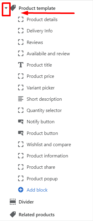
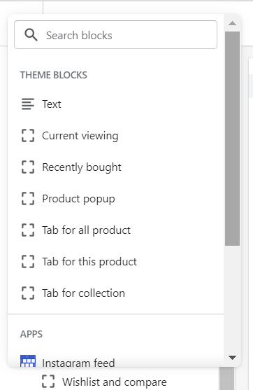
Create a new dynamic block
To create a new block on the product, click "Add block" button. You'll see the available theme blocks: Text, Current viewing, Recently bought, Product popup, Tab for all product, Tab for this product, Tab for collection.
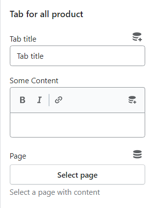
Tab for all product
- Tab title - set the name of the tab;
- Some Content - add the content to the newely created tab;
- Page - select a page with content, for instance About us, Collections, Contact us, Delivery Info, FAQs static pages, etc.
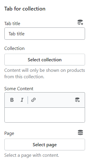
Tab for Collection
- Tab title - set the name of the tab;
- Collection - select the specific collection;
Content will only be shown on products from this collection.
- Some Content - set a specific content;
- Page - select a page with content.
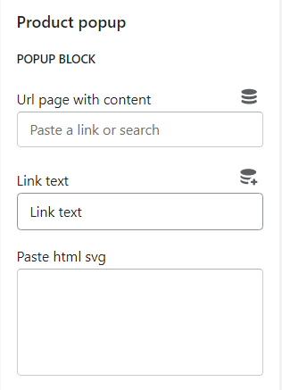
Product Pop Up
Pop-ups are a visual overlay that stops on-site visitors to catch their attention on the important offers, notifications, recommending products, etc.
In Shopify 2.0 functionality, there is an ability to create different, informative dynamic pop up blocks.
- Url page with content - set the URL of the content page;
- Link text - set the specific link text;
- Paste html svg - insert HTML svg.
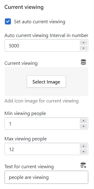
Currently Viewing Block
This block informs about the number of users viewing the definite product. It is displayed randomly, depending on the specified settings.
- Set auto current viewing - eneble/disable the current viewing option;
- Auto current viewing Interval in number - changes in the number of viewing products and the interval of time change (when enabled, the number of viewers changes depending on the specified interval in m/s; when the checkbox is off, the number of product viewers will change only when clicking on the product or when updating the product);
- Current viewing - add icon image for current viewing;
- Min viewing people - the minimum amount of viewing people;
- Max viewing people - the maximum amount of viewing people to be displayed;
- Text for current viewing - set the specific text for currently viewing product.
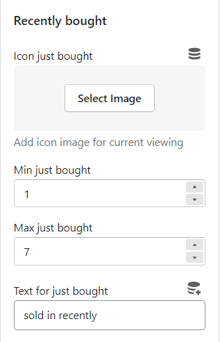
Recently Bought Pop Up
A popup signalizes about the product purchase. It will be shown up everywhere on the Homepage while surfing the store. Products are displayed randomly.
- Icon just bought - add icon image for current viewing;
- Min just bought - popup display interval in m/s;
- Max just bought - popup hiding interval in m/s;
- Text for just bought - set the specific texy for "recently bought" popup.
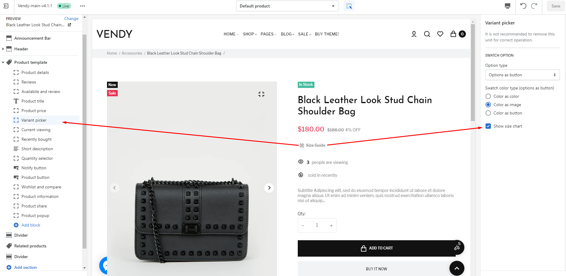
Button Size Guide
You can increase your store's performance and make your visitors more informed by adding Size Charts.
Your product page can include a custom size chart if you sell clothing items that customers need to know their size before purchase.
To add a size chart in your Shopify store follow the instructions below.
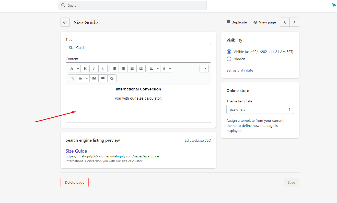
Choose a size chart for the page templates.
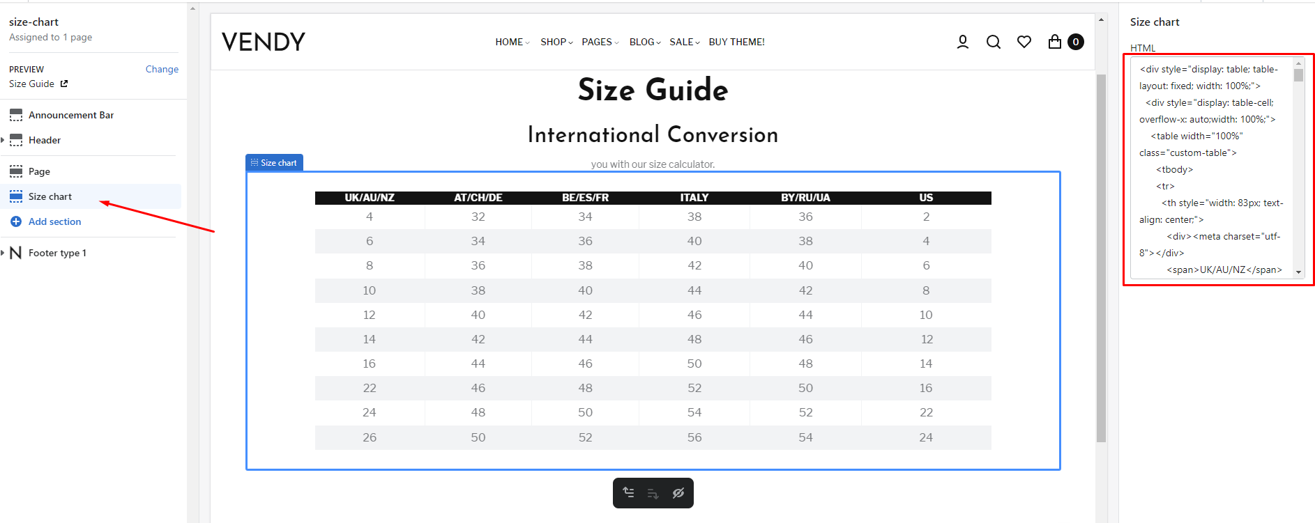
Here the content from the page admin is pulled up, and / or you can add html directly on the page.
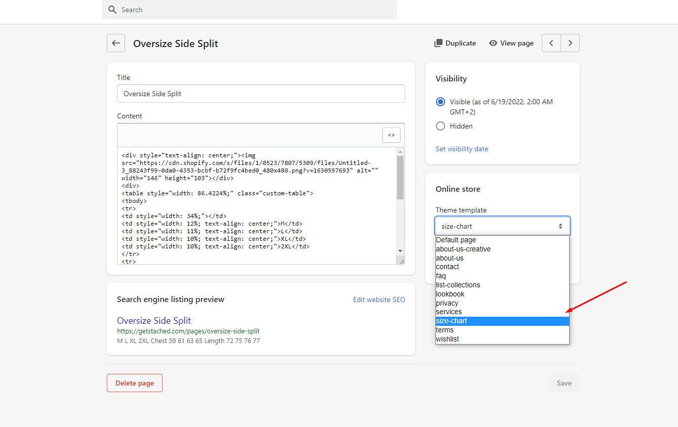
For stylization as on Live Demo, it is possible to add in a tag table class = "custom-table"
In dynamic blocks select this item.