From this block you can learn how to enable and disable needed JetCompareWishlist widgets. Moreover, you can learn more about the key features and options allowing to customize JetCompareWishlist widgets content and style.
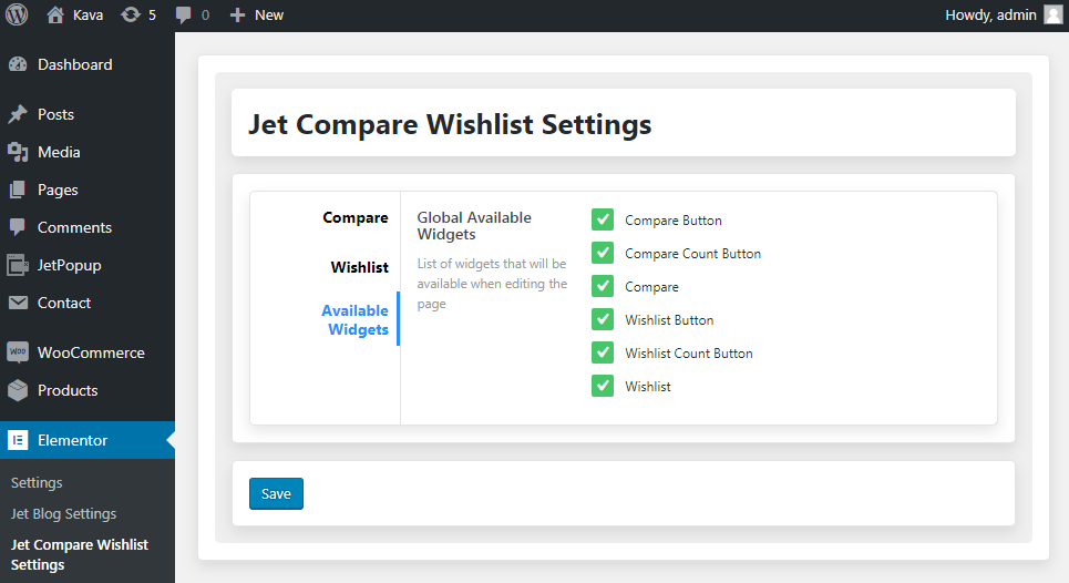
Available Widgets
In this block you can change the list of available widgets that will show up in JetCompareWishlist block on Elementor page builder editing page.
This option is useful for you when:
you want to conceal the rarely used widgets to access the most frequently used ones more quickly;
you want Elementor work faster - in this case disabling some of the rarely used widgets will speed up the loading time.
You might also consider disabling some of the rarely used widgets when you're facing the Memory Limit Exhausted error, and you can't boost up the memory limit on your server.
Just remove the checks for those addons you want to disable and click Save button to save the changes.
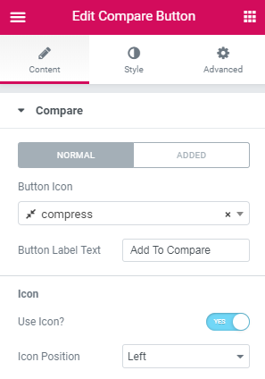
Compare Button
Compare Button widget allows adding products to the comparison list. It can be added on custom Single and Archive WooCommerce templates.
Content
Compare
Here you can switch from customizing Normal to Added Compare button content settings. Just click on the button Added to proceed to customizing added elements.
Button Icon - here you can define an icon for the compare button in Normal and Added status of the product.
Button Label Text - here you can paste a label text of the compare button in Normal and Added status of the product.
Icon
Use Icon - enable this option if you want to display an icon on the compare button.
Icon Position - here you can specify the position of the icon on the compare button (left, top, right, bottom).
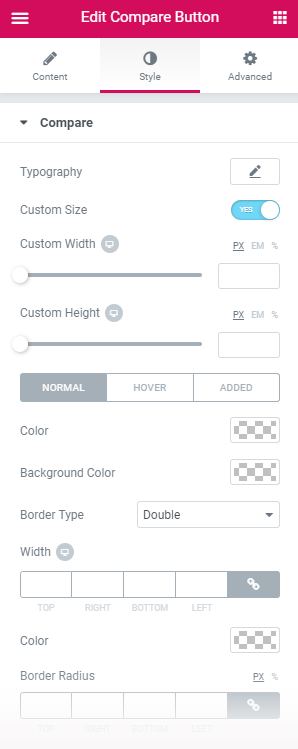
Style
Compare
Typography - turn the option on to view the typography settings.
Custom Size - enable this option if you want to set the custom size of the compare button.
Custom Width - specify the preferable width of the compare button in pixels or percentage.
Custom Height - specify the preferable height of the compare button in pixel or percentage.
Here you can switch from customizing Normal to Hover and Added Compare button style settings. Just click on the button Hover and Added to proceed to customizing hover and added elements.
Color - here you can pick color for the label text and icon of the compare button.
Background Color - here you can select background color of the compare button.
Border Color - here you can choose color of the border of the compare button.
Border Type - here you can define the type of the border you need to use for the element.
Width - here you can specify width of the borders.
Color - here you can pick color for the borders of the compare button.
Border Radius - here you can define the value of the border radius to make the angles more smooth and round.
Alignment - here you can define the preferable alignment of the compare button. The compare button can be placed to the left, to the right, or remain centered.
Padding - here you can set the preferable custom padding for the compare button. Fill in the values for the top, bottom, right and left padding in pixels to apply your custom padding.
Margin - here you can apply your custom margins in pixels or percentage to set them for the compare button.
Icon
Here you can switch from customizing Normal to Added and Hover Icon style settings. Just click on the button Added and Hover to proceed to customizing icon hover and added elements.
Color - here you can pick color of the icon on the compare button.
Font Size - here you can define font size of the icon on the compare button.
Margin - here you can apply your custom margins in pixels or percentage to set them for the icon on the compare button.
Compare Count Button
Compare Count Button widget allows showing the number of products added to the comparison list. It can be added to header, footer etc.
Content
Button Icon - here you can define an icon for the compare count button.
Button Label Text - here you can insert a label text of the compare count button.
Icon
Use Icon - enable this option if you want to display an icon on the compare count button.
Icon Position - here you can specify position of the icon on the compare count button (left, top, right, bottom).
Count
Show Count - enable this option if you want to showcase the number of added products to a comparison list.
Format - here you can specify format of the count items added to the comparison list.
Position - here you can set position of the count on the compare count button.
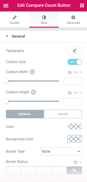
Style
General
Typography - turn the option on to view the typography settings.
Custom Size - enable this option if you want to set the custom size of the compare count button.
Custom Width - specify the preferable width of the compare count button in pixels or percentage.
Custom Height - specify the preferable height of the compare count button in pixel or percentage.
Here you can switch from customizing Normal, Hover to Added general style settings. Just click on the button Hover and Added to proceed to customizing hover and added elements.
Color - here you can pick color for the label text and count of the compare count button.
Background Color - here you can select background color of the compare count button.
Border Color - here you can pick color of the borders on hover.
Border Type - here you can define the type of the border you need to use for the element.
Width - here you can specify width of the borders.
Color - here you can pick color for the borders of the compare count button.
Border Radius - here you can define the value of the border radius to make the angles more smooth and round.
Alignment - here you can define the preferable alignment of the compare count button. It can be placed to the left, to the right, or remain centered.
Padding - here you can set the preferable custom padding for the compare count button. Fill in the values for the top, bottom, right and left padding in pixels to apply your custom padding.
Margin - here you can apply your custom margins in pixels or percentage to set them for the compare count button.
Icon
Size - here you can specify size of the icon.
Here you can switch from customizing Normal to Hover Icon style settings. Just click on the button Hover to proceed to customizing hover elements.
Color - here you can pick color of the icon on the compare count button.
Margin - here you can apply your custom margins in pixels or percentage to set them for the icon on the compare count button.
Count
Size - here you change size of the count.
Width - here you can define width of the count.
Height - here you can specify height of the count.
Here you can switch from customizing Normal, Hover to Added Count style settings. Just click on the button Hover and Added to proceed to customizing hover and added elements.
Color - here you can pick color of the count.
Background Color - here you can select background color of the count.
Border Color - here you can choose color of the border of the count.
Border Type - here you can define the type of the border you need to use for the element.
Width - here you can specify width of the borders.
Color - here you can pick color for the borders of the count.
Border Radius - here you can define the value of the border radius to make the angles more smooth and round.
Margin - here you can apply your custom margins in pixels or percentage to set them for the count.
Compare
Compare widget allows displaying the comparison list on the page in form of a comparison table.
Content
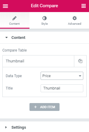
Compare Table
Click on the button Add item to add new features to the comparison table. You can add as many features as you want, and customize each one of them. Click on the newly added item to customize it.
Data Type - here you can specify type of the data displayed in the comparison table.
Title - here you can specify title of the features added to the comparison table.
In the case you’ve selected Remove Button data type, you’ll need to adjust the additional settings.
Button Text - here you can specify text of the button.
Button Icon - here you can select icon of the button.
In the case you’ve selected Thumbnail data type, you’ll need to adjust the additional setting.
Image Size - here you can specify size of the image.
In the case you’ve selected Rating data type, you’ll need to adjust the additional setting.
Rating Icon - here you can define the rating icon.
Settings
Empty Compare Text - here you can insert text appearing when there aren't any comparison lists yet.
Scrolled Table - this option allows table to be scrolled horizontally.
Scrolled On - here you can select devices, where scroll works.
Style
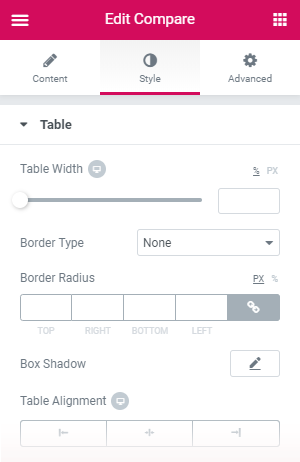
Table
Table Width - here you can specify width of the table.
Border Type - here you can define the type of the border you need to use for the element.
Width - here you can specify width of the borders of the table.
Color - here you can pick color of the borders.
Border Radius - here you can define the value of the border radius to make the angles more smooth and round.
Box Shadow - enable this option if you want to access the shadow advanced settings for the table, and need to apply shadow for it.
Table Alignment - here you can define the preferable alignment of the table. It can be placed to the left, to the right, or remain centered.
Table Headings
Width - here you can specify width of the table headings block.
Typography - turn the option on to view the typography settings.
Here you can switch from customizing Normal to Hover Table Headings style settings. Just click on the button Hover to proceed to customizing hover elements.
There are Normal style settings:
Color - here you can pick color for the table headings.
Background Color - here you can select background color for the table headings.
Striped rows - enable this option to use the different style settings for the rows that are in even count (this way the rows going one under another will have different colors.
Even Background Color - here you can specify the color to use for the even row background.
There are Hover style settings:
Row Hover Background Color - here you can specify the text color to use for the row on hover.
Even Row Hover Background Color - here you can specify the color to use for the even row background on hover.
Padding - type in the custom padding values to add responsive padding for the block.
Border Type - here you can define the type of the border you need to use for the element.
Width - here you can specify width of the borders of the block.
Color - here you can pick color of the borders.
Hidden border for header container - here you can add the hidden border of the header’s container.
Alignment Horizontal - here you can set the table headings' horizontal alignment (on the left, in the center, on the right).
Alignment Vertical - here you can set the vertical position of the table headings (on the top, in the middle or on the bottom).
Table Content
Cell Min Width - here you can specify the minimal width of the cell.
Here you can switch from customizing Normal to Hover Table Content style settings. Just click on the button Hover to proceed to customizing hover elements.
There are Normal style settings:
Row Background Color - here you can specify the text color to use for the row.
Striped Row - enable this option to use the different style settings for the rows that are in even count (this way the rows going one under another will have different colors.
Even Row Background Color - here you can specify the color to use for the even row background.
There are Hover style settings:
Row Hover Background Color - here you can specify the text color to use for the row on hover.
Even Row Hover Background Color - here you can specify the color to use for the even row background on hover.
Even Row Background Color - here you can specify the color to use for the even row background.
Padding - type in the custom padding values to add responsive padding for the block.
Border Type - here you can define the type of the border you need to use for the element.
Width - here you can specify width of the borders of the block.
Color - here you can pick color of the borders.
Hidden border for header container - here you can add the hidden border of the header’s container.
Alignment Horizontal - here you can set the table content’s horizontal alignment (on the left, in the center, on the right).
Alignment Vertical - here you can set the vertical position of the table content (on the top, in the middle or on the bottom).
Remove Button
Typography - turn the option on to view the typography settings.
Here you can switch from customizing Normal to Hover Remove Button style settings. Just click on the button Hover to proceed to customizing hover elements.
Text Color - here you can specify color of the text on the remove button.
Background Color - here you can specify background color of the remove button.
Border Color - here you can pick color of the borders of the remove button on hover.
Border Type - here you can define the type of the border you need to use for the element.
Width - here you can specify width of the borders.
Color - here you can pick color for the borders of the remove button.
Border Radius - here you can define the value of the border radius to make the angles more smooth and round.
Box Shadow - enable this option if you want to access the shadow advanced settings for the remove button, and need to apply shadow to it.
Padding - type in the custom padding values to add responsive padding for the block.
Icon
Size - here you can specify size of the icon.
Offset - here you can tune the icon horizontal offset.
Here you can switch from customizing Normal to Hover Icon style settings. Just click on the button Hover to proceed to customizing hover elements.
Color - here you can pick color of the icon.
Thumbnail
Background Color -here you can specify background color of the thumbnail block.
Border Type - here you can define the type of the border you need to use for the element.
Width - here you can specify width of the borders.
Color - here you can pick color for the borders of the thumbnail block.
Box Shadow - enable this option if you want to access the shadow advanced settings for the thumbnail block, and need to apply shadow to it.
Padding - type in the custom padding values to add responsive padding for the block.
Title
Typography - turn the option on to view the typography settings.
Here you can switch from customizing Normal to Hover title style settings. Just click on the button Hover to proceed to customizing hover elements.
Color - specify the color of the title with color picker tool.
Text Shadow - use the shadow settings (such as shadow color, blur, horizontal, vertical) if you want to make the title’s text highlighted.
Price
Typography - turn the option on to view the typography settings.
Color - here you can pick color for the price.
Space Between Prices - here you can set the gap to apply between the prices and make this distance responsive.
Here you can switch from customizing Regular to Sale price style settings. Just click on the button Sale to proceed to customizing sale elements.
Color - here you can pick color for regular and sale prices.
Text Decoration - here you can add decoration to the text.
Size - here you can specify size of the price.
Font Weight - in this block you can select the suitable font weight.
Currency Sign
Color - here you can pick color for the currency sign.
Size - here you can define size of the currency sign.
Vertical Alignment - here you can set the vertical position of the currency sign (on the top, in the middle or on the bottom).
Here you can switch from customizing Regular to Sale Currency Sign style settings. Just click on the button Sale to proceed to customizing sale elements.
Color - here you can pick color for the currency sign for regular and sale prices.
Size - here you can specify size of the currency sign for regular and sale prices.
Rating
Font Size - define the font size of rating for different screen resolutions.
Here you can switch from customizing All to Rated Rating settings. Just click on the button Rated to proceed to customizing rated elements.
Color - here you can pick color to use it for all and rated rating.
Space Between Stars (px) - here you can set the space between starts for all and rated rating.
Add to Cart
Typography - turn the option on to view the typography settings.
Button Width - here you can specify width of the Add to Cart button.
Here you can switch from customizing Normal, Hover, Added to Loading Add to Cart button style settings. Just click on the button Hover, Added and Loading to proceed to customizing hover, added and loading elements.
Text Color - here you can define color of the text on the button.
Background Color - here you can pick background color of the button.
Border Color - here you can choose color of the borders of the button by added and loading status.
Box Shadow - enable this option if you want to access the shadow advanced settings for Add to Cart button, and need to apply shadow for it.
Border Type - here you can define the type of the border you need to use for the element.
Width - here you can specify width of the borders of the button.
Color - here you can pick color of the borders.
Border Radius - here you can define the value of the border radius to make the angles more smooth and round.
Padding - type in the custom padding values to add responsive padding for the block.
Description
Typography - turn the option on to view the typography settings.
Color - here you can define the suitable color for the text of description.
Text Shadow - use the shadow settings (such as shadow color, blur, horizontal, vertical) if you want to make the description’s text highlighted.
Short Description
Typography - turn the option on to view the typography settings.
Color - here you can define the suitable color for the text of short description.
Text Shadow - use the shadow settings (such as shadow color, blur, horizontal, vertical) if you want to make the short description’s text highlighted.
SKU
Typography - turn the option on to view the typography settings.
Color - here you can define the suitable color for the product service identification code.
Text Shadow - use the shadow settings (such as shadow color, blur, horizontal, vertical) if you want to make the product service identification code highlighted.
Stock Status
Typography - turn the option on to view the typography settings.
Here you can switch from customizing In Stock to Out of Stock Stock Status style settings. Just click on the button Out of Stock to proceed out of stocks elements.
Color - here you can define the suitable color of stock status.
Text Shadow - use the shadow settings (such as shadow color, blur, horizontal, vertical) if you want to make the stock status highlighted.
Weight
Typography - turn the option on to view the typography settings.
Color - here you can define the suitable color for the weight.
Text Shadow - use the shadow settings (such as shadow color, blur, horizontal, vertical) if you want to make the weight highlighted.
Dimensions
Typography - turn the option on to view the typography settings.
Color - here you can define the suitable color for the dimensions.
Text Shadow - use the shadow settings (such as shadow color, blur, horizontal, vertical) if you want to make the dimensions highlighted.
Attributes
Typography - turn the option on to view the typography settings.
Color - here you can define the suitable color for the attributes.
Text Shadow - use the shadow settings (such as shadow color, blur, horizontal, vertical) if you want to make the attributes highlighted.
Categories
Typography - turn the option on to view the typography settings.
Here you can switch from customizing Normal to Hover Categories style settings. Just click on the button Hover to proceed hover elements.
Color - here you can define the suitable color for the categories.
Text Shadow - use the shadow settings (such as shadow color, blur, horizontal, vertical) if you want to make the categories highlighted.
Tags
Typography - turn the option on to view the typography settings.
Here you can switch from customizing Normal to Hover Categories style settings. Just click on the button Hover to proceed hover elements.
Color - here you can define the suitable color for the tags.
Text Shadow - use the shadow settings (such as shadow color, blur, horizontal, vertical) if you want to make the tags highlighted.
Empty Text
Typography - turn the option on to view the typography settings.
Color - here you can set the color to use it for the empty text.
Text Shadow - use the shadow settings (such as shadow color, blur, horizontal, vertical) if you want to make the empty text highlighted.
Background Color - here you can select background color of the empty text.
Border Type -here you can define the type of the border you need to use for the element.
Width - here you can specify width of the borders of the empty text block.
Color - here you can pick color of the borders.
Border Radius - here you can define the value of the border radius to make the angles more smooth and round.
Padding - type in the custom padding values to add responsive padding for the block.
Margin - here you can apply your custom margins in pixels or percentage to set them for the empty text block.
Alignment - here you can define the preferable alignment of the empty text. The empty text can be placed to the left, to the right, or remain centered.
Wishlist Button
Wishlist Button widget allows adding products to the wishlist. It can be added to custom Single and Archive WooCommerce templates.
Content
Wishlist
Here you can switch from customizing Normal to Added Wishlist button content settings. Just click on the button Added to proceed to customizing added elements.
Button Icon - here you can define an icon for the wishlist button in Normal and Added status of the product.
Button Label Text - here you can paste a label text for the wishlist button in Normal and Added status of the product.
Icon
Use Icon - enable this option if you want to display an icon on the wishlist button.
Icon Position - here you can specify position of the icon on the wishlist button (left, top, right, bottom).
Style
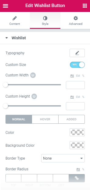
Wishlist
Typography - turn the option on to view the typography settings.
Custom Size - enable this option if you want to set the custom size of the wishlist button.
Custom Width - specify the preferable width of the wishlist button in pixels or percentage.
Custom Height - specify the preferable height of the wishlist button in pixel or percentage.
Here you can switch from customizing Normal to Hover or Added Wishlist button style settings. Just click on the button Hover orAdded to proceed to customizing hover and added elements.
Color - here you can pick color for the label text and icon of the wishlist button.
Background Color - here you can select background color of the wishlist button.
Border Color - here you can choose color of the border of the wishlist button.
Border Type - here you can define the type of the border you need to use for the element.
Width - here you can specify width of the borders.
Color - here you can pick color for the borders of the wishlist button.
Border Radius - here you can define the value of the border radius to make the angles more smooth and round.
Alignment - here you can define the preferable alignment of the wishlist button. The wishlist button can be placed to the left, to the right, or remain centered.
Padding - here you can set the preferable custom padding for the wishlist button. Fill in the values for the top, bottom, right and left padding in pixels to apply your custom padding.
Margin - here you can apply your custom margins in pixels or percentage to set them for the wishlist button.
Icon
Here you can switch from customizing Normal, Added to Hover Icon style settings. Just click on the button Added and Hover to proceed to customizing added and hover elements.
Color - here you can pick color of the icon on the wishlist button.
Font Size - here you can define font size of the icon on the wishlist button.
Margin - here you can apply your custom margins in pixels or percentage to set them for the icon on the wishlist button.
Wishlist Count Button
Wishlist Count Button widget allows showing the number of products added to the wishlist. It can be added in header, footer, etc.
Content
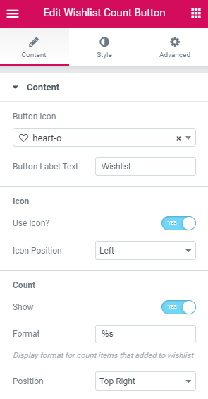
Button Icon - here you can define an icon for the wishlist count button.
Button Label Text - here you can insert a label text of the wishlist count button.
Icon
Use Icon - enable this option if you want to display an icon on the wishlist count button.
Icon Position - here you can specify position of the icon on the wishlist count button (left, top, right, bottom).
Count
Show Count - enable this option if you want to showcase the number of added products in a wishlist.
Format - here you can specify format of the count items added to the wishlist.
Position - here you can set position of the count in wishlist count button.
Style
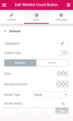
General
Typography - turn the option on to view the typography settings.
Custom Size - enable this potion if you want to set the custom size of the wishlist count button.
Custom Width - specify the preferable width of the wishlist count button in pixels or percentage.
Custom Height - specify the preferable height of the wishlist count button in pixel or percentage.
Here you can switch from customizing Normal to Hover general style settings. Just click on the button Hover and proceed to customizing the elements on hover.
Color - here you can pick color for the label text and count of the wishlist count button.
Background Color - here you can select background color of the wishlist count button.
Border Color - here you can pick color of the borders on hover.
Border Type - here you can define the type of the border you need to use for the element.
Width - here you can specify width of the borders.
Color - here you can pick color for the borders of the wishlist count button.
Border Radius - here you can define the value of the border radius to make the angles more smooth and round.
Alignment - here you can define the preferable alignment of the wishlist count button. It can be placed to the left, to the right, or remain centered.
Padding - here you can set the preferable custom padding for the wishlist count button. Fill in the values for the top, bottom, right and left padding in pixels to apply your custom padding.
Margin - here you can apply your custom margins in pixels or percentage to set them for the wishlist count button.
Icon
Size - here you can specify size of the icon.
Here you can switch from customizing Normal to Hover Icon style settings. Just click on the button Hover to proceed to customizing icon hover elements.
Color - here you can pick color of the icon on the wishlist count button.
Margin - here you can apply your custom margins in pixels or percentage to set them for the icon on the wishlist count button.
Count
Size - here you change size of the count.
Width - here you can define width of the count.
Height - here you can specify height of the count.
Here you can switch from customizing Normal to Hover Count style settings. Just click on the button Hover and proceed to customizing the elements in the hover mode.
Color - here you can pick color of the count.
Background Color - here you can select background color of the count.
Border Color - here you can choose color of the border of the count.
Border Type - here you can define the type of the border you need to use for the element.
Width - here you can specify width of the borders.
Color - here you can pick color for the borders of the count.
Border Radius - here you can define the value of the border radius to make the angles more smooth and round.
Margin - here you can apply your custom margins in pixels or percentage to set them for the count.
Wishlist
Wishlist widget helps to create a wishlist with liked products saved by a customer on the page.
Content
General
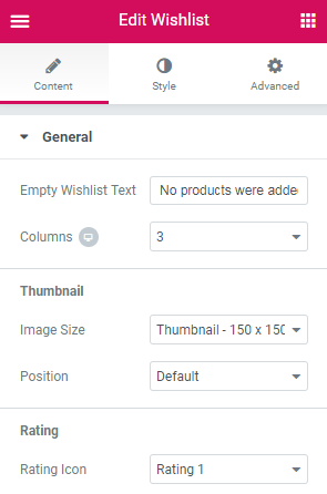
Empty Wishlist Text - here you can insert text displayed when the wishlist is empty.
Columns - here you can select from 1 to 6 columns to showcase liked products.
Thumbnail
Image Size - here you can select the size of the product thumbnail.
Position - here you can specify position of the thumbnail.
Rating
Rating Icon - here you can select style of the rating icon from the dropdown list.
Style
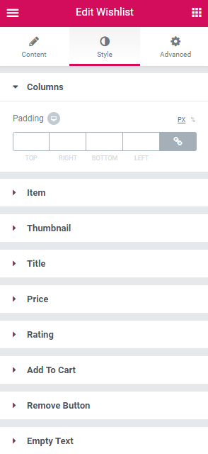
Columns
Padding - type in the custom padding values to add responsive padding for the block.
Item
Background Color - here you can pick blackground color of the item.
Border Type - here you can define the type of the border you need to use for the element.
Width - here you can specify the message appearing if nothing is found.
Color - here you can pick color of the borders.
Border Radius - here you can define the value of the border radius to make the angles more smooth and round.
Box Shadow - enable this option if you want to access the shadow advanced settings for the item, and need to apply shadow for it.
Padding - type in the custom padding values to add responsive padding for the block.
Content
Vertical Alignment - here you can set the vertical position of the item content (on the top, in the middle or on the bottom).
Horizontal Alignment - here you can set the preferable horizontal alignment of the content (on the left, in the center, on the right).
Thumbnail
Background Color - here you can specify background color of the thumbnail block.
Border Type - here you can define the type of the border you need to use for the element.
Width - here you can specify width of the borders.
Color - here you can pick color for the borders of the thumbnail block.
Box Shadow - enable this option if you want to access the shadow advanced settings for the thumbnail block, and need to apply shadow to it.
Padding - type in the custom padding values to add responsive padding for the block.
Margin - here you can apply your custom margins in pixels or percentage to set them for the thumbnail block.
Order - here you can set order of the thumbnail.
Title
Typography - turn the option on to view the typography settings.
Here you can switch from customizing Normal to Hover Title style settings. Just click on the button Hover to proceed to customizing hover elements.
Color - here you can select color of the title.
Text Shadow - use the shadow settings (such as shadow color, blur, horizontal, vertical) if you want to make the title’s text highlighted.
Margin - here you can apply your custom margins in pixels or percentage to set them for the title.
Order - here you can define order of the title.
Price
Typography - turn the option on to view the typography settings.
Color - here you can pick color for the price.
Space Between Prices - here you can set the gap to apply between the prices and make this distance responsive.
Here you can switch from customizing Regular to Sale Price style settings. Just click on the button Sale to proceed to customizing sale elements.
Color - here you can pick color for regular and sale prices.
Text Decoration - here you can add decoration to the text.
Size - here you can specify size of the price.
Font Weight - in this block you can select the suitable font weight.
Margin - here you can apply your custom margins in pixels or percentage to set them for the price.
Order - here you can define order of the price.
Rating
Font Size - define the font size of rating for different screen resolutions.
Here you can switch from customizing All to Rated Rating settings. Just click on the button Rated to proceed to customizing rated elements.
Color - here you can pick color for the price.
Space Between Stars (px) - here you can set the space between starts for all and rated rating.
Margin - here you can apply your custom margins in pixels or percentage to set them for the rating.
Order - here you can define order of the rating.
Add to Cart
Typography - turn the option on to view the typography settings.
Button Width - here you can specify width of the button.
Here you can switch from customizing Normal, Hover, Added to Loading Add to Cart button style settings. Just click on the button Hover, Added and Loading to proceed to customizing hover, added and loading elements.
Text Color - here you can define color of the text on the button.
Background Color - here you can pick background color of the button.
Border Color - here you can choose color of the borders of the button by added and loading status.
Box Shadow - enable this option if you want to access the shadow advanced settings for Add to Cart button, and need to apply shadow for it.
Border Type - here you can define the type of the border you need to use for the element.
Width - here you can specify width of the borders of the button.
Color - here you can pick color of the borders.
Border Radius - here you can define the value of the border radius to make the angles more smooth and round.
Padding - type in the custom padding values to add responsive padding for the block.
Margin - here you can apply your custom margins in pixels or percentage to set them for the Add to Cart button.
Order - here you can define order of the Add to Cart button.
Remove Button
Button Text - here you can specify text of the remove button.
Button Icon - here you can select icon of the remove button.
Typography - turn the option on to view the typography settings.
Here you can switch from customizing Normal to Hover Remove Button style settings. Just click on the button Hover to proceed to customizing hover elements.
Text Color - here you can specify color of the text on the remove button.
Background Color - here you can specify background color of the remove button.
Border Color - here you can pick color of the borders of the remove button on hover.
Border Type - here you can define the type of the border you need to use for the element.
Width - here you can specify width of the borders.
Color - here you can pick color for the borders of the remove button.
Border Radius - here you can define the value of the border radius to make the angles more smooth and round.
Box Shadow - enable this option if you want to access the shadow advanced settings for the remove button, and need to apply shadow to it.
Padding - type in the custom padding values to add responsive padding for the block.
Margin - here you can apply your custom margins in pixels or percentage to set them for the remove button.
Order - here you can define order of the remove button.
Icon
Size - here you can set an appropriate size of the icon.
Offset - here you can tune the icon horizontal offset.
Here you can switch from customizing Normal to Hover Remove Button style settings. Just click on the button Hover to proceed to customizing hover elements.
Color - here you can select color of the icon.
Empty Text
Typography - turn the option on to view the typography settings.
Color - here you can set the color to use it for the empty text block.
Text Shadow - use the shadow settings (such as shadow color, blur, horizontal, vertical) if you want to make the empty text highlighted.
Background Color - here you can select background color of the empty text.
Border Type -here you can define the type of the border you need to use for the element.
Width - here you can specify width of the borders of the empty text block.
Color - here you can pick color of the borders.
Border Radius - here you can define the value of the border radius to make the angles more smooth and round.
Padding - type in the custom padding values to add responsive padding for the block.
Margin - here you can apply your custom margins in pixels or percentage to set them for the empty text block.
Alignment - here you can define the preferable alignment of the empty text. The empty text can be placed to the left, to the right, or remain centered.