JetBlocks
JetBlocks Widgets
Here you can learn more about the widgets represented in JetBlocks addon.
Authorization Links Widget
The widget allows adding the authorization links to the sections created with Elementor.
Content
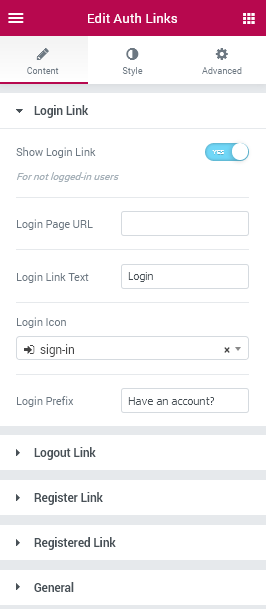
Login Link
- Show Login Link - enable this option in order to enable the users not to only register, but also login to the site using the provided link.
- Login Page URL - here you need to input the URL which will open when one clicks on the link.
- Login link Text - in this field one needs to input his custom text linked to the login page.
- Login Icon - here you can set the preferable icon to use for the login link.
- Login Prefix - in this field one needs to specify the text which you want to be shown before the login link and icon.
Logout Link
- Show Logout Link - enable this option in order to allow the users to use it to log out from the site.
- Logout Link Text - here you can specify the text to display it for the logout link.
- Logout Icon - this option allows to set the icon for the Logout link.
- Redirect After Logout - here you can set where you want to redirect the users after they logged out from the site (in the case they won’t have access to the pages where they’ve previously been (allows them to remain on the current page, redirect to the home page or specify your own custom link).
- Logout prefix - here you can set your own text to be displayed before the logout link.
Register Link
- Show Register Link - here you can set if you want the register link to be shown.
- Register Page URL - here you need to input the URL address of the page where the new user needs to register.
- Register Link Text - here you can set the text to be shown for the Register link.
- Register Icon - here you can assign the needed icon to be shown on the left of Register link.
- Register Prefix - in this field you can specify the text to display it before the Register link and icon.
Registered Link
- Show Registered Link - here you can define, whether you need the Registered link to be shown.
- Registered page URL - here you can set the URL address for the Registered page.
- Registered Link Text - here you can set the custom text to display for the Registered link.
- Registered Icon - here you can assign the needed icon to be shown on the left of Registered link.
- Registered Prefix - in this field you can specify the text to display it before the Registered link and icon.
General
Order
Here you can define the preferable order for the displayed links (login/logout, register/registered).
Style
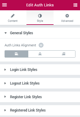
General Styles
- Auth Links Alignment - here you can set the links alignment ot the most convenient one (left, center, right).
Login Link Styles
Link
- Typography - turn the option on to view the typography settings for the login link text.
- Size — define the font size of the text.
- Family — here you can set the font family for the text.
- Weight — in this block you can select the suitable font weight.
- Transform — here you can choose from the dropdown menu, if you want the text to be shown in uppercase, lowercase, capitalize or normal way.
- Style — in this block you can choose from the dropdown menu the style of the font. It can be normal, italic (the characters look similar to handwriting) and oblique (the characters are slightly inclined to the right).
- Line Height — in this field you can set the height of the text line.
- Letter Spacing — here you can set the space between letters.
Switch between Normal and Hover modes in order to be able to customize the links appearance in normal state and when on mouse hover.
- Text Color - here you can set the color of the text using the color picker.
- Background Color - here you can set the background color to use for the element.
- Border Type - here you need to specify the type of the border to use for the element.
- Width - here you can set the needed width to use for the border.
- Color - here you can specify the color to use for the border.
- Border Radius - here you can set the border radius for the chosen border to make the border angles more round.
- Box Shadow - click on the pencil icon to access the shadow options and apply the shadow for the element. The shadow settings are similar for different elements of JetBlocks widgets.
- Padding - here you can select the paddings to use for the links added into the widget.
- Margin - here you can select the margin values to use for the links added into the widget.
Prefix
- Color - here you can select the color to use for the Prefix text.
- Typography - turn the option on to view the typography settings for the text. The typography settings are similar to the other ones available for JetBlocks elements included into the widgets.
Logout Link Styles
The style settings are similar to the ones available for Login Link Styles block.
Logout Link Styles
The style settings are similar to the ones available for Login Link Styles block.
Register Link Styles
The style settings are similar to the ones available for Login Link Styles block.
Registered Link Styles
The style settings are similar to the ones available for Login Link Styles block.
Breadcrumbs
This widget allows adding breadcrumbs in order to display the path to the opened page ina stylish way.
Content
General Settings
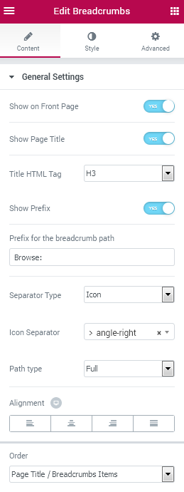
- Show on Front Page - check this option to enable the breadcrumbs on front page.
- Show Page Title - add a page title to the breadcrumbs.
- Title HTML Tag - here you can set the tag to use for the title (heading, div).
- Show Prefix - add a prefix word or symbol to be shown before the breadcrumbs path.
- Prefix for the breadcrumb path - input the needed prefix inside the field to use it as a prefix.
- Separator Type - here you can set the icon or your custom separator type which will separate each breadcrumb link from the other. If the Icon type is selected, you’ll be able to set the needed icon from the icons list. In the case there is a custom separator needed, just input it in the corresponding field.
- Path Type - here you can choose if you want to use the full path to be shown in breadcrumbs, or the minified path showing only the first and the last breadcrumb.
- Alignment - here you can change the breadcrumbs alignment according to your needs. It can be left, centered, right or justified.
- Order - here you can specify the breadcrumbs order: the page title is to be shown before or after the breadcrumbs.
Style
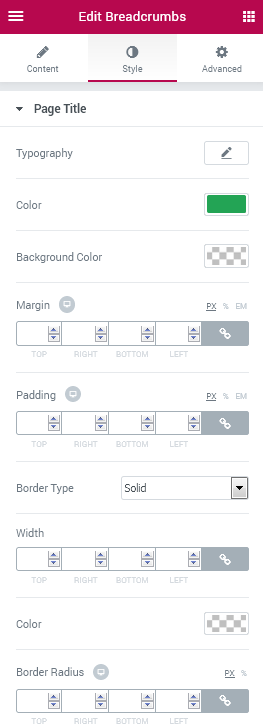
Page Title
- Typography - turn the option on to view the typography settings for the text. The typography settings are similar to the other ones available for JetBlocks elements included into the widgets.
- Color - here you can set the color to use for the page title.
- Background Color - here you can specify the background color to apply for the page title.
- Margin - here you can set the margin values to apply them for the page title.
- Padding - here you can specify the padding values to use for the page title.
- Border Type - here you can specify the border type to use around the page title (none, or the specific type from the dropdown list).
- Border Radius - here you can set the border radius values to make the border angles more smooth and rounded.
- Width - here you can specify the width values for the border in pixels.
- Color - here you can set the color to apply for the border.
Breadcrumbs
Crumbs Style
- Typography - turn the option on to view the typography settings for the text. The typography settings are similar to the other ones available for JetBlocks elements included into the widgets.
- Color - here you can set the color to set for the breadcrumbs text.
- Background Color - here you can set the color to use for the breadcrumbs text background.
- Padding - here you can specify the padding values to apply for the breadcrumbs.
- Border Type - here you can specify the border type to use for the breadcrumbs links (none, or the specific type from the dropdown list).
- Border Radius - here you can set the border radius values to make the border angles more smooth and rounded.
- Width - here you can specify the width values for the border in pixels.
- Color - here you can set the color to apply for the border.
Switch between Normal, Hover and Active styles to customize the breadcrumbs appearance on hover, when active and in normal state.
Separators Style
- Gap - here you can use the controls to set the gap for the separator elements between the breadcrumbs.
- Icon Size - here you can specify the size of the icons used as separator elements.
- Color - here you can customize the color of the icons used as separators.
- Background Color - here you can set the specific color to use as a background for the icon.
- Padding - here you need to specify the padding values for the separator.
- Border Type - here you can specify the border type to use for the breadcrumbs separator elements (none, or the specific type from the dropdown list).
- Border Radius - here you can set the border radius values to make the border angles more smooth and rounded.
- Width - here you can specify the width values for the border in pixels.
- Color - here you can set the color to apply for the border.
Prefix Style
- Gap - here you can specify the gap to apply for the breadcrumbs prefix element.
- Typography - turn the option on to view the typography settings for the prefix text. The typography settings are similar to the other ones available for JetBlocks elements included into the widgets.
- Color - here you can set the color to set for the breadcrumbs prefix text.
- Background Color - here you can set the color to use for the breadcrumbs prefix text background.
- Padding - here you can specify the padding values to apply for the breadcrumbs prefix.
- Border Type - here you can specify the border type to use for the breadcrumbs prefix element (none, or the specific type from the dropdown list).
- Border Radius - here you can set the border radius values to make the border angles more smooth and rounded.
- Width - here you can specify the width values for the border in pixels.
- Color - here you can set the color to apply for the border.
Hamburger Panel
This widget allows adding a neat hamburger panel to the pages built with Elementor in order to make access to the needed template more easy for your visitors.
Please, notice that You need to create at least one template in order to be able to display it in the open Hamburger area.
Content
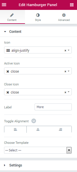
- Icon - here you can specify which icon you want to use for the Hamburger element.
- Active Icon - here you need to set the icon that shows up when the panel is open. By clicking on the icon the user will be able to close the Hamburger panel.
- Close Icon - here you need to set the icon by clicking on which the user will be able to close the Hamburger panel.
- Label - here you can set the Hamburger label text.
- Toggle Alignment - switch the toggle alignment to the one needed (right, center, left).
- Choose Template - here you’ll be able to select the template to use for the Hamburger panel.
Please, note that You’re also able to edit the templates right from current Elementor editing page. To do it, please, open the Hamburger panel and click Edit Template button.
Settings
- Position - here you can change the Hamburger element panel position (attach it to the right or the the left side of the page).
- Effect - here you can select which effect you want to apply for the Hamburger panel (slide or fade).
- Z Order - here you can change the position of the Hamburger menu to be always on top (to stay on top of other elements that have the lower Z index value).
Style
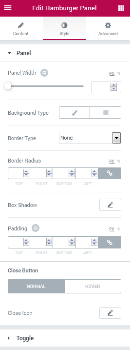
Panel
- Panel Width - here you can change the width of the opened Hamburger panel and make it responsive.
- Background Type - here you can set the preferable background type to use for the panel. It can be Classic or Gradient background.
Classic Background Type
- Color - here you can set the specific color to use for the panel.
- Image - click the image box and upload an image in order to use it as a background for the panel.
- Position - here you can position the image used for the background according to your needs.
- Attachment - here you can make the image fixed or allow it to be scrolled.
- Repeat - here you can allow the image to be repeated horizontally, vertically, tiled or restrict repeating.
- Size - select Cover, Contain or Auto image sizing in order to make it fitted into the panel container.
Gradient Background Type
- Color - add the first color to use for the gradient background of the panel.
- Location - here you can change the location of the first gradient color.
- Second Color - add the second color to use for the gradient background.
- Location - here you can change the location of the second gradient color.
- Type - here you can change the gradient location from linear to radial.
- Angle - if the gradient type is lineer, you can change the angle to use for it.
- Position - if the gradient is radial, here you can change the position of its center to the preferable one.
- Padding - here you can set the padding for the panel content.
- Border type - here you can change the border type to the one needed (solid, dotted, dashed, double, groove or none).
- Width - here you can set the width of the border in px.
- Color - here you can choose the color to use for the border.
- Border Radius - here you can apply a radius for the border andles to make them more smooth.
- Box Shadow - here you can apply a shadow and change the shadow settings for the panel.
- Padding - here you can change the padding values to your custom ones according to your needs.
Close Button
- Close Icon - here you can customize the Close Icon appearance (Color, Background Type, Icon Size, Box Size, Border Type, Border Radius, Box Shadow).
Switch between Normal and Hover modes in order to change the style of the Close button when in is in its normal state and when it is on mouse hover.
Toggle
Switch between Normal and Hover modes in order to change the styles of the toggle elements when it is in its normal state or when it is on mouse hover.
- Background Type - here you can set the preferable background type to use for the element. It can be Classic or Gradient background. The settings are similar for all of the JetBlocks widgets that have a background type feature.
- Border Type - here you can specify the suiting border type to use for the element (solid, dotted, double, dashed, groove or none).
- Width - here you can set the width to use for the border in px.
- Color - here you can specify the color to use for the border.
- Border Radius - here you can apply the radius for the borders to make the angles more round and smooth.
- Box Shadow - here you can set the shadow and customize its settings.
- Padding - here you can change the padding values to custom ones making them responsive.
- Margin - here you can set the margin values to custom ones making them responsive.
Icon Styles
Switch between Normal and Hover modes in order to customize the Icon appearance in normal state or when on mouse hover.
- Toggle Icon - click the Pencil icon to change the icon appearance using all the available settings (they are similar for all the icons possessing this feature in the JetBlocks widgets).
Label Styles
Switch between Normal and Hover modes in order to customize the Label appearance in normal state or when on mouse hover.
- Label Color - here you can change the label color using color picker tool.
- Typography - turn the option on to view the typography settings for the text. The typography settings are similar to the other ones available for JetBlocks elements included into the widgets.
Login Form
This widget allows to add and customize a login form to the pages built with Elementor.
Content
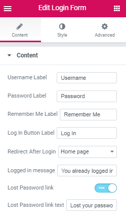
- Username Label - here you can change the username label text to your custom one.
- Password Label - here you can change the password label to the one more suitable.
- Remember Me Label - here you can specify the Remember Me label according to your needs.
- Log In Button Label - here you can change the Log In button label to your custom one.
- Redirect After Login - here you can select to which page the user needs to be redirected after login (home page, stay on the current page, specify your custom URL).
- Logged in message - here you can set your preferable message to make is shown when the user is logged in.
- Lost Password link - enable this option in order to add the lost password link.
- Lost Password link text - here you can define the text of the lost password link.
Style
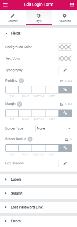
Fields
- Background Color - here you can set the preferable color to use for the background.
- Text Color - here you can set the color to use for the text.
- Typography - turn the option on to view the typography settings for the text. The typography settings are similar to the other ones available for JetBlocks elements included into the widgets.
- Padding - here you can change the padding setting to the custom ones making the paddings responsive.
- Margin - here you can specify the margins to apply them for the elements making them responsive.
- Border Type - here you can specify the suiting border type to use for the element (solid, dotted, double, dashed, groove or none).
- Width - here you can set the width to use for the border in px.
- Color - here you can specify the color to use for the border.
- Border Radius - here you can apply the radius for the borders to make the angles more round and smooth.
- Box Shadow - here you can set the shadow and customize its settings.
Labels
- Background Color - here you can set the preferable color to use for the background.
- Text Color - here you can set the color to use for the text.
- Typography - turn the option on to view the typography settings for the text. The typography settings are similar to the other ones available for JetBlocks elements included into the widgets.
- Padding - here you can change the padding setting to the custom ones making the paddings responsive.
- Margin - here you can specify the margins to apply them for the elements making them responsive.
- Border Type - here you can specify the suiting border type to use for the element (solid, dotted, double, dashed, groove or none).
- Width - here you can set the width to use for the border in px.
- Color - here you can specify the color to use for the border.
- Border Radius - here you can apply the radius for the borders to make the angles more round and smooth.
- Box Shadow - here you can set the shadow and customize its settings.
- Alignment - here you can change the Submit button alignment to right, left or centered.
- Typography - turn the option on to view the typography settings for the lost password link. The typography settings are similar to the other ones available for JetBlocks elements included into the widgets.
- Color - here you can specify the color to use for the lost password link.
- Hover Color - here you can specify the color to use for the lost password link on hover.
- Margin - here you can define the margins for the lost password link.
- Background Color - here you can set the preferable color to use for the background.
- Text Color - here you can set the color to use for the text.
- Typography - turn the option on to view the typography settings for the text. The typography settings are similar to the other ones available for JetBlocks elements included into the widgets.
- Padding - here you can change the padding setting to the custom ones making the paddings responsive.
- Margin - here you can specify the margins to apply them for the elements making them responsive.
- Border Type - here you can specify the suiting border type to use for the element (solid, dotted, double, dashed, groove or none).
- Width - here you can set the width to use for the border in px.
- Color - here you can specify the color to use for the border.
- Border Radius - here you can apply the radius for the borders to make the angles more round and smooth.
- Box Shadow - here you can set the shadow and customize its settings.
Submit
Switch between Normal and Hover modes in order to customize the Submit button in its normal state and when it is on mouse hover.
Lost Password Link
Errors
Site Logo
This widget allows adding textual and image logo to the headers and footers created for the site pages.
Content
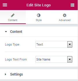
- Logo Type - here you can specify the type of logo you want to use on the page (image, text, or both). Please, note that the customization and content settings will depend on the logo type you’ve selected.
- Logo Text Form - here you can set the source from where the text will be used (either the site name or your custom text).
- Logo Image - here you can set the image to be shown as a website logo.
- Retina Logo Image - here you can upload the image in retina quality to be shown for retina-ready devices.
Settings
- Linked Logo - enable this option if you want the logo to be linked to an URL.
- Remove Link on Front Page - here you can remove the link for the logo on front page (in the case it is linked).
Style
Logo
- Logo Alignment - here you can select the preferable alignment for the logo (left, centered or right).
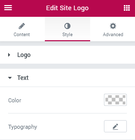
Text
- Color - here you can specify the color of the logo text.
- Typography - turn the option on to view the typography settings for the text. The typography settings are similar to the other ones available for JetBlocks elements included into the widgets.
Nav Menu
This widget makes it easy to create a menu and place it in the website's header or footer built with Elementor.
Content
Menu
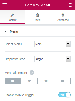
- Select Menu - here you need to select the source from which you’ll be able to pull the menu to display it on the page.
Please, note, that you need to create at least one menu to be able to select it from the dropdown.
- Layout - here you can change the layout of the menu from vertical to horizontal according to your needs.
- Dropdown Placement - here you can make the dropdowm for the menu open at the left side, at the right side or at the bottom of the main item.
- Dropdown Icon - here you can set the preferable dropdown icons to use for the menu items.
- Menu Alignment - here you can change the menu alignment to the one needed (left, center, right, justify).
- Enable Mobile Trigger - enable this option in order to use the mobile trigger.
- Mobile Trigger Alignment - here you can choose the preferable mobile trigger box alignment (left, center, right).
- Mobile Trigger Icon - here you need to select the icon to apply for the mobile trigger from the list of the available icons.
- Mobile Trigger Close Icon - specify the icon the will close the mobile menu from the icons list dropdown.
- Mobile Menu Layout - here you can change the way the mobile meny appears on the page (slide from the left side, slide from the right side, fullwidth, or default).
Style
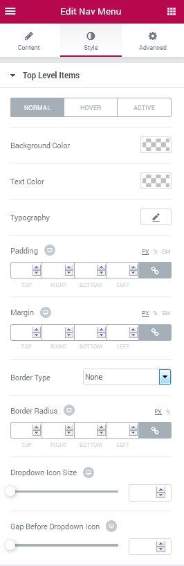
Top Level Items
- Vertical Menu Width - here you can set the custom responsive width to apply to the vertical menu in px or percents.
- Vertical menu Alignment - here you can position the vertical menu to the left, center or right side.
- Background Color - here you can change the color to use for the menu background according to your needs using the color picker tool.
- Text Color - here you can change the color of the menu items text.
- Text Background Color - here you can define the color to use for the items text background.
- Dropdown Icon Color - here you can set the color to use it for the dropdown arrow (or other icon you’ve set for the dropdown).
- Typography - turn the option on to view the typography settings for the text. The typography settings are similar to the other ones available for JetBlocks elements included into the widgets.
- Padding - here you can change the padding values to the custom ones in order to make the menu fully responsive.
- Margin - set your custom margins to make them responsive for different devices.
- Border Type - here you can specify the suiting border type to use for the element (solid, dotted, double, dashed, groove or none).
- Width - here you can set the width to use for the border in px.
- Color - here you can specify the color to use for the border.
- Border Radius - here you can apply the radius for the borders to make the angles more round and smooth.
- Dropdown Icon Size - here you can specify the size of the dropdown icon and make it responsive.
- Gap Before Dropdown Icon - here you can change the size of the gap set before the dropdown icon to make it fully responsive.
- Container Width - here you can set the width of the dropdown container width according to your needs and make it fully responsive.
- Border Type - here you can specify the suiting border type to use for the element (solid, dotted, double, dashed, groove or none).
- Width - here you can set the width to use for the border in px.
- Color - here you can specify the color to use for the border.
- Border Radius - here you can apply the radius for the borders to make the angles more round and smooth.
- Box Shadow - here you can set the shadow and customize its settings.
- Gap before 1st Level Sub - here you can add a gap to apply it before the 1st level of sub menu.
- Gap before 2nd level sub - here you can add a gap to apply it before the 2nd level of sub menu.
- Background Color - here you can apply the needed color to use for the item background.
- Text Color - here you can change the color of the text.
- Typography - turn the option on to view the typography settings for the text. The typography settings are similar to the other ones available for JetBlocks elements included into the widgets.
- Padding - here you can add the custom paddings to use for the items in order to make them responsive.
- Dropdown Icon Size - here you can change the size of the dropdown icon to make it fully responsive and fit for your website’s style.
- Gap Before Dropdown Icon - here you can add a responsive gap to use for the dropdown icon.
- Border Type - here you can specify the suiting border type to use for the element (solid, dotted, double, dashed, groove or none).
- Width - here you can set the width to use for the border in px.
- Color - here you can specify the color to use for the border.
- Border Radius - here you can apply the radius for the borders to make the angles more round and smooth.
- Background Color - here you can change the hamburger menu background using color picker tool.
- Text Color - here you can change the hamburger menu icon or text color.
- Border Type - here you can specify the suiting border type to use for the element (solid, dotted, double, dashed, groove or none).
- Width - here you can set the width to use for the border in px.
- Color - here you can specify the color to use for the border.
- Border Radius - here you can apply the radius for the borders to make the angles more round and smooth.
- Width - here you can change the hamburger element width.
- Height - here you can set the hamburger elements height.
- Icon Size - here you can change the hamburger menu icon size to the needed one.
- Alignment - here you can change the menu alignment when it is in mobile mode to right, left or centered.
- Width - here you can specify the width to apply for the mobile menu in px or using percents value.
- Background Color - in this block you can set the color of the mobile menu background using color picker tool.
- Padding - here you can apply the custom padding for the mobile menu in percents or pixels.
- Box Shadow - enable this otion in order to access the shadow blur, color, horizontal, vertical, position and spread options, and apply the shadow to the mobile menu.
- Close Icon Color - here you can change the color of the icon to apply it to the Close icon of the mobile menu.
- Font Size - here you can change the size of the Close icon according to yuor needs.
Switch between Normal, Hover and Active modes in order to make the menu items react to the mouse hover, style them up to change their appearance when they are active or in their normal state.
Dropdown
Container Styles
Items Styles
Switch between Normal, Hover and Active modes in order to customize the appearance of both making the item styles different when on mouse hover, when the item is active, or when it is in its normal state.
Divider
Mobile Trigger
Switch between Normal and Hover modes in order to make the hamburger menu styles different on hover and when in its normal state.
Mobile Menu
Search
This widget makes it easy to add a Search form to the headers and footers built with Elementor.
General
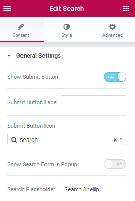
- Search placeholder - here you can specify the placeholder text that will be shown in the search field.
- Show Submit Button - enable this option in order to add a Submit button to the Search field.
- Submit Button label - here you can specify the label text for the Search button.
- Submit Button Icon - here you need to pick an icon to use for the Search button.
- Show Search Form in PopUp - enable this option in order to show the Search field in PopUp.
- Full Screen Popup - in case you've enabled Show Search Form in Popup option you can make the popup occupy the full screen.
- PopUp Trigger Icon - here you can specify the PopUp trigger icon from the general icons list.
- Show Effect - in this block you can specify the effect ot use for the search popup.
- Is Product Search - enable this option in case you want to use the Search field for WooCommerce product search.
Style
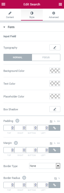
Form
Input Field
- Typography - turn the option on to view the typography settings for the text. The typography settings are similar to the other ones available for JetBlocks elements included into the widgets.
Switch between Normal and Focus modes in order to customize both and change the Search form appearance on hover and in its normal state.
- v
- Background Color - here you can set the background color to use for the search field where the text will be put.
- Text Color - here you can set the color of the Search text.
- Placeholder Color - here you can set the color of the placeholder text.
- Box Shadow - here you can set the shadow and customize its settings.
- Padding - here you can change the padding of the Search and make it responsive.
- Margin - here you can apply your custom margins for the Search and make them responsive.
- Border Type - here you can specify the suiting border type to use for the element (solid, dotted, double, dashed, groove or none).
- Width - here you can set the width to use for the border in px.
- Color - here you can specify the color to use for the border.
- Border Radius - here you can apply the radius for the borders to make the angles more round and smooth.
Submit Button
- Typography - turn the option on to view the typography settings for the text. The typography settings are similar to the other ones available for JetBlocks elements included into the widgets.
- Icon Size - here you can customize the size of the search icon shown on the button.
Switch between Normal and Hover modes in order to make the Button appearance different on mouse hover and when in its normal state.
- Background Color - here you can change the button background color to the needed one.
- Text Color - here you can change the color of the button text.
- Padding - here you can change the button paddings to the custom ones and make them fully responsive.
- Margin - here you can change the button margins to the needed ones and make them responsive.
- Border Type - here you can specify the suiting border type to use for the element (solid, dotted, double, dashed, groove or none).
- Width - here you can set the width to use for the border in px.
- Color - here you can specify the color to use for the border.
- Border Radius - here you can apply the radius for the borders to make the angles more round and smooth.
- Box Shadow - here you can set the shadow and customize its settings.
Popup Box
- Popup Width - here you can set the custom popup width and make it fully responsive.
- Background Color - here you can change the background color of the popup.
- Padding - here you can change the responsive popup window paddings.
- Margin - here you can change the responsive popup window margins.
- Border Type - here you can specify the suiting border type to use for the element (solid, dotted, double, dashed, groove or none).
- Width - here you can set the width to use for the border in px.
- Color - here you can specify the color to use for the border.
- Border Radius - here you can apply the radius for the borders to make the angles more round and smooth.
- Box Shadow - here you can set the shadow and customize its settings.
Popup Position
- Vertical Position By - here you can change the popup position to top or bottom.
- Top Indent - here you can apply the indent for the popup from top.
- Horizontal Position By - here you can change the horizontal position of the popup.
- Left Indent - here you can change the indent for the popup from left.
Popup Trigger
Switch between Normal and Hover modes in order to change the appearance of the popup trigger elements.
- Background Color - here you can change the color of the background color of the trigger elements.
- Text Color - here you can change the color of the text trigger elements.
- Icon Size - here you can change the size of the trigger icon to make it responsive.
- Alignment - here you can change the trigger elements alignment to left, right or centered.
- Padding - here you can change the responsive paddings for the trigger elements.
- Margin - here you can change the responsive margins for the trigger elements.
- Border Type - here you can specify the suiting border type to use for the element (solid, dotted, double, dashed, groove or none).
- Width - here you can set the width to use for the border in px.
- Color - here you can specify the color to use for the border.
- Border Radius - here you can apply the radius for the borders to make the angles more round and smooth.
- Box Shadow - here you can set the shadow and customize its settings.
Popup Close
Switch between Normal and Hover modes in order to customize the popup closing element.
- Background Color - here you can change the color of the element.
- Text Color - here you can change the color of the text to the one more preferable.
- Icon Size - here you can change the size of the icon to the one more suitable for different responsive modes.
- Padding - here you can change the paddings to the ones needed (and make them fully responsive).
- Margin - here you can change the margin values to the ones needed and make them responsive.
- Border Type - here you can specify the suiting border type to use for the element (solid, dotted, double, dashed, groove or none).
- Width - here you can set the width to use for the border in px.
- Color - here you can specify the color to use for the border.
- Border Radius - here you can apply the radius for the borders to make the angles more round and smooth.
- Box Shadow - here you can set the shadow and customize its settings.
Registration Form
This widget is made for adding registration forms to website's header and footer templates.
Content
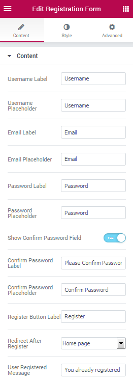
- Username Label - here you can set your custom label for the field where one needs to enter his username.
- Username Placeholder - here you can set your own placeholder text to be shown in the field where one needs to enter his username.
- Email Label - here you can set your custom label for the field where one needs to enter his email.
- Email Placeholder - here you can set your own placeholder text to be shown in the field where one needs to enter his email.
- Password Label - here you can set your custom label for the field where one needs to enter his password.
- Password Placeholder - here you can set your own placeholder text to be shown in the field where one needs to enter his password.
- Show Confirm Password Field - enable this option in order to display the field where one needs to confirm his password.
- Confirm Password Label - here you can set your custom label for the field where one needs to enter his password to confirm it.
- Confirm Password Placeholder - here you can set your own placeholder text to be shown in the field where one needs to enter his password to confirm it.
- Register Button Label - here you can set your custom label for the button where one needs to click to register.
- Redirect After Register - here you can set the page to which you need to redirect the users after they are registered (home page, current page or the custom URL you need to specify in the case you’ve selected this option).
- User Registered Message - here you can input the message to be shown when the user is already registered.
Style
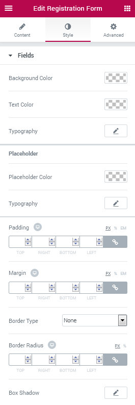
Fields
- Background Color - here you can change the color set for the fields background.
- Text Color - here you can change the color of the text.
- Typography - turn the option on to view the typography settings for the text. The typography settings are similar to the other ones available for JetBlocks elements included into the widgets.
Placeholder
- Placeholder Color - here you can change the color of the placeholder text.
- Typography - turn the option on to view the typography settings for the text. The typography settings are similar to the other ones available for JetBlocks elements included into the widgets.
- Padding - here you can add the custom paddings to use for the input field areas in order to make them responsive.
- Margin - here you can specify the margins to use for the input fields.
- Border Type - here you can specify the suiting border type to use for the element (solid, dotted, double, dashed, groove or none).
- Width - here you can set the width to use for the border in px.
- Color - here you can specify the color to use for the border.
- Border Radius - here you can apply the radius for the borders to make the angles more round and smooth.
- Box Shadow - here you can set the shadow and customize its settings.
Labels
- Background Color - here you can set the color to use for the label text background.
- Text Color - here you can specify the color of the label text.
- Typography - turn the option on to view the typography settings for the text. The typography settings are similar to the other ones available for JetBlocks elements included into the widgets.
- Padding - here you can specify the padding values to use for the labels.
- Margin - here you can set the margin values for the labels to make them fully responsive.
- Border Type - here you can specify the suiting border type to use for the element (solid, dotted, double, dashed, groove or none).
- Width - here you can set the width to use for the border in px.
- Color - here you can specify the color to use for the border.
- Border Radius - here you can apply the radius for the borders to make the angles more round and smooth.
- Box Shadow - here you can set the shadow and customize its settings.
Submit
Switch between Normal and Hover modes in order to make the Submit button appearance fully responsive.
- Background Color - here you can set the background color for the Submit button.
- Text Color - here you can specify the color of the label text for the Submit button.
- Typography - turn the option on to view the typography settings for the text. The typography settings are similar to the other ones available for JetBlocks elements included into the widgets.
- Padding - here you can specify the padding values to use for the button.
- Margin - here you can set the margin values for the button to make it fully responsive.
- Border Type - here you can specify the suiting border type to use for the element (solid, dotted, double, dashed, groove or none).
- Width - here you can set the width to use for the border in px.
- Color - here you can specify the color to use for the border.
- Border Radius - here you can apply the radius for the borders to make the angles more round and smooth.
- Box Shadow - here you can set the shadow and customize its settings.
- Alignment - here you can set the needed alignment for the button (right, left, centered).
Errors
- Background Color - here you can change the background color of the error blocks.
- Text Color - here you can change the color of the text shown when there is an error in the provided information.
- Padding - here you can change the padding of the error elements.
- Margin - here you can change the margins for the error elements and make them fully responsive.
- Border Type - here you can specify the suiting border type to use for the element (solid, dotted, double, dashed, groove or none).
- Width - here you can set the width to use for the border in px.
- Color - here you can specify the color to use for the border.
- Border Radius - here you can apply the radius for the borders to make the angles more round and smooth.
- Box Shadow - here you can set the shadow and customize its settings.
WooCommerce Shopping Cart
The widget adds the shopping cart to website's header or footer and customize its appearance in about few clicks.
Content
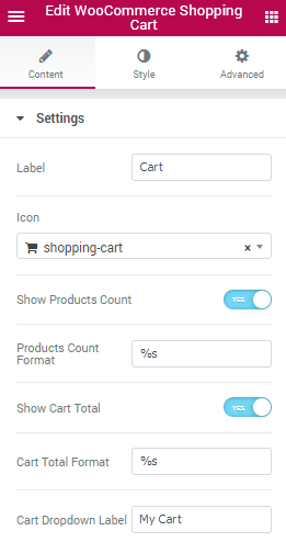
Settings
- Label - input the text in the corresponding field to use it as a label.
- Icon - here you can change the icon shown for the Cart to the one more suitable from the list of available icons.
- Show Products Count - here you can enable the products count to be displayed.
- Products Count Format - here you can change the format of the product count to the one more preferable.
- Show Cart Total - enable this option if you want the users to be able to see the total value of the products added into cart.
- Cart Total Format - here you can specify the format of the total cart value.
- Cart Dropdown Label - here you can specify the text to be shown as the card dropdown label.
Style
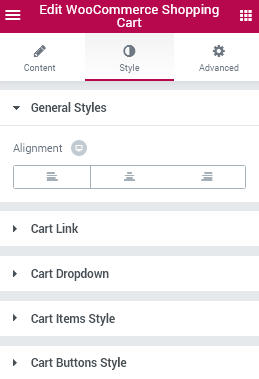
General Styles
- Alignment - here you can change the Cart alignment and make it responsive (specify left, right or centered alignment).
Cart link
Switch between Normal and Hover modes in order to customize the elements when on mouse hover or when in the normal state.
- Background Color - here you can change the color of the Cart element background.
- Label Color - here you can set the color of the Cart label text.
- Icon Color - here you can set the specific color to use for the Cart icon.
- Count Background Color - here you can change the color of the count background.
- Count Color - specify the color of the cart count value.
- Totals Color - here you can set the color of the cart total value.
- Typography - turn the option on to view the typography settings for the text. The typography settings are similar to the other ones available for JetBlocks elements included into the widgets.
- Padding - here you can set the padding values to make the paddings responsive.
- Border Type - here you can specify the suiting border type to use for the element (solid, dotted, double, dashed, groove or none).
- Width - here you can set the width to use for the border in px.
- Color - here you can specify the color to use for the border.
- Border Radius - here you can apply the radius for the borders to make the angles more round and smooth.
- Icon Size - here you can set the size of the icon to apply for different responsiveness modes and suit your webpage’s design.
- Gap After Icon - here you can add a responsive gap distance after the Cart icon.
- Label Font Size - here you can specify the font size to use for the label text.
- Gap After Label - here you can add a responsive gap distance after the textual label.
Label
Count
- Count Font Size - here you can set the font size to use for the count characters.
- Count Box Size - here you can change the size of the count box to the one needed using the control.
- Margin - apply your custom responsive margins to make the count element stand out.
- Border Radius - here you can change the border radius values to make the angles of the element more smooth and rounded.
Totals
- Totals Font Size - use the controls in order to change the size of total cart value font and make it responsive.
Cart Dropdown
Container Styles
- Background Color - here you can set your custom color to use for the container background.
- Border Type - here you can specify the suiting border type to use for the element (solid, dotted, double, dashed, groove or none).
- Width - here you can set the width to use for the border in px.
- Color - here you can specify the color to use for the border.
- Border Radius - here you can apply the radius for the borders to make the angles more round and smooth.
- Box Shadow - here you can set the shadow and customize its settings.
- Width - here you can change the width of the container in px and make it responsive.
- Padding - input your custom padding values to make them responsive and make the container stand out.
- Border Radius - here you can change the border radius border radius values to your custom ones to make the angles more smooth and rounded.
- Horizontal Position By - here you can change the container’s horizontal position to the needed one depending on what you want it to be.
- Left (Right) Indent - add an indent distance for the container depending on what horizontal position you’re using.
Dropdown Label Styles
- Typography - turn the option on to view the typography settings for the text. The typography settings are similar to the other ones available for JetBlocks elements included into the widgets.
- Margin - here you can set the custom margins to use for the labels shown in the dropdown block.
- Padding - here you can add the responsive padding values to apply for the labels inside the box.
- Border Type - here you can specify the suiting border type to use for the element (solid, dotted, double, dashed, groove or none).
- Width - here you can set the width to use for the border in px.
- Color - here you can specify the color to use for the border.
- Border Radius - here you can apply the radius for the borders to make the angles more round and smooth.
- Alignment - here you can change the box’s content alignment to the one more preferable (left, right, centered).
Cart Items Style
Product List Style
- Max Height - here you can change the maximum height of the products list.
- Margin - here you can set the responsive margins to use for the products.
- Padding - here you need to set the responsive paddings for the products.
- Border Type - here you can specify the suiting border type to use for the element (solid, dotted, double, dashed, groove or none).
- Width - here you can set the width to use for the border in px.
- Color - here you can specify the color to use for the border.
- Border Radius - here you can apply the radius for the borders to make the angles more round and smooth.
Product Item Style
- Margin - here you can apply the custom responsive margins to use for the product items.
- Padding - here you can set the responsive padding values to use for the product items.
- Divider - enable this option in the case you want the product items to be separated by a divider.
- Style - select the divider’s style from the list of the styles available (solid, dashed, double, dotted).
- Weight - here you can set the preferable weight for the divider (from 1 to 20) using the controls.
- Color - here you can set the needed color for the divider.
Product Image Style
- Width - here you can set the suitable width of the product’s featured image.
- Margin - here you can set the custom responsive margins for the product’s featured images.
Product Title Styles
- Typography - turn the option on to view the typography settings for the text. The typography settings are similar to the other ones available for JetBlocks elements included into the widgets.
- Color - here you can set the color to use for the product title.
- Hover Color - here you can set the color which will be shown when on mouse hover.
Product Remove Button Styles
- Color - here you can set the color to use for the button used to remove the product from the cart.
- Hover Color - here you can change the color which will be shown on mouse hover.
Product Quantity Styles
- Typography - turn the option on to view the typography settings for the text. The typography settings are similar to the other ones available for JetBlocks elements included into the widgets.
- Color - here you can set the color to use for the product number.
Product Amount Styles
- Typography - turn the option on to view the typography settings for the text. The typography settings are similar to the other ones available for JetBlocks elements included into the widgets.
- Color - here you can change the color in which the product amount is shown.
Product Container Styles
- Margin - here you can set the responsive margins to use for the product container.
- Padding - here you can specify the responsive paddings for the product container.
- Border Type - here you can specify the suiting border type to use for the element (solid, dotted, double, dashed, groove or none).
- Width - here you can set the width to use for the border in px.
- Color - here you can specify the color to use for the border.
- Border Radius - here you can apply the radius for the borders to make the angles more round and smooth.
- Alignment - here you can set the container alignment ot the one preferable (left, right or centered).
Total Title Styles
- Typography - turn the option on to view the typography settings for the text. The typography settings are similar to the other ones available for JetBlocks elements included into the widgets.
- Color - here you can change the color to use for the total title.
Total Amount Styles
- Typography - turn the option on to view the typography settings for the text. The typography settings are similar to the other ones available for JetBlocks elements included into the widgets.
- Color - here you can change the color of the total amount characters.
Cart Buttons Style
Button Container Styles
- Margin - here you need to specify the responsive margins to apply them for the button container.
- Padding - here you can set the responsive paddings to use them for the button container.
- Border Type - here you can specify the suiting border type to use for the element (solid, dotted, double, dashed, groove or none).
- Width - here you can set the width to use for the border in px.
- Color - here you can specify the color to use for the border.
- Border Radius - here you can apply the radius for the borders to make the angles more round and smooth.
View Cart Button Styles
- Typography - turn the option on to view the typography settings for the text. The typography settings are similar to the other ones available for JetBlocks elements included into the widgets.
Switch between Normal and Hover modes in order to customize both the appearance of the elements on hover and in their normal state.
- Background Color - here you can change the color of the background to the suitable one.
- Text Color - here you can set the color you want to use for the button text.
- Border Type - here you can specify the suiting border type to use for the element (solid, dotted, double, dashed, groove or none).
- Width - here you can set the width to use for the border in px.
- Color - here you can specify the color to use for the border.
- Border Radius - here you can apply the radius for the borders to make the angles more round and smooth.
- Box Shadow - here you can set the shadow and customize its settings.
- Padding - here you can specify the paddings for the button and make them fully responsive.
- Margin - here you can specify the margins for the button and make them fully responsive.
Checkout Button Styles
- Typography - turn the option on to view the typography settings for the text. The typography settings are similar to the other ones available for JetBlocks elements included into the widgets.
Switch between Normal and Hover modes in order to customize the appearance of the Checkout button when on hover and in its normal state.
- Background Color - here you can set the button’s background color to the one you need.
- Text Color - here you can change the text color using color picker tool.
- Border Type - here you can specify the suiting border type to use for the element (solid, dotted, double, dashed, groove or none).
- Width - here you can set the width to use for the border in px.
- Color - here you can specify the color to use for the border.
- Border Radius - here you can apply the radius for the borders to make the angles more round and smooth.
- Box Shadow - here you can set the shadow and customize its settings.
- Padding - here you can specify the paddings for the button and make them fully responsive.
- Margin - here you can specify the margins for the button and make them fully responsive.