
Shopify Documentation v2.0
Theme Settings
In order to manage general theme setting, navigate to Online Store -> Themes and click Customize button at the top right corner.
On the Customizer page, scroll to the bottom of the screen, click on Theme settings.
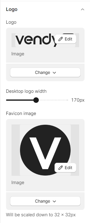
Logo
Enhance your online store's branding by incorporating a logo. Your logo will be prominently displayed in the following areas:
- Header: Your logo will feature across all pages, providing a consistent and recognizable identity for your business.
- Password Page: The logo will also be showcased on the password page, ensuring a cohesive branding experience even during account access.
You have the option to define a custom width for your desktop logo.
You can further strengthen your store's brand by adding a favorites icon, commonly known as a favicon.
Note: The recommended size for a favicon is 32 x 32 px. Larger images might be scaled down to 32 x 32 px.
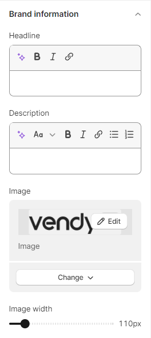
Brand Information
Feel free to incorporate details about your brand. You have the option to place the brand information block within your website's footer.
You can customize headline, description, and set an image that will be displayed in the footer area of your Shopify store.
Within the image width area, simply toggle the slider to choose the exact pixel width you prefer.
Colors
In this section, you choose the colors for your site. The colors must be specified in hexadecimal format (for example, #aabbcc). Also, it is possible to select a color from a palette provided.
The section includes such subsections: Primary Colors, Secondary Colors.
- Primary Color in a Shopify theme refers to the main color that sets the tone and identity of the store. It is the dominant color used throughout the website, including the header, navigation, buttons, links, and various other elements. Choosing the right primary color is crucial because it creates a strong visual association with your brand and helps in establishing recognition and trust among your customers.
- Secondary Color in a Shopify theme complements the primary color and adds depth to the overall design. It is usually used for accents, highlights, and other smaller design elements that help enhance the visual appeal of the website. The secondary color can be used for things like hover effects, icons, borders, and other interactive elements.
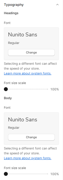
Typography
Typography is a crucial aspect of web design, as it directly impacts the readability, visual appeal, and overall user experience of a website. In Shopify theme settings, you have the ability to customize the typography for headings and body text, allowing you to create a consistent and harmonious design that aligns with your brand identity and enhances the presentation of your content.
You can modify the following settings:
Headings
- Heading Font Family: Shopify typically provides a selection of web-safe fonts, Google Fonts, or custom font uploads to choose from. The font family you select for your headings should reflect the tone and personality of your brand. For instance, a modern, minimalist brand might opt for a clean and sleek font, while a playful brand might choose something more whimsical.
- Font size scale: can vary depending on the importance of the content. For example, the main page title may be larger than subheadings or section titles. Striking the right balance ensures that headings are noticeable without overwhelming the reader.
Body
- Font Family: Similar to headings, you have the flexibility to choose a font family for your body text. Ensure that the font is easy to read, even at smaller sizes, to enhance the overall reading experience.
- Font Size Scale: for body text should strike a balance between readability and aesthetics. Too small, and it becomes difficult to read, too large, and it may look unprofessional.
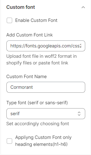
Custom font
Custom fonts in a Shopify theme setting allow store owners to personalize the typography of their online store, enhancing its overall appearance and branding.
By integrating custom fonts, you can maintain consistency with your brand identity and create a unique shopping experience for your customers.
- Enable Custom Font: firstly, it is necessary to enable the custom font you want to add to your Shopify store.
- Add Custom Font Link: add your font file in the WOFF2 format to your Shopify files, or simply paste the font link.
- Custom Font Name: set the title of the custom font.
- Type font (serif or sans-serif): select an appropriate font accordingly.
- Applying Custom Font only for heading elements(h1-h6).
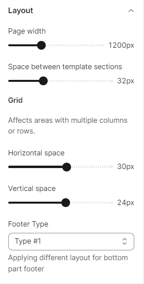
Layout
Through the use of layout settings, you can establish the maximum width at which your online store will be presented.
Applies to all pages except custom Zemez sections, as they have their own settings.
- Page width.
- Space between template sections.
- Grid - when employing a Grid layout, utilize the Horizontal Space and Vertical Space range sliders to introduce space between the content within the grid.
- Horizontal space.
- Vertical space.
- Footer Type - implementing a distinct layout for the footer's bottom section.
Important: Footer design settings are selected in the 'layout footer type'. This applies only to the footer area.
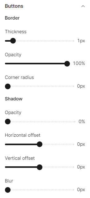
Buttons
Enhance your online store's call to action buttons by personalizing their settings. Add shadows, modify spacing or opacity, and tailor the button shape to suit your preferences.
- Border - you can set the button boarders including its thickness, opacity, and corner radius.
- Shadow you can set the button shadow including its opacity, horizontal and vertical offset, blur.
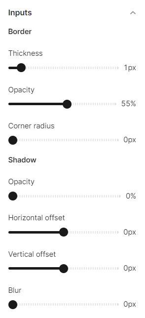
Inputs
Inputs refer to interactive areas that prompt customer engagement, such as quantity selectors, email signup forms, or cart notes. You have the flexibility to customize the visual aspects of these input elements within the theme settings of your online store.
- Border - you can set the inputs boarders including its thickness, opacity, and corner radius.
- Shadow you can set the inputs shadow including its opacity, horizontal and vertical offset, blur.
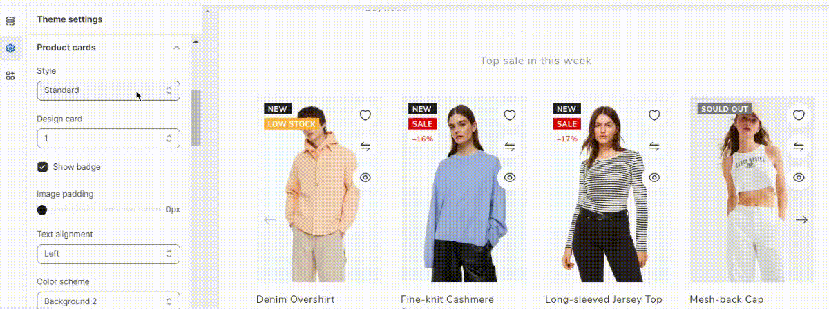
Product Cards
Product cards are a great way to showcase your products on the front page of your Shopify store. You can set different options for your product cards. It's really important to customize it to your brand and give the ability to people to add to cart products directly from the homepage.
Product cards are applied to all Style Card sections, on all product and collection pages.
However, the card design is applied to collection and search pages, but not to the sections. Each section has its own unique design.
Except for the product card style and design, you have the flexibility to set the image padding, choose text alignment, and select a olor scheme. Additionally, you can customize the product card's border and shadow settings.
Card variants url option refers to the ability to use different URLs for various card variants in a product or collection. With this feature, you can assign unique URLs to each variant of a card, allowing users to access specific variations of the product or collection directly through distinct links. This is particularly useful for e-commerce websites or platforms that offer different product options (e.g., colors, sizes) as separate variants, and each variant might have its own dedicated page or view.
You can set the text size and color, choose variant type link (only color, only size, only color+size, or all variants), and set the variants limit.
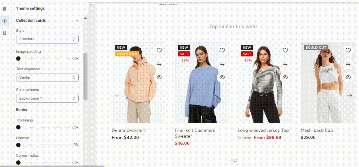
Collection Cards
With this feature, you can effortlessly customize the collection card images used in your Shopify store.
Collection cards are applied to the collection list page, but in the 'collection list' section, there are its own settings.
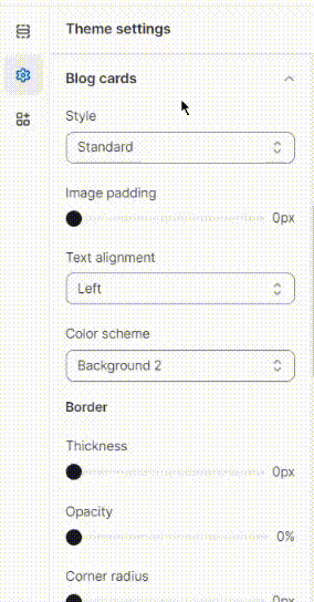
Blog Cards
Product cards are a great way to showcase your products on the front page of your Shopify store. You can set different options for your product cards. It's really important to customize it to your brand and give the ability to people to add to cart products directly from the homepage.
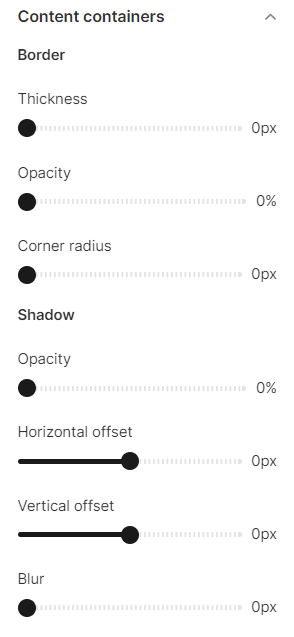
Content Containers
Content containers are essential for organizing and customizing text sections on webpages. They hold content like slideshows, banners, or columns, allowing you to create a visually appealing online store. Customize them to match your brand's style and maintain a clean, organized look for better user experience.
- Border - you can set the inputs boarders including its thickness, opacity, and corner radius.
- Shadow you can set the inputs shadow including its opacity, horizontal and vertical offset, blur.
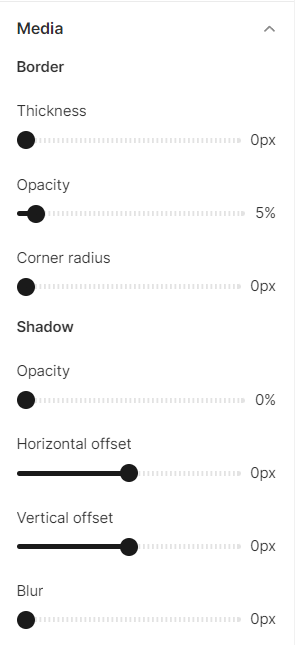
Media
Media refers to the visual elements within sections, such as product images or the pictures used in Image with Text sections. You have the option to enhance your media by adding borders and shadows.
- Border - you can set the inputs boarders including its thickness, opacity, and corner radius.
- Shadow you can set the inputs shadow including its opacity, horizontal and vertical offset, blur.
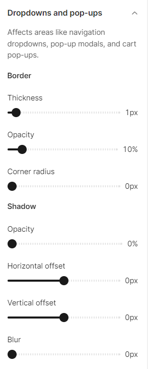
Dropdown and popups
Modify the look of navigation drop-downs, pop-up modals, and cart pop-ups.
Affects areas like navigation dropdowns, pop-up modals, and cart pop-ups.
- Border - you can set the inputs boarders including its thickness, opacity, and corner radius.
- Shadow you can set the inputs shadow including its opacity, horizontal and vertical offset, blur.
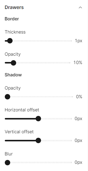
Drawers
Drawers represent concealed, interactive compartments that materialize and vanish upon tapping or clicking. These can include elements like collapsible navigation menus or filter options, providing a seamless user experience.
- Border - you can set the inputs boarders including its thickness and opacity.
- Shadow you can set the inputs shadow including its opacity, horizontal and vertical offset, blur.
Badges
Badges are employed to notify merchants about the status of an object or an action that has been taken.
When the price drops or the inventory count reaches 0, Sale and Sold out badges are automatically applied to your product images. You have the flexibility to customize the position, shape, and color of these badges.
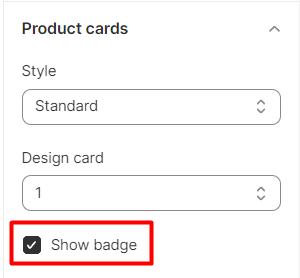
By default, there are two badges: 'Sale' and 'Sold Out'. They are only displayed on product cards.
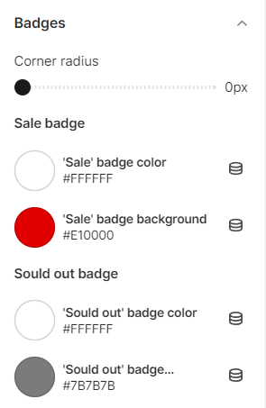
To display badges on the Collection, and Search page, return to Products Cards theme settings and check the box on the Show Badge, so that it appears on the collection and search page. To display them here, check the box.
Create a custom badge
1. In the Online Store 2.0 theme, it is possible to create additianaly 2 custom badges.
2. To create a new badge, go to the desired product. In the tag section and a new one (for example "online").
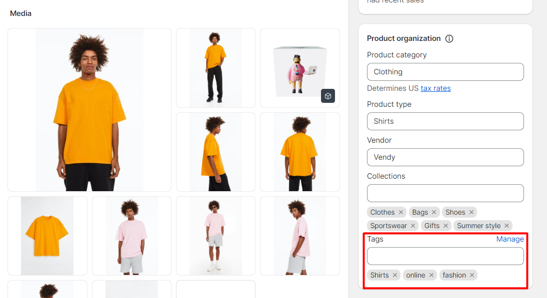
3. Go back to Theme Settings -> Badge -> Custom badge and check the box for Show custom badge 1.
4. Then, duplicate the name of the new badge (e.g. "online") that you have settled on the desired product before, and enter the text you want to display, for example, "online only" - the text that will appear on the label on the front.
Wishlist
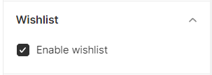
A wishlist is an eCommerce feature that allows shoppers to create personalized collections of products they want to buy.
Enable Wishlist
Activate the Enable wishlist option to use the "Wishlist" functionality for your store by checking the box. It is turned on by default.
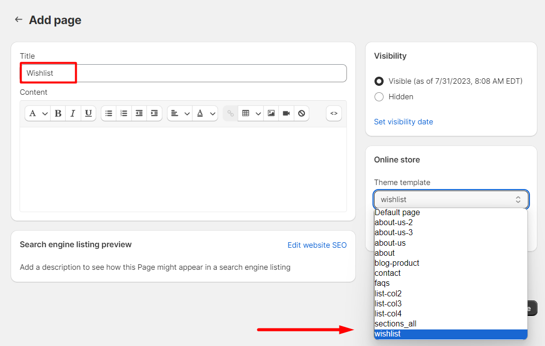
Create a new (Wishlist) page
1. Go to Online Store -> Pages and add page.
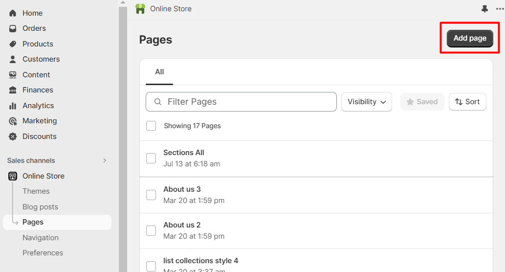
2. Add the title “Wishlist” and assign the “Wishlist” template.
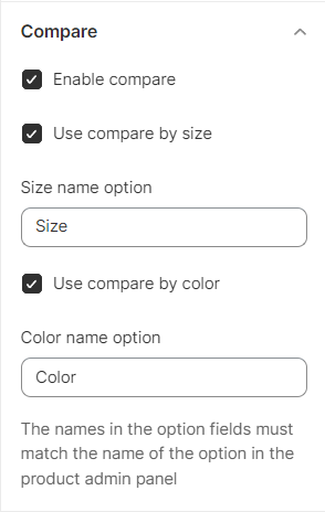
Compare
Product compare allows you to showcase a selected list of products side by side. This is convenient if buyers want to compare the main characteristics visually.
In this section you can choose what product options – size and/or color – should be used for the comparison.
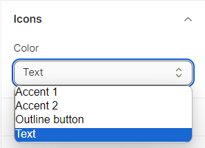
Icons
Icons are diminutive images that can be incorporated into specific sections or blocks.
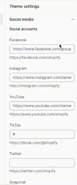
Social Media
Enhance your online store's social presence by incorporating social sharing buttons for both your products and blog posts, along with direct links to your various social media accounts.
Your customers will be able to conveniently share your products and posts with their networks, and they'll find easy access to your social media profiles conveniently placed in the footer of your website.
It is possible to add such social accounts as:
- YouTube
- TikTok
- Snapchat
- Tumblr
- Vimeo
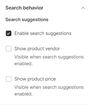
Search behavior
The Online Store incorporates a predictive search feature that presents helpful suggestions as customers begin typing into the search field.
These search suggestions serve to assist customers in expressing and enhancing their search queries, offering novel avenues to explore the offerings within the online store. Additionally, this functionality enables customers to swiftly browse potential matches without having to navigate away from their current page to view a separate list of search results.
Following options are available to set:
- Enable search suggestions.
- Show product vendor.
- Show product price.
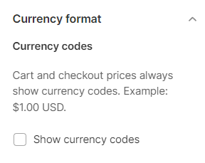
Currency Format
There is an option to display currency codes for product, cart, and checkout prices at all times.
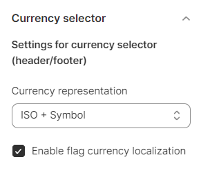
Currency Selector
Before you start setting currency options, check the official information on how to manage markets.
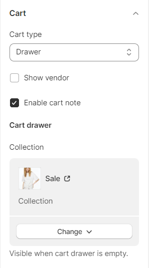
Cart
There is a flexibility to customize the cart's appearance on your online store.
Once a customer adds a product to their cart, it can be displayed as a drawer, a page, or a pop-up notification. Additionally, when the customer's cart is empty, you have the option to showcase a featured collection within the cart drawer.
The following settings are available:
- Cart type - you can choose the way to display the cart in your store as a drawer, separate page, or as a popup notification.
- Show vendor - enable/disable the option to display the vendor information.
- Cart drawer - collection can be visible when cart drawer is empty.
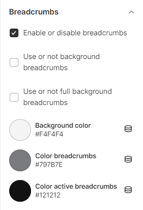
Breadcrumbs
Breadcrumbs, or a breadcrumb navigation, can reduce the number of actions a visitor needs to take in order to navigate to a higher-level page, and improve the discoverability of a website's sections and pages.
Here you can enable/disable the breadcrumbs option in your Shopify store. Also, you can activate: use or not background breadcrumbs and full background breadcrumbs options and set the breadcrumbs colors.
Checkout
This section presents the appearance settings for the order page. You can customize the banner, logo, page title, as well as the buttons color.
Let's review the Checkout configuration:
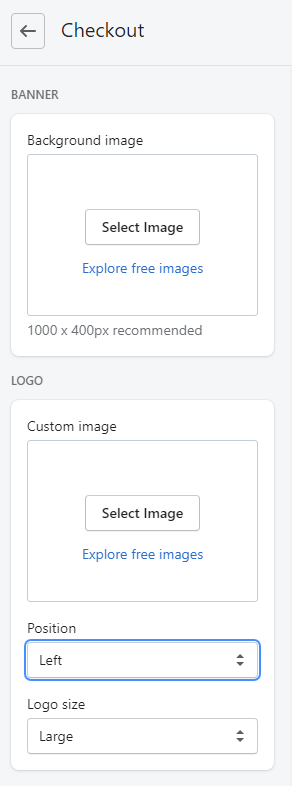
- Banner - set a background image. The recommended size is 1000 x 400px. You can upload image from your computer or select image from your library.
- Logo - set a custom image for Logo. You can upload image from your computer or select
image from your library.
- Position (Logo position) - select a suitable Logo position from the option dropdown (Left/Center/Right).
- Logo size - select a suitable Logo size from the option dropdown (Small/Medium/Large).
Main content area:
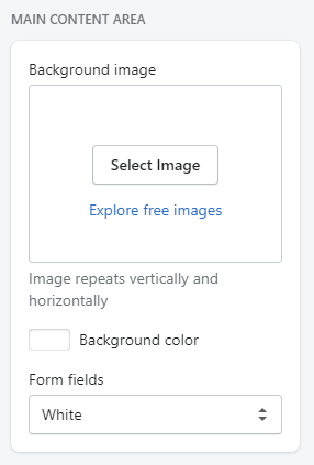
- Background image - set a background image. You can upload image from your computer or select image from your library. Image repeats vertically and horizontally.
- Background color - set a background image (in case Background image is disabled). You can select a color from the Color Palette.
- Form fields - use this field if you want to have Form fields white or transparent.
Order summary:
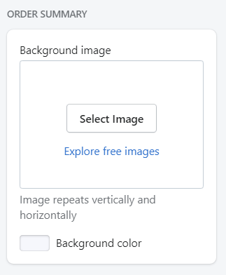
- Background image - set a background image. You can upload image from your computer or select image from your library. Image repeats vertically and horizontally.
- Background color - set a background color (in case Background image is disabled). You can select a color from the Color Palette.
Typography:
- Headings - choose a font family for headings from the dropdown.
- Body - choose a font family for the checkout main text from the dropdown.
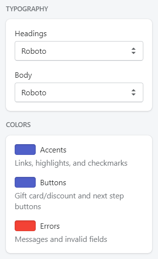
Colors:
- Accents - choose a color for links, highlights, and checkmarks. You can select a color from the Color Palette.
- Buttons - choose a color for gift card/discount and next step buttons. You can select a color from the Color Palette.
- Errors - choose a color for messages and invalid fields. You can select a color from the Color Palette.