Profimed
Widgets
Widgets are basic components of a website, which can be placed to different widget areas, for e.g. to sidebar, header, footer, before or after content, or any other custom area.
Widgets have different functions and can be set and tuned up in Customizer > Widgets tab.
About
This widget is used to display information about your site.

-
- title
- widget's text title;
-
- logo
- you can select a logo for the widget;
-
- enable tagline
- enable/disable tagline;
-
- content
- add content to this field.
About Author
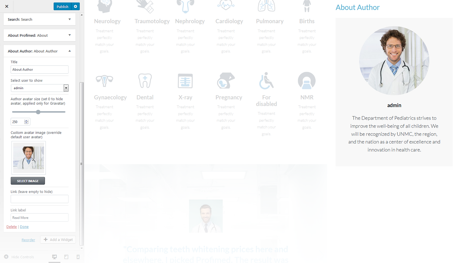
This widget is used to display blog author information.
-
- title
- widgets text title;
-
- select user to show
- you can select a user / author from a dropdown list to show on the page;
-
- author avatar size
- here you can define the author avatar image size, set it to 0 to hide the avatar, it will be applied only to gravatar;
-
- custom avatar image
- here you can choose and upload the custom author avatar image;
-
- link
- here you can set a link, or leave it empty to hide;
-
- link label
- here you can set a link text.
Banner
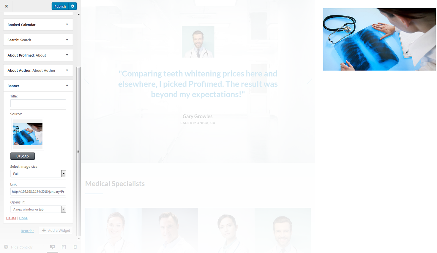
This widget is designed to add banners to the website.
-
- source
- choose the source image for the banner;
-
- link
- this option allows you to add a link to a particular banner. Hover on a thumbnail in the customizer and click the button in the middle of it to specify the address;
-
- open in
- specify whether to open the link in a current window or in a new one.
Contact Information
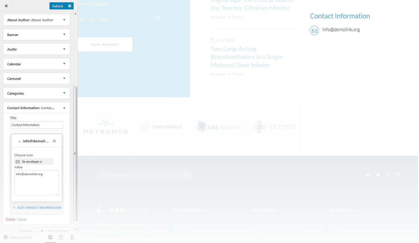
This widget is used to display contact information of the page.
-
- title
- this property specifies the contact box title;
-
- choose icon
- select icon for a contact item;
-
- value
- enter the value for a contact item.
Custom Posts
This widget is used to setup and display custom posts.
-
- title
- this property specifies the widget title;
-
- choose taxonomy type
- select a proper taxonomy type. You can choose from Category, Tag, Post Format;
-
- category
- select the category from which the posts will be displayed;
-
- tag
- specify the tag to display posts;
-
- post format
- specify the post format;
-
- posts count
- here you can define the number of posts to display;
-
- offset post
- this property specifies the number of posts to displace or pass over;
-
- title words length
- this property sets the number of words limit for post's title. Set 0 to hide title;
-
- excerpt words length
- this property sets the number of excerpt words;
-
- display post meta data
- this feature adds meta data to the post;
-
- post read more button label
- add text to the Read More button.
Elementor Template
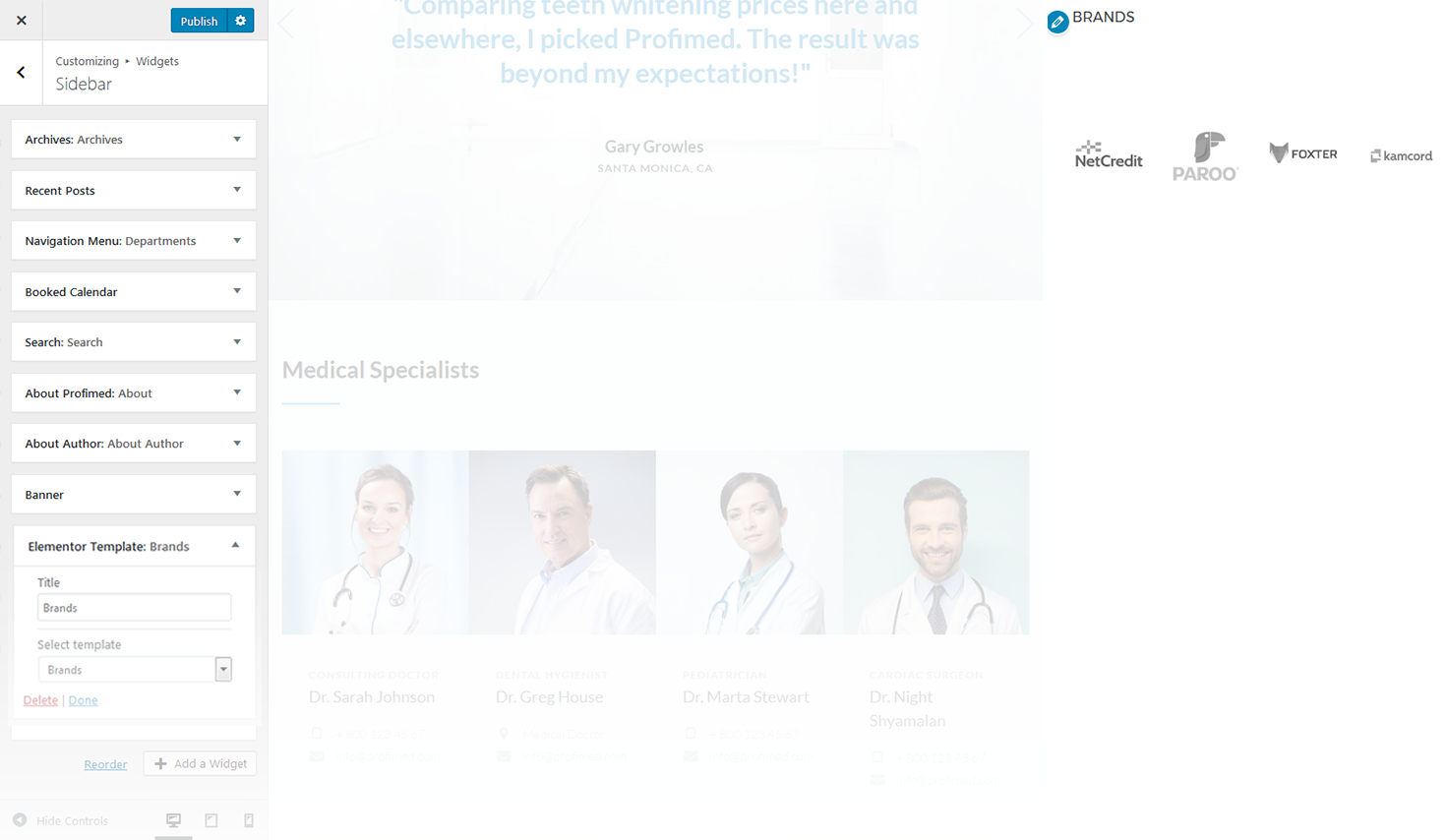
This widget displays Elementor Templates.
-
- title
- this property specifies the title of the widget;
-
- select template
- here you can select any of the predesigned Elementor templates.
Featured Posts Block
This widget is used to display featured post block information.

Post Meta:
- show post title;
- show post excerpt;
- show post categories;
- show post tags;
- show post author;
- show post date;
- show post comments count.
Excerpt Length
This property sets the number of symbols limit for excerpt.
Image Grid
This widget is used to display the image grid. By default, you have to select an appropriate category or tags in order to display the grid.

-
- widget title
- this property specifies the widget title;
-
- choose taxonomy type
- here you can define the items selection source: by category or tag;
-
- select category to show
- exact category to display posts from;
-
- select tags to show
- exact tag to display posts from;
-
- post sorted
- this property specifies how to sort out the posts on display;
-
- posts number
- defines the number of posts/images displayed;
-
- offset post
- this property specifies the number of post to displace or pass over;
-
- title words length
- this property sets the number of words limit for post's title. Set 0 to hide title;
-
- columns number
- here you can define the number of columns to display the images (up to 4). If you want to display the widget in the sidebar, you can display it only in one column;
-
- items padding ( size in pixels )
- this property specifies the distance between the elements in pixels.
News Smart Box
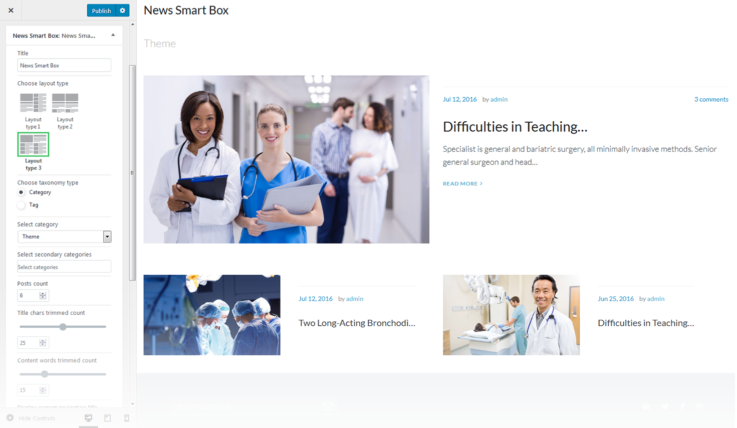
This widget is used to setup and display the news box.
-
- widget title
- this property specifies the widget title;
-
- choose layout type
- here you can select the layout pattern for the page with custom news box layout;
-
- choose taxonomy type
- here you can define the items selection source: by category or tag;
-
- select category
- exact category to use for news items display;
-
- select tag
- exact tag to use for news items display;
-
- main color
- here you can define the text color for the news block;
-
- posts count
- here you can define the number of posts to display;
-
- content words trimmed count
- specify the content words limit.
Playlist Slider
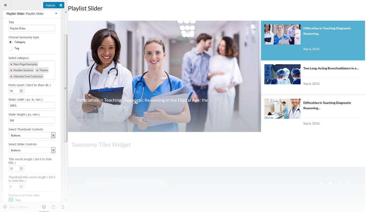
This widget is used to setup and display a playlist slider on the website.
-
- title
- this property specifies the widget title;
-
- choose taxonomy type
- here you can define the items selection source: by category or tag;
-
- category
- here you can select the categories to pull slides from;
-
- tag
- here you can select the tags to pull slides from;
-
- posts count
- this property defines the number of posts / slides to display;
-
- slider width
- specify the slider width;
-
- slider heigh
- specify the slider heigh;
-
- select thumbnail controls
- hide/show thumbnail controls;
-
- select slider controls
- hide/show slider controls;
-
- title words length
- specify the title length;
-
- display post meta data
- specify the post meta data you want to display.
Taxonomy Tiles
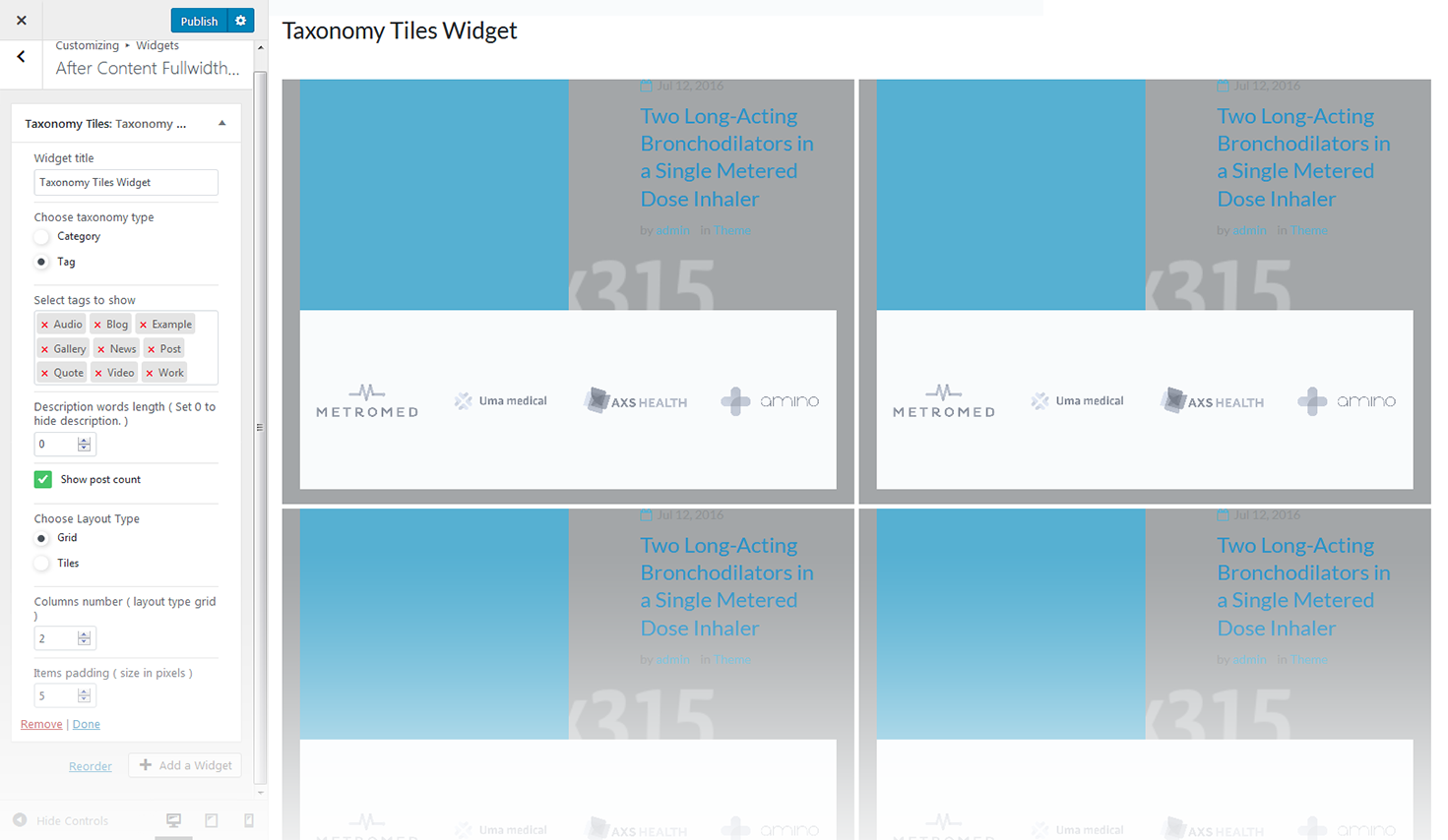
This widget is used to setup and display the categories.
-
- widget title
- this property specifies the widget title;
-
- choose taxonomy type
- here you can define the items selection source: by category or tag;
-
- select category to show
- exact category to use for posts display;
-
- select tags to show
- exact tag to use for posts display;
-
- description words length
- specify the description words length;
-
- show post count
- hide/show information on the number of posts in the selected category;
-
- columns number
- here you can define the number of columns to display category or tag content (up to 4);
-
- tiles first item
- Hhre you can define whether to Hide/Show magnified first item tile in the beginning;
-
- items padding ( size in pixels )
- this property specifies the distance between the category or tag elements in px.
Archives
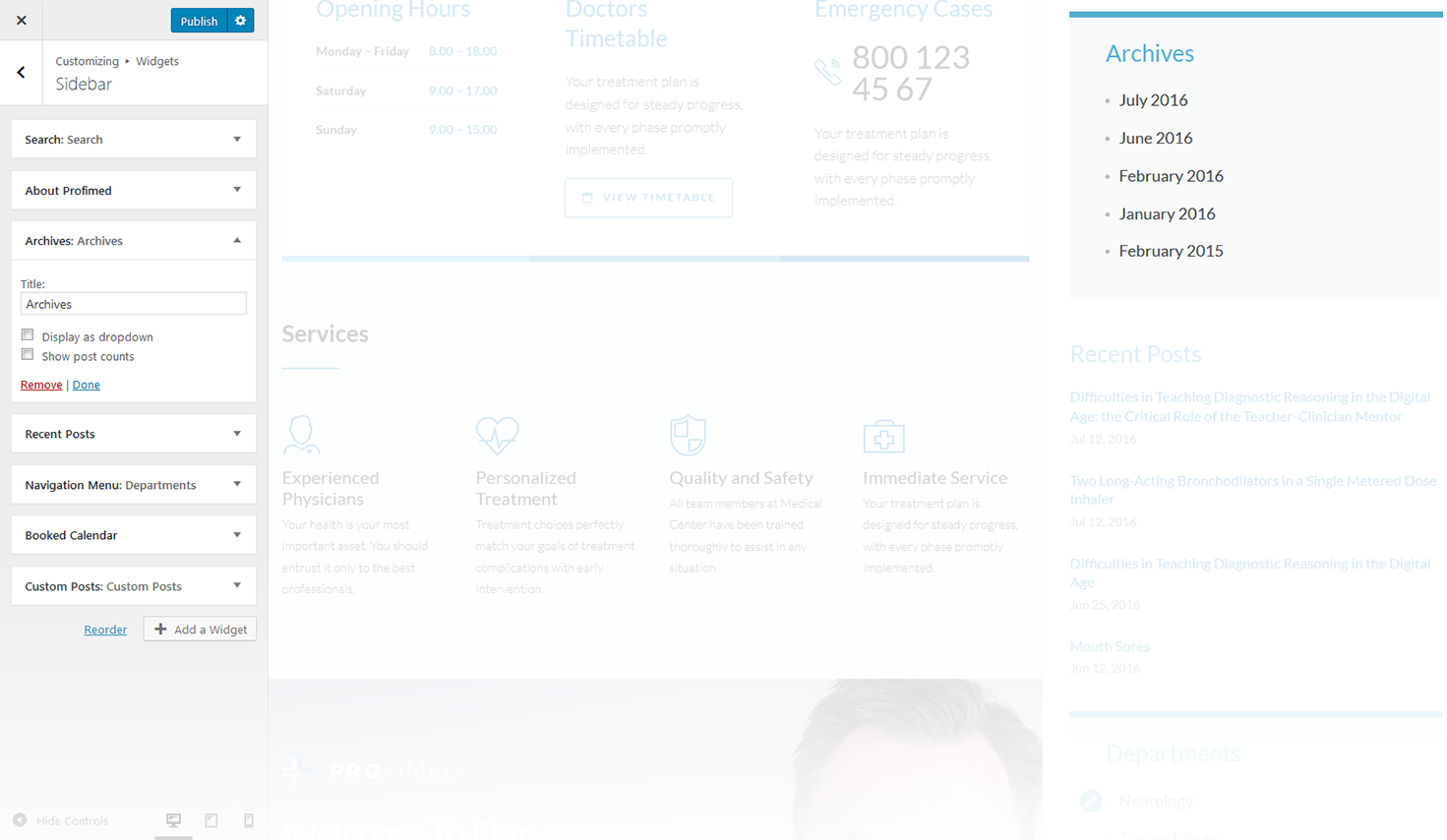
This widget is designed to display archives.
-
- title
- enter the title of the widget;
-
- display as dropdown
- this option allows to display the categories as a dropdown list;
-
- show post counts
- show/hide post counts.
Audio
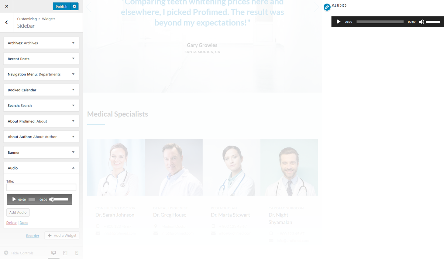
This widget allows to display video player.
-
- widget title
- this property specifies the widget title;
-
- add audio
- here you can select the audio-file from media library;
-
- edit audio
- allows to make chages in audio-file's details;
-
- replace audio
- here you can select another audio-file and replace the existing one.
Calendar
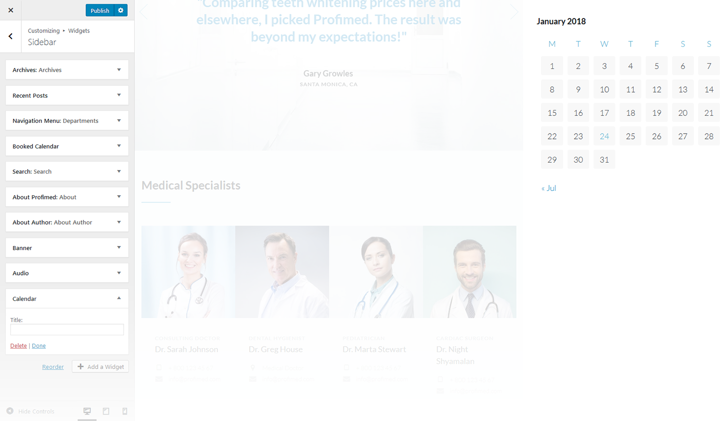
This widget is designed to display calendar.
-
- title
- enter the title of the widget.
Categories
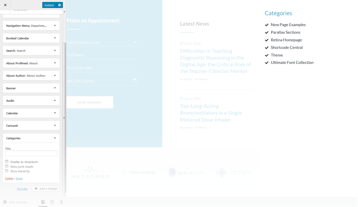
This widget is used to setup and display categories.
-
- title
- this property specifies the widget title;
-
- display as dropdown
- this option allows to display the categories as a dropdown list;
-
- show post counts
- show/hide post counts;
-
- show hierarchy
- show hierarchy.
Navigation Menu
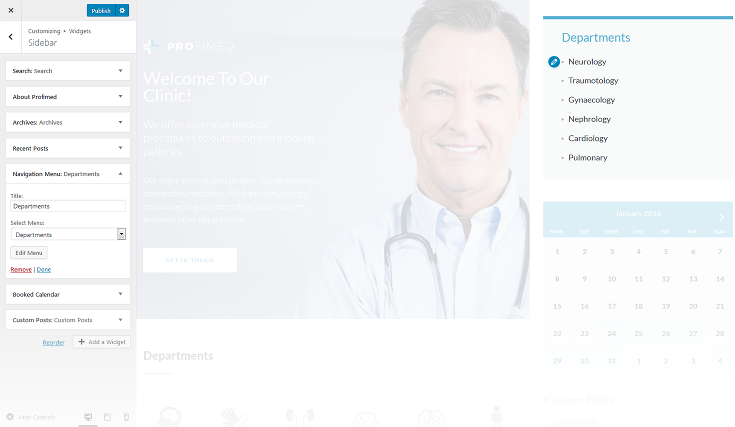
This widget allows you to add navigation menu to the sidebar.
-
- title
- this property specifies the title of the widget;
-
- select menu
- here you can select any of the predesigned menus.
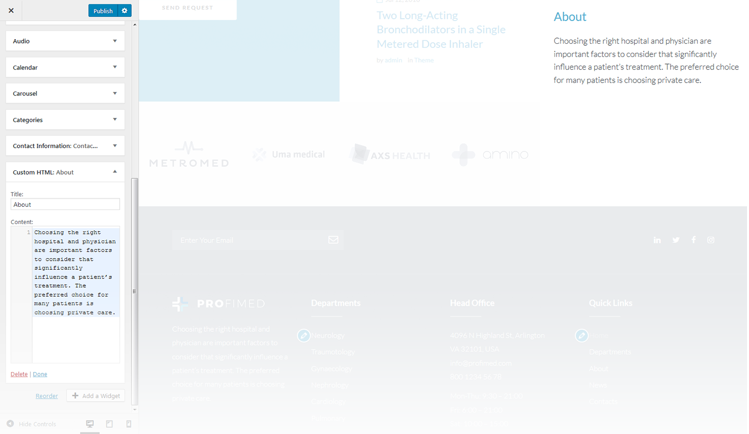
Custom HTML
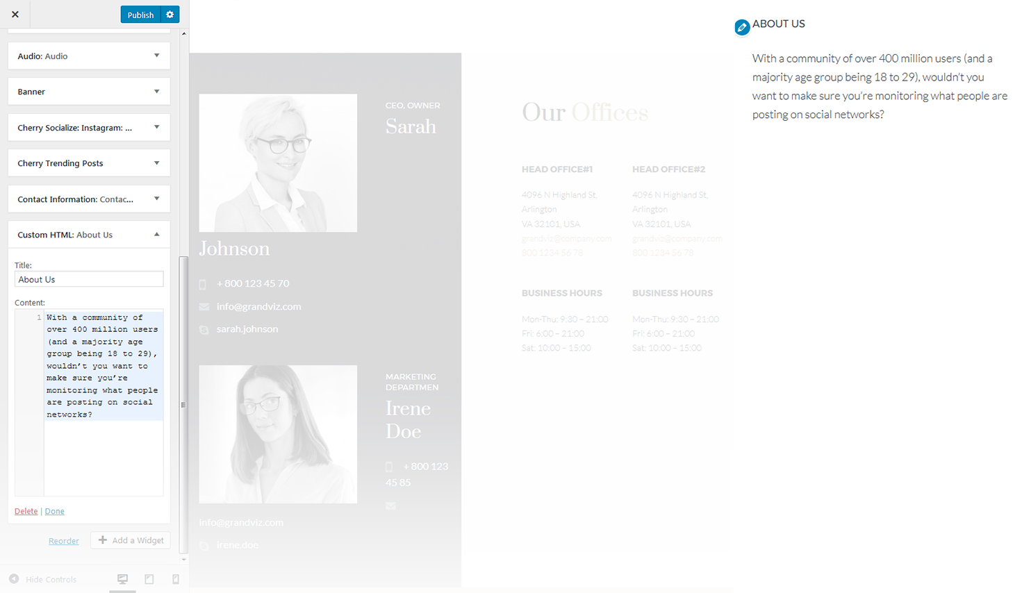
The widget widget allows adding arbitrary HTML to your sidebar and helps to create a custom widget.
-
- title
- this property specifies the widget title;
-
- content
- insert any kind of content.
Meta
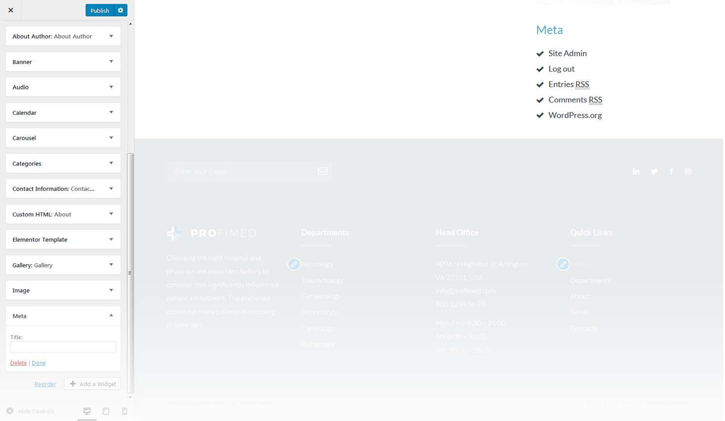
The widget is used to show 5 standard links.
-
- title
- this property specifies the widget title.
Gallery
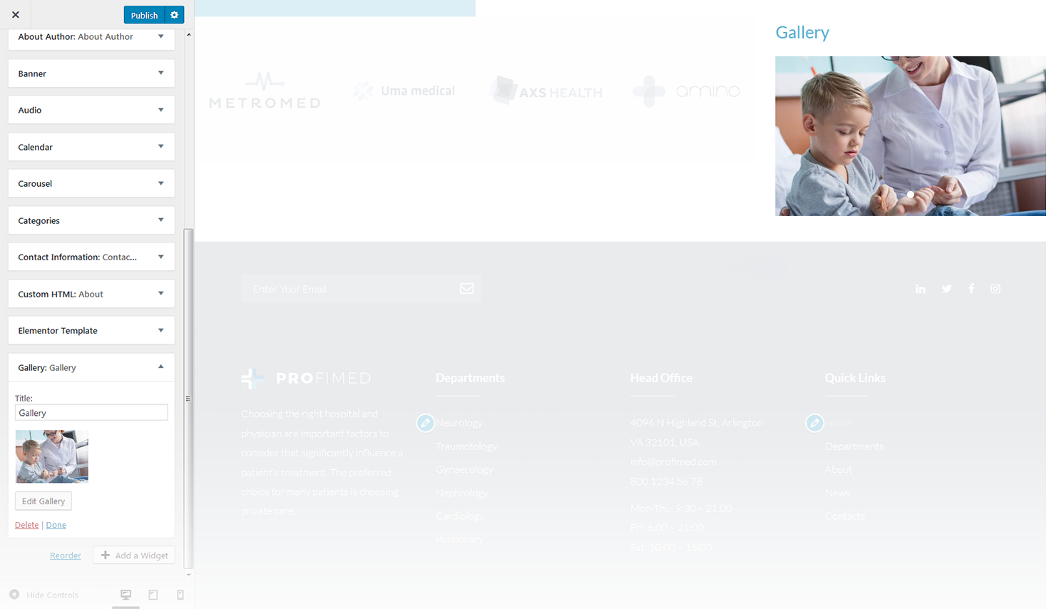
This widget is used to create and display the image gallery.
-
- title
- this property specifies the widget title;
-
- add images
- here you can select images from Media Library and add them to the gallery you have created.
Image
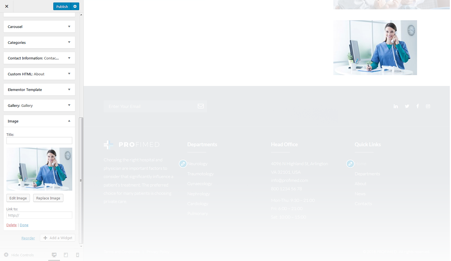
This widget provides you with a simple way to display an image in your blog’s sidebar.
-
- widget title
- this property specifies the widget title;
-
- add image
- here you can select the image from media library;
-
- edit image
- allows to make chages in image's disply options and advanced options;
-
- replace image
- here you can select another image and replace the existing one.
Pages
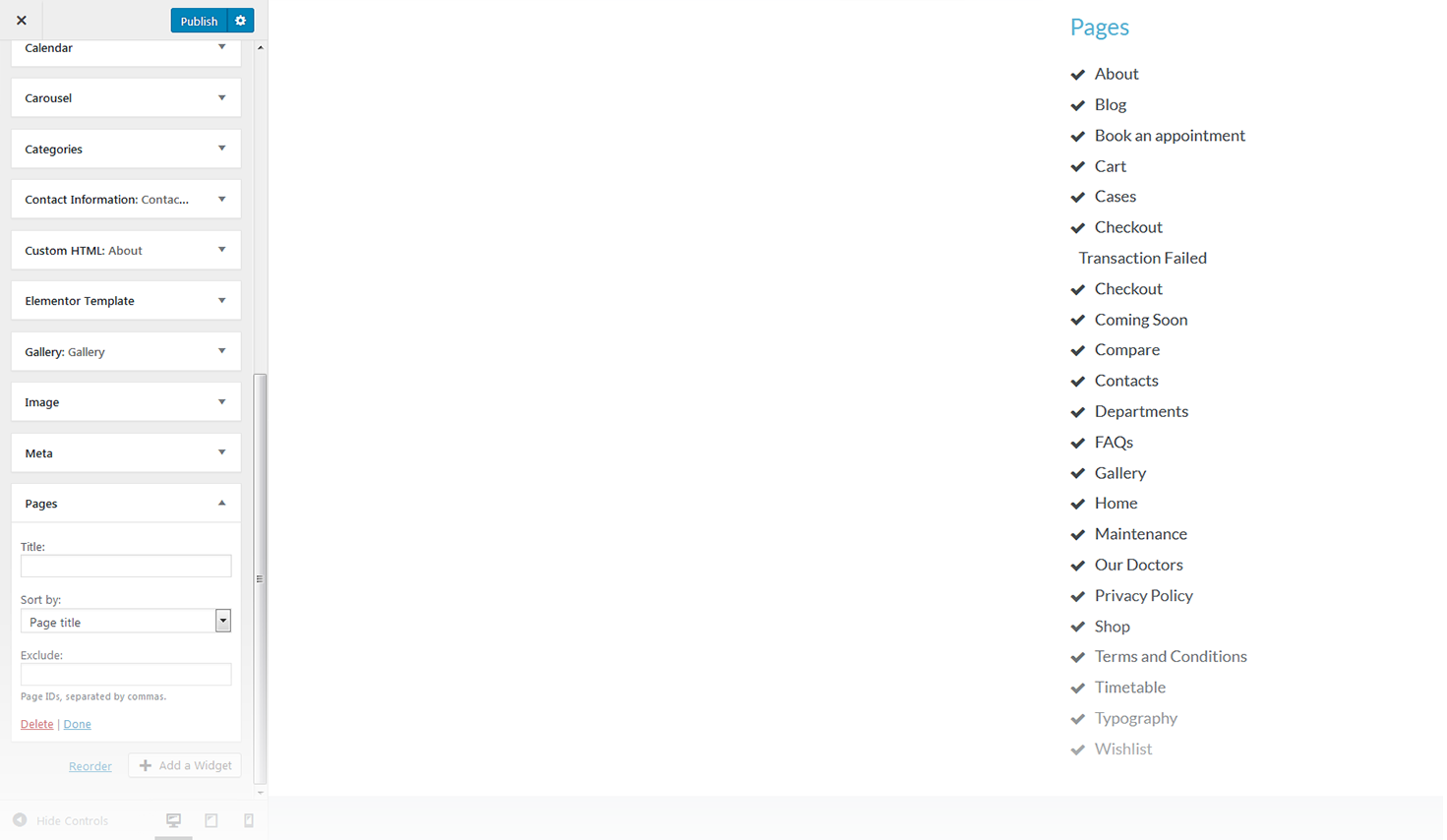
This widget displays a full list of pages of your site.
-
- title
- this property specifies the widget title;
-
- sort by
- this option allows to sort the pages by page title, page order or page ID;
-
- exclude
- specify the IDs of the pages you want to exclude.
Recent Comments
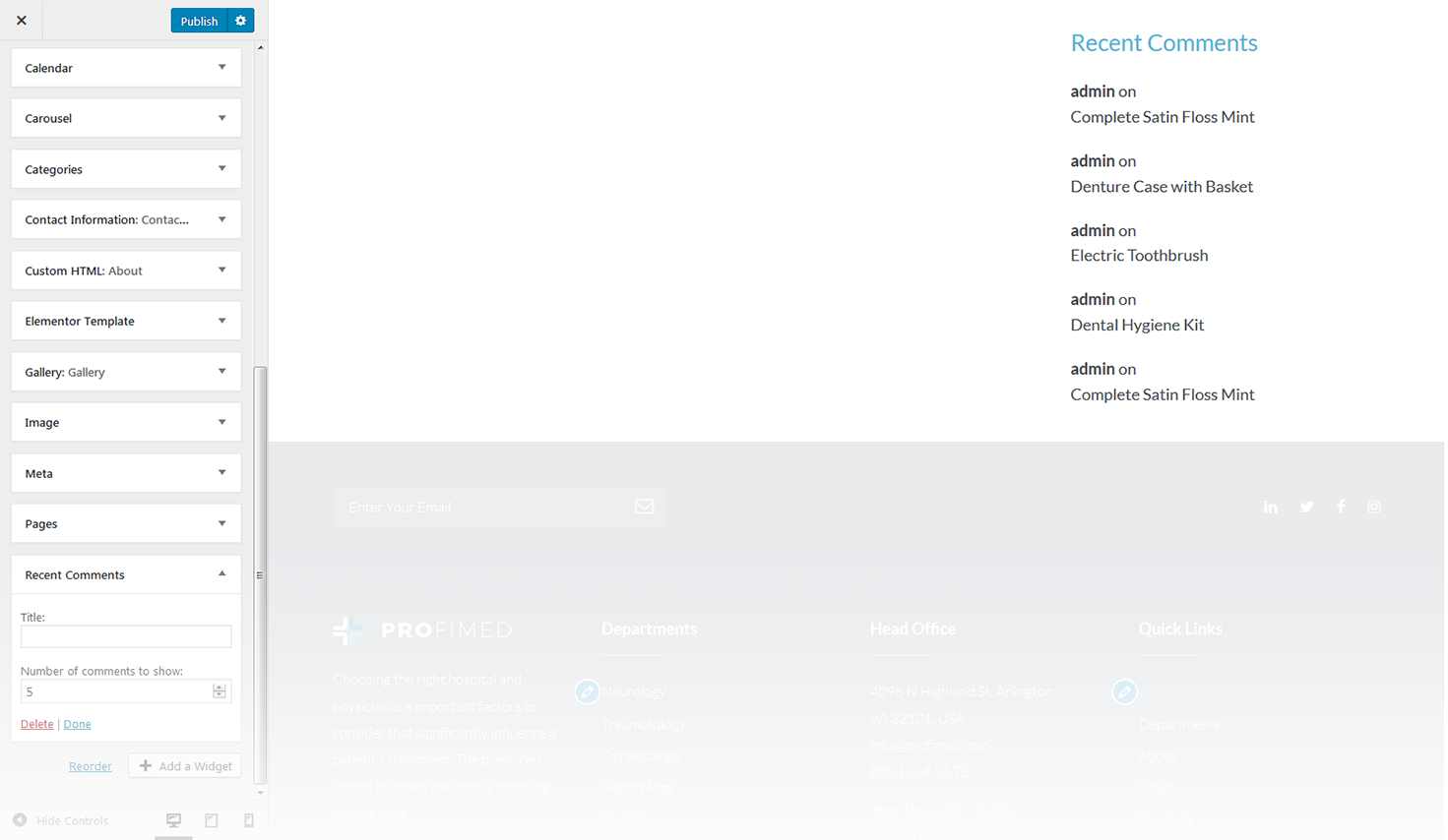
This widget is used to display the recent comments to the posts on the homepage.
-
- title
- this property specifies the widget title;
-
- number of comments to show
- this property allows you to change the number of the displayed comments.
Recent Posts
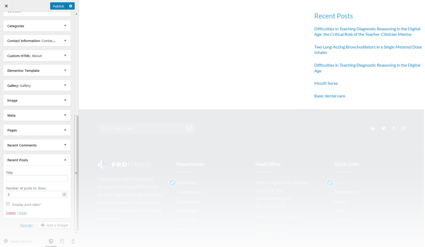
This widget is used to display recent posts on the homepage.
-
- title
- this property specifies the widget title;
-
- number of posts to show
- this property allows you to change the number of the displayed posts;
-
- display post date
- show/hide post date.
RSS
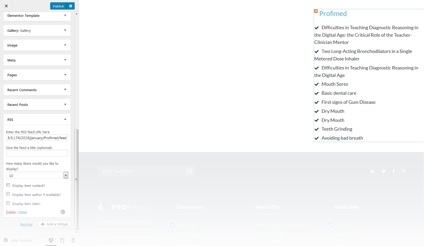
The widget is used to display RSS feeds on the website.
-
- enter the RSS feed URL here
- specify the RSS feed URL;
-
- give the feed a title (optional)
- specify the title;
-
- how many items would you like to display
- specify the number of items displayed;
-
- display item content
- show/hide item content;
-
- display item author if available
- show/hide item author;
-
- display item date
- show/hide item date.
Search
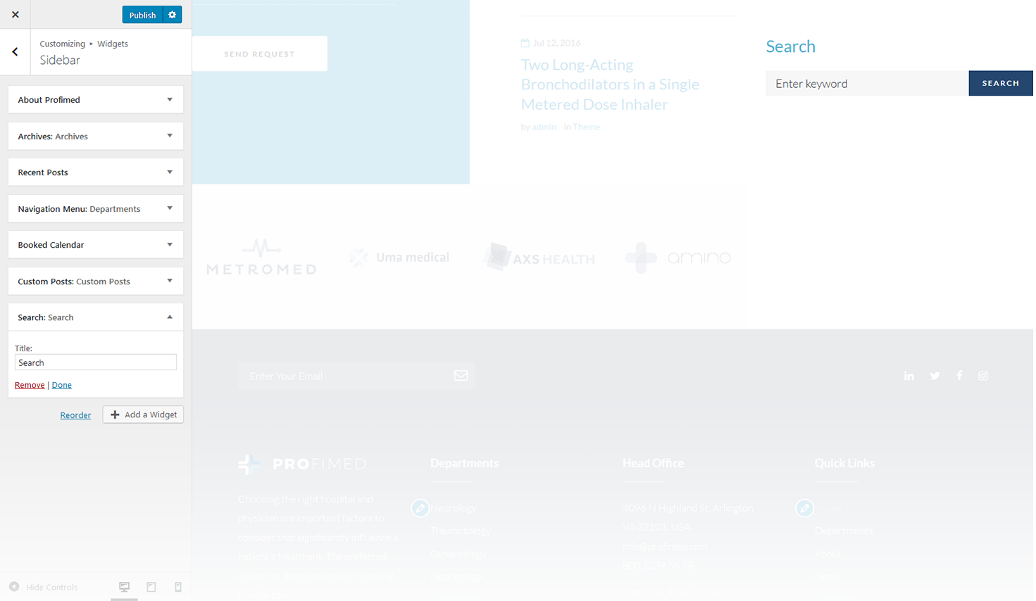
This widget adds a search field to the page.
-
- title
- specify the widget title.
Tag Cloud
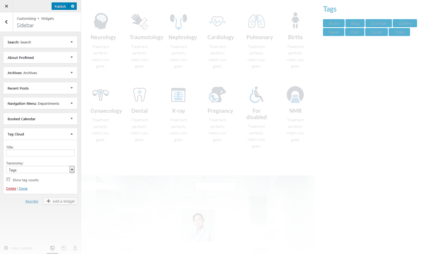
The widget allows you to display tag cloud on the website.
-
- title
- this property specifies the widget title;
-
- taxonomy
- choose a proper taxonomy type.
Text
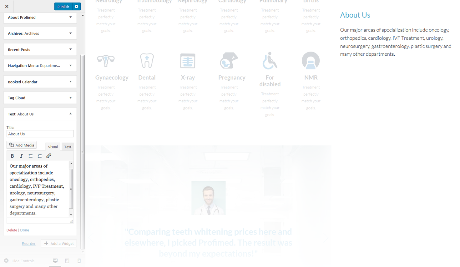
The widget allows you to display various text blocks, you can also use it to insert the shortcodes.
-
- title
- this property specifies the widget title;
-
- content
- insert any kind of content;
-
- automatically add paragraphs
- this option enables the Automatically add paragraphs function.
Video
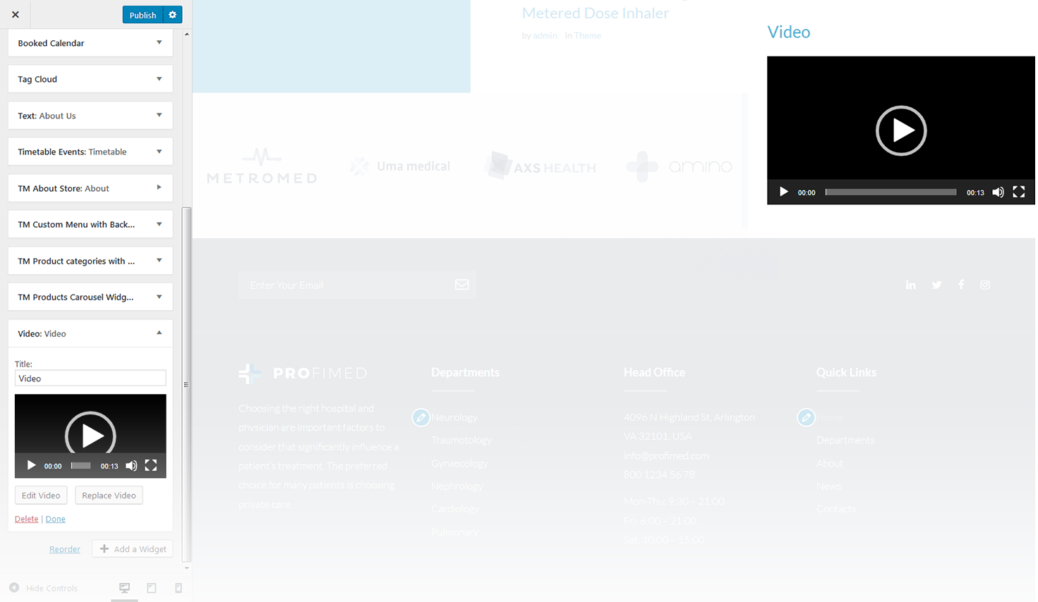
This widget allows to display video player from media library, YouTube, Vimeo, or another provider.
-
- widget title
- this property specifies the widget title;
-
- add video
- here you can select the video-file from media library;
-
- edit video
- allows to customize video details and add subtitles;
-
- replace video
- here you can select another video-file and replace the existing one.
Booked Calendar
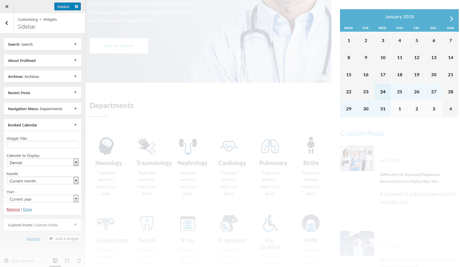
This widget is designed to display appointment calendar.
-
- title
- enter the title of the widget;
-
- calendar to display
- choose the calendar to display;
-
- month
- choose the month to display;
-
- year
- choose the year to display.
Smart Slider
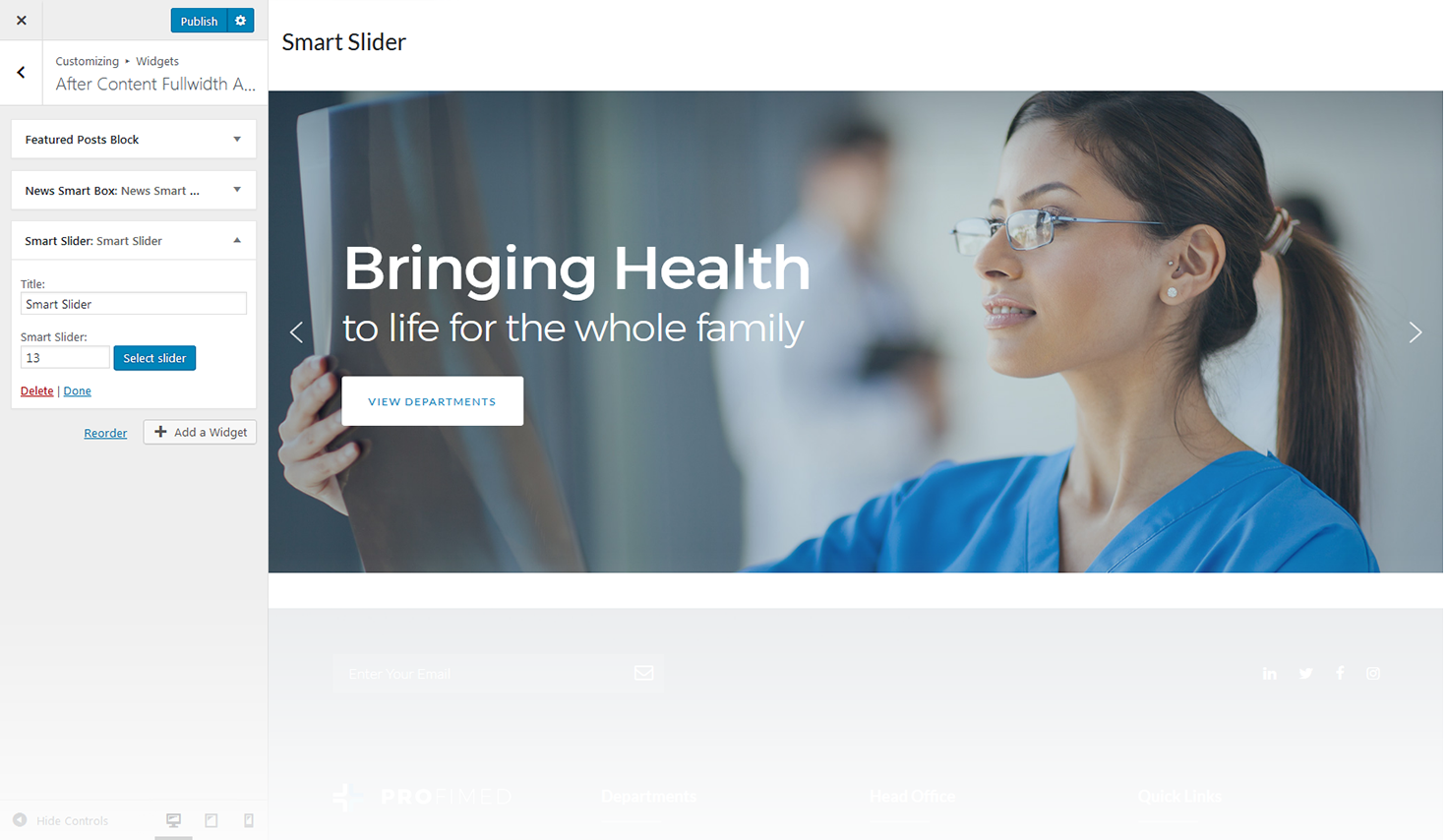
This widget is used to setup and display slider on the website.
-
- title
- this property specifies the widget title;
-
- choose taxonomy type
- select taxonomy type of the slides;
-
- select category
- here you can select category to pull the slides from;
-
- select tags
- here you can select tags to pull the slides from;
-
- posts count
- this property defines the number of posts / slides to display;
-
- display title
- here you can define whether to Hide/Show post's title in a slide;
-
- display content
- here you can define whether to Hide/Show post's content in a slide body;
-
- display more button
- here you can define whether to Hide/Show the Read More button;
-
- more button text
- read more button label;
-
- content words trimmed count
- this property defines the excerpt words limit by choosing the number of words from post's content;
-
- slider width
- this property defines the slider width;
-
- slider height
- this property defines the slider height;
-
- slider orientation
- this property specifies the slider orientation. Smart slider slides are automatically set up in Horizontal / Landscape slide orientation, but you can change the slide orientation to Portrait / Vertical Portrait slide orientation;
-
- slide distance(px)
- this property specifies the distance between slides in px;
-
- slide duration(ms)
- this property specifies slides duration (in ms) to trigger swipe to the next/previous slide during long swipes;
-
- use fade effect
- this property defines whether to enable / disable fade effect on sliding;
-
- use navigation
- here you can define whether to Hide/Show the navigation arrows;
-
- indicates whether the arrows will fade in only on hover
- this property specifies whether the arrows will fade in only on hover;
-
- use pagination
- here you can define whether to Hide/Show bullet navigation on slides;
-
- use autoplay
- this property specifies whether to enable / disable autoplaying for slides;
-
- display fullScreen button
- here you can define whether to Hide/Show full screen button to display slider in full screen mode. It is not available in WordPress customizer preview;
-
- indicates if the slides will be shuffled
- this property specifies whether to shuffle slides randomly. Disabled by default;
-
- use infinite scrolling
- this property specifies whether to enable/disable infinite scrolling on sliding;
-
- display thumbnails
- here you can define whether to Hide/Show slide thumbnails below the slider;
-
- display thumbnails arrows
- here you can define whether to Hide/Show arrows navigation for thumbnails;
-
- set the position of the thumbnail scroller
- this property sets the position of the thumbnail scroller. It is set to bottom by default.
TM About Store
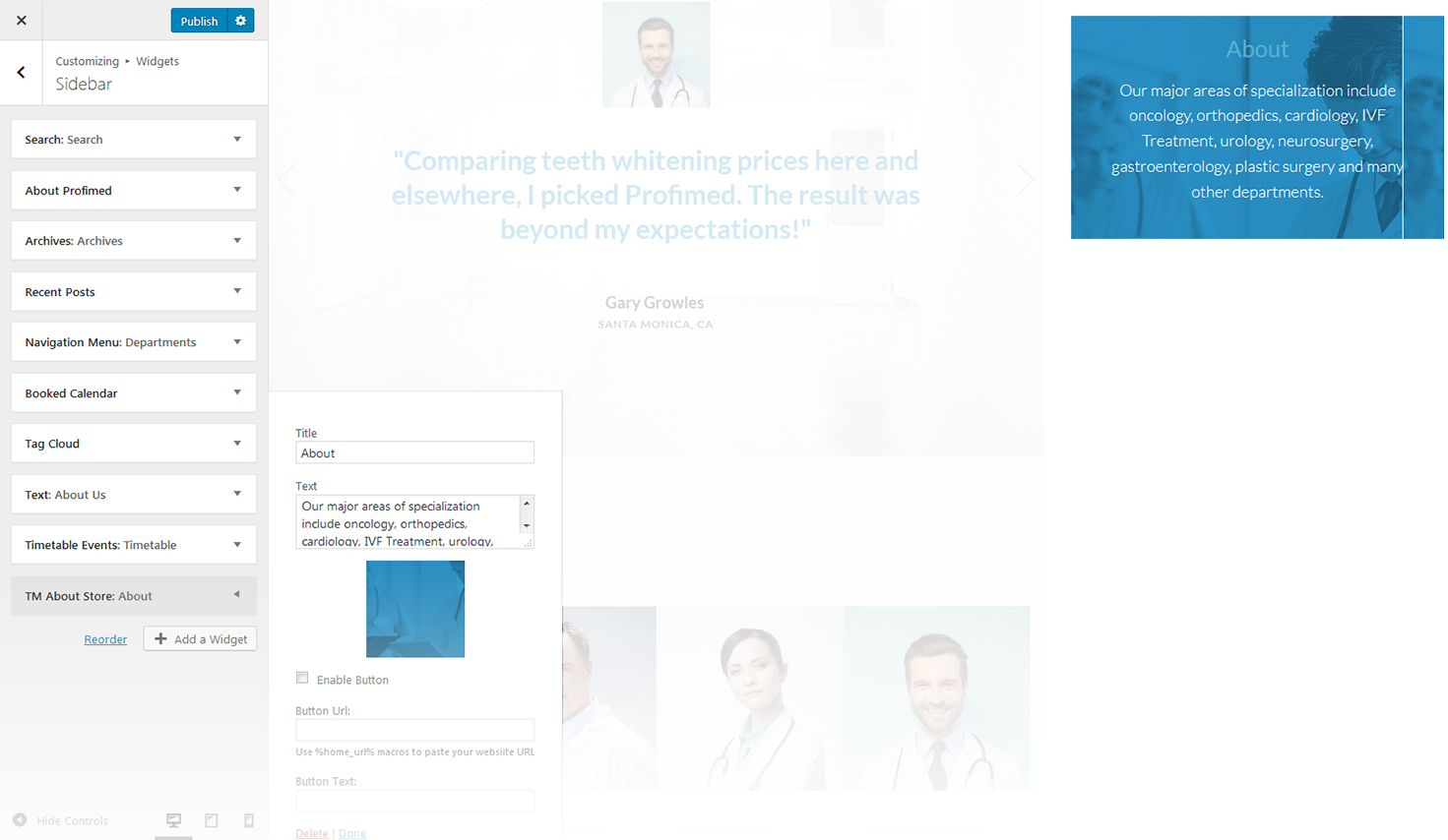
This widget is used to add store description
-
- title
- title of the widget;
-
- content
- insert a brief story of your business or any other information of the same kind;
-
- automatically add paragraphs
- this option adds paragraphs automatically;
-
- enable button
- adds button to the section;
-
- button url
- specify the URL address of the button;
-
- button text
- specify the button text.
TM Banners Grid
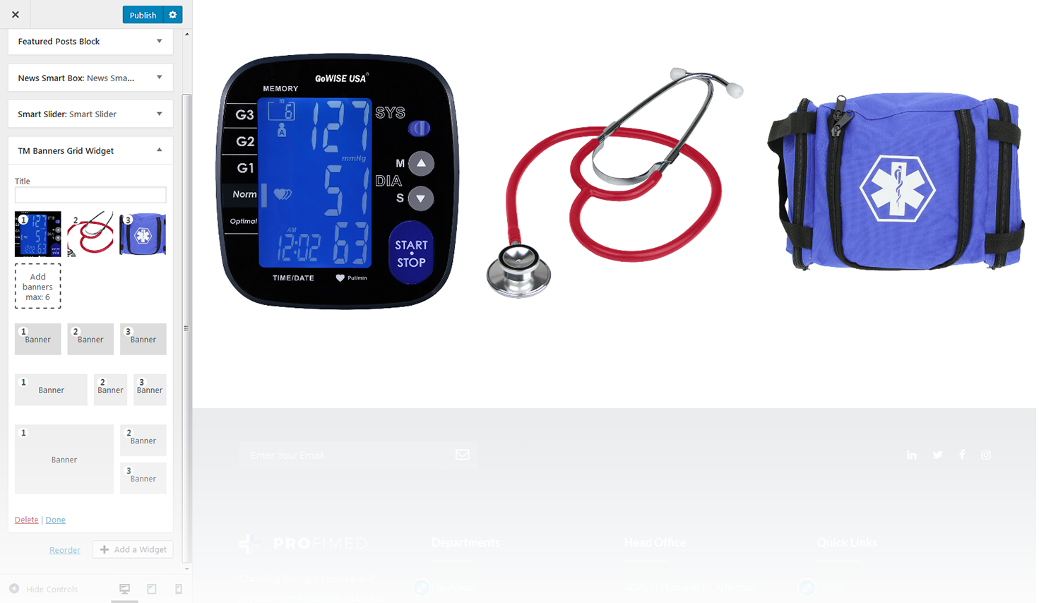
This widget is designed to create the banners grid on the website.
-
- title
- enter the title of the widget;
-
- add banners
- this property allows you to add banners. (Max 6 banners);
-
- set link
- this option allows you to add a link to a particular banner. Hover on a thumbnail in the customizer and click on the button at the middle of it to specify the address;
-
- layout
- under the image thumbnails in the customizer you can switch between several layout types.
TM Custom Menu with Background
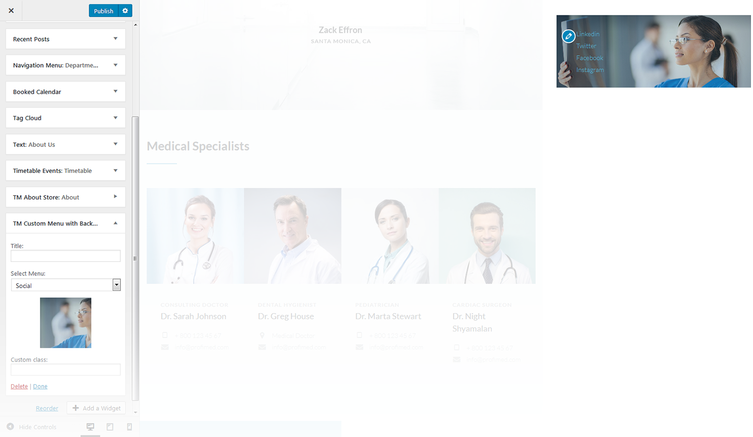
This widget allows you to create various custom menus anywhere on your website.
-
- title
- this property specifies the title of the widget;
-
- select menu
- here you can select any of the predesigned menus;
-
- choose background image
- choose the image you want to use as a background for your menu.
TM Product Categories with Thumbnail
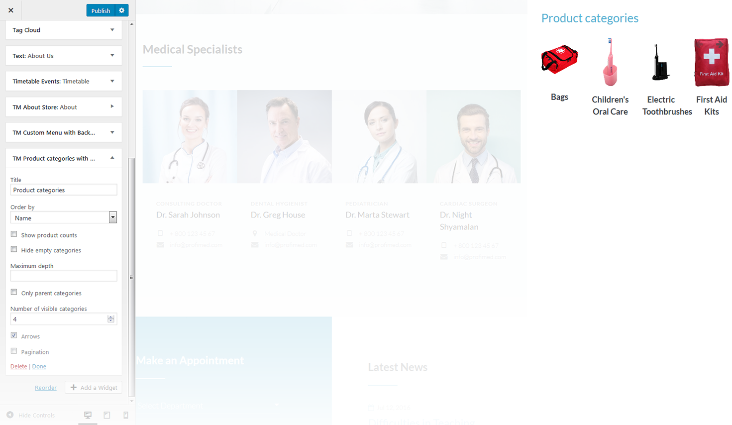
This widget creates a list of product image categories.
-
- title
- this property specifies the title of the widget;
-
- order by
- specify the way you want to order the products inside the widget;
-
- show products counts
- hide/show information on the number of products available in the selected category;
-
- hide empty categories
- hide/show categories with no products;
-
- number of visible products
- changes the number of displayed categories;
-
- navigation
- this feature allows you to display thenavigation arrows and pagination.
TM Products Carousel
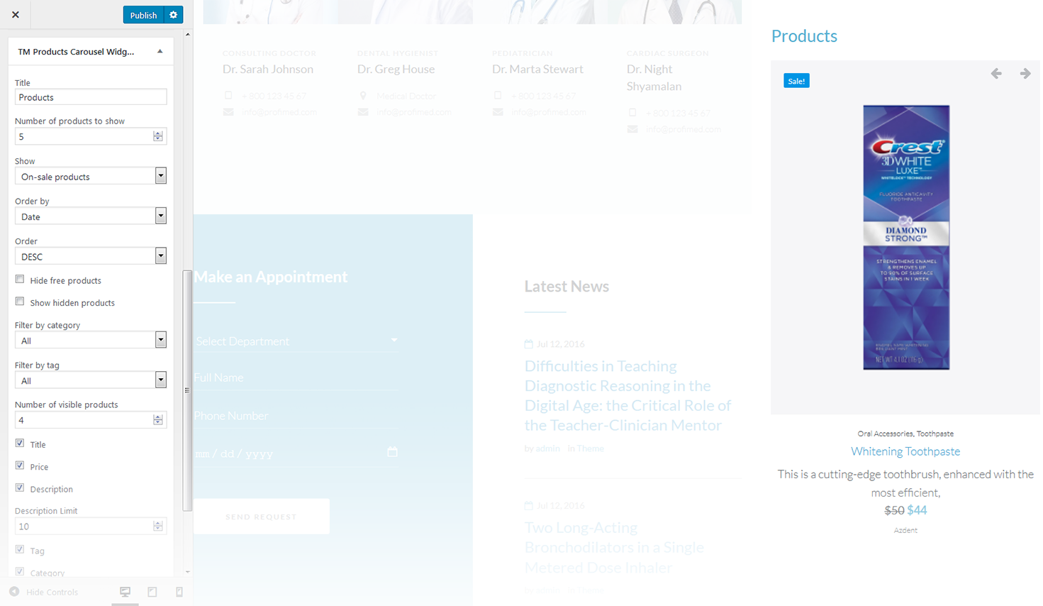
This widget creates a custom designed carousel from Zemez.
-
- title
- this property specifies the title of the widget;
-
- number of products to show
- specify the number of products displayed in the carousel;
-
- show
- this option allows you to show the products from various groups, like: all products, products on sale and featured products;
-
- order by
- specify the way you want to order the products inside the widget;
-
- order
- select the order type of the slides;
-
- hide free products
- this property allows you to hide free products from the carousel;
-
- show hidden products
- show hidden products in the carousel;
-
- filter by category
- filter products by a particular category;
-
- filter by tag
- filter products by a particular tag;
-
- number of visible products
- changes the number of displayed categories;
-
- product meta
- add meta attributes to the products in the slider;
-
- navigation
- this feature allows you to display the navigation arrows and pagination.
TM Products Smart Box
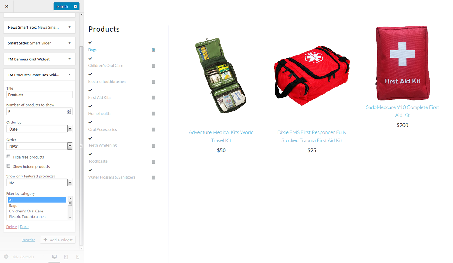
This widget displays the featured products from the particular categories offering the customers some extra products they might want to purchase as well
-
- title
- this property specifies the title of the widget;
-
- number of products to show
- specify the number of featured products that will be displayed;
-
- order by
- specify the way you want the products inside the widget to be ordered;
-
- order
- this property allows you to switch between descending and ascending order;
-
- hide free products
- hide/show free products;
-
- show hidden products
- hide/show hidden products;
-
- filter by category
- choose the category the products will be filtered by.
TM WooCommerce Recent Compare
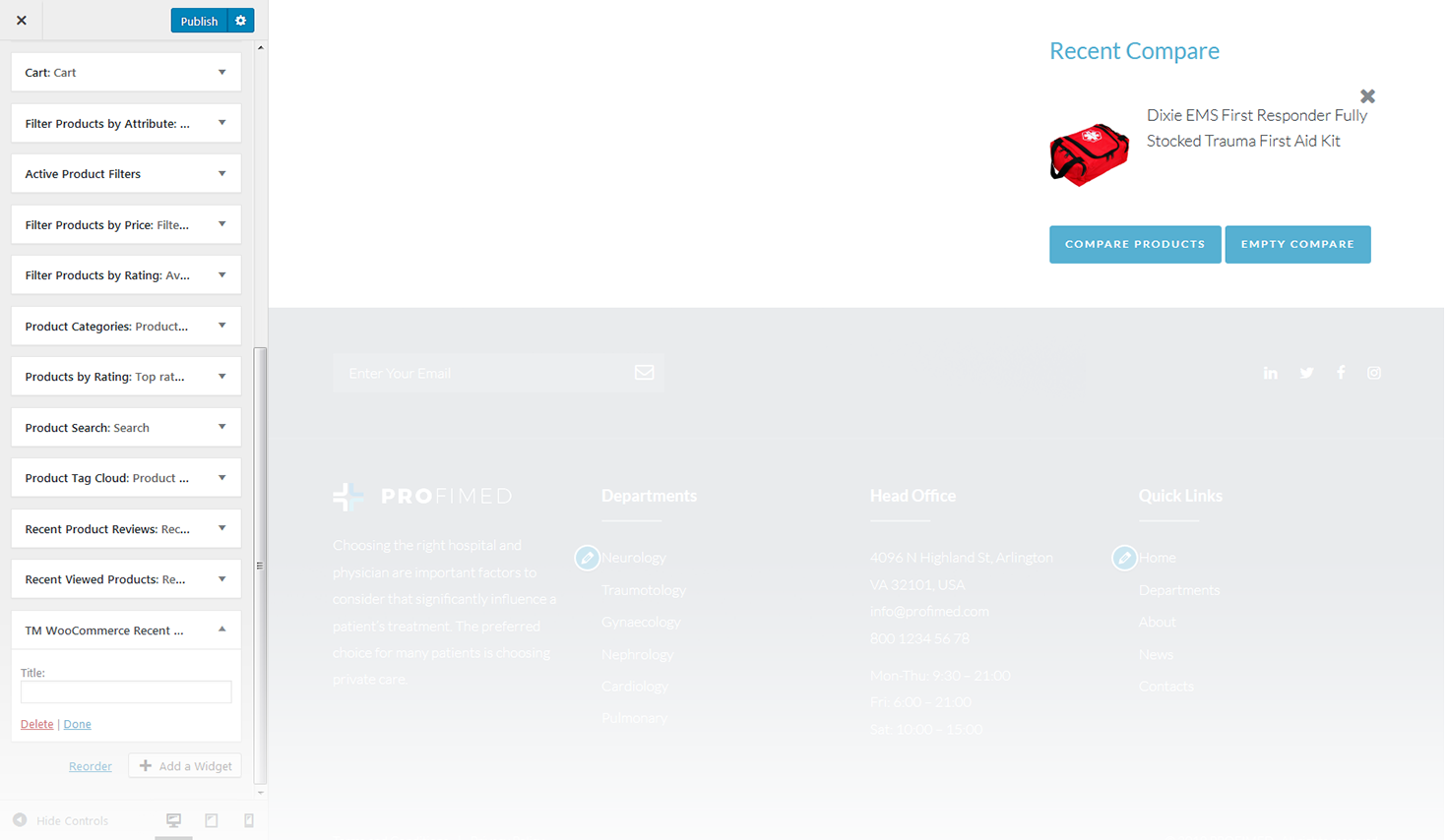
The widget shows the list of products added in the compare table.
-
- title
- this property specifies the widget title.
TM WooCommerce Wishlist
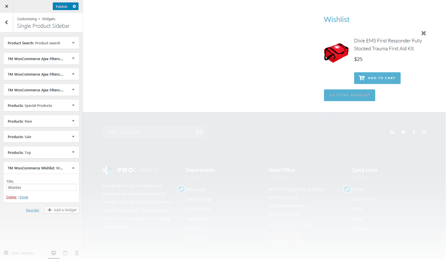
TM WooCommerce Wishlist is designed as an addition to the TM WooCommerce Package and gives your store even more functionality. With its help visitors will be able to add various kinds of products to the wishlist pages. It also allows to go to the compare page, add new products or delete the current ones from the list.
-
- title
- specify the title of the widget.
Filter Products by Rating
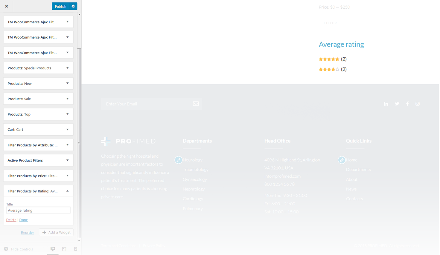
This widget displays the WooCommerce Average Rating for products.
-
- title
- this property specifies the widget title.
Cart
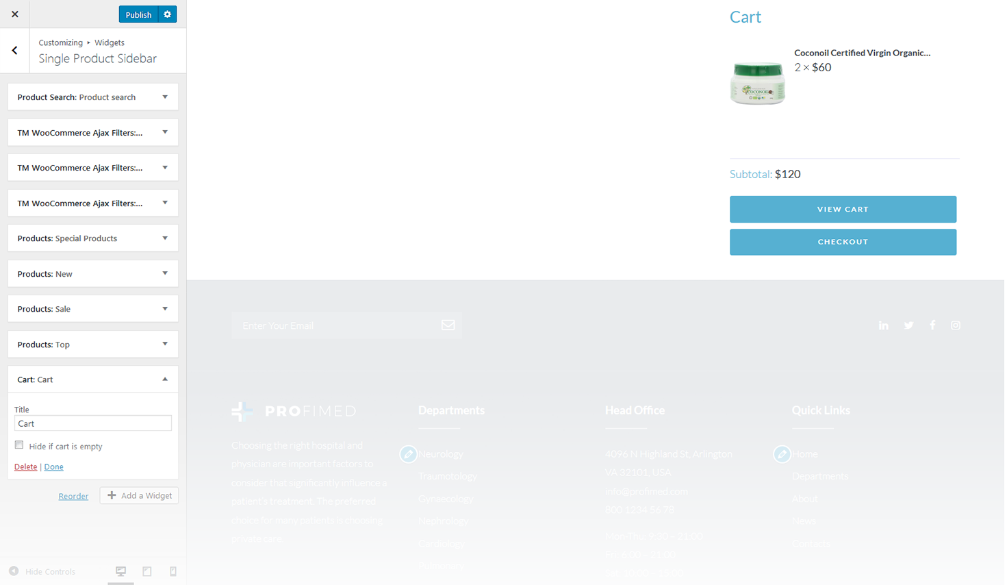
This widget displays the WooCommerce shopping cart.
-
- title
- this property specifies the widget title;
-
- hide if cart is empty
- this option allows to hide the cart if it is empty.
Filter Products by Attribute
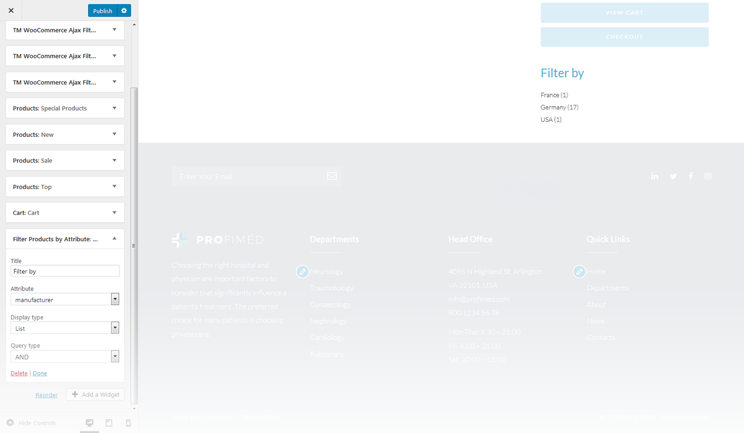
This widget shows a custom attribute that allows to narrow down the list of products when viewing the product categories.
-
- title
- this property specifies the widget title;
-
- attribute
- specify the filtering attribute;
-
- display type
- specify the display type;
-
- query type
- specify the query type.
Active Filters
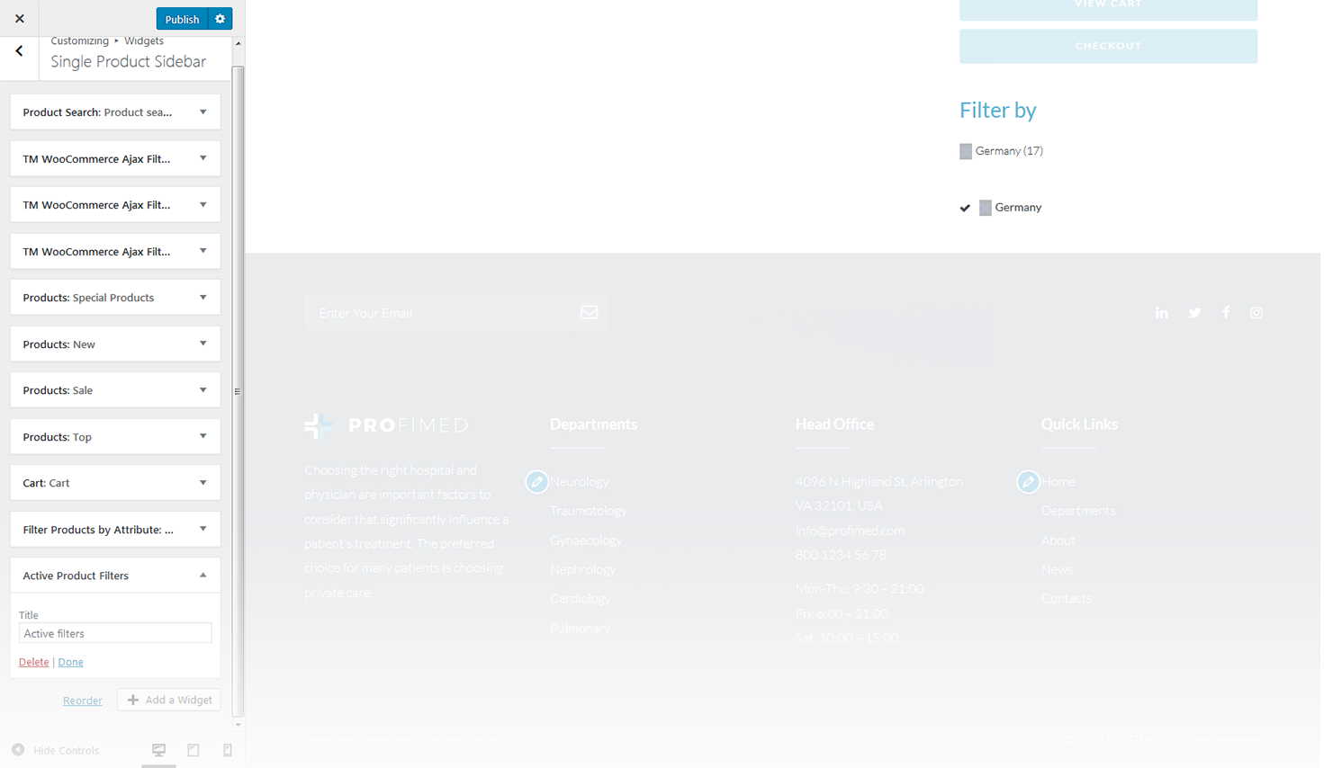
This widget shows the layered nav filters, which are currently active on the page.
-
- title
- this property specifies the widget title.
Filter Products by Price
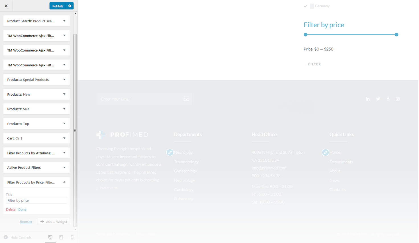
This widget displays the WooCommerce price filter.
-
- title
- this property specifies the widget title.
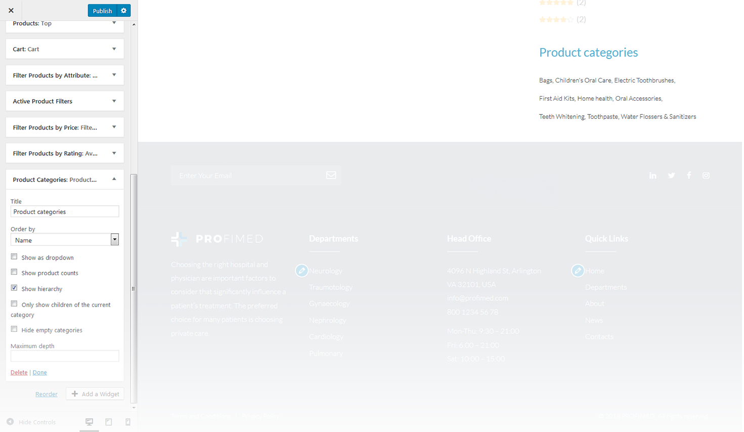
Product Categories
This widget is used to display a list of products on your site.
-
- title
- this property specifies the widget title;
-
- order by
- specify the way you want to order the products inside the widget;
-
- show as dropdown
- this option allows to display the categories as a dropdown list;
-
- show product counts
- show/hide products count;
-
- show hierarchy
- show hierarchy;
-
- only show children of the current category
- display child products of the current category only;
-
- hide empty categories
- show/hide empty categories.
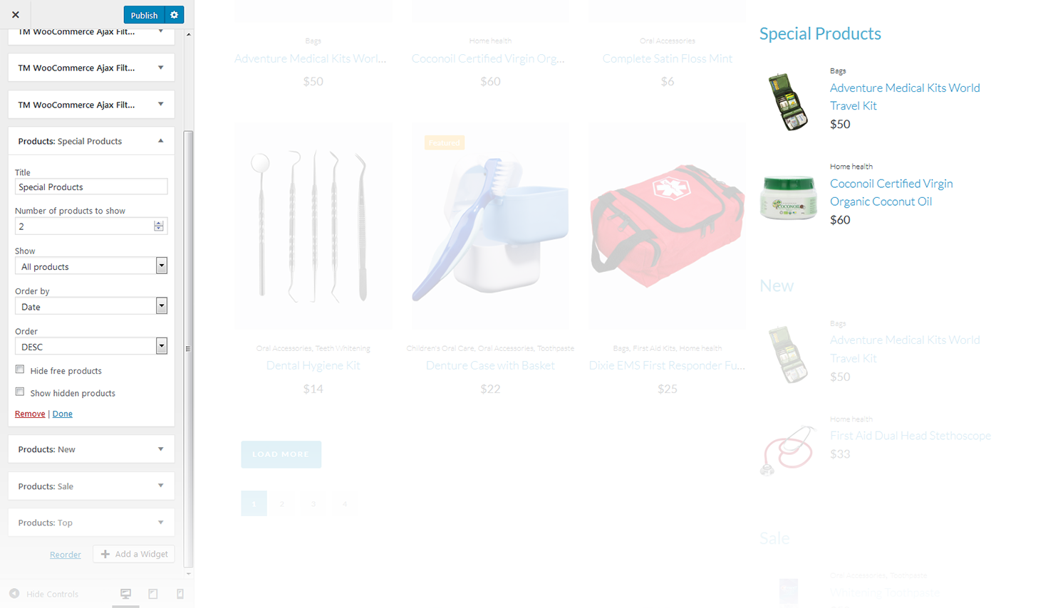
Products
This widget displays the list of new products available on your site.
-
- title
- this property specifies the widget title;
-
- number of products to show
- this property specifies the number of products displayed in the widget;
-
- show
- allows to display the products from a certain group;
-
- order by
- order the products by several criteria;
-
- order
- this property allows you to switch between descending and ascending order;
-
- hide free products
- hide/show free products;
-
- show hidden products
- hide/show hidden products.
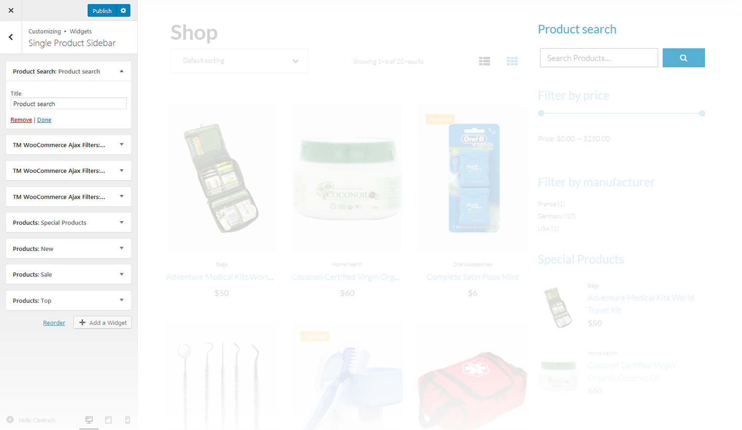
Product Search
This widget displays the WooCommerce search box.
-
- title
- this property specifies the widget title.
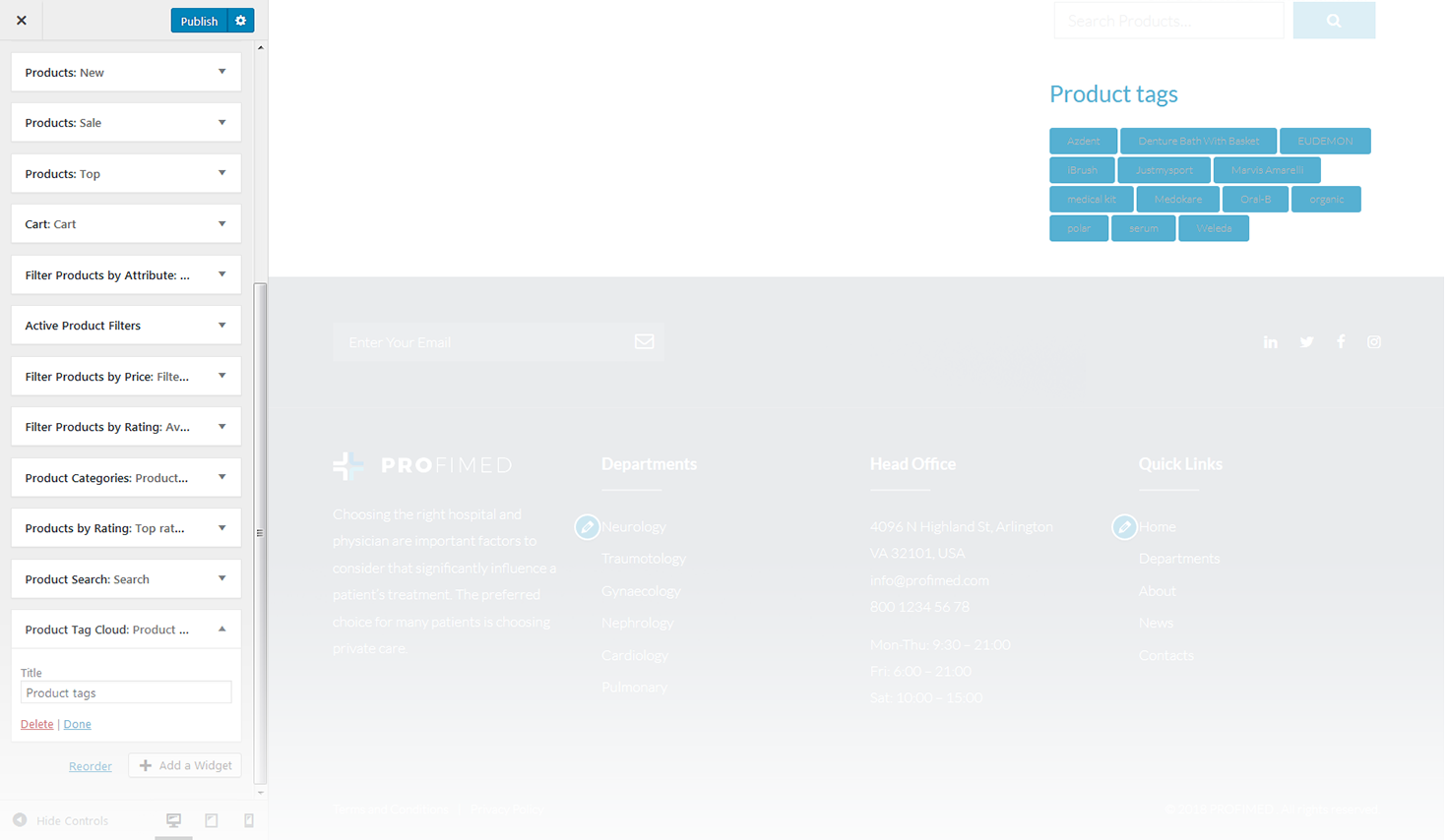
Product Tag Cloud
The widget allows you to display WooCommerce tag cloud on the website.
-
- title
- this property specifies the widget title.
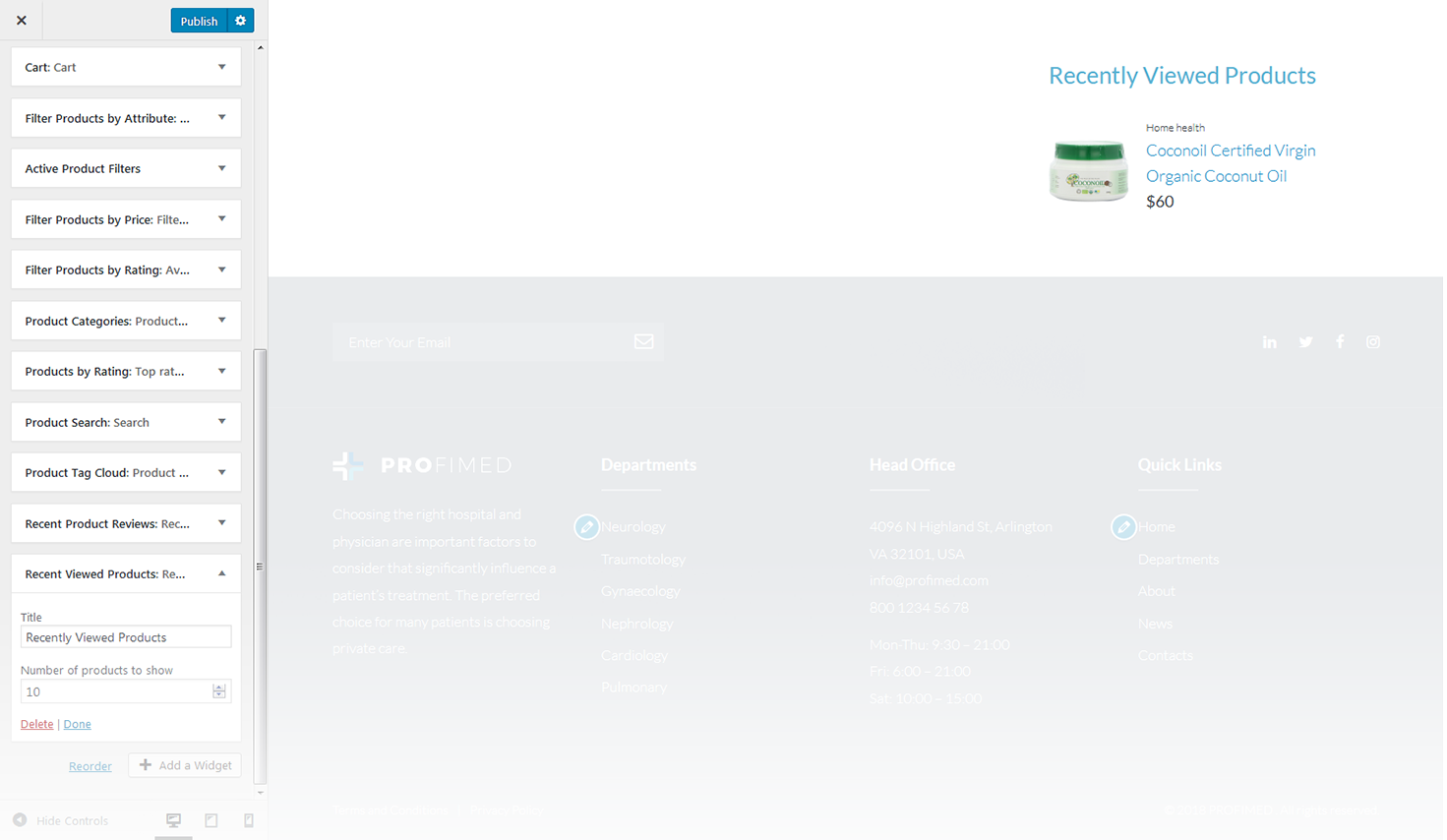
Recent Viewed Products
This widget displays a list of recently viewed products.
-
- title
- this property specifies the widget title;
-
- number of reviews to show
- specify the number of displayed products.
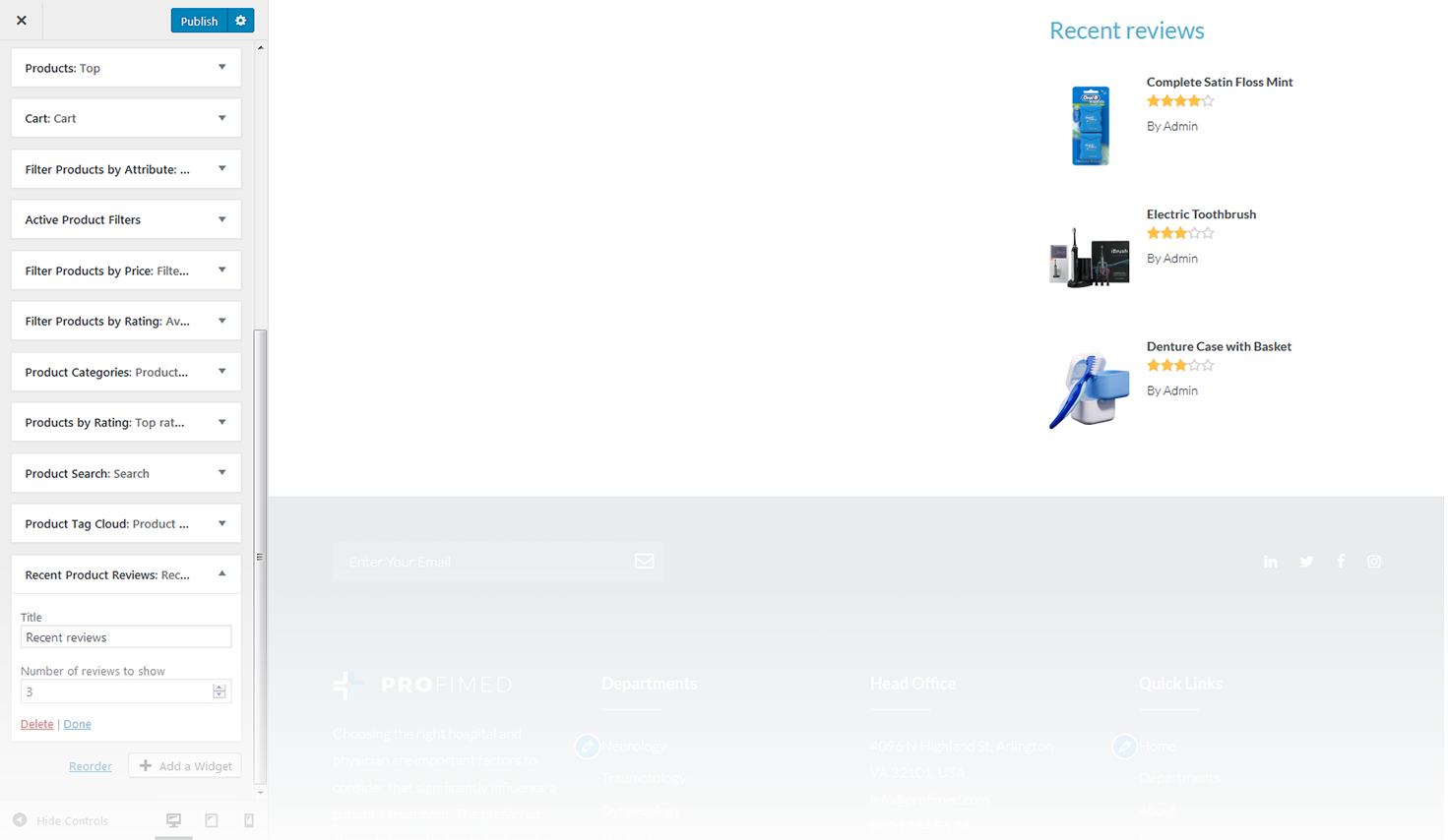
Recent Product Reviews
The widget displays recent reviews on the website.
-
- title
- this property specifies the widget title;
-
- number of reviews to show
- specify the number of reviews displayed.
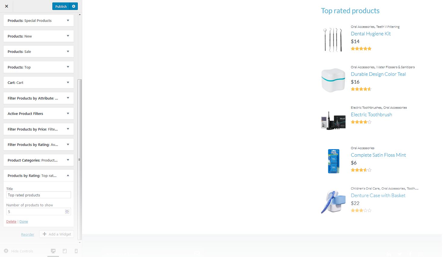
Products by Rating
This widget displays the list of top rated products.
-
- title
- this property specifies the widget title;
-
- number of products to show
- Ttis property specifies the number of products displayed in the widget.
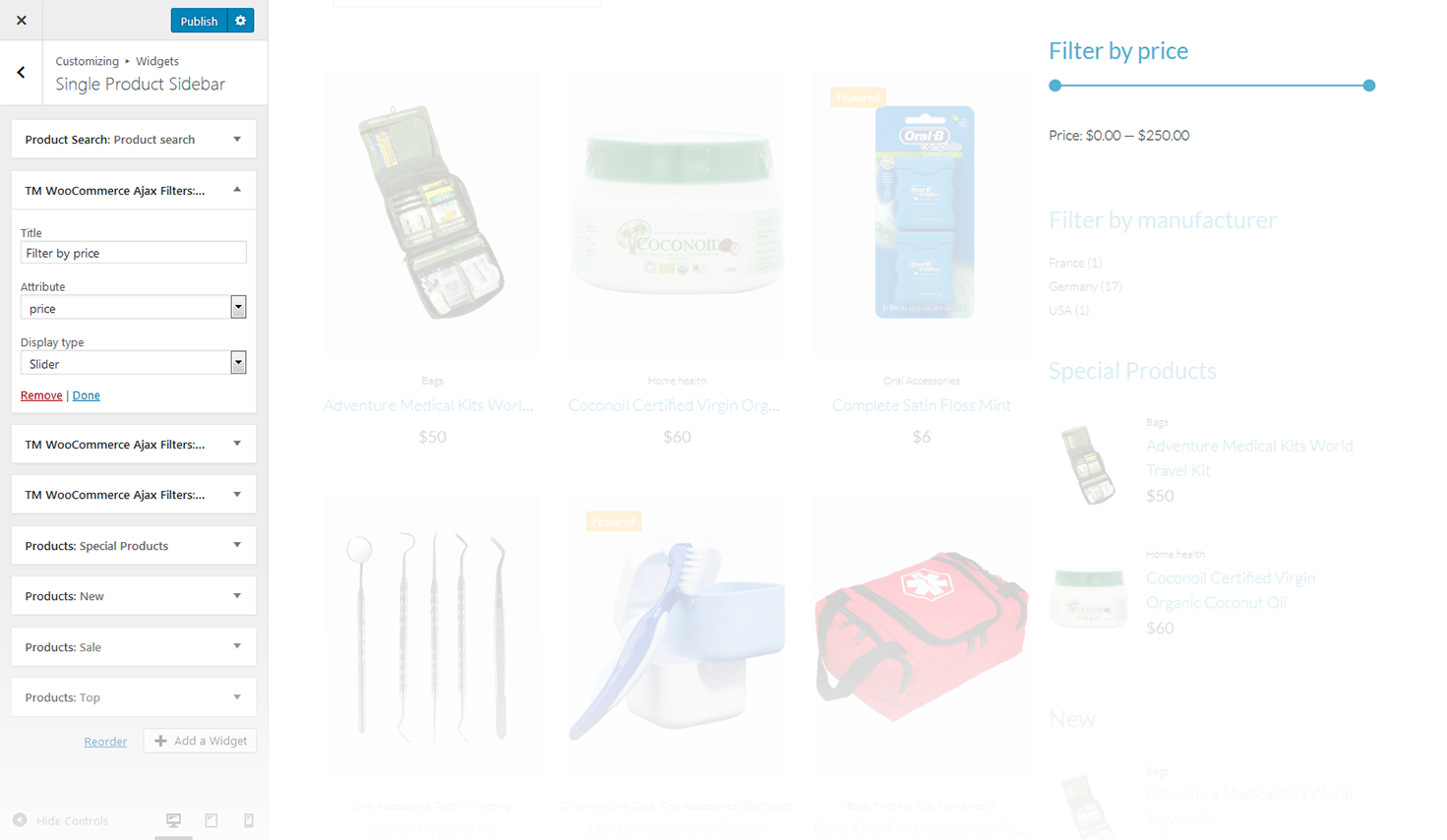
TM WooCommerce Ajax Filter
This widget displays the TM WooCommerce Ajax filter.
-
- title
- this property specifies the widget title;
-
- attribute
- this property specifies the filter attribute;
-
- display type
- this property defines how to show the filter: as a dropdown, or as a list;
-
- query type
- this property defines the query type.
Timetable Events
This widget will become in hand when you need to create various kinds of event schedules and add them to any page of your website.
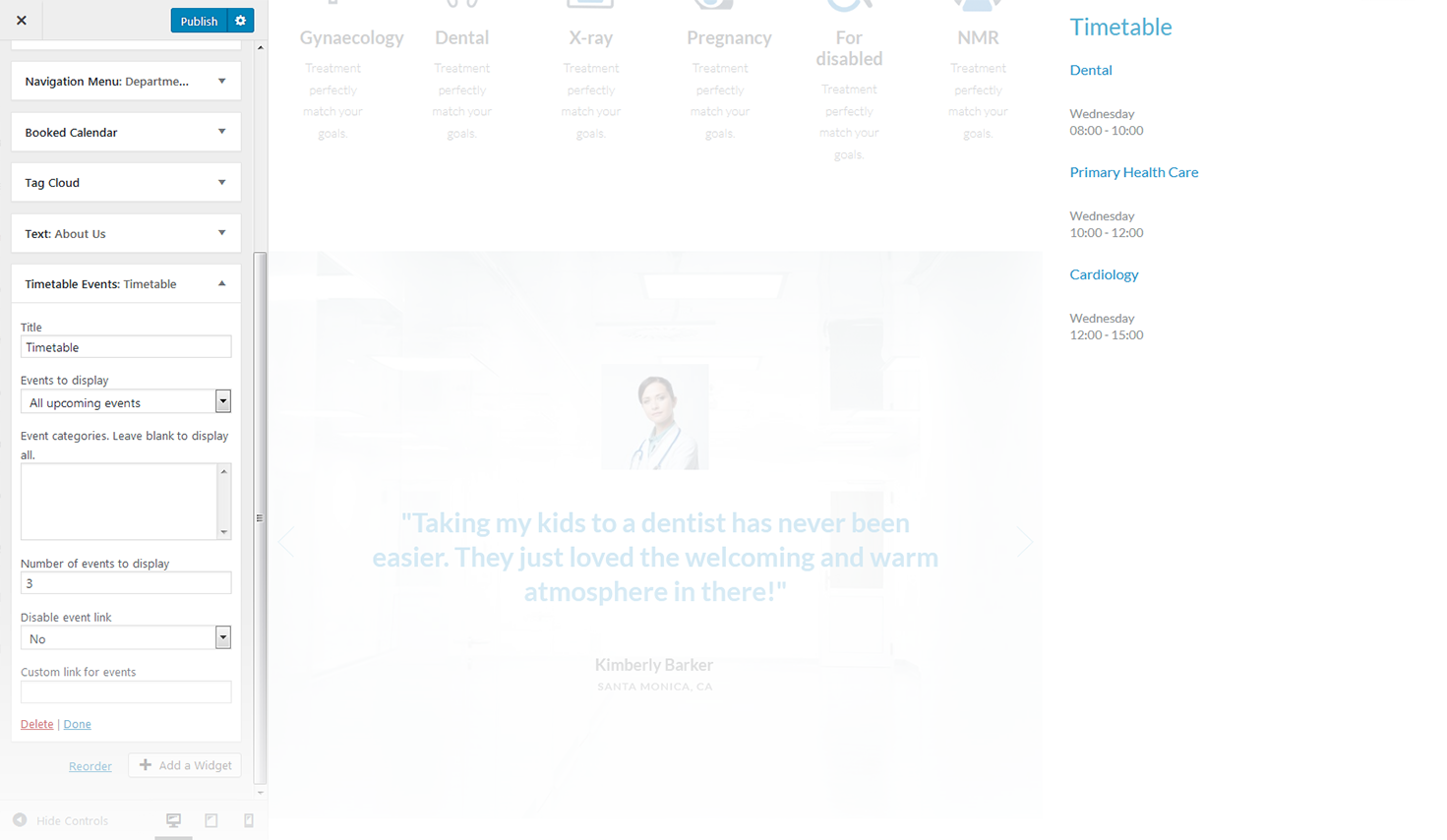
-
- title
- enter the title of the widget;
-
- events to display
- specify the events that will be displayed;
-
- event categories, leave blank to display all
- specify the events categorie that will be displayed;
-
- number of events to display
- specify the number of events that will be displayed;
-
- disable event link
- select yes/no;
-
- custom link for events
- set the custom link for events.
