JetSmartFilters
Working with Filter Widgets
From this block, you’ll get the detailed information on how to add a filter you’ve previously created, to the pages built with Elementor, which include JetEngine Listing Grid widget or JetWooBuilder Products Archive.
Please, before proceeding to working with JetSmartFilters widgets, make sure you’ve created the corresponding filters in WordPress Dashboard.
There are 8 filter types, and each of them corresponds to the specific filtering widget.
- Checkboxes List filter type corresponds to Checkboxes Filter widget.
- Select filter type suits for Select Filter widget.
- Range filter type works with Range Filter widget.
- Check Range filter type suits for Check Range widget.
- Date Range filter type goes with Date Range Filter widget.
- Radio filter type is needed for adding Radio Filter widget.
- Search filter type suits for Search Filter widget.
- Rating filter type suits for Rating Filter widget.
There are also 2 more utility widgets made for adding AJAX pagination and providing an easy way for selecting and removing the active filters on the page.
Checkboxes Filter
The Checkboxes filter perfectly suits for displaying checkboxes with the custom values of the properties of the products from which one is able to choose to filter the posts or products on the page.
Please, create the Checkboxes List filter type in WordPress Dashboard > Smart Filters before proceeding to adding the Checkboxes filter widget to the page.
Content
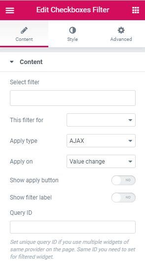
- Select Filter - here you need to select the filter that was previously created and has the Checkboxes List filter type.
- This filter for - here you need to select the listing or archive for which you want to apply the current filter. There are such options:
- Elementor Pro Archive Products - select it in case you're applying the filter to the archive page built with Elementor using Elementor Pro Archive Products widget.
- Elementor Pro Archive - choose it in case you're applying the filter to the archive page built with Elementor using Elementor Pro Posts widget.
- Elementor Pro Posts - in case you’re applying the filter to the content created with Elementor Pro Posts widget, use this option.
- Elementor Pro Products - in case you’re applying the filter to the content created with Elementor Pro Products widget, use this option.
- JetEngine Calendar - select this option in case you’ve got the Calendar widget with the publications shown inside and want the visitors to apply this filter for Calendar content.
- JetEngine - choose it in case you’ve got the listing created by JetEngine listing Grid widget.
- WooCommerce Products Grid - if you’re adding the products to page built with Elementor using JetWoobuilder Products Grid widget, select this option to apply the filter for this specific widget and the products displayed by it.
- WooComerce Products List - if you’re adding the products to page built with Elementor using JetWoobuilder Products List widget, select this option to apply the filter for this specific widget and the products displayed by it.
- WooCommerce Archive (by JetWooBuilder) - in case you’re applying the filter to the products or archive (on Shop page) created with JetWooBuilder widgets, use this option.
- WooCommerce Shortcode - in case you’re displaying the WooCommerce products or categories with WooCommerce shortocde added to a page built with Elementor, and want to apply the following filter for these products or categories, select this option.
Please, note, that in order to filter the products, you’ll have to use the proper meta keys.
- Apply type - here you can choose which filter type is preferable for this filter. An AJAX filter type allows filtering using AJAX method without reloading the page, which makes the filtering through the products much faster for the visitors. The Page Reload filter reloads the page each time the visitor applies the filter.
- Show Apply button - enable this option to display Apply button and allow the visitors select multiple checkboxes and only then apply the filter on button click. Show filter label - enable this option to add the filter label set for this filter to the top of it.
- Query ID - in case you’re using more than one filter and display more than one listing grid, products grid, etc., on the page, you can use the Query ID option to define which filter is applied to which widget.
- Space Between - here you can set the space between the checkboxes and apply different spaces between them for mobile, tablet and desktop devices.
- Children Offset Left - use the control to change the offset for the
- Size - here you can specify the size to apply for the checkbox container. Select Normal or Checked mode to edit the appearance of the checked and unchecked checkboxes.
- Background color - here you can apply the custom color to use inside the checkbox container.
- Border type - here you can select the border to apply around the checkbox. You can select one of the border types to go with (dotted, dashed, solid, none).
- Border radius - here you can set the border radius to apply for the checkbox container to make its angles more smooth.
- Size - here you can set the size of the checkbox icon.
- Color - here you can set the color to use for the checkbox icon.
- Typography - turn the option on to view the typography settings.
- Size — define the font size to apply for the text.
- Family — here you can set the font family for the text.
- Weight — in this block you can select the suitable font weight.
- Transform — here you can choose from the dropdown menu, if you want the text to be shown in uppercase, lowercase, capitalize or normal way.
- Style — in this block you can choose from the dropdown menu the style of the font. It can be normal, italic (the characters look similar to handwriting) and oblique (the characters are slightly inclined to the right).
- Line Height — in this field you can set the height of the text line.
- Letter Spacing — here you can set the space between letters.
- Offset left - here you can specify the offset of the checkbox labels.
- Color - here you can specify the color to use for the label text.
- Typography - turn the option on to view the typography settings. They are similar to the ones for the Checkbox label.
- Color - here you can set the color to apply for the label text.
- Border type - here you can specify the type of the border to apply for the widget’s filter label. After the border is selected you'll be able to specify its width and color.
- Padding - here you can set the responsive padding for the label.
- Margin - here you can set the responsive margin for the label.
- Alignment - here you can change the widget’s filter label alignment to left, center or right.
- Typography - turn the option on to view the typography settings. They are similar to the ones for the Checkbox label.
- Text color - here you can specify the color to use for the text.
- Background color - here you can set the color to apply for the button plane background.
- Border type - here you can specify the type of the border to apply for the button. After that, you’ll get access to border color and width.
- Border radius - specify the responsive border to apply around the button.
- Box shadow - apply the Shadow option for the button.
- Padding - here you can set the responsive padding for the button.
- Margin - here you can set the responsive margin for the button.
- Alignment - here you can change the widget’s filter button alignment to left, center or right.
- Vertical Space Between - in case you’ve got the grouped filters, here you can apply the vertical space between them.
To set an ID for the products grid or listing grid widget, open its Advanced settings and fill in the CSS ID and CSS Classes values into the corresponding fields.
You have to input the same ID into the Query ID field to assign this particular filter to the specific widget on the page.
Style
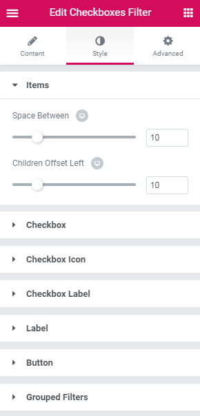
Items
Checkbox
Checkbox icon
Checkbox label
Label
Button
Switch between the Normal and Hover modes to change the appearance of the button on hover and when it’s in its normal state.
Grouped Filters
Select Filter
The Select filter is made for displaying select options with the custom values of the properties of the products from which one is able to choose to filter the posts or products on the page.
Please, create the Select filter type in WordPress Dashboard > Smart Filters before proceeding to adding the Select filter widget to the page.
Content
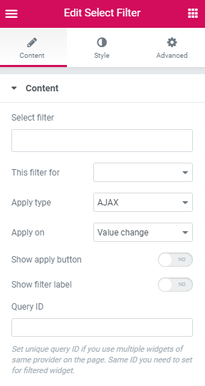
Select Filter - here you need to select the filter that was previously created and has the Select filter type.
- This filter for - here you need to select the listing or archive for which you want to apply the current filter. There are such options:
- Elementor Pro Archive Products - select it in case you're applying the filter to the archive page built with Elementor using Elementor Pro Archive Products widget.
- Elementor Pro Archive - choose it in case you're applying the filter to the archive page built with Elementor using Elementor Pro Posts widget.
- Elementor Pro Posts - in case you’re applying the filter to the content created with Elementor Pro Posts widget, use this option.
- Elementor Pro Products - in case you’re applying the filter to the content created with Elementor Pro Products widget, use this option.
- JetEngine Calendar - select this option in case you’ve got the Calendar widget with the publications shown inside and want the visitors to apply this filter for Calendar content.
- JetEngine - choose it in case you’ve got the listing created by JetEngine listing Grid widget.
- WooCommerce Products Grid - if you’re adding the products to page built with Elementor using JetWoobuilder Products Grid widget, select this option to apply the filter for this specific widget and the products displayed by it.
- WooComerce Products List - if you’re adding the products to page built with Elementor using JetWoobuilder Products List widget, select this option to apply the filter for this specific widget and the products displayed by it.
- WooCommerce Archive (by JetWooBuilder) - in case you’re applying the filter to the products or archive (on Shop page) created with JetWooBuilder widgets, use this option.
- WooCommerce Shortcode - in case you’re displaying the WooCommerce products or categories with WooCommerce shortocde added to a page built with Elementor, and want to apply the following filter for these products or categories, select this option.
Please, note, that in order to filter the products, you’ll have to use the proper meta keys.
- Apply type - here you can choose which filter type is preferable for this filter. An AJAX filter type allows filtering using AJAX method without reloading the page, which makes the filtering through the products much faster for the visitors. The Page Reload filter reloads the page each time the visitor applies the filter.
- Show Apply button - enable this option to display Apply button and allow the visitors select and only then apply the filter on button click.
- Show filter label - enable this option to add the filter label set for this filter to the top of it.
- Query ID - in case you’re using more than one filter and display more than one listing grid, products grid, etc., on the page, you can use the Query ID option to define which filter is applied to which widget.
- Position - here you can select the type of position applied for the Select filter: the inline or columns.
- Select Width - here you can apply the custom responsive width for the widget.
- Typography - turn the option on to view the typography settings. They are similar to the ones for the Checkbox label.
- Text color - here you can set the color to apply for the text.
- Background color - here you can select the proper background color to use for the text.
- Border type - here you can specify the type of the border to apply for the element. After that, you’ll get access to border color and width.
- Border radius - specify the responsive border to apply around the element.
- Box shadow - apply the Shadow option for the element.
- Padding - here you can set the responsive padding for the element.
- Alignment - here you can change the widget’s filter element alignment to left, center or right.
- Typography - turn the option on to view the typography settings. They are similar to the ones for the Checkbox label.
- Color - here you can specify the color to use for the element.
- Border type - here you can specify the type of the border to apply for the label. After that, you’ll get access to border color and width.
- Padding - here you can set the responsive padding for the element.
- Margin - here you can set the responsive margin for the element.
- Alignment - here you can change the widget’s filter element alignment to left, center or right.
- Typography - turn the option on to view the typography settings. They are similar to the ones for the Checkbox label. Switch between Normal and Hover modes to customize the button appearance on hover and in its normal state.
- Text color - here you can specify the color to use for the text.
- Background color - here you can select the proper background color to use for the text.
- Border type - here you can specify the type of the border to apply for the button. After that, you’ll get access to border color and width.
- Border radius - specify the responsive border to apply around the element.
- Box shadow - apply the Shadow option for the element.
- Padding - here you can set the responsive padding for the element.
- Margin - here you can set the responsive margin for the element.
- Alignment - here you can change the widget’s filter element alignment to left, center or right.
- Vertical Space Between - in case you’ve got the grouped filters, here you can apply the vertical space between them.
To set an ID for the products grid or listing grid widget, open its Advanced settings and fill in the CSS ID and CSS Classes values into the corresponding fields.
You have to input the same ID into the Query ID field to assign this particular filter to the specific widget on the page.
Style
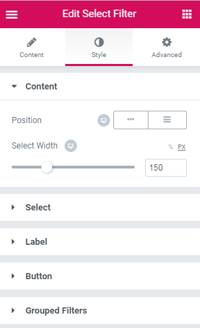
Content
Select
Label
Button
Grouped Filters
Range Filter
The Range filter provides an easy way for the visitors to select the range within which to look for the products or posts.
Please, create the Range filter type in WordPress Dashboard > Smart Filters before proceeding to adding the Range filter widget to the page.
Content
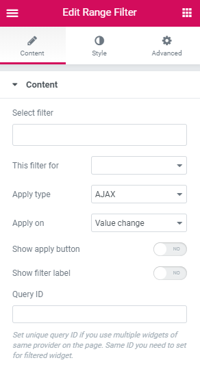
Select Filter - here you need to select the filter that was previously created and has the Range filter type.
- This filter for - here you need to select the listing or archive for which you want to apply the current filter. There are such options:
- Elementor Pro Archive Products - select it in case you're applying the filter to the archive page built with Elementor using Elementor Pro Archive Products widget.
- Elementor Pro Archive - choose it in case you're applying the filter to the archive page built with Elementor using Elementor Pro Posts widget.
- Elementor Pro Posts - in case you’re applying the filter to the content created with Elementor Pro Posts widget, use this option.
- Elementor Pro Products - in case you’re applying the filter to the content created with Elementor Pro Products widget, use this option.
- JetEngine Calendar - select this option in case you’ve got the Calendar widget with the publications shown inside and want the visitors to apply this filter for Calendar content.
- JetEngine - choose it in case you’ve got the listing created by JetEngine listing Grid widget.
- WooCommerce Products Grid - if you’re adding the products to page built with Elementor using JetWoobuilder Products Grid widget, select this option to apply the filter for this specific widget and the products displayed by it.
- WooComerce Products List - if you’re adding the products to page built with Elementor using JetWoobuilder Products List widget, select this option to apply the filter for this specific widget and the products displayed by it.
- WooCommerce Archive (by JetWooBuilder) - in case you’re applying the filter to the products or archive (on Shop page) created with JetWooBuilder widgets, use this option.
- WooCommerce Shortcode - in case you’re displaying the WooCommerce products or categories with WooCommerce shortocde added to a page built with Elementor, and want to apply the following filter for these products or categories, select this option.
Please, note, that in order to filter the products, you’ll have to use the proper meta keys.
- Apply type - here you can choose which filter type is preferable for this filter. An AJAX filter type allows filtering using AJAX method without reloading the page, which makes the filtering through the products much faster for the visitors. The Page Reload filter reloads the page each time the visitor applies the filter.
- Show Apply button - enable this option to display Apply button and allow the visitors set the range and only then apply the filter on button click.
- Show filter label - enable this option to add the filter label set for this filter to the top of it.
- Query ID - in case you’re using more than one filter and display more than one listing grid, products grid, etc., on the page, you can use the Query ID option to define which filter is applied to which widget.
- Stroke - here you can set the preferable stroke width for the filter.
- Color - here you can set the color to apply for the filter’s body.
- Border type - here you can specify the type of the border to apply for the filter. After that, you’ll get access to border color and width.
- Border radius - specify the responsive border to apply around the element.
- Points width - here you can set the custom width for the filter’s controls.
- Points height - here you can set the custom height for the filter’s controls.
- Background color - here you can select the proper background color to use for the element.
- Border type - here you can specify the type of the border to apply for the element. After that, you’ll get access to border color and width.
- Typography - turn the option on to view the typography settings. They are similar to the ones for the Checkbox label.
- Color - here you can specify the color to use for the values.
- Margin - here you can set the responsive margin for the element.
- Alignment - here you can change the element alignment to left, center or right.
- Typography - turn the option on to view the typography settings. They are similar to the ones for the Checkbox label.
- Color - here you can specify the color to use for the text.
- Border type - here you can specify the type of the border to apply for the label. After that, you’ll get access to border color and width.
- Padding - here you can set the responsive padding for the element.
- Margin - here you can set the responsive margin for the element.
- Text alignment - here you can change the label element alignment to left, center or right.
- Typography - turn the option on to view the typography settings. They are similar to the ones for the Checkbox label.
- Text color - here you can specify the color to use for the text.
- Background color - here you can select the proper background color to use for the content.
- Border type - here you can specify the type of the border to apply for the button block. After that, you’ll get access to border color and width.
- Border radius - specify the responsive border to apply around the element.
- Box shadow - apply the Shadow option for the element.
- Padding - here you can set the responsive padding for the element.
- Margin - here you can set the responsive margin for the element.
- Alignment - here you can change the button element alignment to left, center or right.
- Vertical Space Between - in case you’ve got the grouped filters, here you can apply the vertical space between them.
To set an ID for the products grid or listing grid widget, open its Advanced settings and fill in the CSS ID and CSS Classes values into the corresponding fields.
You have to input the same ID into the Query ID field to assign this particular filter to the specific widget on the page.
Style
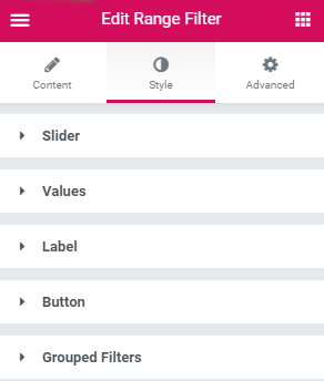
Slider
Switch between the default and range modes to change the appearance of both.
Range points
Values
Label
Button
Switch between Normal and Hover modes to change the appearance of both.
Grouped Filters
Check Range Filter
Use this filter to allow the visitors select the ranges by which the items will be filtered. It adds the checklist of ranges containing the specific range values between which the products or posts will be selected.
Content
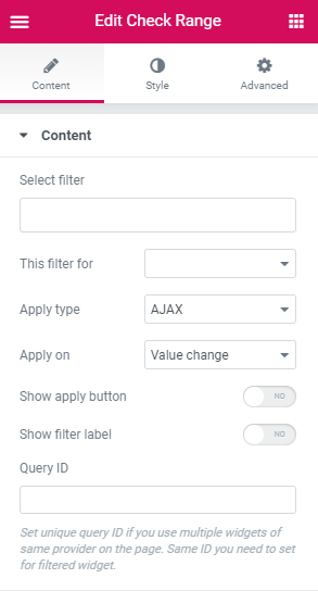
- Select Filter - here you need to select the filter that was previously created and has the Check Range filter type.
- This filter for - here you need to select the listing or archive for which you want to apply the current filter. There are such options:
- Elementor Pro Archive Products - select it in case you're applying the filter to the archive page built with Elementor using Elementor Pro Archive Products widget.
- Elementor Pro Archive - choose it in case you're applying the filter to the archive page built with Elementor using Elementor Pro Posts widget.
- Elementor Pro Posts - in case you’re applying the filter to the content created with Elementor Pro Posts widget, use this option.
- Elementor Pro Products - in case you’re applying the filter to the content created with Elementor Pro Products widget, use this option.
- JetEngine Calendar - select this option in case you’ve got the Calendar widget with the publications shown inside and want the visitors to apply this filter for Calendar content.
- JetEngine - choose it in case you’ve got the listing created by JetEngine listing Grid widget.
- WooCommerce Products Grid - if you’re adding the products to page built with Elementor using JetWoobuilder Products Grid widget, select this option to apply the filter for this specific widget and the products displayed by it.
- WooComerce Products List - if you’re adding the products to page built with Elementor using JetWoobuilder Products List widget, select this option to apply the filter for this specific widget and the products displayed by it.
- WooCommerce Archive (by JetWooBuilder) - in case you’re applying the filter to the products or archive (on Shop page) created with JetWooBuilder widgets, use this option.
- WooCommerce Shortcode - in case you’re displaying the WooCommerce products or categories with WooCommerce shortocde added to a page built with Elementor, and want to apply the following filter for these products or categories, select this option.
Please, note, that in order to filter the products, you’ll have to use the proper meta keys.
- Apply type - here you can choose which filter type is preferable for this filter. An AJAX filter type allows filtering using AJAX method without reloading the page, which makes the filtering through the products much faster for the visitors. The Page Reload filter reloads the page each time the visitor applies the filter.
- Show Apply button - enable this option to display Apply button and allow the visitors set the range and only then apply the filter on button click. Show filter label - enable this option to add the filter label set for this filter to the top of it.
- Query ID - in case you’re using more than one filter and display more than one listing grid, products grid, etc., on the page, you can use the Query ID option to define which filter is applied to which widget.
- Space between - here you can set the space between the checkboxes and apply different spaces between them for mobile, tablet and desktop devices.
- Size - here you can specify the size to apply for the checkbox container. Select Normal or Checked mode to edit the appearance of the checked and unchecked checkboxes.
- Background color - here you can apply the custom color to use inside the checkbox container.
- Border type - here you can select the border to apply around the checkbox. You can select one of the border types to go with (dotted, dashed, solid, none).
- Border radius - here you can set the border radius to apply for the checkbox container to make its angles more smooth.
- Size - here you can set the size of the checkbox icon.
- Color - here you can set the color to use for the checkbox icon.
- Typography - turn the option on to view the typography settings.
- Size — define the font size to apply for the text.
- Family — here you can set the font family for the text.
- Weight — in this block you can select the suitable font weight.
- Transform — here you can choose from the dropdown menu, if you want the text to be shown in uppercase, lowercase, capitalize or normal way.
- Style — in this block you can choose from the dropdown menu the style of the font. It can be normal, italic (the characters look similar to handwriting) and oblique (the characters are slightly inclined to the right).
- Line Height — in this field you can set the height of the text line.
- Letter Spacing — here you can set the space between letters.
- Offset left - here you can specify the offset of the checkbox labels.
- Color - here you can specify the color to use for the label text.
- Typography - turn the option on to view the typography settings. They are similar to the ones for the Checkbox label.
- Color - here you can set the color to apply for the label text.
- Border type - here you can specify the type of the border to apply for the widget’s filter label. After the border is selected you'll be able to specify its width and color.
- Padding - here you can set the responsive padding for the label.
- Margin - here you can set the responsive margin for the label.
- Alignment - here you can change the widget’s filter label alignment to left, center or right.
- Typography - turn the option on to view the typography settings. They are similar to the ones for the Checkbox label.
- Text color - here you can specify the color to use for the text.
- Background color - here you can set the color to apply for the button plane background.
- Border type - here you can specify the type of the border to apply for the button. After that, you’ll get access to border color and width.
- Border radius - specify the responsive border to apply around the button.
- Box shadow - apply the Shadow option for the button.
- Padding - here you can set the responsive padding for the button.
- Margin - here you can set the responsive margin for the button.
- Alignment - here you can change the widget’s filter button alignment to left, center or right.
- Vertical Space Between - in case you’ve got the grouped filters, here you can apply the vertical space between them.
To set an ID for the products grid or listing grid widget, open its Advanced settings and fill in the CSS ID and CSS Classes values into the corresponding fields.
You have to input the same ID into the Query ID field to assign this particular filter to the specific widget on the page.
Style
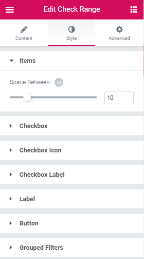
Items
Checkbox
Checkbox Icon
Checkbox Label
Label
Button
Switch between the Normal and Hover modes to change the appearance of the button on hover and when it’s in its normal state.
Grouped Filters
Date Range Filter
This filter widget provides an easy way to filter the posts or products using the date they were added, or filter the events by the event date when it’s supposed to take place.
Content
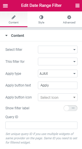
- Select Filter - here you need to select the filter that was previously created and has the Date Range filter type.
- This filter for - here you need to select the listing or archive for which you want to apply the current filter. There are such options:
- Elementor Pro Archive Products - select it in case you're applying the filter to the archive page built with Elementor using Elementor Pro Archive Products widget.
- Elementor Pro Archive - choose it in case you're applying the filter to the archive page built with Elementor using Elementor Pro Posts widget.
- Elementor Pro Posts - in case you’re applying the filter to the content created with Elementor Pro Posts widget, use this option.
- Elementor Pro Products - in case you’re applying the filter to the content created with Elementor Pro Products widget, use this option.
- JetEngine Calendar - select this option in case you’ve got the Calendar widget with the publications shown inside and want the visitors to apply this filter for Calendar content.
- JetEngine - choose it in case you’ve got the listing created by JetEngine listing Grid widget.
- WooCommerce Products Grid - if you’re adding the products to page built with Elementor using JetWoobuilder Products Grid widget, select this option to apply the filter for this specific widget and the products displayed by it.
- WooComerce Products List - if you’re adding the products to page built with Elementor using JetWoobuilder Products List widget, select this option to apply the filter for this specific widget and the products displayed by it.
- WooCommerce Archive (by JetWooBuilder) - in case you’re applying the filter to the products or archive (on Shop page) created with JetWooBuilder widgets, use this option.
- WooCommerce Shortcode - in case you’re displaying the WooCommerce products or categories with WooCommerce shortocde added to a page built with Elementor, and want to apply the following filter for these products or categories, select this option.
Please, note, that in order to filter the products, you’ll have to use the proper meta keys.
- Apply type - here you can choose which filter type is preferable for this filter. An AJAX filter type allows filtering using AJAX method without reloading the page, which makes the filtering through the products much faster for the visitors. The Page Reload filter reloads the page each time the visitor applies the filter.
- Show Apply button - enable this option to display Apply button and allow the visitors set the range and only then apply the filter on button click.
- Show filter label - enable this option to add the filter label set for this filter to the top of it.
- Query ID - in case you’re using more than one filter and display more than one listing grid, products grid, etc., on the page, you can use the Query ID option to define which filter is applied to which widget.
To set an ID for the products grid or listing grid widget, open its Advanced settings and fill in the CSS ID and CSS Classes values into the corresponding fields.
You have to input the same ID into the Query ID field to assign this particular filter to the specific widget on the page.
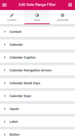
Style
- Position - here you can select the type of position applied for the Date range filter: the inline or columns.
- Input width - here you can apply the custom responsive width for the widget’s inputs.
- Calendar width - here you can customize the general width f the calendar.
- Background color - here you can select the proper background color to use for the calendar.
- Border type - here you can specify the type of the border to apply for the element. After that, you’ll get access to border color and width.
- Border radius - here you can specify the type of the border to apply for the element. After that, you’ll get access to border color and width.
- Box shadow - apply the Shadow option for the element.
- Padding - here you can set the responsive padding for the element.
- Color - here you can specify the color to use for the text.
- Typography - turn the option on to view the typography settings. They are similar to the ones for the Checkbox label.
- Size - here you can specify the size of the navigation elements.
- Color - here you can specify the color to use for the element.
- Hover color - here you can set the color to show on hover.
- Border type - here you can specify the type of the border to apply for the header. After that, you’ll get access to border color and width.
- Header background color - here you can select the proper background color to use for the header.
- Padding - here you can set the responsive padding for the element.
- Border type - here you can specify the type of the border to apply for the cells. After that, you’ll get access to border color and width.
- Typography - turn the option on to view the typography settings. They are similar to the ones for the Checkbox label.
- Color - here you can specify the color to use for the content.
- Background color - here you can select the proper background color to use for the content.
- Border type - here you can specify the type of the border to apply for the button. After that, you’ll get access to border color and width.
- Border radius - specify the responsive border to apply around the element.
- Padding - here you can set the responsive padding for the element.
- Width - here you can specify the width of the inputs.
- Typography - turn the option on to view the typography settings. They are similar to the ones for the Checkbox label.
- Color - here you can specify the color to use for the inputs.
- Background color - here you can select the proper background color to use for the inputs.
- Border type - here you can specify the type of the border to apply for the inputs block. After that, you’ll get access to border color and width.
- Border radius - specify the responsive border to apply around the element.
- Box shadow - apply the Shadow option for the element.
- Padding - here you can set the responsive padding for the element.
- Typography - turn the option on to view the typography settings. They are similar to the ones for the Checkbox label.
- Color - here you can specify the color to use for the text.
- Border type - here you can specify the type of the border to apply for the label. After that, you’ll get access to border color and width.
- Padding - here you can set the responsive padding for the element.
- Margin - here you can set the responsive margin for the element.
- Text alignment - here you can change the label element alignment to left, center or right.
- Typography - turn the option on to view the typography settings. They are similar to the ones for the Checkbox label.
- Text color - here you can specify the color to use for the text.
- Background color - here you can select the proper background color to use for the text.
- Border type - here you can specify the type of the border to apply for the button. After that, you’ll get access to border color and width.
- Border radius - specify the responsive border to apply around the element.
- Box shadow - apply the Shadow option for the element.
- Padding - here you can set the responsive padding for the element.
- Margin - here you can set the responsive margin for the element.
Content
Calendar
Calendar Title
Calendar Prev/Next
Calendar header
Cells
Cells content
Inputs
Label
Button
Switch between Normal and Hover modes to create a different appearance for each of them.
Calendar
Calendar Title
Calendar Prev/Next
Calendar header
Cells
Cells content
Inputs
Label
Button
Switch between Normal and Hover modes to create a different appearance for each of them.
Radio Filter
Use this filter widget to display the radio filter allowing to select from the options represented for the visitor’s choice.
Content
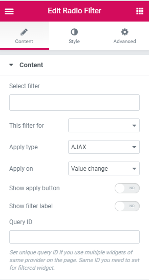
- Select Filter - here you need to select the filter that was previously created and has the Radio filter type.
- This filter for - here you need to select the listing or archive for which you want to apply the current filter. There are such options:
- Elementor Pro Archive Products - select it in case you're applying the filter to the archive page built with Elementor using Elementor Pro Archive Products widget.
- Elementor Pro Archive - choose it in case you're applying the filter to the archive page built with Elementor using Elementor Pro Posts widget.
- Elementor Pro Posts - in case you’re applying the filter to the content created with Elementor Pro Posts widget, use this option.
- Elementor Pro Products - in case you’re applying the filter to the content created with Elementor Pro Products widget, use this option.
- JetEngine Calendar - select this option in case you’ve got the Calendar widget with the publications shown inside and want the visitors to apply this filter for Calendar content.
- JetEngine - choose it in case you’ve got the listing created by JetEngine listing Grid widget.
- WooCommerce Products Grid - if you’re adding the products to page built with Elementor using JetWoobuilder Products Grid widget, select this option to apply the filter for this specific widget and the products displayed by it.
- WooComerce Products List - if you’re adding the products to page built with Elementor using JetWoobuilder Products List widget, select this option to apply the filter for this specific widget and the products displayed by it.
- WooCommerce Archive (by JetWooBuilder) - in case you’re applying the filter to the products or archive (on Shop page) created with JetWooBuilder widgets, use this option.
- WooCommerce Shortcode - in case you’re displaying the WooCommerce products or categories with WooCommerce shortocde added to a page built with Elementor, and want to apply the following filter for these products or categories, select this option.
Please, note, that in order to filter the products, you’ll have to use the proper meta keys.
- Apply type - here you can choose which filter type is preferable for this filter. An AJAX filter type allows filtering using AJAX method without reloading the page, which makes the filtering through the products much faster for the visitors. The Page Reload filter reloads the page each time the visitor applies the filter.
- Show Apply button - enable this option to display Apply button and allow the visitors select multiple checkboxes and only then apply the filter on button click. Show filter label - enable this option to add the filter label set for this filter to the top of it.
- Query ID - in case you’re using more than one filter and display more than one listing grid, products grid, etc., on the page, you can use the Query ID option to define which filter is applied to which widget.
- Space between - here you can set the space between the radio options and apply different spaces between them for mobile, tablet and desktop devices.
- Size - here you can specify the size to apply for the radio option container.
- Background color - here you can apply the custom color to use inside the radio option container.
- Box shadow - apply the Shadow option for the button.
- Border type - here you can specify the type of the border to apply for the element. After that, you’ll get access to border color and width.
- Border radius - specify the responsive border to apply around the element.
- Size - here you can set the size of the radio icon.
- Color - here you can set the color to use for the radio icon.
- Typography - turn the option on to view the typography settings.
- Size — define the font size to apply for the text.
- Family — here you can set the font family for the text.
- Weight — in this block you can select the suitable font weight.
- Transform — here you can choose from the dropdown menu, if you want the text to be shown in uppercase, lowercase, capitalize or normal way.
- Style — in this block you can choose from the dropdown menu the style of the font. It can be normal, italic (the characters look similar to handwriting) and oblique (the characters are slightly inclined to the right).
- Line Height — in this field you can set the height of the text line.
- Letter Spacing — here you can set the space between letters.
- Offset left - here you can specify the offset of the checkbox labels.
- Color - here you can specify the color to use for the label text.
- Typography - turn the option on to view the typography settings. They are similar to the ones for the Checkbox label.
- Color - here you can set the color to apply for the label text.
- Border type - here you can specify the type of the border to apply for the widget’s filter label. After the border is selected you'll be able to specify its width and color.
- Padding - here you can set the responsive padding for the label.
- Margin - here you can set the responsive margin for the label.
- Alignment - here you can change the widget’s filter label alignment to left, center or right.
- Typography - turn the option on to view the typography settings. They are similar to the ones for the Checkbox label.
- Text color - here you can specify the color to use for the text.
- Background color - here you can set the color to apply for the button plane background.
- Border type - here you can specify the type of the border to apply for the button. After that, you’ll get access to border color and width.
- Border radius - specify the responsive border to apply around the button.
- Box shadow - apply the Shadow option for the button.
- Padding - here you can set the responsive padding for the button.
- Margin - here you can set the responsive margin for the button.
- Alignment - here you can change the widget’s filter button alignment to left, center or right.
- Vertical Space Between - in case you’ve got the grouped filters, here you can apply the vertical space between them.
To set an ID for the products grid or listing grid widget, open its Advanced settings and fill in the CSS ID and CSS Classes values into the corresponding fields.
You have to input the same ID into the Query ID field to assign this particular filter to the specific widget on the page.
Style
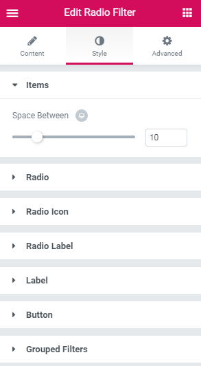
Items
Radio
Switch between Hover and Normal modes to customize the appearance of both.
Radio Icon
Radio label
Label
Button
Switch between the Normal and Hover modes to change the appearance of the button on hover and when it’s in its normal state.
Grouped Filters
Search Filter
Use this filter to allow the visitors to search for the matching results manually by inputting the needed words or phrases into the Search field.
Please, create the Search filter type in WordPress Dashboard > Smart Filters before proceeding to adding the Search filter widget to the page.
Content
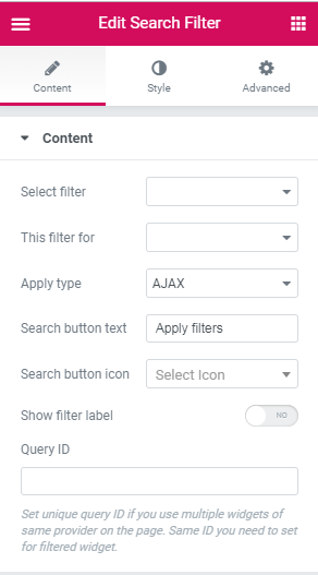
Select Filter - here you need to select the filter that was previously created and has the Search filter type.
- This filter for - here you need to select the listing or archive for which you want to apply the current filter. There are such options:
- Elementor Pro Archive Products - select it in case you're applying the filter to the archive page built with Elementor using Elementor Pro Archive Products widget.
- Elementor Pro Archive - choose it in case you're applying the filter to the archive page built with Elementor using Elementor Pro Posts widget.
- Elementor Pro Posts - in case you’re applying the filter to the content created with Elementor Pro Posts widget, use this option.
- Elementor Pro Products - in case you’re applying the filter to the content created with Elementor Pro Products widget, use this option.
- JetEngine Calendar - select this option in case you’ve got the Calendar widget with the publications shown inside and want the visitors to apply this filter for Calendar content.
- JetEngine - choose it in case you’ve got the listing created by JetEngine listing Grid widget.
- WooCommerce Products Grid - if you’re adding the products to page built with Elementor using JetWoobuilder Products Grid widget, select this option to apply the filter for this specific widget and the products displayed by it.
- WooComerce Products List - if you’re adding the products to page built with Elementor using JetWoobuilder Products List widget, select this option to apply the filter for this specific widget and the products displayed by it.
- WooCommerce Archive (by JetWooBuilder) - in case you’re applying the filter to the products or archive (on Shop page) created with JetWooBuilder widgets, use this option.
- WooCommerce Shortcode - in case you’re displaying the WooCommerce products or categories with WooCommerce shortocde added to a page built with Elementor, and want to apply the following filter for these products or categories, select this option.
Please, note, that in order to filter the products, you’ll have to use the proper meta keys.
- Apply type - here you can choose which filter type is preferable for this filter. An AJAX filter type allows filtering using AJAX method without reloading the page, which makes the filtering through the products much faster for the visitors. The Page Reload filter reloads the page each time the visitor applies the filter.
- Show Apply button - enable this option to display Apply button and allow the visitors select multiple checkboxes and only then apply the filter on button click. Show filter label - enable this option to add the filter label set for this filter to the top of it.
- Query ID - in case you’re using more than one filter and display more than one listing grid, products grid, etc., on the page, you can use the Query ID option to define which filter is applied to which widget.
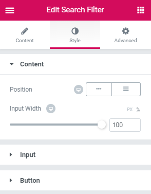
- Position -here you can select the type of position applied for the Search filter: the inline or columns.
- Input width - here you can apply the custom responsive width for the widget.
- Typography - turn the option on to view the typography settings. They are similar to the ones for the Checkbox label.
- Color - here you can specify the color to use for the input.
- Background color - here you can select the proper background color to use for the input.
- Border type - here you can specify the type of the border to apply for the inputs block. After that, you’ll get access to border color and width.
- Border radius - specify the responsive border to apply around the element.
- Box shadow - apply the Shadow option for the element.
- Padding - here you can set the responsive padding for the element.
- Typography - turn the option on to view the typography settings. They are similar to the ones for the Checkbox label.
- Text color - here you can specify the color to use for the text.
- Background color - here you can set the color to apply for the button plane background.
- Border type - here you can specify the type of the border to apply for the button. After that, you’ll get access to border color and width.
- Border radius - specify the responsive border to apply around the button.
- Box shadow - apply the Shadow option for the button.
- Padding - here you can set the responsive padding for the button.
- Margin - here you can set the responsive margin for the button.
- Alignment - here you can change the widget’s filter button alignment to left, center or right.
To set an ID for the products grid or listing grid widget, open its Advanced settings and fill in the CSS ID and CSS Classes values into the corresponding fields.
You have to input the same ID into the Query ID field to assign this particular filter to the specific widget on the page.
Style
Content
Input
Button
Switch between the Normal and Hover modes to change the appearance of the button on hover and when it’s in its normal state.
Rating Filter
Use this filter to allow the visitors to search posts or products by their average rating via marking a certain number of the stars.
Please, create the Rating filter type in WordPress Dashboard > Smart Filters before proceeding to adding the Rating filter widget to the page.
Content
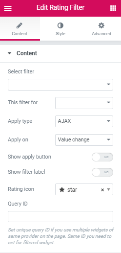
Select Filter - here you need to select the filter that was previously created and has the Rating filter type.
- This filter for - here you need to select the listing or archive for which you want to apply the current filter. There are such options:
- Elementor Pro Archive Products - select it in case you're applying the filter to the archive page built with Elementor using Elementor Pro Archive Products widget.
- Elementor Pro Archive - choose it in case you're applying the filter to the archive page built with Elementor using Elementor Pro Posts widget.
- Elementor Pro Posts - in case you’re applying the filter to the content created with Elementor Pro Posts widget, use this option.
- Elementor Pro Products - in case you’re applying the filter to the content created with Elementor Pro Products widget, use this option.
- JetEngine Calendar - select this option in case you’ve got the Calendar widget with the publications shown inside and want the visitors to apply this filter for Calendar content.
- JetEngine - choose it in case you’ve got the listing created by JetEngine listing Grid widget.
- WooCommerce Products Grid - if you’re adding the products to page built with Elementor using JetWoobuilder Products Grid widget, select this option to apply the filter for this specific widget and the products displayed by it.
- WooComerce Products List - if you’re adding the products to page built with Elementor using JetWoobuilder Products List widget, select this option to apply the filter for this specific widget and the products displayed by it.
- WooCommerce Archive (by JetWooBuilder) - in case you’re applying the filter to the products or archive (on Shop page) created with JetWooBuilder widgets, use this option.
- WooCommerce Shortcode - in case you’re displaying the WooCommerce products or categories with WooCommerce shortocde added to a page built with Elementor, and want to apply the following filter for these products or categories, select this option.
Please, note, that in order to filter the products, you’ll have to use the proper meta keys.
- Apply type - here you can choose which filter type is preferable for this filter. An AJAX filter type allows filtering using AJAX method without reloading the page, which makes the filtering through the products much faster for the visitors. The Page Reload filter reloads the page each time the visitor applies the filter.
- Show Apply button - enable this option to display Apply button and allow the visitors select multiple checkboxes and only then apply the filter on button click.
- Show filter label - enable this option to add the filter label set for this filter to the top of it.
- Rating icon - here you can define the icon of the rating.
- Query ID - in case you’re using more than one filter and display more than one listing grid, products grid, etc., on the page, you can use the Query ID option to define which filter is applied to which widget.
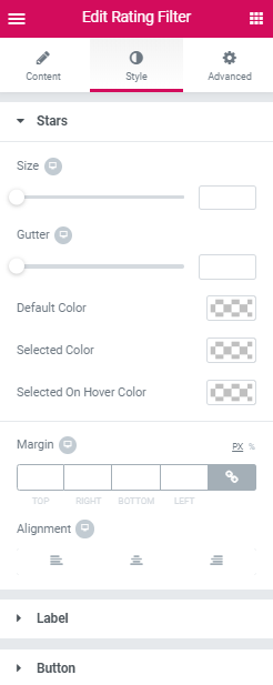
- Size - here you can set the size of the stars.
- Gutter - here you can specify the gutter between the stars.
- Default Color - here you can choose the defauld color of the stars.
- Selected Color - here you can set the color of the selected stars.
- Selected On Hover Color - here you can adjust the color of the selected stars on hover.
- Margin - here you can set the responsive margin for the stars box.
- Alignment - here you can change the stars alignment to left, center or right.
- Typography - turn the option on to view the typography settings.
- Color - here you can specify the color to use for the element.
- Border type - here you can specify the type of the border to apply for the label. After that, you’ll get access to border color and width.
- Padding - here you can set the responsive padding for the element.
- Margin - here you can set the responsive margin for the element.
- Alignment - here you can change the widget’s filter element alignment to left, center or right.
- Typography - turn the option on to view the typography settings.
- Text color - here you can specify the color to use for the text.
- Background color - here you can set the color to apply for the button plane background.
- Border type - here you can specify the type of the border to apply for the button. After that, you’ll get access to border color and width.
- Border radius - specify the responsive border to apply around the button.
- Box shadow - apply the Shadow option for the button.
- Padding - here you can set the responsive padding for the button.
- Margin - here you can set the responsive margin for the button.
- Alignment - here you can change the widget’s filter button alignment to left, center or right.
To set an ID for the products grid or listing grid widget, open its Advanced settings and fill in the CSS ID and CSS Classes values into the corresponding fields.
You have to input the same ID into the Query ID field to assign this particular filter to the specific widget on the page.
Style
Stars
Label
Button
Switch between the Normal and Hover modes to change the appearance of the button on hover and when it’s in its normal state.