JetReviews
Review Widget
From this block you can learn more about the key features and options allowing to customize JetReview widget content and style.
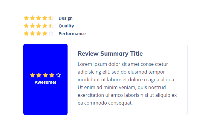
Review Widget Sample
On the picture below you can view the Review widget sample.
Adding Review Widget
- First, let’s open the page where you want to add the Review widget using Elementor live page builder. To do it click Edit with Elementor button.
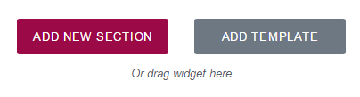
- Add a new section to the page using ADD NEW SECTION button. Select the section’s structure you want to use (e.g., 1 column).
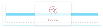
- On the left you can see the list of the available widgets which you can drop to the column you’ve created. Locate Review widget and drop it to the needed area.
- When the widget is added to the page you’ll see Edit Review block on the left. It is separated into 3 different tabs: Content, Style and Advanced. We’ll overview each of them.
Review Widget Content Block
In this block you can edit the content displayed with JetReview plugin.
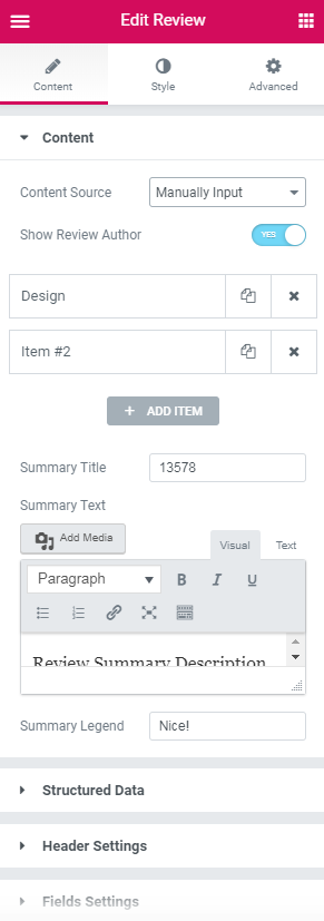
Content
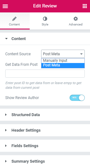
Content Source - here you can select, if you want to add content to the reviews widget manually, or use the post meta information (if it was previously added) to become the source of the widget’s content.
- In the case you’ve selected Manually Input content source, you’ll need to fill in the following information.
- Show Review Author - you can enable this option if you want to display information about the author of the review.
- Add item - click Add Item button to add the features which will be displayed in Review widget as the bars or rating categories.
- Each of the items has the following additional fields you’ll need to fill in.
- Label - here you need to name the rating category (e.g., Design, Quality, etc.).
- Field Value - here you need to input the value you want to assign to this rating category (e.g., 4).
- Field Max - here you need to specify the maximum value for the rating category (e.g., 5, in this case the item will display 4 from 5 possible rating points).
- Summary Title - here you need to fill in the title to use it for the review summary.
- Summary Description - here you have to fill in the summary text in the content field (you can also use html markup in Text editor, add media, etc.).
- Summary Legend - here you need to add the text to show up as the summary for the review.
- In the case you’ve selected Post Meta content source, you’ll need to fill in the following information.
- Get Data From Post - here you need to define the Post ID in order for the widget to get the information from it. Please, feel free to read How to Find Out Page / Post ID tutorial to learn how to find out the post ID.
>Show Review Author - you can enable this option if you want to display information about the author of the review.
- Add Structured Data to Review Box - enable this option in order to add the data markup for the review content and enable ranking and displaying it with Google.
- Average Layout - here you can choose the preferable layout for the average rating (you can set Points, Percentage or Stars).
- Progressbar - enable this option in order to display the average rating in the form of a progressbar.
- Values Position - here you can select the position of the average rating either inside or above the progress bar.
- Layout - here you can select the preferable type of the rating to use it for the items with rating categories (you can set Points, Percentage or Stars).
- Progressbar - enable this option in order to display the rating in the form of a progressbar.
Note, that the progressbar is available only for Percentage and Points layout types.
- Values Position - enable this option in order to display the rating in the form of a progressbar.
- Values Alignment - in the case you’ve set Values Position > Above Progressbar, you can define if the value will be displayed on the left or on the right.
- Summary Results Block Position - here you can select one of the following positions for the Summary Results block:
- At right side of summary box:;
- At bottom of summary box;
- At left side of summary box;
- At top of summary box.
- Results Block Width - here you can specify width of the the results block.
- Summary Average Layout - here you can choose the preferable layout for the summary average results (you can set Points, Percentage or Stars).
- Progressbar - enable this option in order to display the summary results in the form of a progressbar.
- Values Position - here you can select the position of the summary results either inside or above the progress bar.
- Results Block Width - in the case you’ve selected Right or Left block position, you’ll be able to define the Results block width using the corresponding control.
- Summary Average Layout - here you can specify the summary layout type (Points, Percentage, Stars).
- In the case you’ve selected Percentage or Points layout type, you’ll be able to enable Progressbar and set the needed values position (Above or Inside the progressbar).
Structured Data
Header Settings
The header appears when there are at least 2 reviews.
Fields Settings
Summary Settings
Results Block Width
Review Widget Style Block
In this block you can change the style and layout which is used when displaying Review widget.
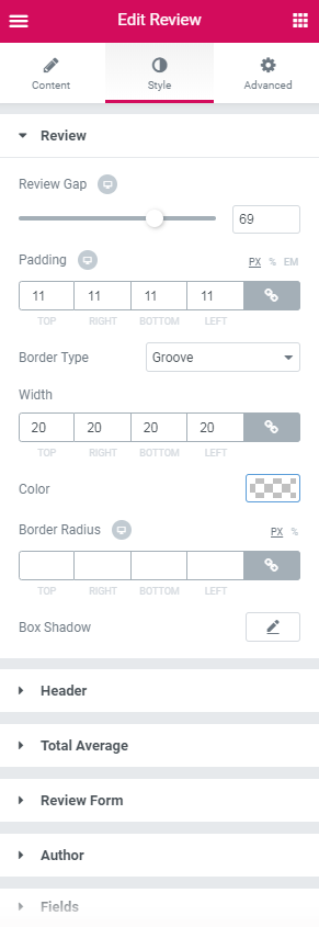
Review
Review Gap - here you can fix the appropriate gap between reviews for different screen resolutions.
Padding - here you can set the preferable custom padding for the review. Fill in the values for the top, bottom, right and left padding in pixels to apply your custom padding.
Border Type - select the preferable border type to use it for the review.
Border Radius - here you can define the value of the border radius to make the angles more smooth and round.
Box Shadow - enable this option if you want to access the shadow advanced settings for review, and need to apply shadow for it.
Header
Background Color - here you can select the color to use it for the header background.
Padding - here you can set the preferable custom padding for the header. Fill in the values for the top, bottom, right and left padding in pixels to apply your custom padding.
Margin - here you can apply your custom margins in pixels to set them for the header block.
Border Type - select the preferable border type to use it for the header.
Border Radius - here you can define the value of the border radius to make the angles more smooth and round.
Title
Color - here you can pick color of the title.
Typography - turn the option on to view the typography settings.
Alignment - here you can define the preferable title alignment. The title can be placed to the left, to the right, or remain centered.
Color - here you can change the color of the value in the average rating.
Typography - turn the option on to view the typography settings.
Size — define the font size of the title.
Family — here you can set the font family for the title.
Weight — in this block you can select the suitable font weight.
Transform — here you can choose from the dropdown menu, if you want the title to be shown in uppercase, lowercase, capitalize or normal way.
Style — in this block you can choose from the dropdown menu the style of the font. It can be normal, italic (the characters look similar to handwriting) and oblique (the characters are slightly inclined to the right).
Line Height — in this field you can set the height of the slide title line.
Letter Spacing — here you can set the space between letters.
Stars Size - here you can set different size for the stars for different screen resolutions.
Empty Stars Color - here you can set the color to use it for the empty stars.
Filled Stars Color - here you need to specify the color to use for the filled stars.
Stars Gaps - here you can fix the appropriate gap between stars.
Progress Height - here you can define the height of the progress bar for different device screens.
Progress Canvas Color - here you can select the color to use it for the empty part of the progress bar.
Border Type - select the preferable border type to use it for the progress bar.
Width - here you can specify width of the borders.
Color - here you can pick color of the borders.
Progress Bar Color - here you can select the color to use of the filled part of the progress bar.
Padding - here you can set the preferable custom padding for the item progress bar. Fill in the values for the top, bottom, right and left padding in pixels to apply your custom padding.
Margin - here you can apply your custom margins in pixels to set them for the item progress bar block.
Border Radius - here you can define the value of the border radius to make the angles more smooth and round.
Fields Gap - here you fix the appropriate gap between fields.
Border Type - select the preferable border type to use it for the container.
Border Radius - here you can define the value of the border radius to make the angles more smooth and round.
Box Shadow - enable this option if you want to access the shadow advanced settings for container, and need to apply shadow for it.
Padding - here you can set the preferable custom padding for the container. Fill in the values for the top, bottom, right and left padding in pixels to apply your custom padding.
Margin - here you can apply your custom margins in pixels to set them for the container.
Color - here you can change the color of the title color.
Typography - turn the option on to view the typography settings.
Color - here you can select the color of the labels.
Typography - turn the option on to view the typography settings.
Slider Color - here you can change the color of the slider.
Color - here you can change the color of the input color.
Typography - turn the option on to view the typography settings.
Border Type - select the preferable border type to use it for the input fiels.
Border Radius - here you can define the value of the border radius to make the angles more smooth and round.
Padding - here you can set the preferable custom padding for the input. Fill in the values for the top, bottom, right and left padding in pixels to apply your custom padding.
Typography - turn the option on to view the typography settings.
Text Color - here you can pick color of text on the submit button
Background Color - here you can pick background color of the submit button.
Border Type - select the preferable border type to use it for the submit button.
Width - here you can specify width of the borders.
Color - here you can pick color for the borders of the submit button.
Border Radius - here you can define the value of the border radius to make the angles more smooth and round.
Box Shadow - enable this option if you want to access the shadow advanced settings for submit button, and need to apply shadow for it.
Padding - here you can set the preferable custom padding for the input. Fill in the values for the top, bottom, right and left padding in pixels to apply your custom padding.
Background Type — in this block you can choose, whether you want to use classic or gradient type for the background of the block with information about the author of review. The customization options vary for each type.
Color — here you can set color for the background using color picker tool.
Image — here you can choose the image you want to use as a background. Select the image from the media library or upload it to define it as a background in this block. When the image is uploaded, you’ll be able to define its position, alignment, turn on repeat and set the necessary size.
Color — here you can set background color for the block using color picker tool.
Location — here you can define the proportion for the first color in the gradient background.
Second Color — here you can set the second color to use in the gradient background.
Location — here you can define the proportion for the second color in the gradient background.
Type — define, if you want to use linear or radial type of the gradient.
Angle — in this block you can set the angle for the gradient (in degrees).
Border Type - select the preferable border type to use it for the block.
Border Radius - here you can define the value of the border radius to make the angles more smooth and round.
Alignment - here you can define the preferable block alignment.
Border Radius - here you can define the value of the border radius to make the angles more smooth and round.
Avatar Size - here you can set different size for the avatar for different screen resolutions.
Border Type - select the preferable border type to use it for the avatar.
Border Radius - here you can define the value of the border radius to make the angles more smooth and round.
Margin - here you can apply your custom margins in pixels to set them for the container.
Color - here you can select the color for the name.
Typography - turn the option on to view the typography settings.
Color - here you can select the color for the email address.
Typography - turn the option on to view the typography settings.
Color - here you can select the color for the date.
Typography - turn the option on to view the typography settings.
Border Type - select the preferable border type to use it for the fields box.
Width - here you can specify width of the borders.
Color - here you can pick color for the borders of the fields box.
Border Radius - here you can define the value of the border radius to make the angles more smooth and round.
Fields Box Padding - here you can set the preferable custom padding for the item label and value field. Fill in the values for the top, bottom, right and left padding in pixels to apply your custom padding.
Color - here you can select the color of the fields labels.
Typography - turn the option on to view the typography settings. They are similar to the typography settings of Review Title block.
Color - here you can select the color of the fields values.
Typography - turn the option on to view the typography settings. They are similar to the typography settings of Review Title block.
Background color - here you can select the color to use it for the item label and value background.
Padding - here you can set the preferable custom padding for the item label and value field. Fill in the values for the top, bottom, right and left padding in pixels to apply your custom padding.
Margin - here you can apply your custom margins in pixels to set them for the item label and value block.
Border Type - select the preferable border type to use it for the item label and value field.
Border Radius - here you can define the value of the border radius to make the angles more smooth and round.
Stars Size - here you can set different size for the stars for different screen resolutions.
Empty Stars Color - here you can set the color to use it for the empty stars.
Filled Stars Color - here you need to specify the color to use for the filled stars.
Progress Height - here you can define the height of the progress bar for different device screens.
Progress Canvas Color - here you can select the color to use it for the empty part of the progress bar.
Progress Bar Color - here you can select the color to use of the filled part of the progress bar.
Padding - here you can set the preferable custom padding for the item progress bar. Fill in the values for the top, bottom, right and left padding in pixels to apply your custom padding.
Margin - here you can apply your custom margins in pixels to set them for the item progress bar block.
Border Radius - here you can define the value of the border radius to make the angles more smooth and round.
Color - here you can select the color of the summary title.
Typography - turn the option on to view the typography settings. They are similar to the typography settings of Review Title block.
Color - here you can select the color of the summary content.
Typography - turn the option on to view the typography settings. They are similar to the typography settings of Review Title block.
Background Color - here you can set the needed background color of the whole review summary block.
Alignment - here you can set the alignment for the summary block content (right, center, left).
Padding - here you can set the preferable custom padding for the summary box content. Fill in the values for the top, bottom, right and left padding in pixels to apply your custom padding.
Margin - here you can apply your custom margins in pixels to set them for the summary block.
Border Type - select the preferable border type to use it for the summary box.
Border Radius - here you can define the value of the border radius to make the angles more smooth and round.
Color - here you can select the color of the border.
Width - here you can set the preferable width to use for the border.
Color - here you can select the color of the summary legend text.
Typography - turn the option on to view the typography settings. They are similar to the typography settings of Review Title block.
Color - here you can select the color of the summary value.
Typography - turn the option on to view the typography settings. They are similar to the typography settings of Review Title block.
Background Color - here you can set the color to use it for the summary value background.
Alignment - here you can set the alignment for the summary value block (right, center, left).
Padding - here you can set the preferable custom padding for the summary value block. Fill in the values for the top, bottom, right and left padding in pixels to apply your custom padding.
Margin - here you can apply your custom margins in pixels to set them for the summary value block.
Border Type - select the preferable border type to use it for the summary value box.
Border Radius - here you can define the value of the border radius to make the angles more smooth and round.
Stars Size - here you can set different size for the stars for different screen resolutions.
Empty Stars Color - here you can set the color to use it for the empty stars.
Filled Stars Color - here you need to specify the color to use for the filled stars.
Progress Height - here you can define the height of the progress bar for different device screens.
Progress Canvas Color - here you can select the color to use it for the empty part of the progress bar.
Progress Bar Color - here you can select the color to use of the filled part of the progress bar.
Padding - here you can set the preferable custom padding for the summary value progress bar. Fill in the values for the top, bottom, right and left padding in pixels to apply your custom padding.
Margin - here you can apply your custom margins in pixels to set them for the item progress bar block.
Border Radius - here you can define the value of the border radius to make the angles more smooth and round.
Total Average
Value
Stars Rating
Progress Styles
Review Form
Container
Title
Label
Slider
Input
Submit
Here you can switch from customizing Normal to Hover Submit button style settings. Just click on the button Hover to proceed to customizing hover elements.
Author
Container
Classic Background
Gradient Background
Avatar
Name
Date
Fields
Fields Box
Label
Value
Stars Rating
Progress Styles
Summary
Summary Title
Summary Content
Summary Box
Summary Average
Legend
Value
Stars Rating
Progress Styles
Advanced Settings
In this block you can change the basic Review appearance settings.
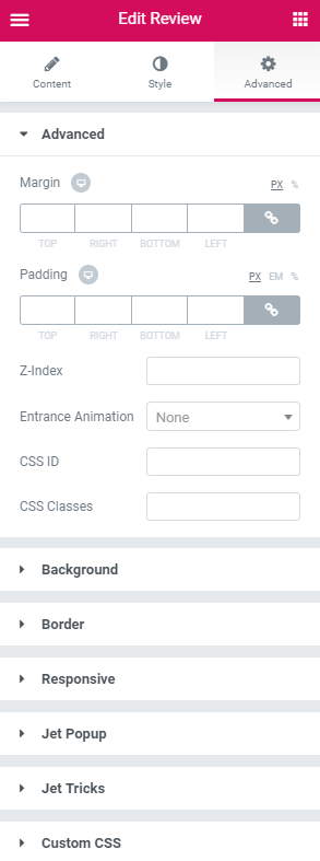
Element Style
- Margin — in this block you can input the values (in pixels) to define the margins for the module you're customizing.
- Padding— here you can set the custom padding for the module. Fill in the values for the top, bottom, right and left padding in pixels to apply your custom padding.
- Z-index— input the value of the z-index to use it for the module.
- Entrance Animation- choose from the dropdown menu one of the styles for the module to appear on the page.
- Animation Duration — here you can define the time during which the module will appear on the page. It can be normal, slow or fast. Choose the one you need from the dropdown menu.
- Animation Delay (ms) — input the value (in ms) for the animation delay.
- CSS Classes — here you can define the CSS class for the module.
Background
Here you can switch from customizing Normal to Hover background style settings. Just click on the button Hover to proceed to customizing hover elements.
- Background Type — in this block you can choose, whether you want to use classic or gradient type for the module background. The customization options vary for each type.
Classic Background Type
- Color — here you can set background color for the background using color picker tool.
- Image — here you can choose the image you want to use as a background. Select the image from the media library or upload it to define it as a background in this block. When the image is uploaded, you’ll be able to define its position, alignment, turn on repeat and set the necessary size.
Gradient Background Type
- Color — here you can set background color for the module using color picker tool.
- Location — here you can define the proportion for the first color in the gradient background.
- Second Color — here you can set the second color to use in the gradient background.
- Location — here you can define the proportion for the second color in the gradient background.
- Type — define, if you want to use linear or radial type of the gradient.
- Angle — in this block you can set the angle for the gradient (in degrees).
Border
Here you can switch from customizing Normal to Hover border style settings. Just click on the button Hover to proceed to customizing hover elements.
Border Type — here you can select the type of the border from the dropdown menu. Here is the list of available border types:
- none;
- solid;
- doubled;
- dotted;
- dashed.
Border Radius — here you can select the radius for the applied border (in pixels).
Box Shadow — enable this option if you want to access the shadow advanced settings for this module, and need to apply shadow for it.
Shadow Settings:
- color — here you can set the color for the shadow (use color picker tool to do it);
- blur — in this block you can define the blur settings for the shadow;
- spread — here you can set how large the shadow will be;
- horizontal — here you can move the shadow horizontally (from right to left);
- vertical — here you can move the shadow vertically (from top to bottom);
- position — here you need to choose, whether you want the shadow to outline the module, or to be inset.