JetProductGallery Documentation
JetProductGallery Widgets
Here you can learn more about the widgets represented in JetProductGallery addon.
Gallery Anchor Navigation
This widget allows organizing product images in a stylish form of a vertical gallery with anchor navigation.
Content
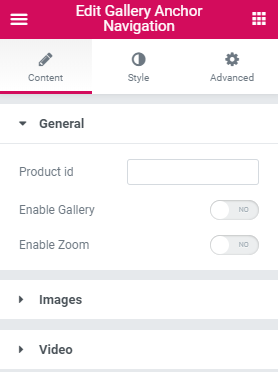
General Settings
- Product ID - here you can specify a certain product, which images are to be displayed by the widget.
- Enable Gallery - use this option if you want to get an access to customization settings of product images gallery.
- Enable Zoom - this option allows applying zoom to product images.
Images
- Image Size - here you can choose from the drop-down list the size of product images.
Gallery
- Button Icon - here you can choose the size of product images in a gallery.
- Show Caption - enable this option in order for the caption of product images to be shown or hidden in the gallery.
Controls
- Show Full Screen - here you can specify if the product gallery is to be showcased fullwidth.
- Show Zoom - here you can adjust the zoom to the product gallery.
- Show Share - here it is available to show share option in the product gallery.
- Show Counter - here you can enable a counter in the product gallery.
- Show Arrows - here you can set if navigation arrows are to be shown or hidden in the product gallery.
Video
You can add the video in the Single Product gallery by inserting video URL of the needed video from Youtube, Vimeo or self-hosted site in Single Product template >Jet Product Gallery Video settings. You can also apply a certain placeholder for the video. This option is available for all JetProductGallery widgets.
- Display Video In - here you can select how the video is to be shown: as a popup or inside the content.
- Aspect Ratio - this option allows your video item to be scaled according to your needs.
Options
- Autoplay - enable this option if you want the video to play automatically.
- Loop - turn this option on if you don’t want the video to stop (the start and end time options will cease to affect the video).
Overlay
- Overlay Color - here you can select the color of the overlay.
Play Button
- Show Play Button - this option allows to display the play button.
- Play Button Type - here you can customize the icon design of the play button. There can be an icon or an image.
- Icon - here you can choose an icon for the play button.
- Image - here you can choose an image for the play button.
Style
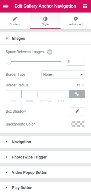
Images
- Space Between Images - here you can set the space between images.
- Border Type - here you can define the needed border type for the widget. It can be dotted, dashed, double, groove or solid.
- Width - ere you can set the width of the border.
- Color - ere you can set the color of the border.
- Border Radius - here you can set the border radius values to make the border angles more smooth and rounded.
- Box Shadow - enable this option if you want to access the shadow advanced settings for this widget, and need to apply shadow for it.
- Background Color - here you can specify the background color of the border.
Navigation
- Offset Top (px) - here you can set the preferable offset of the navigation.
- Position - here you can define the position of the navigation. It can be located on the left or on the right of the images.
Bullets
- Width - here you can set the width of the bullets.
- Height - here you can set the height of the bullets.
- Background Color - here you can choose the background color of the bullets.
- Border Type - here you can define the needed border type for the bullets. It can be dotted, dashed, double, groove or solid.
- Width - here you can set the width of the bullets border.
- Color - here you can pick the color of the bullets border.
- Box Shadow - enable this option if you want to access the shadow advanced settings for this widget, and need to apply shadow for it.
- Border Radius - here you can set the border radius values to make the border angles more smooth and rounded.
- Margin - fill in the custom margin values to add a responsive margin around the bullets.
Switch between Normal, Hover and Current styles to customize the bullets appearance on hover, when current and in normal state.
Photoswipe Trigger
- Position - define the position of the photoswipe trigger.
- Size - customize the size of the photoswipe trigger.
- Icon Size - here you can adjust the icon size of the photoswipe trigger.
- Color - here you can set the color of the photoswipe trigger.
- Background Color - here you can choose the background color of the photoswipe trigger.
- Border Color - here you can define the needed border color of the photoswipe trigger.
- Border Type - here you can define the needed border type for the photoswipe trigger. It can be dotted, dashed, double, groove or solid.
- Border Radius - here you can set the border radius values to make the border angles more smooth and rounded.
- Margin - fill in the custom margin values to add a responsive margin around the photoswipe trigger.
Switch between Normal and Hover styles to customize the Photoswipe Trigger appearance on hover and in normal state.
Video Popup Button
- Icon Size - here you can set the size of the icon.
- Color - here you can set the color of the video popup button.
- Background Color - here you can choose the background color of the video popup button.
- Border Type - here you can define the needed border type for the video popup button. It can be dotted, dashed, double, groove or solid.
- Width - here you can define the width of the border.
- Color - here you can define the color of the border.
- Border Radius - here you can set the border radius values to make the border angles more smooth and rounded.
- Padding - here you can set the custom padding for the video popup button. Fill in the values for the top, bottom, right and left padding in pixels to apply your custom padding.
- Margin - fill in the custom margin values to add a responsive margin around the video popup button.
- Alignment - set right, left or center alignment to use it for the video popup button.
Switch between Normal and Hover styles to customize the video popup button appearance on hover and in normal state.
Play Button
- Icon/Image Size - here you can set the size of the icon or the image.
- Color - here you can set the color of the play button.
- Background Color - here you can choose the background color of the play button.
- Box Shadow - enable this option if you want to access the shadow advanced settings for this widget, and need to apply shadow for it.
- Padding - here you can set the custom padding for the play button. Fill in the values for the top, bottom, right and left padding in pixels to apply your custom padding.
- Margin - fill in the custom margin values to add a responsive margin around the play button.
- Border Type - here you can define the needed border type for the play button. It can be dotted, dashed, double, groove or solid.
- Border Radius - here you can set the border radius values to make the border angles more smooth and rounded.
Switch between Normal and Hover styles to customize the bullets appearance on hover and in normal state.
Gallery Grid
This widget allows displaying single product images in a stylish grid layout.
Content
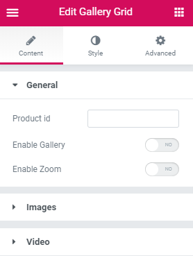
General
- Product ID - here you can select a certain product, images of which will be displayed in the widget.
- Enable Gallery - use this option if you want to get an access to customized options of product images gallery.
- Enable Zoom - this option allows to apply zoom to product images.
Images
- Image Size - here you can choose from drop-down list the size of product images.
- Columns - you can specify the number of columns.
Gallery
- Button Icon - here you can choose the size of product images in gallery.
- Show Caption - enable this option to make the caption of product images show up or stay hidden in the gallery.
Controls
- Show Full Screen - here you can specify if the product gallery is to be showcased fullwidth.
- Show Zoom - here you can adjust zoom to the product gallery.
- Show Share - here you can display share option in the product gallery.
- Show Counter - here you can enable a counter for the product gallery.
- Show Arrows - here you can set if navigation arrows are to be shown or not in the product gallery.
Video
- Display Video In - here you can select how the video is to be shown: as a popup or in the content.
- Aspect Ratio - this option allows your video item to be scaled according to your needs.
Options
- Autoplay - enable this option if you want the video to play automatically.
- Loop - turn this option on if you don’t want the video to stop (the start and end time options will cease to affect the video).
Overlay
- Overlay Color - here you can select the color of the overlay.
Play Button
- Show Play Button - this option allows to display play button.
- Play Button Type - here you can customize the icon design of the play button. It can be either an icon or an image.
- Icon - here you can choose an icon for the play button.
- Image - here you can choose an image for the play button.
Style
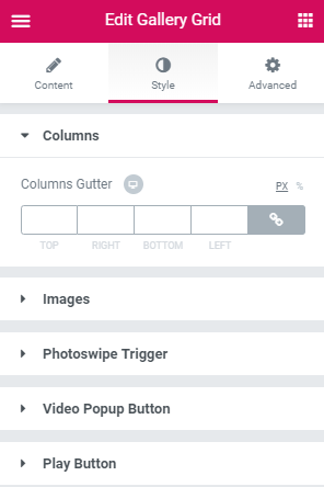
Columns
- Columns Gutter - here you can set the gutter between the columns.
Images
- Border Type - here you can define the needed border type for the widget. It can be dotted, dashed, double, groove or solid.
- Width - here you can define the width of the border.
- Color - here you can choose the color of the border.
- Border Radius - here you can set the border radius values to make the border angles more smooth and rounded.
- Box Shadow - enable this option if you want to access the shadow advanced settings for this widget, and need to apply shadow for it.
- Background Color - here you can specify the background color of the border.
- Padding - here you can set the preferable custom padding for the border.
Photoswipe Trigger
- Position - define the position of the photoswipe trigger.
- Size - customize the size of the photoswipe trigger.
- Icon Size - here you can adjust the icon size of the photoswipe trigger.
- Color - here you can set the color of the photoswipe trigger.
- Background Color - here you can choose the background color of the photoswipe trigger.
- Border Color - here you can define the needed border color of the photoswipe trigger.
- Border Type - here you can define the needed border type for the photoswipe trigger. It can be dotted, dashed, double, groove or solid.
- Border Radius - here you can set the border radius values to make the border angles more smooth and rounded.
- Margin - fill in the custom margin values to add a responsive margin around the photoswipe trigger.
Switch between Normal and Hover styles to customize the Photoswipe Trigger appearance on hover and in normal state.
Video Popup Button
- Icon Size - here you can set the size of the icon.
- Color - here you can set the color of the video popup button.
- Background Color - here you can choose the background color of the video popup button.
- Border Type - here you can define the needed border type for the video popup button. It can be dotted, dashed, double, groove or solid.
- Width - here you can define the width of the border.
- Color - here you can define the color of the border.
- Border Radius - here you can set the border radius values to make the border angles more smooth and rounded.
- Padding - here you can set the custom padding for the video popup button. Fill in the values for the top, bottom, right and left padding in pixels to apply your custom padding.
- Margin - fill in the custom margin values to add a responsive margin around the video popup button.
- Alignment - set right, left or center alignment to use it for the video popup button.
Switch between Normal and Hover styles to customize the video popup button appearance on hover and in normal state.
Play Button
- Icon/Image Size - here you can set the size of the icon or the image.
- Color - here you can set the color of the play button.
- Background Color - here you can choose the background color of the play button.
- Box Shadow - enable this option if you want to access the shadow advanced settings for this widget, and need to apply shadow for it.
- Padding - here you can set the custom padding for the play button. Fill in the values for the top, bottom, right and left padding in pixels to apply your custom padding.
- Margin - fill in the custom margin values to add a responsive margin around the play button.
- Border Type - here you can define the needed border type for the play button. It can be dotted, dashed, double, groove or solid.
- Border Radius - here you can set the border radius values to make the border angles more smooth and rounded.
Switch between Normal and Hover styles to customize the bullets appearance on hover and in normal state.
Gallery Modern
Gallery Modern widget allows arranging Single Product images in the form of an attractive gallery layout.
Content
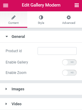
General
- Product ID - here you can select a certain product, images of which will be displayed in the module.
- Enable Gallery - use this option if you want to get an access to the costomization options of product images gallery.
- Enable Zoom - this option allows applying the zoom effect to product images.
Images
- Image Size - here you can choose from drop-down list the size of product images.
Gallery
- Button Icon - here you can choose the size of product images in gallery.
- Show Caption - enable this option and the caption of product images will be shown or hidden in the gallery.
Controls
- Show Full Screen - here you can specify if the product gallery is to be showcased fullwidth.
- Show Zoom - here you can adjust zoom for the product gallery.
- Show Share - here you can to display share option in the product gallery.
- Show Counter - here you can enable a counter in the product gallery.
- Show Arrows - here you can set if navigation arrows are to be shown or hidden in the product gallery.
Video
- Display Video In - here you can select how the video is to be shown: as a popup or in the content.
- Aspect Ratio - this option allows your video item to be scaled according to your needs.
Options
- Autoplay - enable this option if you want the video to play automatically.
- Loop - turn this option on if you don’t want the video to stop (the start and end time options will cease to affect the video).
Overlay
- Overlay Color - here you can select the color of the overlay.
Play Button
- Show Play Button - this option allows to display play button.
- Play Button Type - here you can customize the icon design of the play button. There can be icon or image.
- Icon - here you can choose icon for play button.
- Image - here you can choose image for play button.
Style
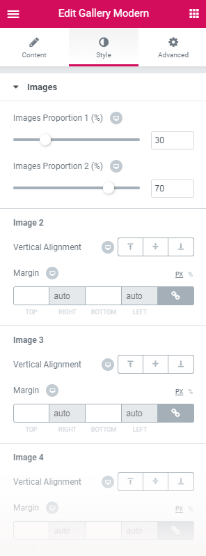
Images
- Images Proportion 1 (%) - here you can define the proportion of the image 2 and image 3.
- Images Proportion 2 (%) - here you can define the proportion of the image 4 and image 5.
Image 2
- Vertical Alignment - here you can select the needed vertical alignment for the image 2.
- Margin - fill in the custom margin values to add a responsive margin around the image 2.
Image 3
- Vertical Alignment - here you can select the needed vertical alignment for the image 3.
- Margin - fill in the custom margin values to add a responsive margin around the image 3.
Image 4
- Vertical Alignment - here you can select the needed vertical alignment for the image 4.
- Margin - fill in the custom margin values to add a responsive margin around the image 4.
Image 5
- Vertical Alignment - here you can select the needed vertical alignment for the image 5.
- Margin - fill in the custom margin values to add a responsive margin around the image 5.
- Border Type - here you can define the needed border type for the module. It can be dotted, dashed, double, groove or solid.
- Width - ere you can set the width of the border.
- Color - ere you can set the color of the border.
- Border Radius - here you can set the border radius values to make the border angles more smooth and rounded.
- Box Shadow - enable this option if you want to access the shadow advanced settings for this module, and need to apply shadow for it.
- Background Color - here you can specify the background color of the border.
- Padding - here you can set the custom padding for the images.
- Outer offset - here you can arrange the offset around the widget's container.
Photoswipe Trigger
- Show on hover - enable this option if you want the photoswipe trigger appears on hover.
- Position - define the position of the photoswipe trigger.
- Size - customize the size of the photoswipe trigger.
- Icon Size - here you can adjust the icon size of the photoswipe trigger.
- Color - here you can set the color of the photoswipe trigger.
- Background Color - here you can choose the background color of the photoswipe trigger.
- Border Color - here you can define the needed border color of the photoswipe trigger.
- Border Type - here you can define the needed border type for the photoswipe trigger. It can be dotted, dashed, double, groove or solid.
- Border Radius - here you can set the border radius values to make the border angles more smooth and rounded.
- Margin - fill in the custom margin values to add a responsive margin around the photoswipe trigger.
Switch between Normal and Hover styles to customize the Photoswipe Trigger appearance on hover and in normal state.
Video Popup Button
- Icon Size - here you can set the size of the icon.
- Color - here you can set the color of the video popup button.
- Background Color - here you can choose the background color of the video popup button.
- Border Type - here you can define the needed border type for the video popup button. It can be dotted, dashed, double, groove or solid.
- Width - here you can define the width of the border.
- Color - here you can define the color of the border.
- Border Radius - here you can set the border radius values to make the border angles more smooth and rounded.
- Padding - here you can set the custom padding for the video popup button. Fill in the values for the top, bottom, right and left padding in pixels to apply your custom padding.
- Margin - fill in the custom margin values to add a responsive margin around the video popup button.
- Alignment - set right, left or center alignment to use it for the video popup button.
Switch between Normal and Hover styles to customize the video popup button appearance on hover and in normal state.
Play Button
- Icon/Image Size - here you can set the size of the icon or the image.
- Color - here you can set the color of the play button.
- Background Color - here you can choose the background color of the play button.
- Box Shadow - enable this option if you want to access the shadow advanced settings for this module, and need to apply shadow for it.
- Padding - here you can set the custom padding for the play button. Fill in the values for the top, bottom, right and left padding in pixels to apply your custom padding.
- Margin - fill in the custom margin values to add a responsive margin around the play button.
- Border Type - here you can define the needed border type for the play button. It can be dotted, dashed, double, groove or solid.
- Border Radius - here you can set the border radius values to make the border angles more smooth and rounded.
Switch between Normal and Hover styles to customize the bullets appearance on hover and in normal state.
Gallery Slider
Gallery Slider displays single product images in an astonishing way. You can customize slider, gallery and video options, create eye-catching appearance of the element.
Content
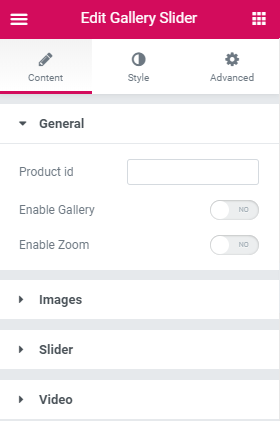
General
- Product id - here you can select a certain product, images of which will be displayed in the module.
- Enable Gallery - use this option if you want to get an access to customized options of product images gallery.
- Enable Zoom - this option allows to apply zoom to product images.
Images
- Image Size - here you can choose from drop-down list the size of product images.
- Thumbnails Image Size - here you can set the size of thumbnails image.
Slider
Navigation
- Show Navigation - in this block you can add navigation to the sides of the slides to provide easy switching from slide to slide for the visitors.
- Arrow Previous - here you can select the type of the arrow icon, that switches slider module to previous slide.
- Arrow Next - here you can select the type of the arrow icon, that switches slider module to next slide.
Pagination
- Show Pagination - here you can enable pagination at the bottom of Galler Slider to provide smoother navigation from slide to slide.
- Type - here you can choose the type of pagination. It can be displayed as bullets or thumbnails.
- Direction - here you can set the direction of pagination (vertical or horizontal).
- Position - here you can set the position of pagination. It can be on the left or on the right side.
Gallery
- Button Icon - here you can choose the size of product images in gallery.
- Show Caption - enable this option that the caption of product images will be showed or not in the gallery.
Controls
- Show Full Screen - here you can specify if the product gallery will be showcased fullwidth.
- Show Zoom - here you can adjust zoom to the product gallery.
- Show Share - here it is available to display share option in the product gallery.
- Show Counter - here you can enable a counter in the product gallery.
- Show Arrows - here you can set if navigation arrows will be showed or not in the product gallery.
Video
- Display Video In - here you can select how the video will be showed: as a popup or in the content.
- Aspect Ratio - this option allows your video item to be scaled according to your needs.
Options
- Autoplay - enable this option if you want the video to play automatically.
- Loop - turn this option on if you don’t want the video to stop (the start and end time options will cease to affect the video).
Overlay
- Overlay Color - here you can select the color of the overlay.
Play Button
- Show Play Button - this option allows to display play button.
- Play Button Type - here you can customize the icon design of the play button. There can be icon or image.
- Icon - here you can choose icon for play button.
- Image - here you can choose image for play button.
Style
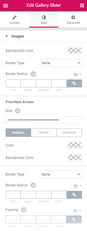
Images
- Background Color - here you can define the needed border type for the module. It can be dotted, dashed, double, groove or solid.
- Border Type - here you can define tthe design of the border. It can be dotted, dashed, double, groove or solid.
- Border Radius - here you can set the border radius values to make the border angles more smooth and rounded.
Prev/Next Arrows
- Size - here you can specify the size of the prev/next arrows.
- Color - here you can set the color of the prev/next arrows.
- Background Color - here you can choose the background color of the prev/next arrows.
- Border Type - here you can define the needed border type for the prev/next arrows. It can be dotted, dashed, double, groove or solid.
- Border Radius - here you can set the border radius values to make the border angles more smooth and rounded.
- Padding - fill in the custom padding values to add a responsive padding for the prev/next arrows.
Switch between Normal, Hover and Disabled styles to customize the Prev/Next Arrows appearance on hover, in disabled and normal state.
Prev Arrow
- Vertical Position by - here you can determine the position of the prev arrow vertically.
- Horizontal Position by - here you can adjust the position of the prev arrow horizontally.
- Left Indent - here you define the appropriate indent of the prev arrow to the left.
Next Arrow
- Vertical Position by - here you can determine the position of the next arrow vertically.
- Horizontal Position by - here you can adjust the position of the next arrow horizontally.
- Left Indent - here you define the appropriate indent of the next arrow to the left.
Pagination
- Size - define the size of the pagination dots.
- Background Color - in this block you can select the background color of the pagination dots.
- Border Color - in this block you can select the border color of the pagination dots.
- Border Type - here you can define the type of the border you need to use for the dots border.
- Border Radius - here you can set the border radius to make the angles more smooth and round.
- Margin - here you can define the margins for the pagination dots box.
Switch between Normal and Hover and Active styles to customize the pagination dots appearance on hover, in active and normal state.
Photoswipe Trigger
- Position - define the position of the photoswipe trigger.
- Size - customize the size of the photoswipe trigger.
- Icon Size - here you can adjust the icon size of the photoswipe trigger.
- Color - here you can set the color of the photoswipe trigger.
- Background Color - here you can choose the background color of the photoswipe trigger.
- Border Color - here you can define the needed border color of the photoswipe trigger.
- Border Type - here you can define the needed border type for the photoswipe trigger. It can be dotted, dashed, double, groove or solid.
- Border Radius - here you can set the border radius values to make the border angles more smooth and rounded.
- Margin - fill in the custom margin values to add a responsive margin around the photoswipe trigger.
Switch between Normal and Hover styles to customize the Photoswipe Trigger appearance on hover and in normal state.
Video Popup Button
- Icon Size - here you can set the size of the icon.
- Color - here you can set the color of the video popup button.
- Background Color - here you can choose the background color of the video popup button.
- Border Type - here you can define the needed border type for the video popup button. It can be dotted, dashed, double, groove or solid.
- Width - here you can define the width of the border.
- Color - here you can define the color of the border.
- Border Radius - here you can set the border radius values to make the border angles more smooth and rounded.
- Padding - here you can set the custom padding for the video popup button. Fill in the values for the top, bottom, right and left padding in pixels to apply your custom padding.
- Margin - fill in the custom margin values to add a responsive margin around the video popup button.
- Alignment - set right, left or center alignment to use it for the video popup button.
Switch between Normal and Hover styles to customize the video popup button appearance on hover and in normal state.
Play Button
- Icon/Image Size - here you can set the size of the icon or the image.
- Color - here you can set the color of the play button.
- Background Color - here you can choose the background color of the play button.
- Box Shadow - enable this option if you want to access the shadow advanced settings for this module, and need to apply shadow for it.
- Padding - here you can set the custom padding for the play button. Fill in the values for the top, bottom, right and left padding in pixels to apply your custom padding.
- Margin - fill in the custom margin values to add a responsive margin around the play button.
- Border Type - here you can define the needed border type for the play button. It can be dotted, dashed, double, groove or solid.
- Border Radius - here you can set the border radius values to make the border angles more smooth and rounded.
Switch between Normal and Hover styles to customize the bullets appearance on hover and in normal state.
