Shopify Documentation
Sections Configuration
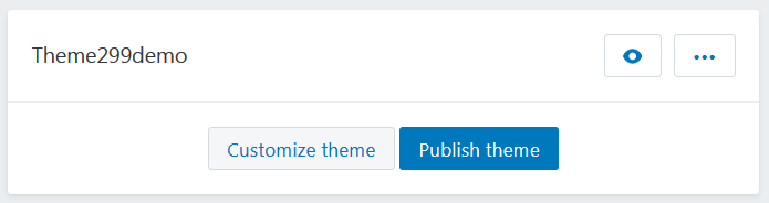
Navigate to the Online Store > Themes section.Select the theme you want to modify.
Click on the Customize theme button to open the settings editor page where you can change the appearance and content of the theme.
Go to the Sections tab. This is Live editor. You can track changes in the appearance of your store without reloading the page.
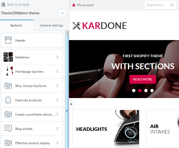
In your installed theme you will see the following options:
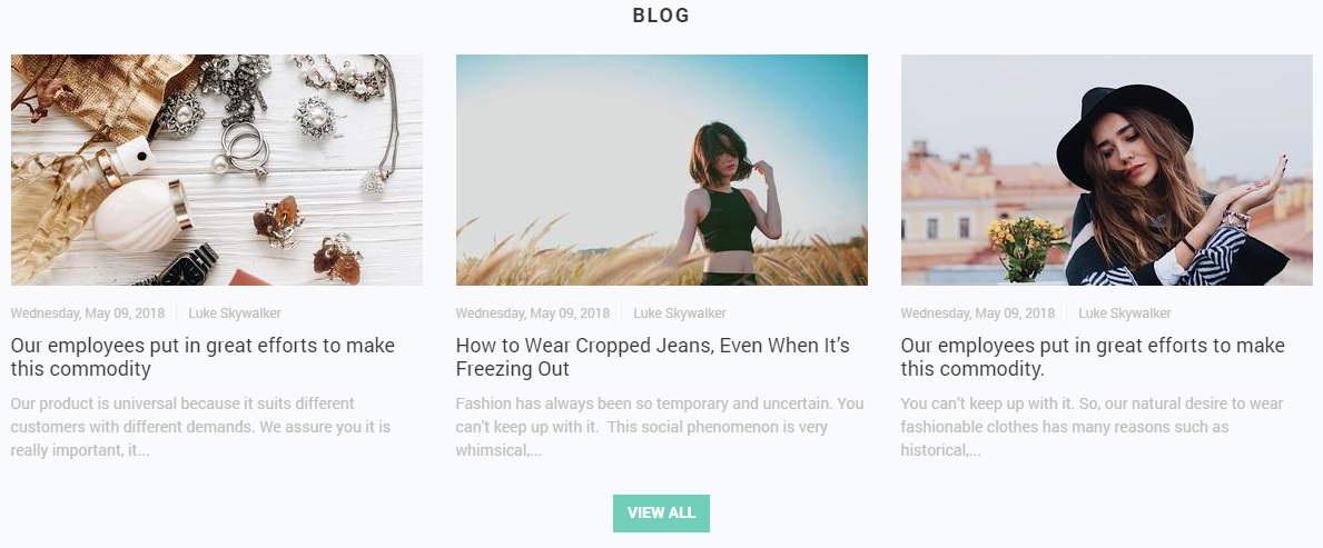
Blog Articles
This functionality enables you to display a number of blog posts from a certain blog (articles) in a grid with image, title, author name, publication date and VIEW ALL button.
Let's review the Blog Articles section configuration:
This section settings allow you to set the title of the section, the background color, blog and the number of recent articles to display (3, 6 or 9), as well as the Small 370х208, Medium 370x308 or Large 370x493рх image size. You can align the image by the top/bottom edges or by the center. The text can be placed in the usual way or over the image. You can also enable the author’s name display and the "View all" button which will lead to the blog page.
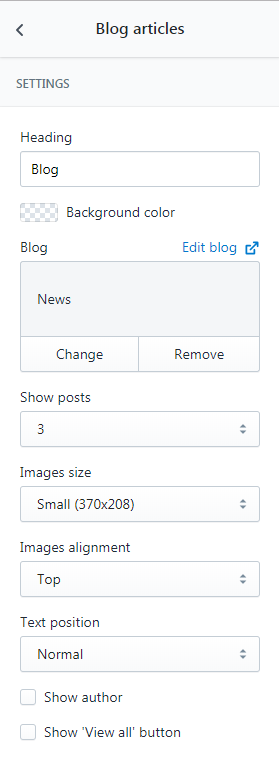
- Heading — add the title of the section;
- Blog — choose the collection of blog post you want to display;
- Show posts — set a number of article to show (3/6/9);
- Images size — select a suitable article image size from the option dropdown (Small/Medium/Large);
- Images alignment — select a suitable article images alignment from the option dropdown (Top/Middle/Bottom);
- Text position — select a suitable text position from the option dropdown (Normal/Overlay);
- Show author — tick to show the author;
- Show 'View all' button — tick to show the View all button.
- Heading — Featured posts;
- Blog — Blog;
- Show posts — 3;
- Images size — Small (370x208);
- Images alignment — Bottom;
- Text position — Normal;
- Show author — Yes;
- Show 'View all' button — No.
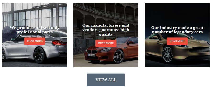
- Heading — Our Blog;
- Blog — Blog;
- Show posts — 3;
- Images size — Medium (370x370);
- Images alignment — Bottom;
- Text position — Overlay;
- Show author — No;
- Show 'View all' button — Yes.
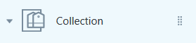
Collection List
This functionality enables you to display a number of collections in a grid with image, amount of products and VIEW ALL button.
Let's review the Collection List section configuration:
The ‘Collection list’ section settings are the following:
- The title of the section.
- Size of the collection image (Small 270x151px, Medium 270x255px, Large 270x360px) and its alignment.
- Text position: over the image or below it.
- The ‘View all’ button, leading to the listing page of all the collections.
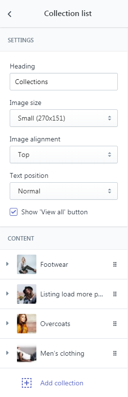
You can add up to 12 collection blocks (4 per row) into this section. To do this you just need to select the desired collection in the block settings.
- Heading — add the title of the section;
- Images size — select a suitable collection image size from the option dropdown (Small/Medium/Large);
- Images alignment — select a suitable collection images alignment from the option dropdown (Top/Middle/Bottom);
- Text position — select a suitable text position from the option dropdown (Normal/Overlay);
- Show 'View all' button — tick to show the View all button;
- Collection — choose the collection of products you want to display.
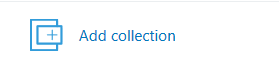
To add a collection to display press the Add collection button.
Click on the Collection section.
Select desired collection from the option dropdown.
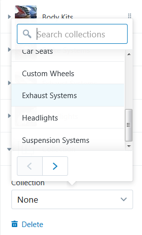
You can display twelve collections maximum.
Example:
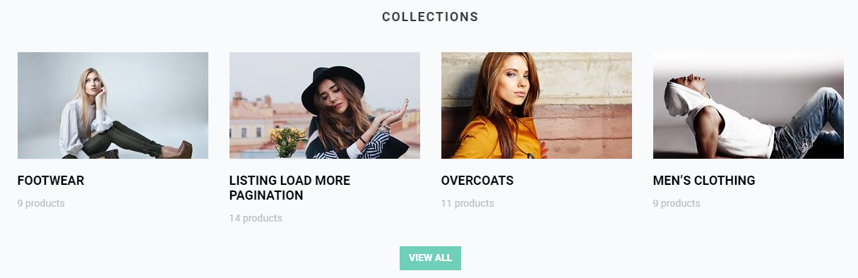
- Heading — Collections;
- Images size — Small (370x208);
- Images alignment — Top;
- Text position — Normal;
- Show 'View all' button — No.
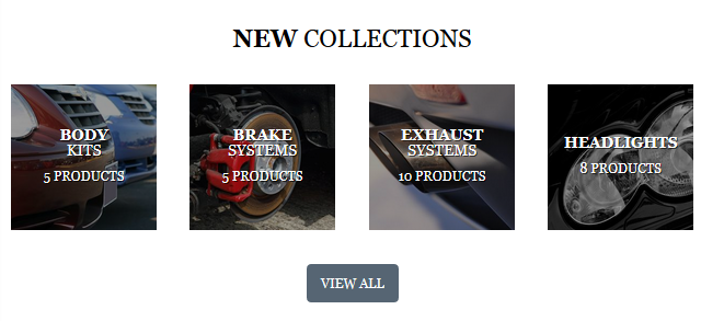
- Heading — New Collections;
- Images size — Medium (370x370);
- Images alignment — Middle;
- Text position — Overlay;
- Show 'View all' button — Yes.
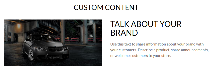
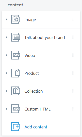
Custom Content
It is possible for you to add a custom content to your website.
You can add Image and Text block.
Add Video block to your website.
You also can add a block with the certain product to your website.
A block with the certain collection can be placed on your website.
You also can add a custom HTML block.
Let's review the Custom Content section configuration:
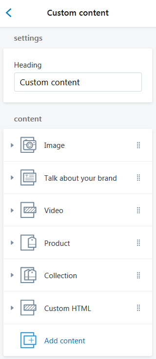
- Heading — add the title of the section;
Image
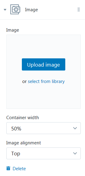
- Image — choose a custom image for this block. You can upload image from your computer or select image from your library;
- Container width — choose a suitable container width from the option dropdown (25/33/50/66/75/100%);
-
Images alignment — select a suitable image alignment from the option dropdown (Top/Middle/Bottom);
Text
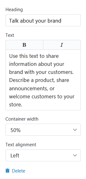
- Heading — add the title of the text block;
-
Text — input the text you want to display within the block. You can italicize text (press the "I" button) or mark it in bold (press the "B" button);
- Text alignment — select a suitable column text alignment from the option dropdown (Left/Centered/Right);
Video
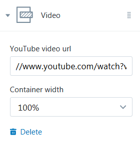
-
YouYube video url — this option allows you to specify custom URL for video from YouTube that has to be visible on the page;
- Container width — choose a suitable container width from the option dropdown (25/33/50/66/75/100%);
Product
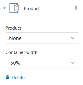
- Product — choose the product to display;
- Container width — choose a suitable container width from the option dropdown (25/33/50/66/75/100%);
Collection
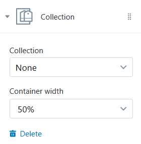
- Collection — choose the collection of products you want to display;
- Container width — choose a suitable container width from the option dropdown (25/33/50/66/75/100%);
Custom HTML
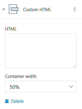
- HTML — enter the custom HTML in this field;
- Container width — choose a suitable container width from the option dropdown (25/33/50/66/75/100%).
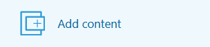
To add a new Custom Block press the Add content button.
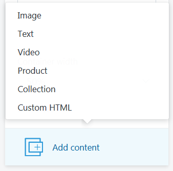
Select desired custom section content type from the dropdown (Image/Text/Video/Product/Collection/Custom HTML).
Click the Content (Image/Talk about your brand/Video/Product/Collection/Custom HTML) section and configure the custom content block options.
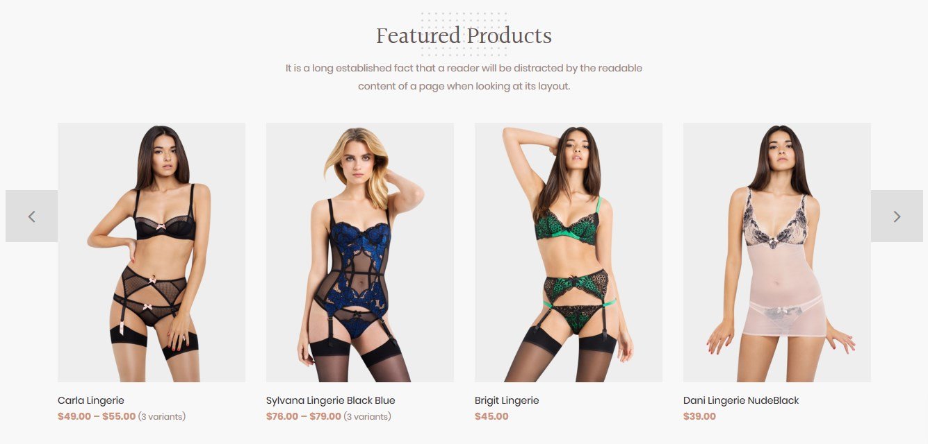
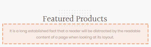
Featured Product
This functionality enables you to show "Featured products" in tab panel, that keeps the layout clean and well-organized.
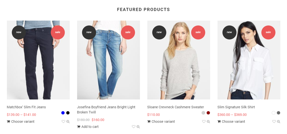
Let's review the Featured Products section configuration:
You may set the preferred title for the Featured products section. You may set the background color for the section, then there will also be some inner paddings.
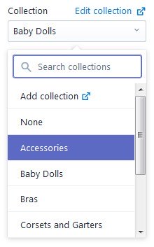
The settings allow you to choose a collection to become ‘featured’ and the number of its products: 4 / 8 / 12 / 16 / 20. There is also an option to define the desired product image size: Small (270x190), Medium (270x270), Large (270x341) , and its alignment.
- Heading — add the title of the section;
- Collection — choose the collection of products you want to display;
- Show products — specify the number of products to show within the section;
- Images size — select a suitable product image size from the option dropdown (Small/Medium/Large);
- Images alignment — select a suitable product images alignment from the option dropdown (Top/Middle/Bottom).
Gallery Section
It is possible for you to customize your Shopify Theme to add a photo gallery or lookbook to your website.
Let's review the Gallery section configuration:
In the gallery section settings, it is possible to choose the height of the section blocks: small, medium, big. change the display style of the blocks to ‘Boxed’ (the blocks are enclosed in the container and have indents in between); and select one of 3 display styles.
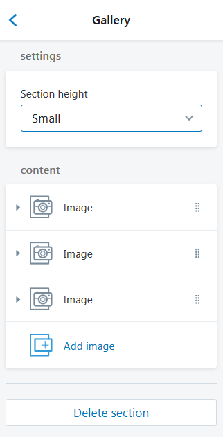
- Section Height — select a suitable gallery section height from the option dropdown (Small/Medium/Large);
Content:
-
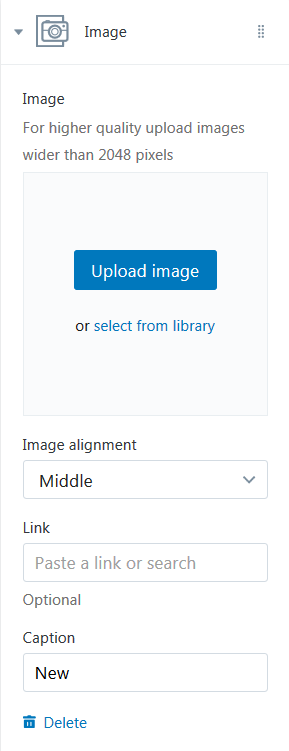
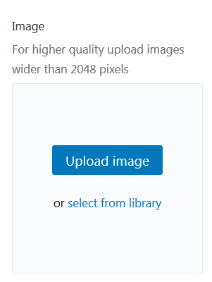
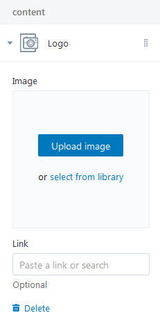
Image — choose a custom image for Gallery. You can upload image from your computer or select image from your library. For higher quality upload images wider than 2048 pixels;
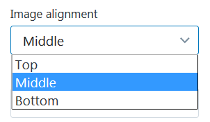
- Images alignment — select a suitable gallery images alignment from the option dropdown (Top/Middle/Bottom);
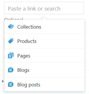
- Link — specify a link to a certain Collection, Product, Pages, Blogs or Blog Post;
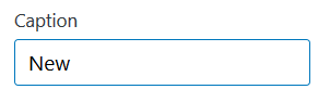
- Caption (optional) — enter the Caption (words printed above a picture).
To add an image to gallery section press the Add image button. You can display four images maximum.
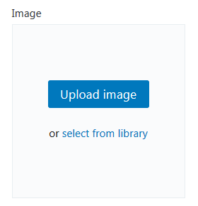
Click on the Image section. Upload desired image from your computer (press the Upload image button) or select image from your library (press the "select from the library" button).
Set an Image alignment: Top, Middle or Bottom.
Specify a Link to a certain Collection, Products, Pages, Blogs or Blog Post.
Enter the Caption (words printed above a picture).
You can delete picture from the Gallery section (press the Delete button).
Example:
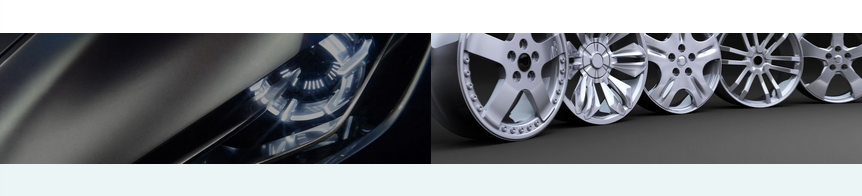
-
Image — 2 images;
- Images alignment
- Picture #1 — Bottom;
- Picture #2 — Bottom;
- Link — no;
- Caption — no.
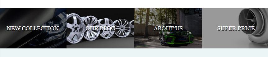
-
Image — 4 images;
- Images alignment
- Picture #1 — Middle;
- Picture #2 — Middle;
- Picture #3 — Middle;
- Picture #4 — Middle;
- Link
- Picture #1 — Collection;
- Picture #2 — Blog;
- Picture #3 — Pages;
- Picture #4 — Product;
- Caption
- Picture #1 — New Collection;
- Picture #2 — Our Blog;
- Picture #3 — About Us;
- Picture #4 — Super Price;
Image with Text Section
It is possible for you to add image with text to your website.
Let's review the Image with Text section configuration:
-
Image — choose a custom image for this section. You can upload image from your computer or select image from your library;
- Layout — choose a proper layout type for the section (Image on left/Image on Right);
- Images size — select a suitable section image size from the option dropdown (Small/Medium/Large);
- Image alignment — select a suitable image alignment from the option dropdown (Top/Middle/Bottom);
- Heading — add the title of the section;
- Text — input the text you want to display within the section;
- Button label — specify the buttons' text;
- Button Link — specify a link to a certain Collection, Products, Pages, Blogs or Blog Post.
Example:
-
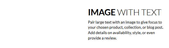
Image — no;
- Layout — Image on left;
- Heading — Image with text;
- Text — Pair large text with an image to give focus/.../;
- Button label — disabled;
- Button Link — disabled.
-
Image — Yes;
- Layout — Image on Right;
- Images size — Medium;
- Images alignment — Middle;
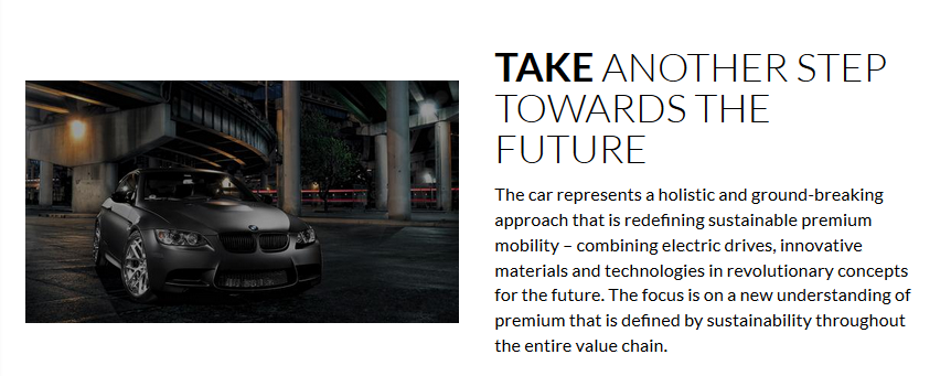
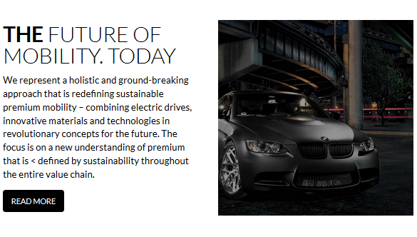
- Heading — THE FUTURE OF MOBILITY. TODAY;
- Text — We represent a holistic and /.../;
- Button label — READ MORE;
- Button Link — Blog Post.
Image with Text Overlay
It is possible for you to add image with the text on it to your website.
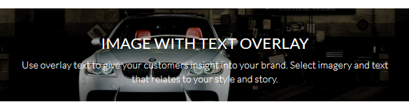
Let's review the Image with Text Overlay section configuration:
The settings allow you to choose the height of the section: Small, Medium, Large and its display mode: fullwidth or boxed (in the container). It is possible to enable the parallax effect on scroll, choose the alignment for the text (right/left/center), enable the inverted text style, select the text background color, and its opacity. Adding the extra blocks will let you compose the image description up to your desire.
The following blocks are available for selection:
- H2 title, with an option of using one of 12 animation effects.
- H4 title.
- H5 title.
- Text.
- The button with the link.
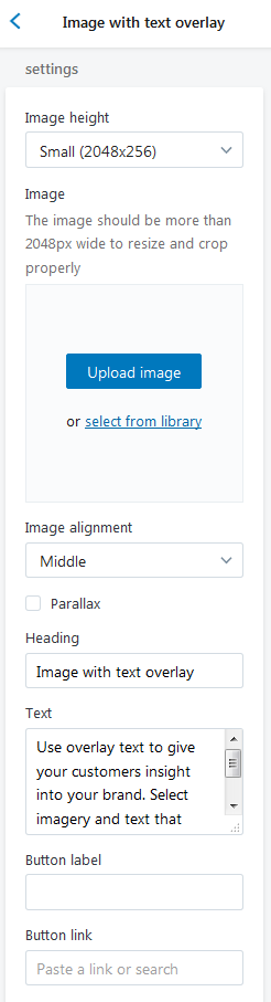
-
Image height — choose a suitable section size from the option dropdown: Small(2048x256), Medium(2048x512), Large(2048x682);
-
Image — choose a custom image for this section. You can upload image from your computer or select image from your library. The image should be more than 2048px wide to resize and crop properly;
- Images alignment — select a suitable image alignment from the option dropdown (Top/Middle/Bottom);
- Parallax — enable the Checkbox to apply parallax effect to the picture;
- Heading — add the title of the section;
- Text — input the text you want to display within the section;
- Button label — specify the buttons' text;
- Button Link — specify a link to a certain Collection, Products, Pages, Blogs or Blog Post.
Example:
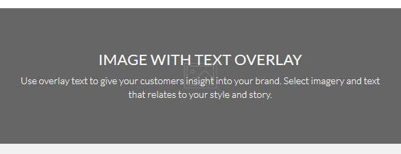
-
Image — no;
- Heading — Image with text overlay;
- Text — Pair large text with an image to give focus/.../;
- Button label — disabled;
- Button Link — disabled.

-
Image height — Medium(2048x512);
-
Image — Yes;
- Images alignment — Middle;
- Parallax — enabled;
- Heading — THE FUTURE OF MOBILITY. TODAY;
- Text — We represent a holistic and /.../;
- Button label — READ MORE;
- Button Link — Blog Post.
Instagram Section
You can set the title and the username for your Instagram feed, add the background of this section, enable the Boxed layout (to show this block in a container), change the text color to inverted (in case of using dark background), define the number of instagram posts for the display in the carousel: 5,7 or 9.
Setting up the instagram profile is to add Instagram user ID to the appropriate field and Instagram access token to its respective field.
You may use various services to generate these values, for example, Pixel Union. Press the Generate button and log into your Instagram profile to do so.
The first 10 digits of the access token are your Instagram user ID, so there’s no strict need to generate the ID separately.
- Heading — add the title of the section;
- Instagram user ID — specify the Instagram user ID. You can get user ID here ;
- Number of images — set a number of article to show. Note, the photos will autoupdate automatically. (6/12).
Remember to Save the settings.
To remove the section press the Delete Section button.
Logo List Section
This functionality enables you to display a number of Logos in a grid with a link to a certain Collection, Products, Pages, Blogs or Blog Post.
Logo list section settings allow you to set the title, choose between the 4 block size options: Extra Small (170x78), Small (170x119), Medium (170x124), Large (170x132), set the background color for the section, define the separate background for the blocks (only for the icon type blocks), select the blocks text color (only for the icon type blocks), set the icon and text alignment for the icon type blocks:
regular (below the icon)or in one line (beside the icon).
You may add up to 12 blocks of 2 types: logo or icon. In case you add more than 6 blocks, they will show up in a carousel.
Logo block allows adding an image and a link.
Icon block allows choosing one of the 20 predefined icons, add the text and the link.
Let's review the Logo List section configuration:
- Heading — add the title of the section;
- Images size — select a suitable Logo image size from the option dropdown (Small/Medium/Large);
- Images alignment — select a suitable Logo images alignment from the option dropdown (Top/Middle/Bottom).
Content
- Image — choose a custom image for Logo. You can upload image from your computer or select image from your library;
- Link — specify a link to a certain Collection, Products, Pages, Blogs or Blog Post.
To add a Logo to display press the Add logo button. Click on the Logo section.
Upload desired image from your computer (press the Upload image button) or select image from your library (press "select from the library").
Specify a Link to a certain Collection, Products, Pages, Blogs or Blog Post.
You can display twenty Logos maximum.
Google Map Section
This section contains the settings which control the display of Google maps on the pages of the store.
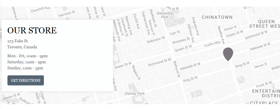
Let's review the Google Map section configuration:
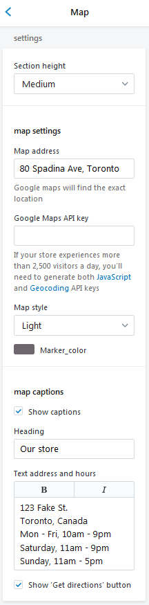
- Section height — select a suitable Google Map section height from the option dropdown (Small/Medium/Large);
- Map address — enter the address you want to be marked on the map. Google maps will find the exact location;
-
API key — Google Api Key is necessary for the correct work of the map. You can receive and activate it by following the link. If your store experiences more than 2,500 visitors a day, you'll need to generate both JavaScript and Geocoding API keys;
- Map style — choose the appropriate Map Style from the option dropdown (Default style/Light/Dark/Pale Down/Apple maps/Midnight);
- Marker color — choose a color for the marker. You can select a color from the Color Palette;
- Show captions — enable the checkbox to show the heading, address and the office hours;
- Heading — add the title of the section;
- Text address and hours — input the text you want to display within the sections (address and the office hours);
- Show 'Get directions' button — enable the checkbox to show Get directions button. The site visitor has the opportunity to generate directions between the destinations (custom address and your store address).
Products Carousel section
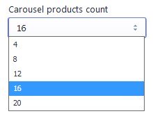
Products carousel has the title and the option for choosing the collection to get the products from for displaying them in the carousel, the background color parameter (if set, there’ll be some extra paddings added, similar to the ‘Featured products’ section), the products number option: 4, 8, 12, 16, 20, the rows number: 1 or 2, the movement direction of the carousel rows: in one direction or in different ones, and the products image size option: Small (270x190), Medium (270x270), Large(270x341) with its alignment.
Let's review the Products Carousel section configuration:
- Heading — add the title of the section.
- Title graphic element — upload the background image for the Title area. Maximum image size is 130 x 70. Click "Edit" to add the Image alt text.
- Caption — enter the text for the caption. The caption is displayed under the Heading.
- Collection — select the products' collection to display in this section. You can add a new collection as well.
- Carousel products count — specify a number of products to display. The carousel activates, in case you select 8, 12, 16 or 20 product to show in One Row mode. In Two Rows mode the carousel is active for 12, 16 and 20 values.
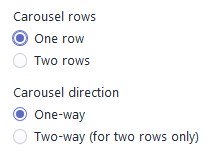
- Carousel rows — you can set one or two rows carousel.
- Carousel direction — choose the carousel direction. Note, the Two-way direction works for Two Rows mode only.
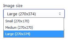
- Image size — set the product images size. You can use Small (270x170 px), Medium (270x270 px) or Large (270x374 px) image size for the section.
- Image alignment — select the image alignment from the option drop-down.
Remember to Save the settings.
To remove the section press the Delete Section button.
Single Product Section
This functionality enables you to show a Single Product block on your site.
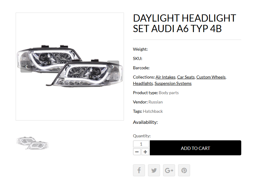
Let's review the Single Products section configuration:
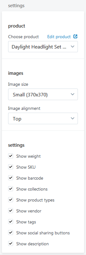
- Product — choose the product to display;
- Image size — select a suitable product image size from the option dropdown (Small/Medium/Large);
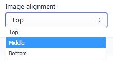
- Image alignment — select a suitable product image alignment from the option dropdown (Top/Middle/Bottom);
- Show weight — enable the checkbox to show the product weight;
- Show SKU — enable the checkbox to show the product SKU;
- Show barcode — enable the checkbox to show the barcode;
- Show collections — enable the checkbox to show the collection;
- Show product types — enable the checkbox to show the product type;
- Show vendor — enable the checkbox to show the product vendor;
- Show tags — enable the checkbox to show tags;
- Show social sharing buttons — enable the checkbox to show social sharing buttons;
- Show description — enable the checkbox to show description.
Slideshow Section
It is possible for you to add a slider to your website with text and button on the slides.
Let's review the Slideshow section configuration:
This section settings allow you to enable autosliding and set the slide display time (from 5 to 10 sec). Also, you may choose the section type from the following variants: just a slider, slider with the menu or slider with the banners block; define slider position: on the left or on the right.
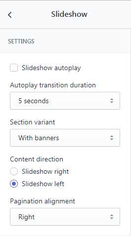
Pagination alignment options are on the right, on the left and centered.
If you decide to use the slider with the menu, you should choose the desired links list in the menu section. Optionally, you may also set the background color.
If you decide to use the slider with the banners, you should add the banner image in the BANNER BIG section, then set the banner’s title, subtitle, and the link.
BANNER SMALL section allows defining the background color, entering the title, subtitle, and the link.
-
Slideshow autoplay — enable the Checkbox to apply the slideshow autoplay;
- Autoplay transition duration — defines slides' autoplay transition duration in seconds (5-10 seconds);
- Slide image size — select a suitable slider image size from the option dropdown (Small/Medium/Large);
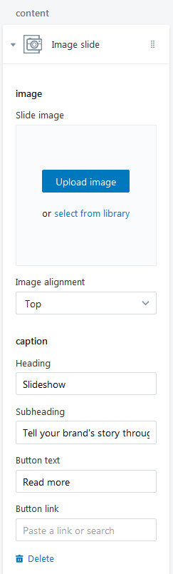
Content
-
Image — choose a custom image for this section. You can upload image from your computer or select image from your library;
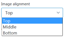
- Images alignment — select a suitable slider image alignment from the option dropdown (Top/Middle/Bottom);
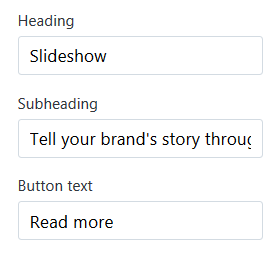
- Heading — add the title of the slide;
- Subheading — input the text you want to display on the slide;
- Button text — specify the button text;
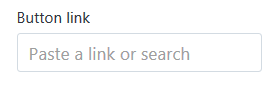
- Button Link — specify a link to a certain Collection, Products, Pages, Blogs or Blog Post.
To add a slide to slider press the Add image slide button. You can add five slides maximum.

Click on the Image slide section.
Upload desired image from your computer (press the Upload image button) or select image from your library (press "select from the library").
Set an Image alignment: Top, Middle or Bottom.
Specify a Link to a certain Collection, Products, Pages, Blogs or Blog Post.
Enter the Caption (words printed above a slide).
You can delete slide from the Slideshow section (press the Delete button).
Testimonials Section
This section contains the settings which control the display of Testimonials on the pages of the store.
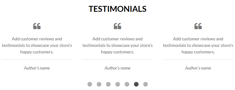
Let's review the Testimonials section configuration:
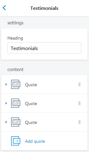
- Heading — add the title of the section;
Content
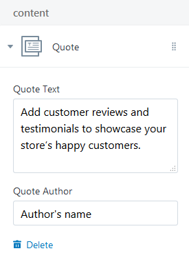
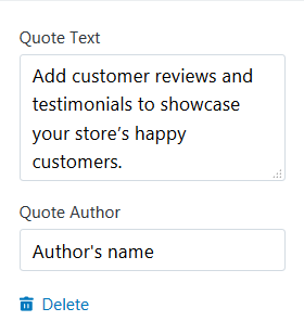
- Quote Text — add the content of the testimonial;
- Quote Author — add the author's name.
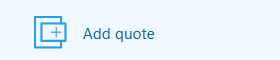
To add a Logo to display press the Add quote button.
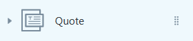
Click on the Quote section.
Add the content of the testimonial and the testimonial author's name.
You can display nine testimonials maximum.
Text Columns with Images
It is possible for you to add text columns with images to your website.
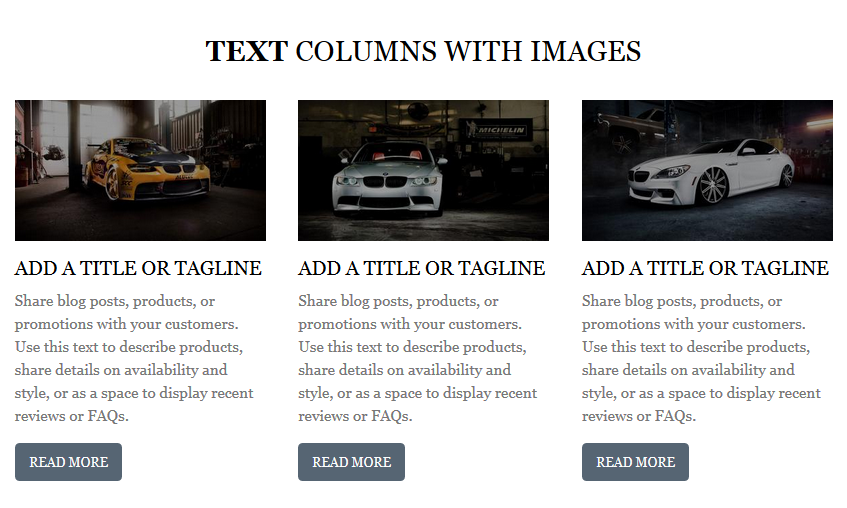
Let's review the Text columns with images section configuration:
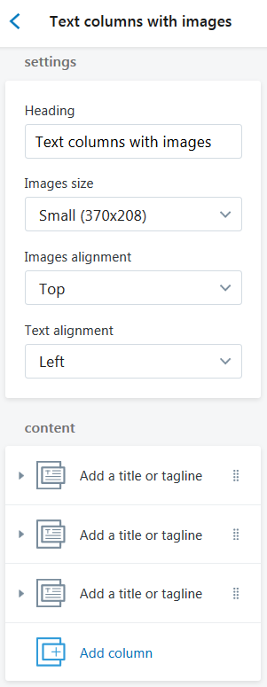
- Heading — add the title of the section;
-
Image size — choose a suitable image size from the option dropdown: Small(370x208), Medium(370x370), Large(370x493);
-
Images alignment — select a suitable images alignment from the option dropdown (Top/Middle/Bottom);
- Text alignment — select a suitable column text alignment from the option dropdown (Top/Middle/Bottom);
Content
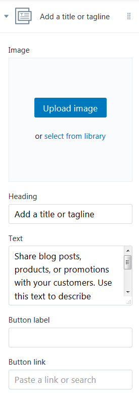
-
Image — choose a custom image. You can upload image from your computer or select image from your library;
- Heading — add the title which will be displayed under the image;
- Text — add the text which will be displayed under the image;
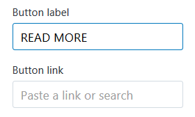
- Button label — specify the buttons' text;
- Button Link — specify a link to a certain Collection, Products, Pages, Blogs or Blog Post.
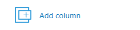
To add a new column to display press the Add column button.
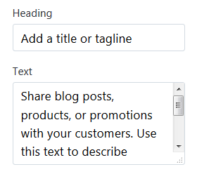
Click on the Add a title or tagline section.
Upload desired image from your computer (press the Upload image button) or select image from your library (press "select from the library").
Enter the Heading and the Text which will displayed under the image.
Specify a button text and set the link to a certain Collection, Products, Pages, Blogs or Blog Post.
You can display six blocks maximum.