Webico
Elementor
Elementor Page Builder is the most advanced frontend drag & drop page builder. It helps to create unique content of different types without coding knowledge and design any page or custom post type. This builder contains a large number of elements for your content customization. By changing their settings you will be able to manage the content according to your needs.
Detailed Elementor Page Builder documentation can be found here.
General
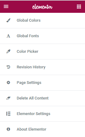
Once you started working with Elementor, you will see General Settings menu in the top left corner of your screen.
These settings allow to change global colors and fonts of the pages, work with page settings, save previous versions of your work, restore them and delete Elementor's content. Elementor Settings option sends you to Wordpress Dashboard Elementor Settings. About Elementor option redirects you to official Elementor website.
Detailed Elementor General Settings documentation can be found here.
Page Layout
Elementor provides ample potential to add content to pages and manage it according to your needs. There are two ways of adding content: creating it from scratch by adding and editing sections or using pre-designed templates. After you decided which option to choose, you should click corresponding button as seen below.

If you click Add Template button, you will see Elementor Library with a large number of ready-made templates. You can select the most suitable design, structure and layout of the page.
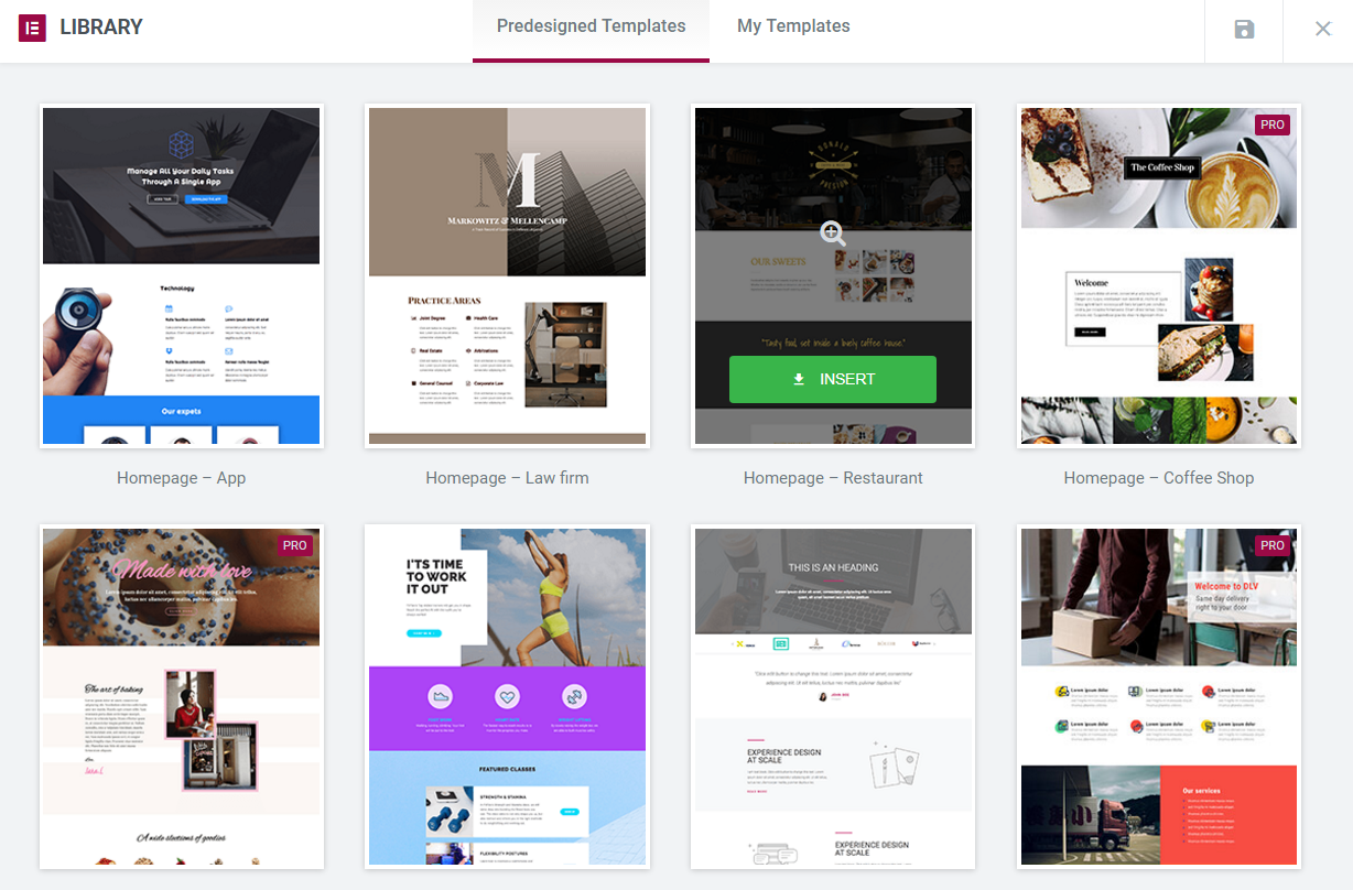
If you decided to add sections manually and clicked Add New Section button, you will see that Elementor offers 12 versions of new sections. You need to select which one you prefer to insert to your webpage. You can easily add new ones or delete those you don't need.

After you clicked on selected section it will appear and become ready for editing.

You can edit either the whole section or any of its columns separately.

Now you are ready to add Elementor modules and create your own content.
Detailed Elementor Page Layout documentation can be found here.
If you are facing Editing Header Section Issue in Elementor, check this tutorial.
Modules
By means of Elementor modules you will be able to form the structure of the page, configure element's background, typography, set up content's layout, element style, its responsiveness and visibility. Elementor allows to drag-n-drop the needed element onto a section field and check out the changes being made instantly.
Columns
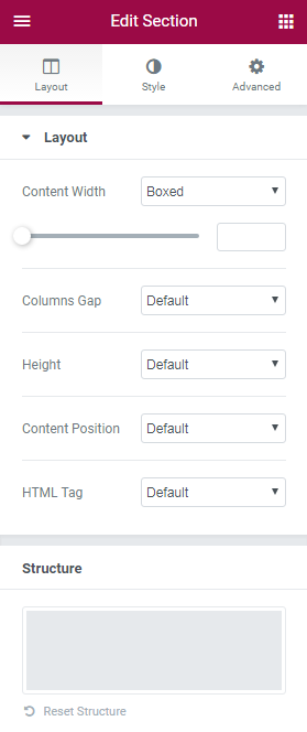
Columns module edits inner sections within a page. Its main feature is setting content's layout inside the section and configuration of its background and typography.
Detailed documentation about Columns module can be found here.
Heading
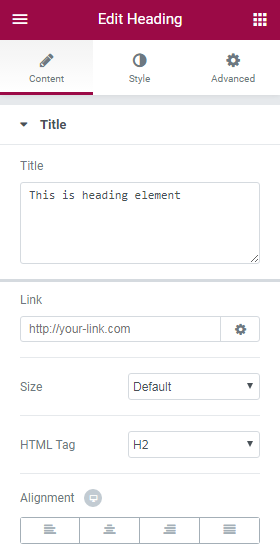
Heading module creates Headings and Titles of the content, edits text block's layout regarding other elements. It also helps to make the heading responsive to all devices.
Detailed documentation about Columns module can be found here.
Image
Image module lets you add images to your pages, and design them visually using Elementor. You can set up image's size, add border, enter text to be displayed near image and edit its layout.
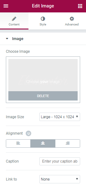
Detailed documentation about Image module can be found here.
Text Editor
Text Editor module is a great tool to add content to your page. With its help you can enter rich text, images and WordPress shortcodes, and easily edit its layout and typography.
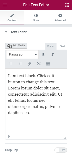
Detailed documentation about Text Editor module can be found here.
Video
Video module allows to embed videos from the video-sharing websites YouTube and Vimeo. It also has many video options to turn on autoplay, suggested videos, player control and others.
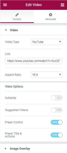
Detailed documentation about Video module can be found here.
Button
Button module helps to customize any button you want. You can change its text, type, size color and other layout options without using any shortcodes.
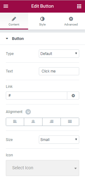
Detailed documentation about Button module can be found here.
Divider
Divider module is an easy-to-use element that allows to add horizontal lines that divide your content creating nice effects as separators of various sections, or for highlighting of your headings.
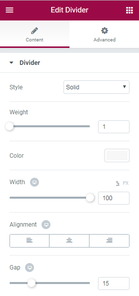
Detailed documentation about Divider module can be found here.
Spacer
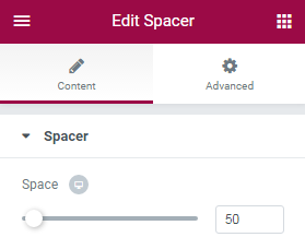
Spacer module's main purpose is to increase or decrease space in the editable column by moving slider to the left and right.
Google Maps
Google Maps module was created to embed Google Maps in your website. The map can be set to show any address. You can also adjust the zoom level and height of the map.
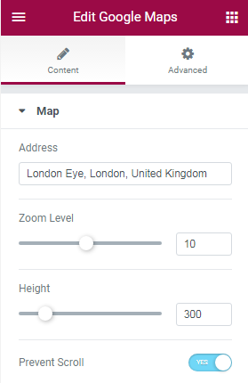
Detailed documentation about Google Maps module can be found here.
Icon
Icon module is used for displaying icons in numerous styles on your page. Elementor offers its options to create fancy icons' design.
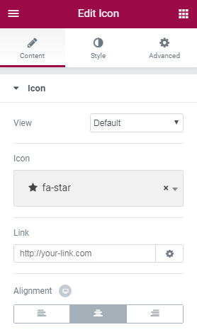
Detailed documentation about Icon module can be found here.
Smart Slider
Smart Slider module allows to create beautiful slideshows, YouTube and Vimeo slides, with smooth transitions, effects and animations.
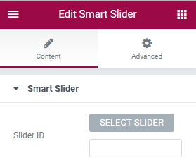
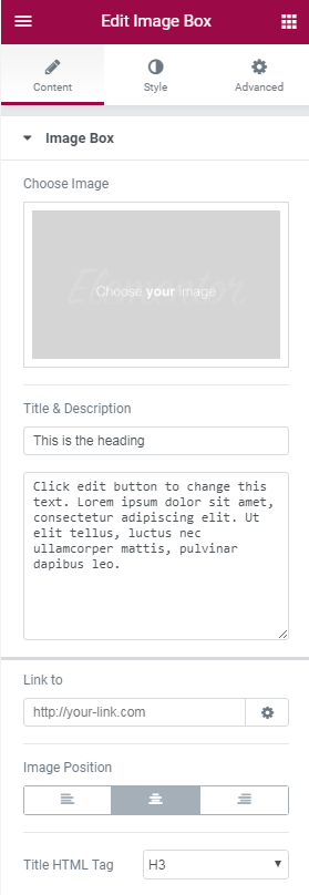
Image Box
Image Box module lets you add image boxes that combine images, headlines and text. Mostly and alternatively this is used for the Icon Box Widget, for features sections. With this module you can change design of the image, the headline and the description.
Detailed documentation about Image Box module can be found here.
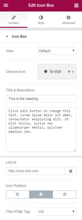
Icon Box
Icon Box module is mostly used for sections that list features of products or services. The icons are derived from the Font Awesome Icons, and you are able to search through them and pick the right one.
Detailed documentation about Icon Box module can be found here.
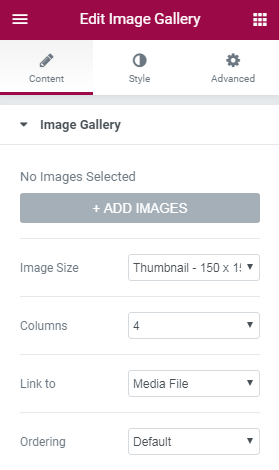
Image Gallery
Image Gallery module was created to add beautiful galleries to your pages, set the size of the gallery, the number of columns.
Detailed documentation about Image Gallery module can be found here.
Image Carousel
Image Carousel module allows to add interesting and dynamic galleries to your pages. Module's configuration sets their sizes to any custom size of your choosing. You can set how many slides will be shown per page, and the number of slides to switch.
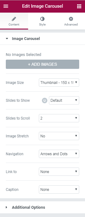
Detailed documentation about Image Carousel module can be found here.
Icon List
Icon List module allows to create list of icons on your website. After the list has been created you can customize it using module settings.
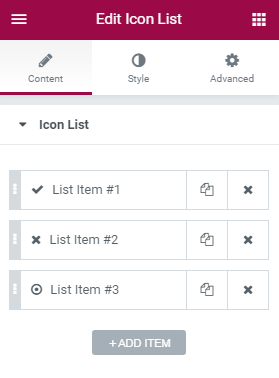
Detailed documentation about Icon List module can be found here.
Counter
Counter module can be used for many purposes. After you drag-n-drop this module you will be able to change its settigns according to your wish.
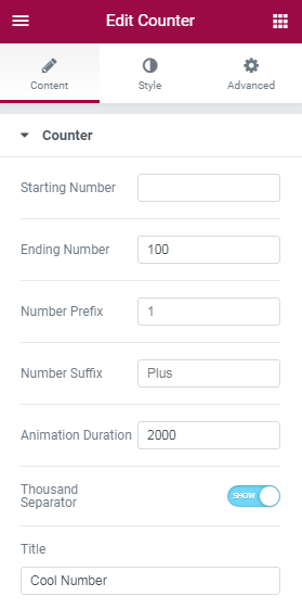
Detailed documentation about Counter module can be found here.
Progress Bar
Progress Bar module adds progress bars to WordPress pages and posts. Progress bars are usually great to engage users in fundraising campaigns or showing off a milestone your business achieved.
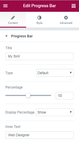
Detailed documentation about Progress Bar module can be found here.
Testimonial
Testimonial module was created to add testimonials from your satisfied customers. This module is a great tool for promoting your services or products and adding social proof of the value you provide for your customers.
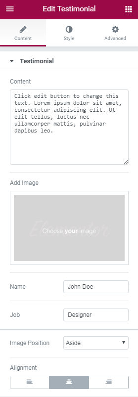
Detailed documentation about Testimonial module can be found here.
Tabs
Tabs module's main purpose is to divide content into tabs.
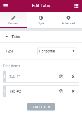
Detailed documentation about Tabs module can be found here.
Accordion
Accordion module displays text in a more condensed manner, letting you save space while still presenting an abundance of content.
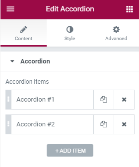
Detailed documentation about Accordion module can be found here.
Toggle
Toggle module creates text boxes that are collapsed, so the visitor only sees the titles of each text box.
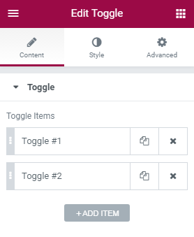
Detailed documentation about Toggle module can be found here.
Social Icons
Social Icons module lets you add icon links to all your social media profiles.
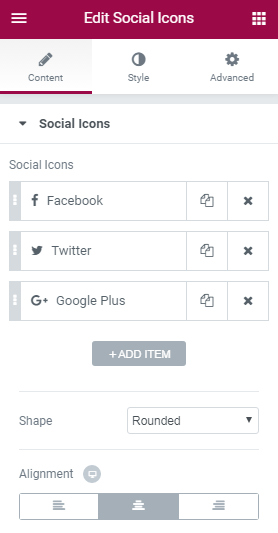
Detailed documentation about Social Icons module can be found here.
Alert
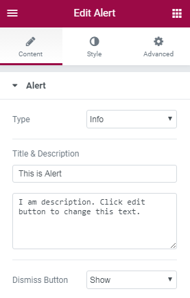
Alert module displays alert messages on pages. With this module you will be able to type your own text and description, select whether to show or hide Dissmiss button and change background and typography alignment.
SoundCloud
SoundCloud module lets you embed audio clip files from SoundCloud with Elementor Page Builder. It contains multiple settings to customize the module.
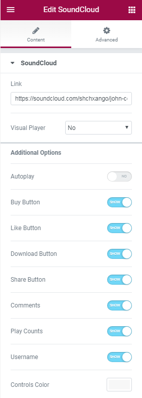
Detailed documentation about SoundCloud module can be found here.
Shortcode
Shortcode module adds shortcodes to any WordPress page using the Elementor page builder.
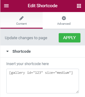
Detailed documentation about Shortcode module can be found here.
HTML
HTML module adds HTML codes to the pages using Elementor page builder.
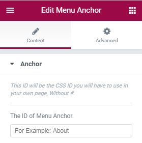
Menu Anchor
Menu Anchor module helps a lot with creating a one page website, or a page with an internal smooth scrolling navigation.
Detailed documentation about Menu Anchor module can be found here.
Sidebar
Sidebar module displays sidebars and allows to set up layout.
Jet Elements
These outstanding modules provide you with additional functionality, extra options and different useful features to make your website unique and engaging.
Cherry Projects
With this module you will be able to create, organize and manage your own portfolio and projects. Cherry Projects help to display them using a large number of options, showcase them user-friendly, visually expressive and convenient.
Attention! Cherry Projects module is available when Cherry Projects plugin is activated only.
This module contains next Settings:
Content
- Cherry Projects:
-
- projects listing layout
- select layout type of project listings from the dropdown menu;
-
- pagination mode
- select pagination mode from the dropdown menu;
-
- loading animation
- select type of loading animation from the dropdown menu;
-
- hover animation
- select type of hover animation: fade, scale or custom;
-
- filters
- enable / disable filters for Cherry Projects;
-
- filter type
- select filter type: category or tag;
-
- projects filter categories list
- specify categories list of projects filter;
-
- projects filter tags list
- specify tags list of projects filter;
-
- order filters
- enable / disable order filters;
-
- order filter default value
- select order filter default value;
-
- order by filter default value
- select type of default value of order byfilter;
-
- post format
- select post format from the dropdown menu;
-
- single term slug
- define number of single term slug;
-
- column number
- select number of columns by moving slider left and right;
-
- labtop column number
- select number columns that will be displayed on laptop;
-
- album tablet column number
- select number columns that will be displayed on album tablet;
-
- portrait tablet column number
- select number columns that will be displayed on portrait tablet;
-
- tablet column number
- select number columns that will be displayed on tablet;
-
- posts per page
- select number of posts per page by moving slider left and right;
-
- item margin
- select number of item margin by moving slider left and right;
-
- justified fixed height
- specify justified fixed height;
-
- grid template
- specify grid template;
-
- masonry template
- select masonry template;
-
- justified template
- select justified template;
-
- cascading grid template
- specify cascading grid template;
-
- list template
- define list template.
-
Advanced Tab contains similar settings in each module.
Advanced
- Element Style:
-
- margin
- manages margin of Pricing Table's element style;
-
- padding
- manages padding of Pricing Table's element style;
-
- Z-index
- define the number of z-index for Pricing Table's element style;
-
- entrance animation
- select type of entrance animation of Pricing Table from dropdown menu;
-
- CSS ID
- insert CSS ID;
-
- CSS Classes
- insert CSS Classes.
-
- Background:
-
- background type
- offers classic or gradient background color of the Pricing Table element's background.
-
- Border:
-
- border type
- select type of the Pricing Table element's border from dropdown list;
-
- border radius
- defines radius of the Pricing Table element's border;
-
- box shadow
- enable / disable box shadow of the Pricing Table element's border.
-
- Responsive:
-
- hide on desktop
- show / hide Pricing Table on desktop;
-
- hide on tablet
- show / hide Pricing Table on tablet;
-
- hide on mobile
- show / hide Pricing Table on mobile.
-
- Custom CSS - lets you add CSS code to any widget, and allows you to view the results in the Live editor window. This feature is available on Elementor Pro only.
Cherry Projects Terms
This module is used for additional customization of your portfolio created with the help of Cherry Projects. It will help you to load animation, setup filters and elements layout as well as showcase how information is displayed on different devices.
Attention! Cherry Projects Terms module is available when Cherry Projects plugin is activated only.
This module contains next Settings:
Content
- Cherry Projects Terms:
-
- filter type
- select type of filter;
-
- terms listing layout
- elect terms listing layout;
-
- loading animation
- select type of loading animation;
-
- column number
- select number of columns;
-
- labtop column number
- select number of columns displayed on labtop;
-
- album tablet column number
- select number of columns displayed on album tablet;
-
- portrait tablet column number
- select number of columns displayed on portrait tablet;
-
- tablet column number
- select number of columns displayed on tablet;
-
- posts per page
- define number of posts per page;
-
- item margin
- specify the margins distance in pixels;
-
- grid template
- select grid template;
-
- masonry template
- select masonry template;
-
- cascading grid template
- select cascading grid template;
-
- list template
- select list template.
-
Cherry Timeline
Cherry Timeline allows you to showcase different events in a chronological order and attract visitors to a website. It also can be used to create the scheme with the most significant steps your company made and your achievements.
Attention! Cherry Timeline module is available when TM Timeline plugin is activated only.
This module contains next Settings:
Content
- Cherry Timeline:
-
- layout
- select Cherry Timeline's layout from dropdown list;
-
- visible items
- select a number of items to display;
-
- date format
- select format of displaying the date;
-
- tag
- select tags related to the events to be displayed;
-
- anchors
- enable/ disable anchors;
-
- order
- select order of displaying events;
-
Cherry Services
Cherry Services allow to create and display list of services that your company offers. They can be represented as lists, single pages, or separate blocks in the content. This module can customize your services' layout by setting up columns, categories, description, filtering options and others.
Attention! Cherry Services module is available when Cherry Service List plugin is activated only.
This module contains next Settings:
Content
- Cherry Timeline:
-
- super title
- type in super title of the service;
-
- title
- type in title of the service;
-
- subtitle
- type in subtitle of the service;
-
- desktop columns
- select number of columns to be displayed on a desktop;
-
- laptop columns
- select number of columns to be displayed on a laptop;
-
- tablet columns
- select number of columns to be displayed on a tablet;
-
- phone columns
- select number of columns to be displayed on a phone;
-
- posts per page
- select a number of posts to be displyed per page;
-
- show services from categories
- select categories by which services will be shown;
-
- show services by ID
- select ID by which services will be shown;
-
- description length
- select length of the services description;
-
- show more button
- show / hide More button;
-
- more button text
- type text of More button;
-
- more button URL
- here you can specify URL for More button;
-
- AJAX load more
- show / hide AJAX Load More button;
-
- pagination
- enable / disable pagination;
-
- show service title
- show / hide service title;
-
- show featured image
- show / hide featured image;
-
- show service content
- show / hide service content;
-
- show service item Read More button (if allowed in template)
- show / hide service item Read More button;
-
- item Read More button text (if empty - used default value from template)
- type text for Read More button;
-
- show filter by category before services listing
- show / hide filter by category before services listing;
-
- listing item image size (if used in template)
- here you can select item image size of the listing;
-
- listing item template
- select template for item listing;
-
- add space between services columns
- add / remove space between services coumns;
-
- add space between services rows
- add / remove space between services rows.
-
Cherry Team
This module makes it easier to display info about your team and personnel. You can add person's bio, position, icons to his social media accounts and lots of other information. It contains an advanced set of options that allow better appearance and functionality of the module.
Attention! Cherry Team module is available when Cherry Team Members plugin is activated only.
This module contains next Settings:
Content
- Cherry Team:
-
- super title
- type in super title;
-
- title
- type in title;
-
- subtitle
- type in subtitle;
-
- desktop columns
- set number of columns to be displayed on desktop;
-
- laptop columns
- set number of columns to be displayed on laptop;
-
- tablet columns
- set number of columns to be displayed on tablet;
-
- phone columns
- set number of columns to be displayed on phone;
-
- posts per page
- select the number of posts per page;
-
- show team members from groups
- select groups from where team members will be shown;
-
- show persons by ID
- type in ID of the person that needs to be shown;
-
- description length
- select length of description;
-
- show more button
- show / hide More button;
-
- more button text
- type text for More button;
-
- more button URL
- type URL for More button;
-
- AJAX load more
- show / hide AJAX Load More button;
-
- pagination
- enable / disable pagination;
-
- show person name
- show / hide person name;
-
- show person photo
- show / hide person photo;
-
- show person bio
- show / hide person bio;
-
- show person position
- show / hide person position;
-
- show person social links
- show / hide person links to social media accounts;
-
- show service item Read More button (if allowed in template)
- show / hide service item Read More button;
-
- links color
- select color of links of posts's meta;
-
- item Read More button text (if empty - used default value from template)
- show / hide item Read More button text;
-
- show filter by groups before team listing
- show / hide filter by groups before team listing;
-
- listing item image size (if used in template)
- select image size of item listing;
-
- listing item template
- select template of item listing;
-
- add space between team columns
- add / remove space between team columns;
-
- add space between team rows
- add / remove space between team rows.
-
Cherry Testi
This is a perfect module that helps you add testimonials and reviews to the site and customize their appearance in accordance with the design of the website and your needs. It has a very easy setup where you can add person's avatar, position, company and other useful information.
Attention! Cherry Testi module is available when Cherry Testimonials plugin is activated only.
This module contains next Settings:
Content
- Cherry Testi:
-
- type
- select type of displaying testimonials;
-
- super title
- type in super title;
-
- title
- type in title;
-
- subtitle
- type in subtitle;
-
- limit
- select limit of text testimonial;
-
- order by
- order the module's items by categories;
-
- order
- select order type;
-
- category
- set testimonial category;
-
- post ID's
- set ID of the post;
-
- content length
- select length of the content;
-
- divider
- enable / disable divider;
-
- avatar
- show / hide avatar;
-
- avatar size
- select avatar size;
-
- show / hide email;
-
- position
- show / hide position;
-
- company
- show / hide company name;
-
- template
- select template type;
-
- class
- select class of testimonial.
-
Notice! The following modules can be added only with the help of Jet Elements for Elementor plugin. Make sure it is installed and activated.
Slider
Slider module allows to create multiple engaging sliders to display all kinds of information you have added. They can be used for displaying information about discounts, special offers, upcoming events, successfully completed projects, etc.
Attention! Slider module is available when Smart Slider 3 plugin is activated only.
This module contains next Settings:
Content
- Slider:
-
- select slider
- here you can select slider type.
-
Contact Form 7
Contact form 7 makes it really easy to manage multiple contact forms and customize the form and the mail contents. With this module you can create as many contact forms as you need and manage their layout and content.Attention! Contact Form 7 is available when Contact Form 7 plugin is activated only.
This module contains next Settings:
Content
- Slider:
-
- columns
- here you can select columns type.
-
Advanced Carousel
This outstanding module allows to display content of website. It contains a variety of settings to showcase the carousel in the most attractive way.
This module contains next Settings:
Content
- Slides:
-
- slides
- add items for creating slides.
-
- Settings:
-
- slides to show
- select a number of slides to show carousel;
-
- slides to scroll
- select slides to be scrolled carousel;
-
- show arrows navigation
- show / hide arrows navigation;
-
- show dots navigation
- show / hide dots navigation.
-
- Additional Options:
-
- pause on hover
- enable / disable pause on slides ' hover;
-
- autoplay
- enable / disable slides' autoplay;
-
- autoplay speed
- specify speed of slides' autoplay;
-
- infinite loop
- enable / disable slides' infinite loop;
-
- animation speed
- specify speed of slides' animation.
-
Style
- Items:
-
- items background color
- select background items color;
-
- items padding
- select items padding;
-
- items alignment
- select items layout.
-
- Items Title Typography:
-
- items title color
- select color for items title;
-
- typography
- enable / disable typography for items title.
-
- Items Content Typography:
-
- items content color
- select color for items content;
-
- typography
- enable / disable typography for items content.
-
- Arrows:
-
- color
- here you can select color for arrows;
-
- size
- select arrows size.
-
- Pagination Dots:
-
- color
- here you can select color for pagination dots;
-
- size
- select size of pagination dots.
-
Advanced Map
This easy-to-use and efortlessly customizable module helps to add extra settings to Google Maps. With advanced Map you can manage the map according to your needs.
This module contains next Settings:
Content
- Map Settings:
-
- map center
- specify center of the map;
-
- initial zoom
- define zoom that will be opened initially;
-
- scrollwheel zoom
- enable / disable scrollwheel zoom;
-
- zoom controls
- show / hide zoom controls;
-
- street view controls
- show / hide street view controls;
-
- map type controls (map/satellite)
- show / hide map type controls;
-
- is map draggable?
- enable / disable map's drag option.
-
- Map Style:
-
- map height
- specify height of the map;
-
- map style
- enable / disable infinite loop;
-
- show arrows navigation
- show / hide arrows navigation.
-
- Pins:
-
- pins
- add / remove pins on map's location.
-
Brands
With the help of this module you can adds different brands to a webpage, organize their layout and capture your visitor's attention with stylish and immaculate Brands appearance.
This module contains next Settings:
Content
- General:
-
- columns
- select number of columns.
-
- Brands:
-
- brands
- add or remove company's brand name.
-
Circle Progress
Circle Progress adds an animated element to your site called progressbar. It can be used to showcase any process you wish. With this module you can change its color, size and type any text you need.
This module contains next Settings:
Content
- Values:
-
- progress values type
- select type of progress value;
-
- current percent
- select type the current percent the value;
-
- Settings:
-
- circle size
- specify size of the circle;
-
- value stoke width
- specify value's width of stroke;
-
- background stoke width
- specify background's width of stroke;
-
- animation duration
- specify duration of animation.
-
- Content:
-
- value number prefix
- select positive or negative value's number prefix;
-
- value number suffix
- select positive or negative value's number suffix;
-
- show thousand separator in value
- show / hide thousand separator in value;
-
- counter title
- define counter title of the value;
-
- counter subtitle
- define counter subtitle of the value;
-
- counter content position
- specify position of counter's content.
-
Style
- Progress Circle Style:
-
- background stroke color
- select color of progress circle's background stroke;
-
- value stroke color
- select color of progress circle's value stroke;
-
- circle fill color
- select color of progress circle fill;
-
- progress line endings
- select progress line endings.
-
- Content Style:
-
- color
- select color of number styles in content style;
-
- typography
- enable / disable typography of number styles in content style;
-
- padding
- select padding of number styles in content style.
- Number Styles - change settings of number styles in content style:
-
-
- color
- select color of title styles in content style;
-
- typography
- enable / disable typography of title styles in content style;
-
- padding
- select padding of title styles in content style.
- Title Styles - change settings of title styles in content style:
-
- color
- select color of subtitle styles in content style;
-
- typography
- enable / disable typography of subtitle styles in content style;
-
- padding
- select padding of subtitle styles in content style.
- Subtitle Styles - change settings of subtitle styles in content style:
Posts
This module helps to create and manage any posts. It contains wide range of settings to customize your posts and to display them in the webpage the way you want.
This module contains next Settings:
Content
- General:
-
- posts number
- select number of posts;
-
- columns
- select number of columns;
-
- query posts by
- define posts' type;
-
- show posts title
- show / hide title of the post;
-
- show posts featured image
- show / hide posts featured image;
-
- featured image size
- specify size of featured image;
-
- show posts excerpt
- show / hide excerpt of the posts;
-
- excerpt length
- define posts excerpt length;
-
- show posts meta
- show / hide posts meta;
-
- show Read More button
- show / hide Read More button;
-
- Read More button text
- type text for Read More button.
-
Style
- Post Item:
-
- background color
- select background color of post item;
-
- padding
- select padding of post item.
-
- Title:
-
- color
- select color of posts's title;
-
- typography
- enable / disable typography of posts's title;
-
- alignment
- select layout of posts's title;
-
- padding
- here you can select padding of posts's title;
-
- margin
- here you can select margin of posts's title.
-
- Meta:
-
- color
- select color of posts's meta;
-
- links color
- select color of links of posts's meta;
-
- typography
- enable / disable typography of posts's meta;
-
- padding
- select padding of posts's meta;
-
- margin
- select margin of posts's meta.
-
- Excerpt:
-
- color
- select color of posts's excerpt;
-
- typography
- enable / disable typography of posts's excerpt;
-
- alignment
- select layout of posts's excerpt;
-
- padding
- select padding of posts's excerpt;
-
- margin
- select margin of posts's excerpt.
-
- Button
-
- background color
- select background color of posts's button;
-
- text color
- select text color of posts's button;
-
- typography
- enable / disable typography of posts's button;
-
- padding
- select padding of posts's button;
-
- border radius
- select border radius of posts's button;
-
- border type
- select border type of posts's button;
-
- box shadow
- enable / disable box shadow of posts's button.
-
Pricing Table
This module helps to create pricing tables for your website the easy way. You can showcase prices and description of products, choose the color, text and set other options. This module has rich functionaluty to display the element.
This module contains next Settings:
Content
- General:
-
- icon
- select icon from media library;
-
- title
- type title text;
-
- subtitle
- type subtitle text;
-
- is featured?
- defines whether this product is featured one.
-
- Price:
-
- price prefix
- select currency prefix;
-
- price value
- specify price value;
-
- price suffix
- specify price suffix.
-
- Features:
-
- text before action button
- type text before action button;
-
- button text
- type button text;
-
- button URL
- specify button URL;
-
- text after action button
- type text after action button.
-
Style
- Header:
-
- background color
- select background color of pricing table header;
-
- icon color
- select icon color of pricing table header;
-
- icon font size
- select size of pricing table header;
-
- title color
- select title color of title of pricing table header;
-
- typography
- enable / disable typography of title of pricing table header;
-
- subtitle color
- select subtitle color of title of pricing table header;
-
- typography
- enable / disable typography of subtitle of pricing table header;
-
- header padding
- select header padding of pricing table header;
-
- alignment
- select layout of pricing table header.
-
- Pricing:
-
- background color
- select background color of pricing;
-
- price prefix color
- select price prefix color of pricing;
-
- typography
- enable / disable typography of pricing;
-
- price color
- select color of price;
-
- typography
- enable / disable typography of price color;
-
- price suffix color
- select price suffix color;
-
- typography
- enable / disable typography of price suffix color;
-
- header padding
- select header padding of price suffix color;
-
- alignment
- select layout of price suffix color.
-
- Features:
-
- background color
- select background color of features;
-
- color
- select color of features;
-
- typography
- enable / disable typography of features;
-
- padding
- select padding of features;
-
- alignment
- select layout of features.
-
- Action Box:
-
- background color
- select background color of action box;
-
- price prefix color
- select price prefix color of action box;
-
- typography
- enable / disable typography of action box;
-
- header padding
- select header padding of action box;
-
- alignment
- select layout of features.
-
- Action Button
-
- background color
- select background color of action button;
-
- text color
- select text color of action button;
-
- typography
- enable / disable typography of action button;
-
- padding
- select padding of action button;
-
- border radius
- select border radius of action button;
-
- border type
- select border type of action button;
-
- box shadow
- enable / disable box shadow.
-
Detailed documentation about Jet Elements modules can be found here.
