Ascendio
Widgets
Widgets are basic components of a website, which can be placed to different widget areas, for e.g. to sidebar, header, footer, before or after content, or any other custom area.
Widgets have different functions and can be set and tuned up in Customizer > Widgets tab.
About
This widget is used to display information about your site.
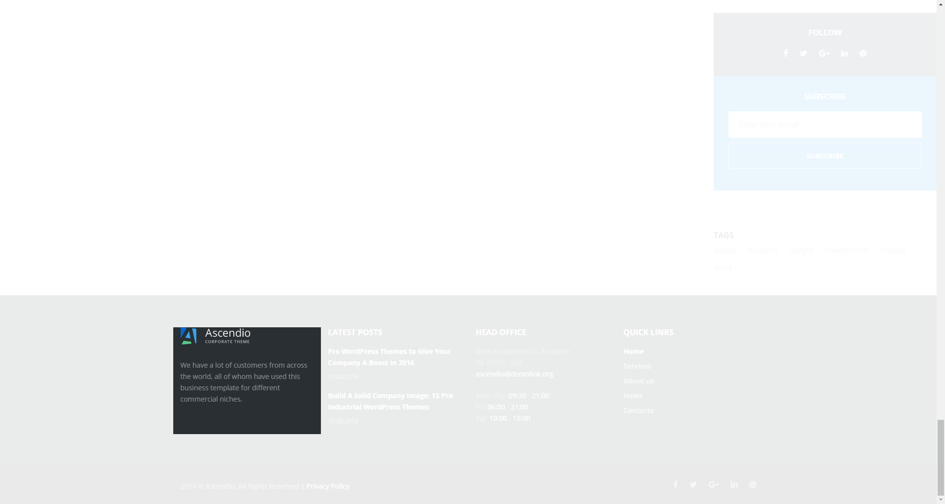
-
- title
- widget's text title;
-
- logo
- you can select a logo for the widget;
-
- enable tagline
- enable/disable tagline;
-
- content
- add content to this field.
Custom Posts
This widget is used to setup and display custom posts.
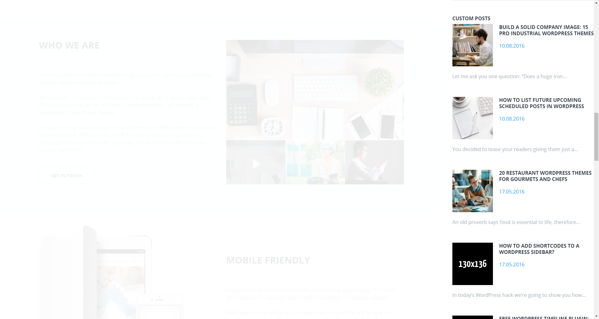
-
- title
- this property specifies the widget title;
-
- choose taxonomy type
- select a proper taxonomy type. You can choose from Category, Tag, Post Format;
-
- category
- select the category from which the posts will be displayed;
-
- tag
- specify the tag to display posts;
-
- post format
- specify the post format;
-
- posts count
- here you can define the number of posts to display;
-
- offset post
- this property specifies the number of posts to displace or pass over;
-
- title words length
- this property sets the number of words limit for post's title. Set 0 to hide title;
-
- excerpt words length
- this property sets the number of excerpt words;
-
- display post meta data
- this feature adds meta data to the post;
-
- post read more button label
- add text to the Read More button.
Subscribe and Follow
This widget is used to display blocks for Subscribe and Follow sections. List of social networks for the Follow block is same as in Social Menu.
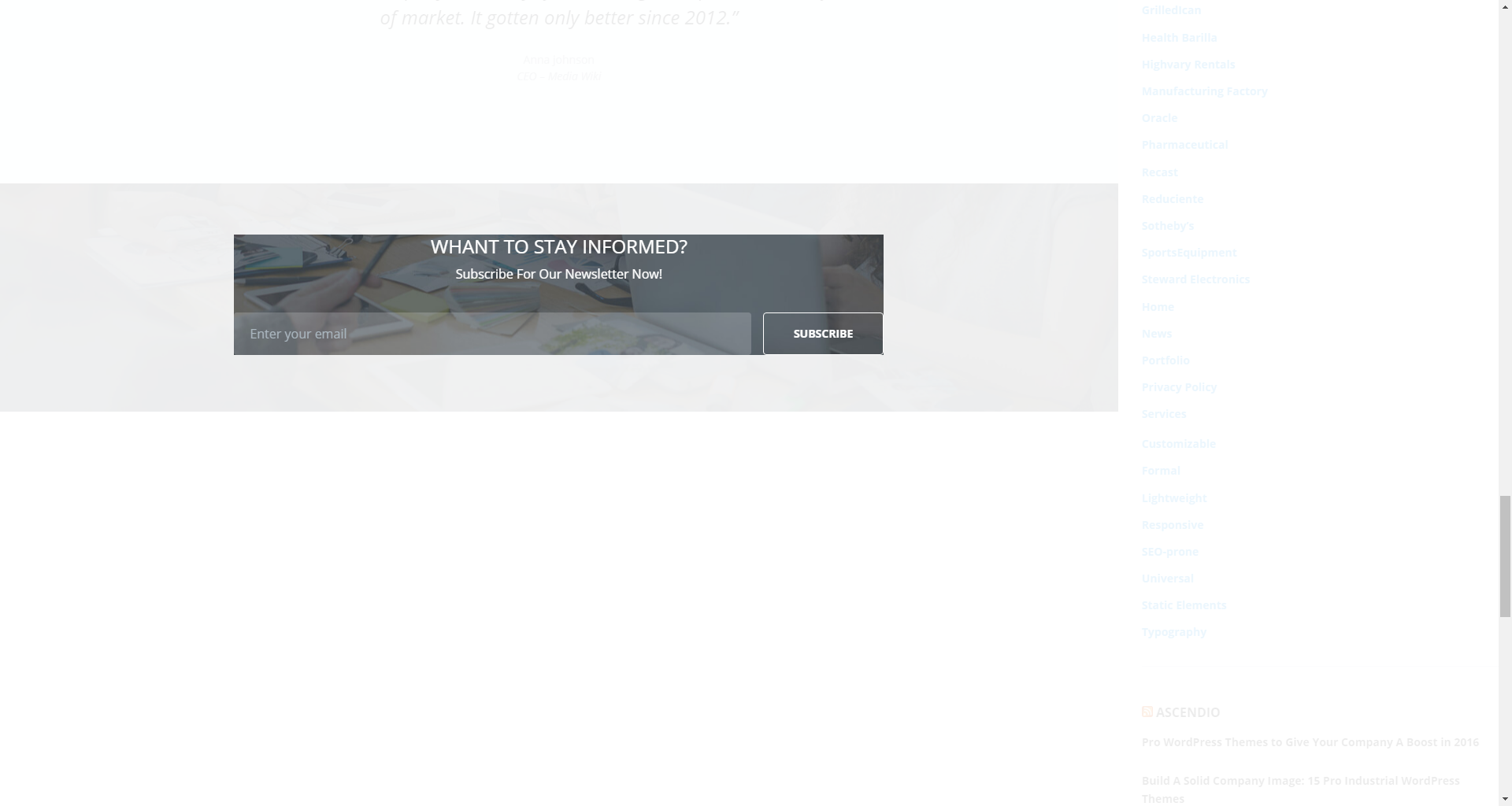
-
- enable subscribe box
- enable/disable the subscribe box;
-
- subscribe title
- this property specifies the subscribe box title;
-
- subscribe text message
- here you can add text description for the subscribe form;
-
- subscribe input placeholder
- this property specifies a placeholder text Enter Your Email Here in the input area of the subscribe box;
-
- subscribe submit label
- this property specifies a placeholder text Submit in the subscribe button of the subscribe box;
-
- subscribe success
- this property specifies a success message text You are successfully subscribed in the subscribe area of the subscribe box;
-
- enable follow box
- hide/show follow box;
-
- follow title
- this property specifies the follow box title;
-
- follow text message
- here you can add text description for the Follow block.
Archives
This widget is designed to display archives.
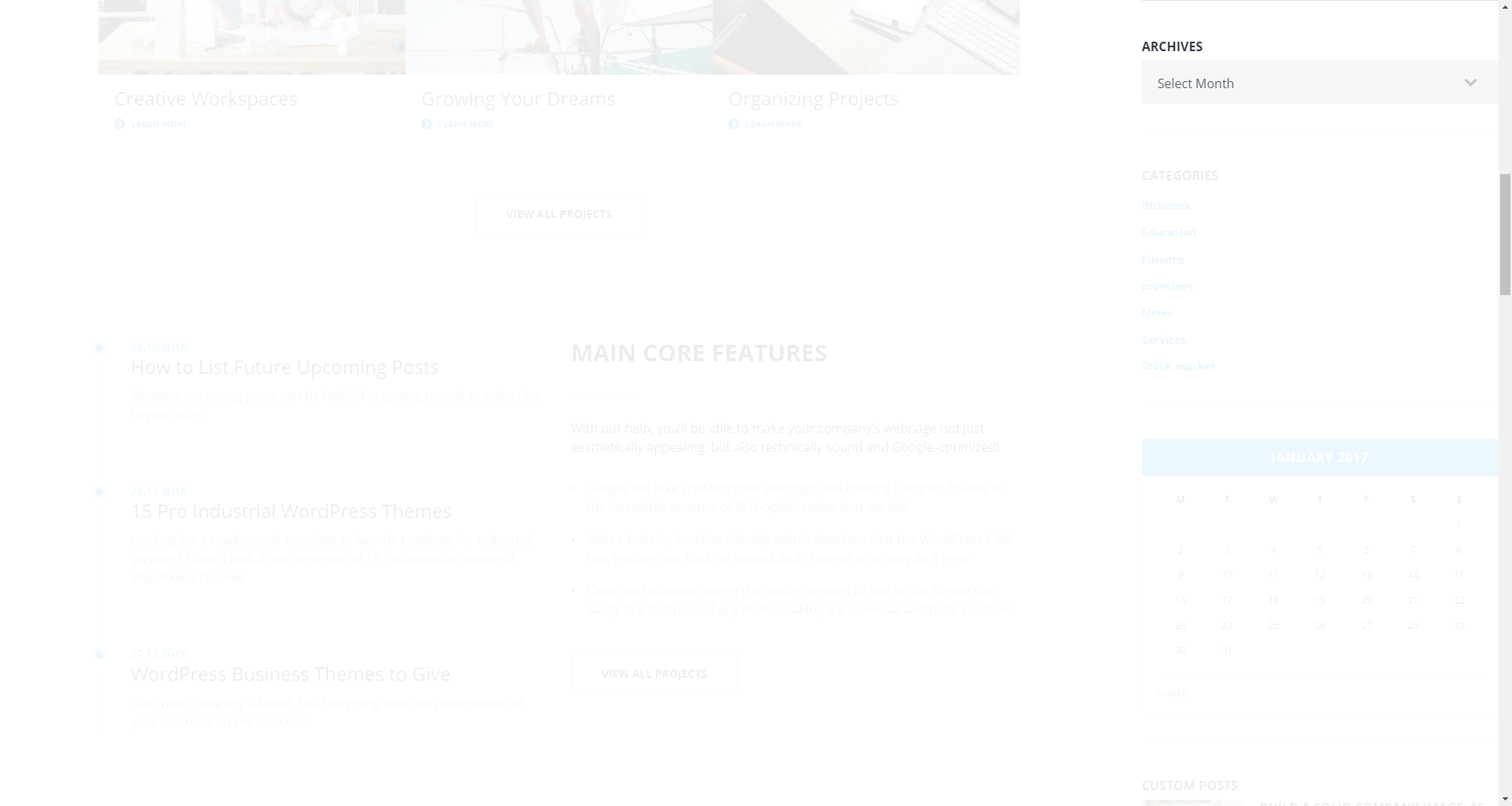
-
- title
- enter the title of the widget;
-
- display as dropdown
- this option allows to display the categories as a dropdown list;
-
- show post counts
- show/hide post counts.
Calendar
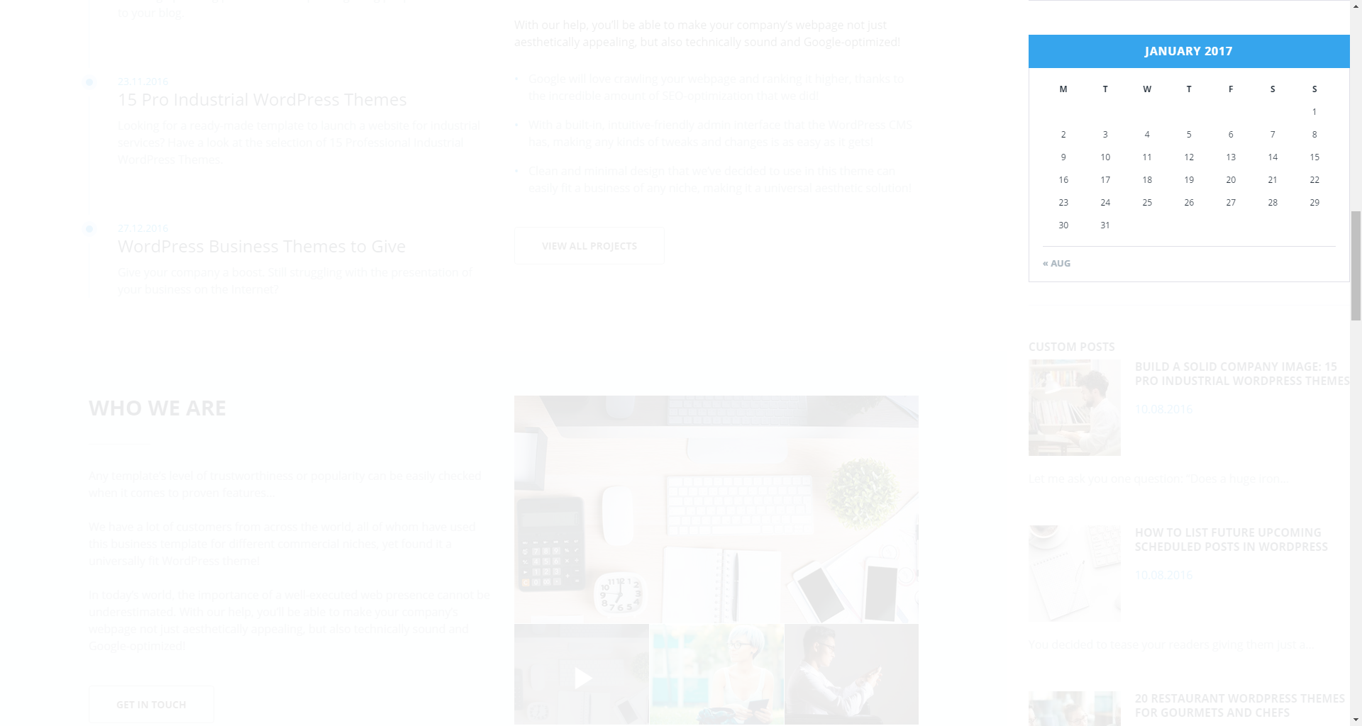
This widget is designed to display calendar.
-
- title
- enter the title of the widget.
Categories
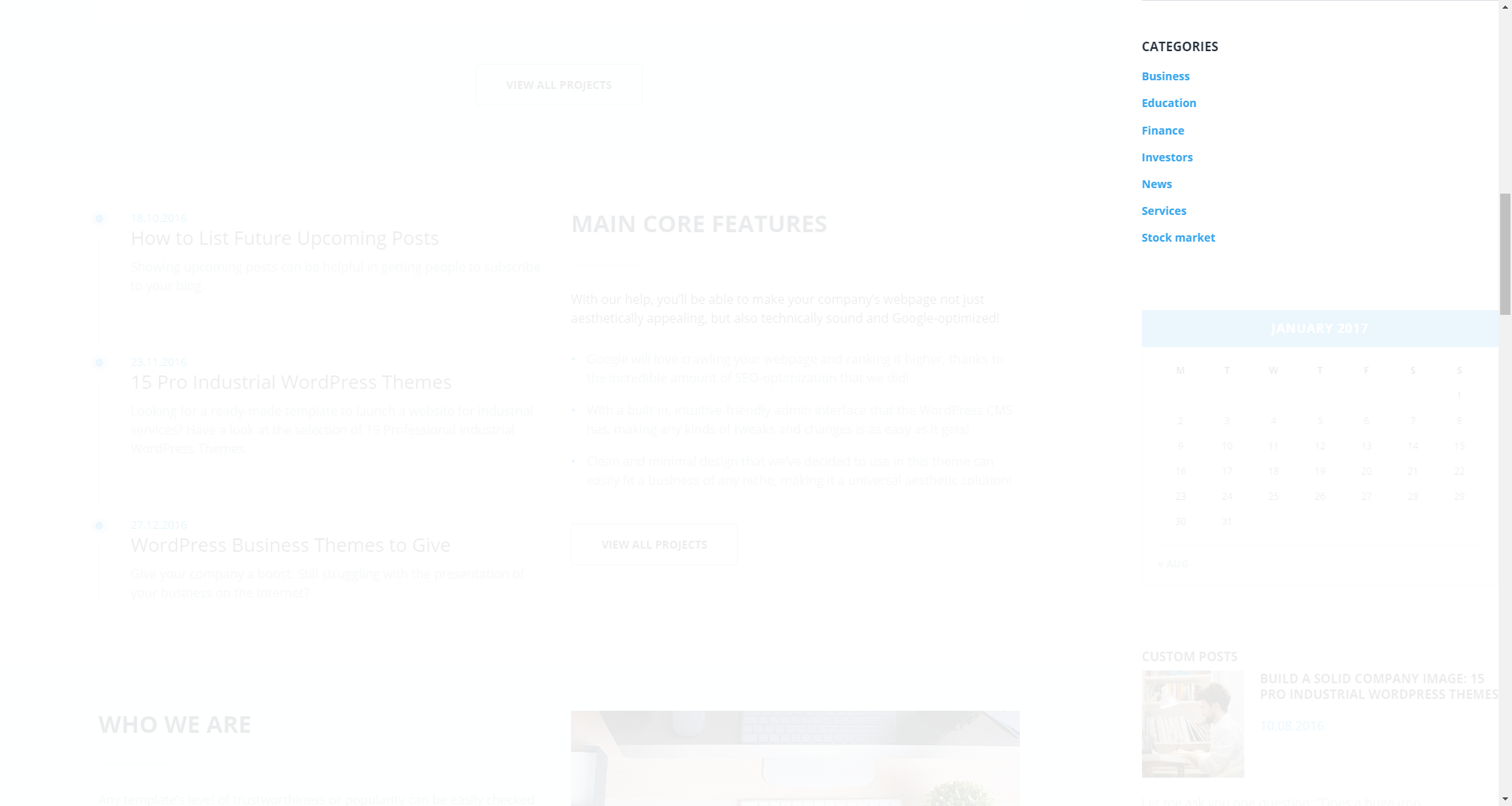
This widget is used to setup and display categories.
-
- title
- this property specifies the widget title;
-
- display as dropdown
- this option allows to display the categories as a dropdown list;
-
- show post counts
- show/hide post counts;
-
- show hierarchy
- show hierarchy.
Custom Menu
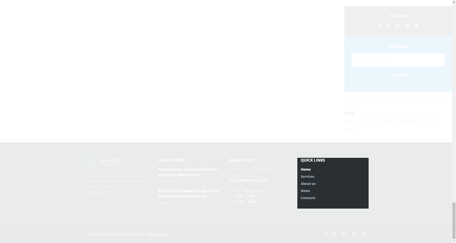
This widget allows you to create various custom menus anywhere on your website.
-
- title
- this property specifies the title of the widget;
-
- select menu
- here you can select any of the predesigned menus.
Meta
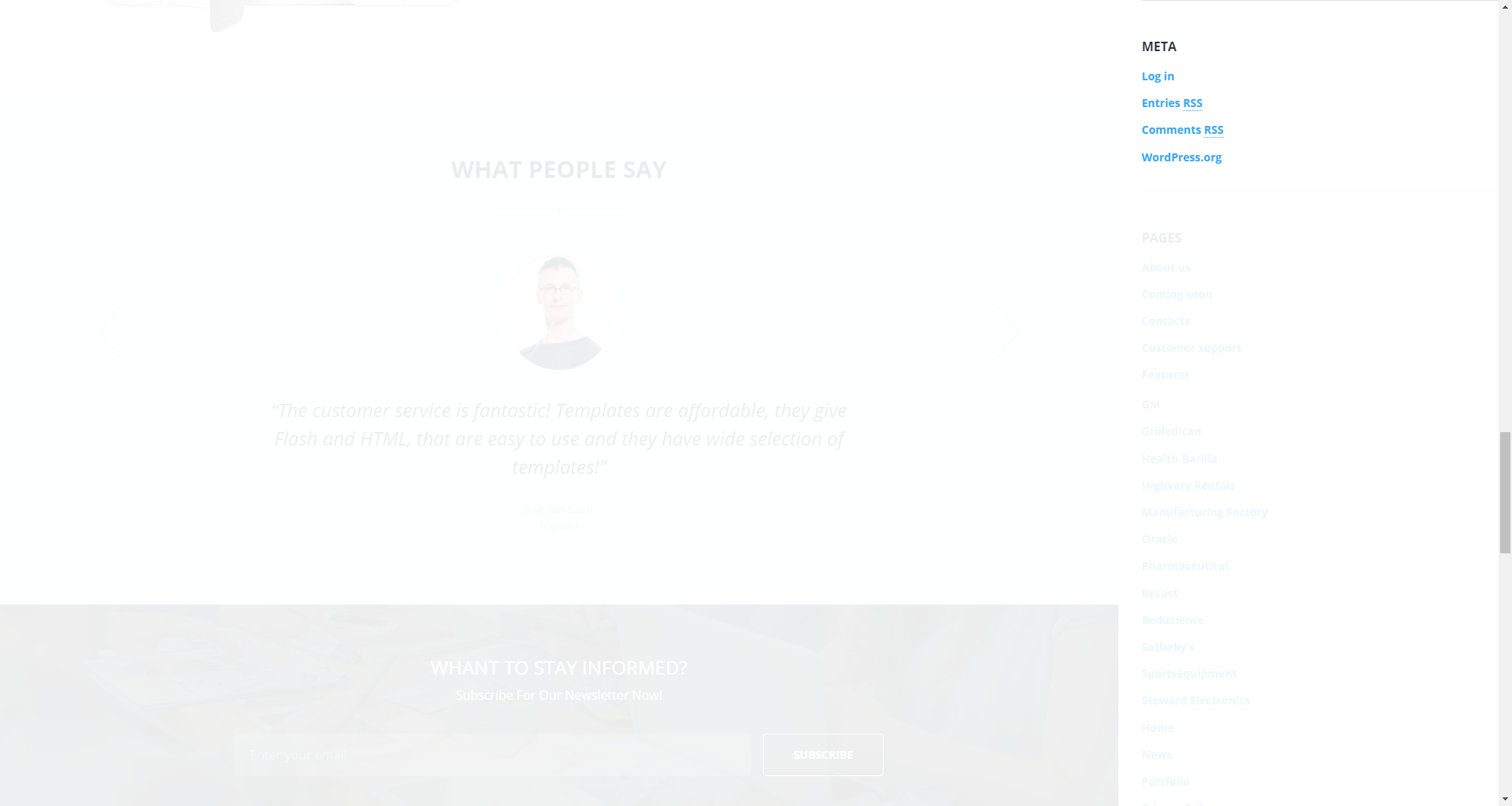
The widget is used to show 5 standard links.
-
- title
- this property specifies the widget title.
Pages
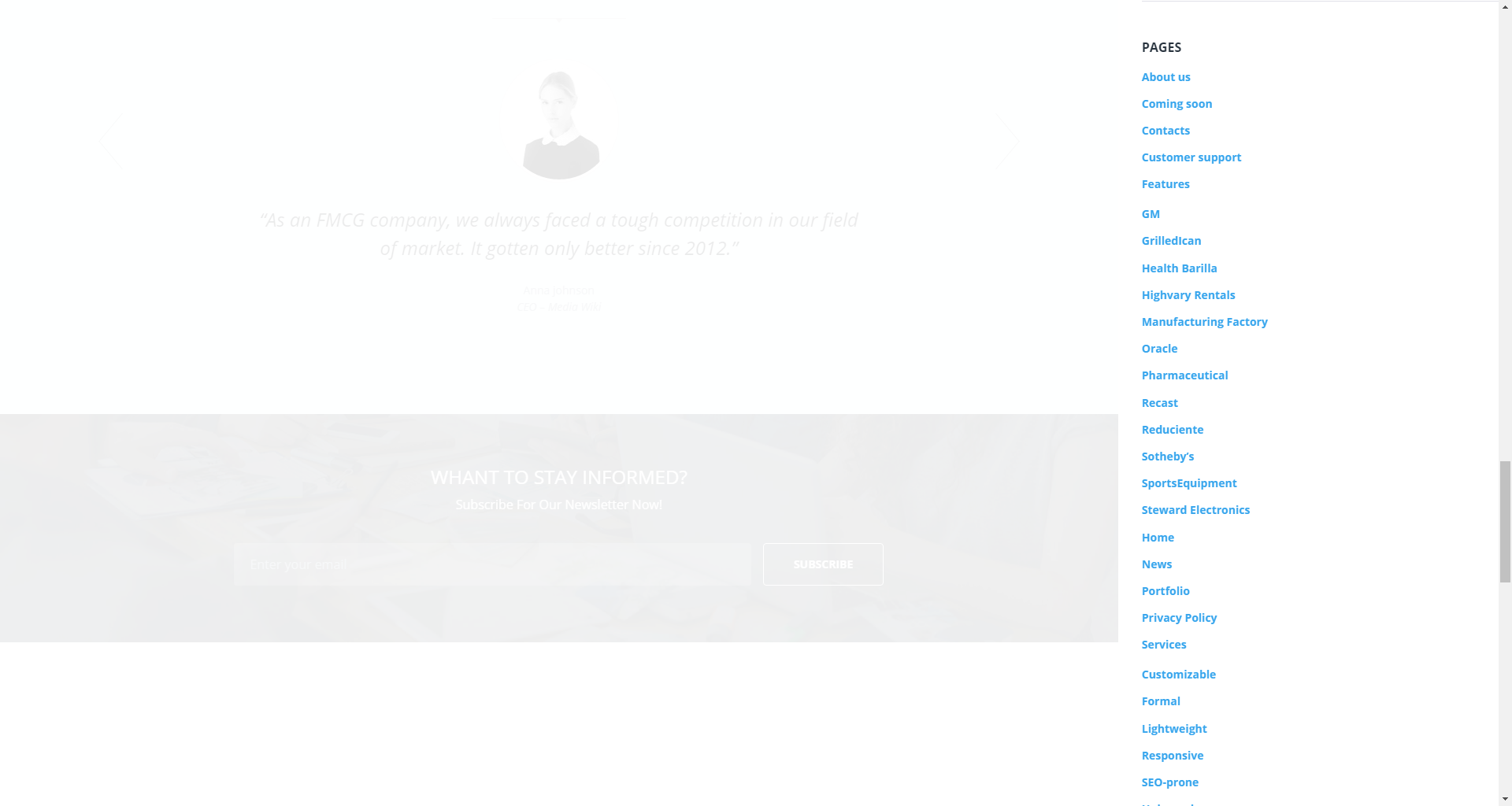
This widget displays a full list of pages of your site.
-
- title
- this property specifies the widget title;
-
- sort by
- this option allows to sort the pages by page title, page order or page ID;
-
- exclude
- specify the IDs of the pages you want to exclude.
Recent Comments
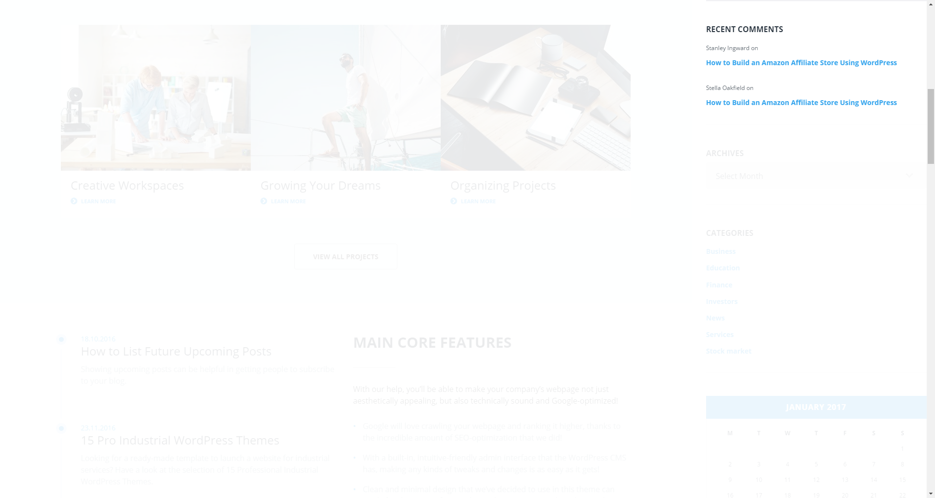
This widget is used to display the recent comments to the posts on the homepage.
-
- title
- this property specifies the widget title;
-
- number of comments to show
- this property allows you to change the number of the displayed comments.
Recent Posts
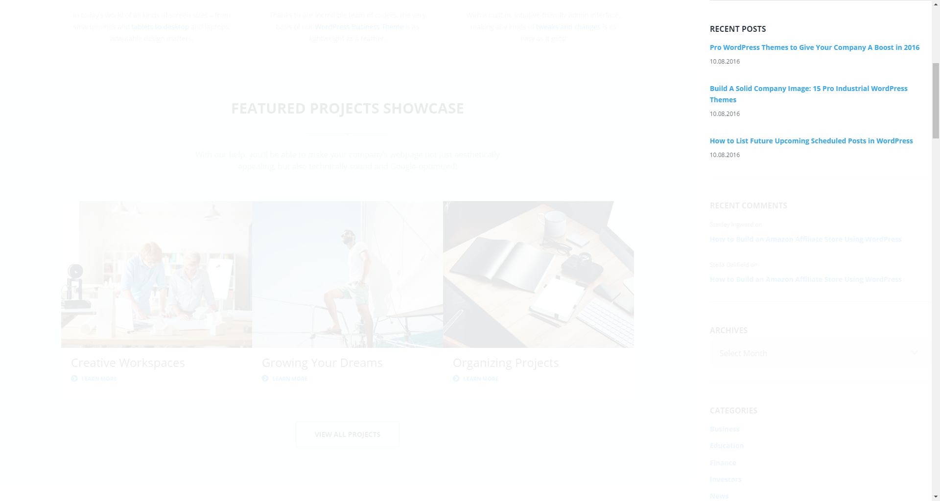
This widget is used to display recent posts on the homepage.
-
- title
- this property specifies the widget title;
-
- number of posts to show
- this property allows you to change the number of the displayed posts;
-
- display post date
- show/hide post date.
RSS
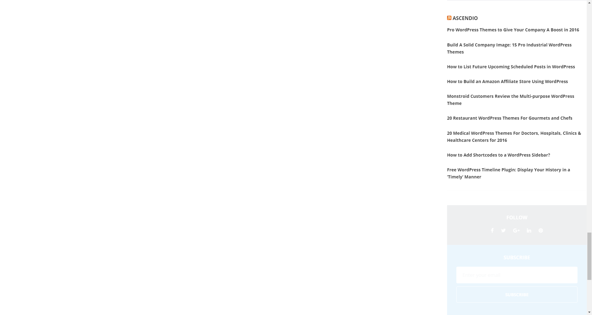
The widget is used to display RSS feeds on the website.
-
- enter the RSS feed URL here
- specify the RSS feed URL;
-
- give the feed a title (optional)
- specify the title;
-
- how many items would you like to display
- specify the number of items displayed;
-
- display item content
- show/hide item content;
-
- display item author if available
- show/hide item author;
-
- display item date
- show/hide item date.
Search
This widget adds a search field to the page.
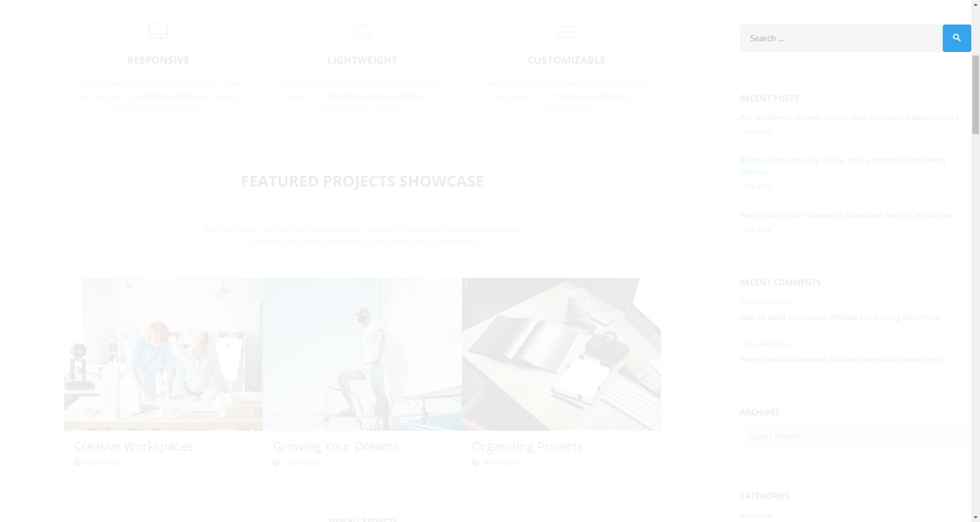
-
- title
- specify the widget title.
Tag Cloud
The widget allows you to display tag cloud on the website.
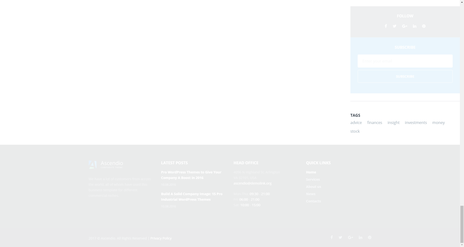
-
- title
- this property specifies the widget title;
-
- taxonomy
- choose a proper taxonomy type.
Text
The widget allows you to display various text blocks, you can also use it to insert the shortcodes.
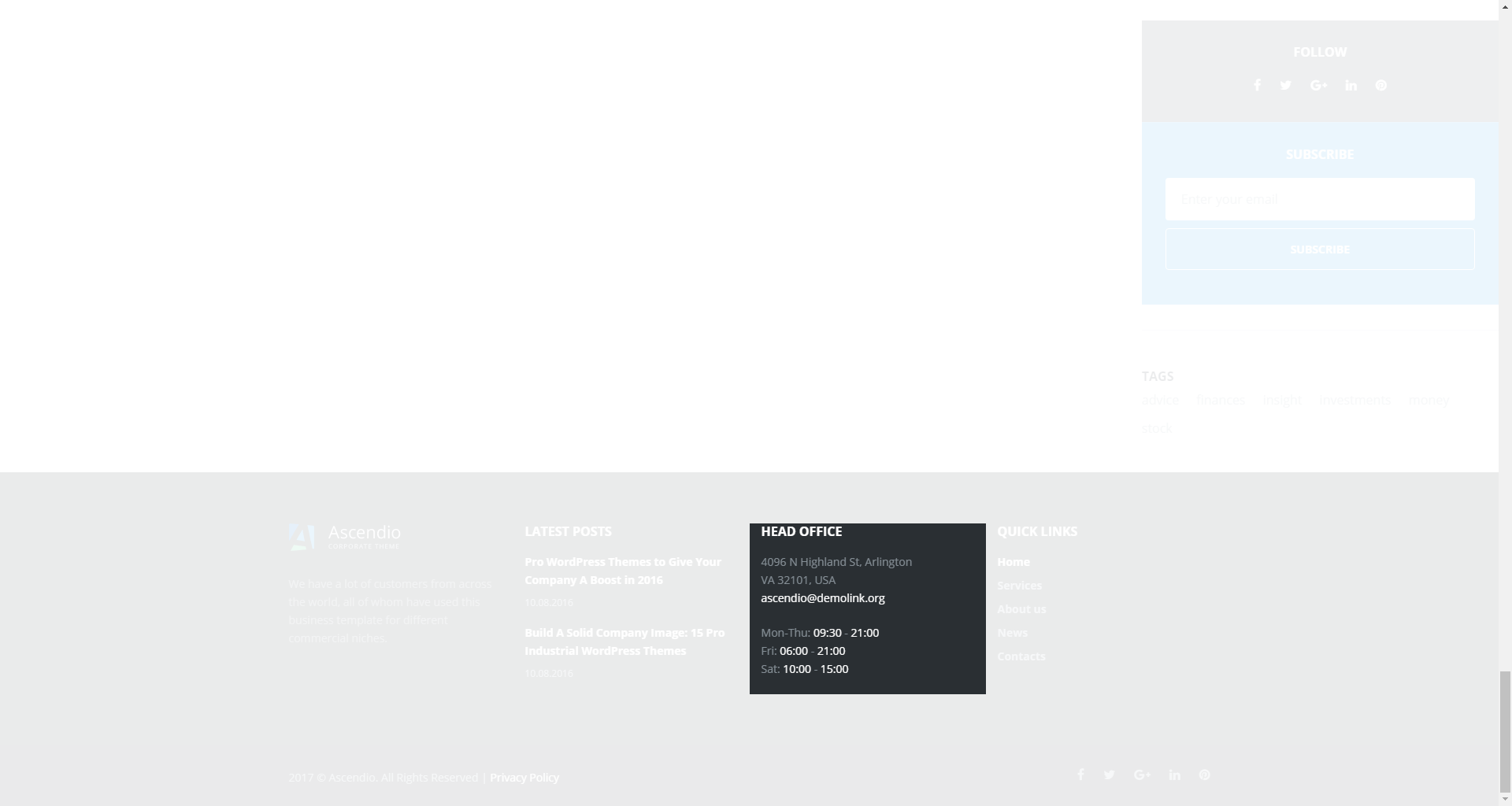
-
- title
- this property specifies the widget title;
-
- content
- insert any kind of content;
-
- automatically add paragraphs
- this option enables the Automatically add paragraphs function.
Smart Slider
This widget is used to setup and display slider on the website.
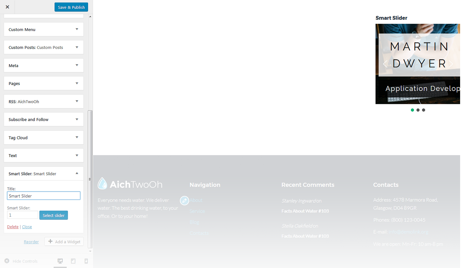
-
- title
- this property specifies the widget title;
-
- choose taxonomy type
- select taxonomy type of the slides;
-
- select category
- here you can select category to pull the slides from;
-
- select tags
- here you can select tags to pull the slides from;
-
- posts count
- this property defines the number of posts / slides to display;
-
- display title
- here you can define whether to Hide/Show post's title in a slide;
-
- display content
- here you can define whether to Hide/Show post's content in a slide body;
-
- display more button
- here you can define whether to Hide/Show the Read More button;
-
- more button text
- read more button label;
-
- content words trimmed count
- this property defines the excerpt words limit by choosing the number of words from post's content;
-
- slider width
- this property defines the slider width;
-
- slider height
- this property defines the slider height;
-
- slider orientation
- this property specifies the slider orientation. Smart slider slides are automatically set up in Horizontal / Landscape slide orientation, but you can change the slide orientation to Portrait / Vertical Portrait slide orientation;
-
- slide distance(px)
- this property specifies the distance between slides in px;
-
- slide duration(ms)
- this property specifies slides duration (in ms) to trigger swipe to the next/previous slide during long swipes;
-
- use fade effect
- this property defines whether to enable / disable fade effect on sliding;
-
- use navigation
- here you can define whether to Hide/Show the navigation arrows;
-
- indicates whether the arrows will fade in only on hover
- this property specifies whether the arrows will fade in only on hover;
-
- use pagination
- here you can define whether to Hide/Show bullet navigation on slides;
-
- use autoplay
- this property specifies whether to enable / disable autoplaying for slides;
-
- display fullScreen button
- here you can define whether to Hide/Show full screen button to display slider in full screen mode. It is not available in WordPress customizer preview;
-
- indicates if the slides will be shuffled
- this property specifies whether to shuffle slides randomly. Disabled by default;
-
- use infinite scrolling
- this property specifies whether to enable/disable infinite scrolling on sliding;
-
- display thumbnails
- here you can define whether to Hide/Show slide thumbnails below the slider;
-
- display thumbnails arrows
- here you can define whether to Hide/Show arrows navigation for thumbnails;
-
- set the position of the thumbnail scroller
- this property sets the position of the thumbnail scroller. It is set to bottom by default.
