JetWooBuilder
Jetwoobuilder Archive Category Widgets
This block contains the detailed information about Jetwoobuilder Archive Category widgets which can be used for creating WooCommerce Single Product page content.
Count
This widget allows to display the number of products applied to certain category.
Content
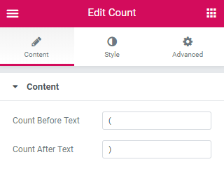
Count Before Text - here you can add or remove symbols before count.
Count After Text - here you can add or remove symbols after count.
Style
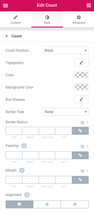
Count
Count Position - select either Block or Inline position of count.
Typography - here you can edit the typography settings. They are the same as available for other JetWooBuilder widgets.
Color - here you need to specify the color of the count.
Background Color - here you can set the needed color to use for the background of the count.
Box Shadow -here you can apply the shadow for the item. Click the Edit pencil option to open the additional shadow settings.
Border Type - here you can define the type of the border to apply for the count (or apply no border, according to your needs).
Border Radius - here you can set the border radius values to make the angles more smooth and round.
Padding - here you can define the padding values for the count.
Margin - here you can apply the specific margin values for the count and make it responsive.
Alignment - here you can change the count alignment.
Description
This widget allows to display the number of products applied to certain category.
Content
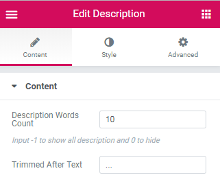
Description Words Count - define the number of words in description.
Trimmed After Text - add symbols to showcase trimmed after text.
Style
Description
Typography - here you can edit the typography settings. They are the same as available for other JetWooBuilder widgets.
Color - here you need to specify the color of the description.
Background Color - here you can set the needed color to use for the background of the description.
Box Shadow -here you can apply the shadow for the item. Click the Edit pencil option to open the additional shadow settings.
Border Type - here you can define the type of the border to apply for the description (or apply no border, according to your needs).
Border Radius - here you can set the border radius values to make the angles more smooth and round.
Padding - here you can define the padding values for the description.
Margin - here you can apply the specific margin values for the description and make it responsive.
Alignment - here you can change the description alignment.
Thumbnail
This widget is used to add thumbnail image to the product on Archive Products page.
Content
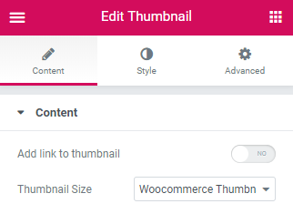
Add Link To Thumbnail - enable/disable adding link to the product thumbnail.
Thumbnail Size - select the size of thumbnail from the drop-down list.
Style
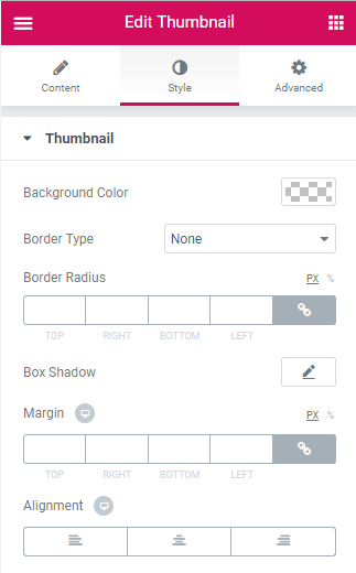
Thumbnail
Background Color - here you can change the color of the thumbnail imageusing the color picker tool.
Border Type - here you can change the margins to use them for the thumbnail image attributes.
Border Radius - input the padding values in order to use the custom paddings for the attributes thumbnail image.
Box Shadow - input the padding values in order to use the custom paddings for the attributes thumbnail image.
Margin - here you can apply the specific margin values for the thumbnail and make it responsive.
Alignment - here you can set the preferable (right, left, center) alignment for the thumbnail image.
Title
This widget allows adding the product title to the Archive Product page. It adds the title set on the Product page in the Title field and provides stylization settings for it.
Content
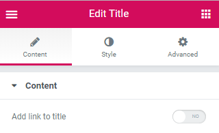
Add Link To Title - enable/disable adding link to the category title.
Style
Title
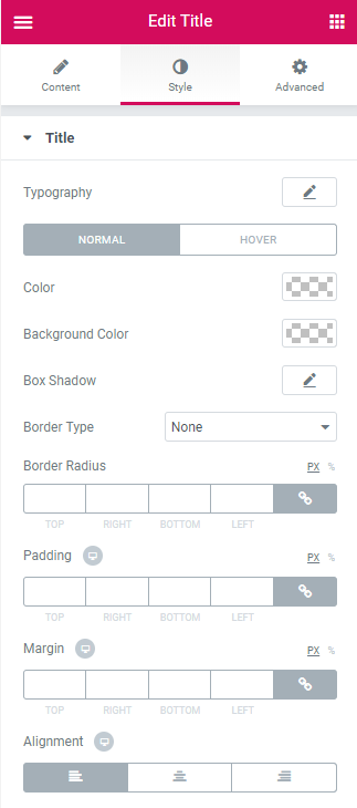
Typography — turn the option on to view the typography settings for the title text.
- Size — define the font size of the title text.
- Family — here you can set the font family for the title text.
- Weight — in this block you can select the suitable font weight.
- Transform — here you can choose from the dropdown menu, if you want the text to be shown in uppercase, lowercase, capitalize or normal way.
- Style — in this block you can choose from the dropdown menu the style of the font. It can be normal, italic (the characters look similar to handwriting) and oblique (the characters are slightly inclined to the right).
- Line Height — in this field you can set the height of the title text.
- Letter Spacing — here you can set the space between the title text characters.
Switch from Normal to Hover or Disabled modes to set the color scheme and box shadow for the title when in normal state, on mouse hover or when the purchase is disabled for the customers.
Color - here you can set the color of the title label text using the color picker.
Background Color - here you can set the background color to use for the title.
Box Shadow - click on the pencil icon to access the shadow option and apply the shadow for the title.
Border Type - here you can select one of the available border types to use for the title: none, solid, double, dotted, dashed or groove.
- Width - here you can define the width of the border in px.
- Color - here you can change the color of the borders.
Border Radius - here you can set the border radius for the chosen border to make the border angles more round.
Padding - here you can set the padding values for the text placed inside the title.
Margin - here you can define the margins applied for the whole button contained in the column.
Alignment - here you can specify the alignment of the title (left, center, right).