JetGuten
JetGuten Blocks
From this block you can learn more about the ways to use the blocks added to Gutenberg with JetGuten addon. Use the different blocks to add any type of content you need and style up it according to your vision using visual or HTML mode.
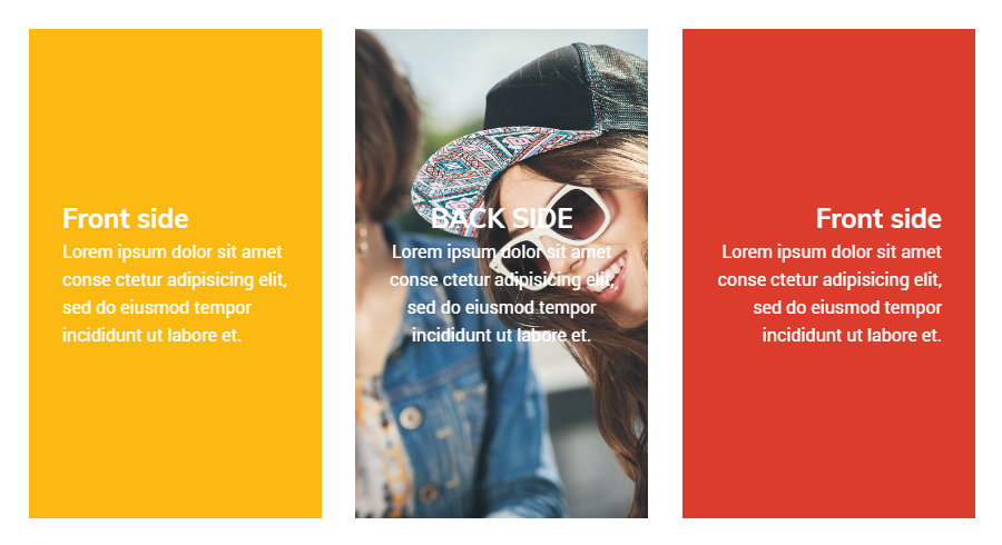
Animated Box
Animated Box block makes it possible to add animated boxes to the pages built with Gutenberg. The block possesses easily changeable animation effects, and the whole set of appearance settings for the back and front sides of the box.
General Settings
Here you can set the effect for the flipbox animation and access the height and border settings.
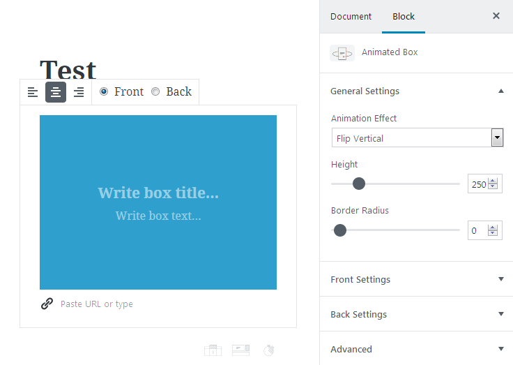
Animated Effect
- flip vertical / horizontal;
- fall up / right;
- slide down / ght;
- flip vertical 3D;
- flip horizontal 3D.
- Height - here you can set the custom height for the flipbox in px using the control.
- Boder Radius - change the border radius value to make the border angles more smooth and round.
Front / Back Settings
In these blocks you can change the appearance of the flipbox from the front and back side.
Front / Back Title Settings
- Heading Tag - choose the tag to use for the flipbox heading (H1 - H6 headings).
- Size - here you can define the size of the title text (S (small), M (medium), L (large) and XL (extra large). Click Reset button to reset the settings to the default ones.
- Custom Size - use the control to set the size of the title.
- Color- here you can specify the color of the title using color palette or color picker tool.
Front / Back Description Settings
- Heading Tag - choose the tag to use for the flipbox description (H1 - H6 headings).
- Size - here you can define the size of the description text (S (small), M (medium), L (large) and XL (extra large). Click Reset button to reset the settings to the default ones.
- Custom Size - use the control to set the size of the description.
- Color- here you can specify the color of the description using color palette or color picker tool.
Front / Back Panel Color - here you can set the color to use for the flipbox block as a background for its content.
Front / Back Panel Border
- Border Width - here you can specify the width of the border to use for the flipbox.
- Border Color - here you can set the color to apply for the flipbox border using color palette or color picker tool.
Front / Back Panel Image
- Select Image - use this button to upload an image to use in the flipbox as a background from your hard drive or select an image from the media library.
- Image Size - here you can set the size to use for the image (there are only the default image sizes that are available in the theme one’s using).
Banner
Banner block will assist you in creating banners from your custom images with the most stylish animation effects, to attract attention of the visitors to your links. The widget has 11 effect settings along with the title, description and overlay styles that can be easily changed according to one’s needs.

Content
Upload Image - click the button to access the media library and select the image to use for the banner, or upload one from your hard drive.
General Settings
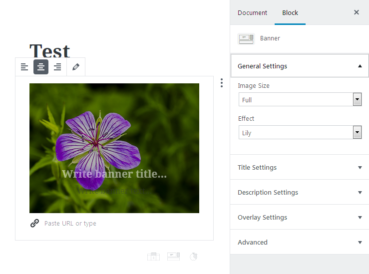
- Image Size - here you can select the size of the image to use for the banner (the sizes are pulled from the available size list in the theme).
- Effect - here you can select the effect to use for the banner from 11 different animation effects.
Title Settings
- Heading Tag - choose the tag to use for the banner heading (H1 - H6 headings).
- Size - here you can define the size of the banner title text (S (small), M (medium), L (large) and XL (extra large). Click Reset button to reset the settings to the default ones.
- Custom Size - use the control to set the size of the title.
- Color - here you can specify the color of the title using color palette or color picker tool.
Description Settings
- Size - here you can define the size of the banner description text (S (small), M (medium), L (large) and XL (extra large). Click Reset button to reset the settings to the default ones.
- Custom Size - use the control to set the size of the description.
- Color - here you can specify the color of the description using color palette or color picker tool.
Overlay Settings
- Overlay Opacity - here you can define the transparency percentage of the color overlay set for the banner.
- Overlay Color - here you can specify the color to use for the overlay.
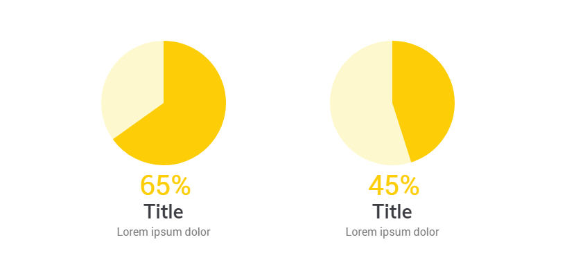
Circle Progress
Circle Progress block is useful for showcasing the current progress of the project, or displaying the rate in percents or to show the proportion from the maximum value. The block provides you with the easy-to-use content settings as well as stylization settings for the circle, value and label blocks.
General Settings
Here you can set up the content of the block to display it with Circle Progress.
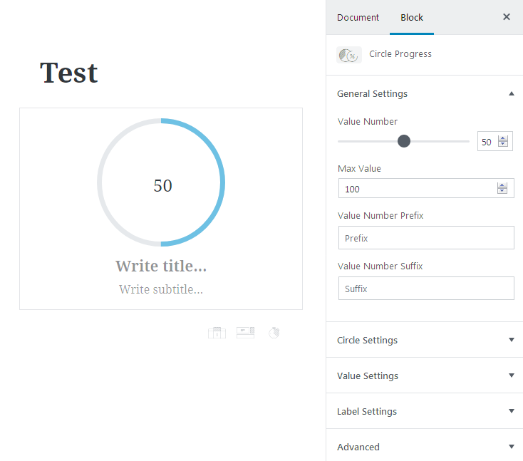
- Value Number - here you can set the value of the progress that’s already accomplished.
- Max Value - here you can define the maximum value to use for the circle progress (by default it is set to 100 (100%), however, you can define your own value according to your needs.
- Value Number Prefix - add the text or any characters to show up before the progress value.
- Value Number Suffix - add the text or any characters to display after the progress value.
Circle Settings
- Circle Size - use the controls to define the size of the circle in px.
- Stroke Color - here you can specify the color to use for the filled part of the circle what stands for the accomplished progress.
- Stroke Width - use the control to define the preferable width of the stroke in px.
- Background Stroke Color - set the color to use for the circle background that shows up in the area where the circle is not filled.
- Background Stroke Width - here you can specify the width of the background stroke of the empty part of the circle.
- Circle Fill Color - add the fill to use the custom color inside the circle progress.
Value Settings
- Value Position - here you can set the preferable position of the progress value:
- Inside progress circle;
- Below progress circle.
- Number Font Size - here you can define the size of the value text (S (small), M (medium), L (large) and XL (extra large). Click Reset button to reset the settings to the default ones.
- Custom Size - use the control to set the size of the progress value.
- Color - here you can specify the color of the progress value using color palette or color picker tool.
- Prefix Font Size - here you can define the size of the prefix text (S (small), M (medium), L (large) and XL (extra large). Click Reset button to reset the settings to the default ones.
- Custom Size - use the control to set the size of the prefix.
- Prefix Color - here you can specify the color of the prefix using color palette or color picker tool.
- Suffix Font Size - here you can define the size of the suffix text (S (small), M (medium), L (large) and XL (extra large). Click Reset button to reset the settings to the default ones.
- Custom Size - use the control to set the size of the suffix.
- Suffix Color - here you can specify the color of the suffix using color palette or color picker tool.
Label Settings
- Title Tag - choose the tag to use for the circle progress title (H1 - H6 headings).
- Title / Subtitle Font Size - here you can define the size of the title text (S (small), M (medium), L (large) and XL (extra large). Click Reset button to reset the settings to the default ones.
- Title / Subtitle Custom Size - use the control to set the size of the title.
- Title / Subtitle Color - here you can specify the color of the title using color palette or color picker tool.
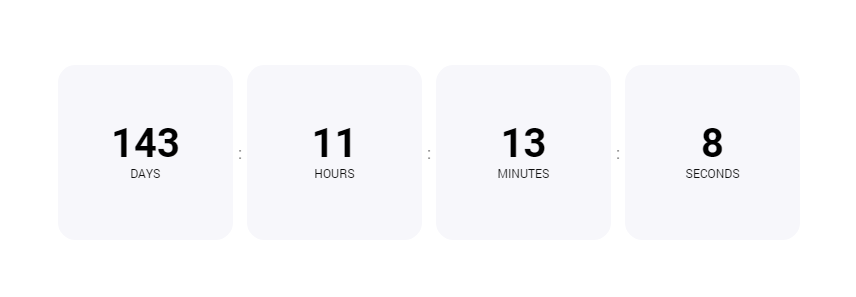
Countdown Timer
Countdown Timer block allows to display the countdown to the set date in the future using the simple countdown that displays the days, hours, minutes and seconds. The block has easily manageable settings, allowing to change the size of the timer, display the separator, change value, label and panel settings.
Creating Countdown Block
If you click on the block saettings you will see the pop-up window where you can set the labels: days, hours, minutes and seconds.
General Settings
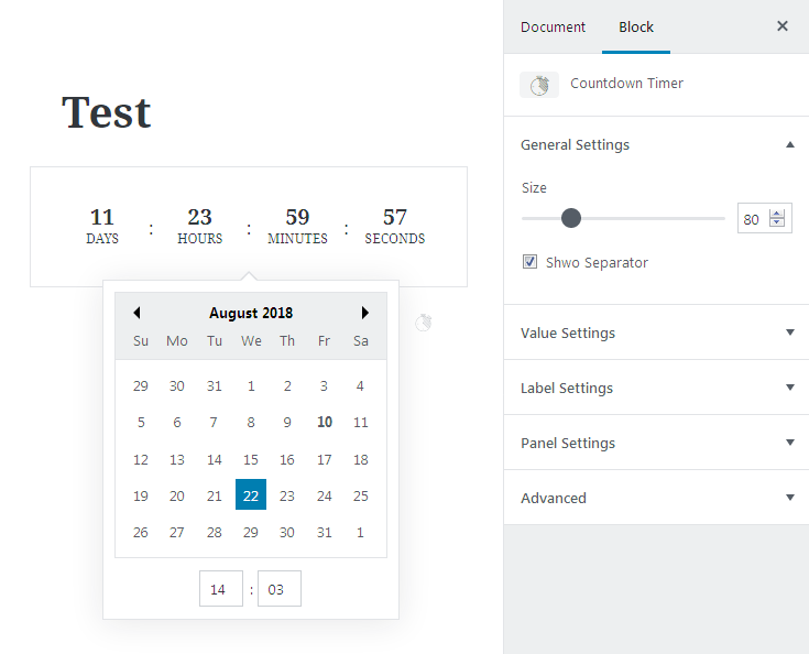
- Size - here you can set the size of the block. Just drag the control to change the value.
- Show Separator - if you click this option the separator (a colon between days, hours, minutes and seconds) will be shown in the block.
Value Settings
- Size - here you can set the block’s size. There are S, M, L and XL sizes, you can choose one of them. If you click Reset, the settings will be canceled.
- Custom Size - this option allows to set customized size. Just drag the control to change its value.
- Color - here you can choose the color of the numbers and the words: days, hours, minutes and seconds (if Show labels option is active).
Label Settings
- Show labels - if you want days, hours, minutes and seconds labels to be displayed in the block, you need to click here.
- Size - here you can choose the appropriate size of the labels. There are S, M, L and XL sizes, you can choose one of them. If you click Reset, the setting will be canceled.
- Custom Size - this option allows to set customized size. just drag the control to change its value.
- Color - here you can choose the color of the labels.
Panel Settings
- Panel Color - here you can choose the color of background.
- Border Radius - set the radius of the borders. Just drag the control to change its value.
- Border Width - set the width of the borders. Just drag the control to change its value.
- Border Color - choose the color of the borders from the variety of colors.
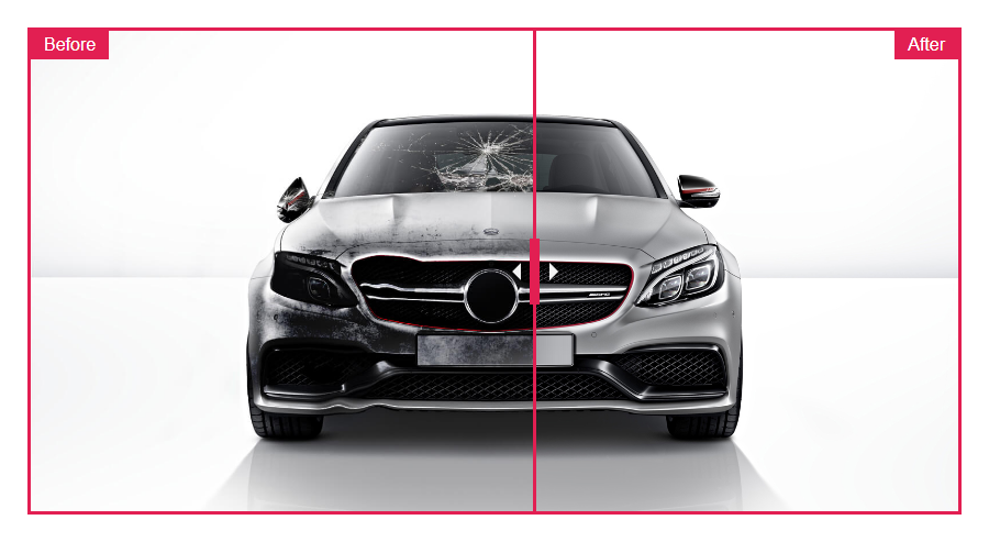
Image Comparison
Image Comparison block provides you with an ability to add the two-image block to showcase Before and After state of the object you’re displaying. It has the basic content settings as well as the style settings for the labels, border, etc.
General Settings
In this block you can customize the content that should be displayed in the Image Comparison block: the Before and After images.
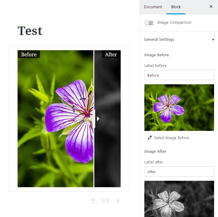
Image Before
- Label Before - here you can specify the title to show up for the image that is displayed in Before block area.
- Select Image Before - click this option in order to access the media library and select the image from the already downloaded ones, or upload it to your site. This image will be displayed in the left Before part of the block.
Image After
- Label After - here you can specify the title to show up for the image that is displayed in After block area.
- Select Image After - click this option in order to access the media library and select the image from the already downloaded ones, or upload it to your site. This image will be displayed in the right After part of the block.
- Start Position - use the switcher to set the initial position of the Before/After control (by default, it is set to 50 and shows 50% from the left Before area and 50% from the After area on the right).
Style Settings
Open the Style settings tab to access the color controls, apply a border, change labels appearance using the visual editing mode.
Controls
- Controls Color - here you can set one of the color available in the palette or use color picker tool to define the color of the control that separates the left part from the right one and enables visitors to drag it in order to view more of the Before or After image to compare them.
Border
- Border Width - here you can specify the width of the border to use for the Before/After images container that will be applied around the block containing both of the images.
- Color - here you can specify the color to use for the border using color picker or the color palette.
Labels
- Labels color - here you can set the custom color to use for the label which marks the image as the one set for Before or After block.
- Labels Background - here you can specify the color to use for the labels background.
- Labels Opacity - here you can set the opacity for the labels to make them more transparent in percents.
Inline SVG
Inline SVG block provides you with an opportunity to add SVG images without the need to add any extra plugins to WordPress. The block makes it easy to download and display the image that has scalable vector graphics format.
General
In this section you can select the SVG image to be shown on the page built with Gutenberg without using any extra plugins for uploading and integrating SVG format into WordPress.
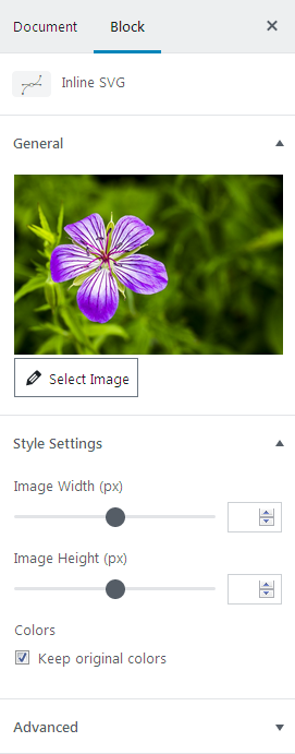
- Select image - click this option to upload an SVG image to the media library or pick one from it if it was already uploaded.
Style Settings
In this section you can set the width and height of the SVG image to the preferable ones, and set the different coloring for the image.
- Image Width - here you can customize the width value of the SVG image.
- Image Height - here you can change the height value to apply for the SVG image.
Colors
- Keep original colors - check this option if you want to use the same colors as they are for the SVG image you’ve defined.
- Fill Color - here you can define the color to fill the image using the palette or the color picker tool.
Map
Map block is a perfect solution if you’re looking for an easy way to add a Google map to the page built with Gutenberg. The block provides access to the general settings, such as Address, Map or Satellite view, zoom level, etc.
General Settings
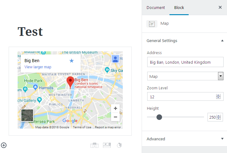
Here you can specify the content that is to be shown in the Map block.
- Address - fill in the needed address to display it on the map.
- Content - here you can specify if you want to show the map using the basic map mode or the satellite layout.
- Zoom Level - here you can specify the initial zoom to apply for the map (the visitor will be able to zoom the map in and out according to his wishes, however, when the map opens it will have the scale you’ve set.
- Height - here you can change the height of the map to use in px. Drag the control to set it according to your needs.
Pricing Table
Pricing Table block will help you display the pricing blocks with all the necessary content added to them using one of the preset styles. You’ll also be able to customize the appearance settings for the pricing blocks, making them suit your general page’s style.
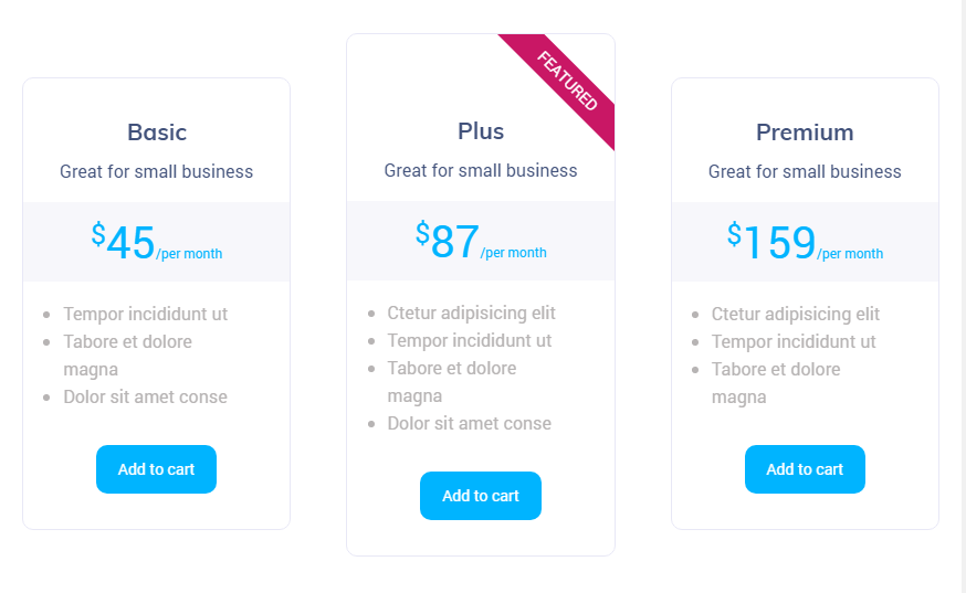
Adding Content
- To add content to the Pricing Table block you should click the Title, Subtitle lines and type in the needed text instead of “Main Title”, “Subtitle” and “List” placeholders.
- To change the link for the button click “Paste URL or type” field and here type in the needed URL.
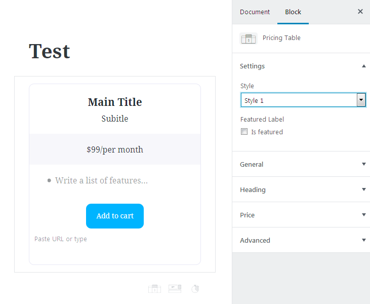
Settings
Here you can style up the block and add a featured label to it, customize its heading and price settings and values.
Style
Here you can choose how the block will look (there are Style 1, Style 2 and Style 3 variations).
Featured Label allows to add the label to the top right corner of the Pricing Table block. If you want to use this option you need to check Is Featured, option. Then the featured label’s settings will become visible.
- Label Text - here you should put any name, which you want to show for the block.
- Label Style - here you can choose how to locate the label ribbon (diagonally or vertically).
- Label Background - here you can choose the color of the label background.
- Label Color- here you can choose the color of the label text.
General
Choose the color of the table text, the table background, the button text, the button background and the border of the block.
Heading
Here it is available to adjust heading’s settings. In the block you can write Main Title and Subtitle.
- Gap Before Content - set the width of the gap between the upper border and the heading.
- Gap After Content - set the width of the gap between the heading and the price.
- Title Color -here you can choose the color of the title.
- Subtitle Color - here you can choose the color of the subtitle.
- Heading Background - here you can set the color of the heading background.
Price
Here are the price settings available to being adjusted.
- Gap Before Content - set the width of the gap between the heading and the price.
- Gap After Content - set the width of the gap after the price.
Price Prefix - here you can adjust price prefix’s settings.
- Prefix - set the sign of the appropriate currency.
- Prefix Color - here you can choose the color of the prefix.
- Prefix Size - here you can choose the prefix’s size. There are S, M, L and XL sizes, you can choose one of them. If you click Reset, the setting will be canceled.
- Custom Size - this option allows to set your customized prefix’s size, just drag the control to change its value.
- Prefix Alignment - here you can set the alignment of the prefix. It can be located on the top, in the middle or at the bottom.
Price Value - here you can adjust price value’s settings.
- Price - here you can indicate the appropriate sum.
- Price Color - here you can choose the color of the price.
- Price Size - here you can choose the number’s size. There are S, M, L and XL sizes, you can choose one of them. If you click Reset, the settings will be canceled.
- Custom Size - this option allows to set customized price’s size. Just drag the control to change its value.
- Price Alignment - here you can set the alignment of the price. It can be located on the top, in the middle or at the bottom.
Price Suffix - here you can change price suffix’s settings.
- Suffix - here you can input the needed information, e.g., for what period of time the price is (per month, per year etc.)
- Suffix Color - here you can choose the color of the suffix.
- Suffix Size - here you can choose the suffix’s size. There are S, M, L and XL sizes, you can choose one of them. If you click Reset, the setting will be canceled.
- Custom Size - this option allows to set customized suffix’s size. Just drag the control to change its value.
- Suffix Alignment - here you can set the alignment of the price. It can be located at the top, in the middle or at the bottom.
- Price Background - here you can choose the color of price background.
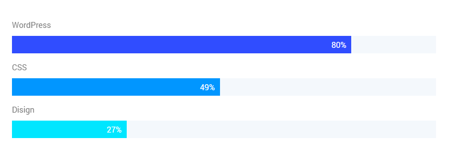
Progress Bar
Progress bar block allows adding attractive progress bars to showcase the progress of the process you’re displaying. With this block you’ll be able to change the progress value, change the layout style by selecting one of the 6 styles, and customize the style of the bar.
General Settings
Here you can change the content shown in the progress bar and the general layout of the progress bar line.
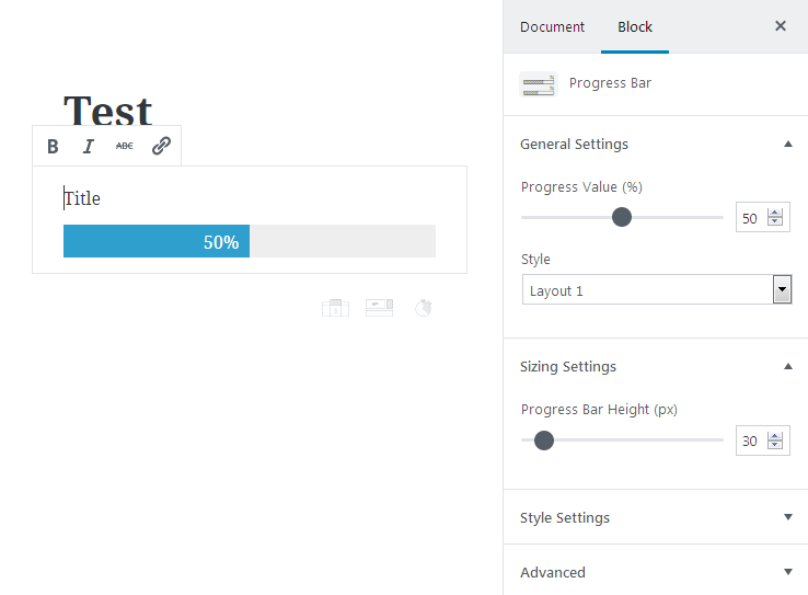
- Progress Value - here you can define the percentage value that will be displayed in the progress bar. Use the control to set the needed number of percents.
- Style - here you can select one of the 6 different stylish layouts for the progress bar in order to position the number of percents, the bar title and the bar itself according to your needs.
Sizing Settings
- Progress Bar Height - here you can change the height for the bar in px using the control.
Style Settings
Title- Size - here you can define the size of the title text (S (small), M (medium), L (large) and XL (extra large). Click Reset button to reset the settings to the default ones.
- Custom Size - use the control to set the size of the title font.
- Color - here you can specify the color of the title using color palette or color picker tool.
Value
- Size - here you can define the size of the value text (S (small), M (medium), L (large) and XL (extra large). Click Reset button to reset the settings to the default ones.
- Custom Size - use the control to set the size of the value characters.
- Color - here you can specify the color of the value characters using color palette or color picker tool.
Progress Bar
- Progress Bar Status Color - here you can specify the color that is used when the bar is filled.
- Progress Bar Color - here you can set the color to use for the empty part of the progress bar.