
Roxxe
Header Area
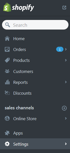
Go to the Sections tab.
Navigate to the Header section.
In your installed theme you will see the following options:
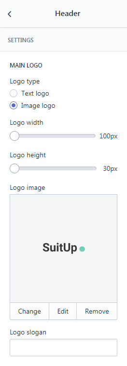
Logo
In this section you can set your Image logo and Text logo for your online store.
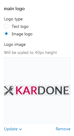
The Logo will be scaled to 40px height.
Image Logo
You are able to Upload the desired image from your computer or select image from your library. Select Upload image or Select from the library from the Update dropdown.
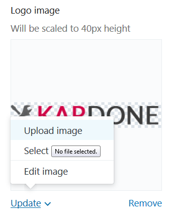
You are able to edit an image. Select Edit image from the Update dropdown.
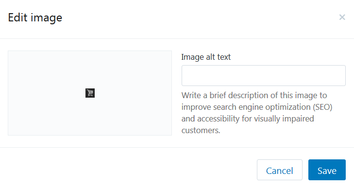
Write a brief description of this image to improve search engine optimization (SEO) and accessibility for visually impaired customers.
You can delete Logo image. In order to do this, press Remove button.
Text Logo
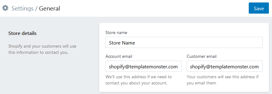
To change the text of the Logo, navigate to the site administration panel > Settings.
Go to the Store details section. Change the Store name. Click the Save button at the top left of the screen to apply changes.
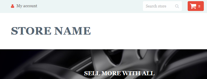
You will see the name you've specified ("Store Name") as a Text Logo on your site.
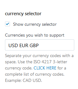
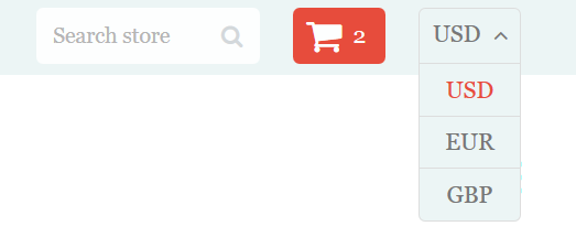
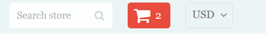
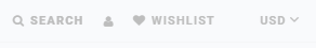
Currency selector
If you want to use several currencies in your online store, you can manage them in this section. You should select Show currency selector and add three-letter currency codes (ISO 4217 standard) in the field Currencies you wish to support.
Frontend:
Currency selector — enabled.
Currency selector — disabled.
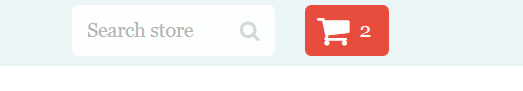
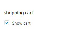
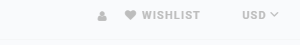
Shopping cart
Enable the Checkbox to show cart on your site.
Frontend:
Shopping cart — enabled.
Shopping cart — disabled.
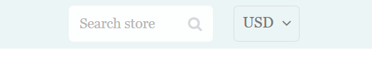
Search Form
Enable the Checkbox to show Search Box on your site.
Frontend:
Search Form — enabled.
Search Form — disabled.
Megamenu
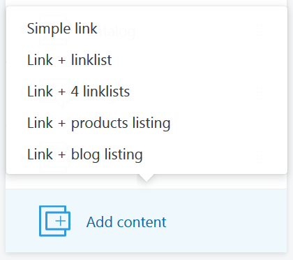
Our templates include the Megamenu widget which helps to build a powerful and functional main menu of your store. The widget has many options that are available in the corresponding section. Menu includes 6 Items, each of which is configured in the corresponding sub-section. One can add a label with the text (Item badge) to each item:
-
the usual custom link, without submenu (Simple link);
-
each column of your mega menu are able to display an individual linklist (Link + linklist). Menus, or link lists, help your customers navigate around your online store;
- each column of your mega menu are able to display the main menu link with only four linklists (Link + 4 linklists);
-
product listing (Link + product listing). Category is chosen by the user, the option to enable/disable the drop-down sub-menu with the list of the latest entries (4 latest products) is also available;
-
blog (Link + blog listing). Blog is chosen by the user, the option to enable/disable the drop-down sub-menu with the list of the latest entries (4 latest posts) is also available.
How to add a new menu item
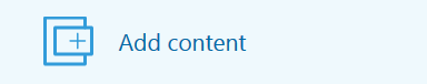
To add a new menu item to the Main Menu, press Add content button. You can display six menu items maximum.
Select the menu item type from the option dropdown (Simple link/ Link + linklist/ Link + 4 linklists/ Link + product listing/ Link + blog listing).
Click on the menu Item section.
Configure the menu item settings. Click the Save button to apply changes.
You can delete the main menu items. In order to do this, click the delete button.
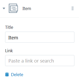
Simple Link Menu Item
Enter the menu item title. You can set a link specify a link to a certain Collection, Product, Pages, Blogs or Blog Post.
How to add a new Collection
To create a new Collection, navigate to the site administration panel > Products.
Go to the Collections section. Press the Create collection button.
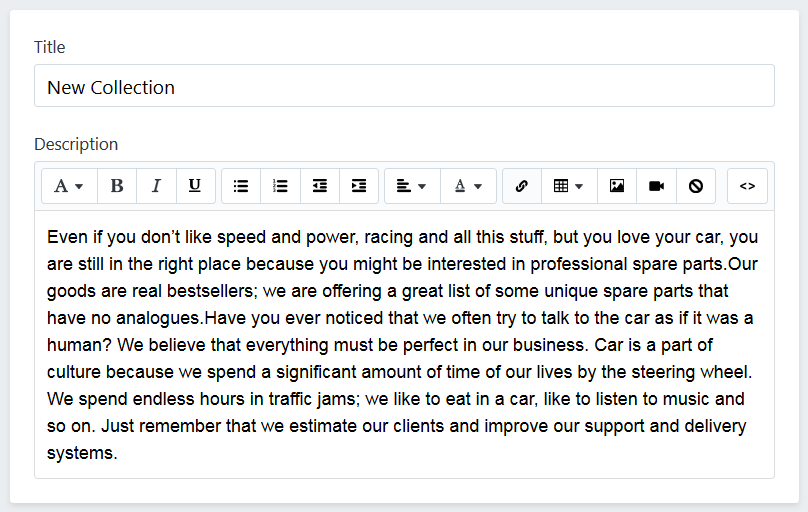
Specify the collection description. Enter the name ("New Collection") of the collection.
Now you can add products to the collection.
You are able to manually select products. You will have to save the collection before you proceed to the product adding process.
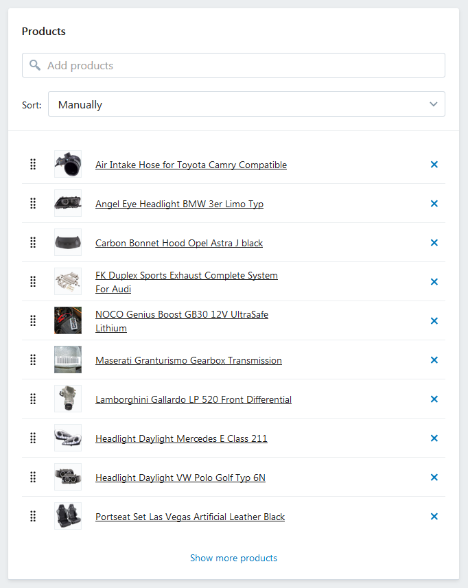
Click the little cross to exclude the product from the collection.
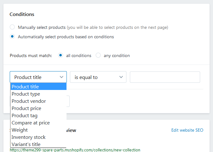
You may also automatically select products based on conditions: product title, type, vendor, price, tag, compare at price, weight, inventory stock, variante's title.
How to add a new Product
To create a new Product, navigate to the site administration panel > Products.
Go to the Products section. Press the Add product button.
Configure the product options.
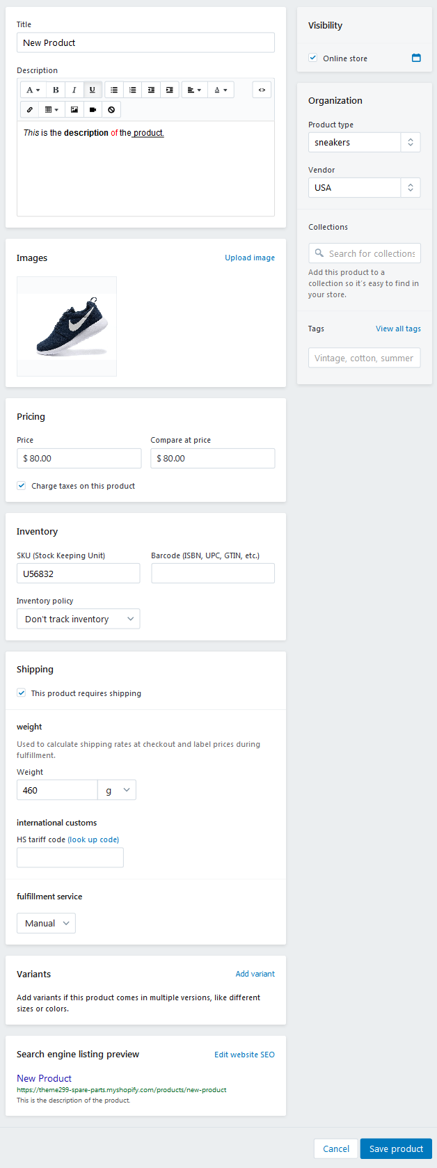
Click the Save product button to apply changes.
How to add a new Page
To create a new Page, navigate to the site administration panel > Online Store.
Go to the Pages section. Press the Add page button.
Specify the page description. Enter the page title ("New Page").
You can hide (check Hidden) or make the page visible (check Visible). You also can set a specific publish date.
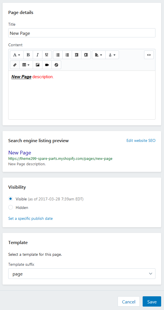
Click the Save button to apply changes.
How to add a new Blog
To create a new Blog, navigate to the site administration panel > Online Store.
Go to the Blog posts section.
Press the action overflow button (3 vertical dots) and select Manage Blogs from the dropdown.
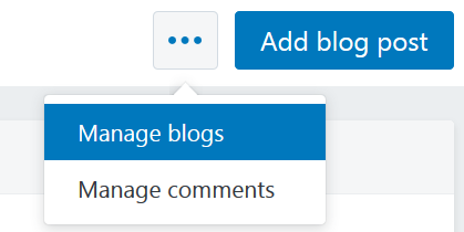
Click on the Add Blog button.
Enter the name ("New Blog") of the blog. Manage how comments are handled on this blog.
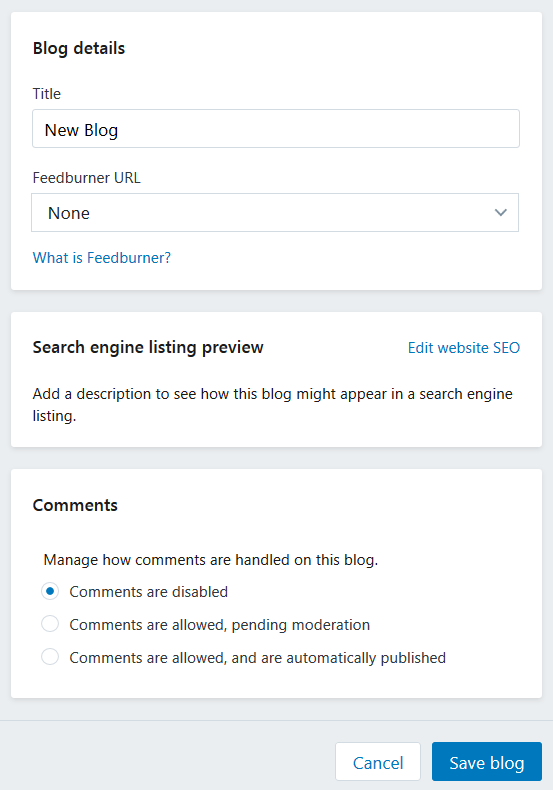
Click the Save blog button to apply changes.
How to add a new Blog Post
To create a new Blog Post, navigate to the site administration panel > Online Store. Go to the Blog posts section. Click Add blog post button.
Enter the title ("New Post") of the blog post. Add the post content. You can hide (check Hidden) or make the post visible (check Visible). You also can set a specific publish date. Assign the new post to the blog (category). You also can upload the Featured image.
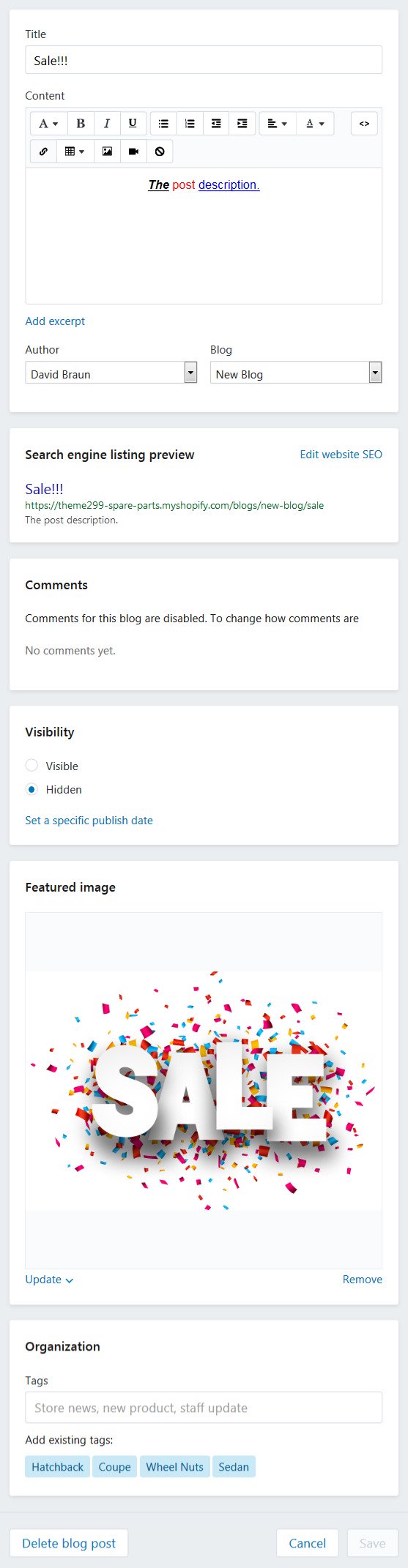
Click the Save button to apply changes.
Link + Linklist Menu Item
Linklists help your customers navigate around your online store. You can create drop-down menus for your online store.
Enter the menu item title. You can set a link specify a link to a certain Collection, Product, Pages, Blogs or Blog Post. Choose the linklist from the option dropdown.
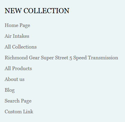
How to create a new linklist
To create a new menu with a linklist, navigate to the site administration panel > Online Store. Go to the Navigation section. Press the Add menu button.
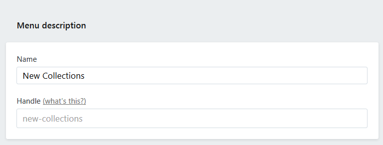
Specify the menu description. Enter the name ("New Collection") of the menu.
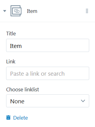
You cam add menu item to the menu. In order to do this, press Add menu items button.
Enter the name of the menu item.
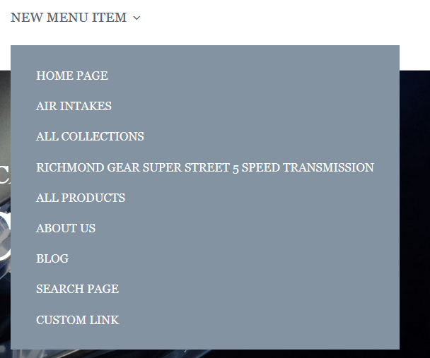
You can set a link to the:
- Home Page;
- Collection. You need to choose the certain collection from the Select a collection option dropdown;
- All Collections;
- Product. You need to choose the certain product from the Select a product option dropdown;
- All Products;
- Page. You need to choose the certain page from the Select a page option dropdown;
- Blog. You need to choose the certain blog from the Select a blog option dropdown;
- Search Page;
- Web address. Enter the custom link.
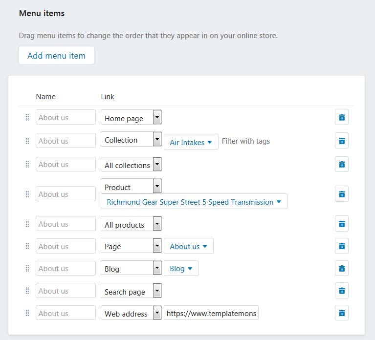
Click the Save menu button to apply changes.
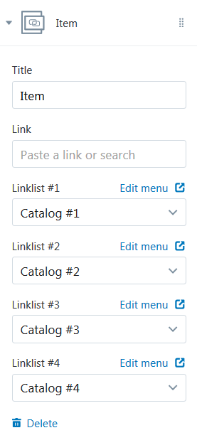
Link + 4 linklists
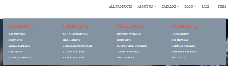
Enter the menu item title. You can set a link specify a link to a certain Collection, Product, Pages, Blogs or Blog Post. Choose the each of 4 linklists from the dropdown.
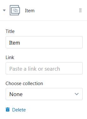
Link + Product Listing
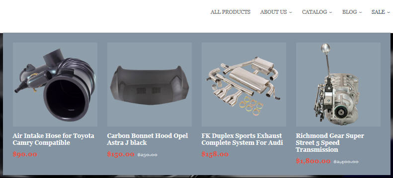
Enter the menu item title. You can set a link specify a link to a certain Collection, Product, Pages, Blogs or Blog Post. Choose the collection (4 products of which will be shown in the submenu) from the Choose collection dropdown.
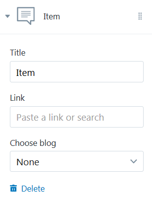
Link + Blog Listing
Enter the menu item title. You can set a link specify a link to a certain Collection, Product, Pages, Blogs or Blog Post. Choose the blog (4 blog posts of which will be shown in the submenu) from the Choose blog dropdown.
HomePage Area
Sections Configuration
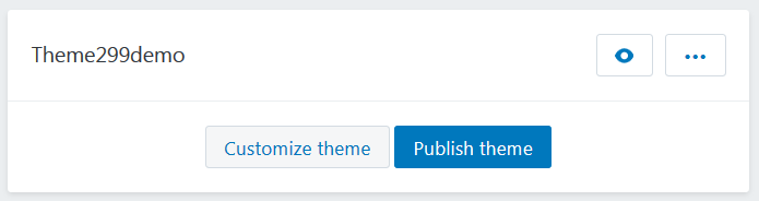
Navigate to the Online Store > Themes section.Select the theme you want to modify.
Click on the Customize theme button to open the settings editor page where you can change the appearance and content of the theme.
Go to the Sections tab. This is Live editor. You can track changes in the appearance of your store without reloading the page.
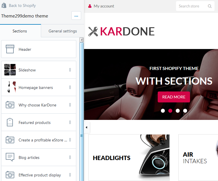
In your installed theme you will see the following options:
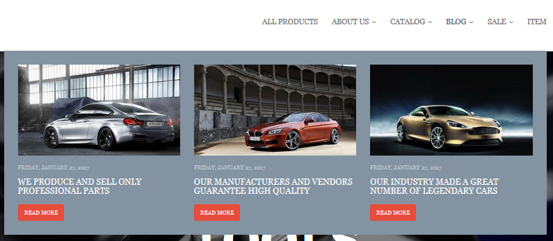
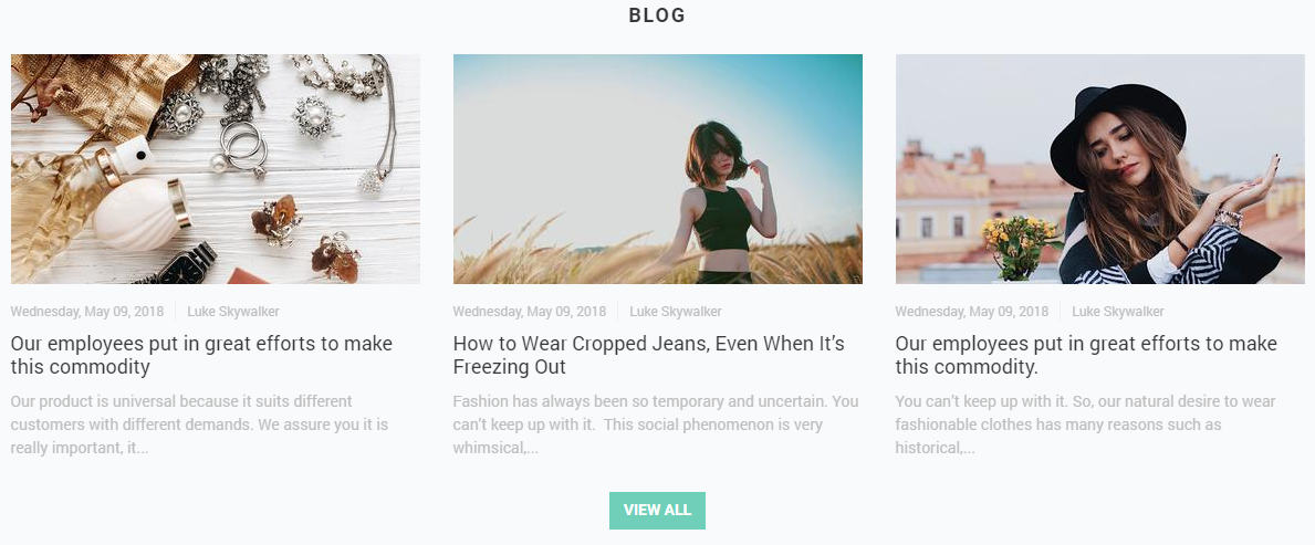
Blog Articles
This functionality enables you to display a number of blog posts from a certain blog (articles) in a grid with image, title, author name, publication date and VIEW ALL button.
Let's review the Blog Articles section configuration:
This section settings allow you to set the title of the section, the background color, blog and the number of recent articles to display (3, 6 or 9), as well as the Small 370х208, Medium 370x308 or Large 370x493рх image size. You can align the image by the top/bottom edges or by the center. The text can be placed in the usual way or over the image. You can also enable the author’s name display and the "View all" button which will lead to the blog page.
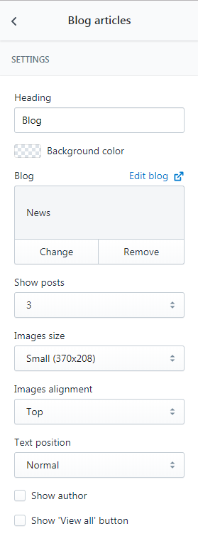
- Heading — add the title of the section;
- Blog — choose the collection of blog post you want to display;
- Show posts — set a number of article to show (3/6/9);
- Images size — select a suitable article image size from the option dropdown (Small/Medium/Large);
- Images alignment — select a suitable article images alignment from the option dropdown (Top/Middle/Bottom);
- Text position — select a suitable text position from the option dropdown (Normal/Overlay);
- Show author — tick to show the author;
- Show 'View all' button — tick to show the View all button.
- Heading — Featured posts;
- Blog — Blog;
- Show posts — 3;
- Images size — Small (370x208);
- Images alignment — Bottom;
- Text position — Normal;
- Show author — Yes;
- Show 'View all' button — No.
- Heading — Our Blog;
- Blog — Blog;
- Show posts — 3;
- Images size — Medium (370x370);
- Images alignment — Bottom;
- Text position — Overlay;
- Show author — No;
- Show 'View all' button — Yes.
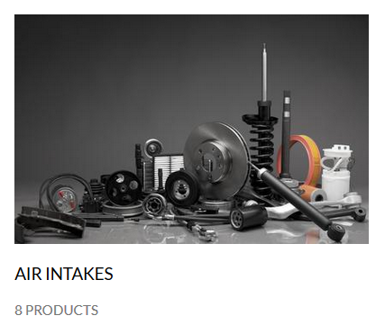
Collection List
This functionality enables you to display a number of collections in a grid with image, amount of products and VIEW ALL button.
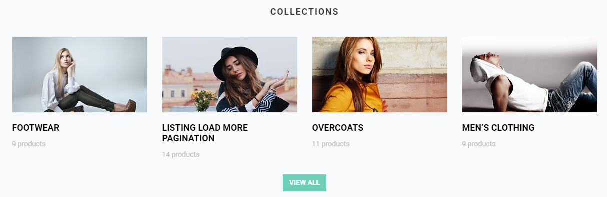
Let's review the Collection List section configuration:
The ‘Collection list’ section settings are the following:
- The title of the section.
- Size of the collection image (Small 270x151px, Medium 270x255px, Large 270x360px) and its alignment.
- Text position: over the image or below it.
- The ‘View all’ button, leading to the listing page of all the collections.
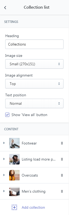
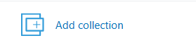
You can add up to 12 collection blocks (4 per row) into this section. To do this you just need to select the desired collection in the block settings.
- Heading — add the title of the section;
- Images size — select a suitable collection image size from the option dropdown (Small/Medium/Large);
- Images alignment — select a suitable collection images alignment from the option dropdown (Top/Middle/Bottom);
- Text position — select a suitable text position from the option dropdown (Normal/Overlay);
- Show 'View all' button — tick to show the View all button;
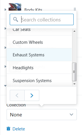
- Collection — choose the collection of products you want to display.
To add a collection to display press the Add collection button.
Click on the Collection section.
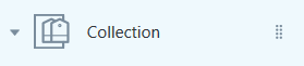
Select desired collection from the option dropdown.
You can display twelve collections maximum.
Example:
- Heading — Collections;
- Images size — Small (370x208);
- Images alignment — Top;
- Text position — Normal;
- Show 'View all' button — No.
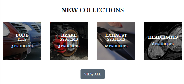
- Heading — New Collections;
- Images size — Medium (370x370);
- Images alignment — Middle;
- Text position — Overlay;
- Show 'View all' button — Yes.
Custom Content
It is possible for you to add a custom content to your website.
You can add Image and Text block.
Add Video block to your website.
You also can add a block with the certain product to your website.
A block with the certain collection can be placed on your website.
You also can add a custom HTML block.
Let's review the Custom Content section configuration:
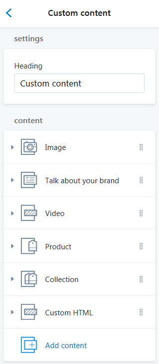
- Heading — add the title of the section;
Image
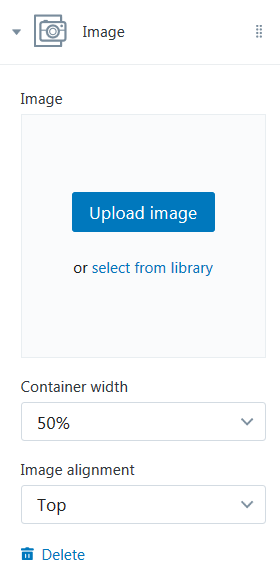
- Image — choose a custom image for this block. You can upload image from your computer or select image from your library;
- Container width — choose a suitable container width from the option dropdown (25/33/50/66/75/100%);
-
Images alignment — select a suitable image alignment from the option dropdown (Top/Middle/Bottom);
Text
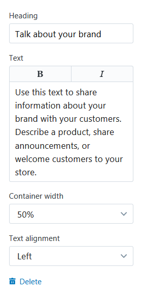
- Heading — add the title of the text block;
-
Text — input the text you want to display within the block. You can italicize text (press the "I" button) or mark it in bold (press the "B" button);
- Text alignment — select a suitable column text alignment from the option dropdown (Left/Centered/Right);
Video
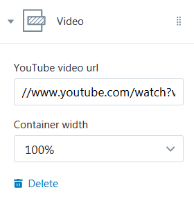
-
YouYube video url — this option allows you to specify custom URL for video from YouTube that has to be visible on the page;
- Container width — choose a suitable container width from the option dropdown (25/33/50/66/75/100%);
Product
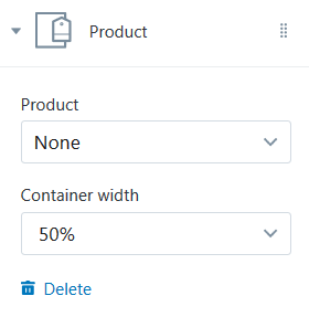
- Product — choose the product to display;
- Container width — choose a suitable container width from the option dropdown (25/33/50/66/75/100%);
Collection
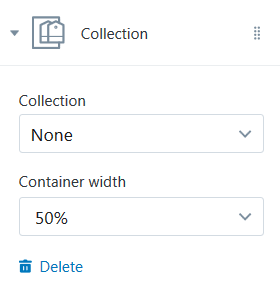
- Collection — choose the collection of products you want to display;
- Container width — choose a suitable container width from the option dropdown (25/33/50/66/75/100%);
Custom HTML
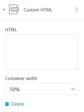
- HTML — enter the custom HTML in this field;
- Container width — choose a suitable container width from the option dropdown (25/33/50/66/75/100%).
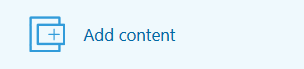
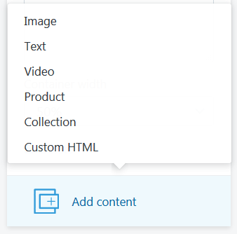
To add a new Custom Block press the Add content button.
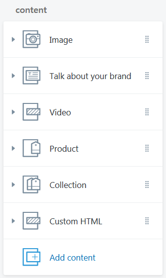
Select desired custom section content type from the dropdown (Image/Text/Video/Product/Collection/Custom HTML).
Click the Content (Image/Talk about your brand/Video/Product/Collection/Custom HTML) section and configure the custom content block options.
Featured Product
This functionality enables you to show "Featured products" in tab panel, that keeps the layout clean and well-organized.
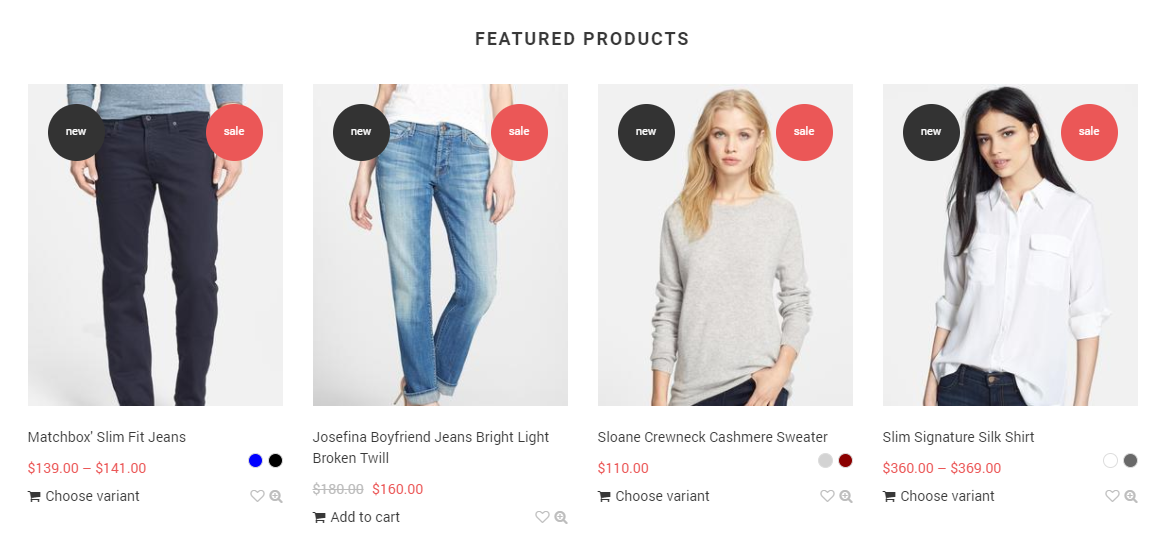
Let's review the Featured Products section configuration:
You may set the preferred title for the Featured products section. You may set the background color for the section, then there will also be some inner paddings.
The settings allow you to choose a collection to become ‘featured’ and the number of its products: 4 / 8 / 12 / 16 / 20. There is also an option to define the desired product image size: Small (270x190), Medium (270x270), Large (270x341) , and its alignment.
- Heading — add the title of the section;
- Collection — choose the collection of products you want to display;
- Show products — specify the number of products to show within the section;
- Images size — select a suitable product image size from the option dropdown (Small/Medium/Large);
- Images alignment — select a suitable product images alignment from the option dropdown (Top/Middle/Bottom).
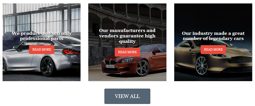
Image with Text Section
It is possible for you to add image with text to your website.
Let's review the Image with Text section configuration:
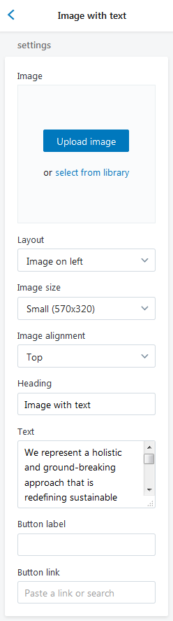
-
Image — choose a custom image for this section. You can upload image from your computer or select image from your library;
- Layout — choose a proper layout type for the section (Image on left/Image on Right);
- Images size — select a suitable section image size from the option dropdown (Small/Medium/Large);
- Image alignment — select a suitable image alignment from the option dropdown (Top/Middle/Bottom);
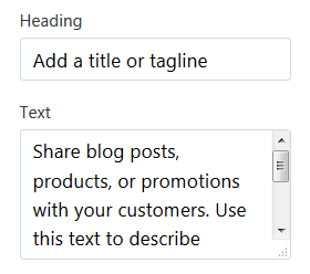
- Heading — add the title of the section;
- Text — input the text you want to display within the section;
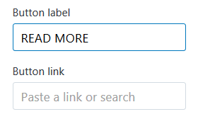
- Button label — specify the buttons' text;
- Button Link — specify a link to a certain Collection, Products, Pages, Blogs or Blog Post.
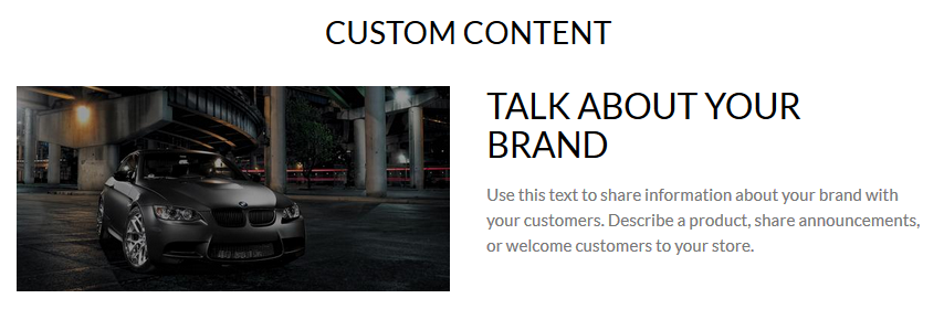
Example:
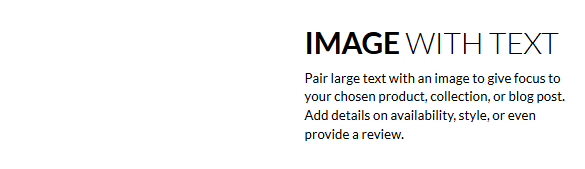
-
Image — no;
- Layout — Image on left;
- Heading — Image with text;
- Text — Pair large text with an image to give focus/.../;
- Button label — disabled;
- Button Link — disabled.
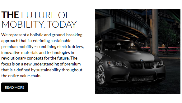
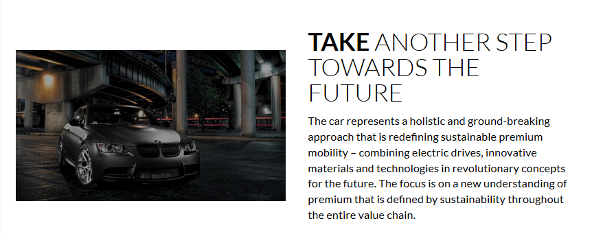
-
Image — Yes;
- Layout — Image on Right;
- Images size — Medium;
- Images alignment — Middle;
- Heading — THE FUTURE OF MOBILITY. TODAY;
- Text — We represent a holistic and /.../;
- Button label — READ MORE;
- Button Link — Blog Post.
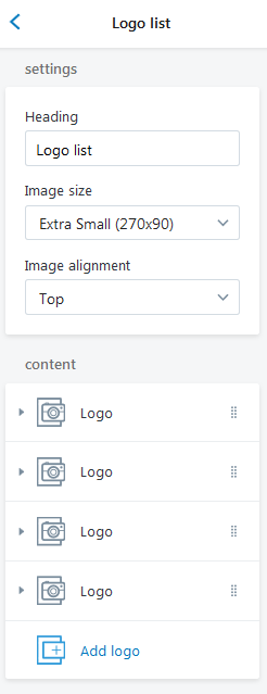
Logo List Section
This functionality enables you to display a number of Logos in a grid with a link to a certain Collection, Products, Pages, Blogs or Blog Post.
Logo list section settings allow you to set the title, choose between the 4 block size options: Extra Small (170x78), Small (170x119), Medium (170x124), Large (170x132), set the background color for the section, define the separate background for the blocks (only for the icon type blocks), select the blocks text color (only for the icon type blocks), set the icon and text alignment for the icon type blocks:
regular (below the icon)or in one line (beside the icon).
You may add up to 12 blocks of 2 types: logo or icon. In case you add more than 6 blocks, they will show up in a carousel.
Logo block allows adding an image and a link.
Icon block allows choosing one of the 20 predefined icons, add the text and the link.
Let's review the Logo List section configuration:
- Heading — add the title of the section;
- Images size — select a suitable Logo image size from the option dropdown (Small/Medium/Large);
- Images alignment — select a suitable Logo images alignment from the option dropdown (Top/Middle/Bottom).
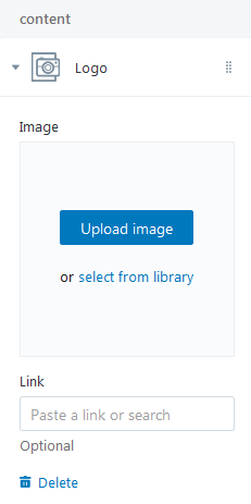
Content
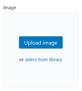
- Image — choose a custom image for Logo. You can upload image from your computer or select image from your library;
- Link — specify a link to a certain Collection, Products, Pages, Blogs or Blog Post.
To add a Logo to display press the Add logo button. Click on the Logo section.
Upload desired image from your computer (press the Upload image button) or select image from your library (press "select from the library").
Specify a Link to a certain Collection, Products, Pages, Blogs or Blog Post.
You can display twenty Logos maximum.
Testimonials Section
This section contains the settings which control the display of Testimonials on the pages of the store.
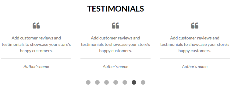
Let's review the Testimonials section configuration:
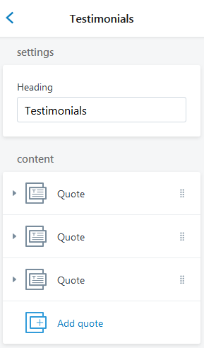
- Heading — add the title of the section;
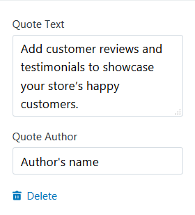
Content
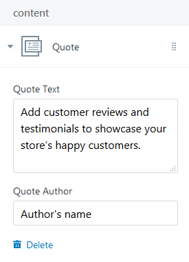
- Quote Text — add the content of the testimonial;
- Quote Author — add the author's name.
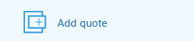
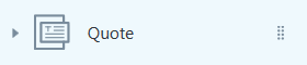
To add a Logo to display press the Add quote button.
Click on the Quote section.
Add the content of the testimonial and the testimonial author's name.
You can display nine testimonials maximum.
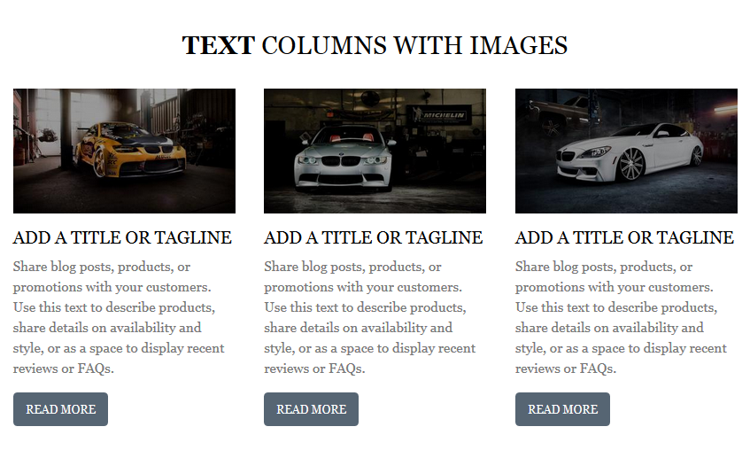
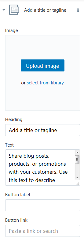
Text Columns with Images
It is possible for you to add text columns with images to your website.
Let's review the Text columns with images section configuration:
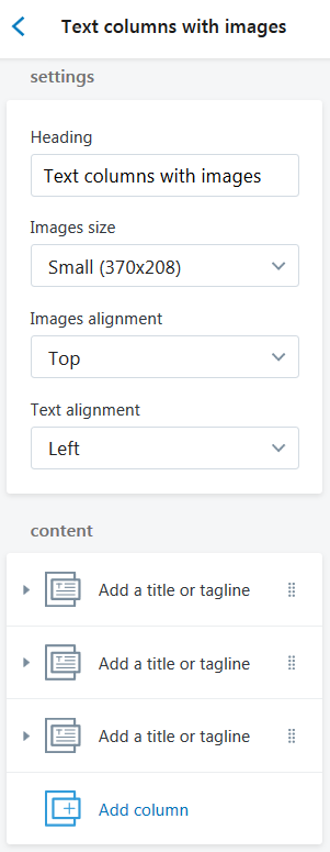
- Heading — add the title of the section;
-
Image size — choose a suitable image size from the option dropdown: Small(370x208), Medium(370x370), Large(370x493);
-
Images alignment — select a suitable images alignment from the option dropdown (Top/Middle/Bottom);
- Text alignment — select a suitable column text alignment from the option dropdown (Top/Middle/Bottom);
Content
-
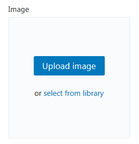
Image — choose a custom image. You can upload image from your computer or select image from your library;
- Heading — add the title which will be displayed under the image;
- Text — add the text which will be displayed under the image;
- Button label — specify the buttons' text;
- Button Link — specify a link to a certain Collection, Products, Pages, Blogs or Blog Post.
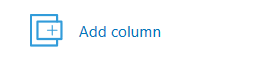
To add a new column to display press the Add column button.
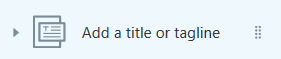
Click on the Add a title or tagline section.
Upload desired image from your computer (press the Upload image button) or select image from your library (press "select from the library").
Enter the Heading and the Text which will displayed under the image.
Specify a button text and set the link to a certain Collection, Products, Pages, Blogs or Blog Post.
You can display six blocks maximum.
Footer Area
Footer section settings allow choosing footer background color, footer block background, footer bottom panel background, using inverted color for footer text, and using the inverted color for footer bottom panel text. There’s also an option to change the footer top padding in the range of 0 to 100 px.
The footer content can include 1-4 blocks available to choose from:
- Linklist - the list of links;
- About block - the 100x60px logo image with the description text;
- Newsletter - subscription block with social menu included;
- Contacts block - address, phone, and e-mail.
Go to the Sections tab. Navigate to the Footer section.
In your installed theme you will see the following options:
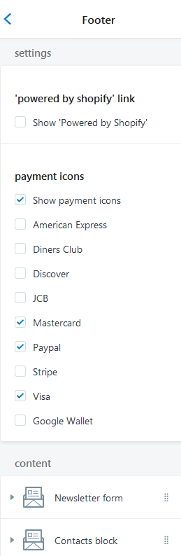
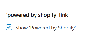
'Powered by Shopify' link
Enable the Checkbox to show 'Powered by Shopify' link in the footer.
Frontend:
'Powered by Shopify' link — enabled.

'Powered by Shopify' link — disabled.

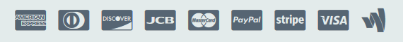
Payment icons
In this section you can manage the logos of the payment systems that show up on the checkout page. You can enable/disable these logos to meet your needs.
Frontend:
- American Express — enabled;
- Diners Club — enabled;
- Discover — enabled;
- JCB — enabled;
- Mastercard — enabled;
- Paypal — enabled;
- Stripe — enabled;
- Visa — enabled;
- Google Wallet — enabled.
Linklist
Linklists help your customers navigate around your online store.
Enter the menu item title. You can set a link specify a link to a certain Collection, Product, Pages, Blogs or Blog Post. Choose the linklist from the option dropdown.
How to create a new linklist
To create a new menu with a linklist, navigate to the site administration panel > Online Store.
Go to the Navigation section.
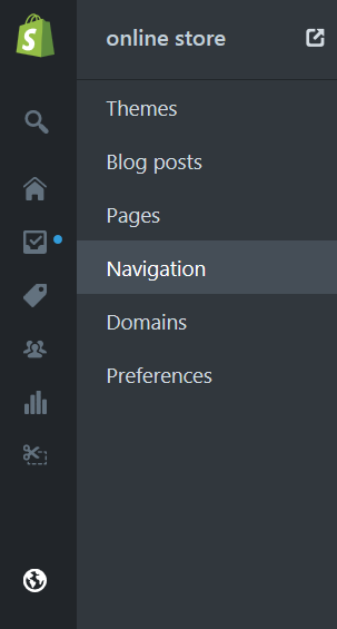
Press the Add menu button.
Specify the menu desctiption. Enter the name ("New Collection") of the menu.
You can add menu item to the menu. In order to do this, press Add menu items button. Enter the name of the menu item.
You can set a link to the:
- Home Page;
- Collection. You need to choose the certain collection from the Select a collection option dropdown;
- All Collections;
- Product. You need to choose the certain product from the Select a product option dropdown;
- All Products;
- Page. You need to choose the certain page from the Select a page option dropdown;
- Blog. You need to choose the certain blog from the Select a blog option dropdown;
- Search Page;
- Web address. Enter the custom link.
Click the Save menu button to apply changes.
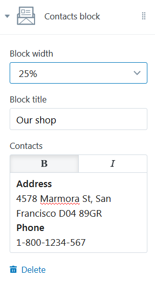
Contacts block
Contacts block allows you to display the section with specified address, the office hours, phone number in the footer.
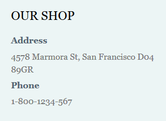
- Block width — select a suitable contact block width from the option dropdown (25%, 33%, 50%, 66%, 75%, 100%);
- Block title — add the title of the contacts block;
- Contacts — input the text you want to display within the sections (address, the office hours, phone number).
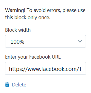
Facebook block
Facebook block allows you to display the section with the link to your Facebook account in the site footer.
Warning!
To avoid errors, please use this block only once.
- Block width — select a suitable Facebook block width from the option dropdown (25%, 33%, 50%, 66%, 75%, 100%);
- Block title — add the title of the Facebook block;
- Enter your Facebook URL.
Twitter block
Twitter block allows you to display the section with Twitter widget in the site footer.
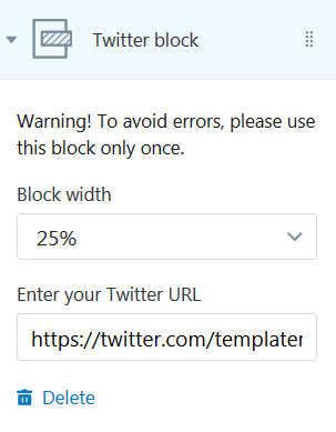
Warning!
To avoid errors, please use this block only once.
- Block width — select a suitable Twitter block width from the option dropdown (25%, 33%, 50%, 66%, 75%, 100%);
- Block title — add the title of the Twitter block;
- Enter your Twitter URL.
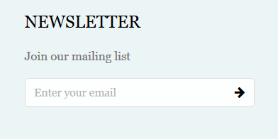
Newsletter form
This block allows you to display newsletter subscription form in the site footer.
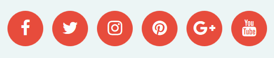
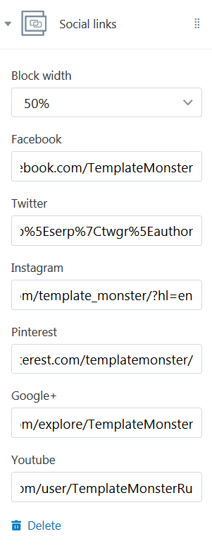
Social Links
This block allows you to display social icons that are set in the site footer.
Warning!
To avoid errors, please use this block only once.
Block Settings:
- Block width — select a suitable Social Links block width from the option dropdown (25%, 33%, 50%, 66%, 75%, 100%);
Facebook:
- Enter your Facebook account URL;
Twitter:
- Enter your Twitter account URL;
Instagram:
- Enter your Instagram account URL;
Pinterest:
- Enter your Pinterest account URL;
Google+:
- Enter your Google+ account URL;
YouTube:
- Enter your Youtube account URL.
How to add a new footer content block
To add a new content block in the footer, press Add content button. You can display six menu items maximum.
Select the new footer content block type from the option dropdown (Linklist/ Contacts block/ Facebook block/ Twitter block/ Newsletter form/ Social link).
Click the Linklist/ Contacts block/ Facebook block/ Twitter block/ Newsletter form/ Social link block settings section.
Configure the footer block settings. Click the Save button to apply changes.
You can delete the footer block. In order to do this, click the delete button.