HTML Templates Documentation
Extensions
RD Calendar. A calendar with events support
HTML Website Template use RD Calendar extension for implementing calendar functionality. The basic HTML marking for a calendar looks the following way:
        <div class="rd-calendar">
            <div class="rdc-panel">
                <a class="rdc-next"></a>
                <a class="rdc-prev"></a>
                <div class="rdc-today_day"></div>
                <div class="rdc-today_date"></div>
                <div class="rdc-today_month"></div>
                <div class="rdc-today_fullyear"></div>
                <div class="rdc-month"></div>
                <div class="rdc-fullyear"></div>
            </div>
            <div class="rdc-table"></div>
            <div class="rdc-events">
                <a class="rdc-events_close"></a>
                <ul>
                    <li class="rdc-event" data-date="10/28/2015">
                        Event 1
                    </li>
                    <li class="rdc-event" data-date="10/31/2015">
                        Event 2
                    </li>
                </ul>
            </div>
        </div>
Map of the classes for creating the HTML markup
RD Calendar supports the following structural elements for creating a calendar markup:
-
- .rdc-today_day
- displays the current day of the week;
-
- .rdc-today_date
- displays the current day of the month;
-
- .rdc-today_month
- displays the current month;
-
- .rdc-today_fullyear
- displays the current year;
-
- .rdc-panel
- displays the info panel;
-
- .rdc-prev
- displays the previous month switcher;
-
- .rdc-next
- displays the next month switcher;
-
- .rdc-month
- displays the calendar month;
-
- .rdc-fullyear
- displays the calendar year;
-
- .rdc-table
- displays the days of the month table;
-
- .rdc-table_day
- displays the day of the week in the calendar;
-
- .rdc-table_date
- displays the day of the month in the calendar;
-
- .rdc-table_events
- displays events of the day of the month in the calendar;
-
- .rdc-table_has-events
- displays a calendar day that contains events;
-
- .rdc-table_events-count
- displays the amount of events in a calendar day;
-
- .rdc-table_event
- displays an event in a day of a month in the calendar;
-
- .rdc-table_today
- displays the current day of a month in the calendar;
-
- .rdc-table_prev
- displays the days of the previous month of the calendar;
-
- .rdc-table_next
- displays the days of the next month of the calendar;
Days of the week display format setup
By default, days of the week are displayed in the following way in RD Calendar:
Sun, Mon, Tue, Wed, Thu, Fri, Sat
To setup a custom days of the week display format, please use the data attribute 'data-days' for the target calendar in the HTML marking. The value should be represented as a line of the days, separated by commas:
    <div class="rd-calendar" data-days="Sn, Mn, Te, Wd, Th, Fr, St">
        ...
    </div>
To set Monday as the first day of the week, you need to add an attribute data-first-day-monday='true' and define the day values in a necessary order using 'data-days' attribute:
    <div class="rd-calendar" data-first-day-monday="true" data-days="Mon, Tue, Wed, Thu, Fri, Sat, Sun">
        ...
    </div>
Attention: RD Calendar display format can take any form. You just need to specify the content you need: any text in any language in a format, shown in the example (text that is separated by commas).
Months of the year format setup
By default moths of the year in RD Calendar are displayed in the following format:
January, February, March, April, May, June, July, August, September, October, November, December
To set up a custom months of the year format, use the 'data-months' attribute for the target calendar in the HTML marking. The value should be represented as a line of the months, separated by commas:
        <div class="rd-calendar" data-months="Jan, Feb, Mar, Apr, May, Jun, Jul, Aug, Sep, Oct, Nov, Dec">
            ...
        </div>
Attention: RD Calendar display format can take any form. You just need to specify the content you need: any text in any language in a format, shown in the example (text that is separated by commas).
Managing events in the calendar
To match a certain event with a certain day in the calendar, set the corresponding event marking in the events list of the target calendar:
        <!-- RD Calendar -->
        <div class="rd-calendar">
            ...
            <!-- Events List Holder -->
            <div class="rdc-events">
                ...
                <!-- Events List -->
                <ul>
                    <!-- Create Event -->
                    <li class="rdc-event" data-date="10/28/2015">
                        Event 1
                    </li>
                </ul>
            </div>
        </div>
Please pay attention that data-date="10/28/2015" attribute of the .rdc-event element is required and should have the MM/DD/YYYY format, otherwise the script will not display the day with the described event and will not show it in the calendar. The event itself can contain any nested marking.
RD Parallax
HTML Website Template uses RD Parallax extension for implementing parallax effect on the page.
Basic script marking looks the following way:
        <!-- RD Parallax -->
        <section class="rd-parallax">
            <div class="rd-parallax-layer" data-speed="0.2" data-type="media"
                 data-url="path/to/your-image.jpg"></div>
            <div class="rd-parallax-layer" data-speed="0.3" data-type="html" data-fade="true">
                ...
            </div>
        </section>
        <!-- END RD Parallax-->
Each parallax element constitutes a separate layer. The number of layers is unlimited.
Layer type setup
To set up the layer type, use the 'data-type' attribute. 'data-type' attribute can take 'media', 'html' values. It defines the parallax layer type. If it's defined as 'media', layer size will be defined in relation to the parallax section height. If it's defined as 'html' the size will be defined by the content.
E.g.:
<div class="rd-parallax-layer" data-speed="0.2" data-type="media">
Layer speed setup
To set up the layer speed, use the 'data-speed' attribute. 'data-speed' attribute can have values from 0 to 2. It defines the parallax speed in relation to scrollbar movement. For instance, if the speed value equals 1, you'll get the css property 'background-attachment: fixed' emulated.
E.g.:
<div class="rd-parallax-layer" data-speed="0.2" data-type="media">
Layer blur setup
To set up layer blur, please use 'data-blur' attribute. 'data-blur' can have values 'true', 'false'. If set to 'true', the image will be blurred,in case it's size is too small for good-quality display in parallax section.
<div class="rd-parallax-layer" data-speed="0.2" data-type="media" data-blur="true">
Layer direction setup
To set up layer direction, use the 'data-direction' attribute.
'data-direction' attribute can have the following values 'inverse', 'normal'.
It defines the parallax direction. If set to 'normal', parallax will move in the same direction as the scroll. If set to 'inverse', it'll move in the opposite direction.
E.g.:
<div class="rd-parallax-layer" data-speed="0.2" data-type="media" data-direction="inverse">
Background image setup
To set a background image inside the media-object, just specify the 'data-url' attribute.
E.g.:
<div class="rd-parallax-layer" data-speed="0.2" data-type="media" data-url="path/to/your-image.jpg">
HTML layer fade effect
To set up fade effect for the HTML layer, please use the 'data-fade' attribute.
'data-fade' attribute can have 'true', 'false' values.
If set to 'true', the layer will gradually emerge from the full transparency to full opacity, depending on the position of the scroll layer.
E.g.:
<div class="rd-parallax-layer" data-speed="0.2" data-type="media" data-fade="true">
Managing layer custom content
The block with the data-type="media" attribute can contain any custom content, for example, different slider scripts, background videos, etc. To place custom content inside the media-object, do not specify the 'data-url' attribute.
E.g.:
<div class="rd-parallax-layer vide" data-speed="0.2" data-type="media">
RD Mailform
You can use any form elements, presented on the Components > Toolkit Components > Form Elements page, for implementing custom forms with a custom set of fields. You can also use any Bootstrap form-related elements that can be found on the Bootstrap Official Website , and Bootstrap Grid and Flex Grid elements for implementing custom form structure.
Attention: in RD Mailform, <input type="email" name="email"> is required for the correct functioning of the form. If the field is not present, you will get an error, when submitting a form.
Basic marking for creating a standard form looks the following way:
<!-- RD Mailform-->
<form data-form-output="form-output-global" data-form-type="contact" method="post" action="bat/rd-mailform.php" class="rd-mailform">
  <div class="form-wrap">
    <label for="contact-name" class="form-label">Name</label>
    <input id="contact-name" type="text" name="name" data-constraints="@Required" class="form-input">
  </div>
  <div class="form-wrap">
    <label for="contact-phone" class="form-label">Phone</label>
    <input id="contact-phone" type="text" name="phone" data-constraints="@Required" class="form-input">
  </div>
  <div class="form-wrap">
    <label for="contact-email" class="form-label">E-Mail</label>
    <input id="contact-email" type="email" name="email" data-constraints="@Email @Required" class="form-input">
  </div>
  <div class="form-wrap">
    <label for="contact-message" class="form-label">Message</label>
    <textarea id="contact-message" name="message" data-constraints="@Required" class="form-input"></textarea>
  </div>
  <button type="submit" class="button button-primary">Send</button>
</form>
Mailform type setup
RD Mailform supports 3 mailform types:
-
- Contact form
- contact;
-
- Order form
- order;
-
- Subscription form
- subscribe;
To change the contact form type, add to HTML marking of the target form 'data-form-type' attribute, where you should specify the form type as the value:
        <form class='rd-mailform' data-form-type="contact" method="post" action="bat/rd-mailform.php">
            ...
        </form>
Form fields setup
RD Mailform supports the following field the following field types:
Text field:
... <div class="form-wrap"> <label for="contact-us-name" class="form-label form-label-outside">Name:</label> <input id="contact-us-name" type="text" name="name" data-constraints="@Required" class="form-input"> </div> ...-
Date and time selection menu. This menu supports 3 display types:
-
- Time selection
- time;
-
- Date selection
- date;
-
- Time and date selection
- datetime.
To choose one of the display types, please use the 'date-time-picker' with the necessary value:
... <div class="form-wrap"> <label for="rd-mailform-time" class="form-label form-label-outside">Time:</label> <input id="rd-mailform-time" type="text" name="time" date-time-picker="time" class="form-input"> </div> ... -
Simple selection menu;
... <div class="form-wrap"> <select data-placeholder="Select an option" name="gender" data-minimum-results-for-search="Infinity" class="form-input"> <option>Male</option> <option>Female</option> </select> </div> ...-
Selection menu with subcategories;
... <div class="form-wrap"> <select data-placeholder="Select an option" name="gender" data-minimum-results-for-search="Infinity" class="form-input select-filter"> <optgroup label="Category 1"> <option>Demo Item 1-1</option> <option>Demo Item 1-2</option> <option>Demo Item 1-2</option> </optgroup> <optgroup label="Category 2"> <option>Demo Item 2-1</option> <option>Demo Item 2-2</option> <option>Demo Item 2-3</option> </optgroup> </select> </div> ... -
Textarea:
        ...
        <div class="form-wrap">
            <label for="message" class="form-label form-label-outside">Message:</label>
            <textarea id="message" name="message" data-constraints="@Required"
                                                    class="form-input"></textarea>
        </div>
        ...
Form fields validation setup
For dynamic validation of the form fields the mailform uses the Regula library. A link to Regula documentation can be found in Credits section.
Information messages setup
RD Mailform supports custom messages that inform about successful/unsuccessful sending of the form.
To change some default information messages, change the value of the msg field of the target validation type in script initialization file (scripts.js) in RD Mailform module:
        msg = {
        'MF000': 'Successfully sent!',
        'MF001': 'Recipients are not set!',
        'MF002': 'Form will not work locally!',
        'MF003': 'Please, define email field in your form!',
        'MF004': 'Please, define type of your form!',
        'MF254': 'Something went wrong with PHPMailer!',
        'MF255': 'Aw, snap! Something went wrong.'
        };
SMTP server setup
Attention: mailform extension will not work on the local server. To send a mailform, upload your website to the hosting server you use.
Configuring spam and abuse protection
RD Mailform uses Google reCAPTCHA for spam protection.
Pay attention: in order to disable Google reCAPTCHA, just delete a section of html code, wrapped in comments "<!--Google captcha-->" - "<!-- End google captcha-->".
Getting Started with Google ReCaptcha
To manage Google ReCaptcha, you should:
-
Register your domain at Google reCaptcha website and get a pair of API-keys (a pair of keys consists of site key and secret).
-
Specify your API-keys in bat/reCaptcha.php file in $siteKey and $secret variables at the beginning of the file:
$siteKey = 'You site key here'; $secret = 'You secret key here'; -
Paste this section to html and specify your site key in data-attribute data-sitekey=""
You can find more detailed instructions at Google ReCaptcha official website.
Google ReCaptcha Marking
The basic marking for ReCaptcha looks the following way:
<!--Google captcha-->
  <div class="form-wrap">
    <div id="captcha1" data-sitekey="You site key here" class="recaptcha"></div>
  </div>
<!-- End google captcha-->
Pay attention: id attribute and .recaptcha class are required.
Google ReCaptcha Setup
Google Recaptcha supports the following settings:
- Changing size;
- Changing color scheme.
Changing Google ReCaptcha Size
To change widget size, specify in data-attribute data-size one of the following size values:
- compact;
- normal (default).
The sample code looks the following way:
<!--Google captcha-->
  <div class="form-wrap">
    <div id="captcha1" data-sitekey="You site key here" data-size="compact" class="recaptcha"></div>
  </div>
<!-- End google captcha-->
Changing Google ReCaptcha widget color scheme
To change widget color scheme, specify in the data-attribute data-theme one of the following variants:
- dark;
- light (default).
Sample code looks the following way:
<!--Google captcha-->
  <div class="form-wrap">
    <div id="captcha1" data-sitekey="You site key here" data-theme="dark"class="recaptcha"></div>
  </div>
<!-- End google captcha-->
MailChimp
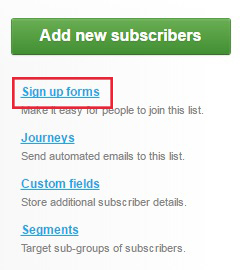
To connect the subscription form to your MailChimp account, you need to create a list or select an existing one (see No. 1) and go to “Signup forms” section (No. 2).
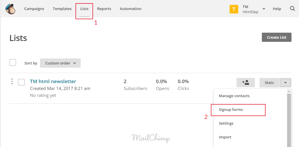
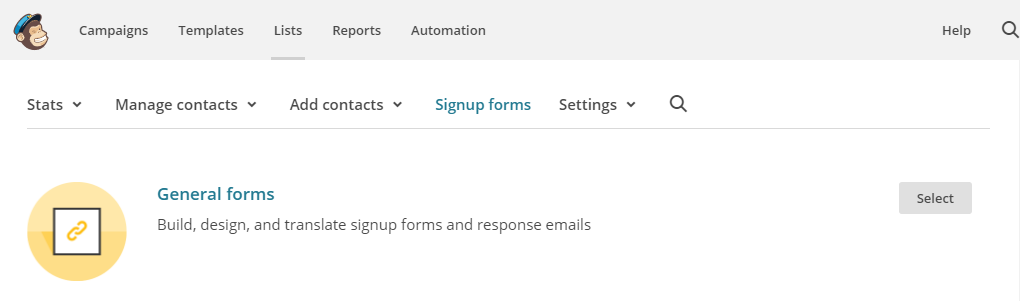
Select “General forms”.
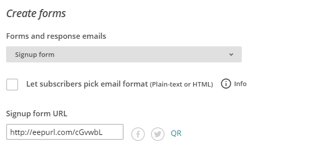
Copy the link from “Signup form URL” field and enter it in the address field of your browser.
You will be redirected to another page, where you need to copy the URL:

You need to add /post to this link after the word subscribe for the link to look like
https://********.***.list-manage.com/subscribe/post?u=*******************&id=*********Paste this link into action attribute of the subscription form, see the example below:
<form class="mailchimp-mailform"
    data-form-output="form-output-global"
    action="https://templatemonster.us15.list-manage.com/subscribe/post?u=ba5bb362073a413f48e4a7b90&id=8dc95d9dec"
    method="post">
  <div class="form-wrap">
    <label class="form-label rd-input-label" for="inline-email">Enter your e-mail</label>
    <input class="form-input" id="inline-email" type="email" name="EMAIL" data-constraints="@Email @Required">
  </div>
  <button class="button button-primary" type="submit">Subscribe</button>
</form>
Done!
Campaign Monitor
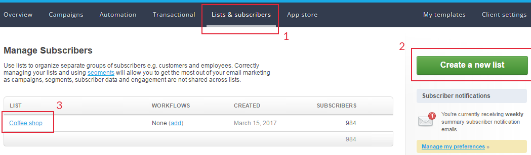
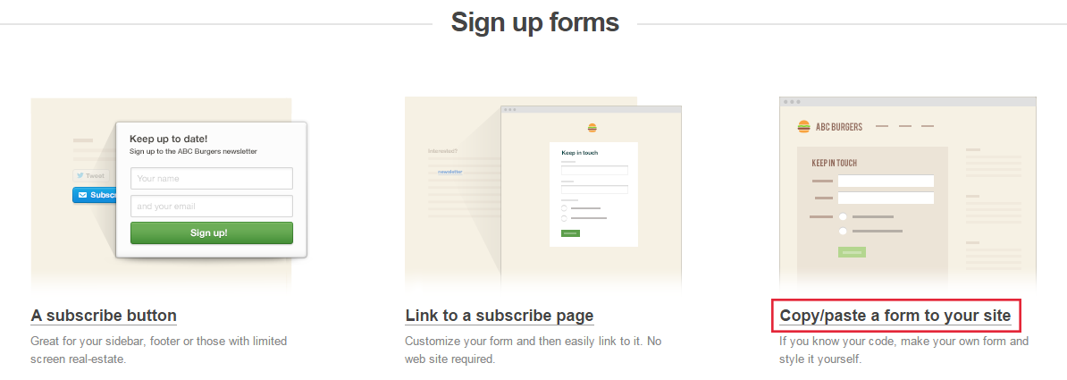
To connect the subscription form to your Campaign Monitor account, you need to go to the Lists page (1), create a list (2) or select an existing one (3).
Go to the “Sign up forms” section.
Then select the “Copy/paste a form to your site” section.
Afterward, generate the form code.
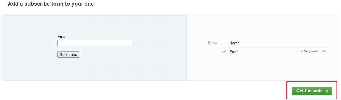
Finally, copy the action attribute of form element and attribute name of input[type='email'] element of the form you generated and paste it into the form of your website.
Here’s an example of the form code:
<form action="http://templatemonster1.createsend.com/t/d/s/xlyhhk/" class="subscribe-campaign rd-mailform-inline" data-form-output="form-output-global" method="post">
  <div class="form-wrap">
    <label class="form-label" for="campaign-email">Enter your e-mail</label>
    <input class="form-input" id="campaign-email" type="email" name="cm-xlyhhk-xlyhhk" required="" data-constraints="@Email @Required">
  </div>
  <button class="button button-primary" type="submit">Subscribe</button>
</form>
RD Navbar. Navigation panel
HTML Website Template Template use RD Navbar extension to implement site navigation functionality. Basic HTML code structure for this extension looks as follows:
        <nav class="rd-navbar rd-navbar-default" data-layout="rd-navbar-fixed" data-sm-layout="rd-navbar-fixed" data-md-layout="rd-navbar-fullwidth" data-md-device-layout="rd-navbar-fixed" data-lg-layout="rd-navbar-static" data-lg-device-layout="rd-navbar-static" data-md-stick-up-offset="80px" data-lg-stick-up-offset="46px">
          <div class="rd-navbar-collapse-toggle" data-rd-navbar-toggle=".rd-navbar-collapse"><span></span></div>
          <div class="rd-navbar-top-panel rd-navbar-collapse">
            <div class="rd-navbar-top-panel-inner">
              <address class="contact-info">
                <ul class="group-lg">
                  <li>
                    <div class="unit unit-middle unit-horizontal unit-spacing-xs unit-xs-top">
                      <div class="unit__left"><span class="icon text-middle fa-phone"></span></div>
                      <div class="unit__body">
                        <div class="p"><a class="text-middle" href="callto:#">1-800-1234-567</a></div>
                      </div>
                    </div>
                  </li>
                  <li>
                    <div class="unit unit-middle unit-horizontal unit-spacing-xs unit-xs-top">
                      <div class="unit__left"><span class="icon text-middle fa-envelope"></span></div>
                      <div class="unit__body">
                        <div class="p"><a class="text-middle" href="mailto:#">[email protected]</a></div>
                      </div>
                    </div>
                  </li>
                  <li>
                    <div class="unit unit-middle unit-horizontal unit-spacing-xs unit-xs-top">
                      <div class="unit__left"><span class="icon text-middle fa-map-marker"></span></div>
                      <div class="unit__body">
                        <div class="p"><a class="text-middle" href="contacts.html">2130 Fulton Street San Diego, CA 94117-1080 USA</a></div>
                      </div>
                    </div>
                  </li>
                </ul>
              </address>
            </div>
          </div>
          <div class="rd-navbar-inner">
            <!-- RD Navbar Panel-->
            <div class="rd-navbar-panel">
              <!-- RD Navbar Toggle-->
              <button class="rd-navbar-toggle" data-rd-navbar-toggle=".rd-navbar-nav-wrap"><span></span></button>
              <!-- RD Navbar Brand-->
              <div class="rd-navbar-brand"><a class="brand-name" href="index.html"><img src="images/brand.png" width="180" height="29" alt=""></a></div>
            </div>
            <div class="rd-navbar-aside-right">
              <div class="rd-navbar-nav-wrap">
                <!-- RD Navbar Nav-->
                <ul class="rd-navbar-nav">
                  <li class="active"><a href="./">Home</a></li>
                  <li><a href="about.html">About</a>
                    <!-- RD Navbar Dropdown-->
                    <ul class="rd-navbar-dropdown">
                     ...
                    </ul>
                  </li>
                  <li><a href=".html">Link</a>
                    <!-- RD Navbar Megamenu-->
                    <ul class="rd-navbar-megamenu">
                     ...
                    </ul>
                  </li>
                </ul>
              </div>
              <!--RD Navbar Search-->
              <div class="rd-navbar-search"><a class="rd-navbar-search-toggle" data-rd-navbar-toggle=".rd-navbar-search" href="#"><span></span></a>
                <form class="rd-search" action="search-results.html" data-search-live="rd-search-results-live" method="GET">
                  <div class="form-wrap">
                    <label class="form-label form-label" for="rd-navbar-search-form-input">Type and hit enter...</label>
                    <input class="rd-navbar-search-form-input form-input" id="rd-navbar-search-form-input" type="text" name="s" autocomplete="off">
                    <div class="rd-search-results-live" id="rd-search-results-live"></div>
                  </div>
                  <button class="rd-search-form-submit fa-search"></button>
                </form>
              </div>
            </div>
          </div>
        </nav>
Please, note: navbar HTML structure might differ depending on exact template design specifications.
Navbar layout configuration
HTML Website Template Template navbar works with 4 different layouts:
-
- Static
- rd-navbar-static
-
- Wide
- rd-navbar-fullwidth
-
- Mobile
- rd-navbar-fixed
-
- Sidebar
- rd-navbar-sidebar
In order to change layout for corresponding navigation panel you should just alter “data-layout” attribute value.
In order to enable/disable stick-up dropdown menu just edit “data-stick-up” attribute value (true/false).
In order to enable/disable dropdown menu on hover just edit “data-hover-on” attribute value (true/false).
  <div class="rd-navbar-wrap">
      <nav class="rd-navbar" data-layout="rd-navbar-fixed" data-hover-on="false" data-stick-up="false">
          ...
      </nav>
  </div>
Please note: data attributes data-layout, data-stick-up, data-hover-on can be defined for all main dimension types as data-xx-layout, data-xx-stick-up, data-xx-hover-on (where xx can take xs, sm, md. lg values). Navigation panel appearance for lower resolutions is defined by template design specifics only.
RD Navbar supports managing layout with the help of data-attributes:
-
- data-layout
- sets default navbar layout.
-
- data-sm-layout
- sets navbar layout for SM resolution.
-
- data-md-layout
- sets navbar layout for MD resolution.
-
- data-lg-layout
- sets navbar layout for LG resolution.
Setting navbar layout type for mobile devices
-
- data-sm-device-layout
- sets navbar layout type for mobile devices with SM resolution.
-
- data-md-device-layout
- sets navbar layout type for mobile devices with MD resolution.
-
- data-lg-device-layout
- sets navbar layout type for mobile devices with LG resolution.
Pay attention: data-md-device-layout='rd-navbar-fullwidth', data-lg-device-layout="rd-navbar-static" attributes are required. Otherwise, touchpad desktops will display navbar layout for mobile devices.
Offset for stick up on scroll setup
RD Navbar supports setting up the offset, on which the navbar will stick up. Use data-(*)-stick-up-offset attribute for this:
-
- data-sm-stick-up-offset
- sets navbar stick-up offset for SM resolution.
-
- data-md-stick-up-offset
- sets navbar stick-up offset for MD resolution.
-
- data-lg-stick-up-offset
- sets navbar stick-up offset for LG resolution.
You can specify the exact offset value, as well as navbar height ratio.
Dropdown menu configuration
In order to define navigation panel dropdown menu, you should just add .rd-navbar-dropdown class to corresponding submenu item.
  <div class="rd-navbar-wrap">
      <nav class="rd-navbar" data-rd-navbar-lg="rd-navbar-static">
          <ul class="rd-navbar-nav">
              <li>
                  <a href="#">Menu Link</a>
                  <ul class="rd-navbar-dropdown">
                      <li>
                          <a href="#">Submenu Link 1</a>
                      </li>
                  </ul>
              </li>
          </ul>
      </nav>
  </div>
Mega menu configuration
In order to define navigation panel mega menu you should add .rd-navbar-megamenu class to corresponding submenu item.
  <div class="rd-navbar-wrap">
      <nav class="rd-navbar" data-rd-navbar-lg="rd-navbar-static">
          <ul class="rd-navbar-nav">
              <li>
                  <a href="#">Menu Link</a>
                  <ul class="rd-navbar-megamenu">
                      <li>
                          … Your Custom HTML Content in 1 Column ...
                      </li>
                      <li>
                          … Your Custom HTML Content in 2 Column ...
                      </li>
                  </ul>
              </li>
          </ul>
      </nav>
  </div>
By default columns size and width are calculated automatically, based on space available.
RD Google Maps
There can be one of embed map scripts in the template: RD Google Maps or Google Maps.
HTML Website Template uses RD Google Maps to implement Google maps.
The plugin supports the following settings:
- Changing map coordinates;
- Adding custom map markers;
- Adding pop-up windows for the markers;
- Custom map styling.
- Search on the map;
How to add search on the map?
RD Google Maps supports adding search on the map.
To enable search on the map, add a textfield with id "rd-google-map-address" and a button with id “rd-google-map-address-submit”.
The fool code of the map with search will look the following way:
    <!--Google map search-->
    <div class="form-wrap">
      <label for="rd-google-map-address" class="form-label rd-input-label">Address</label>
      <div class="input-group">
        <input id="rd-google-map-address"
                  type="text" name="address"
                  data-constraints="@Required"
                  placeholder="" autocomplete="off"
                  class="form-input
                  form-input-has-validation">
          <span class="input-group-btn">
          <a id="rd-google-map-address-submit" href="#" class="btn btn-primary">Find Address</a>
          </span>
      </div>
    </div>
    <!-- RD Google Map-->
    <div class="rd-google-map">
      <div id="rd-google-map"
              data-zoom="15"
              data-x="-73.9874068"
              data-y="40.643180"
              data-styles="[]"
              class="rd-google-map__model">
      </div>
      <ul class="map_locations">
        <li data-x="-73.9874068" data-y="40.643180">
          <p>9870 St Vincent Place, Glasgow, DC 45 Fr 45.</p>
        </li>
      </ul>
    </div>
Changing map coordinates
To change map coordinates to your custom ones, specify 2 attributes in .html file in the corresponding section:
        <!-- RD Google Map-->
        <div id="google-map" class="map_model">
            ...
        </div>
data-x (northern longitude) and data-y (western latitude). As a result, you'll get the following lines of code:
        <!-- RD Google Map-->
        <div class="rd-google-map">
            <div id="google-map" class="map_model" data-x="-73.9994068" data-y="40.643180">
                ...
            </div>
            ...
        </div>
You can find out the coordinates with the help of Google Maps service. To do this, right-click the target map sector and select the "What's there?" option. In the pop-up window, you 'll the needed to copy coordinates below the location name, where the first number is data-x and the second one is data-y.
Attention: it is often the case, that the coordinates get mixed. Then, the map will display a wrong address in the opposite hemisphere.
How to add a map marker
To add a custom map marker, add a new element to the list in the .html file:
        <!-- RD Google Map-->
        ...
        <ul class="map_locations">
            ...
        </ul>
        ...
and define two data attributes in it: data-x (longitude) and data-y (latitude). As a result, you’ll get:
        <!-- RD Google Map-->
        ...
        <ul class="map_locations">
            <li data-x="-73.9994068" data-y="40.643180"></li>
        </ul>
        ...
If you do not specify the coordinates, the script will ignore an empty list item and the marker will not be displayed.
The full code example looks the following way:
        <!-- RD Google Map-->
        <div class="rd-google-map">
            <div id="google-map" class="map_model"></div>

            <ul class="map_locations">
                <li data-x="-73.9874068" data-y="40.643180">
                    <p> 9870 St Vincent Place, Glasgow, DC 45 Fr 45.
                        <span>800 2345-6789</span>
                    </p>
                </li>
                <li data-x="-72.9874068" data-y="39.643180">
                    <p> 9870 St Vincent Place, Glasgow, DC 45 Fr 45.
                        <span>800 2345-6789</span>
                    </p>
                </li>
            </ul>
        </div>
where:
        <!-- RD Google Map-->
        ...
        <li data-x="-73.9874068" data-y="40.643180">
            <p> 9870 St Vincent Place, Glasgow, DC 45 Fr 45.
                <span>800 2345-6789</span>
            </p>
        </li>
        ...
is the new map marker.
Adding marker popup windows
To add a marker popup window, just add the pop-up window content to the corresponding item of the map markers list:
        <!-- RD Google Map-->
        ...
        <li data-x="-73.9994068" data-y="40.643180" >
            ...
        </li>
        ...
As a result, you'll get the following lines of code :
        <!-- RD Google Map-->
        ...
        <li data-x="-73.9994068" data-y="40.643180" >
            Our office
        </li>
        ...
Changing map styling
RD Google Map supports many map styling variants. Some ready-made styling solution can be found on the following website:https://snazzymaps.com/.
On this website, copy the set of styles you like to the 'data-style' attribute of the map on the target *.html page.
        <!-- RD Google Map-->
        <div id="google-map" class="map_model" data-styles='Your Map Styles'>
            ...
        </div>
How to add search on the map
RD Google Map supports enabling search on the map.
To enable search on the map, add a textfield with "rd-google-map-address" id and a button with rd-google-map-address-submit id.
    <!-- RD Google Map Search-->
    <input type="text" id="rd-google-map-address">
    <a href="#" class="btn btn-primary" id="rd-google-map-address-submit">
    </div>
The full sample code of the map with search should look the following way:
    <!-- RD Google Map With Search-->
    <div class="form-wrap">
    <label for="rd-google-map-address" class="form-label rd-input-label">Address</label>
    <div class="input-group">
    <input id="rd-google-map-address" type="text" name="address" autocomplete="off" class="form-input"/>
    <span class="input-group-btn">
    <a id="rd-google-map-address-submit" href="#" class="btn btn-primary">Find Address</a>
    </span>
    </div>
    </div>
    <!-- RD Google Map-->
    <div class="rd-google-map">
    <div id="google-map" data-zoom="14" data-x="-73.9874068" data-y="40.643180"></div>
    </div>
Google Maps
The plugin supports the following settings:
- Google API key setup for the map;
- Changing the map scale;
- Modifying the map’s center according to an address or coordinates;
- Setting the map style;
- Adding markers to the map.
Google API key setup for the map
Without a key, your map will work in demo mode. You can find a guide on getting the key on developers.google.com
Insert the received key into data-key attribute:
<!-- Google Map-->
<div class="google-map-container" data-key="YOUR_API_KEY">
    <div class="google-map"></div>
</div>
How to change the map center coordinates
To replace the map center coordinates with the necessary ones, you need:
<!-- Google Map-->
<div class="google-map-container">
    <div class="google-map"></div>
</div>
to replace a required address in data-center attribute in .html file with a map in the section. As a result, you will get the following code:
<!-- Google Map-->
<div class="google-map-container" data-center="9870 St Vincent Place, Glasgow, DC 45 Fr 45.">
    <div class="google-map"></div>
</div>
How to add a marker to the map
To add your marker to the map, you need to add ito the list:
Для того чтобы добавить свой маркер на карту, необходимо в .html файле с картой в список:
<!-- Google Map-->
...
<ul class="google-map-markers">
    ...
</ul>
...
new position with data-location attribute in .html file with the map. As a result, you will get:
<!-- Google Map-->
...
<ul class="google-map-markers">
    <li data-location="9870 St Vincent Place, Glasgow, DC 45 Fr 45."></li>
</ul>
...
Adding a description to the marker
To add a popup window to a user marker, you need to specify content for the window in data-description attribute:
<!-- Google Map-->
...
<li data-location="9870 St Vincent Place, Glasgow, DC 45 Fr 45." data-description="9870 St Vincent Place, Glasgow"></li>
...
How to replace the map style
The map supports lots of styling variants. You can get different ready-made styling variations on the website: https://snazzymaps.com/.
On the given website you need to copy the style array of a map you prefer and insert it into data-styles attribute of a corresponding map on a target *.html page:
<!-- Google Map-->
<div class="google-map-container" data-styles='Your Map Styles'>
    ...
</div>
RD Video Player
HTML Website Template uses RD Video Player extension for implementing a video player.
Adding video player to the page
To add the video player to the target HTML page, use the following markup:
<div data-rd-video-path="path/to/video" class="rd-video-player">
  <div class="rd-video-wrap embed-responsive-16by9">
    <div class="rd-video-preloader"></div>
    <video preload="metadata"></video>
    <div class="rd-video-preview"></div>
    <div class="rd-video-top-controls">
      <span class="rd-video-title"></span>
      <a href="#" class="rd-video-fullscreen mdi mdi-fullscreen rd-video-icon"></a>
    </div>
    <div class="rd-video-controls">
      <div class="rd-video-controls-buttons">
        <a href="#" class="rd-video-prev mdi mdi-fast-forward rd-video-icon"></a>
        <a href="#" class="rd-video-play-pause mdi mdi-play"></a>
        <a href="#" class="rd-video-next mdi mdi-fast-forward rd-video-icon"></a>
      </div>
      <div class="rd-video-progress-bar"></div>
      <div class="rd-video-time">
        <span class="rd-video-current-time"></span>
        <span class="rd-video-time-divider">:</span>
        <span class="rd-video-duration"></span></div>
      <div class="rd-video-volume-wrap">
        <a href="#" class="rd-video-volume mdi mdi-volume-high rd-video-icon"></a>
        <div class="rd-video-volume-bar-wrap">
          <div class="rd-video-volume-bar"></div>
        </div>
      </div>
    </div>
  </div>
</div>
You can alter this markup in order to change the appearance of the video player. To make player work, you just need to add classes for certain elements. You will find a list of these classes below in a class map:
Video player class map
- .rd-video-prev
- the player switches to the previous video;
- .rd-video-play-pause
- play/pause button;
- .rd-video-next
- the player switches to the next video;
- .rd-video-stop
- stop button;
- .rd-video-progress-bar
- playback progress bar;
- .rd-video-progress-bar-slider
- video progress bar slider;
- .rd-video-duration
- displays video duration;
- .rd-video-current-time
- displays current playback time;
- .rd-video-title
- displays video title;
- .rd-video-fullscreen
- a button to enable\disable fullscreen mode;
- .rd-video-volume
- a button to enable\disable sound;
- .rd-video-volume-bar
- volume bar;
- .rd-video-volume-bar-slider
- volume bar slider;
- .rd-video-playlist
- playlist.
Changing video in video player
To change the video, specify the new video path without the format in 'data-rd-video-path' attribute. This attribute won’t work, if you have a playlist:
        <div data-rd-video-path="path/to/video" class="rd-video-player">
            ...
        </div>
Changing video title in video player
To change the tilt of the video, specify the video title in 'data-rd-video-title' attribute. This attribute won’t work, if you have a playlist:
        <div data-rd-video-title="Your title" class="rd-video-player">
            ...
        </div>
Disabling video volume in the video player by default
To disable the video player volume, add the 'data-rd-video-muted' attribute with 'true' value:
        <div data-rd-video-muted="true" class="rd-video-player">
            ...
        </div>
Setting up the default video player volume
To change the default video player volume, add the data-rd-video-volume attribute. It can take values from 0 to 1:
        <div data-rd-video-path="path/to/video" class="rd-video-player" data-rd-video-volume="0.5">
            ...
        </div>
Adding a playlist to the video player
HTML marking for creating a playlist looks the following way:
        <ul data-rd-video-play-on="li" class="rd-video-playlist">
            <li data-rd-video-src="path/to/video1" data-rd-video-title="title 1">
                ...
            </li>
            <li data-rd-video-src="path/to/video2" data-rd-video-title="title 2">
                ...
            </li>
        </ul>
The marking inside the element can take any form. To add a url of a video file with list elements, use the following attributes:
-
- data-rd-video-src
- path to the video file without format;
-
- data-rd-video-title
- video title (an additional attribute, necessary for displaying the video title in the player).
RD Audio Player
HTML Website Template uses RD Audio Player extension for implementing audio player functionality.
Adding audio player to the page
To add audio player to the target HTML page, use the following marking:
        <div data-rd-audio-playlist-name="audio-playlist" class="rd-audio">
            <div class="rd-audio-controls">
                <div class="rd-audio-controls-left">
                    <a href="#" class="rd-audio-prev mdi mdi-fast-forward rd-audio-icon"></a>
                    <a href="#" class="rd-audio-play-pause mdi mdi-play rd-audio-icon has-controls"></a>
                    <a href="#" class="rd-audio-next mdi mdi-fast-forward rd-audio-icon"></a>
                </div>
                <div class="rd-audio-progress-bar-wrap">
                    <div class="rd-audio-progress-bar"></div>
                    <div class="rd-audio-time">
                        <span class="rd-audio-current-time">00:00</span>
                        <span class="rd-audio-time-divider">/</span>
                        <span class="rd-audio-duration">00:00</span>
                    </div>
                    <div class="rd-audio-title-wrap">
                        <span class="rd-audio-author"></span>
                        <span class="rd-audio-title-divider">- </span>
                        <span class="rd-audio-title"></span>
                    </div>
                </div>
                <a href="#" class="rd-audio-volume mdi mdi-volume-high rd-audio-icon"></a>
                <div class="rd-audio-volume-bar"></div>
                <div class="rd-audio-controls-right">
                    <a href="#" class="rd-audio-playlist-button rd-audio-icon mdi mdi-dots-horizontal"></a>
                </div>
            </div>
        </div>
You can alter this marking in order to change the appearance of the video player. To make player work, you just need to add classes for certain elements. You will find a list of these classes below in a class map:
Audio player class map
q-
- .rd-audio-prev
- the player switches to the previous track;
-
- .rd-audio-play-pause
- play/pause button;
-
- .rd-audio-next
- next track button;
-
- .rd-audio-stop
- stop button;
-
- .rd-audio-progress-bar
- playback progress bar;
-
- .rd-audio-progress-bar-slider
- playback progress bar slider;
-
- .rd-audio-duration
- displays track duration;
-
- .rd-audio-current-time
- displays current playback time;
-
- .rd-audio-title
- displays track title;
-
- .rd-audio-author
- displays track author;
-
- .rd-audio-volume
- a button to enable\disable sound;
-
- .rd-audio-volume-bar
- volume bar;
-
- .rd-audio-volume-bar-slider
- volume bar slider;
-
- .rd-audio-playlist
- playlist.
Changing the track in audio player
To change the track, specify the new audio track path without the format in 'data-rd-audio-src' attribute. This attribute won’t work, if you have a playlist:
        <div data-rd-audio-src="path/to/audio" class="rd-audio">
            ...
        </div>
Adding a playlist to the audio player
This plugin supports creating an unlimited number of playlists on the page.To load a certain playlist, add the 'data-rd-audio-playlist-name' attribute and specify the playlist name:
        <div data-rd-audio-playlist-name="name" class="rd-audio">
            ...
        </div>
        ...
        ...
        <ul data-rd-audio-playlist="name">
            ...
        </ul>
The main principles of creating a playlist are specified below.
Changing audio title in audio player
To change the title of the audio, specify the audio title in 'data-rd-audio-title' attribute. This attribute won’t work, if you have a playlist:
        <div data-rd-audio-title="Your Title" class="rd-audio">
            ...
        </div>
Changing the author of the audio track title in audio player
To change the author of the track, specify the author in 'data-rd-audio-author' attribute. This attribute won’t work, if you have a playlist:
        <div data-rd-audio-author="Your Author" class="rd-audio">
            ...
        </div>
Track autoplay
To enable track autoplay, add the 'data-rd-audio-autoplay' attribute with 'true' value:
        <div data-rd-audio-autoplay="true" class="rd-audio">
            ...
        </div>
Audio loop
To enable audio loop, add the 'data-rd-audio-loop' attribute with 'true' value:
        <div data-rd-audio-loop="true" class="rd-audio">
            ...
        </div>
Adding a playlist to the audio player
HTML marking for creating a playlist looks the following way:
        <ul data-rd-audio-playlist="audio-playlist" data-rd-audio-play-on="li" class="rd-audio-playlist">
            <li data-rd-audio-src="path/to/audio1" data-rd-audio-title="title 1"
                                                                        data-rd-audio-author="author 1">
                ...
            </li>
            <li data-rd-audio-src="path/to/audio2" data-rd-audio-title="title 2"
                                                                        data-rd-audio-author="author 2">
                ...
            </li>
        </ul>
The marking inside the element can take any form. To add a url of a video file with list elements, use the following attributes:
-
- data-rd-audio-src
- path to the audio file;
-
- data-rd-audio-title
- audio track title (an additional attribute, necessary for displaying the audio track title in the player);
-
- data-rd-audio-author
- track author (an additional attribute, necessary for displaying the audio track author in the player).
RD Background Video
HTML Website Template uses RD Background Video for adding a page background video. The basic marking looks the following way:
        <div
                data-rd-video-path="video/bg-video-1/bg-video-1"
                data-rd-video-image-xs="26"
                data-rd-video-image-sm="26"
                data-rd-video-image-md="37"
                data-rd-video-image-lg="74"
                data-rd-video-image-xlg="100"
                class="rd-video">
            ...
        </div>
File requirements
This plugin can adopt the video quality to Internet speed. To achieve this, prepare 5 versions of the video with different extensions for the correct functioning of the script. Moreover, prepare 5 version of the image with *.jpg extension for image display on mobile devices or PCs with low Internet speed.
Please name the files the following way:
video-(suffix).mp4
video-image-(suffix).jpg
Here is the list of extensions, which you should prepare, and their suffixes:
- 1920х1080 - xlg (video-xlg.mp4);
- 1280х720 - lg (video-lg.mp4);
- 854х480 - md (video-md.mp4);
- 640х360 - sm (video-sm.mp4);
- 380х240 - xs (video-xs.mp4).
As a result, you should have 10 files: 5 video files and 5 images.
Changing the background video
To change the background video in the existing section of HTML marking, change the video path in 'data-rd-video-path' data attribute. You shouldn’t specify the video extension, just specify the filename, and the script will automatically select the right format.
E.g.:
<div data-rd-video-path="video/bg-video-1/bg-video-1"></div>
Moreover, to correctly determine Internet speed, specify the size of each image in KB with the help of attributes. Attribute suffixes are specified in "File requirements" section.
E.g.:
        <div
                data-rd-video-path="video/bg-video-1/bg-video-1"
                data-rd-video-image-xs="26" data-rd-video-image-sm="26"
                data-rd-video-image-md="37"
                data-rd-video-image-lg="74"
                data-rd-video-image-xlg="100"
                class="rd-video">
            ...
        </div>
RD Flickr Gallery
HTML Website Template uses RD Flickrgallery extension to display data from https://www.flickr.com/ service on the web-page.
Adding widget to the page
The basic HTML marking for the widget looks the following way:
        <div class="flickr" data-flickr-id="47302490@N05">
            <div data-type="flickr-item">
                <img data-image_q="src" data-title="alt" src="images/_blank.png" alt=""/>
            </div>
        </div>
You can display an unlimited number of items and use this widget several times on one page. Moreover, you can integrate this extension with any third-party scripts (e.g.: carousel, gallery, etc.) HTML structure inside the widget is up to you. For example, you can use ТМ Grid system for handy placing of the elements. Only the data-type="flickr-item" attribute is required.
Flickr account setup
To set up the user, specify the user ID in 'data-id' attribute. E.g.:
<div class="flickr" data-flickr-id="47302490@N05">
You can get the user ID by the following link:
To get data from several accounts, specify them in 'data-id' attribute, separated by commas.
Data filtering setup
To filter data by tags, add the 'data-tags' attribute. To specify several tags, point them out, separated by commas. E.g.:
        <div class="flickr" data-flickr-id="47302490@N05,48444528@N07"
                            data-flickr-tags="webdesign, baseball" data-flickr-tagmode="any">
Where the 'data-flickr-tagmode' defines the filtration type and can take 2 values:
-
- any
- displaying the element, if it corresponds to at least one tag;
-
- all
- displaying the element, if it corresponds to all tags.
Date format setup
To set up the date format, add the 'data-flickr-date-format' attribute. E.g.:
<div class="twitter" data-flickr-date-format="%b/%d/%Y">
where
-
- %d
- displays a digit (1,2,3);
-
- %Y
- displays full year format (2011, 2013, 2015);
-
- %y
- displays 2 last digits of the year (11, 13, 15);
-
- %m
- displays month number (1,2,3);
-
- %B
- displays full month name (January, February, March);
-
- %b
- displays shortened month name (Jan, Feb, Mar).
By default, the date has the Oct/30/2015 format.
Language setup
To change the language, add the 'data-lang' attribute. E.g.:
<div class="flickr" data-flickr-id="47302490@N05,48444528@N07" data-flickr-lang="en-us">
Allowed values:
-
- de-de
- German;
-
- en-us
- English;
-
- es-us
- Spanish;
-
- fr-fr
- French;
-
- it-it
- Italian;
-
- ko-kr
- Korean;
-
- pt-br
- Portuguese;
-
- zh-hk
- Chinese.
Creating the valid element structure
You can get the element data only inside the block with data-type="flickr-item" attribute. E.g.:
        <div data-type="flickr-item">
            <img data-image_q="src" data-title="alt" src="images/_blank.png" alt=""/>
        </div>
Widget logics
To obtain widget element data, add the following attribute:
data-(data name)="target"
Where 'target' is the attribute to insert the data into. If 'target' has 'text' value, the data inside the tag will be displayed as regular text. You can find some examples on getting data of different types below. If you need to enter the data values to several attributes, specify them, separated by commas.
Item image display
To add a link to the service image, specify the data-image_(image suffix)="src" attribute. E.g.:
<img data-image_q="src" data-title="alt" src="images/_blank.png" alt=""/>
With the help of the image suffix, you can specify the desired image size. You can use the following values:
- s: 75px75px;
- q: 150pх150px;
- t: 100px on the larger side;
- m: 240px on the larger side;
- n: 320px on the larger side;
- -: 500px on the larger side;
- z: 640px on the larger side;
- c: - 800px on the larger side;
- b: - 1024px on the larger side;
- h: - 1600px on the larger side;
- k: - 2048px on the larger side;
- o: - original image.
Item link display
To display the service image link, add the data-link="href,text" attribute. For example, to display a link with text, use the following markup:
<a href="#" data-link="href,text"></a>
Item author display
To display the element author and specify the e-mail, add the data-author_name="text" attribute. E.g.:
<p data-author_name="text"></p>
To display the author without the e-mail, please use the data-author="text" attribute. E.g.:
<p data-author="text"></p>
Item tags display
To display item tags, add the data-tags="text" attribute. E.g.:
<p data-tags="text"></p>
Item title display
To display item title, add the data-title="text" attribute. E.g.:
<p data-title="text"></p>
Adding date display
To display the item adding date, add the data-dating="text" attribute. To display the date in YY-MM-DD, specify the data-datetime="text" attribute. E.g.:
<time data-dating="text" data-datetime="datetime"></time>
Item description display
To display the item description, specify the data-description="text" attribute. E.g.:
<p data-description="text"></p>
RD Instafeed
HTML Website Template uses RD Instafeed extension to display data from https://www.instagram.com/ on the website.
Adding widget to the page
The basic widget HTML markup to display one element looks the following way:
<section class="instafeed" data-instafeed-user="..." data-instafeed-get="user">
    <div data-instafeed-item>
        <img src="images/_blank.png" alt="" data-images-low_resolution-url="src" />
    </div>
</section>
You can display an unlimited number of items and use this widget several times on one page. Moreover, you can integrate this extension with any third-party scripts (e.g.: carousel, gallery, etc.) HTML structure inside the widget is up to you. For example, you can use ТМ Grid system for handy placing of the elements. Only the 'data-instafeed-item' attribute is required.
Instagram images display from the user page
To display images from a user page, use the data-instafeed-get="user" and specify the user ID to the 'data-instafeed-user'. E.g.:
<section class="instafeed" data-instafeed-get="user" data-instafeed-user="...">
    ...
</section>
You can find out the user ID with the help of multiple services. Here is one of them .
Instagram images display by a tag
To display images by tag, add the data-instafeed-get="tagged" attribute and specify the tag name in the 'data-instafeed-tagname' attribute. E.g.:
<section class="instafeed" data-instafeed-tagname="food" data-instafeed-get="tagged" data-instafeed-user="...">
    ...
</section>
Instagram user profile display
To display a user profile, add the data-instafeed-get="profile" attribute and specify user Id in the 'data-instafeed-user' attribute. E.g.:
<section class="instafeed" data-instafeed-get="profile" data-instafeed-user="...">
    ...
</section>
Date format setup
To set up the date display format, add the 'data-instafeed-date-format' attribute. E.g.:
<div class="instafeed" data-instafeed-date-format="%b/%d/%Y">
where
-
- %d
- displays a digit (1,2,3);
-
- %Y
- displays full year format (2011, 2013, 2015);
-
- %y
- displays 2 last digits of the year (11, 13, 15);
-
- %m
- displays month number (1,2,3);
-
- %B
- displays full month name (January, February, March);
-
- %b
- displays shortened month name (Jan, Feb, Mar).
By default, the date has the Oct/30/2015 format.
Creating valid item structure
You can get the item data only inside the block with 'data-instafeed-item' attribute. E.g.:
        <div data-instafeed-item>
            <img src="images/_blank.png" alt="" data-images-low_resolution-url="src" />
        </div>
Widget logics
To obtain widget item data, add the following attribute: data-(data name)="target" Where 'target' is the attribute to insert the data to. If 'target' has ‘text’ value, the data inside the tag will be displayed as regular text. You can find some examples on displaying data of different types below. If you need to enter data values to several attributes, specify them and separate them by commas.
Item image display
To display service image, use the data-images_(image resolution)="src" attribute. E.g.:
-
320х320 image:
<img data-images_low_resolution-url="src" src="images/_blank.png" alt=""/> -
640х640 image:
<img data-images_standard_resolution-url="src" src="images/_blank.png" alt=""/> -
150х150 image:
<img data-images_thumbnail-url="src" src="images/_blank.png" alt=""/>
Item link display
To display item link, add the data-link="href,text" attribute. E.g., to display the link with the text, use:
<a href="#" data-link="href,text"></a>
Item tags display
To display item tags, add the data-tags_full="text" attribute. E.g.:
<p data-tags_full="text"></p>
Adding date display
To display the item adding date, add the data-dating="text" attribute. To display the date in YY-MM-DD, specify the data-created_time="text" attribute. E.g.:
<time data-created_time="text"></time>
Item description display
To display the item description, please add the data-caption-text="text" attribute. E.g.:
<p data-caption-text="text"></p>
Likes count display
To display likes count for an image, please use the data-likes-count="text" attribute. E.g.:
<p data-likes-count="text"></p>
Comments count display
To display the comments count for an image, please use the data-comments-count="text" attribute. E.g.:
<p data-comments-count="text"></p>
Username display
To display a username, please use the data-username="text" attribute. E.g.:
<p data-username="text"></p>
Full user name display
To display a full user name, please add the data-full_name="text" attribute. E.g.:
<p data-full_name="text"></p>
User bio display
To display user bio, please use the data-bio="text" attribute. E.g.:
<p data-bio="text"></p>
Followers count display
To display followers count, please use the data-counts-follows="text" attribute. E.g.:
<p data-counts-follows="text"></p>
Count of the pages, followed by a certain user
To display count of the pages, followed by a certain user, use the data-counts-followed_by="text" attribute. E.g.:
<p data-counts-followed_by="text"></p>
User website display
To display a user website, please add the data-counts-followed_by="text" attribute. E.g.:
<a href="#" data-website="href,text"></a>
RD Twitterfeed
HTML Website Template uses jquery.rd-twitter-feed.js to get data from https://twitter.com/ service on the website.
Adding widget to the page
The basic widget HTML markup to display one element looks the following way:
        <div class="twitter" data-twitter-username="templatemonster">
            <div data-twitter-type="tweet">
                <img data-media_url="src" src="images/_blank.png" alt=""/>
                <p data-tweet=text></p>
            </div>
        </div>
You can display an unlimited number of elements and use this widget several times on one page. Moreover, you can integrate this extension with any third-party script (e.g.: carousel, gallery, etc.) HTML structure inside the widget is up to you. For example, you can use ТМ Grid system for handy placing of the elements. Only the data-twitter-type="tweet" attribute is required.
Project setup to work with Twitter API
To work with Twitter API, create an application in your Twitter account, generate the keys and specify the in bat/twitter_api/config.php file. Here is the list of the necessary keys:
- CONSUMER_KEY;
- CONSUMER_SECRET;
- ACCESS_TOKEN;
- ACCESS_SECRET.
config.php file:
        // Consumer Key
        define('CONSUMER_KEY', 'Put CONSUMER_KEY here ');
        define('CONSUMER_SECRET', 'Put CONSUMER_SECRET here');

        // User Access Token
        define('ACCESS_TOKEN', 'Put ACCESS_TOKEN here');
        define('ACCESS_SECRET', 'Put ACCESS_SECRET here');
Local use
If you run the project from files, the plugin won’t work as it requires PHP 5.2+. If used on the local server, Twitter date won’t be received as Twitter authentication service can’t access local data. You will see text data instead, that are identical to what you get from Twitter. When you load the template to a live server, you’ll get the real data.
Twitter account setup
To set up the user, specify the username in data-twitter-username attribute. E.g.:
<div class="twitter" data-twitter-username="templatemonster">
Displaying tweets by a hashtag
To filter tweets by hashtags, specify its name in 'data-twitter-hashtag' attribute.
<div class="twitter" data-twitter-hashtag="webdesign">
Attention! You can display tweets only by a hashtag or by a username
Displaying tweets from a list
To filter tweets by a list, specify its name in data-twitter-listname attribute and specify the username with the help of data-twitter-username attribute. E.g.:
<div class="twitter" data-twitter-username="templatemonster" data-twitter-listname="templatemonster">
Attention! You can display tweets by a list, only if you specify the username.
Date format setup
If the tweet was added recently (up to 2 days), set up the date format in the following way:
-
If the tweet was added less than a minute ago: To configure this text, add the 'data-twitter-date-seconds' attribute. E.g.:
<div class="twitter" data-twitter-date-seconds="less 1m"> If the tweet was added less than an hour ago: To configure the text that is displayed next to the number of minutes (after the tweet was added), add the 'data-twitter-date-minutes' attribute. E.g.:
<div class="twitter" data-twitter-date-minutes="m">-
If the tweet was added less than 24 hours ago: To configure the text that is displayed next to the number of minutes (after the tweet was added), add the 'data-twitter-date-hours' attribute. E.g.:
<div class="twitter" data-twitter-date-hours="h"> -
If the tweet was added yesterday: To configure the text that is displayed next to the number of minutes (after the tweet was added), add the 'data-twitter-date-yesterday' attribute. E.g.:
<div class="twitter" data-twitter-date-yesterday="yd"> -
If the tweet was added more than 2 days age, add the 'data-date-format' attribute to set up the date display format. E.g.:
<div class="twitter" data-twitter-date-format="%b/%d/%Y">where
-
- %d
- displays a digit (1,2,3);
-
- %Y
- displays full year format (2011, 2013, 2015);
-
- %y
- displays 2 last digits of the year (11, 13, 15);
-
- %m
- displays month number (1,2,3);
-
- %B
- displays full month name (January, February, March);
-
- %b
- displays shortened month name (Jan, Feb, Mar).
By default, the date has the Oct/30/2015 format.
-
Creating the valid element structure
You can get the element data only inside the block with data-type="tweet" attribute. E.g.:
        <div data-twitter-type="tweet">
            <img data-media_url="src" alt="" src="#"/>
            <div data-tweet="text"></div>
        </div>
Widget logics
To obtain widget item data, add the following attribute: data-(data name)="target" Where 'target' is the attribute to insert the data to. If 'target' has ‘text’ value, the data inside the tag will be displayed as regular text. You can find some examples on displaying data of different types below. If you need to enter data values to several attributes, specify them, separated by a comma.
Tweet image display
To add a link to the tweet image, specify the data-media_url="src" attribute. E.g.:
<img data-media_url="src" src="#" alt=""/>
Attention: if there is no image in the tweet, this element will be deleted from markup. If you want to display 2 or more images, copy-paste this string of code as many times as needed.
Tweet text display
To display tweet text, specify the data-tweet="text" attribute. E.g.:
<p data-tweet="text"></p>
Adding date display
To display the item adding date, add the data-date="text" attribute. E.g.:
<div data-date="text"></div>
To get the date in 'datetime' attribute format of the 'time', add the data-datetime="datetime" attribute.
User avatar display
To display avatar tags, add the ata-avatar="src" attribute. E.g.:
<img data-avatar="src" src="#" alt=""/>
Tweet link display
To display the tweet link, please use the data-url="href,text" attribute. E.g.:
<a data-url="href,text"></a>
User login display
To display user login in "@templatemonster" format, specify the data-screen_name="text" attribute. E.g.:
<div data-screen_name="text"></div>
Username display
To display the username, specify the data-user_name="text" attribute. E.g.:
<div data-user_name="text"></div>
RD Facebook Feed
HTML Website Template uses jquery.rd-facebook-feed.js to display data from https://facebook.com/ service on the website.
Adding widget to the page
The basic widget HTML markup to display one element looks the following way:
        <div class="facebook" data-fb-id="TemplateMonster" data-fb-access="...">
            <div data-fb-post>
                <img src="images/_blank.png" alt="" data-picture="src" data-remove/>
                <p data-message="text"></p>
            </div>
        </div>
You can display an unlimited number of items and use this widget several times on one page. Moreover, you can integrate this extension with any third-party scripts (e.g.: carousel, gallery, etc.) HTML structure inside the widget is up to you. For example, you can use ТМ Grid system for handy placing of the elements. Only the 'data-fb-post' or 'data-fb-user' attribute is required.
Project setup to work with Facebook API
To work with Facebook API, create an application in your Facebook account, generate the AccessToken and specify it the 'data-fb-access' and page type data-fb-page-type attribute:
        <div class="facebook"  data-fb-page-type="page" data-fb-access="...">
        </div>
Facebook account setup
To set up the user, specify the user ID in the 'data-fb-id' attribute. E.g.:
<div class="facebook" data-fb-id="TemplateMonster">
Attribute data-fb-page-type can be: page or group
- page - If this is a public page
- group - If it's a group
Date format setup
If the post was added more the 2 days ago, add the 'data-fb-date-format' to set up the date display. E.g.:
<div class="facebook" data-fb-date-format="%b/%d/%Y">
where
-
- %d
- displays a digit (1,2,3);
-
- %Y
- displays full year format (2011, 2013, 2015);
-
- %y
- displays 2 last digits of the year (11, 13, 15);
-
- %m
- displays month number (1,2,3);
-
- %B
- displays full month name (January, February, March);
-
- %b
- displays shortened month name (Jan, Feb, Mar).
By default, the date has the Oct/30/2015 format.
Creating valid item structure
You can get the element data only inside the block with 'data-fb-post' or 'data-fb-user' attribute. E.g.:
        <div data-fb-post>
            ...
        </div>
Widget logics
To obtain post data, add the following attribute: data-(data name)="target" Where 'target' is the attribute to insert the data to. If 'target' has ‘text’ value, the data inside the tag will be displayed as regular text. You can find some examples on displaying data of different types below. If you need to enter data values to several attributes, specify them, separated by a comma.
Post image display
To display the post image, specify the data-picture="src" attribute. E.g.:
<img data-picture="src" src="_blank.png" alt=""/>
Post text display
To display the post text, specify the data-message="text" attribute. E.g.:
<p data-message="text"></p>
Attachment name display
To display the attachment name, add the data-name="text" attribute. E.g.:
<div data-name="text"></div>
Attachment description display
To display the attachment description, add the data-description="text". attribute. E.g.:
<div data-description="text"></div>
Likes count display
To display likes count, please add the data-likes-count="text" attribute. E.g.:
<div data-likes-count="text"></div>
Post link display
To display post link, use the data-postlink=”href” attribute. E.g.:
<a href="#" data-postlink="href"></div>
User avatar display
To display user avatar, use the data-from-picture="src" attribute. E.g.:
<img data-from-picture="src" src="_blank.png" alt=""/>
Username display
To display username, add the data-from-picture="src" attribute. E.g.:
<div data-from-name="text"></div>
CountTo
HTML Website Template uses jQuery CountTo extension for implementing countdown timers on web-pages.
Adding countdown timer to the page
To add a countdown timer, paste the following HTML code string to the page:
<div class="counter" data-from="25" data-to="125"></div>
where 'data-from' attribute stands for the starting point of the counter, and 'data-to' attribute stands for the final point, required for displaying the countdown on the page.
Adjusting the countdown time
To change the counting speed, add data-speed attribute and specify the time period in milliseconds before the countdown end.
For example,
<div class="counter" data-from="25" data-to="125" data-speed="5000"></div>
Countdown refresh interval
To change the countdown timer refresh interval, add data-refresh-interval attribute and set the time span in milliseconds.
E.g.:
<div class="counter" data-from="25" data-to="125" data-speed="5000" data-refresh-interval="300"></div>
Countdown
HTML Website Template uses jQuery Countdown for implementing the countdown timer.
Adding timer to the page
To add a countdown timer to the target HTML page, please use the following marking:
<div class="countdown" data-type="until" data-time="24 Dec 2015 15:00">
data-type attribute may have the following values:
-
- until
- the timer counts the time until the date specified in the data-time attribute;
-
- since
- the timer counts the time starting from the date specified in the data-time attribute.
E.g.:
<div class="countdown" data-type="until" data-time="24 Dec 2016 15:00">
The countdown will take place until 15:00 December 24, 2016.
<div class="countdown" data-type="since" data-time="24 Dec 2014 15:00">
In this case, the count will start at 15:00 December 24, 2014.
The countdown date should be specified in data-time attribute, using the following format:
DD month YYYY HH:MM
where "month" is the month, which can take the following values:
-
- Jan
- January
-
- Feb
- February
-
- Mar
- March
-
- Apr
- April
-
- May
- May
-
- Jun
- June
-
- Jul
- July
-
- Aug
- August
-
- Sep
- September
-
- Oct
- October
-
- Nov
- November
-
- Dec
- December
E.g:
<div class="countdown" data-type="until" data-time="24 Aug 2016 12:00">
In this case, the countdown will take place until 12:00 August 24, 2016.
Timer display format setup
To set the timer display format, add the data-format attribute.
Use the following symbols (respectively) to specify, which time spans you want to display: "Y" for many years, "O" for several month, "W" for several weeks, "D" for several days, "H" for several hours, "М" for several minutes, "S" for several seconds.
E.g.:
<div class="countdown" data-type="until" data-time="24 Aug 2016 12:00" data-format="wdh">
In this case, the timer will have the following format:
for several weeks, for several days, for several hours.
RD Search
This plugin allows to implement the search on several pages with the ability to set up the layout for search results.
The basic form marking should look the following way:
        <form action="search-results.html" method="GET" class="rd-search">
            <div class="form-wrap">
                <label for="search" class="form-label">Type and hit enter...</label>
                <input id="search" type="text" name="s" autocomplete="off" class="form-input"/>
            </div>
        </form>
You can paste this marking in any desired place, 'rd-search' class is required.
This search allows to display results with any marking, but you should correctly set up all the target pages.
Search pages setup
All the setup is carried out in the head section of every page and is necessary for generating the search results template:
        <head>
            ...
        </head>
Title display in search results
To display the title in search results, specify it for every page inside the title tag:
        <!-- Site Title-->
        <title>HTML Website Template - multi-page template by TemplateMonster</title>
Keywords display in search results
To display keywords (tags) in search results, specify them for every page in 'content' attribute of the <meta name="keywords"> tag:
<meta name="keywords" content="HTML Website Template web design multipurpose template">
Additional information display in search results
To display additional information in search results, specify it for every page in meta tag with name and content attributes, where 'name' is the unique information name, and 'content' is the information that should be displayed. For example, to display the page description, add the following tag:
<meta name="description" content="This page ...">
The amount of tags is unlimited.
Search form setup
Search setup is carried out on the target page in the form with .rd-search class:
        <form action="search-results.html" method="GET" class="rd-search">
            ...
        </form>
Search filter setup
You can set up a filter, which specifies pages, on which the search should be carried out (by title). For example, to carry out search on HTML pages, the title of which contains 'blog' word, use the following code:
        <form action="search-results.html" method="GET" class="rd-search" data-search-filter="*blog*.html">
            ...
        </form>
The default search filter can be changed in script.js file in defaultFilter variable, which can be found in the code after the following comment:
        /**
        * RD Search
        * @description Enables search
        */
Live Search setup
You can enable live search to display search results without reloading the page. To do this, add the data-search-live attribute with id specification, which will display the result. For example:
        <form action="search-results.html" method="GET" class="rd-search" data-search-live="search-results">
            ...
        </form>
        <div id="search-results"></div>
Search results template setup
Search results template is closely connected with the setup of the page described above, namely with specifying different meta-tags. You can set up the HTML markup for search results. To do this, add data-search-template attribute, to which you should add the corresponding marking for displaying the search results. The line support #{rule} data transfer format.
Here, 'rule' is the 'name' attribute of the meta-tag, which is specified on the page. There are 4 default values, which do not require meta-tags and display the necessary information:
- #{title} -contains the value of the <title/> tag of the target page;
- #{tokens} - contains a part of the found content of the target page, which meets the search results;
- #{href} - contains the path to the target page;
- #{count} - amount of the found instances on the page.
For example:
        <form  action="search-results.html" method="GET" class="rd-search" data-search-template="">
            <div class="result-item">
                <h3 class="title"><a href="#{href}">#{title}</a></h3>
                <p class="tags">in #{keywords}</p>
            </div>
        ...
        </form>
        <div id="search-results"></div>
The default search results template can be changed in script.js file in the defaultTemplate variable, which can be found in the code after the following comment:
        /**
        * RD Search
        * @description Enables search
        */
RD Range. Range selection
HTML Website Templates use RD Range plugin to enable range selection.
The plugin supports the following settings:
-
- data-min
- sets min range value.
-
- data-max
- sets max range value.
-
- data-step
- sets step value.
-
- data-start
- sets start position. For example: [10,20].
-
- data-min-diff
- sets min acceptable difference between 2 values.
-
- data-input
- you should specify CSS selector of the HTML element, in which the value should be displayed (required).
-
- data-input-2
- you should specify CSS selector of the HTML element, in which the second value should be displayed.
-
- data-precision
- data-precision - sets the number of characters after the decimal point for values. For example: (0,01).
-
- data-tooltip
- data-tooltip - enables\disables tooltips with current values for each indicator.
The basic range selection marking looks the following way:
        <!-- RD Range-->
        <input type="text" name="value-1" class="rd-range-input-value-1"/>
        <input type="text" name="value-2" class="rd-range-input-value-2"/>

        <div class="rd-range" data-min="50" data-max="1000" data-start="[75, 244]" data-step="1"
          data-tooltip="true" data-min-diff="10"
          data-input=".rd-range-input-value-1" data-input-2=".rd-range-input-value-2"></div>
You can create a simple range selection slider:
         <!-- RD Range single line-->
         <div class="rd-range-input-value-3"> </div>

         <div class="rd-range" data-min="1" data-max="100" data-start="[15]" data-step="1"
                data-min-diff="10" data-input=".rd-range-input-value-3" > </div>
Owl Carousel
HTML Website Template uses Owl-carousel.js extension on the template pages with the advanced data-API user interface.
        <!-- Owl Carousel -->
        <div class="owl-carousel">
            <div class="owl-item">
                ...
            </div>
            <div class="owl-item">
                ...
            </div>
            <div class="owl-item">
                ...
            </div>
        </div>
Carousel autoplay setup
Owl Carousel autoplay is disabled by default. To enable it, use the 'data-autoplay attribute with the 'true' value:
        <div class="owl-carousel" data-autoplay="true">
            ...
        </div>
Carousel items display setup
Owl carousel supports displaying one or several carousel elements at the same time. To set up the carousel items display, use the corresponding 'data-items' and 'data-*-items' attributes.
-
- data-items="N"
- displays N carousel items by default (default value = 1).
-
- data-xs-items="N"
- displays N carousel items, starting from XS screen resolution.
-
- data-sm-items="N"
- displays N carousel items, starting from SM screen resolution.
-
- data-md-items="N"
- displays N carousel items, starting from MD screen resolution.
-
- data-lg-items="N"
- displays N carousel items, starting from LG screen resolution.
where N the number of the items displayed.
E.g.:
        <div class="owl-carousel" data-items="2" data-xs-items="3" data-lg-items="4">
            ...
        </div>
In this example, the default carousel will display 2 elements, on xs, sm and md screen resolutions - 3 elements, on lg screen resolution - 4 elements.
Carousel navigation setup
To display the navigation elements "Prev"/"Next" in Owl Carousel, use the data attribute data-nav="true" for the target carousel:
        <div class="owl-carousel" data-nav="true">
            ...
        </div>
Carousel pagination setup
To display pagination in Owl Carousel, use data attribute data-dots="true" for the target carousel:
        <div class="owl-carousel" data-dots="true">
            ...
        </div>
To define the pagination step, please use the attribute data-dots-each="N".
        <div class="owl-carousel" data-dots="true" data-dots-each="1">
            ...
        </div>
Where N - is the number of the elements needed.
Carousel stage padding setup
To define the carousel stage padding, please use the data-*-stage-padding="N" attribute:
        <div class="owl-carousel" data-xs-stage-padding="30">
            ...
        </div>
Carousel margin setup
To set up a carousel margin, please use the data attribute data-*-margin="N" (by default = 30).
        <div class="owl-carousel" data-xs-margin="15">
            ...
        </div>
Slick Carousel
HTML Website Templates also use Slick-carousel.js for implementing carousel with extended data-API for interaction on template pages.
        <!-- Slick Carousel -->
        <div class="slick-slider">
          <div class="item">
            ...
          </div>
          <div class="item">
            ...
          </div>
          <div class="item">
            ...
          </div>
        </div>
Carousel autoplay setup
Autoplay for Slick Carousel items in HTML Website templates is disabled by default. To enable the autoplay, use data-attribute data-autoplay with true value.
        <div class="slick-slider" data-autoplay="true">
            ...
        </div>
Carousel items display setup
Owl carousel supports displaying one or several carousel items at the same time. To set up carousel items display, use the corresponding data-attributes: data-items and data-*-items.
-
- data-items="N"
- displays N items by default (default value = 1).
-
- data-xs-items="N"
- displays N carousel items, starting from XS resolution.
-
- data-sm-items="N"
- displays N carousel items, starting from SM resolution.
-
- data-md-items="N"
- displays N carousel items, starting from MD resolution.
-
- data-lg-items="N"
- displays N carousel items, starting from LG resolution.
, where N - a digit displaying a number of necessary elements.
For example:
        <div class="slick-slider" data-items="2" data-xs-items="3" data-lg-items="4">
            ...
        </div>
In this example, the carousel will display 2 elements by default, on xs, sm and md resolutions - 3 elements, on lg resolution - 4 elements.
Carousel navigation setup
To display "Back"/"Forward" controls in Slick Carousel, use data-nav="true" data-attribute for the target carousel.
        <div class="slick-slider" data-nav="true">
            ...
        </div>
Carousel pagination setup
To display pagination in Slick Carousel, use data-dots="true" data-attribute for the target carousel.
        <div class="slick-slider" data-dots="true">
            ...
        </div>
Carousel navigation setup
To display navigation in form of arrows in Slick Carousel, use data-attribute data-arrows="true" for the target carousel.
        <div class="slick-slider" data-arrows="true">
            ...
        </div>
Vertical carousel setup
To create a vertical carousel with the help of Slick Carousel, use data-vertical="true" attribute for the target carousel.
        <div class="slick-slider" data-vertical="true">
            ...
        </div>
Isotope layout filter
HTML Website Template uses Isotope for creating a layout filter.
Adding Isotope to the page
To insert isotope to the corresponding layout of the target page, you should just add the 'data-isotope-layout' attribute to the target HTML marking and specify the corresponding layout mode:
        <div class="row" data-isotope-layout="masonry">
            <div class="col-sm-6 col-md-4">
                Item 1
            </div>
            <div class="col-sm-6 col-md-4">
                Item 2
            </div>
        </div>
Supported layout modes are the following:
-
- masonry
- elements are grouped randomly;
-
- fitRows
- elements are grouped horizontally;
-
- vertical
- elements are grouped vertically.
To insert isotope to the layouts, which do not contain grid elements, you should define the .isotope-item class for every isotope element.
        <div data-isotope-layout="masonry">
            <div class="isotope-item">
                Item 1
            </div>
            <div class="isotope-item">
                Item 2
            </div>
        </div>
Attention: in this case, dimensions of Isotope elements should be set up manually. HTML Website Template offers the ready-made functionality only for the grid elements.
Isotope item filter
To add Isotope filters to a page, you should define a group of Isotope items with the help of the 'data-isotope-group' attribute and define the corresponding filter types for each item:
        <div data-isotope-group="gallery" data-isotope-layout="masonry">
            <div class="isotope-item" data-filter="type-1">
                Item 1
            </div>
            <div class="isotope-item" data-filter="type-2">
                Item 2
            </div>
        </div>
Now, for items filtering it’s enough just to define the corresponding filter control buttons for the target group of Isotope items.
        <button data-isotope-filter="*" data-isotope-group="gallery">
            Show All
        </button>
        <button data-isotope-filter="type-1" data-isotope-group="gallery">
            Type 1
        </button>
        <button data-isotope-filter="type-2" data-isotope-group="gallery">
            Type 2
        </button>
Bootstrap Accordions. Accordions
HTML Website Template uses Bootstrap extension for implementing accodrions. To add accordions to the target page, use the following marking:
<div id="accordionOne" role="tablist" aria-multiselectable="true" class="accordion-custom">
  <!-- Bootstrap panel-->
  <div class="panel panel-custom">
    <div id="accordionOneHeading1" role="tab" class="accordion-custom-title">
      <a role="button" data-toggle="collapse" data-parent="#accordionOne" href="#accordionOneCollapse1"
            aria-controls="accordionOneCollapse1" aria-expanded="true">Accodrion 1
        <div class="accordion-custom-arrow"></div></a></div>
    <div id="accordionOneCollapse1" role="tabpanel" aria-labelledby="accordionOneHeading1"
          aria-expanded="true" class="panel-collapse collapse in">
      <div class="accordion-custom-body">
        <p>Accordion content 1</p>
      </div>
    </div>
  </div>
  <!-- Bootstrap panel-->
  <div class="panel panel-custom">
    <div id="accordionOneHeading2" role="tab" class="accordion-custom-title">
      <a role="button" data-toggle="collapse" data-parent="#accordionOne" href="#accordionOneCollapse2"
          aria-controls="accordionOneCollapse2" aria-expanded="false" class="collapsed">Accodrion 2
        <div class="accordion-custom-arrow"></div></a></div>
    <div id="accordionOneCollapse2" role="tabpanel"
          aria-labelledby="accordionOneHeading2"
          aria-expanded="false" class="panel-collapse collapse">
      <div class="accordion-custom-body">
        <p>Accordion content 2</p>
      </div>
    </div>
  </div>
  <!-- Bootstrap panel-->
  <div class="panel panel-custom">
    <div id="accordionOneHeading3" role="tab" class="accordion-custom-title">
        <a role="button" data-toggle="collapse" data-parent="#accordionOne" href="#accordionOneCollapse3"
            aria-controls="accordionOneCollapse3" aria-expanded="false" class="collapsed">Accodrion 3
        <div class="accordion-custom-arrow"></div></a></div>
    <div id="accordionOneCollapse3" role="tabpanel" aria-labelledby="accordionOneHeading3"
          aria-expanded="false" class="panel-collapse collapse">
      <div class="accordion-custom-body">
        <p>Accordion content 3</p>
      </div>
    </div>
  </div>
</div>
Bootstrap Tabs.Tabs
HTML Website Template uses Bootstrap extension for implementing tabs. To add tabs to the target page, use the following marking:
<div class="tabs-custom">
  <ul class="tabs-custom-list accordion-custom">
    <li class="accordion-custom-title active"><a href="#tabs-1-1" data-toggle="tab">Tab 1
        <div class="accordion-custom-arrow"></div></a></li>
    <li class="accordion-custom-title"><a href="#tabs-1-2" data-toggle="tab">Tab 2
        <div class="accordion-custom-arrow"></div></a></li>
    <li class="accordion-custom-title"><a href="#tabs-1-3" data-toggle="tab">Tab 3
        <div class="accordion-custom-arrow"></div></a></li>
  </ul>
  <!-- Tab panes-->
  <div class="tab-content text-secondary">
    <div id="tabs-1-1" class="tab-pane accordion-custom-body tab-content-item fade in active">Tab content 1</div>
    <div id="tabs-1-2" class="tab-pane accordion-custom-body tab-content-item fade">Tab content 2</div>
    <div id="tabs-1-3" class="tab-pane accordion-custom-body tab-content-item fade">Tab content 3</div>
  </div>
</div>
Responsive Tabs
HTML Website Template uses jQuery Responsive Tab extension for implementing tabs. To add tabs to the target page, use the following marking:
        <div class="responsive-tabs">
            <ul class="resp-tabs-list">
                <li> Tab 1 Title </li>
                <li> Tab 2 Title </li>
                <li> Tab 3 Title </li>
            </ul>

            <div class="resp-tabs-container">
                <div> Tab 1 Body </div>
                <div> Tab 2 Body </div>
                <div> Tab 3 Body </div>
            </div>
        </div>
Responsive Tabs. Accordion
HTML Website Template uses jQuery Responsive Tab extension for implementing accordion. To add accordion to a target page, use the following marking:
        <div class="responsive-tabs" data-type="accordion">
            <ul class="resp-tabs-list">
                <li> Item 1 Title </li>
                <li> Item 2 Title </li>
                <li> Item 3 Title </li>
            </ul>

            <div class="resp-tabs-container">
                <div> Item 1 Body </div>
                <div> Item 2 Body </div>
                <div> item 3 Body </div>
            </div>
        </div>
RD Material Tabs
HTML Website Template uses RD Material Tabs to implement tabs. To add a tab, use the following marking:
    // RD Material Tabs
    <div class="rd-material-tabs">
      <div class="rd-material-tabs__list">
        <ul>
          <li>
            <a href='#'>  Tab 1 </a>
          </li>
          <li>
            <a href='#'>  Tab 2 </a>
          </li>
          <li>
            <a href='#'>  Tab 3 </a>
          </li>
        </ul>
      </div>
      <div class="rd-material-tabs__container">
        <div>
          Content 1
        </div>
        <div>
          Content 2
        </div>
        <div>
          Content 3
        </div>
      </div>
    </div>
Stacktable. Adaptive tables
HTML Website Template uses Stacktable extension for implementation of adaptive tables.To make a target table adaptive, just add the data-responsive="true" attribute to its marking:
        <table data-responsive="true"  >
            ...
        </table>
Progress Bar. Horizontal and radial progress bars
TML Website Templates use ProgressBar.js to implement horizontal and radial progress bars.
The basic HTML marking for a progress bar looks the following way:
      <!-- Progress-bar -->
      <div class="progress-bar progress-bar-type progress-bar-style"
           data-value="70" data-stroke="30" data-trail="15"
           data-easing="linear" data-counter="true" data-duration="600"></div>
, where:
-
- progress-bar-type
- progress bar type (this class is required).
-
- progress-bar-style
- progress bar styles.
-
- data-value
- progress bar value (this attribute is required).
-
- data-stroke
- progress bar tail width (this attribute is required).
-
- data-trail
- progress bar trail width.
-
- data-easing
- progress bar animation easing.
-
- data-counter
- progress bar counter.
-
- data-duration
- progress bar animation duration in milliseconds.
Progress bar value setup
To specify the percentage of how much the progress bar is filled, use the data-attribute data-value.
     <div class="progress-bar progress-bar-horizontal progress-bar-default"
         data-value="70" data-stroke="30"> </div>
Progress bar tail width setup
To specify progress bar tail width, use the data-attribute data-stroke.
     <div class="progress-bar progress-bar-horizontal progress-bar-default"
         data-value="70" data-stroke="30"> </div>
Progress bar trail width setup
To set up progress bar trail width, set the data-attribute data-trail.
     <div class="progress-bar progress-bar-horizontal progress-bar-default"
         data-value="70" data-stroke="30" data-trail="15" > </div>
Progress bar animation easing setup
To set up progress bar animation easing, use the data-attribute data-easing, using the corresponding animation easing function.
     <div class="progress-bar progress-bar-horizontal progress-bar-default"
         data-value="70" data-stroke="30" data-trail="15" data-easing="linear" > </div>
The following animation easing functions are supported:
- linear
- easeIn
- easeOut
- easeInOut
Progress bar animation duration
To set progress bar animation duration (800 milliseconds by default), use the data-attribute data-duration.
    <div class="progress-bar progress-bar-horizontal progress-bar-default"
    data-value="70" data-stroke="30" data-trail="15" data-easing="linear" data-duration="1000"> </div>
Circle-progress. Radial progress bar with gradient
HTML Website Template uses jquery-circle-progress.js to implement radial progress bars with gradient.
The basic HTML marking for creating a progress bar looks the following way:
    <!-- Circle Progress Bar-->
    <div data-value="0.8"
         data-gradient="#5aba67, #78c157"
         data-empty-fill="rgb(245,245,245)"
         data-size="150" class="progress-bar-circle">
      <span></span>
    </div>
where:
-
- data-value
- progress bar value (required attribute);
-
- data-gradient
- progress bar filled part color value (required attribute);
-
- data-size
- progress bar size in pixels;
-
- data-empty-fill
- progress bar empty part color value.
Swiper Slider
HTML Website Template uses Swiper Slider extension to implement a slider on template pages with advanced data-API user interface.
        <!-- Swiper -->
        <div class="swiper-container swiper-slider">
            <div class="swiper-wrapper">
                <div class="swiper-slide" data-slide-bg="">
                    <div class="swiper-slide-caption">

                    </div>
                </div>
                <div class="swiper-slide" data-slide-bg="">
                    <div class="swiper-slide-caption">

                    </div>
                </div>
                <div class="swiper-slide" data-slide-bg="">
                    <div class="swiper-slide-caption">

                    </div>
                </div>
            </div>

            <!-- Swiper Pagination -->
            <div class="swiper-pagination"></div>

            <!-- Swiper Navigation -->
            <div class="swiper-button-prev"></div>
            <div class="swiper-button-next"></div>

            <!-- Swiper Scrollbar -->
            <div class="swiper-scrollbar"></div>
        </div>
        <!-- END Swiper -->
Slider autoplay setup
Slider autoplay in Swiper for HTML Website template is enabled by default. To disable or change the period between switching the slides, please use the 'data-autoplay' attribute with 'false' value or with time span in milliseconds for the target element with .swiper-slider class.
E.g.:
        <div class="swiper-container swiper-slider" data-autoplay="false">
            ...
        </div>
or:
        <div class="swiper-container swiper-slider" data-autoplay="3000">
            ...
        </div>
Slider loop setup
To set up slider loop for the images, use the 'data-loop' attribute (true/false, by default 'true') for the target element with the .swiper-slider class.
E.g.:
        <div class="swiper-container swiper-slider" data-loop="false">
            ...
        </div>
Slider direction setup
In Swiper slider, you can change slides switching direction from horizontal to vertical. To do this, use the 'data-direction' ("horizontal"/"vertical", by default "horizontal") for the target element with the .swiper-slider class.
E.g.:
        <div class="swiper-container swiper-slider" data-direction="vertical">
            ...
        </div>
Slider navigation setup
Swiper supports 'Prev'/'Next' buttons display for managing slider display. To display these buttons, please add the following marking to the target slider:
        <div class="swiper-container swiper-slider">
            <!-- Slider Navigation -->
            <div class="swiper-button-prev"></div>
            <div class="swiper-button-next"></div>
        </div>
Slider pagination setup
Swiper supports slider pagination display. To display pagination, please add the following marking to the target slider:
        <div class="swiper-container swiper-slider">
            <!-- Slider Pagination -->
            <div class="swiper-pagination"></div>
        </div>
By default, slider pagination is clickable. To disable this, add the 'data-clickable' attribute to the corresponding slider pagination:
        <div class="swiper-container swiper-slider">
            <!-- Slider Pagination -->
            <div class="swiper-pagination" data-clickable="false"></div>
        </div>
To display the serial number of the corresponding pagination point, use the data-index-bullet = "true" attribute for the corresponding slider pagination:
        <div class="swiper-container swiper-slider">
        <!-- Slider Pagination -->
        <div class="swiper-pagination" data-index-bullet="true"></div>
        </div>
Slider scrollbar setup
Swiper supports slider scrollbar display. To display it , add the following marking to the target slider:
        <div class="swiper-container swiper-slider">
            <!-- Slider Scrollbar-->
            <div class="swiper-scrollbar"></div>
        </div>
By default, the ability to interact with the scrollbar is enabled. To disable it, use the data-draggable = "false" attribute for the target slider scrollbar:
        <div class="swiper-container swiper-slider">
            <!-- Slider Scrollbar-->
            <div class="swiper-scrollbar" data-draggable="false"></div>
        </div>
Slider keyboard navigation
Swiper supports slider keyboard navigation. To enable it, please use the 'data-keyboard' attribute for the target slider:
        <div class="swiper-container swiper-slider" data-keyboard="true">
            ...
        </div>
Slider mousewheel navigation
Swiper supports slider mousewheel navigation. To enable it, please use the 'data-mousewheel' attribute for the target slider:
        <div class="swiper-container swiper-slider" data-mousewheel="true">
            ...
        </div>
By default, this option prevents further page scrolling, when you reach the last or the first slide in the slider. To enable the page scrolling in this situation, you must use the data-mousewheel-release = "true" attribute for the target slider:
        <div class="swiper-container swiper-slider" data-mousewheel="true" data-mousewheel-release="true">
            ...
        </div>
Integrating parallax to the slider
RD Parallax is used for implementing the parallax effect.
To integrate parallax to the slider, use the slider inside the parallax by using the rd-parallax-swiper class. In this way, parallax effect will be used for slider content. To change the speed of an element in the slider, add the swiper-parallax class and the data-speed attribute to change the speed:
        <div class="rd-parallax rd-parallax-swiper">
            <div data-speed="0.3" data-sm-speed="1" data-type="html" class="rd-parallax-layer">
                <div class="swiper-container swiper-slider">
                    ...
                    <div data-speed="0.5" class="swiper-caption swiper-parallax">
                        ...
                    </div>
                </div>
            </div>
Background video integration
RD Video Background plugin is used for implementing a background video in the slider.
To add a background video to the slider, add the background video activation marking to the 'swiper-slide' block :
        <div class="swiper-slide">
            <div data-rd-video-path="path/to/video" class="rd-video">
                ...
            </div>
        </div>
The path to the video should be specified without the extension.
LightGallery
We use LightGallery plugin in our templates to implement functional mobile-friendly galleries.
This script supports galleries with:
- Thumbnails
- YouTube/Vimeo/HTML5 video
- iframe
- Photo captions
- HTML markup
- Social network sharing
- Custom CSS3 animation
Creating a modal window for a single image
To insert a modal window with a certain image, you need to paste a link with data-lightgallery="item" and href attributes. In the latter, specify a link to the full-size image.
You can also use an alternative variant: add div with data-lightgallery="item" and data-src="path/to/image.jpg" attributes
<a data-lightgallery="item" href="path/to/image.jpg">
  <img class="img-responsive" src="path/to/image.jpg">
</a>
Creating a gallery of multiple images
To paste a gallery from multiple images, use data-lightgallery="group" attribute for a parent element of a proper group, which includes separate images.
<div data-lightgallery="group">
  <a data-lightgallery="item" href="path/to/image.jpg">
    <img class="img-responsive" src="path/to/image.jpg">
  </a>
  <a data-lightgallery="item" href="path/to/image.jpg">
    <img class="img-responsive" src="path/to/image.jpg">
  </a>
</div>
Adding a thumbnail to the gallery made of multiple images
Open script.js file and add thumbnail: true setting in the section with lightGallery script initialization.
See more information in the official documentation.
Changing the photo transition
Open script.js file and add mode: "animation name" setting in the section with lightGallery script initialization, for example: lg-zoom-in-out
Types of available transitions
Creating a gallery from multiple videos
To create a video gallery, insert the video link into its href attribute.
<div data-lightgallery="group">
  <a data-lightgallery="item" href="https://www.youtube.com/watch?v=meBbDqAXago">
    <img class="img-responsive" src="path/to/image.jpg">
  </a>
  <a data-lightgallery="item" href="https://vimeo.com/1084537">
    <img class="img-responsive" src="path/to/image.jpg">
  </a>
</div>
See more information in the official documentation.
Creating a gallery with iframe
To create a gallery with iframe, insert your iframe link in data-src attribute and add data-iframe="true" and data-lightgallery="item"
<!-- Opens w3schools website  -->
<button class="button button-primary" data-lightgallery="item" data-iframe="true" data-src="http://www.w3schools.com/">Opens w3schools.com</button>
<!-- Opens Google Maps -->
<button class="button button-primary" data-lightgallery="item" data-iframe="true" data-src="https://www.google.com/maps/embed?pb=!1m14!1m12!1m3!1d248849.84916296514!2d77.6309395!3d12.9539974!2m3!1f0!2f0!3f0!3m2!1i1024!2i768!4f13.1!5e0!3m2!1sen!2sin!4v1410805729331">Open Google Maps</button>
Adding a photo caption
To create a photo caption, insert the selector of the caption element into data-sub-html attribute.
Then, open script.js and add subHtmlSelectorRelative: true setting in the section with lightGallery script initialization.
<div data-lightgallery="group">
  <a data-lightgallery="item" data-sub-html=".caption" href="path/to/image.jpg">
    <img class="img-responsive" src="path/to/image.jpg">
    <span style="display: none;" class="caption">Caption 1</span>
  </a>
  <a data-lightgallery="item" data-sub-html=".caption" href="path/to/image.jpg">
    <img class="img-responsive" src="path/to/image.jpg">
    <span style="display: none;" class="caption">Caption 2</span>
  </a>
</div>
Adding a social sharing button
Open script.js file and add share: true setting in the section with lightGallery script initialization.
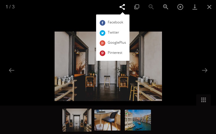
Adding Facebook commentaries
See the detailed instruction on the developers’ website.
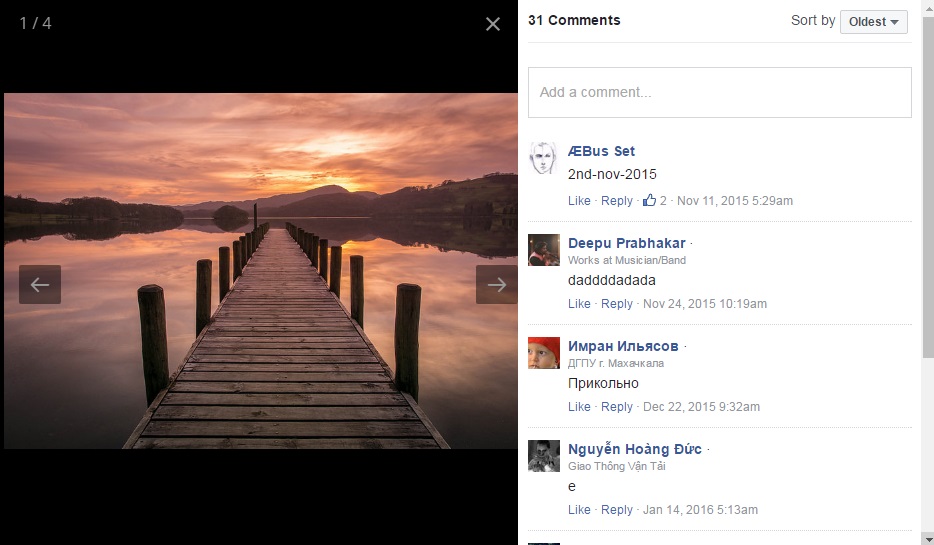
Magnificent. Image zoom
HTML Website Templates use Magnificent.js extension to implement image zoom.
The basic HTML marking looks the following way:
    <!-- Magnificent-->
    <div mag-thumb="inner">
      <img src="images/puppyafter.jpg" width="500" height="300"/>
    </div>
    <div mag-zoom="inner">
      <img src="images/puppyafter.jpg"/>
    </div>
Custom-scrollbar
HTML Website Templates use jquery custom scrollbar extension to implement scrollbar.
The basic HTML marking looks the following way:
    <div class="scrollspy-example scroll-wrap">
      <h2>"Scroll bar"</h2>
      <hr>
      <p>Lorem ipsum dolor sit amet, consectetur adipisicing elit.</p>
      <p>Duis aute irure dolor in reprehenderit in voluptate velit </p>
      <p>Sed ut perspiciatis unde omnis iste natus error sit voluptatem</p>
      <p>Nemo enim ipsam voluptatem quia voluptas sit aspernatur aut</p>
      <p>Neque porro quisquam est, qui dolorem ipsum quia dolor sit amet</p>
      <p>Quis autem vel eum iure reprehenderit qui in ea voluptate</p>
      <hr>
      <p>End of content.</p>
    </div>