PoliNails
Power Builder
Power Builder is a professional solution for quick and worry-free customizing of WordPress themes. It uses multiple building blocks that allow users to create a fully functional and compelling website much faster. Let’s take a look at all the features included in the pack.
Elements
Basically, the builder offers three main sections that will help you build various kinds of layouts.
Sections
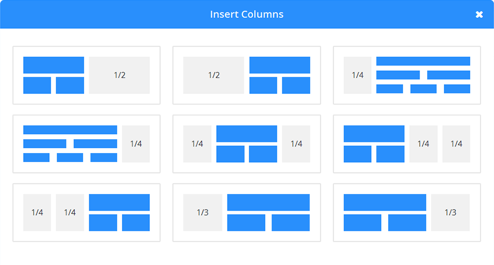
Sections are on the top of the list of the elements you will use in designing the website. Here you can add various kinds of column rows and modules depending on the design of your project.
Section Settings
After adding a section, you need to customize it in accordance with the specifications of the project. For that you need to click the Settings icon. In the popup window you will see a full list of options. Let’s take a look at each one of them separately.
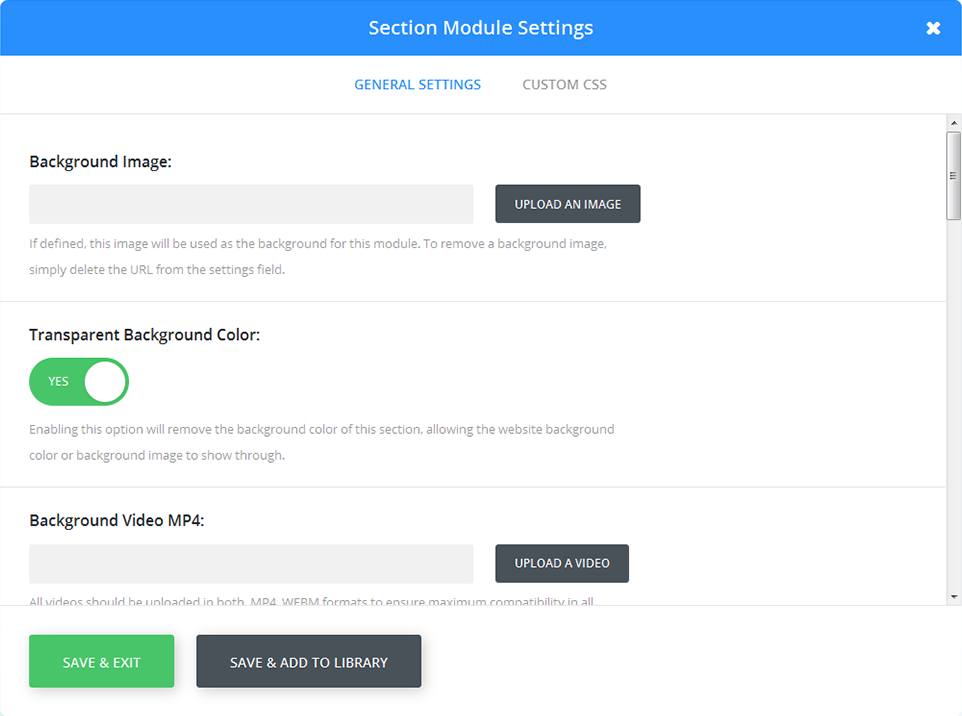
- Background Image - if defined, this image will be used as the background for this module. To remove a background image, simply delete the URL from the settings field.
- Transparent Background Color - Enabling this option will remove the background color of this section, allowing the website background color or background image to show through.
- Background Video MP4 - all videos should be uploaded in both .MP4 .WEBM formats to ensure maximum compatibility in all browsers. Upload the .MP4 version here. Important Note: Video backgrounds are disabled from mobile devices. Instead, your background image will be used. For this reason, you should define both a background image and a background video to ensure best results.
- Background Video Webm - all videos should be uploaded in both .MP4 .WEBM formats to ensure maximum compatibility in all browsers. Important Note: Video backgrounds are disabled from mobile devices. Instead, your background image will be used. For this reason, you should define both a background image and a background video to ensure best results.
- Background Video Width - in order for videos to be sized correctly, you must input the exact width (in pixels) of your video here.
- Background Video Height - in order for videos to be sized correctly, you must input the exact height (in pixels) of your video here.
- Pause Video - allow video to be paused by other players when they begin playing.
- Show Inner Shadow - here you can select whether or not your section has an inner shadow. This can look great when you have colored backgrounds or background images.
- Use Parallax Effect - if enabled, your background image will stay fixed as your scroll, creating a fun parallax-like effect.
- Custom Padding - adjust padding to specific values, or leave blank to use the default padding.
- Keep Custom Padding on Mobile - allow custom padding to be retained on mobile screens.
- Disable on - this will disable the module on selected devices.
- Admin Label - this will change the label of the section in the builder for easy identification when collapsed.
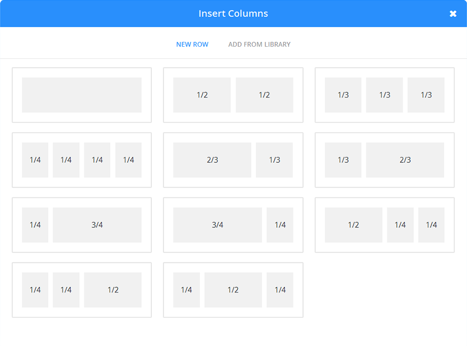
Rows
These elements are added inside the Sections. There are also different types of Rows in which you can add the necessary modules to give the site any functionality and look. All the rows are fully responsive and will look and perform well on any screen resolution.
Row Properties
Rows also can be customized exactly the same way as the sections. After selecting a proper row type, you can start customizing it in accordance with the specifications of your project.
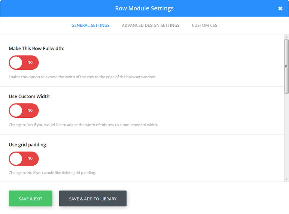
- Make This Row Fullwidth - enable this option to extend the width of this row to the edge of the browser window.
- Use Custom Width - change to Yes if you would like to adjust the width of this row to a non-standard width.
- Use grid padding - change to No if you would like to delete grid padding.
- Custom Padding - adjust padding to specific values, or leave blank to use the default padding.
- Keep Custom Padding on Mobile - allow custom padding to be retained on mobile screens.
- Disable on - this will disable the module on selected devices.
- Admin Label - this will change the label of the row in the builder for easy identification when collapsed.
Modules
The third element required to start designing your website is Modules. Each of the offered Modules can be added to any column.
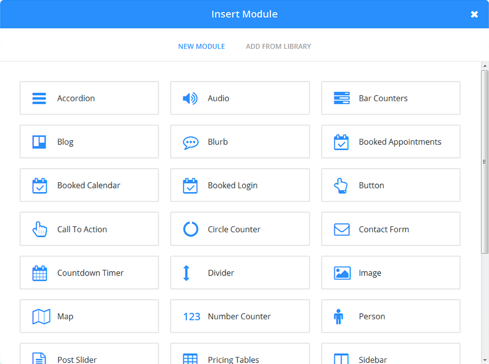
Once the rows and sections are customized you can start adjusting the modules. First of all, you need to choose a proper module from the list and add it to the Row area. After that you can start customizing the modules. Note: each module has a different set of options.
Layout Options
To make the procedure of designing and customizing the site even more comfortable, Power Builder offers you an assortment of layout options. All of them are described below.
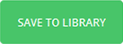
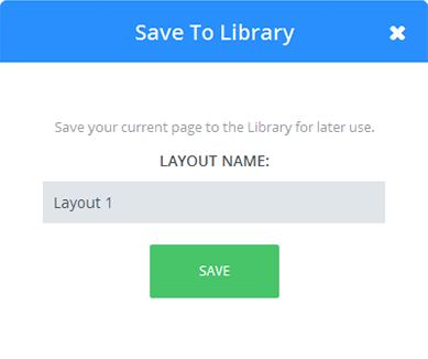
Save to Library
You can save any custom layout you have built and use it later, on another page or on another website. Just press the “Save to Library” button at the top of the panel and the layout will be added to the library.
In the popup window you only need to type down the name of the layout you want to save and press the Save button.
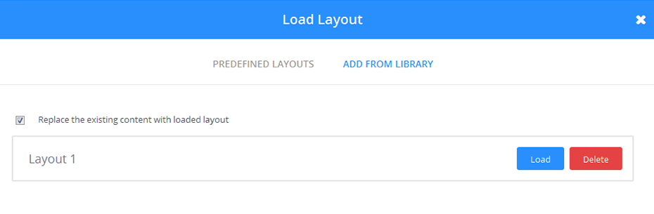
Load from Library
Once you need to insert the layout created earlier, simply click Load from Library > Add from library, find the saved layout and press Load.
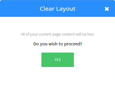
Clear Layout
This option allows you to erase all the changes and start building the layout from scratch. Note that all the changes will be deleted, so make sure that you won’t need this layout saved in the library.