JetBlocks
Advanced Settings
In this block you can access advanced appearance settings for the modules, define module margins and padding, entrance animation, change the background for the whole module, etc.
Element Style
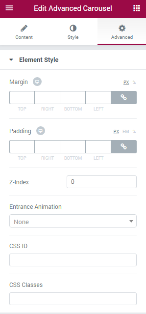
- Margin — in this block you can input the values (in pixels) to define the margins for the module you're customizing.
- Padding— here you can set the custom padding for the module. Fill in the values for the top, bottom, right and left padding in pixels to apply your custom padding.
- Z-index— input the value of the z-index to use it for the module.
- Entrance Animation- choose from the dropdown menu one of the styles for the module to appear on the page.
- Animation Duration — here you can define the time during which the module will appear on the page. It can be normal, slow or fast. Choose the one you need from the dropdown menu.
- Animation Delay (ms) — input the value (in ms) for the animation delay.
- CSS Classes — here you can define the CSS class for the module.
Background
Here you can switch from customizing Normal to Hover background style settings. Just click on the button Hover to proceed to customizing hover elements.
- Background Type — in this block you can choose, whether you want to use classic or gradient type for the module background. The customization options vary for each type.
Classic Background Type
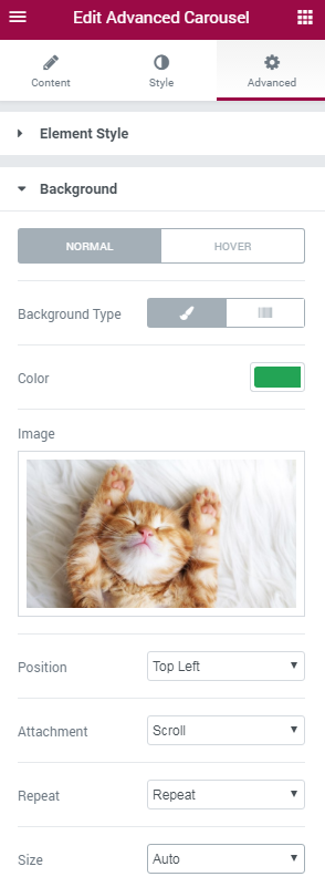
- Color — here you can set background color for the background using color picker tool.
- Image — here you can choose the image you want to use as a background. Select the image from the media library or upload it to define it as a background in this block. When the image is uploaded, you’ll be able to define its position, alignment, turn on repeat and set the necessary size.
Gradient Background Type
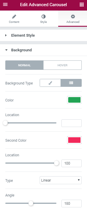
- Color — here you can set background color for the module using color picker tool.
- Location — here you can define the proportion for the first color in the gradient background.
- Second Color — here you can set the second color to use in the gradient background.
- Location — here you can define the proportion for the second color in the gradient background.
- Type — define, if you want to use linear or radial type of the gradient.
- Angle — in this block you can set the angle for the gradient (in degrees).
Border
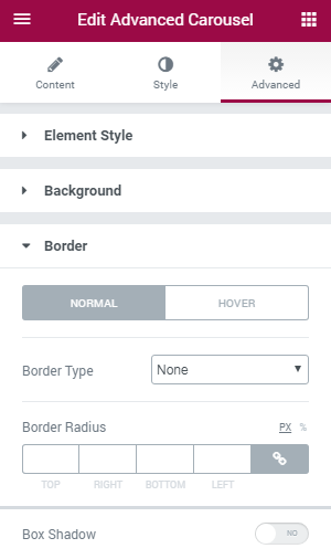
Here you can switch from customizing Normal to Hover border style settings. Just click on the button Hover to proceed to customizing hover elements.
Border Type — here you can select the type of the border from the dropdown menu. Here is the list of available border types:
- none;
- solid;
- doubled;
- dotted;
- dashed.
Border Radius — here you can select the radius for the applied border (in pixels).
Box Shadow — enable this option if you want to access the shadow advanced settings for this module, and need to apply shadow for it.
Shadow Settings:
- color — here you can set the color for the the shadow (use color picker tool to do it);
- blur — in this block you can define the blur settings for the shadow;
- spread — here you can set how large the shadow will be;
- horizontal — here you can move the shadow horizontally (from right to left);
- vertical — here you can move the shadow vertically (from top to bottom);
- position — here you need to choose, whether you want the shadow to outline the module, or to be inset.