JetBlog
JetBlog Widgets
From this block you can learn how to use JetBlog dynamic content widgets to add content to the pages built with Elementor live page builder.
Smart Posts List
Smart Posts List widget is a perfect tool for displaying your posts in the form of neat content blocks with easily changeable layout and customizable appearance. You can change the listing max width, featured post position, image size, style up post excerpts and meta information without ever touching a single line of code.
Smart Posts List Widget Sample
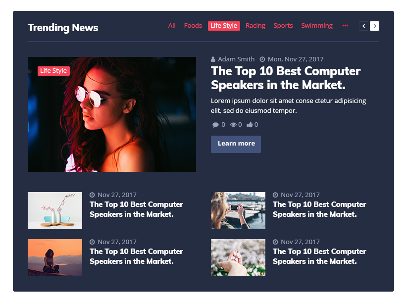
On the picture below you can view Smart Posts List widget sample.
Content
General
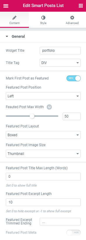
- Widget Title - here you need to input the title for the widget. It will be displayed above the posts listing.
- Title Tag - select the appropriate widget title tag to use it when displaying the title (H1, H2, H3, H4, H5, H6 or div tag).
- Mark First Post as Featured - enable this option in order to display the first post from the listing as a featured one. If the option is disabled, all the posts will be shown as equal listing items.
- Featured Post Position - if you’ve enabled Mark First Post as Featured option, you’ll be able to select the featured post position (Top, Left).
- Featured Post Max Width - use the controls or type in the needed value in px in the corresponding field to set the maximum featured post width.
- Featured Post Layout - here you can select, if you want the featured post to display content in a Boxed style, or use the Simple style.
- Featured Post Image Size - here you can select the suitable size for the featured post image (the sizes may vary depending on what theme you’re using).
- Featured Post Image Max Width - use the controls or type in the needed value in px in the corresponding field to set the maximum featured post image width.
- Featured Post Excerpt Length - here you can select the length of the post excerpt to be displayed in the featured post.
- Featured Excerpt Trimmed Ending - here you can define the appearance of the featured excerpt trimmed ending.
- Featured Post Read More Button - enable this option in order to show the Read More button.
- Read More Button Label - here you can specify the label for the Read More button.
- Featured Post Meta - enable this option in order to display the post meta information in the featured post.
- Featured Meta Position - choose the position of the featured post meta information (before or after the title).
- Show Post Author - enable this option in order to display the post author for the featured post.
- Author Icon - if the previous option is active, you can select the icon to display on the left of the post author’s username.
- Show Post Date - enable this option in order to display the date when the post is published.
- Date Icon - when the previous option is active, you can select the icon to display it on the left of the post publishing date.
- Show Post Comments - enable this option in order to display the number of comments to the post.
- Comments Icon - when the previous option is active, you can select the icon to display it on the left of the number of comments to the post.
- Columns Number - select the number of columns for different screen resolutions to make the widget content responsive. You can set from 1 to 4 columns.
- Rows Number - here you can select how many rows you want to display in the listing.
- Post Thumbnail - enable this option to display the post thumbnail image.
- Post Image Size - here you can set the preferable image size for the posts displayed in the listing (the sizes may vary depending on the theme you’re using).
- Post Image Position - here you can set the needed post image position (Top, Left).
- Post Image Max Width - use the controls or type in the needed value in pixels to define the maximum width for the post images.
- Excerpt Length - type in the post excerpt length value to set it for the posts shown in listing.
- Excerpt Trimmed Ending - here you can define the appearance of the excerpt trimmed ending.
- Post Read More Button - enable this option in order to show the Read More button in posts.
- Read More Button Label - here you can specify the label for the Read More button in posts.
- Post Meta - enable this option in order to display the post meta information.
- Show Post Author - enable this option in order to display the post author for the posts shown in listing.
- Author Icon - if the previous option is active, you can set the icon to display it on the left from the post author’s username.
- Show Post Date - enable this option if you need to display the date when the post is published.
- Date Icon - if the previous option is active, you can set the icon to display it on the left from the date when the post is published.
- Show Post Comments - enable this option in order to enable displaying the number of comments to the post.
- Comments Icon - in the case the previous option is active you can set the icon to display it on the left from the number of comments to the post.
- Show Post Terms - enable the option in order to display the post terms.
- Post Terms From - select the source of the terms (categories or tags).
Query and Controls
- Post Type - here you can select the post type you want to use (e.g., Posts, Pages, Projects).
- Query Posts By - here you can select the query type you want to use for this widget’s content (Categories, Tags or All). In the JetBlog v.1.2.0 and further one can query posts by IDs. After that one needs to ad the comma-separated list of IDs in the corresponding field.
- Get posts from categories/tags/IDs - here you can select which post categories/tags/IDs you want to display using the Smart Posts Listing widget.
- Exclude Posts by IDs - here you can specify the post IDs you want to exclude from showing up.
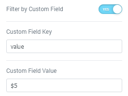
- Filter by Custom Field - enable this option to be able to filter the posts by custom field or even custom field value.
- Custom Field Key - input the custom field key for the posts to show only those which have this custom field.
- Custom Field Value - here you can specify the value by which the posts will be sorted and shown (e.g., key: color, value: red).
- Show Filter by Terms - enable this option if you want to enable the filter and make it available for the website visitors.
- Show "All" Button in Start of Filter - enable this option in order to show the button when clicking on which the visitor will see all the posts shown in the Smart Listing.
- "All" Button Label - here you can define your custom text label for the All button.
- RollUp Extra Terms - enable this option in order to reduce the terms filter size by grouping extra terms items and hiding them under the suspension dots.
- More Terms Icon - here you can select which icon you want to use for the RollUp option.
- Show Paging Control - enable this option if you want to add the arrow controls which will allow to switch from page to page and simplify the listing viewing for the visitors.
Custom Fields
- Show Meta Before/After Title - enable this option in order to show the custom meta information before or after the title.
- Meta Fields Position - here you can select the position of the custom meta information displayed in fields.
- Add Item - click Add Item button to add a new custom meta field.
- Show Meta Before/After Content - enable this option in order to show the custom meta information before or after the content.
- Meta Fields Position - here you can select the position of the custom meta information displayed in fields.
- Add Item - click Add Item button to add a new custom meta field.
Adding Custom Meta Field
- First, let's access WordPress Dashboard and here navigate to Posts > All Posts. Select one of the posts and click Edit in order to add a custom meta field to it.
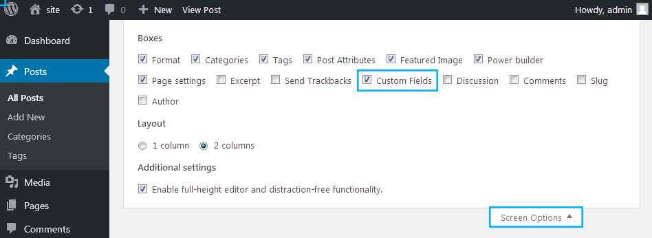
- After that open the Screen Options located in the top right corner and check Custom Fields option.
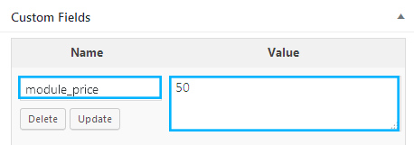
- Scroll the page down to see the Custom Fields block. Navigate to Add New Custom Field area and here fill in the Name of the custom field you want to use and the value to show it for this post.
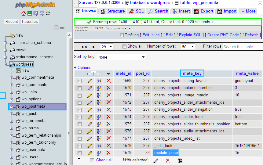
- In order to retrieve the key for this custom field you need to open the phpMyAdmin tool (you can find it in your cPanel) and open the database you're using. Here select wp_postmeta table and look for the meta_key of the custom field you've created. Copy it to the clipboard.
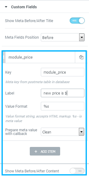
- Now let's return to the Custom Fields block in Smart Posts List. Here click Add Item button and paste the meta key you've previously copied in the Key field. E.g., to show the price for the item displayed in the post you need to create price custom field and set the price in the post when editing it. Then you need to copy the meta key for your new custom field from the database and paste it in the Key field.
- Input the text you want to show before the meta information in the Label field. E.g., you can input 'Buy at $' in the Label field to show the text before the price.
- Input the value format in the corresponding field (if you don't know how to work with it, please, don't change it.)
- In the Prepare meta value with callback dropdown list you can select if you want to use a callback function to prepare the meta information before displaying it (Clean - for the clean value added in the custom field).
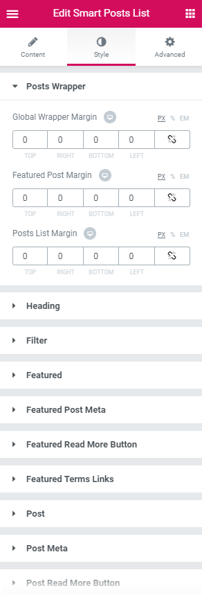
- Global Wrapper Margin - here you can input the margin of the posts wrapper.
- Featured Post Margin - here you can input the wrapper margin for the Featured post.
- Posts List Margin - here you can input the margin of the posts list.
- Background Type - in this block you can choose, whether you want to use classic or gradient type for the heading box. The customization options vary for each type.
Classic Background Type
- Color — here you can set background color for the simple items using color picker tool.
- Image — here you can choose the image you want to use as a background. Select the image from the media library or upload it to define it as a background in this block. When the image is uploaded, you’ll be able to define its position, alignment, turn on repeat and set the necessary size.
- Opacity — here you can define the value for the opacity of the background.
- Color — here you can set background color for the simple items using color picker tool.
- Location — here you can define the proportion for the first color in the gradient background.
- Second Color — here you can set the second color to use in the gradient background.
- Location — here you can define the proportion for the second color in the gradient background.
- Type — define, if you want to use linear or radial type of the gradient.
- Angle — in this block you can set the angle for the gradient (in degrees).
- Opacity — here you can change background opacity, where 1 is 100% opacity, and 0 — is 0% opacity.
- Border Type - here you can define the type of the border you need to use for the element.
- Width - here you can set the preferable border width in px.
- Color - here you can set the border color using color picker tool.
- Border Radius - here you can define the border radius values to make the border angles more round and smooth.
- Box Shadow - enable this option if you want to access the shadow advanced settings for this element, and need to apply shadow for it.
- Padding - here you can set the custom padding for the heading box. Fill in the values for the top, bottom, right and left padding in pixels to apply your custom padding.
- Margin - here you can define the margins for the heading box.
- Title Color - here you can define the suitable color for the widget title. Use color picker tool to select the necessary color.
- Typography - turn the option on to view the typography settings.
- Size - define the font size of the module title.
- Family - here you can set the font family for the title.
- Weight - in this block you can select the suitable font weight.
- Transform - here you can choose from the dropdown menu, if you want the title to be shown in uppercase, lowercase, capitalize or normal way.
- Style - in this block you can choose from the dropdown menu the style for the font. It can be normal, italic (the characters look similar to handwriting) and oblique (the characters are slightly inclined to the right).
- Line-Height - in this field you can set the height of the title line.
- Letter Spacing - here you can set the space between letters.
- Padding - here you can set the custom padding for the title. Fill in the values for the top, bottom, right and left padding in pixels to apply your custom padding.
- Margin - here you can define the margins for the title.
- Typography - turn the option on to view the typography settings. They are similar to the typography settings of other JetBlog widgets.
- Color - in this block you can set the color using color picker tool.
- Background Type - in this block you can choose, whether you want to use classic or gradient type for the filter. The customization options vary for each type. The settings are similar to the common background type settings for other JetBlog modules.
- Border Type - here you can define the needed border type for the filter. It can be dotted, dashed, double or solid.
- Border Radius - here you can define the values for the radius of the selected border.
- Box Shadow - enable this option if you want to access the shadow advanced settings for the filter, and need to apply shadow for it.
- Padding - here you can set the preferable custom padding for the filter. Fill in the values for the top, bottom, right and left padding in pixels to apply your custom padding.
- Margin - input the values for the filter margins in the required fields.
- Hidden Terms Icon Size - here you can define the value of icon size in pixels.
- Typography - turn the option on to view the typography settings. They are similar to the typography settings of other JetBlog widgets.
- Color - in this block you can set the color using color picker tool.
- Hover/Active Color - in this block you can set the color using color picker tool to use in on hover or when the box is active.
- Padding - here you can set the preferable custom padding for the box. Fill in the values for the top, bottom, right and left padding in pixels to apply your custom padding.
- Background Type - in this block you can choose, whether you want to use classic or gradient type for the box. The customization options vary for each type. The settings are similar to the common background type settings for other JetBlog modules.
- Border Type - here you can define the needed border type for the box. It can be dotted, dashed, double or solid.
- Border Radius - here you can define the values for the radius of the selected border.
- Box Shadow - enable this option if you want to access the shadow advanced settings for the box and need to apply shadow for it.
- Padding - here you can set the preferable custom padding for the featured box element with content and overlay. Fill in the values for the top, bottom, right and left padding in pixels to apply your custom padding.
- Margin - here you can apply your custom margins for the whole featured post block.
- Background Type - in this block you can choose, whether you want to use classic or gradient type for the featured post. The customization options vary for each type. The settings are similar to the common background type settings for other JetBlog modules.
- Border Type - here you can define the needed border type for the featured post. It can be dotted, dashed, double or solid.
- Border Radius - here you can define the values for the radius of the selected border.
- Box Shadow - enable this option if you want to access the shadow advanced settings for the featured post and need to apply shadow for it.
- Background Type - in this block you can choose, whether you want to use classic or gradient type for the post image overlay. The customization options vary for each type. The settings are similar to the common background type settings for other JetBlog modules.
- Color - here you can set the color for the post title text using color picker tool.
- Typography - turn the option on to view the typography settings. They are similar to the typography settings of other JetBlog widgets.
- Margin - here you can apply your custom margins for the post title.
- Color - here you can set the color for the post text using color picker tool.
- Typography - turn the option on to view the typography settings. They are similar to the typography settings of other JetBlog widgets.
- Margin - here you can apply your custom margins for the post text.
- Meta Icon Size - here you can define the value of icon size in pixels.
- Meta Icon Gap - here you can set the gap distance between the icon and the meta information text.
- Background Color - here you can set the background color for the featured post meta using color picker tool.
- Text Color - here you can set the color for the featured post text using color picker tool.
- Links Color - here you can set the color for the featured post links using color picker tool.
- Links Hover Color - here you can set the color for the featured post links on hover using color picker tool.
- Typography - turn the option on to view the typography settings. They are similar to the typography settings of other JetBlog widgets.
- Padding - here you can set the preferable custom padding for the featured post meta. Fill in the values for the top, bottom, right and left padding in pixels to apply your custom padding.
- Margin - here you can apply your custom margins for the featured post meta.
- Alignment - here you can define the preferable featured post meta information alignment. It can be placed to the left, to the right, or remain centered.
- Meta Divider - here you can input the custom divider text or symbol.
- Divider Gap - here you can set the gap distance between the divider and the meta information text.
- Customize Icon - enable this option in order to access the icon customization settings.
- Read More Button Icon - here you can select the icon to use it for the Read More button.
- Icon Position - here you can select, if you want to position the icon after the text, or before the text.
- Icon Size - use the controls or type in the icon size value in pixels in order to use it.
- Icon Color - here you can select the icon color using color picker tool.
- Icon Margin - here you can apply your custom margins for the Read More button.
- Background Type - in this block you can choose, whether you want to use classic or gradient type for the Read More button. The customization options vary for each type. The settings are similar to the common background type settings for other JetBlog modules.
- Color - here you can set the button color.
- Text Color - click this option to set the button text color using color picker tool.
- Typography - turn the option on to view the typography settings. They are similar to the typography settings of other JetBlog widgets.
- Text Decoration - here you can apply the underline for the button text.
- Padding - here you can set the preferable custom padding for the Read More button. Fill in the values for the top, bottom, right and left padding in pixels to apply your custom padding.
- Border Radius - here you can define the values for the radius of the selected border.
- Border Type - here you can define the needed border type for the Read more button. It can be dotted, dashed, double or solid.
- Box Shadow - enable this option if you want to access the shadow advanced settings for this button, and need to apply shadow for it.
- Alignment - here you can define the preferable Read More button alignment. It can be placed to the left, to the right, or remain centered.
- Padding - here you can set the preferable custom padding for the post. Fill in the values for the top, bottom, right and left padding in pixels to apply your custom padding.
- Margin - here you can apply your custom margins for the post.
- Background Type - in this block you can choose, whether you want to use classic or gradient type for the post. The customization options vary for each type. The settings are similar to the common background type settings for other JetBlog modules.
- Border Type - here you can define the needed border type for the post. It can be dotted, dashed, double or solid.
- Border Radius - here you can define the values for the radius of the selected border.
- Box Shadow - enable this option if you want to access the shadow advanced settings for the posts, and need to apply shadow for them.
- Background Type - in this block you can choose, whether you want to use classic or gradient type for the post image overlay. The customization options vary for each type. The settings are similar to the common background type settings for other JetBlog modules.
- Color - here you can select the preferable color for the post title using color picker tool.
- Typography - turn the option on to view the typography settings. They are similar to the typography settings of other JetBlog widgets.
- Margin - here you can apply your custom margins for the post title.
- Color - here you can select the preferable color for the post text using color picker tool.
- Typography - turn the option on to view the typography settings. They are similar to the typography settings of other JetBlog widgets.
- Margin - here you can apply your custom margins for the post text.
- Meta Icon Size - use the controls to change the icon size or type in the size value in px in the corresponding field.
- Meta Icon Gap - here you can set the gap distance between the icon and the meta information text.
- Background Color - here you can set the background color for the post meta using color picker tool.
- Text Color - here you can set the color for the post text using color picker tool.
- Links Color - here you can set the color for the post links using color picker tool.
- Links Hover Color - here you can set the color for the post links on hover using color picker tool.
- Typography - turn the option on to view the typography settings. They are similar to the typography settings of other JetBlog widgets.
- Padding - here you can set the preferable custom padding for the post meta. Fill in the values for the top, bottom, right and left padding in pixels to apply your custom padding.
- Margin - here you can apply your custom margins for the post meta.
- Alignment - here you can define the preferable post meta information alignment. It can be placed to the left, to the right, or remain centered.
- Meta Divider - here you can input the custom divider text or symbol.
- Divider Gap - here you can set the gap distance between the divider and the meta information text.
- Font Color - here you can select the color to use for the paging arrows using color picker tool.
- Background Type - in this block you can choose, whether you want to use classic or gradient type for the arrows background. The customization options vary for each type. The settings are similar to the common background type settings for other JetBlog modules.
- Icon Size - here you need to specify the size of the arrows.
- Box Size - here you can set the size of the navigation arrow box.
- Border Type - here you can define the type of the border you need to use for the element.
- Border Radius - here you can set the border radius to make the angles more smooth and round.
- Box Shadow - enable this option if you want to access the shadow advanced settings for the paging arrows, and need to apply shadow for them.
- Vertical Position by - define the vertical position for the prev arrow. It can be positioned at the top or at the bottom.
- Top Indent - define the vertical position indent in pixels, or use controls to define the suitable position automatically.
- Horizontal Position by - define the horizontal position for the prev arrow. It can be positioned on the left or on the right.
- Left Indent - define the horizontal position indent in pixels, or use controls to define the suitable position automatically.
- Vertical Position by - define the vertical position for the next arrow. It can be positioned at the top or at the bottom.
- Top Indent - define the vertical position indent in pixels, or use controls to define the suitable position automatically.
- Horizontal Position by - define the horizontal position for the next arrow. It can be positioned on the left or on the right.
- Right Indent - define the horizontal position indent in pixels, or use controls to define the suitable position automatically.
- Margin — in this block you can input the values (in pixels) to define the margins for the widget you're customizing.
- Padding— here you can set the custom padding for the widget. Fill in the values for the top, bottom, right and left padding in pixels to apply your custom padding.
- Z-index— input the value of the z-index to use it for the widget.
- Entrance Animation- choose from the dropdown menu one of the styles for the widget to appear on the page.
- Animation Duration — here you can define the time during which the widget will appear on the page. It can be normal, slow or fast. Choose the one you need from the dropdown menu.
- Animation Delay (ms) — input the value (in ms) for the animation delay.
- CSS Classes — here you can define the CSS class for the mwidget.
- Background Type — in this block you can choose, whether you want to use classic or gradient type for the widget background. The customization options vary for each type.
- Color — here you can set background color for the background using color picker tool.
- Image — here you can choose the image you want to use as a background. Select the image from the media library or upload it to define it as a background in this block. When the image is uploaded, you’ll be able to define its position, alignment, turn on repeat and set the necessary size.
- Color — here you can set background color for the widget using color picker tool.
- Location — here you can define the proportion for the first color in the gradient background.
- Second Color — here you can set the second color to use in the gradient background.
- Location — here you can define the proportion for the second color in the gradient background.
- Type — define, if you want to use linear or radial type of the gradient.
- Angle — in this block you can set the angle for the gradient (in degrees).
- none;
- solid;
- doubled;
- dotted;
- dashed.
- color — here you can set the color for the the shadow (use color picker tool to do it);
- blur — in this block you can define the blur settings for the shadow;
- spread — here you can set how large the shadow will be;
- horizontal — here you can move the shadow horizontally (from right to left);
- vertical — here you can move the shadow vertically (from top to bottom);
- position — here you need to choose, whether you want the shadow to outline the widget, or to be inset.
Style
Posts Wrapper
Heading
Heading BoxFilter
You can customize the appearance of the title using the Normal, Hover or Active mode. Just switch between the modes using the corresponding buttons.
Featured
You can customize the appearance of the post image overlay using the Normal or Hover mode. Just switch between the modes using the corresponding buttons.
Featured Post Meta
Featured Read More Button
You can customize the appearance of the Read More button using the Normal or Hover mode. Just switch between the modes using the corresponding buttons.
Post
You can customize the appearance of the post image overlay using the Normal or Hover mode. Just switch between the modes using the corresponding buttons.
Post Meta
Paging Arrows
You can customize the appearance of the paging arrows using the Normal or Hover mode. Just switch between the modes using the corresponding buttons.
Advanced
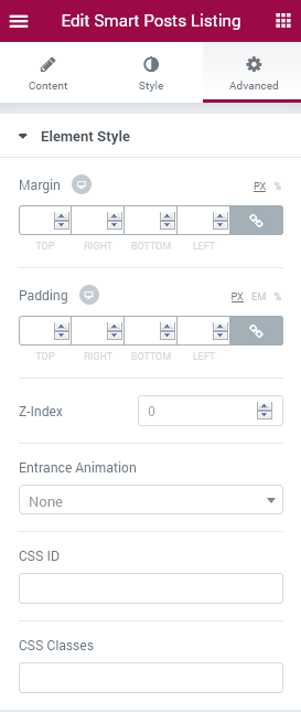
In this block you can access advanced appearance settings for the widgetss, define widget margins and padding, entrance animation, change the background for the whole widget, etc.
Element Style
Background
Here you can switch from customizing Normal to Hover background style settings. Just click on the button Hover to proceed to customizing hover elements.
Classic Background Type
Gradient Background Type
Border
Here you can switch from customizing Normal to Hover border style settings. Just click on the button Hover to proceed to customizing hover elements.
Border Type — here you can select the type of the border from the dropdown menu. Here is the list of available border types:
Border Radius — here you can select the radius for the applied border (in pixels).
Box Shadow — enable this option if you want to access the shadow advanced settings for this widget, and need to apply shadow for it.
Shadow Settings:
Smart Post Tiles
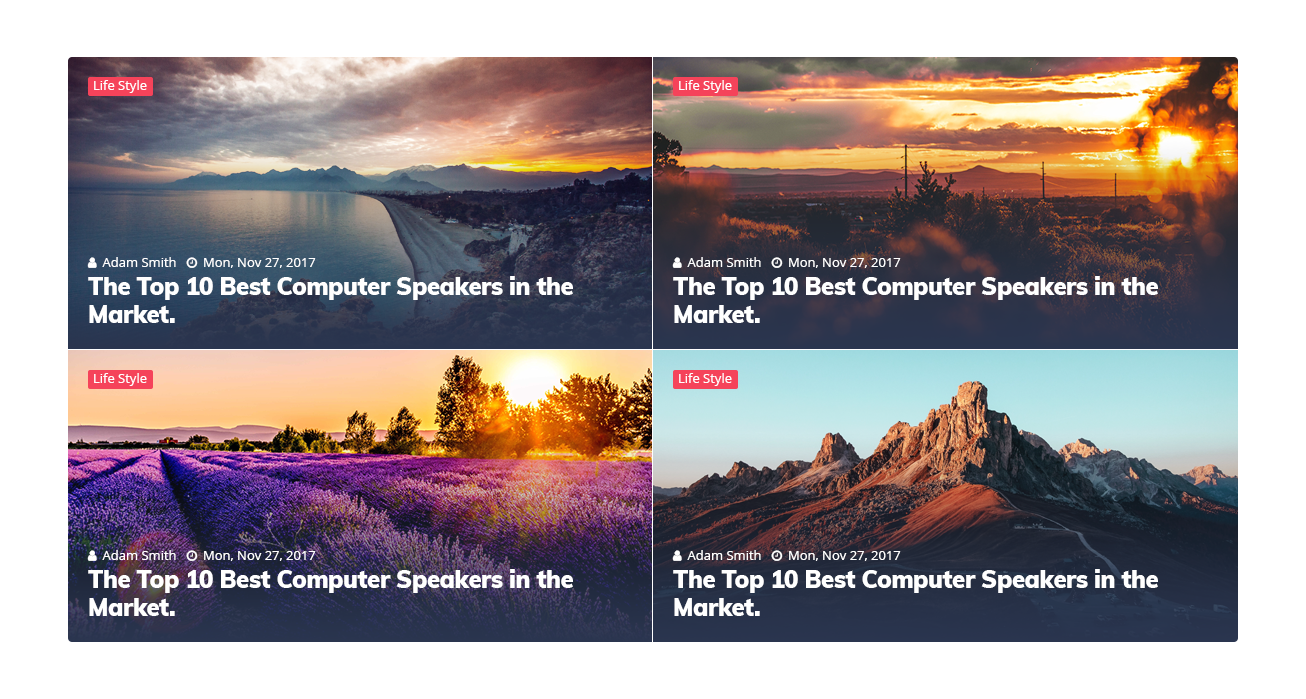
Smart Post Tiles widget will assist you in adding your posts to the website’s page in the form of an eye-catching tiles block with immaculate layout and impeccable style. This module has versatile style settings, allowing to add gap between boxes, create box overlays, change content appearance and meta information. It also has 6 pre-built layouts that will help you showcase your posts in a totally advantageous way.
Smart Post Tiles Widget Sample
On the picture below you can view Smart Post Tiles widget sample.
Content
General
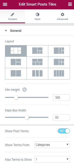
- Layout - here you can select one of the 6 layouts to display your posts content in the most suitable way.
- Min Height - use the controls or type in the height value in the corresponding field in order to define the minimal Smart Post Tiles module height.
- Main Box Width - use the controls or type in the height value in the corresponding field in order to define the main box (the largest box) width.
- Image Size - here you can select the suitable size for post images (the sizes may vary depending on what theme you’re using).
- Show Post Terms - enable this option in order to display the post terms (categories or tags).
- Show Terms From - here you can select, if you want to display tags or categories.
- Max Terms to Show - here you can set, how many tags or categories you want to show per one post (1-4, or all of them).
- Title Max Length (Words) - here you can set the maximum length or the post title in words.
- Excerpt Length - here you can specify the post excerpt length to display with this widget.
- Excerpt Trimmed Ending - here you can define the appearance of the excerpt trimmed ending.
- Show Excerpt on Small Boxes Only on Hover - enable this option in order to show the post excerpt texts only when on hover.
- Post Meta - enable this option to display the post meta information in this widget.
- Show Post Author - enable this option in order to display the post author for the post.
- Author Icon - if the previous option is active, you can select the icon to display on the left of the post author’s username.
- Show Post Date - enable this option in order to display the date when the post is published.
- Date Icon - when the previous option is active, you can select the icon to display it on the left of the post publishing date.
- Show Post Comments - enable this option in order to display the number of comments to the post.
- Comments Icon - when the previous option is active, you can select the icon to display it on the left of the number of comments to the post.
Query and Controls
- Query Posts By - here you can select the query type you want to use for this widget’s content (Categories, Tags or All).
- Get posts from categories/tags/IDs - here you can select which post categories/tags/IDs you want to display using the Smart Post Tiles widget.
- Exclude Posts by IDs - here you can specify the post IDs you want to exclude from showing up.

- Filter by Custom Field - enable this option to be able to filter the posts by custom field or even custom field value.
- Custom Field Key - input the custom field key for the posts to show only those which have this custom field.
- Custom Field Value - here you can specify the value by which the posts will be sorted and shown (e.g., key: color, value: red).
Custom Fields
- Show Meta Before/After Title - enable this option in order to show the custom meta information before or after the title.
- Meta Fields Position - here you can select the position of the custom meta information displayed in fields.
- Add Item - click Add Item button to add a new custom meta field.
- Show Meta Before/After Content - enable this option in order to show the custom meta information before or after the content.
- Meta Fields Position - here you can select the position of the custom meta information displayed in fields.
- Add Item - click Add Item button to add a new custom meta field.
Adding Custom Meta Field
- First, let's access WordPress Dashboard and here navigate to Posts > All Posts. Select one of the posts and click Edit in order to add a custom meta field to it.
- After that open the Screen Options located in the top right corner and check Custom Fields option.
- Scroll the page down to see the Custom Fields block. Navigate to Add New Custom Field area and here fill in the Name of the custom field you want to use and the value to show it for this post.
- In order to retrieve the key for this custom field you need to open the phpMyAdmin tool (you can find it in your cPanel) and open the database you're using. Here select wp_postmeta table and look for the meta_key of the custom field you've created. Copy it to the clipboard.
- Now let's return to the Custom Fields block in Smart Posts List. Here click Add Item button and paste the meta key you've previously copied in the Key field. E.g., to show the price for the item displayed in the post you need to create price custom field and set the price in the post when editing it. Then you need to copy the meta key for your new custom field from the database and paste it in the Key field.
- Input the text you want to show before the meta information in the Label field. E.g., you can input 'Buy at $' in the Label field to show the text before the price.
- Input the value format in the corresponding field (if you don't know how to work with it, please, don't change it.)
- In the Prepare meta value with callback dropdown list you can select if you want to use a callback function to prepare the meta information before displaying it (Clean - for the clean value added in the custom field).
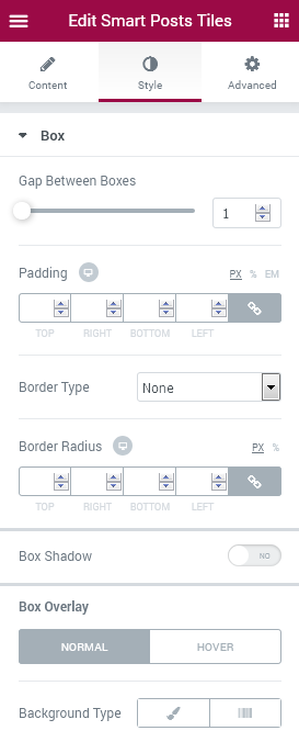
- Gap Between Boxes - use controls or input the gap value in pixels to use it as a gap between the tile boxes.
- Padding - here you can input your custom padding values to apply padding for the whole post tiles layout block.
- Border Type - here you can select the type of the border from the dropdown menu.
- Border Radius - here you can select the radius for the applied border (in pixels) to make the border andles more smooth and round.
- Box Shadow - enable this option if you want to access the shadow advanced settings for this widget, and need to apply shadow for it.
- Background Type - in this block you can choose, whether you want to use classic or gradient type for the box overlay. The customization options vary for each type.
- Color - here you can set the color for the widget content using color picker tool.
- Typography - turn the option on to view the typography settings. They are similar to the typography settings of other JetBlog widgets.
- Margin - in this block you can input the values (in pixels) to define the margins for the widget content you're customizing.
- Color - here you can set the color for the post text using color picker tool.
- Typography - turn the option on to view the typography settings. They are similar to the typography settings of other JetBlog widgets.
- Margin - in this block you can input the values (in pixels) to define the margins for the post text.
- Meta Icon Size - use the controls to change the icon size or type in the size value in px in the corresponding field.
- Meta Icon Gap - here you can set the gap distance between the icon and the meta information text.
- Background Color - here you can set the background color for the post meta using color picker tool.
- Text Color - here you can set the color for the post text using color picker tool.
- Typography - turn the option on to view the typography settings. They are similar to the typography settings of other JetBlog widgets.
- Padding - here you can set the preferable custom padding for the post meta. Fill in the values for the top, bottom, right and left padding in pixels to apply your custom padding.
- Margin - here you can apply your custom margins for the post meta.
- Alignment - here you can define the preferable post meta information alignment. It can be placed to the left, to the right, or remain centered.
- Meta Divider - here you can input the custom divider text or symbol.
- Divider Gap - here you can set the gap distance between the divider and the meta information text.
- Background Type - in this block you can choose, whether you want to use classic or gradient type for the terms links. The customization options vary for each type.
- Color - here you can set the background box color for the terms links using color picker tool.
- Text Color - here you can set the text color for the terms links using color picker tool.
- Typography - turn the option on to view the typography settings. They are similar to the typography settings of other JetBlog widgets.
- Text Decoration - here you can apply the underline for the terms text.
- Padding - here you can set the preferable custom padding for the post terms links. Fill in the values for the top, bottom, right and left padding in pixels to apply your custom padding.
- Border Radius - here you can select the radius for the applied border (in pixels) to make the border angles more smooth and round.
- Border Type - here you can define the type of the border you need to use for the element.
- Width - here you can set the preferable border width in px.
- Box Shadow - enable this option if you want to access the shadow advanced settings for this widget, and need to apply shadow for it.
- Horizontal Alignment - here you can set the preferable horizontal alignment (Left, Center, Right).
- Vertical Alignment - here you can set the needed vertical alignment (Top, Bottom).
- Font Color - here you can set the color to use it for the arrows using color picker tool.
- Background Type - in this block you can choose, whether you want to use classic or gradient type for the paging arrows. The customization options vary for each type.
- Icon Size - here you can set the preferable arrows icon size.
- Box Size - here you can set the preferable arrow box sizes using controls or by filling in the needed value in pixels.
- Border Type - here you can define the type of the border you need to use for the element.
- Border Radius - define the border radius value in pixels in the corresponding fields in order to make the border angles more smooth.
- Box Shadow - enable this option if you want to access the shadow advanced settings for the paging arrows, and need to apply shadow for them.
- Vertical Position by - define the vertical position for the prev arrow. It can be positioned at the top or at the bottom.
- Top Indent - define the vertical position indent in pixels, or use controls to define the suitable position automatically.
- Horizontal Position by - define the horizontal position for the prev arrow. It can be positioned on the left or on the right.
- Left Indent - define the horizontal position indent in pixels, or use controls to define the suitable position automatically.
- Vertical Position by - define the vertical position for the next arrow. It can be positioned at the top or at the bottom.
- Top Indent - define the vertical position indent in pixels, or use controls to define the suitable position automatically.
- Horizontal Position by - define the horizontal position for the next arrow. It can be positioned on the left or on the right.
- Right Indent - define the horizontal position indent in pixels, or use controls to define the suitable position automatically.


Style
Box
You can customize the appearance of the box overlay using the Normal or Hover mode. Just switch between the modes using the corresponding buttons.
Content
TitleYou can customize the appearance of the terms links (tags or categories) using the Normal or Hover mode. Just switch between the modes using the corresponding buttons.
You can customize the appearance of the paging arrows using the Normal or Hover mode. Just switch between the modes using the corresponding buttons.
Advanced
In this block you can access advanced appearance settings for the widgets, define widget margins and padding, entrance animation, change the background for the whole widget, etc.
The Advanced settings of the Smart Post Tiles widget are similar to the ones of the other JetBlog widgets.
Text Ticker
Text Ticker widget is created for adding an eye-catching ticker content module to website’s page, displaying the recent and most important post titles in order to engage more visitors to read the recent publications. This module has multiple content settings, as well as loads of style settings, such as container background type, post thumbnails to display, paging arrows and many more.
Text Ticker Widget Sample
On the picture below you can view Text Ticker widget sample.

Content
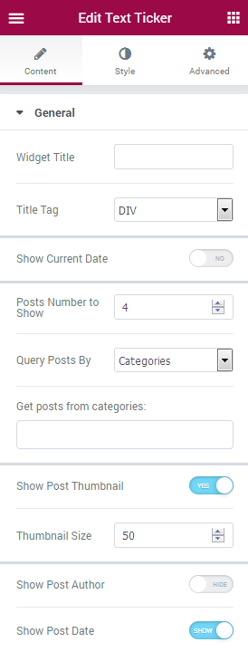
General
Widget Title - here you can fill in the widget title in order to give a name to the text ticker.
Title Tag - select the appropriate widget title tag to use it when displaying the title (H1, H2, H3, H4, H5, H6 or div tag).
Show Current Date - enable this option in order to display the current date.
Date Format - here you can define the date format to use for the displayed date (e.g., F j, Y; you can learn more about displaying the date here).
Date Icon - here you can define what icon to use for the date.
Posts Number to Show - input the number of posts you want to display in Text Ticker block.
Query Posts By - here you can select the query type you want to use for this widget’s content (Categories, Tags or All).
Get posts from categories - here you can select which post categories you want to display using the Text Ticker widget.
Exclude Posts by IDs - here you can specify the post IDs you want to exclude from showing up.
Show Post Thumbnail - enable this option in order to display the thumbnail image for the post.
Thumbnail Size - here you can specify the image thumbnail size in pixels.
Show Post Author - enable this option in order to display the post author in the ticker.
Author Icon - when the previous option is active you can select the author icon to show it on the left from the author’s username.
Show Post Date - enable this option in order to display the date when the post is published.
Post Date Format - here you can set the preferable date format (e.g., H:s).
Date Icon - when the previous option is active, you can select the icon to display it on the left from the date when the post is published.
Slider Settings
Typing Effect - enable this option in order to apply the typing animated effect to the text ticker line.
Typing Cursor Char - here you can set the typing cursor symbol to use it in the ticker line.
Show Controls Arrows - enable this option to make the arrow controls visible in order to make the navigation through the news ticker more comfortable for the visitors.
Select Control Arrows Type - there you can choose which arrow controls symbols you want to use.
Style
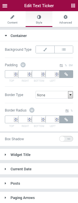
Container
Background Type - in this block you can choose, whether you want to use classic or gradient type for the ticker container. The customization options vary for each type.
Padding - here you can set the preferable custom padding for the container. Fill in the values for the top, bottom, right and left padding in pixels to apply your custom padding.
Border Type - here you can define the type of the border you need to use for the element.
Border Radius - define the border radius value in pixels in the corresponding fields in order to make the border angles more smooth.
Box Shadow - enable this option if you want to access the shadow advanced settings for the container, and need to apply shadow for it.
Color - in this block you can set the color of the title using color picker tool.
Typography - turn the option on to view the typography settings. They are similar to the typography settings of other JetBlog widgets.
Background Type - in this block you can choose, whether you want to use classic or gradient type for the ticker title. The customization options vary for each type.
Padding - here you can set the preferable custom padding for the title. Fill in the values for the top, bottom, right and left padding in pixels to apply your custom padding.
Border Type - here you can define the type of the border you need to use for the element.
Border Radius - define the border radius value in pixels in the corresponding fields in order to make the border angles more smooth.
Box Shadow - enable this option if you want to access the shadow advanced settings for the title, and need to apply shadow for it.
Show Title Pointer - here you can enable the arrow that is pointing from the title to the posts titles switching in the ticker.
Pointer Color - here you can select the preferable ticker color using color picker tool.
Meta Icon Size - use the controls or type in the needed value in pixels to apply it to the pointer arrow size.
Color - in this block you can set the color of the current date using color picker tool.
Typography - turn the option on to view the typography settings. They are similar to the typography settings of other JetBlog widgets.
Background Type - in this block you can choose, whether you want to use classic or gradient type for the current date in the ticker. The customization options vary for each type.
Padding - here you can set the preferable custom padding for the current date. Fill in the values for the top, bottom, right and left padding in pixels to apply your custom padding.
Border Type - here you can define the type of the border you need to use for the element.
Border Radius - define the border radius value in pixels in the corresponding fields in order to make the border angles more smooth.
Box Shadow - enable this option if you want to access the shadow advanced settings for the current date, and need to apply shadow for it.
Padding - here you can set the preferable custom padding for the posts. Fill in the values for the top, bottom, right and left padding in pixels to apply your custom padding.
Margin - here you can define the margins for the posts box.
Margin - here you can define the margins for the image thumbnail.
Border Type - here you can define the type of the border you need to use for the element.
Border Radius - define the border radius value in pixels in the corresponding fields in order to make the border angles more smooth.
Box Shadow - enable this option if you want to access the shadow advanced settings for the image thumbnails, and need to apply shadow for them.
Color - in this block you can set the color of the post author using color picker tool.
Typography - turn the option on to view the typography settings. They are similar to the typography settings of other JetBlog widgets.
Color - in this block you can set the color of the post link using color picker tool.
Typography - turn the option on to view the typography settings. They are similar to the typography settings of other JetBlog widgets.
You can customize the appearance of the paging arrows using the Normal or Hover mode. Just switch between the modes using the corresponding buttons.
Font Color - here you can set the color to use it for the arrows using color picker tool.
Background Type - in this block you can choose, whether you want to use classic or gradient type for the paging arrows. The customization options vary for each type.
Icon Size - here you can set the preferable arrows icon size.
Box Size - here you can set the preferable arrow box sizes using controls or by filling in the needed value in pixels.
Border Type - here you can define the type of the border you need to use for the element.
Border Radius - define the border radius value in pixels in the corresponding fields in order to make the border angles more smooth.
Box Shadow - enable this option if you want to access the shadow advanced settings for the paging arrows, and need to apply shadow for them.
Vertical Position by - define the vertical position for the prev arrow. It can be positioned at the top or at the bottom.
Top Indent - define the vertical position indent in pixels, or use controls to define the suitable position automatically.
Horizontal Position by - define the horizontal position for the prev arrow. It can be positioned on the left or on the right.
Left Indent - define the horizontal position indent in pixels, or use controls to define the suitable position automatically.
Vertical Position by - define the vertical position for the next arrow. It can be positioned at the top or at the bottom.
Top Indent - define the vertical position indent in pixels, or use controls to define the suitable position automatically.
Horizontal Position by - define the horizontal position for the next arrow. It can be positioned on the left or on the right.
Right Indent - define the horizontal position indent in pixels, or use controls to define the suitable position automatically.
Advanced
In this block you can access advanced appearance settings for the widgets, define widget margins and padding, entrance animation, change the background for the whole widget, etc.
The Advanced settings of the Text Ticker widget are similar to the ones of the other JetBlog widgets.
Video Playlist
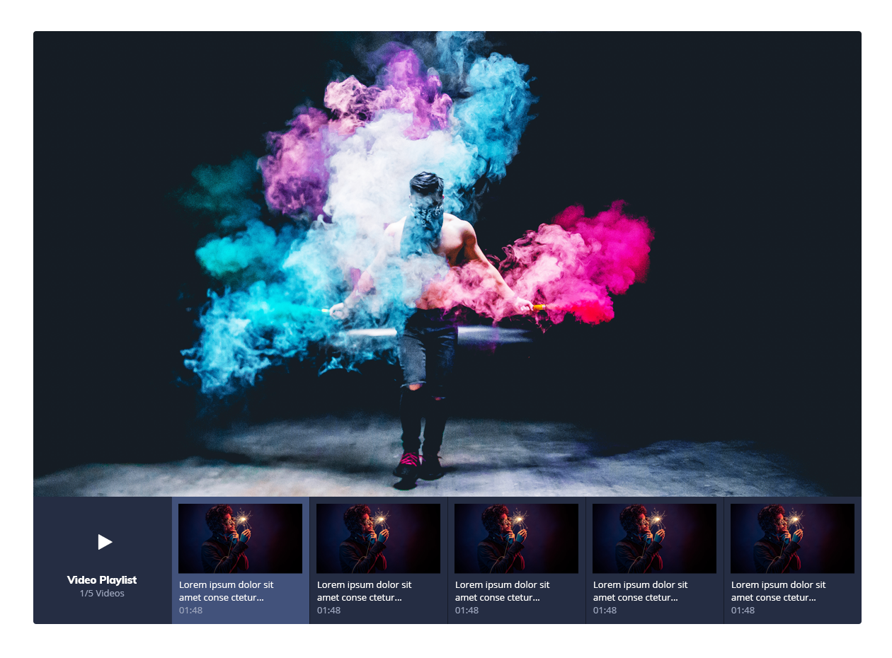
Video Playlist widget allows adding a video playlist to the web page built with Elementor live page builder. It is invaluable if you want to showcase the videos in a stylish way, arrange the playlist in a pixel-perfect layout, and change the style of the thumbnails, as well as scrollbar styles and thumbnail numbers or typography.
Video Playlist Widget Sample
On the picture below you can view Video Playlist module sample.
Content
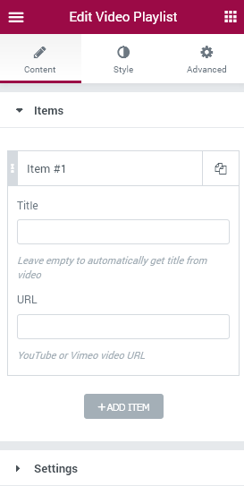
Items
- Add Item - click this button in order to add a new item to the playlist.
- Title - here you need to input the title of the video to show it in the playlist.
- URL - here you need to paste the video URL link in the corresponding field in order to display it in the playlist.
Settings
- Playlist Height - here you can input your preferable playlist height in pixels.
- Thumbnails Orientation - here you can change the video playlist thumbnails orientation from vertical to horizontal.
- Thumbnails Position - here you can change the thumbnail position in the playlist (left or right).
- Thumbnails List Width (%) - here you can drag the controls in order to change the thumbnails list width value.
- Show Thumbnails Heading - enable this option in order to display the thumbnails block heading.
- Heading Text - here you can input your custom text in the Thumbnails Heading block.
- Heading Icon - here you can select the ion to display it on the left from the thumbnail list title text.
- Show Videos Counter - enable this option in order to show how many videos are displayed from the whole playlist.
- Counter Suffix - here you can apply your custom text to show up as the custom counter suffix.
- Show Item Number and Status - enable this option in order to display the video number and status.
- Show Item Duration - enable this option in order to display the video duration.
Style
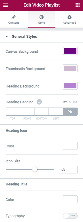
General Style
- Canvas Background - select the color using color picker tool in order to use it as the background color for the widget canvas.
- Thumbnails Background - select the preferable color to use it as a background for the video thumbnails list.
- Heading Background - here you can select the background color to use it for the video playlist heading.
- Heading Padding - here you can apply your custom padding in pixels for the widget heading.
- Color - here you can select the color to use it for the heading icon.
- Icon Size - here you can specify the needed size for the heading icon using the controls or input the size value in pixels.
- Color - here you can select the color to use it for the heading title.
- Typography - turn the option on to view the typography settings. They are similar to the typography settings of other JetBlog widgets.
- Color - here you can select the color to use it for the heading counter.
- Typography - turn the option on to view the typography settings. They are similar to the typography settings of other JetBlog widgets.
- Thumbnail Row Padding - here you can set the custom padding for the thumbnail row in pixels.
- Border Type - here you can define the type of the border you need to use for the element.
- Thumbnail Image Gap - here you can specify the custom gap which will stretch the distance between the video thumbnails and the video titles.
- Typography - turn the option on to view the typography settings. They are similar to the typography settings of other JetBlog widgets.
- Padding - here you can set the preferable custom padding for the title. Fill in the values for the top, bottom, right and left padding in pixels to apply your custom padding.
- Typography - turn the option on to view the typography settings. They are similar to the typography settings of other JetBlog widgets.
- Padding - here you can set the preferable custom padding for the video duration. Fill in the values for the top, bottom, right and left padding in pixels to apply your custom padding.
You can customize the appearance of the thumbnail styles using the Normal, Hover or Active mode. Just switch between the modes using the corresponding buttons.
- Title Color - here you can set the preferable color for the title.
- Duration Color - this option allows to set the color for the duration information.
- Background Type - in this block you can choose, whether you want to use classic or gradient type of the background. The customization options vary for each type.
- Typography - turn the option on to view the typography settings. They are similar to the typography settings of other JetBlog widgets.
- Margin - here you can apply your custom margins for the thumbnail numbers and status icons.
You can customize the appearance of the thumbnail numbers and status icons using the Normal, Hover* or Active mode. Just switch between the modes using the corresponding buttons.
- Font Color - define the color of the thumbnail numbers and status icons using color picker tool.
- Background Type - in this block you can choose, whether you want to use classic or gradient type of the background. The customization options vary for each type.
- Icon Size - here you can select the size of the icon in pixels.
- Box Size - here you can select the size of the box in pixels.
- Border Type - here you can define the type of the border you need to use for the border.
- Border Radius - here you can set the border radius to make the angles more smooth and round.
- Box Shadow - enable this option if you want to access the shadow advanced settings for this widget, and need to apply shadow for it.
These options currently work only in -webkit- browsers.
- Scrollbar Thumb - here you can change the color of the scrollbar thumb (the bar to scroll the playlist.
- Scrollbar Track - here you can change the color of the scrollbar area.
Advanced
In this block you can access advanced appearance settings for the widgets, define widget margins and padding, entrance animation, change the background for the whole widget, etc.
The Advanced settings of the Video Playlist widget are similar to the ones of the other JetBlog widgets.
Posts Navigation
Posts Navigation widget makes it possible to add the navigation arrows in order to make an easier navigation through the posts. It is specially created for using in the templates and archives in Elementor Pro v.2.0 and with CrocoBlock.
Content
General
The older posts link text - here you can change the text that will be shown as the link leading to the older posts.
The older posts link icon - in this block you can specify the icon to use for the older posts link.
The newer posts text - here you can change the text that will be shown as the link leading to the newer posts.
The newer posts link icon - in this block you can specify the icon to use for the newer posts link.
Style
Alignment - select the most preferable alignment for the navigation elements.
Select the Normal or Hover mode in order to change the background, text color and other properties when the navigation element is on hover.
Background Color - here you can set the specific color to use for the background using the color picker tool.
Text Color - here you can pick the color for the navigation item text using the color picker tool.
Typography - turn on the option on to view the typography settings. They are similar to the typography settings of other JetBlog modules.
Item Min Width - here you can set the minimal width of the items on different devices to make them look responsive.
Older link Padding - here you can specify the padding values for the navigation element for different devices.
Newer Link Padding - here you can specify the padding values for the navigation element for different devices.
Gap Between Items - here you can specify the precise gap width between the items.
Border Type - here you can select the border to apply it for the items.
Border Radius - set the border radius values to make the angles of the elements more smooth.
Prev / Next Icons
Select the Normal or Hover mode in order to change the background, icon color and other properties when the navigation element is on hover.
Background Color - here you can set the color to use it for the icon background.
Text Color - here you can specify the color to use it for the icon.
Dropdown Icon Size - use the control to set the icon size on different devices.
Icon Box Size - here you can set the size of the icon box for different devices.
Border Type - here you can set the border to use it for the icon.
Border Radius - here you can change the icon border radius to make its angles more smooth.
Gap Between Text and Icon - here you can set the specific gap value to use it to set the space between the text and the icon itself.
The Advanced settings of the Posts Navigation module are similar to the ones of the other JetBlog modules.
Posts Pagination
Posts Pagination widget makes it possible to add the pagination in order to make an easier navigation through the posts. It is specially created for using in the templates and archives in Elementor Pro v.2.0 and with CrocoBlock.
Content
Add the Previous and Next page links - enable this option in order to add the links to the widget.
The older posts link text - here you can change the text that will be shown as the link leading to the older posts.
The older posts link icon - in this block you can specify the icon to use for the older posts link.
The newer posts text - here you can change the text that will be shown as the link leading to the newer posts.
The newer posts link icon - in this block you can specify the icon to use for the newer posts link.
Style
Select the most preferable alignment for the pagination elements.
Select the Normal, Hover or Active mode in order to change the background, text color and other properties when the navigation element is on hover or active.
Background Color - here you can set the specific color to use for the background using the color picker tool.
Text Color - here you can pick the color for the pagination item text using the color picker tool.
Typography - turn the Typography option on to view the typography settings. They are similar to the typography settings of other JetBlog modules.
Item Min Width - here you can set the minimal width of the items on different devices to make them look responsive.
Padding - here you can specify the padding values for the pagination for different devices.
Gap Between Items - here you can specify the precise gap width between the items.
Border Type - here you can select the border to apply it for the items.
Border Radius - set the border radius values to make the angles of the elements more smooth.
Prev / Next Icons
Background Color - here you can set the specific color to use for the background of the icons using the color picker tool.
Text Color - here you can pick the color for the pagination items dots using the color picker tool.
Icon Box Size - here you can set the size of the icon box for different devices.
Border Type - here you can set the border to use it for the icon.
Border Radius - here you can change the icon border radius to make its angles more smooth.
Gap Between Text and Icon - here you can set the specific gap value to use it to set the space between the text and the icon itself.
The Advanced settings of the Posts Pagination module are similar to the ones of the other JetBlog modules.
