Hedday
Custom modules and extensions
Attention Some modules may not be included into your template package. This section describes configuration of all modules that are used in our templates. Each template pack is provided with a set of modules which is included into the design of this specific template.
JX Compare Product
This module allows you to compare products.
Product comparison as a feature allows comparing two, three or more products at a time.
Installation and Deleting
The module can be installed and deleted like any other PrestaShop module.
Module Settings
The main panel. Here you can set up the following options of the module:
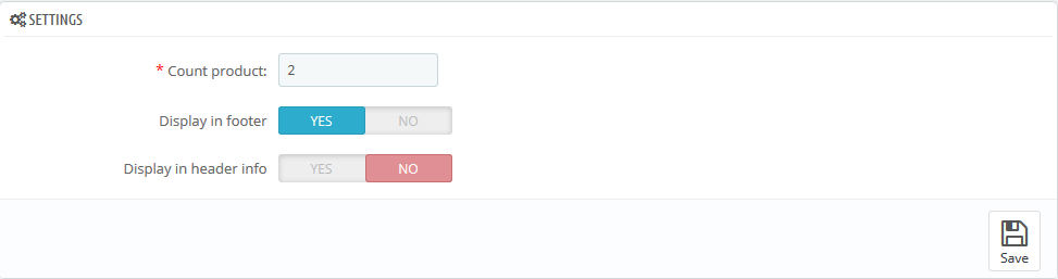
Count product - the amount of products to be compared.
Display in footer - the ability to display the feature in footer area.
Display in header info - the ability to display the feature in header area of the page.
JX Header Account 2.1.0
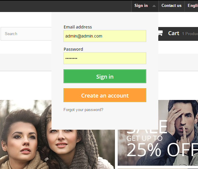
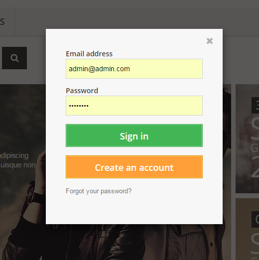
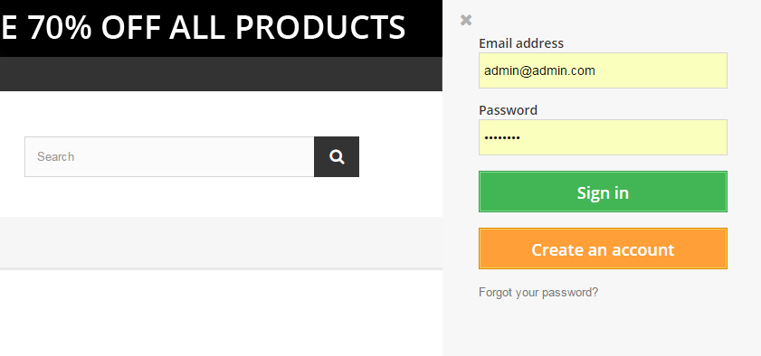
This module displays login and registration forms on the website. It can take the following positions: website header, left and right column. The module allows to log in and register using such social networks as Facebook, Google+ and VK, which is convenient for website users. Registration or logging in proceeds without reloading the page.
The module is compliant with official PrestaShop General Data Protection Regulation (GDPR) module, a new EU legal framework that governs how users' personal data is used.
JX Header Account Main Panel
The main panel. Here you can set up the module.
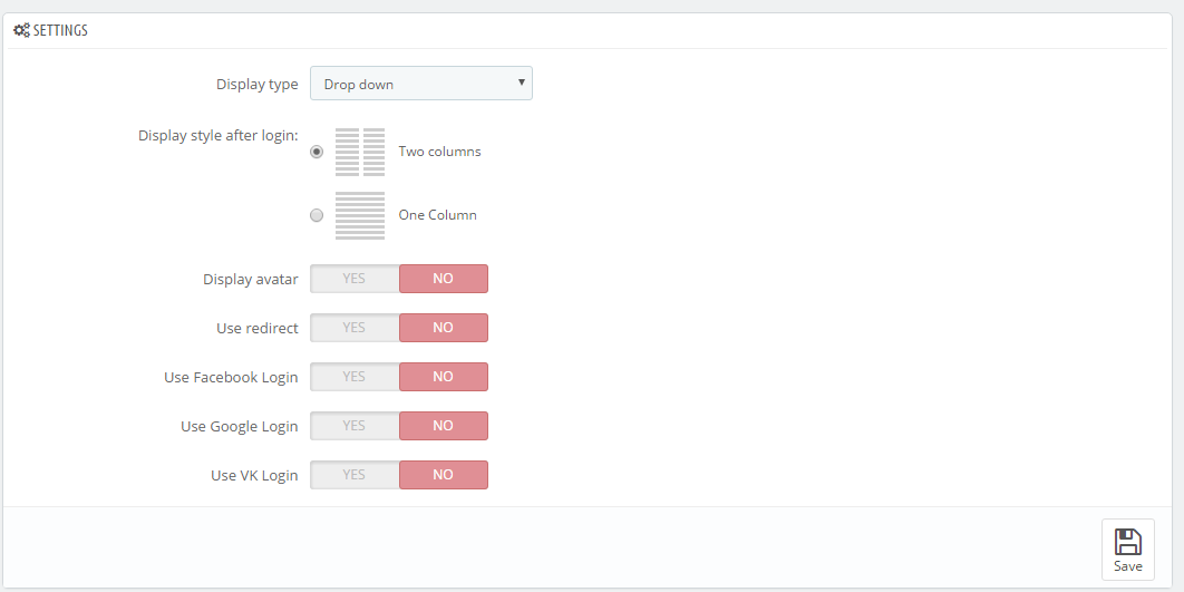
Settings
There are the following settings in the module:
Display type - this setting allows to select the way to display the registration form. It can take the following values:
- Drop-down - the form will display as a drop-down below the button opening it.
- Popup - the form will appear in a pop-up.
- Left side - the form will appear from the left as a sidebar.
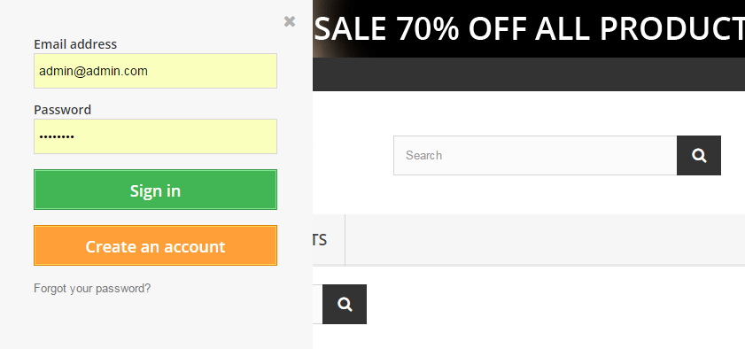
- Right side - the form will appear from the right as a sidebar.
- Drop-down - the form will display as a drop-down below the button opening it.
Display style after login - this setting allows to change the form view after login/registration. You can use the following values:
- Two columns - the list is divided into two columns.
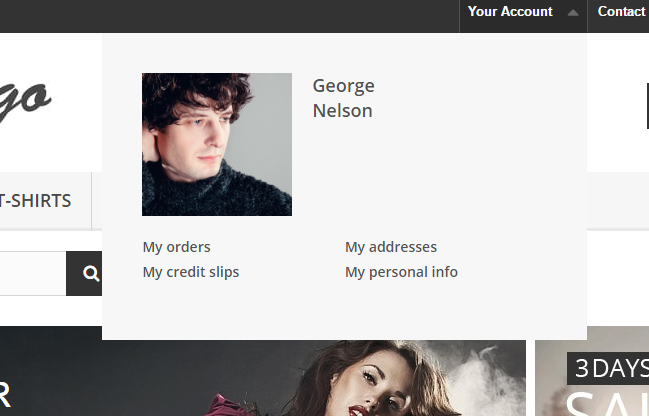
- One Column - the list of links is displayed as one column.
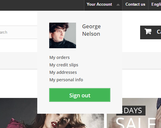
- Two columns - the list is divided into two columns.
- Default avatar - this field appears only if the 'Display avatar' option is enabled. Here you can select the default user avatar.
- Display avatar - this setting allows to enable or disable user avatar. If the user logs in to the account on the website with the help of one of the social networks, the avatar will be taken from the account in this social network, otherwise, the avatar, loaded by the website admin, will be displayed.
- Use redirect - if this setting is enabled, user registration and password recovery will take place on the default PrestaShop registration/password recovery page.
Use Facebook Login - this setting allows enabling user registration and login with the help of the Facebook social network. When you enable this option, you will see the following settings:
- App ID - your account App ID from the Facebook developer account.
- App Secret - your app secret from the Facebook developer account.
Use Google Login - this setting allows enabling user login and registration with the help of the Google+ social network. If you enable this option, you will see the following settings:
- App ID - your App id from the Google developer account.
- App Secret - your App secret from the Google developer account.
- Redirect URLs - your online-store url + index.php?fc=module&module=jxheaderaccount&controller=googlelogin
Use VK Login - this setting allows enabling user registration and login with the help of VK social network. If you enable this option, you will see the following settings:
- App ID - your App id from your VK developer account.
- App Secret - App secret from your VK developer account.
- Redirect URLs - your online-store url + index.php?fc=module&module=jxheaderaccount&controller=vk
Registering apps in social networks:
- Facebook - to get App ID and App Secret, register your app at https://developers.facebook.com/apps.
You may check the following tutorial in order to learn how to create Facebook developer account and get App ID and App Secret values.
- Google+ - to get App ID and App Secret, register your app at https://developers.google.com/accounts/docs/OAuth2/.
- VK - to get App ID and App Secret register your app at https://vk.com/dev.
JX Mega Layout 1.5.0
The module allows building multiple homepage layouts (presets) for hooks. This module advantage is allowing you to create different hook markups and modify them up to your needs.
Module requirements
PrestaShop 1.7+
PHP 5.4+
Hooks
The module has 5 hooks available by default:
- 'Header' is a hook that combines such standard hooks: displayTop, displayNav, displayNav1, displayNav2. This hook corresponds to the website header.
- 'Top Column' corresponds to the displayTopColumn and displayNavFullWidth hooks. This hook comes right after the Header hook.
- 'Home' corresponds to such hooks: displayHome, displayWrapperTop, displayWrapperBottom, displayContentWrapperTop, displayLeftColumn, displayRightColumn. This hook is present only on the main page.
- 'Footer' corresponds to the displayFooterBefore, displayFooter and displayFooterAfter hooks.
- 'Product Footer' corresponds to the original displayFooterProduct hook, which is displayed in product page footer.
Integrating module to the theme
Integrating module to the THIRD-PARTY theme your presets won't be displayed at the frontend without this step.
NOTE: for third-party sources only if JX Mega Layout module is not included by default. The codes below have already been integrated into ZEMEZ template.
Header. In order to add custom preset to the Header hook, you need to perform the following steps:
- Open the /templates/_partials/header.tpl file for editing.
- Locate the following code:
{block name='header_banner'} <div class="header-banner"> {hook h='displayBanner'} </div> {/block} {block name='header_nav'} <nav class="header-nav"> <div class="container"> <div class="row"> <div class="hidden-sm-down"> <div class="col-md-5 col-xs-12"> {hook h='displayNav1'} </div> <div class="col-md-7 right-nav"> {hook h='displayNav2'} </div> </div> <div class="hidden-md-up text-sm-center mobile"> <div class="float-xs-left" id="menu-icon"> <i class="material-icons d-inline"></i> </div> <div class="float-xs-right" id="_mobile_cart"></div> <div class="float-xs-right" id="_mobile_user_info"></div> <div class="top-logo" id="_mobile_logo"></div> <div class="clearfix"></div> </div> </div> </div> </nav> {/block} {block name='header_top'} <div class="header-top"> <div class="container"> <div class="row"> <div class="col-md-2 hidden-sm-down" id="_desktop_logo"> <a href="{$urls.base_url}"> <img class="logo img-responsive" src="{$shop.logo}" alt="{$shop.name}"> </a> </div> <div class="col-md-10 col-sm-12 position-static"> {hook h='displayTop'} <div class="clearfix"> </div> </div> </div> <div id="mobile_top_menu_wrapper" class="row hidden-md-up" style="display:none;"> <div class="js-top-menu mobile" id="_mobile_top_menu"> </div> <div class="js-top-menu-bottom"> <div id="_mobile_currency_selector"></div> <div id="_mobile_language_selector"></div> <div id="_mobile_contact_link"></div> </div> </div> </div> </div> {hook h='displayNavFullWidth'} {/block} - And replace it with:
{assign var='displayMegaHeader' value={hook h='jxMegaLayoutHeader'}} {if $displayMegaHeader} {$displayMegaHeader nofilter} {else} {block name='header_banner'} <div class="header-banner"> {hook h='displayBanner'} </div> {/block} {block name='header_nav'} <nav class="header-nav"> <div class="container"> <div class="row"> <div class="hidden-sm-down"> <div class="col-md-5 col-xs-12"> {hook h='displayNav1'} </div> <div class="col-md-7 right-nav"> {hook h='displayNav2'} </div> </div> <div class="hidden-md-up text-sm-center mobile"> <div class="float-xs-left" id="menu-icon"> <i class="material-icons d-inline"> </i> </div> <div class="float-xs-right" id="_mobile_cart"></div> <div class="float-xs-right" id="_mobile_user_info"></div> <div class="top-logo" id="_mobile_logo"></div> <div class="clearfix"></div> </div> </div> </div> </nav> {/block} {block name='header_top'} <div class="header-top"> <div class="container"> <div class="row"> <div class="col-md-2 hidden-sm-down" id="_desktop_logo"> <a href="{$urls.base_url}"> <img class="logo img-responsive" src="{$shop.logo}" alt="{$shop.name}"> </a> </div> <div class="col-md-10 col-sm-12 position-static"> {hook h='displayTop'} <div class="clearfix"></div> </div> </div> <div id="mobile_top_menu_wrapper" class="row hidden-md-up" style="display:none;"> <div class="js-top-menu mobile" id="_mobile_top_menu"></div> <div class="js-top-menu-bottom"> <div id="_mobile_currency_selector"></div> <div id="_mobile_language_selector"></div> <div id="_mobile_contact_link"></div> </div> </div> </div> </div> {hook h='displayNavFullWidth'} {/block} {/if}
Top column. In order to add custom preset to the topColumn hook, you need to perform the following steps:
- Open the /templates/_partials/header.tpl file for editing.
- Locate the following code
{hook h="displayNavFullWidth"} - And replace it with:
    {assign var='displayMegaTopColumn' value={hook h='jxMegaLayoutTopColumn'}}
        {if $displayMegaTopColumn}
            {$displayMegaTopColumn nofilter}
             {/if}
Home. In order to add custom preset to the Home hook, you need to perform the following steps:
- Open the /templates/layouts/layout-both-columns.tpl file for editing.
- Locate the following code:
<section id="wrapper"> {hook h="displayWrapperTop"} <div class="container"> {block name="breadcrumb"} {include file='_partials/breadcrumb.tpl'} {/block} {block name="left_column"} <div id="left-column" class="col-xs-12 col-sm-4 col-md-3"> {if $page.page_name == 'product'} {hook h='displayLeftColumnProduct'} {else} {hook h="displayLeftColumn"} {/if} </div> {/block} {block name="content_wrapper"} <div id="content-wrapper" class="left-column right-column col-sm-4 col-md-6"> {hook h="displayContentWrapperTop"} {block name="content"} <p> Hello world! This is HTML5 Boilerplate.</p> {/block} {hook h="displayContentWrapperBottom"} </div> {/block} {block name="right_column"} <div id="right-column" class="col-xs-12 col-sm-4 col-md-3"> {if $page.page_name == 'product'} {hook h='displayRightColumnProduct'} {else} {hook h="displayRightColumn"} {/if} </div> {/block} </div> {hook h="display wrapperBottom"} </section> - And replace it with:
    <section id="wrapper">
      {assign var='displayMegaHome' value={hook h='jxMegaLayoutHome'}}
       {if $page.page_name == 'index' && $displayMegaHome}
       {$displayMegaHome nofilter}
      {else}

       {hook h="displayWrapperTop"}
       <div class="container">
       {block name="breadcrumb"}
        {include file='_partials/breadcrumb.tpl'}
       {/block}

       {block name="left_column"}
        <div id="left-column" class="col-xs-12 col-sm-4 col-md-3">
        {if $page.page_name == 'product'}
         {hook h='displayLeftColumnProduct'}
       {else}
         {hook h="displayLeftColumn"}
       {/if}
       </div>
       {/block}

       {block name="content_wrapper"}
         <div id="content-wrapper" class="left-column right-column col-sm-4 col-md-6">
         {hook h="displayContentWrapperTop"}
         {block name="content"}
           <p>Hello world! This is HTML5 Boilerplate.</p>
       {/block}
         {hook h="displayContentWrapperBottom"}
        </div>
       {/block}

       {block name="right_column"}
         <div id="right-column" class="col-xs-12 col-sm-4 col-md-3">
         {if $page.page_name == 'product'}
           {hook h='displayRightColumnProduct'}
         {else}
           {hook h="displayRightColumn"}
         {/if}
        </div>
        {/block}
      </div>
        {hook h="displayWrapperBottom"}
      {/if}
  </section>
Footer. In order to add custom preset to the Footer hook, you need to perform the following steps:
- Open the /templates/layouts/layout-both-columns.tpl file for editing.
- Locate the following code:
{block name="footer"} {include file="_partials/footer.tpl"} {/block} - And replace it with:
  {assign var='displayMegaFooter' value={hook h='jxMegaLayoutFooter'}}
{if $displayMegaFooter}
{$displayMegaFooter nofilter}
{else}
<div class="container">
{block name="footer"}
{include file="_partials/footer.tpl"}
{/block}
</div>
{/if}
Product footer. In order to add custom preset to the Product footer hook, you need to perform the following steps:
- Open the /templates/catalog/product.tpl file for editing.
- Locate the following code:
{block name='product_footer'} {hook h='displayFooterProduct' product=$product category=$category} {/block} - And replace it with:
 {block name='product_footer'}
   {assign var='displayMegaProductFooter' value={hook h='jxMegaLayoutProductFooter' product=$product category=$category}}
   {if $displayMegaProductFooter}
    {$displayMegaProductFooter nofilter}
  {else}
    {hook h='displayFooterProduct' product=$product category=$category}
   {/if}
  {/block}
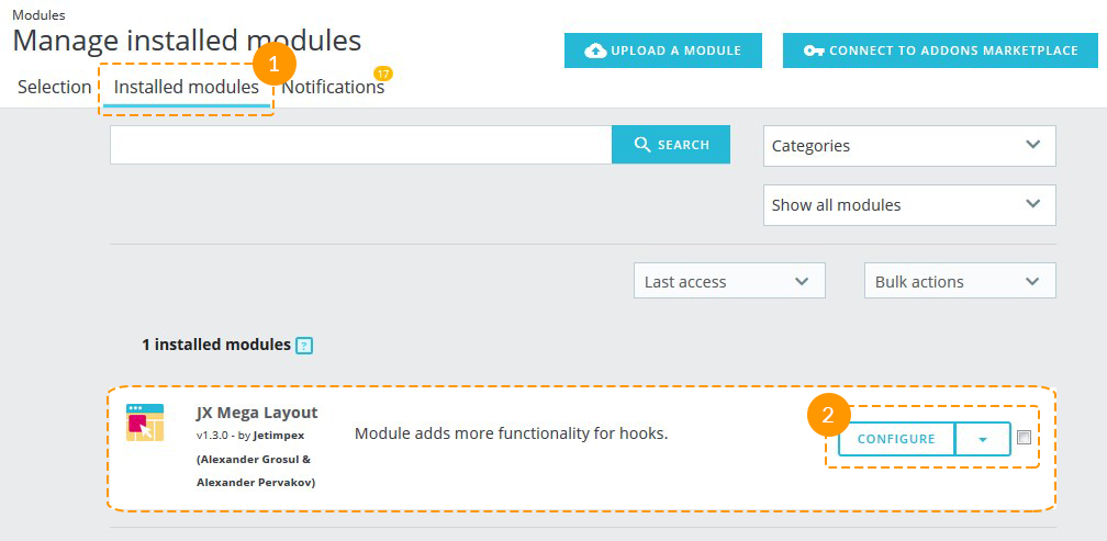
Module configuration
After JX Mega Layout module installation, you can configure it by clicking the Configure button (2).
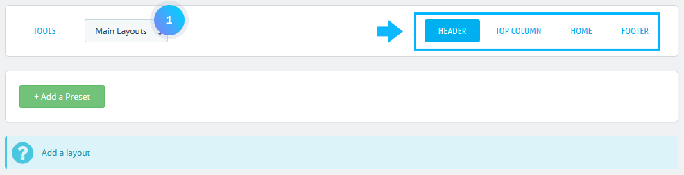
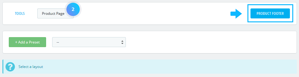
JX Mega Layout Main Panel
Main Layouts
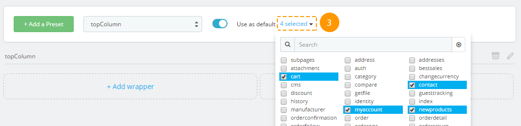
On the main JX Mega Layout module configuration page you are allowed to create Main Layouts and Product Page, add a preset to the required hook and configure it correspondingly.
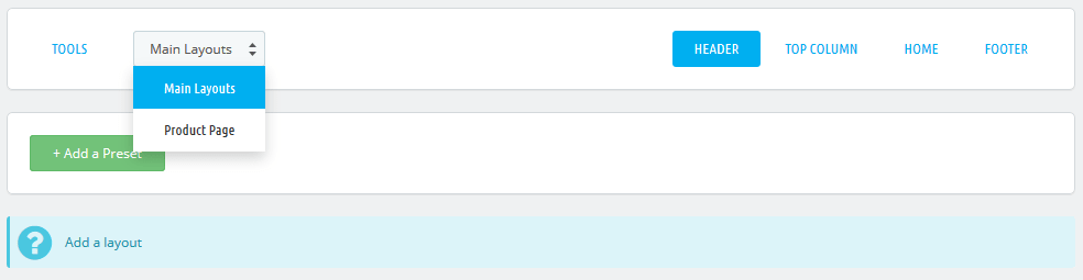
In Main Layouts, four hooks are available: Header, Top Column, Home, Footer.
In Product Page - Product Footer hook is available.
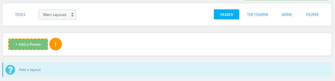
Adding the preset
-
Press '+ Add a Preset' (1) in the needed tab.
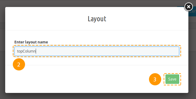
-
Next, fill in the 'Enter layout name' field in the popup typing the new preset (2) title there and press 'Save' (3).
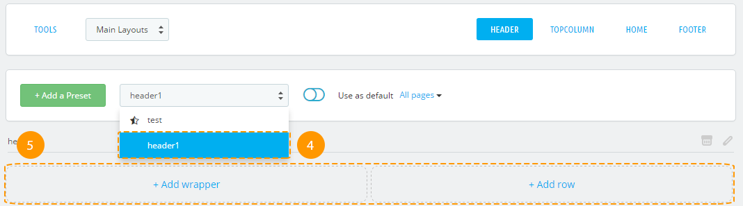
-
Preset was successfully created, it's listed among the available presets (4) now. Newly created preset is selected for editing (5).
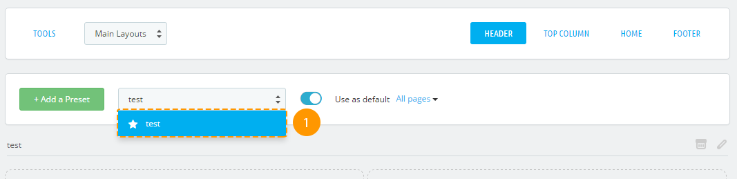
Preset activation
-
First of all, select the needed preset from the list (1).
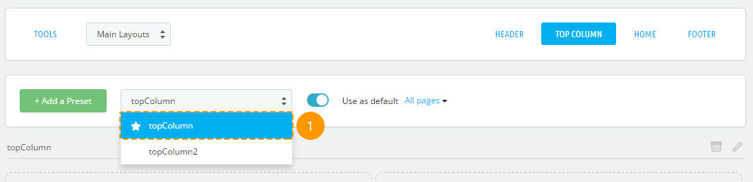
-
Press the 'Use as default' (2) switcher.

-
The preset was activated. If you need to display this preset only on some pages, open the drop-down (3) and select the pages you need. To apply changes, click outside the list area. A preset that is displayed on all pages will be marked with a filled star in the presets list, and the one that is displayed only on some pages will be marked with a partially filled star.
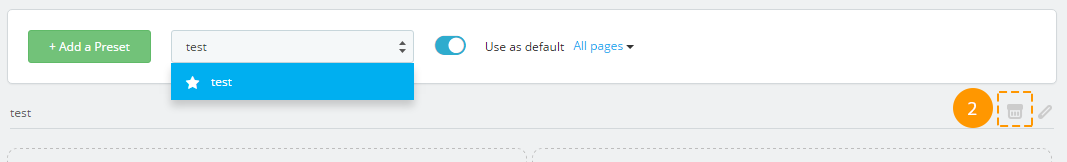
Removing the preset
There is no option to restore the preset after removing.
-
In order to remove the preset, choose the required preset among the list (1).

-
Next, press a cart (2) near the preset title.
-
Preset was successfully removed.
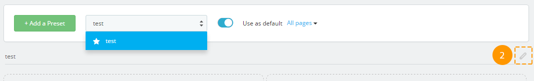
Renaming the preset
-
In order to rename the preset, choose the required preset among the list (1).
-
Next, press a pencil icon (2) next to the preset title.
-
Specify the new preset title (3) in a popup and press 'Rename layout' (4).
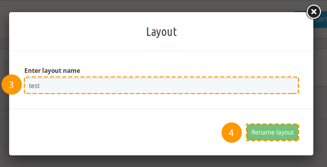
-
Preset was successfully renamed.
Wrapper
Wrapper has no class by default, it's not a mandatory item.
Adding the wrapper
-
In order to create a wrapper, press '+ Add wrapper' (1).
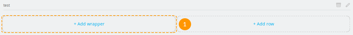
-
Wrapper was added (2).
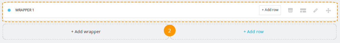
Adding the custom CSS class to the wrapper
Adding the custom class will let you create a specific styling for your wrapper by using CSS rules.
-
In order to add wrapper class, press the button (1).

-
You'll see a pop-up window, fill in the 'Enter wrapper classes' (2) field there and press a 'Confirm' (3) button.
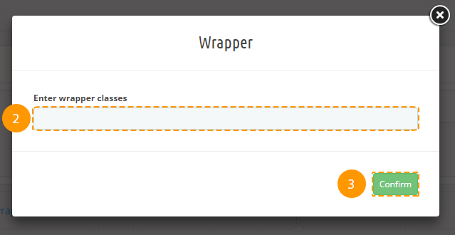
-
Custom class was added successfully.
Deleting the wrapper
Deleting the preset item will also cause all of its child items and their styles removing.
-
In order to remove the wrapper, press the cart button (1).

-
Wrapper was removed successfully.
Styling the wrapper
-
In order to add custom styles to the wrapper, press the 'pencil' (1) icon in the wrapper block.

-
In the following pop-up window fill in all the needed fields (you may refer to the documentation 'Styling' section), and press 'Save' (2) button.

-
If all the fields are filled in correctly, styles will be saved.
Row
Row item from the Bootstrap grid. It's a required item.
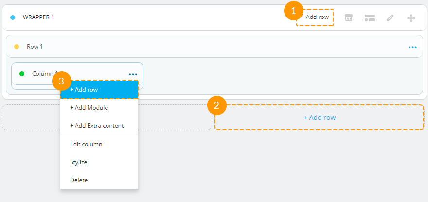
Adding the row
-
In order to insert a new row, press '+ Add row' (1) into the wrapper block, or '+ Add row' (2) in the main preset block, or '+ Add row' (3) in the column drop-down list.
-
The row was added successfully.
Adding custom CSS class to the row
Custom class adding allows you to create custom row styling using CSS rules.
-
In order to add the class to the row, you should press the 'ellipsis' button (1).

-
Choose the 'Edit row' (2) in a drop-down list.
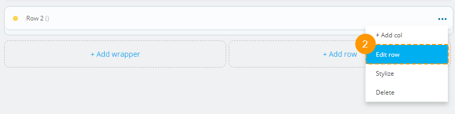
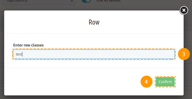
-
Fill in the 'Enter row classes' (3) field in the pop-up window and press 'Confirm' (4) button.
-
Custom class was added successfully.
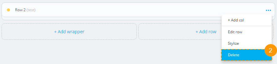
Deleting the row
Removal of preset item will also cause removal of its child items and their styles.
-
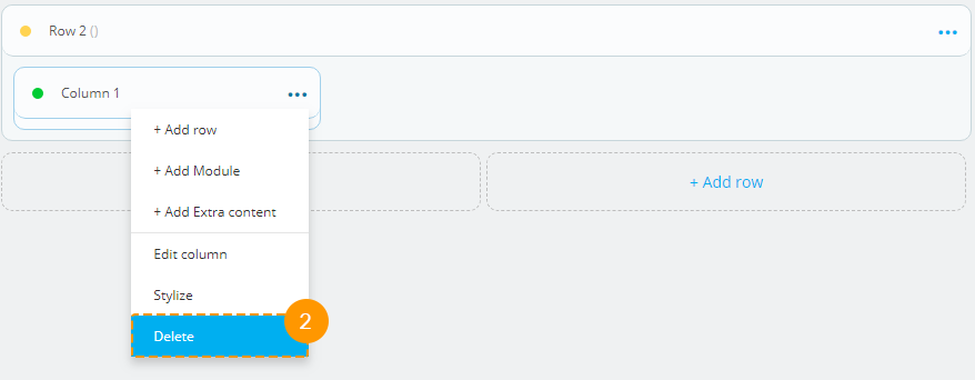
In order to remove the row, open the menu (the 'ellipsis' icon) in the row block.

-
Choose 'Delete' (2) option in the drop-down.
-
The row was successfully removed.
Adding styles to the row
-
In order to add row styles, open the menu (the 'ellipsis' icon) (1) in a row block.
-
Press 'Stylize' (2) in the drop-down.
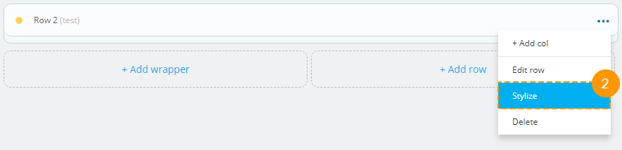
-
You will see the pop-up window, fill in all the needed fields there (you may refer to the documentation 'Styling' section) and press 'Save' (3) button.
-
If all the fields are filled in correctly, styles will be saved.
Column
It is an item with configurable block width for different dimensions, based on Bootstrap grid.
Adding the column
-
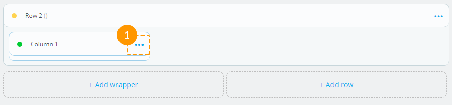
In order to insert a column into a needed 'row', open the menu (the 'ellipsis' icon) (1)
-
Choose the '+ Add Col' (2) among the list.
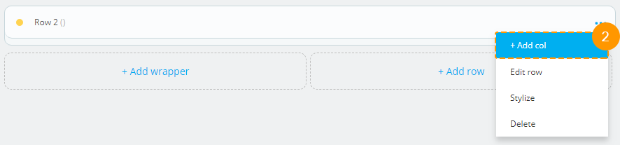
-
Fill in the fields (col*, col-sm*, col-md*, col-lg*, col-xl*, col-xxl* - in accordance with bootstrap 4 requirements) in the pop-up window and press 'Confirm' (3) button.
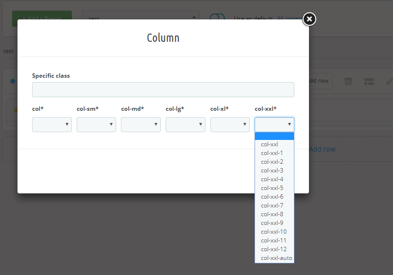
-
The column was added successfully.
Removing the column
Preset item removing will also cause its child items and their styles deleting.
-
In order to remove the column, open the menu (the 'ellipsis' icon) in a column block (1)

-
Press 'Delete' (2) in the list.
-
The column and all of its child items were removed.
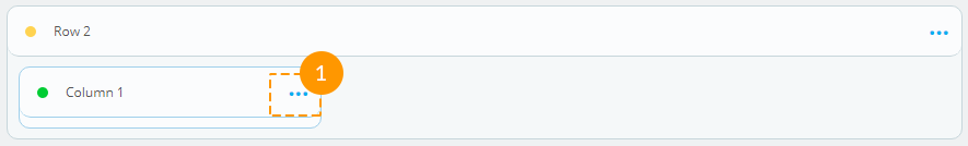
Editing the column
-
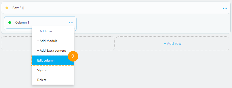
In order to edit the column, open the menu (the 'ellipsis' icon) (1) in the column block.
-
Press 'Edit column' (2) in the list.
-
Fill in the fields (col*, col-sm*, col-md*, col-lg*, col-xl*, col-xxl* - in accordance with bootstrap 4 requirements) in the pop-up window and press 'Confirm'.
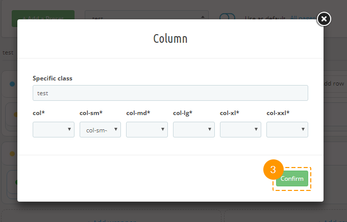
-
The column was successfully edited.
Adding styles to the column
-
In order to add column styles, open the menu (the 'ellipsis' icon) (1) in a column block.
-
Press 'Stylize' (2) in the list of options.
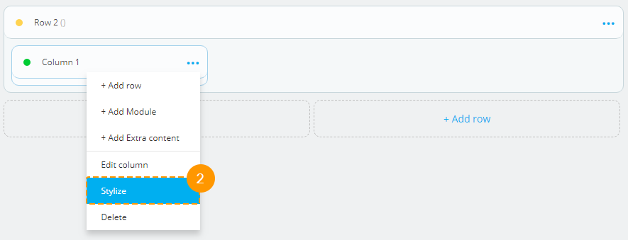
-
You will see the pop-up window, fill in all the needed fields there (you may refer to the documentation 'Styling' section) and press 'Save' (3) button.
-
If all the fields are filled in correctly, styles will be saved.
Module
Module assigned to this hook.
Adding the module
Be careful when adding modules to the preset, some modules are desirable to use if they do not change the visible layout, e.g., 'Data mining for statistics' module.
-
In order to add the module to the preset in a column block, open the menu (the 'ellipsis' icon) (1).
-
Press the '+ Add Module' (2) in the list of options available.
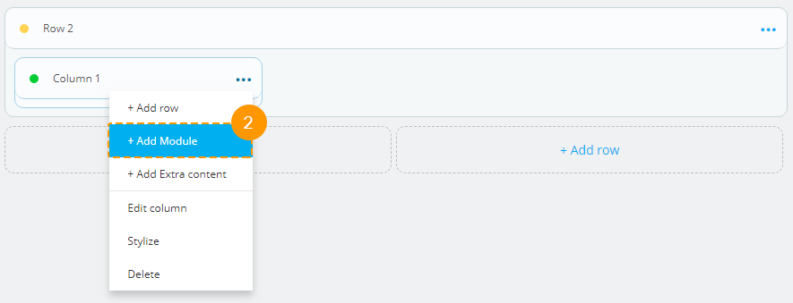
-
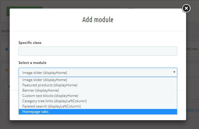
If needed, you can enter the custom class (3) in the pop-up window and select the module (4), next press 'Confirm' (5).
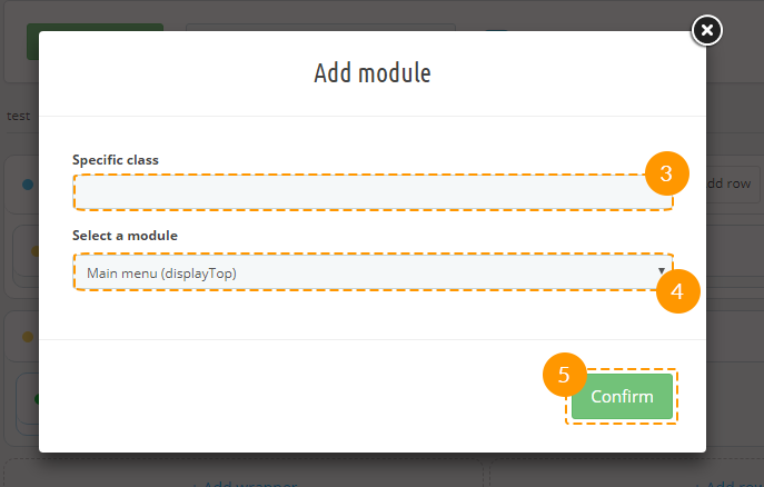
-
The module was successfully added.
-
In this version of JX Mega Layout you can add 'Homepage tabs' module in Home hook.
It can also be customized like all other modules in Mega Layout.
Deleting the module
Removal of preset item will also cause removal of its child items and their styles.
-
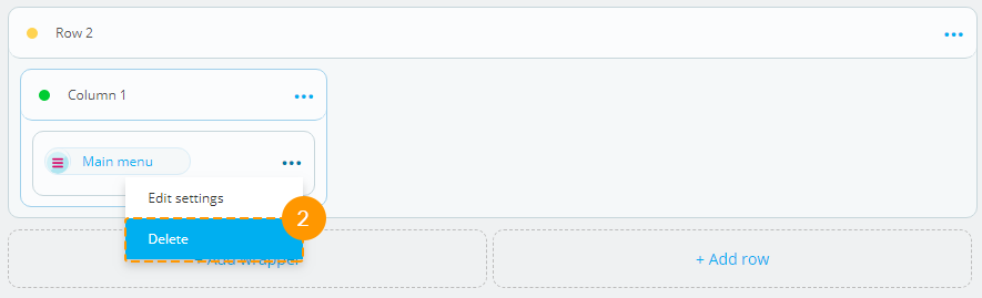
In order to remove the module, open the menu (the 'ellipsis' icon) (1) in the module block.
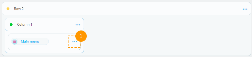
-
Press 'Delete' (2) in the list of options available.
-
The module is removed.
Adding custom class to the module
Custom class adding allows to create module styling using CSS rules.
-
In order to specify custom class for the module, open the menu in the module block (the 'ellipsis' icon) (1).
-
Press 'Edit Settings' (2) then.
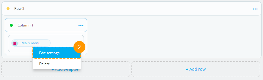
-
Specify custom class (3) in the pop-up window and press 'Confirm' (4) button.
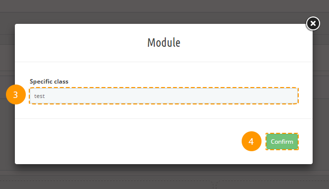
-
Custom class was added.
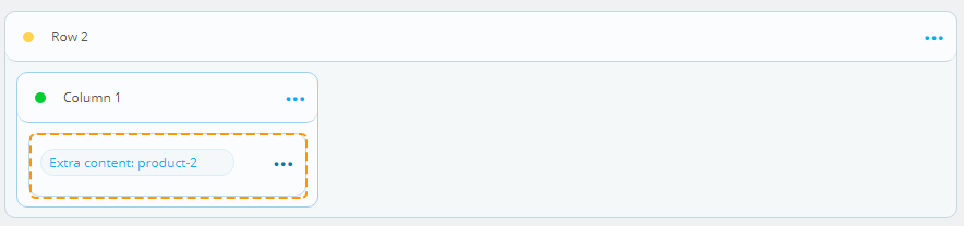
Extra content
Additional custom content in any position.
Adding extra content
-
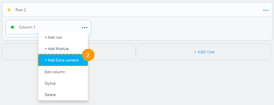
In order to add extra content in a column block, open the menu (the 'ellipsis'icon) (1).
-
Press 'Add Extra content' (2).
-
The pop-up window will appear. Specify the custom class (3), if needed. You need to select the content type (product or post) (4) and identify product ID number (5). Press 'Confirm' (6) button.
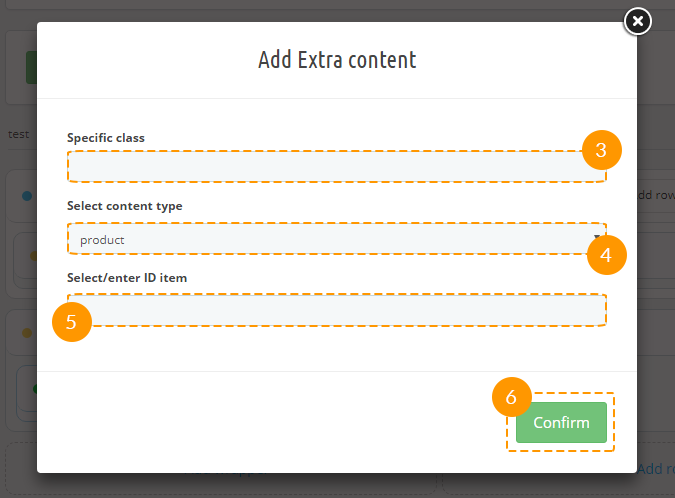
-
Extra content was successfully added.
Deleting extra content
-
To remove the extra content, open the menu (the 'ellipsis' icon) (1) in the corresponding block.
-
Press 'Delete' (2) button.

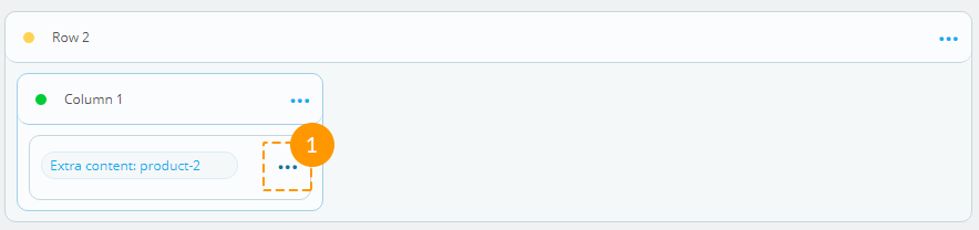
Adding custom class to the extra content
-
In order to add the custom class for the extra content, open the menu in the corresponding block (the 'ellipsis' icon) (1).
-
Press 'Edit settings' (2) button.
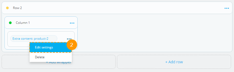
-
Specify the custom class in the appeared pop-up window. Press 'Confirm' button.
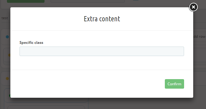
- Custom CSS class was added.
Logo, Copyright
Logo and Copyright blocks are edited the same way as modules, except for the fact that Logo can be placed only in Header or Footer position, and the Copyright block can be placed only in Footer position.
Presets export
Export tool allows you to export presets for the further import into different shops.
-
Navigate to the 'Tools' (1) tab in the main configurations panel.
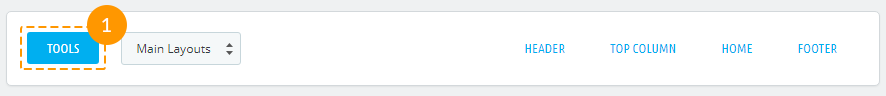
-
Choose 'Export' (2) in the form.
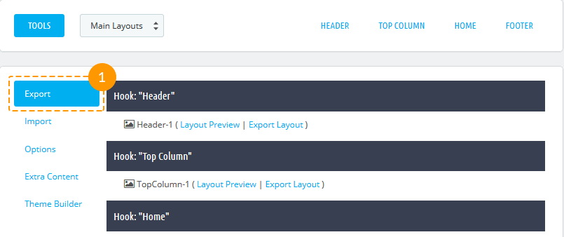
-
You'll see the list of the existing presets in site hooks.
-
In order to preview the preset, press 'Layout preview' (3) button next to the preset you need, in order to export, please press 'Export layout' (4) button.

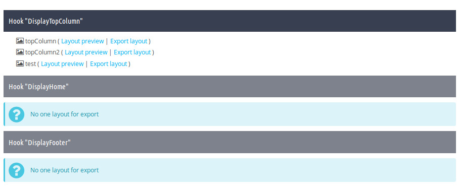
-
Then you'll be able to download this preset as a zip archive.
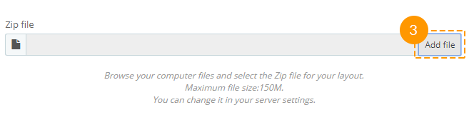
Preset import
Import tool accepts only the presets *.zip files that were previously generated with the same module Export tool.
-
In order to import your preset, you should open the Tools (1) tab and choose 'Import' (2).
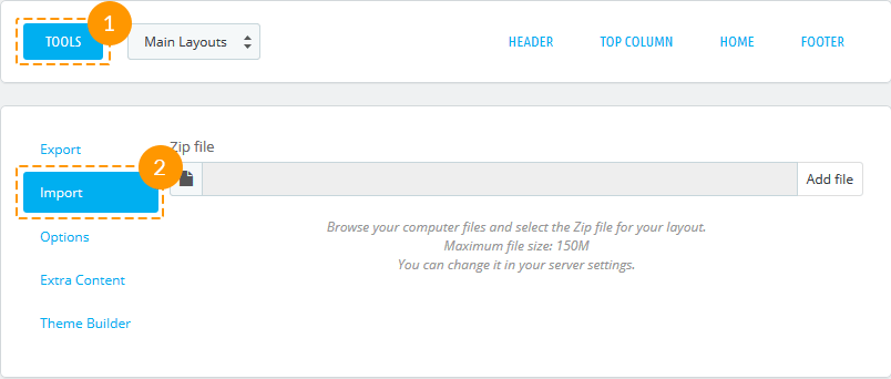
-
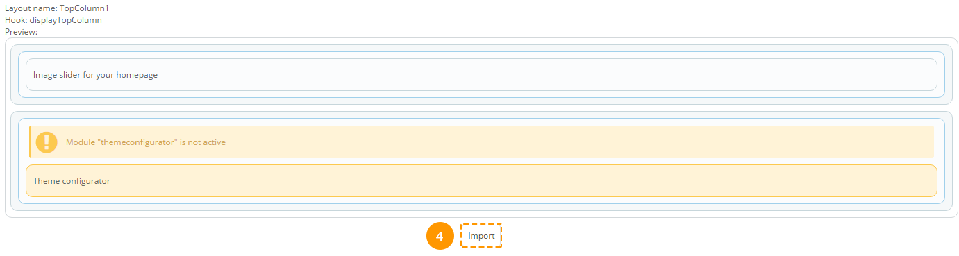
Next, press the Add file (3) button and select the zip file of your exported preset. In case this archive is the exported preset, you will see this preset preview.
-
If this preset meets your needs, press 'Import' (4). The preset will be imported and added to the list of available presets.
Reset
'Reset' reverts all the presets to initial state (to the way they came with the template), and discards all the created presets.
Attention! After reverting presets to default state, all the custom presets will be discarded!
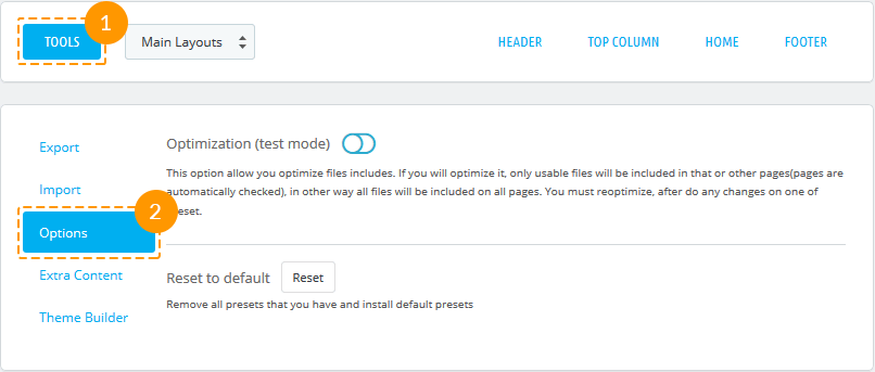
-
To reset presets, navigate to the 'Tools' (1) tab. In the appeared block open the 'Options' (2) tab.
-
Press the 'Reset' button.
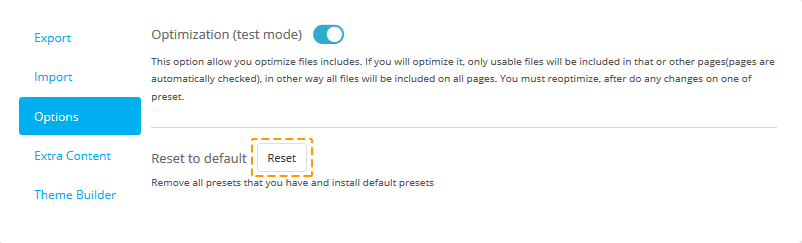
-
That's it! All presets are reset to initial state.
Styles and Scripts Optimization
Styles and scripts optimization adds exclusions for modules in Header section, based on their use in presets. This allows speeding up the page loading speed. Optimization works in test mode.
Enabling optimization:
-
To enable optimization, open the 'Tools' (1) tab and select the 'Options' (2) tab.
-
In the appeared window, you can enable optimization (3).
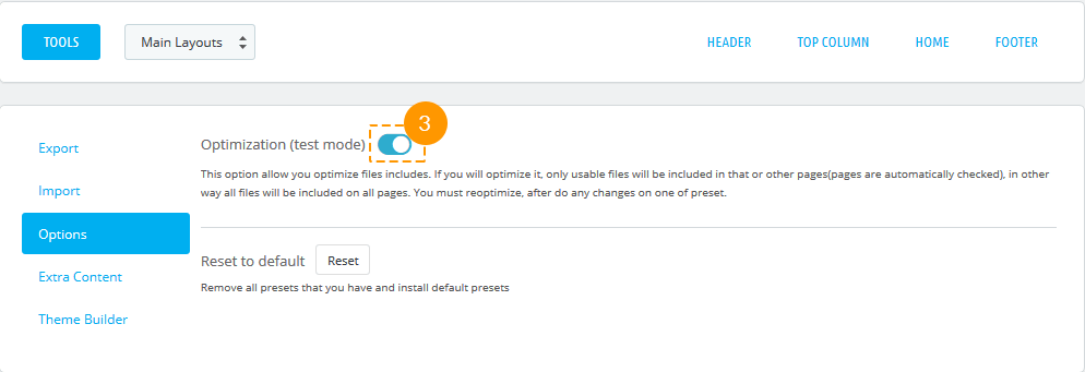
If optimization is enabled when editing and enabling presets, optimization gets discarded, but you'll see a window offering to run optimization. There is no need to optimize scripts and styles every time you change presets. It's better to optimize them when you're done editing.

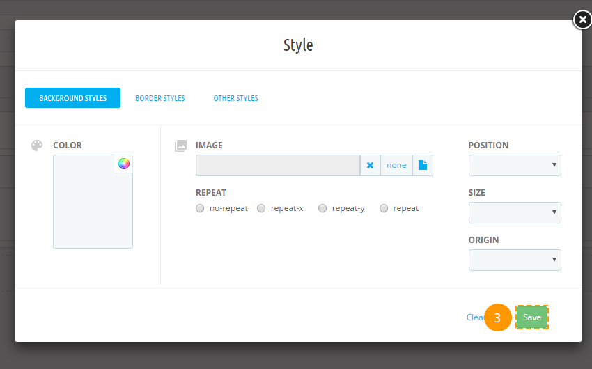
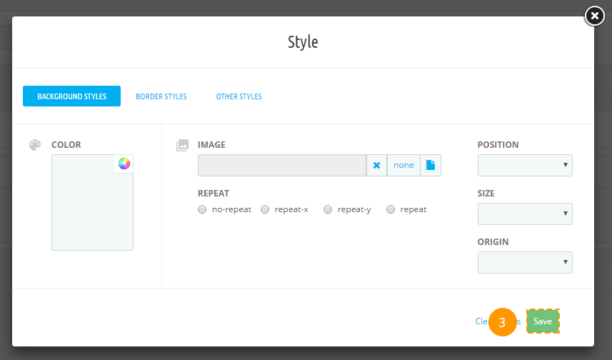
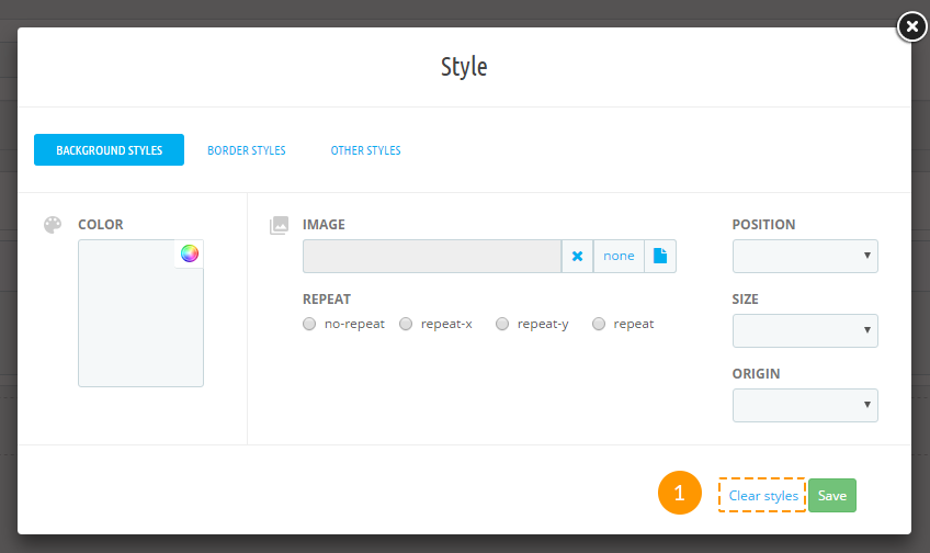
Styling
-
Background styles. Fields description:
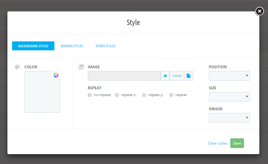
- background-image (background image) - the image URL or 'none' value. The image is picked from the ~/images/cms/ folder.
- background-color (background color) - the value can be set in any color format (rgb, hex, etc.). You can choose the color using the Color Picker tool.
- background-repeat (background repeat) - all the available options are listed in the radio buttons.
- background-position (background position) - all the available options are listed in the drop-down.
- background-size (background size) - all the available options are listed in the drop-down.
- background-origin (background image positioning region) - all the available options are listed in the drop-down.
Border styles.
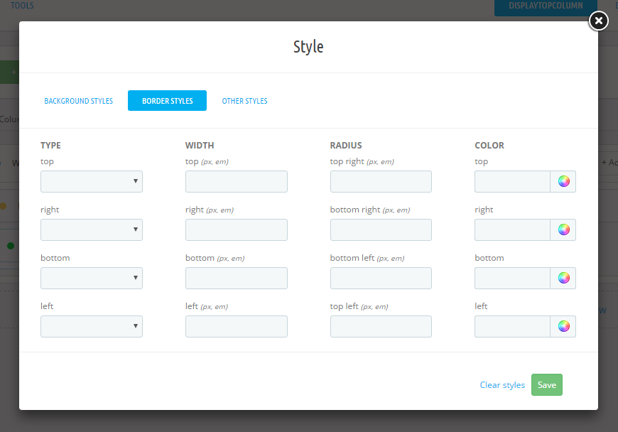
- border-top-style, border-right-style, border-left-style, border-bottom-style (border styles) - all the available options are listed in the drop-down.
- border-top-width, border-right-width, border-left-width, border-bottom-width (borders width) - should be set in pixels.
- border-top-сolor, border-right-color, border-left-color, border-bottom-color (borders color) - the value can be set in any color format (rgb, hex, etc.). You can choose the color using the Color Picker Tool.
- border-top-right-radius, border-top-left-radius, border-bottom-right-radius, border-bottom-left-radius (border radius) - should be set in pixels.
Other styles.
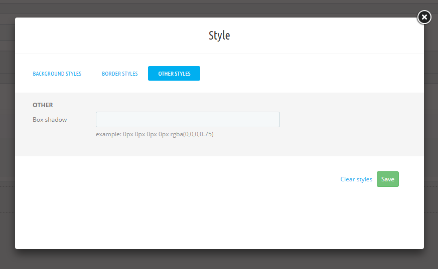
- box-shadow (box shadow) - example:0px 0px 0px 0px rgba(0,0,0,0.75).
Items styles removing
-
In order to remove items styles, open the items styling section and press 'Clear styles' (1)
Extra content
On the module base there is the ability to create one of the available content types (HTML block, Banner block, YouTube block or Slider block) blocks and, also, output the products or posts as slides. You can also Export all the extra content you have created in one click only or import it from your computer.
-
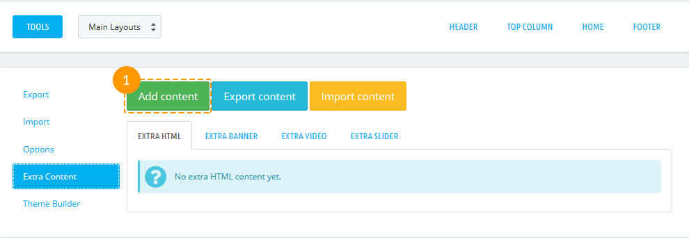
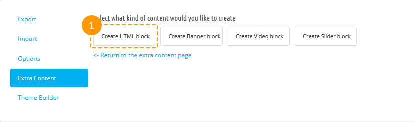
In order to add extra content, you should open the Tools (1) tab and choose 'Extra content' (2.)
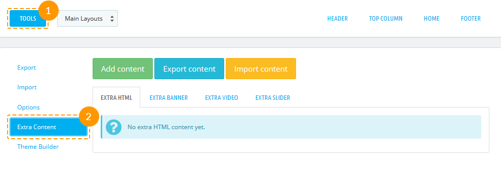
-
Press 'Add content' button.
-
There are 4 available types of content that you can create: HTML block, Banner block, Video block, Slider block.
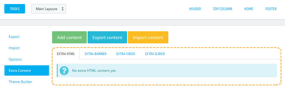
Extra HTML content
-
To create extra HTML content, press 'Create HTML block' tab.
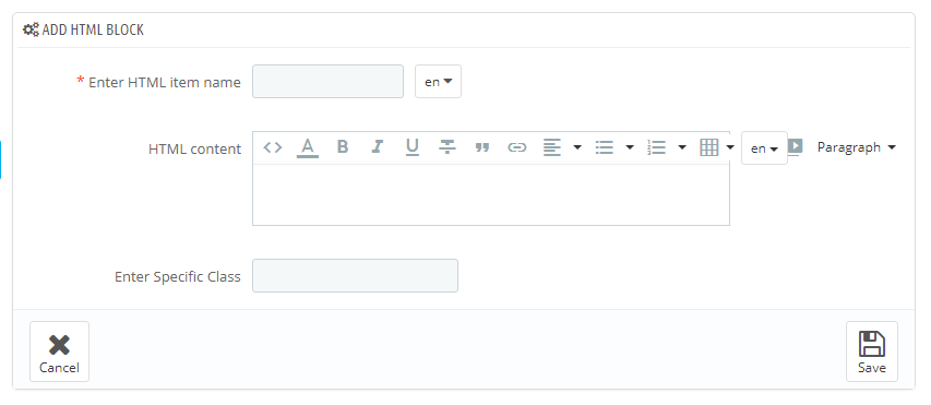
-
In the form that appears, fill in the required fields.
-
- Enter HTML item name
- HTML block name, is mandatory to be filled in for the default language.
-
- HTML content
- HTML content.
-
- Enter Specific Class
- block CSS class.
-
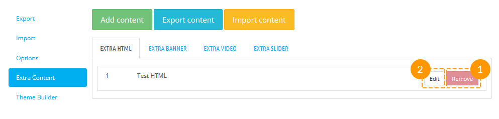
-
To delete HTML block, press 'Remove' (1) button. In order to edit block, press 'Edit'(2) button.
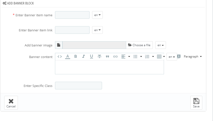
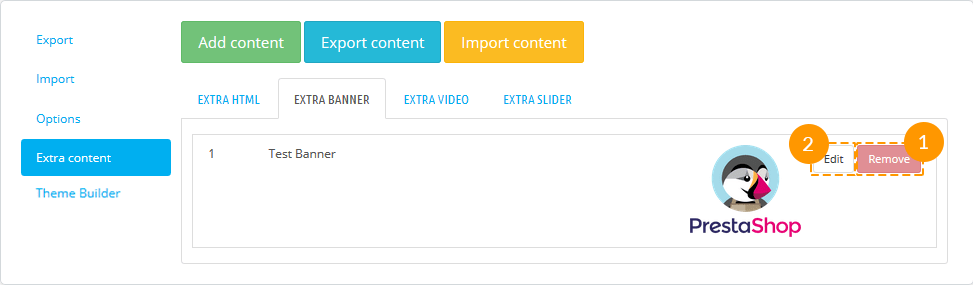
Extra Banner content
-
To create extra Banner content, press 'Create Banner block' (1) tab.
-
In the form that appears, fill in the required fields.
-
- Enter Banner item name
- banner title, is mandatory to be filled in for the default language.
-
- Enter Banner item link
- a link that is assigned to this banner.
-
- Add banner image
- upload an image for the banner.
-
- Banner content
- set the content of the banner.
-
- Enter Specific class
- block CSS class.
-
-
To delete Banner block, press 'Remove' (1) button. In order to edit block, press 'Edit'(2) button.
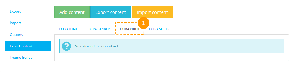
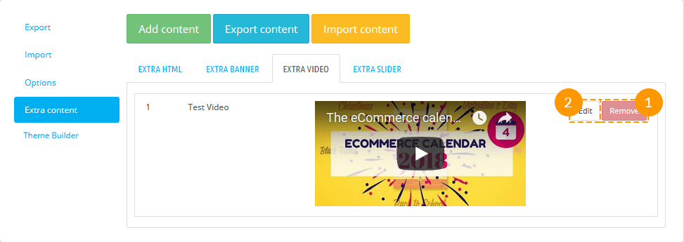
Extra Video content
-
In order to create extra Video content, press 'Create Video block' (1) tab.
-
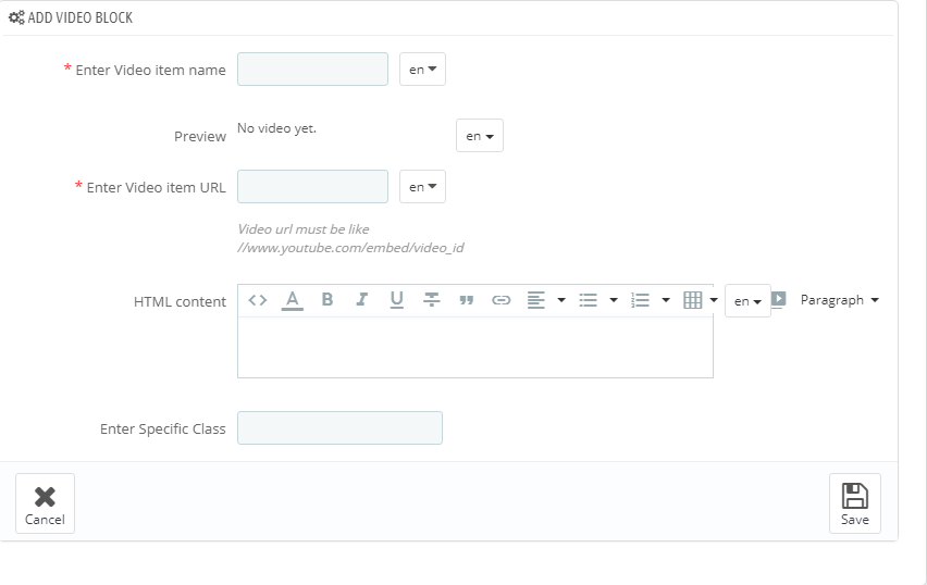
In the form that appears, fill in the required fields.
-
- Enter Video item name
- the title of the video (mandatory).
-
- Preview
- the video will be displayed before it will be published.
-
- Enter Video item URL
- add video link in the YouTube video format.
-
- HTML content
- the field where some HTML content can be added.
-
- Enter Specific Class
- block CSS class.
-
-
To delete Video block, press 'Remove' (1) button. In order to edit block, press 'Edit'(2) button.
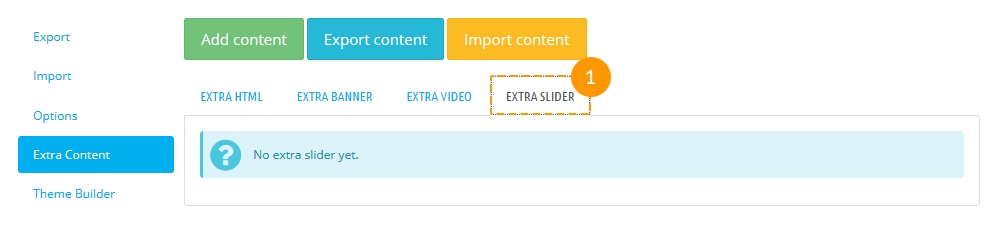
Extra Slider content
-
In order to create extra Slider content, press 'Create Slider block' (1) tab.
-
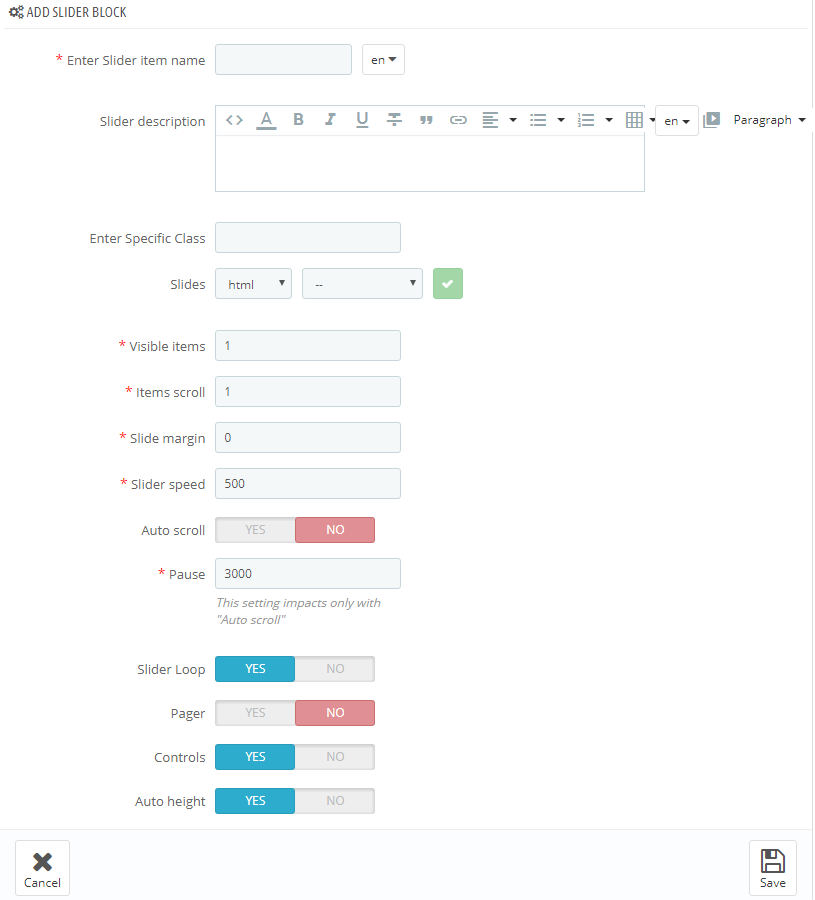
In the form that appears, fill in the required fields.
-
- Enter Slider item name
- the title of the slider (mandatory).
-
- Slider description
- set the description of the slider.
-
- Enter Specific class
- block CSS class.
-
- Slides
- the content of the slide: html, banner, video, product, post.
-
- Visible items
- the number of visible items (mandatory).
-
- Items scroll
- the number of items changed with one scroll (mandatory).
-
- Slide margin
- the carousel list item margin (mandatory).
-
- Slider speed
- speed of changing speed (mandatory).
-
- Auto scroll
- turns on/off slider autoplay.
-
- Pause
- pause between scrolls (if 'Auto scroll' is enabled).
-
- Slider Loop
- allow repeating slides from the beginning after all the slides were shown.
-
- Pager
- show/hide slider pagination.
-
- Controls
- show/hide slider navigation.
-
- Auto height
- slides height.
-
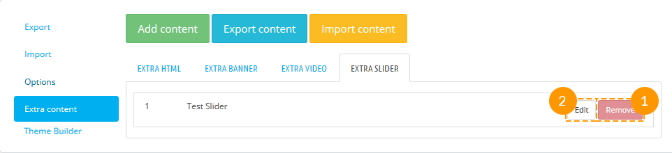
-
To delete Slider block, press 'Remove' (1) button. In order to edit block, press 'Edit'(2) button.
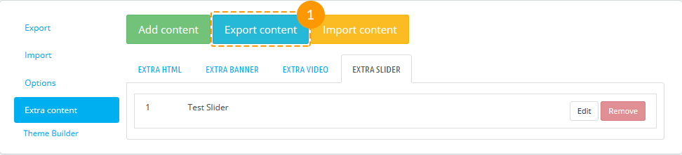
Export content
You may export all the extra content you've created to your computer as a zip file with one click only.
To download extra content, simply press "Export content"(1) tab. The downloading process will start automatically.
Import content
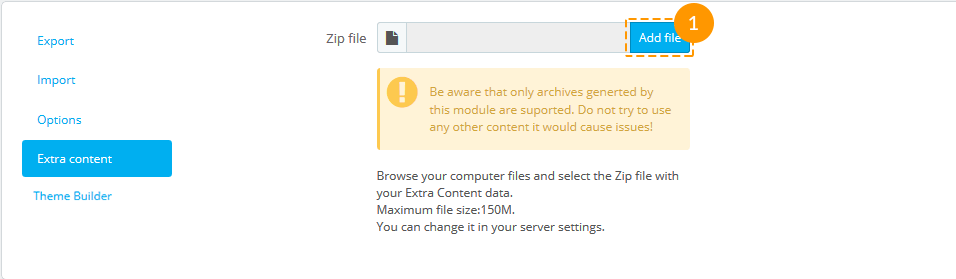
You can also import your own custom content from your computer, but zip files only!
To upload extra content, press "Import content" tab.
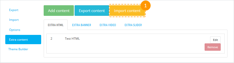
Press "Add file" (1) button and upload from your computer archive that contains extra content only.
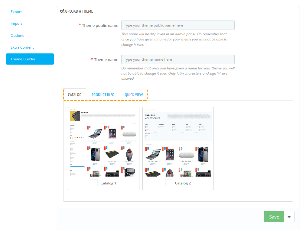
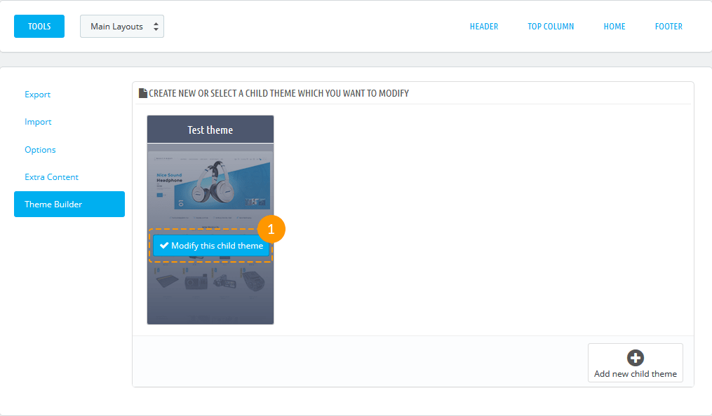
Theme Builder
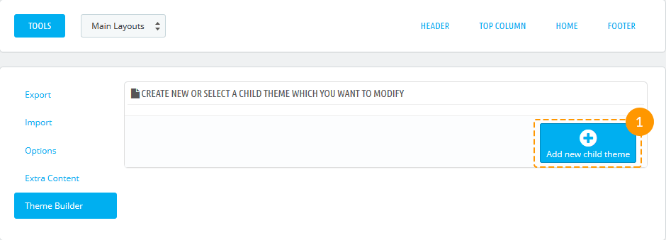
You may create different variations of the child themes on the parent theme basis with the help of Theme Builder option.
To create a child theme, click the "Add new child theme" button.
- In the appeared window, fill in the "Theme public name" and the "Theme name".
- Theme public name - the public theme name will be displayed in the admin panel (the given name you won't be able to change).
- Theme name - the name theme (the given name you won't be able to change).
- Choose the variants of "Catalog Page", "Product Info Page" and "Quick View Page" from the available below.
- Click the "Save" button to save the changes.
- The successfully created child theme will appear on the list. You may edit the child theme simply hovering the preview image and clicking "Modify this child theme" button. You can change the variants of Catalog, Product Info, and Quick View Pages.
Warnings
If the following message appears in the module item block, you should enable the mentioned module.

If the following message appears in the module item block, you should install the mentioned module.

In case you remove or deactivate the 'JX Mega Layout' module, all the active presets will be disabled and you will see the positions (hooks) in their original appearance.
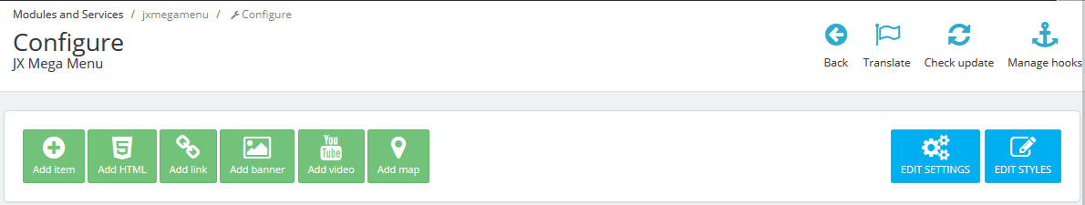
JX Mega Menu
The module is designed to create complex menus. The module provides the ability to display one item (without sub-menu), a menu item with a sub-menu and a menu item with sub-menu by means of a multi-row and multi-column block. The module can be used in different positions, but it will display the same content. Available positions: top (displayTop), left (displayLeftColumn), right (displayRightColumn), footer (displayFooter). You can add categories (with subcategories), CMS categories (with subcategories), manufacturers (one or a list), suppliers (one or a list), stores (if multi-store is used), links to any product, information block about the product, custom links (not limited in quantity), custom HTML blocks (not limited in number) and banners. See below for more details.
The module includes 6 main tabs that allow customizing the menu.
JX Mega Menu Items
JX Mega Menu items are the basic items which appear in the menu.
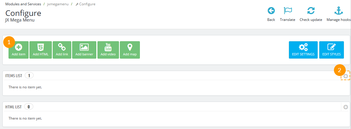
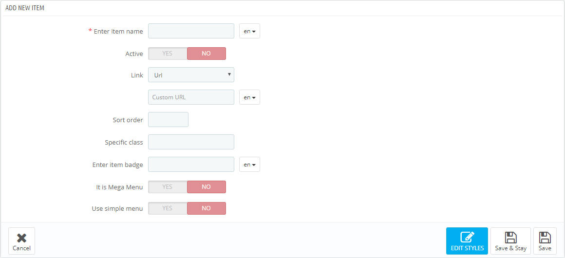
In order to create a new item, open the JX Mega Menu module and click Add item button from the top menu or click "+" button in the top right of the table.
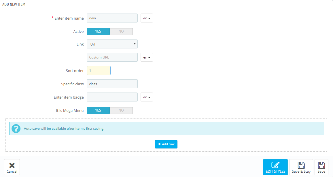
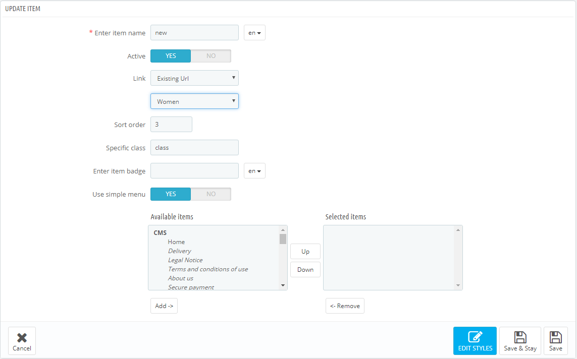
In the form that appears, fill in the required fields.
-
- Enter item name
- the tab title which is mandatory to be filled in for the default language, if the additional languages fields are not filled in, the tab takes its name from the default language.
-
- Active
- active/inactive tab.
-
- Link
- a link that is assigned to this tab. You can enter a custom link, or choose from existing options (categories, CMS categories). If you leave the field blank, the link of this tab is inactive.
-
- Sort order
- the order of tabs to be displayed.
-
- Specific Class
- the class which is added to emphasize the item (CSS class).
-
- Enter item badge
- is filled in depending on multi-languages.
-
- It is Mega Menu
- given tab sub-menu is a Mega Menu. *
-
- Use simple menu
- given tab sub-menu is a simple menu. **
* It is Mega Menu. If this option is selected, there will be a form to create a complex menu (Mega Menu).
** Use simple menu. If this option is selected, there will be a form to create a simple menu. This is a menu that displays the selected content in a single column. If the menu has embedded content, the new column is added.
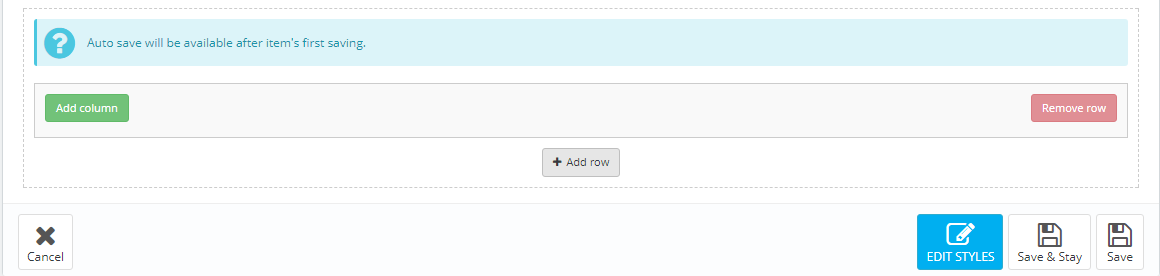
Complex menu consists of rows and columns in rows.
The Row is a part of the Mega Menu structure. It includes the menu columns. The existing row can be removed by clicking the appropriate button. The row will be removed with the content it includes. The rows quantity is not limited.
The Column is a part of the Mega Menu structure, which is placed inside the rows. (The Class) The width of the column cannot be less than 2 and more than 12. In order to make the menu display properly, the total column width cannot exceed 12. The width (class) is a Bootstrap column type, corresponds to the same values.
In order to create the menu, click the 'Add row' button.
In the form appeared, click 'Add column' button.
In the pop up window you need to specify the column class (from 2 to 12). The column itself appears next where you need to set the required settings.
Here you can change the column class, CSS class and the content from the list provided. You can add/remove content by double clicking the item, or by highlighting the items and clicking the corresponding button.
Block can be removed by clicking 'Remove block' button in the footer of the block.
By removing the row, the included columns are also removed.
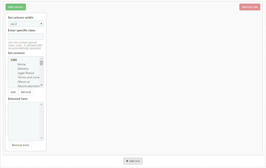
In order to move the content available in the selected menu, double-click or highlight the desired content and press the corresponding button.
Inactive menu information is saved while switching between menu types and you can always change the type of menu.
JX Mega Menu HTML
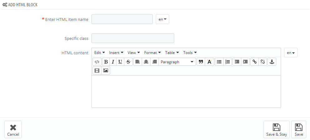
In this section we will explain how to create a custom HTML block in the Mega Menu.
The module has a table listing all the available blocks. You can also add a new block by clicking the '+' button in the top right of the table.
In the form that appears, fill in the required fields.
-
- Enter HTML item name
- HTML block name, is mandatory to be filled in for the default language.
-
- Specific class
- block's CSS class.
-
- HTML content
- HTML content.
Added block will appear in the list of blocks, as well as in the list of available content while creating menu blocks.
JX Mega Menu Links
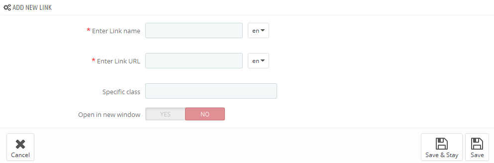
In this section we will show how to create custom links in the Mega Menu.
The module has a table listing all the available links. You can also add a new link by clicking the '+' button in the top right of the table.
In the form that appears, fill in the required fields.
-
- Enter Link name
- link name, is mandatory to be filled in for the default language.
-
- Enter Link URL
- link URL, is mandatory to be filled in for the default language.
-
- Specific class
- block's CSS class.
-
- Open in new window
- open link in a new window.
Added link will appear in the list of links, as well as in the list of available content while creating menu blocks.
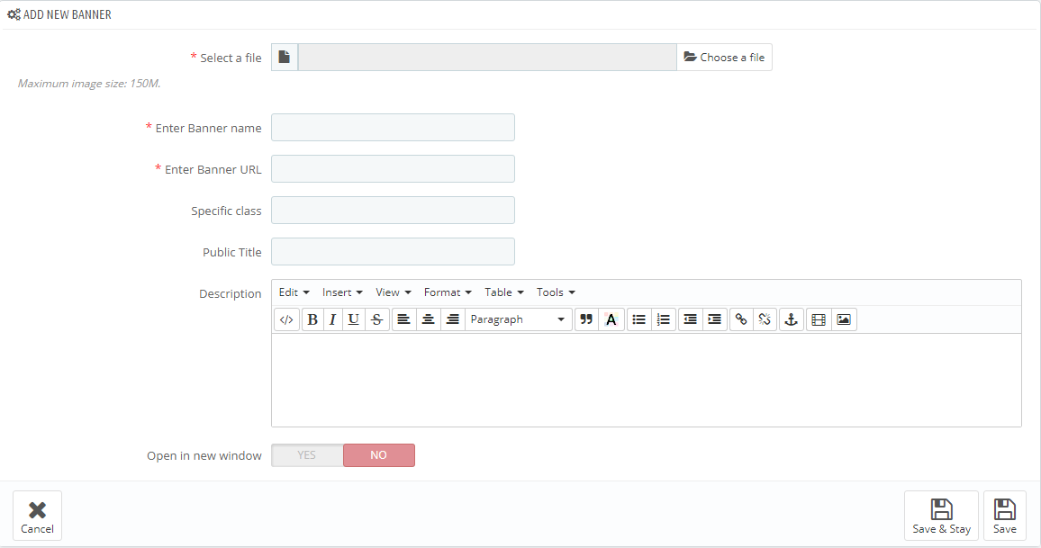
JX Mega Menu Banners
In this section we will explain how to create banners in the Mega Menu.
The module has a table listing all the available banners. You can also add a new banner by clicking the '+' button in the top right of the table.
In the form that appears, fill in the required fields.
-
- Select a file
- select a file, is mandatory to be filled in for the default language.
-
- Enter Banner name
- banner title, is mandatory to be filled in for the default language.
-
- Enter Banner URL
- link URL, is mandatory to be filled in for the default language.
-
- Specific class
- block's CSS class.
-
- Public Title
- public banner title.
-
- Description
- set the description of the banner.
-
- Open in new window
- open link in a new window.
Added banner will appear in the list of banners, as well as in the list of available content while creating menu blocks.
JX Mega Menu Video
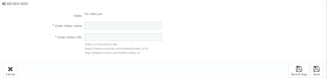
In this section we will explain how to add a video in the Mega Menu.
The module has a table listing all the available videos. You can also add a new video by clicking the '+' button in the top right of the table.
In the form that appears, fill in the required fields.
-
- Enter Video Name
- video title (the field is required).
- Enter Video URL - add video link in the formats described below:
- If this is a YouTube video, click on Embed and copy the code between the quotes for https://www.youtube.com/embed/video_id
- If this is a Vimeo video, click on Share icon and in the Embed section copy the source code between the quotes for http://player.vimeo.com/video/video_id
Added video will appear in the list of videos, as well as in the list of available content while creating menu blocks.
JX Mega Menu Map
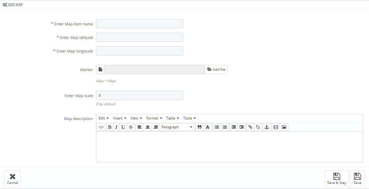
In this section we will explain how to add a map in the Mega Menu.
The module has a table listing all the available maps. You can also add a new map by clicking the '+' button in the top right of the table.
In the form that appears, fill in the required fields.
-
- Enter Map item name
- the title of the map.
-
- Enter Map latitude
- set a latitude value.
-
- Enter Map longitude
- set a longitude value.
-
- Marker
- adding a custom marker.
-
- Enter Map scale
- the scale of the map (used 8 by default).
-
- Map description
- set the description of the map.
Added map will appear in the list of maps, as well as in the list of available content while creating menu blocks.
JX Newsletter
The module displays a notification with a proposal to subscribe to store newsletter in a pop-up window. The email check can be enabled in module settings by means of confirmation email. You can also adjust the timeout between reminders for registered and non-registered users. Registered users can permanently give up on reminders.
The module is compliant with official PrestaShop General Data Protection Regulation (GDPR) module, a new EU legal framework that governs how users' personal data is used.
Module install/uninstall
This module can be installed/uninstalled like any other PrestaShop module.
Module settings
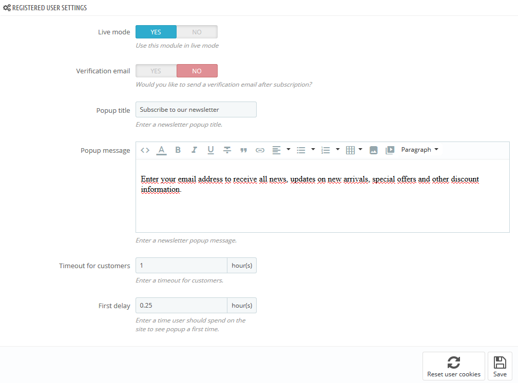
After module has been installed you can set Registered User Settings and Guest Settings below.
There are the following settings that you can set for Registered Users.
- Live mode - enable/disable the module.
- Verification email - choose if you want to send a verification email after the subscription.
- Popup title - write down a newsletter popup title.
- Popup message - write down a newsletter popup message.
- Timeout for customers - set a timeout for popup reminding subscription for customers.
- First delay - set a time that the user should spend on the site to see popup for the first time.
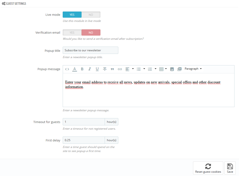
Here you can set the settings for Guests.
- Live mode - enable/disable the module.
- Verification email - choose if you want to send a verification email after the subscription.
- Popup title - write down a newsletter popup title.
- Popup message - write down a newsletter popup message.
- Timeout for guests - set a timeout for not registered users.
- First delay - set a time that the guest should spend on the site to see popup for the first time.
It is necessary to install and enable 'Newsletter block' for proper work of module.
JX One Click Order
Module is used to make the process of making an order much faster and easier than it was before.
It simplifies the procedure from five steps to one and makes it more appealing for the customers who want to save
their time while making an order.
By means of this feature, you can get more spontaneous purchases that will have a positive impact on your business.
The module is compliant with official PrestaShop General Data Protection Regulation (GDPR) module, a new EU legal framework that governs how users' personal data is used.
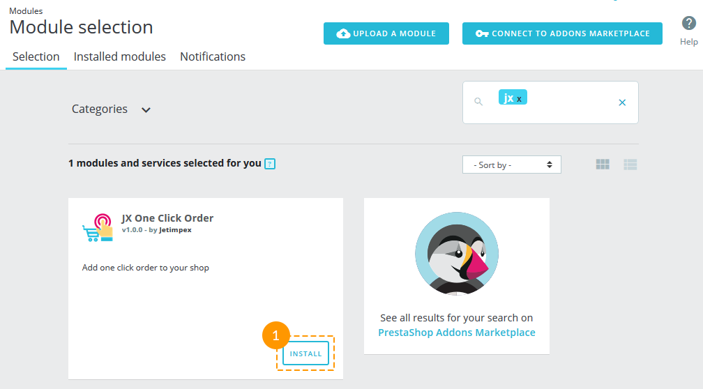
Installation
Navigate to Modules (1) -> Modules and Settings (2) in your admin panel and find the JX One Click Order module (2). Then click the 'Install' button (3).
Module configuration
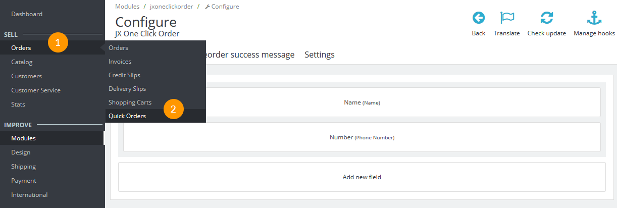
After the module has been successfully installed, the 'Configure' page with the module settings will be opened.
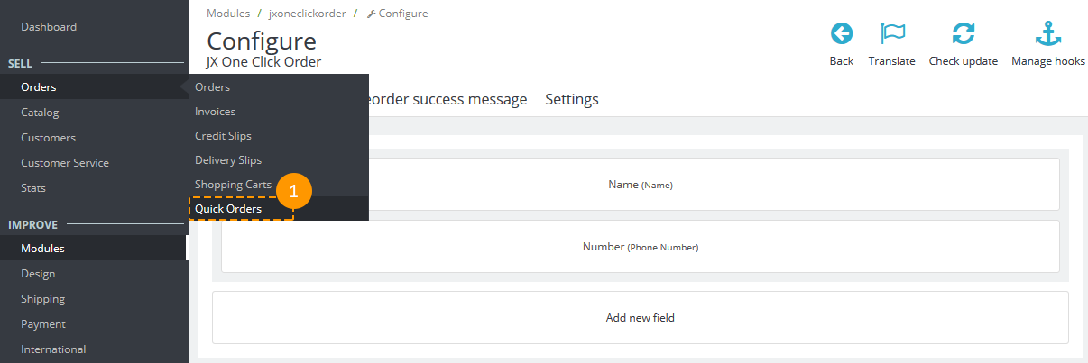
You'll also see the new menu item 'Quick Orders' (2).
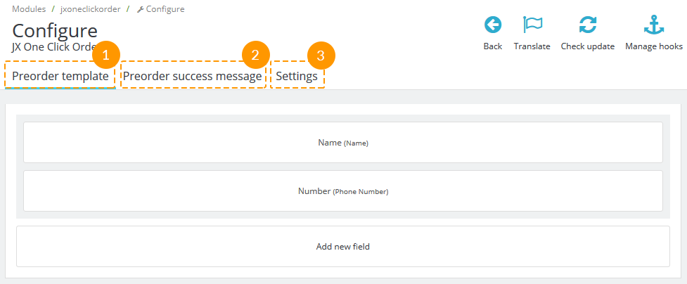
The settings are divided into three tabs - Preorder template (1), Preorder success message (2) and Settings (3).
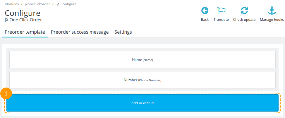
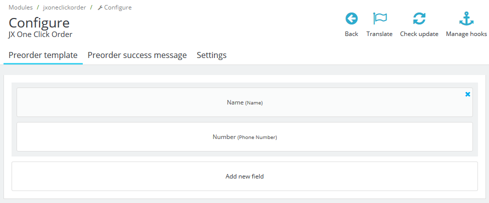
Preorder template
Here you can add a new field by pressing the corresponding button (1):
Choose the options for the new field and click the 'Save' button (1):
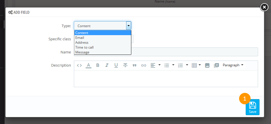
- Type - choose the type of field.
- Specific class - add the custom class for the current field.
- Name - field name.
- Description - field description; appears below the input.
-
Edit the existing field.
Click on the field you want to edit. The settings are the same as for adding new field.
-
Delete the fields from the form.
Click the 'Delete' button (1) in the top right corner of the field.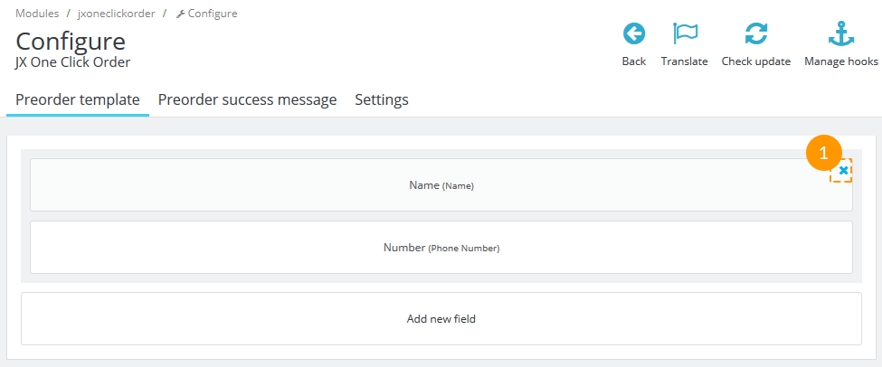
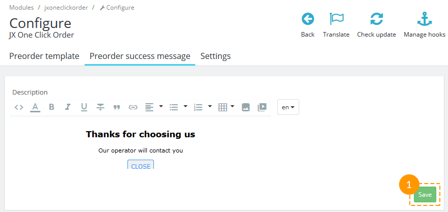
Preorder success message
The tab allows editing the message for the alert window that appears after the user clicks 'Send' button in quick order form.
Add the text/button you want to be shown and click the 'Save' button (1).
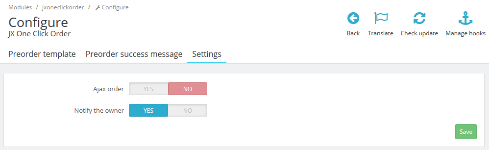
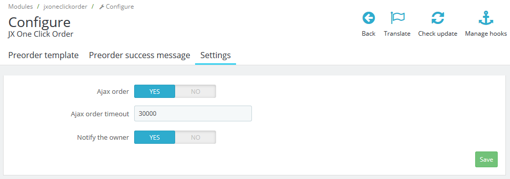
Settings
The tab allows switching the 'Ajax order' option and the 'Notify the owner' option on and off.
It helps the administrator to see the new quick orders which were submitted while processing the existing orders.
If the 'Ajax order' option is enabled, the additional option 'Ajax order timeout' appears.
The value is set in milliseconds and means the time period between each check for new quick orders.
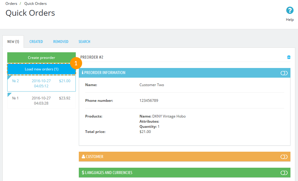
This option helps to open new preorders without page reloading. To see them in the list of quick orders, click the 'Load new orders' link (1) in Orders -> Quick Orders menu.
Order processing
Navigate to Orders -> Quick Orders (1) in your admin panel.
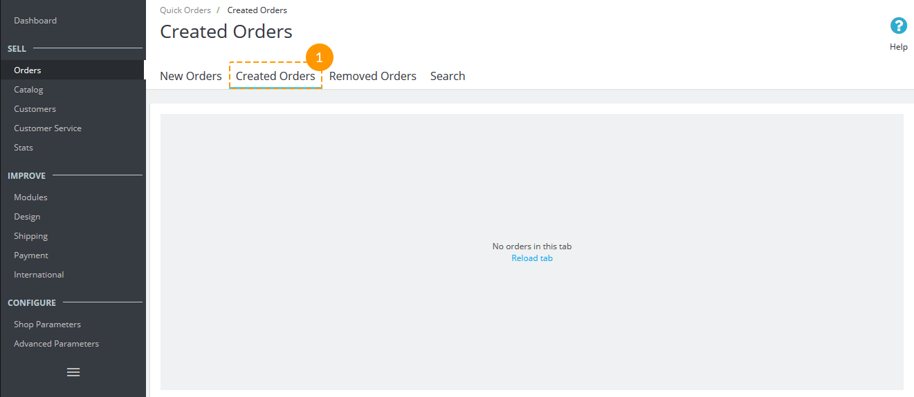
It has four tabs - New, Created, Removed and Search.
-
New - new preorders that have been submitted by the customers.
In the left part there's a button to create a new preorder (1) and a list of preorders (2).
In the right side you can see the preorder details (3) divided into tabs (Preorder information, Customer, Languages and currencies, Cart, Vouchers, Addresses, Shipping, Summary).
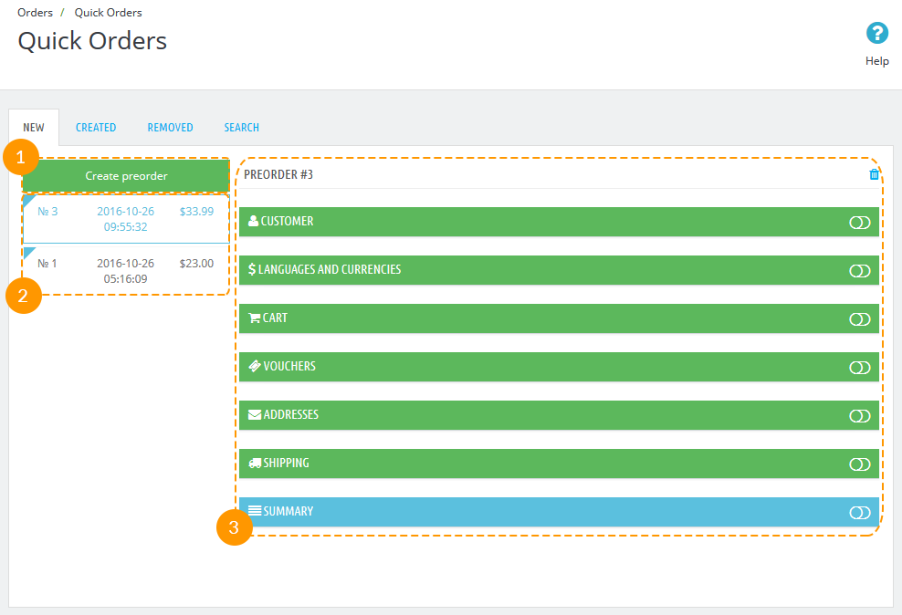
If the order has just been created, you'll see only three of them - Preorder information, Customer, Languages and currencies.
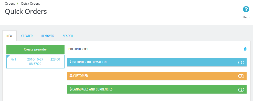
When you fill in the info about the customer, three more tabs will appear - Cart, Vouchers, and Address. When the address info is added, Shipping and Summary tabs will be shown. Tabs where all required information has been successfully added, are colored with green. Yellow colored tabs require some more order details. Blue ones are informational, they are generated automatically.
When the Summary tab appears, there's a button 'Create the order' in the Summary tab (1).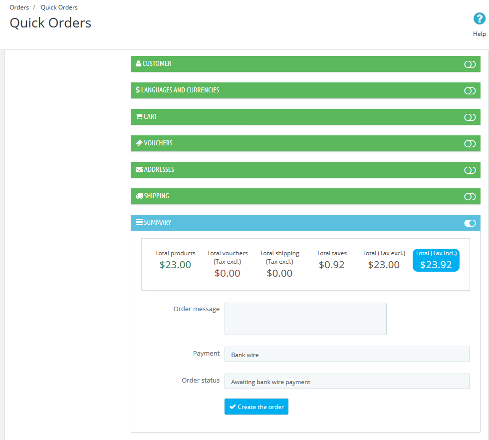
After clicking it the preorder will be transferred from 'New' to the 'Created' preorders list (1).
If you need to delete the order, there's a trash sign in the top right corner (1).
Press it and the preorder will be transferred to 'Removed' orders tab.
-
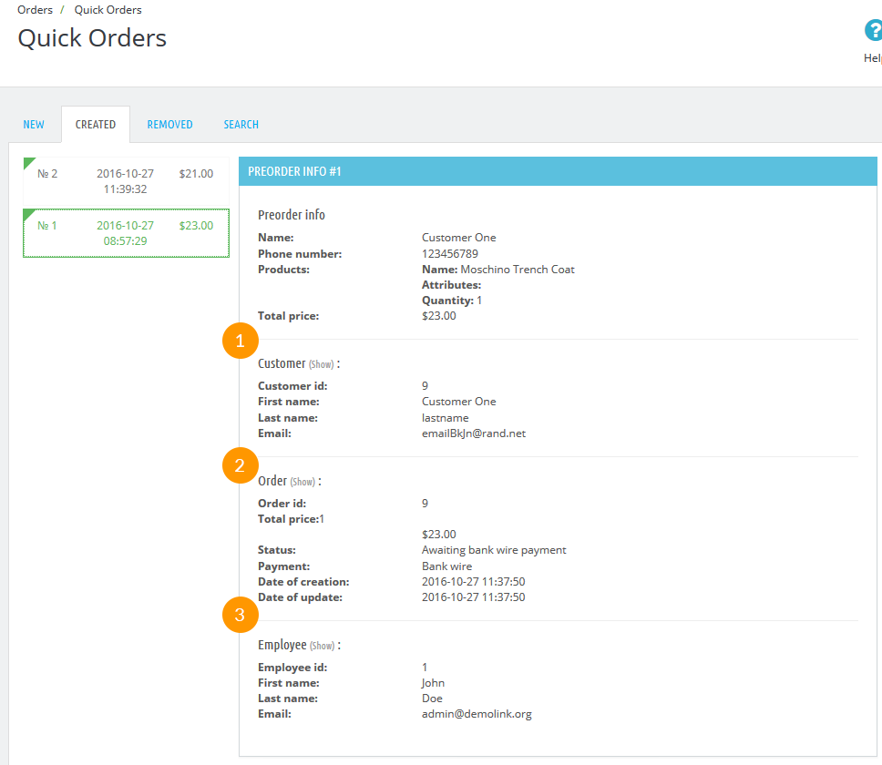
Created - preorders that have been already processed by the administrator.
Choose the order in the left side and click on it to see the detailed info in the right side.
You can also click the 'Show' link to see full information about the customer (1), about the order (2) and the employee (3).
-
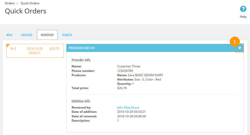
Removed - preorders that have been cancelled.
The preorder in this tab can still be recovered by clicking the '+' button (1). Then it will be transferred back to 'New' preorders tab.
-
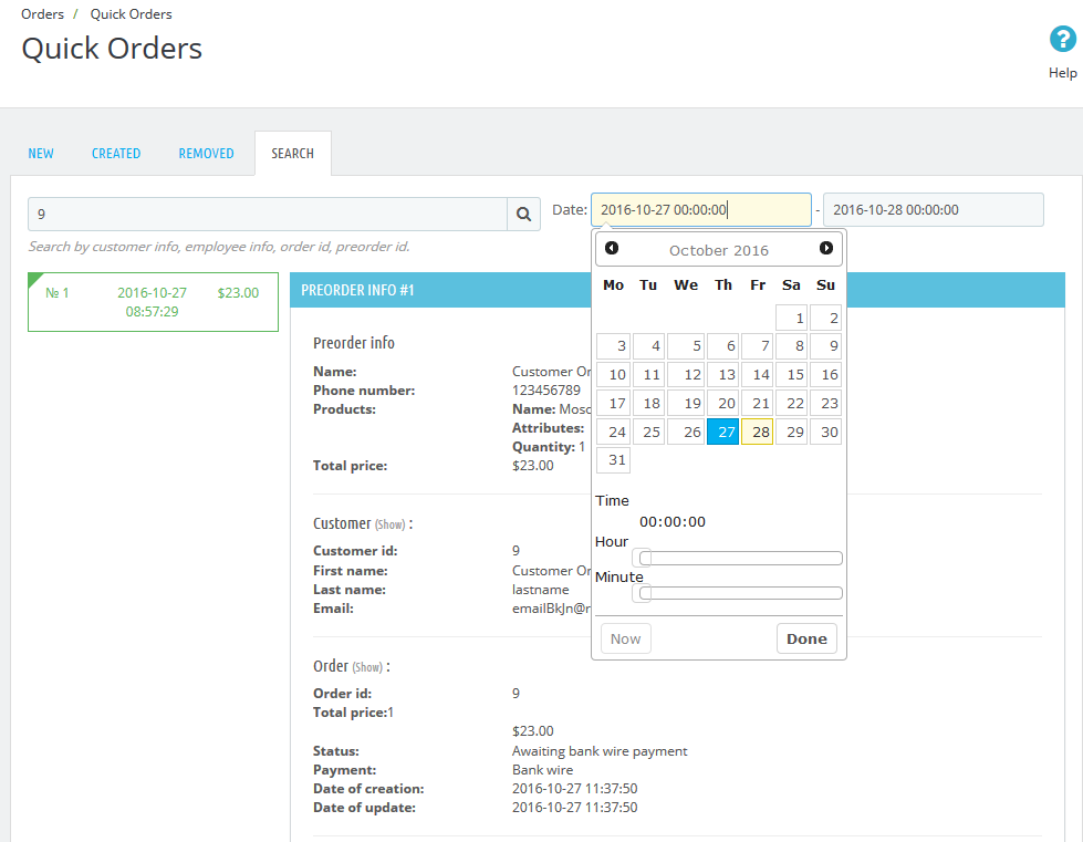
Search - preorders search. Enter the search (by customer info, employee info, order id, preorder id); you can also enter the specific date/date period when preorders were created.
JX Product List Gallery 2.0.0
This module displays all the available product images in form of a gallery on product listing pages. Depending on what settings you choose, the module can display images in form of a rollover or slideshow.
Module Installation and Deleting
This module can be installed and deleted like any other PrestaShop module.
Module settings
After the module is installed, navigate to \themes\classic\templates\catalog\_partials\miniatures\product.tpl. Open this
file and find the following code:
    {block name='product_thumbnail'}
        {if $product.cover}
            <a href="{$product.url}" class="thumbnail product-thumbnail">
                <img src="{$product.cover.bySize.home_default.url}" alt="{if !empty($product.cover.legend)}{$product.cover.legend}{else}{$product.name|truncate:30:'...'}{/if}" data-full-size-image-url="{$product.cover.large.url}">
            </a>
        {else}
            <a href="{$product.url}" class="thumbnail product-thumbnail">
                <img src="{$urls.no_picture_image.bySize.home_default.url}">
            </a>
        {/if}
    {/block}
and replace it with:
    {block name='product_thumbnail'}
        {if $product.cover}
            <a href="{$product.url}" class="thumbnail product-thumbnail">
                {capture name='displayProductListGallery'}{hook h='displayProductListGallery' product=$product}{/capture}
                {if $smarty.capture.displayProductListGallery && count($product.images) > 1}
                    {hook h='displayProductListGallery' product=$product}
                {else}
                    <img src="{$product.cover.bySize.home_default.url}" alt="{if !empty($product.cover.legend)}{$product.cover.legend}{else}{$product.name|truncate:30:'...'}{/if}" data-full-size-image-url="{$product.cover.large.url}">
                {/if}
            </a>
        {else}
            <a href="{$product.url}" class="thumbnail product-thumbnail">
                <img src="{$urls.no_picture_image.bySize.home_default.url}">
            </a>
        {/if}
    {/block}
After installing and connecting the module, you can set it up on the module configuration page.
The module has the following main settings:
- Live mode - ability to use the module in live mode.
- Type - select display type: rollover, gallery or slideshow.
If you choose rollover, you can choose the animation effect:
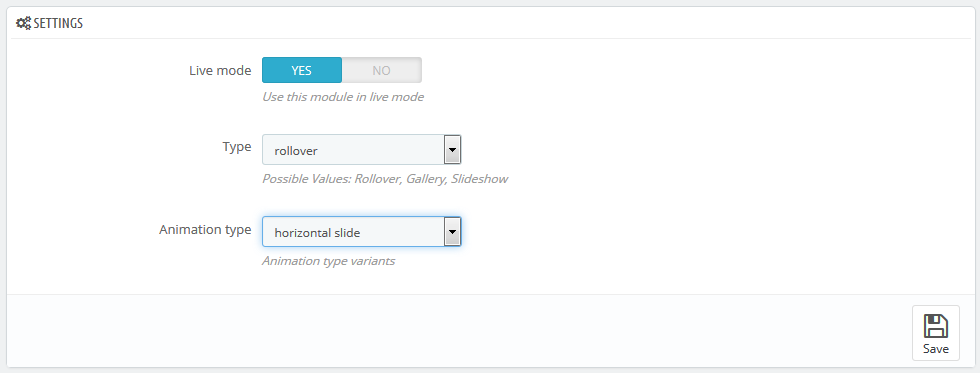
- Opacity slide - opacity changes;
- Horizontal slide - horizontal;
- Vertical slide - vertical.
If you choose gallery, you will find the following settings available:
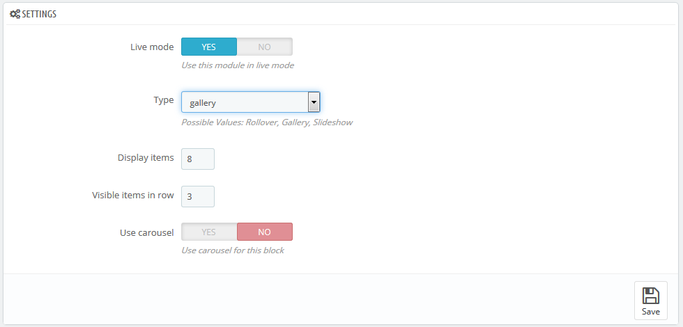
- Display items - the number of items displayed;
- Visible items in row - the number of items in a row;
- Use carousel - enable/disable the carousel for this block.
If you choose slideshow, you will find the following settings available:
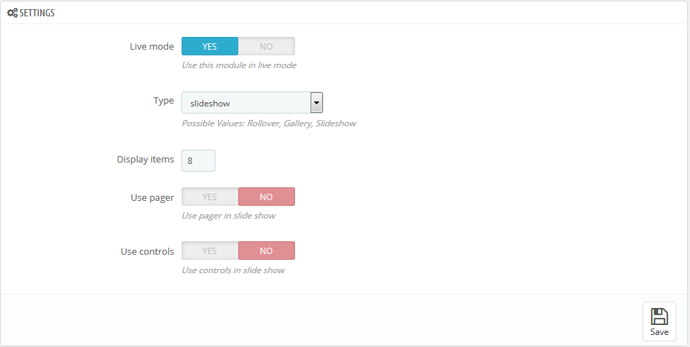
- Display items - the number of items displayed;
- Use pager - pager display in slide show;
- Use controls - controls display in slide show.
JX Product Zoomer
This module is an alternative solution for the standard product image zoom on the single product page. It's fully compatible with the standard additional products thumbnail carousel and product attributes changes. It allows you to choose among the three available options (window/lens/inner) for image zoom with the advanced plugin settings. The module is based on the Elevatezoom Plus plugin.
Installation and removing
The module is installed and deleted like any other PrestaShop module.
Module configuration
After the module has been installed you can configure it on the module configuration page.
By default, the configuration page shows a simplified set of options.
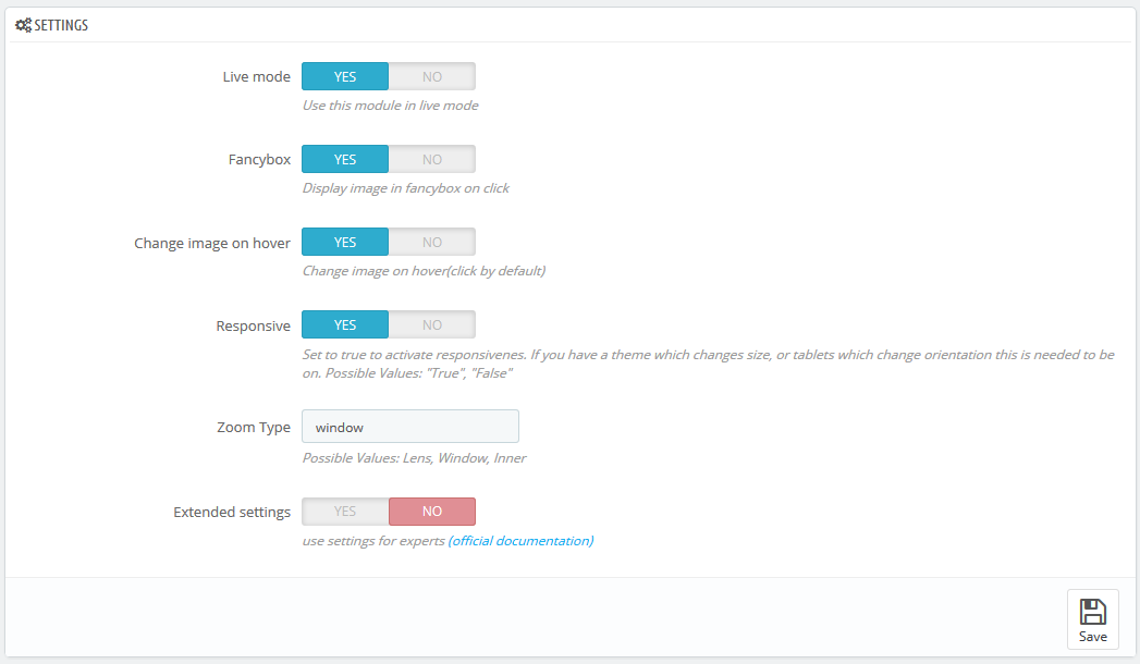
- Live mode - module is on/off.
- Fancybox - whether to show the enlarged image in the Fancybox on click.
- Change image on hover - switch the main image on thumbnail hover (by default is set to switch on click).
- Responsive - allows to the use adaptive functionality for plugin display on the mobile devices.
- Zoom Type - choose the type of the enlarged image display mode
- window - the enlarged image shows up next to the main image in one of the available (16) positions
- lens - the image is zoomed in the lens container, on top of it
- inner - the image is zoomed inside of main image container, fully covering it.
The mobile devices (< 768) have "lens" mode activated instantly. - Extended settings - enables advanced settings for the experienced users. You can see the link to the official documentation for more details next to it.
Extended module configuration
- Scroll Zoom - zoom ratio change on the mousewheel scroll (available for all types).
- Cursor - cursor type on the magnified image hover. The following options are available: default, cursor, crosshair (available for all types).
- Zoom settings - available for all types, if the 'Scroll Zoom' is enabled.
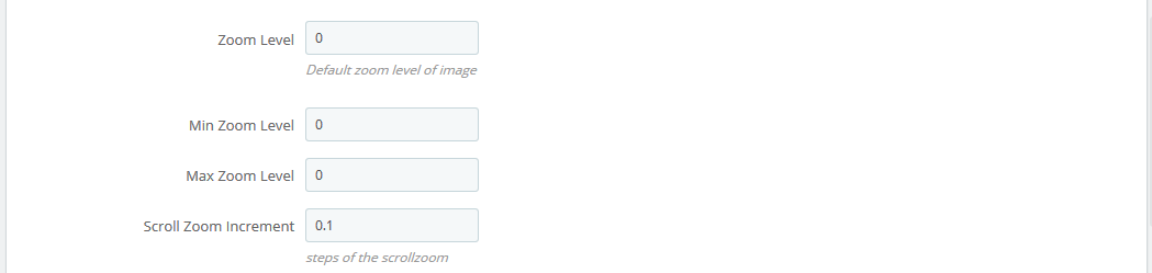
- Zoom Level - the zoom level on the initial hover.
- Min Zoom Level - a minimum zoom level.
- Max Zoom Level - a maximum zoom level.
- Scroll Zoom Increment - magnifying scroll increment.
- Easing - the magnified image appearance effect (available for all types).

- Zoom Easing - effect on/off.
- Easing Amount - effect delay value.
- Image Crossfade - main image blur outside the hover area (the lens) - available for window, lens.
- Magnified image window settings - available for window.
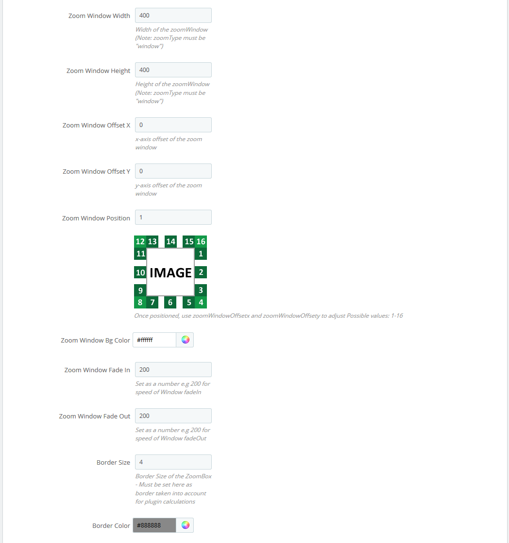
- Zoom Window Width - window width in px.
- Zoom Window Height - window height in px.
- Zoom Window Offset X - window offset on the X axis.
- Zoom Window Offset Y - window offset on the Y axis.
- Zoom Window Position - window position choice relatively to the main image (the positions available are presented on the image below this field).
- Zoom Window Bg Color - window background image (for transparent images only).
- Zoom Window Fade In - the effect of slowing the window appearance.
- Zoom Window Fade Out - the effect of slowing the window disappearance.
- Border Size - window border width in px.
- Border Color - window border color.
- Zoom Lens - zoom lens (available for window, lens).
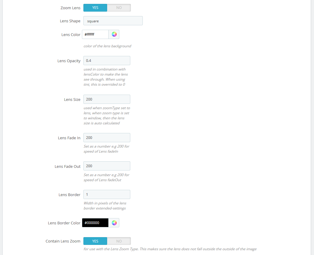
- Zoom Lens - on/off.
- Lens Shape - lens type. It can take the following values: circular/rounded or squared/rectangular.
- Lens Color - lens inner background color.
- Lens Opacity - lens inner background opacity.
- Lens Size - lens size in px.
- Lens Fade In - the speed of lens appearance effect.
- Lens Fade Out - the speed of lens disappearance effect.
- Lens Border - lens border width.
- Lens Border Color - lens border color.
- Contain Lens Zoom - the restriction of the lens overflow outwards the main image container.
- Tint - the shade effect on the area outside the lens (available for window).
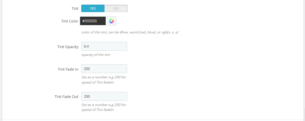
- Tint - effect on/off.
- Tint Color - the lens outer area background.
- Tint Opacity - the lens outer area opacity.
- Tint Fade In - the appearance effect speed.
- Tint Fade Out - the disappearance effect speed.
JX Search 1.1.0
This module is an extended search version that allows you to select a specific category for searching within its content. You can also change the category after defining the query. It also provides a possibility to set the additional product information display (description/price/manufacturer, etc.), and define the search results container layout, e.g., you can divide the results into a few sections with the controls (pagination, next/previous/show all). All the module settings are available in the main admin panel.
Installation and Deleting
The module is installed and deleted like any other PrestaShop module.
Module configuration
After module has been installed you can set it up on the module configuration page.
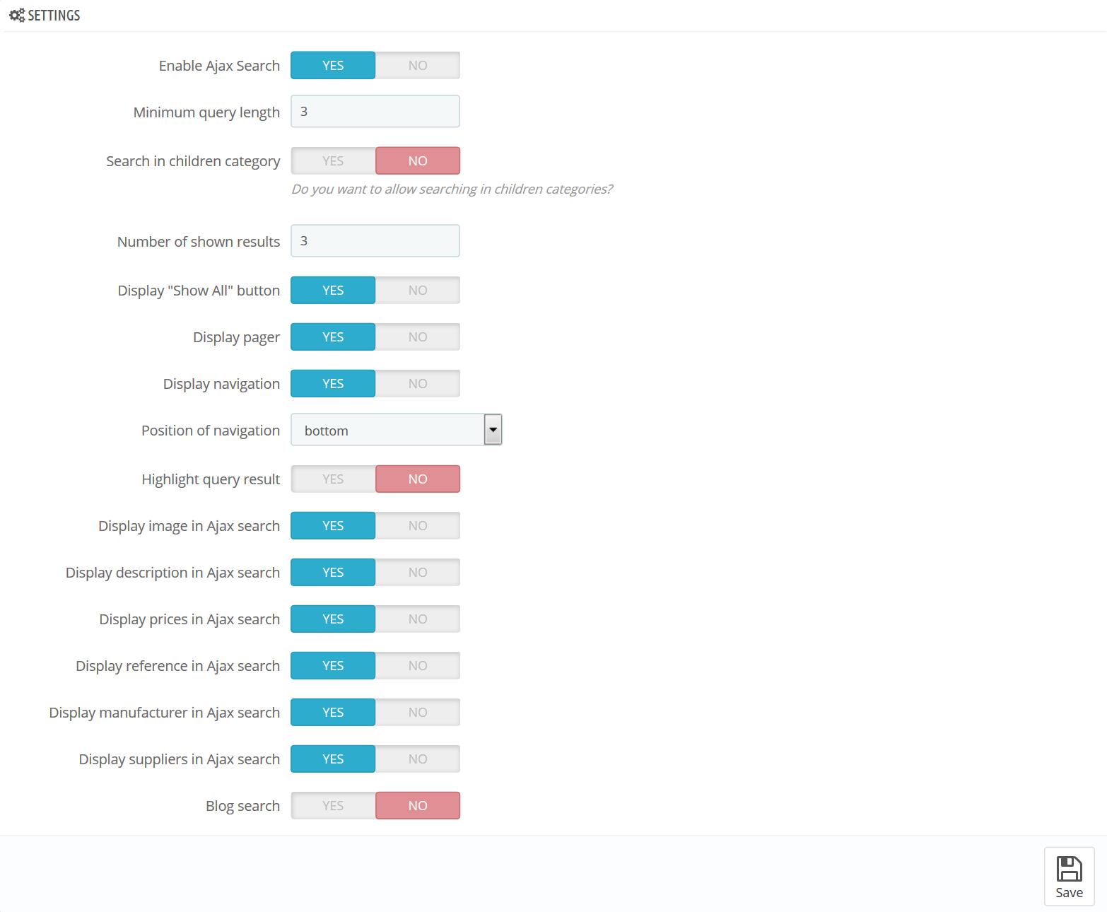
- Enable Ajax Search - enables live search in a drop-down.
- Minimum query length - number of symbols to start the result display.
- Search in children category - enable/disable searching in children categories.
- Number of shown results - number of products that shows up in the results section (number of products per page for the "pager" or "navigation" mode).
- Display "Show All" button - displays the 'Show all' button below the results section, then click on it displays all found results.
- Display pager - divides results into pages (depends on the 'Number of shown results' field value) and displays links to them.
- Display navigation - shows the Previous/Next buttons.
- Position of navigation - hook(s), to show the navigation (top/both/bottom options are available).
- Highlight query result - highlights the text that matches search query.
- Display image in Ajax search - shows product images in the results section.
- Display description in Ajax search - shows product description in the results section.
- Display prices in Ajax search - shows product price in the results section.
- Display reference in Ajax search - shows product reference in the results section.
- Display manufacturer in Ajax search - shows product manufacturer in the results section.
- Display suppliers in Ajax search - shows product suppliers in the results section.
- Blog search - enable/disable search by blog posts.
Some parameters might differ depending on the combination used.
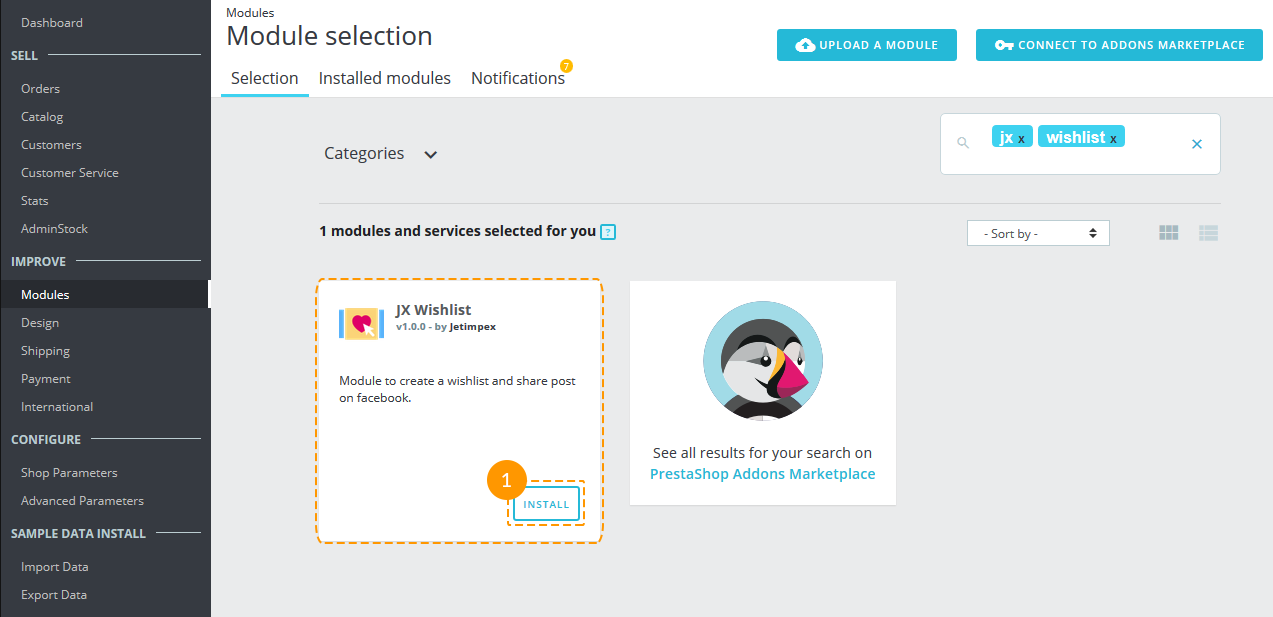
JX Wishlist
JX Wishlist module is created to give the ability to the visitors of online store to add products to wishlists and share these wishlists on Facebook.
The module is compliant with official PrestaShop General Data Protection Regulation (GDPR) module, a new EU legal framework that governs how users' personal data is used.
Module Installation
То install the module navigate to Admin panel -> Modules -> Modules and Services, find the JX Wishlist module and press 'Install' button (1).
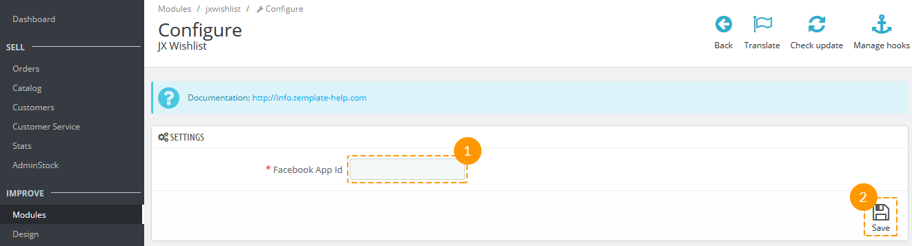
Module Configuration
After the module has been installed, the 'Settings' page will appear.
Add the Facebook App Id to the required field (1) and press 'Save' button (2).
The instruction how to get the Facebook App Id can be found here: Creating an App ID.
Using JX Wishlist Module
Adding product to wishlist
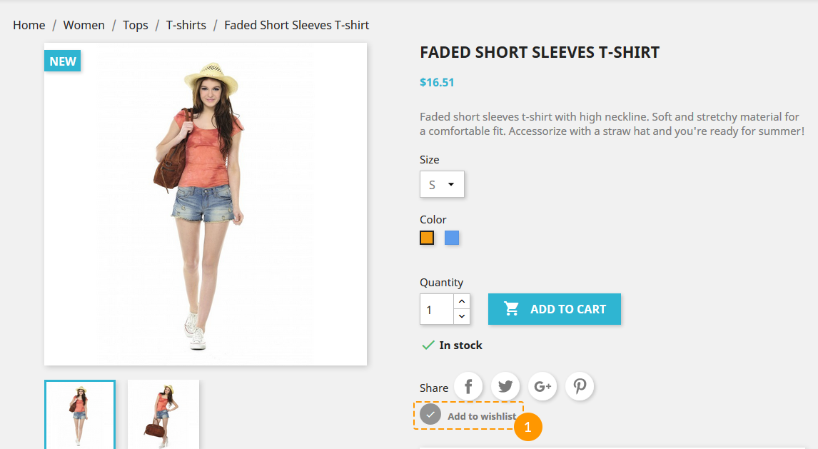
Shop visitors should be logged in to be able to add the items to the wishlists.
-
After the module is installed, the button 'Add to wishlist' appears on each product page. It should look like on the screenshot below (1).
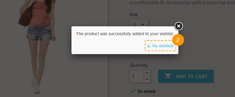
-
After clicking this button a shop visitor will see a notification: 'The product was successfully added to your wishlist.' It can be closed or skipped to wishlists view by clicking 'My wishlists' button (2).
Browsing Wishlists
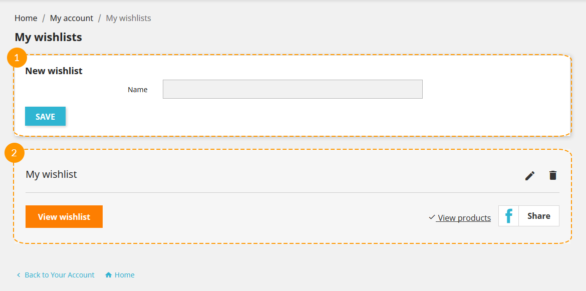
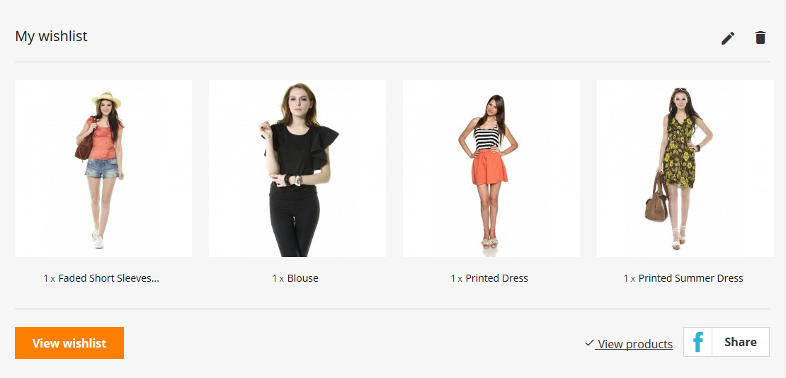
-
On 'My Wishlists' page a client can add the new wishlist (1) or view the list of created ones (2).
-
Clicking 'View wishlist' button (1) will open the wishlist page, the 'View products' button (2) gives the ability to see the products list of this wishlist on current page.
The title of wishlist can be edited (3) or deleted (4).
To share the wishlist the visitor should press the 'Share' button (5).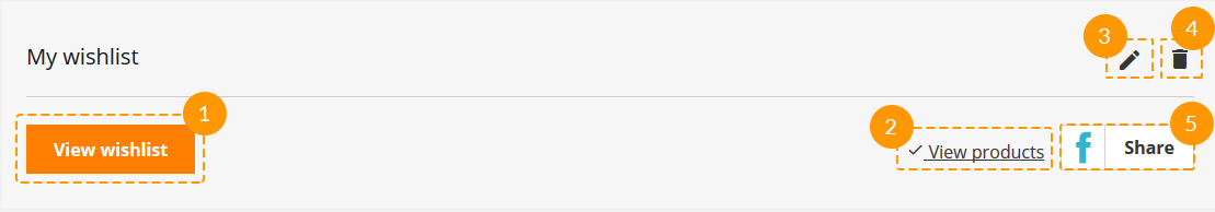
-
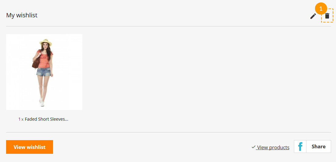
While looking through the items in wishlist after clicking 'View products' button, each item can be removed from the list (1).
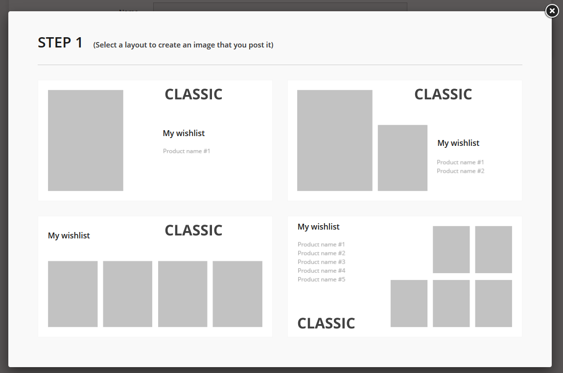
Sharing Wishlists
To share the wishlist the visitor should press the 'Share' button. There will be a few easy steps to follow before posting the wishlist. During each step, there's an ability to go back and change the sharing options.
-
First step is to choose the layout for wishlist that will be posted.
-
Then the products should be added. Each cell with a '+' is a button to add the product image.
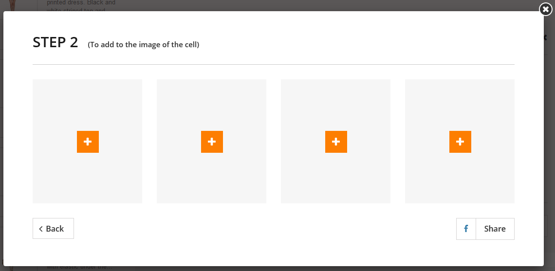
Choosing the images of each product:
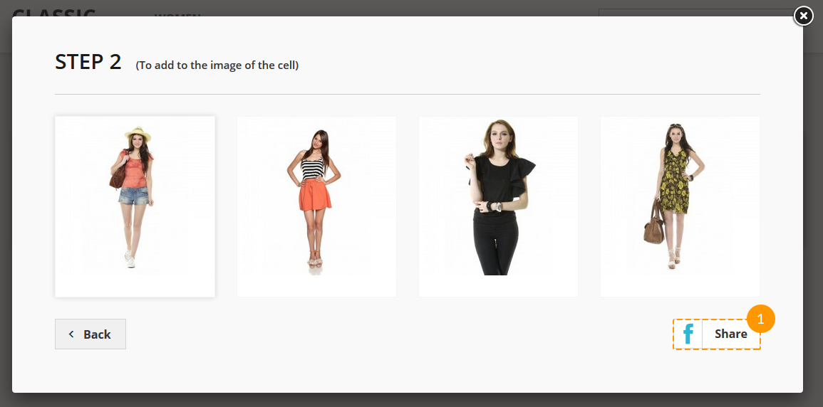
-
When all images are added, the visitor should press the 'Share' button (1).
-
In a small window which is then appeared, there will be some standard posting options to choose and the ability to add some text to the post. After clicking 'Post to Facebook' button, the post will be published.
Statistics
Using this module you can also get the statistics collected while the products are added to wishlists. Thus, you
will know which products are currently popular. This information can be very useful for suggesting a discount, for
example.
You can view the statistics navigating to Admin panel -> Stats -> Stats -> JX Wishlist.
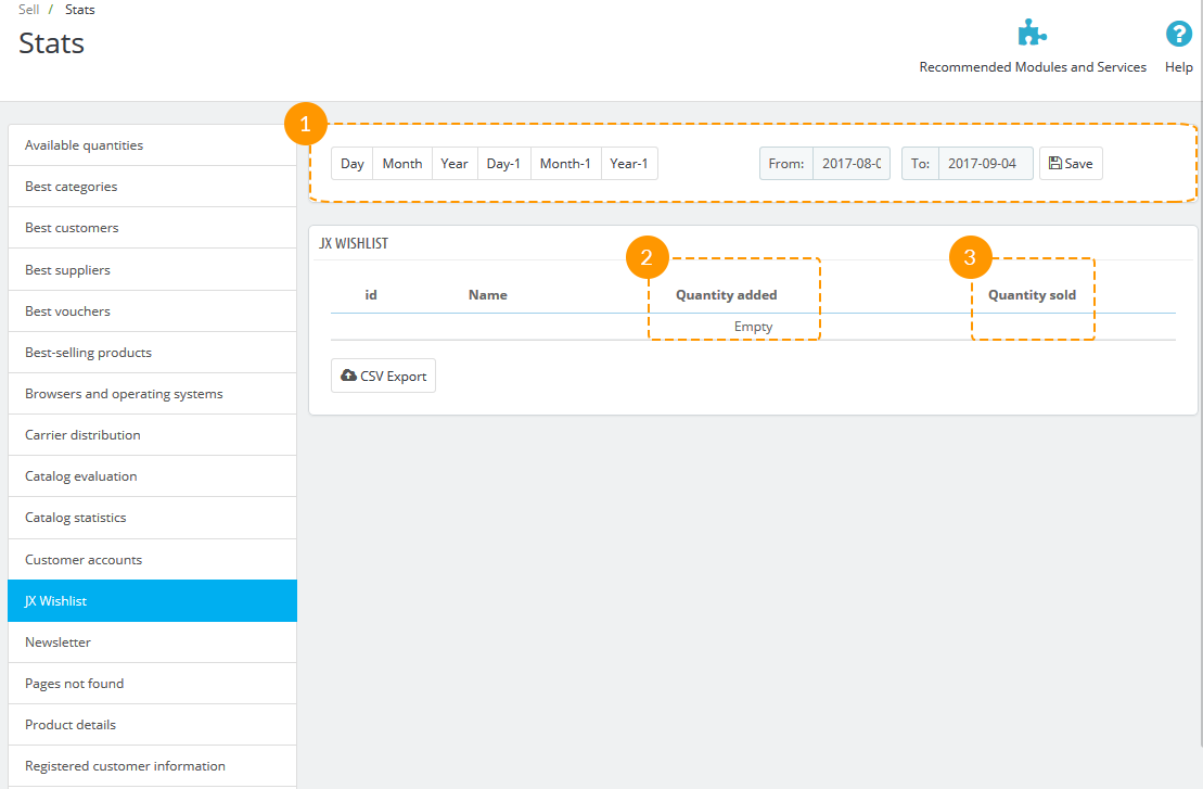
- You can select the period for viewing the statistics from the specified time (1).
- In the first column, there's a number of products that were added (2).
- The second column is created for your convenience. You can use it to see how many of added products were sold (3).