imPresta
Custom modules and extensions
Note: each PrestaShop theme you install has its own set of modules.
Smart Blog
Smart blog - a set of modules that allows creating blog in your store. It consists of the following modules:
- Smart Blog
- RSS Smart Blog Feed
- Smart Blog Archive
- Smart Blog Categories
- Smart Blog Home Latest
- Smart Blog Latest Comments
- Smart Blog AddThisModule
- Smart Blog Popular Posts
- Smart Blog Recent Posts
- Smart Blog Related Post
- Smart Blog Search
- Smart Blog Tags
It also has its hooks where the blog modules can appear on the site, they can also show up in the standard hooks (only columns).
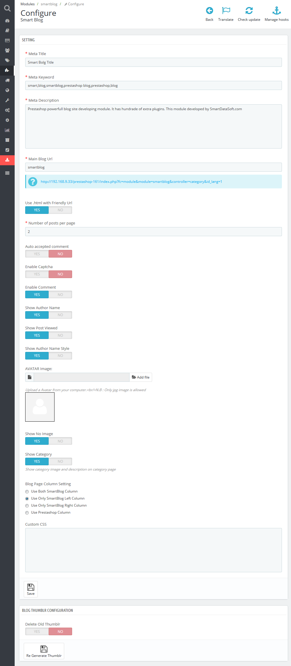
Smart Blog
This is the main module that contains many settings for blog functionality. After its installation the Blog menu tab will show up in the main menu of your admin panel where you can add/remove/edit the posts/categories or select the type of images and their dimensions used in the posts (types and dimensions of post images are different from product images settings in your store). To add the frontend settings of the module, please navigate to Smart Blog (Modules -> Front Office Features -> Smart Blog) and add all the parameters.
Description of parameters:
-
- Meta Title
- the title of your blog that will show up on all its pages.
-
- Meta Keyword
- keywords that will be used by search engines for better SEO optimization.
-
- Meta Description
- description of your blog used by search engines for better SEO optimization.
-
- Main Blog Url
- the URL of your Blog.
-
- Use .html with Friendly Url
- enable/disable adding .html to the blog pages URLs using Friendly Urls.
-
- Number of posts per page
- number of posts that show up per page (category/archives pages, etc.).
-
- Auto accepted comment
- enable/disable the auto accepted user comments; if enabled, comments will be available without admin moderation.
-
- Enable Captcha
- enable/disable Captcha under Leave Comment form on products pages.
-
- Enable Comment
- enable/disable leaving comments by users.
-
- Show Author Name
- enable/disable showing posts author on the blog pages and post single pages
-
- Show Post Viewed
- enable/disable showing number of times the users viewed the post. It will show up under the post on the blog pages and blog single pages.
-
- Show Author Name Style
- changing the format of the author name.
-
- AVATAR Image
- adding the standard avatar image for all users.
-
- Show No Image
- enable/disable the image. No Image is set if there is no image for post/category, etc.
-
- Show Category
- enable/disable the category image and description on the blog category pages.
-
- Blog Page Column Setting
- setting the display of Blog related modules. It often requires additional settings, therefore it is recommended that you install additional modules the same way the standard PrestaShop modules are installed.
-
- Custom CSS
- you can add additional styles in this field. Be careful using the classes that are already used in the theme, since some conflicts may occur.
-
- Delete Old Thumblr
- is used to regenerate blog images in case image dimensions were changed or the new type of image was added. To regenerate, select 'Yes' and click 'Regenerate'.
ONLY AFTER THIS other blog related modules can be installed. The process of removal is opposite: FIRST, YOU SHOULD DELETE ALL RELATED MODULES and only then delete Smart Blog module.
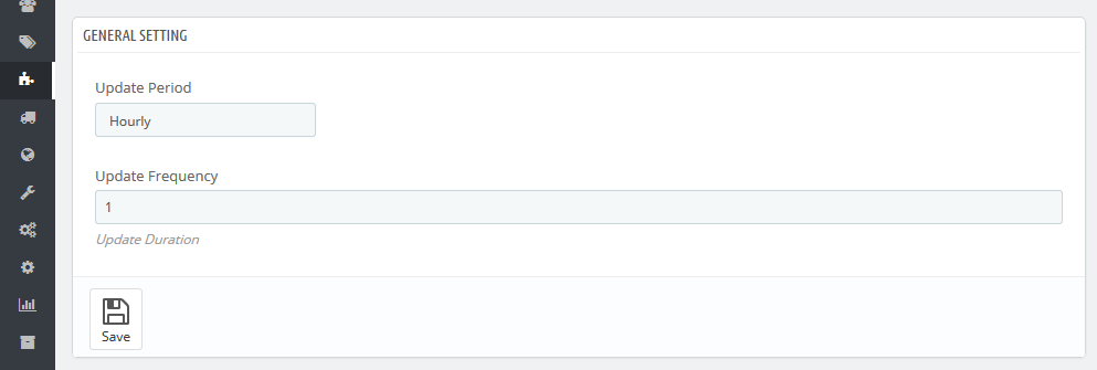
RSS Smart Blog Feed
The module generating the new feed for your Blog.
Has several settings in the admin panel:
-
- Update Period
- allows to display posts from specific time period (hour/day/week/month/year).
-
- Update Frequency
- allows to set the frequency of update (1 week, 2 hours, etc.).
At the top there is a file path where news will be generated. It consists of the website URL + /modules/smartblogfeed/rss.php.
Smart Blog Archive
This block shows up in the left/right column and is used to sort posts by period of time (month).
It does not have any additional settings.
Smart Blog Categories
This block shows up in the left/right column and is used to sort posts by category.
It does not have any additional settings.
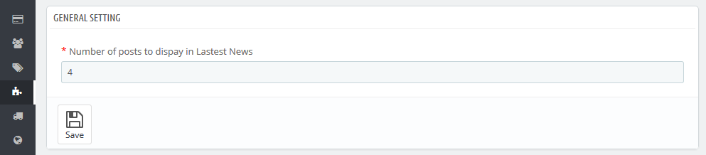
Smart Blog Home Latest Posts
This block shows up only in homepagecontent hook and is used to display latest posts on the home page.
Settings:
-
- Number of posts to display in Latest News
- number of posts that will show up on home page.
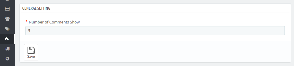
Smart Blog Latest Comments
This block shows up in the left/right column and is used to display the latest comments added for the Blog posts.
Settings:
-
- Number of Comments to Show
- number of comments shown in the block.
Smart Blog AddThis Module
This block shows up on the post single page and allows to share this post in social networks.
It does not have any additional settings.
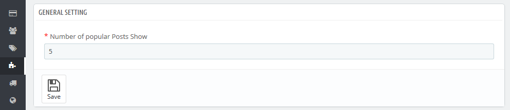
Smart Blog Popular Posts
This block shows up in the left/right column and is used to display the most popular posts viewed.
Settings:
-
- Number of popular Posts to Show
- number of popular posts shown in the block.
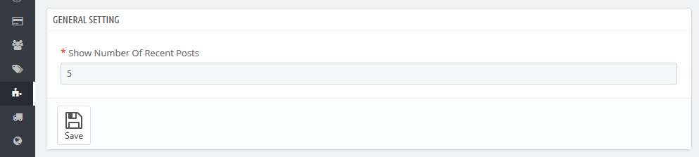
Smart Blog Recent Posts
This block shows up in the left/right column and is used to display the latest posts.
Settings:
-
- Show Number Of Recent Posts
- number of recent posts shown in the block.
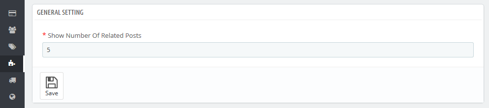
Smart Blog Related Posts
This block shows up on the post single page and is used to show up related posts.
Settings:
-
- Show Number Of Related Posts
- number of related posts shown in the block.
Smart Blog Search
This block shows up in the left/right column and is used to search through the blog.
It does not have any additional settings.
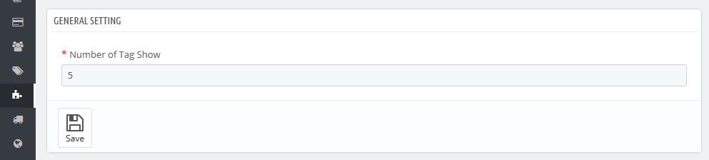
Smart Blog Tag
This block shows up in the left/right column and is used to display tags used in the blog.
Settings:
-
- Number of Tag to Show
- number of tags shown in the block.
TM Category Products 1.0.0
This module displays category products in displayHome and displayHomeTabContent hooks. The module allows displaying single products, products from a category or all products. Moreover, the module comes with a carousel that works, when the module occupies the displayHome position.
TM Category Products Main Panel
The main panel. Here you can set up the module.
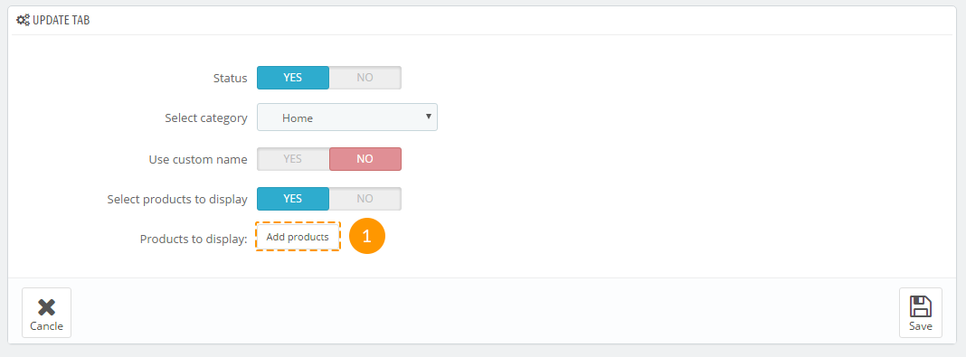
Adding a Tab
Tab is a block that displays products in displayHomeTabContent position.
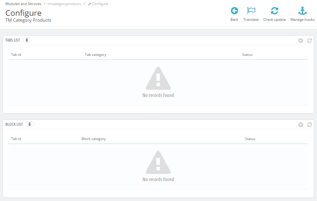
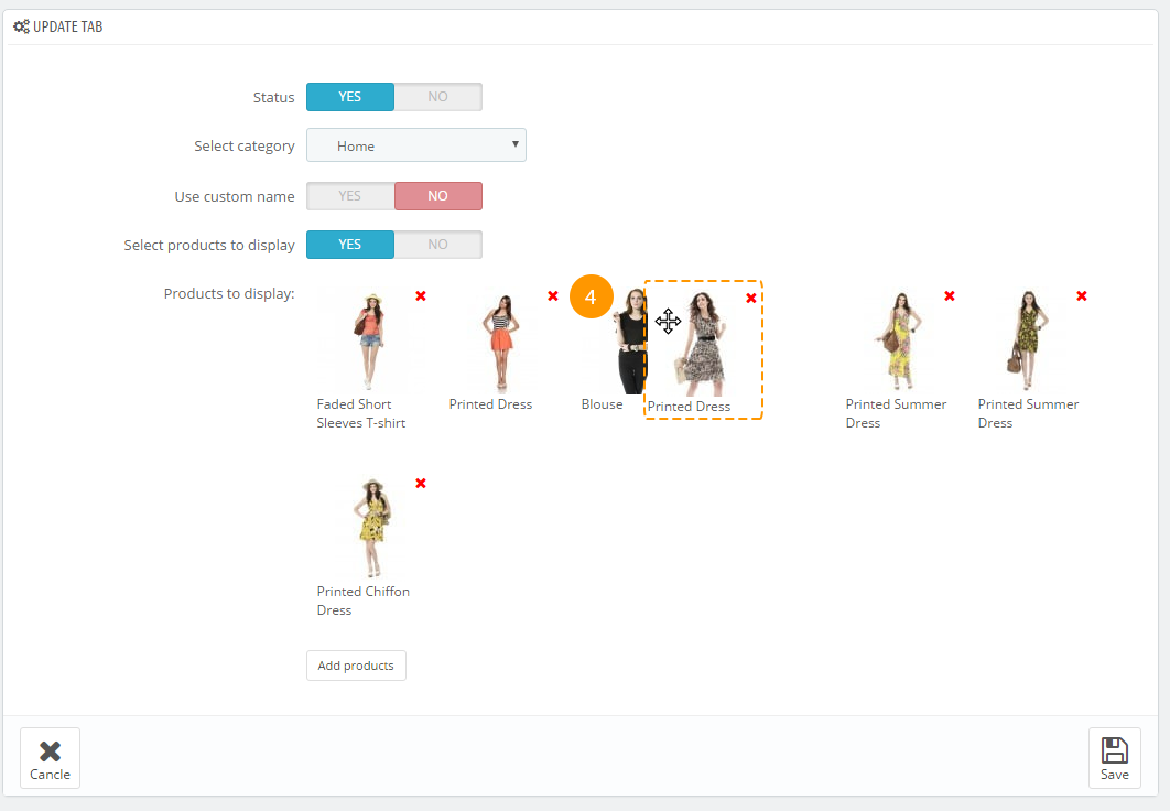
Navigate to the module main panel and press the 'plus' (1) button in the tabs list.
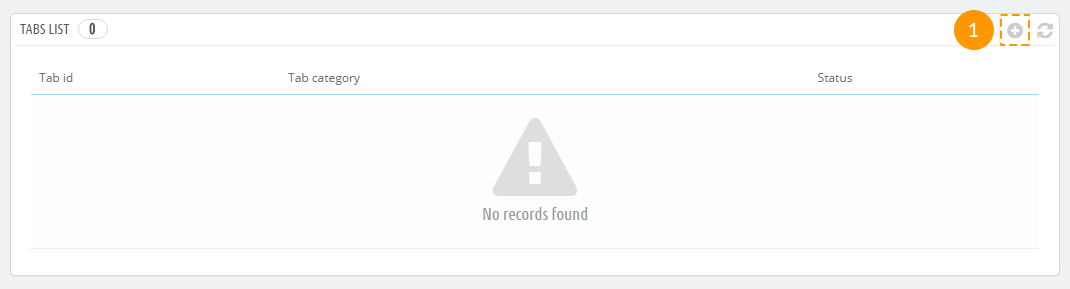
In the appeared form, you'll see the following options:
- Status - this option allows enabling/disabling the tab.
- Select category - the category, products of which will be displayed.
- Use custom name - this option allows changing the displayed category name. If enabled, the following
form will be displayed:
- Name - the custom tab name, displayed on the website.
- Select products to display - if disabled, displays the 'Number of products to display' field, which sets the number of products to display. If enabled, displays the 'Add products' button that allows selecting products to display in the tab.
After configuring all the needed options, press the 'Save' (2) button.
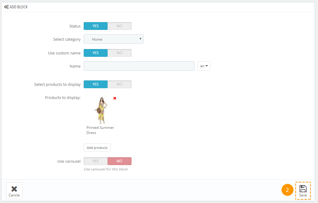
Adding a block
This block allows selecting products in displayHome position.
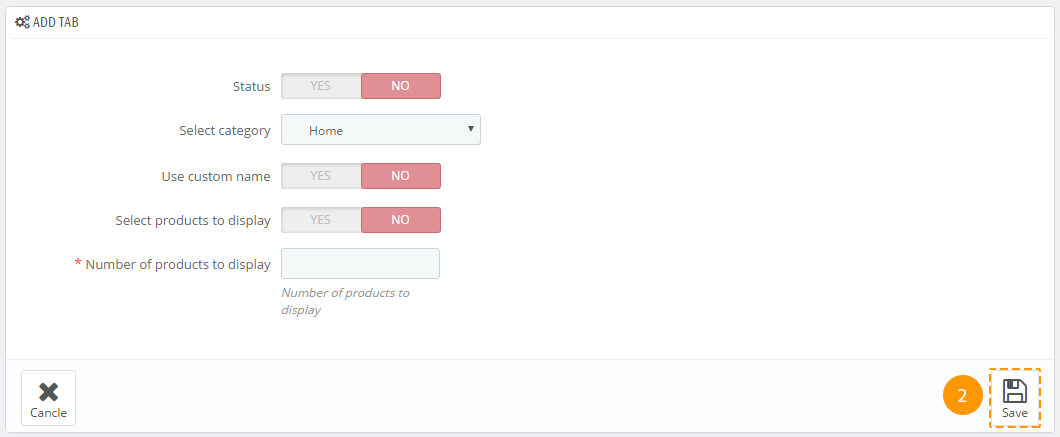
Access the module main panel and press the 'plus' (1) button in the blocks list.
In the appeared form, you'll find the following options:
Status - this option allows enabling/disabling the block.
Select category - the category, products of which will be displayed.
-
Use custom name - this option allows changing the displayed category name. If enabled, displays the following form:
Name - the custom tab name, displayed on the website.
-
Select products to display - if disabled, displays the 'Number of products to display' field, which sets the number of products to display. If enabled, displays the 'Add products' button that allows selecting products to display in the tab.
-
Use carousel - this option allows enabling/disabling the carousel for block products. After enabling the option, you'll see the following settings:
Visible items - the number of visible items.
Items scroll - the number of items changed with one carousel scroll.
Slide Width - the carousel list item width.
Slide Margin - the carousel list item margin.
Auto scroll - auto scroll of carousel items.
Carousel speed - speed of changing items.
Pause - pause between scrolls (if "Auto scroll" is enabled).
Random - the carousel starts with a random item.
Carousel loop - the loop: when all the carousel items have been displayed, carousel starts from the beginning.
Hide control on end - hide control buttons (Next/Prev).
Pager - display pagination.
Control - display controls (Next/Prev).
Auto control - display controls (Play/Pause).
Auto hover - carousel pauses, if the user hovers a list item.
-
After configuring all the needed options, press the 'Save' (2) button.
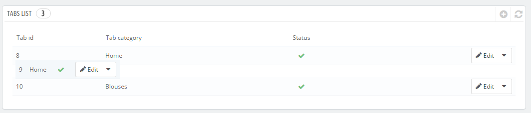
Blocks/Tabs Sorting
You can sort the blocks of the module with the help of drag'n'drop. This allows to change blocks and tabs positions quickly.
Selecting Products
If you create an item and enable 'Select products to display' option, you can choose the products that you want to display. To do this:
Press the 'Add products' (1) button:
In the appeared pop-up, select the needed products (2) and press the 'Add' (3) button:
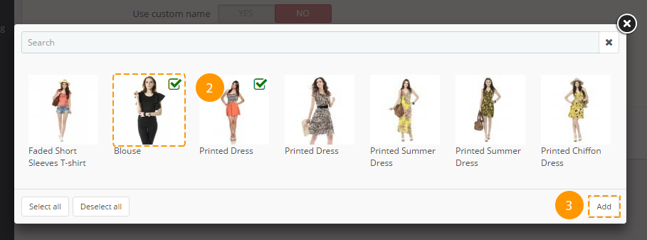
Now, you can place the added products wherever you want with the help of drag'n'drop (4):
When all the needed products are added and arranged in the desired order, press the 'Save' button.
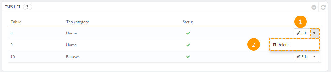
Deleting Blocks/Tabs
To delete items, press the drop-down menu next to the needed block/tab (1) and press delete (2). The item will be deleted.
TM Collections
TM Collections module is created to give the ability to the visitors of online store to add products to collections and share this collections on Facebook.
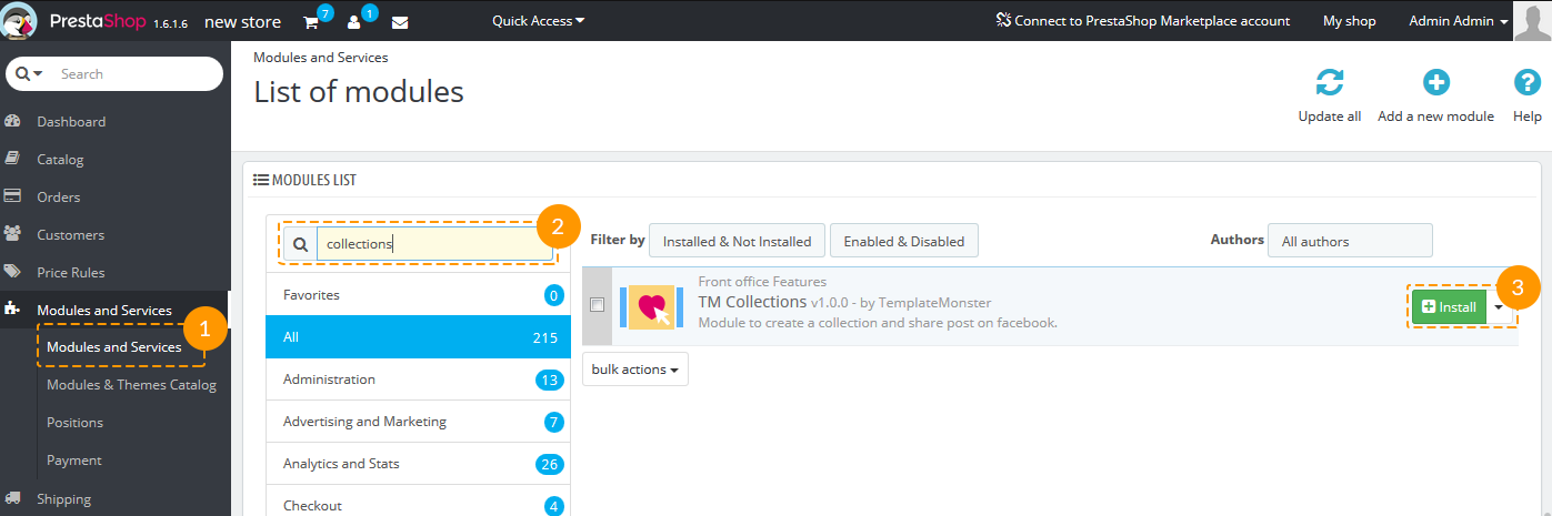
Module Installation
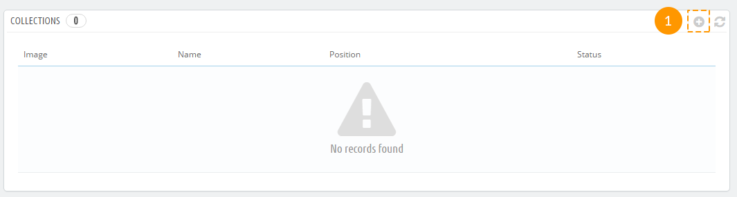
То install the module navigate to Admin panel -> Modules and Services -> Modules and Services (1), find the TM Collections module (2) and press 'Install' button (3).
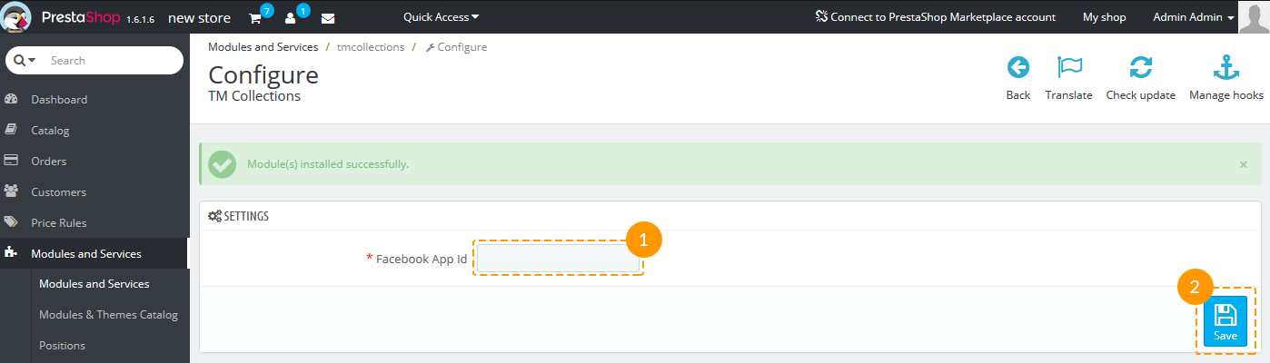
Module Configuration
After the module has been installed, the 'Settings' page will appear.
Add the Facebook App Id to the required field (1) and press 'Save' button (2).
The instruction how to get the Facebook App Id can be found here: Creating an App ID.
Using TM Collections Module
Adding product to collection
Shop visitors should be logged in to be able to add the items to collections.
-
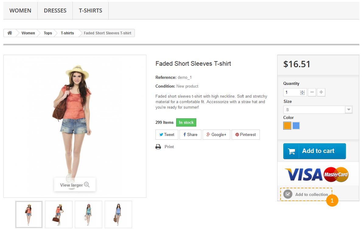
After the module is installed, the button 'Add to collection' appears on each product page. It should look like on the screenshot below (1).
-
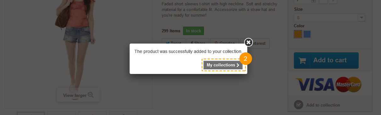
After clicking this button a shop visitor will see a notification: 'The product was successfully added to your collection.' It can be closed or skipped to collections view by clicking 'My collections' button (2).
Browsing Collections
-
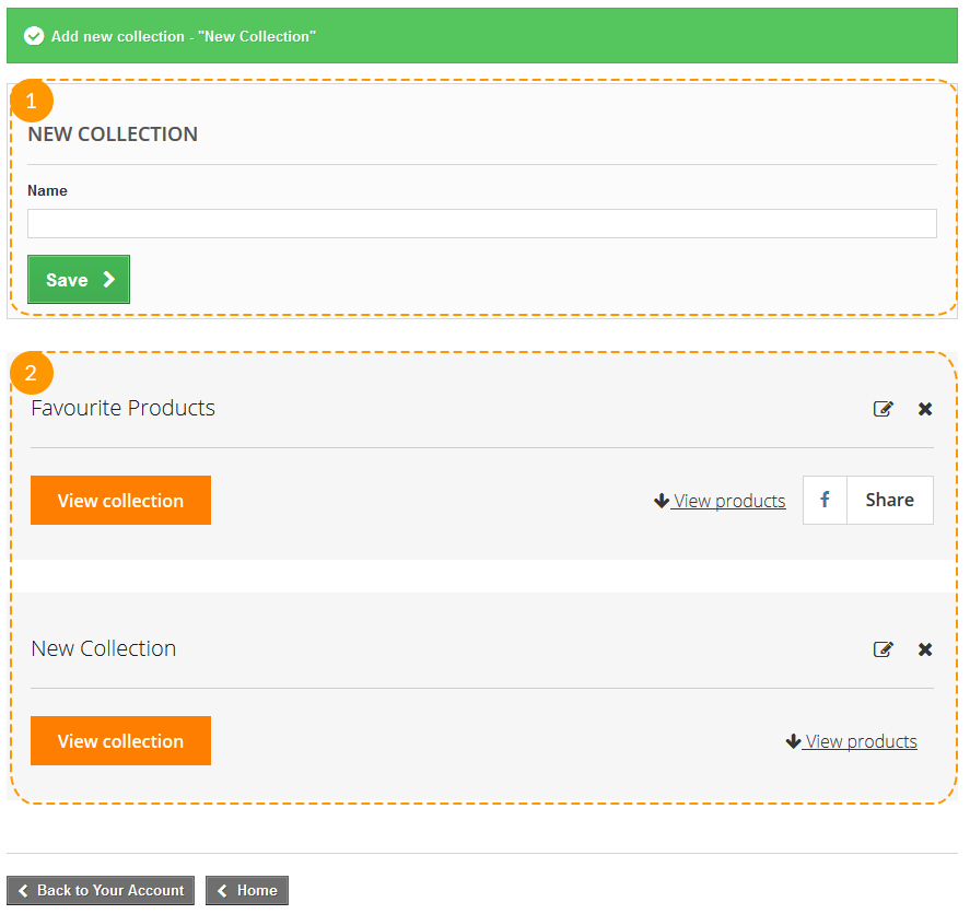
On 'My Collections' page a client can add the new collection (1) or view the list of created ones (2).
-
Clicking 'View collection' button (1) will open the colection page, the 'View products' button (2) gives the ability to see the products list of this collection on current page.
The title of collection can de edited (3) or deleted (4).
To share the collection the visitor should press the 'Share' button (5).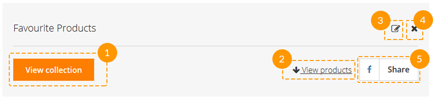
-
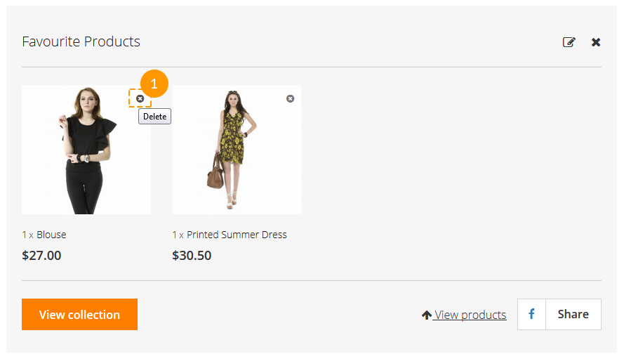
While looking through the items in collection after clicking 'View products' button, each item can be removed from the list (1).
Sharing Collections
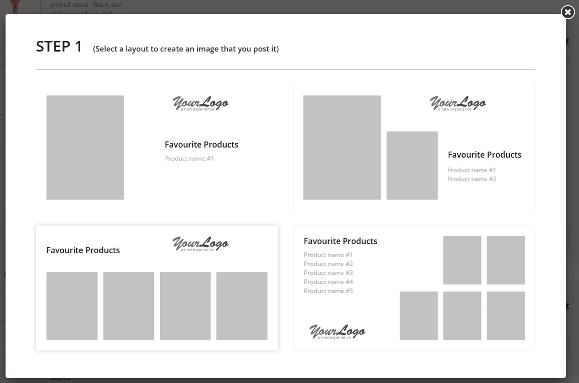
To share the collection the visitor should press the 'Share' button. There will be a few easy steps to follow before posting the collection. During each step there's an ability to go back and change the sharing options.
-
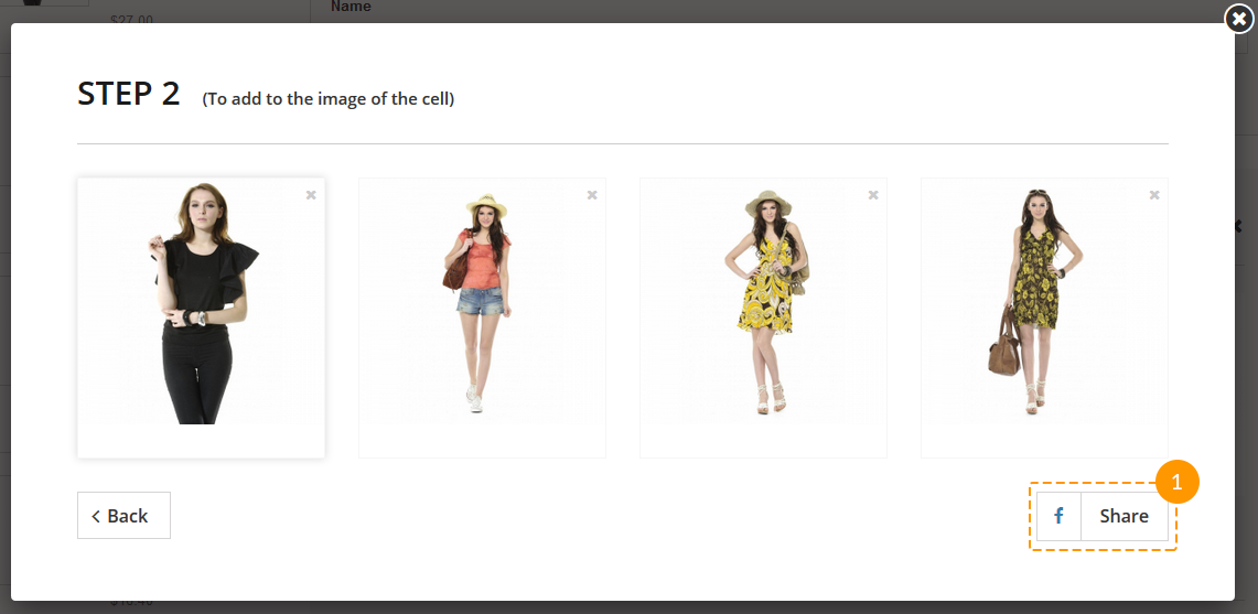
First step is to choose the layout for collection that will be posted.
-
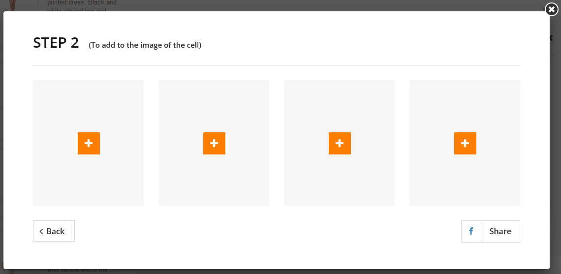
Then the products should be added. Each cell with a '+' is a button to add the product image.
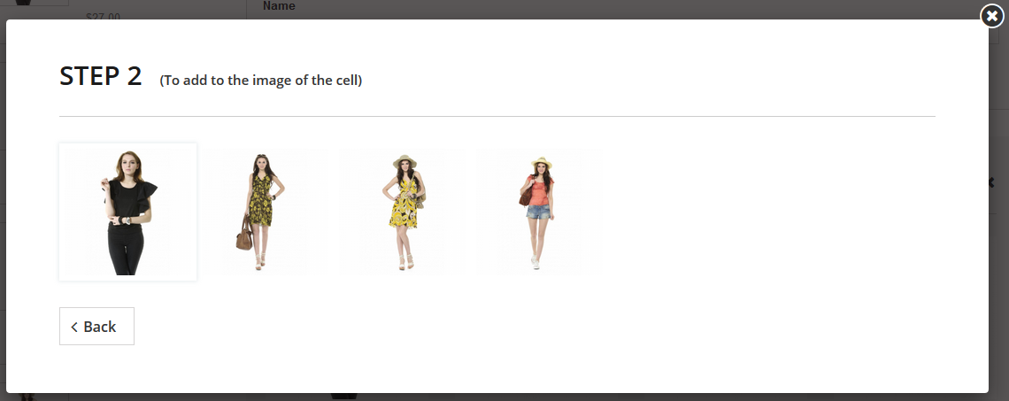
Choosing the images of each product:
-
When all images are added, the visitor should press the 'Share' button (1).
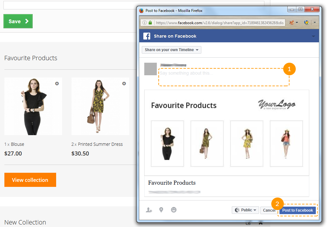
-
In a small window which is then appeared there will be some standard posting options to choose and the ability to add some text to the post (1). After clicking 'Post to Facebook' button (2), the post will be published.
Statistics
Using this module you can also get the statistics collected while the products are added to collections. Thus you
will know which products are currently popular. This information can be very useful for suggesting a discount, for
example.
You can view the statistics navigating to Admin panel -> Stats -> Stats -> TM Collections.
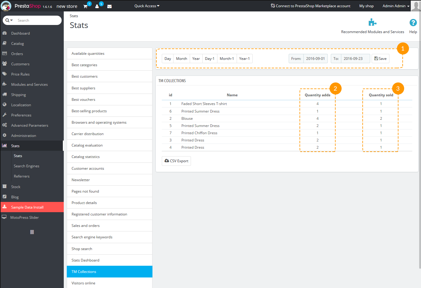
- You can select the period for viewing the statistics from the specified time (1).
- In the first column there's a number of product addings (2).
- The second column is created for your convenience. You can use it to see how many of added products were sold (3).
TM Deal of the Day
This module allows you to display the list of products with the discount countdown timer. You can also add a timer to products in the home page tabs, on the category pages and single product pages.
Installation and Deleting
The module is installed and removed the same way as any other PrestaShop module.
Module Settings
After module installation you can add a product discount with the display period and a discount countdown timer.
Adding/removing/editing blocks
-
In order to add a new product, press 'Add new' button
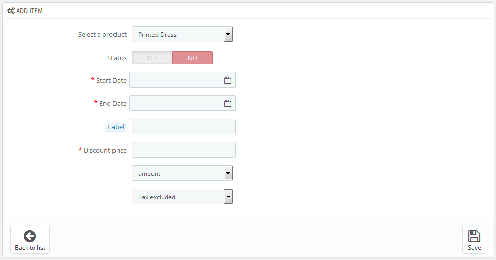
- Select a product - select a product to apply the discount and display a timer.
- Status - item status.
- Start Date - start date of the product discount period.
- End Date - end date of the product discount period.
- Label - product label.
- Discount price - discount price (absolute or percentage value).
-
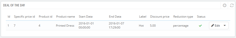
After saving the item it appears in the list of items of this type.
-
In order to edit this item, press 'Edit' button.
-
In order to remove this item, press 'Delete' button.
-
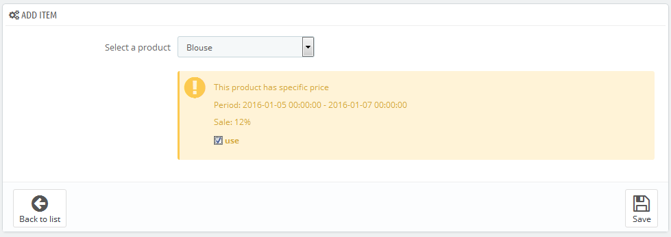
If a special price valid for a certain period was set to the product previously, this product can be added to the module items list.
Product display configuration
-
In order to change product display mode, press 'Configuration' button.
-
Then a form with product display configuration will appear.
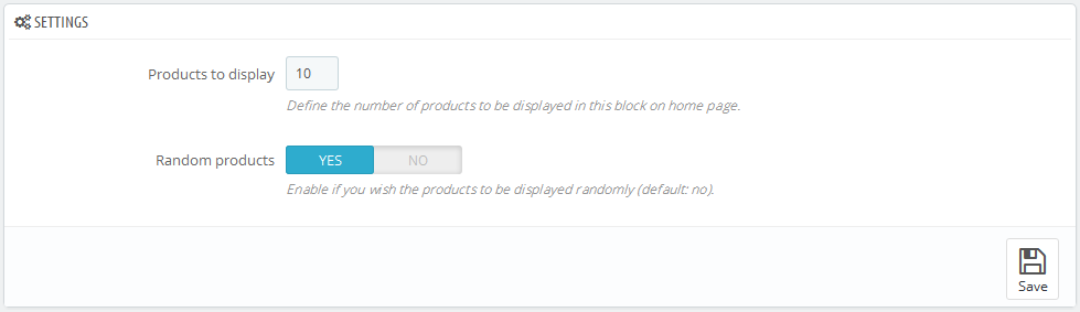
- Products to display - number of products to display in the home page block.
- Random products - random products display.
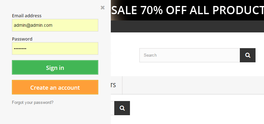
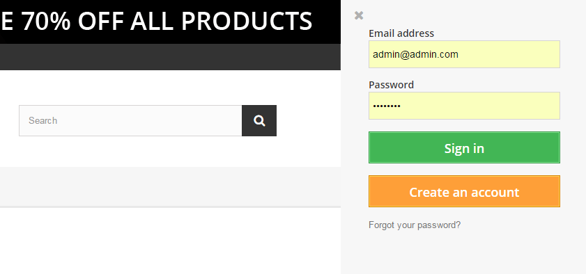
TM Header Account 2.0
If you have the 1.n version of this module installed in your prestashop engine, you are not suggested to update it with the current one. First you need to remove the old version of the module to run without errors.
For the correct module functioning, make sure that the service for sending messages on server is configured correctly. To check if it works correctly navigate to Admin panel -> Advanced parameters -> E-mail -> Test your email configuration -> Send a test email.
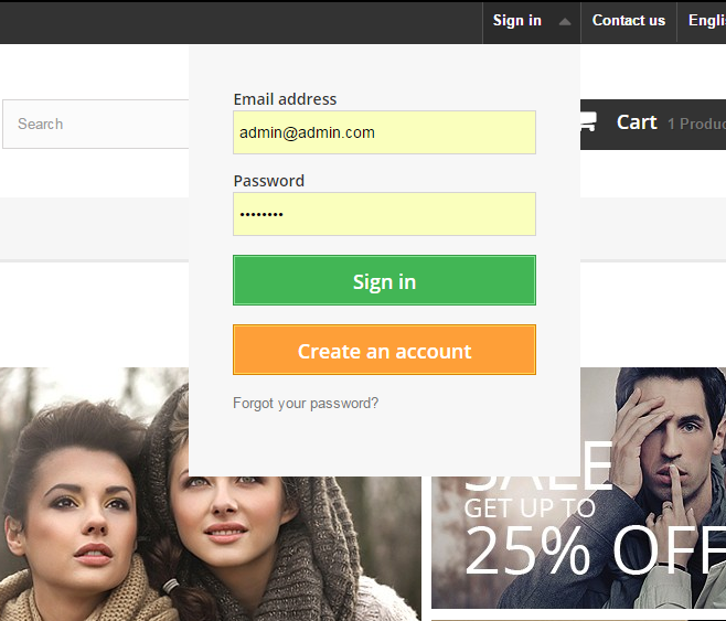
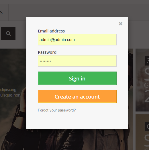
This module displays login and registration forms on the website. It can take the following positions: website header, left and right column. The module allows to log in and register using such social networks as Facebook, Google+ and VK, which is convenient for website users. Registration or logging in proceeds without reloading the page.
TM Header Account Main Panel
The main panel. Here you can set up the module.
Settings
There are the following settings in the module:
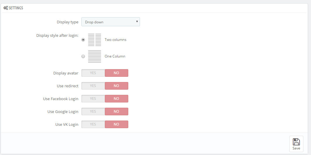
Display type - this setting allows to select the way to display the registration form. It can take the following values:
- Drop down - the form will display as a drop-down below the button opening it.
- Popup - the form will appear in a pop-up.
- Left side - the form will appear from the left as a sidebar.
- Right side - the form will appear from the right as a sidebar.
- Drop down - the form will display as a drop-down below the button opening it.
Display style after login - this setting allows to change the form view after login/registration. You can use the following values:
- Two columns - the list is divided into two columns.
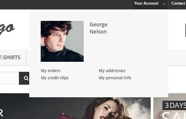
- One Column - the list of links is displayed as one column.
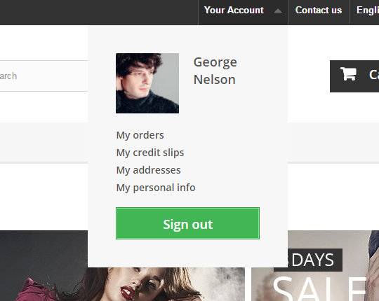
- Two columns - the list is divided into two columns.
- Default avatar - this field appears only if the 'Display avatar' option is enabled. Here you can select the default user avatar.
- Display avatar - this setting allows to enable or disable user avatar. If the user logs in to the account on the website with the help of one of the social networks, the avatar will be taken from the account in this social network, otherwise, the avatar, loaded by the website admin, will be displayed.
- Use redirect - if this setting is enabled, user registration and password recovery will take place on the default PrestaShop registration/password recovery page.
Use Facebook Login - this setting allows to enable user registration and login with the help of Facebook social network. When you enable this option, you will see the following settings:
- App ID - your account App ID from the Facebook developer account.
- App Secret - your app secret from the Facebook developer account.
Use Google Login - this setting allows to enable user login and registration with the help of Google+ social network. If you enable this option, you will see the following settings:
- App ID - your App id from the Google developer account.
- App Secret - your App secret from the Google developer account.
- Redirect URIs - your online-store url + index.php?fc=module&module=tmheaderaccount&controller=googlelogin
Use VK Login - this setting allows to enable user registration and login with the help of VK social network. If you enable this option, you will see the following settings:
- App ID - your App id from your VK developer account.
- App Secret - App secret from your VK developer account.
- Redirect URIs - your online-store url + index.php?fc=module&module=tmheaderaccount&controller=vk
Registering apps in social networks:
- Facebook - to get App ID and App Secret, register your app at https://developers.facebook.com/apps.
You may check the following tutorial in order to learn how to create Facebook developer account and get App ID and App Secret values.
- Google+ - to get App ID and App Secret, register your app at https://developers.google.com/accounts/docs/OAuth2/.
- VK - to get App ID and App Secret register your app at https://vk.com/dev.
TM Homepage Products Carousel
The module adds a carousel to the main page tabs.
Installation and Deleting
The module can be installed and deleted like any other PrestaShop module.
Module configuration
The installed module settings can be configured on the module configuration page.
-
- Use carousel
- enable/disable carousel
-
- Number of elements to display
- the number of items to display
-
- Items scroll
- the number of items to scroll
-
- Item Width
- width of an item in the carousel list
-
- Item Margin
- margin between items in the carousel list
-
- Carousel speed
- item transition duration
-
- Pause
- the amount of time between each auto transition (if the "Auto scroll" option is enabled)
-
- Auto scroll
- enable carousel auto scroll
-
- Random
- start carousel from a random item
-
- Carousel loop
- carousel returns back to the beginning when all elements have been scrolled
-
- Hide control on end
- hide the navigation (next/previous) buttons on last slide
-
- Pager
- show pagination
-
- Control
- show next/previous buttons
-
- Auto control
- show play/pause buttons
-
- Auto hover
- pause the carousel when mouse hovers over carousel items
TM HTML Content
This module allows to display any content (image, HTML, links, etc.) in the following positions: displayNav, home, top, topColumn, left and right (displayLeftColumn/displayRightColumn), footer. It is used to expand design opportunities and add advertisement/information blocks to your store. It is a multilanguage module and can also work in the multistore website.
To add the content, you should follow the steps below:
Navigate to Modules -> Front Office Features -> TM HTML Content (if it is not installed, install it).
- Click 'Add new' button.
- The list of available languages. You can view the available elements for all languages by switching the language tabs.
- The list of elements added for specific position and language.
Adding the element. Click Add item button and fill in the required settings (none of the fields are mandatory).
All elements of one language added to the same position will be displayed as a list at the backend and frontend.
-
- Language
- select the required language from the drop-down list.
-
- Title
- title of the element.
-
- Use title in front
- display the title of the element at the frontend (the title will show up in front of the element).
-
- Hook
- position where the element is added.
-
- Image
- upload the image from your computer.
-
- Image width
- image width shown at the frontend.
-
- Image height
- image height shown at the frontend.
-
- URL
- add the link (the whole block will be wrapped in the link).
-
- Target blank
- open link in new tab.
-
- HTML
- HTML code (except the link if you have added it in the URL field) or text.
-
- Save
- click to save the element.
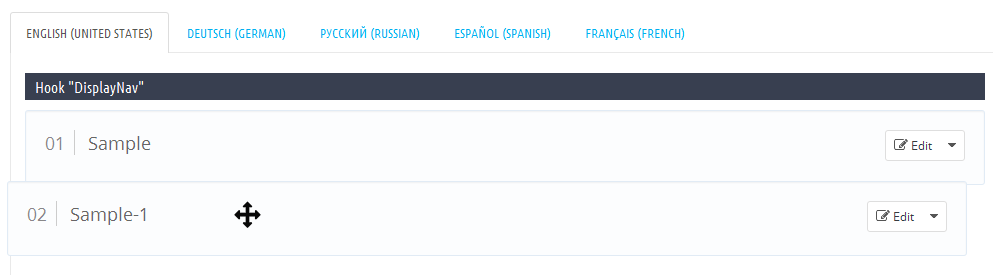
Editing and removing the element
When you add the element, it shows up in the corresponding list.
- The language where the elements were added.
- Position where the elements were added.
- Edit button with the drop-down list.
- Delete button.
Editing
Click Edit button to modify the element.
In the appeared screen change all the required fields.
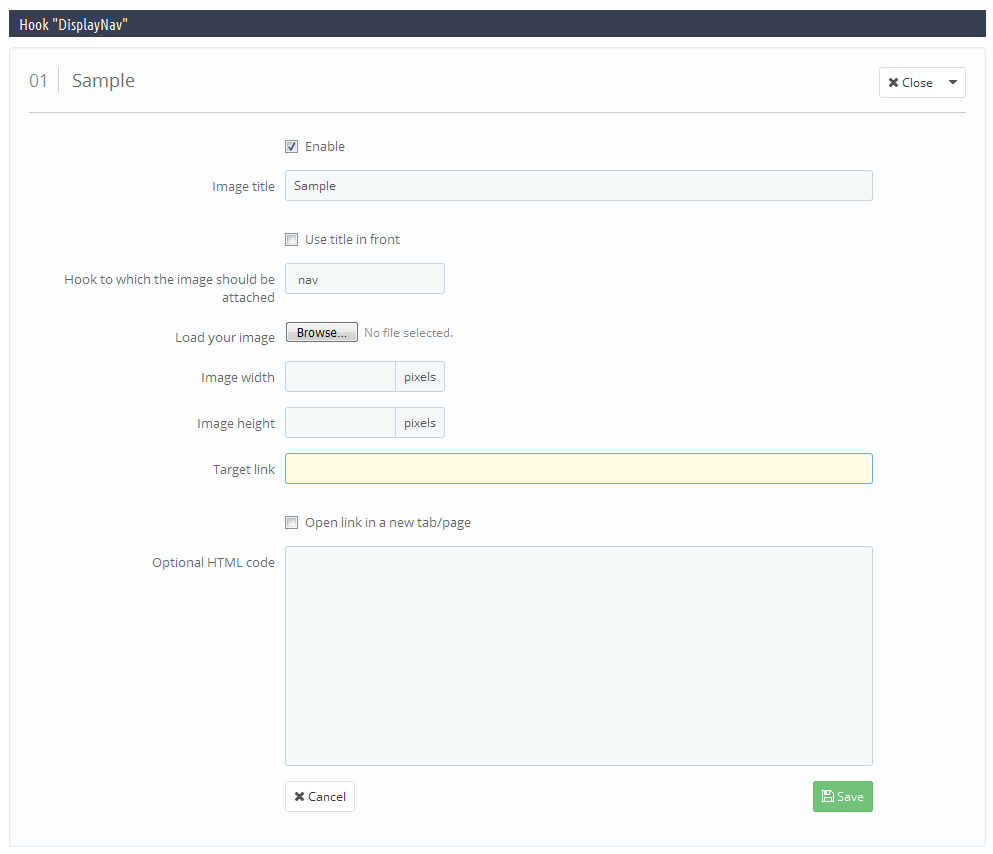
-
- Enable
- display the element at the frontend.
-
- Image title
- title of the element.
-
- Use title in front
- show up title at the frontend.
-
- Hook to which the image should be attached
- position of the element.
-
- Load your image
- image of the element.
-
- Image width
- image width at the frontend.
-
- Image height
- image height at the frontend.
-
- Target link
- assign link to the element.
-
- Open link in a new tab/page
- Open link in new tab.
-
- Optional HTML code
- edit HTML code.
-
- Save
- save changes.
Changing order of elements in the list
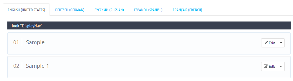
To change the order of elements, you should just drag the element to the position you need.

TM Infinite Scroll
With the help of this module, you can add AJAX products loading to the pages with products listing block. Module functionality allows to set up the auto load of products on scroll or when the 'Show more' button is pressed. Moreover, the module works with PrestaShop default product filters.
TM Infinite Scroll Main Panel
The main panel. Here you can set up the module:
Module Settings
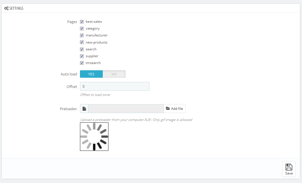
- Pages - pages, where the module is supposed to work.
- Auto load - if this option is enabled, products will automatically load on scroll. Otherwise, if the option is disabled, you'll see the 'Show more' button and the products will load, when you press this button.
- Offset - this option is displayed when 'Auto load' is enabled. It allows to determine the offset before the products loading area (or after it - if the value is negative).
- Pagination - this setting is displayed when 'Auto load' is disabled. It allows to add pagination to the products page.
- Display 'Show all' button - this option is available, only if 'Auto load' is disabled. After clicking this button all products show up.
- Preloader - in this field you can choose a preloader image that will be displayed while products are loading.
TM Look Book
Requirements:
This module allows to create lookbooks and combine them to collections. In their turn, lookbooks allow to view the products directly on the model. Also, if a product is marked in the lookbook, the module displays the lookbook link on the product page.
- PHP 5.4+
- PrestaShop 1.6
TM Look Book Main panel
On the main page of the module, you can delete and edit the module collections.
Adding and editing the collection
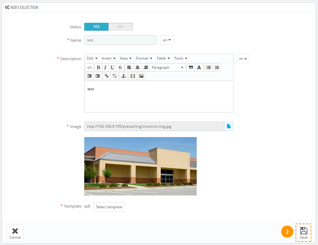
Collections allow to combine several lookbooks on one page. To add a collection, follow the next steps.
-
In the collections table (the main module panel) click on the plus (1).
-
You will see a form with the next fields:
- Status - this option allows to disable or enable the collection display on the collections page.
- Name - the name of the collection that will be displayed on the collections page.
- Description - the collection description.
- Image - the main collection image.
- Template - the template for the lookbooks of this collection. When you select a template, you select the way the lookbooks of this collection will be displayed on the page.
-
After having filled all the fields, press the 'Save' (2) button.
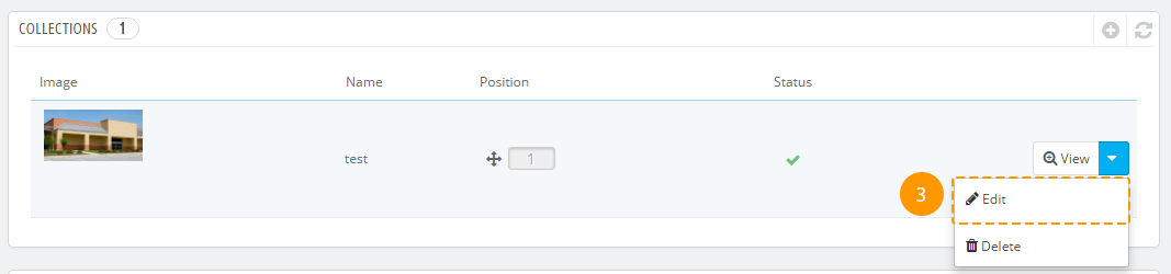
-
The collection has been created. You can edit it by pressing the 'Edit' (3) button, or you can proceed to the next step and create lookbooks for the collection.
Creating and editing lookbooks
-
After creating a lookbook, press the 'View' (1) button next to the needed collection.
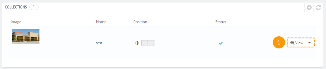
-
In the appeared block press the '+' button (2).
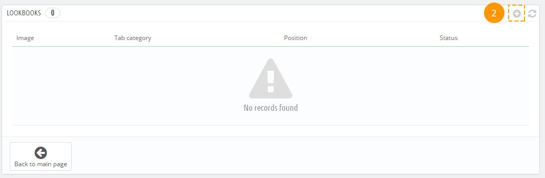
-
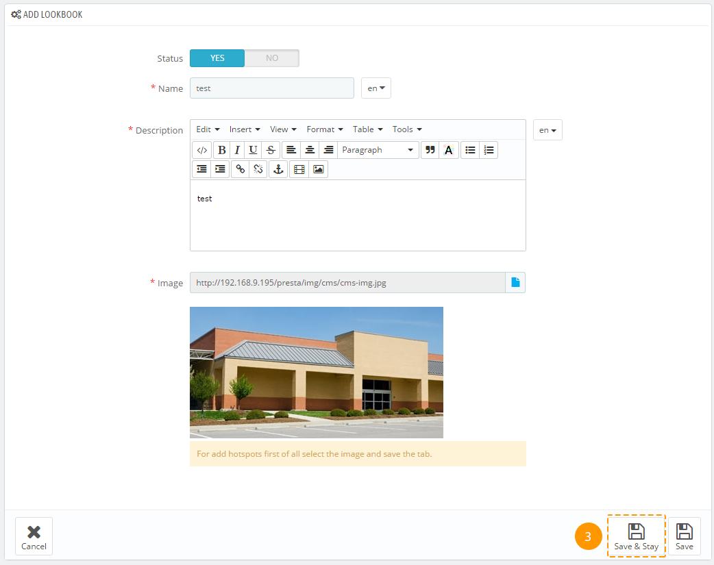
You'll see a form with the following options:
- Status - the lookbook status, the option defines whether the lookbook will be displayed.
- Name - the name of the look.
- Description - the description of the look.
- Image - the main image of the look, here you can mark the products and descriptions.
-
After filling in all the fields, press the 'Save & Stay' (3) button to continue creating hotspots.
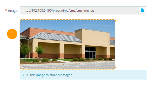
Adding and Editing Hotspots
After having saved the lookbook, you can add the hotspots.
-
Press the image (in the needed point) (1) in the lookbook form.
-
You will see a form with the following settings:
- Type - this is the point type, it has two values 'Product' and 'Content'. The product type allows to select a product that will be attached to the point, and content type allows to add content (name, description, html) to the point.
- Product - selecting a product for the point. It appears, if the selected type is 'Product'.
- Name - the name attached to the point. This field is available, only if the type 'Content' is selected.
- Description - the point description or coding. Available only if the type 'Content' is selected.
-
After having selected the needed options, press the 'Save' (2) button, hotspot will be created and displayed on the page.
Deleting a hotspot
-
To delete a point, hover over it (1).
-
You'll see a button with a cross, press it (2).
The point is deleted.
Changing the hotspot position
To change the point position, drag and drop it to the needed position.
How to navigate to the collections page?
Navigate to the main module page and press the button (1), you'll see a page with all the collections. You can add the links to the lookbooks to any module that supports custom content.
TM Look Book Homepage
To use the module, you should have the TM Look Book module installed.
TM Look Book Homepage is used to display the TM Look Book module block on the Homepage. This module allows to display both the lookbook covers and lookbook pages.
Requirements:
- PHP 5.4+
- PrestaShop 1.6
- TM Look Book Module
Module features:
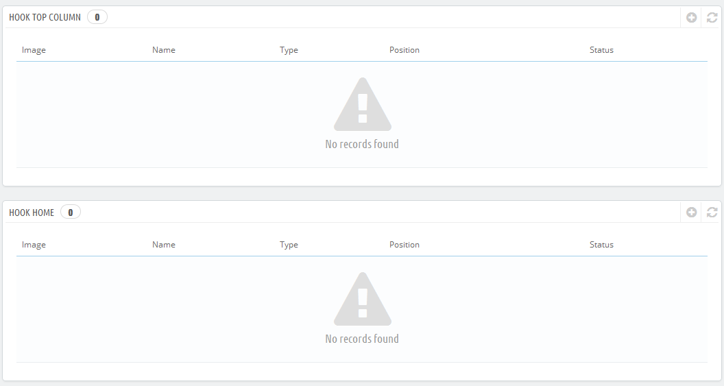
- The module can be displayed in 2 positions: displayHome and displayTopColumn.
- TM Look Book Homepage is a child module of TM Look Book, that's why it can't be used without it.
- The module can display the lookbook cover or its pages.
TM Look Book Main Panel
At the module main panel, you can add, delete and edit blocks, that the module will display on the Homepage.
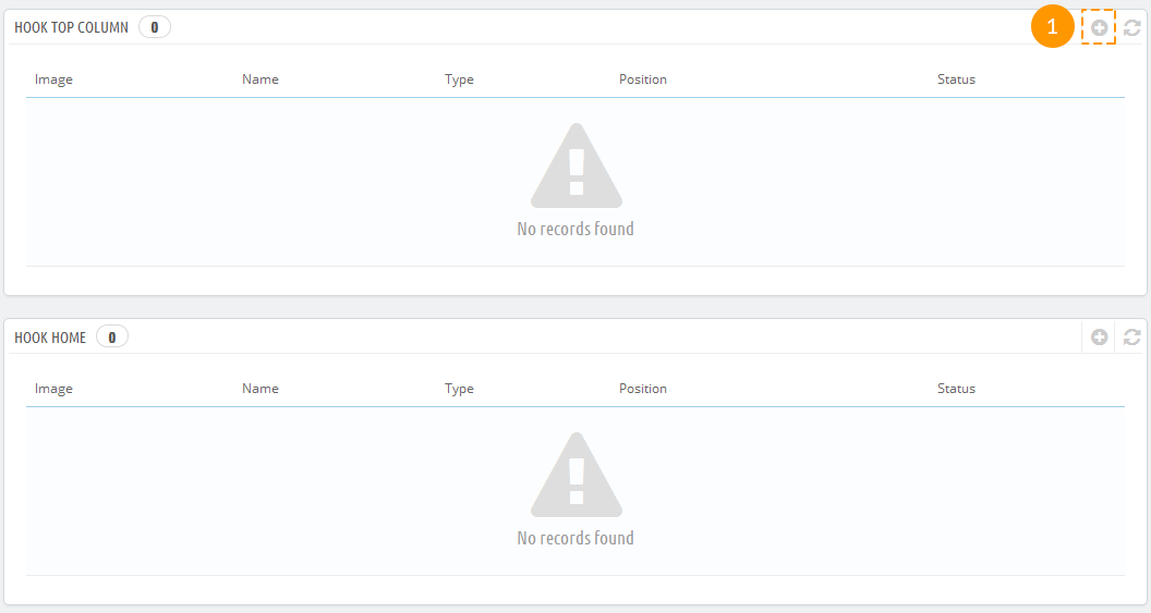
Adding a new block
-
To add a new block, enter the module main panel and click the '+' (1) in the table with the needed hook.
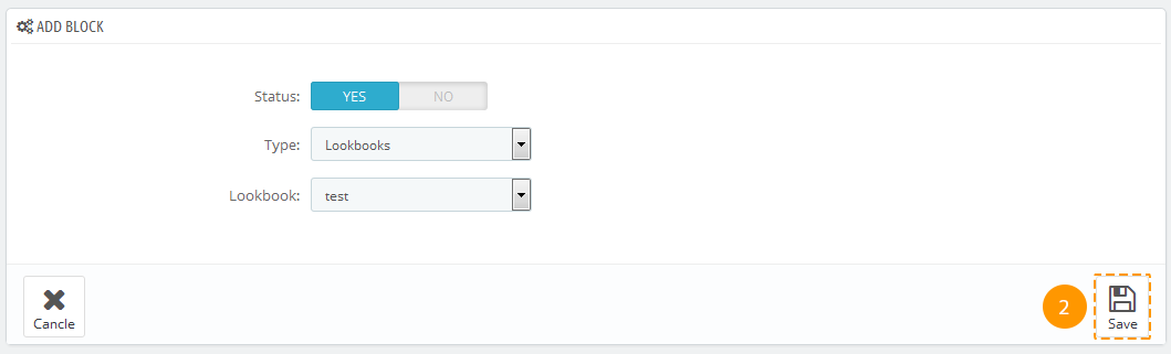
-
In the appeared form, set up the following options:
- Status - the block status. This setting allows to enable or disable the block display.
- Type - allows to select the block type.
- Lookbook - allows to select a previously selected look.
-
After setting up all options, press the 'Save' (2) button.
After the new block is created, it will be displayed on the Homepage.
TM Manufacturers Block
This module shows up manufacturers available in your store. The list of manufacturers may consist of image and title. The list can also show up as a carousel.
Installing and Deleting
The module is installed and deleted like any other Prestashop module.
Module configuration
After installation you can change its settings on the module configuration page.
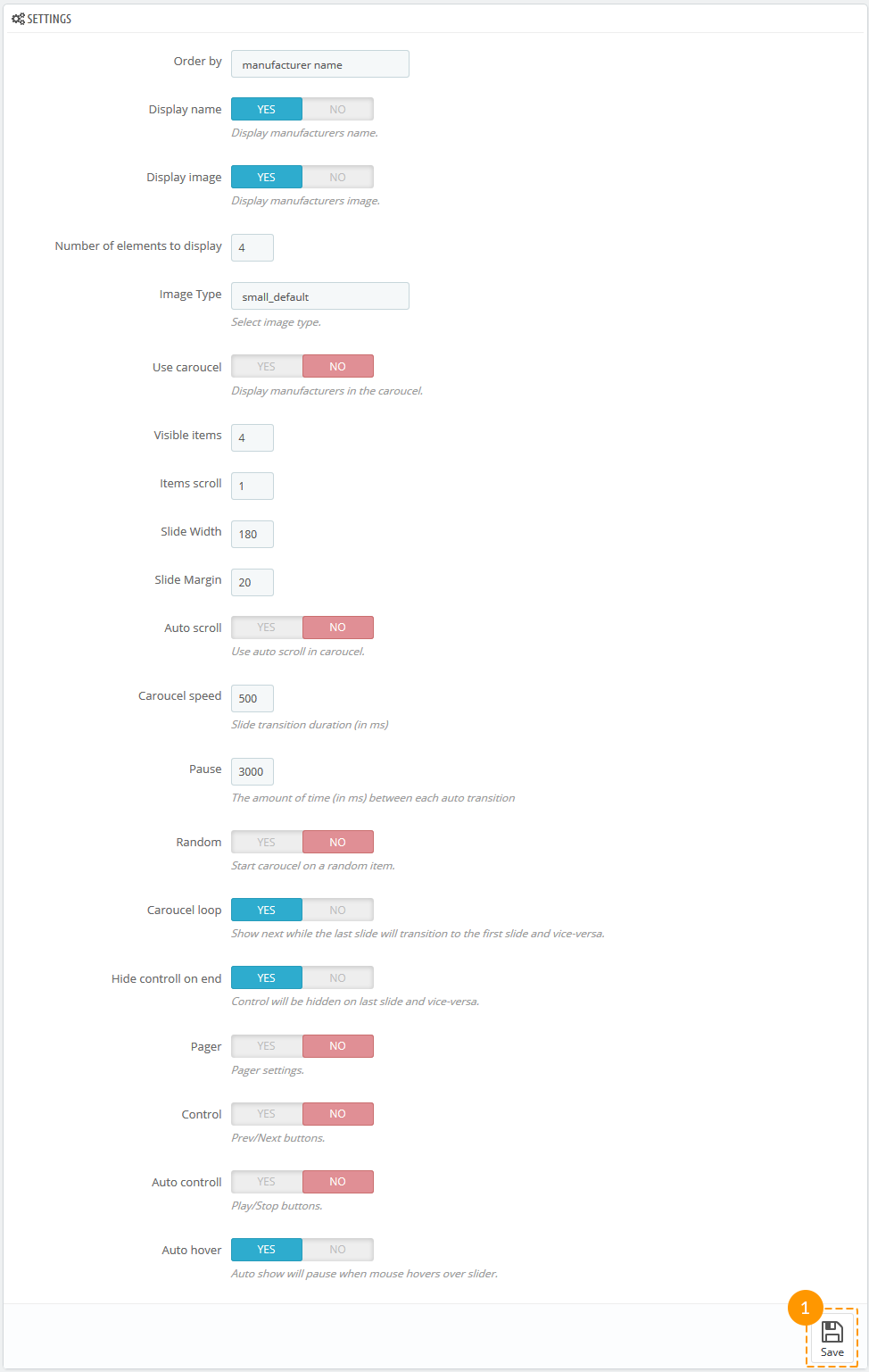
-
- Order by
- type of sorting items of the block.
-
- Display name
- show the manufacturer's name.
-
- Display image
- show the image of the manufacturer.
-
- Number of elements to display
- type the number of elements displayed in the module.
-
- Image Type
- select the image type (you can select the image from the images related to the manufacturer).
-
- Use carousel
- show up the list as a carousel.
-
- * Visible items
- number of visible manufacturers.
-
- * Items scroll
- number of manufacturers shown in one carousel scroll.
-
- * Slide Width
- the width of the element in the carousel.
-
- * Slide Margin
- the margin of the element in the carousel.
-
- * Auto scroll
- automatic scrolling.
-
- * Carousel speed
- speed of the carousel.
-
- * Pause
- pause between scrolls (if "Auto scroll" is enabled).
-
- * Random
- carousel start from the random element.
-
- * Carousel loop
- carousel returns back to the beginning when all elements have been scrolled.
-
- * Hide control on end
- hide next/previous buttons.
-
- * Pager
- show pagination.
-
- * Control
- show next/previous buttons.
-
- * Auto control
- show play/pause buttons.
-
- * Auto hover
- pausing when hovering over carousel elements.
* - settings are available only if carousel is enabled.
After all options have been set, press 'Save' button (1).
The module supports multi-stores.
TM Mega Layout 1.1.0
This module is designed to allow creating custom layouts (presets) for hooks and displaying them at site instead of the default positions. This module advantage is allowing you to create different hook markups and modify them up to your needs.
Functional characteristics and features of the module
-
Requirements:
PrestaShop 1.6+
PHP 5.4+
-
Features:
Module includes 5 hooks: 'Header', 'Top Column', 'Home', 'Footer' and 'Product Footer'.
In case module is not present in the hook, it can't be added to the preset.
Module can be displayed in the preset only once, the same as in a hook.
Module position in 'Modules and Services -> Positions' section does not affect the preset.
The module does not allow you to configure different modules. You cannot set different modules configuration for various presets.
Module provides you with an option for changing module position and setting up the grid for 3 hooks: displayTopColumn, displayHome, displayFooter. Changing the modules position in 'Modules and Services -> Positions' section will not affect the modules position in the preset. In case the module was not added to the hook, it can't be added to the preset either.
Integrating module to the theme
Without this step your presets will not be displayed at the frontend.
Top column. In order to add custom preset to the topColumn hook, you need to perform the following steps:
- Open the /themes/your_theme/header.tpl file for editing.
- Locate the following code
{hook h="displayTopColumn"} - And replace it with:
{assign var='displayMegaTopColumn' value={hook h='tmMegaLayoutTopColumn'}}
{if $displayMegaTopColumn}
    {hook h='tmMegaLayoutTopColumn'}
{else}
    {capture name='displayTopColumn'}{hook h='displayTopColumn'}{/capture}
    {if $smarty.capture.displayTopColumn}
        <div id="slider_row" class="row">
            <div id="top_column" class="center_column col-xs-12 col-sm-12">{$smarty.capture.displayTopColumn}</div>
        </div>
    {/if}
{/if}
Home. In order to add custom preset to the Home hook, you need to perform the following steps:
- Open the /themes/your_theme/index.tpl file for editing.
- Locate the following code:
{if isset($HOOK_HOME_TAB_CONTENT) && $HOOK_HOME_TAB_CONTENT|trim} {if isset($HOOK_HOME_TAB) && $HOOK_HOME_TAB|trim} <ul id="home-page-tabs" class="nav nav-tabs clearfix"> {$HOOK_HOME_TAB} </ul> {/if} <div class="tab-content">{$HOOK_HOME_TAB_CONTENT}</div> {/if} {if isset($HOOK_HOME) && $HOOK_HOME|trim} <div class="clearfix">{$HOOK_HOME}</div> {/if} - And replace it with:
{assign var='displayMegaHome' value={hook h='tmMegaLayoutHome'}}
{if $displayMegaHome}
  {hook h='tmMegaLayoutHome'}
{else}
  {if isset($HOOK_HOME_TAB_CONTENT) && $HOOK_HOME_TAB_CONTENT|trim}
    {if isset($HOOK_HOME_TAB) && $HOOK_HOME_TAB|trim}
      <ul id="home-page-tabs" class="nav nav-tabs clearfix">
        {$HOOK_HOME_TAB}
      </ul>
    {/if}
    <div class="tab-content">{$HOOK_HOME_TAB_CONTENT}</div>
  {/if}
  {if isset($HOOK_HOME) && $HOOK_HOME|trim}
    <div class="clearfix">{$HOOK_HOME}</div>
  {/if}
{/if}
Footer. In order to add custom preset to the Footer hook, you need to perform the following steps:
- Open the /themes/your_theme/footer.tpl file for editing.
- Locate the following code:
{if isset($HOOK_FOOTER)} <div class="footer-container"> <footer id="footer" class="container"> <div class="row"> {$HOOK_FOOTER} </div> </footer> </div> {/if} - And replace it with:
{assign var='displayMegaFooter' value={hook h='tmMegaLayoutFooter'}}
{if isset($HOOK_FOOTER) || $displayMegaFooter}
    <div class="footer-container">
    {if $displayMegaFooter}
         <div id="footer">
              {$displayMegaFooter}
         </div>
    {else}
        <div id="footer" class="container">
            <div class="row">{$HOOK_FOOTER}</div>
        </div>
    {/if}
    </div>
{/if}
Header. In order to add custom preset to the Header hook, you need to perform the following steps:
- Open the /themes/your_theme/header.tpl file for editing.
- Locate the following code:
{capture name='displayNav'}{hook h='displayNav'}{/capture} {if $smarty.capture.displayNav} <div class="nav"> <div class="container"> <div class="row"> <nav>{$smarty.capture.displayNav}</nav> </div> </div> </div> {/if} <div> <div class="container"> <div class="row"> <div id="header_logo"> <a href="{if isset($force_ssl) && $force_ssl}{$base_dir_ssl}{else}{$base_dir}{/if}" title="{$shop_name|escape:'html':'UTF-8'}"> <img class="logo img-responsive" src="{$logo_url}" alt="{$shop_name|escape:'html':'UTF-8'}"{if isset($logo_image_width) && $logo_image_width} width="{$logo_image_width}"{/if}{if isset($logo_image_height) && $logo_image_height} height="{$logo_image_height}"{/if}/> </a> </div> {if isset($HOOK_TOP)}{$HOOK_TOP}{/if} </div> </div> </div> - And replace it with:
{assign var='displayMegaHeader' value={hook h='tmMegaLayoutHeader'}}
{if isset($HOOK_TOP) || $displayMegaHeader}
  {if $displayMegaHeader}
    {$displayMegaHeader}
  {else}
    {capture name='displayNav'}{hook h='displayNav'}{/capture}
    {if $smarty.capture.displayNav}
    <div class="nav">
      <div class="container">
        <div class="row">
          <nav>{$smarty.capture.displayNav}</nav>
        </div>
      </div>
    </div>
    {/if}
    <div>
      <div class="container">
       <div class="row">
        <div id="header_logo">
          <a href="{if isset($force_ssl) && $force_ssl}{$base_dir_ssl}{else}{$base_dir}{/if}" title="{$shop_name|escape:'html':'UTF-8'}">
            <img class="logo img-responsive" src="{$logo_url}" alt="{$shop_name|escape:'html':'UTF-8'}"{if isset($logo_image_width) && $logo_image_width} width="{$logo_image_width}"{/if}{if isset($logo_image_height) && $logo_image_height} height="{$logo_image_height}"{/if}/>
          </a>
        </div>
        {$HOOK_TOP}
       </div>
     </div>
    </div>
  {/if}
{/if}
Product footer. In order to add custom preset to the Product footer hook, you need to perform the following steps:
- Open the /themes/your_theme/product.tpl file for editing.
- Locate the following code:
{if isset($HOOK_PRODUCT_FOOTER) && $HOOK_PRODUCT_FOOTER}{$HOOK_PRODUCT_FOOTER}{/if} - And replace it with:
{assign var='displayMegaProductFooter' value={hook h='tmMegaLayoutProductFooter'}}
  {if isset($HOOK_PRODUCT_FOOTER) || $displayMegaFooter}
    {if $displayMegaProductFooter}
      {$displayMegaProductFooter product=$product category=$category}
    {else}
      {$HOOK_PRODUCT_FOOTER}
    {/if}
  {/if}
Hooks
The module has 5 hooks available by default:
- 'Header' is a hook that combines 2 standard hooks: displayNav and displayTop. This hook corresponds to the website header.
- 'Top Column' corresponds to the original displayTopColumn hook. This hook comes right after the Header hook.
- 'Home' corresponds to the original displayHome hook. This hook is present only on the main page.
- 'Footer' corresponds to the original displayFooter hook.
- 'Product Footer' corresponds to the original displayFooterProduct hook, which is displayed in product page footer.
TM Mega Layout Main Panel
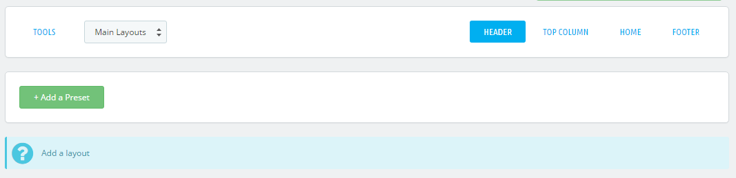
Main Layouts
The main TM Mega Layout module configuration panel that allows you to add a preset to the required hook and configure the preset.
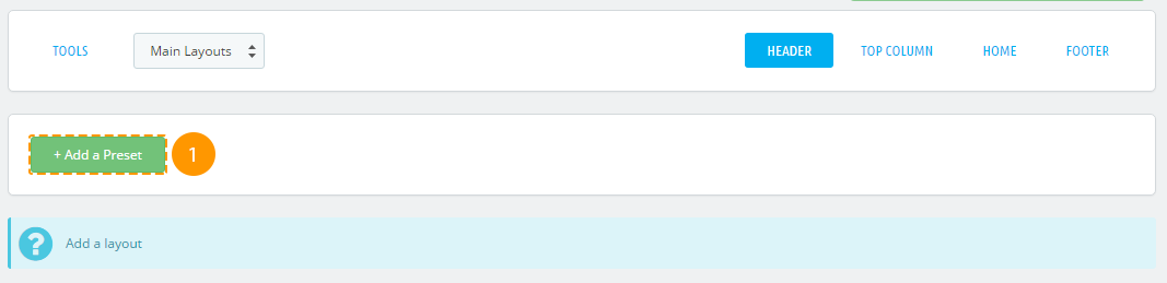
Adding the preset
-
Press '+ Add Preset' (1) in the needed tab.
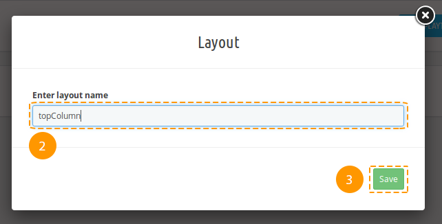
-
Next, fill in the 'Enter layout name' field in the popup typing the new preset (2) title there and press 'Save' (3).
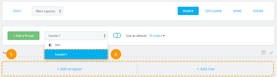
-
Preset was successfully created, it's listed among the available presets (4) now. Newly created preset is selected for editing (5).
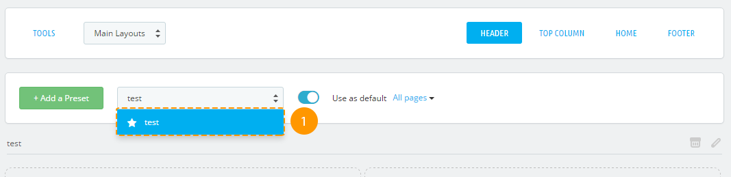
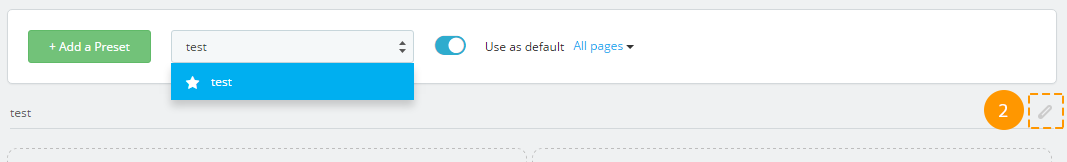
Preset activation
-
First of all, select the needed preset from the list (1).
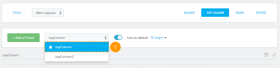
-
Press the 'Use as default' (2) switcher.

-
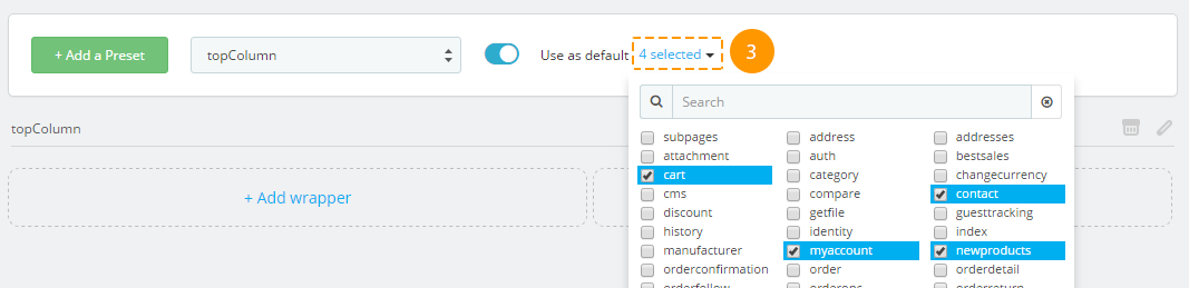
The preset was activated. If you need to display this preset only on some pages, open the dropdown (3) and select the pages you need. To apply changes, click outside the list area. A preset that is displayed on all pages will be marked with a filled star in the presets list, and the one that is displayed only on some pages will be marked with a partially filled star.
Removing the preset
There is no option to restore the preset after removing.
-
In order to remove the preset, choose the required preset among the list (1).
-
Next, press a cart (2) near the preset title.
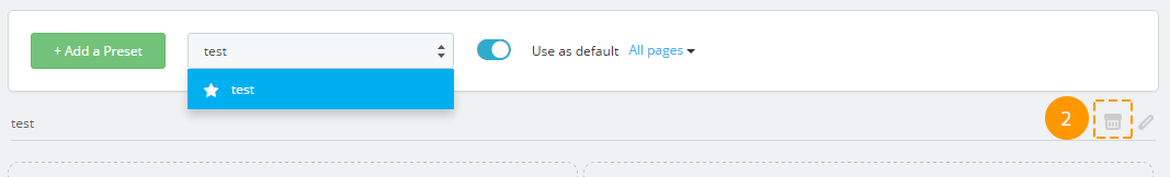
-
Preset was successfully removed.
Renaming the preset
-
In order to rename the preset, choose the required preset among the list (1).

-
Next, press a pencil icon (2) next to the preset title.
-
Specify the new preset title (3) in a popup and press 'Rename layout' (4).
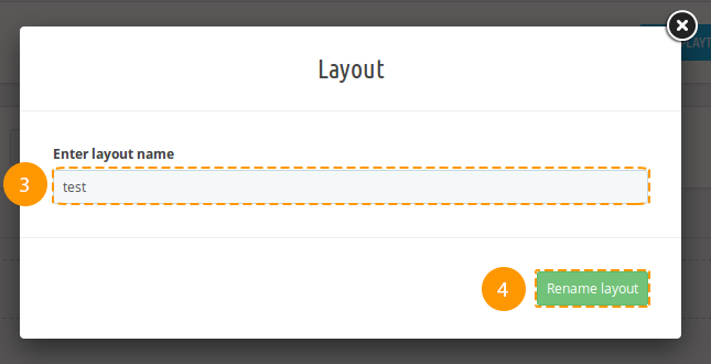
-
Preset was successfully renamed.
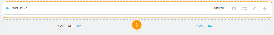
Wrapper
Wrapper has no class by default, it's not a mandatory item.
Adding the wrapper
-
In order to create a wrapper, press '+ Add wrapper' (1).
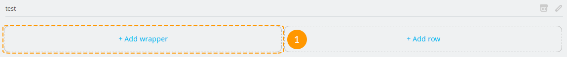
-
Wrapper was added (2).
Adding the custom CSS class to the wrapper
Adding the custom class will let you create a specific styling for your wrapper by using CSS rules.
-
In order to add wrapper class, press the button (1).

-
You'll see a pop-up window, fill in the 'Enter wrapper classes' (2) field there and press a 'Confirm' (3) button.
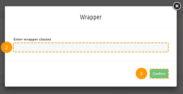
-
Custom class was added successfully.
Deleting the wrapper
Deleting the preset item will also cause all of its child items and their styles removing.
-
In order to remove the wrapper, press the cart button (1).

-
Wrapper was removed successfully.
Styling the wrapper
-
In order to add custom styles to the wrapper, press the 'pencil' (1) icon in the wrapper block.

-
In the following pop-up window fill in all the needed fields (you may refer to the documentation 'Styling' section), and press 'Save' (2) button.
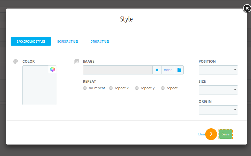
-
If all of the fields are filled in correctly, styles will be saved.
Row
Row item from the Bootstrap grid. It's a required item.
Adding the row
-
In order to insert a new row, press '+ Add row' (1) into the wrapper block, or '+ Add row' (2) in the main preset block, or '+ Add row' (3) in the column dropdown list.
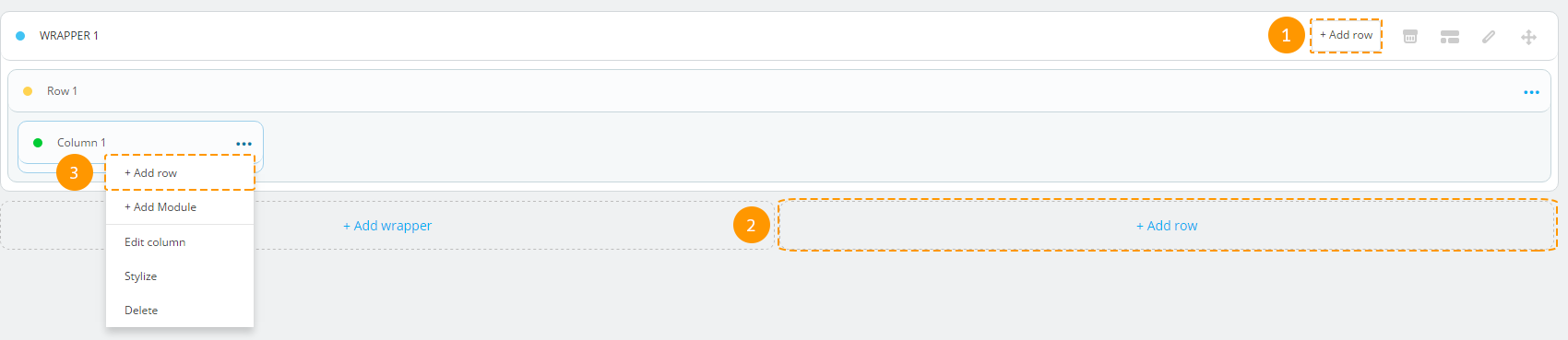
-
The row was added successfully.
Adding custom CSS class to the row
Custom class adding allows you to create custom row styling using CSS rules.
-
In order to add the class to the row, you should press the 'ellipsis' button (1).

-
Choose the 'Edit row' (2) in a dropdown list.
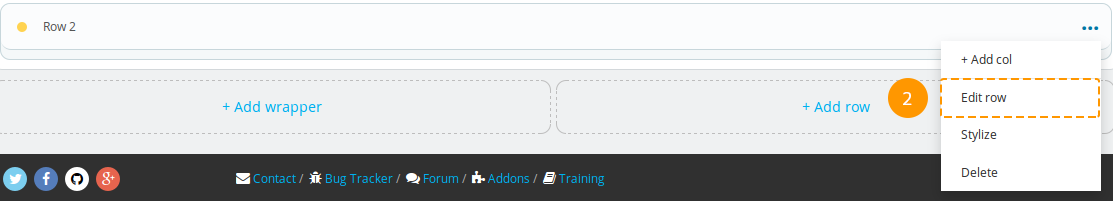
-
Fill in the 'Enter row classes' (3) field in the pop-up window and press 'Confirm' (4) button.
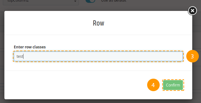
-
Custom class was added successfully.
Deleting the row
Removal of preset item will also cause removal of its child items and their styles.
-
In order to remove the row, open the menu (the 'ellipsis' icon) in the row block.

-
Choose 'Delete' (2) option in the dropdown.
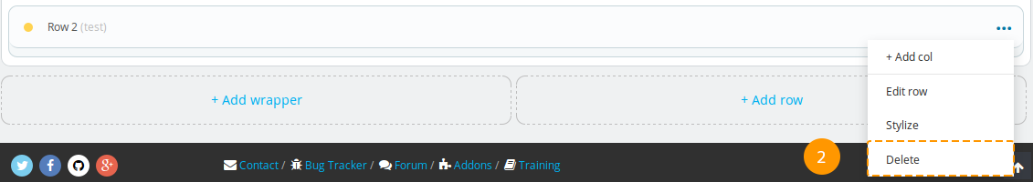
-
The row was successfully removed.
Adding styles to the row
-
In order to add row styles, open the menu (the 'ellipsis' icon) (1) in a row block.

-
Press 'Stylize' (2) in the dropdown.
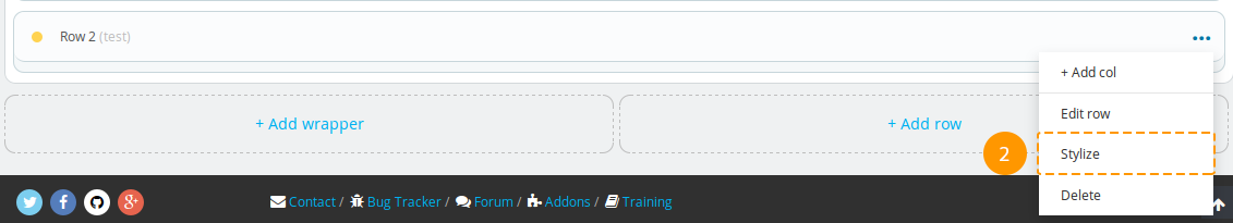
-
You will see the pop-up window, fill in all the needed fields there (you may refer to the documentation 'Styling' section) and press 'Save' (3) button.

-
If all of the fields are filled in correctly, styles will be saved.
Column
It is an item with configurable block width for different dimensions, based on Bootstrap grid.
Adding the column
-
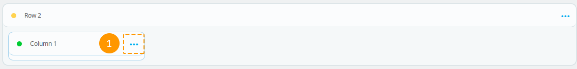
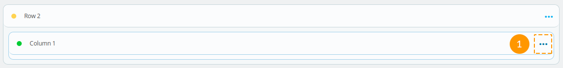
In order to insert a column into a needed 'row', open the menu (the 'ellipsis' icon) (1)

-
Choose the '+ Add Col' (2) among the list.
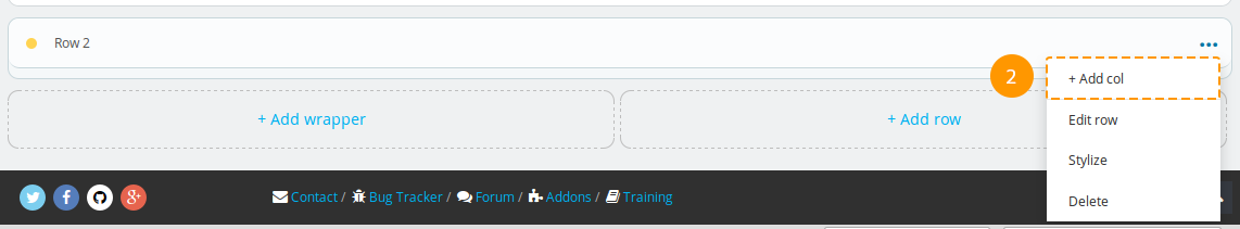
-
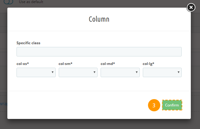
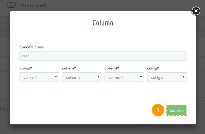
Fill in the fields (col-xs*, col-sm*, col-md*, col-lg - bootstrap classes) in the pop-up window and press 'Confirm' (3) button.
-
The column was added successfully.
Removing the column
Preset item removing will also cause its child items and their styles deleting.
-
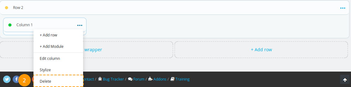
In order to remove the column, open the menu (the 'ellipsis' icon) in a column block (1)

-
Press 'Delete' (2) in the list.
-
The column and all of its child items were removed.
Editing the column
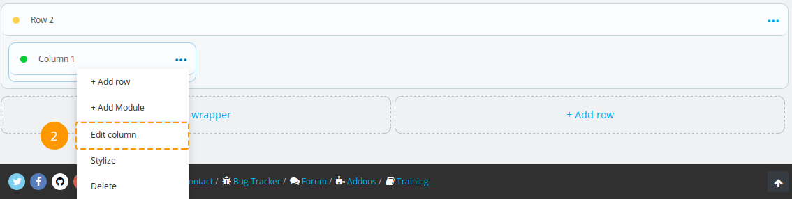
-
In order to edit the column, open the menu (the 'ellipsis' icon) (1) in the column block.
-
Press 'Edit column' (2) in the list.
-
Fill in the fields (col-xs*, col-sm*, col-md*, col-lg - bootstrap classes) in the pop-up window and press 'Confirm'.
-
The column was successfully edited.
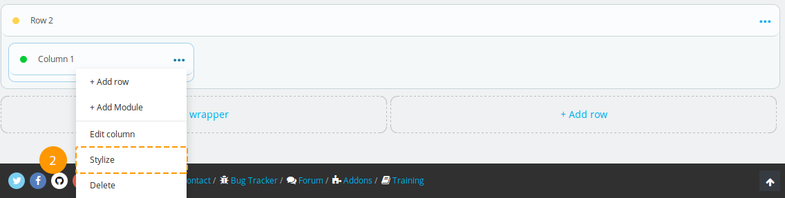
Adding styles to the column
-
In order to add column styles, open the menu (the 'ellipsis' icon) (1) in a column block.
-
Press 'Stylize' (2) in the list of options.
-
You will see the pop-up window, fill in all the needed fields there (you may refer to the documentation 'Styling' section) and press 'Save' (3) button.
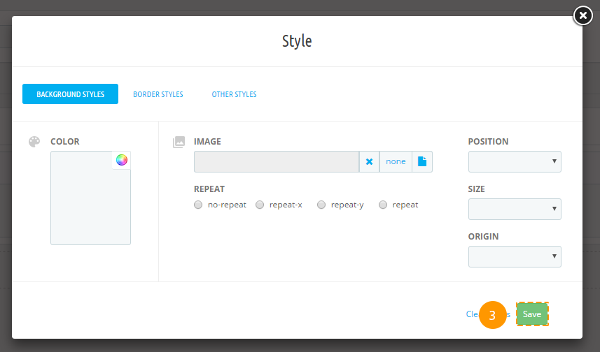
-
If all of the fields are filled in correctly, styles will be saved.
Module
Module assigned to this hook.
Adding the module
Be careful when adding modules to the preset, some of the modules are desirable to use if they do not change the visible layout, e.g., 'Data mining for statistics' module.
-
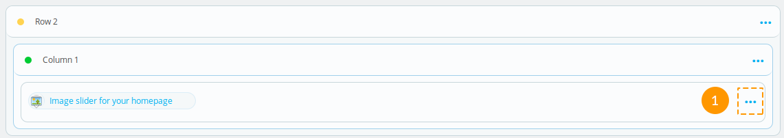
In order to add the module to the preset in a column block, open the menu (the 'ellipsis' icon) (1).
-
Press the '+ Add Module' (2) in the list of options available.
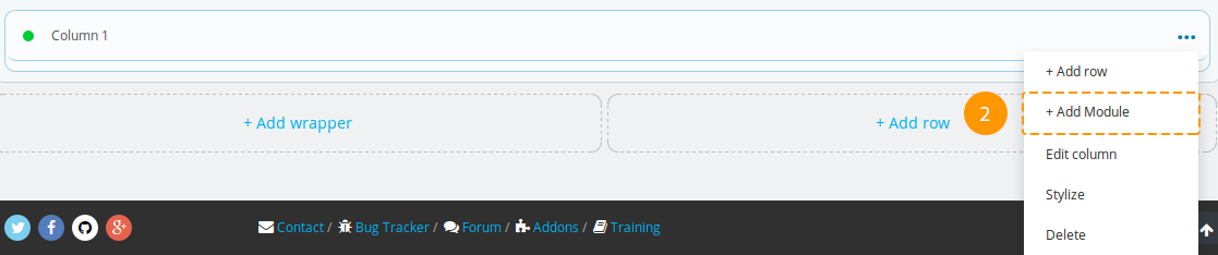
-
If needed, you can enter the custom class (3) in the pop-up window and select the module (4), next press 'Confirm' (5).
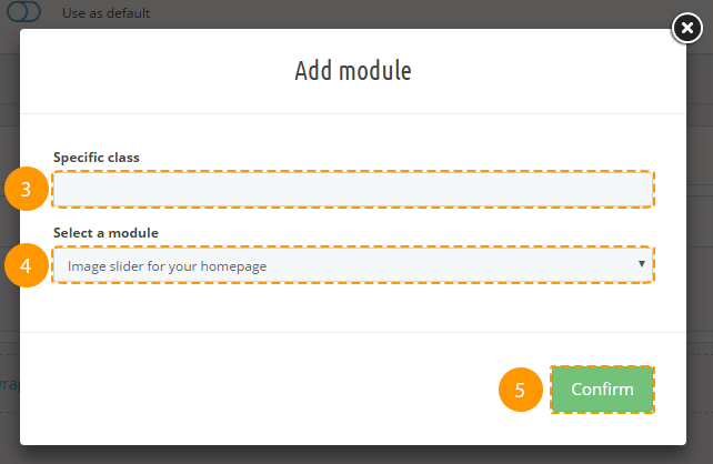
-
The module was successfully added.
-
In this version of TM Mega Layout you can add 'Homepage tabs' module in Home hook.
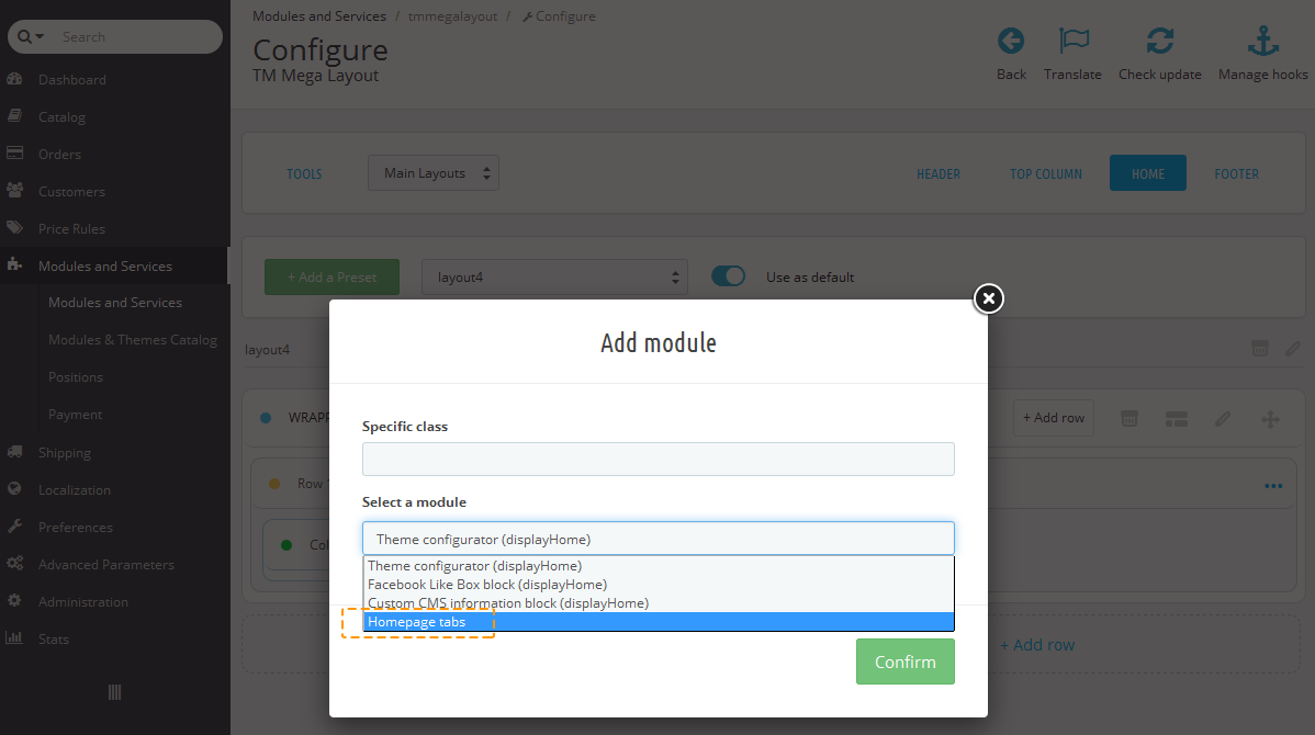
It can also be customized like all other modules in Mega Layout.
Deleting the module
Removal of preset item will also cause removal of its child items and their styles.
-
In order to remove the module, open the menu (the 'ellipsis' icon) (1) in the module block.
-
Press 'Delete' (2) in the list of options available.
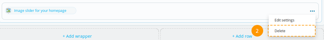
-
The module is removed.
Adding custom class to the module
Custom class adding allows to create module styling using CSS rules.
-
In order to specify custom class for the module, open the menu in the module block (the 'ellipsis' icon) (1).

-
Press 'Edit Settings' (2) then.
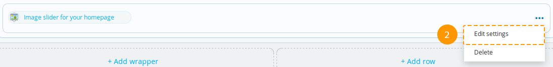
-
Specify custom class (3) in the pop-up window and press 'Confirm' (4) button.
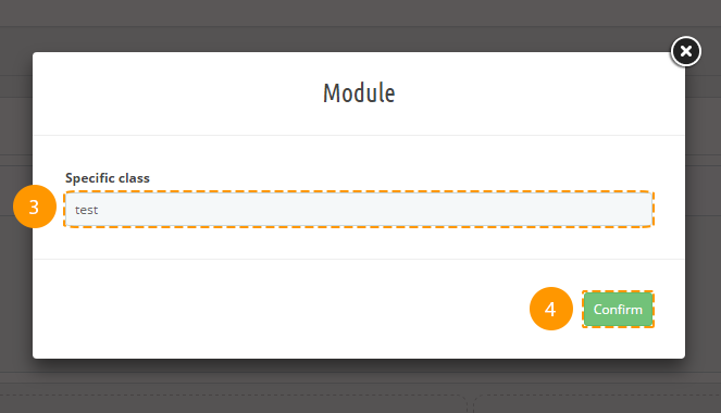
-
Custom class was added.
Logo, Copyright
Logo and Copyright blocks are edited the same way as modules, except for the fact that Logo can be placed only in Header or Footer position, and the Copyright block can be placed only in Footer position.
Product Page
Product Info tab
By means of this tab you can switch the layouts of product page. It will appear in the admin panel after making some simple actions described below.
Creating layout
Layouts are created and edited manually.
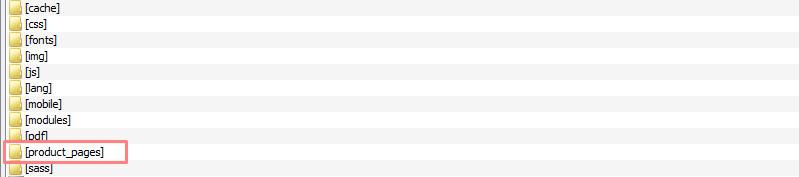
Create folder 'product_pages' in your theme folder.
- In theme folder find the file 'product.tpl', copy it to the created folder 'product_pages' and rename to 'default.tpl'. To create several layouts - duplicate this file, rename it (e.g. 'layout_1.tpl', 'layout_2.tpl') and change the structure according to your needs.
- Create file 'config.json' in this folder. Copy the following code into it:
{ "default": { "name": "Default", "preview": "default.jpg", "default": 1 } }- "default" - name of .tpl file containing the product page structure.
- "name": "Default" - title of product page layout in module settings.
- "preview": "default.jpg" - preview picture of product page layout in module settings; image should be located in 'product_pages' folder.
"default": 1 - set to '1' if the layout should be set as default
One of the layouts should contain '1' value to be set as default.
This code should be duplicated for each created layout, and contain corresponding values. For example:
{ "default": { "name": "Default", "preview": "default.jpg", "default": 0 }, "layout_1": { "name": "Layout 1", "preview": "layout_1.jpg", "default": 0 }, "layout_2": { "name": "Layout 2", "preview": "layout_2.jpg", "default": 1 } } - Open the 'product.tpl' file in the theme folder. Delete everything and paste the following code:
{include file="$tpl_dir./errors.tpl"} {if $errors|@count == 0} {if isset($megalayoutProductInfoPage) && $megalayoutProductInfoPage} {assign var='path' value="./product_pages/`$megalayoutProductInfoPage`"} {include file=$path} {else} {include file='./product_pages/default.tpl'} {/if} {/if} - To add/edit styles of any product page layout, go to your_theme_folder/css/ and add new folder 'product_pages'. In this folder create file with the layout name and .css extension (e.g. 'default.css', 'layout_1.css', 'layout_2.css'). These files should contain styles of the corresponding product page layout.
- To add scripts to any product page layout, go to your_theme_folder/js/ and add new folder 'product_pages'. In this folder create file with the layout name and .js extension (e.g. 'default.js', 'layout_1.js', 'layout_2.js'). These files should contain scripts of the corresponding product page layout.
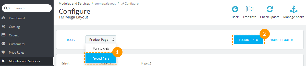
Switching layouts
Select 'Product Page' from the dropdown list (1) and click the 'Product Info' tab (2).
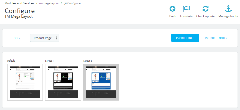
In this tab you can switch the layouts of product page. The layout image with the gray border is set as default.
Presets export
Export tool allows you to export presets for the further import into different shops.
-
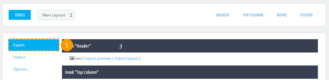
Navigate to the 'Tools' (1) tab in the main configurations panel.

-
Choose 'Export' (2) in the form.
-
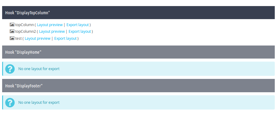
You'll see the list of the existing presets in site hooks.
-
In order to preview the preset, press 'Layout preview' (3) button next to the preset you need, in order to export, please press 'Export layout' (4) button.

-
Then you'll be able to download this preset as a zip archive.
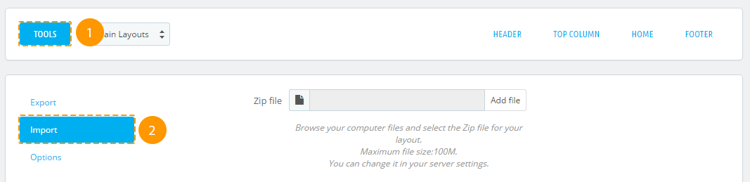
Preset import
Import tool accepts only the presets *.zip files that were previously generated with the same module Export tool.
-
In order to import your preset, you should open the Tools (1) tab and choose 'Import' (2).
-
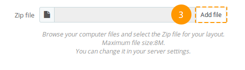
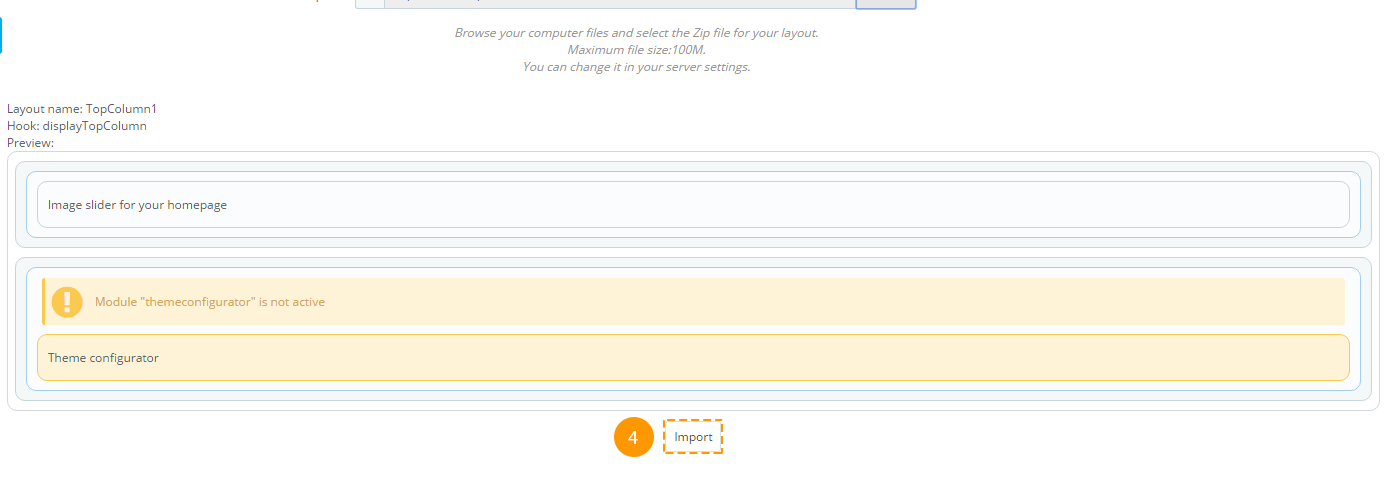
Next, press the Add file (3) button and select the zip file of your exported preset. In case this archive is the exported preset, you will see this preset preview.
-
If this preset meets your needs, press 'Import' (4). The preset will be imported and added to the list of available presets.
Reset
'Reset' reverts all the presets to initial state (to the way they came with the template), and discards all the created presets.
Attention! After reverting presets to default state, all the custom presets will be discarded!
-
To reset presets, navigate to the 'Tools' (1) tab. In the appeared block open the 'Options' (2) tab.

-
Press the 'Reset' button.
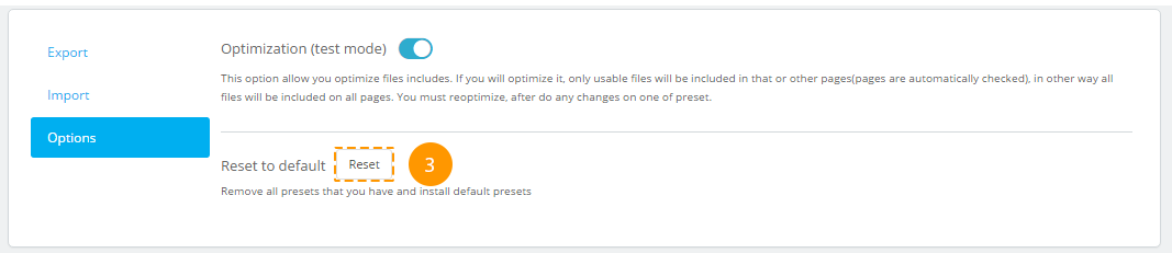
-
That's it! All presets are reset to initial state.
Styles and Scripts Optimization
Styles and scripts optimization adds exclusions for modules in Header section, based on their use in presets. This allows speeding up the page loading speed. Optimization works in test mode.
Enabling optimization:
-
To enable optimization, open the 'Tools' (1) tab and select the 'Options' (2) tab.
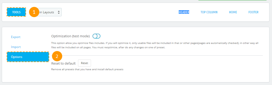
-
In the appeared window, you can enable optimization (3).
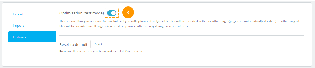
If optimization is enabled when editing and enabling presets, optimization gets discarded, but you'll see a window offering to run optimization. There is no need to optimize scripts and styles every time you change presets. It's better to optimize them when you're done editing.

Styling
-
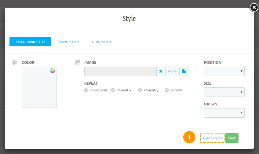
Background styles. Fields description:
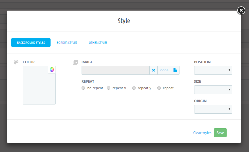
- background-image (background image) - the image URL or 'none' value. The image is picked from the ~/images/cms/ folder.
- background-color (background color) - the value can be set in any color format (rgb, hex, etc.). You can choose the color using the colorpicker tool.
- background-repeat (background repeat) - all of the available options are listed in the radio buttons.
- background-position (background position) - all of the available options are listed in the dropdown.
- background-size (background size) - all of the available options are listed in the dropdown.
- background-origin (background image positioning region) - all of the available options are listed in the dropdown.
Border styles.
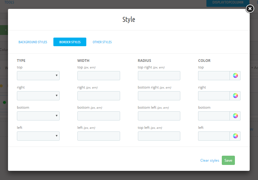
- border-top-style, border-right-style, border-left-style, border-bottom-style (border styles) - all of the available options are listed in the dropdown.
- border-top-width, border-right-width, border-left-width, border-bottom-width (borders width) - should be set in pixels.
- border-top-сolor, border-right-color, border-left-color, border-bottom-color (borders color) - the value can be set in any color format (rgb, hex, etc.). You can choose the color using the colorpicker tool.
- border-top-right-radius, border-top-left-radius, border-bottom-right-radius, border-bottom-left-radius (border radius) - should be set in pixels.
Other styles.
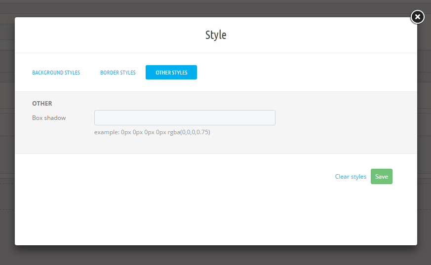
- box-shadow (box shadow) - example:0px 0px 0px 0px rgba(0,0,0,0.75).
Items styles removing
-
In order to remove items styles, open the items styling section and press 'Clear styles' (1)
Warnings
If the following message appears in the module item block, you should enable the mentioned module.

If the following message appears in the module item block, you should install the mentioned module.

In case you remove or deactivate the 'TM Mega Layout' module, all of the active presets will be disabled and you will see the positions (hooks) in their original appearance.
TM Mega Menu
The module is designed to create complex menus. The module provides the ability to display one item (without sub-menu), a menu item with a sub-menu and a menu item with sub-menu by means of a multi-row and multi-column block. The module can be used in different positions, but it will display the same content. Available positions: top (displayTop), left (displayLeftColumn), right (displayRightColumn), footer (displayFooter). You can add categories (with subcategories), CMS categories (with subcategories), manufacturers (one or a list), suppliers (one or a list), stores (if multistore is used), links to any product, information block about the product, custom links (not limited in quantity), custom HTML blocks (not limited in number) and banners. See below for more details.
The module includes 6 main tabs that allow to customize the menu.
TM Mega Menu Items
TM Mega Menu items are the basic items which appears in the menu.
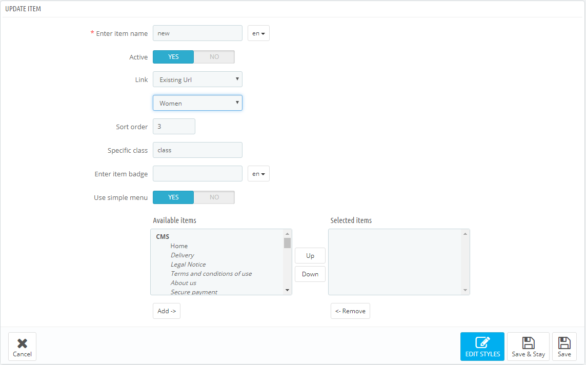
In order to create a new item, open the TM Mega Menu module and click Add item button from the top menu or click "+" button in the top right of the table.
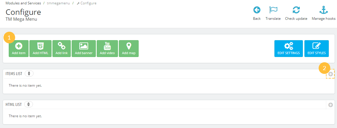
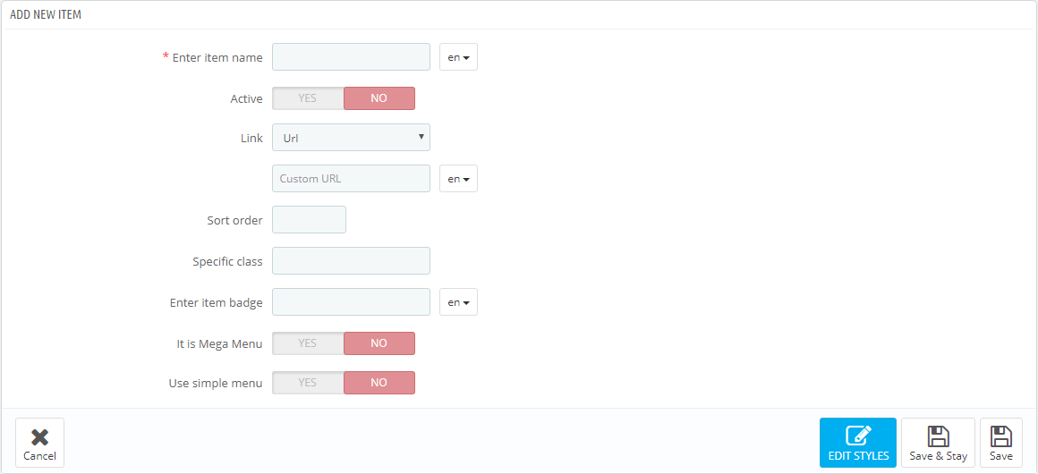
In the form that appears, fill in the required fields.
-
- Enter item name
- the tab title which is mandatory to be filled in for the default language, if the additional languages fields are not filled in, the tab takes its name from the default language.
-
- Active
- active/inactive tab.
-
- Link
- a link that is assigned to this tab. You can enter a custom link, or choose from existing options (categories, CMS categories). If you leave the field blank, the link of this tab is inactive.
-
- Sort order
- the order of tabs to be displayed.
-
- Specific Class
- the class which is added to emphasize the item (CSS class).
-
- Enter item badge
- is filled in depending on multi-languages.
-
- It is Mega Menu
- given tab sub-menu is a Mega Menu. *
-
- Use simple menu
- given tab sub-menu is a simple menu. **
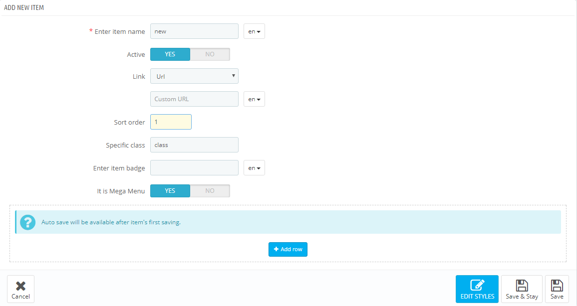
* It is Mega Menu. If this option is selected, there will be a form to create a complex menu (Mega Menu).
** Use simple menu. If this option is selected, there will be a form to create a simple menu. This is a menu that displays the selected content in a single column. If the menu has embedded content, the new column is added.
Complex menu consists of rows and columns in rows.
The Row is a part of the Mega Menu structure. It includes the menu columns. The existing row can be removed by clicking the appropriate button. The row will be removed with the content it includes. The rows quantity is not limited.
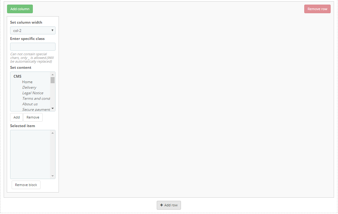
The Column is a part of the Mega Menu structure, which is placed inside the rows. (The Class) The width of the column cannot be less than 2 and more than 12. In order to make the menu display properly, the total column width cannot exceed 12. The width (class) is a Bootstrap column type, corresponds to the same values.
In order to create the menu, click the 'Add row' button.
In the form appeared, click 'Add column' button.
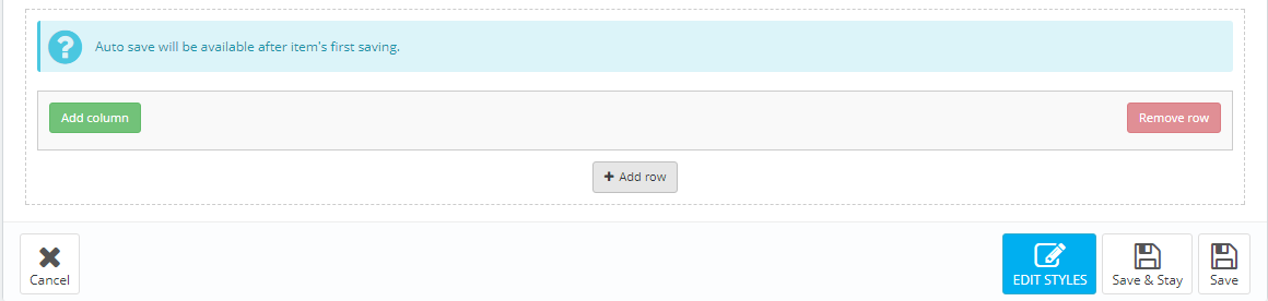
In the pop up window you need to specify the column class (from 2 to 12). The column itself appears next where you need to set the required settings.
Here you can change the column class, CSS class and the content from the list provided. You can add/remove content by double clicking the item, or by highlighting the items and clicking the corresponding button.
Block can be removed by clicking 'Remove block' button in the footer of the block.
By removing the row, the included columns are also removed.
In order to move the content available in the selected menu, double-click or highlight the desired content and press the corresponding button.
Inactive menu information is saved while switching between menu types and you can always change the type of menu.
TM Mega Menu HTML
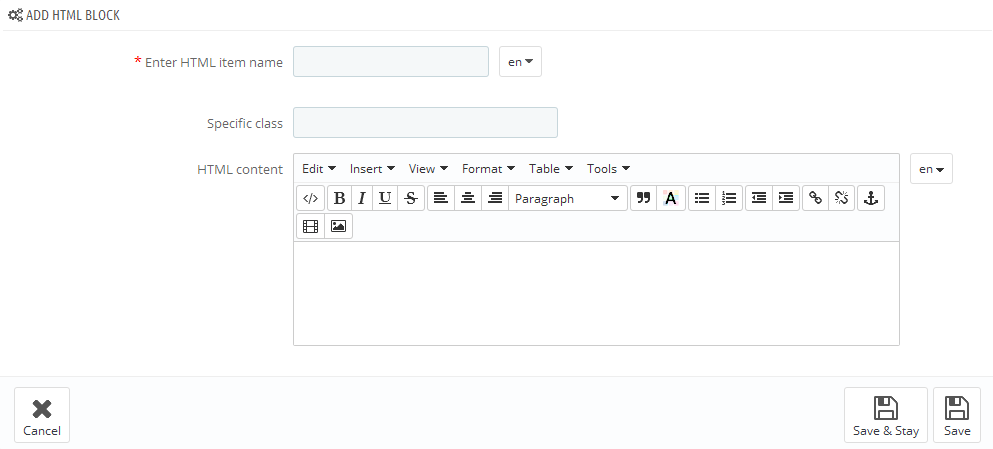
In this section we will explain how to create a custom HTML block in the Mega Menu.
The module has a table listing all the available blocks. You can also add a new block by clicking the '+' button in the top right of the table.
In the form that appears, fill in the required fields.
-
- Enter HTML item name
- HTML block name, is mandatory to be filled in for the default language.
-
- Specific class
- block's CSS class.
-
- HTML content
- HTML content.
Added block will appear in the list of blocks, as well as in the list of available content while creating menu blocks.
TM Mega Menu Links
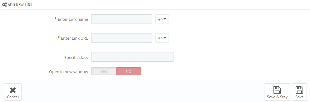
In this section we will show how to create custom links in the Mega Menu.
The module has a table listing all the available links. You can also add a new link by clicking the '+' button in the top right of the table.
In the form that appears, fill in the required fields.
-
- Enter Link name
- link name, is mandatory to be filled in for the default language.
-
- Enter Link URL
- link URL, is mandatory to be filled in for the default language.
-
- Specific class
- block's CSS class.
-
- Open in new window
- open link in a new window.
Added link will appear in the list of links, as well as in the list of available content while creating menu blocks.
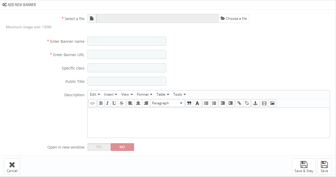
TM Mega Menu Banners
In this section we will explain how to create banners in the Mega Menu.
The module has a table listing all the available banners. You can also add a new banner by clicking the '+' button in the top right of the table.
In the form that appears, fill in the required fields.
-
- Select a file
- select a file, is mandatory to be filled in for the default language.
-
- Enter Banner name
- banner title, is mandatory to be filled in for the default language.
-
- Enter Banner URL
- link URL, is mandatory to be filled in for the default language.
-
- Specific class
- block's CSS class.
-
- Public Title
- public banner title.
-
- Description
- set the description of the banner.
-
- Open in new window
- open link in a new window.
Added banner will appear in the list of banners, as well as in the list of available content while creating menu blocks.
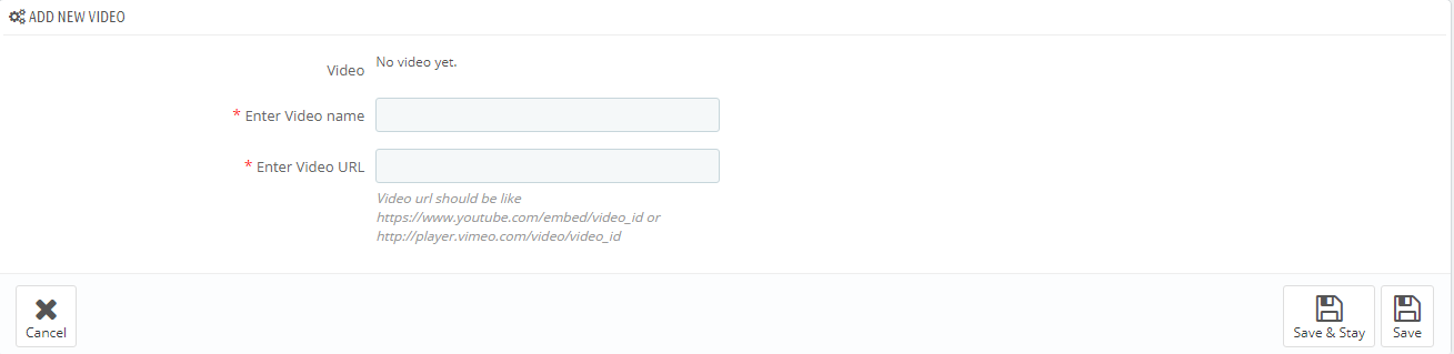
TM Mega Menu Video
In this section we will explain how to add a video in the Mega Menu.
The module has a table listing all the available videos. You can also add a new video by clicking the '+' button in the top right of the table.
In the form that appears, fill in the required fields.
-
- Enter Video Name
- video title (the field is required).
- Enter Video URL - add video link in the formats described below:
- If this is a YouTube video, click on Embed and copy the code between the quotes for https://www.youtube.com/embed/video_id
- If this is a Vimeo video, click on Share icon and in the Embed section copy the source code between the quotes for http://player.vimeo.com/video/video_id
Added video will appear in the list of videos, as well as in the list of available content while creating menu blocks.
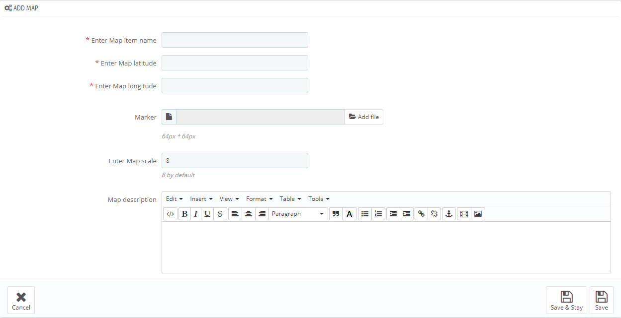
TM Mega Menu Map
In this section we will explain how to add a map in the Mega Menu.
The module has a table listing all the available maps. You can also add a new map by clicking the '+' button in the top right of the table.
In the form that appears, fill in the required fields.
-
- Enter Map item name
- the title of the map.
-
- Enter Map latitude
- set a latitude value.
-
- Enter Map longitude
- set a longitude value.
-
- Marker
- adding a custom marker.
-
- Enter Map scale
- the scale of the map (used 8 by default).
-
- Map description
- set the description of the map.
Added map will appear in the list of maps, as well as in the list of available content while creating menu blocks.
TM Mosaic Products
This module allows you to display categories with products, banners, video (Youtube, Vimeo and custom video), HTML content, various sliders with different number of slides and dimensions in any row on the site home page.
Installation and Deleting
The module is installed and deleted like any other PrestaShop module.
Module settings
After module has been installed, you can add the required blocks with category products, previously added banners, video and HTML content.
Adding/removing/editing Blocks
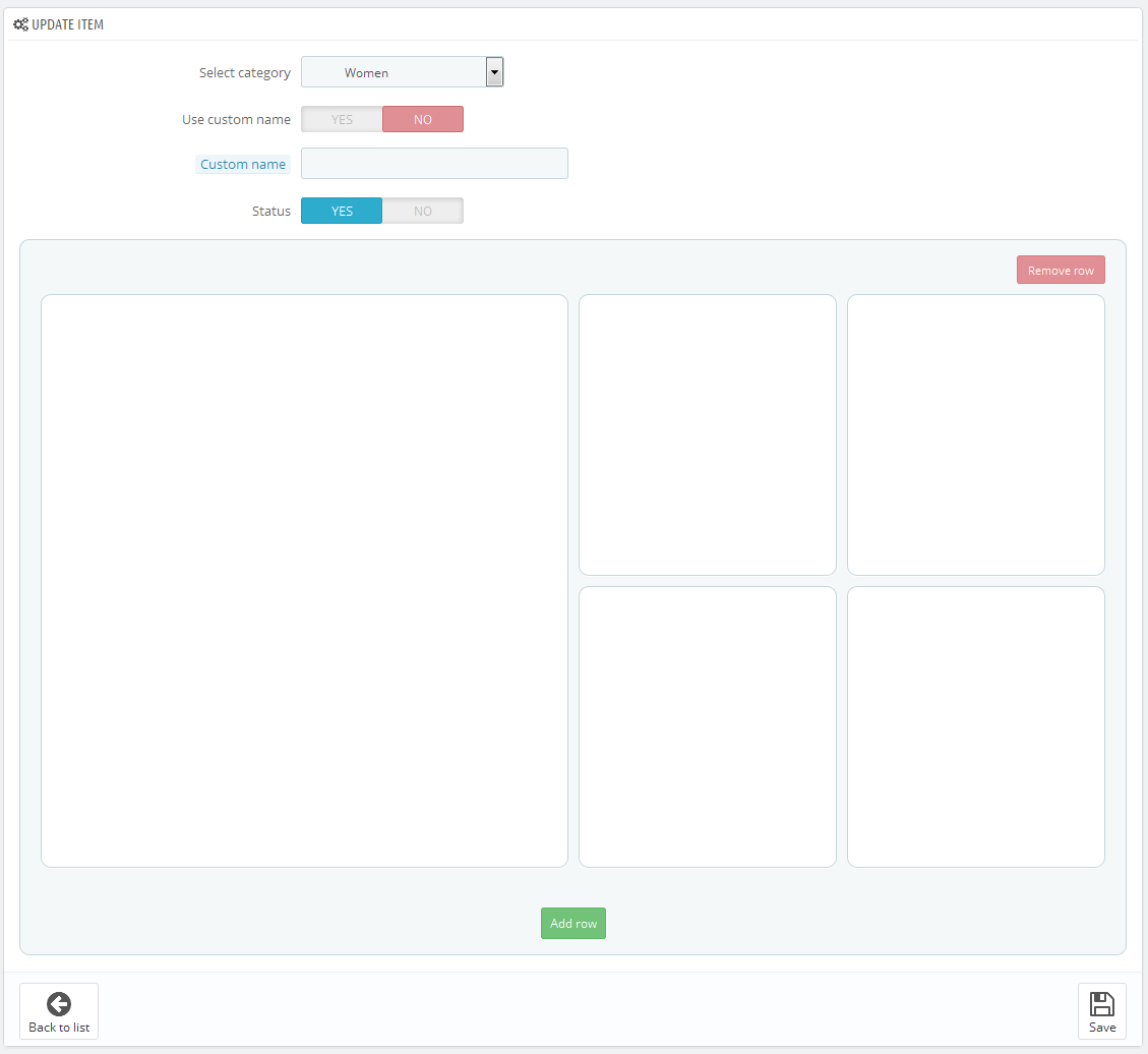
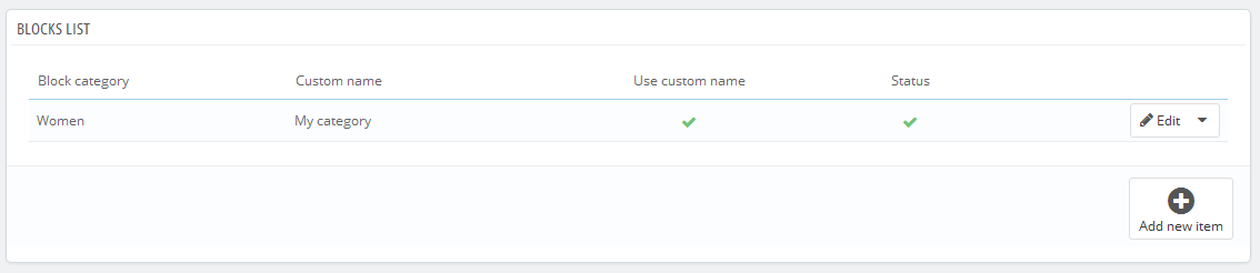
In order to add a new category, press the "Add new" button.
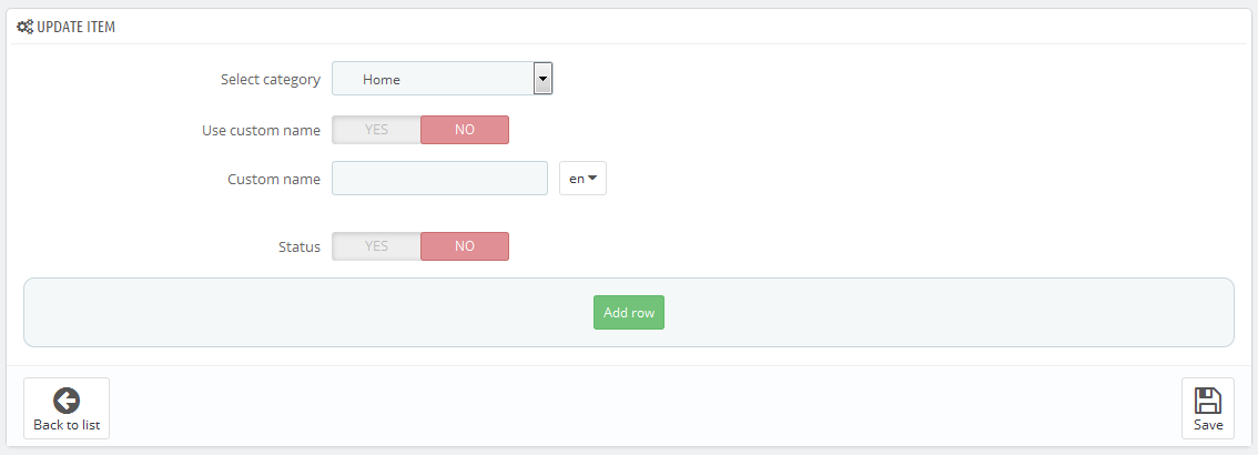
- Select category - choose a category to add products, banners, video and HTML content to.
- Use custom name - custom category status.
- Custom name - category title.
- Status - item status.
In order to add the new row, press the "Add row" button. Then choose one of the eight layouts presented in the following window.
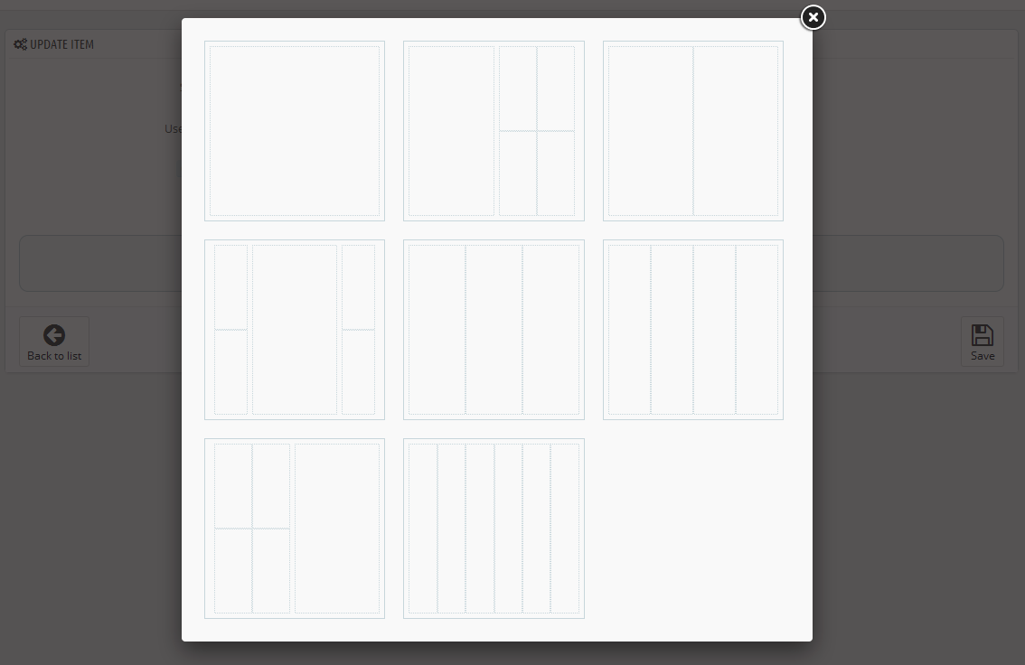
In order to add the layout, click on one of the eight options to pick it, and it will be added to the form.
In order to add items, click on one of the layout cells. You'll see five buttons listing the available items of certain type.
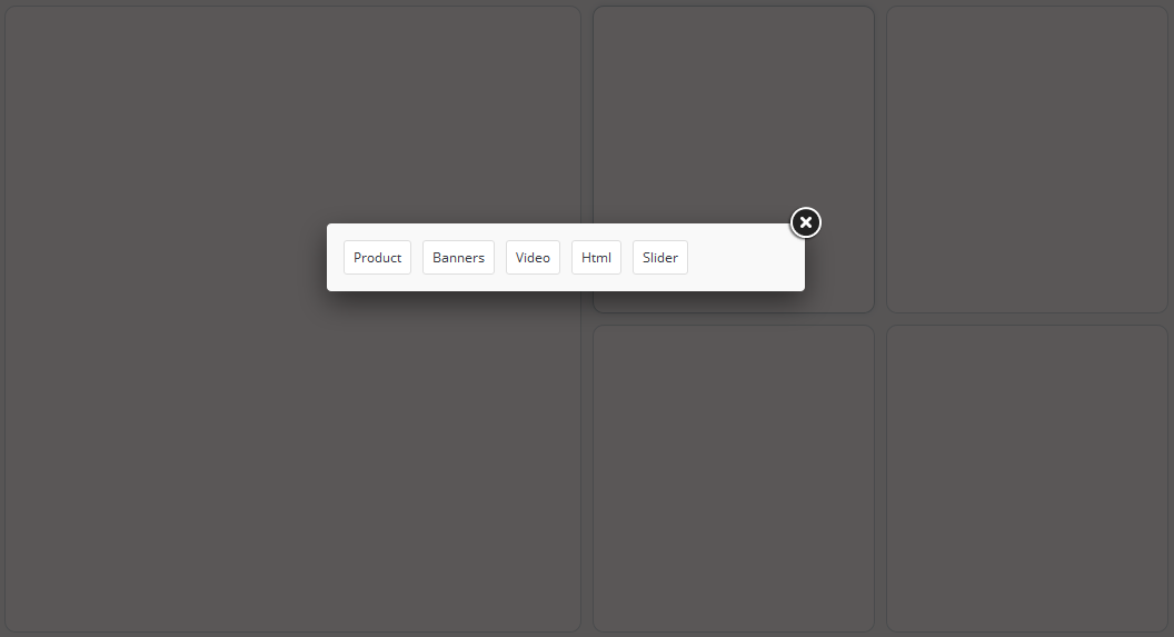
After pressing one of the buttons you will see the form to pick the item of chosen type.
After clicking on one of the items, it will be added to the layout cell. You can fill in the layout with different blocks this way.
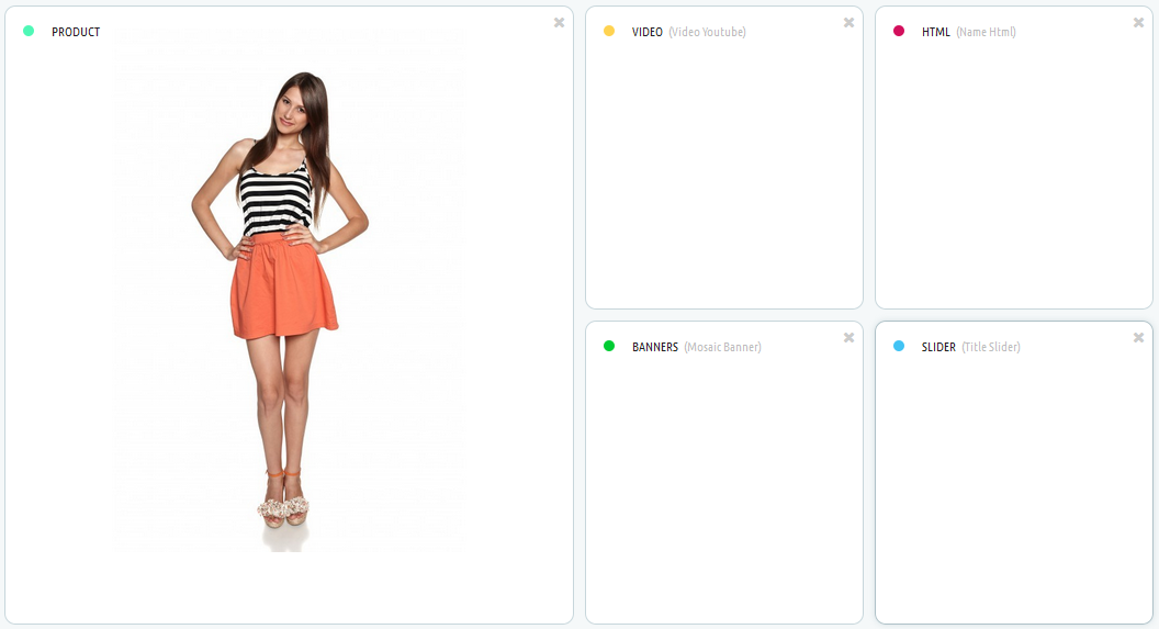
After saving the category with chosen layouts, it will show up in the form of the added categories.
In order to remove the item, press the 'Delete' button.
Banner adding/removing/editing
In order to add a new banner, click the 'Add new banner' button. Next, fill in the required fields in the form that appears.
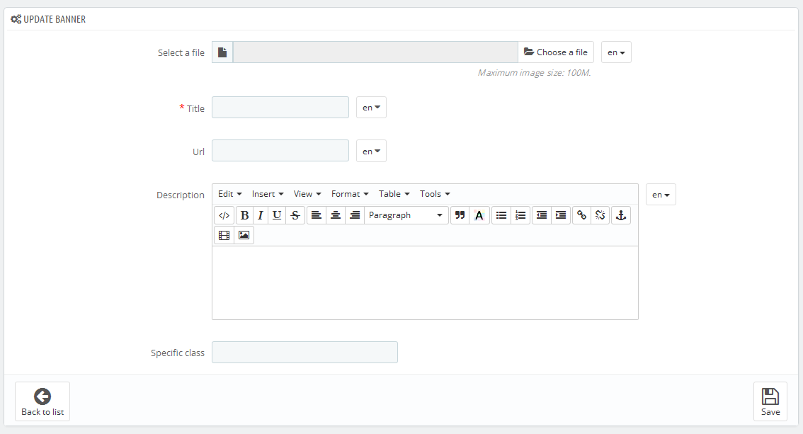
- Select a file - choose a file, this field is required (at least for the default language).
- Title - banner title, this field is required (at least for the default language).
- Url - link path, this field is required (at least for the default language).
- Description - banner description (at least for the default language).
- Specific class - block's CSS class.
Adding/removing/editing Video
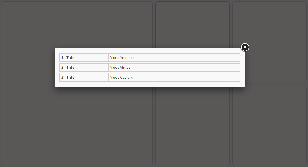
In order to add a new video, click the 'Add new video' button. Next, fill in the required fields in the form that appears.
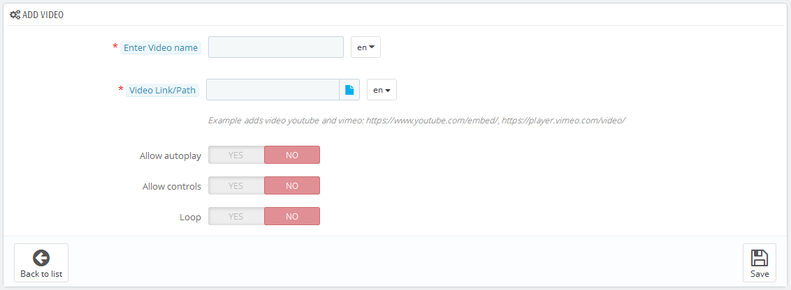
- Enter Video name - video title, this field is required (at least for the default language).
- Video Link/Path - link to the video (youtube, vimeo or custom video), this field is required (at least for the default language).
- Allow autoplay - defines if video starts automatically right after the player has been loaded.
- Allow controls - defines if player controls are displayed.
- Loop - defines if the video playback is in the infinite loop.
In order to add custom video, press the 'file' button. Next, you'll be able to add a video via file manager.
Adding/removing/editing HTML content
In order to add new HTML content, press the 'Add new HTML' button. Next, fill in the required fields in the form that appears.
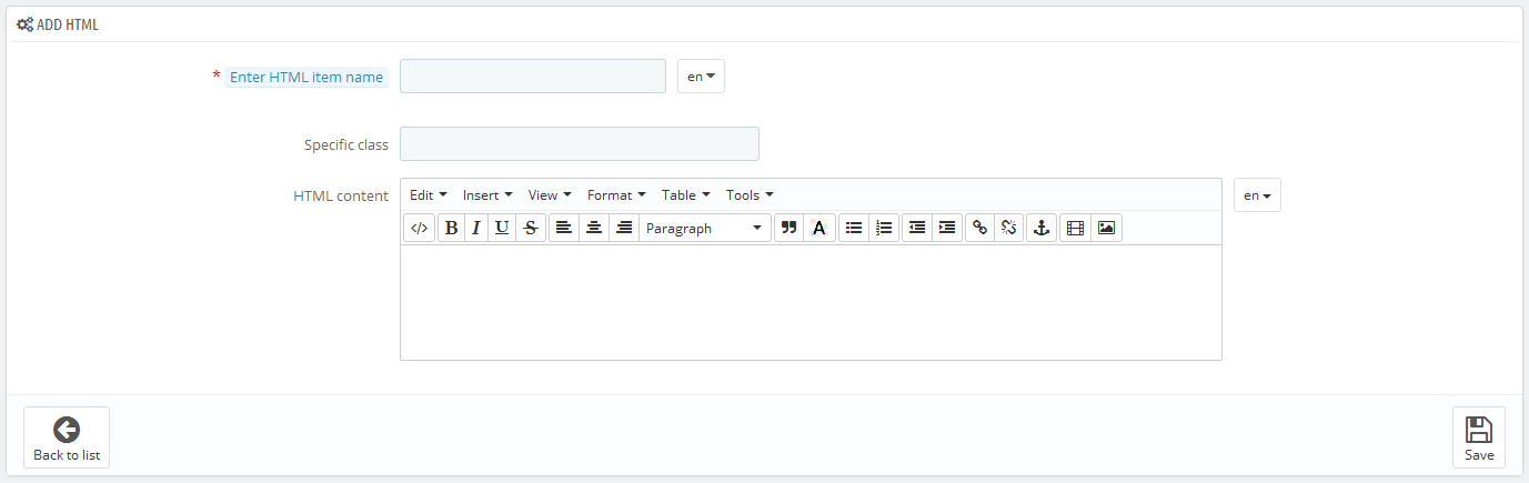
- Enter HTML item name - HTML content title, this field is required (at least for the default language).
- Specific class - block's CSS class.
- HTML content - the content.
Adding/removing/editing Slider
In order to add a new slider, press the 'Add new slider' button. Next, fill in the required fields in the form that appears.
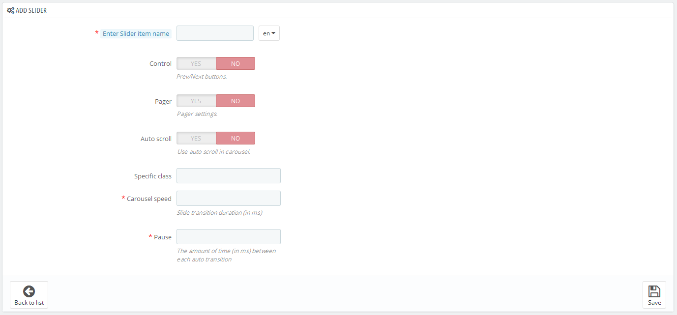
- Enter Slider item name - slider title, this field is required (at least for the default language).
- Control - show/hide slider navigation.
- Pager - show/hide slider pagination.
- Auto scroll - turns on/off slider autoplay.
- Specific class - block's CSS class.
- Carousel speed - slides transition duration (in ms), this field is required.
- Pause - the period between slides switching (in ms), this field is required.
Adding/removing/editing Slides
In order to add a new slide, click the 'View' button in the slider form and then press the 'Add new' button in a window that appears. Then fill in the required fields.
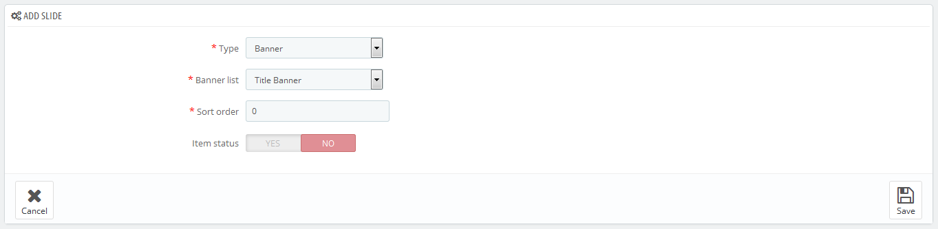
- Type - choose the slide type, this field is required.
- Banner/Video/Html list - choose the element of the previously selected type, this field is required.
- Sort order - slide position.
- Item status - status of the element.
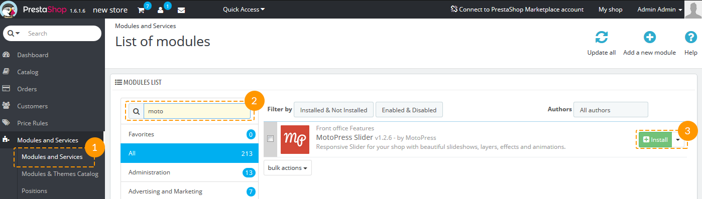
TM MotoPress Slider
Module Installation
This module provides the ability to add MotoPress Slider to your HTML page. It can be installed like any other PrestaShop module:
Upload module to the /modules folder.
Go to Admin panel -> Modules and Services -> Modules and Services (1), find the module (2) and click the 'Install' button (3).
When the module is successfully installed you can see the 'MotoPress Slider' menu appeared at the bottom of your admin panel (1).
Click the 'MotoPress Slider' button in this menu (2).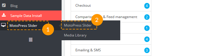
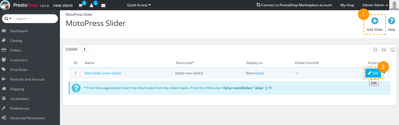
Module Usage
Adding/editing slider
Now you are able to add new slider (1) or edit the existing one (2).
Adding new slider
When you clicked the 'Add Slider' button, there's an option to choose if it should be 'Custom Slider' or 'Product Slider'.
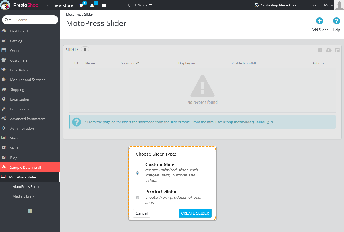
The difference between these two types is the following: Product slider is created from the products of your store, though in Custom Slider you can add as much slides as you wish, customizing them according to your needs.
The settings for Custom and Product slider are slightly different.
They will be mentioned further.
Module Configuration
Slider settings
The main slider settings. Detailed settings description is below the screenshot.
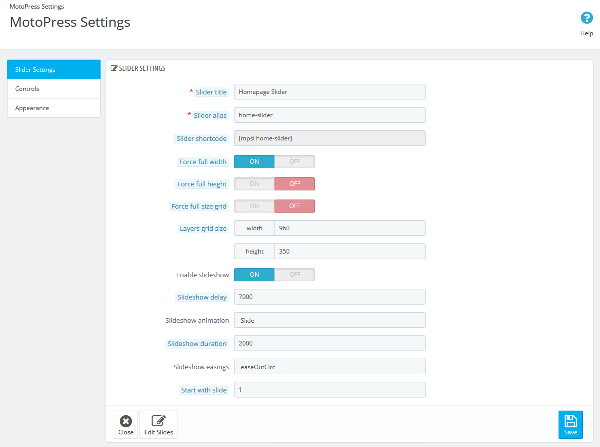
- Slider title - the title of the slider (example: Slider1); it is required when you have several sliders and have to distinguish them.
- Slider alias - the unique alias that will be used in shortcodes for embedding the slider (example: slider1); must be unique.
- Slider shortcode - copy this shortocode and paste to your page.
- Force full width - enable this option to make this slider stretch to full-width.
- Force full height - enable this option to make this slider full-height.
- Force full size grid - makes grid stretch to parent container (but you still need to set grid width and height).
- Layers grid size - allows to set initial width and height of the layers.
- Enable slideshow - enable/disable the slideshow.
- Slideshow delay - the time one slide stays on the screen; is measured in milliseconds.
- Slideshow animation - choose the animation for changing slides.
- Slideshow duration - animation duration in milliseconds.
- Slideshow easings - easings on slide changing.
- Start with slide - first slide index.
Controls
Options which refer to slide switching controls.
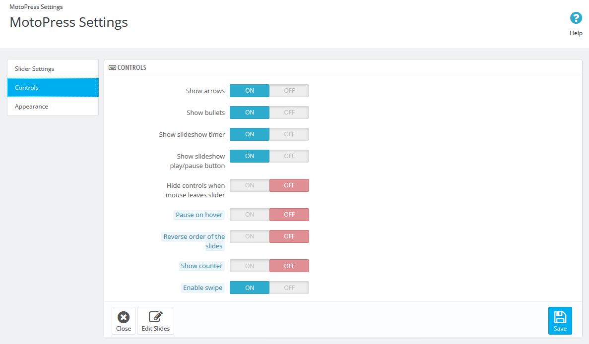
- Show arrows - show/hide arrows.
- Show bullets - show/hide bullets.
- Show slideshow timer - show/hide timer.
- Show slideshow play/pause button - show or hide play/pause button.
- Hide controls when mouse leaves slider - hide controls when mouse is not on slider area.
- Pause on hover - allows to pause slideshow while hover the slider.
- Reverse order of the slides - animate slides in the reverse order.
- Show counter - enable to display the number of slides.
- Enable swipe - turn on swipe on desktop.
Appearance
Options referring the display of slider.
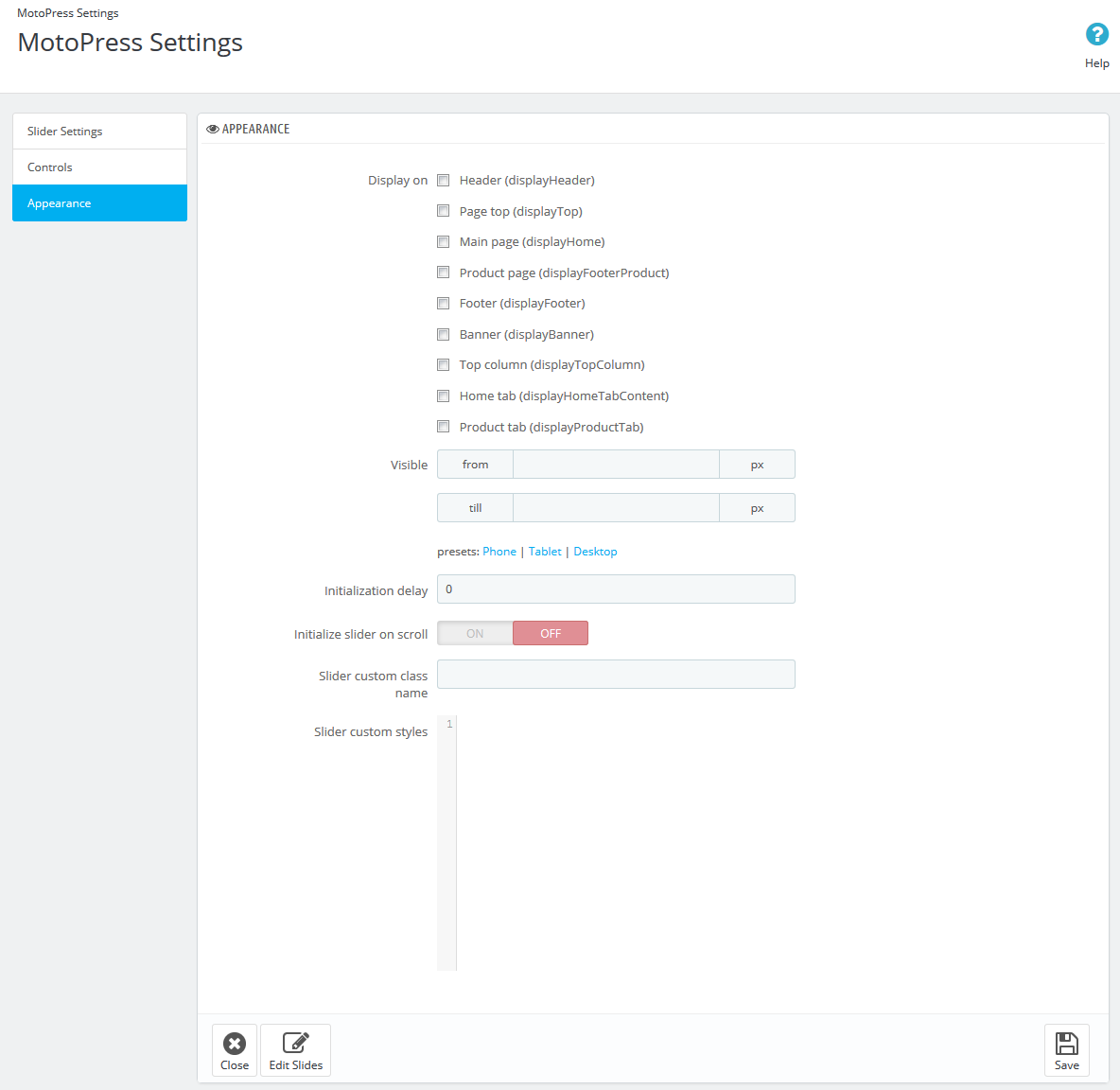
- Display on - hooks where the slider should be displayed.
- Visible - min. and/or max. screen resolutions when the slider is visible (can be set using the presets: phone / tablet / desktop).
- Initialization delay - the delay bofore slider initialization (should be set in milliseconds).
- Initialize slider on scroll - choose if you want the slider to be initialized on scroll.
- Slider custom class name - name of custom class which is used for slider.
- Slider custom styles - custom css styles can be added directly in this textarea.
Content
This menu appears only for the Product Slider.
When it will be configured press the 'Create' button (1).
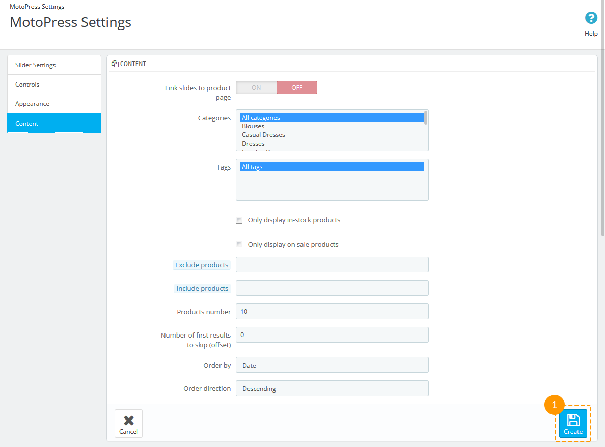
- Link slides to product page - enable if you want the product page to be opened after the click on slide with the product.
- Open in new window - enable this option to open the product page in new window.
- Categories - categories with products to show in slider (Ctrl + click to select several categories).
- Tags - tags to be included.
- Only display in-stock products - only products in stock will be displayed.
- Only display on sale products - only products on sale will be displayed.
- Exclude products - add Product IDs separated by comma.
- Include products - add Product IDs separated by comma.
- Products number - number of products to be displayed.
- Number of first results to skip (offset) - the number of first slides which will not be shown.
- Order by - type of order to be applied.
- Order direction - descending or ascending order direction.
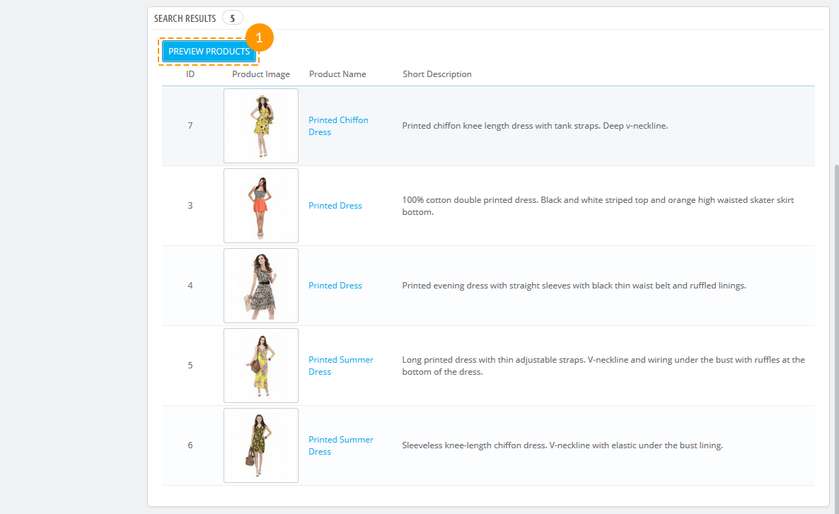
Below there's a list of products which will be displayed in slider. After you've made any changes in settings, press the 'Preview products' button (1).
After the slider has been configured, press the 'Save' button.
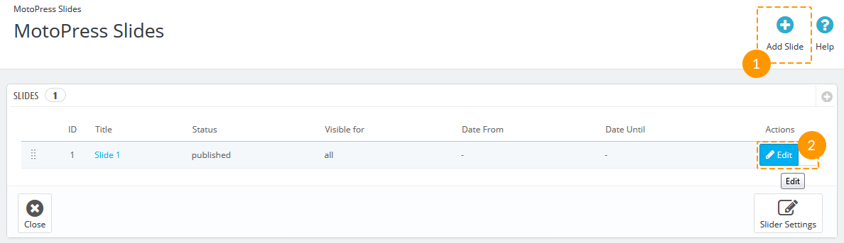
Adding/editing slides
To add new slide press the button 'Add Slide' (1). To edit the existing one click 'Edit' (2).
Slide settings
MotoPress Slider contains the Style Editor. That allows customizing slide layers, their styles and texts using preview area and avoiding any manual changes of code or CSS rules.
Select slider to edit and pick the actual slide to work with.
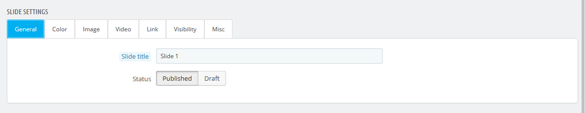
General
General slide settings include slide title and status.
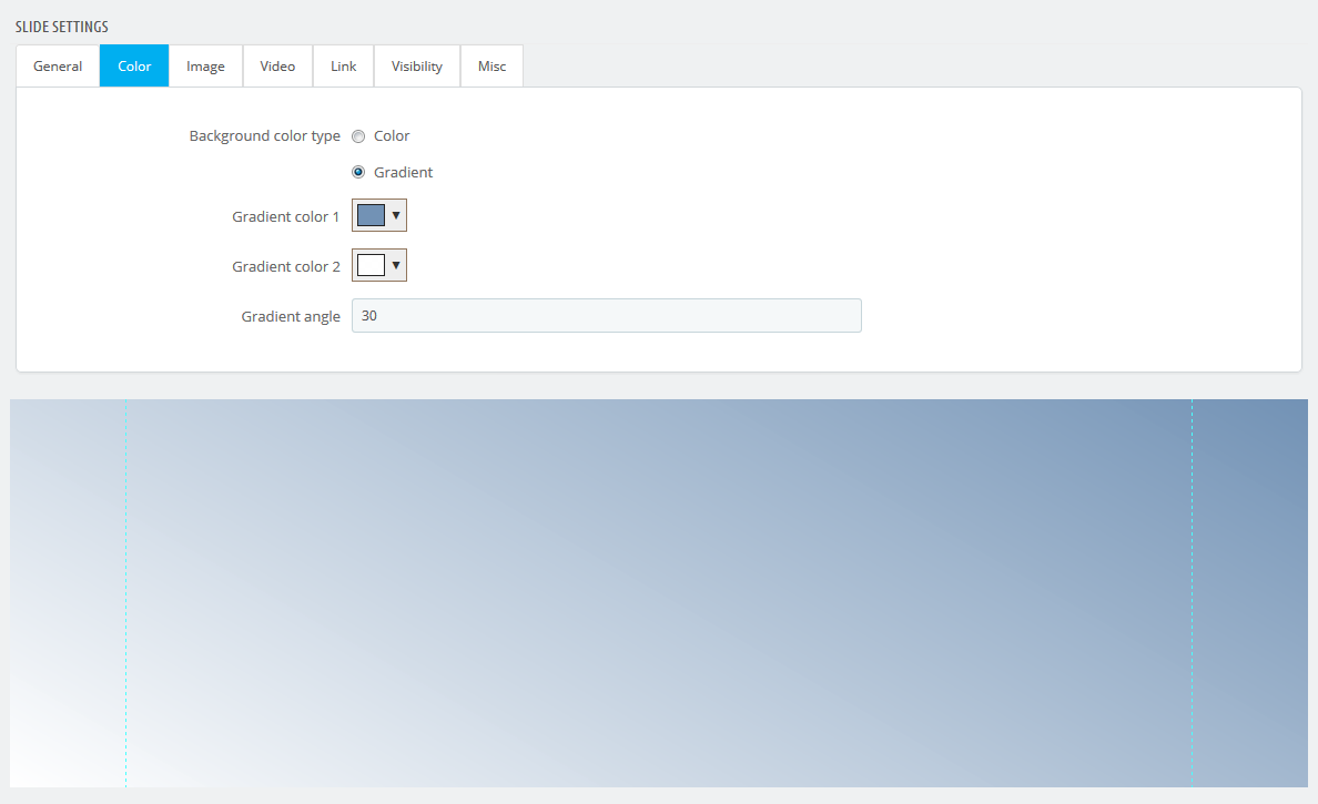
Color
In the 'Color' tab there are two variants of background color type - background color and gradient. Choose the option and the preferable color.
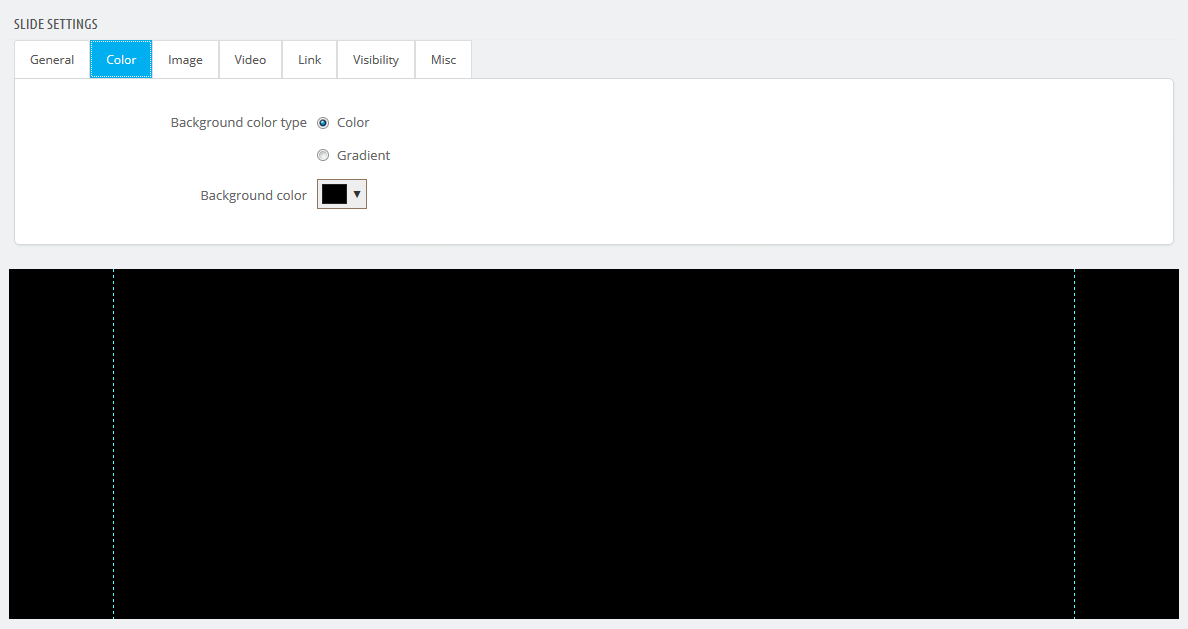
If you choose gradient, select gradient color 1, gradient color 2 and the gradient angle.
Image
Background image can be attached from the Media Library or from the external URL.
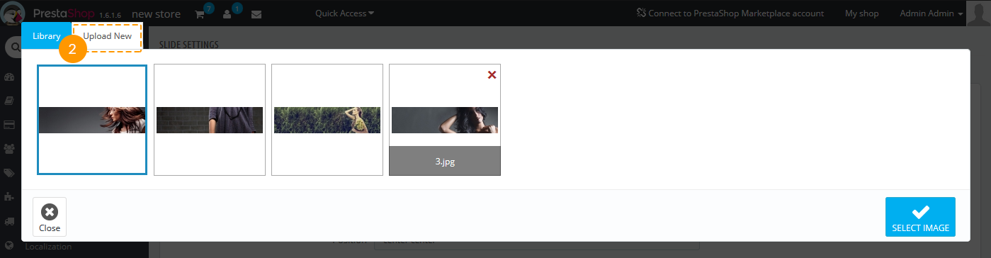
Image can also be added from your local folder to the Media Library. To do this press the 'Browse' button (1).
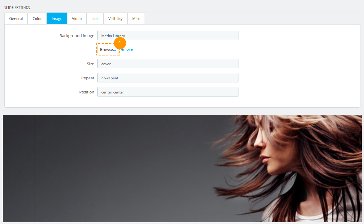
Then choose 'Upload New' (2) tab and click on the selected area or simply drag the images into it.
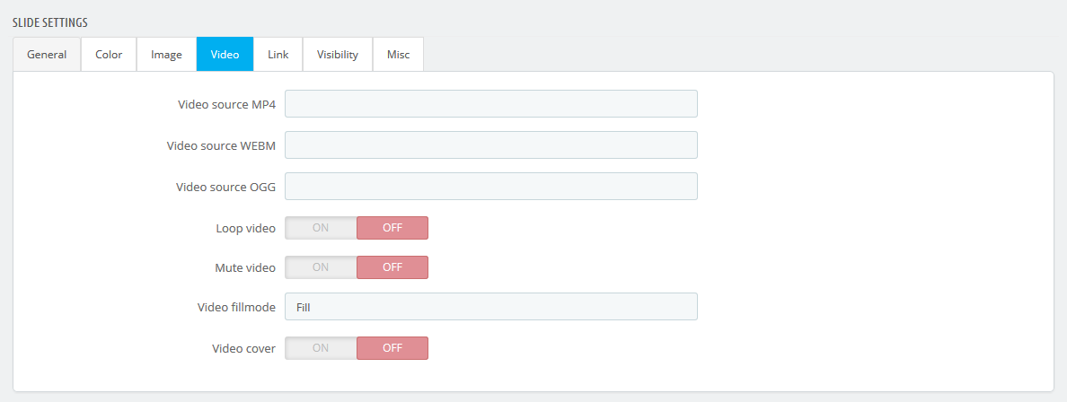
Video
You can add video to your slide. To add video choose sources for different video formats and set other parameters for video display. You'll need to upload a video in MP4, WEBM or OGG format and provide the video file URL in Video tab.
Settings for video display can also be adjusted.
Link
Link tab allows adding a link to your slide, assign the id, class, add link title and relation:
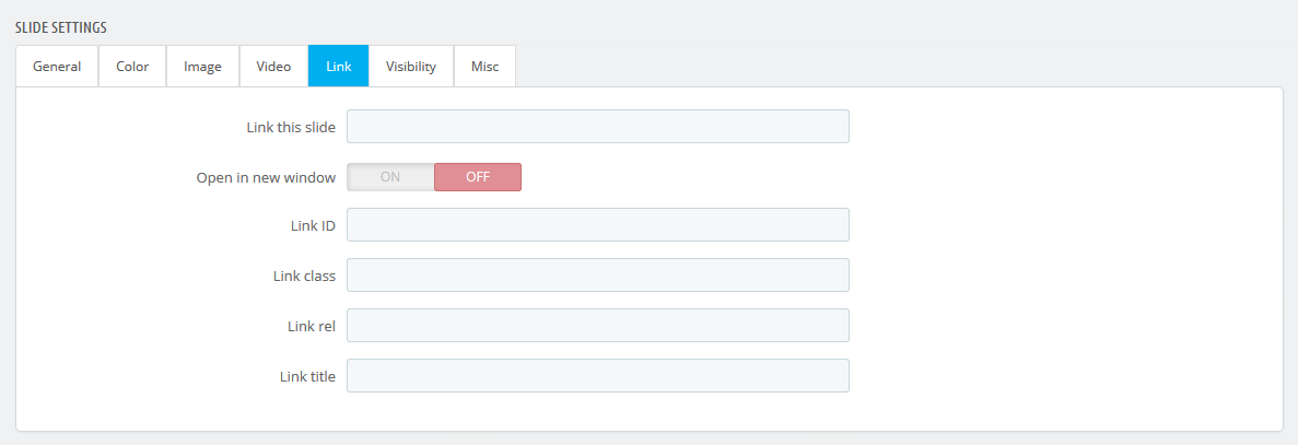
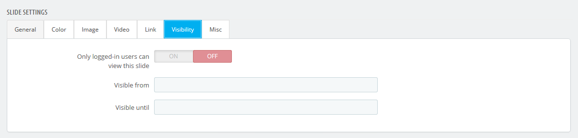
Visibility
Slide visibility options can be managed from the Visibility tab:
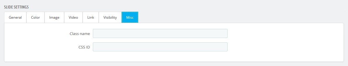
Misc
Misc section allows assigning a css class or id to the slide.
Click on 'Save slide' button when you are done making changes.
Slide content
Here you can add texts, images, buttons and video to each slide.
It is divided into two main sections: 'Layer Settings' (1) and 'Layers Sorting' (2).
Above the 'Layer Settings' area there are four tabs for adding the needed content (3). After you've chosen what
element you want to add, you can go further with detailed customization.
The great feature is that these contents are added as individual layers, so you can drag them up and down to set
their order in the 'Layers Sorting' section (2).
Layers can be deleted separately (4) or all at once (5).
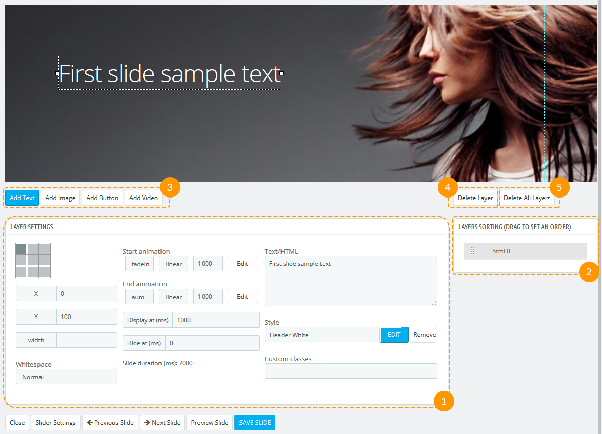
Layer settings
Add Text
This tab is created to add, edit and locate texts in slide.
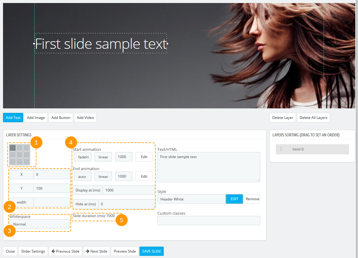
- Using grey squares you can quickly set the position of the text (1).
- To adjust it, add the 'X' and 'Y' value in pixels and set the width of this element (2).
- If 'Whitespace' is set to 'Normal', the text will be wrapped normally. If 'No-wrap' is chosen, the wrapping will be ignored (3).
- In the second column you can control the element animation - how, how long and when it should start and end (4) within the duration of the slide (which is shown below for your convenience (5); to change it go to Slider Settings -> Slideshow delay). You can also preview the animation in the window that appears after clicking the 'Edit' button. Choose the duration, ease function, animation effect and press 'Play' to preview. Then click 'Apply' when it meets your expectations.
Settings described above are similar for each element, that's why only options from the third column will be mentioned further.
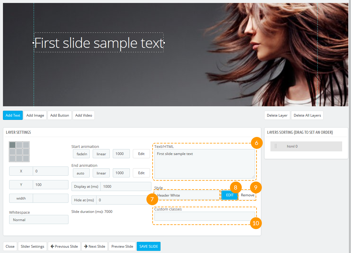
- The text itself can be added in the textarea which comes next (6).
- The text style can be chosen from the presets in the dropdown (7), edited after you've pressed the 'Edit' button (8), and disabled clicking the 'Remove' button (9). After the text style has been edited, press the 'Apply Style' button. If you want to edit and save the existing style, press 'Duplicate' button, edit and save it. To create from scrach the style which will be often applied, click the 'Create new preset' and edit it.
- It is also possible to add a custom class to each element (10).
Add Image
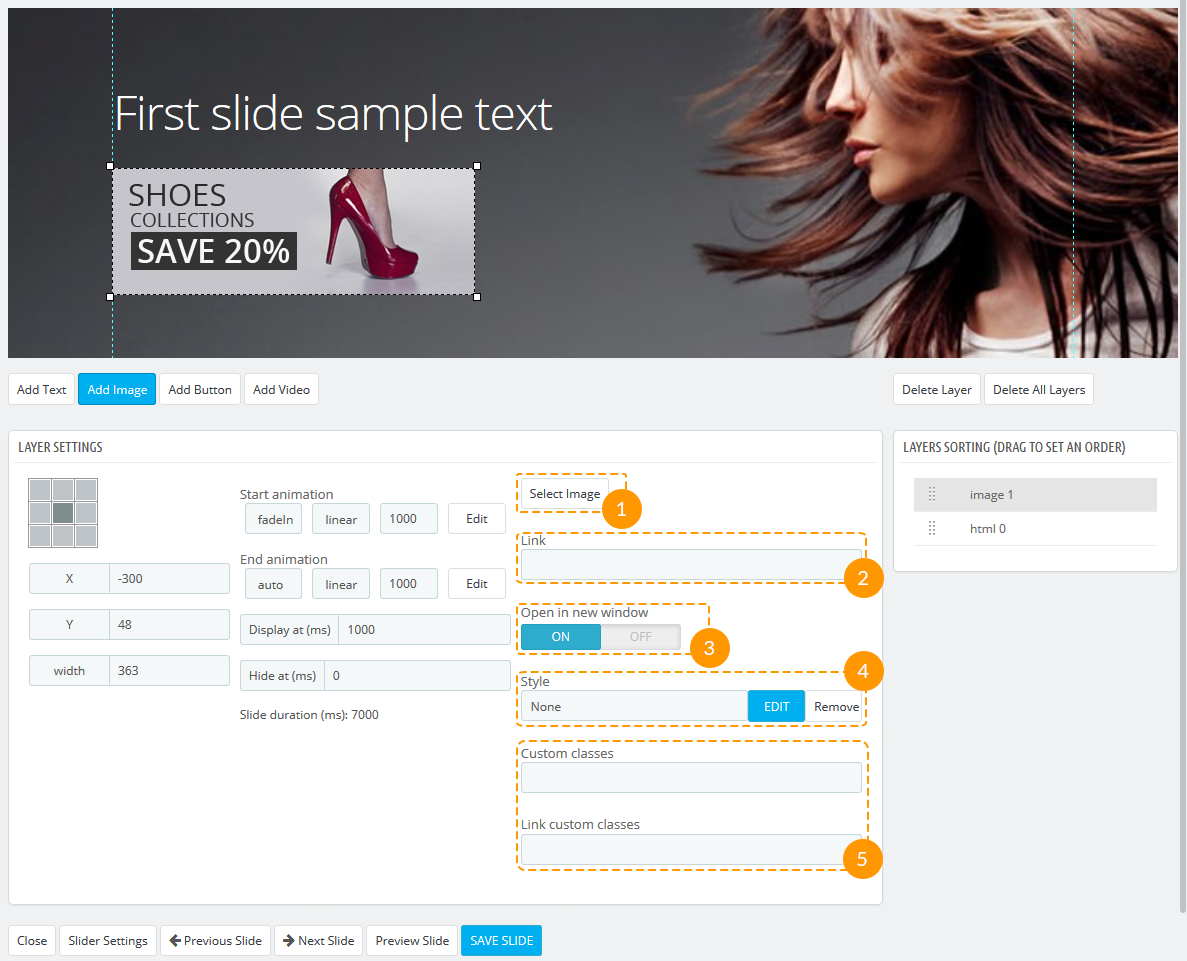
- To choose the image press the 'Select image' button (1).
- If you want to add the link to image, add the URL of the target page in the 'Link' field (2).
- This link can be opened in new window ('On') or in the same ('Off') (3).
- Some styles can also be applied to images (for example, border styles) (4).
- It is also possible to add a custom classes to the element (5).
Add Button
Button styles are almost the same as image styles.
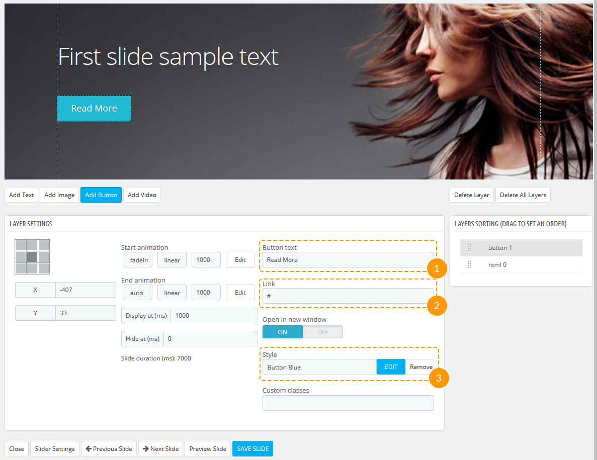
- Add the button text in the corresponding field (1).
- Add the URL of the target page in the 'Link' field (2).
- Choose the style for your button or create your own (3).
Add Video
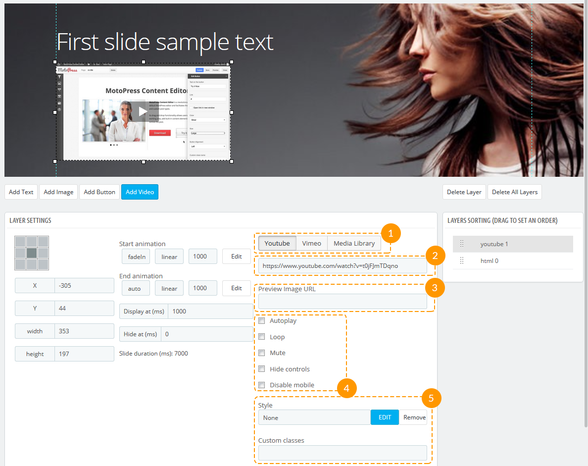
- Video can be added as a link to Youtube or Vimeo, or it can be chosen from Media Library (1).
- Add the video URL (2).
- Add the URL of the preview image (3).
- Choose the video dispaly options (4) and add styles to it (5).
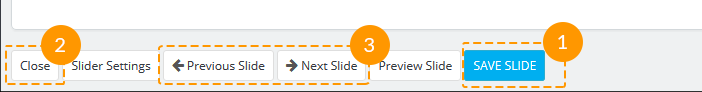
After you've made changes to your slide, don't forget to click the 'Save slide' button (1), then press 'Close' (2) or navigate between other slides (3).
Import and Export Slider
Import & Export Slider is very useful if you need to transfer any Slider to different websites. You do not need to spend much time for re-building sliders from scratch any more. If you are a developer you can create sliders on your website, show them them to your customers and import sliders to customers' websites.
Exporting Slider
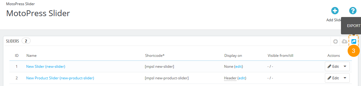
Follow these easy steps to learn how to export Motopress slider.
-
Go to Motopress Slider in your admin panel (1, 2).
-
Click 'Export' button (3).
-
Choose sliders you want to export (4) and click 'Export sliders' button (5).
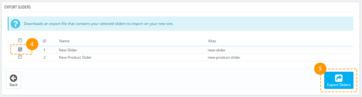
- You'll be prompted to save the exported .json file to PC.
Importing Slider
In order to import Motopress Slider do the following:
-
Go to Motopress Slider in your admin panel (1, 2).
-
Click 'Import' button (3).

-
Select the exported .json file from your PC clicking the 'Browse' button (4) and press 'Import' (5).
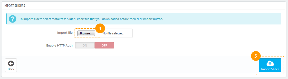
- Slider settings, images and other slider content should be exported successfully to your website.
TM Newsletter
The module displays a notification with a proposal to subscribe to store newsletter in a pop-up window. The email check can be enabled in module settings by means of confirmation email. You can also adjust the timeout between reminders for registered and non-registered users. Registered users can permanently give up on reminders.
Module install/uninstall
This module can be installed/uninstalled as any other PrestaShop module.
Module settings
After module has been installed you can configure it on the module configuration page.
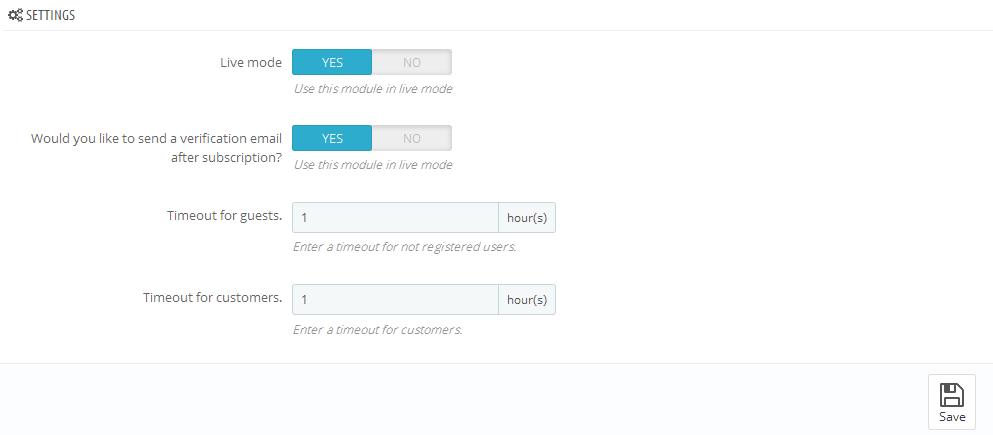
- Live mode - enable/disable the module.
- Would you like to send a verification email after subscription? - enable/disable confirmation email send.
- Timeout for guests - set timeout for popup reminding subscription for guests.
- Timeout for customers - set timeout for popup reminding subscription for customers.
It is necessary to install and enable 'Newsletter block' for proper work of module.
TM Olark Chat
Module to display Olark Chat on your store front-end.
Module install/uninstall
This module can be installed/uninstalled as any other PrestaShop module.
Module settings
After module has been installed you can configure it on the module configuration page.
In order to configure Olark Chat, which you can see on the live demo of the template, you need to register on the official website and to get the ID for your website. Input your ID to the field "Olark site ID" and set module under "Live mode". Now save settings by clicking 'Save' button.
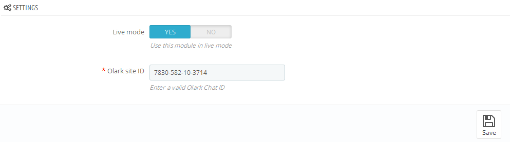
TM One Click Order
Module is used to make the process of making an order much faster and easier than it was before.
It simplifies the procedure from five steps to one and makes it more appealing for the customers who want to save
their time while making an order.
By means of this feature you can get more spontaneous purchases that will have a positive impact on your business.
Installation
Navigate to Modules and Settings -> Modules and Settings (1) in your admin panel and find the TM One Click Order module (2). Then click the 'Install' button (3).
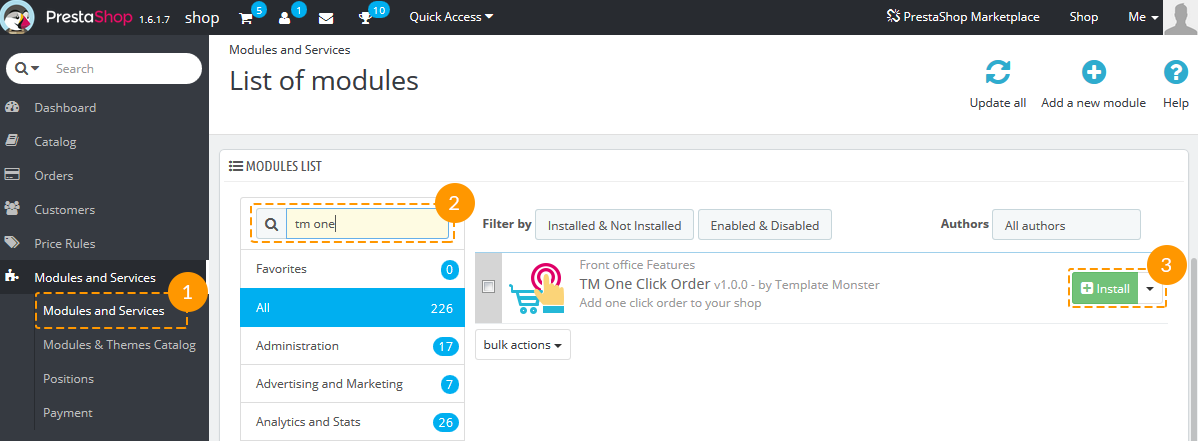
Module configuration
After the module has been successfully installed, the 'Configure' page with the module settings will be opened.
You'll also see the new menu item 'Quick Orders' (1) and a new icon will appear in the navigation panel (2).
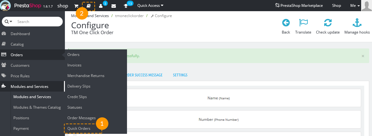
The settings are divided into three tabs - Preorder template (1), Preorder success message (2) and Settings (3).
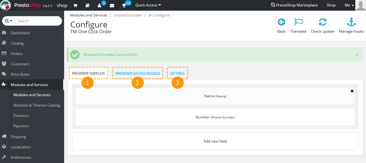
Preorder template
Here you can add a new field by pressing the corresponding button (1):
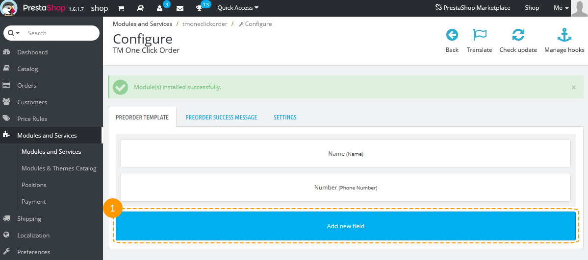
Choose the options for the new field and click the 'Save' button (1):
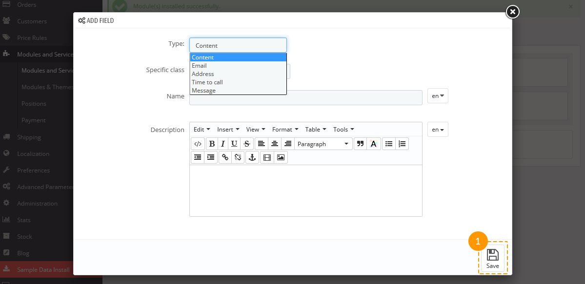
- Type - choose the type of field.
- Specific class - add the custom class for the current field.
- Name - field name.
- Description - field description; appears below the input.
-
Edit the existing field.
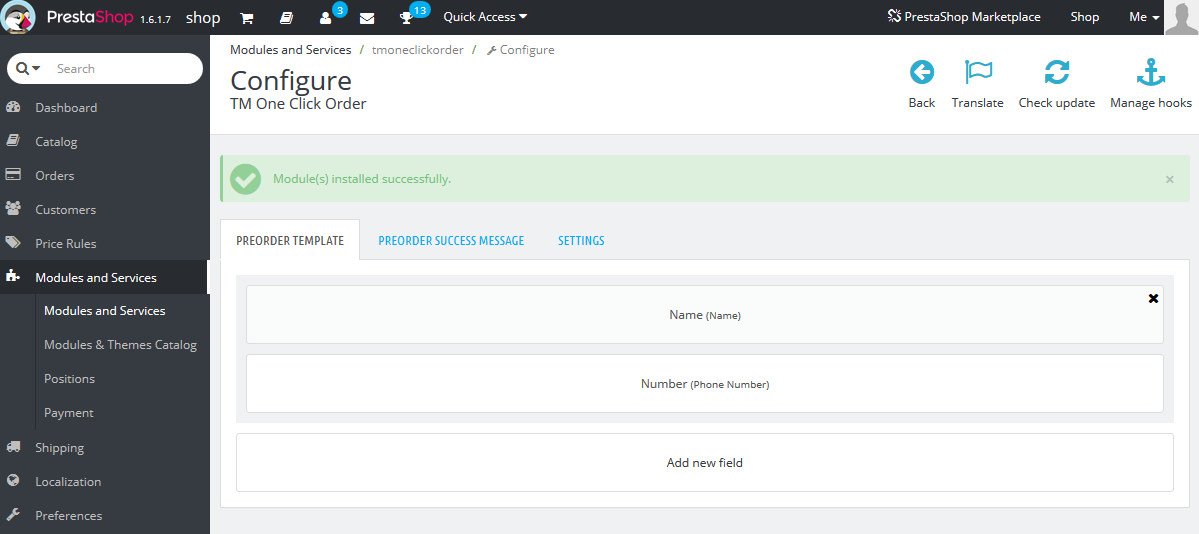
Click on the field you want to edit. The settings are the same as for adding new field.
-
Delete the fields from the form.
Click the 'Delete' button (1) in the top right corner of the field.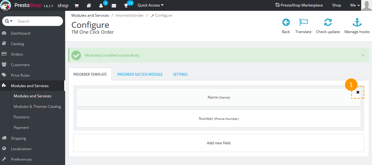
Preorder success message
The tab allows to edit the message for the alert window that appears after the user clicks 'Send' button in quick order form.
Add the text/button you want to be shown and click the 'Save' button (1).
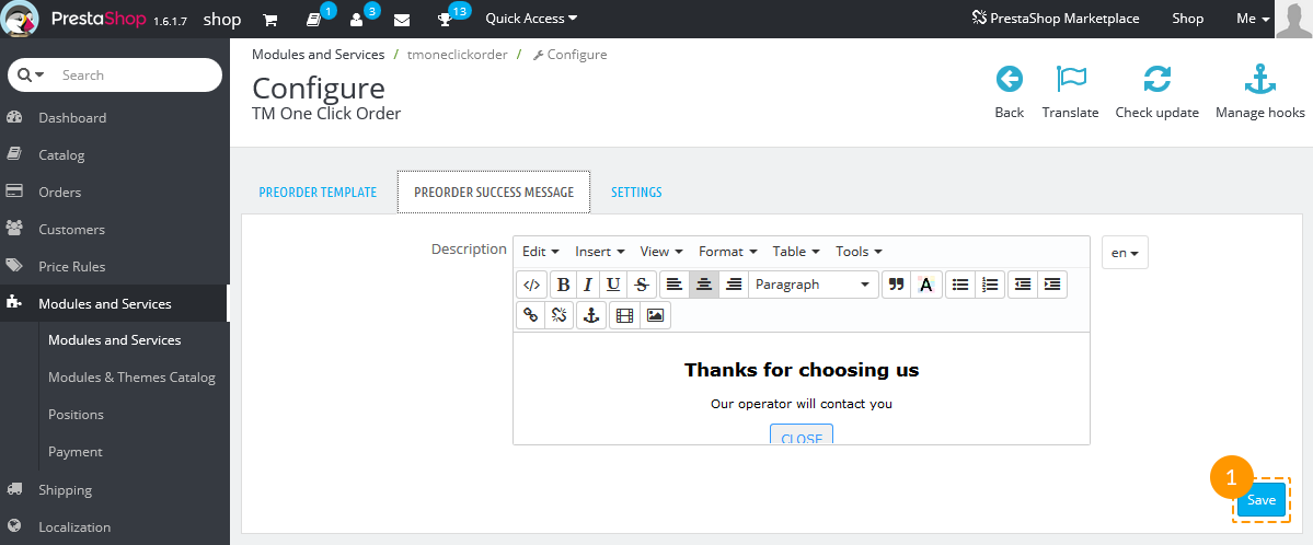
Settings
The tab allows to switch the 'Ajax order' option on and off.
It helps the administrator to see the new quick orders which were submitted while processing the existing orders.
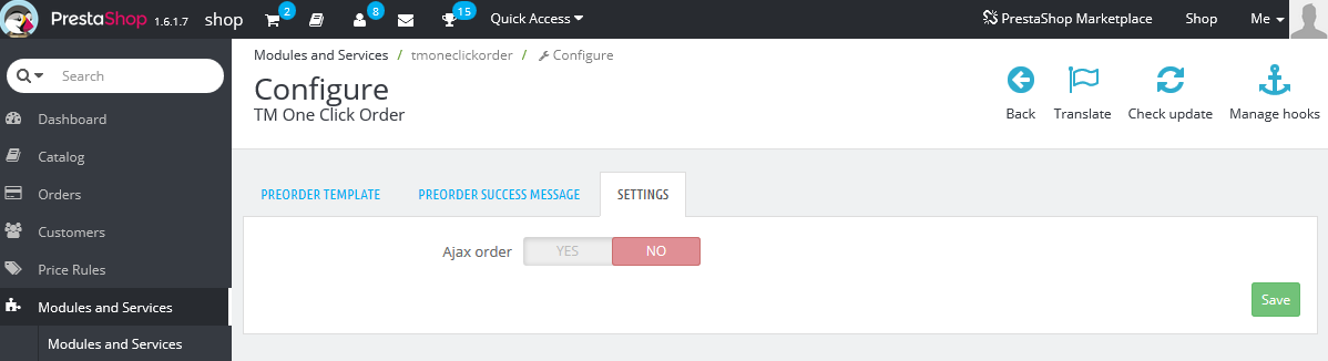
If the option is enabled, the additional option 'Ajax order timeout' appears.
The value is set in milliseconds and means the time period between each check for new quick orders.
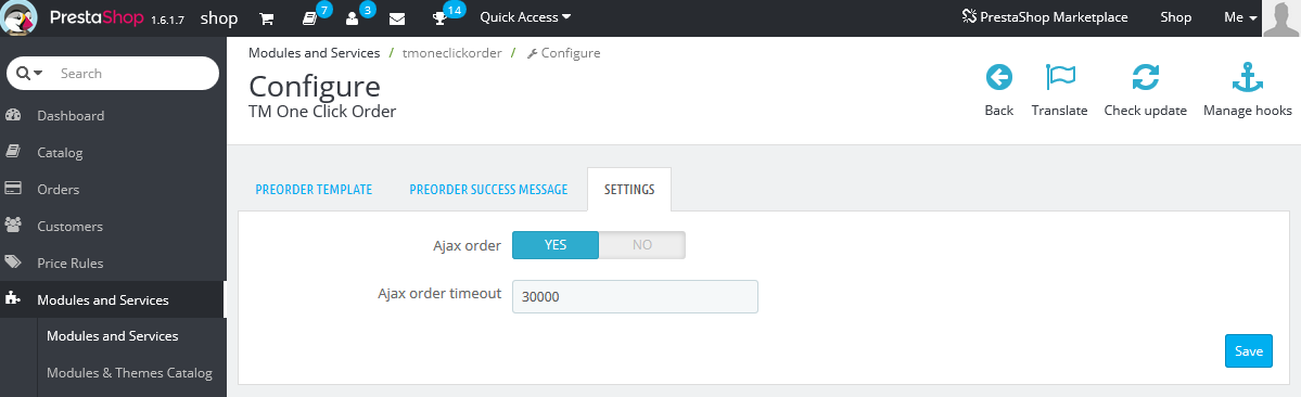
This option helps to open new preorders without page reloading. To see them in the list of quick orders, click the 'Load new orders' link (1) in Orders -> Quick Orders menu.
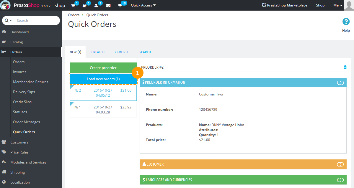
Order processing
Navigate to Orders -> Quick Orders (1) in your admin panel.
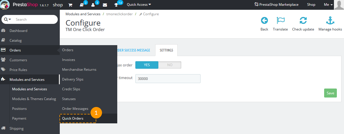
It has four tabs - New, Created, Removed and Search.
-
New - new preorders that have been submitted by the customers.
In the left part there's a button to create a new preorder (1) and a list of preorders (2).
In the right side you can see the preorder details (3) divided into tabs (Preorder information, Customer, Languages and currencies, Cart, Vouchers, Addresses, Shipping, Summary).
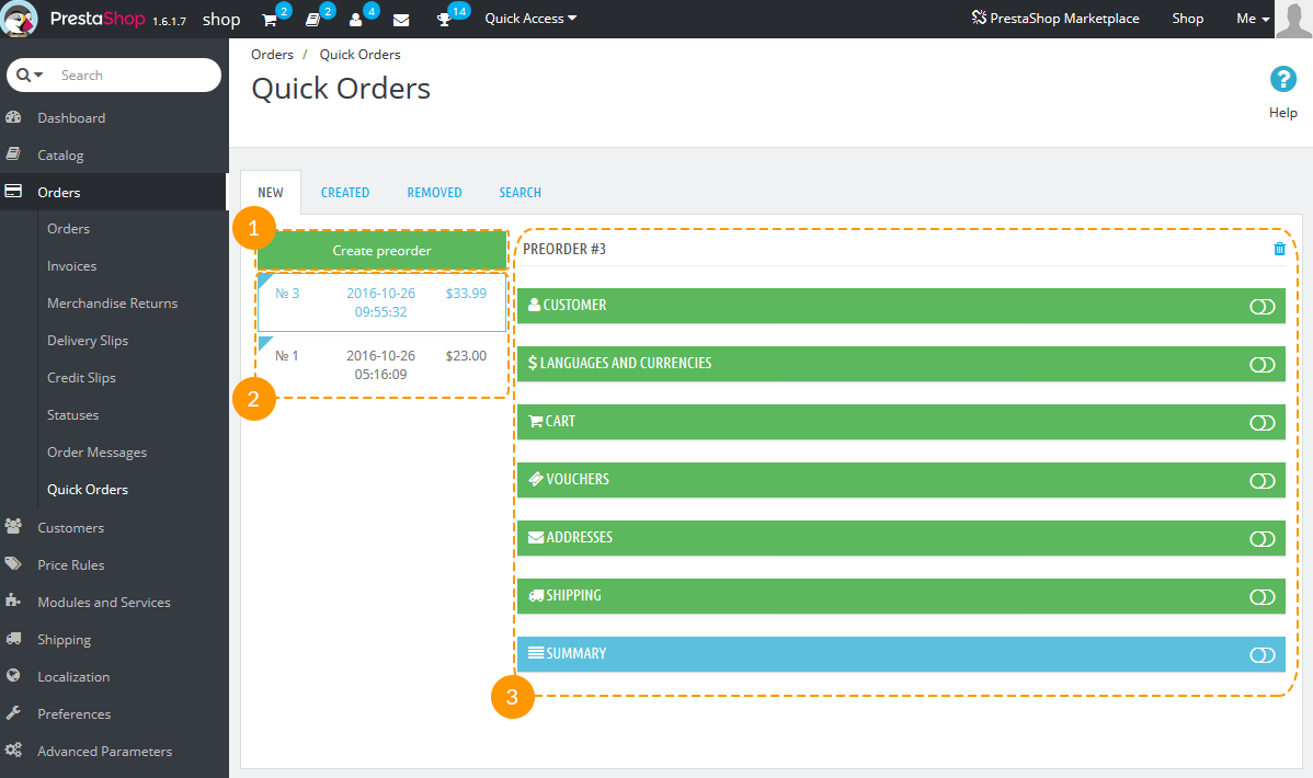
If the order has just been created, you'll see only three of them - Preorder information, Customer, Languages and currencies.
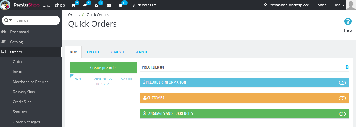
When you fill in the info about the customer, three more tabs will appear - Cart, Vouchers and Address. When the address info is added, Shipping and Summary tabs will be shown. Tabs where all required information has been successfully added, are colored with green. Yellow colored tabs require some more order details. Blue ones are informational, they are generated automatically.
When the Summary tab appears, there's a button 'Create the order' in Summary tab (1).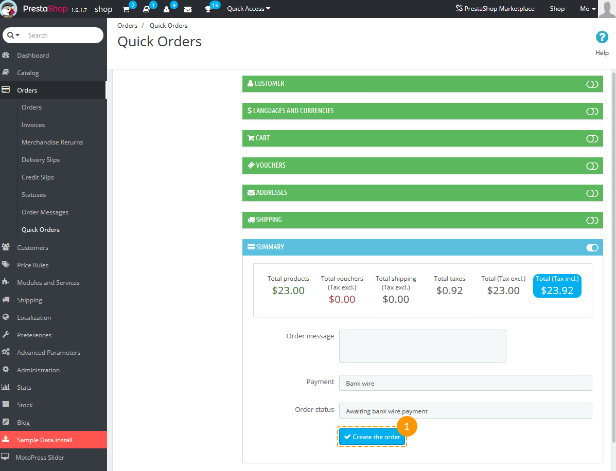
After clicking it the preorder will be transferred from 'New' to the 'Created' preorders list (1).
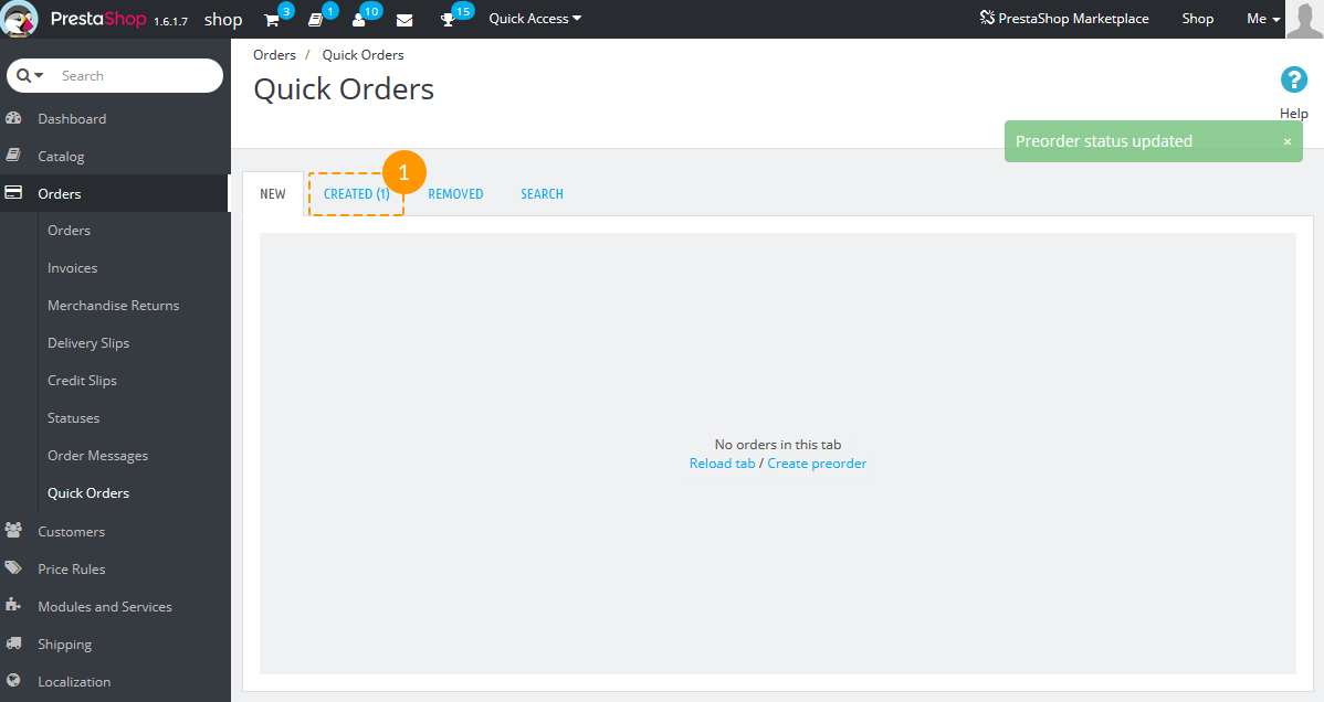
If you need to delete the order, there's a trash sign in the top right corner (1).
Press it and the preorder will be transferred to 'Removed' orders tab.
-
Created - preorders that have been already processed by the administrator.
Choose the order in the left side and click on it to see the detailed info in the right side.
You can also click the 'Show' link to see full information about the customer (1), about the order (2) and the employee (3).
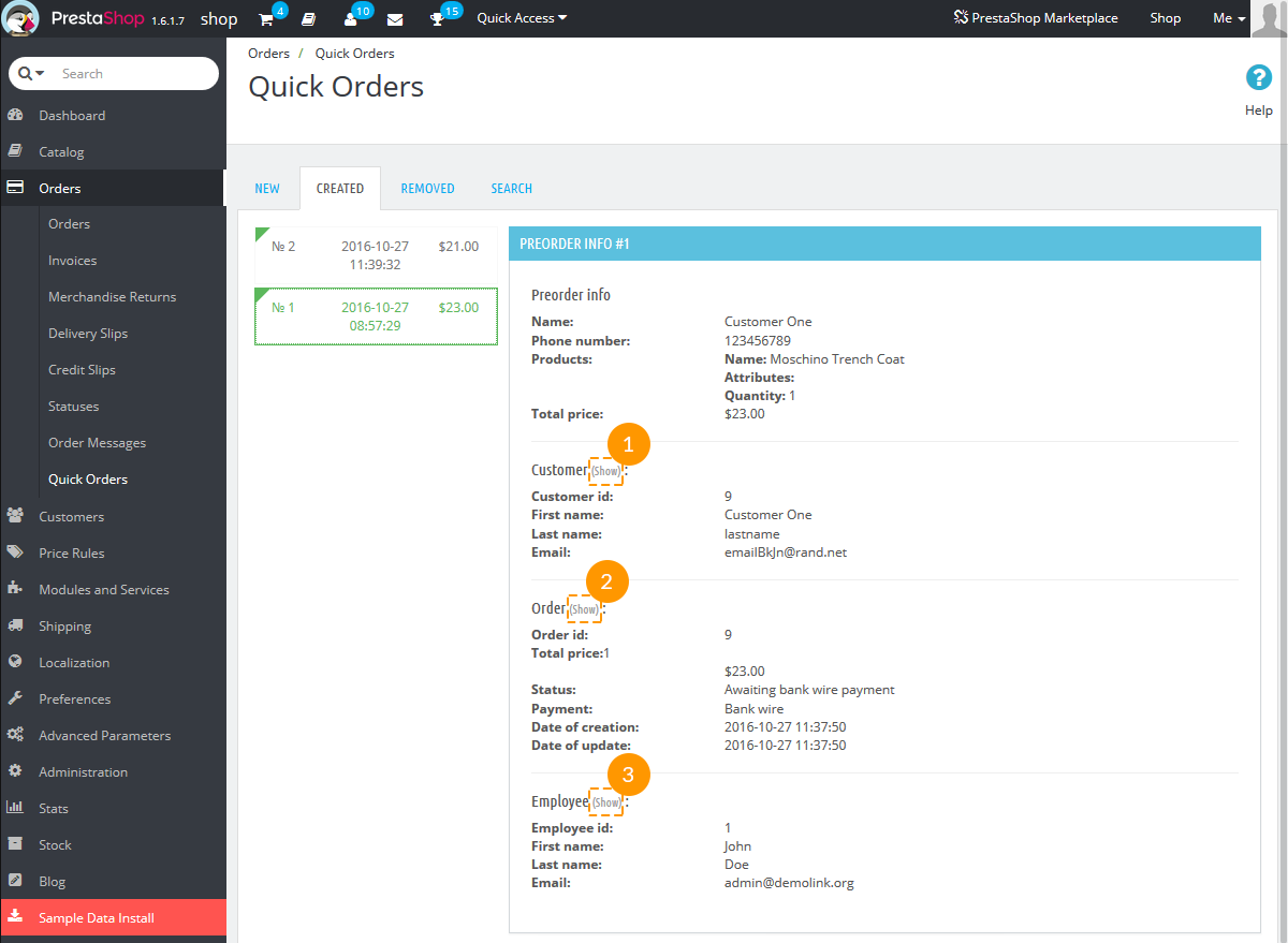
-
Removed - preorders that have been cancelled.
The preorder in this tab can still be recovered by clicking the '+' button (1). Then it will be transferred back to 'New' preorders tab.
-
Search - preorders search. Enter the search (by customer info, employee info, order id, preorder id); you can also enter the specific date/date period when preorders were created.
TM Product Custom Tab
The module serves to create an additional tab on the product page for displaying additional information. The module has an advantage over the existing functionality, due to the ability of adding images, text, video, links, etc.
Installation and removal
The module is installed and removed as any other PrestaShop module.
Module settings
After installing the module, you can add new tabs for the products at the module configuration page, as well as at the product editing page.
Adding tabs through the module configuration:
To add a new tab, press the 'Add new' button (1).
-
Adding a tab to one or several products of a previously selected category.
- Tab Heading - name of the tab, required.
- Tab Description - information about the tab, can include data in the format of an image, text, video, links, etc.
- Status - the element status.
- Additional settings - enabling/disabling additional settings.
- Select category - choosing categories for which the tab should be displayed.
- Products to display - selecting the products from the previously selected categories.
-
Adding the tab to the products that belong to selected categories.
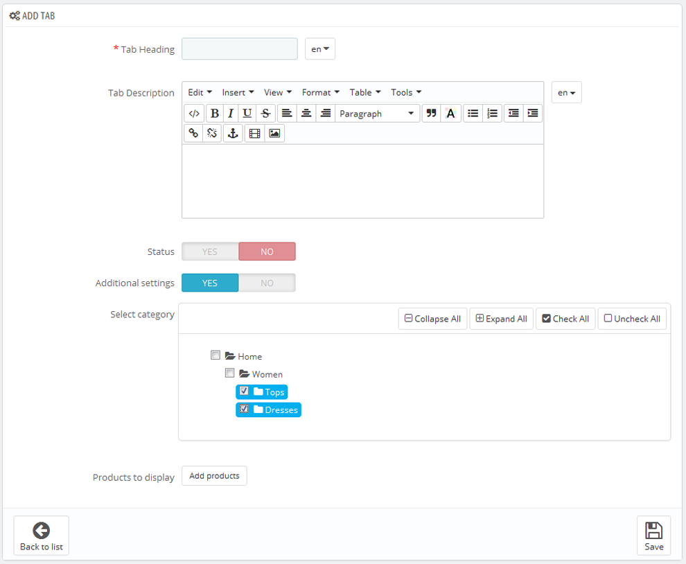
-
To add a tab to all products, disable the 'Additional settings' option.
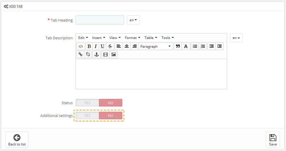
Changing the tab display position
Drag and drop the needed tab to change its position.
Adding tabs through the product settings:
Navigate to the product page and click the 'TM Product Custom Tab' link in the left menu.
If the 'Additional settings' option is disabled, the tab will be added to the product that was edited earlier. You can also add the tab to the products that belong to selected categories, or you can add it to several products that belong to the previously selected category.
To change the tabs display position, drag-and-drop the blocks. You can edit or remove tabs as well.
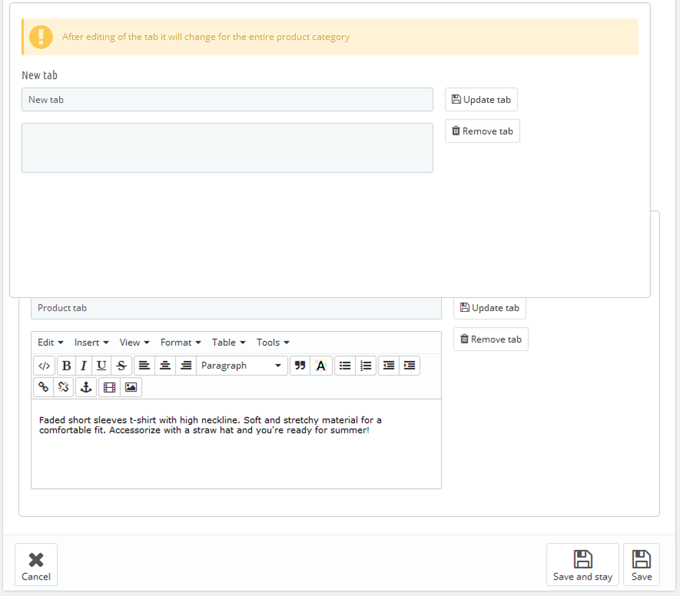
TM Product List Gallery 2.0.0
This module displays all the available product images in form of a gallery on product listing pages. Depending on what settings you choose, the module can display images in form of a rollover or slideshow.
Module Installation and Deleting
This module can be installed and deleted like any other PrestaShop module.
Module settings
After the module is installed, open the product-list.tpl file in your template root folder, find the following
code:

and replace it with:
    {capture name='displayProductListGallery'}{hook h='displayProductListGallery' product=$product}{/capture}
    {if $smarty.capture.displayProductListGallery}
      {hook h='displayProductListGallery' product=$product}
    {else}
      <a class="product_img_link" href="{$product.link|escape:'html':'UTF-8'}" title="{$product.name|escape:'html':'UTF-8'}" itemprop="url">
      <img class="replace-2x img-responsive" src="{$link->getImageLink($product.link_rewrite, $product.id_image, 'home_default')|escape:'html':'UTF-8'}" alt="{if !empty($product.legend)}{$product.legend|escape:'html':'UTF-8'}{else}{$product.name|escape:'html':'UTF-8'}{/if}" title="{if !empty($product.legend)}{$product.legend|escape:'html':'UTF-8'}{else}{$product.name|escape:'html':'UTF-8'}{/if}" {if isset($homeSize)} width="{$homeSize.width}" height="{$homeSize.height}"{/if} itemprop="image" />
      </a>
    {/if}
After installing and connecting the module, you can set it up on the module configuration page.
The module has the following main settings:
- Type - select display type: rollover or slideshow.
If you choose rollover, you can choose the animation effect:
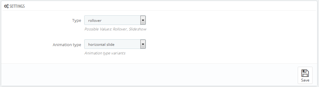
- Opacity slide - opacity changes;
- Horizontal slide - horizontal;
- Vertical slide - vertical.
If you choose slideshow, you will find the following settings available:
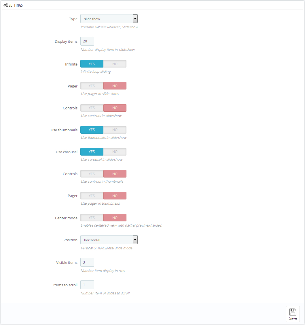
- Display items - the number of items displayed;
- Infinite - endless slideshow cycle;
- Pager - pager display in slide show;
- Controls - controls display in slide show;
- Use thumbnails - slideshow thumbnails display;
- Pager - pager display in thumbnails carousel;
- Controls - controls display in thumbnails carousel;
- Position - vertical or horizontal carousel mode;
- Center mode - centering the thumbnails carousel view;
- Visible items - the number of items in a row;
- Items to scroll - the number of scrolled items in thumbnails carousel.
TM Product Videos
This module allows to add unlimited number of videos to any product in any language and store.
Installation and deleting
The module is installed and deleted like any other Prestashop module. It has no configuration page and supports multi-stores.
After module installation you will see the new tab in your product configuration page (Catalog -> Product -> select any product - TM Product Videos).
To add a video to any product, you should fill in the required fields (the link field is mandatory). The module is multilanguage, so you will have to fill in the fields for all languages this video is related to. If the Link field is not filled for any language, then the video will not be added for this language. The module is supposed to show up videos from Youtube and Vimeo, so you need to add links only from these resources. After making the changes, click 'Save'/'Save and Stay' button to save them.
Examples of links
To display video properly, the links should have the following format:
-
- Youtube
https://www.youtube.com/embed/K6VcTyaym90
-
- Vimeo
http://player.vimeo.com/video/66140585
If the product has video related to this language, you will see the list of videos below.
To save, delete or edit the list, there is no need to click 'Save'/'Save and Stay' button. Use the buttons located in the video blocks. To change the order of videos, use drag-and-drop method to change their position. To enable/disable the video, use the button next to video. To edit videos, fill in the fields with required data and click 'Update' button.
To remove the video from the list, click 'Remove video' button.
While switching languages, only the list of videos related to the language will show up.
To view the video in zoomed format, click 'Zoom' button under this video.
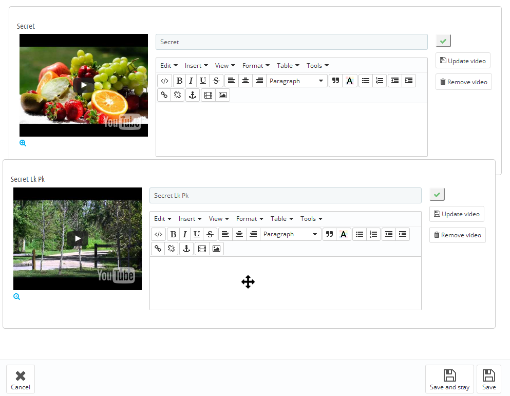
TM Product Zoomer
This module is an alternative solution for the standard product image zoom on the single product page. It's fully compatible with the standard additional products thumbnail carousel and product attributes changes. It allows you to choose among the three available options (window/lens/inner) for image zoom with the advanced plugin settings. The module is based on the Elevatezoom Plus plugin.
Installation and removing
The module is installed and deleted like any other Prestashop module. After module has been installed the standard product zoom effect will be automatically disabled. After deleting the module standard effect should be enabled back manually (if needed) in the Preferences -> Products -> Enable JqZoom instead of Fancybox on the product page section.
Module configuration
After the module has been installed you can configure it on the module configuration page.
By default the configuration page shows the simplified set of options.
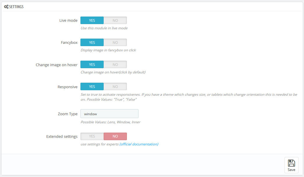
- Live mode - module is on/off.
- Fancybox - whether to show the enlarged image in the Fancybox on click.
- Change image on hover - switch the main image on thumbnail hover (by default is set to switch on click).
- Responsive - allows to the use adaptive functionality for plugin display on the mobile devices.
- Zoom Type - choose the type of the enlarged image display mode
- window - the enlarged image shows up next to the main image in one of the available (16) positions
- lens - the image is zoomed in the lens container, on top of it
- inner - the image is zoomed inside of main image container, fully covering it.
The mobile devices (< 768) have "lens" mode activated instantly. - Extended settings - enables advanced settings for the experienced users. You can see the link to the official documentation for more details next to it.
Extended module configuration
- Scroll Zoom - zoom ratio change on the mousewheel scroll (available for all types).
- Cursor - cursor type on the magnified image hover. The following options are available: default, cursor, crosshair (available for all types).
- Zoom settings - available for all types, if the 'Scroll Zoom' is enabled.
- Zoom Level - the zoom level on the initial hover
- Min Zoom Level - a minimum zoom level
- Max Zoom Level - a maximum zoom level
- Scroll Zoom Increment - magnifying scroll increment
- Easing - the magnified image appearance effect (available for all types).

- Zoom Easing - effect on/off
- Easing Amount - effect delay value
- Image Crossfade - main image blur outside the hover area (the lens) - available for window, lens.
- Magnified image window settings - available for window.
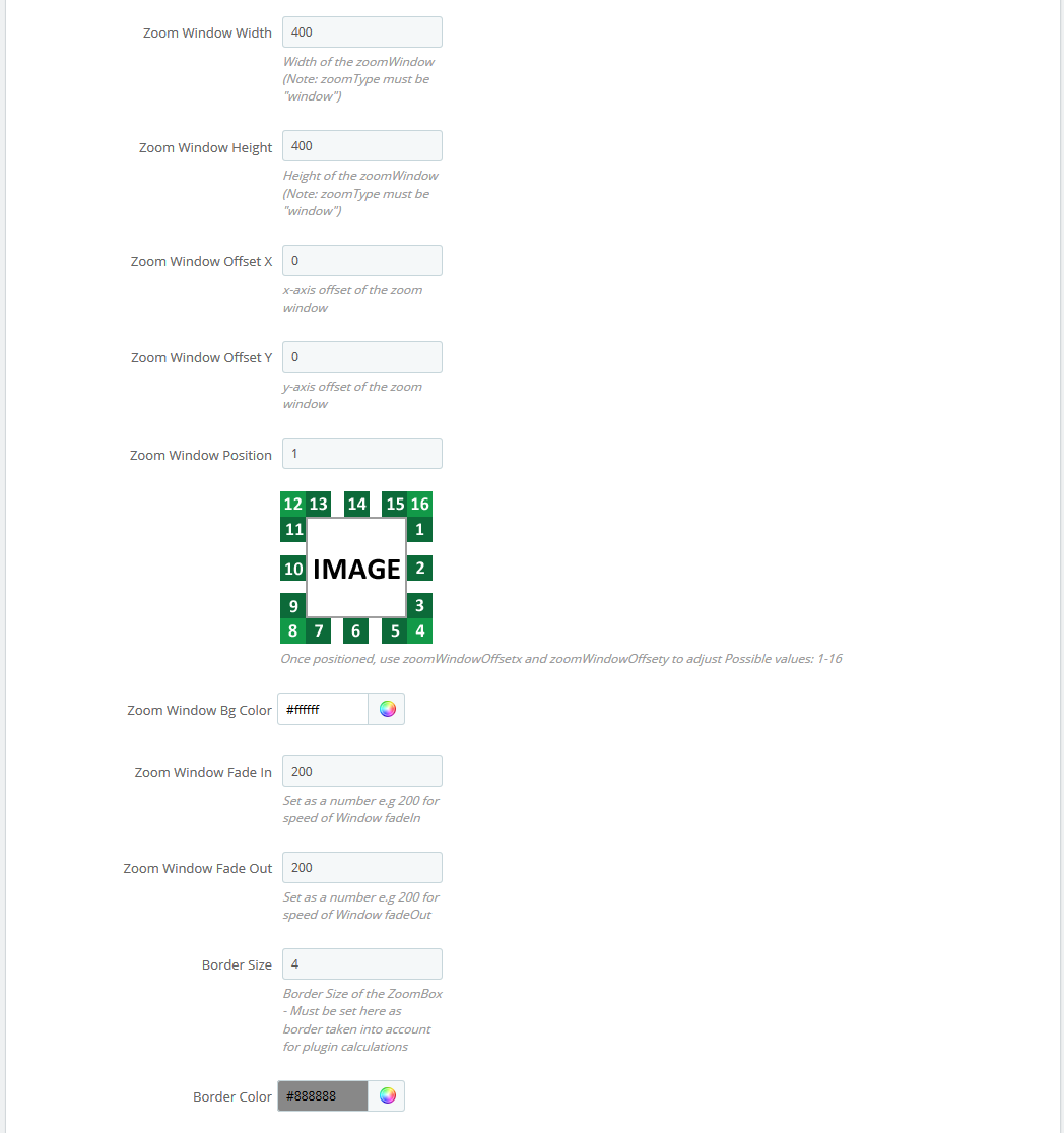
- Zoom Window Width - window width in px
- Zoom Window Height - window height in px
- Zoom Window Offset X - window offset on the X axis
- Zoom Window Offset Y - window offset on the Y axis
- Zoom Window Position - window position choice relatively to the main image (the positions available are presented on the image below this field)
- Zoom Window Bg Color - window background image (for transparent images only)
- Zoom Window Fade In - the effect of slowing the window appearance
- Zoom Window Fade Out - the effect of slowing the window disappearance
- Border Size - window border width in px
- Border Color - window border color
- Zoom Lens - zoom lens (available for window, lens).
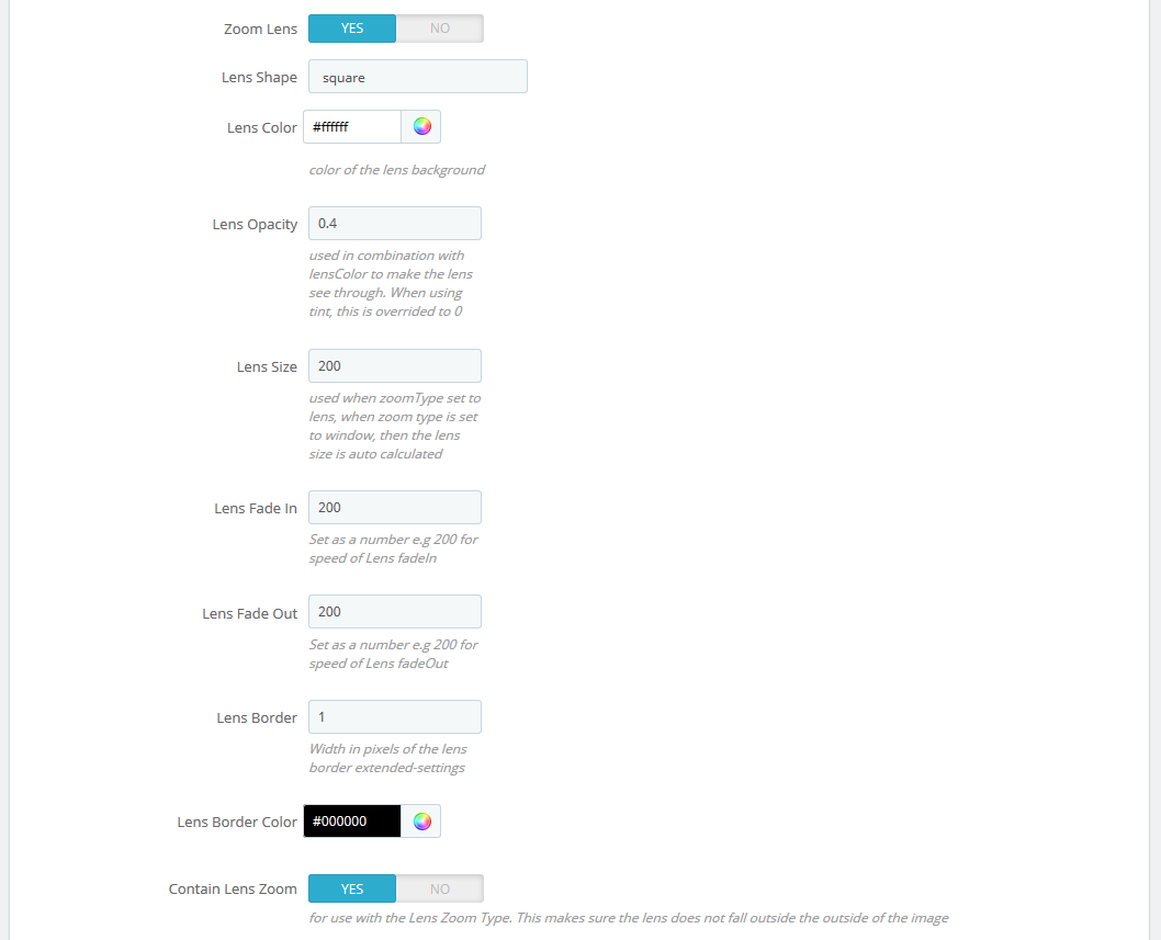
- Zoom Lens - on/off
- Lens Shape - lens type. It can take the following values: circular/rounded or squared/rectangular
- Lens Color - lens inner background color
- Lens Opacity - lens inner background opacity
- Lens Size - lens size in px
- Lens Fade In - the speed of lens appearance effect
- Lens Fade Out - the speed of lens disappearance effect
- Lens Border - lens border width
- Lens Border Color - lens border color
- Contain Lens Zoom - the restriction of the lens overflow outwards the main image container
- Tint - the shade effect on the area outside the lens (available for window).
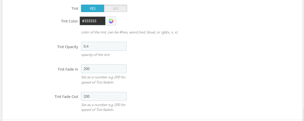
- Tint - effect on/off
- Tint Color - the lens outer area background
- Tint Opacity - the lens outer area opacity
- Tint Fade In - the appearance effect speed
- Tint Fade Out - the disappearance effect speed
TM Products Manager
Introduction
The module is created for managing online shops, especially shops with big amount of products. Using this module you can easily filter your products and make different operations on them.
Installation and removal of the module
The module is installed and removed as any Prestashop module.
Removal or re-installation of the module will not reset the changes you made using it.
When the module has been successfully installed, go to Catalog -> TM Products Manager (1) to see the module's main menu.
Performance
The main module menu is divided into two main parts: 'Choose section' (1) and 'Choose option' (2).
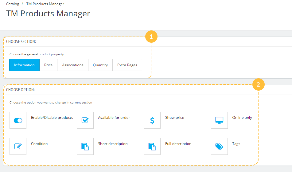
The first part is created in the form of tabs - Information, Price, Associations, Quantity and Extra Pages.
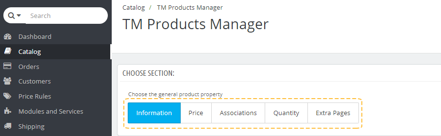
- Information - options concerning product availability and description.
- Price - price and tax rules settings.
- Associations - ability to change brand, category or accessories of several products.
- Quantity - changing products' quantity.
- Extra Pages - ability to add a new page.
-
Click each tab to see the available options in this section. They will be described further.
Each option has a hint - short description, which appears in the right when you hover the option (1).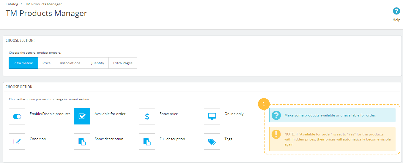
-
Choose the needed option and click it.
-
The next step is filtering products. Set the filtering options according to your needs and click the 'Select' button (1). To clear the selected filters click the 'Reset' button (2).
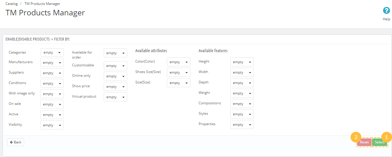
You can also cancel each of the filters after you've selected them. Simply click the cross (1) near the product property value and it will be removed.
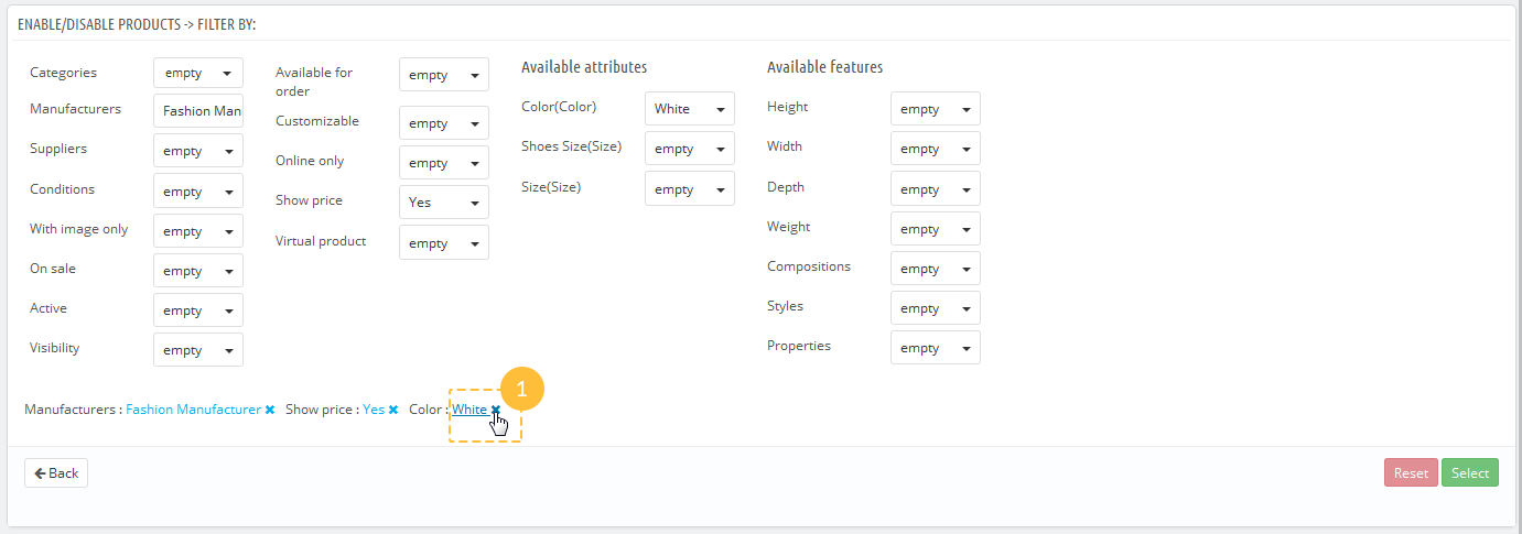
-
Below the filters there's a list of products matching the selected criteria. You can edit it lf you need to delete some of the products from the list. Each product can be removed separately by clicking 'Remove from the list' button (1). To remove all products from the list, click the 'Select all' (2) and 'Remove selected' (3) buttons. If you checked a large number of products and need to uncheck them, click the 'Unselect all' button (4).
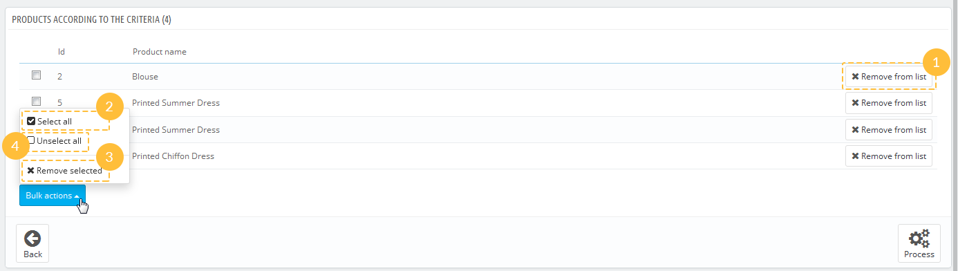
-
When the list of selected products complies with all requirements, click the 'Process' button (1).
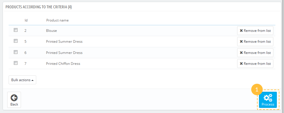
-
Set the option/options according to your needs and click the 'Save' button (1). If you need to make some changes in products list, click 'Back to filter' button (2).
Please note, that you won't be able to undo these changes the same way.
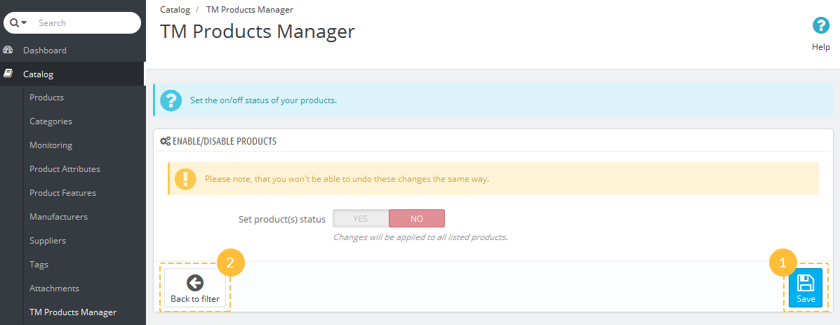
Available options
Information
The section allows to configure the following options:
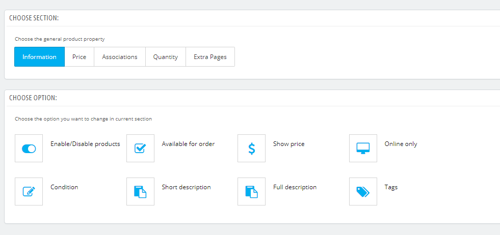
- Enable/Disable products - set the on/off status of your products.
- Available for order - make some products available or unavailable for order.
NOTE: if 'Available for order' is set to 'Yes' for the products with hidden prices, their prices will automatically become visible again.
- Show price - show or hide product price.
NOTE: if you set 'Show price' to 'No' for the products, which are available for order, they will be automatically changed to unavailable.
- Online only - apply the 'Online only' mark to the selected items.
- Condition - change the condition of multiple products.
- Short description - add a short description which should be applied to all selected products.
- Full description - add a description to selected products with an ability to place it before the main description, after it, or replace the whole description with the new one.
- Tags - add more tags to the chosen products.
Price
In this section you can change options concerning product price.
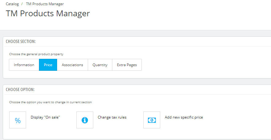
- Display "On sale" - display the selected items with 'On sale' mark.
- Change tax rules - choose the tax rules which will be applied to several products.
- Add new specific price - set the special price for selected products with an ability to add the price activation period.
Associations
Here you can change options connected with product relations.
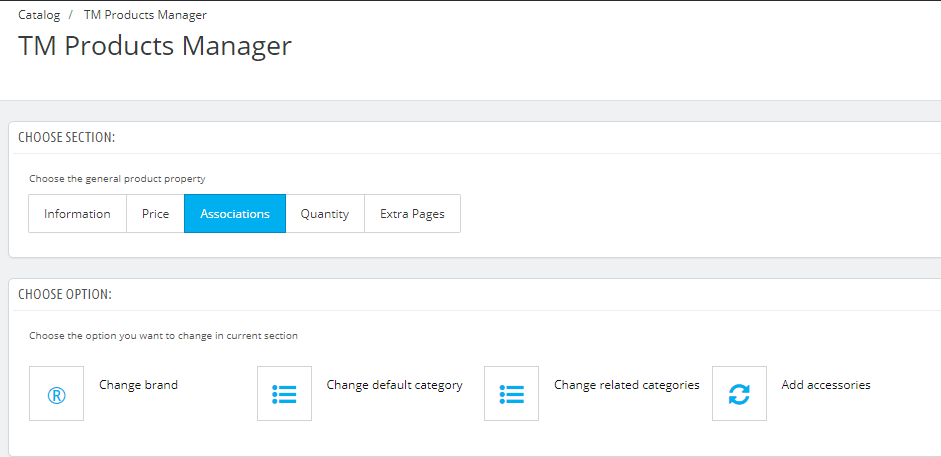
- Change brand - change brand of selected items.
- Change default category - choose the category which will be set as default for some products.
NOTE: You can choose only one default category. Keep in mind that your current default category will be replaced with the new one.
- Change related categories - set the related categories to multiple products with an ability to save or remove old relations.
- Add accessories - add the accessories suitable for the chosen products.
Quantity
This option allows to set the product quantity or increase/decrease current quantity by a certain amount.
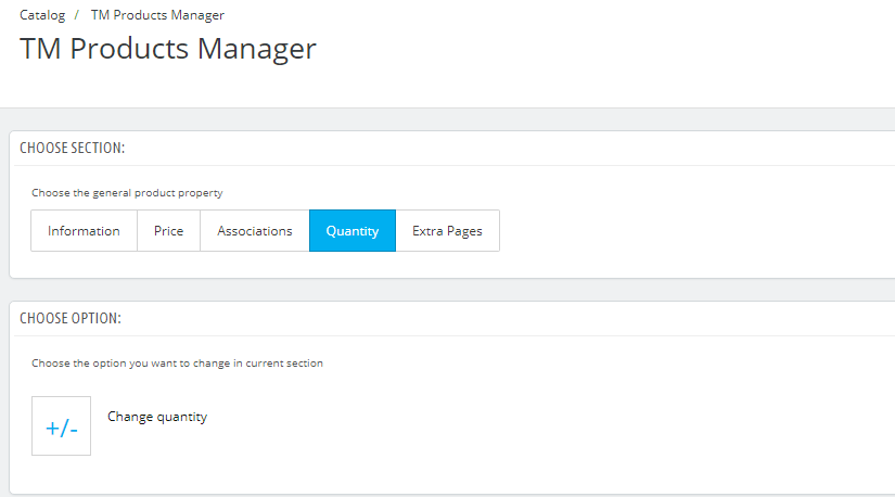
- Change quantity - set the required quantity of some products.
Extra Pages
This option allows to add a new page.
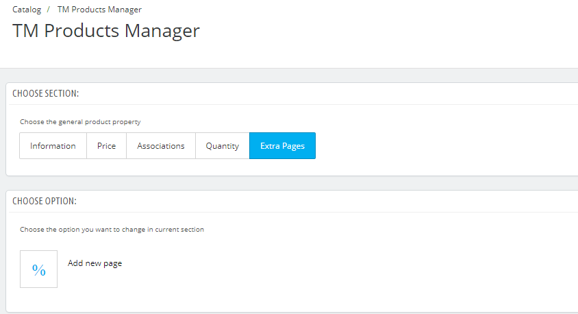
- Add new page - create a new product page.
TM Products Slider 2.0.0
Introduction
This module serves for creating galleries, based on product data and displaying them in form of slides on the website frontend. The module supplies 4 methods of displaying the gallery with individual settings and appearance. Each method has pre-defined functionality. Advanced configuration is also available. The module can display an unlimited amount of products with diverse information.
Installation and removal of the module
If you have the 1.n version of this module installed in your prestashop engine, you are not suggested to update it with the current one. First you need to remove the old version of the module to run without errors.
The module is installed and removed as any default Prestashop module.
After removal or re-installation of the module, all the settings and filters are discarded.
Adding/deleting/editing a slide
Adding a slide
To add a product to the gallery, go to the needed product in the Catalog -> Products section. Then press the 'Edit' button (1) next to the needed product.
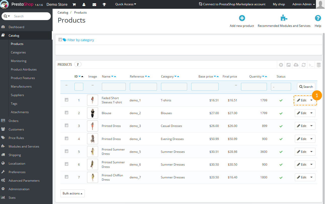
In the appeared window for editing information about the product, navigate to the TM Products Slider tab (2) and mark (3) that you want the product to be displayed in slider.
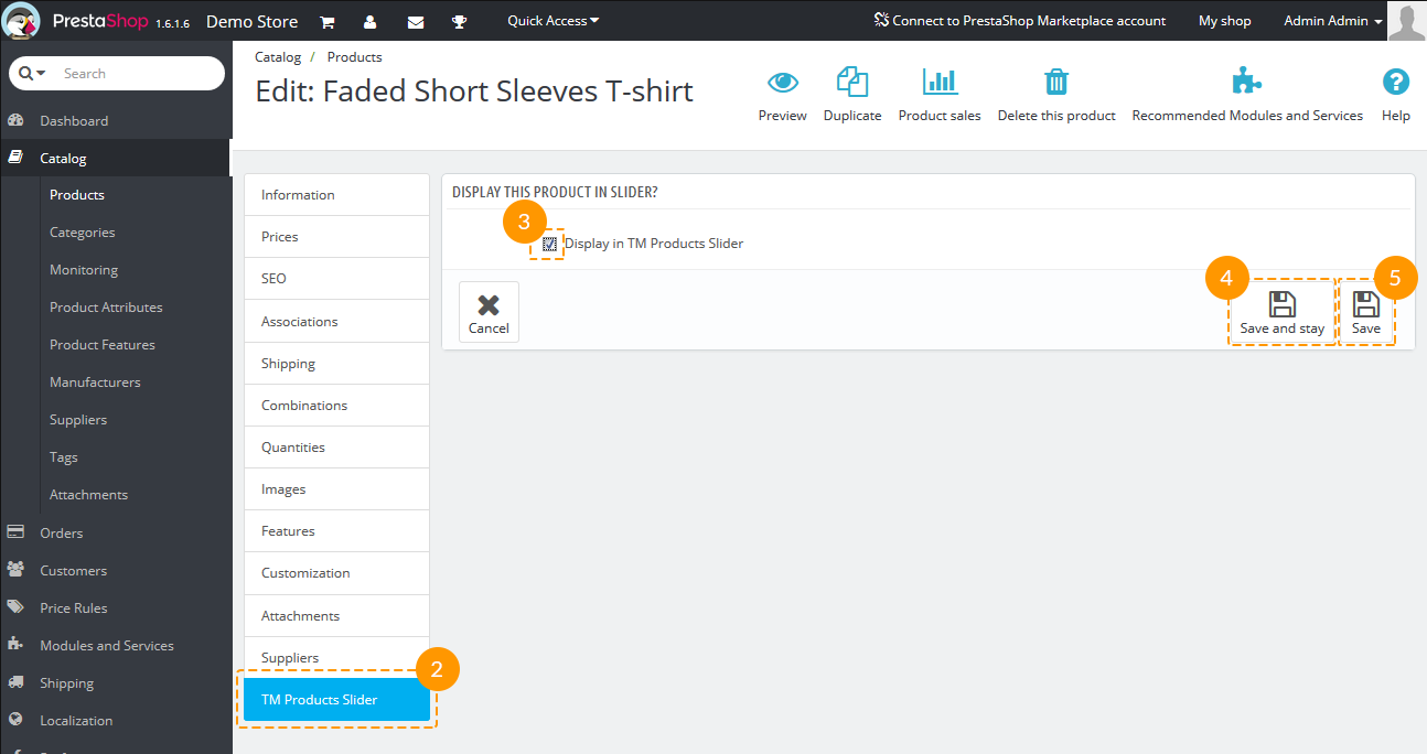
Save changes by pressing either 'Save and stay' (4) or 'Save' button (5).
Slide removal
There are two ways of deleting a slide.
-
To exclude a product from the gallery, navigate to the needed product in Catalog -> Products section. Then press the 'Edit' button (1) next to the needed product.
In the appeared window for editing information about the product, navigate to the TM Products Slider tab (2) and remove the check mark (3) which means that you don't want the product to be displayed in slider:

Save changes by pressing either 'Save and stay' (4) or 'Save' button (5).
-
The second way is to navigate to the module configuration page, find the needed product in the Slides list table and press the Delete button (1) next to it.
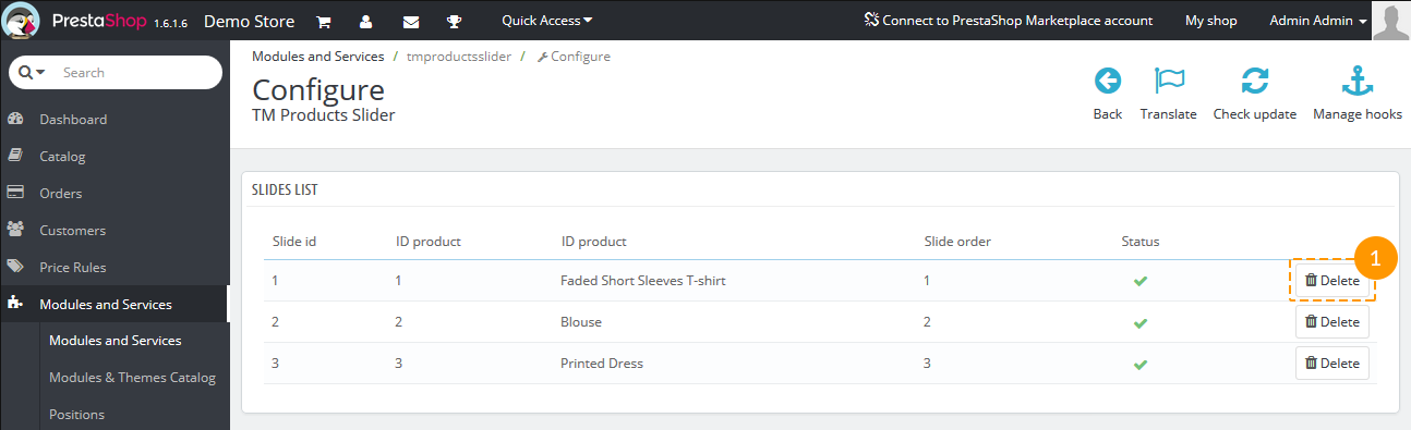
Then confirm the deletion.
Slides display order
By default, the slides are displayed in the order they were added. To change the display order, navigate to the module configuration page and drag the slide to the needed place in Slides list table.
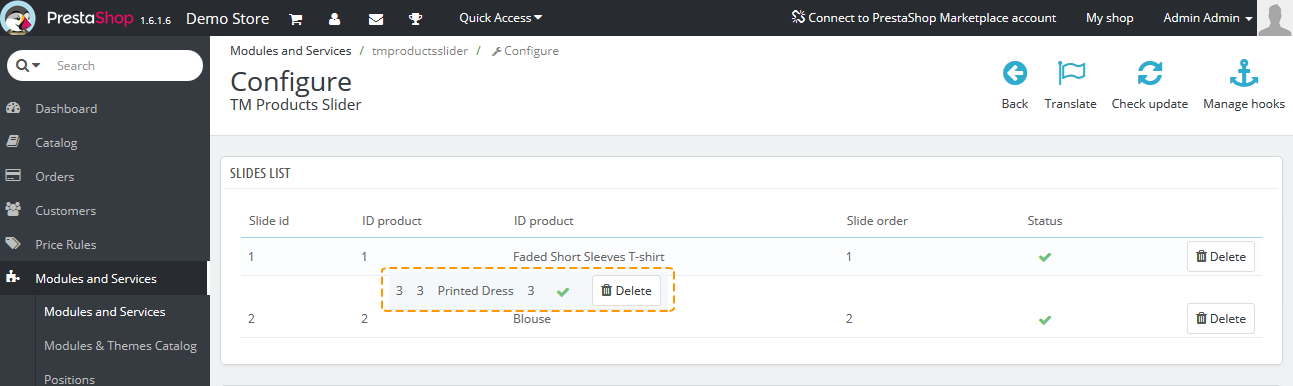
Disabling slides
Moreover, you can temporarily disable a slide (for the time period that a product is out of stock or for any other reason) without removing it completely. To do this, navigate to the module configuration page and click a tick next to the needed product (if it's active now) or click crosses (if it's inactive) in the Slides list table:
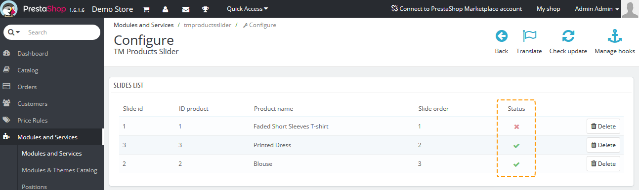
Gallery types and recommended settings
There are four types of gallery display (standard, list, grid, full width). Each of them can be set up independently and you can switch between them if needed.
By default, the gallery uses the following product image types: large_default - for the main image; medium_default - for thumbnails.
Standard
Recommended settings:
- image size (px) - 435*435
- Gallery Width - 1170px
- Gallery Height - 580px
- Extended Settings - off
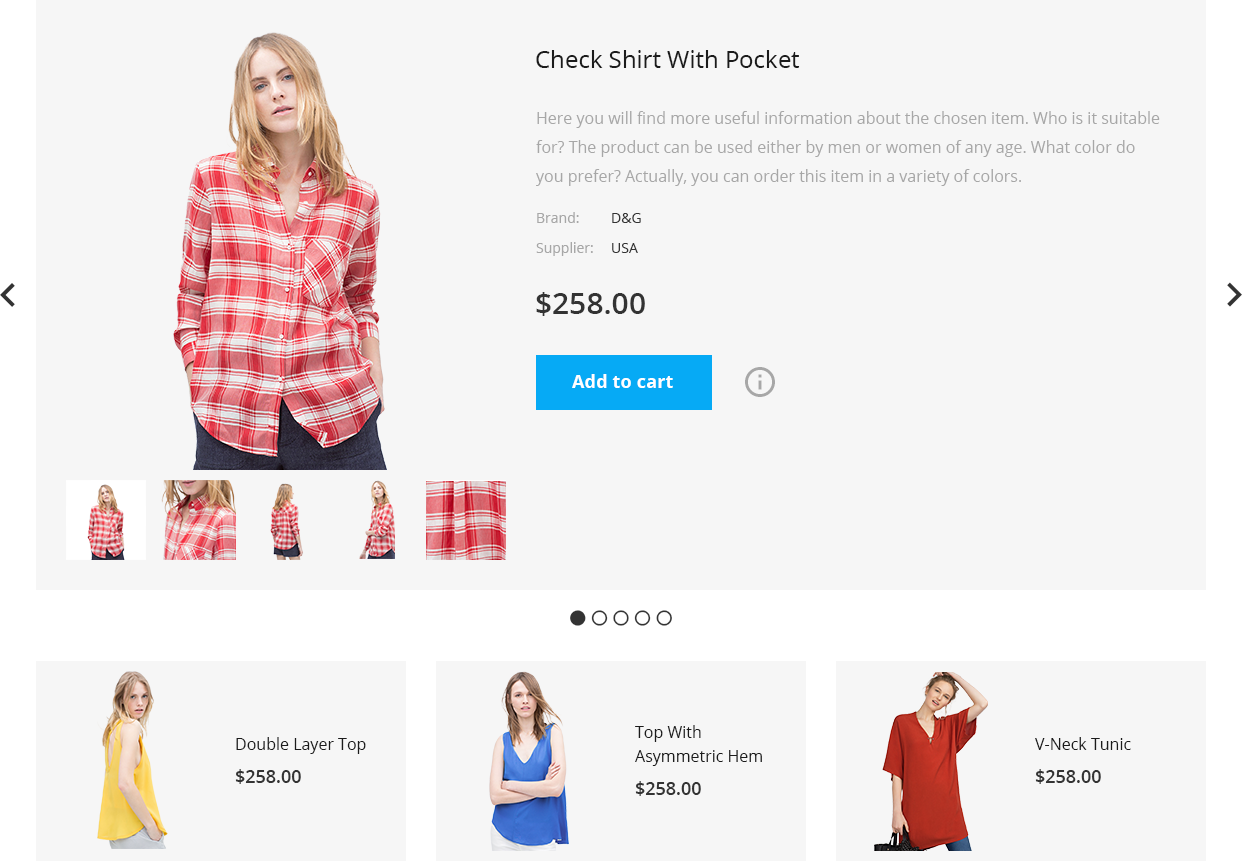
List
Recommended settings:
- image size (px) - 435*520
- Gallery Width - 1170px
- Gallery Height - 520px
- Extended Settings - off
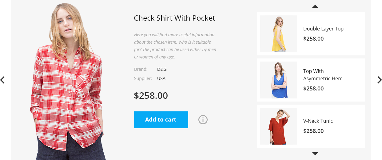
Grid
Recommended settings:
- image size (px) - 585*750
- Gallery Width - 1170px
- Gallery Height - 750px
- Extended Settings - off
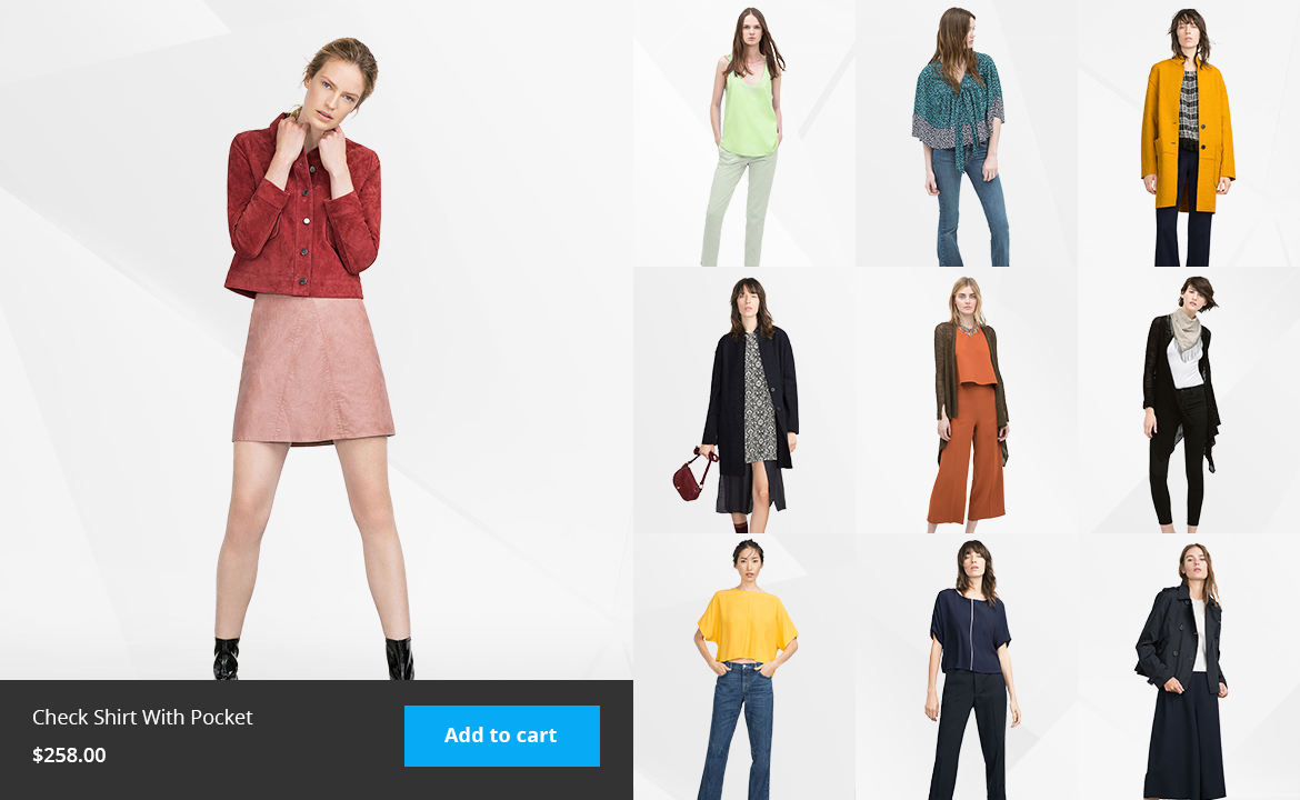
Full width
Recommended settings:
- image size (px) - 435*435
- Gallery Width - 1920px
- Gallery Height - 450px
- Extended Settings - off
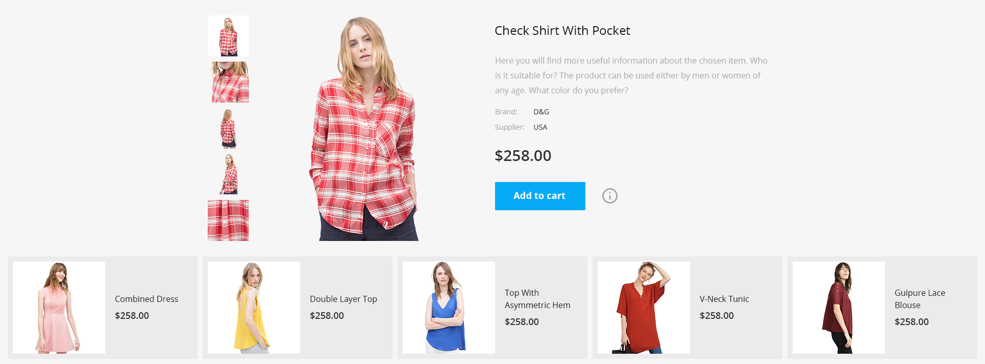
Advanced settings
To access extended settings, move the Extended Settings slider to the Yes position.
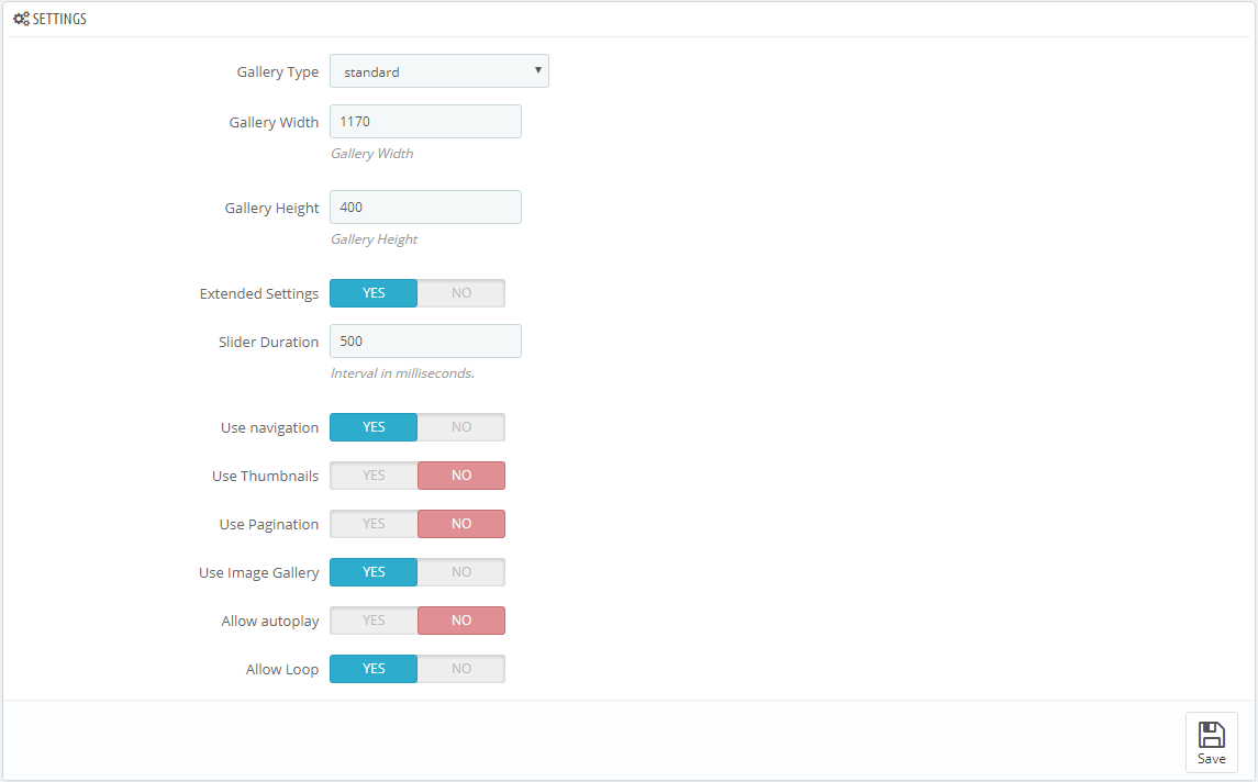
- Gallery Type - active gallery type. Four types of gallery are available (standard, list, grid, full width). You can set up each of them independently.
- Gallery Width - active gallery width.
- Gallery Height - active gallery height.
- Extended Settings - advanced settings; if the option is moved to 'No' position, all the advanced settings will be saved and you can restore them at any time. At the same time, at frontend it will be displayed as by default.
- Slider Duration - the speed of slide changing.
- Use navigation - the display of the Prev/Next buttons for slide switching.
- Use Thumbnails - using thumbnails with additional information about slides as an element for switching the current slide.
- Use Pagination - using pagination as an element for switching the current slide.
- Use Image Gallery - using additional product images inside the slides.
- Allow autoplay - allow automatic slide switching.
- Slider Interval - the time span, after which the slide will switch to another (available only if 'Allow autoplay' is active).
- Allow Loop - allow repeating slides from the beginning after all the slides were shown.
After switching the gallery, all the setup of the previously used gallery is saved.
After disabling/enabling advanced settings, the settings are saved and you can go back to them at any time.
FAQ
- Why the gallery does not display on the frontend?
- I change gallery advanced settings, but I don't see changes on the frontend. What can be done?
TM Related Products
Given module was designed in order to add and display the related products on the product page.
Module installation
This module can be installed/uninstalled as any other PrestaShop module.
Module settings
After module has been installed you can configure it on the module configuration page.
- Display product price.
- Amount of products to display.
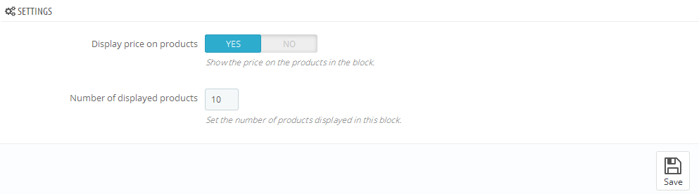
You can add or remove related products for the main product in the product settings Catalog -> Products.
- Navigate to TM Related Products;
- In the product search field start input the title of the product, and choose it from the offered variants;
- In order to remove the product from the list click the X before the product;
- Once all the configuration changes have been made click 'Save and Stay' or 'Save' button.
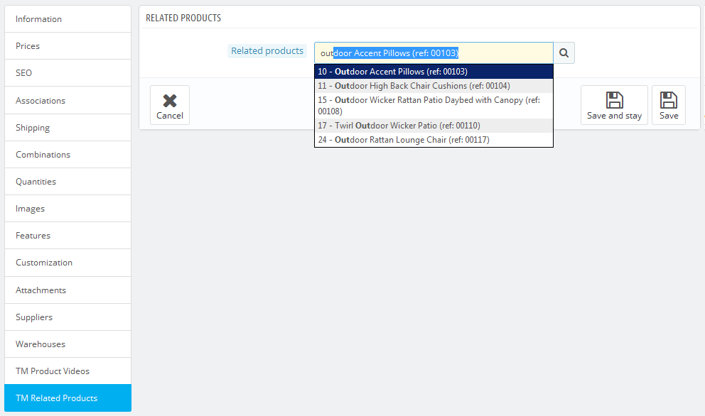
TM Search 1.1.0
This module is an extended search version that allows you to select a specific category for searching within its content. You can also change the category after defining the query. It also provides a possibility to set the additional product information display (description/price/manufacturer, etc.), and define the search results container layout, e.g., you can divide the results into a few sections with the controls (pagination, next/previous/show all). All the module settings are available in main admin panel.
Installation and Deleting
If you have the 1.0.5 version of this module installed in your prestashop engine, you are not suggested to update it with the current one. First you need to remove the old version of the module to run without errors.
The module is installed and deleted like any other Prestashop module.
Module configuration
After module has been installed you can set it up on the module configuration page.
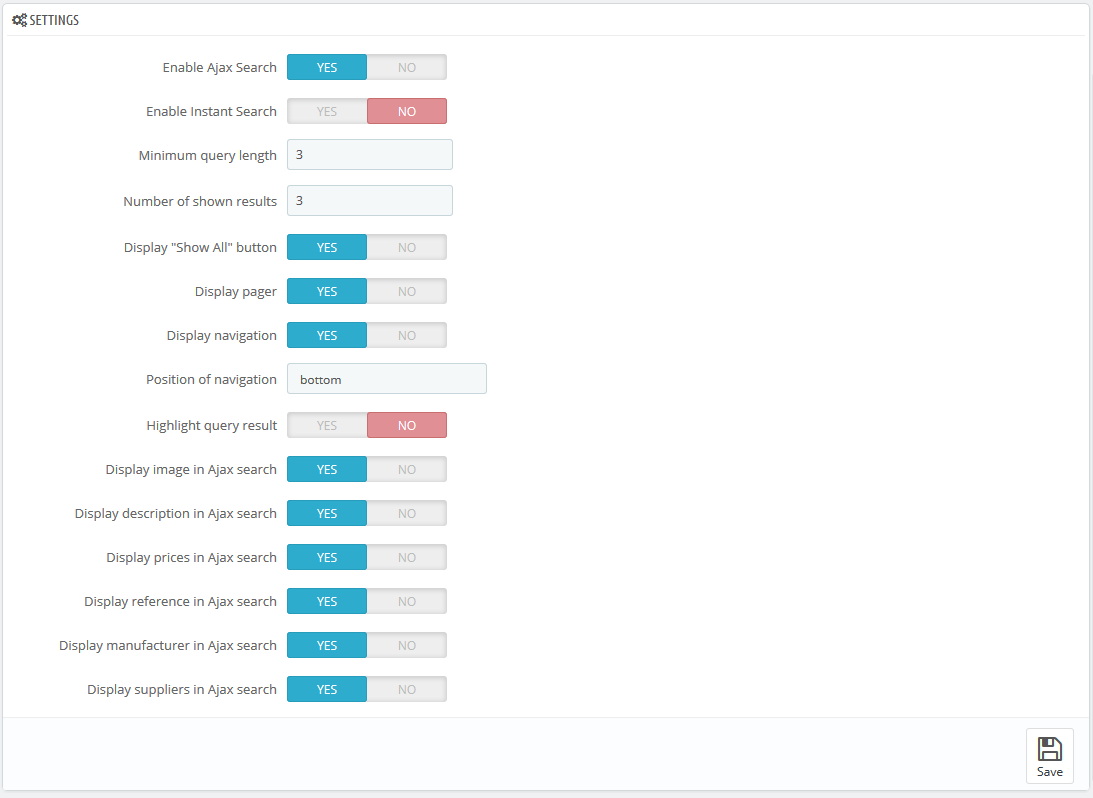
- Enable Ajax Search - enables live search in a dropdown.
- Enable Instant Search - enables instant search.
- Minimum query length - number of symbols to start the result display.
- Number of shown results - number of products that shows up in the results section (number of products per page for the "pager" or "navigation" mode).
- Display "Show All" button - displays the 'Show all' button below the results section, the click on it displays all found results.
- Display pager - divides results into pages (depends on the 'Number of shown results' field value) and displays links to them.
- Display navigation - shows the Previous/Next buttons.
- Position of navigation - hook(s), to show the navigation (top/both/bottom options are available).
- Highlight query result - highlights the text that matches search query.
- Display image in Ajax search - shows product images in the results section.
- Display description in Ajax search - shows product description in the results section.
- Display prices in Ajax search - shows product price in the results section.
- Display reference in Ajax search - shows product reference in the results section.
- Display manufacturer in Ajax search - shows product manufacturer in the results section.
- Display suppliers in Ajax search - shows product suppliers in the results section.
Some parameters might differ depending on the combination used.