STORLLIC Documentation
TM Extensions Settings
Ajax Wishlist
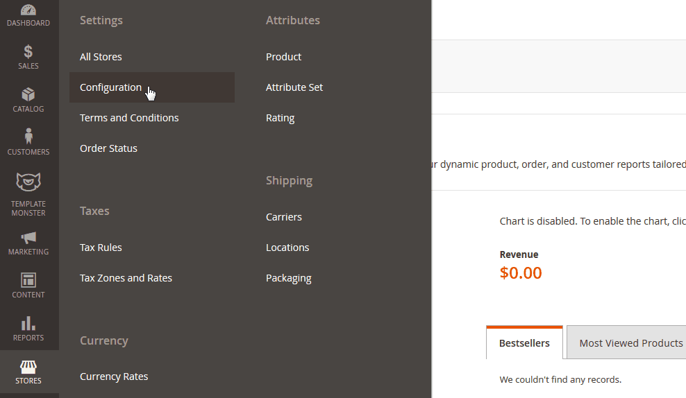
In order to configure this module, you should navigate to Magento admin panel and choose the Stores > Configuration section in the left side menu.
Then choose the TemplateMonster > Ajax Wishlist item on the new page on the left side.
Check the tutorial on How to Manage Ajax Wishlist Extension.
Useful Tutorials:
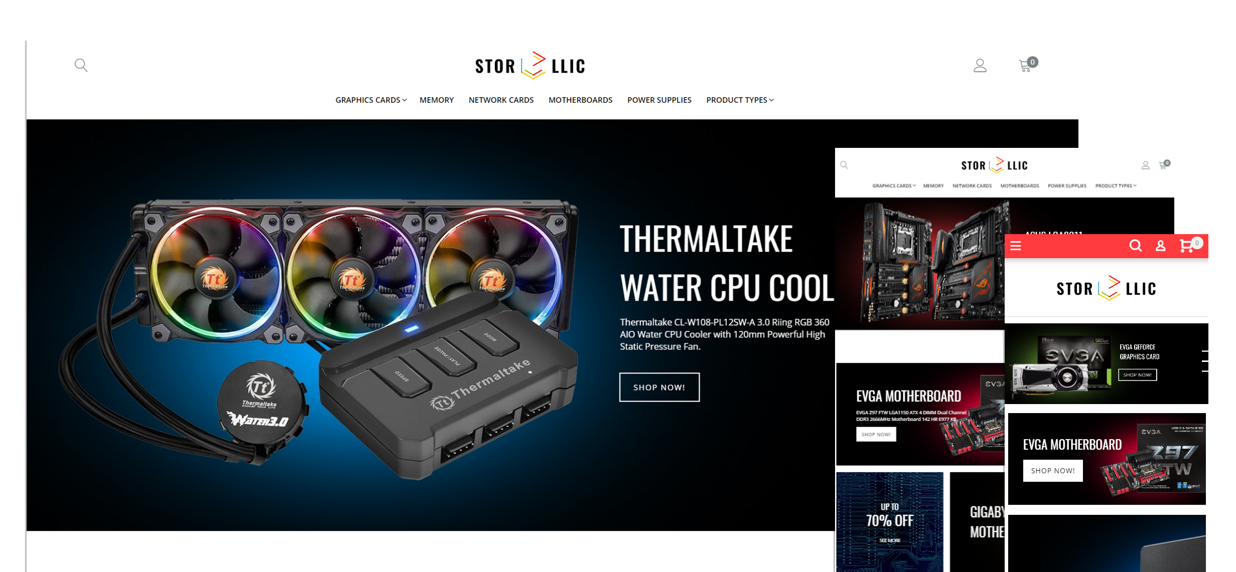
Catalog Images Grid
Catalog page settings
This section contains two subsections:
- General
- Category page
General
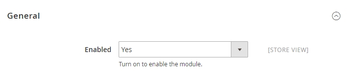
General section contains only one setting: Enable, it completely enables/disables the module.
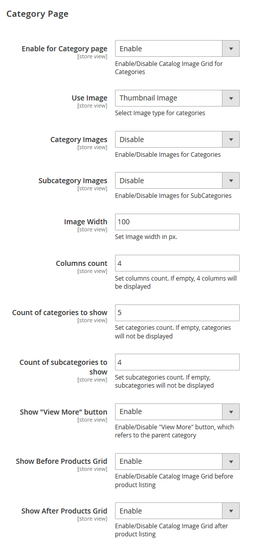
Category page section contains settings for the category page.
Check the tutorial on How to Manage Catalog Images Grid Module.
Widget settings
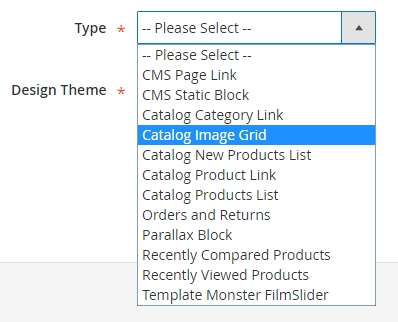
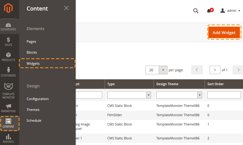
In addition to the static display of the block on the product listing page, you can also display the list of categories on the page of your choice with the help of a widget.To add a widget, navigate to Content > Widgets menu and press Add Widget. In the appeared window, in the Type field, select Catalog Image grid. In the Design Themes select the theme, that you want to apply this widget to. Press Continue.
Check the tutorial on How to Add Catalog Image Grid Widget.
Useful Tutorials:
Ajax Search
In order to configure this module, you should navigate to Magento admin panel and choose the Stores > Configuration section in the left side menu.
Then choose the TemplateMonster > Ajax Search item in the left side menu to go to the module settings interface.
Check the tutorial on How to Manage Ajax Search Module.
If you decide to enable Category Search Ajax and Product Search Ajax options, you’ll also need to enable Use Flat Catalog Category and Use Flat Catalog Product options respectively. You can enable these options at the Catalog > Catalog > Storefront tab.
Featured Products
General
The widget is displayed as any other Magento widget. To set up the widget, navigate to Content > Widgets and press the Add widget button.
Then follow the instuctions described in the tutorial below.
Check the tutorial on How to Manage Featured Products Widget.
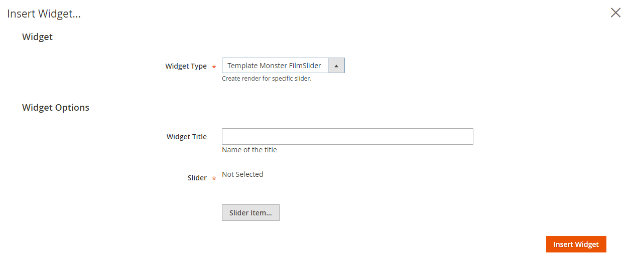
Film Slider
TemplateMonster FilmSlider module is an implementation of elegant and professional jQuery plugin 'Slider Pro'. Allows you to add slider with multiple layers to your store home page. Rich collection of slider configuration options and user interface will help you to configure your slider fast and easily.
In the main navigation menu you'll see new menu option TemplateMonster.
To start working with the FilmSlider module, click Template Monster > Sliders menu item.
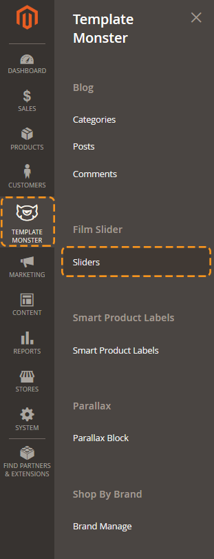
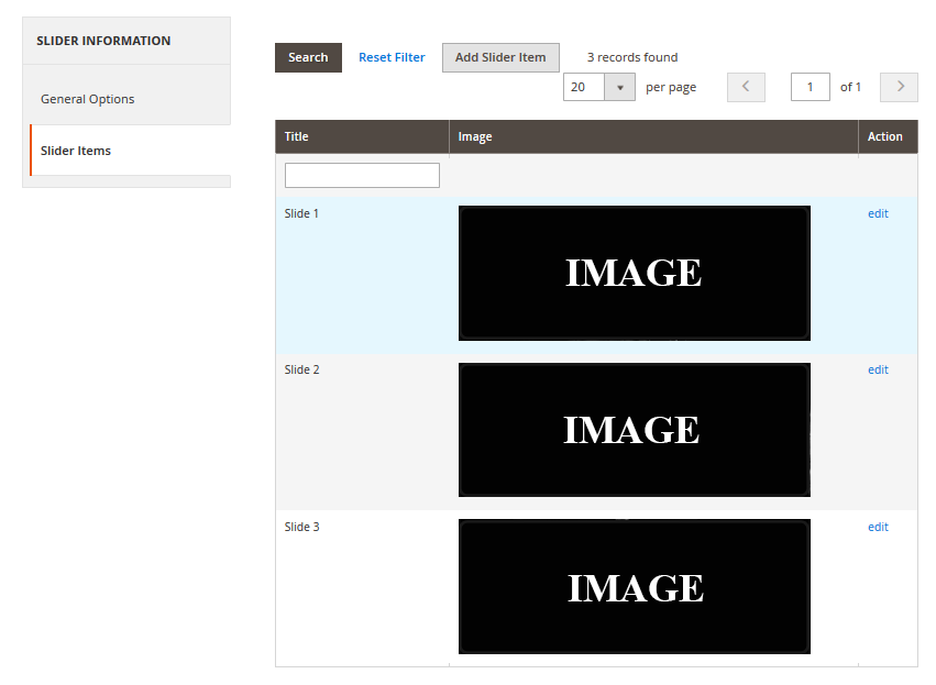
Here you can see a list of available sliders where you can disable/enable, delete or edit sliders.
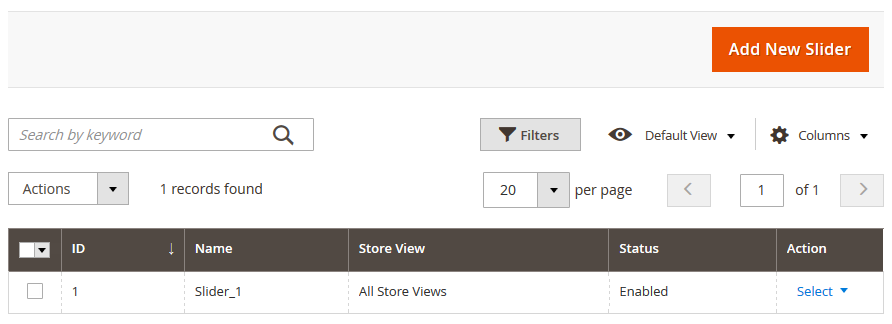
To add new slider click Add New Slider button in the top right corner.
On the slider configuration screen in General Options section you can see all available slider settings. Slider Items section allows you to add slides to your slider.
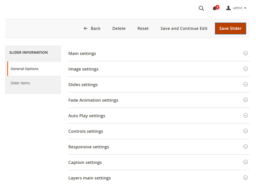
Let's see what slider options are available. As you can see options are divided into several parts to make the configuration interface more user friendly.
General Options
Main Settings
This section allows you to set slider title, select store view, enable/disable slider, set its width and height.
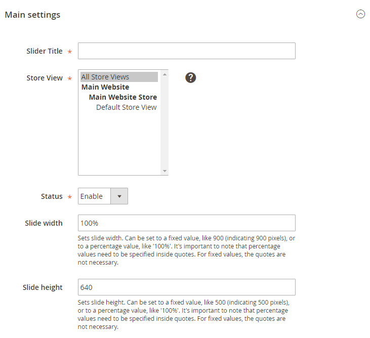
Image Settings
In image section you can adjust slider image configuration settings. Each option has a brief description. Let's describe some of them more specifically.
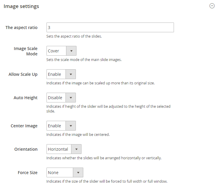
The Aspect Ratio
Image Scale Mode
Sets the scale mode of the main slide images [images added as background].
- cover — will scale and crop the image so that it fills the entire slide.
- contain — will keep the entire image visible inside the slide.
- exact — will match the size of the image to the size of the slide.
- none — will leave the image to its original size.
Force Size
Indicates if the size of the slider will be forced to full width or full window.Slides settings
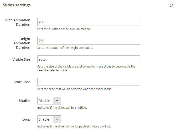
Slides settings section allows configure slides behaviour. Here you can configure slides animation, visible slider size, slides shuffle and loop.
Fade animation settings
This section contains settings for fade animation. Fade animation can be enabled on slide switch.
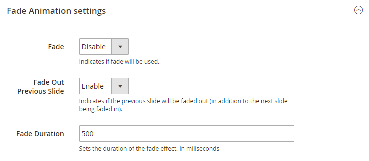
You can set if you want to fade out previous slide and fade animation duration in milliseconds.
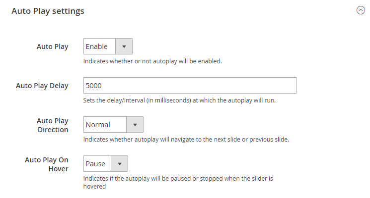
Auto play settings
Autoplay feature in Film Slider allows looping through the slides automatically. This configuration settings contain options to configure auto play delay, direction and pause with mouse cursor on hover.
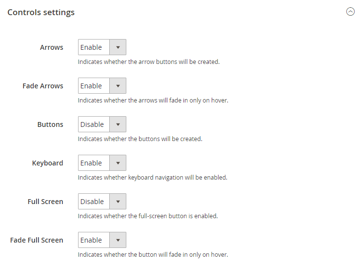
Controls settings
Slider controls are the navigation buttons that let you switch the slides. In FilmSlider there are several types of navigation controls: prev/next arrows, pagination buttons. Enabled keyboard navigation allows you to switch between the slides using keyboard. Also, you can enable button that will switch slider to the full screen mode.
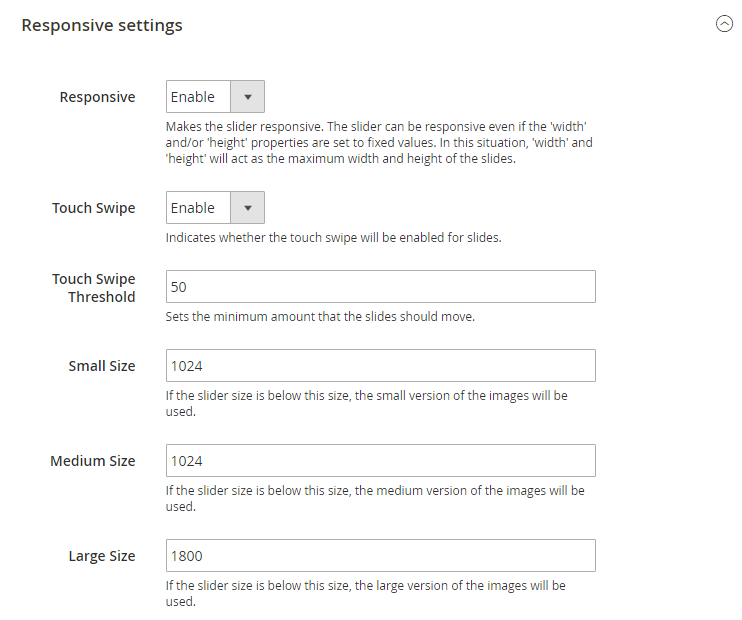
Responsive settings
Caption Settings
Caption feature allows you to add text to each slide. This section allows you to enable caption fade animation and set its duration.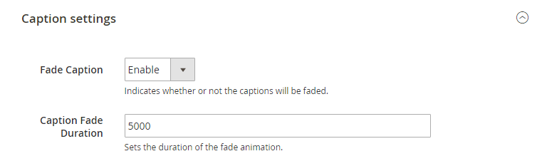
Layers main settings
Layers configuration settings contain slides layers behaviour. Each option has a brief description under the input fields.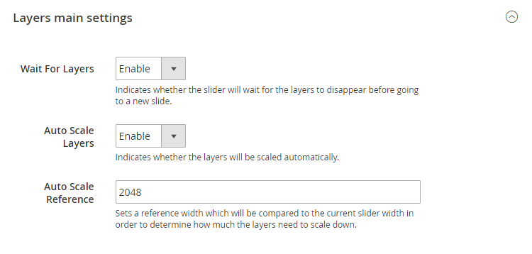
Adding Slides
You can add new slides only after saving the slider. Click Save and Continue Edit button in the top right corner. When the slider is saved, switch to Slider Items tab.
Slide Information
Here you can input slide title and set its status [enabled/disabled].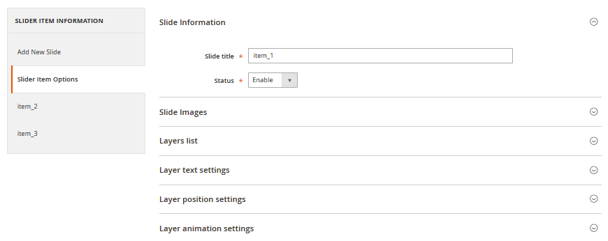
Slide Images
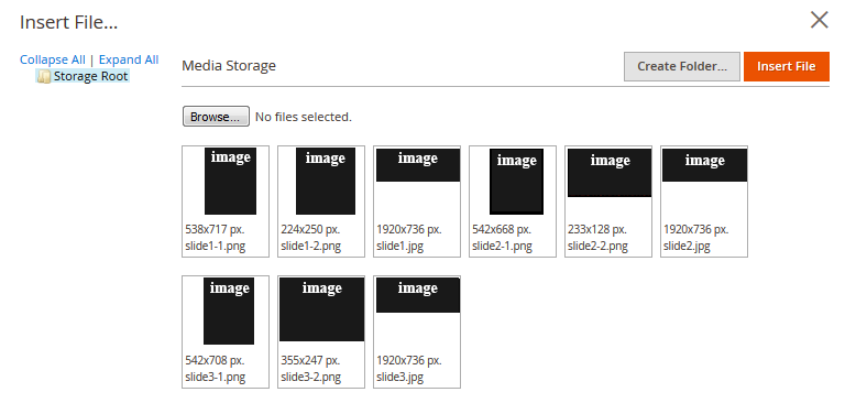
This section allows you to add images to the slide. Click Insert Image button to open Image library where you can select available images.
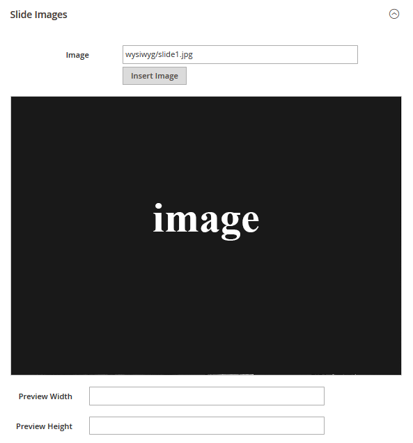
Under the Image field you can see your slide preview. You are free to set preview size the way you like. We moved the next section of slide configuration to the separate section as it is fully related to slide layers.
Working with layers
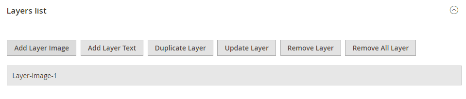
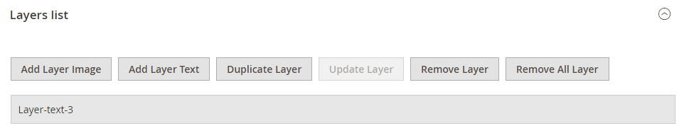
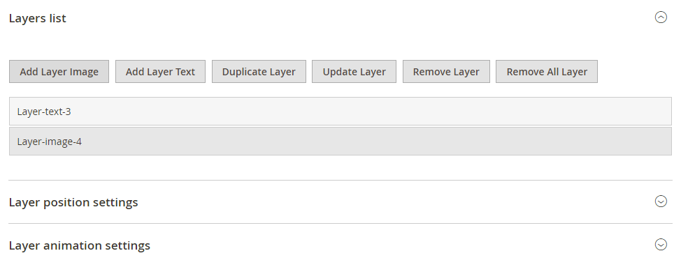
Layers list
Layers list section allows you to add layers to your slide. You can add image layers and text layers. Use corresponding buttons to add layers.
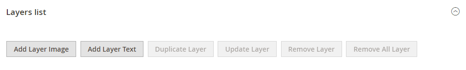
By clicking on Add layer image you'll see an image library where you can select from available images or upload images from your computer. By clicking Add layer text, you'll see new text layer added and layer settings became associated with your new particular layer.
Layer text settings
Using Layer text settings section you can input layer text, layer size, colors, font styling, etc.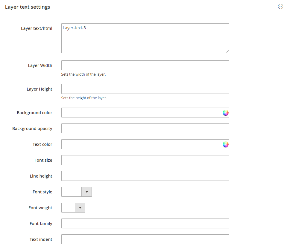
Layer text position settings
In this section you can define text layer position.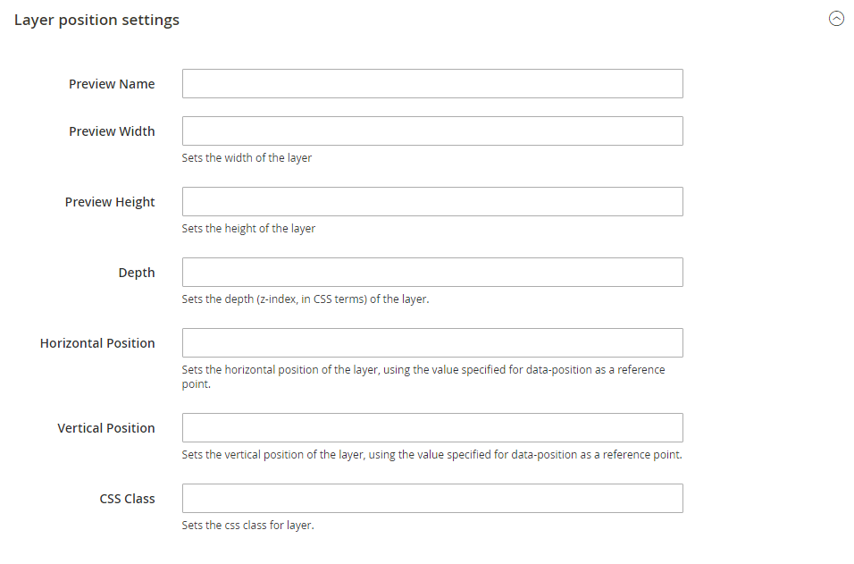
Layer animation settings
This section allows you to define layer animation. You can set its position on the slide, set transition, offsets, delay, duration, etc.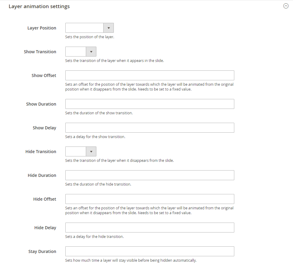
Adding slider to page
To add slider to your page please use Magento widgets. In the main admin panel menu click Content > Pages item.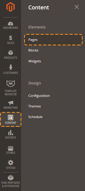
Megamenu
Global configuration
In order to configure this module, you should navigate to Magento admin panel and choose the Stores > Configuration section in the left side menu.
Choose the TEMPLATEMONSTER > Megamenu in the left side menu to go to the module settings interface.
Check the tutorial on How to Manage Mega Menu.
Useful Tutorials:
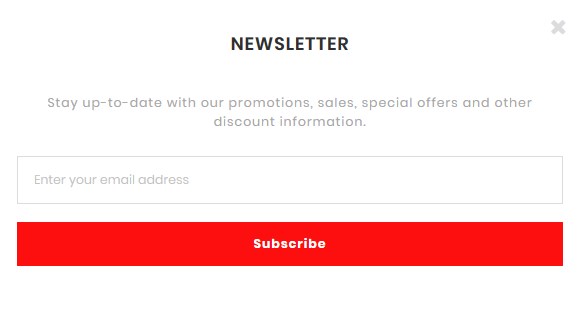
Newsletter Pop-up
Email newsletter has always been the important part of every marketing strategy. This method is used all over the world, so it will definitely help you to gain more orders and subscribers. That's why we proudly present you the Newsletter pop-up module. It displays the popup window with subscription form and social icons right after the client visits your site.
Global Configuration
In order to configure this module, you should navigate to Magento admin panel and choose the Stores > Configuration section in the left side menu.
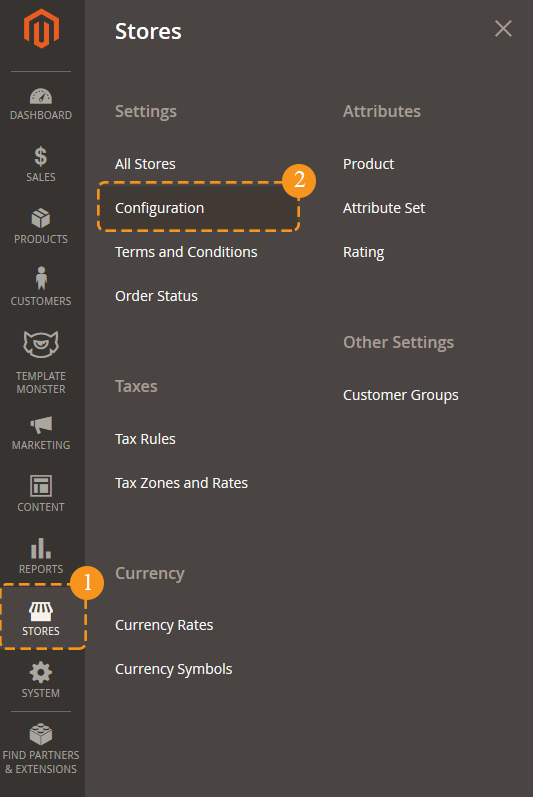
Choose the Zemez > Newsletter Pop-up in the left side menu to go to the module settings interface.
The module has 2 sections, and each one contains a specific set of options:
- General
- Social Settings
General section includes main module settings, Social settings section serves for social icons display setup in the pop-up window, and GDPR section contains Notification Message and Link settings.
General
As stated above, this section includes main module settings. You can enable or disable module here, specify buttons color, define the width of the window, etc. Let's review each option separately.
General section includes main module settings, and Social settings section serves for social icons display setup in the pop-up window.
As stated above, this section includes main module settings. You can enable or disable module here, specify buttons color, define the width of the window, etc.
- In order to enable or disable module completely, you'll need to use Enabled option. It provides the possibility to deactivate the module completely.
-
Show on startup option shows up the pop-up after visiting the site. As soon as shop page is loaded, you will see the pop-up offering you to subscribe to this site's newsletter.
- Show on footer. This pop-up can be also set up to display once again after navigating to site footer by using a scrollbar. E.g., if you close the pop-up that appeared after the initial page loading and scroll down to the footer then, the same pop-up will show up for the second time. In order to re-display this subscription window, you have to enable Show on footer option.
-
Pop-Up width option allows you to define the newsletter pop-up window width. Its size can be set in pixels only.
- Show subscription link in footer option allows you to display a link in the site footer, to display the newsletter pop-up after clicking on it. Footer link text field changes the label for the link displayed in the footer after activating the Show in footer option.
-
The pop-up may not be displayed immediately, but after some certain time period. This setting is controlled by Pop-Up show delay option. You can set a delay before the newsletter pop-up appearance and it will not show up right away, but only after the time you have specified passes since the client visits your site.
-
Button color and Button hover color options let you set a background color for the "subscribe" button.
-
You may need the CSS-class option when customizing the pop-up design. This option allows you to apply additional custom CSS-class for the pop-up window so that it can be used for further stylizing or other actions.
- You can change Content in pop-up window: Title, Content, Submit button text, Cancel button text.
Social Settings
This section is responsible for social icons display and configuration in the newsletter pop-up. It consists of a few subsections that have similar options.
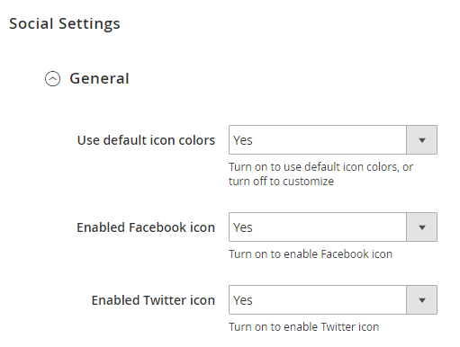
Main settings' subsection allows you to set colors and social icons' appearance for the following services:
- Google+
- Youtube
- Vimeo
- Foursquare
- Tumblr
- RSS
-
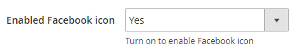
You can enable or disable certain icon appearance by using the respective Enabled ……. icon option. This option activation will make a respective sections appear to let you configure each icon individually.
-
This section also includes the Use default icon colors option. It is used for changing icons color.
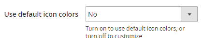 By default, it's enabled, so all the icons have their corporate [standard] color that is specific for each social network. However, if you'd like to define icons color on your own, you should disable this option.
 -
Each social network section has a Link option available. It lets you define the link to any page [your profile] in a respective social network.
-
After disabling the Use default icon colors option, you will see the new fields in subsections for each social network icon configuration:
- Icon background
- Icon color
- Icon background hover
- Icon hover color
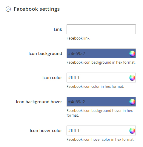
All of these options allow you to customize the icon appearance. They provide you with the option to set the icon background and color for the initial state and on hover [after hovering the icon with the mouse cursor].
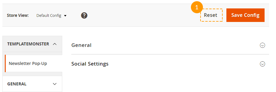
Please be sure to save your configuration!
Just in case, you'd like to return all the default settings, there is a Reset button available next to the Save one.
Parallax Settings
General
To activate the module, navigate to Store > Configuration > Templatemonster > Parallax tab. Here you’ll find option to enable module.
To add and configure parallax block, navigate to TEMPLATE MONSTER > Parallax Block.
Check the tutorial on How to Manage Parallax Module.
PromoBanner
With this widget, you will be able to show banners on the home page, product pages, category pages, cart or specific product page etc. The PromoBanner offers to display images and cms-blocks banner types.
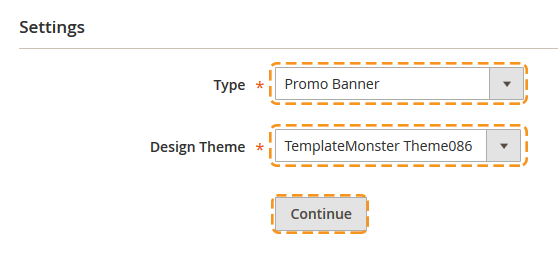
Create new PromoBaner widget
To start working with the PromoBaner widget, navigate to Content > Widgets section and press the Add widget button.
Storefront Properties
In the Settings section in the Type field, select the Promo Banner.
Choose the theme from the Design Theme option dropdown.
Press Continue.
Note, the both fields are required.
Settings section
Select an appropriate name for a promo banner.
The name won't be visible on the frontend.
Select the store(s), where your promo banner should be displayed.
Set the widget Sort Order. The option can be useful when several widgets are displayed in the same position.
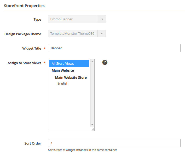
The widget with the lower integer value will be displayed at the top. E.g the widget with the sort order set to 1 will be displayed before the widget with the sort order set to 3.
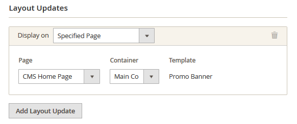
Then specify the place, where you want to display the module in the Layout Updates section.
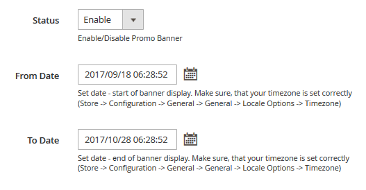
Widget Options section
To set up the widget, go to Widget Options section on the left.
You can enable or disable a banner in the Status field.
Here you can see two options: From Date and To Date. With the help of these options you can apply a time interval, when a promo banner is activated.
Select a month and a year from dropdowns, pick a day on the grid. You are also able to select Hour, Minute and Second using the UI sliders.
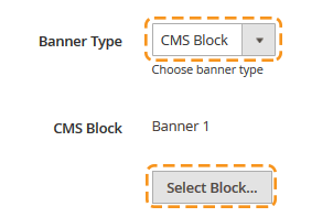
Select the Banner Type
The extension offers two types of promo banners. Choose whether to use Image or CMS Block you want to use for your banner.
Image type
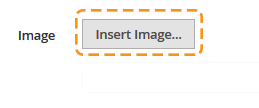
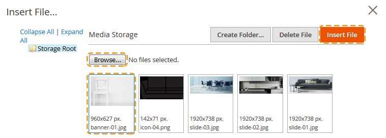
Simply upload a picture of any format. Click on the Insert image... button.
Then press the Browse... button and find the image you want to use for your banner. Then click on the Insert File button.
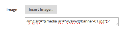
You will see the image tag in the field below the Insert image... button.
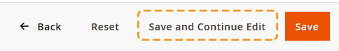
To replace the banner image you should first save the widget settings (click on the Save and Continue Edit button to stay in the widget settings interface).
Now you can change an image by clicking the Insert image... button again > browse the needed image file > press the Insert File button.
CMS Block
Choose from available (press the Select Block... button. Note, the CMS Block type should be selected) or create a new CMS block for your banner.
Create new CMS Static Block
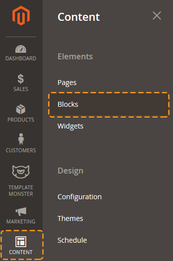
On the Admin sidebar, tap Content. Then under Elements, choose Blocks.
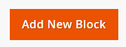
Click the Add New Block button.
The block status should be enabled. If you want to change the status, set Enable Block option to "No".
Assign a Block Title for internal reference.
Enter the unique Identifier for the block. Use all lowercase characters, with underscores instead of spaces.
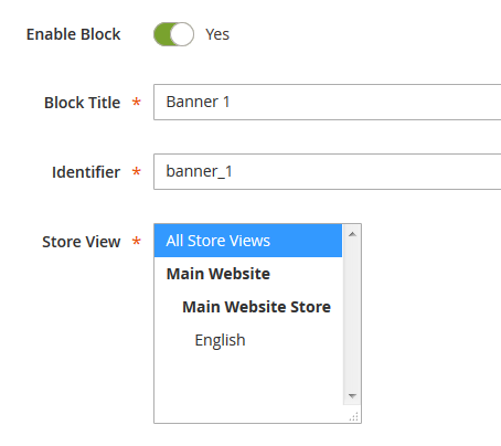
Select the Store View the block considered to be available for.
Complete the block Content as needed.
Use the editor to format text, insert widget, create links and tables, images.
If you prefer to work with the HTML code, tap Show / Hide Editor.
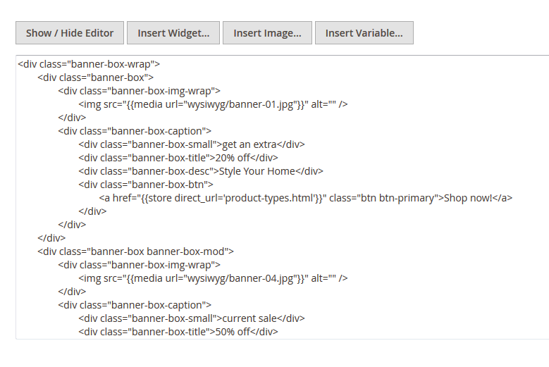
When complete, tap Save Block.
Cookie Expiration Time option
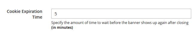
Specify the amount of time to wait before the banner shows up again after the banner was closed (in minutes).
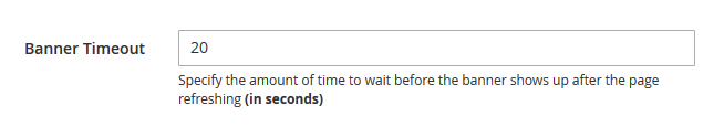
Banner Timeout option
Specify the amount of time to wait before the banner shows up after the page was refreshed (in seconds).
Save the widget (tap Save).
Clear the Magento cache to see the banner on the store frontend.
Product Ajax Compare
You can either enable or disable this module. In order to do this, navigate to the Magento admin panel and choose Stores > Configuration section in the left side menu.
Then choose the TemplateMonster > Ajax Product Compare item on the new page on the left side. Hire you can enable the module for you site.
Useful Tutorials:
Site Maintenance
The Site Maintenance module for Magento 2 allows you to display the "Site under maintenance" page and let your customers know that now there is some technical work going on and that the website will soon become available.
With the help of this plugin, you can change the appearance of this page. You can whitelist IPs, which allows users gain access to the frontend. You can specify the end time of the service work and display a timer to let your clients know the timing of this work. The module allows you display a subscription form for this page, and in the end of the work you can send e-mail notifications to your clients.
General
You'll find three sections there:
- Page configuration;
- Timer section;
- Form settings.
Page configuration
This section serves for setting up the appearance of the page and contains a set of important settings.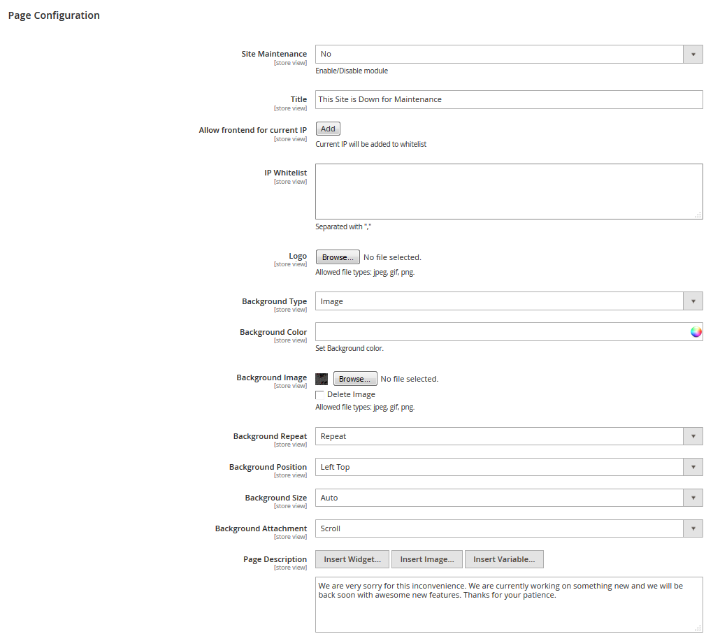
| Site Maintenance | - | enables/disables the module on the whole. |
| Title | - | the page title. It also serves as a heading in the page contents. |
| Allow frontend for current IP | - | with the help of this button, you can automatically add your IP to the whitelist and gain access to the frontend, bypassing the maintenance page. |
| IP Whitelist | - | in this field, you can add the IP addresses of the clients, who need to get access to the website frontend, bypassing the maintenance page. |
| Logo | - | you can add the page logo as an image. |
| Background Type | - | you can select the background type for the page. There are two available options: Image, Color. Depending on what option you choose, you'll see more settings. If you select Color, you'll see the Background color option. If you select the Image type, you'll see additional settings. |
| Background Color | - | the background color for the page. |
| Background Image | - | the image that is displayed on the background of your page. |
| - | css-properties for managing the background in the image form. | |
| Page Description | - | the field for the page content management. You can either use the WYSIWYG-editor, or work with html-code. |
Timer section
This section is responsible for display and setup of the timer on the Maintenance page.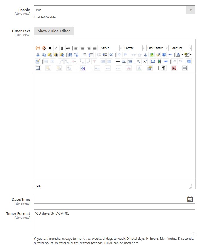
| Enabled | - | enables/disables the timer on the page. |
| Timer Text | - | Allows you to display text before the timer with the help of WYSIWYG-editor or html-code. |
| Date/Time | - | you can set up the end date of the service work. |
| Timer Format | - | the field to format the timer output. The field takes html-code. You can find the more detailed information on formatting the timer output on the plugin official website. %D days %H:%M:%S Y: years, J: months, n: days to month, w: weeks, d: days to week, D: total days, H: hours, M: minutes, S: seconds, h: total hours, m: total minutes, s: total seconds. HTML can be used here |
Form settings section
This section is responsible for displaying and setting up the subscription form.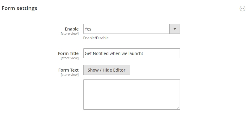
| Enabled | - | enables/disables subscription forms on the page. |
| Form Title | - | the title of the block with the form, which will be displayed in front of the form. |
| Form Text | - | allows displaying some text before the subscription form with the help of the WYSIWYG-editor or html-code. |
Social Login
General
In order to configure the module, navigate to the Stores > Settings > Configuration section.
| Enabled | - | turn on to enable the module. |
Social Providers
Here you can customize each social media platform separately. Just fill in several fields to make the login button appear on the site.Google+
This section allows you to enable the Google+ login button.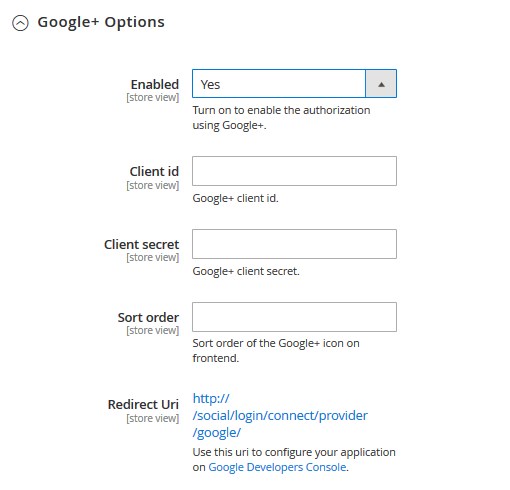
| Enabled | - | turn on to enable the module. |
| Client id | - | Google+ client id. |
| Client secret | - | Google+ client secret. |
| Redirect Uri | - | use this uri to configure your application on Google Developers Console. |
| Sort order | - | sort order of the Google+ icon on frontend. |
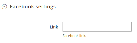
Facebook Options
This section allows you to enable the Facebook login button.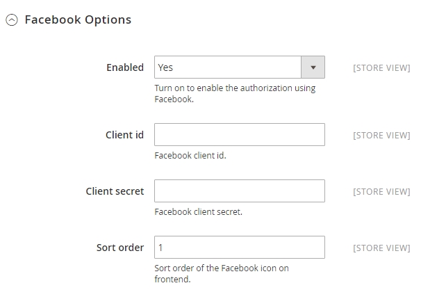
| Enabled | - | turn on to enable the module. |
| Client id | - | Facebook client id. |
| Client secret | - | Facebook client secret. |
| Sort order | - | sort order of the Facebook icon on frontend. |
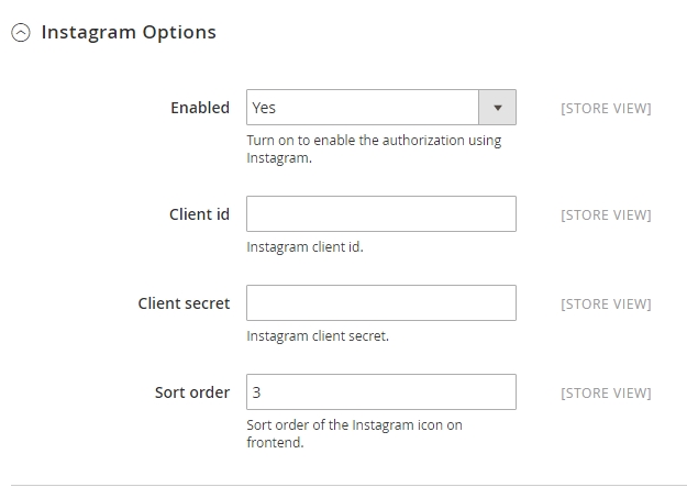
| Enabled | - | turn on to enable the module. |
| Client id | - | Instagram client id. |
| Client secret | - | Instagram client secret. |
| Sort order | - | sort order of the Instagram icon on frontend. |
Twitter Options
This section allows you to enable the Twitter login button.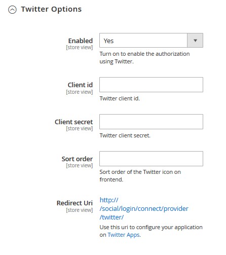
| Enabled | - | turn on to enable the module. |
| Client id | - | Twitter client id. |
| Client secret | - | Twitter client secret. |
| Redirect Uri | - | use this uri to configure your application on Twitter Apps. |
| Sort order | - | sort order of the Twitter icon on frontend. |
Shop by Brand
In order to customize the module, click the Stores > Settings > Configuration.
Then choose the TEMPLATEMONSTER > Shop by Brand in the left side menu and you'll move to the module settings interface.
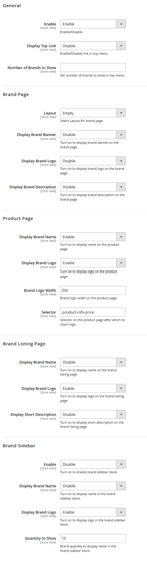
The tab helps you configure the general information of the module.
Check the tutorial on How to Manage Shop By Brand Module.
Add a New Brand
If you want to add a new brand, click on the Add New Brand button at the top right corner, then fill out data about that new brand.
Check the tutorial on Add a New Brand.
Useful Tutorial:
Special Price Timer
Modules settings can be reached at the Store > Configuration > Templatemonster > Special Price Timer section at site admin panel.Check the tutorial on How to Manage Special Price Timer Extension.
Useful Tutorial:
Theme Options settings
Then choose the TEMPLATEMONSTER > Theme Options in the left side menu and you'll move to the module settings interface.
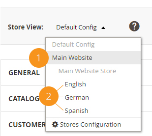
Click on the Store View: Default Config.
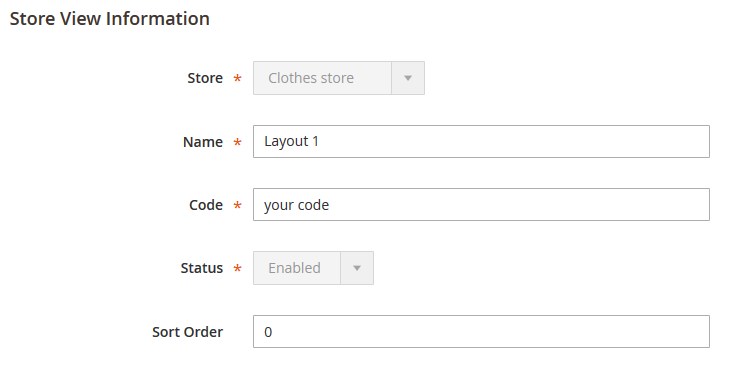
Select a Store View from the option dropdown.
Confirm the scope switching in the pop-up window. Press "OK" to confirm.
After that process, we can see a new tab called Theme color settings under the General one.
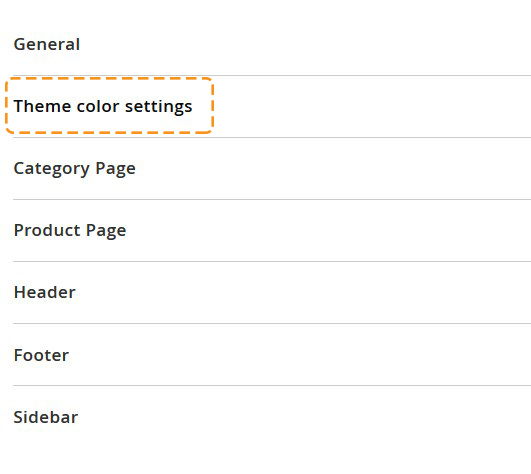
The Tab structure is as follows:
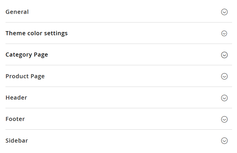
General
For Image Type:
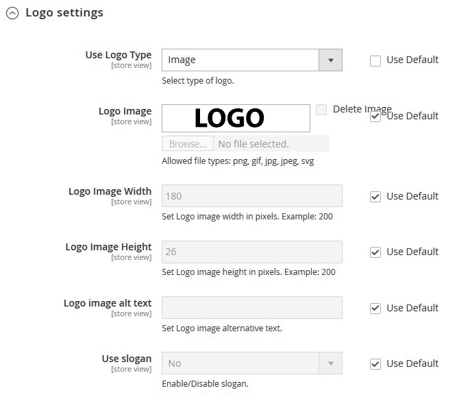
| Use Logo Type | - | select type of logo. |
| Logo Image | - | you can upload your logotype image (Allowed file types: png, gif, jpg, jpeg, svg). |
| Logo Image Width | - | set a Logo image width in pixels. |
| Logo Image Height | - | set a Logo image height in pixels. |
| Logo image alt text | - | enter a Logo image alternative text. |
For Text Logo Type:
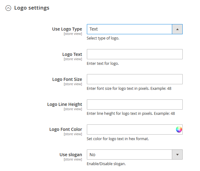
| Use Logo Type | - | select type of logo. |
| Logo Text | - | enter text for logo. |
| Logo Font Size | - | enter font size for logo text in pixels. |
| Logo Line Height | - | enter line height for logo text in pixels. |
| Logo Font Color | - | set color for logo text in hex format. You can select a color from the Color Palette. |
| Slogan Settings: | ||
| Use slogan | - | Enable/Disable slogan. (If you enable this option, additional options became available.) |
| Slogan Text | - | enter text for slogan. |
| Slogan Font Size | - | enter font size for slogan text in pixels. |
| Slogan Line Height | - | enter line height for slogan text in pixels. |
| Slogan Font Color | - | set color for slogan text in hex format. |
| Slogan Position | - | select slogan position relative to the logo. |
SEO
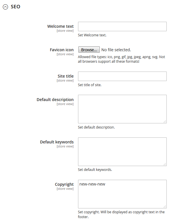
| Welcome text | - | you can change default welcome text. |
| Favicon icon | - | allowed file types: ico, png, gif, jpg, jpeg, apng, svg. Not all browsers support all these formats! |
| Site title | - | set a title site on homepage. |
| Default description | - | you can input default description for your store. |
| Default keywords | - | input keywords for your store. |
| Copyright | - | input your copyright. The text will be displayed as copyright message in the footer. |
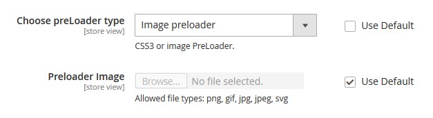
Preloader and BackToTop Button
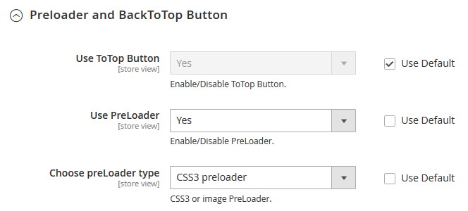
| Use ToTop Button | - | you can decide if you want to show the ToTop button. |
| Use PreLoader | - | set if you want to use the preloaderfor youe website. |
| Choose preLoader type | - | use the CSS3 or Image preloader. |
| Preloader Image | - | in case you choose the Image type, upload the image file for the preloader. Allowed file types: ico, png, gif, jpg, jpeg, apng, svg. Not all browsers support all these formats!. |
Theme Color Settings
Please note: for display Theme color settings and apply color scheme you need select your website (1). If you want to edit each color individually, you need to choose store (2).
All colors set in HEX format: #xxxxxx
Let's review the options available:
Uncheck Use Website to change the layout settings.
Color scheme status
| Color scheme status | - | enable/Disable color scheme. |
| Color scheme | - | choose color scheme for site. |
Header
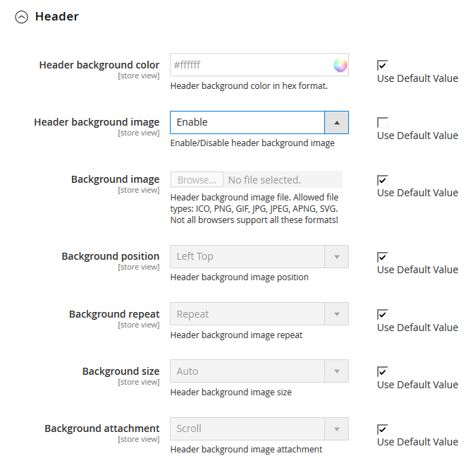
| Header background color | - | the header background color in hex format. You can select a color from the Color Palette. |
| Header background image | - | Enable/Disable header background image |
| Background image | - | upload the header background image file. Allowed file types: ICO, PNG, GIF, JPG, JPEG, APNG, SVG. Not all browsers support all these formats! |
| Background position | - | set the header background image position. |
| Background repeat | - | set the header background image repeat. |
| Background size | - | set the header background image size. |
| Background attachment | - | set the header background image attachment. |
Content
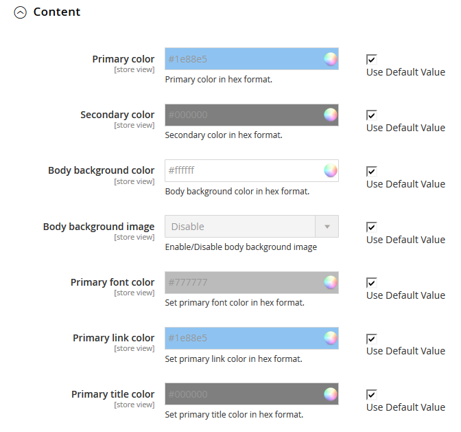
| Primary color | - | the primary color in hex format. |
| Secondary color | - | set the secondary color in hex format. You can select a color from the Color Palette. |
| Body background color | - | body background color in hex format. |
| Body background image | - | Enable/Disable body background image |
| Background image | - | upload the body background image file. Allowed file types: ICO, PNG, GIF, JPG, JPEG, APNG, SVG. Not all browsers support all these formats! |
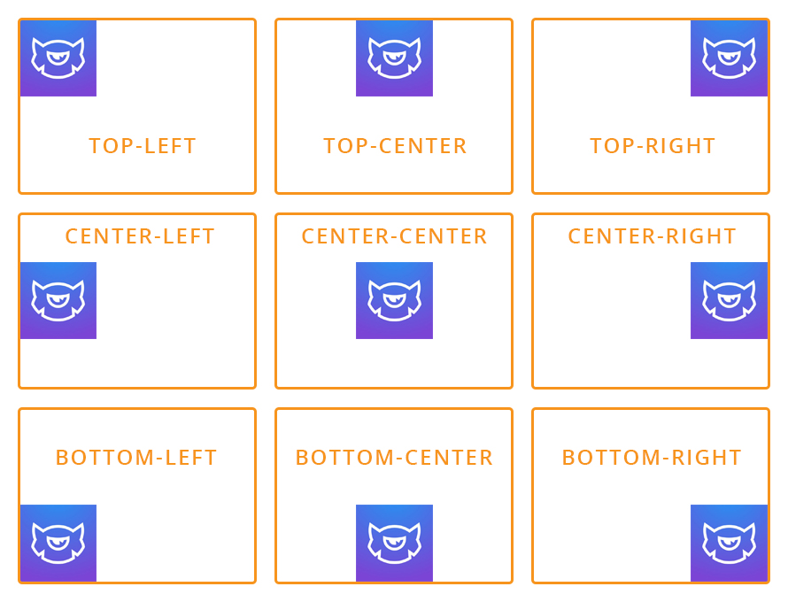
| Background position | - | set position for your background: Left Top, Center Top, Right Top, Left Center, Center Center. Right Center, Left Bottom, Center Bottom, Right Bottom. |
 |
||
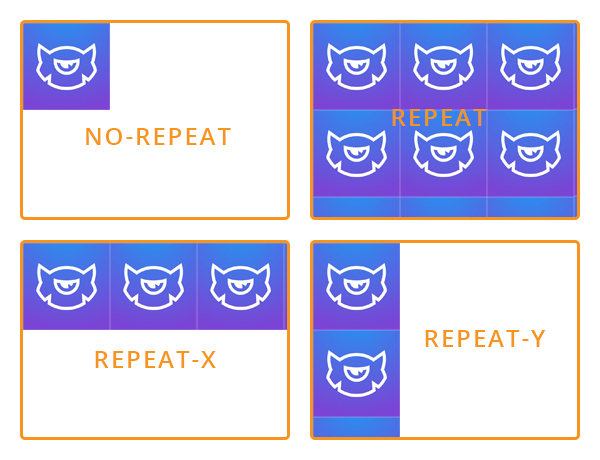
| Background repeat | - | choose how background image will be repeated: Repeat, No Repeat, Repeat X, Repeat Y. |
 |
||
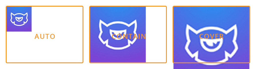
| Background size | - | set the body background image size |
 |
||
| Background attachment | - | body background image attachment: Scroll (scroll with content), Fixed (no scroll with content). |
| Primary font color | - | set the primary font color in hex format. You can select a color from the Color Palette. |
| Primary link color | - | set the primary link color in hex format. You can select a color from the Color Palette. |
| Primary title color | - | set the primary title color in hex format. |
Footer
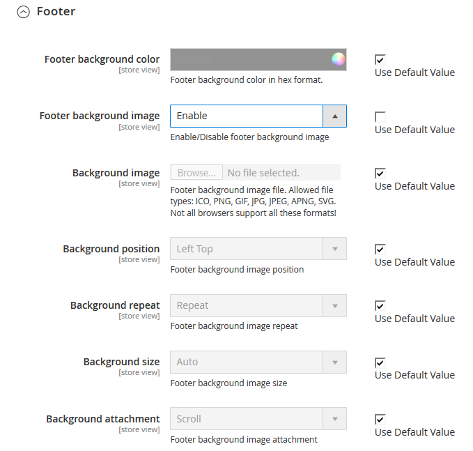
| Footer background color | - | choose the color for your footer. You can select a color from the Color Palette. |
| Footer background image | - | enable/disable the footer background image. |
| Background image | - | Footer background image file. Allowed file types: ICO, PNG, GIF, JPG, JPEG, APNG, SVG. Not all browsers support all these formats! |
| Background position | - | Footer background image position. |
| Background repeat | - | Footer background image repeat. |
| Background size | - | set the footer background image size. |
| Background attachment | - | set footer background image attachment |
In case, you've changed the "website code" in Stores > All stores, you must change it in the color_schemes.xml file, too.
In order to change "website code" in the color_schemes.xml file go to app\code\TemplateMonster\ThemeOptions\etc.
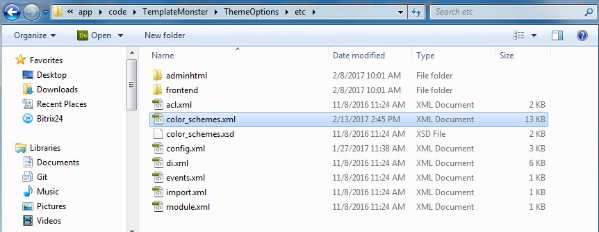
Open the color_schemes.xml file using any code editor.
Find the <website code="clothes_store"> line (in our case) and replace "clothes_store" (the previous code) with the new one <website code="your code">.
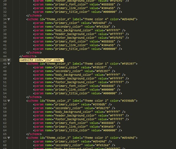
If you change the "website code" for another Web Site, you need to change its code in color_schemes.xml file. Find the <website code="previous code"> line and replace it with <website code="new code">.
Before modifying the website code please make sure it is not used in index.php.
Category Page
Settings for Category page in a list/grid view.
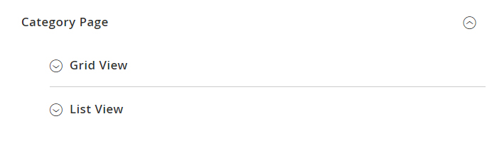
Grid View
| Number of columns | - | specify number of product listing columns in grid view. |
| Enable the Card Parallax Hover | - | set if you want to enable the parallax hover effect for Product Card. |
| Choose the Product Image hover effect | - | choosr the hoover efect you want to use for the Product Page. |
| Choose the Product Image hover effect | - | select type of product hover on product listing. |
| Slides count | - | in case you select the Image carousel, the new option will come up prompting to set the number of slides to show. |
| for Thumpnail Gallery | ||
| Thumbnails width | - | set thumbnails width in px. Example: 50 |
| Thumbnails height | - | specify thumbnails height in px. Example: 50 |
| Slides count | - | set number of slides to display. If empty, all product images will be included to the gallery. |
| Image width | - | product image width in pixels. |
| Image height | - | product image height in pixels. |
| Use aspect ratio | - | using image aspect ratio. |
| Show swatches | - | show swatches block in listing. |
| Show compare | - | select if you want to show a compare button. |
| Show wishlist | - | select if you want to show a wishlist button. |
| Show reviews | - | select if you want to show a reviews section. |
| Show product description | - | select if you want to show a product description section. |
To enable the "image on hover" feature for the products you should first select the image for the effect.
See the tutorial: How to Enable "Product Image on Hover" Feature.
List View
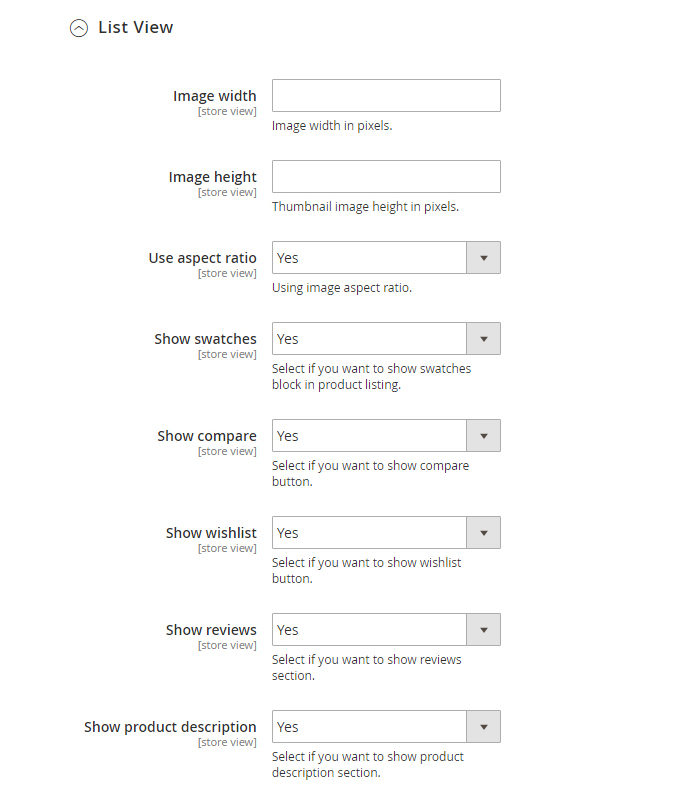
| Image width | - | product image width in pixels. |
| Image height | - | product image height in pixels. |
| Use aspect ratio | - | image aspect ratio. |
| Show swatches | - | select if you want to show a swatches block. |
| Show compare | - | select if you want to show a compare button. |
| Show wishlist | - | select if you want to show a wishlist button. |
| Show reviews | - | select if you want to show a reviews section. |
| Show product description | - | select if you want to show a product description section. |
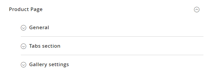
Product Page
You see three tabs: General, Tabs section, Gallery settings.
General
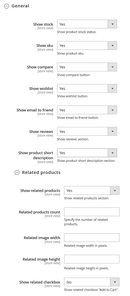
| Show stock | - | show product stock status. |
| Show sku | - | show product sku. |
| Show compare | - | show a compare button. |
| Show wishlist | - | show a wishlist button. |
| Show email to friend | - | show a button email to friend. |
| Show reviews | - | show a reviews section. |
| Show product short description | - | show short description section. |
Related ptoducts
| Show related products | - | show related products on a product page. |
| Related products count | - | specify the number of related products. |
| Related image width | - | related image width in pixels. |
| Related image height | - | related image height in pixels. |
| Show related checkbox | - | show checkbox "Add to Cart" on relate product.You can add few products in a cart if you select product. Configurable products do not support the Show related checkbox option |
Upsell products
| Show upsell products | - | show upsell products section. |
| Upsell products count | - | specify the number of upsell products. |
| Upsell image width | - | upsell image width in pixels. |
| Upsell image height | - | upsell image height in pixels. |
Tabs sections
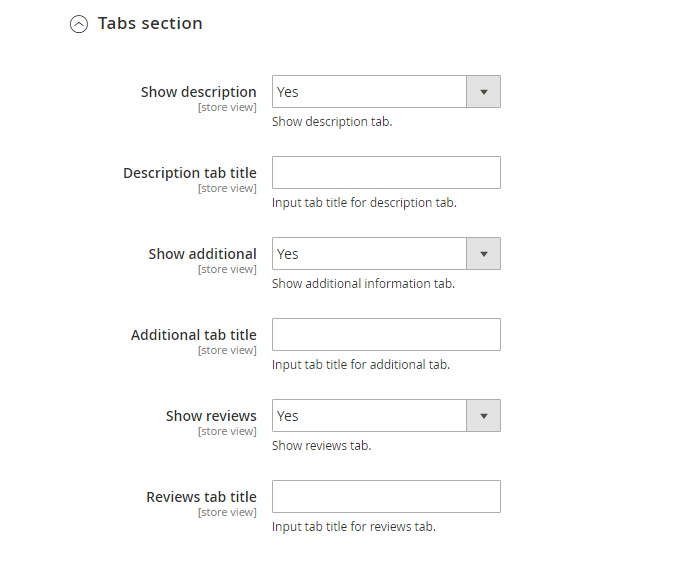
| Show description | - | show a description tab. |
| Description tab title | - | enter the title for description tab. |
| Show additional | - | show a additional information tab. |
| Additional tab title | - | specify the title for additional tab. |
| Show reviews | - | show a reviews tab. |
| Reviews tab title | - | enter the title for reviews tab. |
Gallery settings
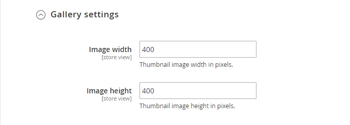
| Image width | - | set the thumbnail image width in pixels. |
| Image height | - | set the thumbnail image height in pixels. |
| Image zoom | - | enable the image zooming for the Product Page. |
Header
General
| Sticky menu | - | specify if you want to use the sticky menu for your website. |
In Header tab you have the Social links section.
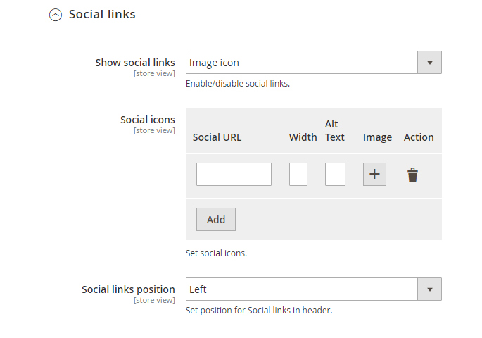
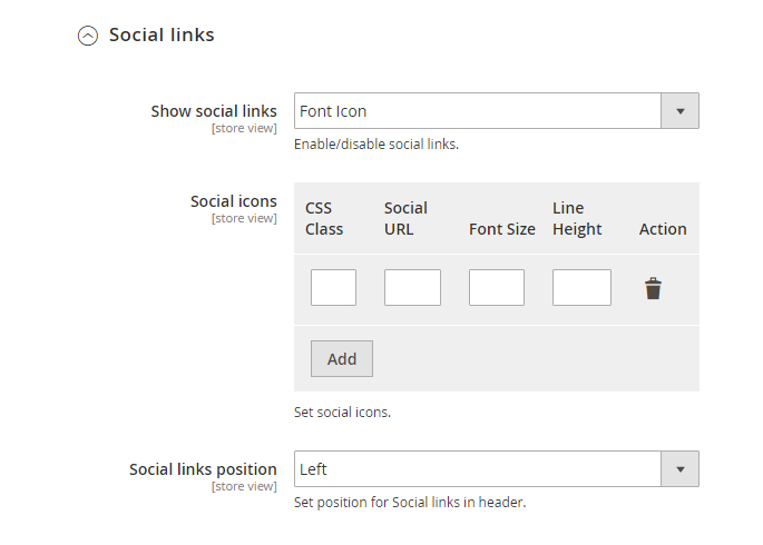
Social links
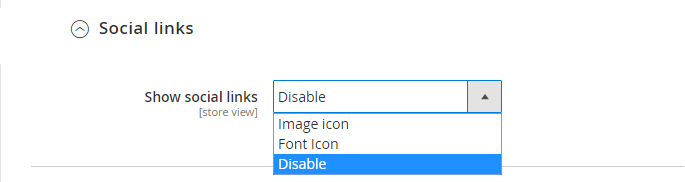
You can add link to your social network using Font Icon or Image icon.
Image icon
For adding URL with image, you need add social url, width of icon, alternative text to image and upload image.
Font Icon
For adding URL with FontIcon, you need add icon CSS Class, social url, set font size and line height
Footer
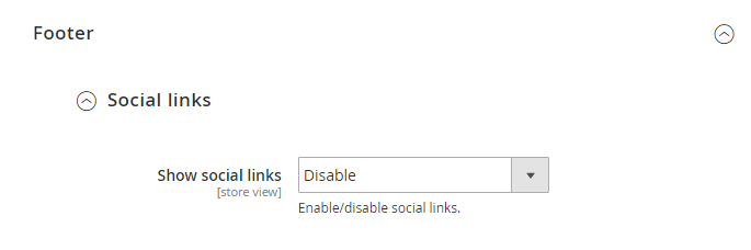
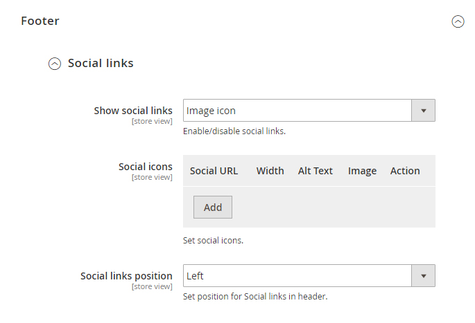
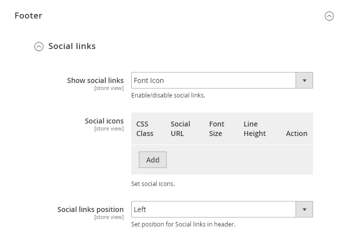
In footer you can add social link and set position
Image icon
For adding URL with image, you need add social url, width of icon, alternative text to image and upload image.
Font Icon
For adding URL with Font Icon, you need add icon CSS Class, social url, set font size and line height.
Sidebar
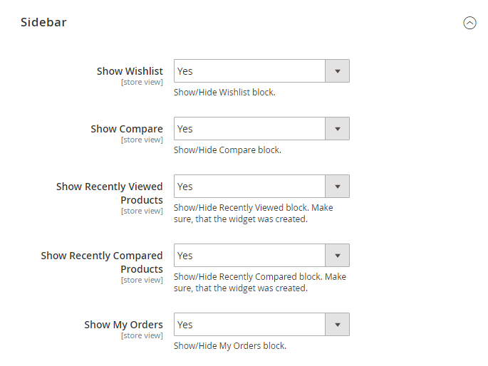
| Show Wishlist | - | show/hide Wishlist block. |
| Show Compare | - | show/hide Compare block. |
| Show Recently Viewed Products | - | show/hide Recently Viewed block. Make sure, that the widget was created. |
| Show Recently Compared Products | - | show/hide Recently Compared block. Make sure, that the widget was created. |
| Show My Orders | - | show/hide My Orders block. |
Useful Tutorials:
- How to set the store typography?
- How to add keywords for your store?
- How to change product image size (Product Page)?
- How to change product image width and height (Category Page)?
- How to disable or enable product description for Category Page?
- How to disable or enable "Compare" button?
- How to manage Category Pages and Products Page?
- How to disable the social media sharing option for the Product Page?
- How to manage Product Reviews?