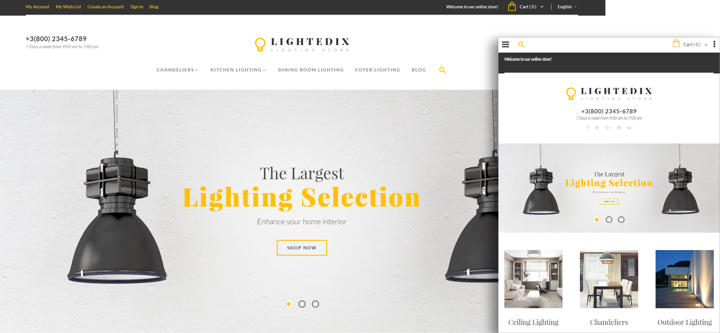
LIghtedix Documentation
TM Extensions Settings
Ajax Wishlist
Products Wishlist is one of the standard e-commerce features. We have created the special module for the convenient use of this feature, it is based on AJAX technology and allows you to add products to the wishlist without having to navigate to the separate page.
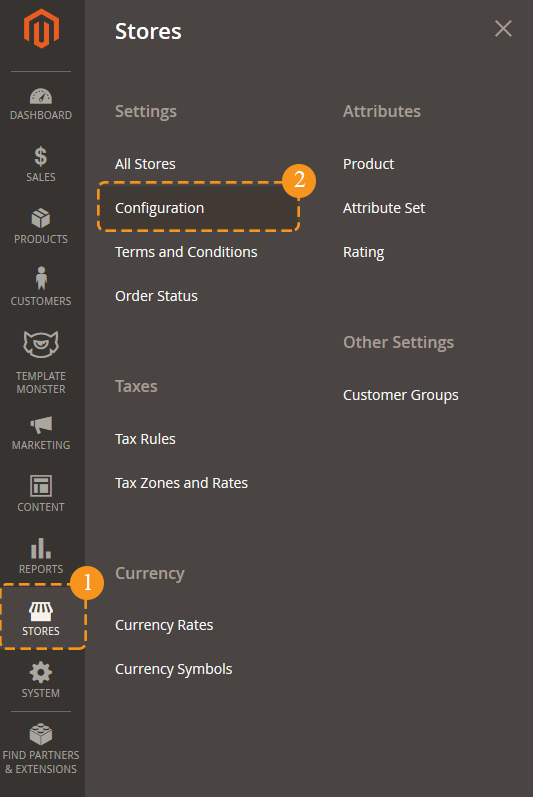
In order to configure this module, you should navigate to Magento admin panel and choose the Stores > Configuration section in the left side menu.
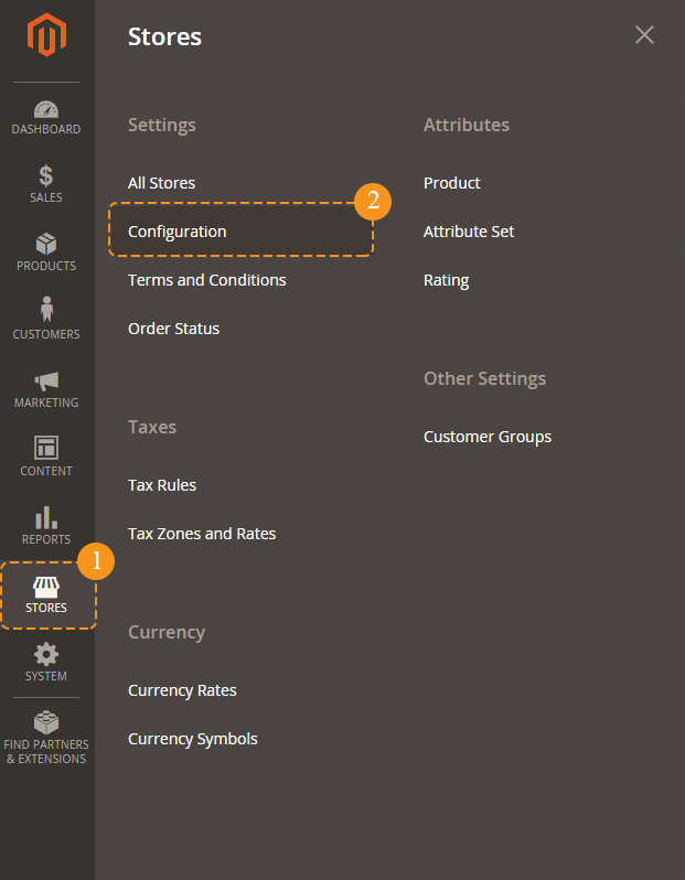
Then choose TemplateMonster > Ajax Wishlist item on the new page on the left side.
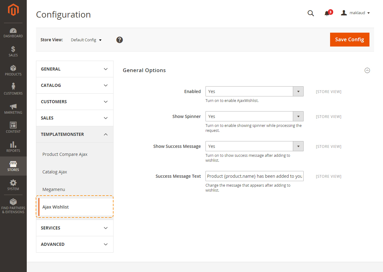
Let's review the module configuration:
| Enable | - | this option allows you to enable or disable the wishlist. |
| Show spinner | - | this option allows you to show the spinner during adding an item to the wishlist. |
| Show Success Message | - | this option allows you to display the message which is shown after adding the product to the wishlist. |
| Success Message Text | - | here you can enter the text you want to be in the pop-up window. |
Frontend
Blog
The Blog module enables the Customers to add their post in the blog form in the Magento2 Webstore. The Customer can also edit or delete the post.
General
In order to configure the module, navigate to the Stores > Settings > Configuration section.
Choose TEMPLATEMONSTER > Blog in the left side menu to go to the module settings interface.
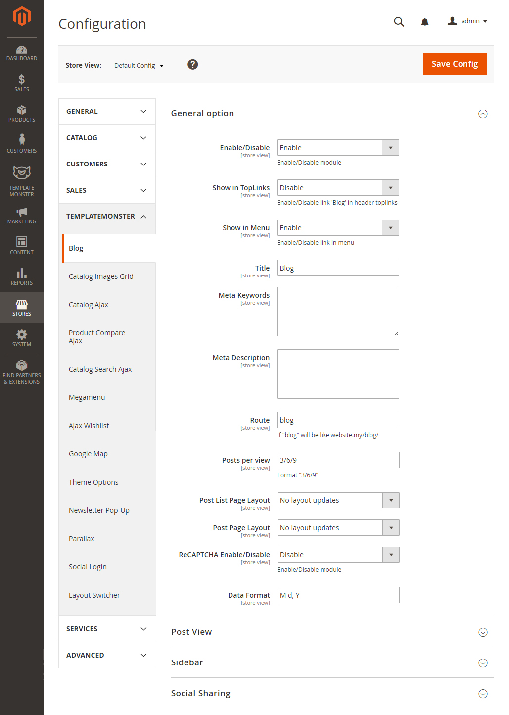
| Enable/Disable | - | enable/disable the module. |
| Show in TopLinks | - | enable/disable the 'Blog' link in the header toplinks. |
| Show in Menu | - | enable/disable the 'Blog' link in the main menu. |
| Title | - | specify the link title. |
| Meta Keywords | - | add meta keywords. |
| Meta Description | - | add the meta description. |
| Route | - | specify the route to the blog page, if "blog", then it will be like website.my/blog/. |
| Posts per view | - | indicate how many posts will be displayed per view (on the blog page). Format "3/6/9". |
| Post List Page Layout | - | choose the layout for the post listing page. |
| Post Page Layout | - | choose the layout for the post page. |
| ReCAPTCHA Enable/Disable | - | this module uses the Google API. You can read more here. You need to get Captcha API key and Captcha API secret. |
| Data Format | - | you can change the date format: Y - year, M - month, d - day. You can use any separating symbol between this letters like: M/d/Y, Y:M:d, etc |
Post View
In this section, you can customize the view type of related the posts and products.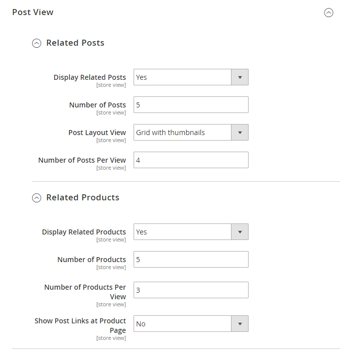
Related posts
| Display Related Posts | - | show/hide the related posts. |
| Number of Posts | - | specify the number of related posts. |
| Post Layout View | - | you can change the view of the related posts: Thumbnail+title or Post title only. |
| Number of Posts Per View | - | if this number is higher than the Number of Posts — turn on a carousel. |
Related Products
| Display Related Products | - | show/hide the related products block. |
| Number of Products | - | specify the number of related products to show. |
| Number of Products Per View | - | if this number higher than the Number of Products — turn on a carousel. |
| Show Post Links at Product Page | - | if this number higher than the Number of Products — turn on carousel. |
Sidebar
In this section, you can add some boxes in the sidebar on a blog page. Note, you should choose the 2 column layout.
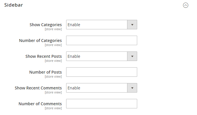
| Show Categories | - | show/hide the box with categories. |
| Number of Categories | - | set the number of recent added categories to be shown. |
| Show Recent Posts | - | show/hide the box with the latest posts. |
| Number of Posts | - | number of recent posts to be shown. |
| Show Recent Comments | - | show/hide box with the latest comments. |
| Number of Comments | - | set the number of recent comments to be shown in the box. |
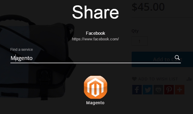
Social Sharing tab
General
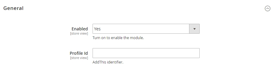
| Enabled | - | enable/disable the module. |
| Profile id | - | Addthis identifier. |
To get the Profile Id, register at the Addthis website. After this, you need to create a project in your Dashboard. When creating a project, you'll be redirected to the General settings, where you'll see the ID field in General section. You should use this very identifier.
You need to paste it in the Profile ID field in the Blog module settings window to make Share Buttons appear on your site.
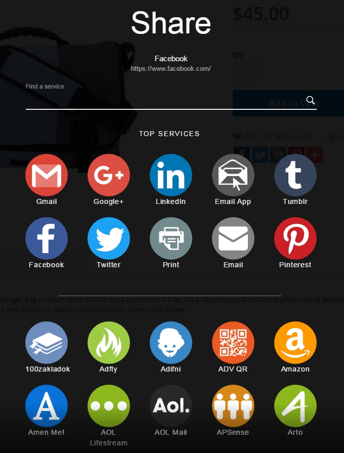
Look & Feel
In this section, you can set up the appearance of the icons. You can choose one of the predefined presets, or you can add your own icons.
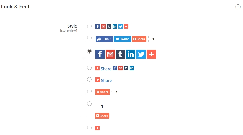
Add your own icons. There are 2 options in this section:
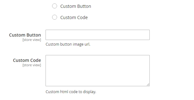
Custom button — select this option and specify the link to your image in the input field. When clicking the link, you'll see a popup for selecting a sharing service.
Custom code — if you select this option, you can fully replace to display of the icons with a custom one. The field can take html and css code. If you need to add a custom Facebook, Twitter or other service's icon, and want to make it work, you need to add a corresponding class to the link. For Facebook, this will be class="addthis_button_facebook", for Twitter - class="addthis_button_twitter", for a popup with selection of social networks - class="addthis_button_more".
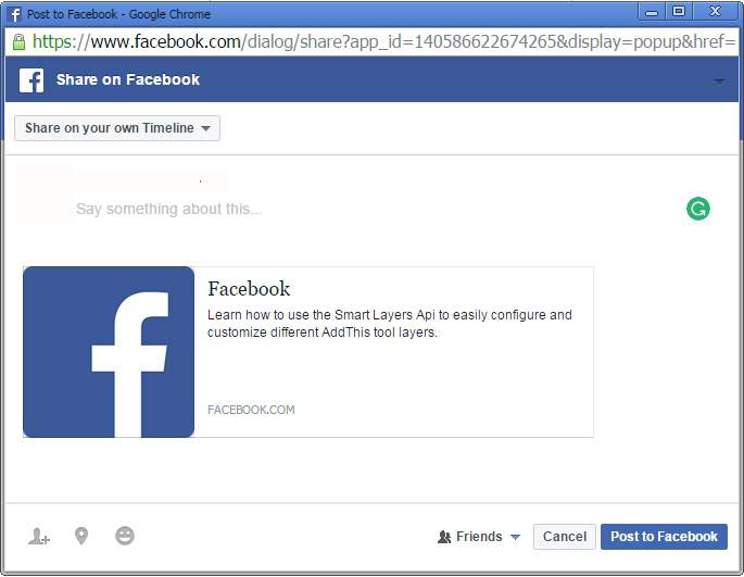
Custom Metadata
In this section, you can set up sharing for a custom page.
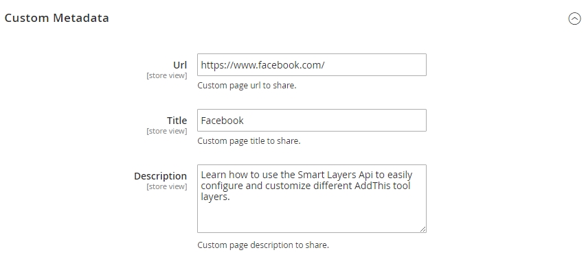
Having specified all the data, you'll see their output in the sharing dialogue window. You'll see the specified data there.
Custom Sharing Service
In this section, you can add an icon of your social network, and users will be able to share, using your service.
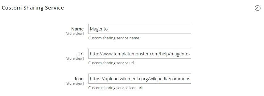
| Name | - | custom sharing service name. |
| Url | - | sharing service link url. |
| Icon | - | sharing service icon url. |
Your module will be changed accordingly.
Api Configuration Options
This section contains the API settings of the Addthis service.
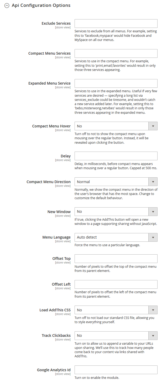
| Exclude Services | - | services to exclude from all menus. For example, setting this to 'facebook,myspace' would hide Facebook and MySpace on all our menus. |
| Compact Menu Services | - | services to use in the compact menu. For example, setting this to 'print,email,favorites' would result in only those three services appearing. |
| Expanded Menu Service | - | services to use in the expanded menu. Useful if very few services are desired — specifying a long list via services_exclude could be tiresome, and wouldn't catch a new service added later. For example, setting this to 'bebo,misterwong,netvibes' would result in only those three services appearing in the expanded menu. |
| Compact Menu Hover | - | turn off to not to show the compact menu upon mousing over the regular button. Instead, it will be revealed upon clicking the button. |
| Delay | - | delay, in milliseconds, before compact menu appears when mousing over a regular button. Capped at 500 ms. |
| Compact Menu Direction | - | normally, we show the compact menu in the direction of the user's browser that has the most space. Change to customize the default behaviour. |
| New Window | - | If true, clicking the AddThis button will open a new window to a page supporting sharing without JavaScript. |
| Menu Language | - | force the menu to use a particular language. |
| Offset Top | - | number of pixels to offset the top of the compact menu from its parent element. |
| Offset Left | - | number of pixels to offset the left of the compact menu from its parent element. |
| Load AddThis CSS | - | turn off to not load our standard CSS file, allowing you to style everything yourself. |
| Track Clickbacks | - | turn on to allow us to append a variable to your URLs upon sharing. We'll use this to track how many people come back to your content via links shared with AddThis. |
| Google Analytics Id | - | turn on to enable the module. |
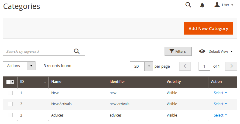
Blog Category
Navigate to the TEMPLATEMONSTER section in the left sidebar. Find the Blog section and click the Categories. Here you will see the list of categories. You can either delete or edit the category by clicking the Select button in the Action column.
To create a new category, you need to click the Add New Category button at the top. In the window, you will see several sections.
General [Category Information]
In this section, you need to specify the main information of category.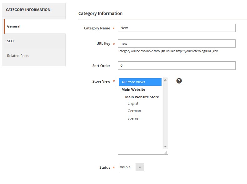
| Category Name | - | input the category name. |
| URL Key | - | enter the URL in lowercase [url_key, urlkey not UrlKey or not Url-key]. |
| Sort Order | - | enter the sorting number. |
| Store View | - | specify the store view. |
| Status | - | show/hide the category. |
SEO [Meta Data]
In this section, you need to specify the additional information.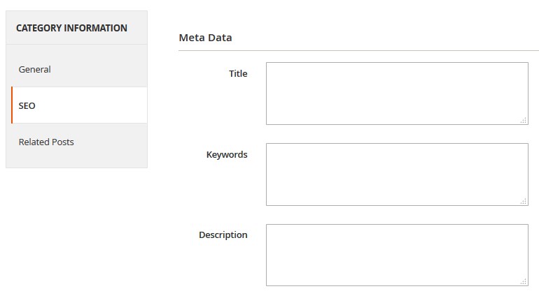
| Title | - | the category title. |
| Keywords | - | input keywords for this category. |
| Description | - | you can add the description for this category. |
Related Posts
In this section, you can add the related post.
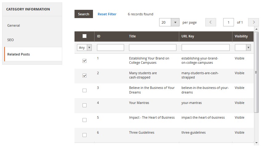
Select posts and click the "Save Category" button.

Adding post
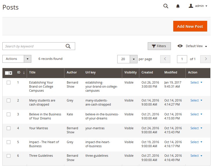
Navigate to the TEMPLATEMONSTER section in the left sidebar. Find the Blog section and click the Posts. Here you will see the list of all posts available on your website. You can either delete or edit the posts by clicking the Select button in the Action column.
To create a new post, you need to click the Add New Post button at the top. In the popup window, you will see several sections.
Post information
In this section, you need to specify all information regarding the new post.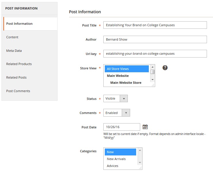
| Post Title | - | specify the post title. |
| Author | - | specify the author name. |
| Url key | - | enter the URL key for the post. |
| Store View | - | specify the store view. |
| Status | - | show/hide the post. |
| Comments | - | enable/disable comments. |
| Post Date | - | choose the post date. |
| Categories | - | choose the category for your post. Category need be created at TemplateMoster > Blog > Categories. |
Content
Articles supported formats: WYSIWYG editor, inserting Widget, Insert Image.
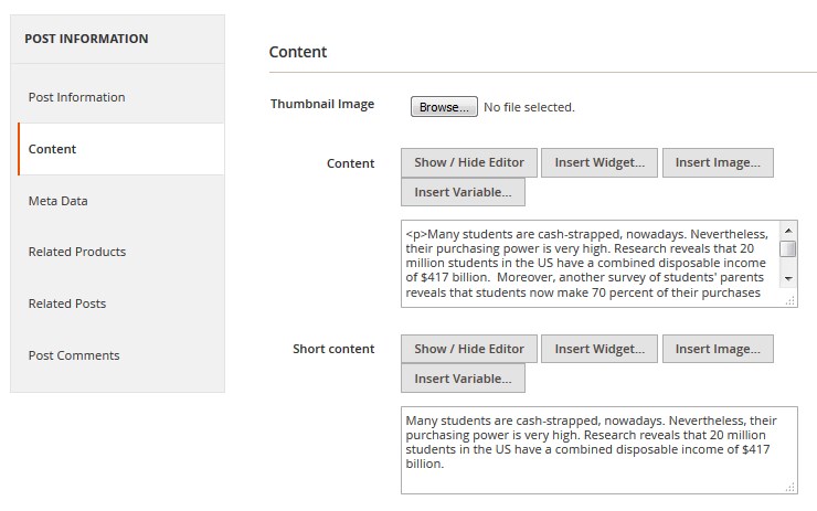
| Thumbnail Image | - | upload the featured image for the post. |
| Content | - | add the content. |
| Short content | - | add short content that will be displayed on the blog page. |
Meta Data
This section contains metadata for your post. You need to specify keywords and short description here.
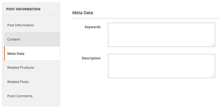
| Keywords | - | add proper keywords. |
| Description | - | add short description. |
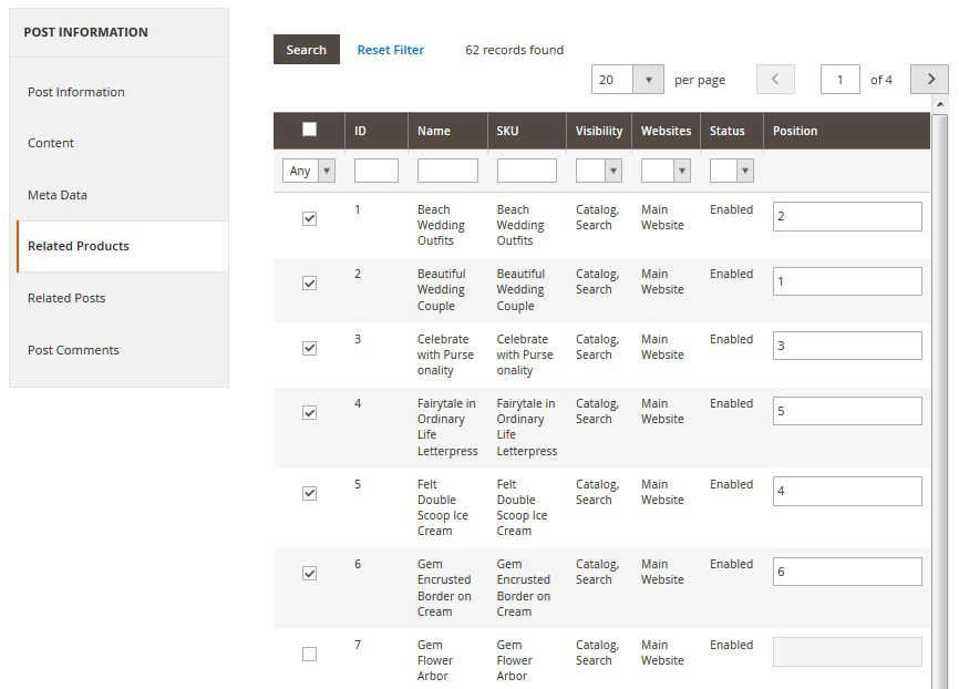
Related Products
Here you can choose related products that will be displayed on the post page. Check the products you need to add and specify position of the products.
Choose Any option from the first column dropdown. Press the Search button. Check products you need to add and specify position of the products.
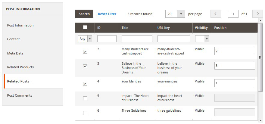
Related Posts
This section works the same way as the Related Products section.
Post Comments
Navigate to the TEMPLATEMONSTER section in the left sidebar. Find Blog and click Comments.
In this section, you can see all the comments for a particular post. You can edit and display each of them. To do this, you need to click the Edit button in the right column.
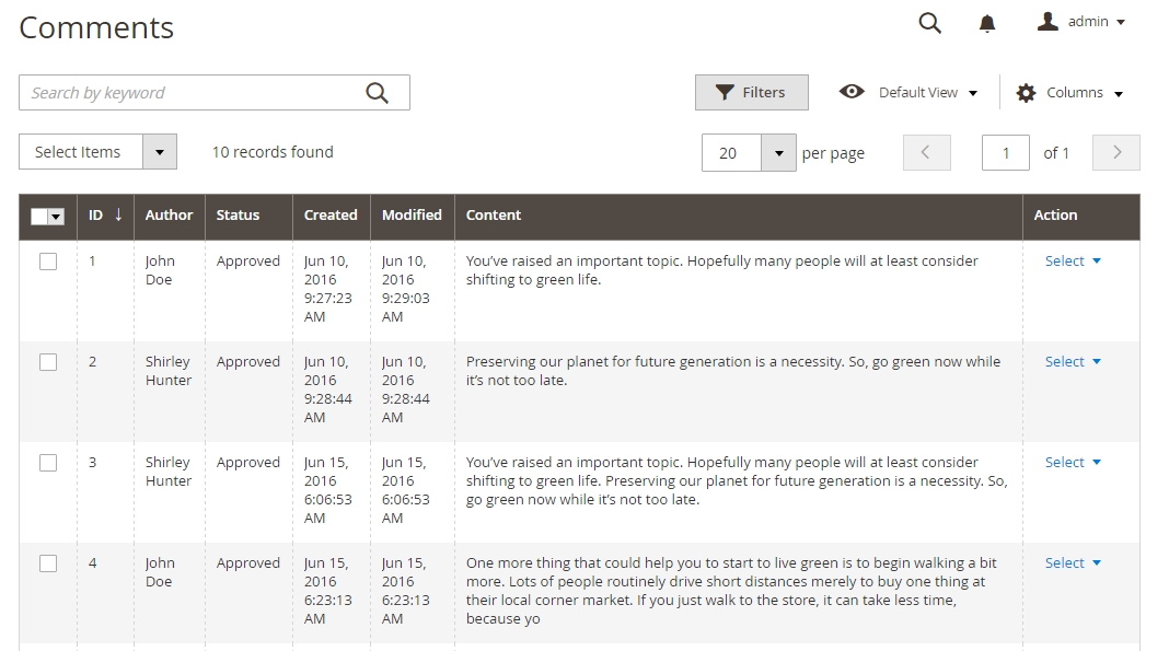
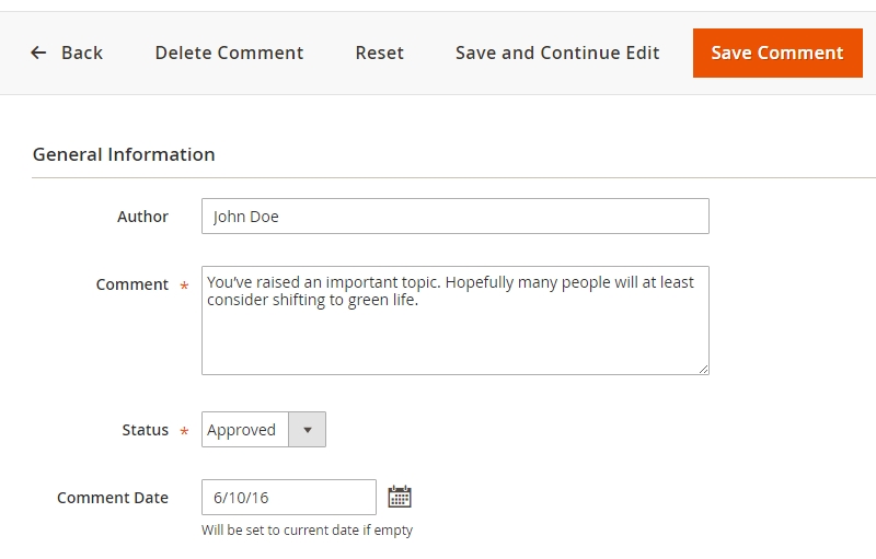
| Author | - | author name. |
| Comment | - | comment text. |
| Status | - | show or hide comments. |
| Comment Date | - | change the comment publish date; Will be set to current date if empty. |
Frontend (based on the Magento default store):
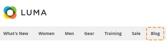
- Show in Menu — enable;
- Title — Blog.
Post List Page (based on the Magento default store):
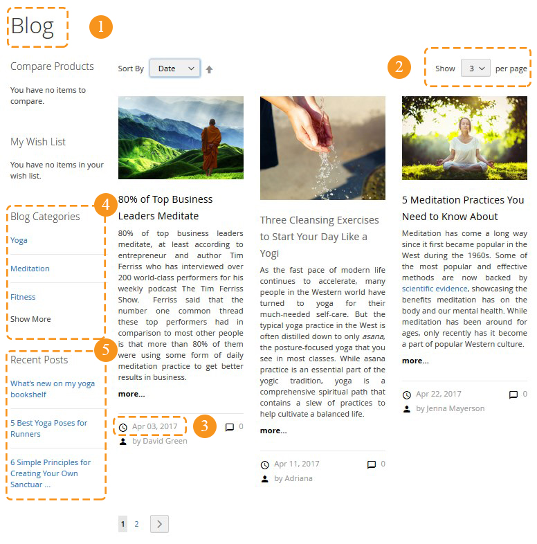
- Title — Blog (1) ;
- Posts per view — 3/6/9 (2);
- Post List Page Layout — 2 columns with left bar;
- Data Format — M d, Y (3);
- Show Categories — enable (4);
- Number of Categories — 3;
- Show Recent Posts — enable (5);
- Number of Posts — 3.
Post Page:
- Title — Blog;
- Post Page Layout — 2 columns with left bar.
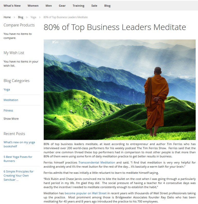
Related Posts (based on the Magento default store)
- Display Related Posts — enable;
- Number of Posts — 5;
- Post Layout View — grid with thumbnails;
- Number of Posts Per View — 4;
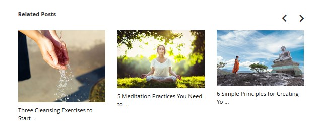
Related Products (based on the Magento default store)
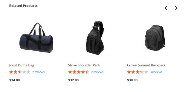
- Display Related Products — enable;
- Number of Products — 6;
- Number of Products Per View — 3;
- Show Post Links at Product Page — yes.
Blog: Latest Posts Widget
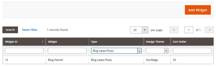
To add a Blog widget to the homepage, you need to navigate to Content > Widgets tab. You can change settings of any Blog Widget here.
Tip:
if you want to find all Blog Widgets, use the filters to simplify the process. Select the "Blog Latest Posts" type in the "- Type -" filter dropdown list [Type column]. To open any edit required widget, click on its title.
Storefront Properties
Here you can find a list of options that allow customizing the widget and making it match the corporate style of your business.
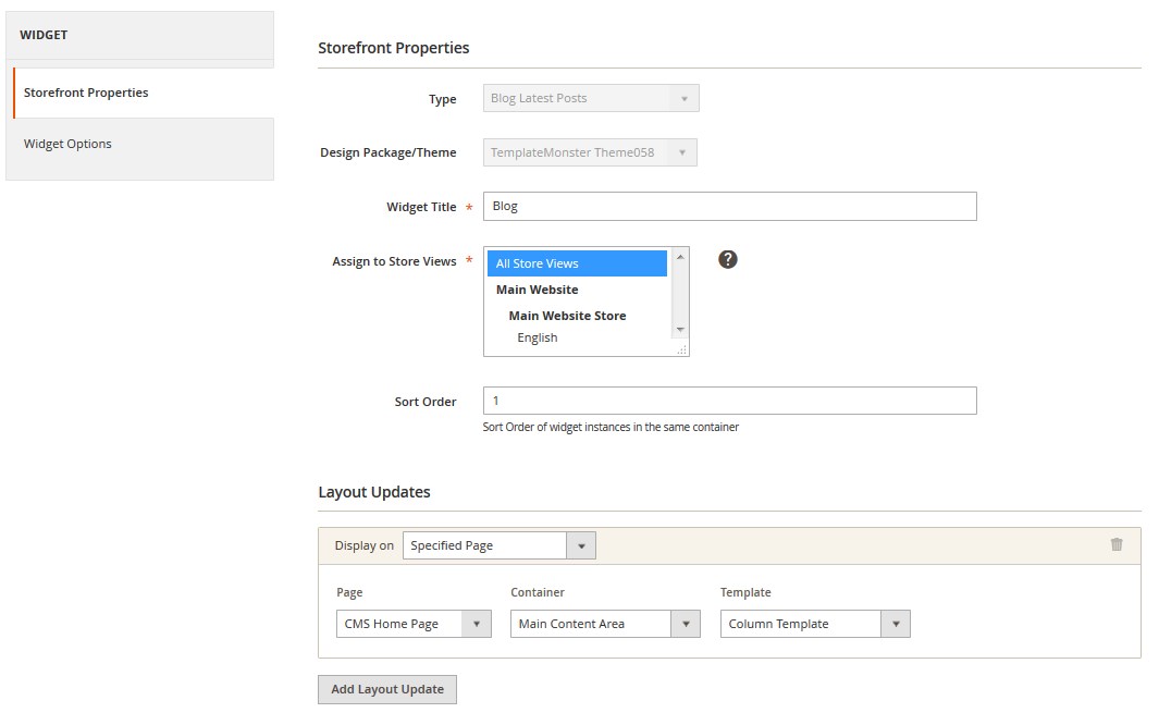
| Type | - | choose a proper widget type. This option is available only when you add a new widget. |
| Design Package/Theme | - | choose a theme to which you want to add a widget. This option is available only when you add a new widget. |
| Widget Title | - | specify the widget title. |
| Assign to Store Views | - | assign the widget to a particular store view. |
| Sort Order | - | sort order of widget instances. |
Widget Options
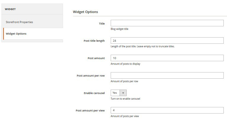
| Title | - | add the blog widget title. |
| Post title length | - | the length of the post title (e.g. 14, 20, 23) . Leave empty not to truncate titles. |
| Post amount | - | number of posts displayed on the page. |
| Post amount per row | - | amount of posts per row. |
| Enable carousel | - | turn on to enable the carousel option. |
Catalog Images Grid
Catalog page settings
This section contains two subsections:
- General
- Category page
General
General section contains only one setting: Enable, it completely enables/disables the module.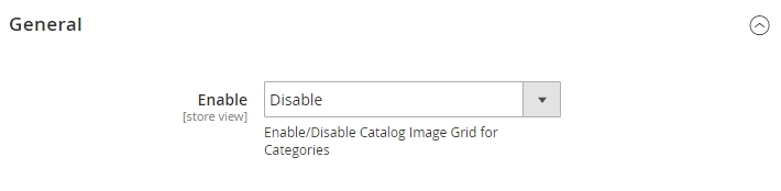
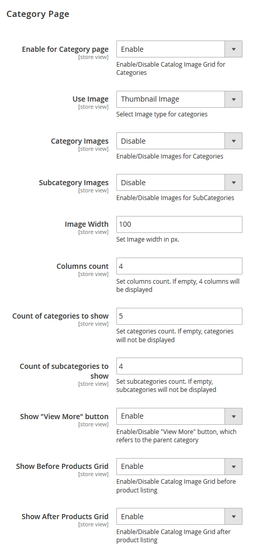
| Enable for Category page | - | Enable/Disable Catalog Image Grid for Categories. |
| Use Image | - | select image type that you want to display on the category page. There are three options to choose: Thumbnail image, Category image, Custom font icon. If you select Custom font icon, you'll see Font Icon size instead of Image Width. Here you can specify the icon size in pixels. |
| Category Images | - | enables displaying images for categories. |
| Subcategory Images | - | enables displaying images for subcategories. |
| Image Width | - | set Image width in px. |
| Font Icon size | - | set Icon size in px. |
| Columns count | - | set columns count. If empty, 4 columns will be displayed. |
| Count of categories to show | - | set categories count. If empty, categories will not be displayed. |
| Count of subcategories to show | - | set subcategories count. If empty, subcategories will not be displayed. |
| Show "View More" button | - | if there are more categories, than specified in the previous option, you'll see the View More button on the website. This option disables the display of this button, which refers to the parent category. |
| Show Before Products Grid | - | displays the block above the product listing on the category page. |
| Show After Products Grid | - | displays the block below the product listing on the category page. |
Widget settings
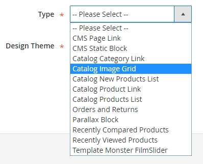
In addition to the static display of the block on the product listing page, you can also display the list of categories on the page of your choice with the help of a widget.To add a widget, navigate to Content > Widgets menu and press Add Widget. In the appeared window, in the Type field, select Catalog Image grid. In the Design Themes select the theme, that you want to apply this widget to. Press Continue.
Storefront Properties
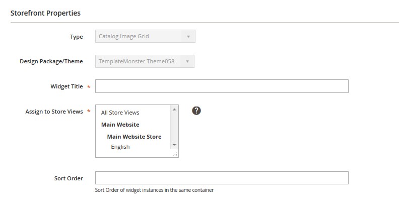
| Type | - | choose a proper widget type. This option is available only when you add a new widget. |
| Design Package/Theme | - | choose a theme to which you want to add a widget. This option is available only when you add a new widget. |
| Widget Title | - | specify the widget title. |
| Assign to Store Views | - | assign the widget to a particular store view. |
| Sort Order | - | sort order of widget instances. |
Navigate to Widget options tab and you will see available options. Part of them is identical with the category page options.
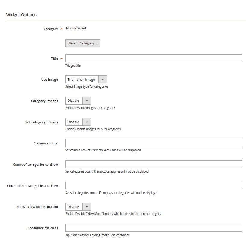
| Category | - | select the category, the subcategories of which you want to display in form of a grid with images. Press Select Category. |
| Title | - | widget title. |
| Use Image | - | select Image type for categories [Thumbnail Image/Category Image/Custom Font Icon]. |
| Category Images | - | enables displaying images for categories. |
| Subcategory Images | - | enables displaying images for subcategories. |
| Font Icon Size [for Custom Font Icon] | - | set Icon size in px. |
| Columns count | - | set columns count. If empty, 4 columns will be displayed. |
| Count of categories to show | - | set categories count. If empty, categories will not be displayed. |
| Count of subcategories to show | - | set subcategories count. If empty, subcategories will not be displayed. |
| Show "View More" button | - | if there are more categories, than specified in the previous option, you'll see the View More button on the website. This option disables the display of this button, which refers to the parent category. |
| "View more" link text [if Show "View More" button is enabled] | - | text to use for "View more" link. If empty, "View more in ..." will be used. |
| Container css class | - | specify the css class for a container that will be used for wrapping a grid with images. |
Product categories settings
In order to configure the module to the fullest extent, configure images, thumbnails, specify the icon class, if needed. Navigate to Products > Categories, select any category and expand the Content tab.You'll see the next options.
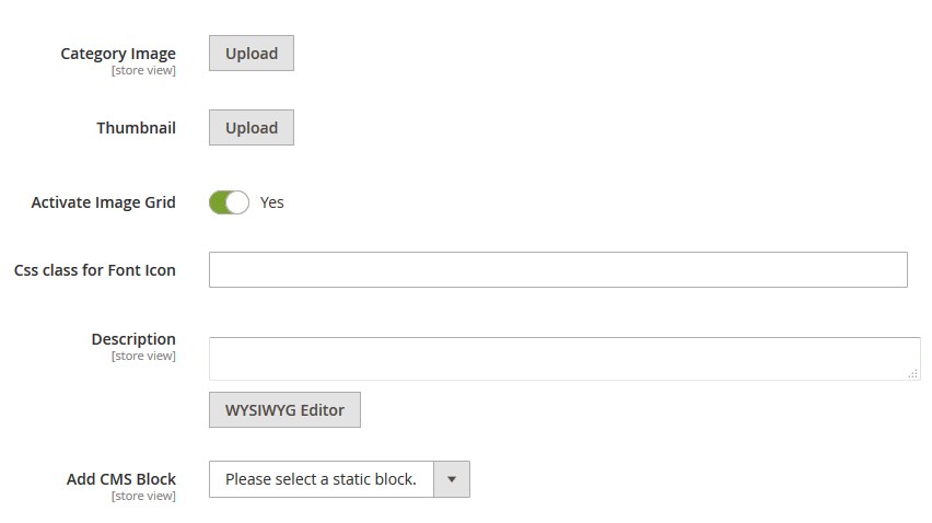
| Category image | - | is the standard functionality of the engine. After you upload an image, it will be displayed on the category page. You can also display it in the module. |
| Thumbnail | - | upload the thumbnail image for the category. Note, to use the thumbnail image for the category you should first select it in the Use Image option. |
| Activate Image Grid | - | activate image grid for the category. |
| Description | - | add description. |
| Add CMS Block | - | you can add CMS Block. Select the block from the dropdown. |
Ajax Search
Quick and easy search among the variety of products contributes to making a positive decision on purchasing in your online shop. Search module is the popular module among the online shops based on various platforms. It allows you to find the products you need according to the selected parameters quickly and easily without reloading the page.
In order to configure this module, you should navigate to the Magento admin panel and choose the Stores > Configuration section in the left side menu.
Then choose the TemplateMonster > Catalog Search Ajax item in the left side menu to go to the module settings interface.
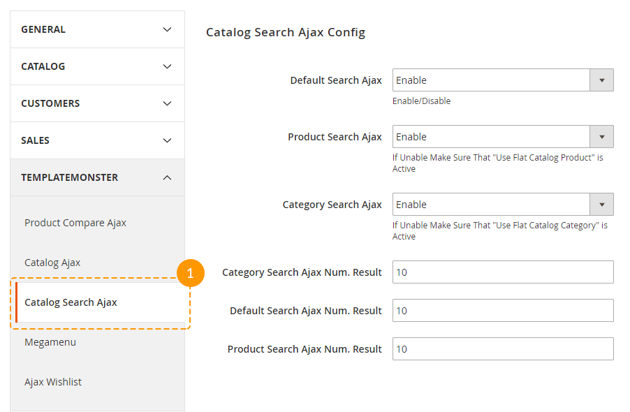
This module has 6 options available for editing if needed.
Let's review each option separately:
| Default Search Ajax | - | enables/disables search by keywords, specified in the "Search Terms" shop section. |
| Product Search Ajax | - | enables/disables search by products' titles, assigned to all of active site categories. |
| Category Search Ajax | - | enables/disables search by all of active site categories titles. |
| Category Search Ajax Num. Result | - | defines the number of categories to show in the search results list. |
| Default Search Ajax Num. Result | - | defines the number of products to show in the search results list while searching by a keyword. |
| Product Search Ajax Num. Result | - | defines the number of products to show in the search results list. |
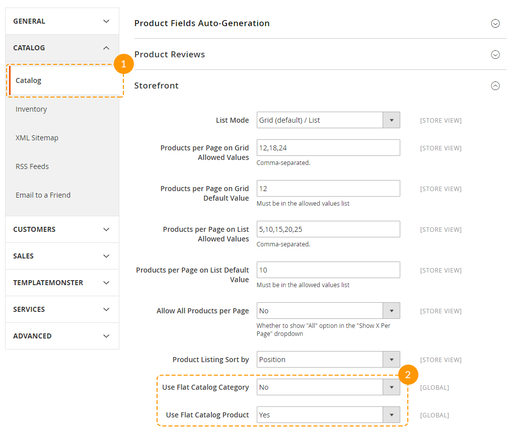
If you decide to enable Category Search Ajax and Product Search Ajax options, you'll also need to enable Use Flat Catalog Category and Use Flat Catalog Product options respectively. You can enable these options at the Catalog > Catalog > Storefront tab.
Feel free to use all the options at once or just some of them, it's up to you. In case there are any suggestions or errors detected, feel free to contact us using the link provided on the module page!
Enjoy using!
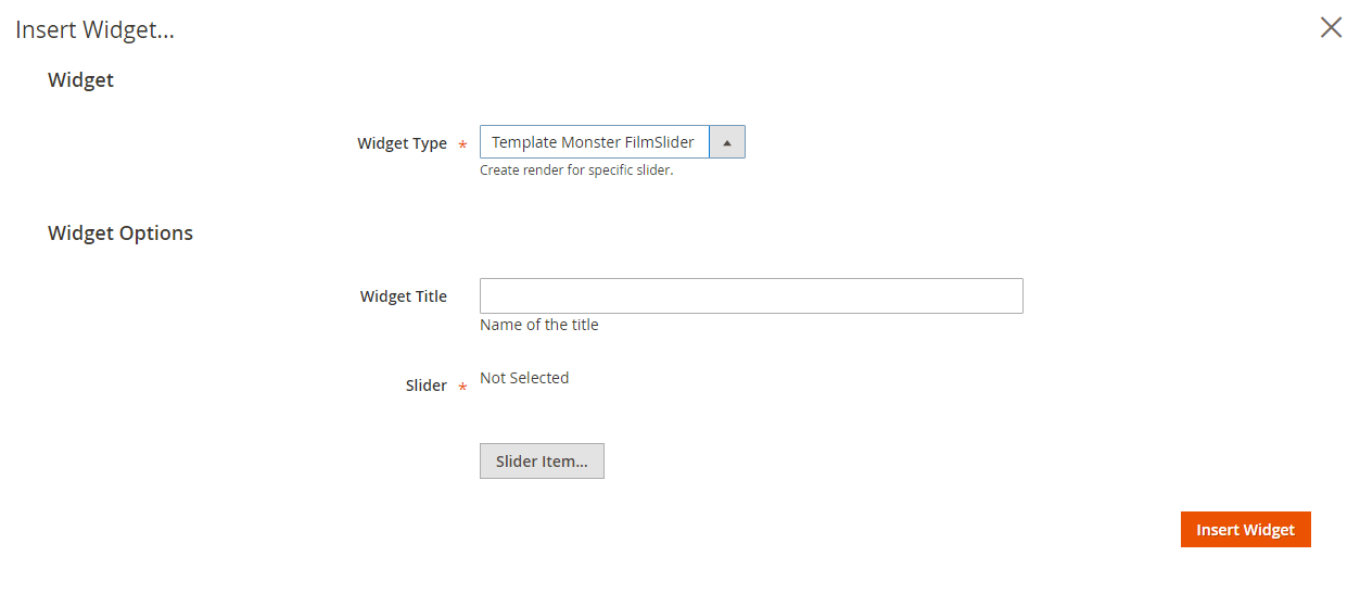
Film Slider
TemplateMonster FilmSlider module is an implementation of elegant and professional jQuery plugin 'Slider Pro'. Allows you to add slider with multiple layers to your store home page. Rich collection of slider configuration options and user interface will help you to configure your slider fast and easily.
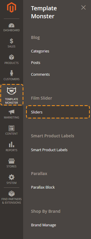
In the main navigation menu you'll see new menu option TemplateMonster.
To start working with the FilmSlider module, click Template Monster > Sliders menu item.
Here you can see a list of available sliders where you can disable/enable, delete or edit sliders.
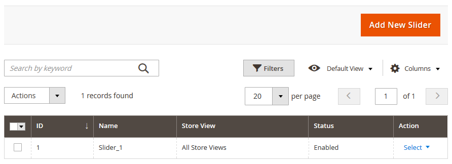
To add new slider click Add New Slider button in the top right corner.
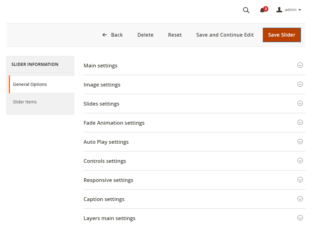
On the slider configuration screen in General Options section you can see all available slider settings. Slider Items section allows you to add slides to your slider.
Let's see what slider options are available. As you can see options are divided into several parts to make the configuration interface more user friendly.
General Options
Main Settings
This section allows you to set slider title, select store view, enable/disable slider, set its width and height.
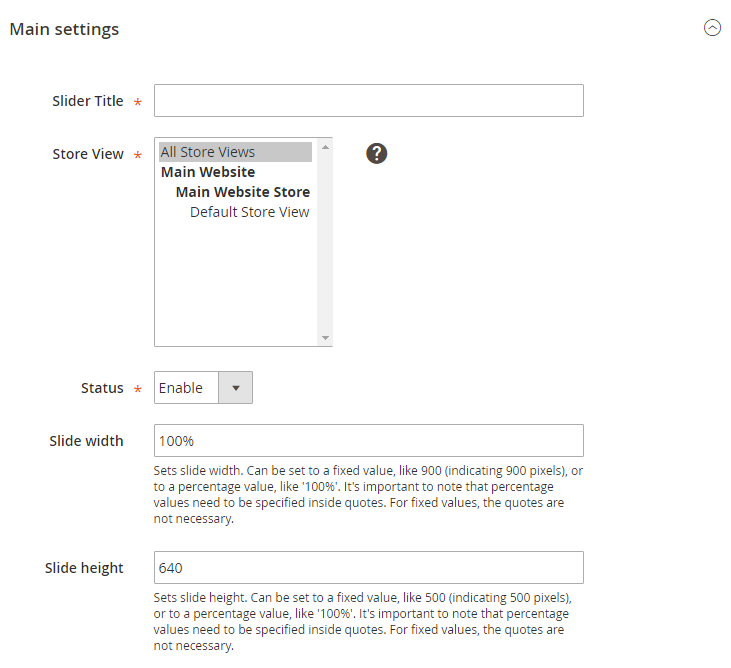
Image Settings
In image section you can adjust slider image configuration settings. Each option has a brief description. Let's describe some of them more specifically.
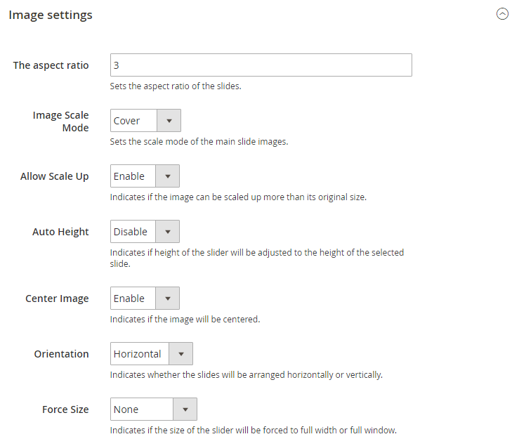
The Aspect Ratio
Image Scale Mode
Sets the scale mode of the main slide images [images added as background].
- cover — will scale and crop the image so that it fills the entire slide.
- contain — will keep the entire image visible inside the slide.
- exact — will match the size of the image to the size of the slide.
- none — will leave the image to its original size.
Force Size
Indicates if the size of the slider will be forced to full width or full window.Slides settings
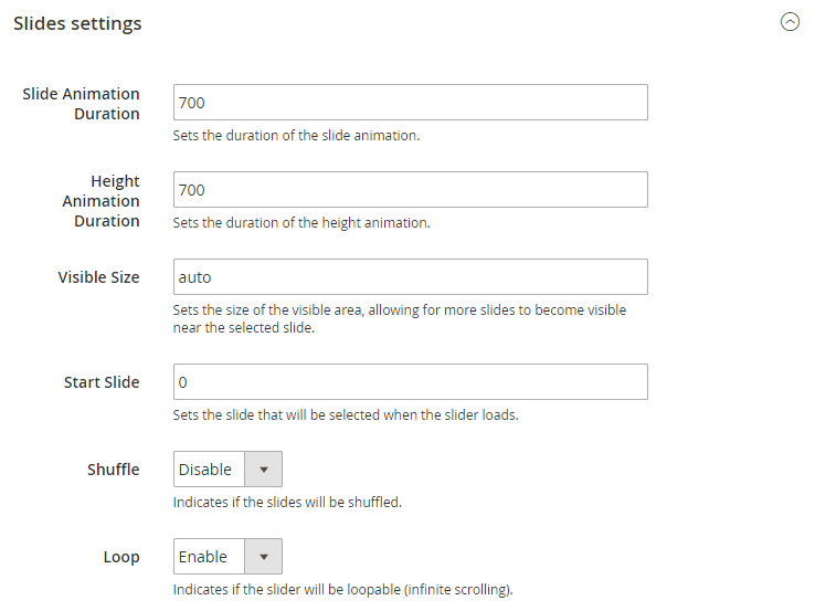
Slides settings section allows configure slides behaviour. Here you can configure slides animation, visible slider size, slides shuffle and loop.
Fade animation settings
This section contains settings for fade animation. Fade animation can be enabled on slide switch.
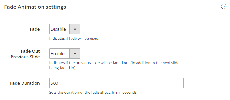
You can set if you want to fade out previous slide and fade animation duration in milliseconds.
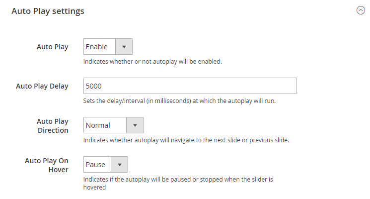
Auto play settings
Autoplay feature in Film Slider allows looping through the slides automatically. This configuration settings contain options to configure auto play delay, direction and pause with mouse cursor on hover.
Controls settings
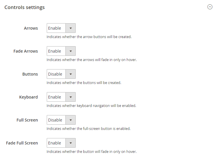
Slider controls are the navigation buttons that let you switch the slides. In FilmSlider there are several types of navigation controls: prev/next arrows, pagination buttons. Enabled keyboard navigation allows you to switch between the slides using keyboard. Also, you can enable button that will switch slider to the full screen mode.
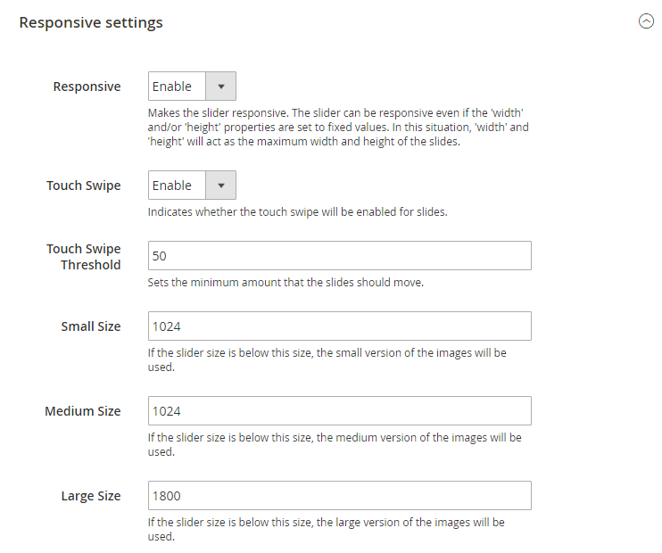
Responsive settings
Caption Settings
Caption feature allows you to add text to each slide. This section allows you to enable caption fade animation and set its duration.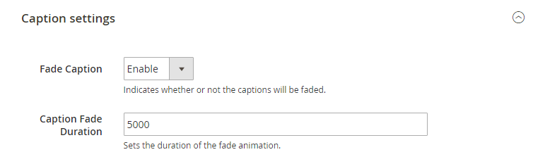
Layers main settings
Layers configuration settings contain slides layers behaviour. Each option has a brief description under the input fields.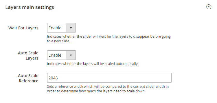
Adding Slides
You can add new slides only after saving the slider. Click Save and Continue Edit button in the top right corner. When the slider is saved, switch to Slider Items tab.
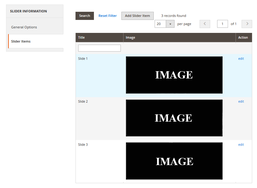
Slide Information
Here you can input slide title and set its status [enabled/disabled].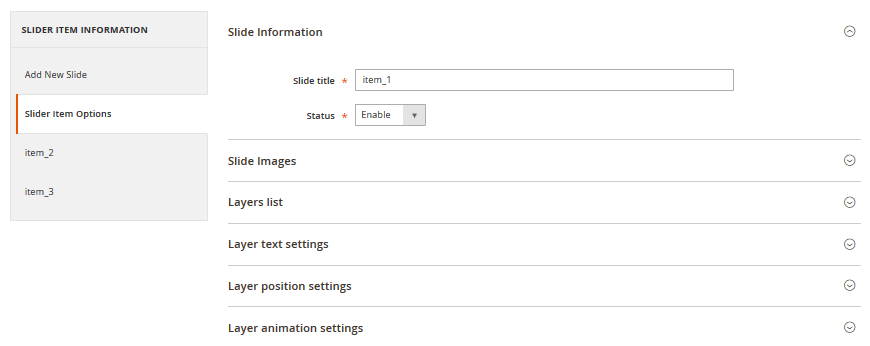
Slide Images
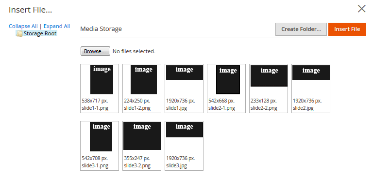
This section allows you to add images to the slide. Click Insert Image button to open Image library where you can select available images.
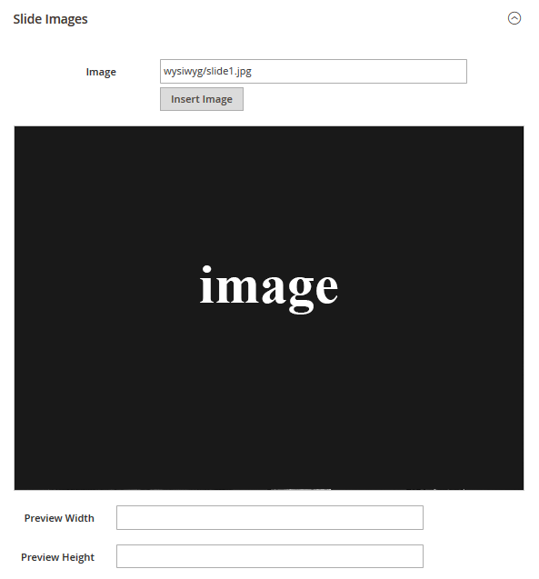
Under the Image field you can see your slide preview. You are free to set preview size the way you like. We moved the next section of slide configuration to the separate section as it is fully related to slide layers.
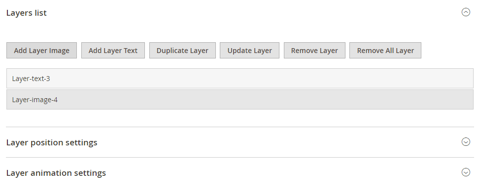
Working with layers
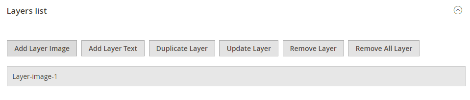
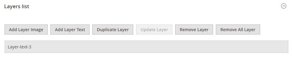
Layers list
Layers list section allows you to add layers to your slide. You can add image layers and text layers. Use corresponding buttons to add layers.
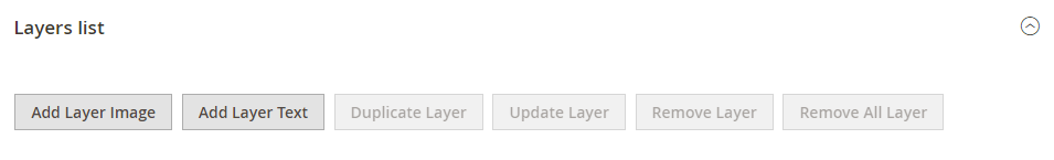
By clicking on Add layer image you'll see an image library where you can select from available images or upload images from your computer. By clicking Add layer text, you'll see new text layer added and layer settings became associated with your new particular layer.
Layer text settings
Using Layer text settings section you can input layer text, layer size, colors, font styling, etc.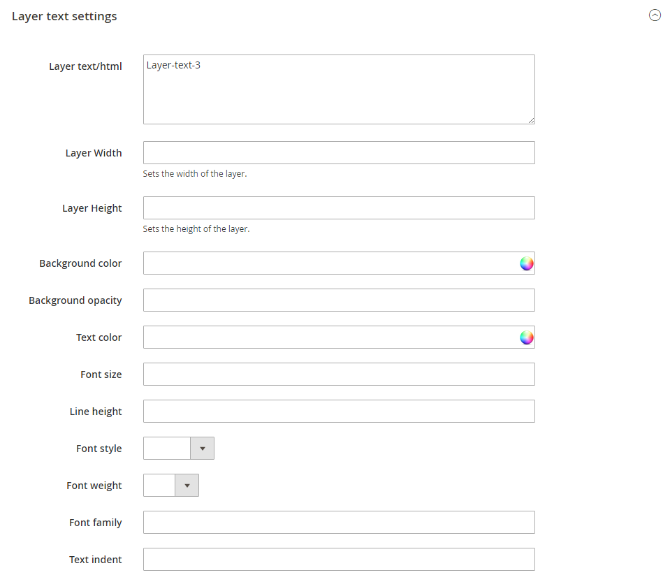
Layer text position settings
In this section you can define text layer position.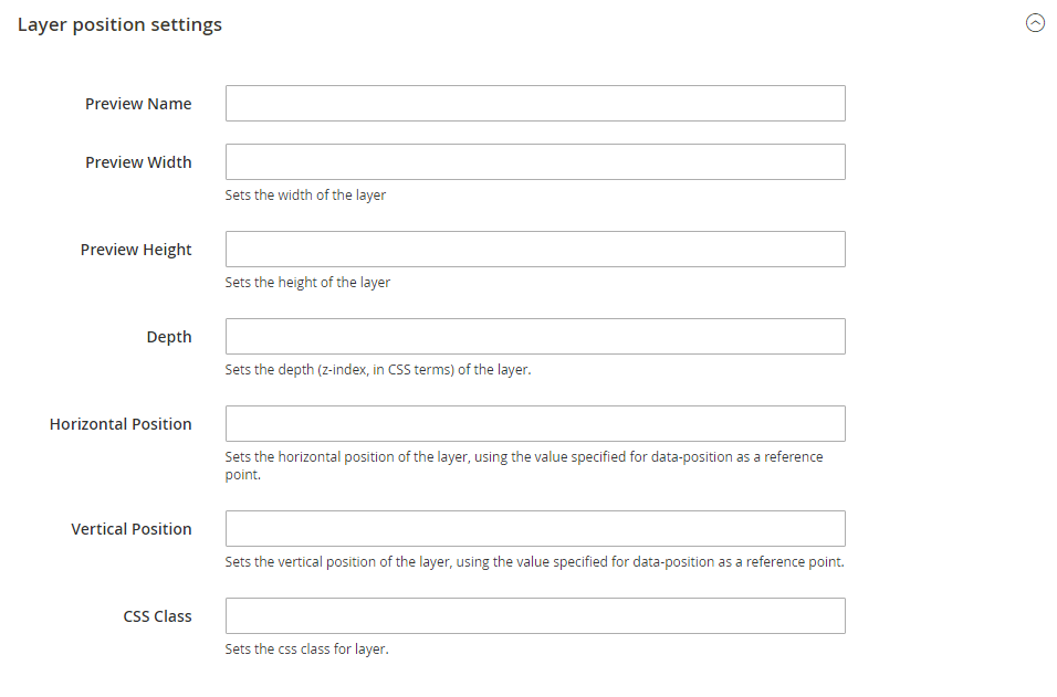
Layer animation settings
This section allows you to define layer animation. You can set its position on the slide, set transition, offsets, delay, duration, etc.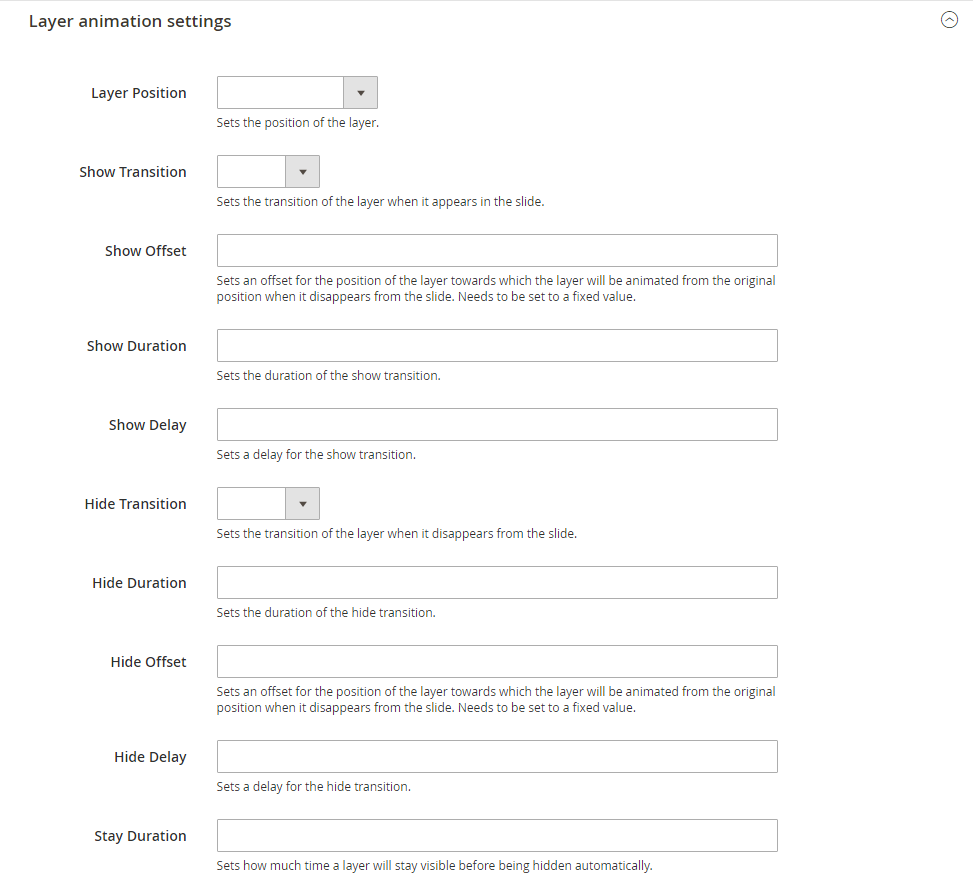
Adding slider to page
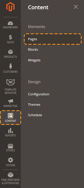
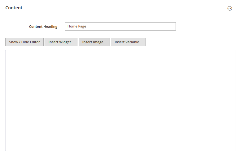
To add slider to your page please use Magento widgets. In the main admin panel menu click Content > Pages item.
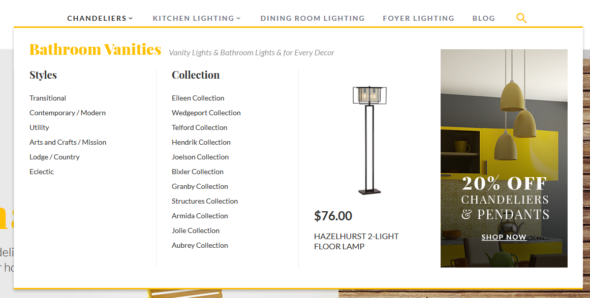
Megamenu
TemplateMonster Megamenu module extends standard Magento menu functionality and allows you to configure subcategories multi-column display, add static blocks and products to the dropdown menu, as well as the flexibly customize its appearance in site admin panel.
Global configuration
In order to configure this module, you should navigate to Magento admin panel and choose the Stores > Configuration section in the left side menu.
Choose the TEMPLATEMONSTER > Megamenu in the left side menu to go to the module settings interface.
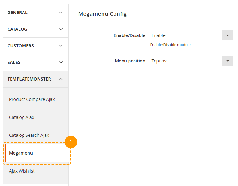
| Enable/Disable | - | you can enable or disable the module if needed; |
| Menu position | - | you can choose menu position here. |
| Topnav | - | displays menu in site header; |
| Sidebar | - | shows menu in sidebar. |
Attention!!! If you're going to display menu in sidebar, be sure to enable a layout with left or right column included. In case, you have one-column layout active for pages and Menu position:Sidebar option is enabled, no menu will appear at site.
Categories configuration
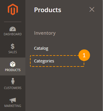
Megamenu block display can be configured on the 1st level category configuration page, that can be found in the Megamenu tab, at Products > Categories section.
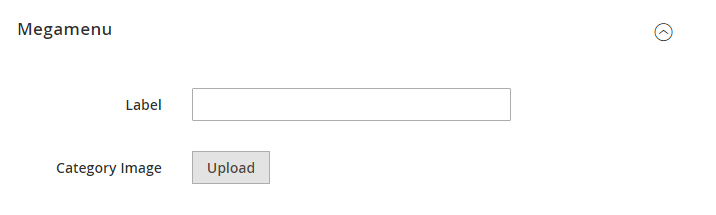
You will see the Turn on Megamenu for this category option at the Megamenu tab. This option enabled Megamenu block for the selected category. After enabling this option, you will see the two fields and a widget with menu content settings.
Label option allows you to display the label [new, sale] for the top-level categories. This label has default styling, but its appearance can be changed by using Css class option. This option sets the class for current menu item's <li> и <a> tags, so you can easily create custom styling for your label by using the class.
Megamenu block content settings' widget allows you to define number of rows, columns, specify their width and lot of other settings.
In order to add a new row you need to use Add row button. Then you will see the empty field with Add column[s] and Remove row buttons.
Remove row - removes the row [field].
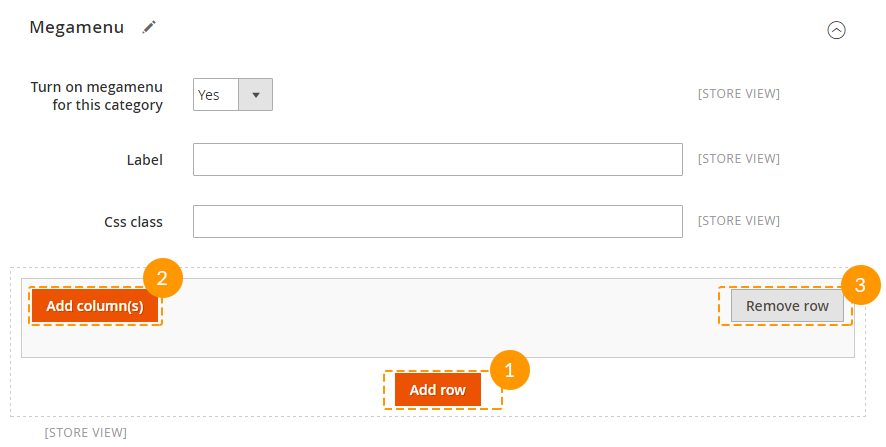
After pressing the Add column[s] button you'll see a pop-up window to select the width of the column you're going to add. The maximum width of the column is col-12 it stretches menu block to the full width of the container. So, if you need to display 4 columns in a row, you have to add 4 columns with the width parameter set to col-3.
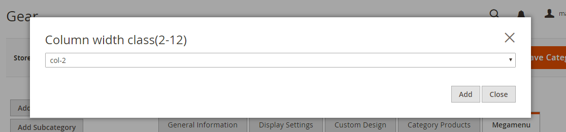
Let's consider columns' settings.
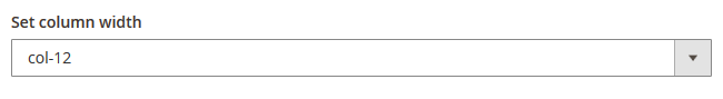
- Set column width - column width. It can take values from col-1 to col-12.
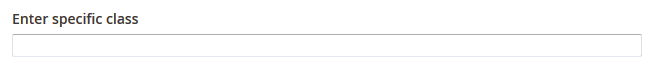
- Enter specific class - custom css class of the column, so that you can further create styles for this column using css rules.
-
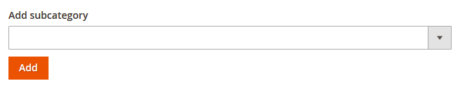
Add subcategory - subcategories dropdown for the parent category. This option allows you to select and display the subcategories you need. In order to do this, choose the subcategory among the list and press on the Add button. On the next step you will see this category listed at the Selected items field.
-
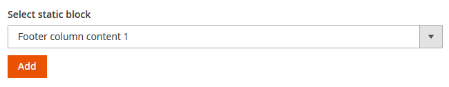
Select static block - static blocks dropdown list. You can show any of site static blocks in the dropdown menu same as the list of subcategories, if you have previously added it to the shop admin panel. In order to add a static block, choose it among the list and press on Add button. Static block title will be listed in the Selected items field.
-
Add product[s] - adding product to the menu. This option allows you to add any of site products to the menu. Product image, title and a price will be displayed in this case. After pressing on the button you'll see the pop-up list of products available for adding. After you add it to menu, it's title will be listed in the Selected items field.
-
Selected items - the field for sorting the items. It allows you to change the display order [sorting] of your column content. Drag&Drop interface allows you to reorder items by dragging them. If you do not want the product or static block to be displayed below, just drag it to the top to reach the required appearance. You can also remove some items here. Select the ones you need to remove and press on Remove selected button to do that.
Subcategories configuration
This module allows to add an image and a label to any products' subcategory. In order to configure the subcategory, open its page and navigate to the Megamenu tab. You'll see two options there: Category image and Label.
To add the subcategory image press on browse and choose an image from the clipart.As to the label adding, fill in the Label field.
Styles configuration
Frontend:
- 2 subcategories;
- Block — menu_banner, menu_logo;
- 1 product.
How to change the menu block image(s)
Navigate to your Magento root folder on your server. Then, go to the app/design/frontend/TemplateMonster/themeXXX/web/images/media folder. (XXX — your theme number)
Find the image you want to replace. Remember (copy) the name of the image.
Upload the new image to the media folder replacing the old one. The new image should have the same name and extension. (e.g. menu_banner.jpg)
- Megamenu block image name — menu_banner.jpg;
- Image size — 254x437 px.
Newsletter Pop-up
Email newsletter has always been the important part of every marketing strategy. This method is used all over the world, so it will definitely help you to gain more orders and subscribers. That's why we proudly present you the Newsletter pop-up module. It displays the popup window with subscription form and social icons right after the client visits your site.
Global configuration
In order to configure this module, you should navigate to Magento admin panel and choose the Stores > Configuration section in the left side menu.
Choose the TEMPLATEMONSTER > Newsletter Pop-up in the left side menu to go to the module settings interface.
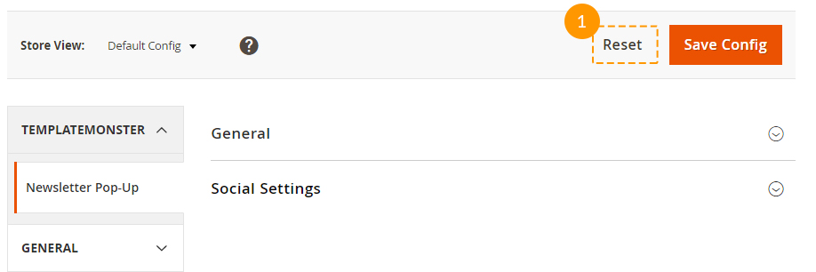
The module has 2 sections, and each one contains a specific set of options:
- General
- Social Settings
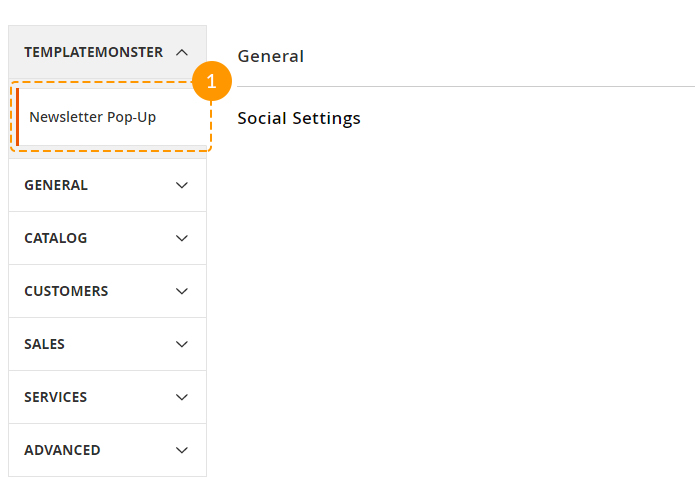
General section includes main module settings, and Social settings section serves for social icons display setup in the pop-up window.
General
As stated above, this section includes main module settings. You can enable or disable module here, specify buttons color, define the width of the window, etc. Let's review each option separately.
General section includes main module settings, and Social settings section serves for social icons display setup in the pop-up window.
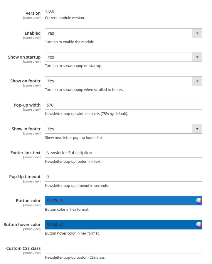
- In order to enable or disable module completely, you'll need to use Enabled option. It provides the possibility to deactivate the module completely.
-
Show on startup option shows up the pop-up after visiting the site. As soon as shop page is loaded, you will see the pop-up offering you to subscribe to this site's newsletter.
- This pop-up can be also set up to display once again after navigating to site footer by using a scrollbar. E.g., if you close the pop-up that appeared after the initial page loading and scroll down to the footer then, the same pop-up will show up for the second time. In order to re-display this subscription window, you have to enable Show on footer option.
-
Pop-Up width option allows you to define the newsletter pop-up window width. Its size can be set in pixels only.
- Show in footer option allows you to display a link in the site footer, to display the newsletter pop-up after clicking on it. Footer link text field changes the label for the link displayed in the footer after activating the Show in footer option.
-
The pop-up may not be displayed immediately, but after some certain time period. This setting is controlled by Pop-Up timeout option. You can set a delay before the newsletter pop-up appearance and it will not show up right away, but only after the time you have specified passes since the client visits your site.
-
Button color and Button hover color options let you set a background color for the "subscribe" button.
-
You may need the CSS-class option when customizing the pop-up design. This option allows you to apply additional custom CSS-class for the pop-up window so that it can be used for further stylizing or other actions.
Social Settings
This section is responsible for social icons display and configuration in the newsletter pop-up. It consists of a few subsections that have similar options.
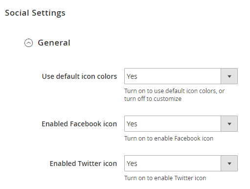
Main settings' subsection allows you to set colors and social icons' appearance for the following services:
- Google+
- Youtube
- Vimeo
- Foursquare
- Tumblr
- RSS
-
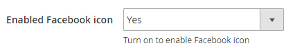
You can enable or disable certain icon appearance by using the respective Enabled ……. icon option. This option activation will make a respective sections appear to let you configure each icon individually.
-
This section also includes the Use default icon colors option. It is used for changing icons color.
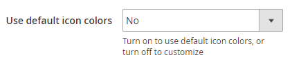 By default, it's enabled, so all the icons have their corporate [standard] color that is specific for each social network. However, if you'd like to define icons color on your own, you should disable this option.
 -
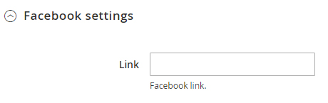
Each social network section has a Link option available. It lets you define the link to any page [your profile] in a respective social network.
-
After disabling the Use default icon colors option, you will see the new fields in subsections for each social network icon configuration:
- Icon background
- Icon color
- Icon background hover
- Icon hover color
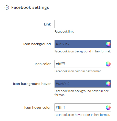
All of these options allow you to customize the icon appearance. They provide you with the option to set the icon background and color for the initial state and on hover [after hovering the icon with the mouse cursor].
Please be sure to save your configuration!
Just in case, you'd like to return all the default settings, there is a Reset button available next to the Save one.
How to change the newsletter text
Navigate to your Magento root folder on your server. Then, go to the app\design\frontend\TemplateMonster\themeXXX\Magento_Newsletter\templates folder. (XXX — your theme number) Open the subscribe.phtml file. Enter the text you want to display within the newsletter block (replacing the old one). Remember to save the file.
Parallax settings
General
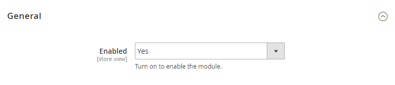
To activate the module, navigate to Store > Configuration > Templatemonster > Parallax tab. Here you'll find option to enable module.
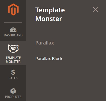
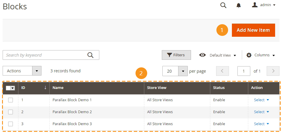
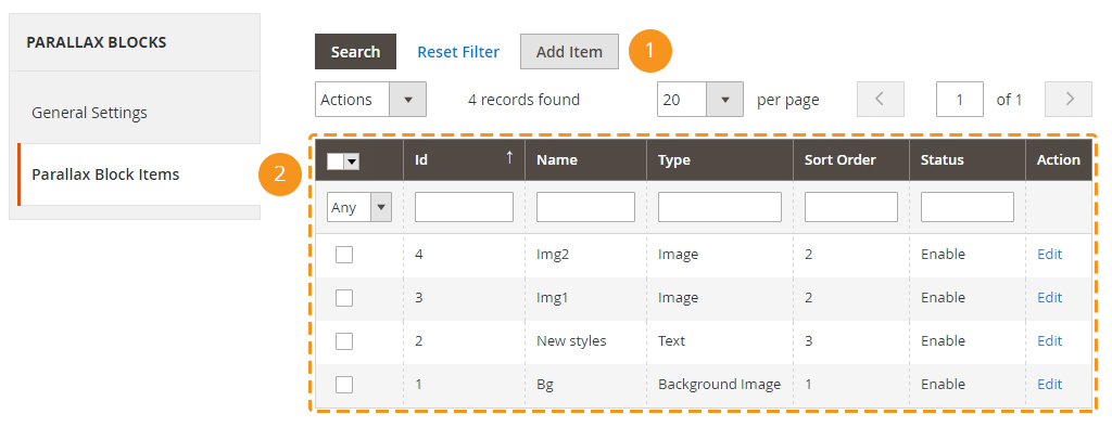
To add and configure parallax block, navigate to TEMPLATE MONSTER > Parallax Block.
You'll see the "Add new item" button [1] with the help of which you can add a new parallax block and a list of existing blocks [2].
While creating or editing a parallax block, two tabs become available. They are General Settings & Parallax Block Item.
General Settings
In this section, you'll see the general setting for a parallax block.
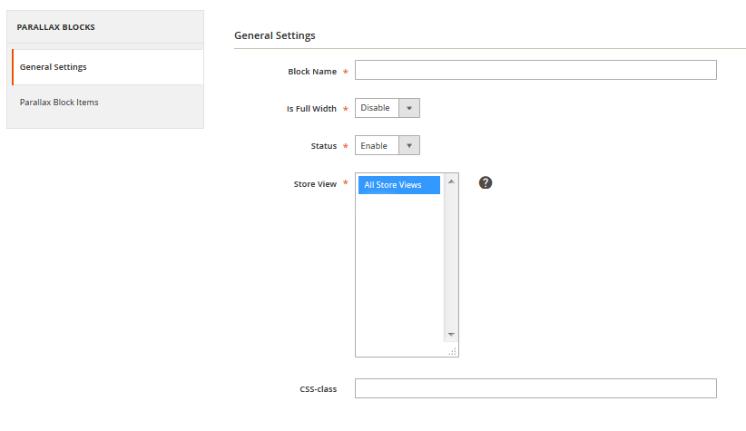
Let's review module options:
| Block Name | - | you can input a name of a parallax block in this field. |
| Is Full Width | - | if you choose "enable", you going to have a full-width page parallax block, if "disable" — the block with the same width as the container in which the one is. |
| Status | - | enables/disables the parallax block on your website. |
| Store View | - | choose the store view, where to place the output of a parallax. |
| CSS-class | - | you can add CSS class to your block hire. |
Parallax Block Items
In this section, you can see the [1] "Add item" button that is needed for adding a new layer, with the parallax or not. This button appears after a new parallax block creating only [once you click on the "Save block" or "Save and Continue edit" button].
Also, you are able to see this parallax block layers list [2].
While creating or editing a layer you might deal with the following settings:
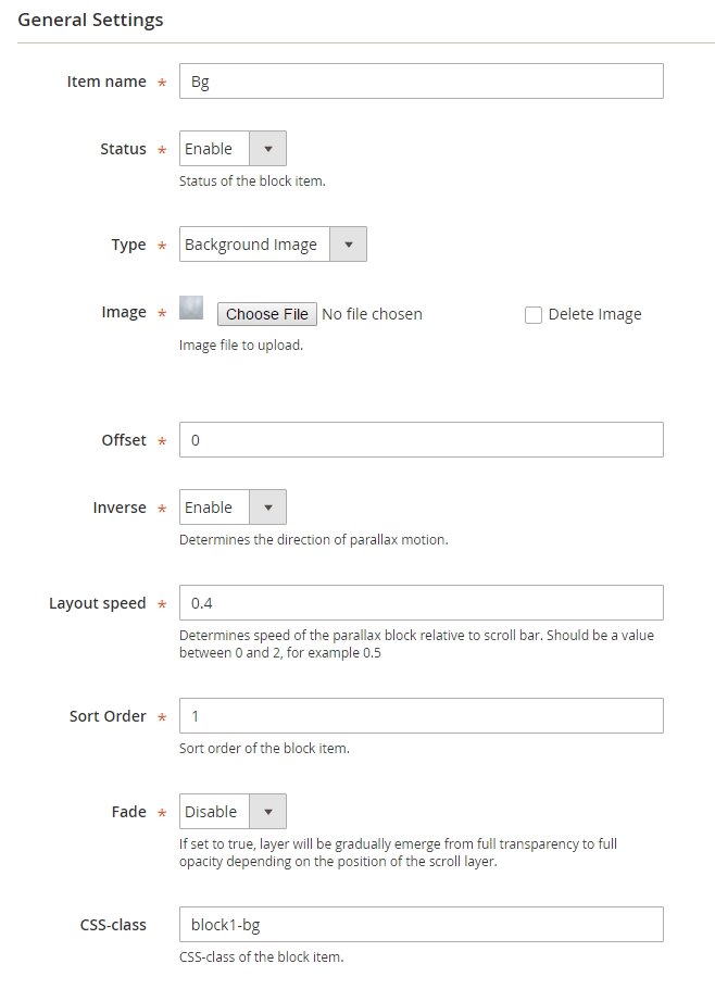
| Item name | - | in this field, you can set a name of a layer. |
| Status | - | enables/disables a parallax block on your website. |
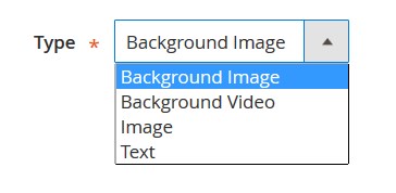
| Type | - | you are free to choose any of four type of layer: Background Image/Background Video/Image/Text [each type settings became available after the type choosing]. |
 |
||
| Offset | - | set the layer vertical offset, in pixels only. |
| Inverse | - | determine the direction of parallax motion. Enable — to the top, Disable — to the bottom. |
| Layout speed | - | determines the speed of the layer relative to the scroll bar. The value should range from 0 to 2. |
| Sort Order | - | sort order of the block item. |
| Fade | - | if Enable, a layer will be gradually emerge from full transparency to full opacity depending on the position of the scroll layer. |
| CSS-class | - | you can add CSS class to your layer. |
Settings according to the layer type
If you choose Background image or Image type, you going to have another field with a button to upload an image file. You can delete an uploaded image ticking the "Delete Image" and saving the configurations.
When choosing Background video, the additional options will appear:
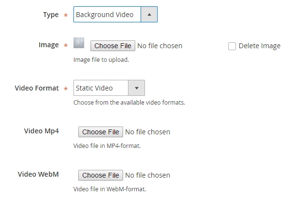
| Image | - | background image to be shown before video starts playing. |
| Video format | - | you can choose Static video — in mp4/WebM format. YouTube Video — you need to insert the video ID in the field just became available. E.g. https://www.youtube.com/watch?v=ZIbfupoM3e4. You should insert that is marked in bold font. |
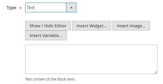
If you choose the Text type, the field for you to input the text or HTML code, which ought to be displayed on your layer, will appear.
The output to Frontend
To display your parallax block on website you need to follow along with these several steps:
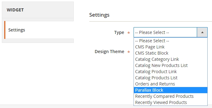
1. Go to Content > Widgets > Add Widget.
2. Select the Parallax block and your Design theme.
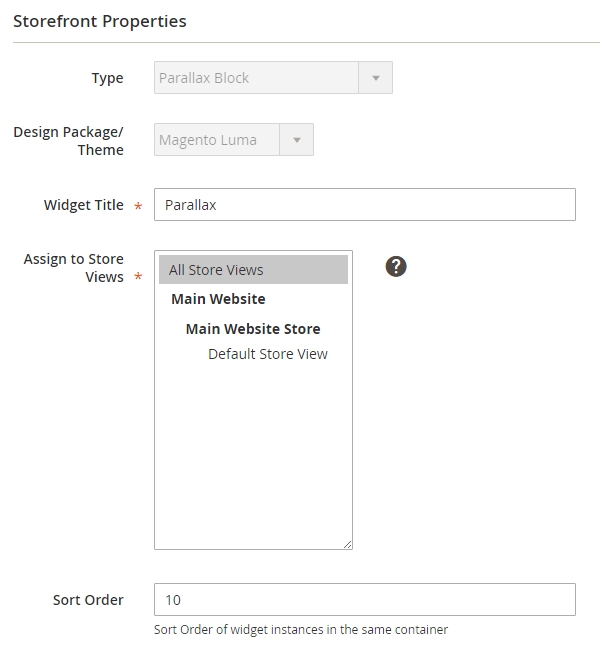
3. Click "Continue" button. Choose Store view in a Store front Properties tab, enter the Widget title and Order number.
4. Then you need to choose specific place to display the block.
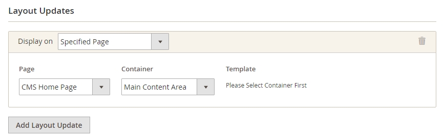
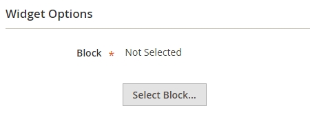
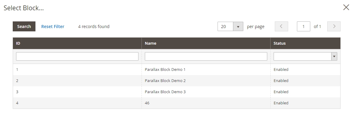
5. Go to Widget Options tab and select your parallax block.
Ajax Compare
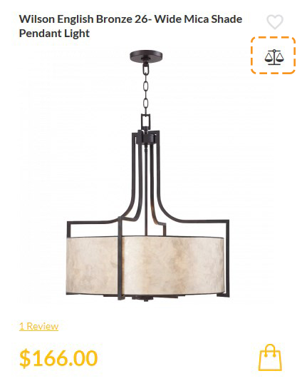
Products compare is one of the standard e-commerce features. We have created the special module for the convenient use of this feature, it is based on AJAX technology, and allows you to add products to compare without having to navigate to the separate page.
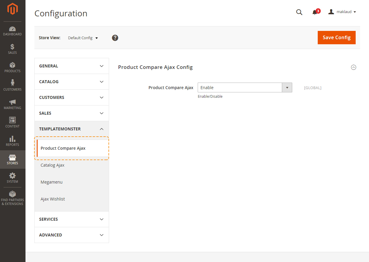
You can either enable or disable this module. In order to do this, navigate to the admin panel and choose the Stores > Configuration section in the left side menu.
Then choose the TemplateMonster > Product Compare Ajax item on the new page on the left side.
Frontend
Theme Options settings
Then choose the TEMPLATEMONSTER > Theme Options in the left side menu and you'll move to the module settings interface.
The Tab structure is as follows:
General
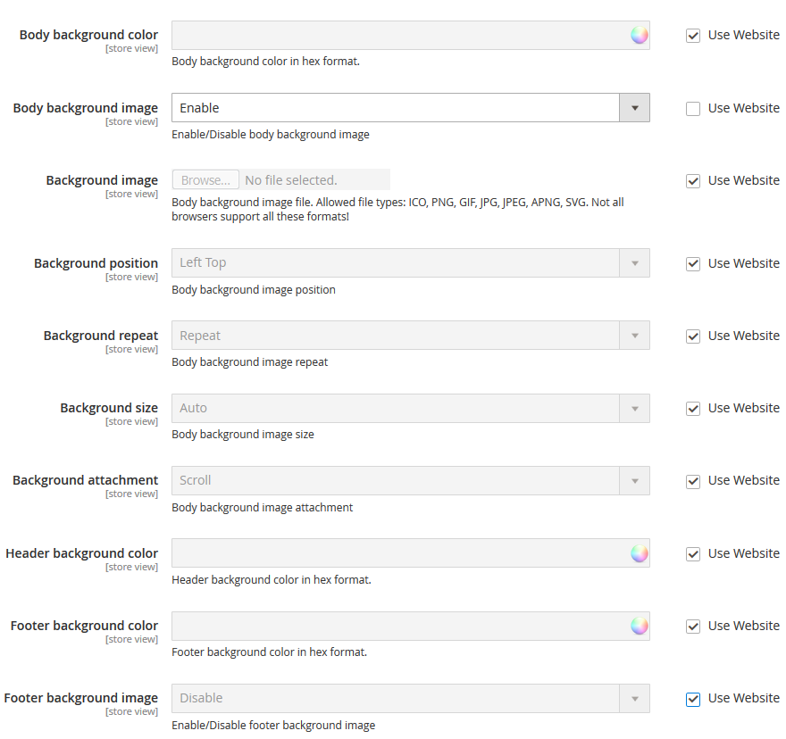
| Body background color | - | body background color in hex format. |
| Body background image | - | Enable/Disable body background image |
| Background image | - | upload the body background image file. Allowed file types: ICO, PNG, GIF, JPG, JPEG, APNG, SVG. Not all browsers support all these formats! |
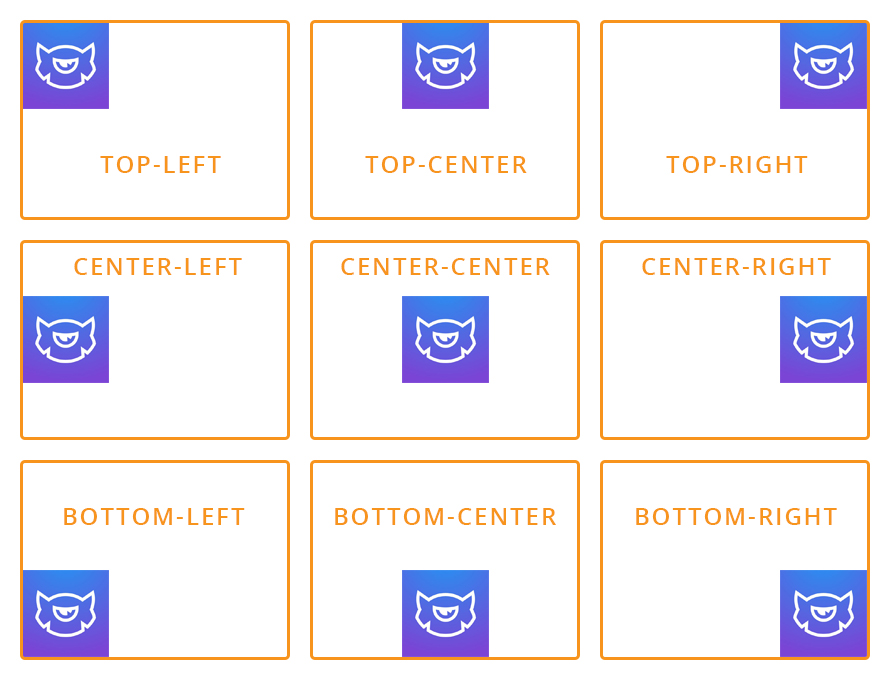
| Background position | - | set position for your background: Left Top, Center Top, Right Top, Left Center, Center Center. Right Center, Left Bottom, Center Bottom, Right Bottom. |
 |
||
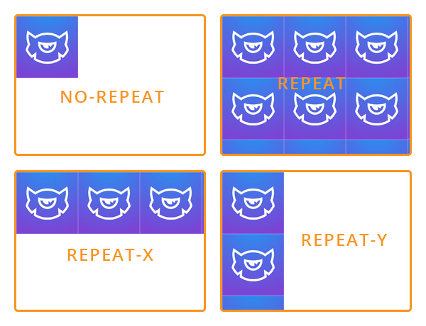
| Background repeat | - | choose how background image will be repeated: Repeat, No Repeat, Repeat X, Repeat Y. |
 |
||
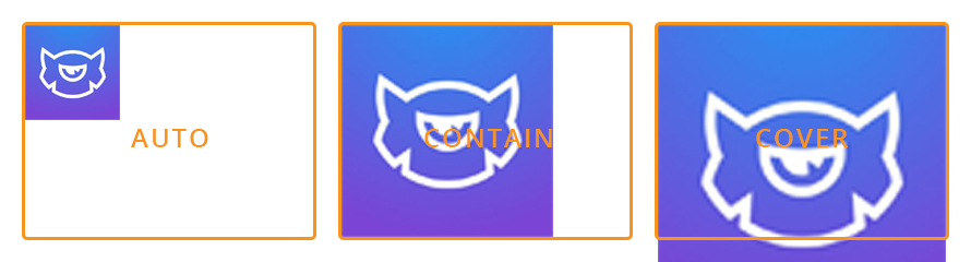
| Background size | - | set the body background image size |
 |
||
| Background attachment | - | body background image attachment: Scroll (scroll with content), Fixed (no scroll with content). |
| Header background color | - | choose the color for your header. You can select a color from the Color Palette. |
| Footer background color | - | choose the color for your footer. You can select a color from the Color Palette. |
| Footer background image | - | enable/disable the footer background image. |
| Background image | - | Footer background image file. Allowed file types: ICO, PNG, GIF, JPG, JPEG, APNG, SVG. Not all browsers support all these formats! |
| Background position | - | Footer background image position. |
| Background repeat | - | Footer background image repeat. |
| Background size | - | set the footer background image size. |
| Background attachment | - | set footer background image attachment |
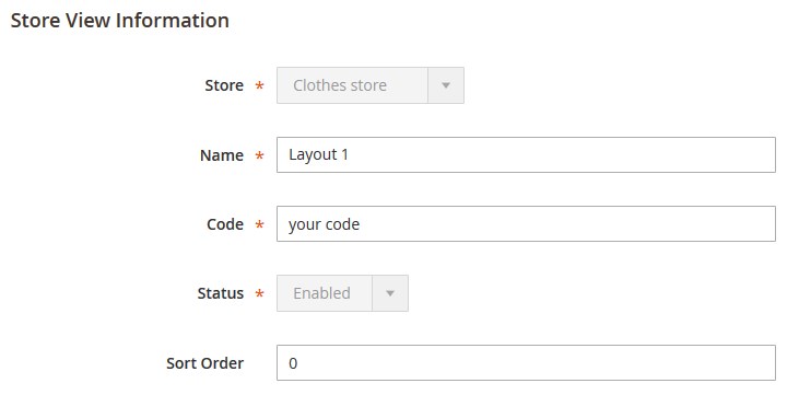
In case, you've changed the "website code" in Stores > All stores, you must change it in the color_schemes.xml file, too.
In order to change "website code" in the color_schemes.xml file go to app\code\TemplateMonster\ThemeOptions\etc.
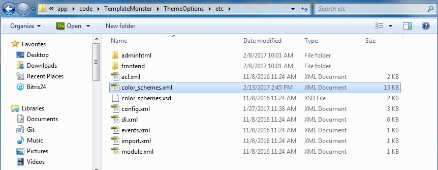
Open the color_schemes.xml file using any code editor.
Find the <website code="clothes_store"> line (in our case) and replace "clothes_store" (the previous code) with the new one <website code="your code">.
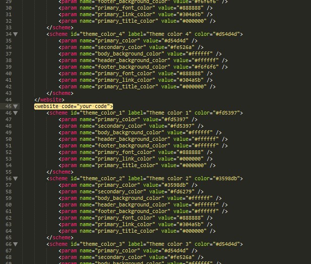
If you change the "website code" for another Web Site, you need to change its code in color_schemes.xml file. Find the <website code="previous code"> line and replace it with <website code="new code">.
Before modifying the website code please make sure it is not used in index.php.
Main Theme Settings
Settings for the Typography tab are the following:
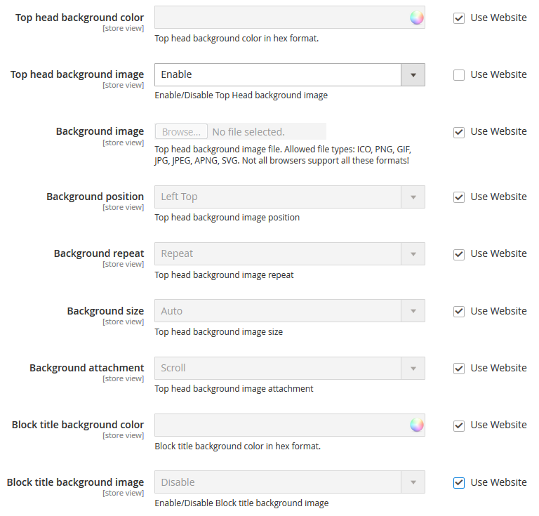
| Top head background color | - | top head background color in hex format. |
| Top head background image | - | Enable/Disable body background image |
| Background image | - | upload the body background image file. Allowed file types: ICO, PNG, GIF, JPG, JPEG, APNG, SVG. Not all browsers support all these formats! |
| Background position | - | set position for your background: Left Top, Center Top, Right Top, Left Center, Center Center. Right Center, Left Bottom, Center Bottom, Right Bottom. |
|
|
||
| Background repeat | - | choose how background image will be repeated: Repeat, No Repeat, Repeat X, Repeat Y. |
|
|
||
| Background size | - | set the body background image size |
|
|
||
| Background attachment | - | body background image attachment: Scroll (scroll with content), Fixed (no scroll with content). |
| Block title background color | - | choose the color for your block title . You can select a color from the Color Palette. |
| Footer background color | - | choose the color for your footer. You can select a color from the Color Palette. |
| Block title background image | - | enable/disable the block title background image. |
| Background image | - | Footer background image file. Allowed file types: ICO, PNG, GIF, JPG, JPEG, APNG, SVG. Not all browsers support all these formats! |
| Background position | - | Footer background image position. |
| Background repeat | - | Footer background image repeat. |
| Background size | - | set the footer background image size. |
| Background attachment | - | set footer background image attachment |
Deskop
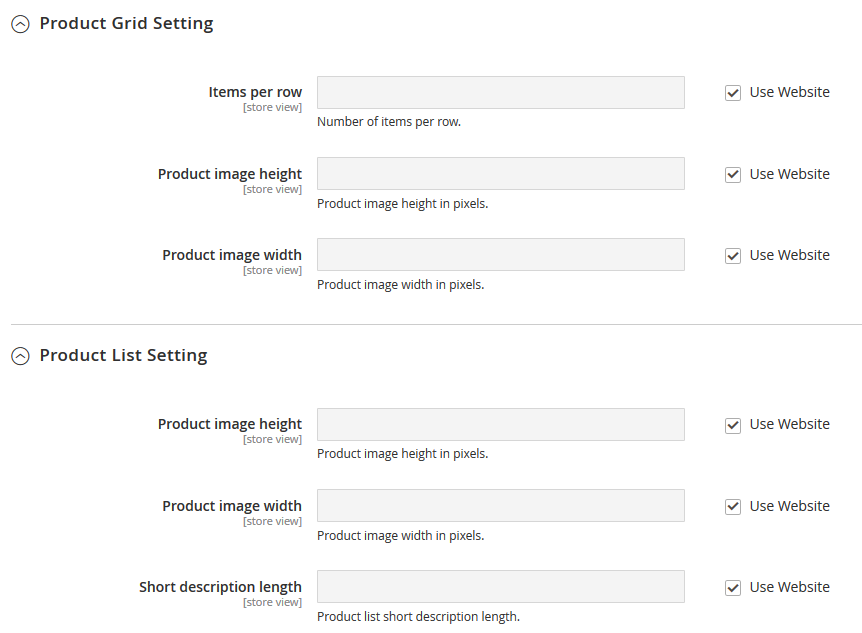
| Items per row | - | specify number of product per row. |
| Image width | - | product image width in pixels. |
| Image height | - | product image height in pixels. |
| Short description length | - | specify the description length. |
Tablet
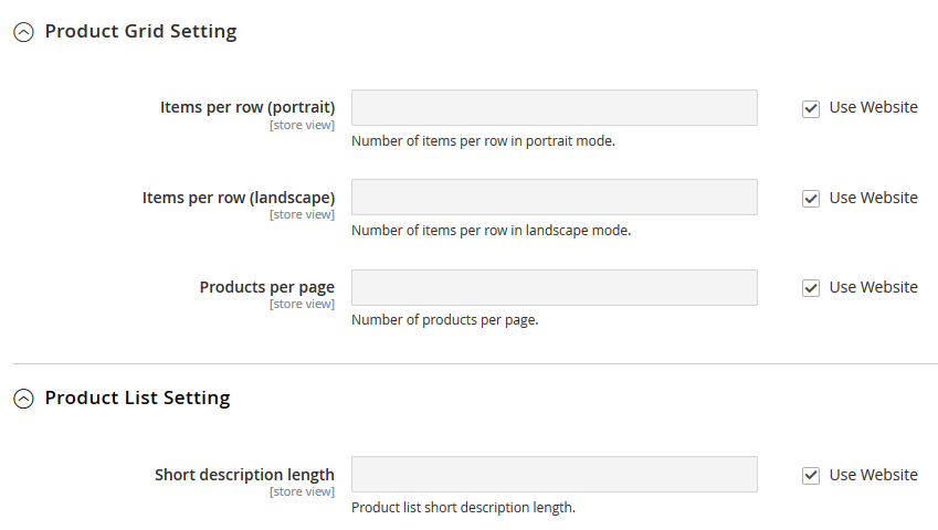
| Items per row (portrait) | - | number of items per row in portrait mode. |
| Items per row (landscape) | - | number of items per row in landscape mode. |
| Products per page | - | specify number of product per page. |
| Short description length | - | specify the description length. |
Mobile
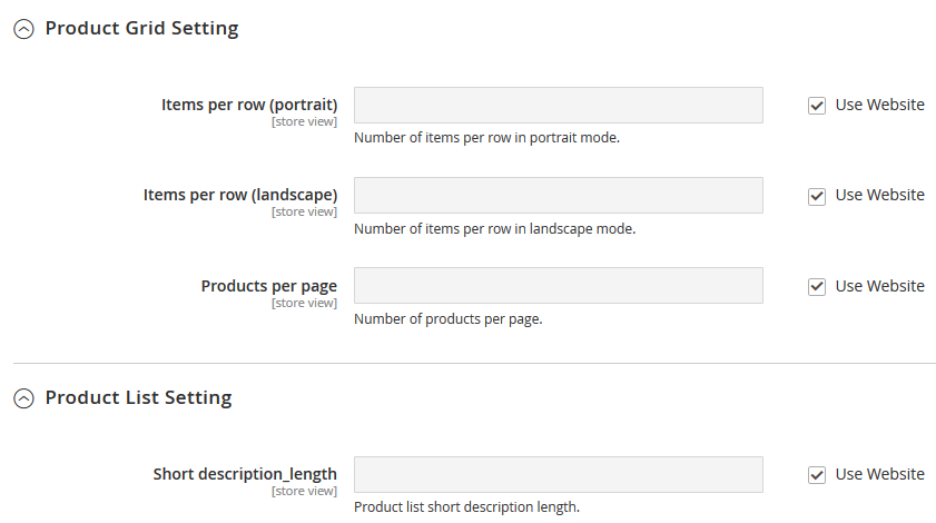
| Items per row (portrait) | - | number of items per row in portrait mode. |
| Items per row (landscape) | - | number of items per row in landscape mode. |
| Products per page | - | specify number of product per page. |
| Short description length | - | specify the description length. |
Product detail settings
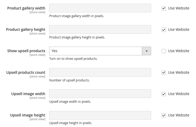
| Product gallery height | - | set the product image gallery height in pixels. |
| Product gallery width | - | set the product image gallery width in pixels. |
| Show upsell products | - | show upsell products section. |
| Upsell products count | - | specify the number of upsell products. |
| Upsell image width | - | upsell image width in pixels. |
| Upsell image height | - | upsell image height in pixels. |
Social links
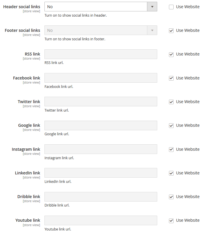
| Header social links | - | turn on to show social links in header. |
| Footer social links | - | turn on to show social links in footer. |
| ... link | - | enter the link URL. |
Swatch Settings
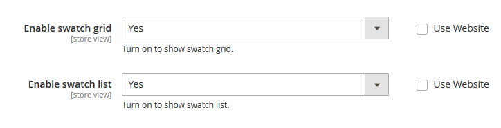
| Enable swatch grid | - | turn on to show swatch grid. |
| Footer social links | - | turn on to show swatch list. |