GrandSale Documentation

Magento Theme Installation
Install Theme on Live Store
To install the theme you only need to upload all the theme files (the app folder) to your server and then enable the theme in the admin panel.
You can find the theme requirements on the Theme Live-Demo page.
But to avoid unexpected problems after installation, you should first prepare your Magento. Please strictly follow the steps described in this guide:
- Step 1. Backup Magento files
- Step 2. Disable the cache
- Step 3. Upload the app folder
- Step 4. Unzip the app folder
- Step 5. Run the console
The detailed Magento update guide you will find on the Magento User Guide.
Template Configuration
We are going to review template configuration options based on the example. We will configure it the same way as our Live Demo template, without affecting products data.
Activate the New Theme
Pages Configuration
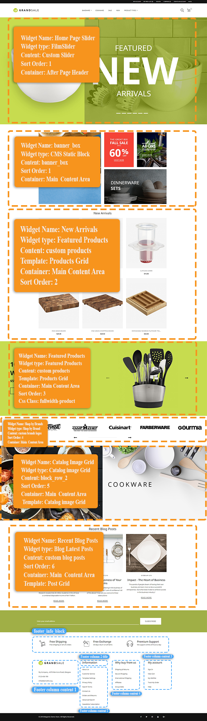
In order to make your template look exactly like our Live Demo, you need to set up store pages in a specific way. We provide all the files with the pages source code. You need to add them into Magento admin panel as per the instructions below using the settings table. Settings table is located on the Template Settings page on the template preview page.
The main template page will be affected the most. It usually contains the following elements: banners, slider, etc.
In case you have already made the changes to your pages code and would like to add our code without affecting your changes, it is recommended to contact professional technicians or prepare a backup before making changes.
-
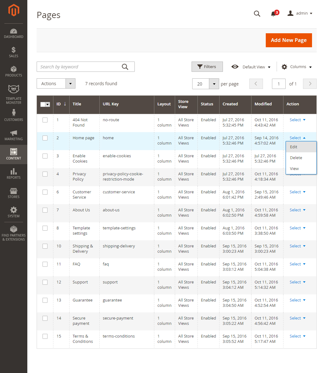
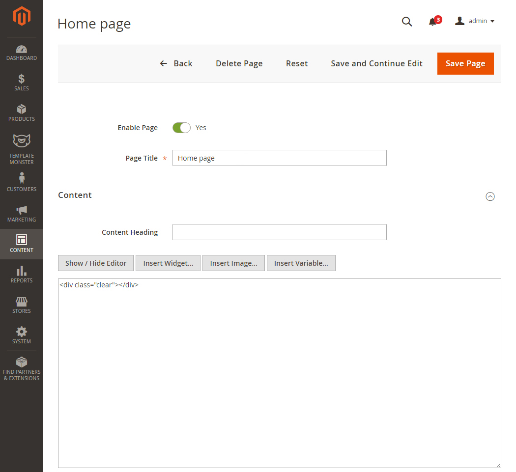
From the top menu select Content > Pages. Here you can find all the store pages. Home page, About Us and Customer Service should already be available, so you don't need to add them. You only need to update the pages HTML and XML content. Open any of them in order to get the access to the content.
-
Open the page and select the Content tab. It contains the HTML code of the page. You can take the page HTML code from the appropriate source file. You can see the list of source files included in the "Template Settings" section on your templates preview page. Copy the code from the source file and paste it to the content area.
-
When you are done with the HTML code, switch to "Design" tab. It contains the page XML code. XML code allows you to add Magento static blocks and widgets to the page. The XML code should be copied the same way as the HTML from the source file. Copy the XML code to the "Layout Update XML" area.
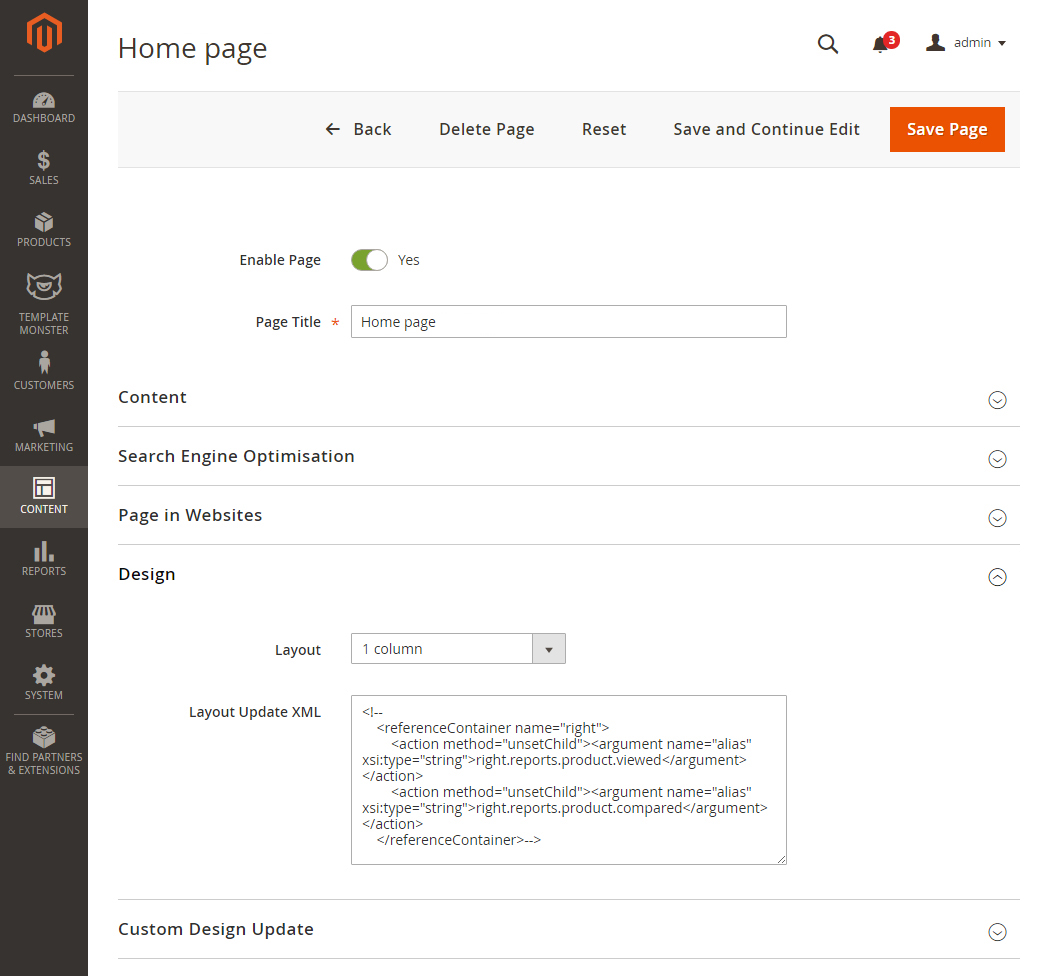
- Don't forget to select the valid "Layout" option.
- In case you need to add a new page, click the "Add New Page" button in the top right corner.
Useful Tutorials:
- How to add content to Contact Us page?
- How to add new Page?
- How to add new Widget on the Page?
- How to add the CMS Page link to Main Menu?
Widgets Configuration
Banner Box

Create the banner_box block
- In the top menu navigate to Content > Blocks.
- In the top right corner click the Add New block button to add a new static block.
-
Specify the block name and identifier. You can get the block details from the Template Settings table.
- Open the sources\demo\blocks\banner_box.phtml file and copy the HTML code into the CMS Static Block content area. See the tutorial on How to add CMS Static Block.
- Save the settings.
Create the banner_box widget
- In the top menu navigate to Content > Widgets
- In the top right corner click the Add Widget button to add a new widget.
- Set the widget type to CMS Static Block and select the theme that you want to apply the widget to, then click Continue button. See the tutorial on How to add new Widget.
-
On the next page in the Widget Title field enter the name of the widget which will be displayed in the admin panel. In the Assign to Store Views field you need to select store views where you want the widget displayed on. Set Sort Order to 1. Move to the Layout Updates section and click on the Add Layout Update button.
-
In the Display On select Specified Page. Choose CMS Home Page for the Page option. Set Container option to Main Content Area. You can get the widget details from the Template Settings table.
- In the left sidebar click Widget Options tab and select the static block you are referring to (banner_box). Don't forget to save changes.
How to change the banner_box images?
- To change the banner link go to the Content > Blocks section.
- Find the static block you want to change (it's the banner_box block in our case).
- Select Edit from the Action option dropdown.
- You'll see the banner content field. Select the code which is responsible for the image display (e.g. <img src="{{view url=''}}/images/media/banner-1.jpg"/>).
- Delete the code and press the Insert Image button. Upload the new banner image (click Browse) and press on the Insert File button.
- Save the widget settings.
Banner_box images:
- banner-1.jpg — 570 x 660 px
- banner-2.jpg — 270 x 320 px
- banner-3.jpg — 270 x 320 px
- banner-4.jpg — 570 x 320 px
How to change the banner_box widget text?

- You also can change the block content.
- In order to do this, go to the Content > Blocks section.
- Find the banner_box static block.
- Select Edit from the Action option dropdown.
- You will see CMS block settings interface.
- Now, you're able to edit the block content in the content field.
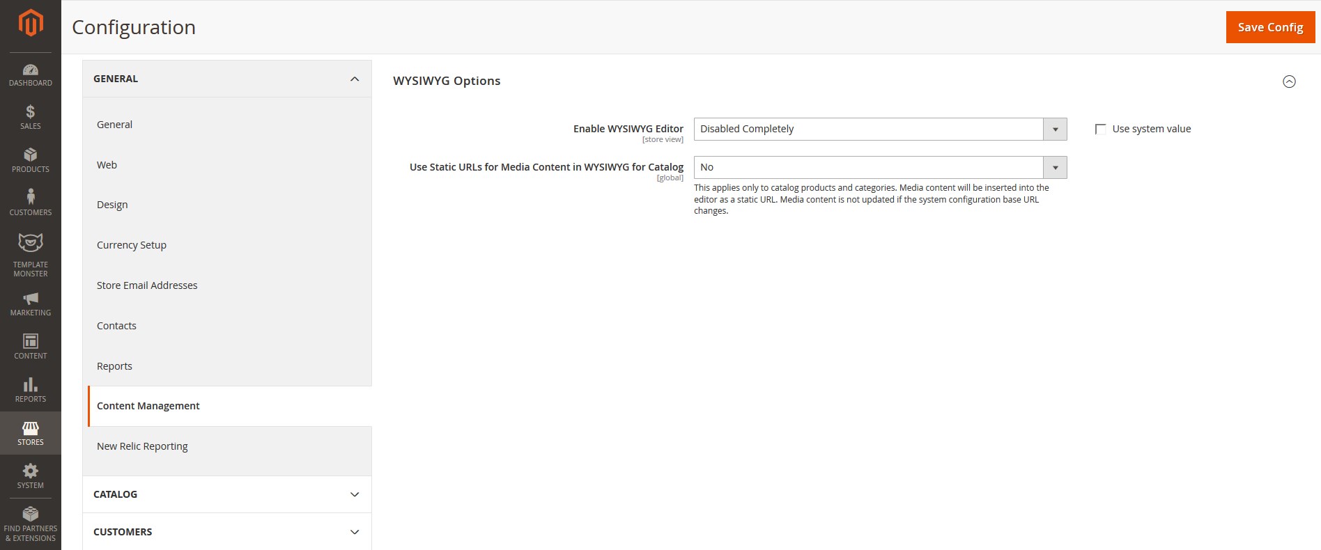
- Full HTML support is provided. (To activate HTML editor, press the Show / Hide Editor button. See the tutorial on How to enable the WYSIWYG editor.)
- You can change the text which is between the angle brackets ( >text< ).
- Remember to save the settings.
How to change banner_box link?
- To change the banner link go to the Content > Blocks section.
- Find the static block you want to change (it's the banner_box block in our case).
- Select Edit from the Action option dropdown.
- You will see CMS block settings interface. Now, you're able to edit the block content in the content field. Full HTML support is provided. (To activate HTML editor, press the Show / Hide Editor button. See the tutorial on How to enable the WYSIWYG editor.)
- Find the <a href="{{store url='XXX.html'}}"> code. Replace the XXX with the needed page or category URL Key.
- Remember to save the settings.
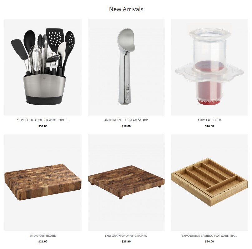
New Arrivals
Create New Arrivals widget
- In the top menu navigate to Content > Widgets
- In the top right corner click the Add Widget button to add a new widget.
- Set the widget type to Featured Products and select the theme that you want to apply the widget to, then click Continue button. See the tutorial on How to add new Widget.
-
On the next page in the Widget Title field enter the name of the widget which will be displayed in the admin panel. In the Assign to Store Views field you need to select store views where you want the widget displayed on. Set Sort Order to 2. Move to the Layout Updates section and click on the Add Layout Update button.
-
In the Display On select Specified Page. Choose CMS Home Page for the Page option. Set Container option to Main Content Area. Choose Products Grid template for the widget. You can find the widget details in the Template Settings table.
- Switch to the Widget Options tab and complete the widget settings as below:
# Option Name Value General Tab:
1. Status Enable 2. Product Types New Products 3. New Products Title New Arrivals View Tab:
1. Product Image Width 370 2. Product Image Height 459 3. Product Name Length 30 4. Products to Display 6 5. Carousel No 6. Number of Products per Row 3 Labels Tab:
1. Show Label No View Tab:
1. Use Banner No Gallery Tab:
1. Choose Hover Type Default - Don't forget to save changes.
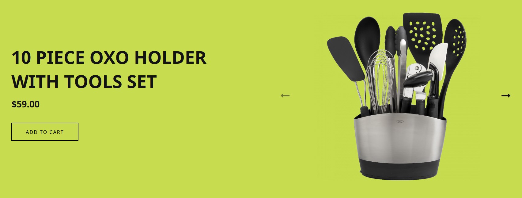
Featured Products
Create Featured Products widget
- In the top menu navigate to Content > Widgets
- In the top right corner click the Add Widget button to add a new widget.
- Set the widget type to Featured Products and select the theme that you want to apply the widget to, then click Continue button. See the tutorial on How to add new Widget.
-
On the next page in the Widget Title field enter the name of the widget which will be displayed in the admin panel. In the Assign to Store Views field you need to select store views where you want the widget displayed on. Set Sort Order to 2. Move to the Layout Updates section and click on the Add Layout Update button.
-
In the Display On select Specified Page. Choose CMS Home Page for the Page option. Set Container option to Main Content Area. Choose Products Grid template for the widget. You can find the widget details in the Template Settings table.
- Switch to the Widget Options tab and complete the widget settings as below:
# Option Name Value General Tab:
1. Status Enable 2. Product Types New Products 3. New Products Title Manual Products. Move to the Choose custom products option and press the Select... button and choose the products you want to show in the widget, then tab Add Product. You should see the "Products selected" message. 4. Css class fullwidth-product View Tab:
1. Product Image Width 550 2. Product Image Height 682 3. Products to Display 3 4. Carousel Yes 5. Number of Products per View 1 6. Use Arrows Yes 7. Prev Button CSS Class fa fa-long-arrow-left 8. Next Button CSS Class fa fa-long-arrow-right 9. Use Pagination No Labels Tab:
1. Show Label No View Tab:
1. Use Banner No Gallery Tab:
1. Choose Hover Type Default - Don't forget to save changes.
Shop by Brands

Note, you should first add some brands (with logo) to display and assign products to each brand.
Useful Tutorials:
Create Shop by Brands Widget
- In the top menu navigate to Content > Widgets
- In the top right corner click the Add Widget button to add a new widget.
- Set the widget type to Shop by Brand and select the theme that you want to apply the widget to, then click Continue button. See the tutorial on How to add new Widget.
-
On the next page in the Widget Title field enter the name of the widget which will be displayed in the admin panel. In the Assign to Store Views field you need to select store views where you want the widget displayed on. Set Sort Order to 4. Move to the Layout Updates section and click on the Add Layout Update button.
-
In the Display On select Specified Page. Choose CMS Home Page for the Page option. Set Container option to Main Content Area. You can find the widget details in the Template Settings table.
- Switch to the Widget Options tab and complete the widget settings as below:
# Option Name Value 1. Status Enable 2. Brands Amount 12 (depends on the number of in-store brands) 3. Carousel Yes 4. Brands Per View 8 5. Brands Logo Width 305 6. Show Brand Title No 7. Choose brands Select brands you want to show in the widget. To select multiple brands, hold down the Ctrl button. - Don't forget to save changes.
Catalog Image Grid

Note, the selected category should have at least 2 subcategories. Also, Categories should have the Thumbnail Images.
- Go to Products > Categories. Select the category (subcategory) you want to display within the widget.
- Navigate to the Catalog Images Grid tab.
- Activate Image Grid for the category (subcategory) and upload the thumbnail image.
- Remember to save the settings.
Thumbnail Images:
- cat-1.jpg - 960x682px
- cat-2.jpg - 960x682px
You can find these images in the pub/media/catalog/category folder.
Useful Tutorials:
- How to manage Catalog Images Grid module?
- How to add Catalog Image Grid widget?
- How to set the category thumbnail image?
- Magento 2. Manage Product Categories.
- How to "disable" the Category Image Grid widget?
Create Catalog image Grid Widget
- In the top menu navigate to Content > Widgets
- In the top right corner click the Add Widget button to add a new widget.
- Set the widget type to Catalog Image Grid and select the theme that you want to apply the widget to, then click Continue button. See the tutorial on How to add new Widget.
-
On the next page in the Widget Title field enter the name of the widget which will be displayed in the admin panel. In the Assign to Store Views field you need to select store views where you want the widget displayed on. Set Sort Order to 5. Move to the Layout Updates section and click on the Add Layout Update button.
-
In the Display On select Specified Page. Choose CMS Home Page for the Page option. Set Container option to Main Content Area and chose the Catalog Image Grid template to use for this widget. You can find the widget details in the Template Settings table.
- Switch to the Widget Options tab and complete the widget settings as below:
# Option Name Value 1. Status Enable 2. Category select category with 2 subcategories in it. 3. Title Catalog image Grid (for internal reference only) 4. Use Image Thumbnail Image 5. Category Images Enable 6. Subcategory Images Disable 7. Columns count 2 8. Count of categories to show 2 9. Show "View More" button Disable - Don't forget to save changes.
Recent Blog Posts

Note, you should first add some blog posts to display in the widget.
Useful Tutorials:
- Magento. Customize the Sharing Buttons
- How to add a new blog post?
- How to add a new blog category?
- How to show “Blog” link in the Menu?
- How to enable Blog extension?
- How to manage Blog extension?
Create Recent Blog Posts Widget
- In the top menu navigate to Content > Widgets
- In the top right corner click the Add Widget button to add a new widget.
- Set the widget type to Resent Blog Posts and select the theme that you want to apply the widget to, then click Continue button.
-
On the next page in the Widget Title field enter the name of the widget which will be displayed in the admin panel. In the Assign to Store Views field you need to select store views where you want the widget displayed on. Set Sort Order to 6. Move to the Layout Updates section and click on the Add Layout Update button.
-
In the Display On select Specified Page. Choose CMS Home Page for the Page option. Set Container option to Main Content Area and chose the Post Grid template to use for this widget. You can find the widget details in the Template Settings table.
- Switch to the Widget Options tab and complete the widget settings as below:
# Option Name Value 1. Status Enable 2. Title Recipes for the Culinary Enthusiast 3. Post amount 3 4. Post amount per row 3 5. Enable carousel No - Don't forget to save changes.
Slider settings

First you should create new slider.
Go to TemplateMonster > Sliders section.
To add new slider click Add New Slider button in the top right corner.
On the slider configuration screen in General Options section you can see all available slider settings. Slider Items section allows you to add slides to your slider.
Then complete the settings as below:
General Setting (click to expand ▼)
Main settings
Enter the slider title (only for internal reference).
| # | Option Name | Option Value |
|---|---|---|
| 1. | Status | Enable |
| 2. | Slide width | 100% |
| 3. | Slide height | 990 |
Image settings
| # | Option Name | Option Value |
|---|---|---|
| 1. | The aspect ratio | 1.94 |
| 2. | Image Scale Mode | Cover |
| 3. | Allow Scale Up | Enable |
| 4. | Auto Height | Disable |
| 5. | Center Image | Enable |
| 6. | Orientation | Horizontal |
| 7. | Force Size | None |
Slides settings
| # | Option Name | Option Value |
|---|---|---|
| 1. | Slide Animation Duration | 700 |
| 2. | Height Animation Duration | 700 |
| 3. | Visible Size | auto |
| 4. | Start Slide | 0 |
| 5. | Shuffle | Disable |
| 6. | Loop | Enable |
Fade Animation settings
| # | Option Name | Option Value |
|---|---|---|
| 1. | Fade | Disable |
| 2. | Fade Out Previous Slide | Enable |
| 3. | Fade Duration | 500 |
Auto Play settings
| # | Option Name | Option Value |
|---|---|---|
| 1. | Auto Play | Enable |
| 2. | Auto Play Delay | 7000 |
| 3. | Auto Play Direction | Normal |
| 4. | Auto Play On Hover | Pause |
Controls settings
| # | Option Name | Option Value |
|---|---|---|
| 1. | Arrows | Disable |
| 2. | Fade Arrows | Enable |
| 3. | Buttons | Enable |
| 4. | Keyboard | Enable |
| 5. | Full Screen | Disable |
| 6. | Fade Full Screen | Enable |
Responsive settings
| # | Option Name | Option Value |
|---|---|---|
| 1. | Responsive | Enable |
| 2. | Touch Swipe | Enable |
| 3. | Touch Swipe Threshold | 50 |
| 4. | Small Size | 480 |
| 5. | Medium Size | 758 |
| 6. | Large Size | 1024 |
Caption settings
| # | Option Name | Option Value |
|---|---|---|
| 1. | Fade Caption | Enable |
| 2. | Caption Fade Duration | 5000 |
Layers main settings
| # | Option Name | Option Value |
|---|---|---|
| 1. | Wait For Layers | Disable |
| 2. | Auto Scale Layers | Enable |
| 3. | Auto Scale Reference | 1920 |
You can add new slides only after saving the slider. Click Save and Continue Edit button in the top right corner. When the slider is saved, switch to Slider Items tab.
Click Add Slide button to add a new slide.
First Slide Settings (click to expand ▼)
Layers settings
To add layer to the slide, tab Layers Settings and click Add Layer button.
Layer 1 (new fall)
Content
| # | Option Name | Option Value |
|---|---|---|
| 1. | Text/HTML | new fall (center alignment) |
| 2. | Width | 810px |
| 3. | Text Color | #ffffff |
| 4. | Font Size | 70px |
| 5. | Line Height | 90px |
| 6. | Font Style | Normal |
| 7. | Font Weight | 400 |
Appearance
| # | Option Name | Option Value |
|---|---|---|
| 1. | CSS Class | title-1 |
| 2. | Horizontal Position | 1.9% |
| 3. | Vertical Position | 23.9% |
| 4. | CSS Class | title-1 |
Animation
| # | Option Name | Option Value |
|---|---|---|
| 1. | Layer Position | Top Left |
| 2. | Show Transition | Down |
| 3. | Show Offset | 500 |
| 4. | Show Duration | 500 |
| 5. | Show Delay | 500 |
| 6. | Hide Transition | Down |
| 7. | Hide Offset | 200 |
Layer 2 (20)
Content
| # | Option Name | Option Value |
|---|---|---|
| 1. | Text/HTML | 20 |
| 2. | Width | 810 |
| 3. | Text Color | #fff |
| 4. | Font Size | 350px |
| 5. | Line Height | 1.2 |
| 6. | Font Style | Normal |
| 7. | Font Weight | 700 |
Appearance
| # | Option Name | Option Value |
|---|---|---|
| 1. | CSS Class | title-4 |
| 2. | Horizontal Position | 9.9% |
| 3. | Vertical Position | -2.2% |
Animation
| # | Option Name | Option Value |
|---|---|---|
| 1. | Layer Position | Center Right |
| 2. | Show Transition | Left |
| 3. | Hide Transition | Down |
| 4. | Show Offset | 600 |
| 5. | Hide Offset | 200 |
Layer 3 (%)
Content
| # | Option Name | Option Value |
|---|---|---|
| 1. | Text/HTML | % |
| 2. | Width | 810px |
| 3. | Text Color | #fff |
| 4. | Font Size | 260 |
| 5. | Line Height | 1.2 |
| 6. | Font Style | Normal |
| 7. | Font Weight | 400 |
Appearance
| # | Option Name | Option Value |
|---|---|---|
| 1. | CSS Class | title-5 |
| 2. | Horizontal Position | -11% |
| 3. | Vertical Position | -13% |
Animation
| # | Option Name | Option Value |
|---|---|---|
| 1. | Layer Position | Cr |
| 2. | Show Transition | Up |
| 3. | Hide Transition | Down |
| 4. | Show Offset | 700 |
| 5. | Hide Offset | 200 |
| 6. | Show Duration | 700 |
| 7. | Show Delay | 700 |
Layer 4 (%)
Content
| # | Option Name | Option Value |
|---|---|---|
| 1. | Text/HTML | % (center alignment) |
| 2. | Width | 810px |
| 3. | Text Color | #BBDC3F |
| 4. | Font Size | 260px |
| 5. | Line Height | 1.2 |
| 6. | Font Style | Normal |
| 7. | Font Weight | 700 |
Appearance
| # | Option Name | Option Value |
|---|---|---|
| 1. | CSS Class | title-4 |
| 2. | Horizontal Position | 1007 |
| 3. | Vertical Position | 253 |
Animation
| # | Option Name | Option Value |
|---|---|---|
| 1. | Layer Position | Top Left |
| 2. | Show Transition | Left |
| 3. | Hide Transition | Right |
| 4. | Show Offset | 600 |
| 5. | Hide Offset | 200 |
| 6. | Show Duration | 600 |
| 7. | Show Delay | 600 |
Layer 5 (off)
Content
| # | Option Name | Option Value |
|---|---|---|
| 1. | Text/HTML | off (center alignment) |
| 2. | Width | 810px |
| 3. | Text Color | #BBDC3F |
| 4. | Font Size | 100px |
| 5. | Line Height | 1.2 |
| 6. | Font Style | Normal |
| 7. | Font Weight | 700 |
Appearance
| # | Option Name | Option Value |
|---|---|---|
| 1. | CSS Class | title-4 |
| 2. | Horizontal Position | 983 |
| 3. | Vertical Position | 493 |
Animation
| # | Option Name | Option Value |
|---|---|---|
| 1. | Layer Position | Top Left |
| 2. | Show Transition | Left |
| 3. | Hide Transition | Right |
| 4. | Show Offset | 600 |
| 5. | Hide Offset | 200 |
| 6. | Show Duration | 600 |
| 7. | Show Delay | 600 |
Second Slide Settings (click to expand ▼)
Layers settings
To add layer to the slide, tab Layers Settings and click Add Layer button.
Layer 1 (new fall)
Content
| # | Option Name | Option Value |
|---|---|---|
| 1. | Text/HTML | new fall (center alignment) |
| 2. | Width | 810px |
| 3. | Text Color | #2A2627 |
| 4. | Font Size | 70px |
| 5. | Line Height | 90px |
| 6. | Font Style | Normal |
| 7. | Font Weight | 400 |
Appearance
| # | Option Name | Option Value |
|---|---|---|
| 1. | CSS Class | title-1 |
| 2. | Horizontal Position | 787 |
| 3. | Vertical Position | 230 |
Animation
| # | Option Name | Option Value |
|---|---|---|
| 1. | Layer Position | Top Left |
| 2. | Show Transition | Down |
| 3. | Hide Transition | Up |
| 4. | Show Offset | 500 |
| 5. | Hide Offset | 200 |
| 6. | Show Duration | 500 |
| 7. | Show Delay | 500 |
Layer 2 (10)
Content
| # | Option Name | Option Value |
|---|---|---|
| 1. | Text/HTML | 10 (center alignment) |
| 2. | Width | 810px |
| 3. | Text Color | #D64D41 |
| 4. | Font Size | 350px |
| 5. | Line Height | 1.2 |
| 6. | Font Style | Normal |
| 7. | Font Weight | 700 |
Appearance
| # | Option Name | Option Value |
|---|---|---|
| 1. | CSS Class | title-4 |
| 2. | Horizontal Position | 671 |
| 3. | Vertical Position | 239 |
Animation
| # | Option Name | Option Value |
|---|---|---|
| 1. | Layer Position | Top Left |
| 2. | Show Transition | Left |
| 3. | Hide Transition | Right |
| 4. | Show Offset | 600 |
| 5. | Hide Offset | 200 |
| 6. | Show Duration | 600 |
| 7. | Show Delay | 600 |
Layer 3 (Curry Pastes)
Content
| # | Option Name | Option Value |
|---|---|---|
| 1. | Text/HTML | Curry Pastes (center alignment) |
| 2. | Width | 810px |
| 3. | Text Color | #2A2627 |
| 4. | Font Size | 70px |
| 5. | Line Height | 90px |
| 6. | Font Style | Normal |
| 7. | Font Weight | 400 |
Appearance
| # | Option Name | Option Value |
|---|---|---|
| 1. | CSS Class | title-3 |
| 2. | Horizontal Position | 786 |
| 3. | Vertical Position | 628 |
Animation
| # | Option Name | Option Value |
|---|---|---|
| 1. | Layer Position | Top Left |
| 2. | Show Transition | Up |
| 3. | Hide Transition | Down |
| 4. | Show Offset | 700 |
| 5. | Hide Offset | 200 |
| 6. | Show Duration | 700 |
| 7. | Show Delay | 700 |
Layer 4 (%)
Content
| # | Option Name | Option Value |
|---|---|---|
| 1. | Text/HTML | % (center alignment) |
| 2. | Width | 810px |
| 3. | Text Color | #D64D41 |
| 4. | Font Size | 260px |
| 5. | Line Height | 1.2 |
| 6. | Font Style | Normal |
| 7. | Font Weight | 700 |
Appearance
| # | Option Name | Option Value |
|---|---|---|
| 1. | CSS Class | title-4 |
| 2. | Horizontal Position | 1007 |
| 3. | Vertical Position | 253 |
Animation
| # | Option Name | Option Value |
|---|---|---|
| 1. | Layer Position | Top Left |
| 2. | Show Transition | Left |
| 3. | Hide Transition | Right |
| 4. | Show Offset | 600 |
| 5. | Hide Offset | 200 |
| 6. | Show Duration | 600 |
| 7. | Show Delay | 600 |
Layer 5 (off)
Content
| # | Option Name | Option Value |
|---|---|---|
| 1. | Text/HTML | off (center alignment) |
| 2. | Width | 810px |
| 3. | Text Color | #D64D41 |
| 4. | Font Size | 100px |
| 5. | Line Height | 1.2 |
| 6. | Font Style | Normal |
| 7. | Font Weight | 700 |
Appearance
| # | Option Name | Option Value |
|---|---|---|
| 1. | CSS Class | title-4 |
| 2. | Horizontal Position | 983 |
| 3. | Vertical Position | 493 |
Animation
| # | Option Name | Option Value |
|---|---|---|
| 1. | Layer Position | Top Left |
| 2. | Show Transition | Left |
| 3. | Hide Transition | Right |
| 4. | Show Offset | 600 |
| 5. | Hide Offset | 200 |
| 6. | Show Duration | 600 |
| 7. | Show Delay | 600 |
Third Slide Settings (click to expand ▼)
Layers settings
To add layer to the slide, tab Layers Settings and click Add Layer button.
Layer 1 (new fall)
Content
| # | Option Name | Option Value |
|---|---|---|
| 1. | Text/HTML | new fall (center alignment) |
| 2. | Width | 810px |
| 3. | Text Color | #FFFFFF |
| 4. | Font Size | 70px |
| 5. | Line Height | 90px |
| 6. | Font Style | Normal |
| 7. | Font Weight | 400 |
Appearance
| # | Option Name | Option Value |
|---|---|---|
| 1. | CSS Class | title-1 |
| 2. | Horizontal Position | 787 |
| 3. | Vertical Position | 230 |
Animation
| # | Option Name | Option Value |
|---|---|---|
| 1. | Layer Position | Top Left |
| 2. | Show Transition | Down |
| 3. | Hide Transition | Up |
| 4. | Show Offset | 500 |
| 5. | Hide Offset | 200 |
| 6. | Show Duration | 500 |
| 7. | Show Delay | 500 |
Layer 2 (10)
Content
| # | Option Name | Option Value |
|---|---|---|
| 1. | Text/HTML | 10 (center alignment) |
| 2. | Width | 810px |
| 3. | Text Color | #BBDC3F |
| 4. | Font Size | 350px |
| 5. | Line Height | 1.2 |
| 6. | Font Style | Normal |
| 7. | Font Weight | 700 |
Appearance
| # | Option Name | Option Value |
|---|---|---|
| 1. | CSS Class | title-4 |
| 2. | Horizontal Position | 688 |
| 3. | Vertical Position | 232 |
Animation
| # | Option Name | Option Value |
|---|---|---|
| 1. | Layer Position | Top Left |
| 2. | Show Transition | Left |
| 3. | Hide Transition | Right |
| 4. | Show Offset | 600 |
| 5. | Hide Offset | 200 |
| 6. | Show Duration | 600 |
| 7. | Show Delay | 600 |
Layer 3 (Herbs & Spices)
Content
| # | Option Name | Option Value |
|---|---|---|
| 1. | Text/HTML | Herbs & Spices (center alignment) |
| 2. | Width | 810px |
| 3. | Text Color | #FFFFFF |
| 4. | Font Size | 70px |
| 5. | Line Height | 90px |
| 6. | Font Style | Normal |
| 7. | Font Weight | 400 |
Appearance
| # | Option Name | Option Value |
|---|---|---|
| 1. | CSS Class | title-3 |
| 2. | Horizontal Position | 786 |
| 3. | Vertical Position | 628 |
Animation
| # | Option Name | Option Value |
|---|---|---|
| 1. | Layer Position | Top Left |
| 2. | Show Transition | Up |
| 3. | Hide Transition | Down |
| 4. | Show Offset | 700 |
| 5. | Hide Offset | 200 |
| 6. | Show Duration | 700 |
| 7. | Show Delay | 700 |
Layer 4 (%)
Content
| # | Option Name | Option Value |
|---|---|---|
| 1. | Text/HTML | % (center alignment) |
| 2. | Width | 810px |
| 3. | Text Color | #BBDC3F |
| 4. | Font Size | 260px |
| 5. | Line Height | 1.2 |
| 6. | Font Style | Normal |
| 7. | Font Weight | 700 |
Appearance
| # | Option Name | Option Value |
|---|---|---|
| 1. | CSS Class | title-4 |
| 2. | Horizontal Position | 1007 |
| 3. | Vertical Position | 253 |
Animation
| # | Option Name | Option Value |
|---|---|---|
| 1. | Layer Position | Top Left |
| 2. | Show Transition | Left |
| 3. | Hide Transition | Right |
| 4. | Show Offset | 600 |
| 5. | Hide Offset | 200 |
| 6. | Show Duration | 600 |
| 7. | Show Delay | 600 |
Layer 5 (off)
Content
| # | Option Name | Option Value |
|---|---|---|
| 1. | Text/HTML | off (center alignment) |
| 2. | Width | 810px |
| 3. | Text Color | #BBDC3F |
| 4. | Font Size | 100px |
| 5. | Line Height | 1.2 |
| 6. | Font Style | Normal |
| 7. | Font Weight | 700 |
Appearance
| # | Option Name | Option Value |
|---|---|---|
| 1. | CSS Class | title-4 |
| 2. | Horizontal Position | 983 |
| 3. | Vertical Position | 493 |
Animation
| # | Option Name | Option Value |
|---|---|---|
| 1. | Layer Position | Top Left |
| 2. | Show Transition | Left |
| 3. | Hide Transition | Right |
| 4. | Show Offset | 600 |
| 5. | Hide Offset | 200 |
| 6. | Show Duration | 600 |
| 7. | Show Delay | 600 |
Fourth Slide Settings (click to expand ▼)
Layers settings
To add layer to the slide, tab Layers Settings and click Add Layer button.
Layer 1 (PALEO, GMO, & MSG)
Content
| # | Option Name | Option Value |
|---|---|---|
| 1. | Text/HTML | PALEO, GMO, & MSG (center alignment) |
| 2. | Width | 810px |
| 3. | Text Color | #2A2627 |
| 4. | Font Size | 70px |
| 5. | Line Height | 90px |
| 6. | Font Style | Normal |
| 7. | Font Weight | 400 |
Appearance
| # | Option Name | Option Value |
|---|---|---|
| 1. | CSS Class | title-1 |
| 2. | Horizontal Position | 787 |
| 3. | Vertical Position | 230 |
Animation
| # | Option Name | Option Value |
|---|---|---|
| 1. | Layer Position | Top Left |
| 2. | Show Transition | Down |
| 3. | Hide Transition | Up |
| 4. | Show Offset | 500 |
| 5. | Hide Offset | 200 |
| 6. | Show Duration | 500 |
| 7. | Show Delay | 500 |
Layer 2 (FREE)
Content
| # | Option Name | Option Value |
|---|---|---|
| 1. | Text/HTML | FREE (center alignment) |
| 2. | Width | 810px |
| 3. | Text Color | #D64D41 |
| 4. | Font Size | 350px |
| 5. | Line Height | 1.2 |
| 6. | Font Style | Normal |
| 7. | Font Weight | 700 |
Appearance
| # | Option Name | Option Value |
|---|---|---|
| 1. | CSS Class | title-2 |
| 2. | Horizontal Position | 789 |
| 3. | Vertical Position | 234 |
Animation
| # | Option Name | Option Value |
|---|---|---|
| 1. | Layer Position | Top Left |
| 2. | Show Transition | Left |
| 3. | Hide Transition | Right |
| 4. | Show Offset | 600 |
| 5. | Hide Offset | 200 |
| 6. | Show Duration | 600 |
| 7. | Show Delay | 600 |
Layer 3 (SEASONINGS)
Content
| # | Option Name | Option Value |
|---|---|---|
| 1. | Text/HTML | SEASONINGS (center alignment) |
| 2. | Width | 810px |
| 3. | Text Color | #2A2627 |
| 4. | Font Size | 70px |
| 5. | Line Height | 90px |
| 6. | Font Style | Normal |
| 7. | Font Weight | 400 |
Appearance
| # | Option Name | Option Value |
|---|---|---|
| 1. | CSS Class | title-3 |
| 2. | Horizontal Position | 786 |
| 3. | Vertical Position | 628 |
Animation
| # | Option Name | Option Value |
|---|---|---|
| 1. | Layer Position | Top Left |
| 2. | Show Transition | Up |
| 3. | Hide Transition | Down |
| 4. | Show Offset | 700 |
| 5. | Hide Offset | 200 |
| 6. | Show Duration | 700 |
| 7. | Show Delay | 700 |
Add Slider Widget
- In the top menu navigate to Content > Widgets
- In the top right corner click the Add Widget button to add a new widget.
- Set the widget type to FilmSlider and select the theme that you want to apply the widget to (your new theme), then click Continue button.
-
On the next page in the Widget Title field enter the name of the widget which will be displayed in the admin panel. In the Assign to Store Views field you need to select store views where you want the widget displayed on. Move to the Layout Updates section and click on the Add Layout Update button.
-
In the Display On select Specified Page. Choose CMS Home Page for the Page option. Set Container option to After Page Header. You can get the widget details from the Template Settings table.
- In the left sidebar click Widget Options tab and select the slider you want to insert. Don't forget to save changes.
How to Change the Newsletter Text
Navigate to your Magento root folder on your server. Then, go to the app\design\frontend\TemplateMonster\themeXXX\Magento_Newsletter\templates folder. (XXX — your theme number)
Open the subscribe.phtml file. Enter the text you want to display within the newsletter block (replacing the old one). Remember to save the file.
* You can change the footer newsletter text with a help of "Translate Inline" tool.
How to change the copyright message
- Navigate to the Stores > Settings > Configuration section.
- Then choose the TEMPLATEMONSTER > Theme Options in the left side menu and you’ll move to the module settings interface.
- Click on the Store View: Default Config.
- Select a Store View (if you have some) you want to modify from the option dropdown.
- Confirm the scope switching in the pop-up window. Press “OK” to confirm.
- Go to the General section.
- Expand the SEO tab.
- Input your copyright massage you want to be displayed in the footer in the Copyright option text field.
- Click on the Save Config button and refresh the Magento cache.
How to change the favicon icon
- Navigate to the Stores > Settings > Configuration section.
- Then choose the TEMPLATEMONSTER > Theme Options in the left side menu and you’ll move to the module settings interface.
- Go to the General section.
- Expand the SEO tab.
- Navigate to the Favicon icon option. Click on the Browse button to upload the Favicon icon. Allowed file types: ico, png, gif, jpg, jpeg, apng, svg.
- Click on the Save Config button and refresh the Magento cache.
Check the tutorial on how to edit footer links block.
Check the tutorials below:
- How can I find out the banner image name and size?
- How to change the Banner image?
- How to change/remove footer links?
- How to manage top (header) links?
- How to edit core footer links?
- How to change default welcome text?
- How to change the copyright message?
- How to change the favicon icon?
- How to change the Logo (Theme Options)?
- How to change the newsletter block text?
- How to add content to Contact Us page?
Template Settings
Configuration of display static blocks/widgets on different layouts shown in the table below.
Page Configuration
| # | Page Name | Page HTML (Content tab) | Page XML (Design tab) | Layout |
|---|---|---|---|---|
| 1. | Home Page | sources\demo\pages\home.phtml | sources\demo\pages\home.xml | 1 column |
| 2. | About Us | sources\demo\pages\about-us.phtml | sources\demo\pages\about-us.xml | 1 column |
| 3. | Customer Service | sources\demo\pages\customer-service.phtml | NA | 1 column |
| 4. | Privacy Policy | sources\demo\pages\privacy-policy-cookie-restriction-mode.phtml | NA | 1 column |
| 5. | Shipping & Delivery | sources\demo\pages\shipping-delivery.phtml | NA | 1 column |
| 6. | FAQ | sources\demo\pages\faq.phtml | NA | 1 column |
| 7. | Support | sources\demo\pages\support.phtml | NA | 1 column |
| 8. | Guarantee | sources\demo\pages\guarantee.phtml | NA | 1 column |
| 9. | Secure payment | sources\demo\pages\secure-payment.phtml | NA | 1 column |
| 10. | Terms & Conditions | sources\demo\pages\terms-conditions.phtml | NA | 1 column |
Static Blocks Configuration
| # | Block Title | Identifier | Content |
|---|---|---|---|
| 1. | Footer column content 2 | footer_col_2 | sources\demo\blocks\footer_col_2.phtml |
| 2. | Footer column content 3 | footer_col_3 | sources\demo\blocks\footer_col_3.phtml |
| 3. | Footer column content 4 | footer_col_4 | sources\demo\blocks\footer_col_4.phtml |
| 4. | Footer column 2 title | footer_col_2_title | sources\demo\blocks\footer_col_2_title.phtml |
| 5. | Footer column content 1 | footer_col_1 | sources\demo\blocks\footer_col_1.phtml |
| 6. | Banner_box | banner_box | sources\demo\blocks\banner_box.phtml |
| 7. | Banners_menu | banners_menu | sources\demo\blocks\banners_menu.phtml |
| 8. | footer_info_block | footer_info_block | sources\demo\blocks\footer_info_block.phtml |
Widgets Configuration
| # | Widget Name | Widget Type | Block Reference | Template / (Static Blocks) | Sort Order |
|---|---|---|---|---|---|
| 1. | Banner_box | CMS Static Block | Main Content Area | CMS Static Block Default Template / Banner_box CMS Static Block | 1 |
| 2. | Home Page Slider | FilmSlider | After Page Header | Custom Slider | 1 |
| 3. | New Arrivals | CMS Static Block | Main Content Area | Products Grid / Custom Products | 2 |
| 4. | Featured Products | Featured Products | Main Content Area | Products Grid / Custom Products | 3 |
| 5. | Shop by Brands | Shop by Brand | Main Content Area | Template for Default Version / Custom Brands | 4 |
| 6. | Catalog Image Grid | CMS Block | Main Content Area | Catalog Image Grid / Custom Categories + Thumbnails | 5 |
| 7. | Recent Blog Posts | Blog Latest Posts | Main Content Area | Post Grid / Custom Blog Posts | 6 |