This block contains information on how to use JetTabs widgets. The plugin includes Accordion, Image Accordion and Tabs widgets.
Accordion
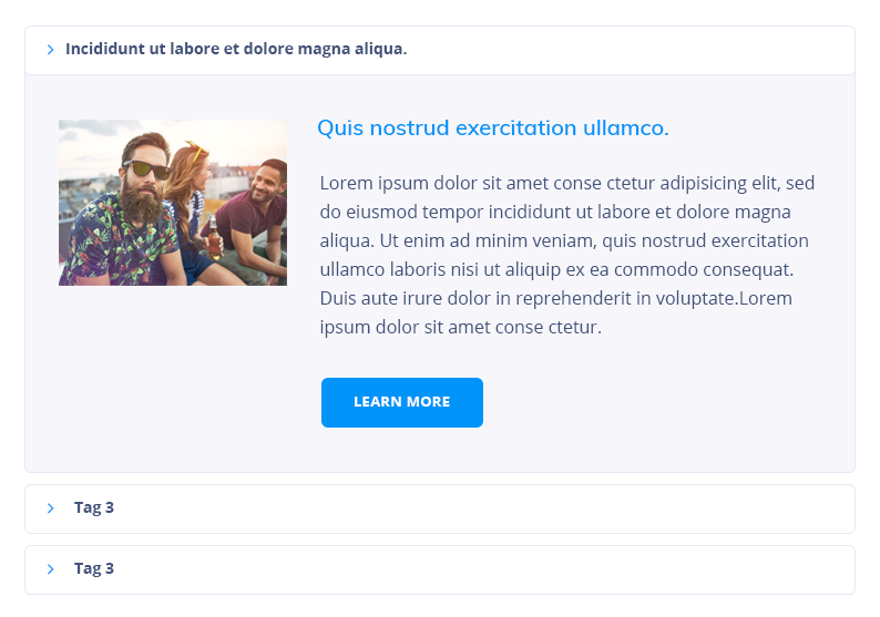
Accordion widget is the perfect tool for adding content templates built with Elementor to the Accordion items, which can be structured according to Your needs and styled up.
Content
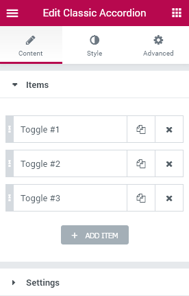
Items
Add Item - click Add Item button to add the new toggle item to the Accordion block.
Active - enable this option to make the toggle active in the Accordion.
Icon - here you can set the icon to be used as the major item icon.
Active Icon - select one of the icons from the dropdown in order to set it as the Active toggle item.
Label - type in the preferable name for the item toggle to use.
Choose Template - select one of the existing previously saved templates to place inside the Accordion toggle.
Settings
Collapsible - enable Collapsible option in order to make the Accordion items collapsible.
Style
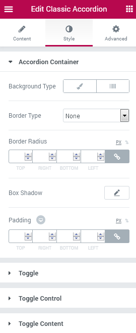
Accordion Container
Background Type — in this block you can choose, whether you want to use classic or gradient type for the Accordion container. The customization options vary for each type.
Classic Background Type
Color — here you can set background color for the Accordion container using color picker tool.
Image — here you can choose the image you want to use as a background. Select the image from the media library or upload it to define it as a background in this block. When the image is uploaded, you’ll be able to define its position, alignment, turn on repeat and set the necessary size.
Opacity — here you can define the value for the opacity of the background.
Gradient Background Type
Color — here you can set background color for the Accordion container using color picker tool.
Location — here you can define the proportion for the first color in the gradient background.
Second Color — here you can set the second color to use in the gradient background.
Location — here you can define the proportion for the second color in the gradient background.
Type — define, if you want to use linear or radial type of the gradient.
Angle — in this block you can set the angle for the gradient (in degrees).
Opacity — here you can change background opacity, where 1 is 100% opacity, and 0 — is 0% opacity.
Border Type - here you can define the type of the border you need to use for the element.
Width - here you can set the border width value in px.
Color - use the color picker tool to select the needed color for the border.
Border Radius - here you can set the border radius to make the angles more smooth and round.
Box Shadow - here you can apply the shadow for the Accordion container and change the shadow’s settings, such as color, blur, spread and position.
Padding - here you can set the preferable custom padding. Fill in the values for the top, bottom, right and left padding in pixels to apply your custom padding.
Toggle
Padding - here you can set the preferable custom padding. Fill in the values for the top, bottom, right and left padding in pixels to apply your custom padding.
Margin - input the values for the margins in the required fields.
Background Type - in this block you can choose, whether you want to use classic or gradient type for the module. The customization options vary for each type. The settings are similar to the common background type settings for other JetTabs widgets.
Border Type - here you can define the type of the border you need to use for the element.
Width - here you can set the border width value in px.
Color - use the color picker tool to select the needed color for the border.
Border Radius - here you can set the border radius to make the angles more smooth and round.
Box Shadow - here you can apply the shadow for the Accordion toggle and change the shadow’s settings, such as color, blur, spread and position.
Toggle Control
Switch between Normal, Hover and Active mode to customize Toggle Control according to your needs when the elements are active, or in the normal state.
Text Color - here you can change the first part of the text color using color picker.
Typography - turn the option on to view the typography settings. The typography settings are similar for all the JetTabs widgets and blocks.
Size — define the font size you want to use.
Family — here you can set the preferable font family.
Weight — in this block you can select the suitable font weight.
Transform — here you can choose from the dropdown menu, if you want the text to be shown in uppercase, lowercase, capitalize or normal way.
Style — in this block you can choose from the dropdown menu the style for the font. It can be normal, italic (the characters look similar to handwriting) and oblique (the characters are slightly inclined to the right).
Line Height — in this field you can set the height of the text line.
Letter Spacing — here you can set the space between letters.
Icon - click the icon options block to view all of them and change the icon color, background, etc.
Color - here you can change the color of the icon using Color Picker tool.
Background Type - here you can select the needed icon background type (the settings are similar to the ones for the other JetTabs widgets blocks background types).
Icon Size - here you can select the icon size in order for icon to fit. The settings are responsive.
Box Size - here you can select the needed icon box size. The settings are responsive.
Border Type - here you can select the needed type of the border to use for the icon box. You’ll also be able to set the border color, width and border radius.
Box Shadow - here you can apply a shadow for the icon box.
Background Type - in this block you can choose, whether you want to use classic or gradient type for the toggle. The customization options vary for each type. The settings are similar to the common background type settings for other JetTabs widgets.
Image - here you can select an image from the media library or upload one to use as the toggle background.
Border Type - here you can select the needed type of the border to use for the toggle block. You’ll also be able to set the border color, width and border radius.
Padding - here you can set the preferable custom padding. Fill in the values for the top, bottom, right and left padding in pixels to apply your custom padding.
Margin - input the values for the margins in the required fields.
Border Radius - here you can set the border radius to make the angles more smooth and round.
Box Shadow - here you can apply the shadow for the toggle and change the shadow’s settings, such as color, blur, spread and position.
Toggle Content
Background Type - in this block you can choose, whether you want to use classic or gradient type for the toggle content. The customization options vary for each type. The settings are similar to the common background type settings for other JetTabs widgets.
Margin - input the values for the margins in the required fields.
Padding - here you can set the preferable custom padding. Fill in the values for the top, bottom, right and left padding in pixels to apply your custom padding.
Border Type - here you can select the needed type of the border to use for the toggle content block.
Border Radius - here you can set the border radius to make the angles more smooth and round.
Box Shadow - here you can apply the shadow for the toggle content and change the shadow’s settings, such as color, blur, spread and position.
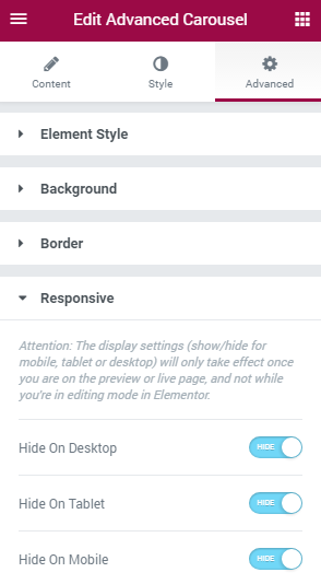
Advanced
The Advanced settings block provides opportunity to change the elements style, background and borders. The settings are similar for all of the JetTabs widgets.
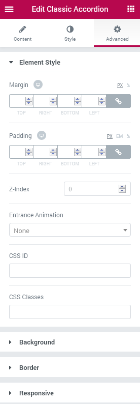
Element Style<
Margin — in this block you can input the values (in pixels) to define the margins for the module you're customizing.
Padding— here you can set the custom padding for the widget. Fill in the values for the top, bottom, right and left padding in pixels to apply your custom padding.
Z-index— input the value of the z-index to use it for the widget.
Entrance Animation- choose from the dropdown menu one of the styles for the widget to appear on the page.
Animation Duration — here you can define the time during which the widget will appear on the page. It can be normal, slow or fast. Choose the one you need from the dropdown menu.
Animation Delay (ms) — input the value (in ms) for the animation delay.
CSS Classes — here you can define the CSS class for the widget.
Background
Here you can switch from customizing Normal to Hover background style settings. Just click on the button Hover to proceed to customizing hover elements.
Background Type — in this block you can choose, whether you want to use classic or gradient type for the module background. The customization options vary for each type.
Classic Background Type
Color — here you can set background color for the background using color picker tool.
Image — here you can choose the image you want to use as a background. Select the image from the media library or upload it to define it as a background in this block. When the image is uploaded, you’ll be able to define its position, alignment, turn on repeat and set the necessary size.
Gradient Background Type
Color — here you can set background color for the module using color picker tool.
Location — here you can define the proportion for the first color in the gradient background.
Second Color — here you can set the second color to use in the gradient background.
Location — here you can define the proportion for the second color in the gradient background.
Type — define, if you want to use linear or radial type of the gradient.
Angle — in this block you can set the angle for the gradient (in degrees).
Border
Here you can switch from customizing Normal to Hover border style settings. Just click on the button Hover to proceed to customizing hover elements.
Border Type — here you can select the type of the border from the dropdown menu. Here is the list of available border types:
none;
solid;
doubled;
dotted;
dashed.
Border Radius — here you can select the radius for the applied border (in pixels).
Box Shadow — enable this option if you want to access the shadow advanced settings for this module, and need to apply shadow for it.
Shadow Settings:
color — here you can set the color for the the shadow (use color picker tool to do it);
blur — in this block you can define the blur settings for the shadow;
spread — here you can set how large the shadow will be;
horizontal — here you can move the shadow horizontally (from right to left);
vertical — here you can move the shadow vertically (from top to bottom);
position — here you need to choose, whether you want the shadow to outline the module, or to be inset.
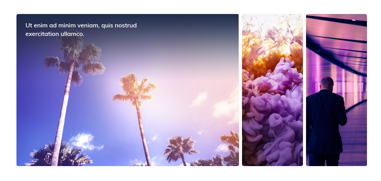
Image Accordion
Image Accordion widget is specially cut for building creative and eye-catching content, making it possible to add images into accordion items and show them up using attractive effects.
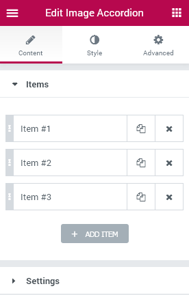
Content
Items
Add Item - click Add Item button to add more items to Image Accordion.
Image - select the image you want to use for the Image Accordion item from the media library or upload it from your hard drive.
Title - here you need to specify the title for the image.
Description - in this block you need to define the description text for the image.
Button Text - here you can set the text to be shown as the button label.
Link - in this field you can define the link to use it for the button. You can also define, if the link opens in new window, or has nofollow value.
Settings
Orientation - here you can change the Image Accordion orientation to vertical or horizontal.
Active Size (%) - here you can change the size of the active position of the accordion item in percents (it shows the percentage which the active image occupies of the full Image Accordion block).
Animation Duration - here you can set the needed animation duration in ms.
Easing - here you can select the type of easing to apply to the Image Accordion items (Circ, Back, Expo, Cubic, Quint, Sine).
Style
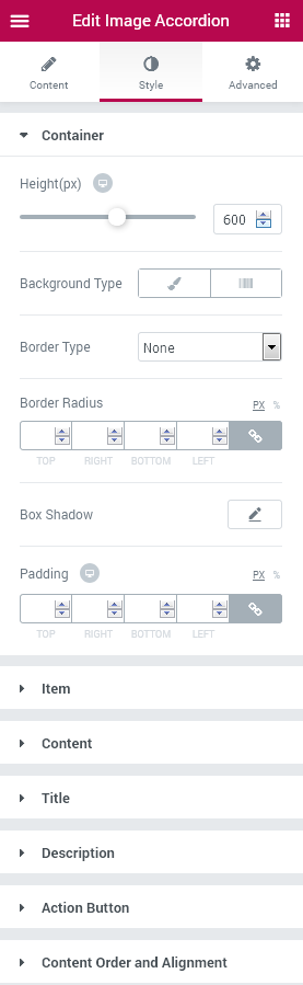
Container
Height (px) - here you can set the height of the Image Accordion widget in px and make it responsive.
Background Type - in this block you can choose, whether you want to use classic or gradient type for Image Accordion. The customization options vary for each type. The settings are similar to the common background type settings for other JetTabs widgets.
Border Type - here you can select the needed type of the border to use for the Image Accordion.
Border Radius - here you can set the border radius to make the angles more smooth and round.
Box Shadow - here you can apply the shadow for the Image Accordion widget and change the shadow’s settings, such as color, blur, spread and position.
Padding - here you can set the preferable custom padding. Fill in the values for the top, bottom, right and left padding in pixels to apply your custom padding.
Item
Item Gutter - here you can set the space gutter between the items shown in accordion, and make it responsive.
Background Type - in this block you can choose, whether you want to use classic or gradient type for the item. The customization options vary for each type. The settings are similar to the common background type settings for other JetTabs widgets.
Border Type - here you can select the needed type of the border to use for the item.
Border Radius - here you can set the border radius to make the angles more smooth and round.
Box Shadow - here you can apply the shadow for the Image Accordion item and change the shadow’s settings, such as color, blur, spread and position.
Content
Background Type - in this block you can choose, whether you want to use classic or gradient type for the content. The customization options vary for each type. The settings are similar to the common background type settings for other JetTabs widgets.
Padding - here you can set the preferable custom padding. Fill in the values for the top, bottom, right and left padding in pixels to apply your custom padding.
Text Alignment - here you can set the right, left and centered alignment for the textual content.
Title
Color - here you can set the color to use it for the item title.
Typography - turn the option on to view the typography settings. The typography settings are similar for all the JetTabs widgets and blocks.
Padding - here you can set the preferable custom padding. Fill in the values for the top, bottom, right and left padding in pixels to apply your custom padding.
Margin - input the values for the margins in the required fields.
Alignment - here you can set the alignment to use it for the title (center, right, left).
Description
Color - here you can set the color to use it for the item description text.
Typography - turn the option on to view the typography settings. The typography settings are similar for all the JetTabs widgets and blocks.
Padding - here you can set the preferable custom padding. Fill in the values for the top, bottom, right and left padding in pixels to apply your custom padding.
Margin - input the values for the margins in the required fields.
Alignment - here you can set the alignment to use it for the description text (center, right, left).
Action Button
Alignment - here you need to select the button alignment (left, right, center) and make it responsive.
Switch between Normal or Hover mode to customize the button according to your needs when the button is active, or in the normal state.
Background Color - here you can set the suitable color to use ir for the button background.
Text Color - here you should select the color to apply it to the button label text.
Typography - turn the option on to view the typography settings. The typography settings are similar for all the JetTabs widgets and blocks.
Padding - here you can set the preferable custom padding. Fill in the values for the top, bottom, right and left padding in pixels to apply your custom padding.
Margin - input the values for the margins in the required fields.
Border Radius - here you can set the border radius to make the angles more smooth and round.
Border Type - here you can select the needed type of the border to use for the item.
Box Shadow - here you can apply the shadow for the button and change the shadow’s settings, such as color, blur, spread and position.
Content Order and Alignment
In this block you can change the order in which the title, description and button are shown.
Advanced
The Advanced settings block provides opportunity to change the elements style, background and borders. The settings are similar for all of the JetTabs widgets.
Feel free to check the detailed description of these settings in the Accordion widget block.
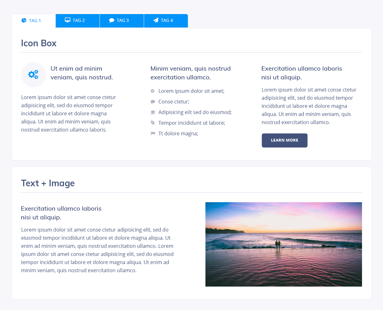
Tabs
Tabs widget is quite useful when creating tabs and enriching them with all kinds of Elementor-built content. It makes possible to organize content in a smart way and make it look way more stylish.
Content
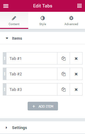
Items
Add Item - click Add Item button to add more tabs to the widget.
Active - enable this option in order to make the item active.
Icon - here you can select the icon to apply it to the tab.
Label - type in the item label to apply it.
Choose Template - here you need to choose the template to embed it inside the tab.
Check Getting Started to learn more about creating templates.
Settings
Show Effect - here you can select one of the effects to apply it to the tabs when they show (fade, zoom, move up, fall).
Style
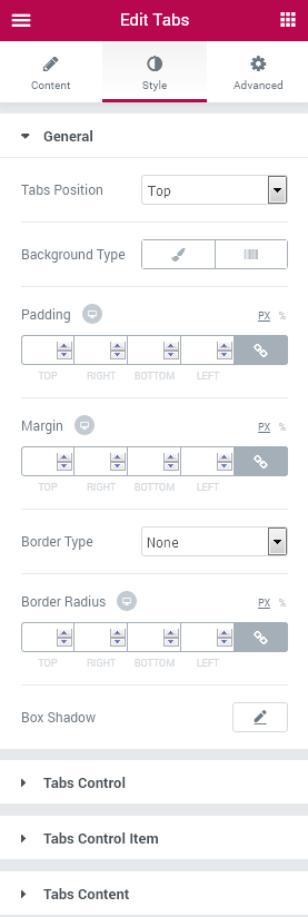
General
Tabs Position - here you can change the tabs position to top, left or right.
Tabs Control
Tabs Alignment - here you can set the tabs alignment and make it different for different screen resolutions.
Control Wrapper Style
Background Type - in this block you can choose, whether you want to use classic or gradient type for the items. The customization options vary for each type. The settings are similar to the common background type settings for other JetTabs widgets.
Padding - here you can set the preferable custom padding. Fill in the values for the top, bottom, right and left padding in pixels to apply your custom padding.
Margin - input the values for the margins in the required fields.
Border Type - here you can select the needed type of the border to use for the item.
Border Radius - here you can set the border radius to make the angles more smooth and round.
Box Shadow - here you can apply the shadow for the button and change the shadow’s settings, such as color, blur, spread and position.
Control Style
Switch between Normal, Hover or Active modes to customize the controls text and icon according to your needs when the tab is active, or in the normal state.
Text Color - here you can change the tab label text color to the one you want.
Typography - turn the option on to view the typography settings. The typography settings are similar for all the JetTabs widgets and blocks.
Icon Color - here you can change the color of the icons to be shown in the tabs.
Icon Size - here you need to customize the size of the icons and make it responsive.
Background Type - in this block you can choose, whether you want to use classic or gradient type for the tabs. The customization options vary for each type. The settings are similar to the common background type settings for other JetTabs widgets.
Border Type - here you can select the needed type of the border to use for the item.
Padding - here you can set the preferable custom padding. Fill in the values for the top, bottom, right and left padding in pixels to apply your custom padding.
Margin - input the values for the margins in the required fields.
Border Radius - here you can set the border radius to make the angles more smooth and round.
Box Shadow - here you can apply the shadow for the tab and change the shadow’s settings, such as color, blur, spread and position.
Tabs Content
Background Type - in this block you can choose, whether you want to use classic or gradient type for the tabs content. The customization options vary for each type. The settings are similar to the common background type settings for other JetTabs widgets.
Padding - here you can set the preferable custom padding. Fill in the values for the top, bottom, right and left padding in pixels to apply your custom padding.
Border Type - here you can select the needed type of the border to use for the item content.
Border Radius - here you can set the border radius to make the angles more smooth and round.
Box Shadow - here you can apply the shadow for the tab content and change the shadow’s settings, such as color, blur, spread and position.
Advanced
The Advanced settings block provides opportunity to change the elements style, background and borders. The settings are similar for all of the JetTabs widgets.
Feel free to check the detailed description of these settings in the Accordion widget block.
Switcher
Switcher widget is a perfect asset for you if you need to display two different content blocks and to show then under different circumstances.
Please, before starting to use the widget make sure you have at least two templates created with Elementor on your site.
Content
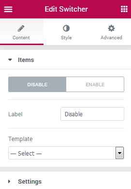
Items
Switch between Enable and Disable modes to specify the template shown when the switcher is enabled and the one template shown when the switcher is disabled.
Label - here you can set the custom name for the Disabled / Enabled switcher mode.
Template - here you have to select the template to be shown when the switcher is active or disabled.
Settings
Initial State - here you can make the Switcher show up in active mode or when it is disabled right after the page loads.
Switcher Preset - here you can select one of the existing switcher presets available in dropdown list to apply it for the switcher.
Show Effect - here you can select the effect to apply for the template when one uses switcher. The effects are available in the dropdown list.
Style
Switcher Control
Width - here you can specify the width of the switcher and make it responsive.
Height - here you can set the height of the switcher and make it responsive.
Handler Width - here you can set the specific width of the handler control and make it responsive.
Margin - here you can set the specific margin to use for the switcher block and make it responsive.
Border Type - here you can apply the neede border type for the switcher or apply no border at all. When the border is applied you’ll be able to set its width and color.
Border Radius - here you can specify the border radius values to make the border angles more smooth and round.
Box Shadow - here you can enable the shadow for the switcher and customize its appearance using the available options.
Handler
Handler Offset - here you can apply the custom offset for the handler control making it positioned inside the switcher field.
Labels
Typography - here you can edit the typography settings. They are the same as available for other JetTabs widgets.
States
Switch between Disable and Enable modes in order to customize the appearance of both.
Control Color - here you can specify the necessary color to use for the switcher control field.
Handler Color - here you can specify the color to apply for the handler control.
Disable Label Color - here you can define the color to apply for the Disable label.
Enable Label Color - here you can specify the color to use for the Enable label.
Switcher Content
Background Type - here you can select whether you want to use the the classic or the gradient background type and customize the one selected. The customization settings are the same for all JetTabs widgets.
Padding - here you can specify the padding values for the switcher content field and make them responsive.
Border type - here you can apply a border and set its type for the content shown inside the switcher. In the case the border is selected you’ll be able to edit its width and color.
Border Radius - here you can set the custom border radius values to make the border angles more smooth and round.
Box Shadow - here you can enable the shadow for the switcher content and customize its appearance using the available options.