JetSmartFilters
Additional Widgets
From this block you can learn more about the additional pagination and active filters widgets allowing to use AJAX pagination and apply or quit using the filters that are not necessary.
Pagination
In case you want to create the AJAX-based pagination and allow using it for the specific widget listing the products or posts, the Pagination widget can assist you in adding such an element to the page and provides multiple stylization options for the pagination elements.
Content
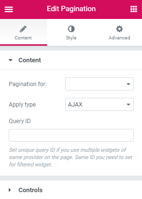
- Pagination for - here you can select for which element you want to add the pagination element.
- Apply Type - here you can choose which type is preferable for this pagination element. An AJAX type allows pagination using AJAX method without reloading the page, which makes viewing the products much faster for the visitors. The Page Reload filter reloads the page each time the visitor uses the pagination.
- Query ID - in case you’re using more than one filter and display more than one listing grid, products grid, etc., on the page, you can use the Query ID option to define which filter is applied to which widget.
Controls
- Enable Pre/Next buttons - this option allows adding previou and next buttons.
- Prev Text - here you can specify the text for the previous button.
- Next Text - here you can define the text for the next button.
- Items center offset - here you can tune the items center offset.
- Items edge offset - here you can set the items edge offset.
Style
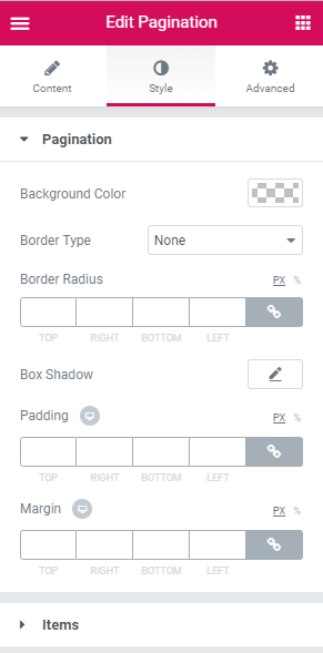
Pagination
- Background color - here you can set the color to apply for the background.
- Border type - here you can specify the type of the border to apply for the pagination. After that, you’ll get access to border color and width.
- Border radius - specify the responsive border to apply for the pagination.
- Box shadow - apply the Shadow option for the pagination block.
- Padding - here you can set the responsive padding for the block.
- Margin - here you can set the responsive margin for the block.
- Typography - turn the option on to view the typography settings. They are similar to the ones for the Checkbox label.
- Background color - here you can set the color to apply for the item background.
- Text color - here you can specify the color to use for the text.
- Padding - here you can set the responsive padding for the item.
- Horizontal gap between items - here you can specify the horizontal gap distance to set between the items.
- Vertical gap between items - here you can specify the vertical gap distance to set between the items.
- Border type - here you can specify the type of the border to apply for the item. After that, you’ll get access to border color and width.
- Border radius - specify the responsive border to apply around the item.
- Alignment - here you can change the widget’s alignment to left, center or right.
Items
Switch between Normal, Hover, Current and Dots modes to customize the appearance of both.
Active Filters
Use this widget to enable the visitors apply the specific filters only and disable the filters from being applied.
Content
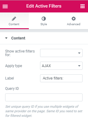
- Show active filters for - here you can select for which element you want to show the active filters.
- Apply Type - here you can choose which type is preferable for this filter. An AJAX type allows filtering using AJAX method without reloading the page, which makes viewing the products much faster for the visitors. The Page Reload filter reloads the page each time the visitor uses the filter.
- Query ID - in case you’re using more than one filter and display more than one listing grid, products grid, etc., on the page, you can use the Query ID option to define which filter is applied to which widget.
Style
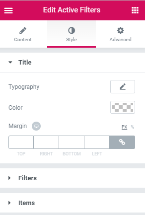
- Typography - turn the option on to view the typography settings. They are similar to the ones for the Checkbox label.
- Color- here you can specify the color to use for the content.
- Margin - here you can set the responsive margin for the element.
Filters
- Filters Position - here you can select the type of position applied for the filter: the inline or columns.
- Vertical Offset - here you can specify the offset between the values.
- Background color - here you can select the proper background color to use for the filter.
- Border type - here you can specify the type of the border to apply for the element.
- Border radius - here you can specify the type of the border to apply for the element. After that, you’ll get access to border color and width.
- Box shadow - apply the Shadow option for the element.
- Padding - here you can set the responsive padding for the element.
Items
- Filter content position - here you can select the type of position applied for the filter content: the inline or columns.
- Background color - here you can select the proper background color to use for the items.
- Border type - here you can specify the type of the border to apply for the element. After that, you’ll get access to border color and width.
- Border radius - specify the responsive border to apply around the element.
- Box shadow - apply the Shadow option for the element.
- Padding - here you can set the responsive padding for the element.
Switch between hover and normal modes to change the appearance of both.
Label
- Typography - turn the option on to view the typography settings. They are similar to the ones for the Checkbox label.
- Color - here you can specify the color to use for the label.
Switch between hover and normal modes to change the appearance of both.
Value
- Typography - turn the option on to view the typography settings. They are similar to the ones for the Checkbox label.
- Color - here you can specify the color to use for the label.
Switch between hover and normal modes to change the appearance of both.
Remove
- Size - use the controls to customize the size of the Remove icon.
- Offset top - here you can set the Remove icon’s offset from the top.
- Offset right - here you can set the Remove icon offset from the right.
- Color - here you can specify the color to use for the icon.
- Background - here you can specify the color to apply for the background.
- Border type - here you can specify the type of the border to apply for the icon. After that, you’ll get access to border color and width.
- Border radius - specify the responsive border to apply around the element.
- Padding - here you can set the responsive padding for the element.
Switch between hover and normal modes to change the appearance of both.
Apply Button
Apply Button widget allows adding apply button functionality to the filters. You can use Apply button widget in case you have several filters and want to adjust apply button with the same settings to them.
Content
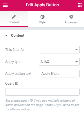
- This filter for - here you need to select the listing or archive for which you want to apply the current filter.
- Apply Type - here you can choose which type is preferable for the apply button. An AJAX type allows apply button using AJAX method without reloading the page, which makes viewing the products much faster for the visitors. The Page Reload filter reloads the page each time the visitor uses the apply button.
- Apply button text - here you can specify the text of the apply button.
- Query ID - in case you’re using more than one filter and display more than one listing grid, products grid, etc., on the page, you can use the Query ID option to define which filter is applied to which widget.
Style
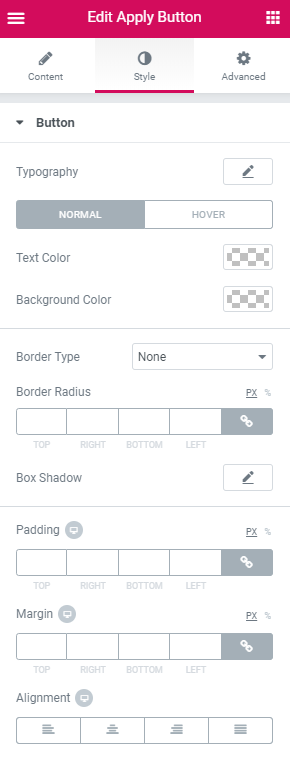
Button
- Typography - turn the option on to view the typography settings.
- Text Color - here you can select the color for the text on the apply button.
- Background color - here you can set the color to apply for apply button.
- Border type - here you can specify the type of the border to apply for the apply button. After that, you’ll get access to border color and width.
- Border radius - specify the responsive border to apply for the apply button.
- Box shadow - enable this option if you want to access the shadow advanced settings for apply button, and need to apply shadow for it.
- Padding - here you can set the responsive padding for the apply button.
- Margin - here you can specify the margins values to set them for the apply button.
- Alignment - here you can change the apply button’s alignment to left, center or right.
Switch between Normal and Hover modes to customize the appearance of both.