JetSearch
Ajax Search Widget
From this block you can learn more about the key features and options allowing to customize JetSearch widget content and style.
Ajax Search Widget Content Block
In this block you can edit the content displayed with JetSearch plugin.
Search Form
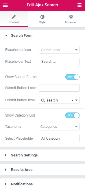
Placeholder Icon - here you can select the appropriate icon for the placeholder from the drop-down list.
Placeholder Text - here you can define the text for the placeholder.
Show Submit Button - enable this option if you want the submit button to appear.
Submit Button Label - here you can specify the label of the submit button.
Submit Button Icon - here you can choose the needed icon for the submit button from the drop-down list.
Show Categories List - enable this option if you what to display the list with categories.
Taxonomy - here you can specify the particular taxonomy to look for the results only within it.
Select Placeholder - here you can define the placeholder text for the category list.
Responsive Form on Mobile - enable this option if you want to apply Ajax Search to mobile screen.
Search Settings
Search in - here you can select particular post type within which the search will be made. If nothing is selected in the option, the search will be made over the entire site.
A number of results displayed on one search page - this option allows to limit the number of displayed search results on one search page.
A number of results displayed in one search query - this option allows to specify the number of displayed search results in one search query.
Sort Results by - here you can indicate how to sort the results. They can be sorted by relevance, date, title, author, last modified and number of comments(descending).
Filter Results by - here you can set ascending or descending order for results.
Results Area
Results Area Width - here you can specify width of the results area. You can set the width to be same as Search Form, Input Box and Categories List or adjust custom width and position.
Show Post Thumbnail - enable this option in order to show thumbnails of the posts.
Thumbnail Size - here you can select the post thumbnail size from the drop-down list.
Post Excerpt Length - here you can select the length of the post excerpt to be displayed in the results area.
Show Product Price - enable this option in order to display product price in the results area.
Show Product Rating - enable this option if you want to display product rating in the results area.
Show Results Counter - enable this option if you want to show the number of results.
Show All Results Button - enable this option if you want to display See All Results button.
All Results Button Text - here you can define the text for the See All results button.
Results Navigation
Bullet Pagination - here you can specify where to display the bullet pagination.
Number Pagination - here you can specify where to display the number pagination.
Navigation Arrows - here you can define where to show the navigations arrows.
Navigation Arrows Type - here you can select type of navigation arrows from the drop-down list.
Notifications
Negative Search Results - here you can specify the message appearing if nothing is found.
Technical Error - here you can specify the message if technical error happens.
Ajax Search Widget Style Block
In this block you can apply customizable style settings to Ajax Search widget.
Search Form
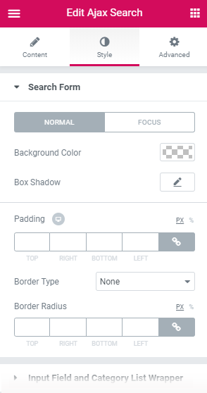
Background Color - here you can pick background color of the search form.
Box Shadow - enable this option if you want to access the shadow advanced settings for the search form.
Padding - here you can set the preferable custom padding for the search form. Fill in the values for the top, bottom, right and left padding in pixels to apply your custom padding.
Border Type - select the preferable border type to use it for the search form.
Width - here you can specify width of the borders.
Color - here you can pick color for the borders of the search form.
Border Radius - here you can define the value of the border radius to make the angles more smooth and round.
Here you can switch from customizing Normal to Focus Search Form style settings. Just click on the button Focus to proceed to customizing focus elements.
Input Field and Categories List Wrapper
Background Color - here you can pick background color of the input field and categories list wrapper.
Border Color - here you can select color for the borders in focus state.
Box Shadow - enable this option if you want to access the shadow advanced settings for the input field and categories list wrapper.
Padding - here you can set the preferable custom padding for the input field and categories list wrapper. Fill in the values for the top, bottom, right and left padding in pixels to apply your custom padding.
Border Type - select the preferable border type to use it for the input field and categories list wrapper.
Width - here you can specify width of the borders.
Color - here you can pick color for the borders of the input field and categories list wrapper.
Border Radius - here you can define the value of the border radius to make the angles more smooth and round.
Here you can switch from customizing Normal to Focus Input Field and Categories List Wrapper style settings. Just click on the button Focus to proceed to customizing focus elements.
Input Field
Typography - turn the option on to view the typography settings.
Placeholder Typography - turn the option on to view the typography settings of the placeholder.
Text Color - here you can pick color of text in the input field.
Background Color - here you can pick background color of the input field .
Border Color - here you can select color for the borders of the input field.
Box Shadow - enable this option if you want to access the shadow advanced settings for the input field.
Padding - here you can set the preferable custom padding for the input field. Fill in the values for the top, bottom, right and left padding in pixels to apply your custom padding.
Margin - here you can apply your custom margins in pixels or percentage to set them for the input field.
Border Width - here you can specify width of the borders.
Border Radius - here you can define the value of the border radius to make the angles more smooth and round.
Here you can switch from customizing Normal to Focus Input Input Field style settings. Just click on the button Focus to proceed to customizing focus elements.
Submit Button
Typography - turn the option on to view the typography settings.
Icon Font Size - here you can set size of the submit button icon.
Color - here you can pick color of the submit button.
Border Color - here you can select color for the borders of the submit button.
Background Color - here you can pick background color of the submit button.
Box Shadow - enable this option if you want to access the shadow advanced settings for the submit button.
Vertical Align - here you can set the vertical alignment of the Submit button.
Padding - here you can set the preferable custom padding for the submit button. Fill in the values for the top, bottom, right and left padding in pixels to apply your custom padding.
Margin - here you can apply your custom margins in pixels or percentage to set them for the submit button.
Border Type - select the preferable border type to use it for the submit button.
Width - here you can specify width of the borders.
Color - here you can pick color for the borders of the submit button.
Border Radius - here you can define the value of the border radius to make the angles more smooth and round.
Here you can switch from customizing Normal to Hover Submit button style settings. Just click on the button Hover to proceed to customizing hover elements.
Categories List
Width - here you can specify width of the categories list block.
Typography - turn the option on to view the typography settings.
Arrow Font Size - here you can define the font size of the arrows.
Text Color - here you can pick color of the text in categories list block.
Arrow Color - here you can pick color of the arrow in categories list block.
Background Color - here you can pick background color of the categories list block.
Border Color - here you can select color of the borders of the categories list block.
Box Shadow - enable this option if you want to access the shadow advanced settings for the categories list block.
Padding - here you can set the preferable custom padding for the categories list block. Fill in the values for the top, bottom, right and left padding in pixels to apply your custom padding.
Margin - here you can apply your custom margins in pixels or percentage to set them for the categories list block.
Border Width - here you can specify width of the borders.
Border Radius - here you can define the value of the border radius to make the angles more smooth and round.
Here you can switch from customizing Normal to Focus Submit button style settings. Just click on the button Focus to proceed to customizing focus elements.
Dropdown Style
Max Height - use the controls or type in the needed value in px in the corresponding field to set the maximum dropdown height.
Gap - here you can fix the appropriate gap between dropdown and search bar.
Background Color - here you can pick background color of the dropdown.
Box Shadow - enable this option if you want to access the shadow advanced settings for the dropdown.
Padding - here you can set the preferable custom padding for the dropdown. Fill in the values for the top, bottom, right and left padding in pixels to apply your custom padding.
Border Type - select the preferable border type to use it for the dropdown.
Width - here you can specify width of the borders.
Color - here you can pick color for the borders of the dropdown.
Border Radius - here you can define the value of the border radius to make the angles more smooth and round.
Scrollbar Thumb Color - here you can pick color of the scrollbar thumb in dropdown.
Dropdown Items Style
Typography - use the controls or type in the needed value in px in the corresponding field to set the maximum dropdown height.
Color - here you can pick color of the dropdown items.
Background Color - here you can pick background color of the dropdown items.
Padding - here you can set the preferable custom padding for the dropdown items. Fill in the values for the top, bottom, right and left padding in pixels to apply your custom padding.
Border Radius - here you can define the value of the border radius to make the angles more smooth and round.
Gap - here you can fix the appropriate gap between dropdown items.
Here you can switch from customizing Normal to Hover Dropdown Items style settings. Just click on the button Hover to proceed to customizing hover elements.
Results Area
Results Area
Gap - here you can fix the appropriate gap between results area and search bar.
Background Color - here you can pick background color of the results area.
Box Shadow - enable this option if you want to access the shadow advanced settings for the results area.
Border Type - select the preferable border type to use it for the results area.
Width - here you can specify width of the borders.
Color - here you can pick color for the borders of the results area.
Border Radius - here you can define the value of the border radius to make the angles more smooth and round.
Results Header
Padding - here you can set the preferable custom padding for the results header. Fill in the values for the top, bottom, right and left padding in pixels to apply your custom padding.
Border Type - select the preferable border type to use it for the results header.
Width - here you can specify width of the borders.
Color - here you can pick color for the borders of the results header.
Results List
Enable Scrolling - this option allows scrolling the results list.
Max Height(px) - use the controls or type in the needed value in px in the corresponding field to set the maximum results list height.
Scrollbar Color - here you can pick color of the scrollbar.
Scrollbar Thumb Color - here you can pick color of the scrollbar thumb.
Results Footer
Padding - here you can set the preferable custom padding for the results footer. Fill in the values for the top, bottom, right and left padding in pixels to apply your custom padding.
Border Type - select the preferable border type to use it for the results footer.
Width - here you can specify width of the borders.
Color - here you can pick color for the borders of the results footer.
Results Items
Background Color - here you can pick background color of the results items.
Title Color - here you can select title color of the results items.
Title Text Decoration - here you can add title text decoration for the results items on hover.
Content Color - here you can specify content color of the results items.
Padding - here you can set the preferable custom padding for the results items. Fill in the values for the top, bottom, right and left padding in pixels to apply your custom padding.
Alignment - here you can define the preferable results items content alignment. The result items content can be placed to the left, to the right, or remain centered.
Divider - enable this option if you want to divide the results items.
Style - here you can apply different styles to the divider.
Weight - here you can specify weight of the divider.
Color - here you can pick color of the divider.
Here you can switch from customizing Normal to Hover Results Items style settings. Just click on the button Hover to proceed to customizing hover elements.
Thumbnail
Width - here you can specify the width of the thumbnails in the results items.
Gap - here you can set the gap between the thumbnail and the content in the results items.
Border Radius - here you can define the value of the border radius to make the angles more smooth and round.
Title
Typography - turn the option on to view the typography settings.
Margin - here you can apply your custom margins in pixels or percentage to set them for the title.
Content
Typography - turn the option on to view the typography settings.
Margin - here you can apply your custom margins in pixels or percentage to set them for the content.
Results Counter
Typography - turn the option on to view the typography settings.
Color - here you can pick color of the results counter.
Background Color - here you can define background color of the results counter.
Border Color - here you can select color of the borders of the all results button.
Box Shadow - enable this option if you want to access the shadow advanced settings for the results counter.
Text Decoration - here you can add text decoration on hover to the results counter.
Padding - here you can set the preferable custom padding for the results counter. Fill in the values for the top, bottom, right and left padding in pixels to apply your custom padding.
Border Type - select the preferable border type to use it for the results counter.
Width - here you can specify width of the borders.
Color - here you can pick color for the borders of the results counter.
Border Radius - here you can define the value of the border radius to make the angles more smooth and round.
Here you can switch from customizing Normal to Hover Results Items style settings. Just click on the button Hover to proceed to customizing hover elements.
All Results Button
Typography - turn the option on to view the typography settings.
Color - here you can pick color of the results counter.
Background Color - here you can define background color of the all results button.
Border Color - here you can select color of the borders of the all results button.
Box Shadow - enable this option if you want to access the shadow advanced settings for the all results button.
Text Decoration - here you can add text decoration on hover to the all results button.
Padding - here you can set the preferable custom padding for the all results button. Fill in the values for the top, bottom, right and left padding in pixels to apply your custom padding.
Border Type - select the preferable border type to use it for the all results button.
Width - here you can specify width of the borders.
Color - here you can pick color for the borders of the all results button.
Border Radius - here you can define the value of the border radius to make the angles more smooth and round.
Here you can switch from customizing Normal to Hover All Results button style settings. Just click on the button Hover to proceed to customizing hover elements.
Navigation Arrows
Font Size - here you can define size of the navigation arrows.
Color - here you can pick color of the navigation arrows.
Background Color - here you can define background color of the navigation arrows block.
Border Color - here you can select color of the borders of the navigation arrows block.
Padding - here you can set the preferable custom padding for the navigation arrows block. Fill in the values for the top, bottom, right and left padding in pixels to apply your custom padding.
Border Width - here you can specify width of the borders of the navigation arrows block.
Border Radius - here you can define the value of the border radius to make the angles more smooth and round.
Here you can switch from customizing Normal to Hover Navigation Arrows style settings. Just click on the button Hover to proceed to customizing hover elements.
Notifications
Typography - turn the option on to view the typography settings.
Color - here you can pick color of the notifications.
Alignment - here you can define the preferable notifications alignment. The notifications can be placed to the left, to the right, or remain centered.
Padding - here you can set the preferable custom padding for the notifications. Fill in the values for the top, bottom, right and left padding in pixels to apply your custom padding.
Spinner
Color - here you can choose the color of the spinner.