Wild Ride
Widgets
This section highlights the basics of working with the widgets (functional blocks). It explains where to start from, how to set them up correctly and use the full range of options.
Widgets import
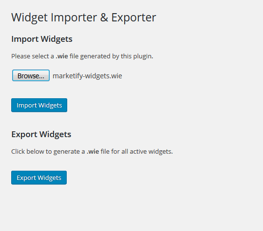
In order to import the widgets to the website, you need to install "Widget Importer & Exporter" plugin
Navigate to "Tools" = > "Widget Importer & Exporter" section after the successful plugin installation and activation. To start the import select the file in .wie format. It is located in "Widget Dummy Content" folder in template package.
When the widgets are successfully imported, you will see a list of widgets with installation status. Then you'll be able to start using them on the site.
About Author
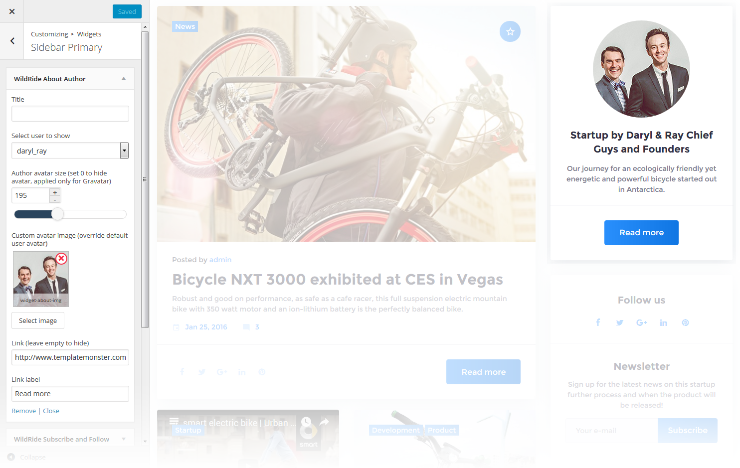
This widget is used to display blog author information
-
- Title
- Widget's text title
-
- Select user to show
- You can select a user / author from a dropdown list to show on the page
-
- Author avatar size
- Here you can define the author avatar image size, set it to 0 to hide the avatar, it will be applied only to Gravatar
-
- Custom avatar image
- Here you can choose and upload the custom author avatar image
-
- Link
- Here you can set a link, or leave it empty to hide
-
- Link label
- Here you can set a link text
Carousel
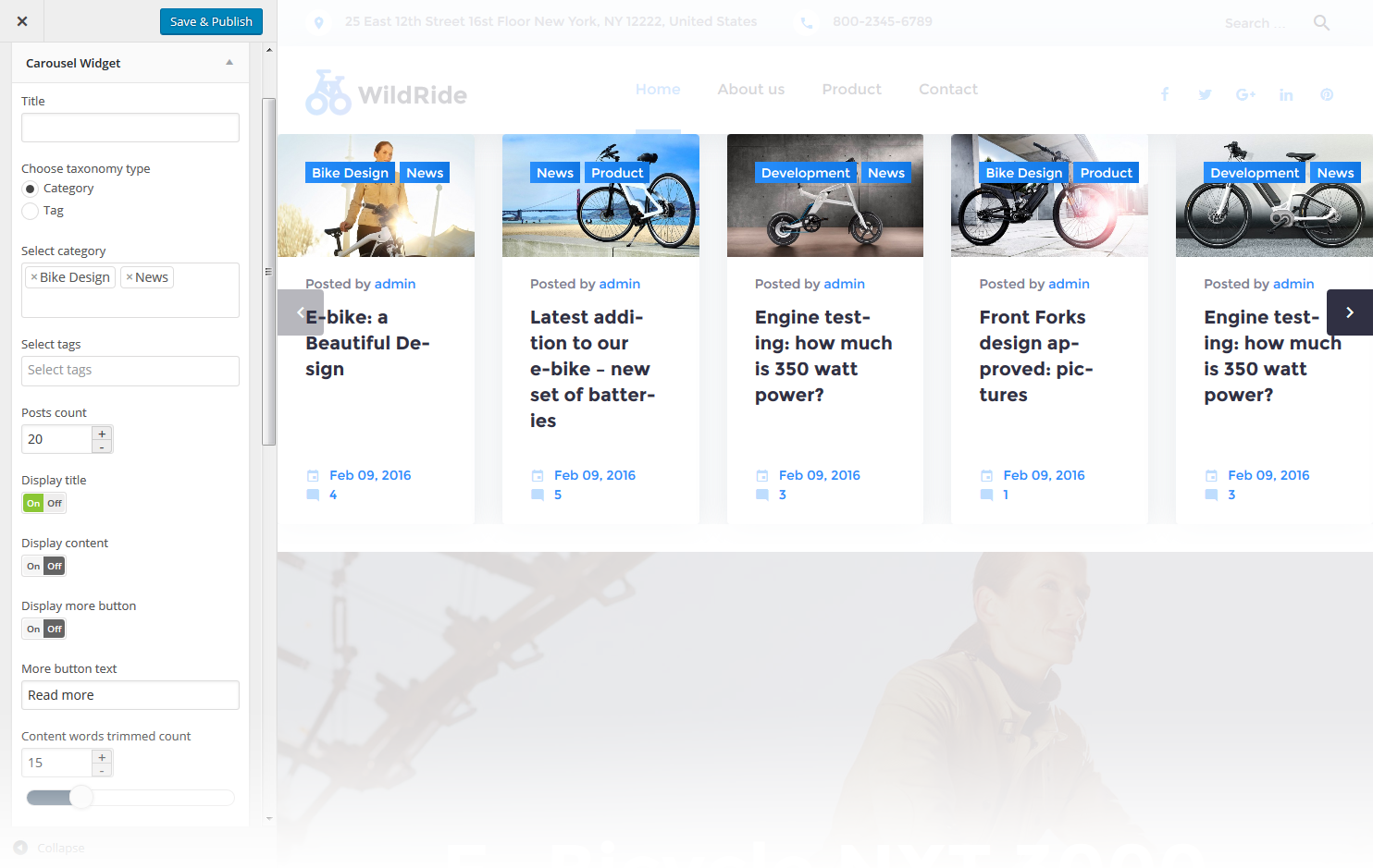
Widget is used to display and setup slider carousel on the website.
-
- Title
- This property specifies the widget title
-
- Select category
- Specify a category to pull carousel slides from
-
- Posts count
- Here you can define the number of slides / posts to display
-
- Display title
- Hide/Show post title below the carousel slide
-
- Display content
- Hide/Show post content below the carousel slide
-
- Display more button
- Hide/Show the More button / link
-
- More button text
- Read more button / link label
-
- Content words trimmed count
- This property defines the content words limit
-
- Number of slides per view
- This property specifies how many slides are visible at the same time inside the slider container
-
- Number slides per group
- This property specifies the numbers of slides to define and enable group sliding
-
- Multi Row Slides Layout
- This property specifies how many slides are displayed per column, for multirow layout
-
- Width of the space between slides
- This property specifies the distance between slides in px
-
- Duration of transition between slides
- This property specifies slides duration (in ms) to trigger swipe to next/previous slide during the long swipes
-
- Slider pagination
- Hide/Show bullet navigation on slides
-
- Choose slider navigation position
- Here you can define the navigation arrows position: inner - inside the container, outer - outside the container
-
- Slider navigation
- Hide/Show navigation arrows
Image Grid Widget
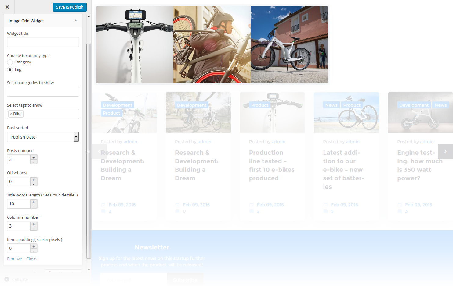
This widget is used to display the image grid. By default, you have to select an appropriate category or tags in order to start display
-
- Widget Title
- This property specifies the widget title
-
- Choose taxonomy type
- Here you can define the items selection source: by Category or Tag
-
- Select categories to show
- Choose the category to display posts from
-
- Select tags to show
- Choose tags to display posts from
-
- Post sorted
- This property specifies how to sort out the posts on display
-
- Posts number
- Defines the number of posts/images displayed
-
- Offset post
- This property specifies the number of post to displace or pass over
-
- Title words length
- This property sets the number of words limit for post's title. Set 0 to hide the title
-
- Columns number
- Here you can define the number of columns to display the images (up to 4)
-
- Items padding ( size in pixels )
- This property specifies the distance between the category or tag elements in px
Tag Cloud
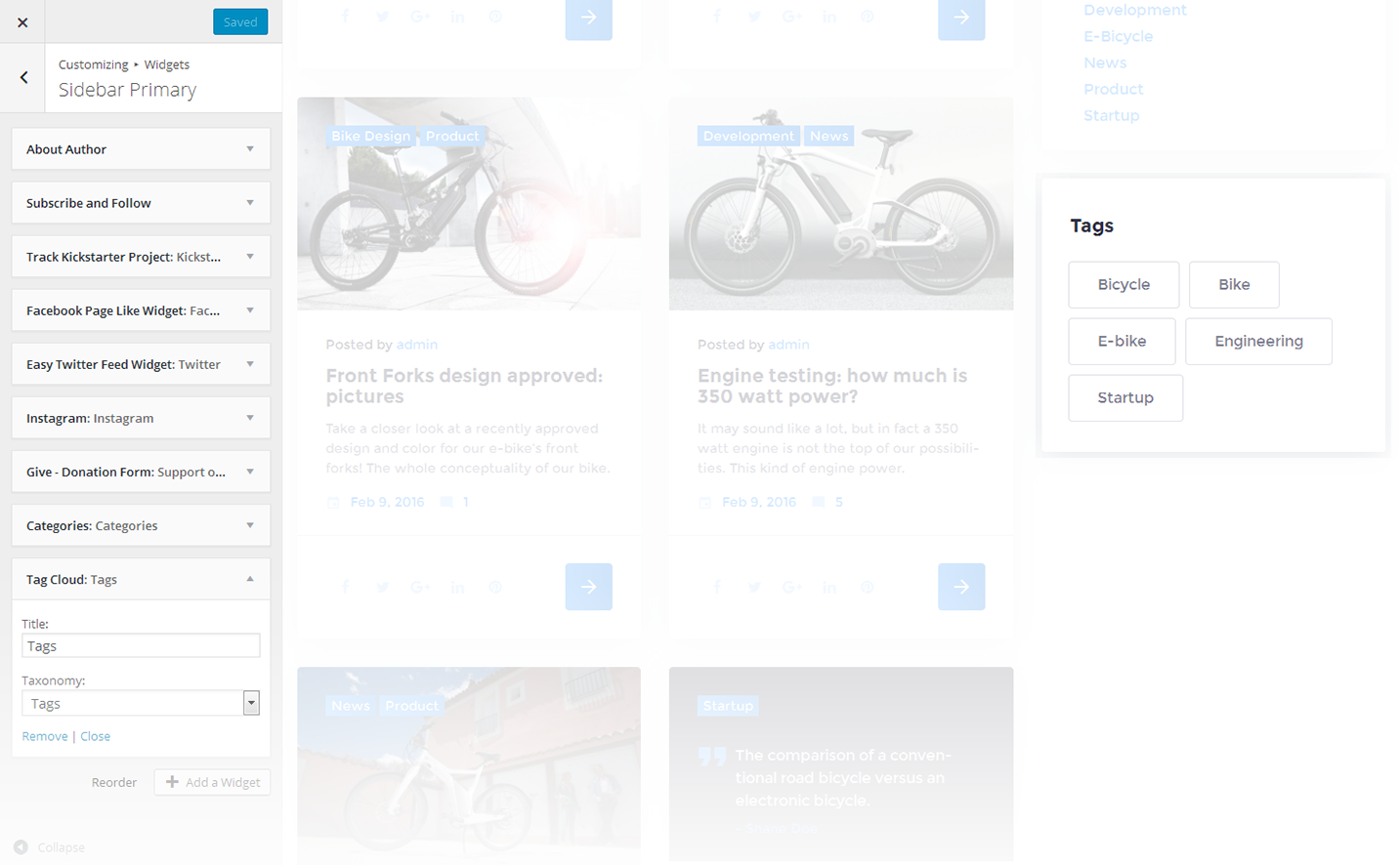
The widget allows you to display tag cloud on the website.
-
- Title
- This property specifies the widget title
-
- Taxonomy
- Choose a proper taxonomy type
Text
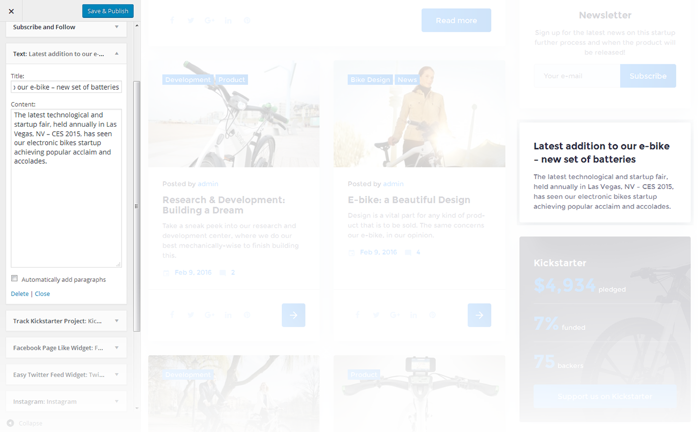
The widget allows you to display various text blocks, you can also use it to insert the shortcodes.
-
- Title
- This property specifies the widget title
-
- Content
- Insert any kind of content
-
- Automatically add paragraphs
- This option enables the "Automatically add paragraphs" function
Archives
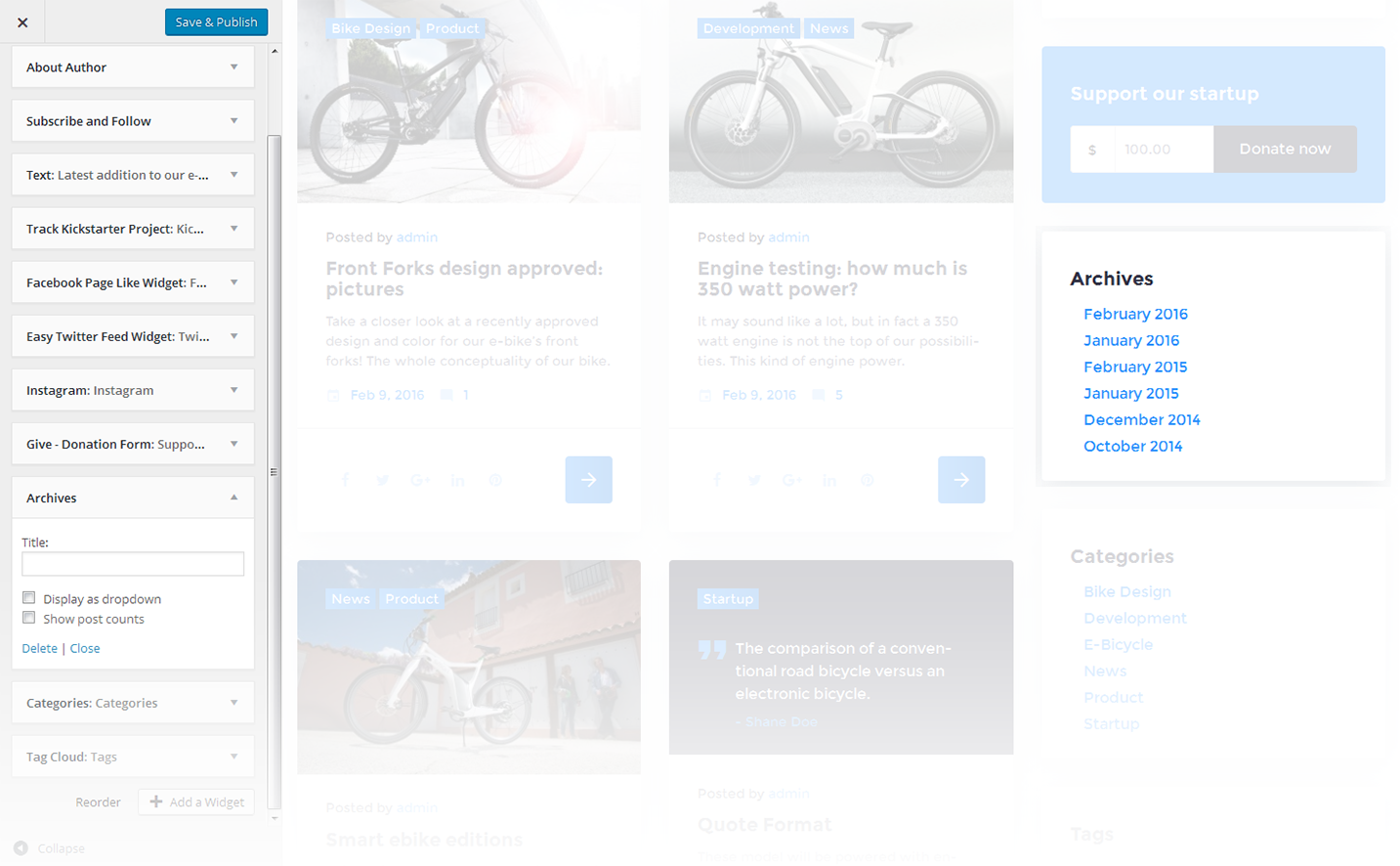
This widget is designed to display archives
-
- Title
- Enter the title of the widget
-
- Display as dropdown
- This option allows to display the categories as a dropdown list
-
- Show post counts
- Show/Hide post counts
Calendar
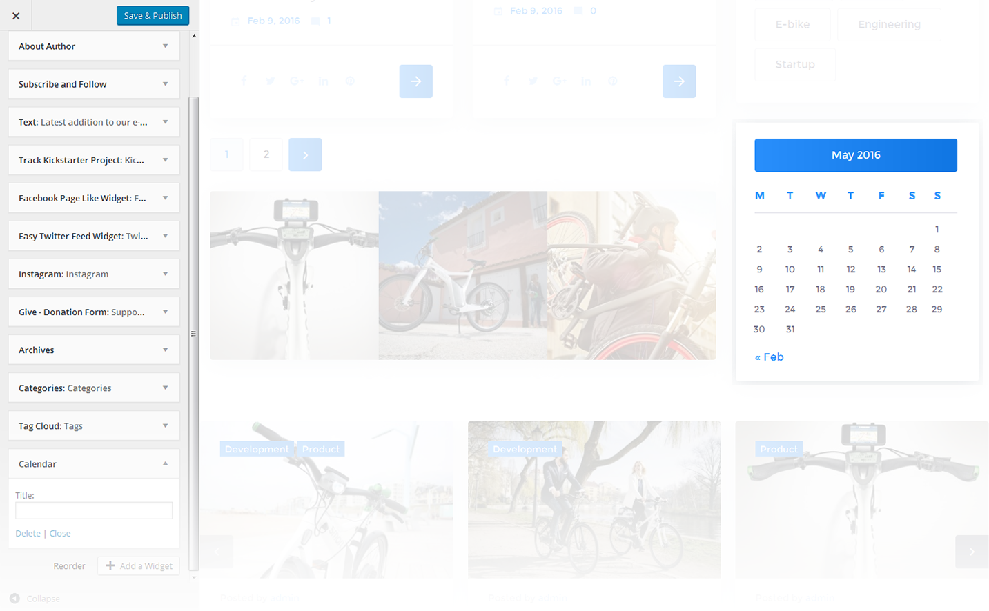
This widget is designed to display calendar
-
- Title
- Enter the title of the widget
Categories
This widget is used to setup and display categories.
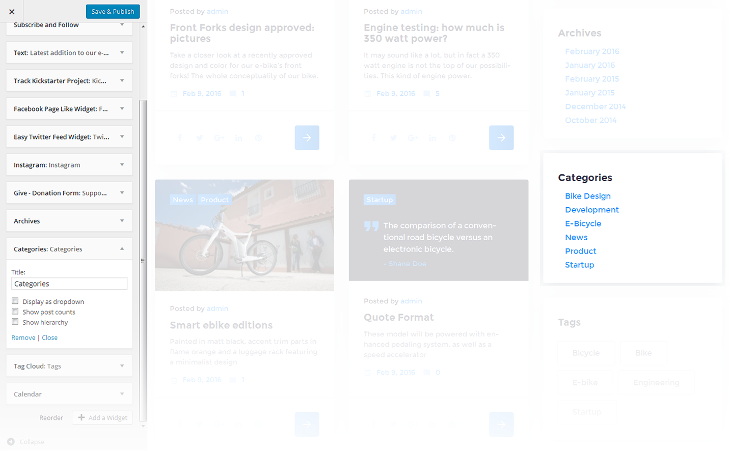
-
- Title
- This property specifies the widget title
-
- Display as dropdown
- This option allows to display the categories as a dropdown list
-
- Show post counts
- Show/Hide post counts
-
- Show hierarchy
- Show hierarchy
Custom Menu
This widget allows you to create various custom menus anywhere on your website.
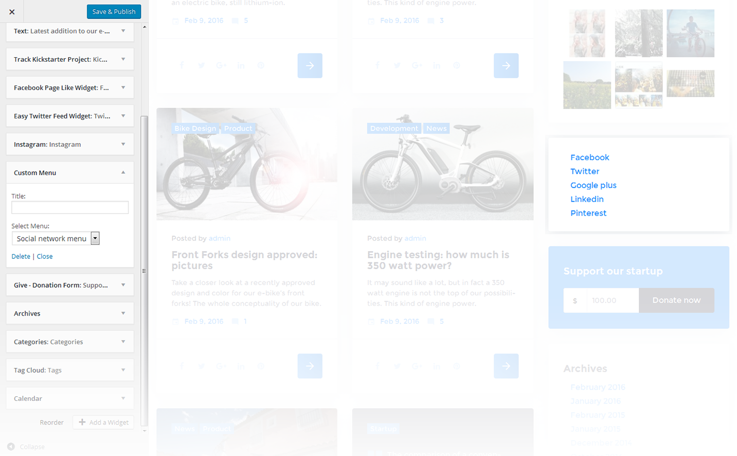
-
- Title
- This property specifies the title of the widget
-
- Select menu
- Here you can select any of the predesigned menus
Meta
The widget is used to show 5 standard links.
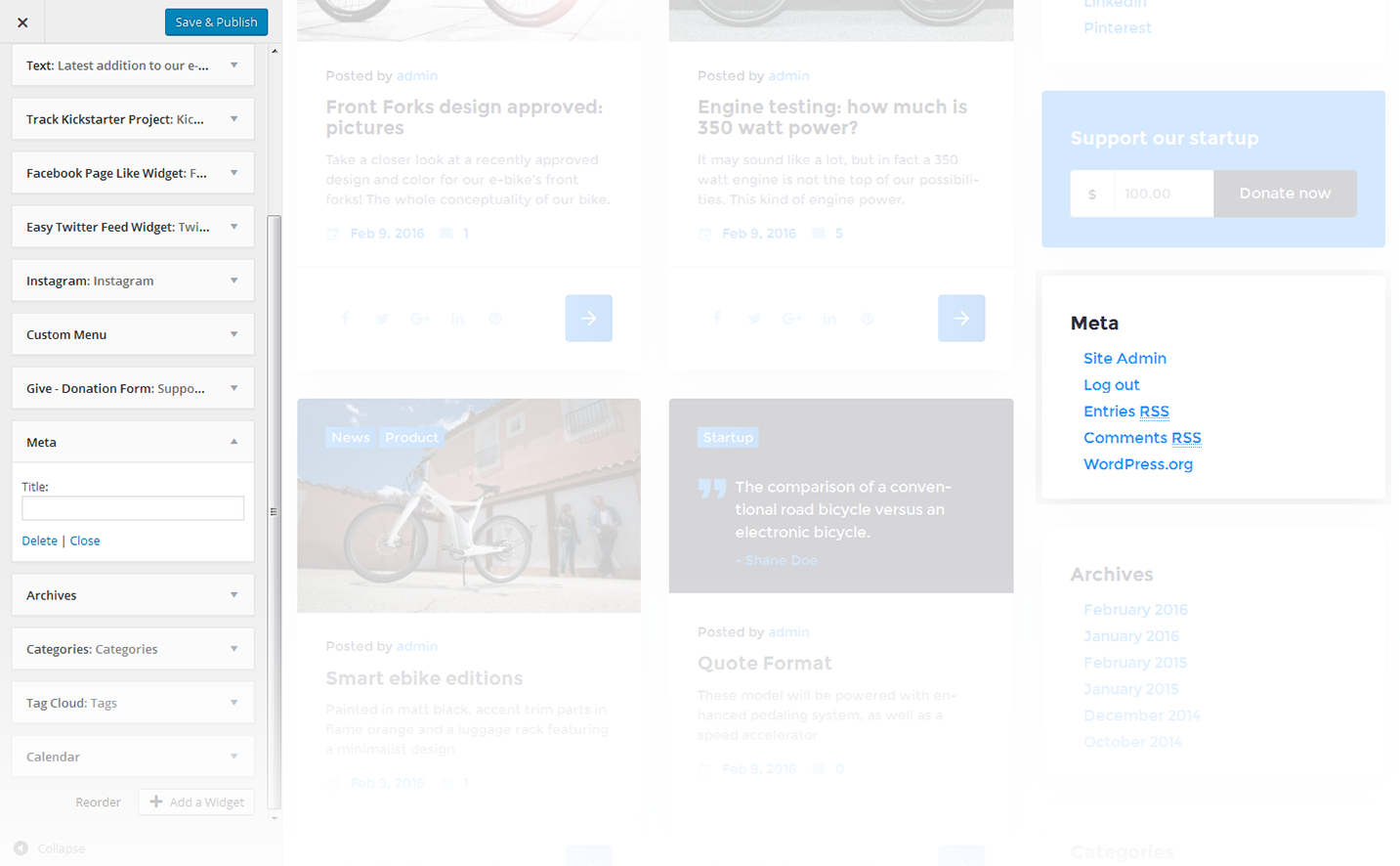
-
- Title
- This property specifies the widget title
Easy Twitter Feed
This widget is used to setup and display twitter feed box on the website.
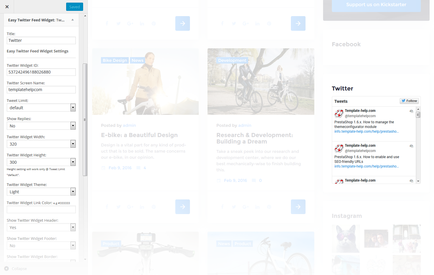
-
- Title
- This property specifies the widget title
-
- Twitter Widget ID
- Here you can define the Widget ID to show the account images on your website
-
- Twitter Screen Name
- Here you can set a twitter account name
-
- Tweet Limit
- Here you can define the number of twitts to display (up to 20)
-
- Show Replies
- Here you can define whether to show or hide the replies
-
- Twitter Widget Width
- This property defines the width of the twitter widget block
-
- Twitter Widget Height
- This property defines the height of twitter the widget block
-
- Twitter Widget Theme
- Here you can select the theme for the twitter widget
-
- Twitter Widget Link Color
- This property defines the link color of the twitter widget block
-
- Show Twitter Widget Header
- Here you can define, show or hide the header inside the twitter widget
-
- Show Twitter Widget Footer
- Here you can define whether to show or hide the footer inside the twitter widget
-
- Show Twitter Widget Border
- Here you can define whether to show or hide the border
-
- Twitter Widget Border Color
- This property defines border color of the twitter widget block
-
- Show Twitter Widget Scrollbar
- Here you can define whether to display or remove the scrollbar. Scrollbar setting will work only @ Tweet Limit "default".
-
- Use Twitter Widget Background Color
- This property defines whether to show or hide the Background Color of the twitter widget
Facebook Page Like Widget
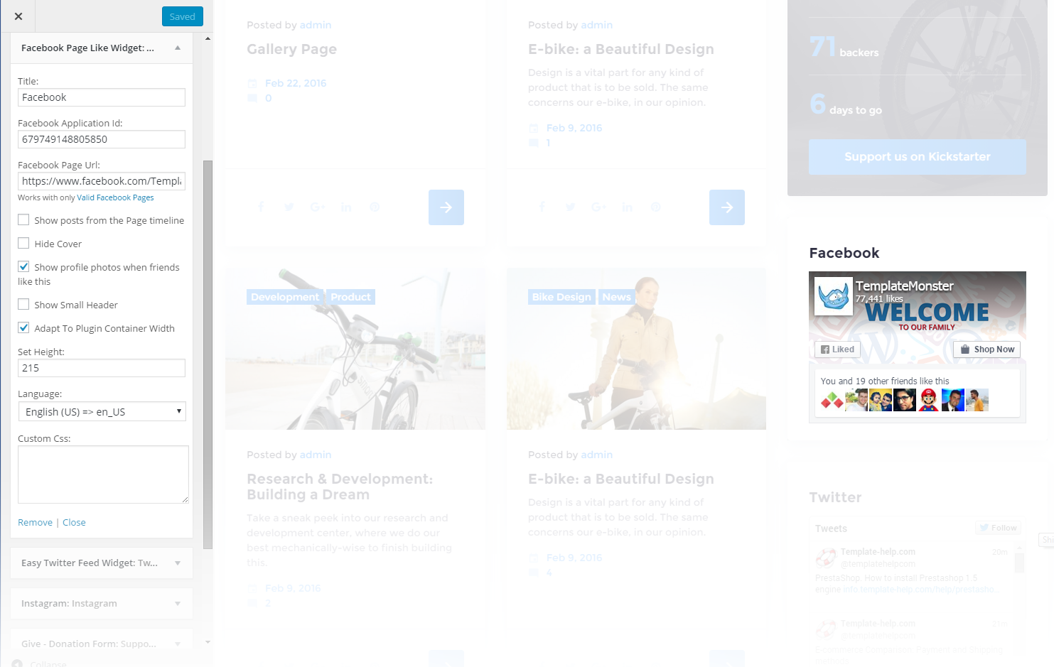
This widget is used to setup and display facebook feed on the website.
-
- Title
- This property specifies the widget title
-
- Facebook application ID
- Here you can define the facebook application ID to show the account images on your website
-
- Facebook page url
- Specify the url address of the facebook page
-
- Show posts from the Page timeline
- This property defines whether to show or hide the posts from the Page timeline
-
- Hide cover
- This property defines whether to display / hide the header background image of the block
-
- Show profile photos when friends like this
- This property defines whether to show or hide the profile photos when friends and followers like them
-
- Show Small Header
- This property defines whether to enable / disable small header for the facebook block
-
- Adapt To Plugin Container Width
- This property defines whether to enable / disable the adaptive width for the facebook container
-
- Set Width
- This property defines the width of a parent container
-
- Set Height
- This property defines the height of a parent container
-
- Language
- Here you can select the languages used on the website
-
- Custom Css
- Extra CSS class
To learn how to get facebook application ID please view the following information here
Pages
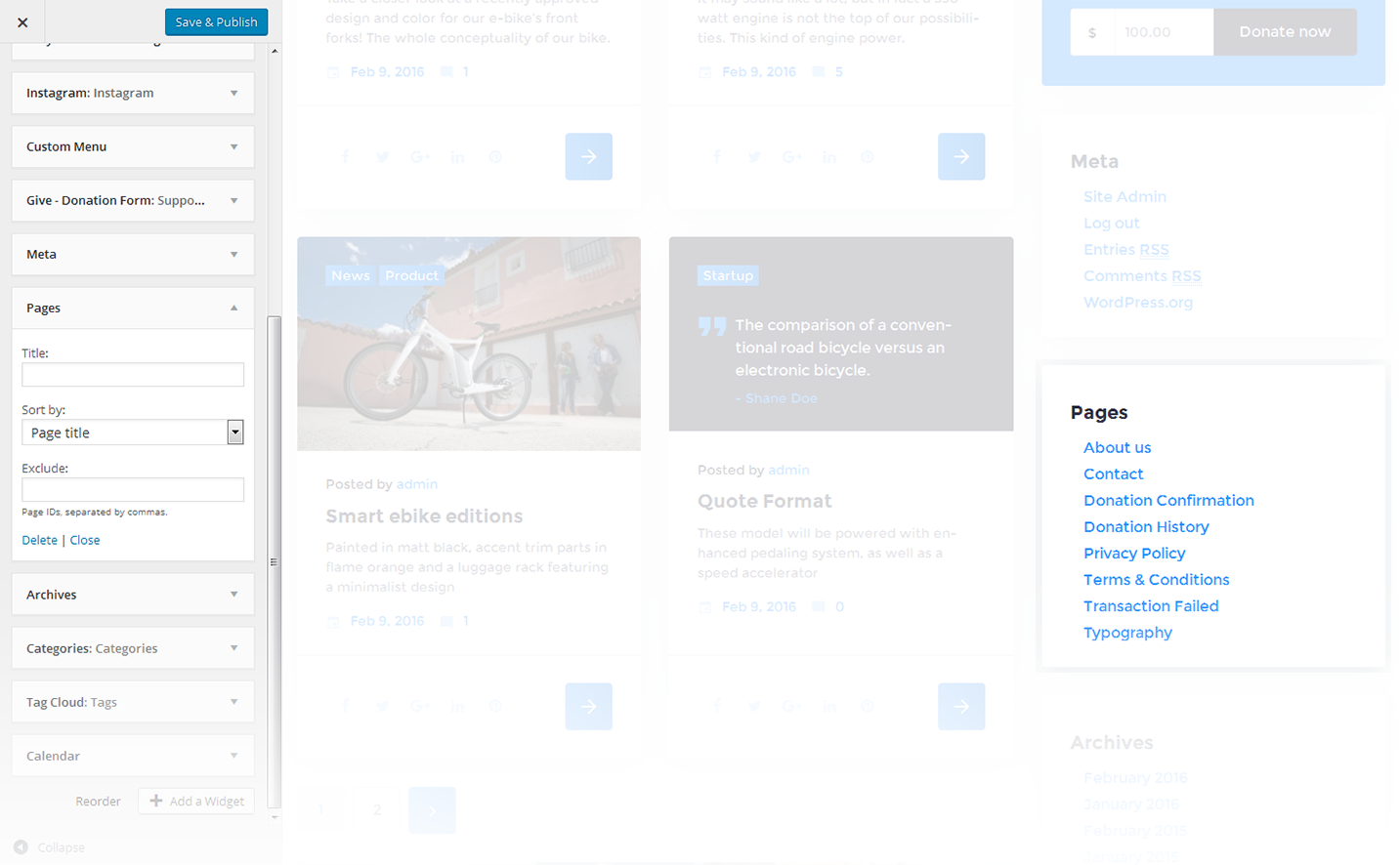
This widget displays a full list of pages of your site.
-
- Title
- This property specifies the widget title
-
- Sort by
- This option allows to sort the pages by page title, page order or page ID
-
- Exclude
- Specify the IDs of the pages you want to exclude
Recent Posts
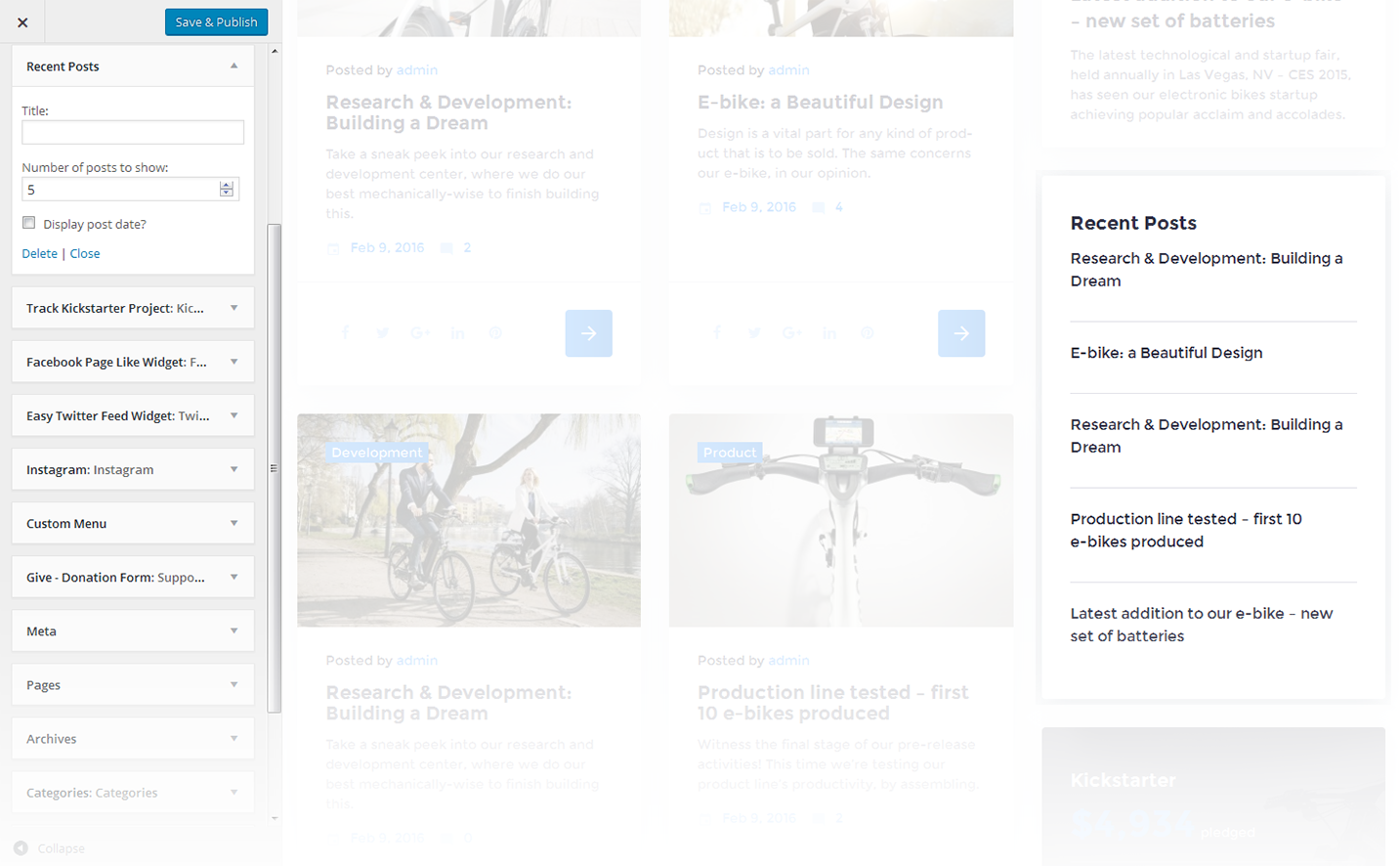
This widget is used to display recent posts on the homepage.
-
- Title
- This property specifies the widget title
-
- Number of posts to show
- This property allows you to change the number of the displayed posts
-
- Display post date?
- Show/hide post date
Recent Comments
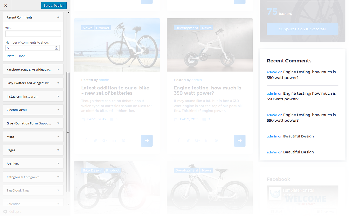
This widget is used to display the recent comments to the posts on the homepage.
-
- Title
- This property specifies the widget title
-
- Number of comments to show
- This property allows you to change the number of the displayed comments
RSS
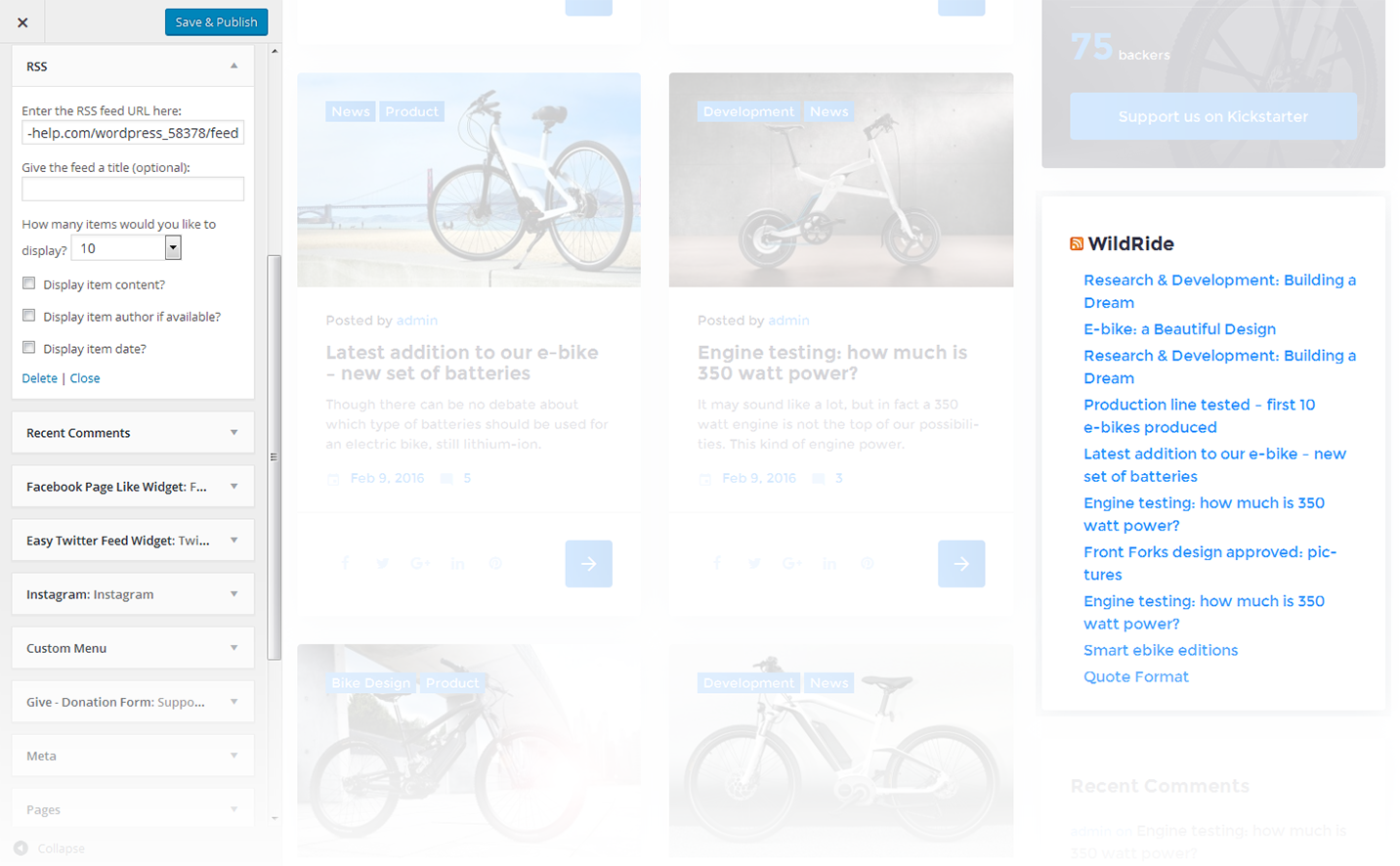
The widget is used to display RSS feeds on the website.
-
- Enter the RSS feed URL here:
- Specify the RSS feed URL
-
- Give the feed a title (optional):
- Specify the title
-
- How many items would you like to display?
- Specify the number of items displayed
-
- Display item content?
- Show/hide item content
-
- Display item author if available?
- Show/hide item author
-
- Display item date?
- Show/hide item date
Search
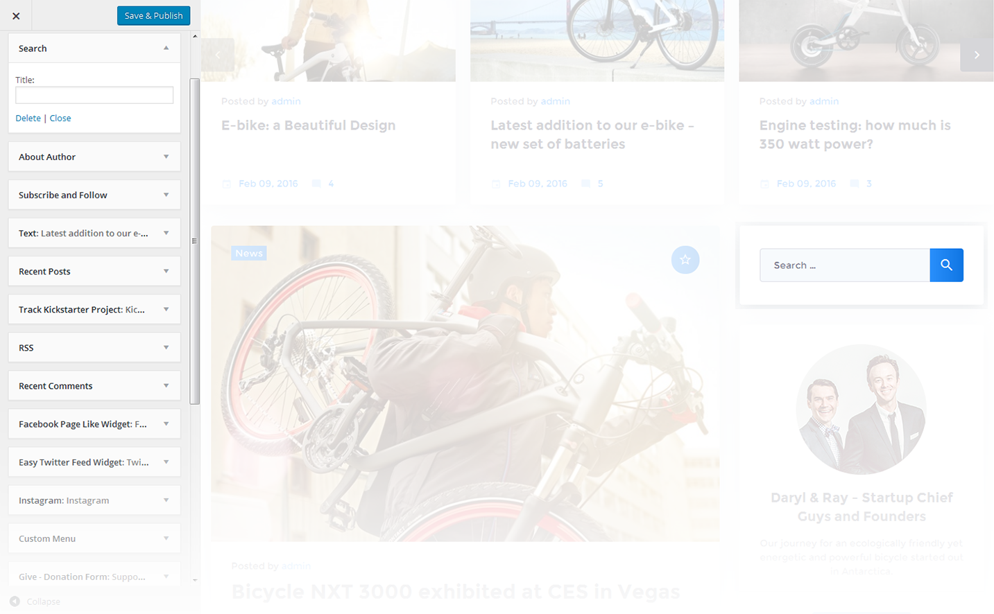
This widget adds a search field to the page
-
- Title
- Specify the widget title
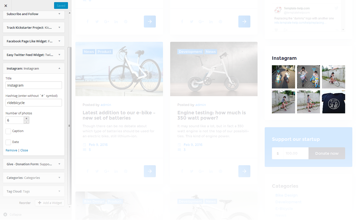
This widget is used to setup and display Instagram feed on the website.
-
- Title
- This property specifies the widget title
-
- Hashtag (enter without `#` symbol)
- Here you can set a hashtag to display the images, selected by this property
-
- Number of photos
- This property defines the number of images to show
-
- Caption
- Hide/Show caption below the images
-
- Date
- Hide/Show date below the images
Smart Slider
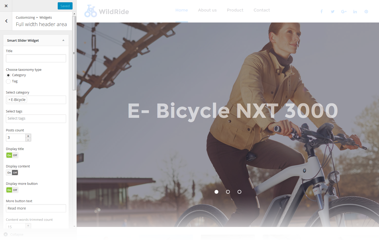
This widget is used to setup and display slider on the website.
-
- Title
- This property specifies the widget title
-
- Choose taxonomy type
- Select taxonomy type of the slides
-
- Select category
- Here you can select category to pull the slides from
-
- Select tags
- Here you can select tags to pull the slides from
-
- Posts count
- This property defines the number of posts / slides to display
-
- Display title
- Here you can define whether to Hide/Show post's title in a slide
-
- Display content
- Here you can define whether to Hide/Show post's content in a slide body
-
- Display more button
- Here you can define whether to Hide/Show the Read More button
-
- More button text
- Read more button label
-
- Content words trimmed count
- This property defines the excerpt words limit by choosing the number of words from post's content
-
- Slider width
- This property defines the slider width
-
- Slider height
- This property defines the slider height
-
- Slider orientation
- This property specifies the slider orientation. Smart slider slides are automatically set up in Horizontal / Landscape slide orientation, but you can change the slide orientation to Portrait / Vertical Portrait slide orientation.
-
- Slide distance(px)
- This property specifies the distance between slides in px
-
- Slide duration(ms)
- This property specifies slides duration (in ms) to trigger swipe to the next/previous slide during long swipes
-
- Use fade effect?
- This property defines whether to enable / disable fade effect on sliding
-
- Use navigation?
- Here you can define whether to Hide/Show the navigation arrows
-
- Indicates whether the arrows will fade in only on hover
- This property specifies whether the arrows will fade in only on hover
-
- Use pagination?
- Here you can define whether to Hide/Show bullet navigation on slides
-
- Use autoplay?
- This property specifies whether to enable / disable autoplaying for slides
-
- Display fullScreen button?
- Here you can define whether to Hide/Show full screen button to display slider in full screen mode. It is not available in WordPress customizer preview.
-
- Indicates if the slides will be shuffled
- This property specifies whether to shuffle slides randomly. Disabled by default
-
- Use infinite scrolling?
- This property specifies whether to enable/disable infinite scrolling on sliding
-
- Display thumbnails?
- Here you can define whether to Hide/Show slide thumbnails below the slider
-
- Display thumbnails arrows?
- Here you can define whether to Hide/Show arrows navigation for thumbnails
-
- Sets the position of the thumbnail scroller
- This property sets the position of the thumbnail scroller. It is set to bottom by default
Subscribe and Follow
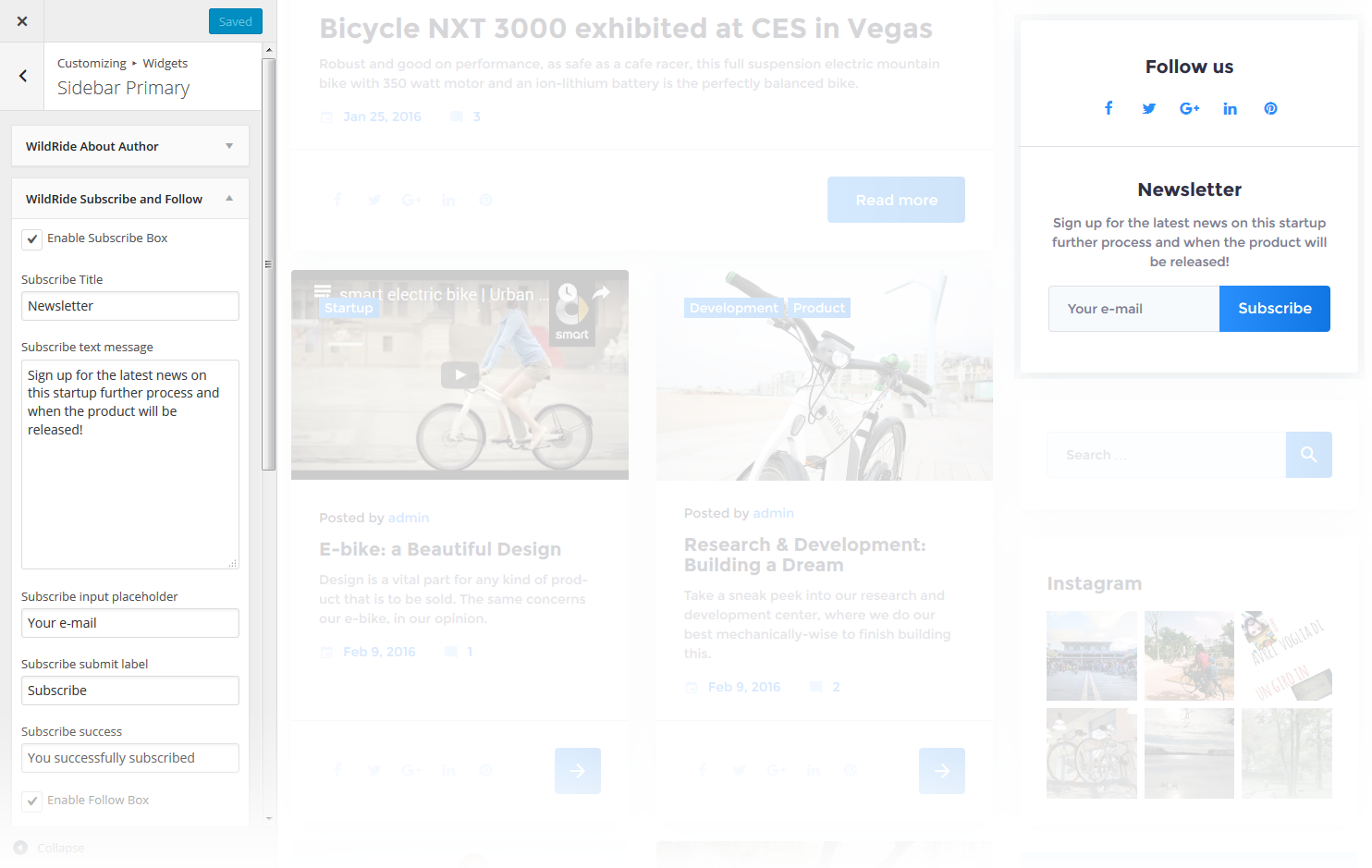
This widget is used to display blocks for Subscribe and Follow sections. List of social networks for the Follow block is same as in Social Menu.
-
- Enable Subscribe Box
- Enable/disable the subscribe box
-
- Subscribe Title
- This property specifies the subscribe box title
-
- Subscribe text message
- Here you can add text description for the subscribe form
-
- Subscribe input placeholder
- This property specifies a placeholder text “Enter Your Email Here” in the input area of the Subscribe Box
-
- Subscribe submit label
- This property specifies a placeholder text “Submit” in the subscribe button of the Subscribe Box
-
- Subscribe success
- This property specifies a success message text “You are successfully subscribed” in the subscribe area of the Subscribe Box
-
- Enable Follow Box
- Hide/Show Follow Box
-
- Follow Title
- This property specifies the follow box title
-
- Follow text message
- Here you can add text description for the Follow block
Taxonomy Tiles
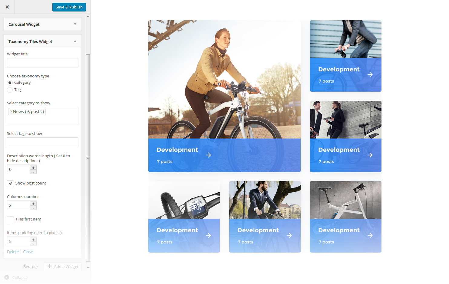
This widget is used to setup and display the categories.
-
- Widget Title
- This property specifies the widget title
-
- Choose taxonomy type
- Here you can define the items selection source: by Category or Tag
-
- Select category to show
- Exact category to use for posts display
-
- Select tags to show
- Exact tag to use for posts display
-
- Description words length
- Specify the description words length
-
- Show post count
- Hide/Show information on the number of posts in the selected category
-
- Columns number
- Here you can define the number of columns to display category or tag content (up to 4)
-
- Tiles first item
- Here you can define whether to Hide/Show magnified first item tile in the beginning
-
- Items padding ( size in pixels )
- This property specifies the distance between the category or tag elements in px.
Track Kickstarter Project
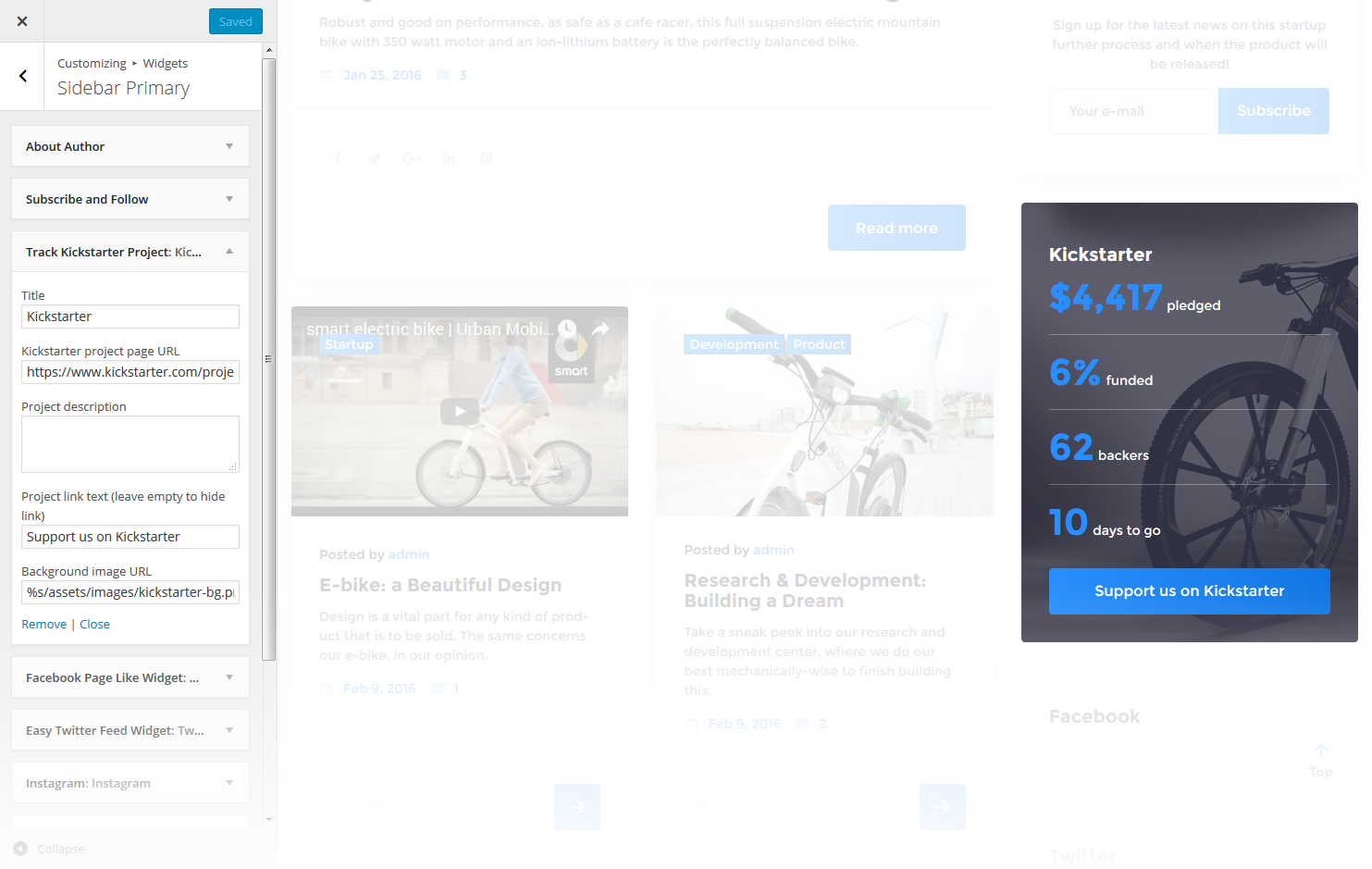
This widget is used to display your Kickstarter project information
-
- Title
- Enter the widget title
-
- Kickstarter project page URL
- Here you can define the page URL for the Kickstarter project
-
- Project description
- Here you can add project description
-
- Project link text
- Here you can set a link text. Leave empty to hide the link
-
- Background image URL
- Here you can set a link, for a background image
Give - Donation Form
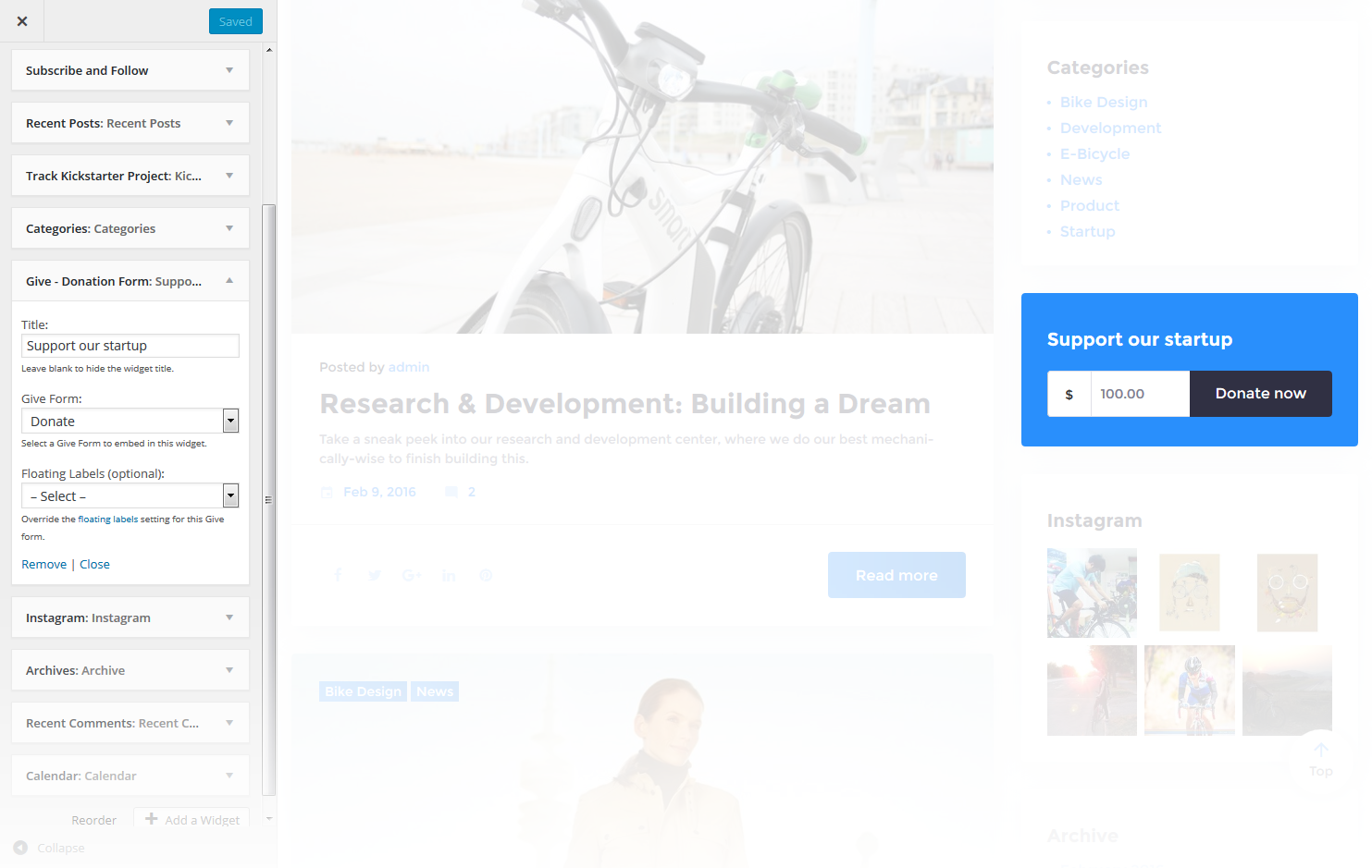
This widget is used to display and set up a donation form
-
- Title
- Widget text title (Leave blank to hide the widget title)
-
- Give Form
- Select Give Form from the dropdown list to embed it in the widget
-
- Floating Labels (optional):
- Override the floating labels setting for this Give form
