JetWooBuilder
JetWooBuilder Widgets
This block contains the detailed information about JetWooBuilder widgets which can be used for creating WooCommerce Single Product page content.
Single Add to Cart
This widget adds the Add to Cart button along with the number of pieces of product for purchasing. The button is needed when one has to add the product to cart.
Style
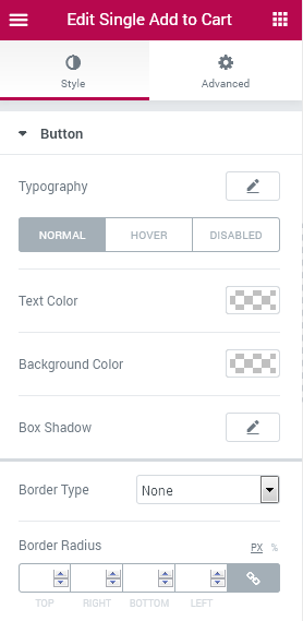
Button
Typography — turn the option on to view the typography settings for the button text.
- Size — define the font size of the button label text.
- Family — here you can set the font family for the button label text.
- Weight — in this block you can select the suitable font weight.
- Transform — here you can choose from the dropdown menu, if you want the text to be shown in uppercase, lowercase, capitalize or normal way.
- Style — in this block you can choose from the dropdown menu the style of the font. It can be normal, italic (the characters look similar to handwriting) and oblique (the characters are slightly inclined to the right).
- Line Height — in this field you can set the height of the text line.
- Letter Spacing — here you can set the space between letters.
Switch from Normal to Hover or Disabled modes to set the color scheme and box shadow for the button when in normal state, on mouse hover or when the purchase is disabled for the customers.
Text Color - here you can set the color of the button label text using the color picker.
Background Color - here you can set the background color to use for the button.
Box Shadow - click on the pencil icon to access the shadow option and apply the shadow for the button.
Shadow Settings:
- color — here you can set the color for the the shadow (use color picker tool to do it);
- blur — in this block you can define the blur settings for the shadow;
- spread — here you can set how large the shadow will be;
- horizontal — here you can move the shadow horizontally (from right to left);
- vertical — here you can move the shadow vertically (from top to bottom);
- position — here you can apply the shadow to the inside of the button or to the outside of it.
Border Type - here you can select one of the available border types to use for the button: none, solid, double, dotted, dashed or groove.
- Width - here you can define the width of the border in px.
- Color - here you can change the color of the borders.
- Border Radius - here you can set the border radius for the chosen border to make the border angles more round.
Padding - here you can set the padding values for the text placed inside the button.
Margin - here you can define the margins applied for the whole button contained in the column.
Quantity Input
Typorgraphy — turn the option on to view the typography settings for the items number.
- Size — define the font size of the number.
- Family — here you can set the font family for the number.
- Weight — in this block you can select the suitable font weight.
- Transform — here you can choose from the dropdown menu, if you want the text to be shown in uppercase, lowercase, capitalize or normal way.
- Style — in this block you can choose from the dropdown menu the style of the font. It can be normal, italic (the characters look similar to handwriting) and oblique (the characters are slightly inclined to the right).
- Line Height — in this field you can set the height of the number.
- Letter Spacing — here you can set the space between the number characters.
Quantity Input Display - here you can set, if you want the number of items field to be displayed in line with the Add to Cart button, or you need it to be displayed in block.
Input width - here you can select the width of the quantity input field.
Switch between styling Normal and Focus modes to style up the number of products input field in its normal state or when it is in focus and someone puts numbers into it.
Text Color - here you can set the color of the text to use for the number characters.
Background Color - in this block you can set the color to use as a background for the quantity field where the numbers are put.
Border Color - here you can set the preferable color of the border for the items number for purchasing field in Normal of Focus mode.
Border Type - here you need to specify the type of the border to use for the products quantity field.
Width - here you can set the needed width to use for the border.
Color - here you can specify the color to use for the border.
Border Radius - here you can set the border radius for the chosen border to make the border angles more round.
Box Shadow - click on the pencil icon to access the shadow option and apply the shadow for the field. The shadow settings are similar for different elements of JetWooBuilder widgets.
Padding - here you can select the paddings to use for the products value added into the items quantity field.
Margin - here you can set the needed margin values to use for the whole items quantity element.
Description
Typography — turn the option on to view the typography settings for the description.
- Size — define the font size of the description characters.
- Family — here you can set the font family for the description.
- Weight — in this block you can select the suitable font weight.
- Transform — here you can choose from the dropdown menu, if you want the text to be shown in uppercase, lowercase, capitalize or normal way.
- Style — in this block you can choose from the dropdown menu the style of the font. It can be normal, italic (the characters look similar to handwriting) and oblique (the characters are slightly inclined to the right).
- Line Height — in this field you can set the height of the text.
- Letter Spacing — here you can set the space between the letters.
Text Color - here you can set the color of the text to use for the description.
Padding - here you can specify the padding values for the description.
Alignment - here you can set the needed alignment (left, center or right).
Price
Typography — turn the option on to view the typography settings for the price text.
- Size — define the font size of the price characters.
- Family — here you can set the font family for the price.
- Weight — in this block you can select the suitable font weight.
- Transform — here you can choose from the dropdown menu, if you want the text to be shown in uppercase, lowercase, capitalize or normal way.
- Style — in this block you can choose from the dropdown menu the style of the font. It can be normal, italic (the characters look similar to handwriting) and oblique (the characters are slightly inclined to the right).
- Line Height — in this field you can set the height of the price text.
- Letter Spacing — here you can set the space between the letters.
Price Color - here you can select which color you want to use for the price using the color picker tool.
Padding - here you can specify the padding values for the description.
Alignment - here you can set the needed alignment (left, center or right).
Currency Symbol
Color - here you can set the color of the currency symbol shown beside the price value.
Typography — turn the option on to view the typography settings for the currency symbol.
- Size — define the font size of the currency symbol characters.
- Family — here you can set the font family for the currency.
- Weight — in this block you can select the suitable font weight.
- Transform — here you can choose from the dropdown menu, if you want the text to be shown in uppercase, lowercase, capitalize or normal way.
- Style — in this block you can choose from the dropdown menu the style of the font. It can be normal, italic (the characters look similar to handwriting) and oblique (the characters are slightly inclined to the right).
- Line Height — in this field you can set the height of the currency.
- Letter Spacing — here you can set the space between the currency characters.
Color - here you can set the color of the availability element.
Typography — turn the option on to view the typography settings for the availability text.
- Sizev — define the font size of the availability text.
- Family — here you can set the font family for the availability text.
- Weight — in this block you can select the suitable font weight.
- Transform — here you can choose from the dropdown menu, if you want the text to be shown in uppercase, lowercase, capitalize or normal way.
- Style — in this block you can choose from the dropdown menu the style of the font. It can be normal, italic (the characters look similar to handwriting) and oblique (the characters are slightly inclined to the right).
- Line Height — in this field you can set the height of the availability text.
- Letter Spacing — here you can set the space between the availability text characters.
Padding - here you can specify the padding values for the availability element.
Alignment - here you can set the needed alignment (left, center or right).
Vertical Alignment
Availability
Switch between In Stock and Out of Stock modes to customize the availability appearance in the case the item is available or if it is out of stock.
Reset Button
Typography — turn the option on to view the typography settings for the button text.
- Size — define the font size of the button text.
- Family — here you can set the font family for the button text.
- Weight — in this block you can select the suitable font weight.
- Transform — here you can choose from the dropdown menu, if you want the text to be shown in uppercase, lowercase, capitalize or normal way.
- Style — in this block you can choose from the dropdown menu the style of the font. It can be normal, italic (the characters look similar to handwriting) and oblique (the characters are slightly inclined to the right).
- Line Height — in this field you can set the height of the button text.
- Letter Spacing — here you can set the space between the button text characters.
Switch between Normal and Hover modes in order to customize the appearance of the Reset button when on hover or in its normal state.
Text Color - here you can specify the color to use it for the button text.
Background Color - here you can set the color to use for the button as a background for the text.
Border Type - here you need to set the border to use for the Reset button. The border specifics and additional features are similar to the ones of the borders described for the elements mentioned above.
Border Radius - here you can set the border radius for the chosen border to make the border angles more round.
Padding - here you can specify the paddings to use for the button text.
Margin - here you can set the margins to use for the button.
Typography — turn the option on to view the typography settings for the variations text.
- Size — define the font size of the variations text.
- Family — here you can set the font family for the variations text.
- Weight — in this block you can select the suitable font weight.
- Transform — here you can choose from the dropdown menu, if you want the text to be shown in uppercase, lowercase, capitalize or normal way.
- Style — in this block you can choose from the dropdown menu the style of the font. It can be normal, italic (the characters look similar to handwriting) and oblique (the characters are slightly inclined to the right).
- Line Height — in this field you can set the height of the variations text.
- Letter Spacing — here you can set the space between the variations text characters.
Input Width - here you can set the input width for the variations element.
Text Color - here you can set the color of the variations text.
Background Color - here you can specify the background color of the variations element.
Border Type - here you need to set the type of the border to use for the variations. The border specifics and additional features are similar to the ones of the borders described for the elements mentioned above.
Border Radius - here you can set the border radius for the chosen border to make the border angles more round.
Box Shadow - click on the pencil icon to access the shadow option and apply the shadow for the element. The shadow settings are similar for different elements of JetWooBuilder widgets.
Padding - here you can specify the paddings to use for the element.
Margin - here you can set the margins to use for the element.
Typography — turn the option on to view the typography settings for the variations title text.
- Size — define the font size of the variations title text.
- Family — here you can set the font family for the variations title text.
- Weight — in this block you can select the suitable font weight.
- Transform — here you can choose from the dropdown menu, if you want the text to be shown in uppercase, lowercase, capitalize or normal way.
- Style — in this block you can choose from the dropdown menu the style of the font. It can be normal, italic (the characters look similar to handwriting) and oblique (the characters are slightly inclined to the right).
- Line Height — in this field you can set the height of the variations title text.
- Letter Spacing — here you can set the space between the variations title text characters.
Text Color - here you can set the color of the variation title text.
Padding - here you can specify the paddings to use for the element.
Margin - here you can set the margins to use for the element.
Variations Select
Switch between Normal and Hover modes in order to change the Variations appearance when it is unselected or on mouse hover.
Variations Title
Single Attributes
This widget is used to display the attributes which are added in the Product > Product Data in the Attributes block.
Content
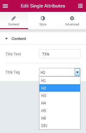
Title Text - here you can input the text to use it as a title for the product attributes.
Title Tag - select the title heading tag to apply to the attributes heading.
Style
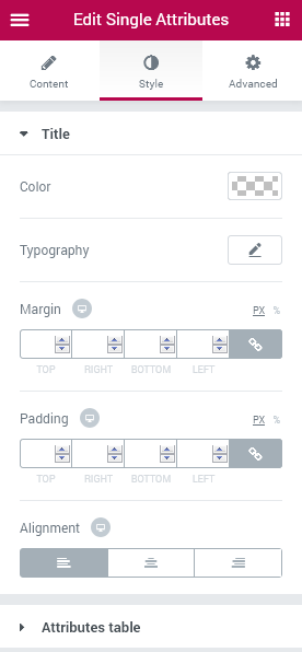
Title
Color - here you can change the color of the title text using the color picker tool.
Typography — turn the option on to view the typography settings for the title text.
- Size — define the font size of the title text.
- Family — here you can set the font family for the title text.
- Weight — in this block you can select the suitable font weight.
- Transform — here you can choose from the dropdown menu, if you want the text to be shown in uppercase, lowercase, capitalize or normal way.
- Style — in this block you can choose from the dropdown menu the style of the font. It can be normal, italic (the characters look similar to handwriting) and oblique (the characters are slightly inclined to the right).
- Line Height — in this field you can set the height of the title text.
- Letter Spacing — here you can set the space between the title text characters.
Margin - here you can change the margins to use them for the title of the attributes.
Padding - input the padding values in order to use the custom paddings for the attributes title.
Alignment - here you can set the preferable (right, left, center) alignment for the title text.
Attributes Table
Table Width - here you can set the custom width for the attributes table to make it responsive.
Title
Color - here you can set the color to use it for the attribute.
Typography — turn the option on to view the typography settings for the attribute text.
- Size — define the font size of the attribute text.
- Family — here you can set the font family for the attribute text.
- Weight — in this block you can select the suitable font weight.
- Transform — here you can choose from the dropdown menu, if you want the text to be shown in uppercase, lowercase, capitalize or normal way.
- Style — in this block you can choose from the dropdown menu the style of the font. It can be normal, italic (the characters look similar to handwriting) and oblique (the characters are slightly inclined to the right).
- Line Height — in this field you can set the height of the attribute text.
- Letter Spacing — here you can set the space between the attribute text characters.
Background Color - here you can set the needed background color of the attribute text.
Border Type - here you can set the border type you want to use for the attribute (solid, dotted, double, dashed, groove, none). The border settings are similar for different elements used in JetWooBuilder.
Width - here you can specify the width of the border in px.
Color - here you can change the color of the border.
Border Radius - here you can apply the border radius to make the angles more rounded and smooth.
Padding - input the padding values in order to use the custom paddings for the attributes.
Alignment - here you can set the preferable (right, left, center) alignment for the attributes.
Color - here you can change the color of the attribute value.
Typography — turn the option on to view the typography settings for the attribute value text.
- Size — define the font size of the attribute value text.
- Family — here you can set the font family for the attribute value text.
- Weight — in this block you can select the suitable font weight.
- Transform — here you can choose from the dropdown menu, if you want the text to be shown in uppercase, lowercase, capitalize or normal way.
- Style — in this block you can choose from the dropdown menu the style of the font. It can be normal, italic (the characters look similar to handwriting) and oblique (the characters are slightly inclined to the right).
- Line Height — in this field you can set the height of the attribute value text.
- Letter Spacing — here you can set the space between the attribute value text characters.
Background Color - here you can change the background of the attribute value block.
Border Type - here you can set the border type you want to use for the attribute value (solid, dotted, double, dashed, groove, none). The border settings are similar for different elements used in JetWooBuilder.
Width - here you can specify the width of the border in px.
Color - here you can change the color of the border.
Border Radius - here you can set the needed values for the borders in order to make the border angles more round and smooth.
Padding - here you can set your own custom padding values in px.
Alignment - here you can specify the left, right or center alignment according to your needs.
Value
Single Content
This widget is used to display the content which is added in the Product content block. It has several style settings and allows displaying the already created content.
Style
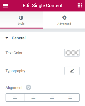
General
Text Color - here you can change the color of the item content text.
Typography — turn the option on to view the typography settings for the content text.
- Size — define the font size of the content text.
- Family — here you can set the font family for the content text.
- Weight — in this block you can select the suitable font weight.
- Transform — here you can choose from the dropdown menu, if you want the text to be shown in uppercase, lowercase, capitalize or normal way.
- Style — in this block you can choose from the dropdown menu the style of the font. It can be normal, italic (the characters look similar to handwriting) and oblique (the characters are slightly inclined to the right).
- Line Height — in this field you can set the height of the content text.
- Letter Spacing — here you can set the space between the content text characters.
Alignment - here you can set the preferable alignment to use for the content (left, center, right, justified).
Single Excerpt
This widget is perfect for displaying the excerpt which is added in the Product Short Description field on the Product page.
Style
General
Color - here you can change the color of the product description to the one more suitable.
Typography — turn the option on to view the typography settings for the product description text.
- Size — define the font size of the product description text.
- Family — here you can set the font family for the product description text.
- Weight — in this block you can select the suitable font weight.
- Transform — here you can choose from the dropdown menu, if you want the text to be shown in uppercase, lowercase, capitalize or normal way.
- Style — in this block you can choose from the dropdown menu the style of the font. It can be normal, italic (the characters look similar to handwriting) and oblique (the characters are slightly inclined to the right).
- Line Height — in this field you can set the height of the product description text.
- Letter Spacing — here you can set the space between the product description text characters.
Alignment - here you can set the preferable alignment to use for the content (left, center, right, justified).
Single Images
This widget makes it simple to add the product featured image to the product page and has stylization options available for setting up.
Style
Main Image
Images Block Width - here you can change the width of the block where the image is shown in percentage for different devices.
Margin - here you can set the preferable margins to use for the image on different devices.
Border type - here you can set the border to use for the image (solid, dotted, dashed, double, groove or none).
Width - here you can set the custom width to apply for the border.
Color - set the needed color to use for the border.
Box Shadow - here you can apply the shadow for the image container. The shadow settings are similar for all of JetWooBuilder widgets and their stylization elements.
Thumbnails
Thumbnails Width - here you can apply the custom width for the product image thumbnails.
Padding - in this block you can set the preferable padding values to use for the image thumbnails.
Border Type - here you can set the border to use for the image thumbnails (solid, dotted, dashed, double, groove or none).
Width - here you can set the custom width to apply for the border.
Color - set the needed color to use for the border.
Box Shadow - here you can apply the shadow for the image thumbnails container. The shadow settings are similar for all of JetWooBuilder widgets and their stylization elements.
Single Meta
This widget embeds the SKU number, category and tag used for the product to the page, and allows changing the color, typography and alignment for this information.
Style
SKU
Color - here you can set the custom color to use it for the SKU unique product value.
Typography — turn the option on to view the typography settings for the product SKU text.
- Size — define the font size of the product SKU text.
- Family — here you can set the font family for the product SKU text.
- Weight — in this block you can select the suitable font weight.
- Transform — here you can choose from the dropdown menu, if you want the text to be shown in uppercase, lowercase, capitalize or normal way.
- Style — in this block you can choose from the dropdown menu the style of the font. It can be normal, italic (the characters look similar to handwriting) and oblique (the characters are slightly inclined to the right).
- Line Height — in this field you can set the height of the product SKU text.
- Letter Spacing — here you can set the space between the product SKU text characters.
Margin - here you can set the preferable margins to use for the SKU text and value.
Alignment - here you can set the preferable alignment to use for the content (left, center, right).
Value
Color - here you can set the specific color separately to the SKU value.
Typography — turn the option on to view the typography settings for the product SKU value.
- Size — define the font size of the product SKU value.
- Family — here you can set the font family for the product SKU value.
- Weight — in this block you can select the suitable font weight.
- Transform — here you can choose from the dropdown menu, if you want the text to be shown in uppercase, lowercase, capitalize or normal way.
- Style — in this block you can choose from the dropdown menu the style of the font. It can be normal, italic (the characters look similar to handwriting) and oblique (the characters are slightly inclined to the right).
- Line Height — in this field you can set the height of the product SKU value.
- Letter Spacing — here you can set the space between the product SKU value characters.
Categories
Color - here you can set the specific color to use for the categories.
Typography — turn the option on to view the typography settings for the product categories.
- Size — define the font size of the product categories.
- Family — here you can set the font family for the product categories.
- Weight — in this block you can select the suitable font weight.
- Transform — here you can choose from the dropdown menu, if you want the text to be shown in uppercase, lowercase, capitalize or normal way.
- Style — in this block you can choose from the dropdown menu the style of the font. It can be normal, italic (the characters look similar to handwriting) and oblique (the characters are slightly inclined to the right).
- Line Height — in this field you can set the height of the product categories.
- Letter Spacing — here you can set the space between the product categories characters.
Margin - here you can set the preferable margins to use for the categories.
Alignment - here you can set the preferable alignment to use for the categories (left, center, right).
Link
Typography — turn the option on to view the typography settings for the product category links.
- Size — define the font size of the product category links.
- Family — here you can set the font family for the product category links.
- Weight — in this block you can select the suitable font weight.
- Transform — here you can choose from the dropdown menu, if you want the text to be shown in uppercase, lowercase, capitalize or normal way.
- Style — in this block you can choose from the dropdown menu the style of the font. It can be normal, italic (the characters look similar to handwriting) and oblique (the characters are slightly inclined to the right).
- Line Height — in this field you can set the height of the product category links.
- Letter Spacing — here you can set the space between the product category links characters.
Switch between Normal and Hover modes in order to customize the color of the categories in the normal state or when on mouse hover.
Color - here you can set the color to use for the category links on hover or in normal state.
Tags
Color - here you can set the specific color to use for the tags.
Typography — turn the option on to view the typography settings for the product tags.
- Size — define the font size of the product tags.
- Family — here you can set the font family for the product tags.
- Weight — in this block you can select the suitable font weight.
- Transform — here you can choose from the dropdown menu, if you want the text to be shown in uppercase, lowercase, capitalize or normal way.
- Style — in this block you can choose from the dropdown menu the style of the font. It can be normal, italic (the characters look similar to handwriting) and oblique (the characters are slightly inclined to the right).
- Line Height — in this field you can set the height of the product tags.
- Letter Spacing — here you can set the space between the product tag characters.
Margin - here you can set the preferable margins to use for the tags.
Alignment - here you can set the preferable alignment to use for the tags (left, center, right).
Link
Typography — turn the option on to view the typography settings for the product tag links.
- Size — define the font size of the product tag links.
- Family — here you can set the font family for the product tag links.
- Weight — in this block you can select the suitable font weight.
- Transform — here you can choose from the dropdown menu, if you want the text to be shown in uppercase, lowercase, capitalize or normal way.
- Style — in this block you can choose from the dropdown menu the style of the font. It can be normal, italic (the characters look similar to handwriting) and oblique (the characters are slightly inclined to the right).
- Line Height — in this field you can set the height of the product tag links.
- Letter Spacing — here you can set the space between the product tag links characters.
Color - here you can set the color to use for the tag links on hover or in normal state.
Switch between Normal and Hover modes in order to customize the color of the tag links in the normal state or when on mouse hover.
Single Price
This widget makes it easy to embed the product price and sale price to the Single Product page. One can also customize the prices along with the currency signs.
Style
Typography — turn the option on to view the typography settings for the product price.
- Size — define the font size of the product price.
- Family — here you can set the font family for the product price.
- Weight — in this block you can select the suitable font weight.
- Transform — here you can choose from the dropdown menu, if you want the text to be shown in uppercase, lowercase, capitalize or normal way.
- Style — in this block you can choose from the dropdown menu the style of the font. It can be normal, italic (the characters look similar to handwriting) and oblique (the characters are slightly inclined to the right).
- Line Height — in this field you can set the height of the product price.
- Letter Spacing — here you can set the space between the product price characters.
Color - here you can change the general color which is applied to the prices.
Space Between Prices - use the controls to set the space between the prices (regular and sale price) and make it responsive.
Switch between Regular and Sale modes in order to customize both product prices.
Color - here you can change the color to use it for the price.
Text Decoration - here you can add the text decorations for the prices (none, line through, e.g., when the regular price is no more active, and underline to make the price stand out.
Size - here you can set the needed size for the prices to make them responsive.
Font Weight - here you can specify the font weight to use for the prices.
Surrency Sign
Color - here you can specify the color to use for the currency sign only.
Size - here you can set the size to use for the currency sign to make it responsive.
Vertical Alignment - here you can change the currency sign alignment to position it beside the price value.
Switch between Regular and Sale mode in order to customize both sale and regular prices.
Color - here you can change the color of the currency sign.
Size - use the controls in order to set the size of the currency sign and make it responsive.
Single Rating
This widget is invaluable when adding the product rating to the Single Product page and styling it up according to one’s vision.
Style
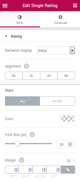
Elements Display - here you can specify if you want the stars and review link to be shown in line or as a block.
Alignment - here you can set the rating to be shown in the center, justified, or align it right or left.
Color - here you can change the color of the stars in the rating.
Font Size - in this block you can change the size of the stars.
Margin - set the custom margins to apply for the stars.
Typography — turn the option on to view the typography settings for the review link.
- Size — define the font size of the review link.
- Family — here you can set the font family for the review link.
- Weight — in this block you can select the suitable font weight.
- Transform — here you can choose from the dropdown menu, if you want the text to be shown in uppercase, lowercase, capitalize or normal way.
- Style — in this block you can choose from the dropdown menu the style of the font. It can be normal, italic (the characters look similar to handwriting) and oblique (the characters are slightly inclined to the right).
- Line Height — in this field you can set the height of the review link.
- Letter Spacing — here you can set the space between the review link characters.
Color - here you can specify which color you want to apply for the review link.
Margin - in this block you can set the custom margins to use for the review link.
Stars
Switch between All and Rated modes in order to customize the appearance of both.
Reviews Link
Switch between Normal and Hover modes in order to make changes in the appearance of the Review links on mouse hover and in its normal state.
Single Related Products
This widget makes it possible to display the related products list and style the colors and the typography for them. Note, that in the related products the widget displays the recently added products that have similar tags or categories.
Style
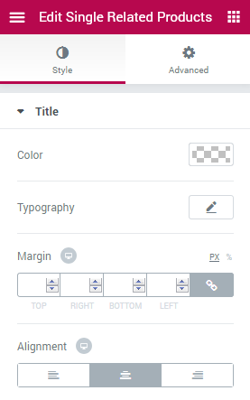
Color - here you can change the color which is applied to the title of the widget.
Typography — turn the option on to view the typography settings for the related products title.
- Size — define the font size of the related products title.
- Family — here you can set the font family for the related products title.
- Weight — in this block you can select the suitable font weight.
- Transform — here you can choose from the dropdown menu, if you want the text to be shown in uppercase, lowercase, capitalize or normal way.
- Style — in this block you can choose from the dropdown menu the style of the font. It can be normal, italic (the characters look similar to handwriting) and oblique (the characters are slightly inclined to the right).
- Line Height — in this field you can set the height of the related products title.
- Letter Spacing — here you can set the space between the related products title characters.
Margin - here you can set the custom margins to use for the title.
Alignment - here you can change the position of the title aligning it to the center, left or right.
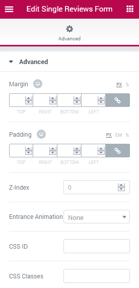
Single Reviews Form
This widget allows displaying the reviews for the product along with the field for adding a new review. The Single Reviews Form widget is necessary when one wants the customers to be able to leave reviews.
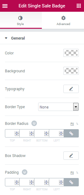
Single Sale Badge
This widget makes it simple to add the Sale badge to the product’s page. Note, that one should set the Sale price in Products > Product Data Sale Price field to enable this functionality.
Style
Color - here you can change the color to use it for the Sale badge text.
Background - here you can change the color of the Sale badge background.
Typography — turn the option on to view the typography settings for the Sale badge text.
- Size — define the font size of the Sale badge text.
- Family — here you can set the font family for the Sale badge text.
- Weight — in this block you can select the suitable font weight.
- Transform — here you can choose from the dropdown menu, if you want the text to be shown in uppercase, lowercase, capitalize or normal way.
- Style — in this block you can choose from the dropdown menu the style of the font. It can be normal, italic (the characters look similar to handwriting) and oblique (the characters are slightly inclined to the right).
- Line Height — in this field you can set the height of the Sale badge text.
- Letter Spacing — here you can set the space between the Sale badge text characters.
Border Type - here you can change the appearance of the Sale badge border by selecting one of the border types.
Border Radius - here you can change the border radius in order to make the angles more smooth and rounded.
Box Shadow - here you can apply the shadow to use for the badge.
Padding - here you can apply custom padding in order to use it for the element.
Single Sharing
This widget adds social icons for the product. Please, note that you need to install and activate the JetPack plugin for WordPress (it is completely free and available at wordpress.org) and set the icons for the JetWooBuilder templates and Product pages. The icons can’t be styled.
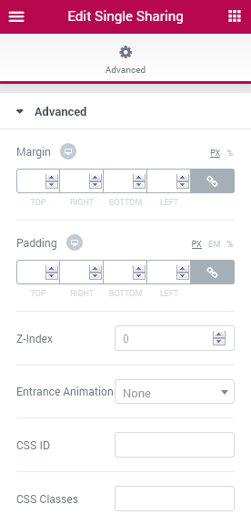
The widget has only Advanced settings the overview of which is available in the Advanced Settings. documentation block.
Single Tabs
This widget provides the opportunity to place the reviews and product description into tabs, which can be opened on click. This widget allows to effectively use the space of the Single Product page.
Style
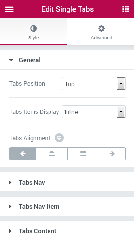
General
Tabs Position - here you can select the most preferable position for the tabs (top, left or right).
Tabs Items Display - here you can set the width to use for the Tab containers.
Tabs Alignment - in this block you can select the alignment to use for the tabs (right, left, center, stretch).
Tabs Nav
Background Type - here you can set the preferable background type to use for the tab controls (boxes). It can be Classic or Gradient background.
Classic Background Type
Color - here you can set the specific color to use for the tab controls.
Image - click the image box and upload an image in order to use it as a background for the tab controls.
Position - here you can position the image used for the background according to your needs.
Attachment - here you can make the image fixed or allow it to be scrolled.
Repeat - here you can allow the image to be repeated horizontally, vertically, tiled or restrict repeating.
Size - select Cover, Contain or Auto image sizing in order to make it fitted into the tabs controls container.
Color - add the first color to use for the gradient background of the tab controls.
Location - here you can change the location of the first gradient color.
Second Color - add the second color to use for the gradient background.
Location - here you can change the location of the second gradient color.
Gradient Background Type
Type - here you can change the gradient location from linear to radial.
Angle - if the gradient type is lineer, you can change the angle to use for it.
Position - if the gradient is radial, here you can change the position of its center to the preferable one.
Padding - here you can set the padding for the tabs content.
Border type - here you can change the border type to the one needed (solid, dotted, dashed, double, groove or none).
Width - here you can set the width of the border in px.
Color - here you can choose the color to use for the border.
Border Radius - here you can apply a radius for the border andles to make them more smooth.
Tabs Nav Item
Typography — turn the option on to view the typography settings for the tabs nav text.
- Size — define the font size of the tabs nav text.
- Family — here you can set the font family for the tabs nav text.
- Weight — in this block you can select the suitable font weight.
- Transform — here you can choose from the dropdown menu, if you want the text to be shown in uppercase, lowercase, capitalize or normal way.
- Style — in this block you can choose from the dropdown menu the style of the font. It can be normal, italic (the characters look similar to handwriting) and oblique (the characters are slightly inclined to the right).
- Line Height — in this field you can set the height of the tabs nav text.
- Letter Spacing — here you can set the space between the tabs nav text characters.
Item Text Alignment - here you can change the text alignment in the tabs (left, center or right).
Padding - here you can apply the paddings for the tabs controls content.
Margin - here you can set the margins for the tabs nav elements.
Border Type - here you can set the type of the border to use (solid, dotted, double, dashed, groove or none).
Border Width - here you can specify the border width in px.
Border Color - here you can set the color of the borders to use.
Border Radius - here you can apply the radius for the border angles to make them more rounded and smooth.
Switch between Normal, Hover and Active modes to change the appearance of the tabs on mouse hover, when they are opened or inactive.
Text Color - here you can apply the borders to use for the tabs nav items.
Background - here you can set the color to use for the tab nav items.
Box Shadow - here you can set the shadow for each of the item nav boxes.
Tabs Content
Background Type - here you can set the preferable background type to use for the tab item content box. It can be Classic or Gradient background. The settings are similar to the ones for the backgrounds used for another JetWooBuilder elements.
Padding - here you can define the specific padding values to use for the tabs content.
Border Type - here you can specify the suiting border type to use for the tabs content (solid, dotted, double, dashed, groove or none).
Width - here you can set the width to use for the border in px.
Color - here you can specify the color to use for the border.
Border Radius - here you can apply the radius for the borders to make the angles more round and smooth.
Single Title
This widget allows adding the product title to the Single Product page. It adds the title set on the Product page in the Title field and provides stylization settings for it.
Style
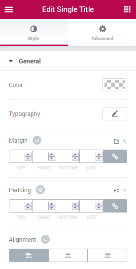
General
Color - here you can specify the color to use for the product title.
Typography — turn the option on to view the typography settings for the title text.
- Size — define the font size of the title text.
- Family — here you can set the font family for the title text.
- Weight — in this block you can select the suitable font weight.
- Transform — here you can choose from the dropdown menu, if you want the text to be shown in uppercase, lowercase, capitalize or normal way.
- Style — in this block you can choose from the dropdown menu the style of the font. It can be normal, italic (the characters look similar to handwriting) and oblique (the characters are slightly inclined to the right).
- Line Height — in this field you can set the height of the title text.
- Letter Spacing — here you can set the space between the title text characters.
Margin - here you can specify the margins to use for the product title text.
Padding - here you can apply the custom padding values in order to position the title.
Alignment - here you can specify the alignment of the title (left, center, right).
Single Upsells
This widget adds the products which may also be needed by the customer when he purchases the product shown on the Single Product page. The upsell products can be set in Linked Products Upsells field available in Products > Product Data block.
Style
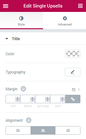
Title
Color - here you can change the color of the widget title.
Typography — turn the option on to view the typography settings for the title text.
- Size — define the font size of the title text.
- Family — here you can set the font family for the title text.
- Weight — in this block you can select the suitable font weight.
- Transform — here you can choose from the dropdown menu, if you want the text to be shown in uppercase, lowercase, capitalize or normal way.
- Style — in this block you can choose from the dropdown menu the style of the font. It can be normal, italic (the characters look similar to handwriting) and oblique (the characters are slightly inclined to the right).
- Line Height — in this field you can set the height of the title text.
- Letter Spacing — here you can set the space between the title text characters.
Margin - here you can specify the margins to use for the widget title text.
Alignment - here you can specify the alignment of the widget title (left, center, right).
Categories Grid
This widget adds the WooCommerce Product Categories Grid layouts to the pages built with Elementor on WooCommerce-based websites.
Content
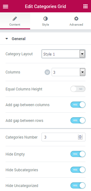
Category Layout - here you can change the layouts for the categories according to your needs (there are 5 different layout types).
Columns - here you can change the number of columns to use for the grid (for 1 to 6 columns) and make the columns responsive by changing their number for desktop, mobile and tablet devices.
Equal Columns Height - enable this option in order to make the height of the columns the same for all every column.
Add gap between columns - here you can set the gap distance between the columns.
Add gap between rows - here you can apply the gap distance between the grid rows.
Categories number - here you can set the number of categories to be shown.
Hide empty - enable this option in order to hide the empty categories from view.
Hide Subcategories - enable this option in order to hide the subcategories from view.
Hide uncategorized - here you can hide from view the uncategorized products.
Show by - use the dropdown menu in order to select the method by which the categories will be displayed (all categories, parent categories only, or category IDs to display the specific categories only).
Set comma separated IDs list - here you can set the list of category IDs to be displayed in the case you’ve selected IDs in the Show by menu.
Order by - here you can set the ascending (ASC) or descending (DESC) order for the categories to be shown.
Sort by - here you need to specify the method using which the categories will be sorted (by name, ID or count).
Show Categories Featured Image- enable this option in order to enable the use of the featured image for the categories.
Featured Image Size - here you can select the size to apply for the featured image (the sizes often depend on the ones already available in the theme for customization).
Show Categories Title - here you can enable the title to be displayed for the categories.
Show Products Count - here you can enable displaying the count of the products related to this category.
Count Before/After Text - here you can define the text or brackets to use for displaying before/after the count.
Show Categories Description - enable this option in order to display the description for the category.
Description Words Count - here you can set the number of words to be shown in the description.
Trimmed After Text - here you can set the symbol or suspension dots to be shown after the description.
Carousel
Enable Carousel - enable this option in order to apply the categories carousel.
Slides Minimal Height - here you can define the minimum height for the carousel slides to use for different devices.
Slides to Scroll - here you can specify the number of slides to scroll.
Show Arrows Navigation - enable this option in order to display the navigation arrows for the slides to allow the users switch the slides.
Prev/Next Arrow Icon - here you can specify the icons to use for the navigation.
Show Dots Navigation - enable this option to display the pagination dots for the slides to enable users switch between them.
Pause on Hover - enable this option to make the carousel or slider pause when one hovers on it.
Autoplay - enable this option to use the autoplay for the slides.
Autoplay Speed - here you can specify the speed used for the autoplay.
Infinite Loop - enable this option to make the slides switch automatically infinitely.
Animation Speed - here you can define the speed of the animated switching between the slides.
Style
Column
Column Padding - here you need to specify the padding values for the columns and make the paddings responsive.
Category Item
Background Color - here you can set the color to use for the category item background using color picker tool.
Border Type - here you can define the type of the border to apply for the item (or apply no border, according to your needs).
Width - here you need to set the width of the border that will be shown in pixels.
Color - here you can customize the color of the border.
Border Radius - here you can set the border radius values to make the angles more smooth and round.
Box Shadow - here you can apply the shadow for the item. Click the Edit pencil option to open the additional shadow settings.
Padding - here you can define the padding values for the item.
Category Item (hover)
Title
Color - here you can specify the color of the item title on hover.
Excerpt
Color - here you can set the color to use for the item excerpt text on hover.
Count
Background Color - here you can specify the color to use for the category products count background.
Color - here you can set the color for the category count.
Border Color - use the color picker tool to set the color for the border.
Content
Background Color - here you can specify the color to apply for the content background.
Border Color - here you need to set the color to use for the content border.
Category Thumbnail (Image)
Border Type - here you can set the border to apply for the thumbnail image (or use None to use no border at all).
Width - here you need to set the width for the border.
Color - here you can customize the color to apply for the border.
Border Radius - here you can set the radius for the border to make its angles more round.
Box Shadow - click Edit pencil option to apply a shadow for the thumbnail image and customize its settings.
Margin - here you can apply the specific margin values for the thumbnail and make it responsive.
Padding - here you can set the custom paddings for the thumbnail and make them responsive.
Content
Background Color - here you can set the background color to apply for the content.
Border Type - here you can select the desirable border type to apply for the content or apply no border at all.
Width - here you can set the needed width for the border.
Color - here you can specify the color to apply for the border.
Border Radius - here you need to set the radius for the border in the case you want to make its angles more smooth.
Box shadow - click Edit pencil option to apply a shadow for the content block and customize its settings.
Margin - here you can apply the specific margin values for the content block and make it responsive.
Padding - here you can set the custom paddings for the content block and make them responsive.
Title
Typography - here you can edit the typography settings. They are the same as available for other JetWooBuilder widgets.
Background Color - here you can set the needed color to use for the background of the title.
Background Color - here you can specify the color to apply for the content background.
Border Color - here you need to set the color to use for the content border.
Border Type - here you can set the border to apply for the thumbnail image (or use None to use no border at all).
Width - here you need to set the width for the border.
Color - here you can customize the color to apply for the border.
Border Radius - here you can set the radius for the border to make its angles more round.
Box Shadow - click Edit pencil option to apply a shadow for the thumbnail image and customize its settings.
Margin - here you can apply the specific margin values for the thumbnail and make it responsive.
Padding - here you can set the custom paddings for the thumbnail and make them responsive.
Background Color - here you can set the background color to apply for the content.
Border Type - here you can select the desirable border type to apply for the content or apply no border at all.
Width - here you can set the needed width for the border.
Color - here you can specify the color to apply for the border.
Border Radius - here you need to set the radius for the border in the case you want to make its angles more smooth.
Box shadow - click Edit pencil option to apply a shadow for the content block and customize its settings.
Margin - here you can apply the specific margin values for the content block and make it responsive.
Padding - here you can set the custom paddings for the content block and make them responsive.
Typography - here you can edit the typography settings. They are the same as available for other JetWooBuilder widgets.
Background Color - here you can set the needed color to use for the background of the title.
Switch between Normal and Hover modes in order to change the style settings for the title in its normal state and when on hover.
Color - here you need to specify the color of the title.
Alignment - here you can change the title alignment to the more preferable one.
Padding - here you can set the specific paddings to apply for the title and make them responsive.
Margin - here you can set the needed margin values for the title and make them responsive.
Count
Typography - here you can edit the typography settings. They are the same as available for other JetWooBuilder widgets.
Background Color - here you can set the needed color to use for the background of the count.
Switch between Normal and Hover modes in order to change the style settings for the count in its normal state and when on hover.
Color - here you need to specify the color of the count.
Alignment - here you can change the count alignment to the more preferable one.
Padding - here you can set the specific paddings to apply for the count and make them responsive.
Margin - here you can set the needed margin values for the count and make them responsive.
Excerpt
Typography - here you can edit the typography settings. They are the same as available for other JetWooBuilder widgets.
Background Color - here you can set the needed color to use for the background of the excerpt text.
Switch between Normal and Hover modes in order to change the style settings for the excerpt text in its normal state and when on hover.
Color - here you need to specify the color of the excerpt text.
Alignment - here you can change the excerpt text alignment to the more preferable one.
Padding - here you can set the specific paddings to apply for the excerpt and make them responsive.
Margin - here you can set the needed margin values for the excerpt and make them responsive.
Overlay
Switch between Normal and Hover modes in order to change the style settings for the overlay in its normal state and when on hover.
Background Type - here you can set the type of the background you want to use (classic or gradient background tyle). The customization settings for each type are similar to the settings for other JetWooBuilder widgets.
Color - here you can set the color to use for the overlay using color picker tool.
Carousel Arrows
Switch between Normal and Hover modes in order to change the style settings for the carousel arrows in its normal state and when on hover.
Typography - here you can edit the typography settings. They are the same as available for other JetWooBuilder widgets.
Prev / Next Arrow Position
Vertical/Horizontal Position by - here you can set the arrows position (top or bottom, left or right).
Top/Left Indent - here you can set the needed indent to apply for the arrows using the corresponding controls.
Carousel Dots
Switch between Normal, Hover and Active modes in order to change the style settings for the carousel arrows in its normal state and when on hover.
Typography - here you can edit the typography settings. They are the same as available for other JetWooBuilder widgets.
Gap - here you can specify the gap distance to apply for the pagination dots.
Dots Box Margin - here you can set the needed margins for the pagination dots box.
Alignment - here you can specify the needed alignment for the pagination dots.
Products List
This widget adds the stylish listing of the WooCommerce products to the pages built with Elementor.
Content
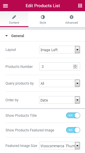
General
- Layout - here you can specify the desirable layout for the product list (image on the left, on the right or on the top).
- Products Number - here you can set the number of the products to display in the list.
- Query products by - here you can specify the query method for the products (all, featured, sale, tag, category, specific ID). Note, that depending on the query method you’ll need to provide the IDs, categories and tags.
- Order by - here you need to set the order in which the products will be shown (date, price, sales, top rated, random).
- Show Products Title - enable this option in order to display the title for the products in the list.
- Show Products Featured Image - enable this option in order to display the featured image for the products in the list.
- Featured image Size - here you can set the size for the featured image (depending on the sizes available for choosing in your theme).
- Show Product Categories - enable this option to display the product categories.
- Show Product Price - here you can display the product price or hide it.
- Show Product Rating - enable this option to display the rating for the product of hide it from view.
- Show Add to Cart button - enable this option to display Add to Cart button and allow the visitors make purchases using it.
Use default Ajax Add to Cart styles - this option enables default WooCommerce styles to 'Add to Cart' Ajax button ('Loading' and 'Added' statements).
In case JetCompareWishlist plugin is installed and actived there are such additional settings:
- Show Compare - enable this option if you want to add a compare button to the products.
- Compare Button Order - here you can specify the order of the compare button.
- Show Wishlist - enable this option if you want to add a wishlist button to the products.
- Wishlist Button Order - here you can specify the order of the wishlist button.
Compare
Button Icon - here you can define an icon for the compare button in Normal and Added status of the product.
Button Label Text - here you can paste a label text of the compare button in Normal and Added status of the product.
Here you can switch from customizing Normal to Added content settings. Just click on the button Added to proceed to customizing added elements.
Icon
Use Icon - enable this option if you want to display an icon on the compare button.
Icon Position - here you can specify the position of the icon on the compare button (left, top, right, bottom).
Wishlist
Button Icon - here you can define an icon for the wishlist button in Normal status of the product.
Button Label Text - here you can paste a label text for the wishlist button in Normal status of the product.
Button Icon - here you can define an icon for the wishlist button in Added status of the product.
Button Label Text - here you can paste a label text for the wishlist button in Added status of the product.
Icon
Icon Position - here you can specify position of the icon on the wishlist button (left, top, right, bottom).
Style
Product Item
- Vertical Alignment - here you can define the alignment type to apply for the item (top, center, bottom, stretch).
- Space Between Items - here you can set the gap to apply between the items and make this distance responsive.
- Background Color - here you can specify the background color to use for the item.
- Border Type - here you can set the type of the border to apply for the item (the specific type of no border at all).
- Width - here you can set the width of the border in order to make its appearance more stylish.
- Color - here you can specify the color of the border according to your vision.
- Border Radius - here you can set the radius values for the border to make its angles more smooth.
- Box Shadow - here you can apply the shadow to be displayed for the item and customize its settings when clicking on Edit pencil option.
- Padding - here you can set the preferable padding values for the product list.
Product Thumbnail (Image)
- Image Width -here you can make the width of the image fully responsive.
- Border Type - here you can set the border to apply for the thumbnail image (or use None to use no border at all).
- Width - here you need to set the width for the border.
- Color - here you can customize the color to apply for the border.
- Border Radius - here you can set the radius for the border to make its angles more round.
- Box Shadow - click Edit pencil option to apply a shadow for the thumbnail image and customize its settings.
- Padding - here you can set the custom paddings for the thumbnail and make them responsive.
Content
- Border Type - here you can select the desirable border type to apply for the content or apply no border at all.
- Width - here you can set the needed width for the border.
- Color - here you can specify the color to apply for the border.
- Border Radius - here you need to set the radius for the border in the case you want to make its angles more smooth.
- Box shadow - click Edit pencil option to apply a shadow for the content block and customize its settings.
- Padding - here you can set the custom paddings for the content block and make them responsive.
Title
- Typography - here you can edit the typography settings. They are the same as available for other JetWooBuilder widgets.
- Background Color - here you can set the needed color to use for the background of the title.
Switch between Normal and Hover modes in order to change the style settings for the title in its normal state and when on hover.
- Color - here you need to specify the color of the title.
- Alignment - here you can change the title alignment to the more preferable one.
- Padding - here you can set the specific paddings to apply for the title and make them responsive.
- Margin - here you can set the needed margin values for the title and make them responsive.
Categories
- Typography - here you can edit the typography settings. They are the same as available for other JetWooBuilder widgets.
- Background Color - here you can set the needed color to use for the background of the categories.
Switch between Normal and Hover modes in order to change the style settings for the categories in normal state and when on hover.
- Color - here you need to specify the color of the categories.
- Alignment - here you can change the categories alignment to the more preferable one.
- Padding - here you can set the specific paddings to apply for the categories and make them responsive.
- Margin - here you can set the needed margin values for the categories and make them responsive.
Price
- Typography - here you can edit the typography settings. They are the same as available for other JetWooBuilder widgets.
- Color - here you need to specify the color of the price.
- Space Between Prices - here you can set the preferable distance between the prices shown.
Switch between Regular and Sale modes in order to customize the appearance of both.
- Color - here you can customize the prices appearance on sale and when it is a regular price.
- Text Decoration - here you can add the text decoration element for the sale or regular price.
- Size - here you can specify the size of the price shown to make the sale price show up larger than the regular one.
- Font Weight - here you can customize the font weight to apply for the sales or regular price.
- Alignment - here you can change the price alignment ot the one more preferable (left, right, center).
- Margin - here you can apply the margins for the price.
Currency Sign
- Color - here you ca npicke the color to use for the currency sign.
- Size - here you can set the size of the currency sign.
- Vertical Alignment - here you can change the vertical alignment for the currency sign to the one needed (the list of available alignments will show the variations).
Switch between Regular and Sale modes in order to customize the appearance of the currency sign for both.
- Color - here you can select the different color of the sign when it is set for the sales or regular price.
- Size - here you can change the size of the currency sign when it is set for the regular or sales price.
Rating
Switch between All and Rated modes to customize both.
- Color - here you can select the color to apply for the rate.
- Font Size - here you can specify the size to apply for the rating.
- Alignment - here you can select the needed alignment to use for the rating (left, center, right).
- Margin - here you can set the custom margins to apply for the rating.
Button
- Typography - here you can edit the typography settings. They are the same as available for other JetWooBuilder widgets.
Switch between Normal and Hover styles to customize both for the button.
- Background Type - here you can choose if you want to apply the classic or gradient background for the button, and customize both according to your needs. The style settings are similar as the ones available for other JetWooBuilder widgets.
- Color - here you can set the color to apply for the button.
- Text Color - here you can change the color of the button text.
- Text Decoration - here you can specify if you want to use any text decoration element.
- Border type - here you can set the border for the button (and also set its width, type, color, or not use any borders at all by selecting None).
- Border Radius - here you can set the radius of the border t omake is angles more round and smooth.
- Box Shadow - here you can apply the shadow for the button and set its styles according to your needs.
- Alignment - here you can change the button alignment to set its positioning to the left, right, or centered.
- Padding - here you can set the padding values to apply the custom paddings for the button.
- Margin - here you can specify the custom margin values to apply a responsive margin for the button.
Compare
Typography - turn the option on to view the typography settings.
Custom Size - enable this option if you want to set the custom size of the compare button.
Color - here you can pick color for the label text and icon of the compare button.
Background Color - here you can select background color of the compare button.
Border Color - here you can choose color of the border of the compare button.
Border Type - here you can define the type of the border you need to use for the element.
Width - here you can specify width of the borders.
Color - here you can pick color for the borders of the compare button.
Border Radius - here you can define the value of the border radius to make the angles more smooth and round.
Alignment - here you can define the preferable alignment of the compare button. The compare button can be placed to the left, to the right, or remain centered.
Padding - here you can set the preferable custom padding for the compare button. Fill in the values for the top, bottom, right and left padding in pixels to apply your custom padding.
Margin - here you can apply your custom margins in pixels or percentage to set them for the compare button.
Here you can switch from customizing Normal to Hover and Added Compare button style settings. Just click on the button Hover and Added to proceed to customizing hover and added elements.
Icon
Color - here you can pick color of the icon on the compare button.
Font Size - here you can define font size of the icon on the compare button.
Margin - here you can apply your custom margins in pixels or percentage to set them for the icon on the compare button.
Here you can switch from customizing Normal to Added and Hover Icon style settings. Just click on the button Added and Hover to proceed to customizing icon hover and added elements.
Wishlist
Typography - turn the option on to view the typography settings.
Custom Size - enable this option if you want to set the custom size of the wishlist button.
Color - here you can pick color for the label text and icon of the wishlist button.
Background Color - here you can select background color of the wishlist button.
Border Color - here you can choose color of the border of the wishlist button.
Border Type - here you can define the type of the border you need to use for the element.
Width - here you can specify width of the borders.
Color - here you can pick color for the borders of the wishlist button.
Border Radius - here you can define the value of the border radius to make the angles more smooth and round.
Alignment - here you can define the preferable alignment of the wishlist button. The wishlist button can be placed to the left, to the right, or remain centered.
Padding - here you can set the preferable custom padding for the wishlist button. Fill in the values for the top, bottom, right and left padding in pixels to apply your custom padding.
Margin - here you can apply your custom margins in pixels or percentage to set them for the wishlist button.
Here you can switch from customizing Normal to Hover or Added Wishlist button style settings. Just click on the button Hover orAdded to proceed to customizing hover and added elements.
Icon
Color - here you can pick color of the icon on the wishlist button.
Font Size - here you can define font size of the icon on the wishlist button.
Margin - here you can apply your custom margins in pixels or percentage to set them for the icon on the wishlist button.
Here you can switch from customizing Normal, Added to Hover Icon style settings. Just click on the button Added and Hover to proceed to customizing added and hover elements.
Products Grid
This widget adds the WooCommerce products into attractive grid layouts to the pages built with Elementor.
Content
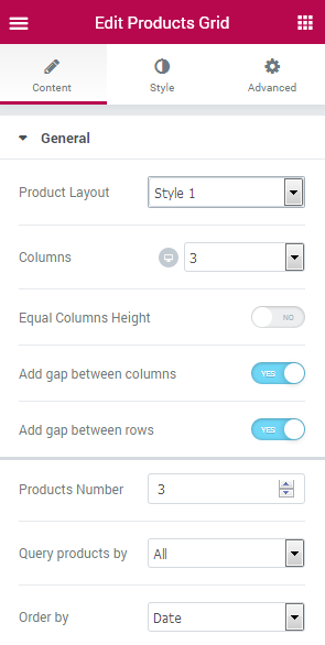
General
Product Layout - here you can set one of 5 available grid layouts to apply for the products.
Columns - here you can change the number of columns to use for the grid (for 1 to 6 columns) and make the columns responsive by changing their number for desktop, mobile and tablet devices.
Equal Columns Height - enable this option in order to make the height of the columns the same for all every column.
Add gap between columns - here you can set the gap distance between the columns.
Add gap between rows - here you can apply the gap distance between the grid rows.
Products number - here you can set the number of categories to be shown.
Query products by - here you can specify the query method to apply for the products shown in the grod (all, featured, sale, tag, category, specific ID).
Order by - here you can set the needed product order in the grid.
Use Current Query - enable this option if you want to display products for the current categories, tags and taxonomies. This option works only on the shop archive page.
Show Products Title - here you can enable the displaying of the products title.
Show Products Featured Image - enable this option in order to enable the use of the featured images for the products.
Featured Image Size - here you can select the size to apply for the featured image (the sizes often depend on the ones already available in the theme for customization).
Show Badges - enable this option to display the badges.
Set Sale badge text - here you can set the text which will be displayed inside the badge.
Show Product Excerpt - here you can enable displaying of the product description excerpt.
Show Product Categories - here you can define if the categories for the products will be displayed.
Show Product Tags - here you can enable the displaying of the product tags.
Show product Price - enable this option to make the price visible for the products.
Show Product rating - here you can enable showing the rating of the products.
Show Add to Cart button - enable this option to let the visitors purchase the products shown in the grid.
Use default Ajax Add to Cart styles - this option enables default WooCommerce styles to Add to Cart Ajax button ('Loading' and 'Added' states).
- Show Compare - enable this option if you want to add a compare button to the products.
- Compare Button Order - here you can specify the order of the compare button.
- Show Wishlist - enable this option if you want to add a wishlist button to the products.
- Wishlist Button Order - here you can specify the order of the wishlist button.
Enable Carousel - enable this option in order to apply the categories carousel.
Slides Minimal Height - here you can define the minimum height for the carousel slides to use for different devices.
Slides to Scroll - here you can specify the number of slides to scroll.
Show Arrows Navigation - enable this option in order to display the navigation arrows for the slides to allow the users switch the slides.
Prev/Next Arrow Icon - here you can specify the icons to use for the navigation.
Show Dots Navigation - enable this option to display the pagination dots for the slides to enable users switch between them.
Pause on Hover - enable this option to make the carousel or slider pause when one hovers on it.
Autoplay - enable this option to use the autoplay for the slides.
Autoplay Speed - here you can specify the speed used for the autoplay.
Infinite Loop - enable this option to make the slides switch automatically infinitely.
Animation Speed - here you can define the speed of the animated switching between the slides.
Button Icon - here you can define an icon for the compare button in Normal and Added status of the product.
Button Label Text - here you can paste a label text of the compare button in Normal and Added status of the product.
Use Icon - enable this option if you want to display an icon on the compare button.
Icon Position - here you can specify the position of the icon on the compare button (left, top, right, bottom).
Button Icon - here you can define an icon for the wishlist button in Normal status of the product.
Button Label Text - here you can paste a label text for the wishlist button in Normal status of the product.
Button Icon - here you can define an icon for the wishlist button in Added status of the product.
Button Label Text - here you can paste a label text for the wishlist button in Added status of the product.
Icon Position - here you can specify position of the icon on the wishlist button (left, top, right, bottom).
Column Padding - here you need to specify the padding values for the columns and make the paddings responsive.
Background Color - here you can set the color to use for the product item background using color picker tool.
Border Type - here you can define the type of the border to apply for the item (or apply no border, according to your needs).
Width - here you need to set the width of the border that will be shown in pixels.
Color - here you can customize the color of the border.
Border Radius - here you can set the border radius values to make the angles more smooth and round.
Box Shadow - here you can apply the shadow for the item. Click the Edit pencil option to open the additional shadow settings.
Padding - here you can define the padding values for the item.
Border Type - here you can set the border to apply for the thumbnail image (or use None to use no border at all).
Width - here you need to set the width for the border.
Color - here you can customize the color to apply for the border.
Border Radius - here you can set the radius for the border to make its angles more round.
Box Shadow - click Edit pencil option to apply a shadow for the thumbnail image and customize its settings.
Margin - here you can apply the specific margin values for the thumbnail and make it responsive.
Padding - here you can set the custom paddings for the thumbnail and make them responsive.
Typography - here you can edit the typography settings. They are the same as available for other JetWooBuilder widgets.
Background Color - here you can set the background color to apply for the title.
Color - here you can set the color to use for the title when on hover and in normal state.
Alignment - here you can change the title alignment on hover and in normal state.
Padding - here you can customize the padding values to apply the custom padding for the title and make it responsive.
Margin - here you can apply your custom margins for the title and make them responsive.
Order - here you can set the order of the title defining where it will be shown on the grid block.
Typography - here you can edit the typography settings. They are the same as available for other JetWooBuilder widgets.
Background Color - here you can set the background color to apply for the excerpt.
Color - here you can set the color to use for the excerpt when on hover and in normal state.
Alignment - here you can change the excerpt alignment on hover and in normal state.
Padding - here you can customize the padding values to apply the custom padding for the excerpt and make it responsive.
Margin - here you can apply your custom margins for the excerpt and make them responsive.
Order - here you can set the order of the excerpt defining where it will be shown on the grid block.
Button Display - here you can specify if you want the button to be displayed in line or as a block.
Typography - here you can edit the typography settings. They are the same as available for other JetWooBuilder widgets.
Background Type - here you can specify if you want to use the classic or gradient background and change the background style with the available options (they are similar for all JetWooBuilder widgets).
Text Color - here you can change the color of the button text.
Text Decoration - here you can apply the decoration elements for the text (such as underlining).
Border Type - here you can select the desirable border type to apply for the button or apply no border at all.
Width - here you can set the needed width for the border.
Color - here you can specify the color to apply for the border.
Border Radius - here you need to set the radius for the border in the case you want to make its angles more smooth.
Box shadow - click Edit pencil option to apply a shadow for the button and customize its settings.
Margin - here you can apply the specific margin values for the button and make it responsive.
Padding - here you can set the custom paddings for the button and make them responsive.
Alignment - here you can specify the needed alignment for the button (left, center, right).
Order - here you can set the order for the button element to be shown in the grid for the product.
Typography - here you can edit the typography settings. They are the same as available for other JetWooBuilder widgets.
Color - here you need to specify the color of the price.
Space Between Prices - here you can set the preferable distance between the prices shown.
Color - here you can customize the prices appearance on sale and when it is a regular price.
Text Decoration - here you can add the text decoration element for the sale or regular price.
Size - here you can specify the size of the price shown to make the sale price show up larger than the regular one.
Font Weight - here you can customize the font weight to apply for the sales or regular price.
Alignment - here you can change the price alignment ot the one more preferable (left, right, center).
Margin - here you can apply the margins for the price.
Color - here you ca npicke the color to use for the currency sign.
Size - here you can set the size of the currency sign.
Vertical Alignment - here you can change the vertical alignment for the currency sign to the one needed (the list of available alignments will show the variations).
Color - here you can select the different color of the sign when it is set for the sales or regular price.
Size - here you can change the size of the currency sign when it is set for the regular or sales price.
Color - here you can select the color to apply for the rate.
Font Size - here you can specify the size to apply for the rating.
Alignment - here you can select the needed alignment to use for the rating (left, center, right).
Margin - here you can set the custom margins to apply for the rating.
Order - here you can specify the order of the Rating element to set the position where it will be shown in the grid for the product.
Typography - here you can edit the typography settings. They are the same as available for other JetWooBuilder widgets.
Background Color - here you can set the needed color to use for the background of the categories.
Color - here you need to specify the color of the categories.
Alignment - here you can change the categories alignment to the more preferable one.
Padding - here you can set the specific paddings to apply for the categories and make them responsive.
Margin - here you can set the needed margin values for the categories and make them responsive.
Order - here you can specify the order of the Categories shown in order to set the position for them for the product in the grid.
Typography - here you can edit the typography settings. They are the same as available for other JetWooBuilder widgets.
Background Color - here you can set the needed color to use for the background of the tags.
Color - here you need to specify the color of the tags.
Alignment - here you can change the tags alignment to the more preferable one.
Padding - here you can set the specific paddings to apply for the tags and make them responsive.
Margin - here you can set the needed margin values for the tags and make them responsive.
Order - here you can specify the order of the Tags shown in order to set the position for them for the product in the grid.
Badges Display - here you can set the way the badges are to be displayed (inline or as a block).
Min Width - here you can specify the minimum responsive width of the badge.
Min Height - here you can set the minimum responsive height of the badge.
Typography - here you can edit the typography settings. They are the same as available for other JetWooBuilder widgets.
Border type - here you can apply the needed border type for the badge and set its width, color, as well as define the border None not to use any borders for the badge.
Border Radius - here you can make the border angles more smooth by setting the custom border radius values.
Box Shadow - here you can apply the shadow for the badge and customize its appearance according to your needs.
Badge Color - here you can set the specific color to apply it for the badge.
Background Type - here you can set the classic or the gradient background type and customize it using the available settings (these are the same for all the JetWooBuilder widgets).
Attachment - here you can change the way how the badge is shown for the product (it can be fixed or can scroll with the page scrolling).
Alignment - here you can specify the desirable alignment for the badge (left, right, center).
Padding - here you can set the preferable custom paddings for the badge and make them responsive.
Margin - here you can set the needed custom margins for the badge and make them responsive.
Background Color - here you can specify the color to use for the product image overlay when on hover and in the normal state.
Typography - here you can edit the typography settings. They are the same as available for other JetWooBuilder widgets.
Vertical/Horizontal Position by - here you can set the arrows position (top or bottom, left or right).
Top/Left Indent - here you can set the needed indent to apply for the arrows using the corresponding controls.
Typography - here you can edit the typography settings. They are the same as available for other JetWooBuilder widgets.
Gap - here you can specify the gap distance to apply for the pagination dots.
Dots Box Margin - here you can set the needed margins for the pagination dots box.
Alignment - here you can specify the needed alignment for the pagination dots.
Typography - turn the option on to view the typography settings.
Custom Size - enable this option if you want to set the custom size of the compare button.
Color - here you can pick color for the label text and icon of the compare button.
Background Color - here you can select background color of the compare button.
Border Color - here you can choose color of the border of the compare button.
Border Type - here you can define the type of the border you need to use for the element.
Width - here you can specify width of the borders.
Color - here you can pick color for the borders of the compare button.
Border Radius - here you can define the value of the border radius to make the angles more smooth and round.
Alignment - here you can define the preferable alignment of the compare button. The compare button can be placed to the left, to the right, or remain centered.
Padding - here you can set the preferable custom padding for the compare button. Fill in the values for the top, bottom, right and left padding in pixels to apply your custom padding.
Margin - here you can apply your custom margins in pixels or percentage to set them for the compare button.
Color - here you can pick color of the icon on the compare button.
Font Size - here you can define font size of the icon on the compare button.
Margin - here you can apply your custom margins in pixels or percentage to set them for the icon on the compare button.
Typography - turn the option on to view the typography settings.
Custom Size - enable this option if you want to set the custom size of the wishlist button.
Color - here you can pick color for the label text and icon of the wishlist button.
Background Color - here you can select background color of the wishlist button.
Border Color - here you can choose color of the border of the wishlist button.
Border Type - here you can define the type of the border you need to use for the element.
Width - here you can specify width of the borders.
Color - here you can pick color for the borders of the wishlist button.
Border Radius - here you can define the value of the border radius to make the angles more smooth and round.
Alignment - here you can define the preferable alignment of the wishlist button. The wishlist button can be placed to the left, to the right, or remain centered.
Padding - here you can set the preferable custom padding for the wishlist button. Fill in the values for the top, bottom, right and left padding in pixels to apply your custom padding.
Margin - here you can apply your custom margins in pixels or percentage to set them for the wishlist button.
Color - here you can pick color of the icon on the wishlist button.
Font Size - here you can define font size of the icon on the wishlist button.
Margin - here you can apply your custom margins in pixels or percentage to set them for the icon on the wishlist button.
In case JetCompareWishlist plugin is installed and actived there are such additional settings:
Carousel
Compare
Here you can switch from customizing Normal to Added Compare button content settings. Just click on the button Added to proceed to customizing added elements.
Icon
Wishlist
Icon
Style
Column
Product Item
Product Thumbnail (Image)
Title
Switch between Normal and Hover modes in order to customize the title appearance on hover and when in its normal state.
Excerpt
Button
Switch between Normal and Hover modes in order to customize the appearance of both.
Price
Switch between Regular and Sale modes in order to customize the appearance of both.
Currency Sign
Switch between Regular and Sale modes in order to customize the appearance of the currency sign for both.
Rating
Switch between All and Rated modes to customize both.
Categories
Switch between Normal and Hover modes in order to change the style settings for the categories in normal state and when on hover.
Tags
Switch between Normal and Hover modes in order to change the style settings for the tags in normal state and when on hover.
Badges
Overlay
Switch between Normal and Hover modes in order to change the style settings for the overlay in its normal state and when on hover.
Carousel Arrows
Switch between Normal and Hover modes in order to change the style settings for the carousel arrows in its normal state and when on hover.
Prev / Next Arrow Position
Carousel Dots
Switch between Normal, Hover and Active modes in order to change the style settings for the carousel arrows in its normal state and when on hover.
Compare
Here you can switch from customizing Normal to Hover and Added Compare button style settings. Just click on the button Hover and Added to proceed to customizing hover and added elements.
Icon
Here you can switch from customizing Normal to Added and Hover Icon style settings. Just click on the button Added and Hover to proceed to customizing icon hover and added elements.
Wishlist
Here you can switch from customizing Normal to Hover or Added Wishlist button style settings. Just click on the button Hover orAdded to proceed to customizing hover and added elements.
Icon
Here you can switch from customizing Normal, Added to Hover Icon style settings. Just click on the button Added and Hover to proceed to customizing added and hover elements.
Taxonomy Tiles
This widget allows to display the taxonomy categories or tags for the WooCommerce products in the form of attractive tile layouts on the pages built with Elementor.
Content
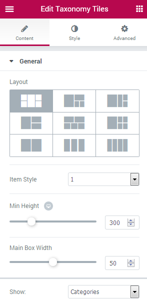
General
Layout - here you can set one of the available 9 layouts for the taxonomy tiles.
Item Style - select one of the styles available in the dropdown list.
Min Height - here you can set the minimum height to apply for the layout.
Main Box Width - here you can specify the width of the tiles main box.
Show - here you can select the taxonomy which will be displayed in the tiles (categories or tags).
Hide Empty - enable this option in order to hide the empty categories or tags from view.
Hide Uncategorized - enable this option in order to hide the uncategorized products from view.
Show by IDs - enable this option in order to be able to show the categories or tags by IDs.
Exclude taxonomy by IDs - here you can specify which categories or tags you need to exclude using their IDs.
Order by - here you can set the ascending or descending order to apply for the categories or tags.
Sort by - here you can set the method by which the categories or tags will be sorted (name, count or IDs).
Show Counts - enable this option to show how many products are included into each of the categories or tags.
Title Max Length - here you can set the maximum length to apply it for the title of the category or tag.
Description Length - here you can specify the maximum length of the category or tag description.
Count Before/After Text - here you can set the brackets, symbols or text to be shown before and after the count of products.
Style
Box
Gap Between Boxes - here oyu can set the necessary gap distance between the tiles.
Border Type - here you can apply the needed border type for the content and set its width, color, as well as define the border None not to use any borders for the count.
Border Radius - here you can apply the custom border radius values to make the border angles more smooth.
Box Shadow - here you can apply the shadow for the box and customize its appearance according to your needs.
Vertical / Horizontal Alignment - here you can set the alignment for the box.
Padding - here you can set your custom paddings to use for the box and make them responsive.
Box Overlay
Switch between Normal and Hover modes in order to customize the appearance of both.
Background Type - here you can set the needed classic or gradient background type and customize its appearance using available options (these are the same for all JetWooBuilder widgets).
Box (Hover)
Content
Background Color - here you can set the background color for the content on hover.
Border Color - here you can set the color to apply for the content on hover.
Title
Color - here you can specify the color to apply for the title on hover.
Description
Color - here you can specify the color to apply for the description.
Count
Color - here you can set the color to use for the count on hover.
Background Color - here you can set the color to apply for the count background on hover.
Border Color - here you can set the needed border color to use for the box count on hover.
Content
Background - here you can select the needed color to apply for the background.
Border Type - here you can apply the needed border type for the content and set its width, color, as well as define the border None not to use any borders for the count.
Border Radius - here you can apply the custom border radius values to make the border angles more smooth.
Box Shadow - here you can apply the shadow for the content and customize its appearance according to your needs.
Padding - here you can apply the custom paddings for the content and make them responsive.
Title
Color - here you can set the custom color for the title.
Typography - here you can edit the typography settings. They are the same as available for other JetWooBuilder widgets.
Margin - here you can apply the custom margins to use for the title and make them responsive.
Products Count
Count Position - here you can set the preferable count position (top right, left, bottom right, left).
Count Display - here you can define if you want the count to be displayed in line or boxed.
Color - here you can set the needed color for the count.
Background - here you can specify the needed background color for the count.
Typography - here you can edit the typography settings. They are the same as available for other JetWooBuilder widgets.
Border Type - here you can apply the needed border type for the count and set its width, color, as well as define the border None not to use any borders for the count.
Border Radius - here you can apply the custom border radius values to make the border angles more smooth.
Box Shadow - here you can apply the shadow for the count and customize its appearance according to your needs.
Padding - here you can apply the custom paddings for the count and make them responsive.
Margin - here you can apply the custom margins to use for the count and make them responsive.
Description
Color - here you can pick the color to use for the description.
Typography - here you can edit the typography settings. They are the same as available for other JetWooBuilder widgets.
Margin - here you can apply the custom margins to use for the description and make them responsive.
Advanced Settings
In this block you can access advanced appearance settings of the widgets, define widget margins and padding, entrance animation, change the background for the whole widget, etc.
Element Style
- Margin — in this block you can input the values (in pixels) to define the margins for the module you're customizing.
- Padding— here you can set the custom padding for the module. Fill in the values for the top, bottom, right and left padding in pixels to apply your custom padding.
- Z-index— input the value of the z-index to use it for the module.
- Entrance Animation- choose from the dropdown menu one of the styles for the module to appear on the page.
- Animation Duration — here you can define the time during which the module will appear on the page. It can be normal, slow or fast. Choose the one you need from the dropdown menu.
- Animation Delay (ms) — input the value (in ms) for the animation delay.
- CSS Classes — here you can define the CSS class for the module.
Background
Here you can switch from customizing Normal to Hover background style settings. Just click on the button Hover to proceed to customizing hover elements.
- Background Type — in this block you can choose, whether you want to use classic or gradient type for the module background. The customization options vary for each type.
Classic Background Type
- Color — here you can set background color for the background using color picker tool.
- Image — here you can choose the image you want to use as a background. Select the image from the media library or upload it to define it as a background in this block. When the image is uploaded, you’ll be able to define its position, alignment, turn on repeat and set the necessary size.
Gradient Background Type
- Color — here you can set background color for the module using color picker tool.
- Location — here you can define the proportion for the first color in the gradient background.
- Second Color — here you can set the second color to use in the gradient background.
- Location — here you can define the proportion for the second color in the gradient background.
- Type — define, if you want to use linear or radial type of the gradient.
- Angle — in this block you can set the angle for the gradient (in degrees).
Border
Here you can switch from customizing Normal to Hover border style settings. Just click on the button Hover to proceed to customizing hover elements.
Border Type — here you can select the type of the border from the dropdown menu. Here is the list of available border types:
- none;
- solid;
- doubled;
- dotted;
- dashed.
Border Radius — here you can select the radius for the applied border (in pixels).
Box Shadow — enable this option if you want to access the shadow advanced settings for this module, and need to apply shadow for it.
Shadow Settings:
- color — here you can set the color for the the shadow (use color picker tool to do it);
- blur — in this block you can define the blur settings for the shadow;
- spread — here you can set how large the shadow will be;
- horizontal — here you can move the shadow horizontally (from right to left);
- vertical — here you can move the shadow vertically (from top to bottom);
- position — here you need to choose, whether you want the shadow to outline the module, or to be inset.