JetTricks
JetTricks Effects
This block uncovers the effects which can be added to the pages using JetTricks widgets and functionality.
Sticky Column
Sticky Column is an additional functionality which makes it possible to make the columns "sticky" when one scrolls the section up and down.
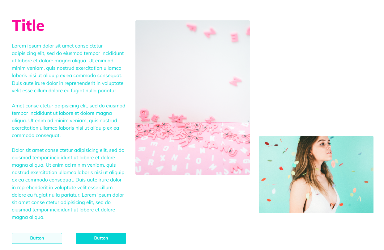
First, add a new section and select the needed columns layout. Place the needed content into the column and the rest of the columns, which will be scrolled. Cick Edit Column option for the column you want to make sticky.
After that open JetTricks tab. Here turn on Sticky Column option. This will make the Sticky Column effect options appear on the page.
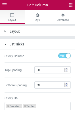
Top Spacing - add the top spacing value in order to make the starting point when scrolling a sticky column a bit lower.
Bottom Spacing - add the bottom spacing value in order to make the ending point of the sticky column when it scrolls a bit higher.
Please, note that the value set for Top and Bottom spacing should be larger than 0.
Sticky on - here you can select on which devices the sticky option will be applied (e.g., desktop, tablet).
Hotspots
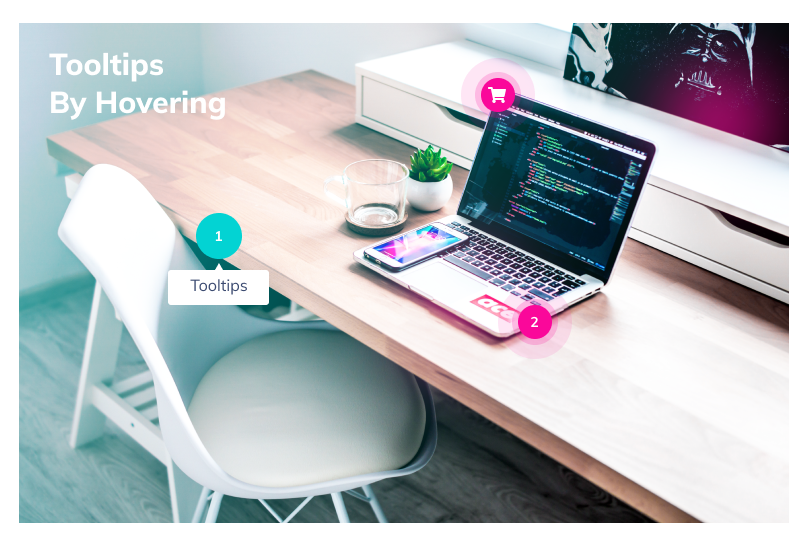
Hotspots widget allows adding the stylish hotspots to the specific image to mark the important details.
Content
Image
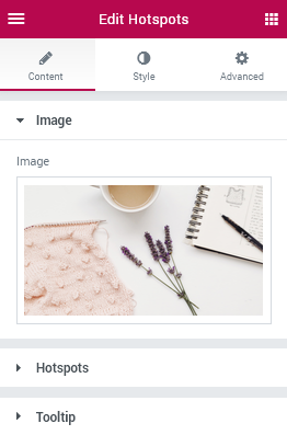
Here you can select the image to which you’re going to add hotspots from the media library or upload it from your hard drive.
Hotspots
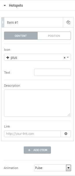
Click Add Item button in order to add a new hotspot to the image.
Switch between Content and Position tabs in order to specify the content you want to display and place the hotspot where it is needed.
Icon - here you can set the icon to use it for the hotspot marker.
Text - here you can add the text to show it beside the icon.
Description - here you can add a text to display when one hovers on the hotspot in an additional tip.
Link - here you can specify a link which will be opened when one clicks on the hotspot marker.
Horizontal Position - use the control in order to position the marker using the horizontal x axis (in percents, assuming that 100% is the full width of an image).
Vertical Position - use the control in order to position the marker using the vertical y axis (in percents, assuming that 100% is the full height of an image).
Tooltip
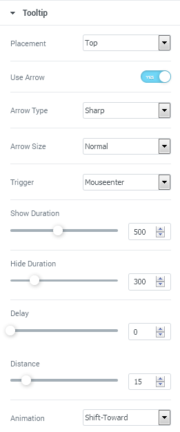
Placement - here you can select, where you want the tooltip with a description text to be displayed (top, bottom, left or right position).
Use Arrow - here you can enable or disable the usage of an arrow pointing to the hotspot to which the tooltip is related.
Arrow Type - here you can select which arrow type you want to apply for the tooltip (sharp or round).
Arrow Size - here you can define, how large or small the arrow should be (normal, small, skinny, large, wide).
Trigger - here you can specify what action triggers the tooltip to show up (hover or click).
Show duration - here you can set how fast or slow the tooltip is to appear.
Hide duration - here you can specify how slow or fast the tooltip is to disappear.
Delay - here you can define the tooltip delay time in ms.
Distance - here you can set the distance between the original hotspot and the tooltip.
Animation - here you can select the suiting animation effect which will be used when the tooltip appears or disappears (shift-away, shift-toward, fade, scale, perspective).
Style
Hotspot
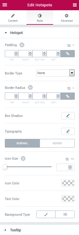
Padding - here you can set the custom paddings to use for the content contained inside the hotspot.
Border Type - here you can define if the hotspot has a border (none, solid, dotted, dashed, double, groove).
Width - here you can specify the required border width for the hotspot.
Color - here you can set the needed color to use for the border.
Border Radius - define the values of the border radius to make the border angles more round.
Box Shadow - here you can set the shadow options for the hotspot in order to make it stand out more on the image. You’ll be able to customize such shadow options, as:
- Color;
- Horizontal;
- Vertical;
- Blur;
- Spread.
Typography - here you can make changes in the hotspot content typography.
Size — define the font size of the hotspot text.
Family — here you can set the font family for the hotspot text.
Weight — in this block you can select the suitable font weight.
Transform — here you can choose from the dropdown menu, if you want the text to be shown in uppercase, lowercase, capitalize or normal way.
Style — in this block you can choose from the dropdown menu the style of the font. It can be normal, italic (the characters look similar to handwriting) and oblique (the characters are slightly inclined to the right).
Line Height — in this field you can set the height of the hotspot text.
Letter Spacing — here you can set the space between the hotspot text characters.
Switch between Normal and Hover modes in order to customize the hotspot marker appearance on hover and in its normal state.
Icon Size - here you can select the necessary size to apply it for the hotspot icon.
Icon Color - here you can define the color you want to apply for the icon.
Text Color - here you can specify the color to use for the text.
Background Type - here you can set the preferable background type to use for the hotspot. It can be Classic or Gradient background.
Color - here you can set the specific color to use for the hotspot.
Image - click the image box and upload an image in order to use it as a background for the hotspot.
Position - here you can position the image used for the background according to your needs.
Attachment - here you can make the image fixed or allow it to be scrolled.
Repeat - here you can allow the image to be repeated horizontally, vertically, tiled or restrict repeating.
Size - select Cover, Contain or Auto image sizing in order to make it fitted into the hotspot.
Color - add the first color to use for the gradient background of the hotspot.
Location - here you can change the location of the first gradient color.
Second Color - add the second color to use for the gradient background.
Location - here you can change the location of the second gradient color.
Type - here you can change the gradient location from linear to radial.
Angle - if the gradient type is linear, you can change the angle to use for it.
Position - if the gradient is radial, here you can change the position of its center to the preferable one.
Padding - here you can set the padding for the hotspot.
Border type - here you can change the border type to the one needed (solid, dotted, dashed, double, groove or none).
Width - here you can set the width of the border in px.
Color - here you can choose the color to use for the border.
Border Radius - here you can apply a radius for the border angles to make them more smooth.
Width - use the control to make the width of the tooltip description larger or smaller depending on your needs.
Typography - here you can make changes in the tooltip content typography.
Size — define the font size of the tooltip description text.
Family — here you can set the font family for the tooltip description text.
Weight — in this block you can select the suitable font weight.
Transform — here you can choose from the dropdown menu, if you want the text to be shown in uppercase, lowercase, capitalize or normal way.
Style — in this block you can choose from the dropdown menu the style of the font. It can be normal, italic (the characters look similar to handwriting) and oblique (the characters are slightly inclined to the right).
Line Height — in this field you can set the height of the tooltip description text.
Letter Spacing — here you can set the space between the tooltip description text characters.
Text Color - here you can change the color of the description text.
Background Type - here you can set the preferable background type to use for the tooltip. It can be Classic or Gradient background.
Color - here you can set the specific color to use for the tooltip.
Image - click the image box and upload an image in order to use it as a background for the tooltip.
Position - here you can position the image used for the background according to your needs.
Attachment - here you can make the image fixed or allow it to be scrolled.
Repeat - here you can allow the image to be repeated horizontally, vertically, tiled or restrict repeating.
Size - select Cover, Contain or Auto image sizing in order to make it fitted into the tooltip.
Color - add the first color to use for the gradient background of the tooltip.
Location - here you can change the location of the first gradient color.
Second Color - add the second color to use for the gradient background.
Location - here you can change the location of the second gradient color.
Type - here you can change the gradient location from linear to radial.
Angle - if the gradient type is lineer, you can change the angle to use for it.
Position - if the gradient is radial, here you can change the position of its center to the preferable one.
Padding - here you can set the padding for the tooltip.
Border type - here you can change the border type to the one needed (solid, dotted, dashed, double, groove or none).
Width - here you can set the width of the border in px.
Color - here you can choose the color to use for the border.
Border Radius - here you can apply a radius for the border angles to make them more smooth.
Arrow Color - here you can change the color of the tooltip arrow to the one more prominent and suiting.
Padding - here you can apply the custom padding values for the description text placed inside the tooltip.
Border type - here you can define if the hotspot has a border (none, solid, dotted, dashed, double, groove).
Width - here you can specify the required border width for the tooltip.
Color - here you can set the needed color to use for the border.
Border Radius - define the values of the border radius to make the border angles more round.
Box Shadow - here you can set the shadow options for the tooltip in order to make it stand out more on the image. You’ll be able to customize such shadow options, as:
- Color;
- Horizontal;
- Vertical;
- Blur;
- Spread.
Classic Background Type
Gradient Background Type
Tooltip
Classic Background Type
Gradient Background Type
Unfold
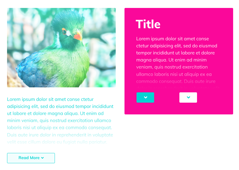
This widget is used to make the content added to the widget hidden or displayed in a beautiful way.
Content
Settings
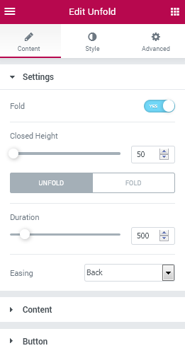
- Fold - enable this option in order to make the initial content shown fully on the page. If the option is disabled, the content will stay hidden unless the user clicks on the Unfold button.
- Closed Height - here you can specify the height of the unfolding content box when it is closed.
Switch between Fold and Unfold modes to customize the behavior of the Fold and Unfold actions.
- Duration - here you can define, how fast or slow the Fold/Unfold option will close or open the content box.
- Easing - here you can change the type of easing used when the content is folded or unfolded:
- Linear;
- Sine;
- Expo;
- Circ;
- Back;
- InOutSine;
- InOutExpo;
- InOutCirc;
- InOutBack.
Content
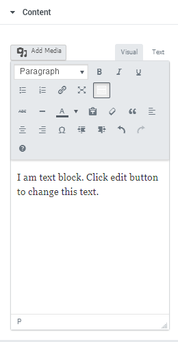
- Content field - here you can add the content you want to place into the widget. You can easily use HTML markup for the text and media objects in order to get the best results.
Button
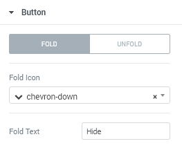
Switch between Fold/Unfold modes in order to customize the content shown on the button that displays and hides content box from view.
- Fold(Unfold) Icon - here you can select the icon to use for the Fold/Unfold button.
- Fold Text - here you can specify the text to use for the button label.
Style
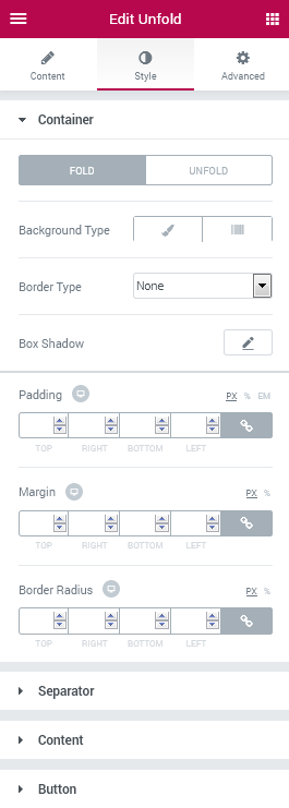
Container
Switch between Fold and Unfold modes in order to be able to customize appearance of both hidden and expanded containers.
- Background type - here you can set the preferable background type to use for the folded or unfolded container. It can be Classic or Gradient background.
Classic Background Type
- Color - here you can set the specific color to use for the container.
- Image - click the image box and upload an image in order to use it as a background for the container.
- Position - here you can position the image used for the background according to your needs.
- Attachment - here you can make the image fixed or allow it to be scrolled.
- Repeat - here you can allow the image to be repeated horizontally, vertically, tiled or restrict repeating.
- Size - select Cover, Contain or Auto image sizing in order to make it fitted into the container.
Gradient Background Type
- Color - add the first color to use for the gradient background of the container.
- Location - here you can change the location of the first gradient color.
- Second Color - add the second color to use for the gradient background.
- Location - here you can change the location of the second gradient color.
- Type - here you can change the gradient location from linear to radial.
- Angle - if the gradient type is lineer, you can change the angle to use for it.
- Position - if the gradient is radial, here you can change the position of its center to the preferable one.
- Padding - here you can set the padding for the container.
- Border type - here you can change the border type to the one needed (solid, dotted, dashed, double, groove or none).
- Width - here you can set the width of the border in px.
- Color - here you can choose the color to use for the border.
- Border Radius - here you can apply a radius for the border angles to make them more smooth.
- Border Type - here you can define if the container has a border (none, solid, dotted, dashed, double, groove).
- Width - here you can specify the required border width for the container.
- Color - here you can set the needed color to use for the border.
- Border Radius - define the values of the border radius to make the border angles more round.
- Box Shadow - here you can set the shadow options for the container in order to make it stand out more on the image. You’ll be able to customize such shadow options, as:
- Color;
- Horizontal;
- Vertical;
- Blur;
- Spread.
- Padding - here you can add your own custom padding values in order to add the paddings to me content encased in the container.
- Margin - here you can add your custom margins to use for the Fold/Unfold container.
- Border Radius - here you can define the values of the border radius to make the border angles more round.
Separator
- Height - here you can change the height of the separator line shown when the content box is folded.
- Background Type - here you can set the preferable background type to use for the separator. It can be Classic or Gradient background.
Classic Background Type
- Color - here you can set the specific color to use for the separator.
- Image - click the image box and upload an image in order to use it as a background for the separator.
- Position - here you can position the image used for the background according to your needs.
- Attachment - here you can make the image fixed or allow it to be scrolled.
- Repeat - here you can allow the image to be repeated horizontally, vertically, tiled or restrict repeating.
- Size - select Cover, Contain or Auto image sizing in order to make it fitted into the separator.
- Color - add the first color to use for the gradient background of the separator.
- Location - here you can change the location of the first gradient color.
- Second Color - add the second color to use for the gradient background.
- Location - here you can change the location of the second gradient color.
- Type - here you can change the gradient location from linear to radial.
- Angle - if the gradient type is lineer, you can change the angle to use for it.
- Position - if the gradient is radial, here you can change the position of its center to the preferable one.
- Padding - here you can set the padding for the separator.
- Border type - here you can change the border type to the one needed (solid, dotted, dashed, double, groove or none).
- Width - here you can set the width of the border in px.
- Color - here you can choose the color to use for the border.
- Border Radius - here you can apply a radius for the border angles to make them more smooth.
- Color - here you can select the color to apply it for the Content text.
- Typography - here you can make changes in the content typography.
- Size — define the font size of the text.
- Family — here you can set the font family for the text.
- Weight — in this block you can select the suitable font weight.
- Transform — here you can choose from the dropdown menu, if you want the text to be shown in uppercase, lowercase, capitalize or normal way.
- Style — in this block you can choose from the dropdown menu the style of the font. It can be normal, italic (the characters look similar to handwriting) and oblique (the characters are slightly inclined to the right).
- Line Height — in this field you can set the height of the text.
- Letter Spacing — here you can set the space between the text characters.
- Alignment - here you can change the alignment to use for the Fold/Unfold button (left, right, center).
- Background Color - here you can change the color of the background to the one more suitable using Color picker tool.
- Text Color - here you can specify the color to use it for the button text.
- Typography - here you can make changes in the button text typography.
- Size — define the font size of the text.
- Family — here you can set the font family for the text.
- Weight — in this block you can select the suitable font weight.
- Transform — here you can choose from the dropdown menu, if you want the text to be shown in uppercase, lowercase, capitalize or normal way.
- Style — in this block you can choose from the dropdown menu the style of the font. It can be normal, italic (the characters look similar to handwriting) and oblique (the characters are slightly inclined to the right).
- Line Height — in this field you can set the height of the text.
- Letter Spacing — here you can set the space between the text characters.
- Padding - here you can change the padding values to the custom ones for the button text.
- Margin - here you can add custom margins for the button.
- Border Radius - in this block you can add the border radius for the button to make its angles more round.
- Border Type - here you can define if the button has a border (none, solid, dotted, dashed, double, groove).
- Width - here you can specify the required border width for the button.
- Color - here you can set the needed color to use for the border.
- Box Shadow - here you can set the shadow options for the button in order to make it stand out more on the image. You’ll be able to customize such shadow options, as:
- Color;
- Horizontal;
- Vertical;
- Blur;
- Spread.
Gradient Background Type
Content
Switch between Fold and Unfold modes in order to customize the appearance of the container content.
Button
Switch between Normal and Hover modes in order to be able to customize the button appearance on hover and in its normal state.
View More
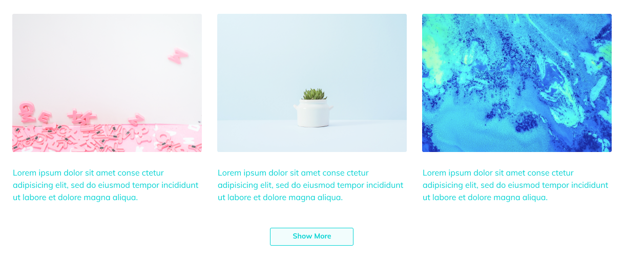
This widget allows displaying sections and hiding them under the cut stylishly, making the page's content more visually compact.
Content
Sections
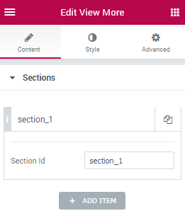
- Add Item - here you can add the section IDs you want to stay hidden until the user clicks the View More button. The first item opens on the first click, the second section is shown on the second click, etc.
Please, note that before adding the section IDs one needs to create the sections and specify the section IDs in the Edit Section > Advanced > CSS ID field.
The ID You entered in the field mentioned above should be placed in the Section ID field of the item.
- Section ID - here you need to input the Section ID found in the Edit Section > Advanced > CSS ID field.
Settings
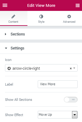
- Icon - here you can change the icon to display in the View More button.
- Label - here you can change the button label text.
- Show All Sections - enable this option in order to show all the sections on first click.
- Show Effect - here you can change the effect to use when the sections are displayed:
- Move Up;
- Fade;
- Zoom In;
- Zoom Out;
- Fall Perspective;
- None.
Style

General
- Padding - here you can change the paddings to use for the View More button.
- Margin - here you can define the custom margins to apply them for the button.
- Border Radius - change the border radius values to make the button angles more smooth and round.
- Text Color - here you can change the button text color.
- Typography - here you can make changes in the button text typography.
- Size — define the font size of the text.
- Family — here you can set the font family for the text.
- Weight — in this block you can select the suitable font weight.
- Transform — here you can choose from the dropdown menu, if you want the text to be shown in uppercase, lowercase, capitalize or normal way.
- Style — in this block you can choose from the dropdown menu the style of the font. It can be normal, italic (the characters look similar to handwriting) and oblique (the characters are slightly inclined to the right).
- Line Height — in this field you can set the height of the text.
- Letter Spacing — here you can set the space between the text characters.
- Icon Color - here you can change the color of the button icon to the suitable one.
- Icon Size - here you can change the size of the ixon to use for the button.
- Background Type - here you can set the preferable background type to use for the button. It can be Classic or Gradient background.
- Color - here you can set the specific color to use for the button.
- Image - click the image box and upload an image in order to use it as a background for the button.
- Position - here you can position the image used for the background according to your needs.
- Attachment - here you can make the image fixed or allow it to be scrolled.
- Repeat - here you can allow the image to be repeated horizontally, vertically, tiled or restrict repeating.
- Size - select Cover, Contain or Auto image sizing in order to make it fitted into the button.
- Color - add the first color to use for the gradient background of the button.
- Location - here you can change the location of the first gradient color.
- Second Color - add the second color to use for the gradient background.
- Location - here you can change the location of the second gradient color.
- Type - here you can change the gradient location from linear to radial.
- Angle - if the gradient type is lineer, you can change the angle to use for it.
- Position - if the gradient is radial, here you can change the position of its center to the preferable one.
- Padding - here you can set the padding for the button.
- Border type - here you can change the border type to the one needed (solid, dotted, dashed, double, groove or none).
- Width - here you can set the width of the border in px.
- Color - here you can choose the color to use for the border.
- Border Radius - here you can apply a radius for the border angles to make them more smooth.
- Border Type - here you can define if the button has a border (none, solid, dotted, dashed, double, groove).
- Width - here you can specify the required border width for the button.
- Color - here you can set the needed color to use for the border.
- Box Shadow - here you can set the shadow options for the button in order to make it stand out more on the image. You’ll be able to customize such shadow options, as:
- Color;
- Horizontal;
- Vertical;
- Blur;
- Spread.
Switch between Normal and Hover modes in order to customize both the button appearance when it is in normal state, or when on hover.
Classic Background Type
Gradient Background Type
Parallax Element
This functionality enables you to add parallax effect for versatile widgets and change parallax speed, enable or disable parallax for different devices, etc.
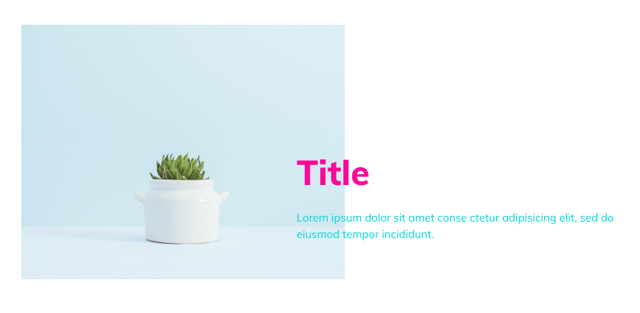
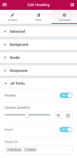
Click on Edit Widget option and then proceed to Advanced settings.
Here open JetTricks menu and enable Parallax option in order to apply parallax for the specific widget.
Use the control in order to set the parallax speed (in percents).
Enable Invert option in order to switch the initial position of the widget to the opposite one.
Active on - here you can define, on which devices the parallax effect should work for the widget.
Section Particles
Section Particles effect allows to add the stylish animated particles to the section’s background using the JSON code.
You can check the code samples using this link.
Use the block in the top right corner to customize the number of particles, their color, shape, size, etc.
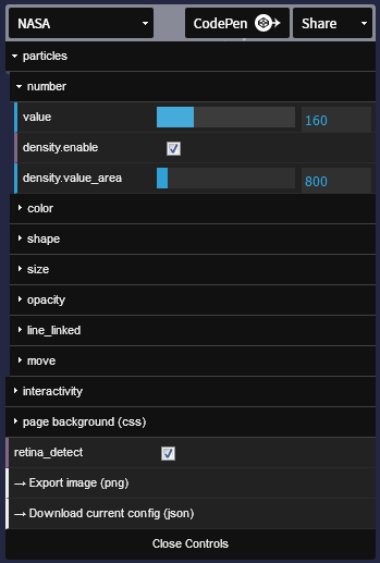
Then click Download Current Config option in .json format and open the file in any text editor.

Copy its content and paste in to the Particles JSON field. The animated particles will be added to the section’s background.
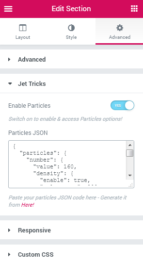
Note, that you can also create your own animated particles or elements to place to the section’s background.
Satellite Element
Satellite effect can be applied for one of the existing widgets to add a textual or image element before or after the widget, styling it up and positioning it according to one’s needs.
In order to use Satellite effect click Edit Widget option and then open Advanced Settings.
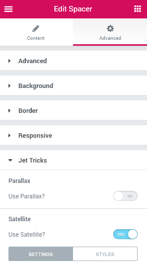
Here open JetTricks block and locate Satellite.
You can create a satellite element for the widget and change its settings and appearance using the settings listed below.
Use Satellite - here you can enable or disable the Satellite effect for the widget. After enabling this effect you’ll be able to change its settings and style.
Settings
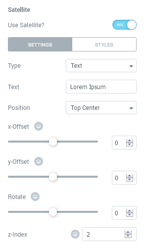
Type - here you can select if you want to add a textual satellite element to the widget or an image satellite element. Depending on what you choose the following settings and the needed styles will vary.
Text - type in the text you need to use as a satellite for the widget in this field.
Image - here you can select one of the images from the media library or upload it in order to use it as a satellite for the widget.
Position - here you can select the position of the element to use it as a satellite (top, middle, bottom, center, right or left).
X-Offset - here you can apply the custom horizontal offset for the satellite element.
Y-Offset - here you can set the custom vertical offset for the satellite element.
Rotate - use the controls to rotate the satellite element using 360 degrees.
Z-Index - - here you can define the position of the satellite element before or after the widget’s content.
Style
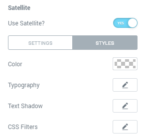
Color - here you can set the color to apply for the text using color picker tool.
Typography - here you can customize the typography options for the text element. The typography settings are similar to the ones available for other textual elements used in JetTricks.
Text Shadow - here you can set the shadow for the text and customize its appearance (color, blur, alignment).
Width - here you can apply the custom width for the image used as a satellite for the widget.
Height - here you can set the custom height for the image used as a satellite.
CSS Filters - here you can set the additional style settings for the satellite element.
Blur - use this control to make the element blurred.
Brightness - use the control to make the element’s brightness lower or higher.
Contrast - here you can set the contrast to maximum or minimum according to your needs.
Saturation - use the control to make the element saturation higher or lower.
Tooltip for Widget
Tooltip effect is necessary whenever you need to add an informational hint tip to one of the widgets.
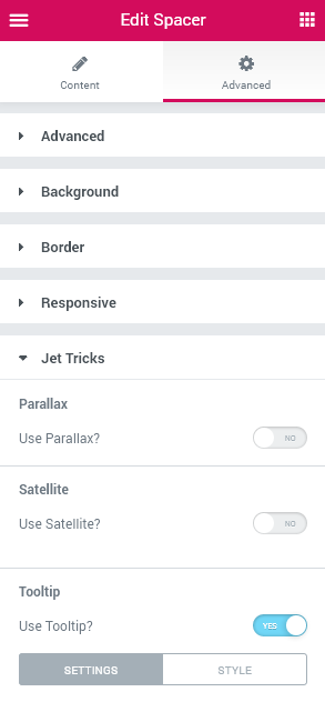
In order to use Tooltip effect click Edit Widget option and then open Advanced Settings. Here open JetTricks block and locate Tooltip.
Use Tooltip - here you can enable or disable the Tooltip effect for the widget. After enabling this effect you’ll be able to change its settings and style.
Settings
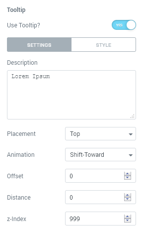
Description - here you need to add the text to be shown inside the tooltip.
Placement - here you can select the needed position of the tooltip (top, bottom, left, right).
Animation - here you can select one of the available animation effects.
Offset - here you can specify the offset for the tooltip.
Distance - here you can set the distance for the tooltip to be shown where it is needed and positioned according to one’s needs.
Z-Index - here you can make the tooltip be shown before or after the widget’s content.
Style
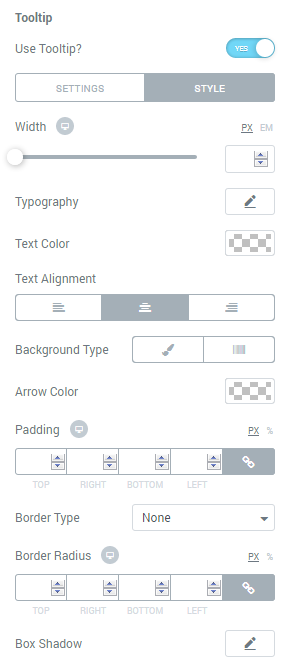
Width - here you can set the custom tooltip block’s width in px.
Typography - here you can customize the typography options for the tooltip text element. The typography settings are similar to the ones available for other textual elements used in JetTricks.
Text Color - here you can specify the color of the tooltip text.
Text Alignment - here you need to set the preferable alignment for the tooltip text.
Background Type - here you can change the type of the background of the tooltip. It can be gradient or classic background. The settings vary for each one and are similar to the ones available for other JetTricks widgets.
Arrow Color - here you can change the color of the tooltip arrow to the one needed.
Padding - here you can set the preferable padding values for the tooltip and make the paddings responsive.
Border Type - here you can apply the custom border type for the tooltip. In the case the border is selected, you can also change the border width and color.
Border Radius - here you can set the radius values to make the border angles more smooth.
Box Shadow - here you can set the shadow for the tooltip and customize its appearance (color, blur, alignment).
